Guest Post by Willis Eschenbach
This is the third post looking at the use of 1° latitude by 1° longitude gridcell-based scatterplots. The first post, Global Scatterplots, looked at a gridcell-based scatterplot of surface cloud radiative effect (CRE) versus temperature. The CRE measures how much clouds either warm or cool the surface through the combination of their effects on shortwave (solar) and longwave (thermal) radiation.

Figure 1. Original caption: Scatterplot, surface temperature (horizontal “x” axis) versus net surface cloud radiative effect (vertical “y” axis). Gives new meaning to the word “nonlinear”.
The slope of the yellow/black line shows the change in CRE for each 1°C change in temperature. Note the rapid amplification of the cloud cooling above about 25°C.
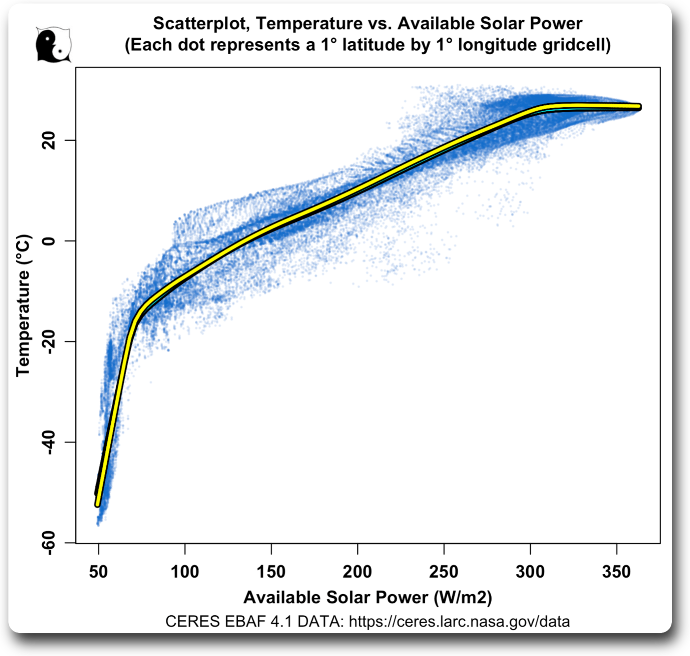
The second post, Solar Sensitivity, used the same method to investigate the relationship between available solar power (top-of-atmosphere [TOA] solar minus albedo reflections) and temperature. Here’s the graphic from that post.

Figure 2. Original caption: Scatterplot, gridcell-by-gridcell surface temperature versus available solar power. Number of gridcells = 64,800. The cyan/black line shows the LOWESS smooth of the data. The slope of the cyan/black line shows the change in temperature for each 1 W/m2 change in available solar. The data in all of this post is averages of the full 21 years of CERES data.
As before, the slope of the cyan/black line shows the change in surface temperature per one W/m2 change in available solar power.
In this one, the points of interest were the three roughly straight sections, particularly the right one. In that section, additional solar power isn’t raising the temperature.
Figure 3 below shows the slope of the cyan/black line versus available solar power.

Figure 3. Original Caption: Slope of the trend line in Figure 2. This shows the amount of change in the temperature for a 1 W/m2 change in available solar.
This method of looking at the data is of great interest because it reveals long-term relationships between the variables. Each gridcell has had thousands of years to equilibrate to its general current temperature and available solar power. So looking at the temperatures of both nearby and distant gridcells with slightly different available solar power shows long-term relationships between solar and temperature, not what happens with a quick change.
Next, it’s of value because the slope is relatively insensitive to changes in average temperature or average available solar. Changes in average temperature merely move the cyan/black line up or down, but this causes very little change in the slope on the cyan/black line.
Similarly, changes in average solar move the cyan/black line left or right. And changes in both average temperature and average solar displace the data diagonally … but none of these change the variable of interest, the slope of the cyan/black line, in any significant manner.
Now, for this post I wanted to look at the relationship between the very poorly named “greenhouse” radiation and surface temperature.
And what is greenhouse radiation when it’s at home?
All solid objects, including the earth, emit thermal radiation. It’s how night-vision goggles work. They allow us to “see” that radiation.
Some of the radiation from the earth goes directly to outer space. But some is absorbed by the atmosphere. This is eventually re-radiated in all directions, with about half going up and half going back towards the earth. This downwelling (earth-directed) longwave thermal radiation is called “greenhouse radiation”.
Now, a smart guy named Ramanathan pointed out that we can actually measure the amount of this greenhouse radiation from space. For every gridcell, we take the amount of radiation emitted at the surface. From that, we subtract the radiation escaping to space. The remainder is what was absorbed by the atmosphere and re-directed downwards—the greenhouse radiation.
So I wanted to see what happens to surface temperatures when greenhouse radiation changes. But there’s an immediate problem. The amount of greenhouse radiation goes up and down whenever the surface temperature changes. If the surface is warmer and radiating more, more is absorbed by the atmosphere, and as a result of the increase in surface temperature, greenhouse radiation is larger.
To remove that difficulty, we can express the greenhouse effect as a percentage of upwelling (directed to space) longwave surface radiation. This takes the direct effect of surface temperature on greenhouse radiation out of the equation. Figure 4 shows the resulting relationship between surface temperature and the greenhouse effect as a percentage of upwelling radiation.

Figure 4. Scatterplot, gridcell-by-gridcell surface temperature versus greenhouse radiation percentage. Number of gridcells = 64,800. The red/black line shows the LOWESS smooth of the data. The cyan/black line’s slope shows the change in temperature for each 1 W/m2 change in available solar. The few negative gridcells are at the poles, and they show the effect of the importation of heat from the tropics.
And here is the corresponding graph of the slope, once the percentages are translated back into W/m2.

Figure 5. Slope of the trend line in Figure 4. This shows the amount of change in the temperature for a 1 W/m2 change in greenhouse radiation.
This has both similarities and differences from the warming due to changes in available solar shown in Figure 3 above. Both start out high on the left, and both end up with a low unchanging slope on the right. However, the greenhouse warming is much larger in the middle. This leads to a global area-weighted average climate sensitivity of 0.58°C per 1 W/m2 additional greenhouse radiation.
This in turn equates to about 2°C per doubling of CO2. This is about the same equilibrium climate sensitivity found by Nic Lewis in his recent study Objectively combining climate sensitivity evidence, viz:
The resulting estimates of long-term climate sensitivity are much lower and better constrained (median 2.16 °C, 17–83% range 1.75–2.7 °C, 5–95% range 1.55–3.2 °C) than in Sherwood et al. and in AR6 (central value 3 °C, very likely range 2.0–5.0 °C).
Finally, this method gives a climate sensitivity estimate for each gridcell. Here is that map, showing how much the surface temperature is estimated to change for each additional W/m2 of greenhouse radiation.


Figure 6. Expected temperature change resulting from a 1 W/m2 increase in greenhouse radiation.
This makes some sense. The blue areas are the location of the intertropical convergence zone and the Western Pacific Warm Pool. They are generally covered with cumulus and thunderstorm clouds. These act as a 100% absorber of upwelling radiation … so any additional CO2 will make little difference. In addition, temperatures in these areas are up near the maximum, so they won’t warm much from increased greenhouse or solar radiation.
Well, there are probably more insights to be drawn from all of this. But this post is long enough, so I’m going to leave it there. I’m sure, for example, that I can get better results by subdividing the data, both by north/south hemisphere and by land vs ocean. That will do a better job of only comparing like with like. But sadly, there are never enough hours, in either a day or a lifetime
And as usual, what I’ve found brings up more questions than answers. I view my writings in some sense as my ongoing lab notebook, where I get to have a permanent record of what I’m finding, and you get to learn about things when and as I learn about them.
My very best to you all, and thanks for your continued interest, participation, and critiquing of my ongoing investigations into the mysteries of this amazing universe,
w.
My Perennial Request: When you comment please quote the exact words you are discussing. It avoids all kinds of misunderstandings.
Previous Work: There’s an index to my work here, divided up by subject matter. Click on any of the headers below to go to that section.
Agriculture
Alarmism
Argo
Atmosphere
Autobiography
Bad Science
Berkeley Earth
Carbon Cycle
Climate Datasets
Climate Indices
Climate Models
Climate Phenomena
Climate Politics
Climate Sensitivity
Climategate
Clouds
CO2
Conferences
Conservation
Constructal Law
COVID
Cryosphere
Cycles
Datasets
Earthquakes
Economics
El Nino
Emergence
Energy
Energy and Poverty
Energy Budget
Energy Problems
Environment
Expeditions
Extinctions
Geoengineering
Greenhouse
Greenhouse Theory
Hurst/Autocorrelation
IPCC
Lack of Effect
Malfeasance
Mathematics
Mercury
Mitigation
Models
Multiproxy Analyses
No Regrets
Ocean
Ocean Neutralization
OHC
Open Letters
Paleo
Peer Review
Philosophy of Science
Policy
Poverty and Energy
Proxy Reconstructions
Publication Reports
Quote of the Week
Radiation
Radiative Forcing
Reconstructions
Renewables
Sea Level
Sunspots
TAO Buoys
Temperature Datasets
Temperature Datasets and Adjustments
Tides
Trends
Urban Heat Island (UHI)
Volcanoes
War On Carbon
Water Vapor
Watts Up With That
Weather Events
Weather Phenomena
Whitewashes
Dear Willis, thank you for sharing these very impressive results.
You say “This in turn equates to about 2°C per doubling of CO2″. One of the most recent (and probably most accurate) average forcing values for 2xCO2 is from Happer/Wijngaarden and amounts 3.0 W/m2. In reality, there’s a certain distribution over the globe, I presume; low latitutes higher values than higher latitutes. If that’s the case (but I’ve a hard time finding literature about that) the higher forcing values would coincide with the non-sensitive area’s you’ve presented in figure 6.
Would it make a lot of difference taking that into account do you think?
Willis
Kindly post the temperature data by year and grid cell so we can validate your work. As I understand temperature is not part of the raw CERES data. Rather you have derived it from upwelling radiation.
thanks, Ferd
Yes, I’ve derived the temperature. Yes, it is indistinguishable from say the Berkeley Earth data. Here’s as in Figure 2 above, but using Berkeley Earth temperature data. The Berkeley Earth LOWESS curve is in cyan/black. It’s almost totally obscured by the yellow/black LOWESS curve using the CERES data that I’ve overlaid on the Berkeley Earth data.
w.
Hi Willis
Kindly post the temperature data by year and grid cell. I believe the generally agreed standard is to release both data and methods behind a paper.
For example: The controvesy over Phil Jones and Steve McIntyre and access to temperature data.
As I recall there was considerable criticism at the time over the failure to release temperature data, even though as with Berkley, the data could be derived from another source.
This situation appears very similar.
Thanks, Ferd
Ferd, kindly osculate my fundament. The source of every bit of data is listed in the graphs. The fact that it appears you are too stupid to download it is your problem, not mine.
And no, with Phil Jones, the data could NOT be derived from another source. That’s a damned lie. The full story is here.
w.
https://www.ncbi.nlm.nih.gov/pmc/articles/PMC3126798/
Data Sharing by Scientists: Practices and Perceptions
“Data sharing is a valuable part of the scientific method allowing for verification of results and extending research from prior results.”
https://www.nature.com/articles/s41597-022-01428-w
A focus groups study on data sharing and research data management
Sharing scientific research data has many benefits. Data sharing produces stronger initial publication data by allowing peer review and validation of datasets and methods prior to publication1,2. Enabling such activities enhances the integrity of research data and promotes transparency1,2, both of which are critical for increasing confidence in science3,4.
https://www.nature.com/articles/s41597-022-01428-w
A focus groups study on data sharing and research data management
After publication, data sharing encourages further scientific inquiry and advancements by making data available for other scientists to explore and build upon2,3,4,5. Open data allows further scientific inquiry without the costs associated with new data creation4,6.
======
especially important for us unpaid researchers and hobbyists.
I was trying to understand what might cause figure 5. It appears to show a highly variable warming effect related to the GHE. My best guess is that it, in fact, is related to clouds. Might be interesting to build a similar graph for cloud cover to see if they match up.
https://climatedataguide.ucar.edu/climate-data/global-surface-temperatures-best-berkeley-earth-surface-temperatures
Key Limitations
Anomaly fields are highly smoothed due to the homogenization and reconstruction methods, despite being gridded at 1×1 degree
The homogenization approach may not perform well in areas of rapid local temperature change, leading to overestimates of warming at coastal locations and underestimates at inland locations
======
Why would highly smoothed BEST data be highly correlated with a CERES outgoing surface radiation derived dataset? Why would satellite data be smoothed? Polar orbits provide global coverage. Why would smoothed data be highly correlated with unsmoothed data?
Willis,
There are at least three problems with your post:
Your calculations are completely wrong – they fail to grasp what sensitivity actually is.
Scott J Simmons October 24, 2022 10:43 am
First, yes, I’m using G/Fs, aka “the greenhouse effect as a percentage of upwelling radiation”, aka the “normalized greenhouse effect”. However, I have no clue what you mean by “The calculation isn’t exact”.
Figure 4 clearly falsifies your claim that “What is clear is that G/Fs increases with temperature, but not by much.” In fact, over the earthly range of temperatures, it varies between ~0% and 50%.
I’ve calculated the top-of-atmosphere forcing change in the manner defined by Ramanathan—TOA LW radiative forcing is equal to surface upwelling LW minus TOA upwelling longwave. Since I’m using the TOA change, I fear the rest of your objection doesn’t apply.
Is this the best or only way to calculate forcing? Not in my world, but that’s a separate question. I’m looking at the accepted definition, which is that of Ramanathan.
Mmm … in such a complex system, there is never complete equilibrium on any time scale. By that, I mean that the system is either warming or cooling over any selected time period.
HOWEVER, it is also overall in such an amazing steady-state that the warming over the entire 20th century was only 0.2%.
And until you give me a seriously calculated uncertainty on your imbalance number, I’ll let that one go except to note that your claimed imbalance is tiny … you’re pointing at a difference that makes no difference. I’m analyzing the worldwide relationship of greenhouse radiation and temperature, and the imbalance you mention is lost in the noise.
Best regards,
w.
Multiple errors continue:
You can calculate g in multiple ways, and G/Fs is one. Another is 1-(T0/T1)^4, where T0 is the earth’s effective temperature (255 K) and T1 is current temperature (~288 K). The values are similar but not the same. I believe the IPCC treats it as a constant 0.4 because it simply doesn’t change that much.
No, it doesn’t. You just made a scatter plot of local temperatures and local g, but g is properly calculated with global surface temperature, and G/Fs doesn’t change by much with a change in GMST. In fact, it changes as I calculated. The numbers don’t lie. Check my math if you doubt me.
What you calculated is NOT top of the atmosphere forcing change. You calculated the greenhouse effect, which is what you described. But that is NOT the top of the atmosphere forcing change. If doubling CO2 causes 3.71 W/m^2 change in EEI (top of the atmosphere forcing change), the greenhouse effect increases by ~16 W/m^2 if ECS = 3 C. Your confusion here is a big part of the problem.
Of course, but that’s besides the point. In order to calculate sensitivity, you need to calculate the dT at equilibrium with dF, where dF is a TOA forcing change (change in EEI). Since EEI is almost never exactly 0, you have to account for EEI in any estimate of sensitivity, which you simply did not do. This is the proper formula to calculate sensitivity using a simple energy balance equation:
λ= ΔT/(ΔF – EEI)
Here λ is sensitivity, ΔT is a change in GMST (not local temperature), ΔF is a forcing change at TOA and EEI is the earth’s energy imbalance. If you plug in empirical values for these, with ΔT = 1.2 C, ΔF = 2.2 W/m^2 and EEI = 0.8 W/m^2, you end up with a λ of about 3 C.
Again, that’s besides the point. Current GMST is 1.2 C warmer than the 1850-1900 mean. so 1.2/288 = 0.4%, but whatever number you want to use for that percentage, you didn’t calculate sensitivity at all.
Loeb estimated it to be 0.77 ± 0.06 W/m^2 from 2005-2019.
Loeb, N. G., Johnson, G. C., Thorsen, T. J., Lyman, J. M., Rose, F. G., & Kato, S. (2021). Satellite and ocean data reveal marked increase in Earth’s heating rate. Geophysical Research Letters, 48, e2021GL093047. https://doi.org/10.1029/2021GL093047
Whether you call it tiny or large doesn’t matter. But it does make a difference. If EEI is 0.77 W/m^2 that means that 0.62 C additional warming is built into current conditions (ECS = 3 C), or about 0.42 C additional warming if ECS = 2 C. If you ignore EEI, as you have done, you can calculate TCR, but you can’t calculate ECS.
You did plot the relationship between g and T, but you did NOT calculate anything approximating ECS.
Hear, Hear!
As I said,
Loeb estimated it to be 0.77 ± 0.06 W/m^2 from 2005-2019.
Loeb, N. G., Johnson, G. C., Thorsen, T. J., Lyman, J. M., Rose, F. G., & Kato, S. (2021). Satellite and ocean data reveal marked increase in Earth’s heating rate. Geophysical Research Letters, 48, e2021GL093047. https://doi.org/10.1029/2021GL093047
Willis Eschenbach
October 22, 2022 11:10 pm
Yes, I’ve derived the temperature. Yes, it is indistinguishable from say the Berkeley Earth data.
=====================
Willis Eschenbach
February 23, 2015 9:26 am
Thanks, Paul. I converted using the standard S-B relationship, which is that
Radiation = S-B_constant * emissivity * temperature^4
For the surface radiation I used the CERES calculated upwelling surface radiation, the EBAF-SURFACE dataset called “surf_lw_up_all”.
=====================
Willis,
Is the above how you derived the surface temperatures from upwelling radiation??
Looking at your excel ceres data for example, for
Year Month 2000 3
surf_lw_up_all 392.35 w/m2
allt2 13.88 C
SB-temp BB 15.264 C (mismatch)
Using S-B with 392.35 w/m2 yields 15.264 C but you have the temp as 13.88 C.
As a double-check, I repeated this exercise using the global average from the CERES EBAF 4.1 data directly with similar results.
Please explain this discrepancy. Thanks, Ferd
It’s the difference between first averaging the gridcell radiation then converting to temperature, and first converting radiation to temperature and then averaging.
Regards,
w.
I have repeatedly warned of this problem on WUWT. That average radiation cannot be used to infer average temperature using S-B because of non-zero statistical variance.
As such using monthly radiation averages from CERES EBAF 4.1 cannot match Berkley Earth except by chance.
Even using realtime gridcell radiation data from CERES is a problem because a gridcell is an arbitrary measure and there is no guarantee the scanners will exactly sample the gridcell. Averaging radiation will be required to infill, which invalidares infering temperature via S-B.
Kindly show the formula that allows you to determine average temperature from CERES average radiation. I contend no such formula exists given present knowledge.
Thanks, Ferd
Climate science is full of this. S-B, Planck, etc. are all exponential functions. They are also based upon a static or momentary point in time. The next small increment of time the temperature will be different.
That is why gradients are necessary. Gradients define actual heat loss or gain in a uniform manner. For example, does copper lose heat faster than iron when starting at a similar temperature? Does humid air lose heat faster than dry air.
That’s why I had to take calculus before taking thermodynamics. Does soil or water lose heat faster than CO2? By what amount and why?
There is a good explanation (below) of the problem in using average radiation to infer average temperature. As Bob Wentworth explains, average radiation only gives you an upper bound for average temperature, unless you have zero variance over the surface and time.
Clearly this is not the case when dealing with CERES monthly averages, where radiation for a grid square is unlikely to remain constant. Thus my request to Willis that he post his grid square temperatures for independent validation.
Looking at CERES own 10 year averages, using the Willis formula from 2015 I calculate an average surface temperature for the earth of 16.4 C. Clearly this must be an upper limit as the generally agreed average surface temp for the earth is 15C or lower.
https://ceres.larc.nasa.gov/documents/DQ_summaries/CERES_EBAF_Ed4.1_DQS.pdf
Table 4-1. Global mean TOA and surface fluxes and CREs for EBAF Edition 4.1 and Edition
4.0 for July 2005 to June 2015 (W m-2). pg 13
All-sky Ed4.0 Ed4.1 Ed4.1 – Ed4.0
Surface
LW up 398.3 398.3 0.0
==================
https://wattsupwiththat.com/2021/06/04/mathematical-proof-of-the-greenhouse-effect/
Mathematical Proof of the Greenhouse Effect
1 year ago Guest Blogger
Guest post by Bob Wentworth, Ph.D. (Applied Physics)
There is a mathematical law, first proven in 1884, called Hölder’s Inequality… Hölder’s Inequality says it will always be the case that:
⟨T⟩⁴ ≤ ⟨T⁴⟩
In other words, the fourth power of the average surface temperature is always less than or equal to the average of the fourth power of the surface temperature.
It turns out that ⟨T⟩⁴ = ⟨T⁴⟩ if T is uniform over the surface and uniform in time. To the extent that there are variations in T over the surface or in time, then this leads to ⟨T⟩⁴ < ⟨T⁴⟩.
(One of the reasons the surface of the Moon is so cold on average (197 K) is that its surface temperature varies by large amounts between locations and over time. This leads to ⟨T⟩⁴ being much smaller than ⟨T⁴⟩, which leads to a lower average temperature than would be possible if the temperature was more uniform.)
=====================