Guest Post by Willis Eschenbach [SEE UPDATE AT END]
In my previous post, “Global Scatterplots“, I discussed how a gridcell-by-gridcell scatterplot of the entire globe could be used to gain insights into the relationship between two variables. The variables I discussed in that post were the cloud radiative effect (CRE) as a function of the temperature. At the end of that post, I threatened as follows:
I will return to what I’ve learned from other gridcell scatterplots in the next post.
So as foretold in the ancient palimpsest texts … he’s baack!
For this expedition into global scatterplots, Figure 1 shows the surface temperature as a function of the amount of solar power that’s actually entering the climate system. This available solar power is the top-of-atmosphere (TOA) solar, minus the “albedo reflections”, which are the amount of sunlight reflected back to space by the clouds and the surface.

Figure 1. Scatterplot, gridcell-by-gridcell surface temperature versus available solar power. Number of gridcells = 64,800. The cyan/black line shows the LOWESS smooth of the data. The slope of the cyan/black line shows the change in temperature for each 1 W/m2 change in available solar. The data in all of this post is averages of the full 21 years of CERES data.
I’ve mentioned before how I love the surprises that science brings. The surprise for me in this was that there are three very distinct regimes shown in Figure 1.
The left side of the plot, below around 100 W/m2 available solar, shows the areas near the poles where there’s little available solar power. In those areas, the temperature rises very quickly with increasing solar power.
Then there’s a long basically straight-line section from ~ 100 W/m2 available solar up to around 300 W/m2.
And finally, from about 310 W/m2 to 360 W/m2, there is a flat straight line, with no slope at all.
That last was the biggest surprise to me. Once the average available solar power is above 310W/m2, you can add up to an additional 50 W/m2 without increasing the surface temperature one bit. And remember, these are not short-term changes. This reflects the effects of an additional 50 W/m2 applied over decades and centuries.
Hmmm … an increase of 3.7 W/m2 from a doubling of CO2 is supposed to cause a 3°C temperature rise. But here’s a part of the world where a change of 50 W/m2, more than ten times as large, does … nothing. However, I digress …
How large a part of the world shows this insensitivity? Figure 2 outlines the areas below 100 W/m2, where there is a steep rise of temperature with increasing solar, and the areas above 310 W/m2, where there is NO rise of temperature with increasing solar.

Figure 2. Available solar power (TOA solar minus albedo reflections), Pacific-centered and Greenwich-centered views. Areas in red outlined in cyan/black do not change temperature with increased average solar input. Polar areas in blue outlined in white/black show where the temperature is very sensitive to increased solar input. Dotted horizontal lines show the tropics and the arctic/antarctic circles.
Note that the red areas that are insensitive to increased solar input are all in the tropics, and are virtually all ocean. They cover half of the tropical area or about 22% of the planet’s surface.
The blue areas of high temperature sensitivity to solar variations, on the other hand, only cover about 8% of the planet.
Returning to Figure 1, recall that I said that “The slope of the cyan/black line shows the change in temperature for each 1 W/m2 change in available solar.” Figure 3 shows exactly that, the slope of the cyan/black trend line in Figure 1.

Figure 3. Slope of the trend line in Figure 1. This shows the amount of change in the temperature for a 1 W/m2 change in available solar.
Here we see the same three regions that we can see in Figure 1. At the left, below ~ 100 W/m2 of available solar, the sensitivity of temperature to changes in solar input is quite high. (Remember that this is not the climate sensitivity to CO2 changes. It is the sensitivity to available solar.)
Then, from 100 W/m2 to 300 W/m2, the sensitivity is basically unchanged, averaging 0.16 °C per W/m2.
Finally, above ~ 310 W/m2 of available solar, the temperature is totally insensitive to changes in available solar power.
Note that this means that solar power has to rise by about six W/m2 to raise the temperature of 70% of the planet by 1°C … and remember that in half the tropical ocean, 22% of the planet, that same six W/m2 increase in available solar doesn’t do doodly-squat to the temperature. (“Doodly-squat”? That’s a technical scientific term for zero.)
Conclusion? Simple.
It takes ~ 5 W/m2 of additional solar input to raise the surface temperature by a single degree C.
Let me close with the threat from my previous post, viz:
I’ll leave this here, and I will return to what I’ve learned from other gridcell scatterplots in the next post.
Best regards to everyone on a foggy coastal day,
w.
I IMPLORE YOU: When you comment, quote the exact words you are responding to. I can defend my own words. I can’t defend your rephrasing of my words. Thanks.
[UPDATE] A commenter said that my saying the situation was stable “over decades and centuries” is a little presumptuous. I answered:
True … but I am judging that on the lack of change on either a yearly average or a 5- year average basis.
Also, the slope shown in Figure 3 is the parameter of interest since it shows dY/dX, the change in the Y variable with respect to the X variable. And that slope changes very little, year to year or decade to decade.
Here, I just made this graph up special for you. It shows yearly averages, rather than the 21-year average as shown in the head post.

Figure 4. As in Figure 3, but showing 21 individual years rather than a 21-year average.
Note that other than right at the poles there is very, very little change in the slope (sensitivity of temperature to changes in solar input) regardless of which year you pick.
Also, I’ve looked at the same analysis using Berkeley Earth temperature data and CERES radiation data. It shows the same thing you see above—very sensitive where there’s little sun, ~ 0.16 °C per W/m2 over ~70% of the earth, and 0.0 °C over ~22% of the earth.
Finally, recall that we are looking at gigantic, planetary-scale patterns of relationships between the two variables. These will not be affected by much smaller local variations, as verified by the graphic above.
And that taken together convinces me that we are looking at stable, long-term relationships. This is what I expected from the start since each gridcell has had millennia to settle into those planetary-scale patterns of temperatures and available sunshine.
Regards,
w.
With that sort of nonlinearity for solar radiation, it is no wonder it would be easy to make a model that goes wrong. No increase from 310 to 360 is notable.
Yes models can only ever produce a projection of outcomes based upon what we think we know will hold true based upon the quantifications we assign to all the elements.
If a modeler decided to list all the possible variations to all the elements along with all the possible influences that weren’t included in the model, they might well conclude that the old tea leaves or chicken entrails provide just as useful a basis for prediction as the slaved-over model.
Chaos in characterization (i.e. incomplete, insufficient) and processing (e.g. numerical) of nonlinear signals limits prediction to the scientific domain (i.e. near-frame).
Yes models can only ever produce a projection of outcomes based upon what we think we know will hold true based upon the quantifications we assign to all the elements.
obviously you never worked with non deterministic perturbation
models.
Can’t say that I have.
Do they put out more accurate results than the suite of climate models we have had for these past 3 decades or so?
Non-deterministic perturbation models are useful but are also, inherently, approximations. The reliability of findings from ANY climate models looking into the future for anything other than very short periods will be no better than tea leaves or chicken entrails. Claiming otherwise is absurd.
Has there ever been a time when Musher made an intelligent comment here ? I’ve been reading this blog for around 2 decades & cannot recall such an occasion.
Well, it wasn’t on WUWT, but this was my all-time favorite series of Mosh comments:
http://rankexploits.com/musings/2012/tell-me-whats-horrible-about-this/#comment-89946
http://rankexploits.com/musings/2012/tell-me-whats-horrible-about-this/#comment-89954
http://rankexploits.com/musings/2012/tell-me-whats-horrible-about-this/#comment-89957
Especially:
http://rankexploits.com/musings/2012/tell-me-whats-horrible-about-this/#comment-89959
http://rankexploits.com/musings/2012/tell-me-whats-horrible-about-this/#comment-89961
http://rankexploits.com/musings/2012/tell-me-whats-horrible-about-this/#comment-89965
http://rankexploits.com/musings/2012/tell-me-whats-horrible-about-this/#comment-89966
http://rankexploits.com/musings/2012/tell-me-whats-horrible-about-this/#comment-89967
http://rankexploits.com/musings/2012/tell-me-whats-horrible-about-this/#comment-89983
http://rankexploits.com/musings/2012/tell-me-whats-horrible-about-this/#comment-89989
http://rankexploits.com/musings/2012/tell-me-whats-horrible-about-this/#comment-90004
http://rankexploits.com/musings/2012/tell-me-whats-horrible-about-this/#comment-90020
http://rankexploits.com/musings/2012/tell-me-whats-horrible-about-this/#comment-90022
http://rankexploits.com/musings/2012/tell-me-whats-horrible-about-this/#comment-90033
http://rankexploits.com/musings/2012/tell-me-whats-horrible-about-this/#comment-90035
http://rankexploits.com/musings/2012/tell-me-whats-horrible-about-this/#comment-90109
http://rankexploits.com/musings/2012/tell-me-whats-horrible-about-this/#comment-90224
http://rankexploits.com/musings/2012/tell-me-whats-horrible-about-this/#comment-90232
http://rankexploits.com/musings/2012/tell-me-whats-horrible-about-this/#comment-90240
Dave Burton, wow, those are painful to read.
I completely understand your perception, but he has commented intelligently on other websites plus his own website.
Mosh is nobody’s fool. You underestimate him at your own peril.
w.
Willis,
Your work would be even greater with a chart starting at 50 W/m2 for the South Pole, to 350 W/m2 for the tropics, and 50W/m2 for the North Pole.
The flat area would be in the middle of the graph.
The Northern and Southern Hemispheres are quite different.
Would the data sets not be different as well?
The NH has warmed more than the SH
Streetcred, I have a hazy memory of him making one possibly, maybe, long ago? IIRC, he did do some decent detective work regarding the Climategate fiasco.
The non-deterministic perturbation models are only useful if you can assume that at least some of the outputs are valid. How do you do that with climate models where almost none of the outputs match real world observations? You can’t just assume that the most common output is valid, it has to be validated in some manner or another. That never seems to happen with climate models. The average of the ensembles are just *assumed* to be a valid output.
I agree, Tim, and should have said “can be useful” rather than “are useful”. However, I wasn’t just referring to climate models.
I understand. I was just using your post as a place to post a reply about the subject.
I think you misspelled that penultimate word. Try beginning with ‘mas’.
Mosh, you could usefully use your undoubted skill with data to quantify the areas of oceans/seas/lakes which are warming faster than the simple CO2 hypothesis can explain. Black Sea, Red Sea, Lake Superior, Eastern Mediterranean, Baikal, Lake Tanganyika etc etc.
If pollution caused the 1910 to 1940 warming (and Wigley’s blip) then a lot of the AGW data jiggery-pokery is unnecessary.
JF
If your model gives different outputs over different runs due to processing variability then how do you know what the *true* output is? It won’t be just the output that is seen the most often unless the model actually matches reality. In fact, you can’t even be sure that the range of outputs encompasses reality unless you have some method of determining the model is “good”. You can’t just assume that a valid output exists somewhere in the varying outputs. They *can* all be wrong!
Non deterministic perturbation
models.
======
How about a roll of the dice. The outcome is probabalistic not deterministic. The toss provides the perturbation.
Monopoly qualifies as a non deterministic pertubation real estate investment model.
“obviously you never worked….”
Don’t understand why you stated that last sentence – was it meant as an insult or only people in the climate disaster club should be allowed to discuss the issue?
W.E. has worked with huge climate models and yet comes up with great insight just using R and a standard computer.
And just about anyone can look at a temperature graph (especially if anomalies are shown on top of the ~15°C average) of the last ~200 centuries and see that there’s no such climate crisis that so many scientists would bet their lives on.
And that’s what Climate Modelers are doing – creating non-deterministic perturbation models!
Or something.
They might indeed and with justice.
But, gazing into my crystal ball, I see zero signs that they will.
Back to the Lalalal-fingers in ears-“I can’t hear you….” and “worse than we thought – send more money…”
I think I see where this going. In the equatorial band, above 310W/m^² the added energy goes into evaporation, driving earth’s heat engine, (delta Enthalpy). Below 100W/m^², the heating doesn’t arise significantly from solar heating but from polar bound warm currents carrying equatorial heat to the cooling end of the heat engine.
Possibly this could be proved by calculating what the temperature should be over the equatorial band without evap and see if it matches what the temp is minus what it should be without the warm currents. The assumption would be that “should-be-heating” is directly related to the angle of incidence on each m^² of the globe.these derived difference should be ~ equal.
derived differences
This post’s Fig. 1 put me in mind of the discussion accompanying a recent Richard Lindzen paper‘s Fig. 4.
Thanks as always, Joe. Noted. To be considered.
w.
Here’s a question I can’t get a straight answer too. How much lag is there in the system?
If you look at seasons, end of December is the solstice. However winter is december to january which implies a lag of a month.
However, if we look at daily temperatures, the “forcing” is turned off at night, and you have drops of the order of a degree an hour or more. Depends on where you are. Low over the ocean, more over land, much more over a desert. That implies the lags are on the seasonal timescale instantaneous.
What’s the cause of the difference?
The diurnal lag depends on specific humidity, which adds thermal inertia to the atmosphere. The seasonal lag (to summer/winter solstice) is on order 2 months, mostly thanks to land/ocean thermal inertia.
From the perspective of annual sunlight, land temperature in the mid latitudes lags by about 1 month. Ocean surface temperature lags the sunlight by about 2 months in the mid and high latitudes.
In the tropics, the ocean surface temperature LEADS the sunlight by about 25 days in the Pacific. Shorter time in the Atlantic. That is because the surface temperature is dominated by cloud feedback in the tropics and it takes up to a month for the atmospheric water to build to the temperature limiting level. The Arabian Sea is very good indicator of this. Most of it hits 30C before the monsoon sets in:
https://earth.nullschool.net/#2022/05/09/0000Z/ocean/primary/waves/overlay=sea_surface_temp/orthographic=-298.37,15.14,654/loc=70.503,11.152
Actual data on thermal response to sunlight is presented here:
https://wattsupwiththat.com/2022/10/04/surface-temperature-response-to-solar-emr-at-top-of-the-atmosphere/
As show here, sunlights is by far the dominant player in surface temperature over ocean and land in the mid latitudes. The changing solar intensity due to orbital changes explain the observed trends in temperature across the globe. The Northern Hemisphere will continue to see higher summer temperature and wetter (snowier) winters. The Souther Hemisphere is the reverse with temperature extremes moderating.
The long term temperature trends are driven by thermal capacity and albedo changes. The Meditteranean Sea and other land locked water ways are latitudinally constrained. They store heat over centuries and respond to centennial scale trends in solar forcing. The oceans have much longer time lags that depend on where the sea ice is being formed.
Ice covered land and ocean cannot exceed 0C. Once the ice is sustained over an annual cycle it takes a long time to melt. The air surface temperature in the low sunlight months is dominated by the advection of warm air. The South Pole currently gets the highest single day solar input of anywhere on the globe and yet the surface temperature does not exceed 0C because it is a 2000+m thick ice block. Same goes for much of Greenland. Minimum temperature over ice blocks is sensitive to fairy farts because there is next to no thermal inertia in the atmosphere above. A 10C variation in average temperature when the low point is -55C means nothing because the high point is inevitably 0C.
Add to this complexity that prevailing winds almost continuously transport sea air onto the continents and continental air to the seas.
A great piece of work. Surprising!
A little nitpick: “over decades and centuries” is a little presumptuous when based on 30+ years of data.
True … but I am judging that on the lack of change on either a yearly average or a 5- year average basis.
Also, the slope shown in Figure 3 is the parameter of interest since it shows dY/dX, the change in the Y variable with respect to the X variable. And that slope changes very little, year to year or decade to decade.
Here, I just made this graph up special for you. It shows yearly averages, rather than the 21-year average as shown in the head post.
Note that other than right at the poles there is very, very little change in the slope (sensitivity of temperature to changes in solar input) regardless of which year you pick.
Also, I’ve looked at the same analysis using Berkeley Earth temperature data and CERES radiation data. It shows the same thing you see above—very sensitive where there’s little sun, ~ 0.16 °C per W/m2 over ~70% of the earth, and 0.0 °C over ~22% of the earth.
Finally, recall that we are looking at gigantic, planetary-scale patterns of relationships between the two variables. These will not be affected by much smaller local variations, as verified by the graphic above.
And that taken together convinces me that we are looking at stable, long-term relationships. Which is what I expected from the start, since each gridcell has had millennia to settle into those planetary-scale patterns of temperatures and available sunshine.
Regards,
w.
That Lindzen paper‘s discussion accompanying its Table 1 may be relevant; it infers from paleo data that the major changes in global-average surface temperature have resulted from changes in tropics-to-polar temperature difference, with very little change in the tropical temperature itself.
Also, I think there’s speculation that much of that polar change is a change in the difference between the surface and the tropopause without a lot of change in the tropopause temperature itself.
Thanks, Joe, your contributions are always interesting.
Here are the year-over-year variations in tropics-to-polar differences.
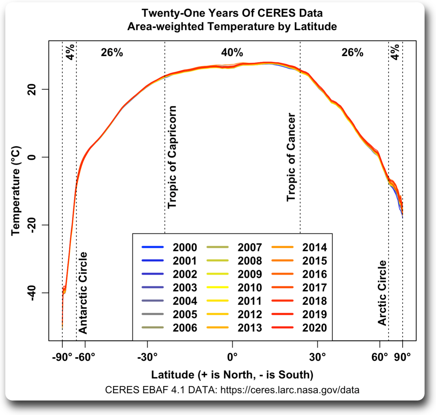
Note that at least at present, the latitudinal temperatures only really vary in the 4% of the planet around the North Pole.
Best regards,
w.
I greatly appreciate that; among my character flaws is zero patience for dealing with arcane data formats, so I’d probably never get around to analyzing those data first-hand.
Obviously your plot deals with a time scale much smaller than Dr. Lindzen’s table does, but it’s still tantalizing.
The sunlight is not constant at any point on the globe from one year to the next. It is continually changing due to orbital changes. That is why Antarctica and the Southern Ocean are cooling and the northern hemisphere is warming.
This table covers 1000 years of April solar intensity at 30N:
-0.500 407.814408
-0.400 408.231635
-0.300 408.649215
-0.200 409.066813
-0.100 409.484100
0.000 409.900750
0.100 410.318143
0.200 410.734184
0.300 411.148357
0.400 411.560133
0.500 411.968970
Currently trending up 0.4W/m^2 per century. That will be causing a rising trend in NH mid latitude temperature. There are significant swings =year-to-year as well due to orbital changes.
November sunlight at 60S is trending down at 0.6W/m^2 per century:
-0.500 397.549763
-0.400 397.039478
-0.300 396.537025
-0.200 396.042597
-0.100 395.556374
0.000 395.078532
0.100 394.607107
0.200 394.144579
0.300 393.691333
0.400 393.247755
0.500 392.814223
This will influence the regional temperature in January due to the thermal lag. These are real changes in solar forcing not make believe.
The globe has to warm up because the peak solar input is moving northward and there is more land in the NH that responds faster and over a wider range to solar input than the ocean.
So the almost 0 C temp change per Watt of available solar from 310 to 360 corresponds to the steep part of the CRE 27 to 30 C from your post 2 days ago. Obviously you are saving the best for last…..PS I like your % of Earth’s surface lines, but you haven’t done that on Fig. 3, of course your prerogative as chief data dabbler…..
I told you.
The extra heat is from earth.
Just think about it. My books say that T is going up 3K per km down.
So to get an increase of 0.5K you only need a change of 200 m of the inside of earth…
https://breadonthewater.co.za/2022/08/02/global-warming-how-and-where/
Doodly squat? And all this timeI thought it was diddly squat! Something new from Willis every time.
“Doodly squat” – “The random pencil writes and having writ”?
Coined originally in 1957’s “Red Hot” by Billy.Lee Riley & the Little Green Men, to wit: “My gal is red hot. Your gal ain’t doodly squat.” Willis clearly goes way back.
I was ten years old then. It was red hot.
w.
Fig. 3 Hmmm… qualitatively similar to something observed during the recent rise of atmospheric CO2? Pronounced warming at the poles, virtually zero for much of the hottest, sunniest places, and gentle warming in between?
Last I looked there hasn’t been any “Pronounced warming” at the south pole.
Dear Willis,
Thank you for another fascinating post. A couple of comments:
In Figure 1 there appears to be a figure of eight in the 100 – 300W/m2 range. In the UK I get a similar relationship between sunshine hours and average temperature, but if I introduce a lag of a month in the temperature (i.e. temperature in June compared to sunshine in May) I get a very good correlation and the figure of eight disappears. I wonder if the same would happen with your data.
Secondly a recent post I saw looked at CERES data from 2001 to 2020, and this suggests CO2 has little effect:
https://phzoe.com/2022/06/10/20-years-of-climate-change/
I don’t have the skills to reproduce this, but would be very interested to know if you support the claims made.
I very much appreciate your posts.
Andrew,
The influence of the increase in CO2 2000-2010 (22 ppmv) was measured in the specific wavelengths of CO2 back radiation (about 0,2 W/m2 increase) at two measuring stations with a full spectrum of incoming IR:
https://escholarship.org/content/qt3428v1r6/qt3428v1r6.pdf
If that has an effect in the full energy balance is a question of how much other factors (clouds…) affect that balance…
Thank you!
Feldman et al 2015 measured downwelling longwave IR “back radiation” from CO2, at ground level, under clear sky conditions, for a decade. They reported that a 22 ppmv (+5.953%) increase in atmospheric CO2 level resulted in a 0.2 ±0.06 W/m² increase in downwelling LW IR from CO2, which is +2.40 ±0.72 W/m² per doubling of CO2.
However, ≈22.6% of incoming solar radiation is reflected back into space, without either reaching the surface or being absorbed in the atmosphere. So, adjusting for having measured at the surface, rather than TOA, gives ≈1.29 × (2.40 ±0.72) per doubling at TOA, and dividing by ln(2), yields:
𝞪 ≈ 4.47 ±1.34 (which is 3.10 ±0.93 W/m² per doubling of CO2)
That’s nearly identical to what van Wijngaarden & Happer 2021 (and see also 2020 & 2022) calculated for CO2’s ERF at the mesopause (similar to TOA):
𝞪 = 4.28 (which is 2.97 W/m² per doubling)
However, Feldman’s uncertainty interval is wide enough to also encompass the Myhre 1998 / IPCC estimate of 𝞪 = 5.35 ±0.58 (which is 3.7 ±0.4 W/m² per doubling). It does preclude the SAR’s higher estimate of 𝞪 = 6.3 (which is 4.4 W/m² per doubling; see SAR §6.3.2, p.320).
I wish Feldman had continued their experiment longer. With 20 years of data they probably could have narrowed their confidence interval enough to preclude that high Myhre 1998 estimate which the IPCC still uses.
Feldman only concerned himself with two locations in [I think?] Oklahoma and Alaska.
How is that of any use to anyone?
There’s massive amount of horizontal heat transfer.
I think his research is useless, and can’t be used to make any judgments whatsoever by any side in the debate.
So I don’t think he needed to continue his “research”, as it was flawed from the beginning.
Kind regards, -Z
Dear Zoe,
Feldman’s research indeed was only at two stations, but they have proven that the influence of increasing CO2 is measurable, even the effect on downwelling IR radiation by the seasonal amplitude of CO2 in the NH (caused by vegetation) was measured.
There is no reason to assume that this is not the case at the many other stations where downwelling IR radiation is measured:
https://scienceofdoom.com/2010/07/17/the-amazing-case-of-back-radiation/
If that has much effect within the natural noise of many other influences, is a matter of time. One can’t prove or disprove that the sea level is rising within the large noise of waves and tides after a year. Only after some 30 years of data, one can deduce it statistically…
Ferdinand, no one has measured DWLWIR at the surface… read more closely and you can see the tricks they use to “invent” it from whole cloth, using fake physics.
Sorry, they measured the whole spectrum, line by line, of downwelling IR.
Not only Feldman did that, but many more at a lot of places, a.o. at the South Pole, where they had no overlaps with water vapor which is virtually absent there:
https://scienceofdoom.com/2010/07/24/the-amazing-case-of-back-radiation-part-two/ Fig. 11.
The full spectrum as measured at Oklahoma is at page 6 of
https://escholarship.org/content/qt3428v1r6/qt3428v1r6.pdf
Integrating the height of every line and its wavelength gives you the total downwelling energy that is radiated back to the surface: about 300 W/m2.
The second graph at that page shows the difference between the measured downwelling and the calculated downwelling according to Hitran…
Okay, let me clarify my statement: no one has measured DWLWIR at night at ambient temperature. The AERI instruments are cryogenically cooled to liquid nitrogen temperatures, which is therefore measuring something else entirely.
In case that wasn’t clear enough, Ferdinand, there are two problems with your statement “Integrating the height of every line and its wavelength gives you the total downwelling energy that is radiated back to the surface: about 300 W/m^2”. The first problem is that you wrote “energy” and then you wrote a number in W/m^2, which are not the same type of quantity. Mixing up those two ideas would get you an “F” on your physics exam. But even worse than that, you left out the critical qualifier: radiated back to the surface if the surface temperature were below 77 Kelvin, the temperature of the AERI sensor. Where on Earth are you expecting to find those kinds of temperatures?
It seems to me that we are back in the realm of faulty thermodynamics again. Zero heat is absorbed by the surface if it is warmer than the alleged “CO2 back radiation”. This has to be the ultimate error, and I agree totally with Steve above. This continuous swapping of energy and temperature is ridiculous, the rules are very clear (2nd Law), and the only way to get to the claimed result is to ignore the surface temperature completely. At 77k the result is not real. At night the absorbed energy should be zero, (space temperature is less than 77k), and is the control measurement, where is it?
Yes, Real Engineer, we are absolutely deep into the realm of faulty thermodynamics. Everything Willis writes on this topic is in that realm. But he is not alone, all of official climate science is right there along with him. Even the Encyclopedia Britannica definition of the Stefan-Boltzmann law makes this error. It is very pervasive. The most common manifestation is, as you said, to ignore the surface temperature completely and convert the temperature of an object (perhaps the atmosphere, or a pyrgeometer sensor sitting on the ground) directly into power, as if it were radiating all of its thermal energy to deep space. But slightly more subtly, they make these liquid nitrogen cooled sensors to measure IR, and pretend that this is the same measurement that would be obtained at ambient surface temperature, if only they could figure out how to do it. That is of course not how thermodynamics works. Not even close.
When you increase CO2 you will see increases in IR in all directions. Feldman only measured the changes in downwelling IR. Without taking into account the changes in upwelling IR those numbers are useless. Same problem exists in almost all output from radiation models. Only looking at downwelling IR is meaningless.
In addition, feedback to changes in downwelling IR at the surface, what I call boundary layer feedback (BLF), almost completely negates whatever warming effect it might have. You will see a little enhanced evaporation and some increases in conduction from the surface to the atmosphere.
Since almost all the IR that Feldman measured (99.9%) comes from within the boundary layer and the BLF returns most of that energy right back into the boundary layer, the net result is no change.
Most of BLF is due to conduction. This form of energy transfer is almost entirely ignored by climate science because the net is small. However, massive amounts of energy are moving back and forth due to pico second level collisions of the atmospheric molecules with the surface. This is what keeps the boundary layer and surface temperatures in a steady state. BLF in this case is primarily a small increase in the amount of energy being conducted from the surface to the atmosphere.
As far as I have understood the whole investigation (radiation was learned mostly in my student age, some 65 years ago…), Feldman used upgoing radiation as well, to correct the intensity of downwelling radiation and used balloon humidity measurements to calculate the back radiation of water vapor.
I did find that the surface (grass in the case of Oklahoma) emits a relative “ideal” black body spectrum in the IR bands where CO2 is active (over 97%), thus the difference between the incoming and outgoing spectra should show the specific back radiation of the different GHGs.
Interesting is the downwelling spectra found at the South Pole, where water vapor is almost absent, see Fig. 11 at:
https://scienceofdoom.com/2010/07/24/the-amazing-case-of-back-radiation-part-two/
“feedback to changes in downwelling IR at the surface, what I call boundary layer feedback (BLF), almost completely negates whatever warming effect it might have.”
I don’t follow that. If a (near) blackbody absorbs IR energy of whatever wavelength, the only way that it can get rid of that extra energy is by heating up, or its radiation energy stays exactly the same and you are destroying energy. If that results in more evaporation or more turbulence is secondary…
But it does not Ferdinand, unless the incoming radiation source (CO2) is warmer than the surface. Radiation Physics and “ideal” black bodies assume the “black body” is at a very low temperature (because any energy in it will have been radiated to the surroundings) but this is never the case in a real situation, unless in deep space.
Yes, the energy gets absorbed and heats the surface. However, that surface is under constant bombardment from atmospheric molecules as well as radiation. Energy is also exchanged when these collisions occur. The heat can very easily get used to energize one of the molecules that comes into contact with the surface.
The overall exchange of energy will follow the 2nd law with more energy transferred from the surface if it is warmer. Since increasing DWIR warms the surface (and cools the atmosphere) you end up increasing this conductive exchange from the surface to the atmosphere. This effectively cancels the temporary warming. Within microseconds the energy state has returned back to where it was.
Yes, I’m ignoring other possible energy transitions here but given the high rate of collisions at the surface and the fact that all the atmospheric molecules are involved, conduction should be the primary method.
Since there are trillions of these events per second you end up looking at it statistically. The 2nd law keeps the atmosphere and surface near thermal equilibrium. More CO2 based radiation to the surface is returned mainly via conduction back to the atmosphere to maintain the equilibrium.
If the surface happens to be a water molecule you will also see some increase in evaporation. Once again, the energy has been returned to the atmosphere.
“A gas is characterized by compressibility, that is, a change in pressure with a change in the volume of the vessel in which the quantity of gas under consideration is enclosed. The compressibility of gases means that a different amount of heat must be supplied by heating the gas by 1C at a constant pressure, and a different amount at a constant volume. In the former case, there is an expansion, that is, an increase in volume. This can be interpreted as an expansion of the gas, which causes it to cool down, i.e. more heat must be supplied to achieve a 1C increase in temperature. If the gas is heated at a constant volume, there is a “peculiar compression” of the gas, because the gas seeks to increase in volume when it is heated. From these considerations, it follows that the specific heat of a transformation realized at constant pressure (isobaric transformation) will always be greater than the specific heat of a transformation realized at constant volume (isochoric transformation).”
The vertical temperature gradient can be calculated from the formula: gravitational acceleration/specific heat of air at constant pressure. However, the specific heat of air at constant pressure increases with increasing solar energy, so the vertical temperature gradient can decrease during the day and increase at night.
It is very likely that the specific heat of air at constant pressure reaches limits, so the vertical temperature gradient in the troposphere cannot fall below a certain value.
Attached is a table of specific heats for various gases.
The Cp of air is equal to the Cv plus the work energy necessary to account for PV or enthalpy.
At 300oK (26.85oC), Cpo is 1005 J/(kg x K).
9.81/1005=0.0098 K/m, so 0.98 K/100 m.
The gradient value of 0.98 K per 100 meters applies to dry air.
If the air consisted only of water vapor, the vertical temperature gradient would be about 0.5 K per 100 meters.
The values in the table are for dry air. That is the basic lapse rate. Yes you need to incorporate WV once you get below about 10000 feet.
So above 310 W/m2 the tropical oceans loose energy as fast as it is delivered. By evaporation I suppose? Your thunderstorm cooling mechanism?
WE, most excellent. Three related longish observations.
First I have a testable hypothesis for 310-350 SWR region causing no change in surface temperature in your figure 1.
It cannot be cloud related per se, because you subtracted albedo reflected SWR. The SWR solar energy is reaching the tropical oceans (figure 2) but not affecting its surface temperature. That means there must be an equivalent energy removal mechanism.
I mentioned in my comment to your previous cloud feeback post (on the Bode feedback method of estimating ECS) that ARGO is showing almost exactly twice the ocean rainfall of CMIP5 and CMIP6 models. That rainfall is the needed surface energy removal mechanism, because rain comes from condensed water vapor, which itself removes the heat of evaporation from the ocean surface with the water vapor formation, then releases it at altitude as the rain condenses inside clouds thanks to the lapse rate.
This is an easily testable hypothesis since the ARGO data is all on line at UCSD, and contains lat/lon. I don’t have the requisite skill set, but simply mapping the actual ARGO ocean rainfall (inferred from near surface salinity) to your figure 2 provides the observational test of the explanatory hypothesis. The ARGO data is ‘good’ since 2007, plenty of overlap time for a good test.
Second, also foreshadowed in my comment on Bode ECS to your last post, there are now 3 MAJOR climate model problems:
Third, three serious defects means the IPCC climate models are useless, their projections worthless. Three strikes and you are out. A BIG deal, since all the climate alarm is based on future model projections since nothing has happened yet:
Highest regards.
“….IPCC climate models are useless, their projections worthless.”
The more one digs and the more one waits, the more that statement becomes obvious.
The last few decades will be fertile territory for social psychology case studies later this century.
Thanks, Rud. You mention the question of rain. I’ve discussed that in various places, including in Drying The Sky. Here’s one of my favorite graphics.
Two surprises in that for me. One was the excellent agreement of the TAO buoy and TRMM data. The other was that over a certain ocean temperature of about 26°C. there were no dry gridcells. Not only that, but as the temperature increased, the rainfall increased. And this means the evaporative cooling increased.
It takes about 75 W/m2 of power to evaporate a meter of water per year. In these areas, as ocean temperatures go from 26°C to 30°C the minimum rainfall goes from zero to about three meters.
And this means that the magnitude of evaporative cooling increases by about -50 W/m2 additional cooling for each degree of ocean warming … and yeah, that’s plenty to put a cap on increasing temperatures …
Regards as always,
w.
Well, again you got there before me. Now no need to do the envisioned experiment I am personally incapable of compsci wise. But I remain a dogged follower/publicist with a broad overview of the battleground.
Indeed you are, sir.
w.
This conclusion is wrong. The change above 26C is due entirely to mid level convergence to more powerful convective towers. Warm pools always get more precipitation than they generate in evaporation.
Ocean regions cooler than 28C are inevitably mid level divergence zones and upper level convergence zones. Regions warmer than 28C are inevitably the reverse unless they are near land and the more powerful towers draw mid level moisture from them. That is the only way ocean surface temperature can exceed 30C – divergence of mid level moisture that disrupts convective instability..
The attached diagram shows the energy balance at a tropical buoy over 17 days when it was temperature regulating at 30C. Almost zero surface heat flux. The 200W/m^2 surface sunlight was almost all evaporation and that limits it to 7.6mm/day but average precipitation was 10.5mm/d.
Warm pools in the Indian Ocean typically make 15mm/d rainfall but are only evaporating 7mm per day. Regions at 26C can evaporate about 9mm/d but rainfall averaged about 5mm/d. These regions lose latent heat to the warm pools nut gain much more from sensible heat transfer in the upper level.
The other point about the 30C column is that it loses some 190W/m^2 in sensible heat due to high level divergence. The difference in enthalpy between a 30C base column and 29C base is significan.
Can you direct us to a higher-resolution version of that diagram? I’m unable to read it, and I think it will come in handy when I re-read your three-part series.
Hey, Joe, I made a clean copy and put it into my Dropbox here.
w.
Much appreciated.
So this explains why there is no increase in temperature above 310 to 360W/m² incident solar. It goes into enthalpy change. I speculated from this, that the apparent rapid temperature rise per W/m² in the segment from 50 to 100W could be largely due to warmed ocean currents at the cool end of the heat engine and not due to solar insolation at the higher latitudes. Perhaps I misunderstood what you presented.
“Here’s one of my favorite graphics.”
Which still does not show evaporative cooling because that water evaporated far away.
Actually, much of the water in rain comes from the greatly increased wind-driven evaporation directly underneath and immediately around the thunderstorms …
I gotta ask. Was there ever a discussion that you actually added something to?
w.
Yes, I think this is the fifth time through the years I have added the very important piece of information that rainfall in a particular spot does not equal evaporative cooling.
Willis,
I did a quick paper on Fig 1 from Global Scatterplots. Can’t really explain the result. Comments welcome.
https://www.transfernow.net/dl/202210162aqxM2Dl
Note that this means that solar power has to rise by about six W/m2 to raise the temperature of 70% of the planet by 1°C … and remember that in half the tropical ocean, 22% of the planet, that same six W/m2 increase in available solar doesn’t do doodly-squat to the temperature.
note all of this neglects the real cause of warming:
the reduction of cooling to space
And this was demonstrated by one of those non deterministic perturbation
models, right?
Mosh, always wonderful to hear from you. I’m getting to the question of reduction of cooling … have patience.
In the meantime, you might have seen my post “A Better Multiplier“. It discusses that question.
My wishes for only the best in your life,
w.
Steven Mosher: “note all of this neglects the real cause of warming:
the reduction of cooling to space”
WR: The lower stratosphere cools better than before, not showing (as stated) a ‘reduction of cooling to space’. Lower stratosphere temperatures go down, not up:
UAH 1979 Jan. Globe 1.14°C
UAH 2022 Aug. Globe -0.40°C
A cooling by 1.54°C. Cooling trend: -0.27°C/decade
Source: https://www.nsstc.uah.edu/data/msu/v6.0/tls/uahncdc_ls_6.0.txt
Lower stratospheric cooling excludes ‘reduction of cooling to space’ as a possible cause for [surface] warming.
If the slight increase in CO2 made its way to the stratosphere would that lead to increased cooling?
Or would the Troposphere holding on to a little bit extra of heat because of CO2 absorbing and remitting some back to the direction of the surface, leave less heat to go to the stratosphere?
PCman999: “If the slight increase in CO2 made its way to the stratosphere would that lead to increased cooling?”
WR: I think so, yes. Probably the following happened:
1. From 1979 to 2021 CO2 rose by about 23%, NOAA data. By nearly a quarter. CO2 is well dispersed up to a height of 80 km. In the lower stratosphere CO2 is able to radiate to space more effectively than from lower elevations. given the low pressure / the wide spacing of molecules at those elevations and given the very low content of the main greenhouse gas water vapor H2O. Logically, the presence of a higher number of CO2 molecules results in more energy absorbed by them, by collisions with other molecules and therefore the higher quantity of CO2 molecules is able to radiate a higher quantity of energy to space. The result of higher CO2 in the lower stratosphere must be the cooling of the lower stratosphere. But there is more.
2. Enhanced high convection in the tropics (because of surface warming) injects more water vapor in the lower stratosphere, further distributed by the Brewer-Dobson circulation. Even when the quantity of extra water vapor is very low, its cooling effect is high: water vapor radiates at many wavelengths that are not absorbed by CO2: stratospheric radiative cooling by H2O molecules must be very effective in reaching space. A small number of extra H2O molecules results in a large extra cooling of the lower stratosphere.
As a result of the colder stratosphere, the temperature gradient of the lower stratosphere with the surface is enlarged. The result of a higher gradient is a stronger energy transport between the surface and stratosphere, finally resulting in the cooling of the surface, in a stronger cooling of the lower stratosphere, and in the cooling of the Earth.
PCman999: “Or would the Troposphere holding on to a little bit extra of heat because of CO2 absorbing and remitting some back to the direction of the surface, leave less heat to go to the stratosphere?“
WR: A rise in CO2 results in small initial warming for the surface. Some warming will be the first, but not the final result. Like other ‘complex systems in equilibrium’, warming results in the activation of cooling processes. By evaporative surface cooling, by enhanced convective cooling, and by enhanced tropical cloud cooling most of the initial CO2 surface warming already disappears. What remains is a cooling stratosphere which is resulting in a higher temperature gradient with the surface. Over time, this higher temperature gradient probably results in taking away about all of the remaining warming.
The Modern Warming as observed after the Little Ice Age is [natural] warming by advection (by oceans and atmosphere) and by related [natural] processes, resulting in higher atmospheric water vapor, especially over the highest latitudes of the Northern Hemisphere: in and around the Arctic. Arctic warming results in a smaller gradient between the North Pole and the equator. The smaller gradient will result in less poleward advection and so in less warming: again temperatures will be nearing the old equilibrium point.
Total result: over time, a highly stable surface temperature as controlled by the H2O molecule, but temporarily influenced by the chaotic behavior of the ocean-atmosphere system, and (on longer timescales) by orbital changes.
The role of orbit is more important than assumed. The reason is the enhancement of orbital latitudinal warming/cooling by the main greenhouse gas water vapor, the quantity of which is going up and down with every temperature change for that specific latitude. Because of water vapor, every change in orbit will have a higher-than-expected temperature effect. By a change in orbit, a change in the advection of energy over latitudes will result, and the effect(s) of advection on the quantity of latitudinal water vapor has to be added. Water vapor is our main greenhouse gas. Water vapor cools (the surface) and water vapor warms (the atmosphere) as long as it is able to remain in the atmosphere. Convection is decisive for the time water vapor can remain in the atmosphere. And the latitudinal surface temperature is decisive for the quantity of water vapor in the air and so for convection.
Surface warming leads to H2O evaporative cooling. Higher evaporative cooling leads to more water vapor in the atmosphere, which stimulates convective cooling and tropical cloud cooling. Higher rising and stronger convection lead to a cooling stratosphere, as does rising CO2. The higher stratosphere-surface gradient will lead to further surface cooling until the former equilibrium state is reached.
All processes are activated/deactivated on their own time scales. Each process has its own ‘cycle’ and all cycles are combined in a multitude of possibilities, making exact future predictions more or less impossible. Looking back to temperature graphics of the past, all those ‘superimposed individual cycles’ did lead to unpredictable patterns. Which does not mean that Climate in its complexity cannot be understood. But to understand the basics of Climate, the immense role of the H2O molecule must be studied and understood.
To summarize: the warming effect of CO2 must be about zero. H2O sets and regulates surface temperatures for each orbital and continent/ocean setting.
.
We live on a water planet with a temperature range that enables that water to easily cross between the three states of solid, liquid, and gas. Like virtually everything else at all scales in the universe, our water planet is spinning – spinning in close proximity to a lively star. That gives an impetus for things to mix and swirl and throb. Our water planet is also blessed with a relatively large moon, which also keeps things churning and mixing on our world. The result? Water dominates our climate.
The effect on our water planet of slight changes in a trace atmospheric gas are more like a stone tossed into a lake than like a boulder dropped into a bathtub.
Climastrology is all hype. It is 1) a convenient subtext for domineering and micromanaging masses of people; 2) one of the only ways left to simultaneously inflate the Communists’ balloon while deflating the Capitalists’; and 3) a convenient excuse to keep the execrable sophistry of Malthusianism afloat for another generation of condescending morons.
Climastrologists, along with racial arsonists, are the useful idiots doing yeoman’s work for those who have their eye on the ultimate prize: Wiping out billions of people, and subjugating the rest.
Spoken by someone who deals with simple averages.
A daily total reduction in cooling would result in a constant increase of both Tmax and Tmin. In other words, every day would be warmer than the day before. That obviously doesn’t occur.
How about seasonal? Well that would mean each season would be warmer than the previous year.
Maybe, just maybe, a reduced rate of cooling is being seen. That would mean it takes longer at night to shed the daytime warming. That is a totally different scenario than a total reduction in cooling at all times.
This is the most important
thought in this debate: Additional CO2 raises the altitude at which the Atmosphere is transparent ton15 micron radiation, thus reducing the temp at which the atmosphere radiates to Space, thus reducing energy lost to Space, thus increasing energy retained in the Atmosphere. But just exactly how much? This is really the only question here.
Those big red blobs over the tropical oceans tell you why that extra energy isn’t increasing the surface temperature. It is evaporating water. Evaporation is an endothermic process which cools the surface. Condensation at the bottom of clouds is an exothermic process so that energy is being transported from the surface to the bottom of clouds. Thunder clouds in the tropics transport that energy to the stratosphere. Try your scatter plot on dew point/frost point and see what you get.
The temperature at the tops of typhoon clouds in the South China Sea is approaching -90 degrees C. This shows how low temperatures in the lower stratosphere actually are.

but in degrees Kelvin still hot.
We always hear about how the arctic / antarctic are showing the greatest effect from “global warming”. From figure 1, those regions do show the highest sensitivity to a changes in radiation, so this is internally consistent.
Given the 3.7W/m^2 per CO2 doubling number quoted in this post, along with with figure 1 that a global average “sensitivity” should be able to be calculated. It seems the atmosphere shouldn’t care where the power comes from – the sun or back-radiated energy from CO2. So, would the general math be as such: For each region, see what % of the earth is in that region, what the expected delta T would be for that region for an increase in 3.7W/m^2 (per the trend curve fit), then do a pro-rata average based on what % of the earth each region represents. And there you go the … you have a globally averaged number for “climate sensitive to CO2”.
If I am reading the Conclusion of this post right, perhaps a quick of the envelope number is as such:
Conclusion of this paper : 5 W/m^2 to raise the planet by 1 deg C
Proportionally, (3.7W/m^2 / 5W/m^2) *1°C = 0.74 °C
So, a doubling of CO2 = 3.7 W/m^2 = 0.74 °C …. climate sensitivity empirically derived at 0.74 °C/doubling .
…. which is way below any alarmist view & pretty much destroys the CAGW hypothesis with observed data. That would be pretty cool!
Anyone want to comment of the maths here? Improve on them? Refute this hypothesis? Would love to hear others thoughts on this.
The AGW is threatening to make Siberia, Alaska, Canada, and Patagonia habitable. It must be stopped at any cost!
Agree, but take into account advection as well. That will make things a bit more complicated. But still, high climate sensitivity seems very very far from likely.
“ At the left, below ~ 100 W/m2 of available solar, the sensitivity of temperature to changes in solar input is quite high.”
I’d suggest you next look at how changes in solar cycles affects these <100W/m2 areas as well as how changes in aerosols and other particulates impacts cloud cover and resulting temps in these areas.
Thanks, Michael. I’ve looked extensively at the solar cycles. Take a look at the links to about 35 of my posts on the subject.
TL;DR answer? I can’t find any solid evidence tying sunspot cycles to surface weather changes in temperature, rainfall, cloudiness, or to a number of other variables. Nothing. And I’ve looked hard.
Aerosols are far harder. We have some spotty evidence regarding location and levels on some aerosols, nothing on many more.
Regards,
w.
There is solid evidence that the surface temperature in the Nino34 region is influenced by solar cycles. This can have some bearing on the intensity of ENSO. Likely contributing to the extent of the current La Nina because it has occurred near the bottom of the influence from the solar cycle.
I go into some detail on solar influence in this note:
https://wattsupwiththat.com/2022/10/04/surface-temperature-response-to-solar-emr-at-top-of-the-atmosphere/
I have not shown the correlation with cosmic rays but found it to be slightly better correlated than the sunspot. Regression coefficient of 8% rather than 6%.
Timing of ENSO is independent of solar activity. Current thoughts are that salinity changes trigger the swing. Evaporative power reduces with salinity so that could be the key factor in the phase switch. Warm pools are always mid level convergence zones so lower salinity than cooler regions that have mid level divergence. .
What could alter the salinity on such a large scale, far away from any glaciers?
Or are you saying that an area off the western coast of South America gets boiled more than normal for some reason, gets a bit more salty due to evaporation and then hits some critical level that causes a ‘knee’ in the evap/temp curve so the cooling from evap drops and temps in that region of water go up?
What throws the cycle back the other way? Just time and currents eventually bringing in more water?
” Figure 1 shows the surface temperature as a function of the amount of solar power that’s actually entering the climate system. This available solar power is the top-of-atmosphere (TOA) solar, minus the “albedo reflections”, which are the amount of sunlight reflected back to space by the clouds and the surface.”
Before any conclusions are made based on these data:
They should be analyzed to determine if they are accurate or could have large margins of error. Conclusions may be easy, but defending the quality of the data used for that conclusion may be difficult. The data quality analysis should be performed with the goal of discrediting the data, and the people who collect the data — pointing out every possible weak spot.
A large majority of the short articles on climate science have conclusions without an analysis of the data quality leading to those conclusions. If the data used are available to the general public, it’s suspicious when one person uses those data for a conclusion that appears to be unique. If the data are reliable, and the conclusion based on them is logical, it’s puzzling why that conclusion would not be a majority consensus among scientists. There are so many wrong conclusions and predictions concerning climate science that one ought to be suspicious of every one of them. Science requires skepticism.
Hi Willis – You are using ‘available solar power’ as the top-of-atmosphere (TOA) solar, minus the “albedo reflections”, which are the amount of sunlight reflected back to space by the clouds and the surface. So these numbers are independent of any “greenhouse effect” (I assume that “reflection” doesn’t include the effect of greenhouse gases). The surface temperatures, however, include the “greenhouse effect” including the effect of man-made CO2. Man-made CO2 has increased significantly over your 21-year period, and we can therefore expect to be able to estimate TCR (Transient Climate Response) from your data. Looking at your Figure 4, I estimate TCR at zero. Is that a reasonable estimate?
Incidentally, if “albedo reflections” does include the “greenhouse effect” then I would estimate that TCR is still remarkably small – about 5% of the observed surface warming over the 21-year period..
Thanks, Mike. I’ve said nothing about TCR. I’m looking at the response of the system to the raw amount of power entering the climate, the total power available to the system.
w.
Yes I understand that, but it seems that an additional inference might be obtainable from your data?
It is not the total power available. It was only the thermalised component. All ToA solar EMR is available.
The thermalised portion is not fixed. The unthermalised solar EMR is a KEY component of THE CLIMATE SYSTEM.
I think Willis’ “available to the system” is the same as your “thermalised component”. If it’s reflected at TOA it isn’t “available to the system”… therefore it cannot join the “thermalised component”.
Mike, surely the ocean’s reaction to any form of energy must be the same whether it is Solar or DWIR?
More energy = more evaporation.
In fact the response to DWIR should be even even higher because it is all surface action due to it’s lack of penetration power.
Surely it is dramatically different. LWIR is entirely absorbed at the surface “skin” layer of water, where much if said energy goes into accelerated evaporation, increased water cycle and atmospheric heat movement created ( hence clouds and potential negative feedback there as well)
Whereas much of SWR penetrates the ocean surface up to several hundred feet and has a very long residence time within the oceans before being released, and therefore has more warming potential than LWIR.
The effect of liquid water availability would be interesting to examine.
Desert vs forest/jungle vs plains vs ice, plus of course actual ocean.
I hypothesize that the response in desert gridcells will be much steeper, since lack of soil moisture, vegetation and free water would prevent the moderating effect of latent heat of evaporation and cloud cover.
Likewise icecap has little available evaporatable water – and from the data the poles clearly show a big response.
Land surface in the mid latitudes responds in half the time and twice the range in temperature for the same solar input as water. It takes 14W/m^2 to shift typical mid latitude land 1C. It takes 28W/m^2 to shift deep water basins like the Med 1C.
https://wattsupwiththat.com/2022/10/04/surface-temperature-response-to-solar-emr-at-top-of-the-atmosphere/
Willis, you said,
Is this a suggestion that the poles (particularly the notoriously cloudy Arctic) are sensitive to changes in cloudiness and that it might help explain the 2-3X more rapid warming in the Arctic?
The attached top chart is similar to your figure 1 but covers only oceans and considers total solar radiation rather than just thermalised short wave. It depicts the different convective regimes as well.
The two images show the ocean temperature and the reflected short wave above oceans.
This highlights that the only ocean surface that sustains temperature above 30C is influenced by land. The reason is that convective towers over land can develop higher convective potential than those over water because the base temperature can rise beyond 30C.
For clearer version of those diagrams go to
https://wattsupwiththat.com/2022/07/23/ocean-atmosphere-response-to-solar-emr-at-top-of-the-atmosphere/
Good on you, Willis. It’s nice to see someone doing climate PHYSICS for a change. What is happening over land may be even more interesting than over the ocean. Local Climate Sensitivity is highest in the dry cold regions of northrn Canada and Siberia where CO2 has a greater effect in inhibiting night-time cooling. See http://paradigm2.net.au/reid-and-nielsen-2022/ .
Two important points to consider:
The tropical SST cap has been known for a long time. Figure 1 is another way of looking at it.
re 1. Willis isn’t referring to a change in the sun delivering an extra 50 W/m2, he’s referring to Earth locations where solar input differs by 50 W/m2 and temperature doesn’t differ at all.
This statement is WRONG. You state energy then provide a measure in power flux. You need to learn the difference because it is important for understanding climate.
The power flux is never constant at the same point on Earth at the same time each year. It has never been and never will be.
About 500 years ago, the solar power flux peaked over the Southern Hemisphere. The peak intensity is now moving northward and will continue that trend for about 9kyr.
Mid latitude surface temperatures are very highly correlated to solar intensity. – in fact everything else is noise from a global perspective. The response of land to solar forcing in the mid latitudes is faster and more responsive in terms of temperature change than over oceans. So as the sun’s view of land increases when it is closest to Earth the global surface temperature must increase.
This is the solar power flux in April at 30N for the last 500 years and the next:
-0.500 407.814408
-0.400 408.231635
-0.300 408.649215
-0.200 409.066813
-0.100 409.484100
0.000 409.900750
0.100 410.318143
0.200 410.734184
0.300 411.148357
0.400 411.560133
0.500 411.968970
Hardly constant.
Once you understand the difference between power and energy you might begin to understand the driver of climate change – solar forcing..
That is true, Rick, but I think even your correction could use a bit of refinement. How about we stop referring to the climatologists’ purpose-invented phrases “solar flux” and “solar forcing”, and instead use an actual physics term for measuring intrinsic radiation energy, namely temperature? The solar radiation has a temperature of about 5000 K, because that is the surface emission temperature of the object that emits it. In order to do anything with that number (e.g. calculate energy flow, heat, work, and power), you need to know the temperature (and reflectivity) of the target object first. No target object, no power.
Most of the people here (presumably through honest ignorance, except for Willis, who actually works at it) (and of course, almost all of official climatology, presumably deliberately in their case) seem to have no clue how any of this works, and so we had better start with the fundamentals…
Javier October 16, 2022 3:25 pm
Thanks, Javier. From the head post:
I’m not discussing TOA solar. I’m discussing available solar, and there is indeed an additional 50 W/m2 as described.
Regards,
w.
About 1/3 of the earth’s surface is in the area of high evaporative cooling from fig 1 of scatterplots. This area is also the warmest.
This would seem to support the notion that the bulk of the heavy lifting to cool the planet’s surface is not IR. It is the convection via evaporation/condensation from the warm oceans.
The energy budget cartoon that is so popular does not show this at all. It has only a very minor role shown for evaporative cooling.
Which is exactly what LWIR striking the oceans surface does.