Essay by Eric Worrall
The oceans swallowed my global warming? Desperate butt covering from alarmists who are facing increasingly embarrassing questions about the failure of the world to end.
14 July 2022 16:41
Factcheck: No, global warming has not ‘paused’ over the past eight years
A decade ago, many in the climate community were fixated on an apparent “pause” in rising global surface temperatures. So many studies were published on the so-called “hiatus” that scientists jokedthat the journal Nature Climate Change should be renamed Nature Hiatus.
However, after a decade or so of slower-than-average warming, rapid temperature rise returned in 2015-16 and global temperatures have since remained quite warm. The last eight years are the warmest eight years since records began in the mid-1800s.
While the hiatus debate generated a lot of useful research on short-term temperature variability, it is clear now that it was a small variation on a relentlessly upward trend in temperatures.
But nearly a decade later, talk of a “pause” has re-emerged among climate sceptics, with columnist Melanie Phillips claiming in the Times this week that, “contrary to the dogma which holds that a rise in carbon dioxide inescapably heats up the atmosphere, global temperature has embarrassingly flatlined for more than seven years even as CO2 levels have risen”.
This falsehood appears to be sourced from a blog post by long-time climate sceptic Christopher Monckton, which claims to highlight the lack of a trend in global temperatures over the past eight years.
In a rebuttal letter to the Times, Prof Richard Betts – head of climate impacts research at the Met Office Hadley Centre and University of Exeter – points out that it is “fully expected that there will be peaks of particularly high temperatures followed by a few less hot years before the next new record year”.
In fact, the last eight years have been unusually warm – even warmer than expected given the long-term rate of temperature increases – with global temperatures exceeding 1.2C above pre-industrial levels. The temperature record is replete with short-term periods of slower or more rapid warming than average, driven by natural variability on top of the warming from human emissions of CO2 and other greenhouse gases.
There is no evidence that the past eight years were in any way unusual and the hype around – and obvious end of – the prior “pause” should provide a cautionary tale about overinterpreting year-to-year variability today.
…
Human-emitted greenhouse gases trap extra heat in the atmosphere. While some of this heat warms the Earth’s surface, the vast majority – around of 93% – goes into the oceans. Only 1% or so accumulates in the atmosphere and the remainder ends up warming the land and melting ice.
…
Most years set a new record for ocean heat content, reflecting the continued trapping of heat by greenhouse gases in the atmosphere. The figure below shows that annual OHC estimates between 1950 and present for both the upper 700m (light blue) and 700m-2000m (dark blue) depths of the ocean.
…
Read more: https://www.carbonbrief.org/factcheck-no-global-warming-has-not-paused-over-the-past-eight-years/
Lord Moncton apparently stirred the hive by publishing a few articles on the growing pause, like this article from three weeks ago.
His article on the last 6 years are entertaining because, where’s the warming? Wasn’t there supposed to be a hockey stick or something? Oh yeah, it disappeared into the ocean depths, allegedly.
The last 172 years, since 1850, temperatures have risen a little. Except for that period between the 1940s to 1970s, when the drop in global temperature triggered climate scientists like Stephen Schneider to suggest we should use nuclear reactors to melt the polar ice, to prevent an ice age. Schneider later claimed he’d made a mistake, and went on to become a global warming activist.
But that context doesn’t stop in 1850.
Looking before 1850, there were notable warm periods during the last few thousand years, like the medieval warm period, Roman Warm Period and Minoan Warm Period, which look suspiciously like our current modern warm period, except back then people didn’t drive automobiles.
Going back further, 9000-5000 years ago, during the Holocene Optimum, the sea level was around 2m higher than today, so it was probably pretty warm back then as well.
20,000 years ago, much of the world was covered by massive ice sheets.
Three million years ago, the world was so warm Antarctica was mostly ice free – until the onset of the Quaternary glaciation, which we are still enduring today. To put the Quaternary Glaciation into context, the Quaternary is one of only five comparable great cold periods which have been identified over the last two billion years.
55 million years ago was the Palaeocene – Eocene thermal maximum, an extremely warm period of such abundance our primate ancestors spread throughout much of the world.
When you take a more complete look at the context, rather than the limited 172 year / 0.0000086% of climate history Carbon Brief seems to want you to focus on, there is nothing unusually warm about today’s global temperatures. Even if further global warming does occur, if those little primate ancestors with walnut size brains could manage to thrive in the Palaeocene – Eocene thermal maximum, I’m pretty sure we could figure out how to cope with a small fraction of the warming they enjoyed.
Whatever happens, they make something up, like “safe and effective.”
The Arctic cooling for the first time since the mid-1970’s could mean the second pause is not temporary this time.
Poor ole Joe wasn’t double vaccinated and triple boosted.
Or the vaccine just is useless.
Dr Birx says 4 months
I never again will be hoodwinked by the cdc and these stupid ‘shots’. I don’t like being hoodwinked.
The vaccines do not prevent infections and are useless for Omicron, which is a very different, and much less deadly, disease than Covid/
If you recover in 2 to 7 days, you most likely had Omicron.
If you recover in 1 to 3 weeks, or possibly die, you most likely had Covid.
There is no evidence in US all-cause mortality data that vaccines reduced deaths in 2021, versus 2020 with no vaccines.
It is very difficult to determine if vaccines reduced hospitalizations in 2021. Up to half of “Covid patients” in a NYC hospital survey actually went to the hospital for another unrelated disease, not Covid. There were strong financial incentives for them to be called Covid patients after they entered the hospital for other reasons.
If you trust the deaths with Covid statistic (actually any death within 28 days of a Covid positive PCR test, from any cause) the deaths with Covid in 2021, with vaccines, were much higher than in 2020, with no vaccines.
There is strong evidence that Covid vaccines were not safe and were not effective. The root cause is most likely the extremely rushed development time financed by the Trump Administration. There is a good reason that vaccines usually take 5 to 15 years for development and testing, rather than nine months.
The lethality of COVID was pure propaganda. During the shamdemic no one apparently died from influenza which is an epidemiological impossibility. I propose that who did perish from infection (COVID, influenza, or other agent) suffered Vitamin D hypovitaminosis. This phenomenon has been observed for decades.
But then again he could be like the others and just got saline.
Just a heads up, but they’re going to invent more “warming” in the oceans.
easy enough to do – just remove the coolest 10% of Argo floats due to “anomalous readings”, and presto change-o a new ocean warming appears before your eyes.
I mean there’s a new paper out. Trenberth and Tamino are involved. It’s going to be karlization of the Argo set.
Like Hansen did culling temperature stations to remove rural and higher altitude inconvenient temperature stations?
Here’s evidence of what CNN is plotting to do to “milk” the global warming thing because COVID is losing fear factor impact with the public.
Utterly disgusting –
https://twitter.com/i/status/1549770683890253825
The Antarctic was far from ice-free 3 Ma, but the Arctic largely was.
The Cenozoic Ice Age began with formation of the East Antarctic Ice Sheet 34 Ma, with the formation of the Southern Ocean. Northern Hemisphere ice sheets did have to await the closing of the Isthmus of Panama about 3 Ma.
Don’t forget “common sense” solutions…
What got me involved in following climate change was the attempt with MBH98 to make the LIA and Medieval Warm period go away, and pretend all climate change is anthropogenic. Mann has still not retracted that atrocity.
Mann wants to mann-u-facture climate history….what a hockey puck!
Various alarmists still try to claim that nobody has refuted the Hockey Stick.
Tom Wigley and Keith Briffa were sceptical as shown in the Climate Gate e-mail release
Wigley “I have just read the M&M stuff criticising MBH. A lot of it seems valid to me. At the very least MBH is a very sloppy piece of work – an opinion I have held for some time”
Briffa “I believe the recent warmth was probably matched about 1000 years ago”
Dennis says we’re in another “hiatus”, in Dessler’s ECS & Cloud Feedback symposium at this point in the video, posted earlier in April 2022. Nobody argued. It is being discussed by the academics and it’s widely acknowledged.
https://youtu.be/aQznFJ9eVrk?t=2187
Sorry, Dennis Hartmann. Schmidt chimes in shortly after and points out his southern ocean cooling observations.
“and obvious end of – the prior “pause” should provide a cautionary tale about overinterpreting year-to-year variability today.”
Betts is one of the several dozen climate spinners on the list of those who will be sharing in the blame for the mounting worst policy-generated global economic crisis the world has known (eclipsing that of the 20th century monsters). The trillions wasted on what is a totally failed false front science used to enable a néomarxiste Great Reset that will cost many trillions more of precious funds needed to repair every facet of our trashed civilization – our education system from K to phony PhD and hundreds of other things.
Before the middle of the first decade of the new millennium I think in the main, Climate Science was honest, if misguided in their beliefs. After the total failure of climate predictions, the continual moving of goalposts, fiddling of climate data, blocking publication of adversarial climate papers, and dirty tricks like pushing the real 20th century temperature highstand of the 1930s-40s down to make 1998 el Niño the new record, etc, were prima facie criminal activity to cling to the broken theory and preserve the cash trough. You even cajoled a failing prime minister to steal another Billion from the taxpayer for climate in her way out of office.
Shame, shame on you and your co-conspirator colleagues. Oh, and you also know that it was an el Niño year that interrupted the 18yr+ “Dreaded Pause”, now apparently resuming. You know Gavin Schmidt stated last year that climate models are “running a way too hot, and we don’t know why. You and Gavin do know why! A wiseman these days would be seriously considering cementing in his pension in these turbulent times.
The very use of “anomalies” is a fraud of its own. Tell us the 5-number descriptor of the values: minimum, first quartile, median, third quartile, and maximum of the data used to calculate these multi-year averages and then the anomaly of the current average compared to the historical average.
If the average absolute global temp is 15C and we have a .13C/decade increase that’s a 0.9% change. Something no one could possibly consider to be “catastrophic”!
Add to that a MINIMUM possible uncertainty of at least +/- 0.5C and you couldn’t even tell if the change was or wasn’t 0.13C over a decade!
It’s all how you spin it (as Popper and Feynman spin in their graves). This is truly the age of neo-deception and the entrapment of humanity by the technocracy.
Put it in Kelvins and it is even less
Mr. Gorman: I’ve read the arguments re: anomalies, and I think there may be a good faith use for such math devices. But this is Climate Science, so there is no chance this is a good faith use!
Using anomalies is fine if *all* the rules are followed. But variance and uncertainty attach to the anomalies in the same magnitude as they do to the absolutes.
The climate crowd neither specifies the variance of their data or its uncertainty. They substitute average residual value between the stated data and the linear trend line as its “uncertainty*. It isn’t uncertainty, it is a best-fit metric and ignores the uncertainty associated with the measurement stated values.
They try to justify the use of anomalies as a way to weight all date equally but that’s just the beginning of the fraud. Since winter temps have a larger variance than summer temps, jamming them all together using anomalies makes no sense at all, especially when they don’t bother to even quote what the variance of the actual data is! Not only that but jamming winter temps and summer temps in the same month (i.e. northern hemisphere temps in July with southern hemisphere temps in July) together generates at least a bi-modal distribution resulting in an average value that is meaningless – and it should be recognized as such by a trained statistician.
I simply don’t trust *anything* put out by most climate scientists today, be it pro-CAGW or anti-CAGW. I only trust actual plots of absolute temps and even then am skeptical if the author doesn’t recognize the uncertainties associated with those temperature measurements. When almost all temperature measurement devices, both old and new, have at least an uncertainty of +/- 0.5C it is impossible to know exactly what is happening with the climate in the hundredths digit. Averaging measurements from different things using different devices does *not* guarantee a normal distribution of measurements where uncertainty cancels – i.e. averaging temps on a global basis doesn’t decrease uncertainty in the result, it only grows it.
Yes.
I agree. When questioned on it though, the argument is ‘well we don’t exactly know global average T exactly so we use anomalies which we can measure more accurately.’ I don’t see how when the same problems of calculating the average T plague the measurement of avg global anomalies.
But measuring as anomalies does invite fiddling temperatures which is an ‘extra degree of freedom’ for cooking data. It also allows easy use of algorithms for making hundreds of small adjustments daily.
When you argue a point regarding apparent artifacts in the data, the response is usually ‘O that’s because of a station move adjustment. Over a long time looking at T data, I noted some station moves for sites that weren’t showing warming and it became clear that station moves had become part of the T fiddler’s toolbox. The classic example was discontinuing the Death Valley Ranch Station because it stubbornly held onto the world’s highest temperature set in 1907 over 100 years later.
They moved the site a few miles down the road with heat enhancing microclimate. In 2021 they announced a ‘new’ world record which wa still a few degrees cooler than the old ranch one. Not knowing the back story, the world was stricken by this ‘warming’.
“Anomalies” without identifying context and error bounds.
Alarmists ignore the fact that smudged temperature adjustments and infilled temperatures increase error bounds.
On top of that alleged climate “experts”, “average” thousands of unique individual temperature measurements.
“If the average absolute global temp is 15C and we have a .13C/decade increase that’s a 0.9% change. Something no one could possibly consider to be “catastrophic”!”
Assuming the temperature at which water turns to ice is 0.
Considering the efforts to convert private pensions to public funds, there may be little security there.
Betts has a history of telling climate lies that makes BoJo look like George Washington.
Except for that period between the 1940s to 1970s, when the drop in global temperature …
_____________________________________________________________
A simple plot of the January-December Annual Mean from GISTEMP LOTI shows that Temperature also dropped from about 1880 to 1910 which is never explained.
1880 to 1910 is not global and is not accurate
Richard:
You can argue that it is not accurate but you cannot show that it was not global. Based on the fact that evidence speaks for itself, we can at least say there is measurement evidence of cooling from 1880-1910. Proof of global cooling in the form of widely dispersed glacier terminations is still obtainable.
It doesn’t matter if cooling cannot (now) be proven to be global. Asserting that evidence from one region is not proof of global cooling is a risky bet. Evidence from the only region with measurements is indicative of the whole, absent any contrary evidence, and you offered none.
Claiming that 93% of the heating (that is supposed to exist) is going into the oceans is downright humorous. The claim from Denver is that the deep oceans are warming. Proving that is basically impossible. Essentially they say the claim stands because there is no definitive proof the claim is not true. That is like the EPA claiming that all airborne particulate matter from any source is equally toxic (the equitoxicity rule) because they “have no proof that it is not”. I kid you not, that is what they said.
I think you should stay clear of statements about what was not global without evidence. Stick to claiming the proof of “globality” is not in evidence. Then you can sit in judgement of evidence as it appears. If you have credibility, people will listen to your sage assessments.
Evidence from the only region with measurements is indicative of the whole, absent any contrary evidence …
____________________________________________________
Excellently stated
Excellently stated nonsense.
Bizarre logic
Saying ‘I’m right because you can’t prove me wrong’.
That’s not how science works
Science requires data.
Data quality must be analyzed to determine if there are sufficient data, with sufficient accuracy, to draw a conclusion. The global average temperature before 1920 is a rough estimate of the Northern Hemisphere only. Not an accurate global average.
And your statement that it was not global is backed by NO EVIDENCE and is thus not scientific.
So assuming that when ALL the areas with temperature records show warming, that the rest of the world does not is typical Richard Greene.
Since you seem to comment at cross purposes every day, I would like to know why you are commenting at all.
Are you just a troll?
The following charts show locations of land based weather stations in various years. They have poor global coverage before 1920 and are still not so great today.
Honest global warming chart Blog: Poor distribution of land-based weather stations (elonionbloggle.blogspot.com)
Surface data in general, even today is a ‘rough estimate’
Certainly rough, when you consider that most of the atmosphere at Earth’s surface is over ocean. There we only have satellite data for the most part there. No thermometers next to runways.
Well stated Richard. So we don’t need to worry about 2°C above preindustrial because we do not know the preindustrial temperature.
Central England’s three weather stations already had well over +2 degrees C. warming since the very cold 1690s. Closer to +3 degrees C.
People living there in the 1690s would have loved today’s much more pleasant temperatures.
“People living there in the 1690’s would have loved today’s much more pleasant temperatures.” Exactly. Today’s temperatures are pleasant and life sustaining. Get your hand off the alarm button.
There were few measurements in the Southern Hemisphere before 1920 and ocean measurements were mainly in Northern Hemisphere shipping lanes with questionable accuracy of buckets and thermometers.
“ Evidence from the only region with measurements is indicative of the whole, absent any contrary evidence, and you offered none.”
Anti-science baloney
Sparse coverage of the Northern Hemisphere is not a global average. Bucket and thermometer measurement methodology makes the problem worse.
Global coverage by well-maintained and sited weather stations was better during the British Henisphere than after its demise, 1948-64, especially in the Southern Hemisphere. No continuous South Pole data however until 1958.
If we’re concerned about accuracy, no global readings before the satellite era make the cut, and even those are debatable. That includes Ice proxies and Mann’s treemometer concoctions and any other numbers you want to discuss. So what were we getting worked up about? Greta’s feelings?
I have no idea why people are getting worked up
about a prediction of climate doom. I guess they
have blind trust in leftist politicians and government bureaucrats,
We love global warming here in Michigan USA.
Give us more of that.
Yup! Sure has been hot and dry here in SE Michigan this summer, I want some rain, must be the La nina?
We have something better than a global average temperature that NOT ONE PERSON lives in:
We have almost 8 billion first-hand witnesses who have lived with up to 47 years of global warming. If you were born after 1974 you have experienced global warming for your entire life.
I bet a lot of people barely noticed. No one was harmed.
We have an advantage here in Michigan where we have llved in the same home since 1987, and four miles south for 10 years before that. Living in one place makes it easier to notice a small gradual change in the climate. Our winters are generally not as cold as they were in the1970s. And last winter had the least amount of snow of any winter since 1977. So not only have we been able to notice the mild global warming, but we also love it. And we don’t need an average temperature number to tell us how climate change actually affected us.
I’ve lived 80 years and see clearly that the warming and cooling are cyclical. What I’m experiencing this year is bringing back memories of the 1950s and your choosing 1974 brings back memories of the extreme snow and cold I experience then. It’s no warmer now than what I experienced repeatedly. I’ve lived in the same spot since 1968 and I see the same ups and downs decade to decade.
But our first-hand experiences with actual climate change over many decades don’t count because we are not climate scientists with supercomputers and climate models. And even worse, we never make scary predictions of the future climate !
But 1850 is ok?
Other than saying the climate has warmed since the Maunder Minimum period in the late 1600s, we do not have accurate global data until UAH in 1979. Surface data after WWII could have been reasonably accurate — still too much infilling — but has had huge arbitrary adjustments for the 1940 to 1975 period. Can’t trust those climate bureaucrats.
I wouldn’t put too much faith in UAH. We truly have no idea what the uncertainty of UAH is. It doesn’t even measure temperature but atmospheric emissions. Those are then converted to temperature. No idea of what the uncertainties are associated with the emission measurements and no idea of the uncertainties of the conversion algorithms.
All we really get is the average residual between the UAH measurements and the UAH average trend line and that is called an “uncertainty”. It is actually a best-fit metric for linear trend lines and the stated values, it is not measurement uncertainty.
Except UAH more closely resembles the sea surface temperature than others.
It’s safe to assume the average temperature either went up or down since 1979. Every data source says up. I say up too.
I think it was the late Prof Bob Carter who made the point that the uncertainty range of the supposed global thermometer record from ~1850 was greater than the claimed temperature rise since then.
Gee thanks know-it-all. Quit thinking you or me have ANYTHING to do with earthly temp changes besides ill-placed thermometers.
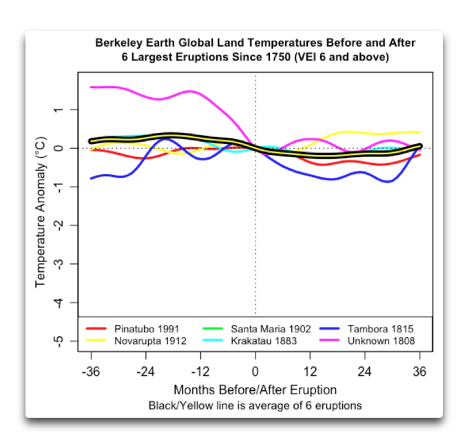
Krakatoa erupted in 1883 and apparently injected so much sulfur and ash into the upper atmosphere that it caused a global cooling event that lasted well into the 20th century. (1:25.00 in the video)
https://www.youtube.com/watch?v=yCXSDzo0tLg
They don’t quantify how much cooler, or how far exactly “well into the 20th century” means, but I’m sure it was a contributory factor.
A volcano affecting the global climate for over 17 years?
I don’t believe it.
Science isn’t about belief.
Volcanoes can affect the climate for a few years.
Not 17+ years.
I know baloney when I read it.
And you piled on with a meaningless character attack.
Troll on Richard.
In one comment tell someone else they are unscientific for not providing “data”, then in this post, you say, without any proof, that “I know baloney when I read it”. without ANY data.
You ARE just a troll.
Find one scientist who even believes any one modern era volcano affected the global climate for 17+ years
And Climate “science” ain’t about science. Hence the autistic girl as spiritual leader and chastiser-in-chief.
If the cooling is enough to cause ice fields to increase in size. Then even after the sulfur drops out of the atmosphere, it the ice fields will continue to cool the planet until they finish melting.
SO2 emissions have already been reduced by 75% to 80% since 1970. There was global cooling with high levels of SO2 before 1975, and global warming with high levels of SO2 after 1975. Conclusion: SO2 is a minor climate variable.
Where the SO2 is makes all the difference. Emissions from power plants and such stay in the lower atmosphere and are washed out of the atmosphere quickly. Volcanoes, especially the big ones, put SO2 into the upper atmosphere where they can stick around for years.
Trying to judge what impact volcanoes have by looking at power plant emissions is a fool’s errand.
Cooling is expected to be 2-3 years. However, maybe it tripped a tipping point. Tipping points are all the rage these days. Why not in 1886?
Crispin Pemberton-Piggot:
For a VEI4 eruption, it takes at least 5 years before their emissions fully settle out of the atmosphere. After that time, temperatures begin to rise because of the fully cleansed air.
For larger eruptions, more time is required, 15 years, or more, for a VEI7..
The only unambiguous VEI-7 eruption to have been directly observed in recorded history was Mount Tambora in 1815 and caused the Year Without a Summer in 1816.
Not out of the question, but much larger volcanoes have blown off in the last few thousand years. I believe that the Arctic ocean is the driver of long-tsrm swings in temperature. When ice extent is high, it insolates the ocean from giving up heat and also increases albedo. contributing to keeping the extent at a higher level. Over time, however the ocean wars under the ice, from water intrudi8ng from the Pacific and Atlantic. Eventually, the ice begins to thin from unde3rneath. As it breaks up, wind becomes a factor, cooling the surface and mixing the surface layer. Cooling increases as albedo drops, so it takes some time for the ice to get back to minimum. As apart of this process, the Arctic air tempe3ratures swing for continental cold toward a more marine state, with follow on effects globally on temperatures.
Or the even larger event in 1815.
Pretty sure that would mean that an individual volcano has to be averaged into the effects of all the much smaller ones. I don’t see how you avoid that conclusion, which reduces the short term effect of the larger volcano. Honestly, 50 years of study and they can’t qualify the effect of anything? Except that whatever happens must make it worse. This is what we’re calling science these days?
Krakatoa is not the only such event in recent past history. The explosion of Mount Tambora in 1815 produced a huge drop in insolation for years after its event. !*16 was known as ‘the year without summer’. And it ushered in years of crop disasters on a global basis. It’s estimated by some to have reduced the world’s average temperature by at least half a degree C.
It’s interesting that the last London Frost Fair of January 1814 predate the Tambora eruption of 5 April 1815 by over a year. The winter of 1813-14 is regarded as one of Europe’s coldest. Napoleon had problems with supplies because of that cold winter. So the eruption was given a headstart in Europe at least
Not in Australia – we had the millennium drought along with our highest temperatures recorded during the 1890s. It was that hot the birds fell out of the sky and citizens were sent by train to the tablelands closer to Sydney. Some 45 people died that night in January 1896 in the Bourke area in western NSW. Now that is hot
Willis disproved this claim several times.
e.g.,
‘Stacking Up Volcanoes‘ – Willis Eschenbach
Krakatau barely affected temperatures for several months.
Steve Case:
The temperature drop was due to volcanic eruptions in 1880 (VEI4?), two in in 1883 (VEI4 and VEI6, three in 1886 (VEI4, VEI5, and VEI4?), six VEI4 between 1888 and 1889, four in 1902 (VEI4, VEI4?, VEI4, VEI5?), and four between 1903 and 1907 (VEI4, VEI4, VEI4?, VEI5).
That was a period when the atmosphere was well polluted with dimming volcanic SO2 aerosols, as well as Industrial SO2, which rose from 9 Megatons in 1880 to 32 Megatons in 1910.
Volcanic activity has been increasing for the past 200 years. You have cherry picked data to obscure that trend.
Global Volcanism Program | Has volcanic activity been increasing?
There were some observations in the Arctic, some areas of the Northern Hemisphere, Austrialia and New Zealand that showed cooling. The problem being with the GISS the coverage was very poor between 1880 and 1910 over the entire ocean, Africa, Middle East, South America, Antarctica and anywhere Mexico South in North America.
https://data.giss.nasa.gov/gistemp/station_data_v4_globe/
Fact checkers seem to always leave out important … facts.
What about the PDO shift in 2014? It completely explains the warming that led to the “rapid temperature rise”. Since then there’s been a 7 year cooling trend of nearly 0.2 C / decade. We are already returning back to the situation prior to 2014 and with the AMO about ready to change into its cool phase, the cooling will only accelerate.
Careful, you might wake up even more people than the initial hockey stick sceptics and independent thinkers with these details and factors. That could case scrutiny from Soros-funded DAs.
fact checkers are fact chokers
The only difference between the two pauses has been the strong El Nino in 2015 and data manipulation of global temperature sets like GISS, HADCRUT4 and RSS trying to hide the decline.
https://www.woodfortrees.org/plot/uah6/from:1998/to:2015/plot/uah6/from:2016/plot/uah6-land/from:1998/to:2015/trend/plot/uah6/from:2016/trend
It might not be a pause…it might be topping out of the Modern Warming Period and a beginning of a return to Little Ice Age type climate….climate changes…none of us alive today will see the next bottom…..call it the Modern Cool Period beginning soon.
Monckton is a data mining fraud.
He hurts the cause of climate realists.
The UAH data begin in 1979.
He truncates data he does not like
to create meaningless short term trends.
“The (UAH) linear warming trend since January, 1979 still stands at +0.13 C/decade (+0.11 C/decade over the global-averaged oceans, and +0.18 C/decade over global-averaged land).”
Monckton cherry picks short term trends because he is biased.
There have been many short term flat trends since the latest
global warming trend began during the 1690s (coldest decade
of the Maunder Minimum period)
There was even a significant global cooling trend from 1940 to 1975,
which has since been “revised away”
Not one of those short term flat trends or the 1940 to 1975 global cooling
had an ability to predict the climate changes that followed. Global warming
continued even after the 1940 to 1975 cooling trend. Those trends were
meaningless variations within a longer term warming trend.
If you’re going to attack someone on their work, provide proof of your position.
Monckton has the whole 42 year UAH record available.
42 years is climate.
He cherry picks only the years
he wants to make a meaningless claim.
8 years is weather.
The Monckton starting year of 2015 includes the unusually large
2015 / 2016 El Nino heat release, unrelated to greenhouse gases. Choosing that starting year is also biased,
Even the 42 years of the UAH is not enough to establish long term trends. First, we know that from the mid 1950’s to late 1970’s we were in a cooler period, but don’t have the data available in the satellite record. Second, there were years in the 1980’s and early 1990’s in which global temperatures were depressed by stratospheric volcanic eruptions, which has a non-CO2 related effect on the per per decade UAH rise. And the 1930’s- mid 1950’s were nearly if not as warm as today.
These variable conditions may be the result of longer term trends influenced by the PMO and AMO. But the issue is that our lack of a complete global dataset more than 42 years old hinders our ability to understand what, if any, contribution CO2 is adding to the recent rise in warming over and above natural cycles. Therefore, anyone who says that the science is settled is either ignorant or lying.
The pre-1979 surface data can’t be trusted.
In 1975 NCAR reported significant global cooling from 1940 to 1975 that has since been “revised away” with no explanation. It’s true the global average temperature accuracy is questionable before 1979and the i use of weather satellites.
But your statement about that is wrong.
You wrote: “The issue is that our lack of a complete global dataset more than 42 years old hinders our ability to understand what, if any, contribution CO2 is adding to the recent rise in warming over and above natural cycles.”
We could have an accurate data set for 100 years and we STILL would not know the exact effect of CO2. There are too many climate change variables to know exactly what CO2 does. To know exactly what CO2 does, you would have to know what every other climate change variable does. We don’t know that, and are not even close to knowing that.
The warming since 1975 could be 100% natural or 100% CO2 but both would be a wild guess, and probably very unlikely. The rate of warming since 1975 suggests 100% natural causes are unlikely.
CO2 is a greenhouse gas. Adding CO2 to the atmosphere should impede Earth’s ability to cool itself by some amount. There is no evidence that amount has been harmful in any way. AGW is a reasonable assumption. But CAGW us an unreasonable prediction.
It’s rather frustrating that alarmists continue to insist that since their assessment of what data can and cannot be trusted begins at the end of the strongest cooling trend in recent history, essentially climate begins at that moment.
It’s a lot like watching a game of hockey starting late in the third period and analyzing teams based on how they behave when the score is particularly one-sided and time is running out.
Of course, when you then extrapolate based on that tiny amount of biased information, you’re going to get a hockey stick.
The data over that short a time period doesn’t suggest much of anything. Especially since when you use your conclusions to go back in time it’s a very poor model for past temperature and requires gymnastics like flatting out the Little Ice Age and the Medieval Warm Period.
And even then, it’s not enough. You have the NOAA altering past temperature record because the trend in the 1930s thoroughly breaks the loose association between CO2 and temperature. And even then, it’s not enough unless you program “tipping points” into models.
Why assume changing CO2 drives anything? It’s just one of millions of variables, and after 30 years of desperately trying to make this tail wag the climate dog, it still requires charlatans like Mann committing malpractice on the scientific method.
‘It’s rather frustrating that alarmists continue to insist that since their assessment of what data can and cannot be trusted begins at the end of the strongest cooling trend”
It’s worse than that.
Alarmists predict a future global warming rate 2x faster than the 1975 to 2020 period. And they never mention they made the same predictions from 1975 to 2020, and were wrong for the entire 45 years!
“We could have an accurate data set for 100 years and we STILL would not know the exact effect of CO2. There are too many climate change variables to know exactly what CO2 does. “
Exactly! Which is why short term trends *must* be considered. They are not meaningless. They are indicators of something occurring that long term trends do not adequately address.
“The rate of warming since 1975 suggests 100% natural causes are unlikely.”
Because of uncertainty in the measurements, including satellite measurements, how do we *really* know what the rate of warming actually is? The uncertainty interval totally masks the entire area the supposed measurements exist in. How do you determine a 0.13C difference when the uncertainty is more than +/- 0.5C?
Averaging does *NOT* increase accuracy nor does it lessen uncertainty, not when you are combining multiple measurements of different things. And that is what temperature measurements are, multiple measurements of different things. There is no guarantee they will generate a normal curve which can be described by the usual statistical descriptions of standard deviation and average. Temperature data should be described using the 5-number description: minimum, first quartile, median, third quartile, and maximum. Why are climate scientists, especially CAGW advocates, so reticent about doing this?
“Exactly! Which is why short term trends *must* be considered. ”
I’ll ask again, and not expect an answer, why do you consider the last 8 years to be a short term trend that needs to be considered and not the last 10 or 12 years?
They *ALL* need to be considered! When doing forecasts, however, the further back you go the less weight individual data values should have. The past eight years should be weighted heavier than years 10, 11, and 12.
It’s EXACTLY like forecasting weather! What happens today in weather is a far better predictor of what is going to happen tomorrow than the weather from 10, 11, or 12 days ago.
Do *YOU* believe the average weather of the past 30 days is a better predictor of the weather tomorrow than the weather you are experiencing today?
Why wouldn’t what happened this year be a better predictor of next year than a year 12yrs in the past? 20 yrs in the past? 40yrs in the past?
Your claim seems to be that what happened 40yrs ago is just as predictive of next year as what happened this year.
Forgive me but that belief is a religious one, not a scientific one.
“They *ALL* need to be considered!”
So why do I never see anyone here doing that? The only short term trends that are considered noteworthy are those showing a negative trend. If more recent term trends are considered more important, why did Monckton spend so much time going on about an 18 year “pause” whilst ignoring the more recent 7 or 8 years showing an accelerated rate of warming?
“It’s EXACTLY like forecasting weather!”
We are not trying to forecast anything here, we are trying to establish what the current trend us and if it has changed.
“Do *YOU* believe the average weather of the past 30 days is a better predictor of the weather tomorrow than the weather you are experiencing today?”
No I don’t. On the other hand the weather of the past 30 years is likely to be a better indicator of the weather in a few years time than the weather yesterday.
“Your claim seems to be that what happened 40yrs ago is just as predictive of next year as what happened this year.”
My claim is that looking at all the data over the last 40 years is a better indicator if what’s currently happening than the last few years, and that before you assume it’s not you should show a statistically significant indication there has been a change.
“Forgive me but that belief is a religious one, not a scientific one.”
Yes, wanting to see evidence for something is the religious approach.
“more recent 7 or 8 years showing an accelerated rate of warming?”
Accelerated compared to what?
See attached. I don’t see any acceleration in the rate of warming!
Accelerated compared with the previous warming. e.g. 0.26°C / decade compared with 0.13°C / decade.
Of course you don’t see any acceleration on that graph. That’s because a) there isn’t any, and b) you are not cherry-picking the most recent years at any point.
For example here is the trend from December 2007 to October 2015. Trend is 0.28°C / decade, more than twice the overall trend. By your logic this should have been of more interest than the 18 year pause.
Here’s the graph:
OK, let’s look at all of the “decadal (120-month trailing) trends” available from the UAH dataset, and how they have evolved (/ are evolving ?) over time.
Following the 1997/9 “massive / Godzilla” El Nino the UAH decadal trends show a jump from a (roughly) zero value to a double-peak (n 1998 and 2001/2), followed by a decline to a minimum at the beginning of 2012.
Following the 2015/6 “massive / Godzilla” El Nino the UAH decadal trends show a double-peak (in 2017 and 2020), and are currently “trending” lower …
Will the decadal trend continue down for the next 7 or 8 years ?
Nobody “knows” for certain.
OK.
Your own graph shows that the 10 year trend up to 2021, the time Monckton starts his new pause analysis, was the highest it’s ever been, over 0.5°C / decade. It’s now down to around 0.2°C / decade, faster than the underlying UAH trend, faster than most data sets over the last 40+ years.
None of this means the rate have warming has accelerated. All the graph really shows is that 10 year trends are very uncertain, and any conclusion drawn from any randomly chosen 10 year period is likely to be very wrong.
If a trend [ = “a rate of warming” ] increases in magnitude then it is, by definition, “accelerating”.
If it reduces in magnitude then it is, by definition, “de-celerating”.
Going from a trend of 0.5°C/decade to 0.2°C/decade is a de-celeration of 60%
Yes they are, which is why the default integration time for something to be considered as “climate” is 30 years.
I still consider my graph to be “intriguing” though, given “monster” El Ninos (1982/3, 1997/8, 2015/6) happen every 15 to 18 years or so …
According to your graph we are already below 1991/1992 temps.
That’s a 30 year spread, not a 10 year spread.
What it really shows is the cyclic factors in the temperatures. Right now it appears we are on the cooling side of a cycle. The question is where it will end.
1) “My graph” is of (10-year / 120-month) trends, not “temps”.
2) UAH, like RSS and STAR, doesn’t provide (global mean) “temperatures”, but “temperature anomalies” at various altitude (/ pressure level) bands derived from satellite MSU data.
Hopefully the following graph will make the difference clearer (with trends in °C per decade so they fit on the same Y-axis number scale).
Temperature anomalies are crap from the start to the finish. They are derived from bad data using bad statistical processes.
You can post anomalies all day long, such as the global average temperature, and I’ll show you how they are crap. I’ve done it multiple times with you and you just refuse to listen, instead just relying on religious dogma to carry you through!
“Temperature anomalies are crap from the start to the finish.”
Yet you use them to claim there’s been a change in the trend with no uncertainty.
Seriously, show so consistency. If there is no record that shows what’s actually happening to global temperatures, then all your claims that there is a pause, or that you can prove CO2 is not correlated with temperature, must be pure speculation.
Uncertainty is not going to help you. If we don;t know for sure temperatures are rising, we also don’t know that they are not rising at a much faster rate.
“Yet you use them to claim there’s been a change in the trend with no uncertainty.”
I am criticizing what is out there. I have stated several times just in this subthread that I have little confidence in *any* of the so-called temperature data, especially the derived anomalies.
“If there is no record that shows what’s actually happening to global temperatures, then all your claims that there is a pause, or that you can prove CO2 is not correlated with temperature, must be pure speculation.”
I have been especially consistent in criticizing *all* of the so-called temperature constructions. I guess you just don’t bother to read or you have a failing memory. That does *NOT* mean I can’t comment on what is out there. *I* am not the one that is saying the 40 year trend line is what we should depend on for creating expectations for the near-term future. That is *YOU*!
“Uncertainty is not going to help you. If we don;t know for sure temperatures are rising, we also don’t know that they are not rising at a much faster rate.”
Which is *EXACTLY* what I have been saying. We don’t know for sure if the trend slope is negative, positive, or zero. I’ve used that sentence multiple times with you!
Are you finally coming around to agreeing with me? Or are you going to continue assuming that measurement uncertainty is irrlevant and can be ignored?
“I have been especially consistent in criticizing *all* of the so-called temperature constructions. I guess you just don’t bother to read or you have a failing memory. That does *NOT* mean I can’t comment on what is out there.”
Granted my memory isn’t that good and not likely to get better at my age. But all I’m trying to get you to acknowledge is the inconsistency in you claiming that all temperature constructions are useless, yet also claiming you know with certainty that the trend has changed over the last 8 years, and claiming this trend shows all models are wrong and CO2 cannot be causing warming.
“*I* am not the one that is saying the 40 year trend line is what we should depend on for creating expectations for the near-term future. That is *YOU*!”
Maybe you need to worry about your own memory. You keep remembering things I haven’t said. All I’ve said is that a 40 year trend is likely to be a better predictor than an 8 year trend. I certainly don’t think you should depend on it.
“We don’t know for sure if the trend slope is negative, positive, or zero. I’ve used that sentence multiple times with you!”
But you insist we shouldn’t ignore it because short term trends often become long term ones. Do you see the problem? How can we concentrate on this short trend if we don’t know whether it’s warming or cooling much faster than before.
“Are you finally coming around to agreeing with me? Or are you going to continue assuming that measurement uncertainty is irrlevant and can be ignored?”
I keep telling you my thoughts on the subject, but you keep forgetting.
“We are not trying to forecast anything here, we are trying to establish what the current trend us and if it has changed.”
The current trend has *certainly* changed over the past eight years. You just don’t want to admit it.
Of what use is a trend line if you aren’t going to use it as a predictor of the future? What does knowing what happened in the past 40 or 50 years tell you? That it warmed over that period? So what? Does that mean it’s going to continue to warm? Or does it mean you simply don’t know what it’s going to do in the future?
If you don’t know what it’s going to do in the future then it’s all just mental masturbation with no purpose.
“No I don’t. On the other hand the weather of the past 30 years is likely to be a better indicator of the weather in a few years time than the weather yesterday.”
ROFL! So if it is sunny and hot today you think it is not likely to be sunny and hot tomorrow if 30 yrs ago it rained?
Why is the weather of 30yrs ago a better predictor of next year than this year? On what do you base that assumption? Tradition?
Bottom line? You are as bad at forecasting as you are at handling uncertainties.
“My claim is that looking at all the data over the last 40 years is a better indicator if what’s currently happening than the last few years”
You would make a *terrible* farmer where you must base your choice of crop and planting time based on what happened over the last few years rather than what happened 40 years ago!
You are bad, bad, bad at forecasting.
The same thing would apply to almost anything one can think of – sizing growth investment in infrastructure, writing long term contracts for supplies, determining highway investments, etc.
“you should show a statistically significant indication there has been a change.”
Exactly what Monckton has done and which you can only denigrate because you are jealous of what he has done.
“The current trend has *certainly* changed over the past eight years.”
Only if you ignore all uncertainties. You only want to use the stated values of the trend. But in that case, the trend is always changing. If you look at all 8 year trends over the UAH data, there are some warming at over 0.5°C / decade, and some cooling by 0.3°C / decade.
“Of what use is a trend line if you aren’t going to use it as a predictor of the future?”
To tell you what has been happening.
“What does knowing what happened in the past 40 or 50 years tell you?”
It tells you it’s been warming. It allows you to investigate reasons for that warming.
“Does that mean it’s going to continue to warm?”
You’re the one who keeps insisting the current trend needs to be considered a possible indication of what’s going to happen.
If you have no other information it may be the best assumption that a trend will continue into the future, but you don’t want to project that too far.
But it’s far better to understand what’s happening and try to use that information for future predictions.
“ROFL! So if it is sunny and hot today you think it is not likely to be sunny and hot tomorrow if 30 yrs ago it rained?”
No. If it’s unusually sunny and hot today, I’m not going to assume that it will continue to be unusually sunny and hot for the next 5 years. It’s reasonable to assume that if it’s rained on occasions over the last 30 years, that it will rain at some point in the future.
It was 40°C here a couple of days ago. I know that’s far from the average, so I’m not going to assume that tomorrow will also be 40.
“You would make a *terrible* farmer where you must base your choice of crop and planting time based on what happened over the last few years rather than what happened 40 years ago!”
If I were a farmer I’d listen to what the weather forecasts were rather than assume the weather this year was going to the same as it was last year.
“You are bad, bad, bad at forecasting.”
Give one example of a forecast I made that has been proven wrong.
“The same thing would apply to almost anything one can think of”
To be clear, when I say look at long term statistics, I’m also including trends etc. I’m not saying the weather next year is likely to be the same as it was 30 years ago, because we know there’s been 30 years of warming since then. I’m just saying don’t assume that just because this summer was unusually hot means next summer will also be unusually hot.
“Exactly what Monckton has done…”
I’ve never seen Monckton give any evidence of a statistically significant change in trend. If you know different than show me where he does. I’ve looked at the data enough to satisfy myself that no such evidence exists, but I’m always willing to look at any new evidence.
“Only if you ignore all uncertainties. “
If you consider uncertainties then the 40 year trend is just as meaningless as the 8 year trend. So are you saying you can’t use the 40 year trend either?
“You only want to use the stated values of the trend.”
Malarky! *I* am the one that informed you that your “uncertainty of the trend” was not an uncertainty at all – it is only a best-fit metric between the trend line and the stated values with no regard to the uncertainty associated with the stated values!
If the uncertainties of the stated values are so bad over the past eight years that the trend is unusable then so is the trend line for the past 40 years!
“To tell you what has been happening.”
What use is that? Are you going to use it to guess the future? It’s already the past. You lived through it. Apparently it didn’t cause the elimination of the human race.
“It tells you it’s been warming. It allows you to investigate reasons for that warming.”
Does that mean it is always going to warm? It’s pretty obvious that you think so.
It’s been 40 years with CAGW advocates creating and running climate models – and we are no closer to knowing the reasons for why the atmosphere acts as it does. The models all show the warming going up with the same slope forever – just like your 40 year trend. Apparently we are never going to have another ice age according to the models.
The 18 year pause and the current 8 year pause *should* be clues to honest researchers that the models aren’t working correctly since they don’t reproduce them at all. Calling the pauses “noise” is just the argumentative fallacy of Argument by Dismissal.
“If you consider uncertainties then the 40 year trend is just as meaningless as the 8 year trend.”
Only if you don’t understand how uncertainties in a trend work. Which of course, you don’t and I’m sure you are about to illustrate that again.
“Malarky! *I* am the one that informed you that your “uncertainty of the trend” was not an uncertainty at all”
You don’t inform someone by spouting nonsense. You insist that there is no uncertainty in a trend line, because “it is just a best fit metric”. Hence you want to rely only on the stated value of the trend line. That’s your only justification for saying the trend has certainly changed 8 years ago.
“If the uncertainties of the stated values are so bad over the past eight years that the trend is unusable then so is the trend line for the past 40 years!”
Pointless explaining this again. But here goes. The uncertainty in the trend line are not based, normally, on supposed uncertainty in the measurements, but on the variation in the data. This variation can come from different sources, including measurement error, but is mainly due to other factors not related to the independent variable (time in this case).
The less data you have, the more this variability contributes to the uncertainty of the trend. Hence the uncertainty over an 8 year period is much greater than over a 40 year period.
Gorman wants to ignore all this uncertainty and only base the uncertainty on the measurement uncertainty for each month. That’s fine, and you can include it. But He also believes the uncertainty in UAH data is huge, much larger than all the variation observed in the data over the last 40 years. And he thinks the best way to determine the actual uncertainty in the trend line is to assume it’s possible for the trend to go from the coldest possible value for the first month to the warmest possible value for the last month, or vice verse.
Hence he thinks the uncertainty over 40 years could be 2.8°C divided by the time frame. So this would be around 0.13 ± 0.7°C / decade. Whilst over the last 8 years it would be 0 ± 3.5°C / decade.
For some reason he doesn’t think this invalidates the claim that the pause proves CO2 does not effect temperature, or that there has certainly been a change in trend over the last 8 years.
“What use is that? Are you going to use it to guess the future? It’s already the past. You lived through it. Apparently it didn’t cause the elimination of the human race.
…
Does that mean it is always going to warm? It’s pretty obvious that you think so.”
So many straw men.
Once again I am not trying to predict the future. I want to know if temperatures have been warming, past tense. I’d like to know if that warming stopped 8 years ago.
One reason for asking these questions might be to see what this would mean if the trend continued into the future, but it is not a good way of predicting the future.
I absolutely do not think it is always going to warm. If, as I thin is likely, warming is being controlled by CO2, then warming will stop at some point after CO2 stops rising.It might also stop if other hypothetical cooling events occur, e.g. the earth is hit by a major asteroid, there’s a super volcano, or the sun was to go cold.
Linear regression can only really tell you about the trend within the scope of the data. Extrapolating far beyond that is dangerous for many reasons.
I do not believe it’s likely that global warming will result in the extinction of the human race. But arguing that it hasn’t happened yet so cannot happen no matter how warm it gets, is another of your fallacious arguments.
“You’re the one who keeps insisting the current trend needs to be considered a possible indication of what’s going to happen.”
They *are* a possible indication of what could happen! Otherwise the pauses would not have happened at all! Even better they are indicators that the models are wrong since the models don’t reproduce the pauses!
“If you have no other information it may be the best assumption that a trend will continue into the future, but you don’t want to project that too far.”
Ahhhh! So now you are changing your tune, eh? It’s always temporary with you. You will soon enough fall back into calling the pauses as discontinuities, statistically insignificant, and cherry-picked data.
“But it’s far better to understand what’s happening and try to use that information for future predictions.”
Of course! And Monckton is pointing out that the models don’t understand what is happening since they don’t reproduce the pauses in the face of ever increasing CO2!
“No. If it’s unusually sunny and hot today, I’m not going to assume that it will continue to be unusually sunny and hot for the next 5 years.”
How about for 18 years?
“It’s reasonable to assume that if it’s rained on occasions over the last 30 years, that it will rain at some point in the future.”
And if you can’t tell from your model when that rain is going to happen then what use is the model?
“If I were a farmer I’d listen to what the weather forecasts were rather than assume the weather this year was going to the same as it was last year.”
The Old Farmers Almanac has provided better long range forecasts for the next year than the climate models! The OFA claims an 80% average accuracy with its long range monthly forecasts. Since they publish a past year review on their accuracy each year, if they were fudging the numbers they’d get caught out pretty quickly.
The OFA does *NOT* use a 40 year trend line to forecast the next years weather!
“Give one example of a forecast I made that has been proven wrong.”
You keep claiming that Monckton’s pause is unusable, statistically insignificant, causes discontinuities, etc. All to try and dissuade people from using the current pause to say that it might continue next year. You’ve said this for over a year. But we just keep seeing the pause continue every month regardless of your claim that it can’t because the 40 year trend line says it can’t.
“I’m not saying the weather next year is likely to be the same as it was 30 years ago, because we know there’s been 30 years of warming since then.”
Really? It sure sounds like that is what you’ve been saying! It sure sounds like you are now trying to change your tune! But then, just like with uncertainty, you revert right back to saying that next year will be just like the past 30 years! That’s based on your sentence “I’ve never seen Monckton give any evidence of a statistically significant change in trend.” In other words you *are* saying that the weather next year will be what the 40 year trend line says and not what the pause trend says.
You want your cake and to eat it too. It just doesn’t work that way!
“They *are* a possible indication of what could happen!”
It’s possible they could be the start of a new long term trend. And it’s possible the trend since the start of 2011, 0.33°C / decade will continue into the distant future. Anything’s possible, but with statistics I’d prefer to be skeptical and wait for clear evidence before basing assumptions on slim possibilities.
“Ahhhh! So now you are changing your tune, eh?”
And I see we are in the another long session of strawman arguments. I say that the best indicator of future trends, if you have no other information, might be the trend over the last 40 years. I’ve no idea why you think that disagrees with anything else I’ve said.
“How about for 18 years?”
Obviously if I think it’s unlikely the current weather conditions will last for the next 5 years, I doubt they will last for the next 18. What is your point?
“And if you can’t tell from your model when that rain is going to happen then what use is the model?”
By model, you mean looking at weather over the last 30 years as an indicator of the range of likely weather for the near future?
The point isn’t to predict when it will rain, the point is to know that rain is possible at times. That’s all I’m claiming, along with the idea that this is better than just using the weather from the last 8 years as a model.
“The Old Farmers Almanac has provided better long range forecasts for the next year than the climate models!”
I’m sure you’ve got lots of anecdotal evidence to back that up.
“The OFA claims an 80% average accuracy with its long range monthly forecasts.”
Piers Corbyn claims 85% accuracy. It doesn’t make it true.
“You keep claiming that Monckton’s pause is unusable, statistically insignificant, causes discontinuities, etc”
That is not a forecast.
I might have jokingly said in 2016 that knowing Monckton he would be claiming that’s the start of a new pause in a few years time. That would have been a forecast.
“All to try and dissuade people from using the current pause to say that it might continue next year. You’ve said this for over a year. ”
An absolute lie. I’ve never said the new pause will end next year. I’m pretty sure it will continue for a number of years yet. It really just depends when the net big El Niño arrives.
“Really? It sure sounds like that is what you’ve been saying!”
It might sound like it to you, because you’ve got a weird habit of ignoring or misunderstanding everything I say.
“But then, just like with uncertainty, you revert right back to saying that next year will be just like the past 30 years! That’s based on your sentence “I’ve never seen Monckton give any evidence of a statistically significant change in trend.” In other words you *are* saying that the weather next year will be what the 40 year trend line says and not what the pause trend says.”
See what I mean?
How on earth does “I’ve never seen Monckton give any evidence of a statistically significant change in trend.”, translate in your mind to me saying “the weather next year will be what the 40 year trend line says”?
“When doing forecasts, however, the further back you go the less weight individual data values should have.”
Do you have a particular weighting you want to use? I’ve tried various ones, and they generally increase the trend slightly. Here for example, I’ve effectively reduced the weight by 10% per year going back from present. The trend increases to 0.15°C / decade.
(Blue line is the unweighted trend, red the weighted one.)
I don’t think you understand how weighting works in such a situation. Take the leftmost value and assign a weight of 1 to it, so that value only appears once. Take the second value and assign an incrementally increased weight to it, e.g. a 2, so it appears twice. Follow through with all the data values so that the rightmost value appears the same number of times as the number of data values in the set. If you have 40 years of monthly data then your last data entry will appear 480 times while the first data point will only appear once. The second to last data point will appear 479 times. Your trend line *should* bend to minimize the residuals between it and the 480 appearances of the last data point and the 479 appearances of the next to last data point and etc. Your x-axis is no longer time but order of appearance.
Use whatever weighting algorithm you want but it *has* to give more weight to current data than past data. And that does *NOT* mean just multiplying the data by some value.
Could you provide a reference to this technique?
The usual way I’ve seen to add weighting is to provide a weight to the cost of each residual.
“Could you provide a reference to this technique?”
If I can find any old studies we did for sizing central office growth additions I’ll forward them to you.
you might look here: https://atlasprecon.com/weighted-average-forecasting/
It will give some hints on how to do this. I’m not your research assistant. If you want to know more on how to do it then do your own research.
“I’m not your research assistant.”
Yet you seem to think I’m yours. You keep making vague claims without ever doing the work to show they are true. You insist that a weighted trend will demonstrate the pause, but then when I do the work and show it doesn’t, you claim I’m not doing it correctly, but still won’t justify the way you want it done.
I don’t know if you’ve noticed, but I’ve now done it exactly as you described, and it still shows an accelerated warming trend, not a pause.
The link you provided is not about a weighted regressions, it’s about weighted averages.
“Yet you seem to think I’m yours.”
Really? I am the *ONLY* one of us two that have worked out the examples throughout Taylor’s book on uncertainty. I’ve even obtained multiple statistics books and given you their reference and exact quotes. I have gone back through my forecasting notes and given you the proper method for weighting past data and given you a link to show how it is done!
And you just keep quoting religious dogma that the best-fit metric is a measure of uncertainty, that all uncertainty in all populations cancel and the accuracy of the mean is the standard deviation of the sample means.
You did *NOT* do the weighting correctly and you probably never will. It’s just too hard for you to understand even with my simple explanation of how to do it.
Nor can you get it into your head that you cannot just analyze physical phenomena by using linear regression based on the earliest start value and the latest end value. You HAVE to look at the pieces of the data along the way if you are trying to isolate physical phenomena. That’s why Monckton does what he does.
I’ve attached Abbott’s graph again. Maybe you’ll open your eyes and see it this time. It distinctly shows cyclical processes which your trend line does not and can not show. So you just remain stuck in your rut.
“Really? I am the *ONLY* one of us two that have worked out the examples throughout Taylor’s book on uncertainty.”
Congratulations. Have a gold star.
“I’ve even obtained multiple statistics books and given you their reference and exact quotes.”
I’m sure you believe that this has some baring on anything.
“I have gone back through my forecasting notes and given you the proper method for weighting past data and given you a link to show how it is done!”
Your memory is playing tricks again. Your link said nothing about a weighted regressions, as I told you.
But again, you keep giving me these tasks. You don’t do the work yourself. You show me what your weighted regression looks like. Don’t expect me to do it for you then complain if you don’t like the result.
“And you just keep quoting religious dogma that the best-fit metric is a measure of uncertainty, that all uncertainty in all populations cancel and the accuracy of the mean is the standard deviation of the sample means.”
All things I’ve never said. But keep arguing with the voices in your head. It’s amusing in a grim sort of way.
“You did *NOT* do the weighting correctly and you probably never will.”
Then you do it.
“It’s just too hard for you to understand even with my simple explanation of how to do it. ”
Really? What do you think I did wrong? As far as I can tell I followed your explanation to the letter. Maybe if you show me your workings we can see who’s done it more correctly.
“I’ve attached Abbott’s graph again. Maybe you’ll open your eyes and see it this time.”
Look at the comment I was responding to. There was no graph.
” It distinctly shows cyclical processes which your trend line does not and can not show.”
And has absolutely nothing to do with what we were talking about, or what you were claiming.
You said:
Your graph is showing a trend from 1975 – 2009. I was talking about the trend over the length of your two overlapping pauses – 1997 – 2022. I’m talking about UAH data, you are using some old HadCRUT data. You claim it stops in 2016, it stops around 2010.
“Your memory is playing tricks again. Your link said nothing about a weighted regressions, as I told you.”
You are the only one with a failing memory. I laid out how you do it in excruciating detail. I even gave you a link: https://atlasprecon.com/weighted-average-forecasting/
but you apparently didn’t go look at it or try to figure it out.
It’s a total waste of time trying to lead you to water, you just refuse to drink – like an old, stubborn mule!
“Then you do it.”
I’ve shown you how to do it. I’ve given you a link on the process. *YOU* are the one that needs to learn how to do it, not me. YOU need to do it as a learning exercise. Me doing it won’t teach you anything! I’ve attached two very simple graphs showing how I’ve done a very simple exercise. You use a polynomial fit to see how the slope of the trend line changes as you weight the most recent data more heavily vs a straight linear regression line of the data.
“Really? What do you think I did wrong? As far as I can tell I followed your explanation to the letter. Maybe if you show me your workings we can see who’s done it more correctly.”
You didn’t follow it at ALL! You don’t just multiply the data values, that changes the actual data without weighting it at all. As usual, you just don’t get it!
“And has absolutely nothing to do with what we were talking about, or what you were claiming.”
Of course it does! Stop whining. It shows you simply cannot just depend on a long term linear regression to determine what is actually happening! Something you just refuse to understand. There are none so blind as those who will not see!
“You are the only one with a failing memory. I laid out how you do it in excruciating detail.”
I was specifically talking about the link. The one you repeat, claiming it explains how to do the weighted regression. IT does not. Maybe you posted the wrong link twice, but the one you posted is about “weighted average forecasting”. It says nothing about regression. All it’s doing is calculating a weighted average by month and using that as a forecast.
As to your excruciating description, I followed it gave you two graphs. They didn’t give you the result you wanted, so you insist I’d done them wrong, but still refuse to show me what they should look like.
“Me doing it won’t teach you anything!”
I’m not asking you to teach me anything, and if I was I’d be asking for my money back. What I’m asking is for you to justify your claims.
“You use a polynomial fit to see how the slope of the trend line changes as you weight the most recent data more heavily vs a straight linear regression line of the data.”
Pity your “excruciating detail” failed to mention you want a polynomial. So what order of polynomial does your method require?
“As usual, you just don’t get it!”
Then show me how you did it. Show me your result.
“There are none so blind as those who will not see!”
There are none so empty as those who are full of themselves.
Wow! Go take your medicine! The entire issue was how you extend past data into the future – FORECASTING. *YOU* want to extend the linear regression line by saying that anything other than the linear regression line is somehow wrong!
I’ve told you MULTIPLE TIMES that such a view is nothing more than the old argumentative fallacy of Appeal to Tradition. When forecasting the *worst* thing you can do is extend a long term linear regression line because that gives equal weight to data in the far past compared to recent data. The link I gave you gives a base for weighting data to make it more applicable to a forecast!
You *REALLY* don’t remember me telling you this? You are going to make me go back through the thread to find it?
What did you expect a weighted data graph to give you? Another linear regression line with a different slope? That’s what you get when you generate a new set of data by just multiplying existing data by some factor! If you multiply the new data by a larger number or the old data by a smaller number exactly what did you expect to get besides another linear regression line with a larger slope?
That simply isn’t how you forecast from past data!
What difference does it make as to what order of polynomial it is? Create the data yourself and do a fit. It’s the only way you are going to learn! It’s pretty obvious what data values I used just from the graph – 1,2,3,4,5,6,7,8,9,10. And how to do it is obvious in the link I gave you.
It is *really* frustrating discussing anything with you because you know so little about the subject but are so willing to dismiss everything out of hand if it doesn’t fit your narrow point of view of how things ought to be!
I DID SHOW YOU! The graph is so simple a 6th grader could figure it out!
You have so blinded yourself you can’t even figure out a simple graph based on 10 numbers. And you are criticizing others?
“Wow! Go take your medicine! The entire issue was how you extend past data into the future…”
These attempts at distraction are getting feeble. You know full well, and if you don’t you can reread the comments, what I was talking about. You gave me a link you keep, claiming it answered the question of how you wanted me to do a weighted linear regression, and when I point out it’s about a weighted average forecast you claim that’s what you meant all along.
“*YOU* want to extend the linear regression line by saying that anything other than the linear regression line is somehow wrong!”
Stop lying. I keep telling you I don’t want to do that.
“I’ve told you MULTIPLE TIMES that such a view is nothing more than the old argumentative fallacy of Appeal to Tradition.”
Yet you have no problem with using the argumentative fallacy of a strawman.
“What did you expect a weighted data graph to give you?”
Stop playing games, and say exactly what you want me to do, or better yet do it yourself. I’m sure if you fiddle about with the data enough you can get something that looks like a pause.
“What difference does it make as to what order of polynomial it is?”
Seriously?
“Create the data yourself and do a fit.”
I did and posted the result.
“It is *really* frustrating discussing anything with you because you know so little about the subject but are so willing to dismiss everything out of hand if it doesn’t fit your narrow point of view of how things ought to be!”
Ditto.
“I DID SHOW YOU! The graph is so simple a 6th grader could figure it out! ”
Show me what it looks like when you use real data.
“You have so blinded yourself you can’t even figure out a simple graph based on 10 numbers.”
Explain to me how you would use your graph to predict what the next value would be.
Your data is growing linearly, but you want to weight the newer values. So you fit this curve which gives the impression the slope is declining, but the x axis isn’t useful, so presumably you need to re-scale it, as I did with the UAH data. At that point do you just get back to a linear line and predict the next value will be 11?
So here is the same weighted technique, using a polynomial. I tried a quadratic but that didn’t look much different to the linear, so here I’m using a cubic.
And here’s the same using the proper x scale, with the normal linear regression in blue.
“I’ve told you MULTIPLE TIMES that such a view is nothing more than the old argumentative fallacy of Appeal to Tradition.”
Do you actually know what appeal to tradition means?
I think this is what you are getting at. Red line shows the linear trend for your increasing repetition weighting scheme, the blue line is the non-weighted linear trend. As before the weighted trend predicts warmer temperatures at this time than the unweighted trend.
Here’s the same, but with the proper x-axis scale.
Not true
Weather predictions work well for a few days
Climate predictions are notoriously inaccurate.
Extrapolating short term trends does not create a good long term climate forecast. Even extrapolating 30 to 50 years trends does not create a good climate prediction for the next 30 to 50 years.
The climate will get warmer,
unless it gets colder.
Monckton is not extrapolating anything. He is finding where a break point in the slope of the trend has happened. It’s the point where the residuals between the data points and the trend line begin to grow with no end in sight up through the present date.
It identifies a point which needs to be investigated to find out why the break point happened.
All the climate alarmists can do is use the argumentative fallacy of Argument by Dismissal. They just say “It’s meaningless” without ever explaining why.
I agree with you about the climate predictions. Their uncertainty as time moves forward just grows and grows until you can’t even identify what the actual trend *is*.
“He is finding where a break point in the slope of the trend has happened.”
I keep asking you exactly what algorithm you think is being used here and why Monckton never claims that is what he’s doing.
“It identifies a point which needs to be investigated to find out why the break point happened.”
And as I keep saying, if you really believed it needed investigating, you should be investigating why there was a spontaneous increase of around 0.25°C at that point. That’s what break point analysis is meant to be alerting you to, not some insignificant change in the rate of warming.
“All the climate alarmists can do is use the argumentative fallacy of Argument by Dismissal. They just say “It’s meaningless” without ever explaining why.”
Stop trying to reduce this to fallacious arguments. Many people have explained why Monckton’s pause is meaningless, you just dismiss their arguments.
“I keep asking you exactly what algorithm you think is being used here and why Monckton never claims that is what he’s doing.”
You’ve been given this multiple times. Monckton explains it each and every post on the pause. And, as usual, you just totally ignore it and pretend its not there – just like you do with measurements consisting of a stated value +/- uncertainty.
“And as I keep saying, if you really believed it needed investigating, you should be investigating why there was a spontaneous increase of around 0.25°C at that point.”
El Nino. You’ve been given this multiple times as wall. The the global average has been *cooling* since the last El Nino. So the step is gradually disappearing!
See the attached chart (hat tip to Tom Abbott). It shows that after each step up you get cooling. And the cooling after the last step up has already started.
“Stop trying to reduce this to fallacious arguments. Many people have explained why Monckton’s pause is meaningless, you just dismiss their arguments.”
Sorry, NO ONE, including *YOU* has ever shown how the pause is meaningless. All they’ve done, including *YOU*, is just to make the assertion that it is. You’ve just resorted to the Argument to Tradition fallacy – “the past 40 year trend is what we should be looking at, not the most recent 8 year data”.
When the residuals start growing that *is* significant. Anyone with a lick of common sense can figure that one out – which lets you out apparently. It’s like a car that starts whipping around on an icy bridge after covering miles before just fine. According to you those past miles tell you that the skidding is meaningless, just keep your foot on the gas!
I know what Monckton does. I’m asking you how your method works. Monckton looks at every start point and chooses the one that gives the longest zero trend. Your method is something about finding the point where residuals start to deviate from the trend line.
“El Nino. You’ve been given this multiple times as wall.”
I’ve been pointing out the El Niño since the beginning as well. So to get this straight you think the El Niño of 2016 explains the increase in temperature at the start of the pause, but you don’t think it explains why the last 8 years have had a flat trend. If that your view?
“Sorry, NO ONE, including *YOU* has ever shown how the pause is meaningless.”
A few reasons:
“I’m asking you how your method works. Monckton looks at every start point and chooses the one that gives the longest zero trend. Your method is something about finding the point where residuals start to deviate from the trend line.”
Unfreakingbelievable! And you think the point at which the zero trend starts is *NOT* the same point where the residuals start to grow!
You’ve lost it man!
“I’ve been pointing out the El Niño since the beginning as well. So to get this straight you think the El Niño of 2016 explains the increase in temperature at the start of the pause, but you don’t think it explains why the last 8 years have had a flat trend. If that your view?”
Stop putting words in my mouth. Before the 8 yr pause we had an 18 year pause – they are separated by the El Nino. Since the El Nino the temps have been going DOWN, not up.
The trend has been zero for 8 yrs. Why do you keep trying to come up with idiotic reasons to deny that?
“The length of the pause is too short to be meaningful.”
When you include the 18 year pause with the 8 year pause you get a time span of almost twenty years. That isn’t significant?
Only to you, only to you!
“It’s confidence interval is such that the true trend could be anywhere between ±0.5°C / decade.”
And you are *still* confused by confidence interval and uncertainty.
“The effect of the pause on the overall trend since 1978 has been to increase it from 0.11 to 0.13°C / decade.”
Because of the El Nino, not the pause.
“Moving the start date back just a couple of years”
So what? This is no refutation of the 8 year pause being significant.
“If the trend over 8 years is considered meaningful, why do you not also consider all 8 year trends as meaningful. This for instance, would include the trend from September 2010 – September 2018, with a rate of warming of 0.55°C / decade.”
Who says it isn’t meaningful? Even it doesn’t comport with what the climate models produce! Why did the slope go UP? The climate models don’t show it! Why?
You are lost in a religious fervor over the climate alarmists dogma. Nothing that calls that dogma into question can shake your faith, you just ignore it.
“Unfreakingbelievable! And you think the point at which the zero trend starts is *NOT* the same point where the residuals start to grow!
You’ve lost it man!”
Calm down. I’ve no way of knowing if the point at which the zero trend starts is the same as the point where the residuals start to grow, because you refuse to explain what you mean by that. It seems unlikely to me, and if they are the same it’s more likely to be a coincidence. If Monckton were doing what you claimed, he would say so himself rather than explicitly telling us what his actual method is. It would sound much more impressive.
“The trend has been zero for 8 yrs. Why do you keep trying to come up with idiotic reasons to deny that?”
I’m not denying it, I’m saying it meaningless. The trend over the last 15 years has been around 0.3°C / decade. I can’t deny that, but that doesn’t mean I have to give it any specific meaning. It’s just natural fluctuations.
“When you include the 18 year pause with the 8 year pause you get a time span of almost twenty years. That isn’t significant?”
When you add the two pauses together the trend is 0.12°C / decade, and just about statistically significant.
“So what? This is no refutation of the 8 year pause being significant.”
It shows how arbitrary it is, and how it only works by cherry-picking the start date. Suppose someone found a warming trend since 1975, but someone else pointed out the trend was cooling if you start in 1973. How much credibility would you then attach to the warming trend?
“You are lost in a religious fervor over the climate alarmists dogma. Nothing that calls that dogma into question can shake your faith, you just ignore it.”
These snide remarks are getting tiresome, and just make it look like you are desperate to justify your own dogmatic believes.
“Calm down. I’ve no way of knowing if the point at which the zero trend starts is the same as the point where the residuals start to grow, because you refuse to explain what you mean by that.”
Playing ignorant isn’t a refutation of anything. See the attached graph. The start point is somewhat indeterminate. Pick one. But the fact that the residuals start to grow is irrefutable. And that is, in essence, what Monckton is finding with his process. Does he need to go back one month or forward one month as the start point – who cares? You continue to using nit-picking as some kind of refutation.
The trouble is that graph looks nothing like the actual data. You still don’t explain what trend trend line you are using. The one up to the start date of the pause, or the one covering all the data, or what?
Here’s the graph showing the trend line based on data up to the start of the pause, projected up to the current date. I’ve marked the pause anomalies in red. As I’ve said before, the pause residuals grow, but mainly because they are warmer than the projected trend. But I’ve still no idea how you calculate September 2014 as being the point where they start to grow.
I am using *YOUR* trend line that you are so adamant can be the ONLY TRUE TREND LINE.
It has a slope going up to the right, just like the one I showed in my picture.
And when the slope changes, e.g you have a pause, the residuals begin to grow.
I didn’t really expect you to understand and you have proved me right.
“I am using *YOUR* trend line that you are so adamant can be the ONLY TRUE TREND LINE”
This is insane. I’ve spent the last few weeks trying to tell you there is uncertainty in a trend line, when you insisted there is none. Now you claim I’m saying there can only be one true trend line.
“It has a slope going up to the right, just like the one I showed in my picture.”
Again, I’m asking you which particular trend line you want to use to determine when residuals start increasing. I even gave you two possibilities to choose from. But now I supposed to guess on the grounds that it’s apparently “my” trend line.
“And when the slope changes, e.g you have a pause, the residuals begin to grow.”
How does the slope change? It’s a straight line.
You’ve been banging on about this method of detecting pauses by finding out when the residuals grow. You claim it gives the same results as Monckton’s method. Yet any attempt to get you to define your method results in you twisting and turning. Throwing up any distraction to evade actually providing an answer. I think it should be obvious why this is – you don’t actually know what you are talking about.
But I’ll give you one more chance – just explain what you think your method is. No hand-waving, or toy diagrams. Just tell me how you determine the month when residuals start to grow.
“This is insane. I’ve spent the last few weeks trying to tell you there is uncertainty in a trend line, when you insisted there is none. Now you claim I’m saying there can only be one true trend line.”
Your “uncertainty” of a trend line is the best-fit metric. I.e. it is based on the differences between the stated values and the trend line – NO CONSIDERATION OF THE UNCERTAINTY ASSOCIATED WITH THE STATED VALUES!
Until you learn that you can’t simply ignore and dismiss the uncertainty in the measurements you’ll never get this right!
If the stated value is 12 +/-1 and the trend line point is 10 then the residual can actually range from 1 to 3 if you consider the measurement uncertainty. That is sufficient to completely change the track of the trend line when considering the uncertainty of surrounding data points.
“Again, I’m asking you which particular trend line you want to use to determine when residuals start increasing.”:
For at least the fourth time, IT DOESN’T MATTER unless the prior trend is the same as the current trend. The residuals will continue to grow if the slope of the current data changes!
“You’ve been banging on about this method of detecting pauses by finding out when the residuals grow. You claim it gives the same results as Monckton’s method. Yet any attempt to get you to define your method results in you twisting and turning.”
No twisting and turning here, just an inability on your part to read a simple graph. I’ve attached it again but I don’t expect you actually understand it. You’ll just keep on claiming I haven’t explained my method.
“Your “uncertainty” of a trend line is the best-fit metric.”
Still no idea what you think this means. It just seems to be a phrase you’ve got stuck in your head.
A trend line is a best fit, for however you are defining best fit. The uncertainty comes from the variation in the data, which can come from natural variability in the sample, or measurement error.
“I.e. it is based on the differences between the stated values and the trend line – NO CONSIDERATION OF THE UNCERTAINTY ASSOCIATED WITH THE STATED VALUES!”
And as I and others keep pointing out, the uncertainty associated with the stated values is present in the variation. That’s how the standard error of the regression is calculated, it’s how Taylor explains how to calculate it. It’s true whether the variation is caused entirely by measurement error, as in Taylor’s example, or if the values are all exact but there is variation in the sample, or for any combination of factors.
Does this mean the standard formula for the standard error is correct? No. There are a lot of assumptions and they can effect the uncertainty.
“If the stated value is 12 +/-1 and the trend line point is 10 then the residual can actually range from 1 to 3 if you consider the measurement uncertainty.”
Broadly correct, but not really true if the residual. That is an exact value. What you mean is the true value could differ by ±1. But another way of looking at it is, if the true value is 12, then the residual could have been between 1 and 3.
“That is sufficient to completely change the track of the trend line when considering the uncertainty of surrounding data points. ”
It isn’t really. You are not dealing with just one data point. The more you have the more the discrepancies will tend to cancel.
IT MEANS RESIDUALS ARE NOT UNCERTAINTY! They are a best-fit metric! They are based only on the stated value and do not consider the actual uncertainties!
It is a best-fit TO THE STATED VALUES. Why is that so hard to get into your head?
It is the variation in THE STATED VALUES. As usual you just simply ignore the uncertainties associated with the stated values! It is *not* uncertainty.
We’ve been around on this already. As usual I gave you the exact quotes from Taylor where he states this is calculating the best fit. THE BEST FIT.
You still have never internalized the fact that ERROR IS NOT UNCERTAINTY!
As usual you are confused by cherry picking from Taylor. In Chapter 8 he uses only stated values, y1, …, yn. NO MEASUREMENT UNCERTAINTIES. He then uses those values to define the residuals as y_i -A – Bx_i. Then he calculates the standard deviation of those residuals which he shows as σ_y. None of this has anything to do with the measurement uncertainty!
STOP CHERRY PICKING. DO THE EXAMPLES!
I’ve attached a graph from Taylor explaining what he is doing. Please note carefully that the point (x,y) HAS NO MEASUREMENT UNCERTAINTY associated with it. Taylor is calculating the residual from the point (x,y) to the trend line. A BEST-FIT metric, not measurement uncertainty. Δy = dy/dx * Δx.
Again, STOP CHERRY PICKING.
Of course it is the residual. The residual is the difference between the (x,y) point and the trend line! If your point is actually (x,y+u) then the residual changes!
tg: “ the residual can actually range from 1 to 3″
bellman: “ then the residual could have been between 1 and 3.”
Judas H. Priest! Do you see any difference between what I said and what you said? Do you *really* think you are stating something I didn’t already understand?
Not when you consider the uncertainty. The trend line can go through any point in the uncertainty intervals of all the data points! That’s why the trend line can range from positive, to negative, to zero when considering uncertainties larger than the differences trying to be identified!
Calm down. It’s really tiring to have a discussion where half of it is written in bold block capitals. It just make you look like a toddler having a tantrum.
“IT MEANS RESIDUALS ARE NOT UNCERTAINTY!”
They are not the uncertainty of the trend line. I’ve never suggested they are.
“It is a best-fit TO THE STATED VALUES“
Yes. What else do you want to get a best fit for.
“It is the variation in THE STATED VALUES.”
Yes. That’s the idea. You are working with the data, not to any other values.
“As usual I gave you the exact quotes from Taylor where he states this is calculating the best fit. THE BEST FIT. ”
And then he shows how to calculate the uncertainty in that best fit.
“In Chapter 8 he uses only stated values, y1, …, yn. NO MEASUREMENT UNCERTAINTIES.”
Yes. That’s what I keep telling you. It’s possible to calculate the uncertainty of a slope using just the stated values. You don’t need to use supposed measurement uncertainties, just the variation in the residuals.
“Then he calculates the standard deviation of those residuals which he shows as σ_y. None of this has anything to do with the measurement uncertainty!”
That’s taken you up to the end of section 8.3. Now read section 8.4. It’s called “Uncertainty in the Constants A and B”. Note, that A and B, are the constants from the linear equation y = A + Bx.
“I’ve attached a graph from Taylor explaining what he is doing.”
As so often you’ve misunderstood that diagram. That’s describing what happens when there is uncertainty in x as well as y. That isn’t an issue here as there is no uncertainty in the time.
“The residual is the difference between the (x,y) point and the trend line! If your point is actually (x,y+u) then the residual changes!”
A residual is the difference between an observed value and the predicted value.
“tg: “ the residual can actually range from 1 to 3″
bellman: “ then the residual could have been between 1 and 3.”
I didn’t explain it well, and it’s not an important point. But what I meant is that if the true value is y, and has a measurement uncertainty of ±1, and if that y is 2 more than the predicted value, then the observed residual could be between 1 and 3.
“Not when you consider the uncertainty.”
Yes when you consider uncertainty. Read Taylor 8.4. Look at the formula for σ_B (Eq 8.17). You’ll need to substitute his formula for Delta, but it should come to the same equation every over source gives.
“And then he shows how to calculate the uncertainty in that best fit.”
It’s not uncertainty. It’s a best-fit metric. Uncertainty is associated with an unknown true value. There is no unknown true value for the residual between a stated value and the trend value!
You didn’t even bother to look at the graph I posted out of Taylor. The point you use to determine the residual is (x,y). It is *not* (x±u_x, y±u_y). There is no uncertainty associated with x or with y. They are stated values!
“You don’t need to use supposed measurement uncertainties, just the variation in the residuals.”
If you don’t take the uncertainty of the measured values into consideration then how do you know your slope is the correct one? Once again, you fall back into the same old box, uncertainty can be ignored!
“That’s taken you up to the end of section 8.3. Now read section 8.4. It’s called “Uncertainty in the Constants A and B””
OMG! You are *STILL* cherry picking!
“Having found the uncertainty σ_y in the measured numbers y1, …, yn, we can easily return to our estimates for the constants A and B and calculate their uncertainties. The point is that the estimates (8.10) and (8.11) for A and B are well-defined functions of the measured numbers y1, …, yn. Therefore the uncertainties in A and B are given by simple error propagation in terms of those in y1, …, yn.”
…
“The results of this and the previous two sections were based on the assumption that the measurements of y were all equally uncertain and that any uncertainties in x were neglible.” (bolding mine, tg)
In other words, all uncertainty is y CANCELS and you are left with the stated values to calculate the best-fit residuals.
STOP CHERRY PICKING. You do *NOT* understand any of this. You are trying to cherry pick crap to throw against the wall. You see the word “uncertainty” and assume the context is the same throughout the book!
“As so often you’ve misunderstood that diagram. That’s describing what happens when there is uncertainty in x as well as y. That isn’t an issue here as there is no uncertainty in the time.”
Please! You haven’t done any of the problems or actually studied the text. You’ve searched for the word “uncertainty”.
And the “uncertainty” in y is the distance between y and the equivalent point on the trend line. It is the RESIDUAL.
You can tell this from Eq. (8.20)!
σ_y(equiv) = Bσ_x. where B is the slope of the line, i.e. dy/dx.
You just keep on trying to rationalize to yourself that you can determine measurement uncertainty from only the stated values and the best-fit linear regression. You can’t. Taylor doesn’t do it and neither can you. Nor can anyone else!
It is truly that simple. Measurement uncertainty means there is an interval within which *any* trend line is just as correct as any other trend line within that interval. Taking just the stated values and ignoring the measurement uncertainty is just one more way of trying to justify ignoring the measurement uncertainty so you can ignore it.
It’s *exactly* like the climate scientists saying the uncertainty of the temperature trend is the residual fit between the stated values and the trend line. That allows them to ignore the measurement uncertainties just like you always want to do!
“It’s not uncertainty. It’s a best-fit metric.”
Take it up with Taylor. That’s his word.
“There is no uncertainty associated with x or with y. They are stated values!”
Take it up with Taylor. He’s using stated values to calculate the uncertainty.
“If you don’t take the uncertainty of the measured values into consideration then how do you know your slope is the correct one?”
You don’t. That’s why there’s uncertainty.
“Once again, you fall back into the same old box, uncertainty can be ignored!”
I’m literally telling you how to calculate the uncertainty in the trend line, which you insist doesn’t exist.
“OMG! You are *STILL* cherry picking!”
So now it’s cherry-picking to point you to the section of your own preferred book that explains how to do something you insist is impossible.
“In other words, all uncertainty is y CANCELS and you are left with the stated values to calculate the best-fit residuals.”
You cut and paste the words, but still don’t understand them.
All you have here is the stated values. That’s how you calculate the best this, and it’s how you calculate the uncertainty of that fit. And yes, there are assumption in that calculation, such as the variation being idd, e.g. that the variation doesn’t change with x.
“You are trying to cherry pick crap to throw against the wall.”
So you are claiming Taylor is crap now? If you don;t like that there are lots of places elsewhere you could read, including Bevington I think. There is nothing wrong with pointing to the parts of a book that explain what you need to know. There is nothing weird or unusual in calculating the standard error of the residual slope. It’s basic statistics. Only you would think that pointing it out is cherry-picking.
“Please! You haven’t done any of the problems or actually studied the text. You’ve searched for the word “uncertainty”. ”
No. All I did was look in the table of contents for the chapter on Linear Regression. Looked through that chapter to see if he described how to calculate the standard error. And then passed the information on to you, hoping that you wouldn’t reject it as being too mathematical. It was a bonus that he actually uses the word “uncertainty”.
“And the “uncertainty” in y is the distance between y and the equivalent point on the trend line. It is the RESIDUAL.”
That’s the uncertainty in y. What I’m talking about is the uncertainty in B.
“You can tell this from Eq. (8.20)!
σ_y(equiv) = Bσ_x. where B is the slope of the line, i.e. dy/dx.”
Yes, that’s how you calculate the uncertainty in y. Now get back to section 8.4.
“You just keep on trying to rationalize to yourself that you can determine measurement uncertainty from only the stated values and the best-fit linear regression.”
Take it up with Taylor.
“You can’t. Taylor doesn’t do it and neither can you.”
Apart from the bit I “cherry-picked” where he tells you how to calculate the uncertainty of A and B.
“It is truly that simple.”
It isn’t that simple. There are lots of complications in the real world, but the calculation of the trend and it’s uncertainties / confidence interval / standard error of the regression slope, or whatever you want to call it is common knowledge, can be found in just about any book on statistics, including the ones you claim to have read and understood. It is that simple, and it’s a mystery known only to your brain care specialist, why you refuse to see it. I’m sure there’s a proverb that explains it.
“Measurement uncertainty means there is an interval within which *any* trend line is just as correct as any other trend line within that interval”
Only if you assume all uncertainty intervals have a uniform distribution, and can conspire to line up in just the right way.
“Taking just the stated values and ignoring the measurement uncertainty is just one more way of trying to justify ignoring the measurement uncertainty so you can ignore it.”
Take it up with Taylor.
“For at least the fourth time, IT DOESN’T MATTER unless the prior trend is the same as the current trend.”
I think at least one of us is suffering from memory loss, as I don’t remember you telling me that at all, despite repeated requests.
I can’t understand why you think it doesn’t matter which trend line you are using. One will show the residuals growing the other won’t.
“No twisting and turning here, just an inability on your part to read a simple graph.”
The graph has relation to reality. I’ve given you the correct graph, I’ve asked you tell me how you detect the exact month the residuals start to grow. But all you do is present the same toy graph, and insist that it should be obvious where the deviation starts. Of course, it’s obvious in your graph, because you’ve shown an actual pause with no ambiguity.
Here’s my graph again. Just tell me how you calculate the exact point where residuals start to grow. Then explain why you think the growing residuals represent a slow down rather than a speeding up.
You don’t remember because you just dismiss anything you don’t agree with out of hand.
Of course the trend line matters. The fact is that within the uncertainty boundaries you can’t be sure what the trend line is by just depending on the stated values. You *have* to consider the measurement uncertainties as well. I’ve attached a graph showing two trend lines, both within the uncertainty boundary, one with a positive slope and one with a negative slope. The residuals between them and the zero slope base, i.e. the “pause”, grow in both cases!
I’ve show *exactly* what Monckton has showed, a pause trend line with no ambiguity. That’s why he starts with today’s date and goes backward to find the longest period of pause.
I don’t know about your graph but I’ve attached the UAH one.
You can visually see a pause in warming from sometime in 1998 through sometime in 2014. You can see another one from 2016 through today. I’ve shown the growing residuals with wide dark lines on the graph. Monckton has already done the actual calculations, I see no need to reproduce them. They are visually obvious on the graph.
To everyone besides you I suspect.
“You don’t remember because you just dismiss anything you don’t agree with out of hand.”
Fine. Provide the links to the other three times you told me it didn’t matter which trend line is used.
“Of course the trend line matters.”
Your exact words were “For at least the fourth time, IT DOESN’T MATTER unless the prior trend is the same as the current trend.”
Can you see why I might find your explanations confusing.
“The residuals between them and the zero slope base, i.e. the “pause”, grow in both cases!”
And another graph that has no relation to reality. If I use the trend up to the start of the pause, the residuals grow, as in are bigger than the predicted trend. If I use the trend up to the current date, they don’t. And in neither case, is there an obvious point where the deviations start.
“I’ve show *exactly* what Monckton has showed, a pause trend line with no ambiguity.”
Yes. If you make up a pause with no ambiguity you get a pause with no ambiguity. What I’m trying to establish is how you handle the real data, which has variability, and a lot of ambiguity.
“I don’t know about your graph but I’ve attached the UAH one.”
My graph is the UAH data. Your attached graph is not.
“You can visually see a pause in warming from sometime in 1998 through sometime in 2014. You can see another one from 2016 through today.”
Then you are not seeing the same as Monckton as his first pause starts in 1997 and ends in 2015. But visually seeing something, is not a substitute for proper analysis. You can visually see lots of things, especially if you want to see them.
“Monckton has already done the actual calculations, I see no need to reproduce them. They are visually obvious on the graph.”
That sounds like an admission that all your claims of having a method to determine the start of the pause by looking for when the residuals start growing was just hot air. You are simply using Monckton’s cherry-pick and saying you can visually see it.
That’s not what I’ve been saying. I have said that it is impossible to know the actual trend line within the uncertainty interval. That’s what *uncertainty* means, the true value is unknown. It’s as true for trend lines within the uncertainty interval of the measured values as it is for each measured value alone.
You simply cannot grasp even the simplest of concepts. As long as the two trend lines diverge the residuals will grow. It doesn’t matter what the trend lines are, if they diverge then they diverge and the residuals between the two will grow.
Why is this such a hard concept for you to understand?
“And another graph that has no relation to reality.”
Just because *YOU* can’t grasp the concept that does not mean it has no relationship to reality!
Cognitive dissonance at its finest!
“And in neither case, is there an obvious point where the deviations start.”
Cognitive dissonance once again! You just said the residuals grow and now you are trying to say they don’t! ROFL!!
“My graph is the UAH data. Your attached graph is not.”
My graph is an attempt at teaching. Are you saying your trend line of the UAH data isn’t a positive slope linear trend line? That’s what I show in my graph. Are you saying that the most recent UAH data is not a horizontal line? That’s what my graph shows from using Monckton’s graph.
All you are doing is *still* trying to say that the change is slope of the recent data is meaningless. Nothing will shake your faith in the long term trend line. Not even the use of weighted values in doing forecasting will sway you from your religious belief.
“Then you are not seeing the same as Monckton as his first pause starts in 1997 and ends in 2015. But visually seeing something, is not a substitute for proper analysis. You can visually see lots of things, especially if you want to see them.”
OMG! The FIRST thing we were taught in probability and statistics was to graph the data and LOOK (i.e. visually) at it in order to assess the reasonableness of the data!
Proper analysis *must* include visual inspection. That is the quickest way to see if the data appears multi-nodal or skewed. Including the measurement uncertainty allows you to see if the data will allow identifying small differences. Just jumping into calculating an average and standard deviation, as you always do, is the primrose path to perdition.
“That sounds like an admission that all your claims of having a method to determine the start of the pause by looking for when the residuals start growing was just hot air.”
Oh, malarky! Your memory is just plain bad!
go here: https://wattsupwiththat.com/2022/05/14/un-the-world-is-going-to-end-kink-analysis-says-otherwise/
“As should be immediately apparent to any skilled data analyst, the least-squares linear regression presented does not represent the underlying data well. Specifically, the “error” in the graph (the deviation of the estimated value from the actual values) increases dramatically after the late 1990s. This indicates that linearity of the data breaks down sometime around the late 1990s, so forecasts based largely on earlier data become invalid.”
“Select the candidate kink point that minimizes the total error. At this point, the amount of reduction in pooled estimation error (vis-à-vis a single linear regression) can be calculated easily, showing how the kinked-line model more closely matches the data set than a single linear regression. ”
YOU EVEN DID THIS YOURSELF AND POSTED THE RESULT!
And now you are claiming that the process doesn’t work!
I’m done with you on this. I have a bunch of lawnmower work lined up I need to get to and I’ll be taking some vacation later this week.
You are a troll, nothing more. I tire of feeding you!
“My graph is an attempt at teaching. Are you saying your trend line of the UAH data isn’t a positive slope linear trend line? That’s what I show in my graph. Are you saying that the most recent UAH data is not a horizontal line? That’s what my graph shows from using Monckton’s graph.”
I think this section gets to the heart of the problem.
Tim has convinced himself that there must be more to Monckton’s pause than I say and reaches for an idea he read on a recent blog post about diverging reciprocals. But he doesn’t really understand or test it. He thinks it’s simple because in his mind it is simple. He sees as being like the diagrams in school text books. He fondly imagines a set of points neatly forming a linear trend, then suddenly stopping, and forming a neat horizontal line, and the point of departure from the trend line is self evident.
The problem is that the real world data is just not like that, for at least two reasons.
Temperature moves up and down all the time, it’s constantly departing from the trend line, only to return months or years later. It’s always possible that the variation is the start of a change of direction, but it probably isn’t and it’s foolish to jump[ to conclusions. You need more evidence, you need a clear signal that there has been a change, not just wishful thinking.
The other problem is that Monckton’s pause, even if it’s a thing, is not what he implies. It isn’t temperatures moving up and then at some point stopping, as Tim’s cartoon graph suggests. It’s temperatures shooting up and then waiting for the trend line to catch up.
I’ll look into this in more detail later, now that Tim’s decided to stop pestering me. But the real issue that should be asked is why, if he is so sure of his facts, does he never try to test them in the real world, using the actual data? Is it the old adage of a beautiful theory being killed by an ugly little fact?
“All you are doing is *still* trying to say that the change is slope of the recent data is meaningless. Nothing will shake your faith in the long term trend line. Not even the use of weighted values in doing forecasting will sway you from your religious belief.”
Yes I am still saying it’s meaningless, because you’ve not been able to suggest otherwise.
But, then we get to the usual lies and strawmen. I do not have “faith” in the long term trend line. It might be correct, it might not be. All I ask is some meaningful evidence that there has been a change, or that a non linear trend is significantly better. My adage is that linear trends are rarely correct, but are usually the best first assumption.
“YOU EVEN DID THIS YOURSELF AND POSTED THE RESULT!“
Yes I did. But you want to ignore the conclusion. The best “kink” point is in 2012 and shows an upward trend.
“When you add the two pauses together the trend is 0.12°C / decade, and just about statistically significant.”
See attached graph from Tom Abbott. As you can see the trend you are looking at reversed around 2012. The end of this graph is around where the 2016 El Nino started so you have a spike at the end but the cooling trend has continued since then.
That *is* statistically significant, especially when you see the trend line changed about 2000. I.e. the first big pause. If you can’t see that the residuals from the trend line to the data started to grow then you being purposefully blind.
“It shows how arbitrary it is, and how it only works by cherry-picking the start date. “
And now we are back to your already debunked “cherry picking” claim.
Can’t see Abbott’s graph, and wouldn’t trust it if I could.
Here’s my own graph. Note, I made a mistake in where I thought the old pause started. According to Monckton it now started in January 1997, so the trend since then is only 0.11°C / decade. Still just about significant.
See the attached graph here:
I know you wouldn’t. You can’t see anything that interferes with your delusions.
There are none so blind as those who will not see.
It’s always darkest before the dawn and a stitch in time saves nine.
Now what are you talking about. You claim to attach a graph and fail, then complain that I don’t trust the source. Maybe if you actually showed me the graph we could figure out what the rest of ramblings were about.
“That *is* statistically significant, especially when you see the trend line changed about 2000.”
Please explain what you mean by “statistically significant”. The trend since 2000 is 0.15°C / decade.
“If you can’t see that the residuals from the trend line to the data started to grow then you being purposefully blind. ”
You keep throwing these hand-waving comments. Started to grow from what date, against what trend line?
You could pick a different eight year period and get a different trend. With data mining you could show am 8 year warming trend, an 8 year neutral flat trend, or am 8 year cooling trend.
Some people are too anxious to imply or declare global warming has ended. Based on history, when a global warming period ends, a global cooling period begins. Global warming is more pleasant than global cooling.
Monckton starts in the present and works backwards. No cherry picking of start dates.
Monckton isn’t trying to say warming has ended. His graph just shows that CO2 can’t be the only thermostat.
T = f(CO2) + f(x) + f(y) + f(z) + …..
The primary function the models look at is f(CO2), i.e. T = f(CO2). The rest are either minor and are ignored or they are parameterized (i.e. they are guessed at, e.g cloud impacts).
If T ≠ f(CO2) then it is incumbent on the climate alarmists to identify and quantify the rest, f(x), f(y), f(z), …… so that the pause can be explained, understood, and handled in future forecasts.
But they won’t. Basically because they can’t. They just have the climate models put out a y=mx+b linear trend line forever. The models can’t even follow the RCP scenarios properly. If CO2 is the thermostat and RCP2.5 shows CO2 growth tapering off then the temperature growth should taper off somewhere in the future. But it never does. No change ever in the of the slope of trend line – just on and on and on into the future!
“In 1975 NCAR reported significant global cooling from 1940 to 1975 that has since been “revised away” with no explanation.”
No-one has ever produced an actual NCAR report saying that. But what is clear is that in 1975, the only data that had been gathered was land data in the Northern Hemisphere, and only a few hundred stations at best. “Revised away” just means subsequently gathering adequate data.
You’re partially correct. It wasn’t an NCAR report. I think it was a 1975 National Academy of Sciences publication. I think the commonly referred to graph was an updated version of Budyko, 1969.
That said, the mid-20th Century cooling has not been revised away, at least not totally revised away.
https://www.woodfortrees.org/graph/hadcrut4gl/mean:12/from:1942/to:1978/plot/hadcrut4gl/mean:12/from:1942/to:1978/trend
The cooling was significant enough to temporarily halt the rise in atmospheric CO2.
MacFarling-Meure, C., D. Etheridge, C. Trudinger, P. Steele, R. Langenfelds, T. van Ommen, A. Smith, and J. Elkins (2006). “Law Dome CO2, CH4 and N2O ice core records extended to 2000 years BP“. Geophys. Res. Lett., 33, L14810, doi:10.1029/2006GL026152.
From about 1940 through 1955, approximately 24 billion tons of carbon went straight from the exhaust pipes into the oceans and/or biosphere.
“what is clear is that in 1975, the only data that had been gathered was land data in the Northern Hemisphere,”
Baloney
Would you care to produce the supposed NCAR report?
If the claim is based on Budyko 1969, as David Middleton suggests, that was explicitly Northern Hemisphere. And there were no ocean datasets until mid 90’s.
We do now have SH reconstructions and the Mid-20th century cooling is still present. The leading hypothesis for the concurrent pause in CO2 rise is cooling of the southern oceans.
If you are suggesting that NASA/NOAA and others are corrupting data, you may be correct.
However, if you are suggesting that the pre-1979 data are not fit for purpose, then I think you need to defend that. The earlier data may not have the same precision as today, and there may be some issues with sampling strategy to obtain a reliable global value. However, the utility of a single temperature for the globe is questionable anyway. The sampling protocol for older data is probably adequate for areas such as the Lower 48, and Western Europe. Which happens to be where a lot of people live. The solution is to state the temperature trends for just the well-sampled area of the globe, and not make a claim for the entire globe because sampling is still too sparse for some areas.
“The pre-1979 surface data can’t be trusted.”
This can’t be trusted?
Hansen 1999:
This can’t be trusted?
Phil Jones says three time periods are equal in warming magnitude
”The rate of warming since 1975 suggests 100% natural causes are unlikely.”
Why?
How about the 19-year flat trend before the latest Super El Niño? At the time the “experts” said it would take a 15 to 17-year flat trend to falsify the UN IPCC CliSciFi climate models.
Also, a 0.13 ℃/decade trend during the upswing portion of an up/down approximately 60 to 70-year cycle of temperatures doesn’t engender much fear.
The models are programmed to make scary predictions.
They have been wrong for 40+ years
Accurate predictions are obviously not a goal
“That said, the mid-20th Century cooling has not been revised away, at least not totally revised away.”
The “revisions” were sufficient to make the cooling trend smaller than the margin of error claimed for the measurements. That’s close to revised away.
Calm down, please, Richard. Lord Monckton is not choosing starting points, he is using a linear regression, which starts at the posting of new data each month, to calculate back in time how far the linear regression is without increase. Your ranting and raving is off the mark.
Exactly, meanwhile CO2 climbs
Monckton specializes in meaningless short term data mining that has no value in predicting the future climate.
Linear regression does not change that fact.
I calmly explained why Monckton is not helping climate realists with his data mining. “Ranting and raving” is how you describe anyone you disagree with.
A meaningless character attack.
Personal attacks in violation of your own demand to stop personal attacks IS ranting.
Richard, I think “ranting and raving” is appropriate based on the nature and style of your denigration of Lord Monckton, who appears to me to be a sincere and capable person.
I’m sure he is sincere.
But he is implying eight year trends are important when they are most likely random variations of a complex system.
As I just posted, short term trends *can* become long term trends. That’s why in forecasting you *have* to give more weight to current data than past data.
Assume you are forecasting the capital investment in a telephone central office where the main independent variables are population growth and secondarily on penetration. Do you continue invest at the long term rate over the past 20 years even though both population and penetration are both showing short term flattening?
How about this novel idea — stop making climate forecasts. They are consistently wrong and only serve to scare people. The past eight years might be the start of a new trend, or it might not.
So it is not very important.
Why not the past 20 years?
Or the past 40 years?
If the forecast includes appropriate uncertainty (not just best-fit metrics) but true measurement uncertainty, then people can judge the credibility of the forecast for themselves.
Certainly, however, a forecast that is nothing but a y=mx+b based on the past 20 years or 40 years is not appropriate. Most people that are 50 yrs or older and live in fly-over country automatically understand that the climate is cyclic, they have *lived* through it.
We aren’t actually looking at just the past 8 yrs. The pause is actually over 20 yrs long, interrupted by an El Nino event. That *should * be long enough to cause even the climate alarmists to question the how much impact CO2 actually has on temperature. It’s certain that CO2 in the atmosphere has increased substantially over the past 20 yrs yet we are not seeing a linear trend line of continuously increasing temperatures. That can’t just be dismissed by handwaving excuses like “the heat is hiding in the deep ocean” or “it’s just noise or natural variation”. Random noise or random natural variation would have heating and cooling interweaved over a 20 year period. If you look at Monckton’s data that is *exactly* what you see, interleaved higher and lower values whose average comes out to zero. See attached.
Monckton’s updates, in fact, ARE valuable. They show that climate factors other than CO2 that affect global temperature trends are at least equally important. We know what some of these factors are but our ability to predict them is essentially non-existent.
Since we cannot predict these factors, how can we possibly know how long a pause will be? Do we really know that the 42-year trend will continue? Hint; we don’t.
What we actually know is that the direct GH effect from CO2 is small, about 1 deg C for a doubling (we’re nowhere near a doubling). We’ve seen non-linear feedback theories that predict that CO2 increases will cause increases in water vapor (a stronger GH gas) that will lead to very large temperature increases but the large temperature increases have not happened – all but ruling out a large feedback effect.
Monckton is appropriately pointing out with actual data that we need to develop a better understanding of natural climate factors before we put too much faith in any climate prediction.
+100
Richard, please give us an example of data that has “… value in predicting the future climate.”
A coin
Flip a coin
More accurate than climate computer games.
Humans have not yet demonstrated any ability to predict the future climate.
SO WHY DO WE NEED ANY PREDICTIONS?
How about an honest analysis of the effects of global warming in the past 47 years? With almost eight billion first-hand witnesses of some or all of that global warming. How did the warming affect them, assuming they even noticed it?
If global warming continues, we should have an honest appraisal of how past global warming actually affected real people. Not some computer game prediction of much faster global warming in the future — a wrong prediction that began in the 1970s and has been wrong for about 50 years … so far.
You are echoing what Freeman Dyson, the noted physicist, said a number of years ago. To have any legitimacy the climate models have to be holistic and look at the entire biosphere, not just temperature and CO2.
The climate scientists denigrated him over that and they are still doing so.
Yep.
“I calmly explained why Monckton is not helping climate realists with his data mining.”
And you did so without understanding how these haitatuses can be used to disprove the models.
Yep.
He looks back at every possible start month and chooses the one that gives him the longest possible flat trend.
I still find it incredible that people don’t think this amounts to choosing a starting point. How do you think his method would differ if he was choosing a start point?
You find it incredible because you are jealous that he thought about doing it instead of you.
It is a valid analysis of the data and is meaningful.
He *chooses* the present date. He *finds* the earliest date.
Choosing and finding are *NOT* the same thing except in your fevered mind!
Thanks, I needed a good laugh after the last few days.
“It is a valid analysis of the data and is meaningful.”
Only to people who know nothing about statistics.
“He *finds* the earliest date.”
And by a staggering coincidence the s=date he “finds” is always the date he would have chosen, if he was trying to choose the date that gives him the longest possible zero trend.
“Choosing and finding are *NOT* the same thing”
In order to choose the best date you fist have to find it. If I examine every cherry until I’ve found the biggest one, and then pick it, did I find the biggest cerry or dis I choose to find the biggest cherry?
For some reason, some here think that calculating the best start date for your purpose is less of a problem than randomly choosing it.
At what point will you accept that temperatures are NOT increasing, contrary to predictions by models? How many years of little or no increase before you accept that the CAGW hypothesis is WRONG?
When someone can supply statistically significant evidence that it’s happening. Even before that, I might accept that there was a high probability that temperatures had stopped warming, if there is clear evidence for that, and preferably had a clear description of what is being claimed, and that it could not be easily explained by ENSO conditions.
If you want to prove that increasing CO2 is not causing warming, then you will have to better. It’s possible for warming to stop for a while despite increasing CO2, it just requires a stronger cooling effect.
At present, none of these cherry picked pauses are doing anything to suggest either warming has stopped or that there is no correlation between warming and CO2. On the contrary, the last 8 years have strengthened both the warming trend and the correlation with CO2.
“It’s possible for warming to stop for a while despite increasing CO2, it just requires a stronger cooling effect.”
WHAT cooling effect? None of the models or the model designers know what the cooling effect is. So how can they judge what the warming factor is?
“At present, none of these cherry picked pauses are doing anything to suggest either warming has stopped or that there is no correlation between warming and CO2”
Of course they do! If T = f(CO2) and f(CO2) goes up but T doesn’t then there is *NO* correlation between the two.
If T = f(CO2) + f(x) + f(y) + ….. then WHAT IS x AND y? Do *you* know? If you don’t then how can you possibly judge the significance of the pause in temperature? We *know* that f(CO2) has gone up but temp hasn’t! You can claim that isn’t significant but you have never been able to actually show why!
“On the contrary, the last 8 years have strengthened both the warming trend and the correlation with CO2.”
According to the Met Office we are no warmer in 2021 than we were in 2016. What happened to the increasing warming trend?
It was a hypothetical cooling effect to explain that a significant pause or cooling trend, does not necessarily prove that CO2 is having no effect.
You really need to try and read what I’m saying, rather than jumping to conclusions.
“Of course they do! If T = f(CO2) and f(CO2) goes up but T doesn’t then there is *NO* correlation between the two. ”
You keep making these assertions, but nether do any actual work to test your believes. What is the correlation between CO2 and temperatures using only data up to September 2014? What is the correlation when you include data up to present?
I can show you once again, that the effect of the pause has been to strengthen the correlation, but you won;t believe me, and at the same time you won;t work it out for yourself. So you’ll continue to make these assumptions based on a cherry picked set of data.
“According to the Met Office we are no warmer in 2021 than we were in 2016.”
Try to keep up, we are only talking about UAH data here. But again you use a common sense fallacy. I say the effect of the last 8 years has been to increase the overall warming trend, and you dismiss this on the grounds that 2021 wasn’t as warm as 2016.
All you have to do is run your own linear regression over the data to confirm what I’m saying.
UAH:
Dec 1978 – Sep 2014, 0.11°C / decade
Dec 1978 – June 2022, 0.13°C / decade
HadCRUT4:
Jan 1975 – Sep 2014, 0.17°C / decade
Jan 1975 – Dec 2021, 0.18°C / decade
“Only to people who know nothing about statistics.”
No, to people that are even halfway familiar with forecasting. You are the type of person that has to be warned by the phrase “past performance is no guarantee of future returns” in financial ads.
“And by a staggering coincidence the s=date he “finds” is always the date he would have chosen, if he was trying to choose the date that gives him the longest possible zero trend.”
Your fevered mind is showing again. How could he choose what he doesn’t know? He *FINDS* what he doesn’t know!
“In order to choose the best date you fist have to find it.”
ROFL!! Finding comes first! Exactly opposite of what you have been claiming! You can’t cherry-pick what you don’t know!
“ did I find the biggest cerry or dis I choose to find the biggest cherry?”
Again, ROFL!!! Your claim is that he is cherry-picking the start date of the pause! And then you use an example of having to FIND the biggest cherry!
Finding is *NOT* cherry-picking!
If you didn’t spend so much time rolling about on the floor, and actually tried to engage with what I’m saying, we might get somewhere.
“No, to people that are even halfway familiar with forecasting.”
Once again, nobody is forecasting anything at this point.We are talking about the past and present, not the future.
“How could he choose what he doesn’t know? He *FINDS* what he doesn’t know!”
He looks for what he wants to find, and when he finds it he chooses it as opposed to choosing another date.
We can keep playing these word games all day. It isn’t going to get us anywhere, unless you define your terms.
“Finding comes first!”
Which is the problem.
“You can’t cherry-pick what you don’t know!”
Which is why you need to find it first.
If you chooses things at random without knowing what you will find, you are doing things correctly. Statistical inference is usually based on the assumption that the data is randomly chosen. Any attempt to find the data that will prove your point before hand is cherry-picking.
“Your claim is that he is cherry-picking the start date of the pause! And then you use an example of having to FIND the biggest cherry!”
And again, I’ve no idea how you think you can choose the biggest cherry before finding it.
I would still like you to say what you think cherry-picking the start date would look like, and how it would differ from what Monckton does.
“Once again, nobody is forecasting anything at this point.We are talking about the past and present, not the future.”
If past isn’t future then what is the future?
“He looks for what he wants to find, and when he finds it he chooses it as opposed to choosing another date.”
So what? Cherry-picking requires you to *know* where to start, not where to end your “finding” process.
“If you chooses things at random without knowing what you will find, you are doing things correctly. Statistical inference is usually based on the assumption that the data is randomly chosen. Any attempt to find the data that will prove your point before hand is cherry-picking.”
You do *NOT* pick data points at random in a time sequence. You follow the time sequence.
You are back to throwing crap against the wall to see if something sticks. STOP IT!
“And again, I’ve no idea how you think you can choose the biggest cherry before finding it.”
Go look up the definition of “cherry picking”.
“I would still like you to say what you think cherry-picking the start date would look like, and how it would differ from what Monckton does.”
If you begin with an arbitrarily chosen starting data point and go forward then you have “cherry picked” the start date. If you start with the most recent data point and worked backwards you have *NOT* cherry-picked anything.
Get out of that box of delusions you live in!
“If past isn’t future then what is the future?”
Wow man. Too heavy for this time of night.
“If you start with the most recent data point and worked backwards you have *NOT* cherry-picked anything.”
Apart from the start date.
There are over 500 possible start dates, and you are finding the one that will maximize your claim, i.e. find the longest pause. Any statistical inference drawn from that choice of start dates has to take into account the large range of possible start dates you could chosen but didn’t.
A honest less biased presentations:
Present all the UAH data since 1979, as context, and then add: By the way, there has been no warming since the warm 2015 / 2016 period affected by a large El Nino heat release. that flat short term trend could be the beginning of a new long term trend or just a random variation of a complex climate system.
I’ve given the context for UAH data many times.
Of course the short term trend could be the beginning of a new trend, but it could just as easily be the start of a trend warming at twice the previous rate. I prefer to be skeptical, and actually wait for evidence of a change.
“Of course the short term trend could be the beginning of a new trend”
So you are finally starting to come around. Soon you’ll be claiming it was *you* that first pointed this out. Unfreakingbelievable.
“I prefer to be skeptical, and actually wait for evidence of a change.”
The evidence of a change is two multi-year pauses separated by an impulse from the 2016 El Nino.
*Something* isn’t right with the models, they don’t show this.
“So you are finally starting to come around. Soon you’ll be claiming it was *you* that first pointed this out. Unfreakingbelievable.”
Flagrant quote mining. Read the rest of the paragraph you are quoting.
“The evidence of a change is two multi-year pauses separated by an impulse from the 2016 El Nino. ”
And as I’ve said else where the trend over these two pauses is almost identical to the overall trend. As always, you want to claim that warming is caused by the El Niños, but ignore the fact that starting a trend just before the El Niño spikes is what causes the appearance of a pause.
And yet CO2 climbs and climbs 😉
And will continue to climb for the foreseeable future.
Looks to me like he intentionally and explicitly shows the time back to the current temperature. What is deceitful about that? Were you expecting a completely flat temperature during the interval? Seems like your real complaint is about the word “pause”.
It appears to me that you don’t understand how he derives the zero trend line.
yep.
”42 years is climate.”
Says who?
42 years is better than 8 years
Mr. Greene: Why do you say Moncton is making a prediction about future climate? Seems to me he is not doing that, instead he is debunking the prediction of CLiSci that CO2 rise means temp must rise. You’re 110% certainty is your worst enemy. As a fellow TCM watcher, I’m trying to be helpful. You can do better if you oppose the CliSci hoax. Consider that Moncton is using availabe data produced by others to show a brief anti-CliSci trend that debunks AGW. What are we fighting about?
We’ve actually had two pauses, an 18 year one and an 8 year one, separated by the temperature impulse from the 2016 El Nino.
It’s been cooling since that El Nino while CO2 has continued to climb. Makes one wonder what it will take to cause the CAGW advocates to begin questioning the relationship between CO2 and temperature. Models are not data!
“… since the latest global warming trend began during the 1690s …”. Is that when Man started burning fossil fuels and increasing the atmospheric CO2 content? But we are told that it all started in 1850, even though the Keeling Curve doesn’t start to rise until the mid-1900’s.
There is no evidence man made CO2 had any measurable effect on the global average temperature before 1940 because there were little man made CO2 emissions before 1940 (weak economies during the 1930s).
There has been warming and cooling by 100% natural causes for 4.5 billion years. The IPCC arbitrarily declared in 1995 that natural causes of climate change were just “noise”. That’s politics, not science.
So, the First world war and the build up to it had no effect, Strange That!
We did not have accurate global temperature data before 1920. Very poor coverage of the Southern Hemisphere and questionable ocean measurements with buckets and thermometers. And CO2 emissions growth was low.
You said 1979 earlier. Which is it?
I thought we had decent 1940 to 1979 measurements — not with the better surface coverage of satellites — but decent data.
But then the 1940 to 1975 global cooling was practically “revised away”. So I have no confidence in the “new” 1940 to 1975 numbers, because I have never read a good explanation of why the original 1940 to 1975 numbers were wrong
There is no evidence that man-made CO2 has any measurable effect on global temperature even now!
The “Keeling curve” is what a lot of the global warming hysteria is all about because it goes up and up, ignoring the fact that it is a tiny component of the air we breath. What is never explained is that the “curve” is about as linear and predictable as a “curve” can get. It is data taken at an unusual height at a very unusual spot, very close too an active volcano on an island in the middle of the largest ocean where human activity in the form of population increase, cement production, increased vehicle and air traffic is ruled out as irrelevant, generated by father and son scientists, using only one method. This is “science”?
And another one of those people who actually believe that starting today and counting backwards is “cherry picking”.
I guess when you can’t actually attack the methods, you have to grasp at something.
Meaningless short term data mining with no predictive ability for the future climate. Monckton tries to convince people he’s on to something big. That’s his ego speaking.
As apposed to meaningless long term models who’s predictions have failed to the point of falsifying themselves? Lord M’s states over and over that his pause calculation is not intended to be predictive, it’s just a point of interest. His real work is his models that show the failings of the climate alarmist community and the IPCC.
8 years of actual data are better than always wrong long term climate computer games, but that’s not saying much
“The (UAH) linear warming trend since January, 1979 still stands at +0.13 C/decade (+0.11 C/decade over the global-averaged oceans, and +0.18 C/decade over global-averaged land).”
The Arctic warmed between 1975/76 until 2010 around 1.8c
Between the 1940’s and 1970’s there was about -0.12c/decade using surface stations (this still stands despite being increasingly removed for the agenda) and the Arctic cooled around 1.8c.
With the Arctic cooling and warming at the same rate it would be logical to assume the planet may have changed similar too.
Taking this into account since the 1940’s it only stands at +0.005C/decade, being the recent warming period has only been slightly more in change than the previous cooling period.
In 1975 the change in average temperature between the coldest and warmest month in the 1940 to 1975 period was reported by NCAR at almost -0.5 degrees C. I know that is data mining, but it shows just how much cooling was “revised away”. Try to find 1940 to 1975 global cooling on current surface global average temperature compilations.
The warming since 1979 is faster than expected from 100% natural changes. +0.13 degrees C. per decade is significant if you trust UAH data. I do. The next 42 years could have a similar trend, or a completely different trend. Extrapolation forward of a prior 30 to 50 year temperature trend does not seem to predict well.
Why do you trust UAH to identify such a small value? 0.013C per year?
What is the measurement uncertainty of the radiation from the atmosphere? Since things like dust can affect that how do you quantify it over the entire globe?
What is the uncertainty of the measurement device in the satellite? Not the resolution capability of the sensor but the actual calibration uncertainty over time?
What is the uncertainty of the conversion algorithm used to convert the emission value to temperature value?
Trusting UAH would require that the total of all these uncertainties would have to be less than 0.013C or you couldn’t actually know if you’ve identified a difference or not.
I, myself, trust UAH more than the surface data but I still don’t “believe” UAH is accurate, not by any measure.
As the gambler said when he was told the dice game was crooked: “But its the only game in town.” Come up with something better than UAH6 and people might listen to you.
This is the old False Dilemma argumentative fallacy. The gambler can start his own game. The gamble can move on to another town (i.e. come up with something better).
Would you use a measuring tape you *know* is inaccurate to build your next house even if it is the only measuring tape in town? You *could* of course do so. But would you trust the result enough to start ordering kitchen cabinets, furniture, and appliances? What if they don’t fit in the areas you have built for them?
“The warming since 1979 is faster than expected from 100% natural changes. ”
Expected ??
By whom ?
Where is there any scientific logic in that statement ?
Expected is an opinion by scientists, not a proven fact.
Increasing CO2 should cause some warming
There was warming from 1975 to 2020
with a strong positive correlation of CO2 and temperature. CO2 may have been one cause of the warming.
In recent centuries we did not have such a fast
rate of warming, over a 45-year period, before there were large manmade CO2 emissions (all natural climate change).
But you’ve said that we don’t have reliable data before 1979. Or before 1920 – you changed your mind between posts. If we don’t have reliable data for recent centuries, how do you know what the rates of warming were?
He doesn’t know. He seems to be a troll that argues black is white and white is black in order to increase the number of clicks and replies to his posts.
I said there are no global data before 1920.
Too few Southern Hemisphere measurements, and poor N.H. coverage outside of the US and Europe, and Eastern China.
I said the 1940 to 1975 numbers were significantly revised to show less cooling, which is very suspicious.
I said UAH since 1979 is capable of decent measurements. It reflects a global warming trend that is slower than the surface measurements. Significant, but certainly harmless and not CAGW.
“In recent centuries we did not have such a fast
rate of warming, over a 45-year period,”
Incorrect:
Pre 1920 is not global data and Northern Hemisphere coverage is not very good until after WWII.
You are also comparing a 47 year period from 1975 to 2022 with shorter periods, in years where surface coverage was biased by too much infilling. You will not find another 47 year period with a warming rate similar to the 47 years from 1975 to 2022 in recent centuries.
Mr. Greene: You claim no reliable data, then tell us about “recent centuries”, about which you have- no reliable data. See the problem?
Richard, you need to click on the chart as it shows the data stopped at 2009.
Dr. Jones a noted warmist scientist made the point that all warming trends are similar.
The current adjusted surface global average temperatures have slowly decreased there cooling over the decades between the 1940’s and 1970’s. It is certainly wrong when the Arctic cooled similar to what it has warmed recently.
I would support +0.13c per decade being quite normal for global cloud albedo declining on average 1% per decade.
These two near 40 year periods are very similar in warming.
https://www.woodfortrees.org/plot/hadcrut4gl/from:1910/to:1950/plot/hadcrut4gl/from:1985
Correct the cooling to more like what it should be and the recent warming compared looks very modest.
https://www.woodfortrees.org/plot/hadcrut4gl/from:1910/to:1950/plot/hadcrut4gl/from:1985/offset:-0.4
+42X42^42
“The current adjusted surface global average temperatures have slowly decreased there cooling over the decades between the 1940’s and 1970’s. It is certainly wrong when the Arctic cooled similar to what it has warmed recently.”
North America shows a similar cooling to the arctic cooling, where it cooled about 2.0C from the 1930’s to the 1970’s (about 1.5C of cooling from the 1940’s to the 1970’s:
Look like about 1c decrease using the 5-year mean.
“The warming since 1979 is faster than expected from 100% natural changes.”
The warming was similar three different times in the past. The first two were caused by natural changes, but the last and current one was not? The last and current one looks strikingly similar to the previous two. You claim the current warming couldn’t be natural, without any evidence. The evidence actually points to today’s warming being natural since the Little Ice Age.
I do like this chart.
“Between the 1940’s and 1970’s there was about -0.12c/decade using surface stations (this still stands despite being increasingly removed for the agenda) and the Arctic cooled around 1.8c.”
The U.S. cooled about 2.0C from the 1930’s to the 1970’s:
“Global warming continued even after the 1940 to 1975 cooling trend.”
No it didn’t. Get better facts.
Cooling was from 1940 to 1977, with sea ice increasing until 1979. Warming started again from 1978 to 1998 then stopped for a number of years. Fiddling with the data began in earnest during those latter years in an attempt to make it look as if CO2 concentration automatically translates into warming temperatures. From the evidence, it does not.
There was some warming in the 21st century when a super El Nino held fast, and no net warming since. Your claim above that we are seeing steps that are tending upward is true: with a warming rate of ~1.1 deg per century. There is noting scary about 1.1 degree warming per century. The rate from 1920-1940 was far in excess of that and look – nothing happened of any consequence (except the global cooling that followed).
“Those trends were meaningless variations within a longer term warming trend.”
How true! Congratulations. I will not listen to people claiming that short term warming is indicative of any longer warming trend.
Century long warming trends are thankfully appreciated because when the world is warmer, everything gets better. The last thing we want, the worst of all possible futures, is one in which the world cools by one or two degrees globally as it appears to be doing at the moment. Quiet sun = dropping temperatures, shorter growing season, less food, more hungry people, plus we have an ideological war on “fossil” fuels, the stupidity of printing truck loads of fiat currency, rising global sovereign debt in the trillions, rising interest rates; all point to a cold, hungry, impoverished world in the immediate future. What else? Maybe read the book “Lucifer’s Hammer”.
I have ignored your back-biting about Lord Monckton. If you want to do something useful, refute his irreducibly simple climate forecasting formula and while you are at it, his paper on positive feedbacks and his claim that the IPCC warming feedback rate is impossible. You would gain considerable standing in the global warming community, were you to be successful. They have all failed at that task.
Every global average temperature compilation shows significant global warming from 1975 to 2020. Do you have better data?
You don’t.
Monckton seems to want attention (for data mining) that he does not deserve.
I Iove global warming here in Michigan and favor a lot more CO2 in the troposphere to improve plant growth, if put there by burning fossil fuels with modern pollution controls.
I don’t like data mining.
There is no proof the IPCC warming positive feedback rate ever existed. It’s an unproven theory with no evidence, used to make scary climate predictions. How can you disprove a prediction without waiting for many decades? The feedback rate prediction is from the 1970s and has not been observed since then. It’s always “coming” in the future.
I have a theory that it is impossible to prove anything.
But I can’t prove it.
You appear to savour the term “data mining”. It’s fair game to critique Monckton’s work but using inappropriate terminology and using it in a vituperative manner lessens the value of your argument.
When you have a 42 years of UAH data, with two very large El Nino heat releases in 1998 and 2015/2016, and you choose to show only eight years of the 42, with 2015 and 2016 as your starting years, that’s biased data mining.
If your objective is to show how far back from the present a pause in warming extends, then you can only go back eight years with a flat trend. So in effect, the full extent of the data available is used in that it shows at most an eight year flat trend extending back from the present.. You may legitimately espouse that measuring the short term “pause” is a useless fact but it is not deceptive, it is not cherry picking and it is certainly not a “data mining fraud”.
I’m sorry, you just aren’t getting it! This isn’t actually data mining at all!
If I size the next addition to my central office based on a 42 year long linear regression line instead of looking at the past five year data just how far off will my sizing of the addition be?
It’s the same with climate. Climate is a cyclical phenomenon, it is *not* a linear growth forever and ever. As a cyclical phenomenon there will be periods of temp growth and temp decline. You *have* to look at recent data in order to determine what is going on at any point in time.
Ask *any* reputable forecaster if it is valid to weight data from 40 years ago equally with data from eight years ago in order to determine the future. On ANYTHING, not just climate!
H*LL, just ask any farmer if they think they should make crop and planting decisions based on what happened 40 years ago instead of the past five years! They will laugh in your face! Even the old timers that dropped out of elementary school!
“Cooling was from 1940 to 1977, with sea ice increasing until 1979. Warming started again from 1978 to 1998 then stopped for a number of years. Fiddling with the data began in earnest during those latter years in an attempt to make it look as if CO2 concentration automatically translates into warming temperatures.”
I think that’s correct. You see, the alarmists were thinking that 1998 was going to be one more step to higher temperatures which would tend to verify their CO2 demonization delusions, but something happened after 1998: The temperatures started cooling and cooled by about 1.0C after 1998. This is when the serious manipulation of the temperature records began. This is when James Hansen said, “Well, maybe 1934 wasn’t that hot”.
These Climate Change Fraudsters ought to all go to jail for the harm they have caused, and are causing, our society.
This “cherry picking” by CMoB accusation is a dead horse, stop flogging it.
Really! It’s getting tiresome.
I thought you objected to personal attacks.
I know a guy who keeps track of consecutive numbers that come up in Roulette. He studies these results and swears that from them it’s possible to discern trends in the results that can be used to improve winning odds in future spins. There are even video’s online that proport to demonstrate how to use tends to win at Roulette. Casinos love these folks. The reality is that in highly variable data with an unknown uncertainty it is easy to fool yourself into thinking you see tends that are nothing but random variation in noise.
Still it is common and effective practice to use short term trends in process quality control to determine whether a process is in or out of control. But this requires:
If these conditions are met then the Western Electric Rules
https://en.wikipedia.org/wiki/Western_Electric_rules
can be used to determine when the process might be out of control and require correction. I don’t think GAT meets these requirements.
You are, in essence, using the argumentative fallacy of Appeal to Tradition. You are giving old data the same weight as new data – a forecasting no-no. New trends, especially over the short term, do sometimes become long term trends, that’s why you have to be able to identify the short term trends and watch them. You are like a horse with blinders, all you can see is the part of the picture – till you get blindsided by something you couldn’t see coming.
The other issue is that the history of the planet and solar system is one of cycles. Linear trends based on time dependent cycles is also fraught with danger since you don’t know what you are actually basing the linear trend on. How do you trend a sine wave?
An eight year flat trend has no use for climate forecasting.
Climate forecasting is notoriously inaccurate.
An eight year cooling trend while CO2 is rising could be important. But we still won’t know of the planet will be warmer or cooler in 100 years.
.
You need to stop talking into the mirror, no one here is claiming what YOU suggest which is why you seem to be running in circles.
No one is suggesting using the eight year trend for forecasting. It is just an indicator that the past forecasts have a problem. It needs to be investigated to determine WHY the eight year pause is happening when the current climate models don’t show it *or* the recent 18 year pause. Something is wrong with the models – as you apparently agree with. You *do* need to consider present data with more weight than data from the past. Just ask any farmer.
global temperatures have since remained quite warm
the last eight years have been unusually warm
Where is this spot that has been unusually warm for eight years?
I would like to plan an annual holiday there to get away from a miserable “quite warm” Dublin.
The past few years have been much warmer than the historical mean, despite the absence of a statistically significant warming trend:
There’s a good book about Hockey Stick charts advertised on this webpage. You should read it.
This isn’t a “hockey stick chart,” it is the instrumental surface temperature record.
In the previous pause it took time to build up the alarmist narrative and get the science community to respond and issue statements. In the current pause, the dismissive response is pre-packaged without the science community.
“……with global temperatures exceeding 1.2C above pre-industrial levels.”
***************
Ignoring the Little Ice Age seems to be an ongoing and favorite tactic among the CAGW alarmists. It is far too inconvenient to admit we’ve been coming out of one since the 19th Century. What is the Earth’s climate supposed to do while coming out of the LIA?
Thought control and propagandizing like this is absolutely vital to maintaining the CAGW narrative as a smokescreen for the power and money to drive political and eco-activist agendas in environmentalism and politics. The alarmists are going to have a real problem on their hands if and when the Earth’s climate goes into a serious cooling period in the future.
But that will still be Climate Change (TM).
Hahaha..global warming was terrible branding. It Didn’t sound scary enough. I think Climate Extinction is Covid type scary.
There is no real time global average temperature to prove a global Little Ice Age. There were a few weather stations in Europe and the US and not much more.
Climate reconstructions are local and not accurate enough to determine whether a century averaged one degree cooler or warmer than the prior century.
We know climate always changes.
We don’t know if the Little Ice age was a global climate trend.
We know Central England is considerably warmer now than in the mid 1600s.
We don’t know how much the global average ocean temperatures changed since then.
The Holocene Climate Optimum from 5000 to 9000 years ago was probably global, but we can’t be sure. The local climate reconstructions show warmth that probably exceeds their margins of error for that period, but there’s no proof for the 5,000 years since then, that the average temperature had ever been warmer than it was in the past 10 years.
Hundreds of studies from around the world indicate that existence of both the LIA and the MWP.
BTW, using your standard, nothing prior to the start of the satellite record in 1979, can be used for determining the temperature of the planet.
Remember to clowns like BigOil, the final nail , Griff, Simon….MWP only happened in the town of medieval….here in NY, they were freezing their @sses off 😉
So now today we have “tipping points” left, right, and center.
They are local climate reconstructions
Averaging them to create “global average” tends to make variations quite small relative to the likely margin of error.
We know the planet is always warming or cooling but do not have accurate global average temperatures before the 20th century. So what?
All those claimed warming and cooling periods were caused by 100% natural causes of climate change. They do not answer the question about the effect of manmade CO2 emissions. They do show the IPCC should not dismiss all natural causes of climate change as “noise”.
Averaging does not reduce measurement uncertainty, and measurement uncertainty is not error.
Averaging local reconstructions to create a “global” temperature has tended to reduce
variations to about +/- 1 degree C. The locations selected for local climate reconstructions were not selected with the intention of having good global coverage.
If the mean is taken to represent a common tendency of the population, about which random errors exist in the individual members, then averaging will indeed reduce the uncertainty of an estimate of this common tendency. In fact the uncertainty in the mean is inversely proportional to the sample size.
Alan,
Please! Not this statistical garbage again. The badly named “uncertainty of the mean” is actually not an uncertainty at all. It is merely the standard deviation of the sample means. It has nothing to do with accuracy and uncertainty. It is more a measure of how well the samples represent the entire population.
Doing this type of calculation also requires that the population be identically distributed around a true value, e.g. something like a Gaussian distribution or a uniform distribution.
Multiple temperature measurements of different things using different measurement devices is not guaranteed to be either a gaussian distribution or a uniform distribution. As such using standard deviation and average to describe the distribution is simply not correct. It should be described using the 5-number description – minimum, first quartile, median, third quartile, and maximum. Just like you would do with any skewed of multi-nodal distribution.
The uncertainty of any “average” you calculate from such a distribution will inherit the uncertainty propagated from the individual elements in the distribution. Not the “average uncertainty” of the elements but the *total* uncertainty of the elements when added together.
Almost all climate scientists ignore the uncertainties of their measurements, whether out of ignorance or convenience is hard to determine. I can’t do that. It was trained into me early by my mechanic father, by subsequent trade work, and finally by my engineering experience.
When you take the mean of a sample, you want to know how certain you can be that the calculated mean represents the true mean of the full population, which you cannot measure (in this case it would be every single point on the earth’s surface). That is the uncertainty in the mean. We are not supposing that the temperature measurements themselves form a Gaussian distribution but that the means of those measurements will form a Gaussian distribution, and that this distribution converges as the number of samples grows. The Central Limit Theorum states that the distribution of the sample means will be normal whether the underlying population is normally distributed or not.
Your explanation does not go far enough. In order to achieve a Gaussian distribution of the samples means, one must first achieve a cohesive set of samples where the samples sizes are large enough, there are enough of them, and that the samples themselves have the same distribution as the population. If these are not properly met, the sample mean will have a large standard deviation. In other words, the sample mean will have a large interval surrounding it where the population mean could be.
Climate science wants to declare that the data points are samples. Then turn around and find the SEM, that is, the Standard Error of the sample Means, as if the samples are the entire population. The equation relating these is:
SEM = population SD / √N
Where the SEM is the standard deviation of the sample means. It is not the Standard Deviation of the population.
Yet they have declared them as samples, so they are acutally dividing the SEM by √N which gives them a worthless number.
This is really noticeable if you look at the samples. Winter and summer months have a different variance of temperature. Yet the samples are segregated by summer and winter, i.e., Northern Hemisphere and Southern Hemisphere. These samples can not have the same variance and standard deviation. Yet they are treated like they have the same distribution as the entire population.
Lastly, I would point out that none of this addresses the uncertainty of the measurements. For example, I have 10 samples where each is made up of measurements with an uncertainty. Then the mean of each of the sample will also include the measurement uncertainty. The measurement uncertainty must be factored into the uncertainty of the estimated population mean. The GUM refers to this as the “combined uncertainty”.
When the population standard deviation is unknown then the standard error of the mean is estimated by using the sample standard deviation as a point estimate. It is in fact quite common not to know the standard deviation of the population, and to use the sample SD to estimate 95% confidence intervals.
When computing climatological means the anomaly is used rather than the absolute temperature, and station anomalies are gridded before being taken as a regional or global average, so seasonal variability across hemisphere is of little concern.
The sample standard deviation IS the Standard Error of the sample Mean! They are one and the same.
You can then estimate the population Standard Deviation by the formula I showed before.
Population SD = SEM * √N
You DO NOT calculate an SEM of the sample mean by dividing the SEM again by the √N. That is what climate science does. It is why they end up with a ridiculously small SEM.
No one is doing that. If you want to know the estimated standard error of the sample mean without knowing the population standard deviation it is simply given as the sample standard deviation divided by the square root of the sample size.
“When you take the mean of a sample, you want to know how certain you can be that the calculated mean represents the true mean of the full population”
Again, if you do not have a Gaussian distribution (or at least an identically distributed population around a mean) in the population then a calculation of a mean is useless and meaningless.
Multiple measurements of different things simply will not provide an identically distributed population distribution. Thus standard deviation and mean are useless descriptors of the population.
“We are not supposing that the temperature measurements themselves form a Gaussian distribution but that the means of those measurements will form a Gaussian distribution, and that this distribution converges as the number of samples grows.”
Think about what you just said here. 1. the distribution may not be Gaussian. 2. the distribution converges to a mean as the number of samples grows.
Again, if you do not have a Gaussian distribution then convergence to a mean is useless. You *must* use the 5-number description of the distribution and that does not include a mean.
Suppose you take a set of temps from the SH and a set from the NH in the same month. For the SH you get (20F, 25F, and 30F). For the NH you get (70F, 75F, and 80F).
If you jam those together what do you get? You get a bi-modal distribution in which the average tells you nothing. It simply can’t give you an expectation for what the next temperature will be! That’s because the average temp simply doesn’t exist in reality!
You can take as many SH temps as you want and as many NH temps as you want, jam them together and you will *still* get an average value that doesn’t exist in reality or in the distribution.
“The Central Limit Theorum”
The central limit theory *ONLY* works with a Gaussian distribution. And even then it can only tell you how precisely you have calculated a mean from the sample means, it can’t tell you whether that mean is a true value or not. It can be as inaccurate as all git out! That’s because you leave out the uncertainty of the data elements when you do the sample. It’s the same thing Bellman does all the time. You can’t eliminate uncertainty by ignoring it.
Those temps above should be quoted as 20F +/- 1F, 25F +/- 1F, and 30F +/- 1F. The NH temps would be 70F +/- 1F, 75F +/- 1F, and 80F +/- 1F. Where in your samples and in the central limit theory are all those +/- 1F carried through? The CLT can’t eliminate them or make them smaller. Where do they appear?
No, I said the sample means will converge to a Gaussian distribution per the central limit theorem. This is how we can assess the uncertainty of the mean even for non-normally distributed populations. I’m concerned that you don’t understand what the central limit theorem is.
The anomaly is used to calculate mean temperatures and for global datasets the station anomalies are gridded before averaging. Your point is quite irrelevant in regards to global surface temperature records.
It certainly does work for any population distribution. From Wikipedia:
“In probability theory, the central limit theorem (CLT) establishes that, in many situations, when independent random variables are summed up, their properly normalized sum tends toward a normal distribution even if the original variables themselves are not normally distributed. The theorem is a key concept in probability theory because it implies that probabilistic and statistical methods that work for normal distributions can be applicable to many problems involving other types of distributions.”
A side note: are there two Gormans I am speaking to or is there a single Gorman who goes by two names?
Claims that some centuries were +- degree C. colder, or + 1 degree warmer, than other centuries, are likely within the margin of error of the LOCAL climate reconstructions.
“using your standard, nothing prior to the start of the satellite record in 1979, can be used for determining the temperature of the planet.”
That’s what I was thinking, too. Rather limiting. Rather dismissive of all those people down through the years who regularly recorded the temperatures in their area, for posterity.
Richard, the little ice age lasted for hundreds of years. It would be extremely unlikely to be a localised event for that period of time.
I agree, but the data do not conclusively prove that.
70% of the surface is oceans
Did they have a Little Ice Age too?
How about in the Southern Hemisphere?
Cripes, it’s difficult to keep up with what that ‘rebuttal’ is trying to say…
First we read this…
“the last eight years have been unusually warm – even warmer than expected”
Then we get this…
“There is no evidence that the past eight years were in any way unusual”
He doesn’t actually seem to rebut what Lord Monckton points out either. Monckton points out that the globe hasn’t heated over the last 7 years or so, and the ‘rebuttal’ simply says this isn’t unexpected, so he actually seems to agree.
Oh, Monckton doesn’t ‘claim’ there’s been no warming over the last 7 years or so, he’s simply making an observation.
The professor seems to be going out of his way to avoid using certain words.
E.g… “a few less hot years”
Why not just say ‘cooler’?
I wonder if alarmists like the professor get lessons on what language to use, what words to avoid, that sort of thing.
No need for lessons. They are smart people. They know full well they are lying by omission. Given the amount of funding involved, that is also something “not unexpected”.
Of course alarmists are well practised in emotive language usage.
I studied and wrote marketing & advertising copy writing for many years.
Persuasive words and phrases can make a significant difference in the response rates for a direct marketing campaign.
The discipline of direct marketing content development is write > test > tweak > retest > tweak > retest > again again again . . .
I’ve seen just 2 word changes in a 100-word ad lift response rates from 2.5% to 5.5%.
Words are very powerful emotion triggers.
Ask any snowflake.
The Climate Agenda Media Industrial Complex better package a lot more denial-of-thinking assaults because I don’t think a super El Nino is going to save them this time.
Eric, do you never get embarrassed publishing that GISP2 chart?
For well over a decade now it’s been pointed out, probably hundreds if not thousands of times, that the GIPS2 data stop around 1855, not 2000, as claimed (again) on the chart title.
So it misses out on the entire modern period of warming.
To Eric and ‘skeptics’ in general: is this really the best you can come up with?
Its meant to show the large variations in temperatures over time during the Holocene that were not driven by CO2. Dispute that, if you will.
Since he has to start his whine with an easily disproven lie regarding what the chart shows, there is no reason to pay any attention to the rest of his nonsense.
The chart also shows that for a solid majority of the last 10,000 years temperatures have been warmer than today. Ttherefore the claims that a few tenths of a degree of further warming is both unprecedented and proof that bad things are going to happen, cannot be supported using actual data.
The chart shows a period with 100% natural climate changes.
It does not show any effect from manmade CIO2 emissions after 1850.
So what?
The amount of manmade climate changes after 1850 are an important question that needs an answer.
Who can determine the amount of manmade climate changes after 1850? So far all I can see is rank speculation. Until natural processes are fully described it is all guesswork.
Do you ever get tired lying about the GISP2 chart. The last datapoint on the chart shows 95 years ago, and the chart itself was produced several years ago.
Anyone with even a 1st grade ability to read charts should be capable of recognizing that there is no claim that the data extends to 2000.
As regards to the modern warming, if you add it to the end of the chart, it still barely gets temperatures back to the levels of the MWP.
If that’s the best you’ve got, you really should just hang your head in shame.
“The last datapoint on the chart shows 95 years ago, and the chart itself was produced several years ago.”
It doesn’t. The last data point is 95 years Before Present. The chart is from Easterbrook, who doesn’t seem to know what that means
“Because the “present” time changes, standard practice is to use 1 January 1950 as the commencement date (epoch) of the age scale.”
Even the WUWT reference page gets it right (after some argument):
The data ends, as Nail says, in 1855.
Poor, poor, Nick. He has gone to a great length to refute a claim that I never made.
Not once did I claim that the data did not end in 1855.
What I disproved, and you provided support for that position, was the claim that the chart continued to the year 2000.
Yeah, and he and others do it again and again because they like to eat a hearty meal of strawman soup.
“Not once did I claim that the data did not end in 1855.”
Well, you said
“Do you ever get tired lying about the GISP2 chart. The last datapoint on the chart shows 95 years ago”
What exactly was TheNail’s lie supposed to be?
As I stated several times, it’s his claim that the chart continues to the year 2000.
Are you really this desperate to change the subject?
Hey, there you are buddy. Do you think Mann was a fraud?
The GIPS2 was drilled in 1993 and the most recent data coverage from it, was summer 1950.
https://www.ncei.noaa.gov/access/paleo-search/study/17835
“the most recent data coverage from it, was summer 1950.”
Actually, it is 1989. But where is the temperature data? All that does is enumerate the layers of ice they drilled.
The temperature data is here. It starts 95 BP, ie 1855.
At least your file does verify that 0BP is 1950AD
A further explanation is required with my link above indicating that the latest data from GIPS2 is not 1950 BUT actually 1988/9.
GIPS2 also including GIPS2 B above has negative years that indicate periods after 1950. The data available has the most recent year -39 cal yr BP that represents 1989. The above shows -38 cal yr BP showing 1988.
Resource Description (data set id):noaa-icecore-17835
Data Coverage:Latitude: 72.6
Longitude: -38.5
Minimum Elevation: 3200 m
Maximum Elevation: 3200 m
Earliest Year: 163164 cal yr BP (-161214 CE)
Most Recent Year: -39 cal yr BP (1989 CE)
“This archived Paleoclimatology Study is available from the NOAA National Centers for Environmental Information (NCEI), under the World Data Service (WDS) for Paleoclimatology. The associated NCEI study type is Ice Core. The data include parameters of ice cores with a geographic location of Greenland. The time period coverage is from 163164 to -39 in calendar years before present (BP). See metadata information for parameter and study location details. Please cite this study when using the data.”
Is this a updated data set to the illustrated graph?
Again, your file shows the dating of the ice. But it does not show temperature data. That ends in 1855.
Agreed, there is no temperature data that I can find from there. The data from R Alley according to him ends at 1855, but has he done it right? Where is the later data from the study? It seems strange that the time periods and length don’t match referenced work.
“has he done it right?”
Alley is the authority people are quoting here. His file that I linked is the source for the top graph. If you don’t have that, you have nothing.
I know, but scientists can make mistakes and sometimes they need checking epecially when data doesn’t seem to match the timelines referenced in my link.
Why are you complaining? The chart has the bastardized Hockey Stick chart tacked right on to the end of it. I would think you would like that. But I guess your complaint is really that the chart shows it was warmer in the past than it is today, even with the bogus Hockey Stick chart tacked onto the end.
“Global warming” was the popular vernacular in the media prior to the “The Pause” after the deep minimum of the 23rd cycle which ended 2009-2010. Soon after, there was a terminology shift from “Global Warming” to “Climate Change” in the popular media. In the “global warming” days the risk was related to increasing temperatures. Since 2010, anthropomorphic climate change has become the center of the hermeneutic for interpreting all extreme weather events and anything else wrong with world. The movement departed it’s weak science and launched it self, fully leveraged by people who have no common cause with truth, into a full fledged propaganda campaign of revolution. The movement is impervious to the facts of of logic, because they know what the problem is… it’s us! If we are the problem, then there is a reason to control us, disenfranchise us, (the global masses) because the threat is ever imminent and pervasive. It was always a political movement with a bit of science, now it is a revolution.
It’s worse than you think. First it was global warming; then it was anthropogenic global warming; then it was catastrophic global warming; then it became Climate Change; then it became Catastrophic Climate Change. A few other catchy names were tried (Climate Weirding), but it settled back to Climate Change. It’s as easy as talking about carbon pollution (evil black stuff) rather than talking about carbon-dioxide.
Rough estimates (climate reconstructions) of pre-1850 local climates in the era of nearly 100% natural causes of climate change, can not be used to explain the long term effect of a manmade +50% CO2 increase since 1850.
UN IPCC CliSciFi climate models can not be used to explain the long term effect of +50% CO2 increase since 1850. Hell, they can’t even get the past correctly.
Long term effect of what?
How do you know all that increase in CO2 concentration is “manmade”? I am interested to see your sources. Usually scientific discretion allows no claims for atmospheric influence until after WWII, 100 years after you say humanity was influential. Even now. Only half (at most) of human-sourced emissions accumulate in the atmosphere. From 170 to 70 years ago the total emitted was far below today’s CO2 disappearances. Worse for your argument, since 1950 the regrowth of the Eastern Forest of the USA has been absorbing 100% down to 80% of the CO2 emitted by the USA. Personally, I see the oceans as the primary source and sink for CO2. I repeat: “source”.
Humans added far more CO2 than remained in the atmosphere — an estimated 50% increase of the CO2 level since 1850
That means nature is absorbing some of the manmade CO3 emissions. Nature is a net CO2 absorber, not a net CO2 emitter. The CO2 increase is 100% man made.
Proof of manmade CO2 in atmosphere:
“14C an ideal tracer of carbon dioxide coming from the combustion of fossil fuels. Scientists can use 14C measurements to determine how much 14CO2 has been diluted with 14C-free CO2 in air samples, and from this can calculate what proportion of the carbon dioxide in the sample comes from fossil fuels.”
“Most fossil fuels, like oil and coal, which are ancient plant and animal material, have the same δ13C isotopic fingerprint as other plants. The annual trend–the overall decrease in atmospheric δ13C–is explained by the addition of carbon dioxide to the atmosphere that must come from the terrestrial biosphere and/or fossil fuels. In fact, we know from Δ14C measurements, inventories, and other sources, that this decrease is from fossil fuel emissions”
SOURCE OF QUOTE:
https://gml.noaa.gov/outreach/isotopes/c13tellsus.html
Greenhouse effect:
Measurement of downwelling infrared radiation:
“Carbon dioxide is the second most important greenhouse gas (behind water vapor) so increasing its concentration gradually results in a stronger greenhouse effect. That means more downwelling infrared radiation (IR) being emitted toward Earth, … ”
impeding Earth’s ability to cool itself (aka ‘a global warming’).
Many measurement methodologies are discussed at the link below:
SOURCE OF QUOTE:
https://www.sciencedirect.com/science/article/pii/S2666017221000158
If Greenland is the bellwether, the trend is toward cold. We are at the bottom of the melt curve and from here on out, melting will slow and turn to accumulation around 4 to 5 weeks from now. If you look at where we stand compared to averages not a lot of melting has happened to date, and if you look at the snow forecast for the next week over the island, not a lot of melting will happen short term.
So at NASA’s estimate of 350GT = 1mm of sea level, it looks like Greenland all by itself will take out 1.25mm this season (Sept – Aug). Throw in the Southern Hemisphere has been really cold this winter season including high snowfall totals, things are going to get dicey here.
However, after a decade or so of slower-than-average warming, rapid temperature rise returned in 2015-16 and global temperatures have since remained quite warm. The last eight years are the warmest eight years since records began in the mid-1800s.
never forget Hansen predicted “business-as-usual” temps would rise by around 2 degrees by now, as opposed to the half-degree we actually got
Fact check the fact check of the fact check. That is the problem. No. The problem is that accepted “science” requires demonstrable proof not model projections (from models known to not represent the empirical real data. Showing demonstrable cause and effect is hard, requiring a lot of data and a lot of effort. And unbiased researchers not researchers on the payroll.
So all that carbon “goes into the oceans” – so whaddya spose happens to all that carbon in the oceans? Does it heat the oceans?
Hmm, what do all those trillions of tons of carbonate-based sea life do, both the living critters and their long dead ancestors? Oh, now I remember, they form coral reefs and coral-based “sands” that cover much of the sea bottom and islands in the tropical zones. And others get eaten by animals higher up the food chain .. while still gazillions of tons (about 5% of the total mass of the Earth’s crust) of that carbon get turned into limestone.
I’ve pointed this out before, even if the pauses/slowdowns are temporary, each one is causing the secular trend to continue diverging from the models. Each 10 or 15 year pause just means that the temperature would have to surge impossibly fast just to catch up to the predictions. So we have a really slow rebound from the LIA that neither agriculture nor the biosphere will have any trouble with.
The trendologists won’t like this one, prepare for more whining.
The Global Average Surface Temperature of Earth still has not risen to the expected Earth-like Temperature of 15°C. We are still at 14.9xxxx maybe.
If one is careful enough in the selection of one’s time periods, one could say the entire observed modern warming period is nothing more than a series of pauses and coolings.
Quite remarkable. This present pause is surely going to be the warmest of all the pauses until the next one.
Take your chart back 6000 years and you will see this warming period is just one of many in a continuing downward trend, an identical pattern found in all interglacial periods during this ice age.
It doesn’t look like the modern warming follows any pattern seen during the Holocene:
No link for the chart is it a Marcott chart?
Your post is worthless without the background and the link.
The reconstruction is from Kaufman, et al., 2020
What a crappy paper that was…..
It removes the LIA and the MWP completely.
So it’s a crappy paper because it tells you things you don’t like hearing? Lol
No because it eliminates the well documented MWP and LIA existence which you ignored.
Rather it demonstrates, as if we needed more demonstration, that these were not globally synchronous events. The MWP did exist at different times for different parts of the world but it never had significant global expression. Such a phenomenon has never been well documented.
No one claims it was synchronous and it was indeed all over the world within a 350-year period and you are LYING since it is well documented with hundreds of published papers.
Notice you are silent about the well-known LIA phase because you are quickly running out of steam in your lies about long-established climate phases.
That is why I don’t take papers that abolished well known climate phases of the MWP and LIA seriously as they are LYING.
If the MWP was not synchronous then the globe as a whole was never experiencing warmth comparable to today’s. Case closed.
The notion that the MWP was ubiquitously accepted by all scientists as having been a period of global warmth greater than today before multiproxy reconstructions were available is simply a lie. It was long debated exactly what the timing and extent of Medieval warmth was, and our global multiproxy reconstructions simply confirmed what many scientists had long suspected. There was no great “undoing” of a paradigm. The evidence we ever had before these reconstructions was sparse and uncertain.
I have yet to see you counter anything I posted, just more assertions while I have access to many published papers showing the existence of warming all over the world within the time frame MWP existed:
Medieval Warm Period Project
The dishonest use of the word synchronous to the MWP while ignoring that today there isn’t any like it either.
I like how the global temperature was magically flat for millennia. It’s magic, I tell you…
Hausfather makes the claim for the graph of the Berkley Earth temp data:
“this chart highlights a distinct acceleration in the rate of surface temperature change after the 1970s”
I checked some of the numbers on the chart and decided to have a bit of fun.
I took two 40 year periods:
1904 to 1944 (Before our CO2 emissions were supposed to be making much of a difference) and 1981-2021 (end of 70s to present day, when our emissions are supposed to be burning the earth to a crisp)
1904 to 1944
-0.20 deg – 0.51 deg
temp change = 0.71 deg
1981 to 2021
0.67 deg – 1.21 deg
temp change = 0.54 deg
If Zeke wants to pick the 1970s (handily low temps) as his starting point to prove we are accelerating towards thermageddon, I can pick the starting points of other periods to demonstrate the opposite. In other words, the whole eco-zealotry is just cherry picked rubbish.
BTW before you all pile on, don’t get too carried away with the method behind my calculations – it was just for a bit of a giggle.