By P Gosselin on 11. May 2022
Fritz Vahrenholt: The transition to green energies and the missing warming
By Kalte Sonne


Dear ladies and gentlemen,
During the energy crisis that has become visible in Germany and Europe over the past few months, things have gotten quieter about the supposedly imminent climate emergency. On the one hand, energy prices and security of supply have pushed the climate issue into the background. On the other hand, a weakening of the warming trend of the last 40 years is apparent.
.
The temperature curve of the satellite-based measurements of the University of Alabama UAH has been oscillating between -0.2 and 0.4 degrees for 20 years and seems to have remained stable since 2015, as shown in the next graph in the enlargement. (Source: woodfortrees). The mean value is drawn in green- it shows a slightly decreasing trend since 2015. Why hasn’t this been reported?
What are the reasons for this stagnation?
CO2 concentrations in the air have continued to rise unabated. It is true that global annual CO2 emissions have been more or less constant for some years now, at 40 billion tons of CO2. Slightly more than half is absorbed by the oceans and plants, so that currently each year the equivalent of about 2.5 ppm CO2 is added to the air concentration. In 2015, there were 401 ppm of CO2 in the air; in 2021, there were 416 ppm. At this rate, by the way, we would never reach the IPCC’s scary scenarios of 800 to 1000 ppm in 2100.
No, the lack of warming must have other reason
What has been the amount of natural warming in the last 30 years?
And how big is the natural cooling in the next 30 years?
A change in global temperature can also happen naturally. We know that clouds have decreased by about 2% after the turn of the millennium, and that for the last ten years cloud cover has been stable at a low level. Second, there are oceanic temperature cycles such as the Atlantic Multidecadal Oscillation AMO, which increased sharply from 1980 to the beginning of this millennium (by 0.5 degrees, after all), has remained at maximum since then, and is now weakening slightly again (see next graph).

The United States Weather and Oceanographic Administration, NOAA, writes that the AMO can amplify anthropogenic warming in the warm phase and make it disappear in the cold phase. According to NOAA, the AMO is a naturally occurring change in North Atlantic temperatures that has occurred for at least 1000 years with alternating warm and cold phases of 20-40 years. Add to this the weakening solar radiation since 2008, and further significant warming beyond 1.5 degrees is unlikely in the next 30 years.
Sea ice melt has stalled
The stagnant trend of temperatures that has been observed for several years can also be seen in the halted decline in Arctic sea ice extent reported by the European Copernicus program in March (see next graph
This is actually good news.
Wouldn’t it be time for climate researchers to bring these trends to the attention of politicians and the public? After all, politicians are currently readjusting the priorities of energy supply. While until last year’s price explosion and the aftermath of the Ukraine war it was apparently taken for granted that climate impacts would be the sole determining factor for energy policy, we are all now being made aware of the importance of security of supply and price trends.
However, German policymakers are still reacting inadequately. They believe they can solve the problem of self-generated energy shortages due to the double phase-out of coal and nuclear energy by simply building more wind farms and solar plants. It must always be remembered that in 2021 the share of wind and solar energy was just over 5% of primary energy supply (oil, gas, coal, nuclear, renewables). Even in a good windy year, it would not be much more than 6%.
Politicians do not have the necessary courage to repeal the coal phase-out law, to stop the nuclear phase-out, to lift the natural gas fracking ban and the ban on CO2 capture at coal-fired power plants. Not yet.
Gas-fired power plants like the one in Leipzig are still being built to replace coal-fired power plants with domestic lignite. Industry is already further ahead. Volkswagen has postponed the conversion of two of its own coal-fired power plants into gas-fired power plants indefinitely. This statement by CEO Diess was not widely reported in Germany, but it was abroad.
The U.S. government is also repositioning itself. John Kerry, the U.S. government’s climate envoy, for whom the 1.5-degree target was previously the sole political guideline, is now putting things into perspective and, in view of skyrocketing energy prices, saying that 1.8 degrees should be quite sufficient as a target. China, India and Southeast Asia, whose growth path is threatened by the price explosion, are practicing a renaissance of coal production.
That’s where we should listen when Jochem Marotzke of the Max Planck Institute for Meteorology in Hamburg says: “It’s unrealistic to bring global emissions to zero by 2050… a 2.5 degree world is still better than a 3.5 degree world.”
Let us reassure Mr. Marotzke: a 2.5 degree world will not be achieved in this century because natural variations in climate dampen anthropogenic warming. Had this been adequately accounted for in climate models, we would all have been spared much public panic and flawed policy decisions.
With best wishes
Fritz Vahrenholt
The roller coaster is slowing for some reason.
Must be the cooling affects of increasing CO2.
The effects of the AMO fit temperatures over the past 170 years better than CO2 levels.
The R^2 of AMO and BEST (Berkeley Earth) is 0.10.
The R^2 of log2(CO2) and BEST (Berkeley Earth) is 0.89.
log2(CO2) is a far better fit than AMO over the last 165 years.
Nice hockey stick!
We’re all doooooooomed!
The chart has greater emaphetic effect when perturbations attributed in faith are perceived through the cumulative noise floor.
If the reality and nature are perceived through the ever cumulative noise stereotyped tendency;
then what actual meaning ‘noise’ has or holds really in reality!
cheers
And now a word from Mikey Mann…..
Mickey! Long time, dood!
Nice chart. It looks like increasing temperature pushes more CO2 out of the oceans. Thanks.
The ocean is a net sink of CO2. It is pulling mass from the atmosphere; not pushing it into the atmosphere.
In other words, the oceans aren’t warming. Thank you for agreeing that warming is not a problem.
The ocean is warming too. [Schuckmann et al. 2020]
Would monsieur like some spaghetti with his hockey stick today?
If the oceans were warming, then they would be releasing CO2.
BTW, when you convert joules to degrees C, the alleged warming works out to about 0.03C. Less than 1/0th what the instruments are capable of measuring.
In other words, the claims of warming are also made up.
MarkW said: “If the oceans were warming, then they would be releasing CO2.”
That is true only when all other things are equal. One significant factor in play today is that there is a significant overpressure in the atmosphere as a result of CO2 concentration increase. The overpressure caused by the 140 ppm increase more than offsets the decrease in buffering capacity which is about 17 ppm at a surface ΔT = 1 according to Takahashi 1993.
MarkW said: “BTW, when you convert joules to degrees C, the alleged warming works out to about 0.03C. Less than 1/0th what the instruments are capable of measuring.”
According to Cheng et al. 2022 from 1986-2021 the ocean took up 318e21 ± 11 joules. That is 318e21 j * (1/3900) kg.C.j-1 * (1/0.6e21) kg-1 = 0.13 ± 0.005 C. The ARGO era pulls the uncertainty down to ± 0.002 C.
+/- 0.002C is better than the uncertainty of the Argo sensors let alone the floats. There is simply no way to measure temps or energy down to that level of uncertainty. Total uncertainty simply can’t be less than the uncertainty of individual measuring devices, systematic error makes it impossible.
He doesn’t care about reality—because he saw something in a paper, it must be correct.
”The ocean is warming too”
No it isn’t. Not since 2015 anyway. Just stop lying.
Mike said: “No it isn’t. Not since 2015 anyway. Just stop lying.”
I’m not lying. Schuckmann et al. 2020 really does say the ocean is warming. And the more recent Cheng et al. 2022 publication extends that warming through 2021.
”I’m not lying. Schuckmann et al. 2020 really does say the ocean is warming. And the more recent Cheng et al. 2022 publication extends that warming through 2021.”
Ok, so then you are repeating the lies of others.
Oceans CANNOT be warming (as in GAINING heat) if the surface is not warming.
Look up inertial lag….again.
Mike said: “Ok, so then you are repeating the lies of others.”
I’ve not seen any evidence that Schuckmann et al., Cheng et al., countless authors from other publications, etc. know the oceans are not warming, but conspired to say they were anyway. I’ve not even seen any evidence that the ocean hasn’t warmed in recent decades to begin with.
Mike said: “Oceans CANNOT be warming (as in GAINING heat) if the surface is not warming.”
That’s not true at all. The 2LOT says that two bodies will tend toward a high entropy state. That means if the two bodies are not in equilibrium then the hot body will cool and the cold body will warm.
Here is an experiment I want you to try. Fill a cake pan halfway with water and put it in the freezer. After the water is frozen take the pan out and fill the remaining volume with luke warm water. The water in the bottom of the pan will begin warming and melting even though the water in the top of the pan begins cooling!
This is conceptually what happens with ENSO cycles. During La Nina the atmosphere begins cooling while the heat uptake rate in the ocean increases due to the reduction in the transfer rate from ocean to atmosphere. The opposite happens with El Nino. You can see this pretty well in figure 1b of the Cheng et al. 2022 publication I cited above.
Mike said: “Look up inertial lag….again.”
There’s no need to look it up. I’m pretty familiar with it already.
“That’s not true at all. The 2LOT says that two bodies will tend toward a high entropy state. That means if the two bodies are not in equilibrium then the hot body will cool and the cold body will warm.”
did you actually read this after you wrote it?
That’s not true at all. The 2LOT says that two bodies will tend toward a high entropy state. That means if the two bodies are not in equilibrium then the hot body will cool and the cold body will warm.
Why is the ”hot body” cooling when it’s claimed reason for warming has not ceased?
That honestly is the question to be answered. Using averages means every square meter on earth receives the same insolation from the sun. Is that correct. If so, explain ice caps. The average insolation is also over 24 hours, so as you say, why does the “hot” body ever cool? If it didn’t it would accumulate heat arriving from the sun and we would burn up. Since it does, using averages, some really funky radiation balance amounts must be calculated.
Zettajoules, in amounts well below instrumentation capability.
One of the main reasons NOAA converted tiny fractions of a degree Celsius to Zettajoules.
The other main reason is because they can make scarier charts with misused Zettajoules.
The reason joules is used is because it is the SI unit for energy and because it can be applied equally among heat reservoirs with different specific heat capacities. There is nothing scary about a zettajoule. It’s just a unit of energy.
Again, conservation of energy must be maintained. If the surface cools and the depths warm there is no gain in energy. So where is the energy increase coming from?
Tell us exactly how this energy gain was measured. I’m sure you have heard of latent heat. How do you measure that in a body of water?
Maybe by temperature gain? 0.002 is well beyond the uncertainty in an ARGO float. It is a guess as to what the real value is. Remember, uncertainty has both a plus and minus. The temp could just as likely be a -0.002.
So how many zettajoules to 1C again? 😂
For the troposphere it is 1000 j/kg.C * 1 C * 3.86e18 kg = 3.9 ZJ.
For the ocean it is 3900 j/kg.C * 1 C * 1.4e24 kg = 5500 ZJ.
Once again, badwaxjob posts his fatuous graph of total ocean heat content.
It is not my graph. It comes from Schuckmann et al.
You are correct bdgwx. The oceans have been a heat sink since the end of the last ice age and will continue to warm until we plunge into the next glacial. Nothing to do with man’s piddly CO2 emissions.
Do you have a hypothesis as to what caused the ocean warming since 1960? How did you test the hypothesis?
Try this experiment. Warm a glass of beer and see if it goes flat from out-gassing Carbonation. CO2 concentration FOLLOWING temperature change.
Next, chill a glass of beer and see if it holds its flavor longer and does not out-gas Carbonation as quickly.
That demonstration has nothing to do with this conversation other than to illustrate that CO2 concentration FOLLOWS temperature change, but it teaches you how to prepare a glass of beer for maximum enjoyment.
It is a fine experiment. Once everyone agrees with the trivial ceteris paribus case we can move on to the more complicated case where there is an overpressure of CO2 in the head space that is significantly larger than the outgassing rate caused by the warming of the beer.
See Mark W’s post above.
Kindly explain how the alleged increase in ocean heat content corresponds to an increase in temperature of less than 0.03C, well below the instrumental resolution.
I responded to MarkW’s post here. The increase is actually 0.13 ± 0.005 C. 0.13 is a lot higher than 0.005.
Thanks. So smaller than the resolution of the sensors.
0.13 is greater than 0.005.
You genuinely believe the ARGO temperature sensors can be calibrated to +- 0.005C?
The sensors themselves might be calibrated to that level. The issue is how long they stay at that calibration. Even better the float itself contributes to the uncertainty of the float temperature result yet all you ever see quoted is the theoretically possible calibration of the sensor itself.
Also ignored is the fact that the electronics used to read the sensor has its own uncertainty. The components themselves can never reach the +/- 0.005C level, their uncertainty will mask the uncertainty of the sensor itself!
It’s why the float itself has an uncertainty somewhere between +/- 0.2C and +/- 0.5C.
It’s why the float itself has an uncertainty somewhere between +/- 0.2C and +/- 0.5C.
And despite that, our friend badwaxjob continues to insist that ocean temperatures can be measured by ARGO to thousandths of a degree Celsius.
Maximum enjoyment comes from Jack Daniels, or, as an excellent alternative, Beefeaters w/tonic and lime.
I tried that experiment but drank all the beer before it warmed up and went flat – that is an even better experiment!
Instead, I prefer Earth-scale experiments, where you eliminate scale-up errors AND you get to drink the beer while it’s cold and still has some (!!!WARNING: Deadly CO2!!!) carbonation!
Question: Do Al Gore and Michael Mann only drink nasty warm flat beer? That would explain a lot. Warm flat beer makes people dishonest, stupid and bad-tempered. Look it up!
Ole Humlum: State of the Climate 2021 (pdf) An excellent report.
Atmospheric CO2 changes lag temperature changes at all measured time scales. (MacRae 2008). Humlum et al (2013) confirmed this conclusion. Kuo et al (1990) made similar observations in the journal Nature.
IF CO2 is a significant driver of global temperature, CO2 changes would LEAD temperature changes but they do NOT – CO2 changes LAG temperature changes.
For decades, alarmists have ignored that reality and wasted trillions of dollars and millions of lives with their false climate crisis.
Climate Sensitivity to CO2 is very small, so there is NO real fossil-fuel-caused climate crisis. The only measurable impact of increasing atmospheric CO2 concentrations is improved crop yields – hugely beneficial to feed the world.
The proof is in my 2008 paper – the close correlation of the rate-of-change dCO2/dt vs Lower Tropospheric air temperature*:
The lag of atmospheric CO2 changes after atmospheric temperature changes is ~9 months, as confirmed by Humlum Figure 20. That observation disproves the alleged Global Warming crisis, which ASSUMES that increasing CO2 drives dangerous warming. “The future cannot cause the past.”
Global Cooling is happening now, as we correctly predicted in 2002 – another disproof of the false global warming climate crisis.
Cheap abundant reliable energy is the lifeblood of humanity. The failure of intermittent wind power generation caused the disastrous electrical energy shortfall in Britain and Germany in recent years.
All this is happening just as we predicted 20 years ago, in 2002 publications.
* Snarky footnote:
One of my friends published that the close correlation of dCO2/dt with atmospheric temperature T could be “spurious correlation”. I can only accept his comment if he thinks “spurious” means “damned near perfect”! 🙂
My understanding is that “adjustments” to temperature vs [CO2] has a linear correlation coefficient of 0.98.
The only problem is that BEST is a poor match for the actual temperature record.
Anyone can see at a glance that BEST shows more warming than UAH. BEST has 0.8 deg of warming since 1980, UAH has 0.4 DEGREES. Badwaxjob is choosing a temperature index that’s heavily “adjusted”, weighted to land temperatures, and polluted by UHI to show his high correlation. That’s either ignorant or dishonest.
I wouldn’t describe BEST as heavily adjusted since they use the scalpel method. I would, however, describe UAH as both heavily adjusted and heavily infilled They’re adjustments include satellite calibration, annual heating cycle, linear diurnal drift, hot target variations, orbital decay, non-linear diurnal drift, and more. They’re infilling in particular is rather liberal allowing empty cells to be populated by a simple linear interpolation up to 15 grid away. On a 2.5 degree grid that is 4000 km at the equator and far more than any of the other datasets I’m aware of. Don’t take my word for it. Read through the literature yourself.
Rhode et al. 2013
Spencer et al. 1990
Spencer & Christy 1990
Spencer & Christy 1992a
Spencer & Christy 1992b
Christy et al. 1995
Christy et al. 1998
Christy et al. 2000
Christy et al. 2003
Spencer et al. 2006
Spencer et al. 2017
You’re an idiot. A complete idiot. Comparing satellite coverage to surface station on infilling. Wow. Full of shi+, right up to the top of your head.
That’s exactly what I’m doing. The WUWT audience is hyper critical of NASA for infilling using data 1200 km away, but commends UAH even though they do it up to 4000 km away and is arguably more invasive with adjustments as well given that they total +0.307 C/decade and that doesn’t even count the effect of the unquantified adjustments documented in their earlier works from 1990-1992. Don’t take my word for it. I invite you to read the literature.
LIAR.
Again, UAH doesn’t “adjust” measurements. They adjust the calculation algorithm they use to convert the measurements into temperature. A far different thing from “adjusting” thermometer temperatures 2 decades in the past because current calibration might be off. No one knows what the calibration error was 20 years ago unless it was measured at that point in time. And if it *was* measured 2 decades ago then why change it now?
Nor does UAH “infill” anything. Their system is a “metric”, it is a snapshot in time. It is not a measure of “global” temperature because there is no such thing.
Data sets like BEST use infilling and homogenization to try and supposedly make their global average more representative of the Earth’s “global temperature”. It’s a losing battle. Not only do they use mid-range daily values when don’t actually represent “climate” they use that incorrect base data to average an average – again a losing battle.
They would be much better off to just admit that their measurements are a metric and not a true measurement and stop with all the infilling and homogenization.
UAH data correlates with the Weather Balloon data.
Got anything bad to say about the Weather Balloon data?
Tom Abbott said: “UAH data correlates with the Weather Balloon data.”
No it doesn’t.
Thanks for keeping the discussion academic and elevated. Comments like your are so tremendously useful!
You have a fan.
What some realists don’t understand is that many alarmists routinely make stuff up. Like claiming that satellites routinely infill data over 4000 km distances, but that’s greater than the poleward distance that the satellite doesn’t cover. Like BadWaxJob’s flat lie that UAH shows a trend of .307 degrees per decade, a cherry picked number over an inappropriately short period made up by Bellend (probably the same guy as BadWaxJob). The actual trend is 0.13 deg per decade averaged over the whole satellite record – right on Roy Spencer’s homepage. It’s pointless to challenge a person with actual facts who endlessly makes up lies. In this case, calling him out is warranted.
“The actual trend is 0.13 deg per decade averaged over the whole satellite record – right on Roy Spencer’s homepage.”
You keep agreeing with me, and don’t realize it. Yes, we should be preferring the warming rate over the last 40 years to short term cherry-picked trends. I just hope you tell Monckton next time he announces the current length of the pause.
Monckton’s observations are legitimate, Bellend. What they tell you is CO2 is not the sole control knob on the climate, there are other drivers that are just as significant because, obviously, these other factors completely compensated for the CO2 increase over the length of the pause.
Although you haven’t disagreed you still (irrationally) attack Monckton.
Infantile name calling aside, why do you think Monckton’s observations are legitimate, but my observation about the rate of warming since 2012 are not?
“What they tell you is CO2 is not the sole control knob on the climate, there are other drivers that are just as significant because, obviously, these other factors completely compensated for the CO2 increase over the length of the pause.”
Nobody said CO is the only factor that has a short term effect. You only have to look at any graph of the last few decades to see the effect that ENSO and other’s have. And these factors more than compensate for the rise in CO2 over a few years – that’s why you have to look at the longer term picture to see if CO2 is having an effect.
Whether that makes ENSO a “control knob” depends on how you see the analogy. To me it isn’t becasue we cannot control ENSO, but also because ENSO is, in the long term, neutral. Suggesting El Niños can make the world permanently hotter seems infeasible. All they can do is temporarily move the heat around.
Meab said: “Like claiming that satellites routinely infill data over 4000 km distances”
Spencer & Christy 1992a pg 850 column 1 paragraph 3. Note that 1 degree at the equator is 111.3 km. So with 2.5 degree grid a 15 grid units of movement is 2.5 * 15 * 111.3 = 4174 km.
Meab said: “but that’s greater than the poleward distance that the satellite doesn’t cover. “
Spencer at al. 1990 pg 1150 figure 4. The poleward distance that the satellite doesn’t cover on a daily basis is huge.
Meab said: “Like BadWaxJob’s flat lie that UAH shows a trend of .307 degrees per decade,”
I didn’t say that. What I said is that adjustments total +0.307 C/decade and that doesn’t even count the effect of the unquantified adjustments documented in their earlier works from 1990-1992. Here is breakdown.
Year / Version / Effect / Description / Citation
Adjustment 1: 1992 : A : unknown effect : simple bias correction : Spencer & Christy 1992
Adjustment 2: 1994 : B : -0.03 C/decade : linear diurnal drift : Christy et al. 1995
Adjustment 3: 1997 : C : +0.03 C/decade : removal of residual annual cycle related to hot target variations : Christy et al. 1998
Adjustment 4: 1998 : D : +0.10 C/decade : orbital decay : Christy et al. 2000
Adjustment 5: 1998 : D : -0.07 C/decade : removal of dependence on time variations of hot target temperature : Christy et al. 2000
Adjustment 6: 2003 : 5.0 : +0.008 C/decade : non-linear diurnal drift : Christy et al. 2003
Adjustment 7: 2004 : 5.1 : -0.004 C/decade : data criteria acceptance : Karl et al. 2006
Adjustment 8: 2005 : 5.2 : +0.035 C/decade : diurnal drift : Spencer et al. 2006
Adjustment 9: 2017 : 6.0 : -0.03 C/decade : new method : Spencer et al. 2017 [open]
Meab said: “a cherry picked number over an inappropriately short period made up by Bellend (probably the same guy as BadWaxJob)”
Bellman had nothing to do with +0.307 C/decade worth adjustments UAH applied. Nor is it cherry-picked. It is what Spencer & Christy are reporting.
Meab said: “The actual trend is 0.13 deg per decade averaged over the whole satellite record – right on Roy Spencer’s homepage. It’s pointless to challenge a person with actual facts who endlessly makes up lies.”
Nobody is challenging the overall +0.13 C/decade trend here.
A swing and a miss. Not even close, a complete whiff. “Adjustments” don’t combine linearly in absolute value. The only significant positive correction was for orbital decay, actually found by RSS.
I’m not sure what you mean here exactly, but it is awfully close to a mischaracterization of what I’m saying so let me make sure something is clear right off the bat. I’m not saying or implying that the UAH trend would be 0.13 – 0.307 = -0.18 C/decade without adjustments. I’m only saying that there is 0.307 worth of adjustments. The net effect of those adjustments is -0.03 + 0.03 + 0.10 – 0.07 + 0.008 – 0.004 + 0.035 – 0.03 = +0.039 C/decade. I also want to make it clear that the descriptions of the adjustments are not my own. They come from Christy. And I actually take issue with the 1st in which it is described as “simple bias correction”. According to their own publications it is anything but “simple”. I’d be happy to discuss their methods with you if want.
Request DENIED.
“They’re adjustments include satellite calibration, annual heating cycle, linear diurnal drift, hot target variations, orbital decay, non-linear diurnal drift, and more.”
Since these are applied equally across all data it doesn’t affect the overall trends, only the absolute values.
That is different than the adjustments that are made willy-nilly in BEST with very little actual proof that the adjustments need to be made.
As we’ve discussed in the past, Berkeley Earth assumes the uncertainty in their data is the base uncertainty in the sensor and not the uncertainty in the measuring station. If they used actual uncertainties, the uncertainties would overwhelm the differences they are trying to identify.
I’ve not seen the uncertainties for UAH specified anywhere. And there *are* uncertainty factors in each measurement, uncertainties caused by things like atmospheric humidity, cloud cover, and terrain. At least with UAH they are not calculating mid-range values and assuming that value is representative of the climate at a location.
I personally will not put my trust in either of them until they properly propagate uncertainty into their results.
A scalpel the size of a semi trailer.
Yes.
Provided, that scalpel is 1,200 kilometers long.
I think there is some confusion. The scalpel method does not have any concept of distance. The method is to treat changepoints caused by station moves, instrument changes, procedural changes, etc. as if it they were a completely separate and independent station. See Rhode et al. 2013 for details.
All the way back to 1701?
https://climatedataguide.ucar.edu/climate-data/global-surface-temperatures-best-berkeley-earth-surface-temperatures
Only select areas are available back to 1701. The global average only goes back to 1850.
I’ll use a different dataset if you want. Give me a link to a dataset with monthly values going back to at least 1856 and I’ll plug the data and post the graph and R^2 values.
Bdg here is a temperature record that has an R² correlation with CO² of over 95%! The graph is of government adjustments to observed thermometer station readings you can replicate yourself. So how can one logically be okay with this?
Probably this curve has an R² 95% correlation with with gasoline and food prices, too!
USHCN is not a global average temperature dataset.
BadWaxJob,
Please try to keep up. Willis just recently showed that the USHCN closely tracks the global data sets. You’re being dishonest suggesting that it doesn’t.
That means, and you’ve been schooled on this before, that since the USHCN “adjustments” are responsible for a significant part of the US trend, the same MUST be true for GHCN, the global temperature dataset.
You also know that the “adjustments” continued AFTER the need was obviated by moving to computerized measurement stations in the 1980s. During the most recent period, the main correction should have been downward for the UHI effect but that wasn’t what happened, was it? Don’t try to mislead by bringing up the other corrections – they should have been random and should have averaged out to zero.
meab said: “Willis just recently showed that the USHCN closely tracks the global data sets.”
The R^2 between USHCN and the BEST record is 0.49. Interestingly this is lower than the R^2 of 0.89 between log2(CO2) and the BEST record. In other words, CO2 provides a significantly better fit to the global average temperature than does the US temperature record.
That’s the problem, there are no good datasets that go that far back.
That’s why you warmists are forced to make up the data you use.
If there are no good datasets that go that far back then we cannot eliminate an even higher R^2 fit than 0.89 or that the global average temperature trend is significantly higher than even the raw-unadjusted data suggests.
The AMO and the written temperature record tells the story. We don’t need your bastadized temperature data. There is no runaway warming going on.
Pretending to be able to accurately adjust temperatures in the decades past is a joke. You don’t have enough information to make any such adjustments, so the data mannipulators are just making it up to suit their politics.
I don’t see how anyone can support a Hockey Stick profile when the written record is available and the written record refutes the Hockey Stick temperature profile. There is a disconnect here somewhere, or politics is involved.
Can you post a link to a global average temperature dataset going back 170 years that you feel is not bastardized?
Link this.
You simply cannot apply calibration error today to measurements taken decades ago. You have no idea what the calibration error was in the past. But that *is* what the data manipulators do.
<blockquote>or that the global average temperature trend is significantly higher than even the raw-unadjusted data suggests.</blockquote>
…or lower?
I guess blockquote does not work any more!
Mark,
Here is why it is a poor match:
The WORST Data Set | Real Climate Science
AMO is just a detrended North Atlantic SST. AMO, just like any other local temperature on the globe, does not affect global temperature. It’s nonsense. However, just like it’s widely known and Willis showed in his article few days ago, most local temperatures do correlate very well with the global one. It would be strange if they didn’t. So, if we detrend a global temperature and compare it with the so-called (and already de-trended) AMO, of course it looks almost exactly the same.
https://woodfortrees.org/plot/esrl-amo/plot/hadcrut4gl/detrend:0.92/plot/hadcrut4gl/detrend:0.92/trend
The pattern is not only Atlantic and not only multidecadal. It’s Global Temperature Oscillation (GTO). And CO2 has got nothing to do with it.
I don’t disagree. But Tom Halla said “The effects of the AMO fit temperatures over the past 170 years better than CO2 levels.” He was not talking about the variation in the temperature. He was talking about the temperature itself.
And Tom Halla was correct. The written temperature record backs up the AMO profile and Tom Halla.
What R^2 do you get when you compare the AMO with the global average temperature?
Nice strawman. Where did the author say the AMO was the only climate driver? Oh wait, he didn’t. That was your completely dishonest interpretation.
The point is the AMO has been driving up the temperature for the past 25+ years and is due to start working in the opposite direction and work against future warming for decades.
Now, if you really want to derive a meaningful correlation to natural climate effects you need to add in the influence of the sun, the PDO, etc. Then add in plastic pollution, contrails, etc. Since we really don’t know how all these pieces fit together, it is almost impossible to say. However, together they do appear to have been providing a warming influence for the last 200 years. Hence, the correlation with temperature would be fairly high.
Richard M said: “Where did the author say the AMO was the only climate driver?”
He didn’t.
Richard M said: “That was your completely dishonest interpretation.”
No it wasn’t. You and you alone are the one that brought up AMO being the only climate driver is this subthread. If you think bringing up that topic is dishonest then you need to do your own introspection here. Just don’t expect me to defend strawmen I didn’t create.
I’m responding to Tom Halla’s statement “The effects of the AMO fit temperatures over the past 170 years better than CO2 levels.” and nothing more.
The chart shows no rise in temperature from the mid-1880’s until 1914, from 1944 until 1975 and from 2004 through the present. During these periods of no temperature rise, the CO2 level rose continuously. This an indication of no cause or effect of CO2 level upon the temperature.
Bill Everett said: “This an indication of no cause or effect of CO2 level upon the temperature.”
No it isn’t. It is an indication that CO2 cannot be the only thing modulating the global average temperature; nothing more.
CO2 has zero measured effect on the real global temperature.
You are regurgitating baseless, anti-science mantra.
The abundance of evidence is consistent with a doubling of CO2 raising the near surface temperature by 2.6 – 3.9 C (1σ). [Sherwood et al. 2020] But that is not relevant to this discussion since any range of sensitivity would not invalidate the fact that over the last 170 years the bit between CO2 and global average temperature is better than the fit of AMO and global average temperature.
Your article looks to be entirely based on computer models and probabilities.
Perhaps you could explain how temperatures rose very suddenly and rapidly at the end of the last glaciation, at a time when CO2 was about 180 ppm.
“The abundance of evidence is consistent with a doubling of CO2 raising the near surface temperature by 2.6 – 3.9 C”
What evidence? Hockey Stick charts? Don’t make me laugh.
“ near surface temperature “
Do you ever wonder why no one ever runs a long term dataset on subsoil temperature? We don’t live on “near surface”, we live on the ground. The ground temps have much more impact on us than does the “near surface” temps. Soybeans never get much of 2ft above the ground, neither do rice or milo. Corn does but the temps at the top of the stalk aren’t much of a factor in kernel growth, in fact the corn shades the ground making it cooler!
I keep asking what it is on the actual ground that absorbs “back radiation” but I never get an answer. Gypsum and silicon are the two most common materials on the ground but their absorption spectrum doesn’t cover CO2 emission spectrum. So what is it?
What is the correlation factor between air temp at 6ft and sub-soil temps at 4″ deep?
Not only that but the solid earth has much more mass than the atmosphere. The mass of CO2 (that is, the number of molecules) doesn’t radiate sufficient energy to raise the temp of the solid earth to a +3 degrees. Remember, part of GHG theory is that the sun only warms the solid earth and not the atmosphere.
Tom Abbott said: “What evidence?”
[Sherwood et al. 2020]
You are quite correct in saying CO2 cannot be the only thing modulating temperature. Now kindly present evidence that CO2 has any measurable effect on temperatures.
I’ll give you the same response I gave you the last time. IPCC AR5 WG1 pg 721-730. It’s by no means an exhaustive list of evidence, but it is reasonably comprehensive. I encourage you read the whole report as well. It is only 1500 pages and is pretty easy read (relatively speaking) so it won’t take much time to get the high level overview. You can then spend a lifetime (or as much time as you want) taking the deep dive into the 9200+ direct lines of evidence and the hundreds of thousands of 2nd and 3rd order lines of evidence at your discretion.
So, you are saying the people who have made a lucrative career of global warming alarmism, have thousands of pages of bullshit to support their bullshit?
Why should that surprise anyone?
What else would one expect grifters to say?
I’m sure you could summarize here in a few lines the main pieces of physical evidence cited by the IPCC.
At the most fundamental level the 2 most important lines of evidence are the laws of thermodynamics and the spectroscopy and related data showing that CO2 (and other polyatomic gas species) impede the transmission of energy in the outgoing terrestrial radiation spectrum.
Still waiting for verifiable, empirical evidence.
Why do temperatures always rise when CO2 levels are at their lowest?
Graemethecat said: “Still waiting for verifiable, empirical evidence.”
That has been given to you at least 3 times already.
Graemethecat said: “Why do temperatures always rise when CO2 levels are at their lowest?”
They don’t always rise or fall in tandem in with CO2. But generally speaking any positive correlation of the variables X and Y will be can be described as falling when either X or Y is high and rising when they low.
That has been given to you at least 3 times already.
Where? Sherwood et al is computer-games drivel.
They don’t always rise or fall in tandem in with CO2. But generally speaking any positive correlation of the variables X and Y will be can be described as falling when either X or Y is high and rising when they low.
Indeed they do. Unfortunately for you, on all timescales temperatures always change BEFORE CO2 concentrations
bdgwx: Looks like you just might have discovered the BEST temperature adjustment algorithm. Congratulations.
Hockey stick away
H/T JoNova
US Postal rates drive global warming
HIDE THE DECLINE…Climate Change over the past 1000 years per the IPCC
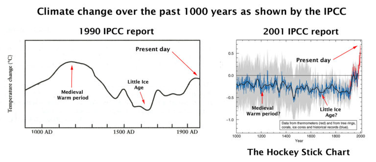
URGENT CLIMATE EMERGENCY!!
US postal charges must be kept down to prevent a climate catastrophe!
Yellow line is a total fabrication of urban heat and data mal-manipulation.
Reality of global temperatures is much closer to the blue line.
b.nice said: “Reality of global temperatures is much closer to the blue line.”
Would you mind posting a link to a global average temperature dataset which publishes monthly values that you prefer? I’ll plug them into my spreadsheet and we’ll see what happens.
Is it just me b.nice or is budgerigarwx’s commenting remarkably similar to belledman and mgc’s posting these last few days?
An astonishing level of similarities. Perhaps a posting method suggested by their alarmist masters?
Of course BEST matches CO2. That is what happens when data sets are adjusted according to how much CO2 is in the air!
But when we use the temperatures as they were measured, suddenly everything makes sense again…almost as if the measurements recorded the actual temperature, and the adjustments are all 100% bogus and fraudulent and done for the sole purpose of propping up a failed hypothesis.
Imagine that.
If you cannot imagine it, that is OK too…because we have it all clearly documented.
All Temperature Adjustments Monotonically Increase | Real Climate Science
That graph was supposed to post as a GIF animation.
This is the other part that did not post:
Nicholas McGinley said: “But when we use the temperatures as they were measured,”
We can certainly do that, but on a global scale it only makes the warming trend higher. If you are interested in details regarding why the adjustments bump up the warming trend in the US while simultaneously decreasing it globally we can discuss that. And if you have any questions please ask. [1].
You must have me confused with one of the gullible uneducated rubes you are accustomed to having discussions with.
Literally every scrap of warmista “evidence” is made up, phony, fake, wrong, and obvious & deliberate fraud.
Every.
Single.
Bit.
You should be ashamed of yourself, supporting this outrage.
It is impoverishing the world, causing an extinction catastrophe for birds and bats, and has done nothing, can do nothing, to lower that one thing which you claim., without evidence, needs to be lowered in order for human beings to control the weather of a planet.
No wonder you do not dare use your actual name.
Nicholas McGinley said: “You must have me confused with one of the gullible uneducated rubes you are accustomed to having discussions with.”
On the contrary I have no reason to think you are anything but a smart educated critical thinker.
Anyway, I’m still very much willing to discuss the adjustments with you. I have large archive of relevant publications that are key in understanding what the adjustments are, why they are needed, and why they cause a bump up in the US and a bump down globally.
Nicholas McGinley said: “No wonder you do not dare use your actual name.”
My name is Brian Gideon. I’m always happy to provide it for those who ask.
BTW…I can read between the lines. I recognize that I must have offended you in some way. It is never my intention to offend comments on the WUWT blog or any forum for that matter. Please accept my sincere apology
Unadjusted HADCRUT, UHA, and AMO, on one graph, below.
It seems that when we remove all of the manufactured warming, IOW, when we assume that the people who have been caught lying and committing fraud, are lying and committing fraud when they alter historical data, it seems that everything is just as it appears in the proxy data, and just as it was reported by everyone in the world prior to the era of global warming alarmism.
Beautiful graph!
Notice how all three datasets (before debasement to impose a trend) show a clear cooling between 1940 and 1980. This alone punctures the central Alarmist hypothesis that CO2 drives temperatures.
Yes, the bogus Hockey Stick charts not only cooled the 1930’s into insignificance, they also downplay the cold of the 1970’s. They have to do that, I understand, in order to cool the 1930’s. It’s a consequence of the bastardization process.
That graph shows it was just as warm in the Early Twentieth Century (ETC) as it is today.
That means that CO2 is a minor player in the Earth’s temperatures since CO2 has been increasing since the ETC yet it is no warmer now than then. Going by the temperatures, you can’t see any extra effect CO2 has on temperatures. More CO2 does not mean higher temperatures.
And currently the temperatues have cooled 0.4C from the 2016 highpoint, all the while, more CO2 is being pumped into the atmosphere with no visible effect.
Now give us the correlation coefficients for a split test ie for the first half and second half of the time series.
Then while you are at it give us the correlation coefficient between the first order increments of BEST and logCO2. Otherwise your R^2 is grossly inflated by the trends. You could do a split test on that too.
Using your logCO2 as a predictor, predict the temperature and then show us the residuals. I strongly suspect post-1965 they will appear random but pre-1965 they will be structured and the AMO signal will be apparent.
Finally, explain why the warming approx. 1910 to 1945 doesn’t fit with CO2
ThinkingScientist said: “Now give us the correlation coefficients for a split test ie for the first half and second half of the time series.”
pre-1965
AMO: 0.28
log2(CO2): 0.39
post-1965
AMO: 0.71
log2(CO2): 0.93
ThinkingScientist said: “Then while you are at it give us the correlation coefficient between the first order increments of BEST and logCO2.”
For Δlog2(CO2) the R^2 is 0.02.
For ΔAMO the R^2 is 0.38
ThinkingScientist said: “Otherwise your R^2 is grossly inflated by the trends.”
Δlog2(CO2) does not have a lot of skill in predicting the yearly ΔT. However, ΔAMO does have limited skill in predicting the yearly ΔT. This is why a model that incorporates both AMO and log2(CO2) have been skill in predicting T than just AMO or log2(CO2) alone. Since AMO is a cyclic process that is known to modulate the variability of temperature it does a decent job of explain the variability. But it does a terrible job at explaining the long term trend. The opposite is true for CO2. It is a non-cyclic process with small but persistent modulating effect so it does a good job of explaining the temperature and its long term job. But it does a terrible job at explaining the variability.
ThinkingScientist said: “Using your logCO2 as a predictor, predict the temperature and then show us the residuals.”
The model is T = 2.5 * log2(C/C0) – 0.4. This yields an RMSE of 0.13 C.
The mean and sd of the residual before 1965 is -0.02 C and 0.14 C.
The mean and sd of the residual after 1965 is 0.00 and 0.10 C.
ThinkingScientists said: “Finally, explain why the warming approx. 1910 to 1945 doesn’t fit with CO2″
It does fit. Just not as well. The R^2 is 0.68. Notice that the residuals during this period show a high bias. Contrast this with the low bias from 1865 to 1900. Remember CO2 is not the only thing modulating the global average temperature. There will be periods of deviation in which the residuals can be partially explained by cyclic modulators.
No warming 1920-1940, no cooling 1940-1980. Why does this temperature series differ so much from the temperature series posted above by Nicholas McGinley?
The graph shows warming from 1910-1945 and cooling from 1945-1980. It is very close to the graph Nicholas McGinley posted despite his being monthly and for the NH only from the discontinued HadCRUTv3.
Why does it show the 1930’s to be cooler than than present day?
Yikes. I apologizes for all of the typos and grammatical errors in that post. I usually proof read, but I had to submit and move on quickly after this one.
Well done, the result for the split test is:
pre-1965
log2(CO2): 0.39
post-1965
log2(CO2): 0.93
R or R^2? if those are R then CO2 is fail pre-1965. As I would expect.
Note the huge difference in fit for the two periods – over fitting post-1965 anyone?
On the increments the R^2 with CO2 is 0.02. Hmmm….bit worrying eh?
As for the period 1910-1945, the forcings over this period in GCMs are 3x smaller than in the period 1970-2005, yet the rates of warming observed are almost identical. The models and CO2 are a poor fit pre-1950 (epsecially on warming rates) but superb from the 1960s. Unless you can provide evidence to the contrary, the null hypothesis would be that natural processes have stationary properties. Therefore CO2 would be expected to fit about as well over any period, as would natural processes. However, the difference in fitting is huge. That’s a bad sign for the models, classic symptom of overfitting. And of course the IPCC AR5 and AR6 models have basically no natural in them at all of any magnitude other than volcanos, which simply give short period cooling impulse functions. None of this other stuff, including AMO, is any AR5 or AR6 forcings.
Finally note in your picture the residuals are structured per-1965 and my Mark 1 eyeball thinks they may be trending down post-1965. But I know what the answers to these points are already having looked at these matters previously with various AR5/AR6 to temp series comparisons.
I always use R^2.
No. The R^2 between Δlog(CO2) and ΔT is not expected to be high since no one seriously entertains the hypothesis that CO2 can explain the variation in T. Because CO2 is a well-mixed non-condensing gas it does not itself vary a whole lot. And it’s modulation on the global average temperature on monthly and yearly timescales relatively small compared to other modulating factors like heat fluxed to/from the ocean and atmosphere. The importance of CO2 is that it’s effect, though small relatively speaking, is always positive and persistent. In other words, the effect accumulates over decadal and higher time scales.
I’m not sure where you are seeing that forcings in GCMs are 3x smaller between the two periods. Can you post more information so that I can see the context?
And regarding the GCM fit you can see that CMIP5 is pretty good. Do you know of alternate model that has comparable to skill in terms of RMSE and R^2 that does not include the outgoing terrestrial radiation blocking properties of polyatomic gas species?
Try explaining why sea level and glacier retreat data directly contradict temperature and climate model data. And why they show a steady linear increase since 1850, with a low amplitude periodic oscillation of period approx 60 – 70 years.
Sea level and glacial retreat are, of course, difficult to adjust.
Explain why the rate of warming 1910 – 1945 is almost indistinguishable from the rate of warming 1970 – 2005 but the logCO2 are very different.
Wood for Trees: Interactive Graphs
CO2 is not the only thing modulating the near surface temperature.
Then how come the fit to CO2 is so amazing post-1965, such that no other modulating influences could have a role? If other things are modulating surface temperature, and we can see them pre-1965 because CO2 performs poorly as a predictor then, how come we don’t see them after 1965?
Note the rate of warming 1910-1945 is almost indistinguishable from the rate of warming 1970-2005. If other processes are acting, how can the rates over the two periods be the same, but the CO2 influence be 3x different (which is what it is in the GCMs over the two periods)?
Did nature suddenly go on vacation in 1965?
You realize you are never going to get an answer, right?
Oh he’ll get answers. Just think of the ‘answers’ as a series of piles of male bovine feces…
That’s ok. Keep asking questions, TS. I like them. I think you are right on the money with your argument. I think you are moving the curtain aside.
TS said: “Then how come the fit to CO2 is so amazing post-1965, such that no other modulating influences could have a role? If other things are modulating surface temperature, and we can see them pre-1965 because CO2 performs poorly as a predictor then, how come we don’t see them after 1965?“
Why would you conclude that no other modulating influences could have role from this data?
Let me illustrate an important point here. You have variables X, Y, and Z that modulate variable A. Those variables and only those variables can ever modulate A. If you study only variable X and observe a very high R^2 for a period it does not mean that Y and Z went on a vacation. It just means that Y – Z ~ 0 (Y and Z sum to something close to zero).
Understanding this concept what hypothesis can you construct that might explain the pre and post 1965 differences?
TS said: “Note the rate of warming 1910-1945 is almost indistinguishable from the rate of warming 1970-2005. If other processes are acting, how can the rates over the two periods be the same, but the CO2 influence be 3x different (which is what it is in the GCMs over the two periods)?”
You answered your own question. Other processes are acting too. CO2 isn’t the only thing modulating the global average temperature at these time scales. I cannot say and stress this enough.
TS said: “Did nature suddenly go on vacation in 1965?”
Not at all. Total solar irradiance continue to change. ENSO continued to cycle. AMO continued to cycle. Volcanic eruptions continued to wax and wane. It’s the same with humans. Aerosol emissions continued to change. In fact there was a dramatic ramp up of aerosols post WWII that offsets a significant portion of the GHG radiative forcing. None of that stuff and a lot I didn’t mention are not included in this analysis.
Well bdgwx, as a professional geophysicist of nearly 40 years standing I don’t need patronising lectures on X, Y Z variables. My expertise is in forward and inverse modelling and geostatistics and stochastic models.
And having spent over 15 years deconstructing the temperautre, GCM outputs, glacial and sea level data amongst others I think I have a reasonable understanding of what makes these datasets tick and what the limitations are.
The problem you have, and the GCM modellers have, with your line of reasoning is this.
Why is this a problem? Because in order to reconcile those points you have to accept either:
(a) That the models are overfitted to the post-1950s or
(b) Natural process simply stopped post-1950s as the model fit is so good to CO2 and leaves no room for other influences.
Only the first of those two options makes rational sense. An examination of the residuals makes that clear, along with comparison of the rates of warming in the different periods.
And just to reinforce the point about the rate of warming being the same in both periods, but the models are 3x different in forcings.
In the IPCC the natural forcings are basically only volcanos and they are trendless. Only picture to hand shows without and without “anthropogenic” for CMIP3 and 5, but 6 is pretty much the same. Natural only is a flat temperature response over time.
The only thing putting trends in from the model perspective is anthropogenic. But it can’t simultaneously fit the same level of warming 1910-1945 and 1970-2005. Square peg, round hole.
Models have no natural trends and overfit post-1950s. Any idiot can do that. But to fit the entire temperature record properly requires natural variation to be much larger and CO2 effects much smaller.
ThinkingScientist said: “Because in order to reconcile those points you have to accept either:”
Your options are not limited to a or b. I present a 3rd option c in which CO2 combined with natural processes is not the only thing that modulates the global average temperature.
ThinkingScientist said: “n the IPCC the natural forcings are basically only volcanos and they are trendless. Only picture to hand shows without and without “anthropogenic” for CMIP3 and 5, but 6 is pretty much the same. Natural only is a flat temperature response over time.”
“Anthroprogenic” is not equivalent to CO2 and CO2 alone. Anthropogenic includes all agents modulated by human behavior including but not limited CO2, CH4, NO2, O3, CFCs, HCFCs, land use changes, aerosol emissions, etc. Aerosol emissions are a huge component in the anthropogenic category which offsets nearly half of the CO2 forcing.
IPCC AR6 WG1 figure 2.10 helps illustrate the attribution. Notice that tropospheric aerosols increase significantly in the early 20th century and even more than offset the positive RF of CO2 just after WWII. In fact the net anthropogenic RF went down to 0 W/m2 1960. It wasn’t until after 1970 when tropospheric aerosols stabilized and began declining after 1980 that the net anthropogenic force began rapidly increasing again.
Another very important point is that of the lagged nature of the global average temperature (GAT) wrt to the total forcing. One thing that is not immediately obvious from a simple analysis like what I’ve done in this subthread is that the Earth energy imbalance (EEI) responds instantly to these forcing factors whereas the GAT does not. The reason is because the GAT has an equilibration time throttled by the rate of heat uptake in the climate system and the specific heat capacities in the various heat reservoirs within the system. It takes several decades for the fast feedbacks to reduce a positive perturbation in EEI to close to 0 W/m2. In other words, models that do not take the lag into account will have their skill suppressed somewhat.
Not sure what you are arguing about on the anthro side. I am aware of all the various forcings and have worked with them in multilinear regressions. You can reproduce the model output with to R=0.96 with just the sum of all anthro + natural.
But the point is natural is trendless, according to IPCC. I posted the chart already, the IPCC natural only model output is trendless. Natural is basically cooling spikes from volcanos, according to IPCC.
In my view the models are overfitted post-1950s and don’t fit pre-1950s. In temps I see a linear trend + 2 cycles of about 60-70 years imposed. In Glacier and sealevel data, which go back further, I see linear trend + 3 cycles. Using forward modelling, I can fit the glacial retreat data better with a linear trend + sinewave model than any of the temperature outputs from GCMs for AR5 or AR6. Modellers are basically fitting the latest cycle (post1965) entirely with anthro (predominantly GHGs) and miss the earlier cycle. That’s an overfitted model. Because the IPCC have no other natural forcings, they will never reconcile the issue.
Note also the IPCC (certainly up to AR5) only claimed post-1950s caused by humans. Everything else largely ignored. Why? Because they can’t explain it.
Here are the AR5 model versus temp residuals. The residuals are structured and periodic. That is a clear indication the models are incomplete.
And here’s a final point as I have work to do.
The GCMs are basically an attempt at forward modelling from the forcings. The result is only revealed by averaging the models. But the model average can be reproduced almost completely by simple linear regression of the forcings (eg Willis in a recent article at WUWT, Pat Frank in his published paper). So models don’t really do anything other than convert input forcings to temps and add random noise. The models are only driven by the prior forcings, nothing else. No further information is added. They are a smokescreen (although I don’t think the modelers really get this).
How do we see this? By subtracting the model mean from the individual models. Below is a picture for the main 39 models from KNMI for AR5 with the mean model subtracted. Note the spread of the models in temp is 3.5 degC, larger than the entire temperature record. The residuals for each model are unstructured noise.
The mean model response is determined solely by the input forcings, so the fit to temps is already in the prior model and is as good as it can get. The models are circular nonsense. You cannot prove anything by forward modelling from a prior and as the model output can be trivially computed by linear regression from the inputs they are pointless.
This then raises another question: how/where does the noise originate inside the models?
I think you have asked this of me before. I don’t know as I don’t run these models. Numerical instability is one possibility, or round off errors.
All the models do the same thing because they are forward models so they can only do what the forcings (and their coding) say. Without input forcings the models would do nothing (if they are numerically stable).
We see the mean of the forcings by averaging the models. Averaging is effectively a low pass filter, all we then see is the input prior.
The problem here is that you cannot prove anything by forward modelling. Conversely, inverse modelling would only give the average forcing and no attribution. The IPCC problem is all the positive trends are assumed (a priori) to be anthropogenic. Clearly that cannot be true because the forcings are about 3x larger post-1950s than pre-1950s yet the warming observed in the two periods is almost identical.
The models cannot be right in one period and wrong in the other and still have credibility.
Very much liked your analysis.
I’ve always had a problem with the climate models. As Pat Frank pointed out long ago they basically devolve into nothing more than a linear equation, ala y = mx + b, that continues forever. Thus the idiotic conclusion by the CAGW crowd that the Earth will turn into a burnt cinder from increased CO2. No recognition of cyclical processes over long periods of time and no recognition of the logarithmic response of CO2 levels. There *has* to be more than just CO2 or the earth would have become a burnt cinder long, long ago!
That chart you show, bdgwx, is a perfect example of Data Mannipulator lies about the Earth’s climate. You show the true temperature profile of the Earth in blue, and the bastardized temperature profile in black.
the true profile shows we have nothing to fear from CO2.
BEST is a bunch of crap before the satellite era.
The global average temperature is in black.
The AMO is in blue.
Just wait:
Our resident thermageddonists will come barging in to tell us that we’re all blind and if we had our CAGW goggles on we’d be able to see a hockey stick curve, just like they can.
All the Usual Suspects are showing up to defend the hockey sticks.
Yep, Bodywax and Bellend have turned up right on cue to tell us that actually the temps have been rocketing skyward and we’re all going to die. Aiieeeee!!!
I assume you are referring to me?. If so, I get +0.14 C/decade over the last 40 years with UAH. I have no idea if that fits anyone’s definition of “rocketing skyward” though. And the warming trend isn’t the primary focus of my two main posts. Those would be the challenge that the warming trend is weakening and that the AMO is a better fit to the temperature than CO2.
My challenge to you, as I’ve mentioned elsewhere on this thread, is to give us all some empirical proof of CAGW. So far, no one’s found any
BTW models aren’t proof
I don’t know what CAGW is to you. If it is 1+ C of warming under an RCP4.5 or higher scenario then I can probably meet the challenge. If it is that all humans will cease to exist by years end then I will not be able to meet the challenge.
1 Deg of warming? Can’t wait. A warmer and wetter world. What’s not to love? It sure beats cold, famine, and starvation.
And it’s already happened. Nothing catastrophic occurred.
No catastrophe means no problem, doesn’t it?
You want to be careful: you’ll get cancelled by your fellow censorious thermageddonists for admitting the whole CAGW scam isn’t a real problem.
And now a word from Mikey Mann.
No hockey stick could possibly ‘make‘ your head look fat.
It is your ego that balloons your head far beyond most people’s houses.
On Mikey Mann’s personal website he has a whole page chock full of HD photos of himself in case anybody wants to use them for a puff-piece about the great man. His ego is the size of a very large planet.
He’s a pathetic little man.
He’s the modern-day Trofim Lysenko.
I wonder whether, in the small hours, he realizes he is a fraud, and his entire career has been based on a lie. Perhaps this explains his aggression and litigiousness.
Yes, Michael Mann represents some strange psychology.
How do they know 2.5 degree warming is “better” than 3.5 degrees. So far warming has been nothing but beneficial and history tells us cold periods are what we should fear. Never mind that the ones touting CAGW have no evidence that human CO2 emissions are anything more than a minor contributor to the warming we see. And no, climate models are not evidence, they are theory. Without rigorous validation against real world data the models are just a political fantasy designed to support favoured narratives and policies. John Kerry swore up and down that we must not pass 1.5 degrees, up till the point that it was politically unsustainable to do so and then he just adjusted the number for his own convenience. So clearly he is not a source of science or truth – just another talking puppet for socialism.
2.5 is better politically than 3.5. Less wood on the CAGW Hysteria Fire.
You pretty much nailed it. Freeman Dyson said a number of years ago that climate models are useless. He said that any models of the Earth need to be holistic to be of any real use, not just an attempt to forecast temperature using models whose uncertainty is wider than the temperature difference trying to be identified.
If a rising average temperature means more food, fewer climate related deaths, and a better standard of living then why try to limit the rise in average temperature. A “global average temperature” doesn’t even tell you what is causing the rise! Is it rising minimum temps? Rising max temps? A weighted combination of some kind?
P Gosselin said: “A “Weakening Warming Trend Of The Last 40 Years Is Apparent”, Says German Expert”
I did a 2nd order polynomial regression which says the warming trend over the last 40 years is actually accelerating albeit only barely.
Using UAH6 – per the poster – and starting in 3/82, mine shows it decelerating at ~ -0.000025 deg*year^-2*. I.e., also, “only barely”. But the magnitude of the standard error of that acceleration term is over 5* it’s value. So, the best indicator of the “Weakening Warming Trend” doesn’t indicate that at all.
It took me awhile to figure out the discrepancy. Apparently I analyzed 1982/01 through 2021/12 (which is a 40 year period) which does have a slightly positive x^2 fit. That was unintentional. I actually meant to do 1983/05 to 2022/04 which I can confirm has a slightly negative x^2 fit.
How do you know that using a second-order fit isn’t over-fitting the data?
I don’t necessarily think a 2nd order polynomial fit is the best way to test for “weakening warming trend”, but it was simple and easy for me to do quickly. I’m certainly open to other objective tests.
Maybe Andy May would use the method he imagineered a little over a month ago for sea level data. Oh, BTW Mr. May, I check back every few days to see if you have yet applied it to time periods with a modern amounts of cumulative and accumulating GHG’s. I.e., 1960 or 1970 or 1980 to present. So far, nada….
https://wattsupwiththat.com/2022/03/22/ar6-and-sea-level-part-3-a-statistically-valid-forecast/#comment-3482835
https://wattsupwiththat.com/2022/03/22/ar6-and-sea-level-part-3-a-statistically-valid-forecast/#comment-3482145
Here an idea—do an eighth-order polynomial fit!
Go for it!
CM said: “Here an idea—do an eighth-order polynomial fit!”
Here are the coefficients for 1982/05 to 2022/4.
^8 = 4.68e-19
^7 = -1.1e-15
^6 = 1.01e-12
^5 = -5.1e-10
^4 = 1.48e-7
^3 = 2.5e-5
^2 = 0.0024
^1 = -0.11
So you do polynomial fitting without looking at the results.
No wonder you are so confused.
Carlo Monte implied an honest question here. And who knows, it might be his first teachable moment in this forum.
We checked out quadratic fits because it is the single best way to evaluate the central posit of this WUWT post. The smaller the magnitude of the expected value of the acceleration, and the larger it’s standard error relative to that expected magnitude, the weaker is that posit.
I don’t count on lightning to strike here, but hope springs eternal.
Why is it, blob, not one of your ilk (you know who you are) dares to question Mickey Mann’s tree ring thermometer and the hockey stick?
Word salad Bob on the job.
I had the same idea, and did the same thing. I went from start (12/78) to end, though.
I got positive curvature as well.
“I did a 2nd order polynomial regression which says the warming trend over the last 40 years is actually accelerating albeit only barely.”
That sure is the truth. Absolutely minuscule. Almost not even there. just noise + random fluctuations.
It is hardly a wonder that a small change in the start date would set the curvature swinging back and forth between positive and negative. The curvature is so minuscule, just a few points near the end can yank it around.
I marvel at the -15 rating on this comment (as of now). bdgwx simply did a reasonable thing and checked the data. I did too.
It looks like at least a few readers here still do not like facts and simple calculations. Too bad.
bdx gave a meaningless (pre-concieved) conclusion, based on an imprecise data set;
and the (perceived) reason being that bdx wanted to cast doubt on the subject post …
Let me be clear. I am challenging Pierre Gosselin’s statement “A “Weakening Warming Trend Of The Last 40 Years Is Apparent”, Says German Expert”. The only global average temperature dataset referenced in the post was UAH. I’m not the one who selected it. I just tested the statement with 2nd order polynomial regression which shows that the warming trend has not “weakening”. If you feel that UAH not precise for this kind of analysis then you need to let Pierre Gosselin and WUWT know so that they can retract the article.
The data set is not precise enough to utilize, as a verification of your (originally unstated) premise.
Premise: rate of warming over last 40 years is not decreasing … it is increasing.
Bunch of stuff: ……………
Conclusion: The premise is ‘barely’ correct, based on the input data set (‘barely’ being defined as so small it is meaningless).
The premise is “A Weakening Warming Trend Of The Last 40 Years Is Apparent”. It’s not my premise. It is from Pierre Gosselin. And if the dataset mentioned in the article is not fit test the statement then perhaps Pierre Gosselin should not have stated it in the first place.
AMO & associated temps are in decline.
Sea ice … not in decline.
Temp rate is flat (or ‘barely’ not, or slightly negative, or slightly positive …)
-27 (and counting)
As bigoilbob pointed out above the statistical uncertainty on the acceleration term of the trends is larger than the magnitude. That means the trends have no statistical “weakening” nor “strengthening” component. In other words it is fairly steady +0.14 C/decade over both 1982/01-2021/12 or 1982/05-2022/04.
Prove the warning’s not natural. Oh yeah, you can’t. End of story.
“Prove the warning’s not natural.”
Boy, these motorized goal posts are selling like hot cakes in this fora. I’m sure they’re on Alibaba, but even with 27% off, I don’t want 50 of them..
Seriously, stop drinking so heavily in the morning.
Does the warming have to be non-natural for the trend to be something other than “weakening”?
The trend can be anything, but you can’t prove it’s anything but natural and nothing to do with someone driving an SUV.
I think the abundance and consilience of evidence can falsify the natural-only hypothesis. But that’s not relevant to Pierre Gosselin’s claim that the warming is weakening.
When you’ve found some empirical proof of CAGW, get back to me.
I don’t know what CAGW is. It doesn’t seem there is a widely accepted definition here. I’ve asked before and the definitions ranged from all humans would cease to exist this year to only 1 C of warming. Not that it matters because presenting evidence either for or against CAGW would not say anything about whether the warming trend is weakening.
All we want is some actual evidence that CO2 has an effect – any effect – on temperatures. So far, you have merely presented that drivel from Sherwood et al, which is based on computer models and statistics.
I’ll give you the same response I gave you the last time. IPCC AR5 WG1 pg 721-730. It’s by no means an exhaustive list of evidence, but it is reasonably comprehensive. I encourage you read the whole report as well. It is only 1500 pages and is pretty easy read (relatively speaking) so it won’t take much time to get the high level overview. You can then spend a lifetime (or as much time as you want) taking the deep dive into the 9200+ direct lines of evidence and the hundreds of thousands of 2nd and 3rd order lines of evidence at your discretion.
You know exactly what it means: catastrophic anthropogenic global warming. So far, we haven’t had the much promised catastrophe. As far as I’m concerned, no catastrophe, no problem. You should stop getting your nickers in a twist about a non-problem.
I know what the letters stand for. I’m saying I don’t know what delineates AGW from CAGW. Is there a threshold of warming for the later? Is there a cataclysmic event involved in the later?
“I’m saying I don’t know what delineates AGW from CAGW. Is there a threshold of warming for the later?”
According to the UN and the rest of the signatories to the Paris Agreement there is. In fact, according to these pseudo-omniscient bodies there are two.
The first one comes at just over 1.5⁰C above the pre-industrial global mean temperature and is possibly survivable if everyone on the planet converts to using carbon-free everything, changing their diets to vegan and/or insectivorous ones (yum, yum), and stops all activity (including industrial) that cannot be powered by windmills, water-mills, solar panels, tidal barrages, wave-power, geothermal energy, bio-mass, or nuclear. The nature of the proposed catastrophe is called ‘climate chaos’.
The second one comes at 2⁰C above pre-industrial and would not be survivable because it implies the heat-death of the planet due to runaway global warming.
I’m surprised that you claim not to know this because it’s been streaming out of every mainstream media orifice 24/7 for years now. I think you must need to get out more and find out what’s really going on in this mad world that you have chosen to inhabit.
I don’t know what CAGW is. It doesn’t seem there is a widely accepted definition here.
There’s probably no “widely accepted definition” because the alarmists who want to stop it can’t seem to settle on exactly what it is.
But let me ask this: What, exactly, are we supposed to “stop”, and why?
TonyG said: “But let me ask this: What, exactly, are we supposed to “stop”, and why?”
I don’t know. That’s a policy topic. I do not engage in policy discussions.
That’s a policy topic. I do not engage in policy discussions.
Seems a bit of a cop-out to me, given the scale of those issues and their impact on practically all of the discussion around this subject. It’s an integral part of the issue.
It is a cop-out, he treats this stuff like measuring density of angles on pins.
“I do not engage in policy discussions”
Well, that’s rather pompous.
The whole CAGW scam is all about policy. No policy and you’ve got no climate grifters ripping off the general public.
In other words, you are saying that AGW is academic and of no practical consequence that would engage your interest.
Yet whenever asked for actual scientific evidence..
… .. all the AGW scammers and their useful-idiot followers do, is blather and rant.
Follow the money in explanations for slow policy response to emerging reality.
Is this the same “expert” who ten years ago was predicting a cooling of 0.2°C by 2035?
Going by the rule of arbitrary trend calculation and ignoring all uncertainty, the UAH warming since 2012 is +0.3°C / decade.
Only 0.3C? We need more GW. Palm trees would look great in the North Woods. I can’t wait
to hit the beach in my Hawaiin shirt holding a mai tai! Bring it on! 😮
https://wattsupwiththat.com/2010/12/05/has-charles-dickens-shaped-our-perception-of-climate-change/
Yes, and I reckon this trend has a inverse correlation with Bitcoin prices.
Some people have more anxiety about how the temperature graphs dip and spike than others do about how stock markets dip and spike.
The difference is – reality only applies to one of these constructs.
I’ll leave you to figure out which one is worth worrying about.
Doing an online search for “rule of arbitrary trend calculation” does not produce any hits. Just what do you mean?
https://academic.oup.com/bja/article/115/3/337/312358?login=false
Bellman sometimes lets me take the easy ones. I also have not heard the term. But from context I think he is referring to the expected trend results with no consideration of their uncertainties.
B, since I’m barging in here, feel free to set me straight. BTW, your 2012 on trend is not only spot on, but is more statistically durable than the comparable fit for the last 40 years.
Correct, though I don’t think starting in 2012 makes much more sense than starting in 2015. It just illustrates how easy it is to get contradictory short term trends. Though it does illustrate that so far we are not seeing any indication of the predicted 0.2°C drop by 2035.
Last November we were not seeing any indication of the predicted stock market reversal.
It’s a rule I’ve discovered based on the many articles posted here where an arbitrary trend over a short period is used to prove some point. It treats any OLS trend as being the unarguable truth, provided it is being used to confirm an existing bias. It ignores any uncertainty in the warming rate, it ignores the fact that it doesn’t join up with the previous trend, it ignores what this new trend does to the long term trend, it ignores the fact the trend was carefully chosen to get the desired outcome (the end point fallacy as someone once called it).
In this article it is used to prove the idea that a weakening trend is apparent, in others it is used to prove there has been a structural break in the global climate, and in many others it is usd to claim global warming has stopped or at least paused.
Irony alert! AGAIN!
I’m glad you spotted the irony.
No, you missed it, as usual.
So, your were circularly referencing Bellman’s Rule, despite no one being familiar with it. There always have to be bounds to a problem, such as the limits of integration. As long as the purpose of the trend analysis is clearly stated, such as Monckton does, then it is perfectly valid. It is up to the individual reader to infer what the ultimate meaning is.
One can reasonably expect that in a world with changes in geology and climate that trends will change with time. The effects of the changes have to be placed in the context of how they impact things that are of importance to people.
Since when do any alarmists provide uncertainty to their warming trends?
I’ve had enough experience with trying to forecast growth in telephone central office usage to know that short term trends many times become long term trends. For example, a neighborhood may have had straight-line growth for several years. It’s really easy to fall into the trap of ignoring one or two years where the growth rate decreases assuming the straight line growth will soon resume – but it doesn’t and you wind up over-provisioning equipment. Like the earth’s temperature, demographic trends have many, many factors (job availability, housing availability, infrastructure degradation, etc). You need to understand *all* of those factors before dismissing something as “noise” in the natural progression of things.
CO2 and other GHG’s are just ONE factor in the equation that describes the biosphere of Earth – and it isn’t apparent that the CAGW scientists and the climate models are even cognizant of the myriad other factors!
“So, your were circularly referencing Bellman’s Rule” I wouldn’t want to take any credit for it – call it Bellend’s Rule if you want. That seems more appropriate.
It was a joke. I was hoping people would realize that when I say I’m using an arbitrary trend and ignoring all uncertainties, they should not take the trend seriously. For a bonus I might have hoped that any skeptic would have seen I was doing exactly what the “German expert” of this article was doing in order to make apparent the supposed weakening of warming trend.
“Since when do any alarmists provide uncertainty to their warming trends?”
I don’t know what alarmists you are taking about. Scientists certainly should do that, all the IPCC reports I’ve seen indicate the uncertainty. e.g. from AR5
Bellend,
Fortunately for us, Roy Spencer (the Roy Spencer responsibe for the UAH satellite temperature) has computed the trend over the entire length of the satellite record.
It’s 0.13 degrees per decade (over ocean and land).
https://www.drroyspencer.com/
You know quite well that the trend over decadal time scales varies dramatically and is not a reliable indicator of a long term trend. You’re being dishonest.
“You know quite well that the trend over decadal time scales varies dramatically and is not a reliable indicator of a long term trend. You’re being dishonest.”
But the claim of this article, based on that UAH data, is that the trend is slowing down. How can you test that without calculating recent trends?
It slowed down slightly with UAH since it was .14C/decade now it is .13C/decade the change was January 2022.
Nick, the observation by Fritz Vahrenholt was a qualitive assessment, not a quantitative one. Suffice it to say that not one temperature trend estimate comes close to the fancifully high UN IPCC CliSciFi models’. All the rest is dick-dancing. Anyway, UAH6 42+ year trend of 0.13 ℃/decade was made during a warming portion of an approximately 70-year cycle. It appears it is possible that we’ll stay within the fearsome 2 ℃ limit by the year 2100 even without worldwide Nut Zippy.
You can’t, and if you see a small deceleration in such a short, noisy data set you probably can’t claim it to be meaningful. Just exactly like the alarmists who are always claiming to see some (tiny) acceleration.
One clue that you’re dealing with an amateur (or a shyster) is if they calculate a trend without calculating a confidence interval and then extrapolate the trend over long times as if it was meaningful.
“One clue that you’re dealing with an amateur (or a shyster) is if they calculate a trend without calculating a confidence interval|”
Well, this WUWT articles is all about trend, and claiming to identify a decline in it. The second fig explicitly shows one. Where are the confidence intervals?
Pierre Gosselin, Kalte Sonne, Fritz Vahrenholt, and WUWT don’t seem have a problem with calculating trends over an 88 month period from 2015/01 to 2022/04. That is provided in figure 2 in the article.
Correct, a trend of a few years does not contradict the long term trend, until there is statistically significant evidence to support it. Finally we agree on something.
One question with all these short term trends should be what effect if any has it had on the long term trend. What was the trend up to 2012 or 2015. I’ll have to check, but I’m pretty sure in both cases it was less than 0.13°C / decade. This does not suggest that there has been recent weakening of the trend.
Trends that rely on El Nino events that are not caused by human CO2.
In reality, there has been no warming for some 38 of the last 43 years.
No warming from 1980-1997 (17 years)
No warming from 2000-2015 (15 years)
Cooling since the 2015/16 El Nino (6 years )
“Trends that rely on El Nino events that are not caused by human CO2.”
You mean like the trend from 2015 which relies very heavily on the 2016 El Niño and the current La Niñas to get a flat trend?
“In reality, there has been no warming for some 38 of the last 43 years.”
Yet still it warms.
“In reality, there has been no warming for some 38 of the last 43 years.“
Is this a watermelon growth curve?
Paging Carlo Monte’s creators, your language processing routine is on the blink again.
This is the best you can do for an insult?
Not surprised.
Sorry if my jibe wasn’t up to your usual standard. Next time I’ll just tell you to stop whining.
But I would still like to know what you meant by a “watermelon growth curve”.
You figure it out, you’re the expert on absolutely everything,
You flatter me. I’m not an expert on anything. I’m sure you are a far more experienced melon farmer than I.
What of the naturally (non-CO2) driven warming trend between about 1915 and 1945? It was of about the same magnitude and duration of the late 20th Century warming for which the UN IPCC CliSciFi climate models were tuned to assert a CO2-driven high ECS. Observationally derived ECS’s are coming in less than 2 ℃.
Except the “long term” trend is 10,000 years and it’s all down hill. You guys act like you know something but you playing stupid games over an almost irrelevant climatic time scale. We all know where this heads and that’s the next glaciation and none of your BS changes that. Nick knows it but for some reason he’s yo stubborn to say it, but the 3 Bs are just a bunch frauds trying to snow people.
He’s a lot more accurate than the standard “We only have ____ yrs before we’re beyond the
tipping point”/”The Arctic will be ice free in ____ yrs”/”the children won’t know what snow is”/”…
memes. How are they working out for you? 😮 😮 😮
Are we going to start laughing people off the stage that have made ridiculously false claims in the past? Good! That would thin out the Malthusian Leftist mob quite a bit.
No. You should laugh him of the stage because of lack of any actual evidence for his claim that there is a weakening warming trend. But this article makes it a headline that he is an expert, without saying what his expertise is.
Isn’t that much higher than the standard used by Warmistas as they fawn over Greta,
AOC, & Algore? You should’ve quit when you were only a little bit behind! 😮
The 21st Century is warming far less than the last quarter of the 20th Century. I’d say that indicates a weakening warming trend. Why else were the CliSciFi practitioners freaking out over the Pause?
It would help to understand your point if you didn’t keep making up this silly nicknames. I’ve no idea who these CliSciFi practitioners are, who are freaking out of the pause. The only people I see who even think there is a pause are Lord Monckton and his followers.
But to your point, what data set are you using?
Using the Skeptical Science Trend Caclulator for the 2 sigma uncertainty values I get
GISS 4
1975 – 2000: +0.16 ± 0.08°C / decade
2001 – 2022: +0.21 ± 0.10°C / decade
HadCRUT 4
1975 – 2000: +0.18 ± 0.07°C / decade
2001 – 2022: +0.15 ± 0.09°C / decade
UAH 6
1979 – 2000: +0.14 ± 0.14°C / decade
2001 – 2022: +0.14 ± 0.13°C / decade
Bellman,
I find the Viscount Monckton method for calculating the duration of a zero trend to be credible. What other method is better?
There is an overall problem with all temperature/time data sets, which is the inability to go back in time to find data and events that allow a meaningful calculation of uncertainty.
It is non- scientific to accept uncertainties that include made-up infilled values, using guesses to estimate uncertainty.
The lack of ways to collect uncertainty data for UAH means that present uncertainties are likely to have missed some relevant effects and therefore are optimistic. The best that can be done has been done, like comparison with data from rockets, but closure still awaits.
In the absence of definitive uncertainty terms, all assertions about trends are capable of easy challenge. Geoff S
“I find the Viscount Monckton method for calculating the duration of a zero trend to be credible.”
There’s nothing incredible about how he finds the longest zero trend he can. But that’s all he’s doing, just a meaningless number game.
I’m not statistician, but I do understand that the purpose of statistics is to try to show skepticism. Are you seeing something that might be real or is it just fluctuations. A classical approach is to describe the null-hypothesis and then establish that the result you see would be unlikely to have happened under the null-hypothesis. Monckton does nothing of the sort, he just asserts the trend exists and is this long.
I would suggest the most basic hypothesis test is, is the trend I am seeing different from the previous trend. The null-hypothesis is they are the same, and if you can show that it the difference is statistically significant it is a first step towards demonstrating something interesting. But he can’t show that, it’s just not true. The short pause is just too uncertain to be significantly different to the previous trend. There is insufficient evidence to rule out the possibility that the trend continues unabated, or even that it has not greatly accelerated.
That doesn’t mean you can rule out the possibility that warming stopped in October 2014 or whenever, it’s just that so far there is insufficient evidence to support it.
As always, the clue resistance is of the highest order.
The alarmists claim that rising CO2, in particular anthropogenic CO2, is directly responsible for increasing temperatures.
If seven years elapse without a statistically significant rise in global temperatures, it seriously challenges the ‘Control Knob’ hypothesis when the annual CO2 concentration is rising monotonically. The trend will almost certainly eventually change, and it will probably (but not certainly) be an increase. The important thing is that several years of temperature being uncoupled from CO2 concentration strongly implies that there is little or no correlation between the two, meaning that CO2 has little practical value for predicting the variance in future global temperatures. The longer the two are de-coupled, the greater the probability that CO2 has an insignificant impact on global temperatures. I have previously demonstrated almost no correlation between annual and monthly anthropogenic emissions of CO2 and global mean temperature. However, there is a correlation between warm El Nino events and global CO2 concentrations, with no physical explanation of how CO2 could cause El Ninos.
“The alarmists claim that rising CO2, in particular anthropogenic CO2, is directly responsible for increasing temperatures.”
I think that’s quite likely, but I don’t know if you think that makes me an alarmist. Alarmists are often going on about an impending ice age, or the collapse of civilization due to green policies.
“If seven years elapse without a statistically significant rise in global temperatures, it seriously challenges the ‘Control Knob’ hypothesis when the annual CO2 concentration is rising monotonically.”
I don;t know why CO2 rising monotonically keeps being mentioned. It’s not true for a start, there’s a seasonal cycle which I thought you were aware of.
Nor am I sure why you think the statistical significance of any temperature rise is important. There will have been no statistically significant warming for much longer than seven years, and there always will be.
The real question is, is there any statistical correlation between rising CO2 and temperatures? The answer is yes (which does not prove causation of course). Claiming that seven years can refute that is hand waving nonsense. Even if there had been no rise in temperatures in 7 years it’s unlikely to damage the overall correlation, but as I keep trying to suggest, it’s not true to say temperatures haven;t warmed over the last 7 years. Temperatures over that period have been somewhat warmer than previous years, temperatures are still rising in line with the CO2 increase, it’s just you can’t see it if you only look at a small part of the trend through a keyhole.
“I have previously demonstrated almost no correlation between annual and monthly anthropogenic emissions of CO2 and global mean temperature.”
Which is another example of looking for answers in all the wrong places. Why would you expect to see a correlation with emissions? The temperature doesn’t know how many emissions there were, it responds to the total CO2 in the atmosphere.
“However, there is a correlation between warm El Nino events and global CO2 concentrations”
Correct. As I keep saying, predictions of next years CO2 levels use this effect.
“with no physical explanation of how CO2 could cause El Ninos.”
Nobody, as far as I know, has ever claimed increasing CO2 causes El Niños. Although it would seem likley that if the greenhouse theory is correct, if there was no CO2 there would probably be no El Niños.
“I don;t know why CO2 rising monotonically keeps being mentioned. It’s not true for a start, there’s a seasonal cycle which I thought you were aware of.”
The model’s resolution is not seasonal but annual. The forcing in the model’s is annual growth in CO2, not seasonal.
True, but when I mentioned annual values to Clyde before, he insisted you couldn’t ignore the seasonal cycle.
My problem here though, is that people keep saying monotonically increasing, when I think they mean something else – maybe they mean linearly increasing. Using monotonically increasing to explain why it’s inevitable that linearly increasing temperatures will correlate with CO2 makes no sense.
“True, but when I mentioned annual values to Clyde before, he insisted you couldn’t ignore the seasonal cycle.”
You can’t ignore seasonal cycles in determining annual emissions nor in determining monthly resolution. You are just deflecting. Stop it!
My problem here though, is that people keep saying monotonically increasing, when I think they mean something else – maybe they mean linearly increasing. Using monotonically increasing to explain why it’s inevitable that linearly increasing temperatures will correlate with CO2 makes no sense.”
A monotonic function is always increasing or decreasing. It doesn’t have to be a linear increase or decrease nor does it have to be a constant slope. E.g. y = x^5 is always increasing (i.e. first derivative = 5x^4) but it is not linear.
A function that has a slope of zero is not monotonically increasing and cannot correlate with a function that does. If CO2 is always increasing then it is a monotonic function and then it cannot positively correlate with a function that is not monotonically increasing – i.e. temperature that has long pauses with a slope of zero. It’s why Monckton’s analysis of the pauses is so important.
Your ability to drag what was only a passing observation always fascinates me. As I said it’s irrelevant if CO2 is increasing monotonically or not.
“A monotonic function is always increasing or decreasing.”
Thanks, but I know what monotonic means, hence my observation about the seasonal cycle.
“A function that has a slope of zero is not monotonically increasing and cannot correlate with a function that does.”
Pedantically that’s wrong. A slope of zero can still be monotonically increasing or decreasing. What you are thinking of is “strictly monotonic”.
I suspect you are wrong on the second point, but I’ll have to think about it.
“It’s why Monckton’s analysis of the pauses is so important.”
You’ve still yet to show any analysis that the “pause” proves there is no correlation between CO2 and temperature. You surly cannot think that you can ignore all uncertainty and say a short period of lack of correlation proves that no correlation exists.
“Pedantically that’s wrong. A slope of zero can still be monotonically increasing or decreasing. What you are thinking of is “strictly monotonic”.”
You are nitpicking in an attempt to avoid the actual issue. CO2 increasing while temperature is not doing so is no correlation at all. A seven year pause is *NOT* insignificant. A monotonically (or strict monotonic if you must) increasing function with a positive slope everywhere is *NOT* correlated at all to a non-monotonically increasing function whose slope is 0. A linear trend line has a constant, non-zero derivative. A non-linear trend line, e.g. ax^3, has a non-constant derivative that *can* be zero. (first derivative of ax^3 is 3ax^2, when x=0 the derivative is zero). Now you tell us just how mx and ax^3 can be correlated.
According to the IPCC, CO2 does have a positive, non-zero slope everywhere. Temperature apparently does not. So how can they be correlated?
I am not the one ignoring uncertainty. Neither the effect of man-made CO2 in the atmosphere or the “global average temperature” can be measured with an uncertainty interval sufficient to make the claims that are made for them, including them being correlated.
It seems to be *YOU* that believe the “global average temperature” can be measured accurately enough to support a monotonic increase for it (while continuing to ignore the pauses) and claim that it is correlated to the man-made CO2 in the atmosphere.
I think that you are taking my comment out of context. I’m sure that I was pointing out that any two time-series that have a trend will show a correlation. However, to establish cause and effect, one has to take the flux rate and see if they correlate.
I used “monotonically” in the same sense as explained by Tim, below.
“I think that you are taking my comment out of context.”
Possibly, I think what I was thinking of was this comment which was about detecting human emissions on a monthly scale.
“Claiming that seven years can refute that is hand waving nonsense. “
Why is it nonsense? As usual you change the issue. The issue is does CO2 act as the thermostat? If you increase the setting on your thermostat but the furnace never turns on then is the thermostat actually controlling the furnace or is something else?
“As usual you change the issue. The issue is does CO2 act as the thermostat?”
And nobodies done any analysis to demonstrate why the pause refutes that hypothesis. It’s just claimed it must, hence hand waving.
“If you increase the setting on your thermostat but the furnace never turns on then is the thermostat actually controlling the furnace or is something else?”
A better analogy would be, if you have been slowly increasing the thermostat and seen temperatures rise, then you increase it a little more and see a brief period where there is no rise in temperature does that prove the thermostat has never worked. Especially when you know that the temperature shot up at the start of the pause when you opened the oven door, and cooled down later when someone opened a window.
The pause itself refutes the claim that CO2 is the thermostat.
You don’t state whether the past changes have seen a pause before the temperature rises. You have a poorly designed analogy. At least my analogy is self-consistent.
The thing is, if the furnace and thermostat are working properly, and the furnace usually turns on within less than a minute when turned up, and nothing has happened after 1/2 hour, a reasonable person will assume that there is a problem.
We know from the seasonal cycle of CO2 that there is at most a couple of weeks of lag time between changes in photosynthesis and changes in the atmospheric CO2 levels. Therefore, if there has been a monotonic increase in annual CO2 levels over the last 7+ years, and there has not been a similar increase in global temperatures, a reasonable person will question the assumed driving efficacy of CO2.
The question isn’t about the when the furnace comes on, we can’t see that, it’s about what we can infer from the temperature.
And to make this analogy complete, we’ve been slowly increasing the thermostat up over several hours. We’ve seen the temperature increase roughly in line with a adjustments. Roughly because eternal factors cause short term changes, but the thermostat ensures that temperatures eventually return to their expected value. 1/2 hour ago someone turned on a second heat source which caused a sudden surge in the temperatures. The furnace turned off and it started to cool back to the set temperature (which remember we keep increasing slowly), then just as it was almost back to the current setting, someone opened a window and the temperature dropped down below thermostat setting. At which point someone notices that the trend over the last 1/2 hour was flat, and so jumps to the conclusion that the heating system had never worked, and there must be an alternative reason why temperature had been warming over the past few hours.
“someone opened a window”
Most people would go looking for the source of the alternative temperature control – be it a window or whatever. But the CAGW advocates and climate scientists never do. They just assume that since the temp has always gone up that it will continue to do so and massage the data to make it look that way – even in their models.
If the window is that strong of an influence on the temperature and you never go looking for it then how do you know it will ever be closed? Perhaps it will remain open forever!
“Most people would go looking for the source of the alternative temperature control – be it a window or whatever. But the CAGW advocates and climate scientists never do.”
People have been investigating ENSO for decades. Even WUWT and Monckton mention it as having an effect on temperatures. For some reason, you seem to have never heard of it, or believe it cannot cause short term warming and cooling.
“They just assume that since the temp has always gone up that it will continue to do so…”
Nobody says that. Well, apart from some here including Monckton who will occasionally say the it’s been warming for the last 300 years, and that explains all the warming we’ve seen.
“If the window is that strong of an influence on the temperature and you never go looking for it then how do you know it will ever be closed? Perhaps it will remain open forever!”
A permanent La Niña would certainly raise questions, especially if temperatures continue to rise.
As far as hand waving is concerned, I’ve yet to see any mention of how much CO2 actually increased over the pause, and what thy think this should have increased the temperature to. Let alone make any any estimate of how much the current temperatures are a departure from this.
For example, CO2 has risen by a little under 5% over the pause period, as a log2 this is around 0.07 on the way to doubling. The transient climate sensitivity is estimated to be between 1.0 and 2.5°C. So assuming it was at the the upper end of this range you might expect 0.18°C of warming, everything else being equal.
If you look only at the pause period and say there has been no warming, then you need something that might have caused that much cooling over the period. But you can also note that the pause period was about 0.25°C warmer than the previous few years and wonder why it warmed more than the rise in CO2 would suggest. In either case the obvious place to look is ENSO.
A better way, in my view, is to see how the strength of the relationship between CO2 and temperature has been changed by the pause.
Looking at the correlation between log2 of CO2 and UAH data up to the start of the pause, I see a statistically significant relationship of 1.58°C rise for a doubling of CO2, with an r^2 of 0.27.
If I look at the whole of UAH data including the pause I get 1.87°C per doubling of CO2, with an r^2 of 0.47.
(This is using monthly values, but with CO2 smoothed with a 12 month moving average to avoid seasonal changes.)
The pause has actually made the relationship between CO2 and temperature stronger.
This shouldn’t be surprising, because as I keep saying, the effect of the pause so far has been to increase the overall rate of warming.
“The pause has actually made the relationship between CO2 and temperature stronger.”
You insist on sticking with the claim that CO2 is the thermostat while ignoring the pauses. Unfreakingbelievable.
Considering we’ve been discussing the pause for the last few hundred comments, I’m not sure why you think I’m ignoring it.
Because you claim it is insignificant on one hand and claim that uncertainty makes it so you don’t know if the pause exists or not.
You just keep trying to ignore the pause using what ever excuse you can come up with.
“no warming,”
” wonder why it warmed more than the rise in CO2 would suggest.”
You can’t even stay consistent in the very same post. And you wonder why you have no credibility?
Context:
“If you look only at the pause period and say there has been no warming,”
“But you can also note that the pause period was about 0.25°C warmer than the previous few years and wonder why it warmed more than the rise in CO2 would suggest.”
Welcome to the world of uncertainty. You can look at a noisy time series and come to different conclusions about it depending on which period or method you use. From October 2014 there has been no warming, since a month earlier there has been some warming, a month later and there’s cooling. Start a few years earlier and there is a faster rate. Look at averages or other smoothing methods and you can see different patterns.
“Welcome to the world of uncertainty. You can look at a noisy time series and come to different conclusions about it depending on which period or method you use. From October 2014 there has been no warming, since a month earlier there has been some warming, a month later and there’s cooling. Start a few years earlier and there is a faster rate. Look at averages or other smoothing methods and you can see different patterns.”
Then why do you assume that temperature is monotonically increasing so it can be correlated with monotonically increasing man-made CO2? If there is uncertainty in the temperature record then you simply don’t know if the temperature record is monotonically increasing.
You can’t claim uncertainty in some parts of the record and then turn around and claim there is no uncertainty in other parts of the record. If there is uncertainty then it is common to the entire record. You simply don’t know if the temp is increasing when measured from Sept, 2014 because of the uncertainty!
I would add that if CO2 causes an increase in temperature, then it can not also cause a pause or decrease in temperature. There simply is no direct functional relationship involved between temperature and CO2.
“Then why do you assume that temperature is monotonically increasing…”
I don’t.
“… so it can be correlated with monotonically increasing man-made CO2?”
CO2 is not monotonically increasing, and your second clause doesn’t follow from the first. Two things do not need to be monotonically increasing to correlate.
“If there is uncertainty in the temperature record then you simply don’t know if the temperature record is monotonically increasing.”
It’s not.
“You can’t claim uncertainty in some parts of the record and then turn around and claim there is no uncertainty in other parts of the record.”
I don’t, though some parts of the record may be less certain than others.
“You simply don’t know if the temp is increasing when measured from Sept, 2014 because of the uncertainty!”
Indeed, nor do you know if it stopped warming the following month. To test if it’s likely temperatures are increasing, decreasing, or pausing, you normally need a much longer time series than 8 years.
“CO2 is not monotonically increasing, and your second clause doesn’t follow from the first. Two things do not need to be monotonically increasing to correlate.”
The CO2 scenarios SSP 2, SSP3, and SSP5 used in the climate models *do* assume monotonically increasing CO2 emissions until 2080. The only difference in the scenarios is the slope of the increase up to 2080. SSP 1 and SSP 4 show increasing monotonically CO2 till about 2060.
Not sure where you are getting your information but you might try at carbonbrief.org.
“Indeed, nor do you know if it stopped warming the following month. To test if it’s likely temperatures are increasing, decreasing, or pausing, you normally need a much longer time series than 8 years.”
Again, my life experience says this assertion simply isn’t true. If you wait till a historic linear regression trend changes from positive to negative you will be so far behind the curve that you’ll never catch up. You need to identify a change in slope as soon as you can in order to make sound judgements on how to proceed. That is why the climate model forecasts are so distressing. They assume that the past historical trend will continue forever.
If you impoverish the entire globe over the next thirty years assuming a historical linear trend will continue forever, in the face of obvious cyclical elements, the earth will never recover. Too many people will starve and war will condemn the planet.
“Again, my life experience says this assertion simply isn’t true. If you wait till a historic linear regression trend changes from positive to negative you will be so far behind the curve that you’ll never catch up. You need to identify a change in slope as soon as you can in order to make sound judgements on how to proceed. ”
Did you apply that “life experience” in 2018, when the 8 year trend had shot up to 0.44°C / decade?
“That is why the climate model forecasts are so distressing. They assume that the past historical trend will continue forever.”
Nobody does that.
“The temperature doesn’t know how many emissions there were, it responds to the total CO2 in the atmosphere.”
And what determines the total CO2 in the atmosphere? Is it the emissions of CO2?
“And what determines the total CO2 in the atmosphere? Is it the emissions of CO2?”
On the whole human emissions, but others here disagree.
But my point is you don’t expect there to be a direct relationship between annual emissions and temperature change.
“On the whole human emissions, but others here disagree.
But my point is you don’t expect there to be a direct relationship between annual emissions and temperature change.”
Human contribution is small compared to nature.
Annual emissions *is* the main driving force behind the climate models. The models *do* assume a direct relationship between annual emissions and CO2 – what do you think the RCP scenario’s are?
Yes, I am aware of it, which is why I said, “… the annual CO2 concentration is rising monotonically.”
Sorry, I missed that.
But the question still remains, why it keeps being mentioned here. Temperature doesn’t rise monotonically, and it wouldn’t matter if CO2 occasionally dropped in a year, it isn’t what determines the correlation.
It does rise monotonically with a resolution that is annual, at least till about 2060 for most cimp6 scenarios. Seasonality doesn’t apply with this gross of a resolution. See the attached graph of CIMP6 global pm growth.
You are not the only one who has discovered that. I have a math major friend who found this exact same thing.
“I’m not statistician, but I do understand that the purpose of statistics is to try to show skepticism.”
The purpose of statistics is to enhance understanding of data.
As Clyde has pointed out Monckton is using statistics to enhance our understanding of the data we have. Pauses *do* indicate that dependence of predictions on CO2 emissions (and that includes other GHG’s) as the control knob for temperature is questionable. If other factors are now controlling temperature today then ignoring them, especially with no explanation of why they can be ignored, just ruins credibility.
All of the failed predictions based on CO2 being the thermostat stand as mute proof of the pauses as being significant. Studies by agricultural scientists in recent years also question the climate models and even the temperature data sets as being accurate. It’s not even obvious that the CAGW scientists even try to use sub-soil temperatures as a factor to be used in verifying their temperature data sets and model predictions. They are at least as important as sea temperatures at various depths since most of us actually live on the land and not at some depth in the ocean.
“The purpose of statistics is to enhance understanding of data.”
Maybe I shouldn’t have been restrictive. there are many different types of statistics, and I was only thinking of those used for hypothesis testing. But even if you are trying to understand the data, it’s better to be skeptical. Otherwise you risk fooling yourself. Or deliberately using statistics to fool others.
“As Clyde has pointed out Monckton is using statistics to enhance our understanding of the data we have.”
And I disagree. It seems very clear to me that Monckton is trying to mislead by promoting a statistic that seems impressive but misses out the important context. It’s like a company or government putting out press releases saying they had the biggest increase in productivity over the past year, but ignoring the important context that the growth follows from a big drop in the previous year.
“Pauses *do* indicate that dependence of predictions on CO2 emissions (and that includes other GHG’s) as the control knob for temperature is questionable.”
Yet I never see any actual analysis to demonstrate this, just hand waving appeal to common sense. And if that is the purpose of the numerous pause articles, then it’s a claim that needs to demonstrated through testing. What would the last 7 years have looked like if CO2 was controlling temperature, and is what we see significantly different?
“If other factors are now controlling temperature today then ignoring them, especially with no explanation of why they can be ignored, just ruins credibility.”
The only people ignoring other factors are Monckton, Vahrenholt and the like. I don’t know how many times I have to say that you can easily explain the “pause” by taking account of the the ENSO conditions in addition to CO2.
I’ve posted before showing what a linear trend using nothing but CO2 and ENSO would look like over the pause. Just knowing the ENSO conditions over the pause is enough to be able to predict a pause.
Here’s another graph, where I’ve also included optical depth values, which accounts for the drops in temperatures in the early part of the graph. (Note, the data for optical depth only goes up to 2012 – I’ve assumed it does change since then).
Green dot’s are the monthly UAH data up to the pause which I’ve used to train the model, the blue dots are the pause period. The shaded area is the 95% prediction interval.
Malarky! Who’s the denier now? The pause exists. The previous pause exists. Pointing that out is *not* misleading. Nor is it missing any important context.
You *continue*, even after multiple explanations, to cast Monckton as trying to disprove the average global temperature, as calculated by the CAGW crowe, has not gone up. That is *NOT* what the context of the pause actually is.
ROFL!!! That’s what Monckton’s analysis is all about!
Again, ROFL! Monckon’s analysis uses the EXACT same data the CAGW advocates use! We know the climate models don’t match reality, yet I don’t see you claiming that the climate model accuracy needs to be demonstrated by testing!
You *are* a denier denying proof in the form of pauses that the CAGW crowd needs to start looking for other causes of their claims that the earth is going to become a burnt cinder.
And you refuse to even think about what this statement implies! If ENSO impact is so significant that it can override CO2 then why aren’t the CAGW activists trying to explain ENSO in their models? It’s just proof that the models are not complete and are lacking comprehensive coverage of the significant factors affecting the biosphere, factors like cloud coverage, topsoil and subsoil temperatures, greening of the earth and its effect as a CO2 sink, etc.
Your graph is just as inconclusive as the climate models. Your graph and the climate models are nothing more than circular logic where you are simply confirming your already conceived conclusion. It’s not a complete picture of the biosphere at all.
You would do well to read the current thread on “kink analysis”.
“Malarky! Who’s the denier now? The pause exists. The previous pause exists. Pointing that out is *not* misleading. Nor is it missing any important context. ”
Well if you say it exists then I suppose it must. I apologize for my skepticism.
As I’m sure I’ve said many times, whether it exists or not depends entirely on your definition of what a pause is. Define it as any arbitrary flat line you can find then of course it exists, it’s just it’s existence isn’t very interesting.
You could say the same about warming. Define a warming period as anytime the trend is positive and you can always find warming periods exist, even when there is no long term change in temperature, or even when the temperature is clearly cooling.
That’s why I would sooner see evidence that any trend could not have happened by chance before accepting it as really existing.
“As I’m sure I’ve said many times, whether it exists or not depends entirely on your definition of what a pause is.”
Moncton has *always* defined the pause the same way. He starts at the present time and goes backward to where the pause exists, i.e. the slope of the regression line remains zero.
“ it’s just it’s existence isn’t very interesting.”
Really? Showing that CO2 is *NOT* correlated with temperature rise is not interesting? I suppose that true for those who see rising temp being caused by increasing CO2 as religious dogma which must be taken on faith.
“You could say the same about warming. Define a warming period as anytime the trend is positive and you can always find warming periods exist, even when there is no long term change in temperature, or even when the temperature is clearly cooling.”
So what? Temperature changes. That’s a fact. Trying to determine why it changes as it does *is* interesting. If you have a hypothesis as to why the temperature is cooling but there is a pause in cooling then the hypothesis is falsified by the temperature remaining stagnant or by going up. You need to revisit your hypothesis because you have something wrong with your physical processes. That’s where the CAGW crowd is today – but they refuse to revisit their hypothesis that man is causing the earth to turn into a burnt cinder.
“That’s why I would sooner see evidence that any trend could not have happened by chance before accepting it as really existing.”
Live by the data, die by the data. Are you finally coming around to the realization that the “global average temperature” is useless for predicting the future? Trends in our biosphere don’t happen by chance. There is always a reason something happens.
I’ll repeat what I’ve told you multiple times – short term trends many times become long term trends when it comes to a biosphere. What happens tomorrow is far more heavily determined by what happened today then it is by what happened 100 years ago. Your “linear trend line” for the temperature data weights the distant past equally with what happened yesterday and ignores the cyclical factors associated with the biosphere.
“If you have a hypothesis as to why the temperature is cooling but there is a pause in cooling then the hypothesis is falsified by the temperature remaining stagnant or by going up”
And there’s your problem. You don;t understand how hypothesis testing works in statistics. You do not falsify your hypothesis. You see if the data is likely to be supported by the null-hypothesis.
In your example I have a hypothesis that something is causing cooling. I want to see if there is a correlation between temperature and whatever I think is causing cooling. But finding a correlation isn’t enough because the correlation might just have happened by chance.
So in the standard classical system, I describe a null-hypothesis, in this case that there is zero correlation between temperature and whatever it is I think is causing cooling. I collect data and test it against the null-hypothesis. This tells me how likely it is that any correlation I see would have happened if the null-hypothesis were true. In order to reject the null-hypothesis I have to see the probability as being below a per-determined value, say 5%.
So two things can happen. The p-value is above 5% in which case I can;t reject the null-hypothesis, or it’s below 5% in which case I can reject the null-hypothesis. Neither of these conditions prove anything, and you need to understand exactly what the p-value is telling you. Relevant here is that not rejecting the null-hypothesis does not mean you have accepted the null-hypothesis or necessarily rejected the alternative hypothesis.
The fact that the p-value to too large to reject the null-hypothesis may be because it is true and there is no correlation, or it could be because the correlation exists but the data was insufficient to detect a significant effect. One option is to try better data, such as a longer sample.
All of this brings us back to your claim that the pause refutes the correlation between CO2 and temperature. You’re looking at a small sample, seeing insufficient evidence to reject the null-hypothesis, zero correlation between CO and temperature, and claiming that this proves there is no correlation. But that’s not how it works. With only a few years, temperatures could have been shooting up and you will still probably not have enough evidence to reject the null-hypothesis. But you don;t need to restrict your data to a self-selected pause period, you can look at the 40 years of data across the entire range, and that does give you enough data to easily reject the null-hypothesis.
You are stuck in mathematical statistics and probabilities. Physical phenomena, especially periodic phenomena, are not analyzed by probabilities and statistics where “chances” determine what is true.
You do experiments and create mathematical equations to describe the functional relationships between variables. You and most climate scientists have fallen into the pseudoscience trap where statistics determine outcomes rather than mathematical derivations of functional relationships that describe interactions between variables.
Using averages of temperature only to try to predict what will happen through time is a perfect example of pseudoscience. Even GCM’s fall into the trap such that their projections turn into linear projections based on one simple variable.
You want a perfect example of pseudoscience? Splitting NH winters/SH summers into different years to calculate GAT. That’s done only to make “statistics” software easier to deal with. Want another? How about averaging NH/SH seasons that obviously have different variances without expanding the total variance when that is done.
“Physical phenomena, especially periodic phenomena, are not analyzed by probabilities and statistics where “chances” determine what is true.Physical phenomena, especially periodic phenomena, are not analyzed by probabilities and statistics where “chances” determine what is true.””
Really?
https://en.wikipedia.org/wiki/Higgs_boson
Funny that you use an example of data that is analyzed from a highly controlled experiment measured with extreme resolution, precision and accuracy and that cost a huge amount of money.
In addition, the Wiki you referenced never included a mention of time being a fundamental property of the Higgs boson. Its primary definition is a particle with a given GeV, basically energy in Joules. Time doesn’t appear to be used in its definition. Kinda like time is not a fundamental property of temperature.
What difference does the cost make? It was just the first example that sprung to mind, as I remember at the time the talk of multiple sigmas.
Physics probably doesn’t need to use statistics so much as it’s more theoretical and much can be performed under controlled conditions.
No idea why you keep going on about time.
“And there’s your problem. You don;t understand how hypothesis testing works in statistics. You do not falsify your hypothesis. You see if the data is likely to be supported by the null-hypothesis.”
And you don’t understand how hypotheses work in the real world of physical science. You design your experiments to confirm the hypothesis works. If the experiment gives different results than you expect then you have either falsified the hypothesis or have badly designed your confirming experiment.
Take Gauss’ Law. You take it as a hypotheses and design an experiment to confirm it. If your experiment produces results different from what you expect then you have falsified the hypothesis. Now, the converse of this that if the experiment does produce results consistent with the hypothesis it doesn’t actually prove the hypothesis is correct. It might just be coincidence, it might even be that a different physical process is at work that you don’t know about that is causing the results to be the same.
This is the case with the hypothesis that CO2 is causing the earth’s temperature to rise. You can’t *prove* that is the case by seeing that CO2 increase and temperature increase are correlated. But you *can* disprove the hypothesis by showing that CO2 and temperature rise are *not* correlated.
Statistics only come into play here in trying to describe the data gathered from the experiment. Statistics allows you to confirm that the data is or isn’t different from that expected from the experiment. But statistics alone can never, ever allow skipping the experiment and results gathering portion of the scientific method.
As Feynman once said: “We are trying to prove ourselves wrong as quickly as possible, because only in that way can we find progress.”
“You’re looking at a small sample, seeing insufficient evidence to reject the null-hypothesis, zero correlation between CO and temperature, and claiming that this proves there is no correlation.”
Your diatribe has one glaring problem. Science exists to explain the real world. Everything you have said about statistics ignores the real world. If I examine the Dow Jones and the temperature rise will I find a correlation between them? Probably so. Both have risen over time and a linear trend of both would probably show a statistically significant correlation, even if the Dow Jones has temporary stagnation or declines. According to you we can just ignore those and depend solely on the end points of each data set to define the linear trend.
Now does the rise of the Dow Jones explain the temperature rise? According to you it would!
~2600 days x at least 2 temps per day per station is not what I would call a small sample.
Yet longer sample samples are ignored when they do reject the null-hypothesis.
The seven years is small, certainly too small to confirm or reject a claim about the correlation with CO2 – this is obvious just looking at the uncertainty in the trend, and that’s before considering the way the period was selected specifically because it had a zero trend, and the jump in temperatures just before the pause.
But it doesn’t matter how large the sample is, the point still stands that you cannot, in classical hypothesis testing, reject the alternative hypothesis, only fail to find sufficient evidence to reject the null-hypothesis. That would be, as Gorman likes to say, the argument from ignorance, claiming that absence of evidence is evidence of absence.
Now if you want to look at different methods such as Bayesian analysis, you can look at what inferences can be drawn from those 2600 days. But given you already have a much a longer period with a statistically significant correlation, and those 2600 days make the correlation stronger, I suspect the answer will be a high probability that the correlation is true.
“The seven years is small, certainly too small to confirm or reject a claim about the correlation with CO2 – this is obvious just looking at the uncertainty in the trend, and that’s before considering the way the period was selected specifically because it had a zero trend, and the jump in temperatures just before the pause.”
We’ve had two long pauses since 1997. That is 25 years – quickly approaching the 30 year target for significance set by the CAGW advocates – which they are now trying to increase to 50 years.
“But it doesn’t matter how large the sample is, the point still stands that you cannot, in classical hypothesis testing, reject the alternative hypothesis, only fail to find sufficient evidence to reject the null-hypothesis. “
You are stuck in statistical world and not in the real world. In the real world of short-term, medium-term, and long-term cyclical processes you *must* analyze changes as they occur otherwise you will miss identifying the change. In the physical world short-term trends many times become long-term trends since there *has* to be a reason for the change. It is not just “random noise”.
“We’ve had two long pauses since 1997. That is 25 years”
And as I’ve explained to you before the trend over those 25 years is nearly identical to the long term trend.
“…quickly approaching the 30 year target for significance set by the CAGW advocates – which they are now trying to increase to 50 years.”
I’ve asked to provide some citation for either of those claims, that there is some sort of target of 30 years for significance, and that it’s being increased to 50 years. Rather than provide any explanation of these bizarre claims, you just double down on the straw man.
How long you need to establish a trend is statistically significant depends on the data. It’s depends on how much there is, but also how strong the trend is and how much variance there is. With UAH data that has a weaker warming trend and more variation in the data you need longer than you would need with other data sets that have stronger trends.
Nevertheless, the first 25 years is easily enough to establish a statistically significant warming trend, +0.15 ± 0.11°C / decade up to 2005.
The trend over the last 25 years, from 1997 is weaker because of the 1998 El Niño, but still just about significant at the 2 sigma level +0.115 ± 0.112°C / decade. The trend since 1999 is stronger and more significant.
“You are stuck in statistical world and not in the real world.”
Statistics is about analyzing the real world, especially when that world is variable and uncertain. I don’t know if you get the irony that you keep attacking statistics for ignoring uncertainty, and are now attacking it for insisting there is uncertainty.
“In the real world of short-term, medium-term, and long-term cyclical processes you *must* analyze changes as they occur otherwise you will miss identifying the change.”
You nether answer my question as to how your determine the correct length that should be considered. Why you ignore short and medium term increases in trend, whilst insisting that you must take notice of any short term reduction in the trend. It’s almost as if you have a bias for only noticing changes in trend when it suits your hypothesis.
“In the physical world short-term trends many times become long-term trends since there *has* to be a reason for the change. It is not just “random noise”.”
Did you see the graph I made, showing how much variety there is in pause length trends. If you insist that there’s a good chance that any 7 year 7 month period might be a true change in the trend and has to happen for a reason, you are going to be very busy.
I might as well re-post the graph, though I expect you’ll just ignore it again.
All those changes and not one of the short term trends has turned into a long term one yet. And yes, there is a reason for most of those changes, and that reason is ENSO.
“You *continue*, even after multiple explanations, to cast Monckton as trying to disprove the average global temperature, as calculated by the CAGW crowe, has not gone up. That is *NOT* what the context of the pause actually is.”
Then what do you think the word “pause” is intended to imply?
“ROFL!!! That’s what Monckton’s analysis is all about!”
As you might have noticed I’m not much of a fan of Monckton’s pretend analysis. Just playing with a stats package until you find a trend you like is not my idea of statistical analysis.
“Again, ROFL! Monckon’s analysis uses the EXACT same data the CAGW advocates use!”
I’ve never suggested he fakes the data. He does have a tendency to only use data that suits his purpose, whilst claiming any data that doesn’t is fake.
“We know the climate models don’t match reality, yet I don’t see you claiming that the climate model accuracy needs to be demonstrated by testing!”
I have no knowledge or interest in the climate models at this point. This is entirely about what’s happening to the current data, not about what’s been projected. Given the range of model outputs it’s inevitable that most, possibly all will prove to be wrong.
“You *are* a denier denying proof in the form of pauses that the CAGW crowd needs to start looking for other causes of their claims that the earth is going to become a burnt cinder.”
I”m glad to see that word is no longer considered so obscene that anyone using it is assumed to already have lost the argument. But apart from that I’ve no idea what you are talking about. What “proof”? How does a pause real or not proof anything? I keep asking in fain that show your evidence that a pause in any way demonstrates a lack of evidence for CO2 affecting temperatures. Claiming “proof” for any hypothesis marks it out as psudo-scientise. That’s just not how science works, nothing is ever proven.
“Then what do you think the word “pause” is intended to imply?”
EXACTLY WHAT YOU’VE BEEN TOLD TIME AND TIME AGAIN! Why don’t you tell us what we’ve told you multiple times? Maybe it will sink in!
“As you might have noticed I’m not much of a fan of Monckton’s pretend analysis. Just playing with a stats package until you find a trend you like is not my idea of statistical analysis.”
It’s not a “pretend” analysis. That’s just a rationalization you keep telling yourself so you don’t have to actually think about what the implications of the pauses are.
“I’ve never suggested he fakes the data. He does have a tendency to only use data that suits his purpose, whilst claiming any data that doesn’t is fake.”
You can’t even be consistent within two adjacent sentences! If he isn’t faking the data then he is using the exact data everyone else uses. The fact that he teases out conclusions that others don’t isn’t him “only* using data that suits him! Have you read the thread about “kink” analysis for understanding yet? Monckton is merely finding a “kink” in the data!
Now, why don’t you just go ahead and tell us that the newly described “kink” analysis is illegitimate as well?
“I have no knowledge or interest in the climate models at this point. This is entirely about what’s happening to the current data, not about what’s been projected.”
And Monckton uses the current data and not models. So both of you are using the same data. So why do you think the same data is being wrongly used in one instance and rightly used in another?
“How does a pause real or not proof anything? “
You truly just cannot face the facts, can you? The pauses falsify the claim that man-made GHG’s are the thermostat causing warming. When GHG emission grow annually but temperature does not then some other hypothesis needs to be formulated. The IPCC need to completely redo their RCP scenarios to add in other possible thermostat controls instead of just parameterizing assumptions.
“Have you read the thread about “kink” analysis for understanding yet? Monckton is merely finding a “kink” in the data!”
Have you read it? I can’t comment on the validity of that article regarding change point detection, but it is definitely not what Monckton is doing.
The “kink detection” algorithm is looking at every possible change point and selecting the one that minimizes the error. Does Monckton do that?
It also constrains the junction to be continuous. Monkton does not do that, because as I keep pointing out his pause creates a serious discontinuity.
It then tests the significance of the change and rejects it if there is no significant difference in trends at the 1% level. If Monckton did that he’d have to reject the October 2014 data as an inflection point, because as I keep saying there is no significant difference between the trend before or after that date.
Not making any claims about the accuracy of this, but I tried running a segmented regression on UAH data, and it found a change point in 2012.
Have you ever heard of piecewise analysis of a discontinuous function? Engineers experience this all the time. In electronics this occurs due to stray inductance and capacitance that causes discontinuities due to resonance in the overall transfer function. These have to be fixed, but the overall transfer function can be analyzed in pieces.
When you do this, you will find that CO2 can not be both a growth factor and a non-growth factor. Other variables simply MUST be involved.
You need a multi-variable analysis. Something like a function that combines CO2 concentration with the percent of cloud cover that can result in both growth of temperature and pauses or even reductions in temperature growth.
“When you do this, you will find that CO2 can not be both a growth factor and a non-growth factor. Other variables simply MUST be involved.”
As I’ve been trying to tell you every time the pause is raised. Other variables are involved, that’s why the pause does not refute the correlation between CO2 and temperature.
“You need a multi-variable analysis.”
You mean like this?
It’s not obvious that you know what a multi-variate function is.
Multivariate functions usually have to be represented in multi-dimensional space. You are trying to just graph several single-number functions on the same two-dimensional space.
It’s a multi-variate linear function. It’s multi-dimensional. The graph doesn’t show all the dimensions as WUWT won’t accept 4 dimensional images.
Then why did you try to pass the image off as a multivariate graph?
Are you really this clueless in real life, or is it just an act for this site?
I ran a multi-variant linear regression on the data. This gave me a best fit for the temperature. I plotted the predicted temperature using the various variables to show how they compared with the actual data, including the test period.
“Have you read it? I can’t comment on the validity of that article regarding change point detection, but it is definitely not what Monckton is doing.”
Of course that is what he is doing! He’s finding where the derivative of the data is changing slope. Your argument is nothing more than the old “Argument by Dismissal” fallacy you are so fond of employing!
“The “kink detection” algorithm is looking at every possible change point and selecting the one that minimizes the error. Does Monckton do that?”
He is finding the point where the residuals begin to grow! When one remains increasing in value and the other stops increasing the residuals will get larger and larger! I.e. a KINK!
“It also constrains the junction to be continuous. Monkton does not do that, because as I keep pointing out his pause creates a serious discontinuity.”
That is a requirement to make the algorithm work. It is *not* a requirement for the kink to exist. Strictly speaking it is *NOT* a discontinuity. A discontinuity is typically where a pole exists, a division by zero. Is sin(pi/2) a discontinuity? The slope changes between (pi/2) +Δ and (pi/2) – Δ. Yet neither point represents a discontinuity.
Bellman: “The “kink detection” algorithm is looking at every possible change point and selecting the one that minimizes the error.”
Bellman: “because as I keep saying there is no significant difference between the trend before or after that date.”
Do you *ever* read what you write to make sure it is consistent?
If the temperature trend line has a slope of “m” and the temperatures turn stagnant (i.e. zero slope) or down then the error between the actual data and the trend line *will* keep growing. That error has been growing for over seven years. How does ignoring that growing error minimize error? And seven years worth of divergence *is* significant. The “Argument by Dismissal” *is* a fallacy, you can’t just dismiss the growing error!
“Of course that is what he is doing! He’s finding where the derivative of the data is changing slope. Your argument is nothing more than the old “Argument by Dismissal” fallacy you are so fond of employing!”
Then demonstrate to me how Monckton uses the algorithm in the article to decide there is a change point, or kink, in October 2014.
And [please stop claiming I’m just dismissing your claim – I gave multiple reasons why Monckton is not using the same approach as the kink algorithm.
“He is finding the point where the residuals begin to grow!”
What does that even mean? How is that the same technique used in the kink algorithm, and why does he never claim to be doing that?
“That is a requirement to make the algorithm work. It is *not* a requirement for the kink to exist.”
You claim Monckton is using the same method as the kink, but now you admit he isn’t. Yes in detecting change points in the trend you can either constrain the trends to be continuous or allow breaks. The kink algorithm does the first, you claim Monckton does the latter, hence not the same.
“Strictly speaking it is *NOT* a discontinuity.”
I guess we are going to have to add discontinuity to the list of words you don’t understand.
“Is sin(pi/2) a discontinuity?”
No, sin is a continuous function.
“The slope changes between (pi/2) +Δ and (pi/2) – Δ. Yet neither point represents a discontinuity.”
The change in slope has nothing to do with whether a discontinuity exists. The graphs in the article all change direction but are continuous, although not analytical. The sine function is both continuous and analytical.
“Do you *ever* read what you write to make sure it is consistent?”
Very rarely, hence the numerous typos. Do you ever read what I’ve written before claiming it’s inconsistent. In this case I said
If you could explain what you think is inconsistent about those two statements I’d be grateful.
“If the temperature trend line has a slope of “m” and the temperatures turn stagnant (i.e. zero slope) or down then the error between the actual data and the trend line *will* keep growing. That error has been growing for over seven years. How does ignoring that growing error minimize error?”
I’m not sure if stagnant is a word I’d use to describe temperatures during the pause. Some very big swings in temperature year to year.
You’re right that continuing the trend line into the pause does result in big errors, mainly because most of the pause is hotter than the trend would have predicted. But that does not mean that October 2014 marks the month when splitting the trend at that point minimizes the errors. I suppose it will be too much to expect you to actually look at the data and see for yourself. (For all I know it might be the best place for a kink, but you haven’t eplained why you think it is beyond the usual hand waving.)
“And seven years worth of divergence *is* significant. The “Argument by Dismissal” *is* a fallacy, you can’t just dismiss the growing error!”
So you just dismiss the idea that there is no significant difference between the before and after trend lines, and then accuse me of using “Argument by Dismissal”.
“Then demonstrate to me how Monckton uses the algorithm in the article to decide there is a change point, or kink, in October 2014.”
I didn’t say he is using the kink algorithm. I said he is doing the same thing. Finding a kink point!
So all the time you kept insisting I had to read about the kink algorithm because that’s “exactly what Monckton was doing” was not exactly accurate. All you actually meant was the two both find what they describe as kinks. Is that all you are saying?
Why do you think this is at all impressive? You could choose virtually any date in the data and it would be a “kink”. Here’s how the author introduces the algorithm
Does Monckton have an algorithm to rigorously identify whether or not there is a “kink”? Or do you think he sometimes reflects his own biases when he just decides to find a kink that leads to a pause?
“So all the time you kept insisting I had to read about the kink algorithm because that’s “exactly what Monckton was doing” was not exactly accurate. All you actually meant was the two both find what they describe as kinks. Is that all you are saying?”
I never said Monckton was using the kink algorithm. I said he was doing exactly the same thing the kink algorithm does – finding a kink point.
“All you actually meant was the two both find what they describe as kinks. Is that all you are saying?”
Absolutely! That *is* what I am saying. And which you are trying to deny!
“Does Monckton have an algorithm to rigorously identify whether or not there is a “kink”? Or do you think he sometimes reflects his own biases when he just decides to find a kink that leads to a pause?”
Yes, he has an algorithm. The fact that you don’t know that shows that you have never taken the time to actually figure out what he is doing – you just keep trying to dismiss it using an argumentative fallacy!
His algorithm is to start at the present and incrementally step backwards to find the start of the slope change, where the error between the linear trend line and the actual temperature begins to grow.
The fact that you simply can’t accept this as a valid method only shows *your* bias, not his.
“Absolutely! That *is* what I am saying. And which you are trying to deny!”
I’m not denying that. I think Monckton’s pause is very kinky. I just don’t think it rigorously determined.
“Yes, he has an algorithm. The fact that you don’t know that shows that you have never taken the time to actually figure out what he is doing – you just keep trying to dismiss it using an argumentative fallacy!”
Here we go again. I don’t apparently understand Monckton’s algorithm. Yet I’ve spent many months telling everyone exactly what he’d be claiming the new start would be before he announced it.
“His algorithm is to start at the present and incrementally step backwards to find the start of the slope change, where the error between the linear trend line and the actual temperature begins to grow. ”
And that is not his algorithm. He explains it every month. He tests every starting point until he finds the one that produces the longest non-positive trend. How do you find where the slope changes if you are searching backwards? Perhaps if you gave a step by step demonstration of what you think your words mean, we could test it and see if it always finds the same start point as Monckton’s.
“And [please stop claiming I’m just dismissing your claim – I gave multiple reasons why Monckton is not using the same approach as the kink algorithm.”
of course he is using the same approach, finding a change in slope that is significant. The methods are similar.
“What does that even mean? How is that the same technique used in the kink algorithm, and why does he never claim to be doing that?”
You *really* didn’t bother following the kink thread did you? It’s obvious from this statement!
“You claim Monckton is using the same method as the kink, but now you admit he isn’t. “
If you have an equation y = 2x + x^2 is it a different method to calculate x^2 first and 2x next than if you calculate 2x first and then x^2?
The end goal is to find y. It’s the same goal to find where the slope of a trend line should change. Do you work it backwards or frontwards?
You are just throwing crap against the wall hoping something will stick!
“of course he is using the same approach, finding a change in slope that is significant. The methods are similar.”
You’ve already admitted he’s not using the same algorithm. I find it difficult to imagine how anyone could imagine the two approaches are in any way similar. To sum up,
Approach 1
Examine every point as a kink, calculate the total error and choose the point that gives the smallest total error, subject to the constraint of the trends being continuous. Test if the two trends are significantly different at the 1% level, and only accept the kink if they are.
Approach 2.
Look throught eh data until you find a point that gives a non-positive trend to the end of the data. Don’t worry about how big a discontinuity this produces. Make no attempt to determine if the slopes are different.
“If you have an equation y = 2x + x^2 is it a different method to calculate x^2 first and 2x next than if you calculate 2x first and then x^2? ”
Which has zero to do with the question. Are you claiming that Monckton’s algorithm produces the same results as the kink algorithm?
Two different methods giving the same result. Take off your blinders!
And your evidence for this is…?
“You’ve already admitted he’s not using the same algorithm. I find it difficult to imagine how anyone could imagine the two approaches are in any way similar. To sum up,”
No one is saying the approaches are similar. Only that they find the same thing!
No one has set a benchmark of 1%, only you. When the error begins to grow *that* is the kink point. It doesn’t matter if it grows by 1% or .1%. It’s the point of divergence that is important.
Moncton *does* determine if the slopes are different. And his method does *not* create a discontinuity. Once again you are throwing crap against the wall to see if anything sticks. You’ve failed so far!
“And his method does *not* create a discontinuity.“
“No one has set a benchmark of 1%, only you.”
What on earth are you on about? I said that the algorithm requires the slopes to be significantly different at the 1% level. Fair enough, double checking that’s only half the story. For some reason Dr Smith allows a possibility of a kink at the 10% level.
I don’t think Monckton’s kink even passes the 10% level, and that’s before taking into account auto-correlation.
Ok, let’s set up two hypotheses.
h1: CO2 – T trend is increasing
h2 (null hypothesis): CO2 – T trend line is stagnant or decreasing
Now we plot the difference values at each time step.
Do you *really* have to go through all the statistical rigamarole to confirm which hypothesis is proven and which is disproven?
As for autocorrelation – is the CO2 trend line autocorrelated? Is the temperature trend line itself autocorrelated?
It would appear that both are. That leads to the question of So What?
To be clear, do you mean CO2 minus anomaly?
I’m not sure what this is meant to prove. What units are you using? Just subtracting the Anomaly in °C from the CO2 in ppm will of course give you an increasing trend.
“I’m not sure what this is meant to prove. What units are you using? Just subtracting the Anomaly in °C from the CO2 in ppm will of course give you an increasing trend.”
You implied CO2 was not increasing.
Bellman: “CO2 is not monotonically increasing”
The trend line for CO2 is developed by subtracting CO2(t) from CO2(t + 1).
The trend line for temp is defined by subtracting T(t) from T(t+1).
The trend for anomalies better the same as the trend for the absolutes. If they are not something is wrong!
You then check the slopes. As I’ve already told you you subtract m_temp from m_CO2. If you find a divergence then you take one interval step back and redo the calculation until you find the point where they are not diverging.
E.g.if CO2 is growing and temperature is not, i.e. m_CO2 is > 0 while m_temp ≤ 0 then you have found a kink point.
Why are you making this so hard? Monckton shows it is easy! And it is rigorous. All you are doing is using specious arguments as an attempt to fog the issue!
“You implied CO2 was not increasing”
I think you are confusing me with the voices in your head. Of course CO2 is generally increasing, just not monotonically. It oscillates over a year, and may even occasionally fall over a year, it doesn’t alter the correlation with temperature.
“The trend line for CO2 is developed by subtracting CO2(t) from CO2(t + 1).”
OK, so when you said CO2 – T, you actually meant CO2(t +1) – CO2(t).
So what you are arguing in the hypothesis is not that CO2 is increasing, but that it’s rise is accelerating, is that what you meant by the CO2 – T is increasing hypothesis?
“You then check the slopes. As I’ve already told you you subtract m_temp from m_CO2.”
What do you mean by m_temp and m_CO2? It would really help if you defined your terms.
“If you find a divergence then you take one interval step back and redo the calculation until you find the point where they are not diverging.”
Sorry, I thought you were talking about hypothesis testing. Now you seem to be trying to cherry-pick some data.
“E.g.if CO2 is growing and temperature is not, i.e. m_CO2 is > 0 while m_temp ≤ 0 then you have found a kink point.”
This has nothing to do with Dr Smith’s definition of kink points.
“I think you are confusing me with the voices in your head. Of course CO2 is generally increasing, just not monotonically. It oscillates over a year, and may even occasionally fall over a year, it doesn’t alter the correlation with temperature.”
As I pointed out the climate models use an annual resolution. You are using another argumentative fallacy – Equivocation. You are changing the issue being discussed.
“OK, so when you said CO2 – T, you actually meant CO2(t +1) – CO2(t).”
How else do you get a slope?
“So what you are arguing in the hypothesis is not that CO2 is increasing, but that it’s rise is accelerating, is that what you meant by the CO2 – T is increasing hypothesis?”
How can you get things so wrong?
“What do you mean by m_temp and m_CO2? It would really help if you defined your terms.”
A linear regression line is defined as y = mx + b where m is the slope. What else did you think “m” could stand for? The term “slope” is a huge indicator of what “m” is!
“Sorry, I thought you were talking about hypothesis testing. Now you seem to be trying to cherry-pick some data.”
Your inability to keep a thread straight is not my problem, it is yours!
What did you think my hypothesis stated?
tpg: “ CO2 – T trend is increasing” I probably should have used vs instead of the minus sign.
“This has nothing to do with Dr Smith’s definition of kink points.”
In other words you have no idea what Dr. Smith is doing with his kink analysis! When does a linear regression line suddenly change its slope? It’s a kink!
See his latest graph I’ve provided. What do you think he is showing? He’s showing where the trend line CHANGES! Which is exactly what you don’t do. The kink algorithm simply doesn’t weight the oldest data the same as the newest data. *YOU DO*!
“How else do you get a slope?”
Linear regression?
“How can you get things so wrong? ”
Because nothing you say makes any sens, so I have to keep guessing what you are trying to say.
“What else did you think “m” could stand for?”
It could have stood for mean, it could have stood for anything given your nonsense. You never mentioned you were using m for the slope. But now lets see if the rest of your hypothesis test makes any sense.
“What did you think my hypothesis stated?”
I didn’t know, that’s why I was asking.
“ I probably should have used vs instead of the minus sign.”
Finally we’re getting somewhere.
“In other words you have no idea what Dr. Smith is doing with his kink analysis! When does a linear regression line suddenly change its slope? It’s a kink!”
The slope will change at every point. The idea is to rigorously find the best point.
“The kink algorithm simply doesn’t weight the oldest data the same as the newest data.”
Where is there any mention of weighting? The article explains what he does. Look at every point, draw two continuous trend lines about that point, calculate the total error, choose the point with lowest error.
“Why are you making this so hard?”
Because you keep on with confusing hand waving claims, with no attempt to define a rigorous test.
“Monckton shows it is easy!”
What Monckton does is very easy. I’ve explained and demonstrated it many times. But for some reason you refuse to believe that’s correct and keep throwing up these increasingly confusing algorithms that make no sense. I’m guessing you really want to belief that somehow Monckton is doing something clever.
“Because you keep on with confusing hand waving claims, with no attempt to define a rigorous test.”
Just because I don’t think statistics are the only way to approach a problem doesn’t mean what I or Monckton do is any less rigorous. You are just demonstrating your obvious biases!
” But for some reason you refuse to believe that’s correct and keep throwing up these increasingly confusing algorithms that make no sense. I’m guessing you really want to belief that somehow Monckton is doing something clever.”
What Monckton is doing is *NOT* something clever. It only seems that way to statisticians who can’t accept a new way to do things! That’s *YOU*, by the way.
I suspect you have a typo here and that you are really trying to say that Monckton is incorrect, not correct. Again, you are a hide bound mathematician that thinks everything he doesn’t think of is incorrect!
Look at Smith’s newest graph. It identifies where the slope of the current data is different than the old, hidebound linear regression trend which you seem to think is the only way of looking at data. You just can’t accept anything new at all. And all Monckton is doing is the very same thing! Finding where a slope change in the newest data exists.
“Just because I don’t think statistics are the only way to approach a problem doesn’t mean what I or Monckton do is any less rigorous. You are just demonstrating your obvious biases!”
Yes, my bias is towards rigorous analysis rather than just looking for what you want. My bias is to try and avoid confirmation bias. You still haven’t answered why it’s OK to take a short trend at the end of the time line as an indicator of the future when it’s flat, but not when it’s rising quickly.
“What Monckton is doing is *NOT* something clever. It only seems that way to statisticians who can’t accept a new way to do things! ”
I don’t any competent statistician thinks that what Monckton does is remotely clever.
“I suspect you have a typo here and that you are really trying to say that Monckton is incorrect, not correct.”
No. For once that wasn’t a typo, you’re just missing the context. What I’m saying you refuse to accept as correct is the fact that I’ve demonstrated what he does is easy.
“Again, you are a hide bound mathematician that thinks everything he doesn’t think of is incorrect!”
Good grief. If I did that I’d think everything is incorrect. I don’t have many original thoughts. Elsewhere you accuse me of having a religious belief because I trust scientists to know more about a subject than I do.
And again, flattering though it is, I am not a mathematician.
“Look at Smith’s newest graph. It identifies where the slope of the current data is different than the old, hidebound linear regression trend which you seem to think is the only way of looking at data.”
We’ve just spent the last eternity talking about change point detection. What do you think is different with that new graph apart from the fact he’s forced two change points rather than one?
“You just can’t accept anything new at all.”
In the last couple of days, I’ve been looking at different change point packages, implemented the kink algorithm, found out how to do the required continuous split linear regression and played about with fractional Gaussian noise. It’s only the chance to accept new things that makes we want to spend so much time arguing here.
BTW, here’s what I get if I produce a continuous break point at October 2014.
Spot the difference?
So what? You are still stuck in the box of using the entire data set to do a linear regression. You totally miss the slope of the regression line from 2014 to the present!
In other words you still believe the historical data carries the same weight for forecasting as the most recent data! As I’ve tried to point out that is just *wrong* when it comes to physical processes, especially those that are cyclical. It’s what is wrong with the climate models – they just assume that the temperature is going to increase tomorrow in exactly like it did 20 years ago. It’s whey the models all devolve into a y = mx + b linear trend after a few years! We are all going to die as the temperature goes higher and higher with no limit!
The so what, is you insisted Monckton’s kink wasn’t discontinuous, and I showed you what it would look like if it was continuous.
The so what is you were the one insisting the kink algorithm was something I should look late and appreciate it was the same think Monckton was doing.
The so what is no you are saying the kink algorithm is wrong becasue it looks at all the data rather than cherry-picking the last few years.
No, I didn’t say Monckton’s kink wasn’t discontinuous. I said it didn’t matter if there was a discontinuity. Please try taking a remedial English class.
Nor did I say Monckton was doing the same thing as the kink algorithm. I said they were finding the same kink point even though they were using different methods! One coming from the left and the other from the right on the timeline. You can’t even get this straight!
The kink algorithm finds a breakpoint from the typical linear regression! That’s not saying it is wrong because it looks at all the data! You saying that Monckton is wrong because he doesn’t look at all the data is what is incorrect!
You are acting like a petulant child whose mad because someone took away his favorite toy. Grow up!
“No, I didn’t say Monckton’s kink wasn’t discontinuous”
Your exact words:
“And his method does *not* create a discontinuity“
“Nor did I say Monckton was doing the same thing as the kink algorithm. I said they were finding the same kink point even though they were using different methods!”
And I said they weren’t finding the same kink point, and then I did the calculation myself and showed the kink algorithm found the kink in 2012.
“No one is saying the approaches are similar. Only that they find the same thing!”
OK, as you don’t want to do the work yourself I’ve run my own attempt at the kink algorithm and the best suggested date is March 2012 – which ironically is close to what I used at the start of this discussion to send up the German Expert’s predictions in that year.
Whether this would pass the kink significance test I don’t know. I’ll have to figure out how to do the significance test with these modified trends, but here is what the kink looks like if it exists.
“hence not the same.”
ROFL! Do you climb the west side of a mountain first and then go down the east side or do you climb the east side first and then go down the west side?
Same difference – you cross the mountain. And the point is to cross over the mountain.
“ROFL! Do you climb the west side of a mountain first and then go down the east side or do you climb the east side first and then go down the west side? ”
There’s stiff competition, but that must be the most inane comparison you’ve made today.
The difference between Monckton and the kink algorithm has nothing, absolutely nothing, to do with what direction you search the dates.
Thank you! That’s the whole point! How they do it makes no difference, the result is the same!
I see your reading skills are as good as your maths.
Me: “The difference between Monckton and the kink algorithm has nothing, absolutely nothing, to do with what direction you search the dates.”
You: So you are saying there’s no difference, you get the same result.
“The change in slope has nothing to do with whether a discontinuity exists. The graphs in the article all change direction but are continuous, although not analytical. The sine function is both continuous and analytical.”
The graphs do not *have* to be continuous. That is only a requirement for using a simple computer algorithm to find the change point.
You are building a red herring to distract from the issue at hand.
“The graphs do not *have* to be continuous.”
They do if you want to pretend that Monckton is getting the same result as Dr Smith.
“They do if you want to pretend that Monckton is getting the same result as Dr Smith.”
Why is that a requirement? It might be a requirement for one method of calculation to be completed but that’s all.
“Why is that a requirement?”
Because it’s what you keep insisting. E,g,
Nope. You can’t even get this straight for some reason.
The issue is if being continuous is a requirement for finding the where the slope changes when working backwards from the present.
If the slope when approaching the discontinuity from one direction is different than the slope when approaching the discontinuity from the other direction then you have found a kink point.
Have you *ever* looked at a transfer function that has a pole? I.e. the denominator goes to zero? Do you think that stops engineers from evaluating the transfer function on either side of the discontinuity?
Sorry, you just seem to be putting words together in a random order at this point.
“Sorry, you just seem to be putting words together in a random order at this point.”
ROFL!! So the terms pole and zero are unknown to you? Why am I not surprised?
Go back and look at what you said about climbing a mountain. It applies exactly to handling a discontinuity.
You are *really* tiresome. Couldn’t even bother to google the terms “transfer function” and poles/zeros.
Ignorance is bliss I guess.
It wasn’t the words pole or zero I don’t understand, it’s your entire comment. All your words make sense individually, but not when joined together.
I never said anything about crossing a mountain, that was your analogy for something or other.
You don’t understand the concepts at all. If you did you would understand that a pole causes a discontinuity in a transfer function. Yet that discontinuity doesn’t keep engineers from using the transfer function.
Here is what you said about the mountain analogy: “There’s stiff competition, but that must be the most inane comparison you’ve made today.”
In other words you didn’t get it then and you *still* aren’t!
I know what a pole is. I don’t know why you think it is relevant to discussing temperature trends.
The point about the discontinuity in linear regressions, is a good indicator that your analysis is wrong. You do not expect there to be discontinuities in global temperatures.
“I know what a pole is. I don’t know why you think it is relevant to discussing temperature trends.”
*YOU* are the one whining about discontinuities in the temperature record making it impossible for Monckton to do what he does with the temperature trends. And now you turn around and ask how discontinuities are relevant? Do you *ever* listen to yourself?
“The point about the discontinuity in linear regressions, is a good indicator that your analysis is wrong. You do not expect there to be discontinuities in global temperatures.”
Again, then why did you bring up discontinuities in the temperature record making it impossible for Monckton to find a kink in the record?
I listen to myself more than you listen to me.
I am not saying discontinuities in the temperature record make it impossible for Monckton to do what he does. I am saying that the fact that Monckton’s trivial analysis results in discontinuities in his trend lines indicate that his analysis is flawed. There are some domains where discontinuities might be expected because of system breaks, e.g. in economics a change in taxation or interest rates. But you don’t expect something like that in the climate baring an asteroid strike or a super massive volcanic eruption.
I would also say that if Monckton’s analysis was correct and he really had identified a structural break in temperature in 2014, that’s a bigger story than the “pause”. The question heshould be asking is why did the earth spontaneously warm by 0.25°C in a single month?
And none of this has anything to do with poles. Nobody, I hope, is suggesting there is a pole in global temperatures. We have not so far seen temperatures rise to infinity. You have your usual hammer and screw problem, because you understand that poles cause discontinuities you think that all discontinuities are caused by poles.
“I am not saying discontinuities in the temperature record make it impossible for Monckton to do what he does.”
Really? Then why did you say what you said about discontinuities?
bellman: “It also constrains the junction to be continuous. Monkton does not do that, because as I keep pointing out his pause creates a serious discontinuity.”
Pick a viewpoint and stick to it!
“ But you don’t expect something like that in the climate baring an asteroid strike or a super massive volcanic eruption.”
Really? Then why do you claim that “other” processes caused the pause in the temperature rise, that CO2 is not the only thermostat? Certainly some of those other processes could cause a discontinuity!
“I would also say that if Monckton’s analysis was correct and he really had identified a structural break in temperature in 2014, that’s a bigger story than the “pause”. The question heshould be asking is why did the earth spontaneously warm by 0.25°C in a single month?”
Who said Monckton identified a structural “BREAK”. Answer: YOU. You are using the argumentative fallacy of Circular Reasoning. You assert that Monckton process creates a discontinuity and then say your assertion proves that his process creates a discontinuity – WITHOUT EVER EXPLAINING HOW THAT HAPPENS!
“And none of this has anything to do with poles. Nobody, I hope, is suggesting there is a pole in global temperatures. We have not so far seen temperatures rise to infinity. You have your usual hammer and screw problem, because you understand that poles cause discontinuities you think that all discontinuities are caused by poles.”
As usual you ENTIRELY MISSED THE POINT! I did *NOT* say that all discontinuities are the result of a pole. The use of a pole was to illustrate that a discontinuity does *NOT* make it impossible to analyze the function under scrutiny.
You simply don’t read for crap.
““I am not saying discontinuities in the temperature record make it impossible for Monckton to do what he does.”
Really? Then why did you say what you said about discontinuities?
bellman: “It also constrains the junction to be continuous. Monkton does not do that, because as I keep pointing out his pause creates a serious discontinuity.”
Pick a viewpoint and stick to it!”
You really need to learn how to read. Where in my second quote do I say discontinuities in the temperature record make it impossible for Monckton?
What I’m saying in the second quote is that Moncktons method and that of the kink cannot be the same because the kink method explicitly says not have discontinuities, whereas Monckton has them all over the place.
“Where in my second quote do I say discontinuities in the temperature record make it impossible for Monckton?”
So you *are* now agreeing that discontinuities don’t invalidate Monckton’s process?
“What I’m saying in the second quote is that Moncktons method and that of the kink cannot be the same because the kink method explicitly says not have discontinuities, whereas Monckton has them all over the place.”
And now you turn around and say that Monckton’s process can’t work because of discontinuities.
I say again — pick a viewpoint and stay with it!
Discontinuities simply don’t matter in Monckton’s process. It works. And you have yet to show how Moncton’s process creates discontinuities.
Calm down, relax, sleep on it, take any required meditation, and re-read through what I’ve said slowly. I’m sure you’ll be able to figure it out eventually.
As a hint, consider what two things being different mean. Does it mean that one must be impossible? Also consider the difference between impossible to do something, and doing something incorrectly.
“Calm down, relax, sleep on it, take any required meditation, and re-read through what I’ve said slowly. I’m sure you’ll be able to figure it out eventually.”
So now your argument is to just use Ad Hominems.
“As a hint, consider what two things being different mean. Does it mean that one must be impossible? Also consider the difference between impossible to do something, and doing something incorrectly.”
More word salad. It appears that you are finally starting to accept the proposition that your criticism of Monckton’s process is wrong.
If the old slope ends on value V and the new slope begins on value V (eg. the temperature for September) there is no discontinuity, just a change in the slope of data trend.
Impossible has nothing to do with it! Nor does doing it incorrectly!
“So now your argument is to just use Ad Hominems.”
You really need to brush up on your fallacies. Suggesting you read what I wrote more carefully so as to avoid your constant strawmen fallacies, is not an ad hominem.
“More word salad.”
Maybe if you did what I suggested and think about what I’m saying it wouldn’t be.
“It appears that you are finally starting to accept the proposition that your criticism of Monckton’s process is wrong. ”
Absolutely wrong. But presumably follows in your head because you think I’m saying Monckton is doing something impossible.
“If the old slope ends on value V and the new slope begins on value V (eg. the temperature for September) there is no discontinuity, just a change in the slope of data trend. ”
Which would be correct. The problem is Monckton’s trends do not do this, hence the discontinuity.
I assume you’ve done the calculations yourself as you wouldn’t want to take Monckton’s word for it. But here’s what I get:
Monckton’s pause trend line currently starts in October 2014, with an anomaly of 0.232°C.
If you assume the previous trend line was consistent up to that point, i.e. assume a linear trend from December 1978 to October 2014, it ends in October with a value of 0.061°C.
Not the same value.
If you want to assume the previous pause was correct, then the trend (according to Monckton) ran from January 1997 to August 2015. In October 2014 this would be 0.008°C.
Not the same value.
bellman: “ take any required meditation”
bellman:
This isn’t an ad hominem?
You really aren’t worth debating any longer!
It may be an insult, though a very mild joke aimed at trying to get you to read what I actually say, rather than making up contradictions based on your own misreading. But it isn’t an ad hominem in the sense of a fallacious argument. I am not saying your arguments are wrong because you haven’t done enough meditation.
“Really? Then why do you claim that “other” processes caused the pause in the temperature rise, that CO2 is not the only thermostat? Certainly some of those other processes could cause a discontinuity!”
Other processes create spikes. Temporary warm or cold years. They cause a discontinuity, only in the sense that if someone foolishly or deliberately breaks a trend in the wrong place, there is an apparent discontinuity. If you are claiming your two trend lines in some way model reality, you are are also claiming there was a big spontaneous jump in temperatures, not just in the El Niño year, but across the entire pause.
“Other processes create spikes. “
Spikes? You mean an impulse function? How can an impulse be continuous? You get multiple y values for a single x value.
Or are you saying that the slope just changes greatly? How is that any different than what Monckton finds with his method?
“They cause a discontinuity, only in the sense that if someone foolishly or deliberately breaks a trend in the wrong place, there is an apparent discontinuity. If you are claiming your two trend lines in some way model reality, you are are also claiming there was a big spontaneous jump in temperatures, not just in the El Niño year, but across the entire pause.”
Word salad! If the trend gives one y value for one x value then there is not a discontinuity – e.g. a sine wave at pi/2. A large change in slope does *not* indicate a discontinuity.
You keep tailing off into talking about a jump in temperature when the issue at hand is the SLOPE of the trend line. You keep trying to use the argumentative fallacy of Equivocation – changing the definition of the issue at hand by changing definitions.
“Spikes? You mean an impulse function?”
Stop trying to hit everything with your electrical engineering hammer. It’s perfectly obvious what I mean, you just have to look at the monthly values for the year. Temperatures rise quickly but continuously and then cool down quickly and continuously.
“Or are you saying that the slope just changes greatly? How is that any different than what Monckton finds with his method?”
See above. It cools down.
“Word salad! If the trend gives one y value for one x value then there is not a discontinuity – e.g. a sine wave at pi/2.”
Well done, a sine wave is an example of a continuous function. I’m sure I’ve told you that before.
Now consider the floor function. That is an example of a discontinuous function. Specifically it’s discontinuous at each integer. Do you need me to explain how to prove it’s discontinuous at 2?
“You keep tailing off into talking about a jump in temperature when the issue at hand is the SLOPE of the trend line. You keep trying to use the argumentative fallacy of Equivocation – changing the definition of the issue at hand by changing definitions. ”
Nobody’s disputing the slope of either trend line, it’s the discontinuity you seem to have problems with.
Trying to be a generous as possible to your nonsense, maybe you are trying to claim is that if the trend line up to September 2014 shows 0°C and The trend line from October 2014 starts at 0.25°C, then there’s an implied one month trend line from September to October warming at the rate of 30°C / decade. And thus it’s not a literal discontinuity in a mathematical sense. But it’s still nonsense. The point isn’t about the literal discontinuity, it’s about the idea that there’s a spontaneous warming. (It also doesn’t account for the fact that according to Monckton the previous trend line was another pause that ended about a year after the new pause began, so that extra trend line needs to travel backwards through time.)
Once again you make it obvious that you don’t understand the physical world at all. Impulse functions are not unique to electrical engineering. Consider a hammer striking an anvil. Or an out-of-control car striking a mailbox pole.
Then why do you think Monckton’s process of trending temperature values can create a discontinuity? The slopes of such a function change drastically but that doesn’t mean there is a discontinuity. Identifying where such a slope change occurs doesn’t create a discontinuity either.
What does that have to do with anything? It doesn’t explain why you think Monckton finding a slope change creates a discontinuity as you claim.
Which doesn’t address why you think Monckton finding a slope change somehow creates a discontinuity – which seems to be your only argument for not accepting his method.
WHAT DISCONTINUITY? You keep saying the temperature record is continuous thus its trend line is continuous. A change of slope in the temperature does *NOT* create a discontinuity. You keep saying it does but you never bother to show how it happens!
Again, MALARKY! You jumped from talking about the slope of the trend line to the data used to create the trend line! The SLOPE CHANGE happens at the point the data indicates. The trend line slope change will happen in September. The original slope will end with the value posted for September and the new slope will begin with the value posted for September – a continuous function.
” The point isn’t about the literal discontinuity, it’s about the idea that there’s a spontaneous warming”
Still malarky! There is no spontaneous warming! The value in September remains the value for September. The value for October just has to be a *LITTLE* less than September instead of a little more. And then the value for November has to continue the new trend slope and on and on and …
Meaningless word salad! You are still stuck in the box labelled “linear regression trends have to continue forever, they can’t change”. Again, an indication that you know nothing of the real world. Piecewise analysis of data has been an accepted method since the Enlightenment!
Again, you are stuck in the Argument from Inertia mindset. You just can’t admit that you are wrong about Monckton’s process for identifying a slope change in the temperature trend line. “By Pete, I’ve staked out my position and won’t change it for love or money! I’ll say whatever I have to say to defend it whether it’s rational or not!”
“Who said Monckton identified a structural “BREAK”. Answer: YOU.”
Maybe I should call it a structural change. That’s what it’s called when you have a discontinuity in trends, see for example,
https://wattsupwiththat.com/2022/05/11/the-recent-decline
It’s an appropriate technique in data where you expect such things to occur, such as economics, where outside influences can cause a sudden dramatic change in the mean value.
“You are using the argumentative fallacy of Circular Reasoning. You assert that Monckton process creates a discontinuity and then say your assertion proves that his process creates a discontinuity – WITHOUT EVER EXPLAINING HOW THAT HAPPENS!”
I do assert that in both pauses, along with his 7 years of dramatic cooling spiel, there is always a discontinuity created by his carefully chosen start points – correct. But I do not claim me asserting that proves he creates discontinuities. I simply draw the graph and plot the trends, that’s my prove that his technique has created discontinuities.
I’m not saying it’s inevitable that there will always be a discontinuity, but in most cases there probably will be.
And there’s a good reason for that. He keeps wanting to show things that are contrary to the data. There is a fairly consistent upward trend in all the data sets. He wants to claim that warming has paused or that there has been cooling, and the only way that works is because the trend starts at a warmer position than the previous trend ended. This is why the pause causes an increase in the overall trend.
“Maybe I should call it a structural change. That’s what it’s called when you have a discontinuity in trends, see for example,”
You admitted that a sine wave has a change in trend at pi/2 and that it is not a discontinuity. Now you are saying that a change in slope *is* a discontinuity!
As usual, you can’t be consistent in what you say. You just say whatever you need to say at the time with no worries about being consistent.
You are so tied into only believing in a linear regression trend line can represent data that you simply can’t admit that things can change, that the linear regression trend line may not correctly represent the data when the residuals begin to grow because the data points begin to move away from the linear regression trend line.
You truly appear to be suffering from the mindset known as Argument from Inertia. You are so tied into trying to prove Monckton can’t be right that you simply cannot admit you are wrong. Instead you just make things up and say whatever you need to say in order to support your initial assertion.
“It’s an appropriate technique in data where you expect such things to occur, such as economics, where outside influences can cause a sudden dramatic change in the mean value.”
And there you go again with the Equivocation fallacy. A dramatic change is *not* a discontinuity. If the function approaches the same number from both sides then the function does not have a discontinuity. You are back to just saying whatever you think you need to say. If “y” is bounded and you only get one y for one x then you don’t have a discontinuity. Yes, you may have a dramatic change but that is meaningless.
You are back to showing you have little knowledge of the real world. To a mathematician a square wave has discontinuities because you can get multiple y values for the same x value at various points. To a real world engineer that doesn’t happen because of physical limitations of the real world. You can’t build a circuit that has an infinite slew rate which is what would be required to actually have a discontinuity. The same thing applies to temperature. You can’t really have a physical discontinuity because the real world limits the slew rate of the temperature change. What *you*, as a mathematician, see looks like a discontinuity because your resolution in the data is limited, just like trying to see a square wave on an oscilloscope. Using a scope with a higher resolution would allow you to see that the real world square wave doesn’t actually have a discontinuity in the real world.
I’ll say it again for emphasis – a dramatic change in slope does *NOT* mean you have a discontinuity. If it did then a sine wave would be discontinuous.
“I do assert that in both pauses, along with his 7 years of dramatic cooling spiel, there is always a discontinuity created by his carefully chosen start points – correct. “
And you *still* can’t get it into your head that he picks the end point and works backwards. He doesn’t pick the start point, HE FINDS THE START POINT!
YOUR BIAS IS SHOWING, FIX IT!
A tracker tying to FIND where a deer was shot after finding the deer doesn’t PICK the spot where the deer was shot, he FINDS it! You are blinded by your bias. I know of no one else who would say the tracker picks the spot where the deer was shot!
“Now you are saying that a change in slope *is* a discontinuity!”
A change in slope is not necessarily a discontinuity. How are you so obsessed with not seeing this. It’s really very simple. Something is continuous when it is connected, discontinuous when it’s not connected. A slope can change as many times as you like and it’s continuous as long as there are no breaks between them.
I’m not sure of the point of this discussion if you are just going to ignore everything I say and make up your own contradictions.
“If the function approaches the same number from both sides then the function does not have a discontinuity.”
See you do understand, but for some reason you can’t see that Monckton’s trend lines do not approach the same value from both sides.
“To a real world engineer that doesn’t happen because of physical limitations of the real world.”
And that’s why in the case of the real world I’m saying your model is wrong if it has discontinuities.
“What *you*, as a mathematician, see looks like a discontinuity because your resolution in the data is limited, just like trying to see a square wave on an oscilloscope.”
I don’t need to look at the resolution. By definition the kink point is both the end of one line and the start of the other. If the two ends are distinct then they are discontinuous.
But none of this matters that much. It doesn’t matter if you see a discontinuity at October 2014 or a very sharply rising one month trend line. It’s still implying the world is doing something unlikely that needs to explained if you think the pause is a realistic model of the climate.
“If it did then a sine wave would be discontinuous. ”
What makes you think a sine wave has a dramatic change in slope. It’s a smooth analytical curve. Kink points or whatever you call them are an abrupt change in slope, whether continuous or not.
“He doesn’t pick the start point, HE FINDS THE START POINT!”
I don’t care what you call it or how he does it, picks chooses finds, whatever the method it still produces a discontinuity. You’re the one who suggested he’s doing the same thing as the kink algorithm. That tells you to “Select the candidate kink point that minimizes the total error.”. Monckton’s the same except he selects the the candidate that gives the longest non-positive trend.
“I know of no one else who would say the tracker picks the spot where the deer was shot!”
And what if the tracker has to examine hundreds of spots where the deer might have been shot, assess each one for the probability of that being the correct place, and then select the one that gave the greatest probability of being correct. Does he, choose, find, select or pick that spot?
How does one trend line ending in September and a second trend line beginning in September become discontinuous and not connected?
Why can’t you see that both trend lines connect at the same point? The temperature value for trend line t1 and the temperature value for trend line t2 both have the same value, one at the end and the other at the beginning? The same number is approached from both sides – e.g. the temperature in September!
If you can’t see this in a sine wave try thinking of a triangle wave. The slope approaching the peak is one thing, the slope leaving the peak is another. Yet both have the same number in common – the value at the peak! One slope ends at the peak and the other begins at the peak. There is no discontinuity.
And the kink point calculated by Monckton is exactly the same. One trend line ends at a value and the next trend line begins at the exact same value. You keep mixing up the values of the data with the slope of the trend lines!
Exactly what I just said. The issue is that the first tend line ends in Sept and the other begins in Sept, They both use the same value!
October is just the first month that the new slope can be used to calculate the slope! Is the trend line from Sept going up in October (i.e. the Oct value is greater than Sept) or is the trend line from Sept to Oct stagnant or going down (i.e. the October value is less than or equal to Sept).
(it’s actually more complicated than this since Oct could be going up but when combined with the values from Sept to the present the linear regression line could still have a stagnant or downward trend)
But there is still NO DISCONTINUITY! You are stuck in thinking that a linear trend line has to be continuous over the entire set of data and that it can’t change unless a discontinuity causes it!
“Why can’t you see that both trend lines connect at the same point?”
I’m getting tired of having to explain to you that they don’t. So lets assume I’m wrong (it could happen), and you’re correct. You show me. Draw your graph. Calculate the trend lines, demonstrate that the two lines connect at the same point. Tell my what that point is. Do anything rather than insisting I take it on faith.
Is a triangle wave a smooth analytical curve? The same value is approached from both sides and there is only one y-value for each x-value. There is no pole driving the function to infinity.
Never mind, I know the answer but you probably don’t. It is a periodic, piecewise linear, continuous function.
It’s the exact same thing as what Monckton does. Define a piecewise linear, continuous function. It can be broken down into having periodic components using the Fourier transform.
Why does the temperature have to have a sharply rising value from month to month for the slope of the ongoing trend line to change? That’s an assumption you are making that you haven’t provided justification for! The slope of the ongoing trend line can change *without* a discontinuity.
“I don’t care what you call it or how he does it, picks chooses finds, whatever the method it still produces a discontinuity.”
You haven’t proved that it produces a discontinuity! You’ve used an unjustified assumption that the only way the slope can change is for there to be a discontinuity. Yet you’ve been given at least two examples (sine wave, triangle wave, and add in a sawtooth wave) where the slope can change at one, single value of “y” without a discontinuity being required.
So the kink algorithm has to be wrong as well as Monckton’s process? Is that what you are saying?
He FINDS the point that gives the longest non-positive trend. And that does *NOT* require there to be a discontinuity!
And, once again, you show your absolute lack of knowledge of the real world. What does the word “tracker” imply to most people?
If there is no “track” to follow then the deer may have been shot from a plane! Are you going to create a 3-dimensional set of probabilities in order to evaluate where the shot came from? How do you assign probabilities to each location? How do you assess each location?
Unfreakingbelievable!
“Is a triangle wave a smooth analytical curve?”
Oh an easy one. A triangle wave is neither smooth nor analytic.
“It is a periodic, piecewise linear, continuous function.
It’s the exact same thing as what Monckton does.”
Except Monckton’s is neither periodic nor continuous. But one out of three ain’t bad.
“You haven’t proved that it produces a discontinuity!”
Argument from Ignorance, I see.
You’re the one insisting you don’t need any significant tests if it just looks right. If you cannot see the obvious discontinuity I doubt any formal proof will help. But here goes.
The two linear regressions make a piecewise function
f(t) = -22.01 + 0.01096 t (when t < 2014.75), 2.361066 – 0.001057 t (when t >= 2014.75)
let a = 2014.75
The value f(a) is > 0.23
The value for any t < 2014.75 is < 0.072.
Choose epsilon of 0.1. Any delta > 0, means the value f(a – delta) < f(a) – epsilon.
Hence, f is not continuous at a.
(Hope I’ve got that right. It’s a long time since I’ve had to do this.)
“So the kink algorithm has to be wrong as well as Monckton’s process? Is that what you are saying?”
Read for context.
“And that does *NOT* require there to be a discontinuity!”
Another strawman. I’m not saying Monckton’s method requires there be a discontinuity. I’m saying it usually results in them.
There are scenarios where his method wouldn’t result in a discontinuity, and that’s when there’s a genuine pause. I.e temperatures were rising, reached a certain value, and then stopped warming, just keeping at that value.
“And, once again, you show your absolute lack of knowledge of the real world. What does the word “tracker” imply to most people?”
And you demonstrate the problem with an argument from analogy. The tracker may not do that, but the statistician does.
“As usual you ENTIRELY MISSED THE POINT! I did *NOT* say that all discontinuities are the result of a pole. The use of a pole was to illustrate that a discontinuity does *NOT* make it impossible to analyze the function under scrutiny.”
But that’s not something I’ve claimed. I am not saying there are discontinuities in the temperature that make it impossible to analyze, nor am I saying that if there are discontinuities it makes it impossible to analyze. I’m saying that Monckton has discontinuities in his analysis, which makes it at best suspicious.
“You simply don’t read for crap. “
“But that’s not something I’ve claimed.”
Then why are you making such a big deal out of it?
” I’m saying that Monckton has discontinuities in his analysis, which makes it at best suspicious.”
You are back to the same old delusion. If y = sin(x) has no discontinuity at pi/2 then Monckton has no discontinuity in the trend line he finds by starting in the present.
You *still* can’t show where or what would cause the discontinuity, you can only assert that there is one!
“If y = sin(x) has no discontinuity at pi/2 then Monckton has no discontinuity in the trend line he finds by starting in the present.”
Now try the function y = 0 if x <= pi/2, 1 if x > pi/2.
“You *still* can’t show where or what would cause the discontinuity, you can only assert that there is one!”
Yes, I’m asserting there is a discontinuity in the trends of the graph I’ve shown to you before. It’s clearly visible in the gap between the end of one trend and the start of the next.
“Now try the function y = 0 if x <= pi/2, 1 if x > pi/2.”
As usual you set up something that is not continuous to try and prove that something that *is* continuous can’t be so.
We are talking about SLOPES OF TREND LINES, not values of temperature! You’ve already admitted that the temperature is a continuous function.
If trend line t1 ends at value v1 and trend line t2 begins at v1 then where is the discontinuity?
“Yes, I’m asserting there is a discontinuity in the trends of the graph I’ve shown to you before. It’s clearly visible in the gap between the end of one trend and the start of the next.”
The trend lines end and begin at the same point! NO DISCONTINUITY!
“As usual you set up something that is not continuous to try and prove that something that *is* continuous can’t be so.”
No. I gave you an example of a discontinuous function, because for some reason your entire argument that Monckton’s trends are not discontinuous is to point out that a continuous function is continuous.
I’ve really no idea what argument you are trying to make here. You just keep saying over and over that a sine function is continuous despite having a changing slope. It has nothing to do with what I’m saying.
“We are talking about SLOPES OF TREND LINES, not values of temperature!”
No we are not. You might be, because you don’t want to acknowledge I might be right, but I’m talking about the values of the temperatures, as represented by the trend lines. That’s where you see a discontinuity. The change int he slope is irrelevant, the value of the slope doesn’t have to change, as in the case of the two overlapping pauses, if the end point of one is not the same value as the start point of the next then they are not continuous.
“If trend line t1 ends at value v1 and trend line t2 begins at v1 then where is the discontinuity? ”
Nowhere. Once again you are giving me an example of a continuous function and claiming it proves a completely different situation must also be continuous. I’m sure you know the name of this type of fallacy.
“The trend lines end and begin at the same point! NO DISCONTINUITY!”
NO THEY DON’T. I’ve shown you the graph. Monckton’s even shown you the graph at some point. Monckton admits the discontinuity, and talks about it being like a stair case. I would assume that at some point you’ve checked the data and done the same analysis. Yet for some reason, you cannot see the obvious.
“No. I gave you an example of a discontinuous function, because for some reason your entire argument that Monckton’s trends are not discontinuous is to point out that a continuous function is continuous.”
Once again you can’t admit that when the increasing slope and the decreasing slope meet at the same value you are continuous.
I asked you about a triangle wave and a sawtooth wave, both with a single point where the slope of the function changes and which are continuous.
You have completely ignored them because you can’t rebut the fact that they are continuous. If Monckton’s new trend line meets the old trend line at the same value then it is no different than a sawtooth or triangle wave. NO DISCONINTUITY.
“ but I’m talking about the values of the temperatures, as represented by the trend lines. That’s where you see a discontinuity.”
You said the temperature data is continuous. If it isn’t then how does YOUR trend line handle the discontinuity.
The trend line is *NOT* the data. That’s why you do a “best fit” trend line!
“ if the end point of one is not the same value as the start point of the next then they are not continuous.”
The end point of one *is* the beginning of the next! You tried to say that one ends in September and the other in October and I showed you how this was wrong.
As I said in another message, it’s not worth arguing with you any longer. You are inconsistent in your assertions and wrong on your math. And you using the Argument by Repetition as if that could make something true. You keep saying Monckton’s method creates a discontinuity in the temperature data and I keep showing you that he doesn’t. And then you just repeat the same thing over and over. You are a troll trying to build up clicks, nothing more. I’m done!
“Once again you can’t admit that when the increasing slope and the decreasing slope meet at the same value you are continuous.”
You still keep using these straw man arguments.There’s no need to admit anything, what you have said is what I believe, because it’s correct. If two slopes meet at the same value they are continuous at that point.
You keep trying to claim victory over a phantom, you are just not understanding my point, which is that if two slopes do not meet at the same value, then they are discontinuous, and that is why Monckton’s slopes are discontinuous.
“You have completely ignored them because you can’t rebut the fact that they are continuous.”
Again there#’s nothing to rebut, the triangular wave, along with all the other continuous functions you keep presenting me with are continuous.
“ If Monckton’s new trend line meets the old trend line at the same value then it is no different than a sawtooth or triangle wave. NO DISCONINTUITY.”
Correct. But what if his new trend line does not meet the old trend line at the same value? Do you think that would make it discontinuous? Follow up question, does his pause trend line meet the old trend line at the same value? Hint, you can look back over my comments to find the graph I drew of the two trend lines, and the one where I gave the two different values for the same date.
“You said the temperature data is continuous. If it isn’t then how does YOUR trend line handle the discontinuity. ”
If I said that I was wrong. The temperature data is not continuous. It’s a monthly average, so is discrete and so cannot be continuous. What I hope I said was that we should assume the actual temperature is continuous.
But linear regression doesn’t care if the data, or reality is continuous, it’s just the best fit to the data.
“The trend line is *NOT* the data.”
Indeed it’s not, but it is a model of the data. Monckton’s trend line is flat, and is taken to mean there has been no warming over the last 7 or so years. That does not mean there’s been no actual warming or cooling, there’s been an awful lot of both, it’s just saying that the best model for that period is flat, on average the temperatures are as warm today as they were 7 years and 7 months ago. The problem is the best model for the periods before then, show temperatures were on average some what cooler 7 years and 7 months ago. Hence a discontinuity.
“The end point of one *is* the beginning of the next! You tried to say that one ends in September and the other in October and I showed you how this was wrong.”
When I proposed one ends in September and the other starts in October, I was trying to figure out why you were so insistent that there was no discontinuity. In reality, when you find a knot or kink, the assumption is that one value is both the end and start of the two lines.
“As I said in another message, it’s not worth arguing with you any longer.”
On one hand I’d be grateful if you did stop arguing, as it would mean I didn’t have to go through these time wasting attempts to explain why you are wrong. On the other hand, it would be a pity, as I do really want to figure out what the issue is. I suspect you are just not understanding what a discontinuity is in this context.
“You are inconsistent in your assertions and wrong on your math.”
The thing is, I’ve tried to get you to explain yourself. I’ve shown you the graph of the lines, I’ve shown what the lines would like if they were continuous, I’ve given you my figures and I’ve even proven formally that the equation is not continuous. And rather than refuting anything I’ve actually said, or provided your own data, or your own graphs showing the lack of discontinuity, you’ve just endlessly repeated they meet at the same point, and claim I’m the one whose arguing by assertion.
“And you using the Argument by Repetition as if that could make something true.”
The irony here is palpable.I’ve tried to explain this to you in different ways. But the fact is I have to keep repeating myself because it is true, and no matter how many times you repeat that it isn’t true doesn’t make it so. The only way out of this cycle is if you admit you are wrong, or demonstrate why you are correct.
“You keep saying Monckton’s method creates a discontinuity in the temperature data and I keep showing you that he doesn’t.”
And we are still locked in this endless I said / you said form of argument. I think I’ve shown many times why Monckton’s model is discontinuous, I’ve seen nothing that could be remotely considered you showing me there is no discontinuity. A simple graph would be a start. But all I see are these false syllogisms: A triangular wave is continuous, a triangular wave has different slopes, Monckton’s trends have different slopes, therefore Monckton;s trends are continuous.
“You are a troll trying to build up clicks, nothing more. I’m done!”
I’m not sure what clicks you think I’m after. I don’t care if anyone up or down votes for me, I don’t even link to my obsolete blog, or my twitter account. My only motive for engaging in these futile arguments are for my own satisfaction, and the hope that an occasional objective observer might find they offer an alternative view.
That is not what he is doing. You are bright enough that I have to conclude that you simply don’t want to acknowledge what he is doing.
I’ve explained what he’s doing on numerous occasions. I’ve reproduced his results. And I say it’s my idea of statistical analysis. The fact that so many refuse to believe my description and keep insisting he’s doing something cleverer, is telling.
We’ve had two articles in the past week showing better ways of detecting changes, ways that are more objective, take into account all the data, and even make a stab at checking the statistical significance of the change. Monckton does none of this, he just finds the date that best suits his argument.
“ The fact that so many refuse to believe my description and keep insisting he’s doing something cleverer, is telling.”
It isn’t an issue of being clever. It’s an issue of his analysis being correct! Your so jealous of Monckton that you can’t admit that he is doing something you didn’t think of doing!
“We’ve had two articles in the past week showing better ways of detecting changes, ways that are more objective, take into account all the data, and even make a stab at checking the statistical significance of the change. Monckton does none of this, he just finds the date that best suits his argument.”
Your jealousy just comes shining through! Every one of your objections have been answered.
Using a backhoe to plant a flower is *NOT* a “better” way. Using a matlab program to find where the slope of the data changes doesn’t mean Monckton’s process isn’t right.
Objective? In who’s eyes? Anyone can do what Monckton is doing and get the same answer. You just don’t think his method is correct because of your jealousy!
Take into account all of the data? Why do you need to do that? That’s your jealousy and bias speaking. Again, when you are forecasting the future then historic data should *not* be weighted as heavily as present data – and that is exactly what your linear regression trend line does, weights the past equally with the present. That means you *MISS* when things start to change.
Statistical significance? I showed you why a statistical analysis is not needed for Monckton’s process. If the size of the residuals between your data and your trend line are increasing as you move along the time line then that is a priori proof that you need to establish a new trend line. The old data is biasing the new data thus masking a change that has happened. If your linear regression trend line for temperature is going up while the actual temperature is either stagnant or decreasing exactly what “statistical significance” do you need to know something has happened?
“It’s an issue of his analysis being correct!”
Correct at what? If the intention is to find the longest period with a zero trend up to present, then of course it’s correct. If it’s intended to be a robust analysis that finds the most probable location of a trend deviation, then no it’s not correct. If the intention is to assess the most likely picture of what temperatures have been doing over the last few decades then it’s just wrong. Unless you really believe the world’s mean temperature warmed up by 0.25°C in a single instant, without explanation.
How can finding the point at which the slope of the data changes be incorrect. Once again you are making an unproven claim!
Wow! Your bias is just shining like an lighthouse on the coast!
Monckton has never once claimed he is finding the most likely picture of decades long temperature! You are putting words in his mouth he has never said!
Everyone sees that you are now just searching for something, anything, you can throw out to try and save face.
“How can finding the point at which the slope of the data changes be incorrect.”
Again, you ignore what I said. It’s an incorrect method if you want to do robust analysis that finds the best location of a trend deviation. All Monckton’s method does is find one possible deviation with no regard to whether there stronger possibilities, and makes no attempt to determine if the change in slope is significant.
“Once again you are making an unproven claim!”
You need to prove his method is robust and correct. Or do you just trust Monckton as a matter of religious dogma?
“Take into account all of the data? Why do you need to do that? That’s your jealousy and bias speaking.”
Got me there. What possible reason could there be to want to use all the data rather than the small bit that confirms your argument, than jealousy.
“Again, when you are forecasting the future then historic data should *not* be weighted as heavily as present data – and that is exactly what your linear regression trend line does, weights the past equally with the present.”
Nobody is talking about forecasting the future. Monckton emphasizes that he’s not trying to do that. I’ve never suggested you should take a linear regression and project it too far into the future. But if you want to project the pause into the future why do yo assume that October 2014 is the point where old data turns into present data. Why not start in 2012? And if you are projecting the pause into the future, the uncertainties in the trend are enormous. You could well have 5°C warming by the end of the decade using just the last 7 years 7 months as your model.
“Statistical significance? I showed you why a statistical analysis is not needed for Monckton’s process.”
Is it because you agree with him? Or just an argument by false authority?
“If the size of the residuals between your data and your trend line are increasing as you move along the time line then that is a priori proof that you need to establish a new trend line.”
That’s not an argument for rejecting significance testing, you’re just saying it looks right. How do you determine how many residuals have to be increasing before you decide a change is needed?
And as I keep saying if you followed that advice you would need to increase the slope of the trend line, because most of the residuals are too warm during the pause.
“If your linear regression trend line for temperature is going up while the actual temperature is either stagnant or decreasing exactly what “statistical significance” do you need to know something has happened? ”
Always remember you’re the easiest person to fool.
To find a slope change that questions the correlation between CO2 and temperature!
If there is something out there that can override any effects that CO2 causes then what is it? Why aren’t the CAGW modelers identifying it and studying it? Why aren’t they including it in their models? Is it clouds? We already know the models don’t handle clouds well. Is it the greening of the earth increasing the removal of CO2 from the atmosphere? The models don’t include this at all. Is it the oceans? Our measures of the ocean are terrible since so little of it is covered by measuring devices. Are the models all correctly handling the ocean and its impacts? Who knows!
As I keep pointing out and you keep ignoring short term trends many times become long term trends, especially with physical changes. When cyclical factors are at play over decades, centuries, or even longer, giving the same weight to historical data as you give to current data can lead you down the primrose path!
It is *very* important to know what short term trends are indicating. But you, for some reason, just quite seem to get this into your brain.
No, because identifying residual changes is not a statistical process. It is an arithmetic process. Graphing the residuals is not a statistical process. For many kinds of data sets you don’t need to do a statistical analysis to see if the data is changing over time. I should point out that Monckton *does* do a linear regression, a *statistical* process to find the new trend line. But identifying that the residuals are growing doesn’t require you do do so, that can be done by inspection. Finding the growth rate, i.e. the trend, does.
You need as many as you need. How many do *YOU* need? Apparently there will never be enough for you since you think the trend line of *all* the data is the only thing you need to know. If you don’t measure how the residuals are growing then you’ll likely never know that they are!
Did you actually re-read this before you hit the post button?
“To find a slope change that questions the correlation between CO2 and temperature!”
In other words confirmation bias and cherry-picking.
Clyde, you are correct. There is an argumentative fallacy named Argument from Inertia. It’s where you can’t admit you are wrong because it might be embarrassing – so you just continue saying what ever you need to say so you don’t have to admit you are wrong.
That’s bellman on this issue.
“There is an argumentative fallacy named Argument from Inertia. It’s where you can’t admit you are wrong because it might be embarrassing – so you just continue saying what ever you need to say so you don’t have to admit you are wrong.”
Sounds familiar.
“Sounds familiar.”
It should. You’ve been stuck there for several days trying to defend something you probably know is wrong.
“If ENSO impact is so significant that it can override CO2 then why aren’t the CAGW activists trying to explain ENSO in their models?”
Perhaps if you thought a bit more rather than resorting to silly name calling, you might understand.
I’ll explain it yet again. CO2 causes a slow build up of heat that is manifest when looking at any reasonable length of time. Over a decade or so the amount of warming is small, and easily lost in the noise. But in the long term the warming caused by CO2 becomes obvious. ENSO causes large fluctuations over a year or so. That is enough to hide the CO2 warming over a few years, but does not mean the CO2 warming has stopped.
“It’s just proof that the models are not complete and are lacking comprehensive coverage of the significant factors affecting the biosphere, factors like cloud coverage, topsoil and subsoil temperatures, greening of the earth and its effect as a CO2 sink, etc.”
Why would anyone think a model can be complete?
“Your graph and the climate models are nothing more than circular logic where you are simply confirming your already conceived conclusion. It’s not a complete picture of the biosphere at all.”
I’m certainly not claiming otherwise. My model takes just three aspects likely to affect temperatures and applies a linear model. It would be astonishing if this explained every monthly variation. But the point is it does explain quite a lot of the variation.
“You would do well to read the current thread on “kink analysis”.”
I may do. I’m looking into change point detection, and I assume this is similar.
“I’ll explain it yet again. CO2 causes a slow build up of heat that is manifest when looking at any reasonable length of time. Over a decade or so the amount of warming is small, and easily lost in the noise. But in the long term the warming caused by CO2 becomes obvious. ENSO causes large fluctuations over a year or so. That is enough to hide the CO2 warming over a few years, but does not mean the CO2 warming has stopped.”
Malarky! Pure, unadulterated malarky!
“Why would anyone think a model can be complete?”
The IPCC, NASA, and NOAA apparently do. John Kerry does. President Brandon does. They are betting the economic well being of much of the world on the models be complete!
“My model takes just three aspects likely to affect temperatures and applies a linear model. “
But the biosphere is *NOT* a linear model! That’s the big problem with the climate models. They are basically y = mx + b linear equations that continue forever, no mitigating factor ever seems to appear to affect “m” at any point.
“But the point is it does explain quite a lot of the variation.”
The models, including yours, *explain* nothing. That’s a statistician talking that knows very little about the physical world.
As I’ve pointed out many times, looking at demographics associated with a telephone central office using a linear trend line over a period of 40 years is a recipe for capital investment disaster. Extending that trend line into the future, even when the past several years show increasing residual values, will cause capital investment to be put in place to handle the demand shown by the linear trend line and that investment can easily wind up as stranded investment with zero return on the investment.
Only statisticians live and die by linear trend lines of historical data being able to be extended into the future just because of history. The real world doesn’t work that way. It’s why Monckton’s present pauses are so important to look at. They could very well be signaling a “kink”. Ignore them at your statistical peril!
You are attempting to tie CO2 concentration to an increase in temperature as a functional relationship. Yet you are using time as the independent variable and NOT CO2. If you plot CO2 as the independent variable and temperature as the dependent variable it will become quickly visible that there is not a linear relationship nor even a function at all.
Why? Multiple temperatures for the same concentration! That is the physical world telling you that there is not a direct relationship and other variables are involved.
You can run all the time regressions you want and you will prove nothing since long time intervals (annual, decades, centuries) are not part of the function that determines temperature at a given point in time. Look at Planck’s or Stephan-Boltzmann equations, time is part of a CONSTANT, i.e., unvarying in time.
“You are attempting to tie CO2 concentration to an increase in temperature as a functional relationship.”
Nope.
“Yet you are using time as the independent variable and NOT CO2.”
Not when I’m comparing temperature to log CO2 I’m not. It doesn’t make much difference for UAH as CO2 increase is close to linear.
“If you plot CO2 as the independent variable and temperature as the dependent variable it will become quickly visible that there is not a linear relationship nor even a function at all.”
How many time have I posted graphs showing you are wrong? Can’t even be bothered to produce an updated one, here’s one I made earlier.
You have data points that are 50% or more away from the trend line. And this is the *best* fit you can get to the data?
Look at what Jim said and then examine your graph closely. Between about 352 and 353 for concentration, i.e. very close to the same concentration, you get widely separated anomalies! It’s the same for 342 and 343 concentrations.
When you get widely varying temperatures for the same CO2 concentration (or almost the same concentration) you can’t define a functional relationship. Linear regression trend lines are not the same as a functional relationship.
“Between about 352 and 353 for concentration, i.e. very close to the same concentration, you get widely separated anomalies! It’s the same for 342 and 343 concentrations.”
It’s almost as if I was correct to say there are other things beside CO2 that affect the annual temperature.
Then why are you pushing that CO2 is causing the increase in temperature?
“Why? Multiple temperatures for the same concentration! That is the physical world telling you that there is not a direct relationship and other variables are involved.”
Saying other variables are involved is not the same thing as saying there is no direct relationship. One variable, e.g. CO2 can have a direct relationship, but other variables have their own direct relationship. The purpose of a statistical regression is to tease out a possible direct relationship between one or more independent variables and the dependent one. In the real world you are almost never going to get an exact match, because it’s impossible to factor in every possible variable, not to mention actual errors in measurements.
“You can run all the time regressions you want and you will prove nothing since long time intervals (annual, decades, centuries) are not part of the function that determines temperature at a given point in time.”
And yet again you insist that if something doesn’t tell you everything, it tells you nothing. (Also again, prove is the wrong word. You never prove things in statistics or science.)
If you want to argue math, ok. A direct relationship means as one goes up so does the other. That is:
T = kC, where k is constant, T is temp, C is CO2.
An inverse relationship means as one goes up the other goes down. That is:
T = k/C, where k is constant, T is temp, C is CO2.
The relationship between CO2 and Temperature can not be inverse because as CO2 goes up, Temperature would go down.
The relationship between CO2 and Temperature must be direct if as you claim, when CO2 increases the Temperature also increases.
Pauses tell me that Temperature does not follow CO2 in a direct fashion.
This also tells me that “k” is not constant. “k” must be a function such that:
k = 1 / f(x1, x2, xn), where “f” is some function of other variables that can offset an increase in C .
Linear regression of temperature versus time will do nothing to find the sources of the variables that control this type of relationship. Not even the fake correlation of ‘log CO2’ vs temperature proves CO2 is in control because it can not prove why pauses occur.
Didn’t get to add this.
Look at your graph closely. At
~365 – 370 –> rises ~0.4
~ 380 – 385 –> falls ~ 0.3
Do you really want to call that kind of variation a “direct” relationship with no other variables involved?
The graph was refuting your claim that “ it will become quickly visible that there is not a linear relationship”.
The relationship appears linear, and it certainly isn’t “quickly visible” that a non linear relationship would be better.
And the relationship is direct, in the sense that the correlation is positive.
The relationship cannot be linear because you get different temperatures for the same or close to the same volume of CO2.
The linear regression trend line does *NOT* define the relationship it only defines the correlation. You keep violating your assertion that correlation is not causation.
Cause and effect defines the relationship.
The problem here is that “direct relationship” is a bit ambiguous across different fields. As far as I’m aware, statistically speaking, it means the correlation is positive. What your describing is a direct proportional relationship.
We are speaking of physical phenomena – temperature and CO2. Correlation does not define a physical relationship.
“The purpose of a statistical regression is to tease out a possible direct relationship between one or more independent variables and the dependent one.”
I thought you claimed that correlation is not causation. Now you seem to be saying it is. A functional relationship *is* cause and effect.
Pick one and stick to it!
How does “tease out a possible direct relationship”, become “correlation is causation”?
That is what you are claiming – that correlation implies causation. It is only causation that can result in a direct physical functional relationship, not correlation.
You may was well say rising temperature has a possible direct relationship with the Dow Jones index. Maybe the IPCC should have the CAGW advocates create temperature models using the Dow Jones Index as the forcing!
Who said anything about a physical function? What does that even mean? The only references I can find to physical functions are to do with healthcare.
All I’ve said is that there is a statistically significant linear relationship between CO2 and global temperatures. Does that prove CO2 caused the change in temperature? No. Does it suggest CO2 might be cause of warming? I’d say yes. But it isn’t in itself proof.
The trend in CO2 is close to linear, and will therefore be correlated with anything else that is increasing with time. But, there are reasons why CO2 could cause a rise in temperature, and I haven’t seen a plausible alternative explanation. Postage stamps and the stock markets could correlate just as well with temperature, but there’s no obvious physical reason why they would cause a rise in temperature.
“But, there are reasons why CO2 could cause a rise in temperature, and I haven’t seen a plausible alternative explanation. “
What on the surface of the land absorbs radiation from atmospheric CO2?
It isn’t silicon or gypsum, the two most common substances on the surface of the land. If you don’t know then why do you say there are reasons why CO2 could cause a rise in temperature?
Sounds like it might be religious dogma.
“What on the surface of the land absorbs radiation from atmospheric CO2?”
You’re asking the wrong person. But to be clear, you are now saying you think the greenhouse gas theory is wrong?
“You’re asking the wrong person.”
If you don’t know then you must be taking the “back radiation” causes a temp increase as religious dogma to be taken on faith.
And you consider religious dogma to be science?
“But to be clear, you are now saying you think the greenhouse gas theory is wrong?”
Yes. Every radiative balance description I’ve seen says “back radiation” is absorbed by the earth and the earth retains the energy of that “back radiation” thus raising its temperature.
That requires the assumptions that something on land is absorbing the “back radiation” and that the increased temperature doesn’t increase the earth’s outward radiation.
First, no one, and I mean NOONE, here on WUWT has ever been able to tell me what material on land absorbs the “back radiation”. It’s just taken on faith that something does. Nor does any of the literature I can find on “back radiation ever specify what is doing the absorbing. Again, its just taken on faith.
Second, assuming that the earth doesn’t increase its radiation intensity as its temperature goes up violates both the SB theory as well as Planck’s theory. According to both theories radiation goes up as temperature goes up. But the radiative balance description just assumes the earth’s radiation intensity stays the same as the temp goes up.
Third, The radiative balance descriptions assume that *all* of the “back radiation” gets back to earth in order to warm it. Yet that “back radiation” has to traverse the very same atmosphere that they assume absorbs part of the outgoing radiation and re-radiates it back toward earth. How can that be? Why doesn’t that very same atmosphere absorb part of the “back radiation”?
There are some BIG holes in all of the radiative balance descriptions. Holes that even a layman should be able to discern.
And yet you suck it all up without question.
“If you don’t know then you must be taking the “back radiation” causes a temp increase as religious dogma to be taken on faith.
And you consider religious dogma to be science?”
Either that or I consider people who have made a career studying this sort of thing probably know more about it than I. Remember, you’re the easiest person to fool.
To be clear, I do not assume the greenhouse effect as religious dogma. I think it is probably correct on the basis a) that that’s what scientists have been saying for centuries, with no serious alternative view being proposed. b) whilst I don’t claim to know much about the details, I think I understand the basic concepts well enough to feel that is makes sense, and again I haven’t heard anything here to contradict that. c) Even those generally opposed to the idea of AGW think the greenhouse effect is correct. d) There’s clear evidence for the effects of increasing CO2 in multiple data sources, this is one are I can test for myself. and e) less seriously, the fact that everyone I’ve heard from who disagrees with the theory, turns out to be a blithering idiot.
“Either that or I consider people who have made a career studying this sort of thing probably know more about it than I. Remember, you’re the easiest person to fool.”
In other words all you have is the Argument from Ignorance fallacy combined with the False Appeal to Authority.
“I don’t know but it must be true because some else says it is!”
” I think it is probably correct on the basis a) that that’s what scientists have been saying for centuries, with no serious alternative view being proposed.”
Again, Argument from Ignorance coupled with the False Appeal to Authority and the Argument from Tradition fallacies. Ask Galileo if that is a good rebuttal argument.
When you say no serious alternative view is being proposed you are actually saying “I don’t know of any serious alternative view and I don’t care to know if there are any. I’ll just stick with my religious dogma.”
I’ll give you a few other theories that have support in the literature:
Bio-thermostat
Clouds and albedo
Land Use (think of UHI among others)
Cyclical Ocean processes
Solar Cycles
Here’s your chance to use your Argument by Dismissal tactic!
“There’s clear evidence for the effects of increasing CO2 in multiple data sources, this is one are I can test for myself.”
This is the “correlation means causation” argumentative fallacy. You can’t even explain what there is on the surface of the land that absorbs CO2 back radiation but by Pete it happens! Religious dogma!
“less seriously, the fact that everyone I’ve heard from who disagrees with the theory, turns out to be a blithering idiot.”
This is the argumentative fallacy known as the “They don’t think like us!” fallacy mixed with the Ad Hominem argumentative fallacy.
Do you have *anything* to offer except argumentative fallacies?
“In other words all you have is the Argument from Ignorance fallacy combined with the False Appeal to Authority.”
Oh goody, he’s got his Big Book of Logical Fallacies out. This could be a long ride.
But first – I am not trying to argue that the greenhouse effect is real – I’m specifically saying I don’t think I ‘m qualified to prove or reject the hypothesis. What I’m giving is my reasons for thinking the effect is probably true, and why that is not based on religious dogma.
I’m not sure if you understand what any of these fallacies mean, or if you understand that just because someone uses a fallacy does not mean they are wrong (that’s the Fallacy Fallacy). I also suspect you won’t see how many of them apply to you. But then as I said you are the easiest person to fool.
So, you say I’ve committed both The Argument from Ignorance and the False Appeal to Authority fallacies in response to me saying:
The “either that” being in response to your claim that I believed the Greenhouse Effect as a matter of religious dogma.
I’m completely missing where you think the Argument from Ignorance comes in here. This is the fallacy of claiming that the absence of contradictory evidence proves something, or that the absence of positive evidence disproves it.
For example. claiming the lack of correlation over a seven year period between CO2 and temperature proved there was no correlation would be an Argument from Ignorance.
I’m not sure what you mean by False Appeal to Authority. Possibly Appeal to False Authority is what you are after. But I’m not sure how it applies to this case. I specifically appealed to “people who have made a career studying this sort of thing”. That is not an appeal to False Authority, it ‘s an appeal to people who know more about the subject than me.
You go on to suggest what I believe is
“I don’t know but it must be true because some else says it is!”
Which is a straw man of my position. I specifically stated I think it is probably true, not must be true. And I gave multiple reasons why I thought that, not “because someone else says it”.
“Oh goody, he’s got his Big Book of Logical Fallacies out. This could be a long ride.”
You can run but you can’t hide!
” I’m specifically saying I don’t think I ‘m qualified to prove or reject the hypothesis.”
Yet you feel qualified enough to dismiss on-point arguments you don’t like.
“I’m not sure if you understand what any of these fallacies mean”
I judged in middle school debate tournaments for ten years. I’m pretty sure I understand the fallacies you are so fond of using.
“I’m not sure if you understand what any of these fallacies mean, or if you understand that just because someone uses a fallacy does not mean they are wrong (that’s the Fallacy Fallacy).”
You are still required to support *YOUR* assertion, even if it is presented as an argumentative fallacy. Otherwise it just becomes the Argument by Dismissal fallacy.
You have yet to show how Monckton’s process actually creates discontinuities, you’ve just dismissed his results with no support for doing so – Argument by Dismissal.
“or I consider people who have made a career studying this sort of thing probably know more about it than I.”
Monckton has been studying this for a long time – yet you just dismiss his assertion with no supporting reason being presented.
“I don’t know” – Argument from Ignorance
“I consider people” – False Appeal to Authority
“I’m not sure what you mean by False Appeal to Authority. Possibly Appeal to False Authority is what you are after. But I’m not sure how it applies to this case.”
If you don’t like the word “False” then take it out. Perhaps calling it Blind Loyalty would describe it better. You have authorities whose opinions you like and you just dismiss all opinions that are different. An Appeal to Authority *can* be a persuasive point in a debate *BUT* it simply can’t be the whole of your argument or even a major part of it. You *must* present persuasive evidence as the major part of your argument. It can’t be just “I don’t know but this guy says”. Middle schoolers are famous for trying this tactic – usually because they haven’t put in the time preparing.
“ I specifically stated I think it is probably true, not must be true.”
In other words, religious dogma!
Me: “ I specifically stated I think it is probably true, not must be true.”
TG: In other words, religious dogma!
How many dogmatic religions start by saying that what they belief is probably true, but might not be true?
“Monckton has been studying this for a long time – yet you just dismiss his assertion with no supporting reason being presented.”
a) Studying for a long time does not make you an authority. Monckton gives no indication that he understands the subject, has no applicable qualifications, and little to no applicable publications.
b) I do not dismiss his arguments with no supported reason. I’ve been explaining the reasons why his assertions are either trivial or wrong. You might not agree with my reasons, but saying I just dismiss them because I don’t like them is incorrect and a fallacious argument. I’m sure you figure out which ones.
“You have yet to show how Monckton’s process actually creates discontinuities, you’ve just dismissed his results with no support for doing so – Argument by Dismissal.”
Again, Tim Gorman simply asserts that I haven’t shown how Monckton’s process creates discontinuities. He ignores all the clear evidence I’ve presented showing that they do create discontinuities, and my explanation why it’s inevitable that if you look for pauses that don’t exist there will be discontinuities. He just “dismisses” these as not being compatible with his “religious dogma” that there can be no discontinuity.
“First, no one, and I mean NOONE, here on WUWT has ever been able to tell me…”
Having spent over a year trying to explain basic statistics to you I think there may be a good reason why nobody wants to explain this too you.
Absorption of radiation has *NOTHING* to do with statistics. It is a physical property of matter.
Nor have they indicated they don’t want to explain. Each and everyone has said the same thing you say: “I don’t know”.
So, like you, they take it on faith as part of their religious dogma!
“Who said anything about a physical function? What does that even mean?”
At least get the quote right instead of just making something up.
I said a “direct physical functional relationship”.
Correlation says nothing about a direct physical functional relationship existing. It’s why the DJI can correlate with temperature!
If there is nothing on land that can absorb CO2 back radiation then where is the direct physical functional relationship?
“I said a “direct physical functional relationship”.”
And what do you think that word stack means?
It’s pretty obvious to anyone that can read.
DJI vs GAT is *NOT* a direct physical functional relationship. They may be correlated but there is no direct physical functional relationship.
GAT ≠ k * DJI
In other words, you are saying that there are other things more important than CO2 and it can’t be the ‘control knob.’
I’m not saying they are more important, just that they create short term noise. The importance of CO2 levels (assuming present theories are correct) is that a) it will ultimately set the equilibrium temperature, and b) it’s the only thing we can control.
How do you know it is short-term noise? Once again you are giving the past the same weight as the present. That’s the kiss of death for forecasting. It’s nothing more than an Appeal to Tradition fallacy.
We are in the second long pause since 1997. That is fast approaching the typical 30 year benchmark the CAGW advocates first set for significance. Of course they are now trying to say that it must be a 50 year pause to be significant – the typical fallacy of Moving the Goal Posts. And we are *still* hearing the excuse that the heat is “hiding” in the deep ocean with no real physical explanation of how that heat can get in the deep ocean without traversing the surface.
The evidence that we will return to the traditional GAT rise is not overwhelming at all.
“How do you know it is short-term noise?”
Short answer, you don’t. Longer answer, you have to either wait for more data, or try to understand how the climate works.
If you know nothing about the data, just what it looks like, and if it’s variable and keeps going up and down on a year to year data, you will need quite a bot of data, before you can be reasonably sure of what the trend, if any, is, and the same if you want to detect a change in the trend.
That doesn’t mean you can’t guess that a short term trend might be an indication of an actual change, but that’s all it would be, a guess.
If you can see reasons for the noise, e.g. ENSO, it’s possible to factor them out of the noise, and get a better impression.
But mainly you are stuck with the problem that, if a) there is a change it will look like noise in the short term, and b) if there is no change short term noise can make it look like there is a change.
If you want to be skeptical, the answer is to wait and see, and get more data. That doesn’t mean you can try to take action based on the possibility that the change is real, but if you keep jumping up and down, worried at every tiny deviation you are going to be wrong much more than you are right.
And all that’s before you consider that your method for detecting any possible change is deeply flawed by because of the all the reasons I keep trying to explain. If there’s any indication of a change in recent years, it’s for a very slight increase in the rate of warming, but certainly nothing that is statistically significant.
You still haven’t explained what criteria you use to determine when a short term trend should be taking seriously. Why do you think the last 7 or 8 years might be a shot term trend that becomes a long one, but not the last 10 years. As I’ve said the best fit for a single kink in UAH is starting in 2012 and shows an increase in the warming rate. The warming rate since 2012 is more than double the rate over the last 40 or so years. Yet when I mentioned it, I was condemned for ignoring the overall trend and only cherry-picking a small 10 year period.
In 2009 Monckton was using his methods to show there had been a 7 year period of very rapid and significant cooling. In current UAH data we see a rate of cooling over that period of over 0.3°C / decade. Yet 13 year later, and the trend since 2002 is now pretty much the same, slightly faster in fact, as the over warming rate.
Up to 2015 Monckton was plugging a 17 year or so pause, using the same methods. Going from January 1997 to August 2015. Yet in August 2015, starting in February 2008, i.e. a period as long as the current pause, the warming rate was 0.24°C / decade. Why was Monckton not suggesting this short term warming rate was more important than the pause going back to 1997. Why isn’t he weighting the more recent period as being more important than temperatures going back to the last century?
“Once again you are giving the past the same weight as the present. … It’s nothing more than an Appeal to Tradition fallacy.”
That’s not what Appeal to Tradition means, and you should know it.
“We are in the second long pause since 1997. That is fast approaching the typical 30 year benchmark the CAGW advocates first set for significance.”
What are you on about now? Where do you get the idea that 30 years marks some test for significance?
You are making the usual mistake here of assuming that adding two pauses together makes one long pause. This is where your refusal to understand what discontinuous means. The trend from January 1997 to 2015 might be close to zero, the trend from October 2014 to today might be close to zero, but put them together and you have a trend of 0.115 °C / decade, just about statistically significant compared with zero, and not remotely significantly different compared with the overall trend.
Out of interest here’s what every single 30 year trend looks like in UAH data, with an estimated 2 sigma uncertainty range taken from Skeptical Science Trend Calculator.
Here’s the equivalent for all 7 year 7 month trends, without the uncertainty range.
Note there have been periods where the warming trend is greater than 0.5°C / decade, and periods when there has been a cooling trend of over 0.25°C / decade.
Would you have insisted we we should not ignore any of these trends given that 7 years and 7 months is such a significant length of time?
“Of course they are now trying to say that it must be a 50 year pause to be significant – the typical fallacy of Moving the Goal Posts.”
Typical straw man fallacy. Give me an exact quotation for that claim, or I’ll assume you are making it up.
“The evidence that we will return to the traditional GAT rise is not overwhelming at all.”
The Argument from Ignorance fallacy.
Bellman,
What other method is better?
Geoff S
The “experts” from your camp told us that by now the Eastern US coastline would all be washed away, polar bears would be extinct, 50 million climate refugees would be roaming the earth, and the North Pole would be ice free.
I really advise you not to go toe to toe with busted predictions.
“Let us reassure Mr. Marotzke: a 2.5 degree world will not be achieved in this century because natural variations in climate dampen anthropogenic warming”
Mr. Vahrenholt
If there are natural variations, can you please say preciously where they end and anthropogenic ones begin? If you can’t differentiate between early 21st century warming and previous warnings, why assume there is any anthropogenic warming at all?
Preciously?
Wouldn’t know where to start on that one, poppet!
I presume he means “precisely”.
The detrended AMO is unreliable given the long cycles and using it will understate the cooling in this phase.
Because it’s of no significance to the long term warming trend. Not even in the UAH data chosen.
Yes, there is a cooling trend in UAH from 2015 (red line in chart). Despite this, temperatures have generally remained at a very high level, which has actually had the effect of increasing the full rate of warming in UAH, not reducing it.
It’s easy enough to check this using the WoodforTrees site. The rate of warming in UAH up to and in cluding 2014 is +0.11 C per decade (blue line). Include the period of cooling from 2015 and the full trend actually increases to +0.13C per decade (purple line).
Short periods of cooling are commonplace in all global temperature data sets. But if temperatures remain at relatively high levels, as they have in this case, then they have very little impact on the long term warming rate; in this case they actually increased it slightly.
I read your two uses of the term “high level” as “lovely level”. That’s because I see no reason to abandon calling warm climates “Optimums”. No reason whatsoever.
” remained at a very high level”
The earth has been a lot warmer in the past. Current temps are not “very high”. You need to look beyond the last 100 years.
The ‘high level’ referred to is in the context of the UAH data set. The UAH monthly temperature anomalies since 2015, despite containing a cooling trend, are high relative to monthly anomalies earlier in the series. Linear regression picks that up. That’s why the rate of warming in the full UAH series has increased over this recent period of cooling, which is clearly ENSO driven.
Like I say, you need to look back further than 100 years.
You’re not one of those young earth creationist types, are you?
I wonder why you didn’t raise this point with the author of the above article, who is getting exited about a trend in a temperature series that goes back just over 6 years?
The author didn’t make any claims to temps being at a “high level”, did they?
“The ‘high level’ referred to is in the context of the UAH data set.”
Even though that data is very much at the bottom of temperature range of the last 10,000 years
You really have to stop your manic panicking and carrying-on about a slight warming from the coldest period in 10,000 years.
it makes you look like a chicken-little wannabe.
Just pointing out that the reason the press aren’t picking up on the cooling trend since 2015 is because it’s meaningless with regard to the full trend in UAH.
“which is clearly ENSO driven.”
Yes, the whole warming in the satellite era is clearly ENSO driven
There is zero human fingerprint at all.
I think you are forgetting to count the cooling impact of ENSO while fully counting the warming impact. According to NOAA, the trend in ENSO since 1982 is practically zero (0.03 per decade). The rate of warming in UAH since 1982 is +0.14C/dec (+0.23C/dec in RSS). El Nino warming is cancelled out by La Nina cooling over the long term. ENSO does not explain the long term warming trend seen in the satellite data sets.
And that matters … why?
Agreed, Andrew: The 6,000-year “long term” period has had a cooling trend. The approximately 125 thousand year period (Eemian through Holocene) was one of cooling as well. Wanna go back further, TFN? We can all just continue the dick-dance nitpicking on inconsequential minor temperature variations.
Hang on.
Your mate Bellman reckons it’s 0.3C per decade.
Fight! fight! fight! fight! we onlookers cried.
(as everyone gets their phones out to video the action and post it on Tik Tok)
I think he was referring to the warming rate from 2012, wasn’t he?
The +0.13C per decade warming is the full UAH trend, from Dec 1978 to the present.
I’m pulling yer chain TFN.
Wish the trout rose so readily to my flies 🙂
Short periods of … warming … are (also) commonplace in all global temperature data sets.
Long periods of warming are also commonplace.
Long periods of cooling are also commonplace.
None of that matters.
Statement of fact: overall, warmer is better
Where will the inflection point be?
(Better question: Where was the inflection point?)
Relatively high! 1+ C. Terrible. The end of the world. Unprecedented.
Being ignorant of the effect of El Nio events is a real “thing” with AGW stall warts.
All the warming in the satellite era has come at El Nino events.. so is totally unrelated to any human activity.
In reality, there has been no warming for some 38 of the last 43 years.
No warming from 1980-1997 (17 years)
No warming from 2000-2015 (15 years)
Cooling since the 2015/16 El Nino (6 years )
If we propose that human activity is altering the climate, we must first establish what the optimum climate for our biosphere is. Only then can we know if we are moving towards that optimum or away from it. Are we harming the climate or improving it?
https://bit.ly/3cxwkqG
The problem I have is that we cannot trust the determination of CliSciFi practitioners as to the relative benefit/harm of various temperature levels; they have a lousy track record.
And, they never acknowledge any benefits.
“things have gotten quieter about the supposedly imminent climate emergency”
Not in the UK media, it’s quite the reverse
I think the dead cat bounce phase of CAGW will be as strident as anything seen to-date.
Funny (NOT) that 40 years just happens to coincide with beginning of the satellite era of global temperature measurement and the end of a multi decade cooling that had many warning us of another ice age.
Has anyone ever calculated how much of the warming from 1978-1997 was warming that had been
suppressed by increased particulates from air pollution before the EPA started cleaning it up in
the ’70s? That “stored” heating would be subtracted from the rise in temps to show
the real change in the last 40 yrs.
Well, that was not so hard.
The first 20 years of UAH TLT shows as 0.16 deg/decade.
The whole of UAH TLT from start to finish = 0.13 deg/decade. Not quite as much.
TonyL
No it doesn‘t. Using annual data, the trend in UAH TLT over the first full 16-years, 1979-1994 inclusive, is +0.04 C per decade. The warmest full 16-year trend in UAH is +0.26C/dec, which occurred between 2006-2021.
Thanks to both you & Tony for giving me some insight. The way I would have
done a chart reflecting the effect of particulates would’ve been to adjust the
temps upward & as the particulates would’ve been removed, that adjustment
would fall to 0 when the air would’ve been “clean” relative to today. One key
question: when would’ve that “clean” moment occurred as the graph would be
tilted upward on the left-hand side until then, with “that time” being a pivot
point? Am I seeing this correctly? Wouldn’t this also affect the discussion
whether the last 40 yrs are weakening as it wouldn’t have been as
strong to begin with?
Thanks again.
What the hell are you talking about.
I stated clearly “first 20 years”, and UAH data is monthly, so I used it, even by default.
You said:”No it doesn‘t.”
Directly calling me wrong.
Then you explain “16 years”.
In real science, that jumps right over the line into clear-cut scientific misconduct. Many, many times where researchers changed the parameters of an experiment, got different results, and used their new results to try to discredit the original work. That trick is both dirty and stupid.
You called me wrong, which is a clear statement that you reproduced my work, and got a different result.
Then you acknowledge that you did not actually reproduce my work.
1) you changed the time from 20 years to 16 years.
2) You averaged the data into annual averages.
*Not The Same*
If you want to do a parallel study and anounce you results, great.
You do not get to change a bunch of parameters and conditions, and claim you duplicated the original calculation. You did not duplicate anything.
Sorry, that’s my bad. I got the 0.16C trend mixed up with the years. You are right, the trend in the first 20 years of UAH is +0.16C and the long term trend is +0.13C (both per decade). Apologies.
OK.
The only climate reference network in the world shows no warming since 2005 in the US. https://www.ncdc.noaa.gov/temp-and-precip/national-temperature-index/time-series?datasets%5B%5D=uscrn¶meter=anom-tavg&time_scale=p12&begyear=2004&endyear=2022&month=12
Annual USCRN is warming at the rate of 0.39°C / decade. Not statistically over such a short period, but difficult to see evidence for no warming.
You’re wrong. click on the link I provided, updated for April 2022, select 1 month in the 2nd box and select all months in the 3rd box and click plot.
Bellman is right. On an annual basis the trend is +0.39 C/decade and on a monthly basis the trend is + 0.33C /decade. You can download the annual data here and the monthly data here. Don’t forget to convert to Celsius.
Thanks for the tip. Using monthly values the warming rate is only 0.34°C / decade.
Wow! We got a short term warming trend ending on a Super El Nino. Where will that lead us in understanding the the underlying causes of global warming and cooling?
Just look at the plot below the UAH plot on the WUWT above.
Look at major El Nino events.. 1997/98 and 2015/16.. They are the separators
In reality, there has been no warming for some 38 of the last 43 years.
No warming from 1980-1997 (17 years)
No warming from 2000-2015 (15 years)
Cooling since the 2015/16 El Nino (6 years )
And yet we had an 18+ year essentially flat trend from about 1997 to 2015. Hey! 18 is more than 16; mine’s bigger than yours. See how ridiculous this whole discussion is, TFN?
Yep, the panic of the AGW useful-idiots that actually realise that the AMO and PDO are starting to head downwards.. is quite hilarious to watch.
They are bending twisting and carry-in on as if it were the end of existence.. Which for the AGW scam, it may actually be.
It would be of interest (to me anyway) to see the model predictions with all the feedbacks removed and compared to the UAH data.
IIRC, they did that by using actual ocean temperatures to drive modeling of land temperatures. Modeled temperatures dropped significantly. You’d have to look it up; I’m too lazy and disinterested to spend time in further debunking the UN IPCC CliSciFi climate models. The last 20+ years have shown how worthless they are.
The following chart shows the 30-year trend in the Central England Temperature since 1690. The y value is the slope of the OLS regression line for the 30-year period ending in the year shown on the x axis. I will post the 40-year trend shortly.
Wow! You could get some real CAGW if you tune your UN IPCC CliSciFi climate models to the CET over the period 1880’s to 1910’s.
It looks like the English temperatures were in a downtrend from the 1720’s, until just recently. Somewhere around the time the data mannipulators got ahold of the temperature record and decided to use it for political propaganda purposes by trying to demonize CO2.
Following up my post of a minute ago, here is the 40-year trend in the Central England Temperature.
And even more CAGW if you used CET from the depths of the Little Ice Age to 1730 to tune your UN IPCC CliSciFi models.
This one shows England in a temperature downtrend since the 1720’s.
What Global Warming?
It don’t matter. “NOAA hurricane scientist Hiroyuki Murakami ran numerous climate computer simulations to explain change in storm activity in different parts of the globe that can’t be explained by natural climate cycles and found a link to aerosol pollution from industry and cars…”
https://apnews.com/article/climate-storms-science-air-pollution-united-states-a629da4d72fa94d75f6668acd5a04bf3
Say’s everything needed.
Models do not produce data. Ever!
cold kills more people than warm
This topic really is getting quite boring.
Whether the planet is warming, slightly warming, stagnent or cooling has nothing to do with CO2 concentrations. No evidence has ever been provided. The Alarmists are claiming that an increase of roughly .01% of CO2 in our atmosphere is causing catastrophic warming. How rediculous is that? Next question, how much of that .01% of CO2 concentration is from man and how much is natural occurance? The Alarmists should all be ashamed of themselves.
You nailed it with the first sentence!
Although the conclusions reached by Dr. Vahrenholt may be correct, his credentials will be attacked by the climate orthodoxy.
La Niña has been trying to strengthen since the beginning of the increase in solar wind strength. However, the solar cycle is too weak for the western Pacific to store very much warm water. Therefore, La Niña will continue until there is a strong increase in solar activity. Then, in the downward phase of the 25th cycle, El Niño may just form.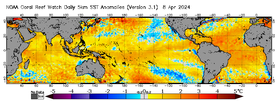
http://www.bom.gov.au/archive/oceanography/ocean_anals/IDYOC007/IDYOC007.202205.gif
The Humboldt Current now delivers very cold water to the equator.
Hmmm… I recently developed a tool to look *objectively* for kinks in time-series data (where a “kink” is a point where if the data is split into two lines, the pooled standard error is minimized and there is a statistically significant difference in the slopes of the two lines).
We need an objective tool to prevent bias in analysis.
I was surprised that when I applied the tool to the UAH6.0 NSSTC lower trop. global meantemperature data (in the graphs at the top of your article), it found an UPWARD kink at 2012.25, rather than your putative downward kink at 2015.
Ok, ok, I’ll run your post. But that was the most subtle squeaky wheel I’ve seen to date.
Seriously, no whining, no complaining about waiting.
Oh — I get what you were saying…. No. It wasn’t a “squeaky wheel” at all (although I can see why you thought it was). I was just looking for an opportunity to apply the tool to see how it worked in this case. It’s just that I have a new hammer and this looked like a perfect nail…
Uh huh. Own the win.
Sorry. New here. Tried to post the image of the graph but failed. There must be a trick to it…
If it doesn’t post properly using the image icon, try just entering the URL for for a JPG or PNG image on a website.
I’m interested in seeing your analysis. You can post the graph to a file sharing site like imgur.com and then just paste the link directly into the comment. It will show up as an inline picture.
Ok. Let’s try this again. https://imgur.com/a/rMzrhll
The difference in slopes between the two lines was significantly significant at p<0.05.
That being said, the total reduction in pooled estimation error was only a bit less than 2%, so placing the kink here does not fit the data much better than the straight linear regression. It should be noted that this IS a greater reduction in pooled estimation error than placing the kink later (as was done by the author)
That is really cool. This is the first I’ve heard of kinked regressions. I’ll have to study these in more detail. In the meantime can you provide an intuitive explanation of what is happening? Could you interpret the kink as a changepoint in which a new modulating actor got introduced into the y-variable?
In response to many postings here (such as this paper) that posit that trends have changed, I took it upon myself to write a tool to objectively find kinks. (There will be a paper explaining this in detail in WattsUpWithThat.com soon, I understand.) The technique is still a work in progress. For example, I have to reverse myself slightly. While the most statistically significant kink was at 2012.25, there is also a statistically significant kink in the line segment to the right of that, about where the author initially cited, about 2016.42. https://imgur.com/a/kiFknBE
Hence I now *agree* with the author’s initial statements.
That kink at 2016 is the introduction the transition from El Nino to La Nina. If the La Nina continues and intensifies we would expect that kink to continue. If, however, a different transition from La Nina to El Nino occurs we would expect a new kink leg with a positive trend.
bdgwx:
On an earlier thread, i pointed out to you that every temperature change, increase or decrease ,over the last 170 years, was associated with changing levels of SO2 aerosols in the atmosphere, of either volcanic or industrial origin (except for “Clean Air Act” reductions in Industrial SO2 aerosol levels).
The temperature changes resulting from changing SO2 aerosol levels so closely match our climate that there can be no extra warming due to CO2 or other”Greenhouse Gasses”
Also, because they are all random events, there can be no temperature “trends” derived from them. Why do you persist in your nonsense?
I don’t know anything about the method, but shouldn’t there be a kink at about 1996 or 7? It goes from a relatively flat trend to a positive trend.
There might be. The tool at the present time only identifies the most statistically prominent kink in the data set presented, which was about 2012. I took the data from that point forward, to look for the most prominent kink in the data from 2012 to present, and the kink returned was in 2016. I did not look for a kink in the data from start to 2012.
Can you assign a ranking or index to the kink?
The rats are beginning to leave the sinking ship.
The detrended AMO chart is the REAL temperature profile of the globe.
Note that the 1880’s are very warm, and the 1930’s are equally warm, and both are warmer than our current temperatures.
The AMO also shows the cold periods of the 1910’s and the 1970’s.
As you can see, the temperatures warm for a few decades and then they cool for a few decades and, the highs and the lows stay within a certain range (about 2.0C).
We know that the Temperature Data Manipulators cooled the 1930’s to insignificance in their computers in order to try to demonize CO2, but the AMO puts the lie to these manipulations.
One thing I find interesting is that the data mannipulators at NASA Climate and NOAA show the 1880’s as just as warm as the 1930’s on their bastardized charts, although they show both eras as much cooler than the present. And they are correct about the 1880’s and the 1930’s being equal in warmth, as you can see from the AMO chart. The 1880’s and the 1930’s were just as warm as each other. The thing NASA Climate and NOAA got wrong (deliberately) is that the 1880’s and the 1930’s are as warm or warmer than current day temperatures. The AMO shows it all. It shows what NASA Climate and NOAA are trying to hide with their computer mannipulations of the temperature record.
The truth is our climate warmed out of the Little Ice Age and reached a high point in the1880’s; then the temperatures cooled by about 2.0C from the 1880’s to the1910’s; then the temperatures started warming and warmed 2.0C up through the 1930’s, reaching essentially the same high temperatures as were reached in the 1880’s; then the temperatures started cooling again and cooled by 2.0C from the 1930’s to the 1970’s (Ice Age Cometh time); and then the temperatures started warming and warmed about 2.0C from the 1980’s to 2016; and now the current temperatures have cooled by about 0.4C.
Here’s the U.S. surface temperature chart (Hansen 1999) that shows the same trend as the AMO:
Here’s a comparison of the NASA Climate/NOAA bastardized temperature profile next to the real temperature profile, the U.S. chart.
The NASA Climate/NOAA bastadized chart shows the temperatures getting hotter and hotter, decade after decade and show us to be at the hottest temperatures in the last 1,000 years. They claim this temperature profile is caused by CO2 increases in the atmosphere. This is why they bastadized the temperature record in their computers.
The U.S. temperature profile looks nothing like the bastardized NASA Climate/NOAA chart.
The AMO temperature profile looks nothing like the bastardized NASA Climate/NOAA chart.
Other unmodified, regional surface temperature charts from around the world look like the AMO/U.S. profile and look nothing like the NASA Climate/NOAA Bastardized Hockey Stick chart.
The AMO and the U.S. chart show we have nothing to fear from CO2. Regardless of the amount of CO2 in the air, the temperatures are still following the traditional pattern of warming for a few decades and then cooling for a few decades.
NASA Climate and NOAA and the whole lot of data mannipulators are lying to us about the Earth’s climate.
CO2 is a benign gas essential for life. Trying to regulate and control it is purely political, not scientific.
Another legacy of the NASA/NOAA/CRU fraudulent data changing is that they’ve raised a host of people like the usual suspects here who are firm believers that these mannipulations are valid.
Tom Abbott said: “The detrended AMO chart is the REAL temperature profile of the globe.”
Say what? The AMO is the Atlantic Multi-decadal Oscillation. It is the detrended sea surface temperature in the North Atlantic region. It is no different conceptually than ENSO just for a different region.
Good news will not be tolerated!
The beatings will continue until morale improves.