From the NoTricksZone
According to the media and climate alarmists, winters like we used to have in the global cooling days of the 1970s were supposed to be disappearing due to increasing warming from rising CO2.
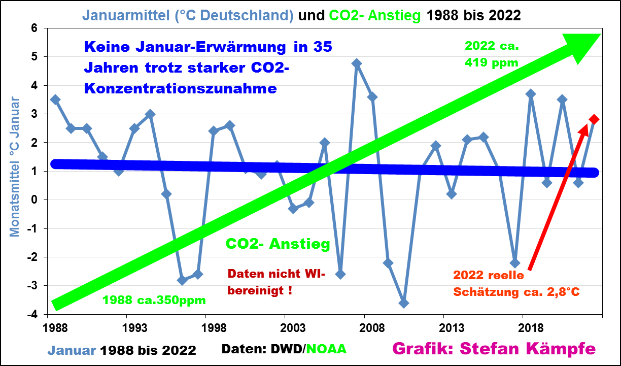
But that hasn’t really been happening. For example, Stefan Kämpfe at the European Institute for Climate and Energy (EIKE) plotted Germany’s mean January temperature going back to 1988:

Chart: Stefan Kämpfe, English headings added by NTZ.
The data source for the above chart is the DWD German national weather services, and the NOAA for Co2.
Obviously January mean temperatures in Germany have been falling for quite some time now, thus contradicting the often heard claims of warming.
Looks like the German mean January temps have been increasing a bit while the globe has been flat or declining the past 6-7 years.
With their energy issues I suppose that is a good thing, maybe fewer dying of cold this winter, with luck
I guess you didn’t look at the graph.
Greenies do not need to look at graphs as they know that they alone hold the Truth.
I would say he did look at the graph, had a brain fart, and misinterpreted it. 🙂
Wait a few months for the “adjustments”. And the reason given will be that the German scientists back in the 1980s & 90s didn’t know who to read a thermometer properly and were recording values that were too high. And then the pre-1980s data will suddenly be lost; presumably they were on the same hard drive as Michael Mann’s hockey stick data. (lol)
There is no reason at all to look at this graph.
Because it is, as (too) many outputs coming from the TricksZone, simply biased.
If you would chose
or
you would obtain completely different data.
An example: take January out of about 300 stations available for the period 1978-2022 (absolute temperatures):
The red period was chosen randomly, of course, wasn’t it?
Oh Noes.
The globe is neither flat, nor declining…
Good one griff. Uptick for the humour.
notice the long term trend line, if you can grasp what a trend line is
Go back 50 years, the trend is rising.
Go back 1000 years, the trend is falling.
Go back 10,000 years, and the trend is falling even faster.
Go back 100,000 years, and it’s rising again.
It all depends on where you want to start your timeline and what story you are being paid to push.
What’s the trend for the past 4 billion years? 🙂
Downwards, ever downwards. Only in greenies heads do you ever get a situation where free energy is suddenly added to a system that reverses entropy, against all the relevant laws of physics.
Yeah more yikes for griff as it’s the most rain in a 100 years!
Kimberley cattle station records West Australia’s highest rainfall in a century (msn.com)
Meanwhile down around Perth in the south of Western Australia they’re on bushfire alert this time of year as that’s what you get with weather over continents.
For once griff is right about something.
The globe is actually round.
Temperatures for the last 6 or 7 years have been flat to declining.
An oblate spheroid in fact!
” The globe is neither flat, nor declining… ”
Are you recanting your deeper beliefs, griff?
?…
It looks like slight increase in general since the mid 90’s with a decline the last half decade. But really, drawing such a thin line through a graph with such a huge standard deviation is as close to meaningless as a graph can be…..
interesting that the time scale is limited to 1988 what about the rest of the data? Does this spoil your plot?
it’s 30 years of data; plenty long enough to identify any trend.
Correct. Climate is the combined averages of weathe over a minimum of 30 years. All it takes is 30 years to determine climate. Anything less than that is mere weather.
That’s pretty rich coming from a warmonger
According to the thermaggedonists:
a) 30 years is climate
b) everywhere was supposed to be warming.
I used to see claims on Watts that a trend (e.g.arctic sea ice) was just weather, as only after 30 years could it be a climate trend… now we have evidence going over 30 years, suddenly I see an about turn…
Reminds me of the way nobody mentions RSS temp data any more
“as only after 30 years could it be a climate trend”
Get it right griff. It’s you climate alarmist mob who claimed that climate could only be judged over 30 years, until a hot day came along…..somewhere in the world.
“Get it right griff. It’s you climate alarmist mob who claimed that climate could only be judged over 30 years”
Good point.
“Reminds me of the way nobody mentions RSS temp data any more”
Why would anyone use RSS when UAH is available? UAH is the best, so that’s what is used around here. UAH correlates with the weather balloon data.
RSS isn’t that far from UAH, but it does have its flaws, so there’s no poiint in using it if UAH is avaliable, and it is.
Your conspiracy theories about WUWT are unfounded.
If Germany has been cooling since 1988, then a good bet is that the rest of Europe has been, too. Given climateering zealotry in Germany, you can be assured that in reality it’s an even steeper decline than shown. Anybody got The charts for France, Eastern Europe, Benelux.
Didnt we learn a day ago that Austria hasn’t warmed in even a longer period?
“In summary, there’s been no climate change in terms of precipitation since 1880, and manmade snowmaking is not harming the local water cycle.
Nothing is collapsing and there’s no doom in sight (on the climate front, at least) in Austria.”
https://wattsupwiththat.com/2022/01/29/no-change-in-precipitation-in-austria-in-140-years/
It’s okay if you get called away to go serve in the trenches. We’ll understand.
Climate change: EU’s plan to call natural gas ‘sustainable’ triggers backlash – CNN
It does not spoil the plot at all.
Atmospheric CO2 has continued to increase but temperatures haven’t followed suit. Even if CO2 has a warming effect, that means there’s a counter-effect at least as powerful.
The null hypothesis should still be that natural variability is complicated, both in cause and effect, but that the trend we have observed so far indicates we continue to warm out of the Little Ice Age. That trend will eventually reverse and we will then resume the long term cooling trend leading to the next glaciation.
Hey the drink bleach one is back…yawn
Yes, I calculated the OLS-Trends to 2022 from every start year on from the same data as used in the post:
And yes, the year 1988 is the only one with a negative slope. It’s well known that the winter temperatures in Europe are strongly correlated with the NAO, which is internal variabilty. Therefore the shorter trends are noisy. When one looks at the longer trends one clearly sees the warming signal also in the Jan. data: 0.38K/ decade.
One issue with your graph. It shows the temps as almost flat from 1950 to 1975 – when CO2 was increasing rapidly. Why is that? What triggered the sudden jump in 1975 and in 1988? CO2 didn’t take jumps like that. Something is odd about your graph at the very least. Could it be data manipulation?
Tim, these data are NOT temperatures itself but the slopes of the trends of the temperatures from the year on the abscissa to 2022. There is nothing odd in this graph.
So the slope of the trends of the temps was zero prior to 1980 and >0 after 1980? I submit the same objection. What happened in 1980 to change the slope of the trend?
Forced warming!
Your 1950 is also a cherrypick it seems to me. The OP cherrypicked 1988 it’s true. NoTricks seems to be posting on the same year in Germany.
Rangnaar, “Your 1950 is also a cherrypick it seems to me.”
It is not. Here are shown the trendslopes to 2022 from the beginning of the dataset on with some error bars. The trendslope for 1988 is NOT statistical different from the long time trends in the 95% Confidence Interval. It’s randomly negative. I think the post describes randomly fluctuations mostly due to the NAO. This does NOT contradict forced warming as it was mentioned in the title of it.
hmmm…. the error bars grow over time? That means if the same error bar applies to 2001 as 1988 then the actual trend of the slope could be up, down, or stagnant. There’s no way to tell. A downward trend from 1961 to 1991 would easily fit within the error bars.
So the blue line on the graph is essentially useless for telling us anything.
You nailed it! The error bars get wider and wider if the timespan for the trend is reduced more and more. And the internal flucuations get more influence when the span shortens. Therefore the slope of the trend from 1988 to 2022 tells nothing at all about the forced trend. It’s only a cherrypicked startpoint in the noise, mostly introduced by the NAO which is the leading internal variability in mideurope in the winter season. The post is maningless, not my response.
“I think the post describes randomly fluctuations…”
I think you’re right.
Please look at the LH scale. This graph is called ant f*cking and totally meaningless.
Why are trendslopes “totally meaningless”?? The original post also works with a slope, the only one to 2022 which is negative and longer then 20 years since 1881. Not everything you don’t like is meaningless.
If the error bars associated with the data are wide enough then the trendslopes actually plotted on the graph are meaningless. Almost any trendline will fit within the error bars, up, down, or stagnant. So how do you pick which one applies?
Trend slopes may not be meaningless, that that graph is. If you can draw a flat line, a rising line, and a falling line through the error bars, the graph is telling you nothing.
It was already warming at the same rate as when anthropogenic CO2 was believed to have taken over in 1950. And then that rate of warming didn’t change until the mid 70s and then decreased from the late 70s to late 80s. Odd behaviour for a constant forcing.
Anthropogenic warming started long before 1950. It started with the extensive use of fossils (coal) during the Industrial Revolution. The mid 20th century slight cooling was caused by aerosols (mainly sulfur from fossils) but that was gone with the clean air acts and the much increased greenhouse effect.
Even the true warmingists disagree with that.
When did CO2 begin it’s massive rise? You are basically advocating for returning to Little Ice Age temperatures! What CO2 level will suffice to do that?
“It started with the extensive use of fossils (coal) during the Industrial Revolution.”
You say “extensive” but its all relative. Fossil fuel (eg coal) use before 1950 was tiny by comparison to today’s emissions. It was warming and at a fair rate…but not due to anthropogenic CO2.
Post hoc arguments about aerosols are to be taken with a large grain of salt…all post hoc arguments are dubious.
Anthropogenic warming started with the creation of the first urban centres and has been a feature of urban development ever since. The current recording of urbanized temperatures and microclimates is still simply that – a feature of urban development. If the climate scientists were in any way serious about anthropogenic warming then the very first thing they would have done is to set up temperature stations well away from the current urbanized ones – they haven’t, in fact there has been complete silence on that front.
“The mid 20th century slight cooling was caused by aerosols (mainly sulfur from fossils)”
So you assert. Got any evidence backing up this claim for aerosol cooling?
“Slight cooling” you say? It cooled about 2.0C between 1940 and 1980, according to the U.S. surface temperature chart (the Real global temperature profile).
If this graph is correct it shows that 1988 was a blatant cherrypick. As sceptics we should accept that. The whole article should be given a low score IMHO
Well, 1988 IS the year that the propaganda campaign about human-induced climate change kicked off, seems like a meaningful starting point. And 33 years is about twice what Phil Jones said qualified as a meaningful “trend,” another inconvenient fact. But then you have no issue with all the other cherry picking that so-called “climate science” repeatedly is guilty of.
Funny how ghoulfont complains about the “rest of the data”.
I’m sure he’s whinning that the data doesn’t start at his preferred point of 1979, or even better 1850.
However I’m also sure that if we attempted to push the data back even further, to say 1000, 2000, 3000, 5000, or even 10,000 years ago, he would find some reason to reject that data.
If it wen 8000 years back, the cooling tendency would be even higher; if they would have gone 3 million back, the tendency would be even higher…
You can of course choose months that don’t show much warming. But the annual average (from DWD here) is clearly warming rapidly:
If some months are flat, others are warming even faster, to yield this average.
2.1 degrees C in 134 years is “rapidly”?
I submit that this number is smaller than the accuracy of the determined temperature values. Charts like the one you posted should have confidence interval error bars. I’m guessing you know why they don’t.
The original post showed a similar plot for January, with data for DWD, again without error bars. It seems if they do not show warming, there is no complaint.
Good point about error bars, Nick…Now use that thought to analyze your warming since 1890 graph—Any of those data points more than 2 SD from the mean for the period?
Nick, it looks like you chose an interval than includes two mitigating factors, one is recovery from the Little Ice Age and the other one is increasing Heat Island effect. You have to work harder to get a point across here at WATTS.
Are you actually arguing that we know the temperatures as accurately in 1890 as we do for 1988?
Or are you just engaged in nick picking again?
Where are YOUR “error bars”, Nitpick Nick?
The post was Jan for 30 years and you post year for +130 years. But the 130 year graph doesn’t show much warming. And doesn’t look like much is last 100 years. Global is about 1 C century, and apparently Germany has less. And global warming is has polar amplification, or Germany should warm quicker than global. Maybe they removed too much in their adjusting for UHI effect.
But obviously, 9 C average yearly temperature is cold.
The graph shows that the rapid warming is over the last thirty years. About 1C in that time.
I submit the two graphs/data sets are likely inconsistent. It isn’t likely that a rapid warming of 1C in 30 years is associated with cooler January. One or the other data set has problems.
It is the same DWD monthly data set. The annual just averages the twelve months. There is variability between months.
So you are trying to draw statistical conclusions from random variables (days/months/years) that have a high variance. Someone above asked for the 2 sigma standard deviations. How about showing those?
Looks closer to .18 per decade, which is the global land.
UAH Global Temperature Update for December, 2021: +0.21 deg. C. « Roy Spencer, PhD (drroyspencer.com)
Rapid 😉
Exactly.
The graph shows almost no warming until 1980. What changes in 1980? Data manipulation?
1978 satellite record begin…since then extreme recalculation measures to reconcile land based measurements with sats.
The best LIG thermometers have a +/- uncertainty interval. The exact same as the Argo floats and most land based stations today.
The “extreme recalculation measures” would seem to be nothing more than subjective corrections. “This is what they *should* have read!”
The fact that you don’t understand this (and the statistics behind) doesn’t constitute evidence for manipulation.
It is both manipulation and bad statistics. All your protestations will not undo that. You can’t even show that these are not time series data that should be treated as such.
From: 6.4.4.2. Stationarity (nist.gov) : NIST/SEMATECH e-Handbook of Statistical Methods, http://www.itl.nist.gov/div898/handbook/, date.
Contained in the Engineering Statistics Handbook. It would do you well to study it.
It is just like expanding the precision of data beyond the original number of digits in the measurement. It fraudulently expands the information conveyed by the original measurement.
What about the rapid warming for 30 years in the early 20th Century, Nick? Without significant CO2 increases? Everything else is CliSciFi smoke.
Looks like NOAA data where the past has been cooled and the present warmed.
Yes, it does. It has that familiar “Hockey Stick” look. That’s what fooled Boris.
2 degs in 130 years?
Marjorie, run me an ice bath, I’m sweating one out here. I think I might faint!
“rapidly” chortle!
How do you explain the warming in the first half of that graph?
He can’t.
You mean the lack of warming in the first half of the graph?
In which Germany was the data collected since 1870. Borders have changed, Germany has grown and shrunk and grown. And, is it not to be expected that coming out of the Little Ice Age temperatures should climb back to “normal”?
Nothing wrong with a nice bit of warming. We have had a lovely mild winter so far in the UK. No snow disruptions at all really. Summer wasn’t great though, coolest since 2014 or so I believe.
Problem is the wind hasn’t blown too much which has promoted the skyrocketing cost of energy.
Meanwhile the planet goes on greening thanks to lot’s of nicely increasing atmospheric CO2 mankind can never put a dent in.
Whale numbers continue to increase, the GBR is doing well, as are the Walruses and Polar Bears, and someone has yet to find the floating mass of garbage the size of Texas in the Pacific.
The sky rocketing energy prices (my power bill has risen by 60% and is predicted to rise even further) has thrust many in the UK into energy poverty. This is because of the UK’s reliance on hopeless “renewables” alongside the UK govt’s refusal to let us use our own fracked gas and mined coal.
The obsession with “renewables” is all down to people such as Nick touting the CAGW hysteria over a tiny rise in temps.
People have been forced into poverty because of people such as yourself Nick. It’s nothing more than despicable and I hope you’re ashamed of yourself.
Eyeballing that graph, temps started to rise at the start of the 20th century.
As we’re permanently told that anthro CO2 didn’t start making a difference until the 1950s, can you explain why the natural warming for the first half of the 20th suddenly turned itself off and left our see-oh-toos to do all the hard work?
Let’s face it, the whole CAGW thing is just junk, isn’t it?
Your graph is essentially flat till 1988, long after CO2 increases were recognized. What happened in 1988 that causes the significant change in the slope of the temp growth? If you can’t propose a cause then jut how much credence should we put in this graph. It appears to be a result of data manipulation, at least if you can’t offer up a physical reason.
“Your graph is essentially flat till 1988, long after CO2 increases were recognized.”
Good point! Other items / questions that stick out to me include:
– It’s a graph of temperature rather than temperature anomalies, so it’s imperative that the composition of the stations, instrument types and methods has to remain constant, otherwise the results are suspect.
– Are the graph data raw or adjusted?
What difference does that make? If the anomalies are calculated using the same data sets, any errors will be the same.
It makes a difference if the composition of the locations changes over time. If you’re averaging Chicago and NYC temps, and then drop NYC for, say, Miami, I think you’d see a warming in the average that wouldn’t be seen if you were averaging anomalies.
Yes, but I specifically said “same data sets” meaning the “same data sets.” If you swap NYC for Miami, it’s not the “same data set.”
Germany has warmed up since the end of the Little Ice Age. I’m sure all Germans are glad for that.
Beyond that, none of the warming prior to 1950 is caused by CO2. Why do you assume that the warming after CO2 must have been caused by CO2?
Yep, Nick; I see rapid warming in the early 20th Century. Your point?
LOL, you employed what is called a DEFLECTION where you expand the temperature timeline in the chart to 1888 when the headline and Chart is from year 1988.
Since you didn’t show if the headline statement and the chart is false, you have nothing.
This is being dishonest on your part.
“f some months are flat, others are warming even faster, to yield this average.”
That graph looks like a little warming from around 1880 to 1910 and then pretty much no warming from 1910 through to about 1990 and then the bulk of the warming in the last 30 years.
One of the key arguments for Anthropogenic Global warming caused by CO2 being responsible for “most” of the warming is that its global but when you look at the detail there are many anomalies within that claim. Waving off 80 years of no warming in a region doesn’t cut it for me.
more global warming…
TURKEY DIGS OUT; CUBA’S RECORD CHILLS; + GROUND HOG DAY SNOWSTORM TO BE ENHANCED BY GEOMAGNETIC STORM — PREPARE
February 1, 2022 Cap Allon
The COLD TIMES are returning. The long winter is just getting started.
“The COLD TIMES are returning.”
Yes, the UAH satellite data says we are now 0.7C cooler than 2016, the warmest year (maybe) in the satellite era.
Another 0.8C drop and we will be 1.5C cooler than the average. And here the alarmists are worrying about being 1.5C above the average. It doesn’t seem to have dawned on the alarmists that the temperatures are cooling, not warming. They are clinging to the trend. it’s getting harder and harder.
Going by past temperature history, there is a good chance we could cool down by 2.0C. That’s how cool it was in the 1910’s and in the 1970’s, and we may have started on a similar cooling period and magnitude, if the climate indeed operates on a cycle, where it warms for a few decades and then cools for a few decades and then repeats the process and the warm and cool temperatures operate within certain bounds, not too hot, not too cold.
The U.S. surface temperature chart (Hansen 1999, on the left at the link) shows the cycle. CO2 has nothing to do with this cycle of warming and cooling. At least, there is no evidence for CO2 having anything to do with any of it.
https://www.giss.nasa.gov/research//briefs/1999_hansen_07/
The Real temperature profile of the world is represented by the U.S. surface temperature chart on the left. The alarmists made up a different temperature profile, the bogus Hockey Stick chart on the right, in order to scare people into thinking we are living in the warmest times in 1,000 years. Boris was fooled by this lie, and many others.
But all the unmodified, regional surface temperature charts recorded by human beings down through the years, from all over the world, show the same temperature profile as the U.S. chart.
They all show that temperatures were just as warm in the Early Twentieth Century as they are today.
This means CO2 has little effect on Earth’s temperatures.
This is what the alarmists want to keep secret, so they created a computer-generated global temperature chart and they manipulated it to tell the story they want told which is for us to be very scared of CO2. It’s all a Big Lie meant to sell a political position.
Regional surface temperature chart profiles look nothing like the bogus, bastardized, instrument-era Hockey Stick chart temperature profiles. One of the profiles is wrong. The one Boris believes in, the Bogus Hockey Stick chart, is wrong. it’s an OutLiar. It’s a one-of-a-kind. The real world looks very different and not very scary at all.
Wow, perhaps you could cherry pick even more by just using day or night temps?
Cherry pick or not, the fact remains that for 35 years January average temperatures in Germany have, to my eye, been flat.
Why is that?
If you look at the data for England over the last 30 years, or even longer, you’d be forgiven for being totally underwhelmed.
Interesting graph. There appear to be a lot of points in history where it was warmer than it is today. So no unprecedented warming in the month of January today as compared to the past.
England has been in a temperature downtrend in the month of January since the 1930’s.
What do the other 11 months show?
As I have looked at various locations around the globe I too have not seen the CAGW warming. If CO2 is both well mixed and works the same everywhere this is very consternating. We should be able to find a similar number of locations that DO HAVE CAGW warming that would offset the ones with no or slight warming.
I am a firm believer that the mathematical and statistical methods of calculating a GAT are entirely wrong. Too much variance, uncertainty, lack of precision, and not meeting the needed assumptions for the statistical tools being used end up with a totally incorrect metric that is meaningless.
As I understand the technical “climate change” proposition regarding temperature is that the trend in daily minimum temperature has been getting “warmer”. While occurring at a different rate than any “warming” of the daily maximum temperature. With the result being that there is less of a spread in temperature difference between daily minimum and the daily maximum.
This dynamic seems to be ignored by the mass media which play up hot days that occur – the contemporary news version of “if it bleeds it leads”. Since the Original Post link to it’s graph source omits the other 11 months whether their data reinforce that January pattern is unknown.
The use of an average for discussing temperature overlooks the significant variation of elevation, whether mountainous or low lands, found in different regions of Germany. When the North Atlantic Oscillation (NAO) is classified as positive Germany generally has warmer winters and when the NAO is classified as negative German winters are generally cooler.
Below is a suite of soil temperature for western Germany’s region of North Rhine Westphalia (Dusseldorf is probably a well know city there) that covers elevations from 37 meters to (just) 839 meters. This is for specific parameters of soil temperature and not air temperature; it is averages for soil depths of 5 cm (~ 2inches) down to 100 cm (~39 inches). It is not regional air temperature data and actually the regional soil temperature data just a bit “warmer” than the regional air temperature (averaging less than 0.5* Centigrade “warmer”.
The data is for 1951 to 2018 and, if we accept soil temperature as a general proxy for air temperature, shows the [soil] minimum temperature is increasing more than the [soil] maximum temperature – as I alluded to in above comment. See charts “b” and “c” for this.
Chart “d” shows monthly average [soil] temperature changes for the region. The yellow graphing is for 2011 -2018, the light green graphing is for 2001-2010 and the green graphing is for 1991-2000; all of which indicate that on average monthly [soil] temperatures have been greater in those decades. For brevity I’m skipping elucidating the other graph colors’ time frames since the chart “d” image has their corresponding legend.
Citation for above chart = “Soil Temperature Strongly Increases: Evidence from Long-Term Trends (1951-2018) in North-Rhine Westphalia, Germany”. The authors state that on average soil temperature has increased more (1.76 +/- 0.59*Celsius) than on average the air temperature increased (1.35 +/-0.35*Celsius) in that specific part of Germany.
That’s one of the problems with using averages. You lose the very data you need to make informed judgements about reality. If the average is going up more due to increasing minimum temps than due to increasing maximum temps is that a good thing or bad thing.
From US ag data the interval between first frost day of the year and first frost in the fall has been increasing. Meaning minimum temps are going up. This results in earlier plantings and increasing growth before summer temps arrive and precipitation falls. That’s a *good* thing.
Could also mean humidity is going down. Air temp and relative humidity are both factors in frost.
Düsseldorf is situated in geoactive seismic zone:
@K.G. – I usually read your comments as astute, but your seismic interjection seems spurious. The data I put up is for province/state wide soil temperature reading at 5, 10, 20, 50 and cm – not just Dusseldorf.
I only mentioned Dusseldorf because we Americans tend to be unfamiliar with German geography and those so could quickly internet search up a map of the province/state. Those interested in the cited text details will get more specifics about the data sources.
I see your posted map of “geoactive seismic” locals; it looks like the western provincial/state border is largely both narrow and, where found, statistically a “zone 0” category. I assume pale yellow legend is where German geoactivity is relatively the least (except for grey shaded areas, supposedly not geoactive.
If your comment/image is meant to indicate my above cited comparison(s) in 10 year blocks of data (reproduced in color coded charts) is compromised by your aggregated chart then I ask if you are propose that during the different decades before 1991 the soil temperature average minimum, average maximum and 12 monthly averages chart were relatively lower because the specific province/state had lower “geoactive seismic” activity. To believe your image explains soil temperatures in the entire province/state when assessing soil data down to 100 cm then you are implying there has been a significant geological change in the recent decades that generated more “warmth”.
If you have any related soil temperature data in the first 100 cm of ground anywhere in that province/state which demonstrates a recent historical time frame trend during the lifespan of modern Germany geoactive seismic that was/is capable of statistically warming any 100cm strata of that soil then post it. Otherwise you have given WUWT readers who upvoted you (“+”) an irrelevant detail; or maybe we should warn Dusseldorf.
“Düsseldorf”? Hogan…
Average surface air temps miss a whole lot of things like total enthalpy. Your soil temp observations illustrate a thermodynamic conclusion that the earth is the absorber of the sun’s radiation which then tries to cool through conduction and radiation. It means that CO2 can not warm the surface but only reduce the cooling rate. The end result is that surface air temp will be lower than the soil.
The higher minimum does point to a slower cooling rate. All to be expected.
There is data for the 1951-201 period categorizing the “rate” of change for the summer air temperature minimum (Fig. 1; “d”), the summer air temperature maximum (Fig. 2: “d”) and the winter air temperature maximum(Fig.3; “d”) in all regions of Germany. The authors categorize this rate as “velocity” and use Km to quantify the patterns; color legend indicating red hues are where the “warming” rate in Germany has been going up
See “Climate Change and Climate Change Velocity Analysis Across Germany”; free full text available on-line. Sorry, I tried but I was not able to post those Figures to this WUWT comment.
In other words, heat accumulates. In other words, it’s heating up. Slowly but surely. Like insulation in a house. You have a heat source (heating). If insulation is bad, there will be cold in your house. If insulation is good (slower cooling rate), there will be warm in your house. A thing that is colder than the inside makes you warmer. This is again a plain and simple thing you don’t understand.
You have no idea about thermodynamics do you? You obviously believe that objects store heat, objects like the surface of the earth. Have you ever heard of an idea called entropy? Look it up. It might explain to you why what you are claiming would violate both the Stephan-Boltzmann law and Planck’s Law.
While you are correct that insulation slows the loss of heat, the insulation does not heat the surface, it only slows the loss. There is no storage of heat. The hot objects radiates based on the above laws regardless of what it is in contact with.
To try and get some context and identify a possible reason, we need temperatures for July.
I don’t know my way around the DWD site but we see what Nick has posted up, we see what DWD says for Summer temps.
Just eyeballing the graphs: Summers over the last 30 odd years are getting warmer and winters are getting colder.
Good news for the People of Germany, Global Warming Theory is debunked.
Bad news for the People of Germany, but you are turning your country into a desert.
And it is impossible to get any more badly bad or badder news than that.
It really isn’t. Better start thinking how to turn things around.
Proof of the pudding was that awful rainstorm you had recently.
The rainstorm itself was proof enough of that = a large and strongly convective air column – brought about by the high Lapse Rate you get above dry places such as cities and deserts.
Then some water vapour got sucked in.
Result was like a Fire Storm but involving rain
Compounded by the failure of the ground/land/soil/cityscape that the rain fell upon to handle the rain and so cause the ‘flood’
‘Rain’ does not equal ‘flood’
What makes the flood is how the landscape that the rain fell upon handles the rain. Floods are only in the eyes, houses, towns & cities of the beholders.
And legions of hysterical, doom-fixated and mendacious scientists (and their acolytes plus attendant media) just waiting for such a big phat juicy cherry to fall from the sky
Deserts are for real, for everybody and everything.
Deserts are total wastelands.
Go there if you wish but don’t drag everybody else in with you. OK?
“Just eyeballing the graphs: Summers over the last 30 odd years are getting warmer and winters are getting colder.”
It seems the 30 year Jan chart shows average month daily temperature of 1 C with very slight [and unnoticable] cooling in the trend. Or January in whole country of Germany over 30 year period has not been warming.
Now, it could be possible Germans 20 years ago, thought 1 C average temperature for January was too warm.
On average place in germany one is not going to have frozen lake most of the time. Or to get more frozen lakes, one might 0 C or colder as Jan average- or it seems less than 1/2 of years was there good chance to have nice really cold and long lasting frozen lake in most places in Germany during January. Or at least not having to drive very far for ice skating opportunities for every one in Germany.
A trend for 400 years now as perihelion moves ever later than austral summer solstice until it coincides with the boreal summer solstice in 12,000 years. By then June insolation over northern land masses will be 40W/sq.m more than now. That should be enough to melt the additional winter snowfall in places like Germany but not further north and on alps where it will accumulate.
Of course as the NH summers get more sunlight, the winters get less and that is when oceans are hitting peak evaporation in December; an increasing proportion of the evaporated water falling as snow over land.
That is only measured data. It needs homogenisation to bring it back in line with models.
The Bureau of Meteorology in Australia could lend a hand with the homogenisation. They claim world’s best practice in that fine art.
Germany is clearly seeing and suffering climate change impact though… like last years 1 in 1000 year across large areas of Rhineland.
This is no proof to the contrary!
Oh, I see the Grifter has started early on the gin today.
I don’t see and don’t suffer anything, beside your comments.
it’s OK griffy-poo, take a chill pill.
The axes of evil (Austrio-German-France) are sorting out their sins of Climageddon by locking everyone up and turning off their heat supplies.
https://www.zerohedge.com/markets/germany-shunning-nuclear-power-just-when-eu-needs-it-most
That’s called Natural Selection and they, and you, won’t be around when we are. Now go and be a good useless eater and get your 4th booster.
Break the earth down to 400 mile sq blocks and you expectation for 1 in 1000 year events is about 1.5 per day. Stop with the stupid 1 in a thousand year events, non of which you site are any way.
What are they suffering from?
You ignore the proof that is constantly posted to refute your inane comments
One in a thousand year what? Only large areas of Rhineland?
And what proof do you have that it had any connection to climate change theory?
Sure there is. There is some 600+ years of flood information available for that are that plainly shows previous flood events (more than one) that were a virtual blueprint for what occurred last year, and also shows even worse floods that occurred in the distant past.
Long before there was any human CO2 emissions to blame it on.
Germany experienced some bad weather, and nothing unusual when considered in the context of historical records.
You can actually see climate change? What does it look like? Does the color of the sky change? Do trees change color?
griff,
Did you know that there was another “1 in 1000 year” event in Germany in 1962 when a storm tide in Hamburg killed 315 people, more than twice as many as died in last years floods. Just because you have such an event happen this year it doesn’t mean a similar event can’t happen next year.
By the way the European Flood Assessment System (EFAS) sent out specific warnings for the worst hit region in Germany FOUR days in advance but the local authorities did nothing
My the pests are out in their masses today. What’s caused that?
Almost a full compliment of the nutters.
With data that is sensitive to start and end dates, giving different trends if you start and end at different dates. You probably need to widen the error bars.
I do not know statistically how you would do that but you could adopt the alarmist approach and remove error bars completely.
All station records are a time series that are not stationary. That is their variance and autocorrelation and means are not constant. They need to be treated as such and analyzed with time series methods. Trending from arithmetic averaging is NOT one of the correct methods.
From: 6.4.4.2. Stationarity (nist.gov)
This is from an NIST web page with engineering information. Section 6 of the Handbook starts at:
6. Process or Product Monitoring and Control (nist.gov)
What was the trend for Min and max temperatures? Has cleaner air led to overnight greater cooling through less cloud in winter?
Meanwhile in the U.K., What changed Boris Johnson’s mind from sceptic to warmista https://www.bbc.co.uk/news/science-environment-60203674
Mrs Johnson
That isn’t fair using the 33-year graph because there isn’t the effect of beginning temps at the end of the LIA plus tamperatures pushing the graph downward on the left-hand side, thus making the upward slope bigger.
C’mon, man.
Memo to Griff…
Nuclear Power, Natural Gas Secure EU Backing as ‘Green’ Investments
BRUSSELS—Brushing aside charges of greenwashing, the European Union will press ahead with a controversial proposal to label certain nuclear energy and natural-gas investments as sustainable over the coming years despite strong opposition from some of the bloc’s member states, environmental groups and investors.
The proposal to expand what can qualify as a sustainable source of energy has exposed deep rifts between countries that rely on different technologies and comes amid surging electricity prices. Nuclear and natural gas are just two high-profile components of a plan that will affect a range of industries—from forestry to manufacturing and transportation—and is meant to shift the ways companies and investment funds approach sustainable investment.
The European Commission, the EU’s executive arm, published a revised version of its proposal on Wednesday, which includes tweaks to the criteria for labeling nuclear and natural gas as sustainable and changes that are meant to strengthen companies’ disclosure requirements.
“Nuclear Power, Natural Gas Secure EU Backing as ‘Green’ Investments
BRUSSELS—Brushing aside charges of greenwashing, the European Union will press ahead with a controversial proposal to label certain nuclear energy and natural-gas investments as sustainable over the coming years”
Somebody needs to tell the German politicians they don’t need to shut down their nuclear reactors.
Can it get any dumber than going ahead and shutting down perfectly good nuclear reactors in an uncertain energy supply environment, which could lead to suffering and death if the energy supply fails to meet demand?
Is Biden secretly in charge over in Germany? This kind of stupidity sounds like something he would do.
I think WUWT can do better. The SkS elites will talk about end point bias. And in this case they’ll be right. There’s no mention of December’s temperatures. Numbers like these will always have some randomness in them.
I could say solar works economically and better than fossil fuels on a remote island in the South Pacific. Therefore proving it works better everywhere. Same thing.
One month of twelve was used as was one year in the last about 34 was used.
To be honest, temps should be averaged, if at all, by season and not by calendar year. Calendar years split the cold season rather than single periods being contiguous.
I doubt WUWT can do much better on ultraconservative fossilized politics.
I doubt that YOU can do much better than radicalized liberal climate “change” politics.
Enlighten us, O wise one, with the errors WUWT makes.
Oops! Actually they could have done even better. Selecting Scandinavia or the cold spot in Russia which cooled even more.
It does do better. Wanting cheap reliable energy is a strong point. Because fossils like us care about the poor and do something about it by bringing them the bounties of the Earth instead punishing them for living. Drill baby drill.
No hockey stick?
I am shocked.
https://www.cnn.com/2022/02/02/energy/eu-sustainable-energy-taxonomy-climate-gas-nuclear-intl/index.html
Here’s a bombshell. An EU proposal to include natural gas and nuclear as sustainable energy. I knew the climate game was likely to end with the energy mess Europe and UK created for themselves this year.
They still talk renewables but admit they need a lot more time for a workable scheme. At least the January temperatures inside German homes will trend back higher.
For comparison here’s the UAH global January values over the same period.
Units?
Sorry, should have stated it’s in °C – though I’m not sure what else it could be for temperature anomalies. Also should have said the anomalies are from the 1991 – 2020 average.
A better comparison may be the Northern Hemisphere Anomalies.
Where is your plot for the NH of Saturn?
Was wondering when the World’s Foremost Expert on All Things Statistical and Metrological would pop up again.
And here you are.
The Gormans are the ones who claim this kind of knowledge.
Neither of us are anything like statistical and metrological experts. The fact that we can identify the statistical and metrology errors and inconsistencies in most of the so-called climate studies should give everyone second thoughts on how much expertise the so-called climate scientists have in actual statistical methods, metrology methods, and how each apply in the real world.
Me neither.
But if I think where we differ is I assume I’m the easiest person to fool. If I think I know something and someone points me to a source that says I’m wrong I like to try to understand why I’m wrong. And if I’m not sure if I’m right or wrong I try to think of examples that will test it.
You on the other hand are so confident you are correct on everything you will never accept a simple point even when your own recommended text books explain it to you in the simplest possible terms.
Oh malarky!! You’ve been given reference after reference after reference as to why you are wrong. And you simply won’t take the time to read the references and understand what they are saying.
Things such as sample means having uncertainty propagated from the sample elements. And that uncertainty propagating into the calculation of the mean of the sample means. You just keep insisting that sample means are 100% accurate and the mean calculated from those means is therefore 100% accurate.
You’ve been given multiple references as to why the standard deviation of the sample means is *NOT* the uncertainty of the mean of the population. Yet you and your compatriots continue to ignore physical reality.
Go whine to someone else. You are falling on deaf ears here.
Did you ever accept that Taylor says , or that this implies that if you scale down a measurement you can also scale down the measurement uncertainty? Or do you still insist that the measurement uncertainty of a mean is the same as that for the sum?
Did you run any simulation to see how this might work? Did you ever accept that you cannot calculate daytime mean temperatures or CDDs just from the maximum temperature?
Do you still think that if you mix two populations the variance of the new population will be the sum of the two population variances?
“And you simply won’t take the time to read the references and understand what they are saying.”
How many times did you insist I had to use the partial deviation rules as specified in the GUM? And when I did and showed they supported the simple idea that measurement uncertainty of a mean decreases with sample size, I was told that the GUM didn’t tell you everything.
“Things such as sample means having uncertainty propagated from the sample elements.”
I’ve no idea why you think I rejected that. It’s what we’ve been arguing about all this time, not the fact that uncertainties propagate, but how they propagate.
“You’ve been given multiple references as to why the standard deviation of the sample means is *NOT* the uncertainty of the mean of the population.”
Sorry I missed all these references, could you link to one again so I can check what it said. As I may have said before you need to be sure what uncertainty you are talking about. If you are talking about individual elements then the standard error of the mean is not what you want, but if you are talking about how certain the mean is, then that is what you want.
“You just keep insisting that sample means are 100% accurate and the mean calculated from those means is therefore 100% accurate.”
And now you demonstrate that you don;t actually read my comments. I’ve never said that and it’s certainly not something I think is true.
“You are falling on deaf ears here.”
So it seems.
Seems to me the whole “reduce the measurement error with multiple measurements” discussion doesn’t really apply to an instantaneous temperature at a point.
If I have a board of length x, and I measure its length a hundred times, I can reduce the error in the mean of my measurements. However, I don’t think you can take 1500 temperature measurements of places around the world and use the same logic to get the mean of the Earth’s anomaly. There is a fixed length to the board, but the Earth’s temperatures are not fixed in that way.
A light bulb in your brain just illuminated! Congratulations!
“Did you ever accept that Taylor says https://s0.wp.com/latex.php?latex=%5Cdelta_q+%3D+%7CB%7C%5Cdelta_x&bg=ffffff&fg=000&s=0&c=20201002, or that this implies that if you scale down a measurement you can also scale down the measurement uncertainty?”
You can’t scale down uncertainty unless you know the overall uncertainty. If you know ẟq, the total uncertainty, then you can divide it by B to get ẟx. If you don’t know the total uncertainty, i.e. ẟq, then you can’t downscale the total uncertainty to the uncertainty of the individual elements ẟx.
You keep getting mixed up on what is being calculated. Total uncertainty is ẟq. Individual uncertainty, ẟx, is ẟq/B. If you know the individual uncertainty then the total uncertainty becomes ẟq = B * ẟx, an UPSCALE of the individual uncertainty.
Remember Bx = x + x + x + … x, i.e. the summation of x “B” times. So the total uncertainty becomes ẟq = ẟx + ẟx + ẟx + …. ẟx for B times. If you will it is ẟq = ẟx_1 + ẟx_2 + … + ẟx_B where ẟx_1 = ẟx_2 = … = ẟx_B or B * ẟx.
After explaining this to you over and over and over and over you still don’t get it. You can downscale total uncertainty to individual uncertainty IF you know the total uncertainty. In how many situations do you know the total uncertainty first and then try to determine the individual uncertainty?
Do you know the total uncertainty of the sum of a data set of temperatures before you know the individual uncertainties associated with the temperatures? My guess is that you don’t, not unless you have superhuman powers.
This is the crux of your problem:
“Remember Bx = x + x + x + … x, i.e. the summation of x “B” times.”
You only think of multiply in terms of repeated addition so you don;t understand that B can be less than 1. Therefor can’t comprehend the possibility that you can be multiplying x and hence ẟx by a proper fraction. That is if B is 1/100 you are dividing ẟx by 100.
I appreciate you don’t accept any mathematical practice not used in engineering, but you still have to ignore the example given by Taylor when he divides the uncertainty of a stack of 200 pages by multiplying by 1/200.
“In how many situations do you know the total uncertainty first and then try to determine the individual uncertainty?”
If, by the total uncertainty you mean the uncertainty of the sum, you know this by propagating the uncertainties as you explained write at the start. If each of your measurements has a measurement uncertainty of ±0.5°C, then the uncertainty of the sum is ±5°C.
You still don’t know how a sine wave works, do you? I showed you that you can calculate the area under a part of a sine wave but you never did get it.
I gave you references from at least three different sources that support my assertion that the variances of two combined populations is the sum of the variances of the two individual populations. And *YOU* still think you know more than the professors that wrote those text books. Did you ever write to the authors and tell them they need to revise their textbooks like I asked you to do?
You are lost in the multiverse. I never asked you to do any such thing. Partial derivatives of a linear equation are equal to 1. Can you show how the temperature profile is non-linear?
And you *still* haven’t gotten the idea of the standard deviation of sample means right, have you. If the mean of sample1 is 29 +/- 0.5, the mean of sample2 is 28.5 +/- 0.5, and the mean of sample3 is 29.5 +/- 0.5 then you simply cannot use only the stated values to calculate the mean of the samples and ignore the uncertainty of those stated means. Yet you and your compatriots want to ignore the fact that the uncertainty of the sample means exists.
In our case the mean of the stated values = 29 and N = 3. The standard deviation of the stated values sqrt[ (28.5-29)^2 + (29-29)^2 + (29.5-29)^2 ] / 3. This equals sqrt(.25 + 0 +.25)/3 = .866/3 = .3.
Yet the total uncertainty of the calculated mean from the stated values is either 0.5+0.5+0.5 = 1.5 or sqrt(1.5) = 1.2. Your total uncertainty is at least four times as large as the standard deviation of the stated values of the sample means.
Increasing the number of samples won’t help lower the uncertainty of the mean you calculate. The uncertainty just keeps growing. Increasing the size of each sample won’t help either because the uncertainty of the mean calculated from from the individual elements will just keep growing as well.
The *ONLY* way you can avoid this is to have multiple measurements of the same thing using the same measurement device and by assuming there is no systematic error component in the measurements so that all error in measurement value is totally random.
These assumptions simply don’t apply when you have multiple measurements of different things using different devices each of which have at least some component of systematic error in each measurement.
You simply cannot ignore the uncertainty in the means you obtain from each sample. Although that is what mathematicians and climate scientists like to do. They just assume that all measurement uncertainty is random and therefore cancels. What hooey *that* is!
Nice. Wish I had written it.
“You still don’t know how a sine wave works, do you? I showed you that you can calculate the area under a part of a sine wave but you never did get it.”
And you still don’t understand that the problem is not how a sine wave works. It’s that you cannot treat a temperature profile as a sine wave centered at 0.
And as I showed you it simply doesn’t matter. That is merely an offset that falls out when calculating the area under the sine curve and the square wave representing the offset.
Area1 – Area2 where Area1 is the area under the sine wave and Area2 is the area under the square wave.
I even drew this out for you twice. You can shift Area1 and Area 2 where ever you want on the vertical axis and you’ll still get the same answer. It’s exactly the same as if you have two circles of different diameters, one inside the other. The area between the two circles doesn’t change no matter where you locate them on the x and y axes.
You didn’t pass basic geometry did you?
And how do you know what the offset is?
Who cares what the offset is? Did you not understand the fact that two circles, one inside the other, have the same area between them NO MATTER WHAT OFFSET YOU HAVE!
The area between a sine wave and a square wave of the same freq is the same NO MATTER WHERE ON THE GRAPH YOU PUT IT! The area between the two doesn’t change no matter where you put them! The only two things that will change the area between the two curves is the max value of the sine wave,assuming the square wave max value remains the same, or the max value of the square wave, assuming the max value of the sine wave stays the same.
If the max value of the sine wave and the square wave stay the same the area between them will stay the same. It doesn’t matter if Tmax_sine is 70 and the Tmax_sqwave is 65 or if the Tmax_sine is 15 and the Tmax_sqwave is 10.
Why is this so freakin hard for you to grasp? It’s basic geometry.
“Who cares what the offset is?”
You do, if you want to get an accurate estimate of the area under the curve.
“Did you not understand the fact that two circles, one inside the other, have the same area between them NO MATTER WHAT OFFSET YOU HAVE!”
The offset is removing a proportion the circles, why do you think it won’t affect the area. And why have you switched from sine waves representing temperature to circles. It’s a tactic I’ve noticed with you, to keep changing the subject like this.
“The area between a sine wave and a square wave of the same freq is the same NO MATTER WHERE ON THE GRAPH YOU PUT IT!”
Again, I don;t know why you’ve started talking about square waves. This is really very simple – if you know just the maximum temperature, you know how far it is above zero (which will be in a different position depending on what temperature scale you are using). If you treat this as the peak of a sine wave, you are assuming it is centered at zero, which won’t be the correct temperature profile for the day, unless the mean temperature is zero. If you multiply max by 0.64 you get mean “daytime” temperature if and only if the mean temperature is zero. You can correct this by treating as sine wave as being centered at the mean temperature, but you have to know what that mean temperature is.
“…or the max value of the square wave, assuming the max value of the sine wave stays the same.”
And again, how do you know what the max of the square wave is? I assume you want it to be the daily mean temperature, but if not what is it?
“It doesn’t matter if Tmax_sine is 70 and the Tmax_sqwave is 65 or if the Tmax_sine is 15 and the Tmax_sqwave is 10.”
But it does matter if Tmax_sine is 70 and Tmax_sqwave is 50.
“Why is this so freakin hard for you to grasp?”
Maybe because it’s nonsense, and easily demonstrated nonsense.
You failed geometry, didn’t you? Again, I’ll use the two circles, one inside the other. If their center is at 10,10 on the x,y axis and the area between the two circles is 10 then will that area of 10 change if you move the center of the circles is moved to 20,20?
If the area between a sine wave and a square wave is 10 when the max value of the sine wave is 20 and the square wave max value is 15 will that area change if the max value of the sine wave is changed to 70 and that of the square wave changed to 65?
The offset is *NOT* removing a proportion of the circles! If the area between the circles is 10 when the center of the circles is at 10,10 then why would anything change if the center of the circles is moved to 20,20? Or 5,15? Or any other center point?
If I put one balloon inside another with one being smaller there will be a volume between them. Will that volume change if I move the balloons from the floor to the ceiling? If I take a vase and put 10 marbles in it there will be a certain volume still available in the vase. Will that volume change if I move the vase from inside the house to outside the house?
If I take a cereal bowl whose shape is approximately a sine wave and turn it upside down on the kitchen table there will be a certain volume between the top of the bowl and the kitchen table. If I move the bowl from the kitchen table to the patio table will the volume between the top of the bowl and the patio table change from that using the kitchen table?
The physical offset in each of these is different, floor/ceiling, kitchen table/patio table, x-y axis location, yet nothing changes when you move location.
I changed the geometric shape hoping something would click with you. Apparently not.
A square wave has a flat top, just like the set point when calculating degree days.
You are totally lost in a non-geometric universe. What you are interested in is the AREA BETWEEN THE SINE WAVE AND THE SET POINT. That area won’t change if you move the location of the sine wave and the set point.
Take a piece of paper and draw an approximate sine wave on it. Now take a second piece of paper and cover up the sine wave partially. Now move that drawing all over your kitchen table so as to represent a different max value for the sine wave. Does the area between the part of the uncovered sine wave and the second piece of paper change as you move them around to different locations on your kitchen table?
I really REALLY mean for you to do this. Maybe it will click something in your brain. It’s probably a faint hope but still a hope.
Now, I’m *really* going to blow your mind. Take those two pieces of paper and estimate the area between the sine wave and the second piece of paper. Now move the sine wave paper up while leaving the second piece of paper in place. Can you *still* estimate the area between the sine wave and the second piece of paper? I know you can. It’s because the area is the difference between the two curves, one a sine wave and the other the top of a square wave. The area changes of course, but it remains the difference between them and it doesn’t matter if your reference point is zero or has a DC offset. Move that second setup around on the table and the difference area will stay the same.
You are sill lost in a non-geometric universe. The mas of the square wave is set point you want for calculating degree-days.
Of course it matters. But you have just changed the relationship like in the second experiment above.
The whole point of this is that you do *NOT* have to know the zero level of the sine wave and square wave to calculate the difference in area between them! The area between them stays the same no matter what the zero level is. If the difference between the top of the sine wave and the top of the square wave stays the same the area between them stays the same!
It’s not nonsense. It’s basic geometry. That inverted cereal bowl has a certain volume sitting on your kitchen table. Now take it up 30,000 feet in an airliner and set it down on your tray table. IT WILL STILL HAVE THE SAME VOLUME. The zero reference has changed significantly but the volume stays the same.
You keep wanting to change the volume of the bowl by changing the depth of the bowl. Of course the volume changes when you make the bowl bigger. But that new volume won’t change whether its sitting on the floor of your house or 30000ft in the air!
Struth! How many more folksy examples can you come up with, just to demonstrate you still haven’t got the point.
This isn’t about translating an are from one place to another, it’s about knowing what the area is in the first place. But this is getting a bit confusing as we are flipping between the mean daytime average and the CDD. Both are wrong, but in different ways.
The mean daytime average was where you first introduced these misconceptions. (I think by daytime you mean the 12 hours centered on the time of the maximum temperature). You said this was just TMA * 0.64, using the formual for the area under the curve for a sine wave. This is only true if you assume the sine wave is centered on 0, that is if TMin = -TMax.
For example if max temperature was 20°C, you think the mean daytime temperature is 20 * 0.64 = 12.8°C. Which would be correct if the mean mean daily temperature was 0°C, but is nonsense if say the minimum temperature was 10°C. You can correct this by applying the mean 15°C as an offset – then you would see that the mean daytime temperature was (20 – 15)*0.64 + 15 = 18.2°C. But you can only do that if you know what the minimum was. As an added bonus you will get the same result regardless of whether you measure the temperature in Celsius, Fahrenheit or Kelvin. Using your method you will get different results as they all have different zeros.
Cooling Degree Days are a bit different as now you have a constant offset (the base line where it’s assumed cooling starts), and are trying to find the area between the sine wave and this offset. I think this is where you are getting all your balloons and cereal bowls from. The difference between the maximum temperature and this offset will be constant regardless of the minimum temperature. But that’s not the problem here.
The problem is that you need to know where, and if, the sine wave crosses the base line. As I showed you months ago, with graphs, that depends on the slope of the sine wave which depends on the amplitude, which depends on the mean temperature.
If there’s little difference between the mean and max, there will be a gentle slope and temperatures will be above the line for a long time – if the minimum is above the base line they will be cooling all day. If there’s a big difference between mean and maximum there will be a sharper rise and fall in temperatures and so the there will be a shorter time when temperatures are above the base line.
This isn’t about translating an are from one place to another, it’s about knowing what the area is in the first place.”
If you can calculate the area between the curves in one place then you can calculate every place. The only alternative is that you can’t calculate the difference between the two curves *any place*. It’s simply impossible to calculate the area between the two curves.
Tell me that’s what you believe. Go ahead. That’s the only choices you have: 1. you can calculate the area between the curves or 2. you can’t calculate the area between the curves.
Which is it?
The only one confused is you. We’ve *ALWAYS* been discussing how to calculate the area between the curves – that’s called a degree-day. It has absolutely *NOTHING* to do with mean daytime average. Let me repeat that: CDD has nothing to do with mean daytime average.
Now, the actual average of a sine wave is *NOT* a simple average. I’ve integrated a sine wave for you and then you divide by pi to get the average. It is truly that simple. And it comes out to 0.63 x Tmax. Not root-mean square which is .707. And not the mid-range value which is Tmax/2.
You are lost in the multiverse!
The mean daily temperature is meaningless.
If you have a 5volt peak sine wave, i.e. it varies from +5v to -5v (10v peak-to-peak), sitting on top of a 20v DC offset then the the voltage varies from (+5v + 20v) = +25v. to (20v – 5v) = 15v. That is still a 10volt (25v – 15v) = 10v peak-to-peak voltage.
Now I want the area between the 20v DC component and the 25v peak voltage sine wave. The area between the sine wave and the DC offset is 5v peak for the sine wave, just as it would be if the DC offset was 1000v.
What *YOU* want to keep doing is redefining what the values of everything are rather than just adding an offset against which the integral can be done. If the difference between Tmax and the set point is constant then the area between the sine wave and the set point will ALWAYS BE THE SAME! You keep wanting to change Tmax without changing the set point! It’s a circular argument, the area gets bigger because the max temp gets bigger!
If Tmax is 70 and the set point is 60 then it doesn’t matter if you move that to 80 and 70. The difference between the two is still 10 and you’ll get the same area between them. You could move the Tmax to 10 and the set point to zero and you’ll still get the same area.
Stop trying to argue that if Tmax grows then the area grows and thus you can never calculate the area between the sine wave and the set point. Your grasp of geometry, trigonometry, and integration is just very poor!
The time baseline is ALWAYS 0 radians to 2π radians. Daylight from 0 radians to π radians. Of course the area under the sine wave goes up as Tmax goes up. Why would you think otherwise. But calculating *where* the temp curve crosses the set line has nothing to do with the slope. It’s where Tmax * sin(t) = Sp (set point). Or sin(t) = Tmax / Sp. Since the sine wave is symmetric you will have two cross points. One where the curve is going up and one where it is going down.
You simply don’t need to know any kind of a mean temperature. CDD doesn’t depend on the mean temperature. It depends on the temperature above or below a set point!
“Tell me that’s what you believe. Go ahead. That’s the only choices you have: 1. you can calculate the area between the curves or 2. you can’t calculate the area between the curves.
Which is it?”
You cannot calculate the area between two curves if you don;t know what the curve is. You do not know what the sine wave is if you only have the one value.
“Let me repeat that: CDD has nothing to do with mean daytime average.”
Which is why I said it was important to distinguish between the two.
“What *YOU* want to keep doing is redefining what the values of everything are rather than just adding an offset against which the integral can be done.”
Says someone who’s just redefined this as alternating current.
“Now I want the area between the 20v DC component and the 25v peak voltage sine wave. The area between the sine wave and the DC offset is 5v peak for the sine wave, just as it would be if the DC offset was 1000v.”
And how do you know what these values are in terms of the daily temperature cycle. In this analogy, the peak of 25v is max temperature, and the 20v DC component is mean temperature. But you are insisting you don’t need to know the mean temperature.
“ If the difference between Tmax and the set point is constant then the area between the sine wave and the set point will ALWAYS BE THE SAME!”
By set point do you mean TMean? How do you know the difference is constant?
I see you are completely ignoring my worked example where I showed how to do this daytime mean calculation if you know TMean. How would you do the calculation if you didn’t know TMean?
On to the CDD issue.
“The time baseline is ALWAYS 0 radians to 2π radians. Daylight from 0 radians to π radians.”
What has daylight got to do with CDD, (Are you sure you are not mixing up the two cases, CDD and daytime mean?) and obviously daylight is not exactly 12 hours, unless you live on the equator, nor is it centered on the maximum temperature.
“It’s where Tmax * sin(t) = Sp (set point). Or sin(t) = Tmax / Sp.”
Again you are assuming temperature profile is centered on 0°. Hence your Tmax * sin(t). If the mean temperature is not zero the formula would be (Tmax – Tmean)*sin(t) + Tmean = Sp. (BTW, your second formula should be sin(t) = Sp. / TMax)
“I gave you references from at least three different sources that support my assertion that the variances of two combined populations is the sum of the variances of the two individual populations.”
And you ignored the explanation that they are talking about adding random variables, not mixing them. You also ignored my simple counter example – mix {1,2,3} and {21,22,23}. What is the variance? Is it the sum of the two variances?
Go back to school and take statistics again. A “random variable” is a collection of data, for example, the annual temps from a station. Let’s call it random variable “A”. That random variable has its own mean, variance, and standard deviation. Another station will be a collection of different data, and let’s call it random variable “B”. “B” will have its own mean, variance and standard deviation.
When you “combine” random variables you don’t MIX the data. You find the mean of the two random variables and add the variances of each random variable.
If you want to calculate a GAT using the method of MIXING all the data together go right ahead. That means you’ll have one random variable with 365 Tmean’s per station times 9000 stations for each year. Multiply that by the number of years you want to use. You’ll find a pretty large variance because you’ll be using temps from summer and winter which are pretty similar to numbers in your example!
There must be some rule that shows an inverse correlation between anyone insisting people should go back to school and them actually understanding what they are talking about.
A random variable is a function that produces a random value. It may represent a single sample from a data set, or any other function.
Combining two or more random variables means applying some function to them to produce a new random variable. This may for instance mean adding them. This for instance could represent adding the result of the rolls of two dice. When you add two independent random variables, the mean of the result will be the mean of the random variables and the variance will be the sum of the variances.
Another way of combining random variables is to select one random variable at random according to some weighting, and use that random variable’s value. This resulting distribution is called a mixture distribution. This is equivalent to taking two or more populations and creating a union of them – which I’m pretty sure is what Tim had in mind when he talks about combing ponies and stallions. If you mix two random variables with equal weight the mean of the mixture will be the mean of the two variable’s means. The variance is the mean of the two variances plus the variance of the two means. The obvious point is that the further apart the two means are the greater the variance of the mixture.
Tell you what dude, MIX all the temperature data from ALL STATIONS together for a single year in order to find a mean and variance of the great big mix. Then find the mean of each station’s temperature over a year and the associated variance. Find the mean of all the annual temperature of all
stations and add the variances.
What do you find for the two different variance?
Or you could just look at my simple example. Let X be the discrete random variable obtained by random selections with equal probability from the set {1,2,3} and Y from the set {21,22,23}. Let Z by the random variable from mixing X and Y with equal weights, so that Z is a random selection from the set {1,2,3,21,22,23}.
What is Var(X) and Var(Y)?
What is Var(Z)?
Is Var(Z) = Var(X) + Var(Y)?
Learn what you are doing. You are playing arithmetic games, not statistics. Learn the basic assumptions that go along with stat tools.
And you’re not answering the question. I really don’t understand what you and Tim are trying to prove. I’m quite prepared to believe it was a simple misunderstanding, confusing adding random variables with combining populations, but rather than accept your mistake you both keep digging, and accuse me of playing games when I present the simplest possible counter example.
You are a prototypical mathematician. Where are your uncertainties?
This should be X = (1 +/- ẟx, 2 +/- ẟy, 3 +/- ẟy) and Y = (21 +/- ẟa, 22 +/- ẟb 23 +/- ẟc)
When you calculate the standard deviation of the stated values you do *NOT* get the uncertainty associated with the average values.
X + Y gives you a multi-modal distribution.
Since when is variance a useful descriptive statistic for a bi-modal distribution? Is the resulting variance due to the gap between the two modes or is it because one mode has a wide variance and the other does not?
This is the very problem in combining temps in the NH with temps in the SH. You get at least a bi-modal distribution. One mode will have a higher variance than the other (do temps vary more in winter or summer?) and contribute more to the variance than the other mode. But how do you know that just by looking at the overall variance?
“Where are your uncertainties?”
Good grief, stop thinking like an engineer and try to work out how mathematics work. There are zero uncertainites in those numbers, because they are just numbers. Numbers I plucked out of my head to illustrate why you are wrong about the variances adding.
“Good grief, stop thinking like an engineer and try to work out how mathematics work. There are zero uncertainites in those numbers, because they are just numbers. Numbers I plucked out of my head to illustrate why you are wrong about the variances adding.”
And you wonder why I say that mathematicians and climate scientists have no understanding of the real world.
If a number represents something that has a dimension, e.g. inches, millimeters, degrees, rate of change, then they have an uncertainty. It is *truly* that simple. I don’t know why that hasn’t been taught in school apparently for a long time!
I must apologize to all engineers, I didn’t mean to suggest that most are as dense as Tim here. It’s just he keeps accusing me of thinking like a mathematician, as if it’s a bad thing. This is then used as justification for him not understanding even the simplest statistical concept, on the ground that it doesn’t work in the real world.
“If a number represents something that has a dimension, e.g. inches, millimeters, degrees, rate of change, then they have an uncertainty.”
Yes, but my numbers were just numbers, not measurements. If someone tells you that 2 + 2 = 4, do you object on the grounds that you haven’t specified the uncertainty of each number?
But if it makes you feel happier,
Let X and Y be defined as here, and let X’ and Y’ be continuous random variables resulting from adding a random variable with a normal distribution of µ = 0 and σ = 0.1.
Let Z’ = X’ + Y’
What is Var(X’) and Var(Y’)?
What is Var(Z’)?
Is Var(Z’) = Var(X’) + Var(Y’)?
It *IS* a bad thing if we are speaking of measurements in the real world. As typified by you wanting to ignore the uncertainties in measurements!
In other words you are living in a universe separate from the one the rest of us are living in. That’s always been pretty obvious. Living in your own universe allows you to just ignore the rules of the physical universe the rest of us live in.
“If someone tells you that 2 + 2 = 4, do you object on the grounds that you haven’t specified the uncertainty of each number?”
Yes, if I know they are measurements like temperature!
If they are multi-modal temperature distributions then the variances are meaningless. You don’t know if the variance is describing the gap between the modes or is describing the variance of the mode with the widest variance.
Let me hoist my sail to ask a question. I assume the goal of this exercise is to determine a global average temperature anomaly from the thousands of weather stations around the world.
Part of this process is to calculate a 30-year window of average monthly temperatures for each station, for use as a baseline.
Each month each station takes its daily TMAX, TMIN, and TAVG and averages them up to get a single mean for the month of all three of those values. Then it subtracts the baseline mean for that month to get that month’s anomaly. This is repeated at each station.
This is where I start to see problems. In the world of measurement and statistics, all of the measurements are of the same thing: I’m measuring the length of a board, and I take ten measurements, and then perform the same exercise as with the temperatures at the stations. I know there’s a true value for the length of the board, and my measurements are like the arrows in a target clustered around the center. I measure the distance from each arrow to the bulls-eye, and those are like my weather station temps.
Those arrows aren’t clustered around the true value, though, they’re clustered around the average. It’s like using a target with no rings or bulls-eye, so you don’t know WHAT the true value is, all you have is where all the arrows hit and you work from those to get your estimated true value. The mean of the distance between arrows can be calculated, but you have no real way of knowing if that average is close to the true value or not.
Think about each weather station being its own blank target. The average distance between arrows can be calculated at each station, but there’s no way of telling how close that average center of arrows is to the true value.
We end up with thousands of blank targets, each with its cluster of arrows and no bulls-eye to let us know if we’re close or not. Then it’s magnified by taking all those bulls-eye-less targets and using the average center of each one’s arrows and the standard deviation of arrow from local center to estimate the distance to the true value.
I just don’t see how any answer derived that way can have any meaning. Mathematically it can be solved, but does the solution have any meaning in the real world.
“It is further to Pittsburgh, or by bus?”
Looks like a question. Sounds like a question. But it’s got no logic in the real world.
You have a good concept on measurements. What you are basically describing is accuracy. We may have precise numbers but are they accurate. Precision is another whole different subjects. Think what creating that baseline does when it is carried out to two or three decimal places when the measurement is only in integers or to the 1/10th.
Think about temps recorded as integers in 1930 but when they are used to calculate a baseline the baseline is taken out to three decimal places. Consequently, when I subtract the baseline from the integer measurement I (with a straight face) tell you I just converted that integer value to a more precise measurement called an anomaly.
“Those arrows aren’t clustered around the true value, though, they’re clustered around the average. It’s like using a target with no rings or bulls-eye, so you don’t know WHAT the true value is, all you have is where all the arrows hit and you work from those to get your estimated true value. The mean of the distance between arrows can be calculated, but you have no real way of knowing if that average is close to the true value or not.”
You got it! +100!
“We end up with thousands of blank targets, each with its cluster of arrows and no bulls-eye to let us know if we’re close or not. Then it’s magnified by taking all those bulls-eye-less targets and using the average center of each one’s arrows and the standard deviation of arrow from local center to estimate the distance to the true value.”
you got it dead center. Your target must have the bullseye painted on it!
“Living in your own universe allows you to just ignore the rules of the physical universe the rest of us live in.”
Does your universe not include natural numbers? Do you never need to count things, only measure them?
“If they are multi-modal temperature distributions then the variances are meaningless.”
You were the one talking about the variance of a bimodal population of horses. I just wanted to make sure you used the correct calculation.
Are two different things being argued here? it appears that Tim Gorman is talking about measurement and Bellman is talking about population sampling. The statistical methods used are similar, but they’re apples and oranges.
Myself, I’m talking about measurement; the old “board” example, where you’re trying to get the most accurate measurement of its length as possible.
The other side is the weather stations represent a sample of the population of temperatures across an area, and how best does one calculate the most probable mean value for the population from the sample.
The problem is that the “measurement” scenario is not applicable with weather stations. There is no “board” being measured.
On the other hand, while the weather stations are a sample of a population, what’s the size of the population? That’s kind of an important thing. Is the sample size (the number of reporting stations whose data is being used) being used as the total population? I’m sure it could be, but what potential impact does that have on the final result?
Whatever that might be, it’s obvious that techniques for improving the accuracy of measuring a board can’t be used for determining the probable mean of a population sample.
But let’s look at what you are saying to see if I get you right. Say I have 100 stations around the world, and look at the variance of daily mean temperatures over a year for each one. Let’s say each one had a standard deviation of 10°C, so a variance of 100. Now lets put them all into the mix, so I can pull out random days for random stations and see what the variance is. By your logic the variance of the mix is equal to the sum of all the variances, so 10000, and the standard deviation is 100°C. Does that seem plausible to you, regardless of the range of the means?
Then what if we use 10,000 stations rather than 100. Now the variance is 1,000,000 and the standard deviation is 1,000°C. Is it really likely that I can pick one day and station at random and find a reading that is more than 1,000°C warmer than the global average? And why should increasing the number of stations increased the variance by that much, or at all?
Get real dude. When you figure out what you are doing let us know!
Perhaps if you explained exactly what you are trying to do I could figure it out. Are you still saying that if a population has multiple sub-populations, the variance of the population will be the sum of all the variances of the sub-populations, or not?
If you have multiple sub-populations then variance is simply not a good descriptive statistic measurements. Does the variance describe the gap between the populations or describe the sub-population with the widest range in values?
Then what have you been arguing about all this time? You introduced the idea of variance adding when you talked about combining ponies with stallions. I’ve still no idea what point you think you are making, all I wanted to do is make sure you got the maths correct in the first place.
If those temps are spread across the NH and SH then what is the variance of the combined data and subsequent samples actually telling you? First the variance for stations in one hemisphere will be different than the other because of summer and winter and different ranges of temps.
Your results are meaningless because you are investigating a modal distribution and not a Gaussian distribution.
“If those temps are spread across the NH and SH then what is the variance of the combined data and subsequent samples actually telling you?”
You’re the ones who keep asking about the variance. I’m only interested in the average.
“Your results are meaningless because you are investigating a modal distribution and not a Gaussian distribution.”
They’re meaningless because you don’t do what you seem to think you do and add the variances.
“You’re the ones who keep asking about the variance. I’m only interested in the average.”
You don’t know any more about the average of a multi-modal distribution than you do about the variance.
WHAT DOES THE AVERAGE OF A MULTI-MODAL DISTRIBUTION TELL YOU ABOUT THE POPULATION?
“They’re meaningless because you don’t do what you seem to think you do and add the variances.”
In other words, you don’t care that you have a multi-modal distribution and haven’t a clue as to what the ramifications of that are. As long as you can calculate an average you are happy and to hell with the consequences!
try here; https://physics.stackexchange.com/questions/29829/calculating-the-uncertainty-for-an-average-value
“The standard deviation of the data is not the same as the uncertainty of the mean…with enough data you can find the mean to high precision even when the data have a broad distribution. Do a little more reading.”
Or go here: https://www.physicsforums.com/threads/uncertainty-of-an-average.612633/
You are talking nonsense. The sample means become the individual uncertain elements in your data set and you calculate the mean of those uncertain elements. Therefore the average of those uncertain elements also has a propagated uncertainty.
The standard deviation of the sample means is *NOT* the uncertainty of the sample means or of the average of the sample means.
You are trapped in a mathematicians mindset where all numbers are 100% accurate. No uncertainty. If I give you three values, 29.5 +/- 0.5, 30 +/- 0.5, and 30.5 +/- 0.5 and *YOU* want to calculate the standard deviation of the three stated values and consider that to be the uncertainty of the average, 30. When that isn’t the case at all! Why do you continue to want to drop the uncertainties associated with those values and just ignore them? Do you think they all just go away? That they somehow cancel?
“The standard deviation of the data is not the same as the uncertainty of the mean…with enough data you can find the mean to high precision even when the data have a broad distribution. Do a little more reading.”
Which is exactly what I’m saying. The standard deviation of a population is not the uncertainty of the mean. It’s the standard error of the mean that is the uncertainty of the mean.
Define “uncertainty of the mean” in statistical terms and what it ultimately tells you.
“The standard deviation of a population is not the uncertainty of the mean. It’s the standard error of the mean that is the uncertainty of the mean.”
Start paying attention! The uncertainty of the mean is the propagated uncertainty from the individual sample means.
Once again, take this data, Sm1 is the mean of sample 1, Sm2 is the mean of sample 2, and Sm3 is the mean of sample 3.
Sm1 = 29.5 +/- 0.5
Sm2 = 30.0 +/- 0.5
Sm3 = 30.5 +/- 0.5
The standard deviation of the stated values of those means is:
sqrt{ [.5^2 + 0^2 + .5^2)/3] } =
[ (.25 + 0 + .25)/3 ]^.5 = sqrt[ .5/3 ] = sqrt[ 1.7 ] = 0.4
With me so far?
Now, if you assume that three elements is too small to see any cancellation of random differences the uncertainty of the calculated mean is δSm1 + δSm2 + δSm3 = .5 + .5 + .5 = 1.5
Even if you do RSS you get sqrt[ .5^2 + .5^2 + .5^2 ] = sqrt(.25 + .25 + .25) = sqrt(0.75) = .9
So the actual uncertainty of the mean you calculated is between 0.9 and 1.5.
The standard deviation of the sample means is 0.4.
The uncertainty of the mean is at least twice the σ of the values.
The mean of the sample means is calculated as 30. Using your view of the uncertainty of the mean is the standard deviation of the sample means this would be given as 30 +/- 0.4
In actuality the *real* uncertainty of that calculated mean is either (30 +/- 0.9) or (30 +/- 1.5)
Mathematicians and climate scientists always want to assume than 29.5 +/- 0.5 is actually 29.5, no uncertainty. And that 30 +/- 0.5 is actually 30, no uncertainty. And that 30.5 +/- 0.5 is actually 30.5, no uncertainty.
Then they can use the descriptive statistic of standard deviation of the stated values as the uncertainty.
99% of the literature on the internet written by mathematicians assumes the stated values in the base data set has zero uncertainty. So when they list out the data its always just stated values, e.g. 29.5, 30, and 30.5, all with no uncertainty.
E.g.: “A rowing team consists of four rowers who weigh 152, 156, 160, and 164 pounds.”
E.g.: Suppose you’re given the data set 1, 2, 2, 4, 6.
E.g.: Find the standard deviation given a sample of the gasoline mileage (in miles per gallon) of new, 6-cylinder automobiles produced in a given year: 36, 32, 31.3, 30.5, 28.4, 27, 26.2, 24, 21, 18.6
E.g.: The ages of you and your friends are 25, 26, 27, 30, and 32.
This is just a small sample off the internet. Not a single data point with uncertainty. All the data is 100% accurate. This is exactly how mathematicians and climate scientists view their data – no uncertainty, just numbers. So there is no uncertainty to propagate and the standard deviation of the sample means becomes their “uncertainty of the mean”.
You are included in this bunch.
It would be a lot easier to “pay attention” if you ever explained what you were talking about, or gave any indication of learning from your mistakes.
Let me see if I understand what your current toy example is. You have three different samples with means
Sm1 = 29.5 +/- 0.5
Sm2 = 30.0 +/- 0.5
Sm3 = 30.5 +/- 0.5
You don’t specify what the sample size is, or what the ±0.5 is. Is it the standard error of the mean, or the standard deviation, or the estimated measurement uncertainty in the mean?
Then for some reason you want to take the standard deviation of these three means. From previous discussions you seem to think this is how the standard error of the mean is calculated. You could calculate it in this way, but a) there’s no point doing it this way in a real world, you could do it in a simulation, but if these are real samples why not just pool the results and get a more precise standard error. And b) if you want to do it this way you need a lot more than 3 samples.
“Now, if you assume that three elements is too small to see any cancellation of random differences the uncertainty of the calculated mean is δSm1 + δSm2 + δSm3 = .5 + .5 + .5 = 1.5″
“Mathematicians and climate scientists always want to assume than 29.5 +/- 0.5 is actually 29.5”
Apart from all those books on uncertainty using mathematics, all the statisticians describing uncertainty, and all the uncertainty analysis of global anomaly estimates.
The only self-proclaimed mathematician here ignoring uncertainty is Lord Monckton who never shows the uncertainty of his pause trend.
“99% of the literature on the internet written by mathematicians assumes the stated values in the base data set has zero uncertainty.”
Are you certain?
Obviously most texts explaining the statistics of sampling are illustrating it with simple quantities.
“E.g.: “A rowing team consists of four rowers who weigh 152, 156, 160, and 164 pounds.”
Terrible. Using non standard units. But how much uncertainty is there in measuring people to the nearest pound? How will that effect whatever that example is going on to describe?
“E.g.: Suppose you’re given the data set 1, 2, 2, 4, 6. ”
How much uncertainty do you expect in those integers?
“E.g.: Find the standard deviation given a sample of the gasoline mileage (in miles per gallon) of new, 6-cylinder automobiles produced in a given year: 36, 32, 31.3, 30.5, 28.4, 27, 26.2, 24, 21, 18.6”
Do you think an exercise that asks you to find the standard deviation is more interested in how you calculate the standard deviation, rather than about how measurement errors propagate?
“E.g.: The ages of you and your friends are 25, 26, 27, 30, and 32.”
How much uncertainty is there in knowing your friends’ ages?
“This is exactly how mathematicians and climate scientists view their data”
Yes, because mathematicians and climate scientists base all their knowledge of mathematics on what they learnt at school.
“You don’t specify what the sample size is, or what the ±0.5 is”
It doesn’t matter what the sample size is or what the +/- 0.5 is. The data set you are analyzing are the three values with their uncertainty. Just assume that the samples are legitimate and the measuring device has the limit of +/- 0.5.
You are looking for a way out.
“Is it the standard error of the mean, or the standard deviation, or the estimated measurement uncertainty in the mean?”
It doesn’t matter. What is the deviation of the stated values and what is the uncertainty of that calculated mean?
“Then for some reason you want to take the standard deviation of these three means.”
That is what *YOU* want to do. You want to use the standard deviation of the sample means as the uncertainty of the resulting calculated mean.
Or are you now going to change your mind?
Why do you think I want it? All I’ve said is that uncertainties generally reduce with increased sampling size, that the standard error of the mean is a measure of the precision of a sampled mean, and can also be used to reduce measurement uncertainty, and tried to explain to you, unsuccessfully, how to calculate the standard error of the mean.
If you want to estimate the standard error of the mean by literally taking multiple samples of the same size and calculating their standard deviation, I’m not going to stop you. But it is a waste of time and effort, and you really need more than 3 samples
Increased sampling size? Does that mean larger samples or more samples?
In either case it only changes the standard deviation and doesn’t impact uncertainty at all!
I’ve shown you the issue with three samples whose means have uncertainty propagated into the mean from the sample elements. Make the samples larger and the uncertainty grows unless you are measuring the same thing with the same device and obtaining a random error distribution where the errors cancel. If there is *any* systematic error in the measurements then the errors can’t cancel. Measuring different things doesn’t generate a random error distribution, especially if each element is measured using a different device.
As Taylor states in the introduction to Chapter 4: “For this reason, uncertainties are classified into two groups: the random uncertainties, which can be treated statistically, and the systematic uncertainties which cannot.”
You want to assume that all temperature measurements consist totally of random error. The problem is that just isn’t true. Especially when considering multiple measurement devices. If you can’t differentiate between random and systematic error at each specific station then you can’t eliminate the errors by cancellation. If you can’t assume random measurement effects cancel then standard deviation is *NOT* the uncertainty since you can’t use statistical methods to determine the uncertainty.
Nor can you identify the systematic error in one station and apply that correction to all other devices. That’s why Hubbard and Liu found that corrections have to be determined on a station by station basis. Think about the actual sensors in the measurement device. *ALL* sensors drift. They drift at different rates. The drift period is different for each sensor since it depends on installation date. Now *some* sensors may drift at the same rate and have the same drift period. That is why Taylor says that even with different things and different measurement devices you may get *some* cancellation and using RSS is appropriate instead of direct addition.
Consider: To be useful each sample should have similar measurements as the overall population. Similar means, similar variance, etc. If they don’t then are you really taking samples from the same population? Now, when you are measuring different things with different devices you are really creating multiple independent populations, each with a different set of statistical descriptions, different means, different variances, etc. When you try to create a sample you wind up combining the descriptors of independent populations. There is no guarantee that any two samples will, therefore, have similar descriptors meaning you do not have similar distributions. If you don’t have similar distributions then is any combination of the samples meaningful?
ONLY if you consider the uncertainties of individual elements to be TOTALLY RANDOM and have a NORMAL DISTRIBUTION.
Once again you are doing exactly the same thing climate scientists do – just pretend all measurement differences are due totally to random effects, no systematic error. Then you can just ignore propagation of uncertainty up the chain of calculation and pretend it doesn’t exist. Then the standard deviation becomes the measurement of uncertainty.
Only someone not living in the real world thinks you can ignore uncertainties and pretend they don’t exist.
The standard deviation of the sample means IS the standard error of the mean. It is *NOT*, however, the uncertainty of the mean.
Actually you don’t. That is why many people say the standard deviation of the sample means should be derived using (n-1) instead of n. By doing so this allows a number of samples equaling 1 to have an undefined standard deviation of the sample means because x/0 is undefined. And uncertainty can’t really be determined by just one measurement. So having only three samples is perfectly legitimate.
“Increased sampling size? Does that mean larger samples or more samples?”
Larger samples of course. You are the only ones who think that you should take multiple small samples.
“In either case it only changes the standard deviation and doesn’t impact uncertainty at all!”
It impacts the standard error of the mean, not the standard deviation. And that impacts the uncertainty of your estimate of the mean.
“Make the samples larger and the uncertainty grows unless you are measuring the same thing with the same device and obtaining a random error distribution where the errors cancel”
You keep asserting this. It’s still wrong, and distracts from any more salient points you might be trying to make.
“If there is *any* systematic error in the measurements then the errors can’t cancel.”
Your correct that system errors won;t cancel – that’s the definition of a systematic error. The problem is you now seem to be using this to distract from your claim that increased sample size will increase uncertainty. Increasing sampling will reduce uncertainty caused by random error and leave uncertainty caused by systematic error unchanged. In no way does the uncertainty increase. (Expect a visit from the uncertainty police any time for calling it error.)
“Measuring different things doesn’t generate a random error distribution, especially if each element is measured using a different device.”
Of course it does – though it’s likely to be small compared with the random distribution caused by random sampling. Moreover, if you are worried about systematic error, then surely you want to use different devices.
“From previous discussions you seem to think this is how the standard error of the mean is calculated. You could calculate it in this way, but a) there’s no point doing it this way in a real world, you could do it in a simulation, but if these are real samples why not just pool the results and get a more precise standard error. And b) if you want to do it this way you need a lot more than 3 samples.”
“Pool what results? You mean combine the samples? Why?”
To have a bigger sample and hence more precise estimate of the mean.
“More samples only shrink the standard deviation of the sample means, meaning you get a more precise estimation of the mean of the sample means, i.e. the standard deviation of the sample means shrinks”
See, even you get it.
“That won’t make the mean you calculate from the sample means any more accurate.”
Which definition of accurate are you using?
Uncertainty. What else is there? Uncertainty determines the accuracy of the average of sample means, not their standard deviation. As you’ve been told and shown multiple times.
The sample is not the population. Making 1 sample out of two would violate the rule followed by many statisticians that the standard deviation of the sample means using n-1 as a divisor creates an undefined fraction.
The standard deviation of the sample means is *NOT* the uncertainty of the mean. Once again you are trying to ignore the propagation of uncertainty by assuming all values are 100% accurate – no uncertainty!
Accuracy is defined by uncertainty. Precision is defined by repeatability. Accuracy is hitting the bullseye. Precision is hitting consistently in the same spot. Accuracy and precision are not the same thing. The smaller the standard deviation of the sample means then the more precise you are, all the sample means are close together. That does not imply that the accuracy of the sample means goes down or that the mean of the sample means is accurate. While the sample means may give a precise result, i.e. small variance, that does not imply they are accurate!
“The sample is not the population.”
Correct. Not sure what your point is.
“Making 1 sample out of two would violate the rule followed by many statisticians that the standard deviation of the sample means using n-1 as a divisor creates an undefined fraction.”
No idea what you are talking about here. You have one sample which has a size greater than 1. the larger the better. You’re correct about the sample standard deviation requiring dividing by n-1 rather than n.
“The smaller the standard deviation of the sample means then the more precise you are, all the sample means are close together. That does not imply that the accuracy of the sample means goes down or that the mean of the sample means is accurate.”
There smaller the standard error of the mean the more precise your sample mean is. Agreed that it is not the entirety of the uncertainty, but it is part of it, possibly a large part. The point of the SEM is to estimate how close your random sample is likely to be to the real mean. There’s a lot of assumptions in that and you need to know about selection biases etc. But it is an important start. If your sample size is small the precision of your sample mean is small and the other factors won’t make much difference. If your sample is large and the sampling random and independent you can have much more confidence in the precision of the mean, and other issues become more important. In most cases though, I think the measurement uncertainty is going to be less important than the sampling uncertainty. And there’s no reasonable scenario I can think of where increasing sample size will make the mean less accurate.
“Apart from all those books on uncertainty using mathematics, all the statisticians describing uncertainty, and all the uncertainty analysis of global anomaly estimates.”
Then why do none of the excerpts I provided list out the uncertainties in their data? You can’t include uncertainty in your statistics if the uncertainties of the data is never mentioned!
There are *very* few books on uncertainty that do not assume that all uncertainty is random and therefore cancels. That’s the same thing as just assuming there is no uncertainty.
I understand that uncertainty DOES propagate. You want to continue believing they don’t!
“So you don’t think uncertainties add? ROFL!! The only question is whether the add directly or by RSS! I provided you both methods!”
In case you’ve forgotten again – I’ve been trying to tell you for a year that uncertainties do not increase in the average. You add them in the sum, but then divide them when you divide the sum.
The fact you still don’t accept this despite the numerous examples and explanations provided using your own reference books is telling. The fact you seem to keep forgetting that I’ve even told you is worrying.
Of course they do! That’s what the entire Chapter 3 of Taylor is about! Uncertainties grow, it only depends on how you add them!
Again, take q = x/n where n is a constant. You find the fractional uncertainties in a division.
ẟq/q = ẟn/n + ẟx/x. Since ẟn = 0 for a constant you get
ẟq/q = ẟx/x
In our case x = sum of all the elements.
ẟx is either the direct sum or the RSS sum of the uncertainties of each element.
As the number of elements grows, the sum of the elements grows. The sum (either direct or RSS) of the uncertainties grows as well. ẟx1 + ẟx2 + ẟx3 IS going to be smaller than ẟx1 + ẟx2 + ẟx3 + ẟx4. Both the direct sum of the uncertainties and the square root of the direct sum of the uncertainties will grow.
Meaning the uncertainty in the average will grow.
Division by a constant does *NOT* add or subtract to the final uncertainty. The uncertainty of a constant is ZERO. The fractional uncertainty of the average *is* the fractional uncertainty of the sum. ẟq/q = ẟx/x. As ẟx goes up so does ẟq/q!
The problem is that you are poor at basic math. You refuse to accept that ẟn = 0 and therefore cannot add or subtract from the total uncertainty!
——————————————————
Taylor: “According to the rule (3.8), the fractional uncertainty in q = Bx is the sum of the fractional uncertainties in B and x. Because ẟB = 0, this implies that
ẟq/|q| = ẟx / |x|.
That is, the fractional uncertainty in in q = Bx (with B known exactly) is the same as that in x.
———————————————————–
Why you refuse to believe this is beyond me. When ẟx goes up ẟq goes up as well. When x goes up ẟx goes up, either by direct addition or by RSS.
“Again, take q = x/n where n is a constant. You find the fractional uncertainties in a division.
ẟq/q = ẟn/n + ẟx/x. Since ẟn = 0 for a constant you get
ẟq/q = ẟx/x”
And back to square one. You still refuse to see the ;logic of what you’re saying even after Taylor points it out to you.
If q = x/n and ẟq/q = ẟx/x, then ẟq/(x/n) = ẟx/x, so
You’ve lost your way once again. ẟx/ n is *NOT* a relative uncertainty. ^q by itself is not a relative uncertainty.
ẟx remains ẟx. All you are doing is calculating the relative uncertainty of q which is ẟq.
If you have this for x: 10 +/- .1, 20 +/- .2, …, 90 +/- 9
then the sum of x = 450. ẟx (assuming direct addition) = 4.5.
The average of x = 450/9 = 50 = q
So you have ẟq/50 = (ẟx = 4.5) / 450 = .01 So ẟq = 50(.01) = .5
You haven’t lowered ẟx, all you’ve done is calculated ẟq.
So what? .5/50 = 4.5/450. That doesn’t mean ẟx changes from 4.5 to .5!
ẟx/n is the uncertainty in q, not in x. ẟx remains 4.5. It doesn’t change! The relative uncertainties remain the same. It doesn’t change the relative uncertainty of x to .5/450.
Why is this so hard for you to understand?
“So ẟq = 50(.01) = .5”
Yes, finally you are getting it.
“You haven’t lowered ẟx, all you’ve done is calculated ẟq.”
Correct. ẟx, the uncertainty of the sum remains unchanged, ẟq is a new value, the uncertainty of the mean.
“ẟx/n is the uncertainty in q, not in x.”
Exactly, q is the mean, and ẟx/n is it’s uncertainty.
“It doesn’t change the relative uncertainty of x to .5/450.”
Correct again, the relative uncertainties are the same for sum and mean, therefore the absolute uncertainty for the mean is the uncertainty for the sum divided by n.
“Why is this so hard for you to understand?”
It isn’t. You got there eventually.
I gave you a bunch of excerpts where uncertainties of the data elements are not included. I can give a LOT more if you insist!
And thereby teach a method that doesn’t apply in the real world!
If your measuring device only measures to the nearest pound then there is at least +/- 0.5 lbs uncertainty. You just confirm that you do not understand uncertainty in the real world every time you make a post like this!
If they are data from the real world then the *will* have some uncertainty. This is just an example of how mathematicians ignore uncertainty, just as you do!
I believe that *any* student should be educated in the real world. The uncertainties should be given and then the students asked to find the standard deviation of the stated values. This example just embeds in student’s minds that there is no such thing as uncertainty. Most students only learn about this in technical majors when taking introductory physics or chemistry. Those majors that don’t have to do this (e.g. math majors) never learn anything about uncertainty and therefore just ignore it.
This was an example of a set of COUNTING statistics. How many blue balls, red balls, and yellow balls are in the bucket There *are* situations where there is no uncertainty in the data elements. But this is never explained in any of these internet links.
And they were never taught anything about the real world and physical measurements in the field. Just like you!
Try reading this for some help in time series.
http://www.itl.nist.gov/div898/handbook/
I have a question. All studies and or comments refer to average or mean global temperatures. Why is the mode never discussed? I would think that the high that appears most often or the low that appears most often would be worth discussing.
This is a very good question. I have given it a little thought. I see two things.
1) Since stations appear to be the number one goal for deriving a Global Average Temperature, a mode is probably going to be controlled by the region with the most stations. Since the number of stations is also controlled by region, the mode would not give valid representation of an average temperature. This is a problem with the mean also since areas must be infilled with questionably accurate temperatures.
2) The earth’s temperatures are predominately controlled by season. That is, when it is summer in the Northern Hemisphere it is winter in the Southern Hemisphere. This should give you two modes of quite varying temperatures. It also makes a average meaningless because the standard deviation is so large.
Wouldn’t the mode be useful when looking at a single station?
I’m not sure mode is applicable to a time series, anymore than a mean is. Read this and think about the 4 seasons and should each season have a mean and a mode.
http://www.itl.nist.gov/div898/handbook/
Over what timeframe? Annual? Annual temps are a multi-modal distribution cold in winter, warm in spring, hot in summer, warm in fall. The temps all group around different averages during each season. What would the mode of the combined data set tell you?
If your temps were a Gaussian distribution then the mode should be pretty close to the average. Otherwise its anyone’s guess as to what the mode will tell you. If the mode and mean are quite different it’s a sure bet you have a skewed distribution. But in a multi-modal distribution what is the mode? You might have several values in the data set that are modes.
a reminder of how climate change is affecting Germany:
‘The heavy rainfall in the south of North Rhine-Westphalia and north of Rhineland-Palatinate in Germany in 2021 produced accumulations which averaged 100 to 150 mm (3.9 to 5.9 in) in 24 hours, equivalent to more than a month’s worth of rain. In Reifferscheid, 207 mm (8.1 in) fell within a nine-hour period while Cologne observed 154 mm (6.1 in) in 24 hours. Some of the affected regions may not have seen rainfall of this magnitude in the last 1,000 years.’
2018 heat wave
Germany swelters under heat wave | News | DW | 26.07.2018
and a general summary, a little old but still relevant:
How Climate Change Is Affecting Germany | Climate Reality (climaterealityproject.org)
One event isn’t climate change.
“Some of the affected regions MAY not have seen rainfall of this magnitude in the last 1000 years”
In other words ‘we don’t know if some of these regions have seen rainfall of this magnitude in the last 1000years or not’
“Some of the affected regions may not have seen rainfall of this magnitude in the last 1,000 years.’”
So, they don’t really know.
This is an example of alarmist climate science. Lots of guessing and speculation and not much else.
In the end, warmer is better so what’s all the fuss about?
It appears to me that Germany’s January temperature has inverse correlation with the Atlantic Multidecadal Oscillation. I suspect maybe AMO being high causes the jet stream to move northward in the Atlantic and southward somewhere east of the Atlantic. Also, singling out one month of the year in one country that has .07% of the Earth’s surface area looks like cherrypicking for a counterexample to the global warming trend.
For that matter, 35 years is a non-standard amount of time and appears chosen for cherrypicking.
Winter temperature in northern Europe (and much of Russia) correlates with NAO, and yes, the starting point is cherrypicking. The NAO jumped in 1988.