Reposted from the NoTricksZone
By P Gosselin on 21. September 2021
Late summers have been cooling across far northern Europe…September: Finland braces for one of its coldest this century, mercury drops to -6.4°C
By Kirye
and Pierre
Last month we looked at July mean temperature data from the stations in northern Europe for which the Japan Meteorological Agency (JMA) have enough data and found northern Europe (Norway, Sweden and Finland) had seen no mid summer warming in 20 years.
Now the JMA has the data for the same stations for August. Again the trends show late summer has been cooling, and not warming.
What follows are the trends for Finland since 1996:

Data: JMA
In Finland, all six stations for which the JMA has sufficient data show a slight to notable cooling since 1996. None have shown warming for the month of August.
Sweden
Next we look at Sweden, home of teen climate doomsday alarmist, Greta Thunberg:

Data: JMA
Poor Greta has seen her summers cool.
Norway
Finally we look at the trends at 11 stations in Norway:

Data: JMA
Seven of of 11 stations in Norway have seen cooling. So summers over far northern Europe obviously are not extending further into the fall. Quite the opposite seems to be the trend: fall is encroaching into summer.
And how is September, 2021, shaping up? The following anecdote provides a hint.
September may be “perhaps the coldest of the 21st century”
Earlier today at Twitter Mika Rantanen posted how frost has gripped much of Finland this morning, with temperatures falling to a wintry -6.4°C.
Last night was the coldest one so far during this autumn, with -6.4°C measured in Ylivieska airport.
September 2021 is on its way to perhaps the coldest of the 21st century in Finland. pic.twitter.com/kc3J6ci4CB
— Mika Rantanen (@mikarantane) September 21, 2021
Does anyone here actually believe this stuff?
“believe” no – analyse and add as a data point like any other scientific discourse – yes.
Belief is for religions. Unfalsifiable.
It’s blatant cherry picking. First, the choice in where to delineate “Northern Europe” is fairly arbitrary and seems to have been chosen because that’s where you can see cooling trends:
Second, using August as a stand-in for summer is arbitrary, and if you use the full range of summer months these regions have shown warming over this period:
And of course the time interval is chosen specifically so that it will show cooling for this region, without any indication of the statistical significance of the trend. If we start two years earlier, we get warming:
When your trend can reverse in sign based only on your start year, you’re probably not looking at enough time for the region under consideration.
And of course this is the problem with cherry picking – you can present “true” data that presents a misleading and/or incomplete picture of what is actually happening.
The large warm pool north of Hawaii will fade this winter with nothing to feed it. La Niña looks pretty likely.
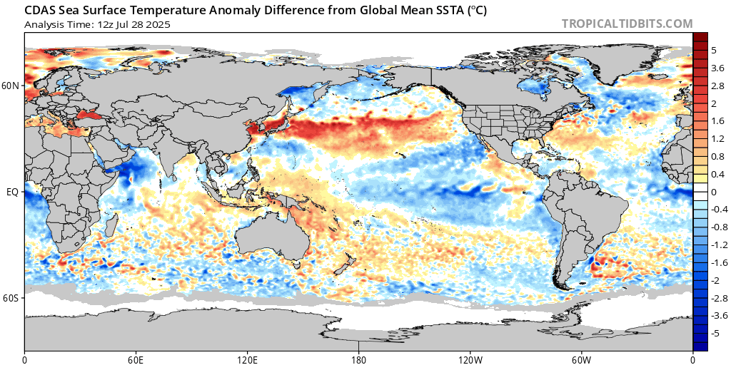
this map is trash. The temps at the North Sea are way off. It is a bug, because other data from the same source confirms this.
No idea why it duplicated the comment. Sorry folks.
Can’t even admit you pasted the stuff twice.
If you don’t like picking start points, then why do you do that too?
The point being that there are consecutive months that display cooling. It means there must be an area of similar size that bumps up the Global Average Temperature. The problem is that when there is no cooling, then those “hot” regions must have something like 1 degrees warming to reach 0.5 degrees. Do you think there wouldn’t be lots of propaganda blaring loudly about those regions? I assure you that the media wouldn’t miss the opportunity.
It points out what fallacy the GAT is. To reach an average, there must be regions above and below the mean. To have a positive mean anomaly you must have regions with more warming than cooling. No one ever shows the breakdown of the parts, let alone display what the variance is for the GAT.
Picking a starting point isn’t the problem, the problem is trying to establish a climatic trend over a period of time so short and a region so small that simply shifting the start date reverses the sign of the trend. That means you’re drawing trend lines in the noise.
To your other point, you can see from the global view that the planet warmed during this period, and that is true whether you’re looking at August-only temps, whole-summer temps, or temps from 1995 or 1993. So of course the “cooling” in Scandinavia in August is more than offset by warming in the rest of the world.
You really didn’t address Jim’s point. If you look at August from 1995-2021 there are huge areas of cooling. Same for Jul-Sep for ’95-’20. Do these areas offset? It’s hard to tell from the picture. You seem to believe they do. I’m not so sure. It’s even worse for Aug, ’93-2021. You complain about picking Norway, Sweden, and Finland but then turn around and only seem to be looking at the red areas on the global map. Your global maps don’t seem to be showing Norway, Sweden, and Finland as cooling at all, they show to have some of the worst warming of anywhere.
The global trend is given in the upper right hand corner of each map. If it is positive, the positive trends offset the negative trends.
the problem is trying to establish a climatic trend over a period of time so short and a region so small that simply shifting the start date reverses the sign of the trend.
CORRECT! Which is why any climate trend analysis that starts less than 6000 years ago (when civilization really started to take off) is simply cherry picking.
Starting 6000 years ago – in the middle of the Minoan Warm Period – shows we’re cooling. These modern extrapolations/trends are all cherry picked as it “reverses the sign of the trend”.
I think you’ve misunderstood, egregiously so, my point about start dates. Starting a trend at 6000 years ago will not be different than starting a trend at 6001 years, or 6010, or 5090 years ago. Thus the sign of the trend isn’t being driven by random variability. Similarly starting a trend at 50, 55, 45 years ago will not reverse the sign of the trend. So here too you are looking at a long enough time interval to overcome the natural variability. But the trend for Scandinavia over the last ~25 years do change sign depending on start date, so you’re actually just drawing trend lines in random noise, not identifying the underlying signal.
The best way to look at it is noting the mild warming trend from the Little Ice Age. From modern data it appears the warming trend has ups and downs. With the current about 35-year “up” part of an approximately 70-year trend, we draw no “climatic” information. The longer term warming trend is less than 1 C/century.
The results of the 2020s and 2030s will tell us if the UN IPCC CliSciFi models have any use. Until then, I see no reason to wreck our society, economy and energy systems with Marxist-like schemes.
“Starting 6000 years ago – in the middle of the Minoan Warm Period – shows we’re cooling. These modern extrapolations/trends are all cherry picked as it “reverses the sign of the trend”.”
Of course it does.
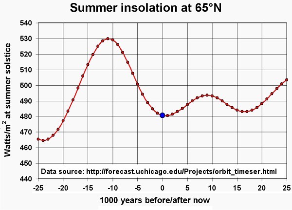
We were coming out of the HCO 6K ya, with TSI at 65 deg N falling (as much as an orbital eccentricity ever does as well) …
And no, the point is what changes mankind has made to the climate since preindustrial … That is a rise in atmospheric CO2 by ~ 50%
with a consequent increase in radiative forcing of 5.35 ln(413/280) ~= 2W/m2
We can’t do anything about the Earth’s orbit, we might be able to do something about polluting the atmosphere/oceans.
Are you going to run away from explaining what you mean by “insolation” again, Banton?
Posh word for sunlight.
Answering for Baton now? And I know the definition of the word, thanks.
“with a consequent increase in radiative forcing of 5.35 ln(413/280) ~= 2W/m2”
What makes you think that is the correct value for radiative forcing for the recent increase in CO2 in the atmosphere?
Why do you consider human emissions of CO2 to be “pollution”, given that CO2 is a natural component of the atmosphere and that there is no fixed value for the percentage of CO2 in the atmosphere? Do you personally pollute the atmosphere when you breathe out?
What you are really showing is that there exist a lot of natural variability; something the IPCC and their cult followers declare does not exist. You have been proven wrong again!
Cheers
Please show me chapter and passage in any IPCC report where it is claimed that natural variability in the climate system does not exist.
25 years is considdered as likely a trend. I would agree with you, if it is only 10 years. But this is not the case.
The thing is: we are far from having a very clear of error with always the same setting worldwide covering temperature measured.
It’s record is filled with instrument changes station relocations etc.
First lesson of science in school: “ in order to have a reliable series of mesurements, you use through the observations the SAME method and the SAME measuring instruments”
That doesn’t mean “don’t improve”, that means simply that the modern way with automated weather stations and their new requirements should be considdered as a second series of observations, that exists next to the old method, which should then continue.
You can’t just “consider” something a trend, you need to perform statistical significance tests. If you find that shifting the start date of your trend by a short period completely reverses the sign of the trend, it’s a very strong indication that you aren’t looking at a long enough time period.
And while, yes, you can often achieve statistically significant trends over 25-30 years at the global or hemispheric level, that isn’t necessarily true of very small regions like the Scandinavian peninsula, especially when you’re looking at a limited number of station records.
And of course I have to note here that the author of this article has done none of this more thorough analysis.
Have you ever done a statistical analysis on a periodic function? Traditional statistical analysis just doesn’t work. If I start a trend on a minimum of a sine wave and then move or even pi or even pi/2 radians I can easily change the sign of any “trend”.
Jim
I never see a discussion of the climate, temperatures and rainfall in the thirty climate zones and sub-zones and how these impact on their neighbors. I suspect the reason is that weather and climate is far more complex that the simplistic modelers would have us believe. We do not need to be scientists to ask hard questions, only keen observers.
Actually the best scientists have one thing in common – their keen observation. They see patterns and ask questions and do experiments to test their theories. Today’s alarmists have nothing in common with men like Michael Faraday and all those who impacted on his life. Faraday welcomed hard questions but today’s alarmists despise them because they cannot allow anyone to threaten their convictions.
I see you skipped the JMA database and ignored the article itself to push the worst dataset available which doesn’t cover the specific listed regions mentioned in the article, you show the GLOBAL maps instead.
The article covers three countries, Finland, Norway and Sweden. You ignored that to use the entire world instead which means you didn’t even address the specific regions at all.
That is pathetic!
I don’t see any disagreement between the JMA database and Gistemp, here. If you look carefully at the maps I’ve provided you will find that they do, in fact, include Finland, Norway, and Sweden, which is the region I was commenting on.
The presented region is named Scandinavia, not World, as US data aren’t World data, Scandinavians aren’t either.
When you are presented with an image of a world map, it actually is possible to only look at one region of it. Did you know that?
It sounds like you don’t have any familiarity with map projections. They are always a tradeoff. However, it is possible to see the entire globe at once.
Finland isn’t part of Scandinavia. That’s Denmark, Norway and Sweden.
Finland, Norway and Sweden are however a reasonably large piece of land area on the same latitude. And all three countries have long instrument records.
Denmark is somewhat further south and has a climate very much moderated by the North Sea to the west and the Baltic Sea to the east. So it’s a very different climate.
Surely you can’t be blind since the JMA charts shows a very different picture, they show a DECLINE in most stations listed.
Yours is GLOBAL while The JMA data covers just three Countries of Finland, Norway and Sweden.
You are not even close to addressing the specific stations listed at all.
What you are doing here is really dumb.
Just… focus your gaze on Scandinavia. Just because the map shows the entire world doesn’t mean you’re forced to only take in the global trend. Look at the region under discussion and relate my comments to that region. The August “cooling” in Scandinavia the article points out is plainly visible in the map. But that August “cooling” that the article claims is actually “late summer” cooling disappears (again, look at Scandinavia on the second map) when you look at Jul-Sep.
I’m sorry if my tone seems incredulous but I genuinely can’t believe I’m having to explain how to look at a map.
Now you are just flailing since you still haven’t acknowledged that you are using a GLOBAL map against listed stations charts of just three countries.
You haven’t once addressed the JMA database at all….. LOL!
Really you need to stop digging the hole you are in.
All of my comments relate to Scandinavia on the maps I provided. You should go back and re-read them with this knowledge in mind. Perhaps you can cut a hole in a piece of paper and hold it over Scandinavia to help you with this visualization since you seem to be struggling. I’m not going to waste more time trying to explain this to you. The data from GISS agree with the data from JMA on these maps.
Perhaps you can look at a satellite image and not see the hole in your roof, therefore the hole doesn’t exist (and you just can’t understand where all that water is coming from).
If you claim to know how to look at maps, it’s a SCALE issue. you don’t use a map of the United States to find a road in Baltimore. You make a snarky comment about cutting a hole in a piece of paper, while at the same time you are covering up the hole with a tarp.
Sunsettommy is not the sharpest pencil even among these not too sharp denier-pencils.
Sunsettommy defended you trollops and here you are maligning the good guy, just because Sunsettommy has it nailed, nyicky.
???
And now Noci the Nasty takes an at-bat.
I’ve been looking at maps for over 40 years and I don’t need your dumm @ss to “explain” to me how to look at one.
You are ignoring the point that regions do not add up to the whole. If you want to refute the temps shown, then find similar sized regional stations anywhere that show the warming needed to make up the difference shown by the GAT. I assure you, you will have a hard time finding them, especially on a global basis.
The very basis for the GAT assumes a non-normal distribution for GAT. That is, it is skewed toward the warm extreme. However, that would likely mean a large variance, skew, and probably a large kurtosis.
Why are none of these statistical parameters EVER quoted when stating a mean value? You want to be an expert, tell us what these statistical parameters are for the temperature distribution. I suspect that you will find the same thing I did, no organization is willing to provide these vital statistical parameters. This demonstrates a lack of scientific rigor and I suspect you will do no better.
Just look at the provide maps… it is abundantly clear that the planet overall is warming. The net global trend is in the upper right corner.
You do realize what you are defining is a cyclical or periodic function don’t you? move the starting point 90 degrees on a sine wave and you’ll get a major change in slope of a linear line. That is why trying to use linear regression to determine a trend on a periodic waveform is less than useless. Trying to use statistical analysis of a periodic waveform is also less than useless.
I should add that any analysis using statistics must also include time as a function and currently nothing with temperature ever includes time to derive time coherent samples of various temperatures at each and every location.
Except in this case if you keep shifting the start point further and further back you just get a warming trend. The behavior is not cyclic – the climate is warming over the long term.
There, FIFY. Again, you’re cherry-picking the start point and making an arbitrary determination of how long is “long term.”
Your lack of scientific education is showing. You must start analyzing a multi-signal periodic function using Fourier or wavelet analysis. Moving further and further into the past provides no special insight into what is happening. If you’ve ever worked with any kind of signals you would understand that various oscillations with varying phases and amplitudes can result in a moving signal. That is basically natural variation. Trying to put a trend line on a signal like this means nothing. You certainly can’t isolate something like CO2 by merely doing averages. It just won’t work. You can’t even forecast the future unless you can also forecast the amplitudes, frequencies and phases of all the different oscillations. Think of AMO, PDO, La Nina, El Nino, Hadley, etc. cells, sun’s variation. These all combine into a symphony of the climate on earth. They all vary with different amplitudes and frequencies. Any you think a simple average will tell you what will happen in the future?
Nobody thinks the linear trend will tell us what will happen in the future, and in fact no curve fitting exercise will successfully predict future climate states. We are talking about what has happened in the past.
Translation:
All climate models projecting doom over the next 30-70 years are trash.
Bullshite ! Are you now admitting that rising CO2 has little to no effect going forward? Or, do you have proof that CO2 temperature effects are greater than natural variation? If you are only looking at the past and not into the future, why the focus on CO2?
Not at all, I’m saying you cannot simply extrapolate historic trends into the future and call it a climate projection, you need to consider possible forcing scenarios. I’m saying that in this discussion we are trying to understand what the trend has been doing for the past few decades.
I think you should be “considering” tea leaves and goat entrails.
Warming at a very slow, unalarming and cyclic pace. CliSciFi picked an upswing and called it CAGW. Man’s CO2 contribution, theoretically, should have some minor positive impact on that naturally increasing trend. That is no reason to destroy our society, economy and energy systems.
That is absolutely correct, even a high school student understands that argument; which is why it is VERY troubling to see NASA/NOAA doing it:
How Government Twists Climate Statistics
Former (Obama) Energy Department Undersecretary Steven Koonin on how bureaucrats spin scientific data.
https://www.wsj.com/video/opinion-journal-how-government-twists-climate-statistics/80027CBC-2C36-4930-AB0B-9C3344B6E199.html
And then there are various and sundry other “anomalies”:
1] An Arctic that refuses to melt (promised by some by 2014), glaciers that refuse to melt (GNP), snows that refuse to disappear…
2] The fact that there is not a single high quality long term tide gauge that shows accelerating sea level rise. Never mind a tripling.
3] The fact that there is not a single temperature dataset (with the exception of UAH) that has not been “adjusted”. Before all the adjustments, the previous determination was:
U.S. Data since 1895 Fail to Show Warming Trend
https://www.nytimes.com/1989/01/26/us/us-data-since-1895-fail-to-show-warming-trend.html
4] And we can go on and on…
The whole thing has a Lance Armstrong taint about it: his primary physician was a notorious doper, inconsistent VO2 maxes with times, miraculously appearing therapeutic use exemptions, assistants finding PEDs in his refrigerator, testimony from witnesses that he told his cancer doctors he was using PEDs, positive laboratory results for EPO from past Tours…
And that was all before his USPS team mates got up in front of a federal grand jury and testified that that they were all doped to the gills and before the final confession on Oprah.
So, if you are not skeptic with all of that, God bless you. The only piece of advice I can give you, if and when you finally do come to your senses, is don’t admit it publicly as you will jeopardize your scientific career as well as lose most of your social media accounts.
Before I “did the math” I was teaching CAGW at University, so I don’t care if the theory it is is true or not, I will go in whatever the direction the science indicates. However, the science has to be correct.
The problem is that your skepticism shouldn’t end at the above points – you need to express skepticism towards these claims as well.
For instance, here is an article showing multiple individual tide gauges showing sea level rise acceleration. Here is the sea ice index showing undeniable decline of the Arctic sea ice. Here is a comparison of raw (black line) and adjusted temperature data, showing that the trend is not the result of adjustments at all. So where is your skepticism towards the skeptics? Are you willing to acknowledge that each of those claims you made is incorrect or misleading?
Look at the attached photo to see how much temps can vary over very small distances. Landscape features such as hills, wooded lots, rivers can all contribute to differing temps of several degrees.
Here is one for you to address, converting Farenheit to Celcius. Do you have any idea what the uncertainty is? How is it addressed?
Not sure what your point is, here, tbh.
The point is that there is quite a variance in temperatures. I’m sure that also exists in tide levels. What is the variance of the data you are presenting? You can’t just compute an average. That is a statistical parameter and scientists also quote the associated variance in the mean so that one can tell how well the mean represents the data being used.
Where is your variance quote? There are numerous standard deviation and variance calculators on the internet that you can put your data into.
The mean represents the central tendency of the population. We are interested in knowing whether that tendency is shifting. Here the range of variance is not so important. If the mean is shifting over time then the distribution is shifting.
You are lying by throwing information away. And you are lying to yourself if you believe you can actually detect such tiny changes.
I asked specifically for “high quality long term tide gauges”. Why would you give me tine gauges that start at 1950?
Here is why:
Special Report on Sea Level Rise
“Tide gauges also show that rates of global mean sea level rise between 1920 and 1950 were comparable to recent rates.”
https://judithcurry.com/2018/11/27/special-report-on-sea-level-rise/
And you can verify that yourself by looking at tide gauges with 100+ more years of history.
And you give me 1979 as proof of “undeniable decline in Arctic sea ice”? If you viewed the WSJ link above you will notice that 1979/80 is a recurring date in all of this:
NOAA : Hiding Critical Arctic Sea Ice Data
https://youtu.be/nIEGo8E9s_8
And as for the “adjustments”:
Posted on November 6, 2015
The bottom line with regards to the hiatus is all of the data sets except for the new NOAA/NCDC data set show a hiatus (with NASA LOTI being the other data set coming closest to not showing a hiatus).
https://judithcurry.com/2015/11/06/hiatus-controversy-show-me-the-data/
Judith A. Curry is an American climatologist and former chair of the School of Earth and Atmospheric Sciences at the Georgia Institute of Technology. Who she is. See:
Climate heretic: Judith Curry turns on her colleagues
(https://www.nature.com/news/2010/101101/full/news.2010.577.html)
————-
Data Adjustment Timeline:
DATA ADJUSTMENT #1 (Land Temperatures – 2015 (this was the new dataset Curry mentions above))
Global warming ‘pause’ caused by glitch in data
https://www.irishtimes.com/news/world/global-warming-pause-caused-by-glitch-in-data-1.2239199
DATA ADJUSTMENT #2 (Troposphere RSS Temperatures – 2017)
Major correction to satellite data shows 140% faster warming since 1998
https://www.carbonbrief.org/major-correction-to-satellite-data-shows-140-faster-warming-since-1998
DATA ADJUSTMENT #3 (Ocean Temperatures – 2019)
Ocean temperature data shows warming is accelerating faster than we thought*
“In the past when [the models and records] didn’t agree so well, part of that was a problem with the observations, not the models,” he said.*
https://www.abc.net.au/news/science/2019-01-11/ocean-warming-accelerating-faster-than-thought-science/10693080
DATA ADJUSTMENT #4&5 (Australian Land Temperatures – 2019)
Heat on Bureau of Meteorology over data records rewrite
The Bureau of Meteorology has rewritten Australia’s temperature records for the second time in six years, greatly increasing the rate of warming.
https://www.theaustralian.com.au/nation/climate/heat-on-bureau-of-meteorology-over-data-records-rewrite/news-story/30c0bc68e582feb2828915e172702bd1
DATA ADJUSTMENT #6 (UK Land Temperatures – 2020)
HadCRUT5 shows 14% more global warming since 1850 than HadCRUT4
The usual method is adopted: depress the earlier temperatures (we know so much better what the temperature was a century and a half ago than the incompetents who actually took the measurements), and elevate the later temperatures with the effect of steepening the trend and increasing the apparent warming.
https://wattsupwiththat.com/2021/02/21/hadcrut5-shows-14-more-global-warming-since-1850-than-hadcrut4/
And with all of those adjustments, the “hiatus” observed by Curry in 2015 has disappeared. As well as the disappearance of the “no trend” reported in the NYT link above.
I have no problem with the adjustments as a praxis (we often need to adjust data) but what is salient about these is that they are not isolated (flukes) but involve ALL of the datasets. (this quite simply beggars’ credulity, and casts real doubt on the experimental competence of the discipline).
I have undergraduates that can point out what I pointed out above… and they do. Which is why I stopped teaching CAGW at University and have gone back to the fundamental sciences.
This is just moving the goal posts. You claim no individual tide gauges show acceleration, I show you that they do, then you claim no, you meant a higher rate of global sea level rise than any time in the past.
Your sea ice video from Heller is bizarre. He takes a graph of sea ice extent and mashes it into a graph of sea ice anomaly, after apparently stretching out the graph of anomalies to correspond with the numeric units on the side of the extent graph. This is completely unnecessary, as we have modern reconstructions of sea ice data:
There is no question that Arctic sea ice is declining. Again, you need to be more skeptical of the skeptics. You are seemingly completely uncritical of any information that fits your preconceptions.
And, again, you can complain about adjustments all you want – I just showed you a comparison between raw (black line) and adjusted temp data:
There’s little difference, the warming is real, it’s not a result of adjustments. I hope you imparted a higher level of scientific rigor to your former students than you display here.
Some excellent posts here Weekly, nice work.
You seem to think he is part of the solution when in fact he is part of the problem.
That is correct. And as a result of not wanting any goal posts, running the data myself was the first thing I did when I started becoming skeptical of the AG hypothesis. It is quite simple to do and a lot simpler than the spectroscopy data I normally work with.
All of the data is there at the PSMSL & NOAA. Download it yourself and run the regression analyses.
With the US temperature data sets, you will produce multiple iterations, as you start with the original raw data (which the NYT piece was based on) and then move through the adjusted data sets. Which is also now true of ACORN and HadCRUT, which also have multiple data sets, from raw to adjusted.
What you will find at the end of the exercise is exactly what Judith Curry reported for SLR in addition to multiple US temperature plots that you can select from… using whatever “Goldilocks” criteria you fancy, from no warming to what they report today.
*And you don’t need something as sophisticated as MATLAB to do it, Excel will work just fine, it will just be a lot more unwieldy.
I agree that running the data yourself is fairly straightforward, which is why I did so in the analysis presented above. The original raw data show an undeniable warming trend consistent with the adjusted data. You won’t be able to perform the analysis in Excel but the code is provided in the link above and is fairly easy to run.
“with the adjusted data” — says it all.
Well, in context with the rest of my comment it does indeed say it all. Your snippet doesn’t really say much, though.
undeniable warming – it is pronouncements like that, that make AGW difficult to take seriously; which are in turn accompanied by inanities like the “Arctic will be ice free by 2014” or that the world has only 12 years left, which has been averred since the 1990s by AGW proponents, BTW (before that the alarm was about peak oil, population outstripping foodstuffs and a return to a neo-boreal climate, if you keep track of the “alarms” as they go by).
And when the “undeniable statements” fall flat… it is “crickets”, with no accountability. Maybe you all are just “joshing about”, but I can’t separate your joshing from what you seriously believe. So, it might be time for someone to draw a line in the sand, and take personable responsibility (put their careers on the line) for what they say?
I think your Reddit comments cover most of what I want to say, so there is no need for a repetition here. However, as the analysis uses the GHCN…. I could use the same model and statistics to make the undeniable argument that stopping global nuclear proliferation is impossible, because each nation already has ~68.9 nuclear warheads (assuming I grid out the existing stocks over the entire globe).
Convincing one’s self is the easy part. Convincing others however is difficult, but can be greatly facilitated by locking others out of the debate, and by labelling them “deniers”, “wreckers” or “Trotskyites”, etc… However, as Trofim Lysenko eventually discovered, sooner or later the harvest figures come in and hungry people eventually stop giving you the benefit of the doubt and demand answers for the discrepancies.
Maybe Lysenko was just “joshing about” as well? However, we are fast approaching half a century of CAGW hysteria… and all I see is an Arctic that refuses to melt, sea levels that refuse to rise, and a Northern Hemisphere that refuses to warm (which we learn now may growing cooler, because of the unprecedented warming of the Arctic)…. and a plethora of various and sundry other “anomalies”.
However, what I find most astonishing is that if one genuinely believed that the Earth was going to end in twelve years, why would one be so averse to news that it might not be or that it isn’t ? The normal reaction to a cancer diagnosis is a second opinion… but whoa to any second opinion about CAGW.
Instead, CAGW seems to serve as a perverse “raison d’être”… go figure.
More fake graphs.
What’s bad about declining sea ice? Currently it is near-impossible to live in the Arctic and Antarctic, let alone grow food, or navigate the waters. We should all be happy that the ice left over from the last ice age is finally melting. Future generations will have enormous swaths of habitable land and open water, and the surface not experiencing frost in winter will likewise expand enormously. This will help more than anything else both to feed a growing population and provide it with living space, AND bring down the amount of energy currently wasted on heating our dwellings because the current climate outside the tropics is so very unsuited for humans (as well as most farm animals and crops – look at the amount of tasty and nutritious food we currently have to import from the tropics, again wasting tremendous amounts of fuel). Wouldn’t it be wonderful if Russians, Canadians, and Swedes could grow their own bananas, mangos, ananas and oranges?! Fighting global warming is fighting prosperity, fighting health and wealth, ultimately fighting LIFE. Only Death is cold.
Your Arctic sea ice data shows that minimum summer sea levels have stopped decreasing
🤣 😂🤣🤣
Tamino…
🤣 🤣
“Coastal sea-level acceleration is analyzed using all of the world’s high-quality tide gauge recordings with lengths of at least 75 years that extend through 2017–19. Earlier studies have demonstrated that tide gauge recordings of at least 75 years in length are required to reduce the effects of multidecadal variations on acceleration. There are 149 tide gauge records that meet the criteria. Mean and median sea-level accelerations based on these gauges were 0.0128 ± 0.0064 mm/y2 and 0.0126 ± 0.0080 mm/y2, respectively, both at the statistically significant 95% confidence level.“
https://meridian.allenpress.com/jcr/article-abstract/37/2/272/450977/Sea-Level-Acceleration-Analysis-of-the-World-s
These tiny changes are caused by CO2, Phlips?
That is a step in the right direction: 0.0128 ± 0.0064 mm/y2.
As you cited J.R. Houston, I assume you will stick by his acceleration values?
If so, that will allow you to dispute almost every single paper now being published by the alarmist side and may get you labeled as a “climate denier” should you persist, as the acceleration values they publish are often an order of magnitude (10x) or greater than .0128 mm/y2.
For example, with Houston’s paper in hand, you can rubbish the following study’s findings:
https://phys.org/news/2021-01-sea-level-cards-trends.html
In which they claim that Rock Port Texas is experiencing an acceleration rate of 0.262 mm/y2, which is 20x what Houston reports.
Furthermore, you can cite the Houston paper to rubbish the “time frames” they are using, of less than a decade, as you know from Houston that time periods of “at least 75 years in length” are required to reduce multidecadal variations.
Furthermore, the Houston paper is a follow-up to a study they did in 2011.
https://judithcurry.com/wp-content/uploads/2018/11/special-report-sea-level-rise-3.pdf
I don’t think there is a skeptic here at WUWT that will disagree with 0.0128 ± 0.0064 mm/y2. It sounds about right and is hardly alarmist or a concern or likely related to carbon dioxide.
So, the next time you read a paper that posits values greater than 0.0128 ± 0.0064 mm/y2, I hope you will have the fortitude and the integrity to cite Houston. I guarantee it won’t win you any friends in the CAGW alarmist community.
You are free to assume whatever you wish; however the Houston study was cited purely to refute the nonsense claim that no tide gauges show acceleration, you are inferring that means I also endorse their estimate for global SLR acceleration. Infer away.
There are known issues with tide gauges, including vertical land movement and sparse coverage, particularly in the Southern Hemisphere. Satellite altimeters do not suffer from these drawbacks and so I prefer SLR measurements from that source.
https://www.pnas.org/content/115/9/2022
You believe it is possible to resolve 1mm changes in sea level from a satellite?
Absurd.
stutter much?
Strangely enough, I place far more trust in actual, verified thermometer measurements in defined locations than in homogenized, extrapolated, or averaged “global” temperatures, but that’s just me.
There does not seem to be any major disagreement between the JMA series and the GISTEMP index in this case. But that “defined location” piece is a bit of a bear, because thermometers get moved all the time, so claiming that you don’t need to deal with this is a bit naive. You can also see that there is enormous difference in the mean of the different series shown, so pretending that those represent a homogenous series is also naive.
“because thermometers get moved all the time, so claiming that you don’t need to deal with this is a bit naive.” You cannot deal with that, you can only guess what direction the changes happen, but it only a guess. If you were honest you would have to say the so called average world temperature is a WAG. The error bars would be in degrees not tenths of hundreds, and those errors could way south the way north from one year to the next. The world temperature is numerology has no meaning, it trying to get a signal out of red noise and that not possible. This whole debate is stupidity. It would not be if it was framed honestly.
You can actually deal with it pretty well by identifying break points in the temperature series using the data and data from nearby stations. This has only a minor effect on the global trend but is very significant on small regional scales.
If it were actually truly impossible to compile a global temperature estimate using thermometers then we wouldn’t expect to see good agreement between thermometer and satellite estimates:
then we wouldn’t expect to see good agreement between thermometer and satellite estimates:”
You can’t have a good agreement between the two because they measure at different gradients.
You have already been exposed lying about this.
Fudged compared with fudge… right…
🤣 🤣 🤣
The only people who “need to deal with” such are averagers, fooling themselves they are able to detect 0.01K changes.
Anyone who wants to compile a global temperature estimate needs to deal with these issues. It’s also fine to ignore them, but ignoring them is a form of dealing with them, so you should be able to justify your choice.
Your “global temperature estimate” is totally without any merit and tells exactly zero about any climate “changes”.
0.01 temperature variations are so far within the uncertainty range that no respectable physical scientist would stoop to quoting those variations as real!
The fact that you even repeat the claims indicates that you have no idea what uncertainty, standard deviation, or variance parameters means when dealing with the real physical world.
And just as wrong as to claim they can average decimal places to tenths, hundredths, thousandths…
No instrument error.
No site location error.
No site contamination error.
No verification of instrument accuracy. Indoor laboratory accuracy numbers claimed.
No side by side testing before, during, after instrument installation or replacement.
Every adjustment, every infill, every swaged temperature is just another admission that the error bounds increased while those increases are ignored in favor of sums and averages.
The reason is simple: Climate “Science” is practised almost exclusively by computer and data scientists, not by people trained in Physical Science.
You missed infilled and swaged from other stations up to 1,200 km away.
Dude! How can analyzing both July and August be “cherry picking” for reporting summertime temperature trends in northern Europe?
And how can using data for Sweden, Norway, and Finland be “cherry picking” for northern Europe? What other countries are in northern Europe but for these three?
Again, cherry picking does not mean you’ve presented false data, it means you’ve omitted data that doesn’t suit your narrative and this can mislead people, as it has in this very comment thread.
“it means you’ve omitted data that doesn’t suit your narrative ”
It is actually worse than that. Even after tweaking the selection of region and start dates to maximise the cooling trend, she did not show all the stations that met her criteria.
Torungen in July actually has more data than some stations she did plot and yet is excluded. By an amazing coincidence it shows a warming trend.
I think my incredulity is vindicated.
http://ds.data.jma.go.jp/gmd/tcc/tcc/products/climate/climatview/graph_mkhtml.php?&n=1465&p=999&s=7&r=0&y=2021&m=8&e=0&k=0&d=0
Thanks, I would love to see a response to this from someone insisting that this article is not a blatant exercise in cherry picking.
Phillips is doing exactly what he’s accusing the authors of doing ,there 25 year cooling is exactly right , hes not argued against this, hes playing around with the data, unlike you who lies about how many weather stations were used, and trys to compare satellite data with land based data, both of you are desperate and frauds.
Except sometimes it is a 21 year cooling, or a 22 year cooling (etc). As I showed with one of the most ‘cooling’ stations, you can eradicate or reverse the trend by moving the start date a few years in either direction. Why do you think her plots use different start dates for each country and month? Start dates spanning 5 years? Blatant cherry picking is the answer.
And if anyone has the time, have a look at the July data for Torungen.and confirm ….
It is in Norway
It has sufficient data
It has a warming trend
It is not shown in the post.
Many posters here style themselves ‘sceptics’. I seem to be the only one who has done the simple sceptical thing of looking at the data.
Judging by the voting on the first comment a lot of folks do believe this stuff. Which is revealing.
http://ds.data.jma.go.jp/gmd/tcc/tcc/products/climate/climatview/graph_mkhtml.php?&n=1465&p=999&s=7&r=0&y=2021&m=8&e=0&k=0&d=0
“ How can analyzing both July and August be “cherry picking” for reporting summertime temperature trends in northern Europe?“
Here’s some of that summertime cooling in Norway ….;-)
“And of course this is the problem with cherry picking – you can present “true” data that presents a misleading and/or incomplete picture of what is actually happening.”
Misleading with true data, you mean like in the images that you post showing the temperature change? The ones that use much more vibrant colors to emphasize warming, while muting the colors for the cooling? Thanks for posting such a nice example of distortion.
“And of course this is the problem with cherry picking – you can present “true” data that presents a misleading and/or incomplete picture of what is actually happening.”
I thought the subject was climate not covid?
Notice how Phillips doesn’t even attempt to refute the data.
Not only that he and Weekly_rise don’t stick with the article coverage of the three listed countries and the use of the JMA database that covers it.
And why shouldn’t we?
Because the high priests of climate science have ordered you to ignore it.
What stuff, that it is getting cooler instead of warmer? That is normal weather, has been happening for decades and we have lots of data to show warmer and cooler trends. Slightly cooler in the 1970s that inspired the fear of a new ice age, then some warmer years, now cooler again.
If you don’t believe that official records do not lie, what do you believe? Crystal ball statements? Official records “homogenized” by NOAA or NASA?
Obviously, you must have a refutation of this article. Can we hear it?
Is JP one of those who claims that “warming causes cooling”?
Here is what I believe:
I believe we had this CAGW nonsense sorted in 2002, when we published:
1. “Climate science does not support the theory of catastrophic human-made global warming – the alleged warming crisis does not exist.” – 2002
2. “The ultimate agenda of pro-Kyoto advocates is to eliminate fossil fuels, but this would result in a catastrophic shortfall in global energy supply – the wasteful, inefficient energy solutions proposed by Kyoto advocates simply cannot replace fossil fuels.” – 2002
3. “If [as we believe] solar activity is the main driver of surface temperature rather than CO2, we should begin the next cooling period by 2020 to 2030.” – 2002
3a. “I suggest global cooling starts by 2020 or sooner. Bundle up.” – 2013
See Electroverse.net for record-cold events all over the world.
ARCTIC FRONT ENGULFS EUROPE, HEAVY SEPTEMBER SNOW TO BLAST WESTERN U.S., + SUBTROPICAL QUEENSLAND SUFFERS RARE SPRING SNOWS AND WINTER-LIKE LOWS
September 23, 2021 Cap Allon
With the intensifying gas crisis, one UK charity has already said that people will be forced to choose between “heating and eating’” this winter. And that’s assuming there is even enough food and gas to go around — things are really that tight at the moment.
Just ordered my standby generator mate.
I endured the 1970’s energy crisis in the UK complete with power cuts. I’m not putting up with that sh!t again!
I seriously hope you get fuel to run it. We have a propane fueled one with a large underground tank that we keep topped off. A couple of years ago with a hurricane and widespread power outages propane was hard to get for a period. The good news with hurricanes is it is warm, not freezing if the power goes out.
Best of luck. The European continent is already starting winter.
It’s LPG. We’ll only need a couple of 19Kg bottles as power cuts will only last a few hours, probably 4 at most. Evidently we. can get 20 hours from a bottle at 50% load which should be fine, it’s only to run our gas boiler, fridge/freezer and some LED lights.
I’ve come to the conclusion that the reason to eliminate fossil fuels and move to unreliable electricity generation is to create a new “Apple” stock that gives the monied folks a place to park their savings with a high return. When it appears to be going south, the investments will move on leaving everyone else to deal with the fiasco.
Anything you write NO, looks like you have actually answered the question ” define climate denial ” by example well done.
“Does anyone here actually believe this stuff?”
Belief is hardly scientific, and it seems exclusively reserved to climate modelling.
Semiconductor driven blind faith
So you don’t believe in easily verifiable facts?
Yep thats climate denial, from a global warmest, the hypocrisy is strong in this one.
JP,
Here is a longer record with no signifciant T change. This image was made in 2017, when it had long been apparent that global warming was dependent on factors like UHI and homogenization. Other charts like this can be made from several Antarctic stations. Geoff S
http://www.geoffstuff.com/macquarie_gw.jpg
Why are you replying to my post then addressing John Phillips, your better at finding spelling mistakes.
re: “your better at finding spelling mistakes.”
Que?
B Clarke,
I do not have management of the formatting of the blog.
It did not show where I intended.
My spelling is exemplary (or examplary).. Geoff S
You do manage to quote yourself i see so its not really a problem for you is it sherri, then you address the content to me, thinking I won’t reply, well your wrong again sherri .
Your a coward sherri with a grudge ,take your games elsewhere,
John Phillips, I believe you’re an idiot. I find the data presented by Pierre interesting, especially as regards the Doom Princess in Sweden.
I certainly believe what you state that you believe, although having some facts that substantiate the assumption that our belief is halfway between belief and truth…
I mean – does anyone believe this ever so carefully cherry-picked set of data signify anything worth signifying?
Why JMA? Why Summer? Why start 1995/6, Why Scandinavia?
I guess having put in the hours to find locate one dataset/season/time period/region out of countless possible combinations that showed cooling, Kirye wanted to get another post out of her labours 😉
PS Stockholm.
Damage limitation exercise phillips ,its getting cooler not warmer.
Actually, looking at the station in Google Earth 59.350000, 18.050000, the temp sensor sits about 3 meters (8-10 feet) from a roadway adjacent to a Traffic Control Light where ICE cars with warm engines and hot exhaust are forced to sit idle for a minute waiting their turn to proceed
It’s on a small island in the midst of urbia
Well researched, so that gives us two conveniences, 1 easy to access the data , 2 skewed data that will have no relevance except in its own micro area. I’m not surprised phillips relies on this.
Yep, on a scale of A-F, this site deserves a D- at least it’s sited on grass
PS Stockholm population.
Can you spell UHI John?
Your attempt to address the article is a complete failure because you are using an ANNUAL Mean while the article was specific for one month, AUGUST.
You didn’t counter anything here……..
Now THAT’S what I call a Cherry
Bogus!
Looks like a lot of UHI and adjustments.
Answering to yourself now phillips Freudian slip, or embarrassed, why summer because that’s when its supposed to get hotter ,what would you say if they gave data for winter, ” oh it would be its winter” why start 1995/ 96 gives a longer time period to show a longer trend ,perfectly reasonable ,why Scandinavia, why not, would you cherry pick a seasonally hot country of course you would, failed again phillips,
Is this another example of global warming philips in Europe..
https://www.bbc.co.uk/news/av/world-europe-58671941
It’s not a surprise that there is some frost in late September (the BBC piece). It’s past the Autumn equinox now and recently a HP cell has advanced cold air from northern Russia/Siberia, where things have been cooling, into E Europe….
There is as yet though no sig cold/ frost over eastern/northern Europe…..


All quite normal.
Thats right banton no global warming to stop the frosts .
Then you say
“air from northern Russia/Siberia where things have been cooling into E Europe….”
Then you say
“There is as yet though no sig cold/frost over eastern/northern Europe.”
So a very big contradiction there banton, Russia is eastern europe. And were exactly do you think Poland is.
Another damage limitation exercise banton , another disgusting post of yours trying to deflect from deaths people freezing to death in Poland forests.
“So a very big contradiction there banton, Russia is eastern europe. And were exactly do you think Poland is”.
I said N Russia/Siberia actually (you fail)
“And were exactly do you think Poland is”
Where I implied it was …. E Europe (you fail)
For those blinded by the rage of having to perform bias control, comprehension is obviously impossible.
AGAIN:
It is late September.
Land over high latitudes is cooling and air from there came west into E Europe (N Russia/Siberia is/are NOT in Europe and Poland is).
As weekly has said … I’m genuinely amazed at the obtuseness here.
And it takes some beating!
Maybe a function of to many “alarmists” ratting some denizens.
Well you can repeat echoes all you like if you want to just vent anger, but you wont know what’s happening in the real world of climate unless you have someone post up other than “alternative facts”.
“Another damage limitation exercise banton , another disgusting post of yours trying to deflect from deaths people freezing to death in Poland forests.”
AS weekly has said this really are amazing!
Even for this place – and that’s saying something.
What has pointing out actual weather conditions in E Europe (and the meteorology of it occurring) got to do with …”trying to deflect from deaths people freezing to death in Poland forests”
And also: how would a “socialist” (as I am often accused of being on here for posting up the science) not sympathise with immigrants? – actually I’m not and I very much do. It just takes a good person.
Putting your ignorance on a moral high-horse with that slur is disgusting ad hom.
Your talking rubbish banton I’ve shown what a fraud you are,my original reply stands.
No you are talking rubbish.
For that to be true – you need to show it with data/facts and not come at me in a nasty ad hom manner.
No matter how much fake facts you need to bolster your confirmation of bias – there is no need for it.
Just on a basic human level there isn’t.
You don’t know me.
So don’t attack me for making a statement of meteorological fact just because you don’t like it.
It’s not big and certainly not clever.
Try countering with facts not supposed errors in comprehension – which turn out to be yours.
It’s really pathetic.
Not only are you a idiot your a liar too, remember banton when you said a Astrophysics paper was a opinion, turned out it was a PR Paper, your a desperate little man believing in a false religion.
Banton you are an idiot.
I live here, and it’s bl…dy freezing cold!
Everyone is complaining about it!
It was the same this spring, 1 month late for the leaves to appear.
Maybe Anthony is vying for Griff’s gig as the new Baghdad Bob?
He’s not going about it very well.
I’m not “vying for anything”.
I post on here with facts that counter the often fake stuff that appears as a dog-whistle to the faithful.
It’s fun and so easy.
You live down a rabbit-hole here.
The science isn’t passed in echoes between denizens, with forever “whack-a-mole myths” that are just basic mistruths of climate science – that would be known, if anyone WANTED to be enlightened.
You don’t, as is hilariously obvious from this thread alone.
And someone turns up with stuff from above surface and the attack-dogs come in savaging whoever.
A thread a week or so back did have 2 denizens that thanked me for the info I posted – so there are some not so rabid people on there.
Again I don’t care a jot what any of you think – it’s quite obvious what the majority of denizens thinks and I don’t expect to change minds.
I do care about being respectful and polite.
There are some here that are plainly not.
How dare you to claim reality while the models say otherwise! Think again, you must be sweating!!! 🙂
“I live here, and it’s bl…dy freezing cold!”
Where is here?
Finland or Poland.
Read again – I didn’t say it wasn’t!
What I said…
“It’s not a surprise that there is some frost in late September (the BBC piece). It’s past the Autumn equinox now and recently a HP cell has advanced cold air from northern Russia/Siberia, where things have been cooling, into E Europe….
There is as yet though no sig cold/frost over eastern/northern Europe…..
All quite normal.”
Note the word “SIG”, meaning significant.
Not NONE.
The CR map shows exactly that.
It’s quite normal to have ground frost and a touch of air frost at this time of year and of course it feels “bl…dy freezing” coming, as it does, after warmth.
The point is that it’s not anomalously cold.
Only significant to kill people, idiot.
We are talking climate.
Grow some integrity idiot
Completely ignoring deaths through cold obfuscating the facts around the cold, replying 4 times yet not once acknowledging the fact makes you somewhat a psychopath.
“Where is here?
Finland or Poland.
It’s past the Autumn equinox now a…of course it feels “bl…dy freezing” coming, as it does, after warmth.”
If you really want to know we spent August (or a good deal of it) in SPB Russia….
The bad cold weather, already started in Ural in early August & it was cold all around the Finnish gulf area from then on,- same going further north thru Rybinsk, where it poured with rain for days…
Moving along the Baltic coast kept us the same weather, which is the same as in Finland.
Poland???
You crazy?
Poland has nothing like the same weather!
Autumn equinox was literally 2 days ago!
We have had our communal heating on here for a week now.**
It’s never put on until October, but all of us were so cold they begged to get it going early this year….(cold after warmth??!!!) WTF!
You are doing nothing but talking bollox!
I can see you are another one of those guys that sits in a warm office for years, and has no idea what real world conditions are, then try to rabbit on** about how I must be wrong!
“You are doing nothing but talking bollox!
I can see you are another one of those guys that sits in a warm office for years, and has no idea what real world conditions are, then try to rabbit on** about how I must be wrong!”
I am talking meteorology – as a retired meteorologist.
It’s you that are talking “Bollox” as you have no data to back it up – I do, and have.
You are just handwaving and now being abusive as well.
Nothing I said disputed that you haven’t “had our communal heating on here for a week now.**
If you had comprehended what I had written.
Perhaps English isn’t your native language?
AGAIN: I said that currently it is NOT ANOMALOUSLY cold beyond what is normal for this time of year.
GOT IT NOW!

“If you really want to know we spent August (or a good deal of it) in SPB Russia….”

This is the Aug 21 anomaly map that shows SPB to be near 0.5C ABOVE the ’51 to 80 baseline.
So, if you felt “bl..dy freezing” then I would suggest it’s because you are used to hot Augusts now because of AGW. (sarc)
Sorry the data disagrees with you.
But you could always go to the “with one bound he was free” option and say it’s all a fraud.
You’re welcome
“AGAIN: I said that currently it is NOT ANOMALOUSLY cold beyond what is normal for this time of year.”
You are talking utter bollox, but there, you are from the UK, and it’s par for the course now…as you don’t travel out of your armchair with your slippers, and don’t work outside.
As for your stoopid “Maybe English is not your native language” how about being a fluent WELSH speaker? Doh!
Fact is, Europe is colder because I live there and my work is highly weather dependent (as are people that do roofing & building work).
It’s the 2nd year we have cold summers in Russia, which is a damn sight bigger than your little island on the edge of Europe.
It was so cold last 2-3 years in Russia in the middle of summer, people called it “zillioniy zima”…GREEN WINTER.
How do you explain the failure of all fruit and grape harvests in France – with etat de “catastrophe naturel”….duh!
I don’t care what your fancy maps claim to say, because your background in Met office with its 100% failure record is a “failed state”, and all you can moan on about is, how I must be wrong!
Hmmm. Your “climatereanalyzer.org” graphics have major problems.
The world temperature graphic? Did you choose the color scheme?!
Of course you did, that’s why the oceans are a flaming red where other world map graphics show a lot of cooling.
Show us the approaching La Nina, banty? Why isn’t La Nina showing?
Then there is your third mystical climatereanalyzer graphic. Besides your chosen temperature colors:
What happened to the 21st Century?
Besides using adjusted temperatures, you use the classic maximum sea ice year 1979 as the start for the base and then end in 2000.
Afraid to use the current accepted base years?
Fudged, fraudulent data. All to deceive any way you can.
Surely you jest! A whole 5 minutes difference between sunrise and sunset, or 0.35% imbalance in insolation.
Why not? It’s data. Or do you believe JMA data is fabricated?
Because the thermageddonists told us the Summers in N Europe will get warmer
Why not? That’s a quarter of a century of data.
Because last time I looked, Scandinavia is in Northern Europe. Or has it moved? Does someone need to tell Google Maps?
Orland
Kirye says she plotted stations for which there is enough data, and for July in Norway she started her plot in 2001.
Torungen is in Norway and has a continuous record of July data going back to 2001. For some reason it did not make the plot.
I can’t think why.
What’s the standard deviation of this fit, Phillips?
Pure deflection. What is the SD for the plots in the post? I notice you didn’t ask.
The point is – this station should have been included. It was not. It has a warming trend. It could be an innocent mistake, even so, at the very least it invites scepticism about the author’s credibility and competence.
The credibility in question is yours phillips you accuse the authors of cherry picking ,a 25 year spread is not cherry picking ,then you do exactly the same, that makes you a hypocritic .you have not disproved the authors data.
Alarmists came.
Alarmists saw.
Alarmists shimmied, shaked, faked and lost.
Repeatedly.
Falsehoods exposed, lies exposed, idiocy exposed.
Can’t even answer a simple question about the data YOU posted — pathetic.
Two wrongs don’t make a right! Just because someone else didn’t quote appropriate statistical parameters is no reason for you not to do so. Your statement is nothing more than an excuse.
Unbelievable. Faced with evidence the author dropped inconvenient data, the response is a nitpick over stats.
The trend is every bit as significant as those she did show.
Kirye seems to have the same integrity levels as her husband.
Still running away from inconveniences…
You overlook the fact that all the Temps records used in “the science” are cherry picked.
2 examples –
Australia’s BoM excludes everything prior to 1910 because disastrous heatwaves in the 1890s;
Canada excludes everything prior to 1950 because disastrous Heatwaves in the 1930s;
And what records are then used are adjusted to become “the data”.
So John be self aware that it’s not a good look to be sanctimonious about cherry picking when you’re standing on huge mounds of picked cherries yourself.
More myths about adjustment/omission – as though recording/siting/instrumentation back (whenever) was an equivalent to today.
When of course *they* wouldn’t countenance the same today..
FI:
“Australia’s BoM excludes everything prior to 1910 because disastrous heatwaves in the 1890s;”
Rubbish.
http://www.bom.gov.au/climate/change/acorn-sat/#tabs=Early-data
“The national analysis begins in 1910
While some temperature records for a number of locations stretch back into the mid-nineteenth century, the Bureau’s national analysis begins in 1910.
There are two reasons why national analyses for temperature currently date back to 1910, which relate to the quality and availability of temperature data prior to this time.
Prior to 1910, there was no national network of temperature observations. Temperature records were being maintained around settlements, but there was very little data for Western Australia, Tasmania and much of central Australia. This makes it difficult to construct a national average temperature that is comparable with the more modern network.
The standardisation of instruments in many parts of the country did not occur until 1910, two years after the Bureau of Meteorology was formed. They were in place at most Queensland and South Australian sites by the mid-1890s, but in New South Wales and Victoria there were still many non-standard sites in place until 1906–08. While it is possible to retrospectively adjust temperature readings taken with non-standard instrumentation, this task is much harder when the network has very sparse coverage and descriptions of recording practices are patchy.
These elements create very large uncertainties when calculating national temperatures before 1910, and preclude the construction of nation-wide temperature (gridded over the Australian continent) on which the Bureau’s annual temperature series is based.”
An “national average temperature” for Australia?
What a meaningless construct that is.
The climates of continental Australia range from tropical, marine, desert, mountain, snowy high plains, sub-tropical, temperate, concentrated urban, savannah, and more.
The BoM is infested with ideological activists.
Read the participation of their records chief Jones in the Climategate perfidy.
Baton is one of the world’s foremost averagers.
Australia’s BoM excludes everything prior to 1910 because disastrous heatwaves in the 1890s;
Canada excludes everything prior to 1950 because disastrous Heatwaves in the 1930s;
That may be true at the national level (are you sure about Canada?) however the global datasets – eg GHCN – do use the earier data to compile their trends and averages.
Here’s the GHCN record for Darwin, Northern Territory, Australia.
Funny you should mention Darwin.
Look what the BoM did with those records –
https://jennifermarohasy.com/2019/02/changes-to-darwins-climate-history-are-not-logical/
The station moved. They should ignore that?
“As previously advised, the main temperature station moved to the radar station at the newly built Darwin airport in January 1941. The temperature station had previously been at the Darwin Post Office in the middle of the CBD, on the cliff above the port. Thus, there is a likely factor of removal of a slight urban heat island effect from 1941 onwards. However, the main factor appears to be a change in screening. The new station located at Darwin airport from January 1941 used a standard Stevenson screen. However, the previous station at Darwin PO did not have a Stevenson screen. Instead, the instrument was mounted on a horizontal enclosure without a back or sides. The postmaster had to move it during the day so that the direct tropical sun didn’t strike it! Obviously, if he forgot or was too busy, the temperature readings were a hell of a lot hotter than it really was!”
This quote makes the case about records fudging for me –
“Obviously, if he forgot or was too busy, the temperature readings were a hell of a lot hotter than it really was!”
This is pure speculation about how the Post Master carried out his duties.
If there is no actual evidence of such distracted conduct by the Post Master, the recorded contemporary readings should be left as is, not arbitrarily “adjusted” because some latter-day, unaccountable smartarse at the BoM decides he/she has special insights as to how things were done.
So the station moved, readings simultaneously dropped, and this should be ignored. Got it.
LOL.
The record should end, and a new one started. To assume you can fabricate a “long” record by making adjustments is just wrong. The uncertainty involved just absolutely destroys any accuracy and precision estimates.
Basic metrology teaches that you can not “calibrate” one device with another device because of the combined uncertainty. If you have a question about the accuracy of a device it needs to be calibrated at a laboratory that specializes in meeting NIST standards. That can’t occur with devices that are no longer there. That is the reason for stopping the record and starting a new one!
Exactly, and this is the way a competent meteorology lab does things. An example (goes back to 1981):
https://midcdmz.nrel.gov/apps/html.pl?site=BMS;page=qa_fd
When changes are made, the previous block is ended and a new one started; no going back and “adjusting” old data to match what is expected.
It is true phillips ,who said in a earlier post the more data the better ,yet you completely ignore this blatant minipulating by boM.
More hypocritical obfuscating by you.
Where’s the hockey stick, phlips?
So I picked one of the most ‘cooling’ stations at random and went and got all the data, rather than using Kirye’s arbitrary start date. This adds just 8 years.
UTSJOKI KEVO
Year Month Mean Temp.
1988 8 10.6
1989 8 11
1990 8 11.3
1991 8 11.1
1992 8 9
1993 8 10.9
1994 8 11.6
1995 8 10.1
1996 8 12.3
1997 8 13.2
1998 8
1999 8
2000 8 10.9
2001 8 10.5
2002 8 11.5
2003 8 11.3
2004 8 11.8
2005 8 11.9
2006 8 12.4
2007 8 11.7
2008 8 9.1
2009 8 12.2
2010 8 9.9
2011 8 10.9
2012 8 10.2
2013 8 13.1
2014 8 12.2
2015 8 12.7
2016 8 10.5
2017 8 10.4
2018 8 11.4
2019 8 10.7
2020 8 11.2
2021 8 11.1
http://ds.data.jma.go.jp/gmd/tcc/tcc/products/climate/climatview/graph_mkhtml.php?&n=2805&p=999&s=4&r=0&y=2021&m=8&e=0&k=0&d=0
And I plotted it.
Did you think we have all gone away phillips , thats why your replying to yourself ,so let’s look you change the start date , thats not good when your trying to disprove something, like for like but its ok for you to shift the parameters? I don’t think the plot is right either
As I said, I got all the data, more data points are generally better. The cooling trend disappears if you look at the whole record for the station. After all, what is so special about 1996? (I can guess).
This post is an update one Kirye did about the same stations in July. Here are the start dates she chose for July and August by country:
Sweden 1997 1995
Norway 2001 1996
Finland 1997 1996
So she starts her plots in a different year for each month and usually a different year for each country, with no reason provided.
I think she just chose the earliest year for each country/month that gave her a non-warming trend. There’s a name for this kind of data selection and it includes a popular stone fruit 😉
No phillips what you are doing is expanding the data 5hats not relevant to the data set in the article your not disproving anything, your trying desperately to show theres no cooling when in fact the article areas show cooling for some 25 years ,
“the article areas show cooling for some 25 years ,”
Here’s the 12 year trend for a ‘cooling’ station.
Still manipulating the data phillips I don’t believe a word you say nor does anyone else
“the article areas show cooling for some 25 years ,”
and here’s the 6 year trend for that ‘cooling’ station.
Use all the data – warming.
Start 1996 – cooling
Start 2010 – warming
Start 2016 – warming.
See? You can show pretty much any trend you want with a careful selection of start date. Which is what Kirye did.
And if you’re also willing to hide data that doesn’t fit, well so much the better.
I repeat, does anyone still believe Mrs Heller?
LOLS.
Looks like no trend whatever.
Very slight warming. Not cooling.
Hello! Mr. Standard Deviation!
Why not?
John P,
Up above, I posted the 50-year official record of Tmax and Tmin at Macquarie Island. No cherry picking, simply a selection of data with no UHI, no homogenization, remote, isolated, with few man-made complications.
Can you explain, seriously, why there has been no significant change of temperatures over that 50 years? By what mechanism does the pervasive global warming effect somehow identify and de-select Macquarie Island from the places it has warmed?
I see you managed to reply to the person you wanted to communicate with no problems sherri, ok game on .
Up above, I posted the 50-year official record of Tmax and Tmin at Macquarie Island. No cherry picking,
Selecting a single location that has the trend you want is the very definition of cherry-picking. Global warming does not mean that every single location on the whole planet is getting warmer.
You phillips have been cherry picking and manipulating data for two days, you can’t refute the article so you manipulate data thats not relevant to the article. A sign of desperation and fanatical manipulation
By you , the global warmests are getting desperate.
“you can’t refute the article”
Do you agree that the article fails to show (at least) one station that met the criteria for inclusion and has a warming trend?
Yes or No will do.
Still no standard deviations, phlips?
Lets see phillips you don’t answer to the allegations, yet you expect me to answer a distraction and bait tactic , your distractions don’t work phillips .
The post is fatally flawed, hardly a distraction.
Your inability to answer the simplest of questions is noted.
If the article fails to “show” phillips then is not part of the article ,its you who are basically flawed , you have just compounded everything I accused you of,, why don’t you try to answer the allegations, do you really want to go down the road I asked first.
If the article fails to “show” phillips then is not part of the article ,its you who are basically flawed , you have just compounded everything I accused you of,, why don’t you try to answer the allegations, do you really want to go down the road I asked first.
You don’t actually believe the “stuff” the MSM feeds you, do you?
Probably not, hes a paid troll
Since 4 nights in a row, the western part of Germany is happy to announce a temporary end of warming shown by groundfrost in September.
Not just usual 😀
Yes. It’s data, not models.
Why do you ask? Do you not believe it?
Do you not believe the data from the Japan Meteorological Agency (JMA)?
If you have a quibble with the story, analyze the data for yourself, if you are able to do so. Otherwise, a good starting point would be some research methods courses.
Your comment is typical of the left, a snide remark with no substance. If you’re going to serve a useful purpose in the world, try to develop substantive criticisms and reasoned analyses. That will make us raise our game and global ignorance will decrease a little bit.
His problem is: “How dare we use raw station data instead of homogenized data that smears the Stockholm UHI across the entire arctic.”
I am pretty sure if we check one of the vaunted homogenized databases, we will find that the station trends have all been inverted. Reality does not seem to comport with the narrative so must be ignored.
Does anyone here actually pay attention to you?
No!
Pretty much stopped responding to his foolishness months ago.
Waste of money for an ineffective trollop.
Better get back on the troll instruction manual, which says something like “science explains that global warming causes more extreme cooling.”
Because in some cases it does.
Then in accordance with the scientific method, your theory is a pile of crap. QED.
“Because in some cases it does.”
An unsubstantiated assertion.
There is no evidence that CO2 is having any effect on the Earth’s weather, hot or cold.
An assertion by UN IPCC Charlatans, or you, is not evidence of anything.
Griff is beyond parody.
Thank you for showing you have no counterpoint to offer against the article.
Actually I do, because I live here!
It’s been bl..dy freezing here for weeks, and it started in mid August while we were stating in next door St Petersburg!
The east wind has been freezing our butts off for weeks now, with high winds and all sorts, coming from the top end of Siberia, and the Murmansk peninsula.
That combined with an extremely late spring means we have a 2 month shortened summer this year. (OK it was unusually hot for a few weeks in the summer, = 30C+but 3-4 weeks DO NOT make a summer!)
This morning there was a frost, which is something I frankly have very rarely seen here at equinox.
I can perfectly believe, that just across the water in Suomi, it’s even colder than here, and the birds don’t lie!
(They are flying out ASAP, because they know the cold is coming).
I have an old mate in Scotland.
Asked him what he got up to this past summer.
His reply was –
“well not much, because summer this year fell on a Tuesday . . .”
Data, not Dogma.
The point being that climate change is 10 times smaller and 100 times slower than the weather changes.
So if we have to cope with the weather changes we can easily cope with climate change – no extra actions required.
This year doublethink has gone extreme in itself
Its been a relatively cool and wet summer with three hot days (followed by the inevitable thunderstorm)
But if you consult griff’s weathermeisters it’s a different story
“Summer has been warmer and drier than normal despite floods, Met Office says
You could be forgiven for thinking it’s been a terrible summer. Just look out of the window and you’re as likely to see torrential rain as sunny skies – putting paid to any idea of a beach staycation….”
https://www.telegraph.co.uk/news/2021/08/07/summer-has-warmer-drier-normal-despite-floods-met-office-says/
When you ‘ve had a lot of rain the ground gets saturated. Add in a heavy storm or two…
The Met Office is sticking with the narrative – ‘hotter, drier summers’ h/t David King
“Met Office meteorologists say the heavy rain and flooding have made people forget the long hot periods”
https://www.mirror.co.uk/news/uk-news/uk-weather-british-summer-warmer-24715239
That’s the three hot days (and a thunderstorm).
The trees are showing signs of packing up earlier than usual this year, it must be too hot and arid for them.
The leaves have been dropping for over a week, wild Berrys are overloading the trees this year.
Pleasent days cool nights were I am.
Leaf drop started here in northern NJ about a week and a half ago, but may have been driven partly by a bit of a hot, dry spell we’ve been having. Temperatures are definitely trending down at night. At 0830 today, the outdoor temperature was 57°F.
How can the summer be drier, hasn’t griff proven that rainfall has increased by a whole 6% over the last 30 years?
Just not this summer. The same thing must have caused the wind to be becalmed for an “unusual” amount of time.
The rain stopped raining and the wind stopped blowing.
Let me think: When a high pressure system sits on top of you for a long time, the rains go away and the winds stop blowing (at least, not enough to power a windmill). That sounds like this situation.
Maybe Griff didn’t figure high pressure systems and their behavior into the mix.
This nullschool picture of the arctic jetstream circulation looks a lot like the circulation patterns on the poles of Jupiter and Saturn.
https://earth.nullschool.net/#current/wind/isobaric/500hPa/orthographic=45.14,80.55,304
It’s beyond parody, isn’t it?
How so? There was heavy flooding but this was confined to specific areas. The UK had a much drier summer than average overall.
Again, before making rash claims, we should turn to the Met Office’s freely available online resource. Summer 2021 was the 21st driest in the UK rainfall record, which starts in 1862.
UK summer (Jun-Jul-Aug) rainfall in 2021 averaged 181mm. The 30-year average summer rainfall in the UK (1991-2020) is 253mm.
So yes, much drier than average, despite local flooding.
21st driest? Oh my word! Smashing records left right and centre! (If you regard coming 21st as an achievement)
I live in the UK. It’s been a very normal summer, rain-wise.
“I live in the UK. It’s been a very normal summer, rain-wise.”
It may well have been, as there was a large disparity between the south of England and the rest of the UK.
But not with me – been quite dry (Lincolnshire)
See maps here …
https://www.metoffice.gov.uk/binaries/content/assets/metofficegovuk/pdf/weather/learn-about/uk-past-events/summaries/uk_monthly_climate_summary_summer_2021.pdf
So, a bit of regional weather. Welcome to the UK climate.
No, not smashing records, just much drier than average, contrary to the implication being made, i.e. that localised flooding must mean wet everywhere.
Flooding doesn’t mean wet everywhere, and neither does a bit of regional dryness imply we’re heading for desertification of the UK.
Getting upset about some mild dryness in one part of a relatively small landmass is pure unwarranted alarmism.
Let’s hope Fretslider reads your comments and learns from them.
OK, the poster provides data to back his/her claim and gets a flurry of down-votes? With no rebuttal? C’mon, surely we’re better than that here.
What is there to rebut? How is being the 21st driest year significant? It needs no rebuttal.
Andrew, above, espressed the correct sentiment: So what?
Final got three down votes, none of which were from me. I don’t do down votes. I will do up votes, though.
I think you are making a little too much out of this particular exchange, D.J.
Just pointing out that unusually dry conditions across a region can co-exist with localised flooding within that same region over the same period without being ‘beyond parody’.
I’m not disagreeing with you.
Yet when heatwaves (“confined to specific areas”) occur, they’re presented as proof positive of “global warming”?
How does that work?
“How does that work?”
In the case of the Canadian record this year – it’s probably because it was near 5C above the previous highest recorded…..
https://www.rmets.org/metmatters/record-breaking-heat-canada
Yes, the Met situation was extreme but there was a “few degrees” (see below) of that 5C that was highly probably because of the long-term warming trend of AGW as Cliff Mass said here…..
https://wattsupwiththat.com/2021/07/06/was-global-warming-the-cause-of-the-great-northwest-heatwave-science-says-no/
“The evidence for a predominantly natural origin of the high temperatures records of last week is compelling, with global warming marginally increasing the peak temperatures BY PERHAPS A FEW DEGREES. Without global warming, we still would have experienced the most severe heatwave of the past century.” (my CAPS)
I follow Prof Mass’ blog assiduously.
He acknowledges incremental warming of the ConUS NW climate. His area of specialty.
Many human activities have an influence (eg land clearing, industry).
What he also acknowledges are the vast gaps in current scientific knowledge about natural climate influences and cycles.
Ask Cliff what he thinks about “The Settled Science”
fretslider
According to the UK Met Office, at 15.28C summer (Jun-Jul-Aug) 2021 was the 9th warmest on record in the UK. The record starts in 1884.
The Met hide facts like this in freely available online resources, but if people don’t check these things before making rash claims based on their own local experience then they run the risk of making themselves look a little unskeptical.
9th warmest. So, not the warmest.
How underwhelming, when Al Gore promised us we were all going to fry.
Right, 9th warmest is not warmest, but can it fairly be described as ‘relatively cool’ in a data set that’s 136 years long?
Thankfully, it’s warmer than 136 years ago. Cold kills.
However, it’s not the earth-scorching heat that XR and their acolytes keep predicting.
You are speaking of a cyclical function. It get hot/drier, then cooler/wetter, then hot/drier, then cooler/wetter. Where is your time function describing the cyclical climate? 9th warmest? 21st driest? Sounds pretty much like just another point on the cyclical function!
Maybe there is a an as yet unidentified cyclical driver to these things. That’s not the point. The point is that to claim that summer 2021 in the UK was ‘relatively cool and wet’ is obviously false. It was much warmer and drier than average.
A simple check of freely available Met Office material confirms this. None of you checked (or if you did, you didn’t inform Fretslider he was wrong). Is that ‘skepticism’ or is it just plain old confirmation bias?
Why the check the MET? Do none of these countries keep their own records?
Because the MetO has adjusted their numbers and Phil lost the original data.
Leaving nothing from MetO trustworthy.
“A simple check of freely available Met Office material confirms this. None of you checked (or if you did, you didn’t inform Fretslider he was wrong). Is that ‘skepticism’ or is it just plain old confirmation bias?”
Rhetorical of you I would expect Final
Of course it’s confirmation bias.
That’s the reason they come here – to answer the dog-whistles and spout hand-waving rhetoric at the likes of you and me (and John Phillips, Griff, Ghalfrunt, weekly etc).
They are not interested (well most anyway) in what the real data/climate science says away from cherry-picked examples from a small part of the globe for a small part of the time (as in this thread).
They never accept it anyway, with always the “with-one-bound” option of it’s all a fraud anyway available.
As someone has said “Sceptics will always win” … meaning with those applied standards they obviously always will in their minds.
Real climate science, eh? The thermageddonist establishment have been getting it hopelessly wrong for half a century, but you expect me to listen to them?
Here’s just one example of your climate science getting it wrong in 1995:
There’s lots more where that came from. It’s embarrassing for the thermageddonists:
https://extinctionclock.org/
If your doctor had got all his diagnoses wrong for the last 50 years you’d be an idiot to still listen to him, wouldn’t you? Yet you expect people to take heed of the climate scientists who have been so hopelessly, terribly wrong. I’m sorry, I’m not that much of a fool (despite what my wife says).
The CO₂ myth is busted!
Why isn’t 2021 the 1st warmist? Did the well distributed worldwide CO2 atmospheric concentration go down?
Or are you admitting that CO2 back radiation cannot be the temperature control knob you purport it to be?
Can you point to any IPCC document that claims global (much less regional) warming is expected to proceed in a year-on-year progression of successive warmer temperatures? Natural variability has always been acknowledged as a strong influence on climate and it always will be. That in no way negates the long term effect of increasing greenhouse gas concentrations in the atmosphere.
What effects have been proven by experiment? How many models have projected accurate depictions of what will happen? Even the IPCC recognizes that forecasting is unreliable. Correlations PROVE nothing, especially when predictions continually fail.
None.
And they’re correlations only when their relationship is proven correlating. One goes up, the other moves in concert or reverse.
Otherwise what appear as correlating are simply coincidental.
Odd, how none of the alleged alarmist scientists have bothered with basics.
The UN yokels can’t even get the temperature versus altitude right, why do you put any stock in their predictions?
If CO₂ is the driver, yes!
The IPCC assumes that increasing human CO2 emissions will always raise the global average temperature in case you haven’t been paying attention. That is why they issue a summary for policy makers.
The IPCC is only concerned with human influence on climate change as stated in their charter. So asking about IPCC documents that address other natural aspects of climate warming is disingenuous. They don’t exist.
Hmmm… who to believe? The UK Met Office, or ‘some guy on the internet’?
Isn’t MET Office data presentation not on the internet ??? Just curious…
There’s a link to it above.
“…who[m] to believe? The UK Met Office, or ‘some guy on the internet’?”–griff
Not if the guy on the Internet is griff.
You’re some guy on the internet, so I’ll presume you agree there’s no reason to believe anything you say.
“The trees are showing signs of packing up earlier than usual this year, it must be too hot and arid for them.”
That’s funny! 🙂
It’s chilly around here, too.
So global warming appears now to not be seasonal in high latitude countries, so we only have selective left, which is more down to media than global geographic locations , we can now drop global out of the equation.
According to UAH, summer (Jun-Jul-Aug) 2021 was the warmest summer on record (starts 1979) over land areas in latitudes 20N-90N (see their NoExt_land column).
By a relatively big margin too. The summer 2021 average anomaly over land areas 20N-90N was +0.61 C warmer than the 1991-2020 average and +0.05C warmer than the second warmest, +0.56C in 1998.
Land areas 20N-90N isn’t exactly a cherry-picked surface station somewhere in Scandanavia, so perhaps we should hold off on dropping ‘global’ out of the equation.
What is uah measuring ? Thats right lower atmosphere temps, what is JMA measuring, surface temperature within one meter, your compairing apples and oranges ,your next mistake,
” cherry-picked surface station somewhere in Scandanavia.” Note the word station if you had bothered to read the article it takes its data from at least 11 stations,
I will not be dropping global out of the equation.
Yet we so often see UAH described here as the ‘gold standard’ when it comes to global temperature measurements. The minute it shows record warming over a vast region this summer, a region that has eleven surface stations (yes, fully 11 out of the thousands available) showing a cooling trend, then under the bus UAH must go… bye, UAH! We don’t like your stinking lower troposphere data, we’re surface station men now, here at WUWT!
You compaired apples to oranges , no mistake no excuses , the 1 you originally stated was in fact 11 thats deception or your inability to read , the 11 stations are relevant to the area under discussion, you have repeatedly moved the goalposts to include a world wide vision which is not relevant.
“Yet we so often see UAH described here as the ‘gold standard’ when it comes to global temperature measurements.”
It is to lower atmosphere temperature readings ,
Very often we see UAH being treated as the main provider of global temperatures here at WUWT. It’s the only data set that is regularly updated. Surface data sets are frequently criticised as sub-standard by comparison. So it’s a bit rich to suddenly see a handful of surface stations in a relatively confined area being used to claim that European winters are cooling, in the very year that UAH says the region in which these few stations are contained has just had its warmest summer on their record.
I’m not interested in your excuses, you were wrong.
I look forward with interest to see your reaction to the next WUWT article that says UAH is a better indicator of global temperatures than surface stations are.
That depends on what if any,if any readings are compared to what.
I can I magine some idiot try to discredit some article with a like for like comparison when the two have no mutual grounding.
Who would do such a thing.
If you don’t like it, refute it with actual data from the area.
If you don’t like it, refute it with actual data from the area.
Torungen – July.
It is in Norway
It has sufficient data
It has a warming trend
It is not shown in the post.
Busted.
http://ds.data.jma.go.jp/gmd/tcc/tcc/products/climate/climatview/graph_mkhtml.php?n=01465&y=2021&m=8&s=7&r=0&e=0&k=0&d=0
Do you truly expect to compare absolute readings between UAH and atmospheric thermometers near the earth? They are measuring different things!
Have you examined the individual station readings and found that this article misstated them? If not, your whining has no merit.
I’m old enough to remember when pointing out satellites didn’t measure the surface would get you labelled a satellite unbeliever.
According to JMA, globally this summer was the equal 3rd warmest, tied with 2020, 0.27°C above the 1991 – 2020 average.
1st. 2016(+0.30°C), 2nd. 2019(+0.28°C), 3rd. 2021,2020(+0.27°C), 5th. 2015(+0.25°C)
http://ds.data.jma.go.jp/tcc/tcc/products/gwp/temp/sum_wld.html
Most of the areas mentioned in the article had an above average summer, compared with the 1991 – 2020 average.
That globe graph is meaningless it shows nothing on topic can’t see Scandanavia at all
Top left.
If you prefer, here’s the GISS version, which put’s Europe at the center.
Looked at a couple of the station data from JMA. Jan Mayen and Stavanger. As the above graph shows, looking only at August since 1996 Jan Mayen has been rising, and Stavanger falling.
JM has been rising at the rate of 0.33°C / decade, Stavanger falling at the rate of 0.28°C / decade.
The rise in JM is just about significant, the fall in Stavanger not significant.
But what I find interesting is that if you look at the full range for both stations, starting in 1982, the August trend for both is positive, and significant.
For Jan Mayen the trend is 0.56°C / decade. for Stavanger it’s 0.51°C / decade.
Here’s the graph of Stavanger, which give some indication of why starting in 1996 gives negative trend.
Here’s the equivalent graph for Jan Mayen. Very different temperature profiles. This was the equal warmest August for Jan Mayen, tying with 2018 and 2019.
Here, incidentally is what August 1996 looked like according to GISS.
You are preaching to your base but you are not proving anything. Look at the stations used in the article and see if you can find an error in the calculated values.
Your use of global “calculated” values have no bearing on regional temperatures. Why don’t you find an equivalent area where heating offsets the cooling shown here? And, don’t use areas subject to UHI.
What you are trying to refute is what people have seen and felt this summer in the NH and during the winter in the SH. Take it as an indication that MAYBE the way Global Average Temperature is calculated doesn’t reflect what is actually happening to people.
It is another reason that variance is an important statistical parameter that is never quoted. Large variances result in lots of different data at varying locations. It also makes the mean not a great indicator of what is occurring everywhere. In other words, a large variance tells you that the mean is of little value. Kind of like finding the mean of heights in a herd of Clydesdales and Shetlands. Not much good for anything.
As I tried to show Bellman last week, they also ignore the distributions of the temperatures they average, declaring them to be not related to the quest for the holy Global Average Temperature.
Last time you were claiming the uncertainty in the monthly average of a single station was around ±6°C.
So if this was 1-second data instead of 1-minute, the uncertainty would be 0.004 °C instead of 0.04°C?
Absurd.
I’m not making any claims about that station. I don’t know how good the readings are or if there is any systematic error. As I also pointed out last time it may be that taking minute by minute readings means the errors are not independent. However, if as you claim it might be out by 6°C, maybe it should checked, as the only way for that to happen is if every minute reading was out by 6°C, or some readings are off by much more than that.
If the monthly averages if the JMA stations in this article are this inaccurate I’m not sure how it would be possible to claim summers are getting colder.
I never said anything about it being “out by 6°C“.
“this inaccurate” — you’ve missed the point again, this is typical monthly station data, taken by a competent meteorological lab using periodic recalibrations. The uncertainty of any single temperature is on the order of ±0.5°C.
You are looking at the natural variability of the station air temperature!
The point is that your division by sqrt(N) is not valid.
“I never said anything about it being “out by 6°C“.”
My apologies, you didn’t say it might be out by 6°C. You actually said the uncertainty in the average would be at least equal to the standard deviation which was 7.4°C.
I really want you to tell me if you think it’s possible for that monthly average to be out by as much as 7.4°C, and if so how? Especially if you rule out instrument error.
To your broader point, it doesn’t really make sense to look at the standard error of the mean in relation to the standard deviation of a daily cycle, as you are not taking a random sample of measurements, but to all intents and purposes a continuous reading of the daily cycle. Apart from the uncertainty in the readings, there’s no reason to suppose the average of the minute by minute samples is different to the average of the continuous temperature profile. But 0.00, or 0.04, is largely irrelevant. The error of the mean that matters is that caused by the spatial sampling. It doesn’t matter how accurate that one station is, it’s only at best telling you the temperature of that one station.
The example is the first step in calculating a temperature anomaly.The point is you can’t just throw away or ignore the standard deviation of an average, it is the best indication of what you don’t know—that your average has a 32% chance of being outside of the arithmetic mean!
Combined uncertainty can be composed of many individual uncertainties; regardless, they are all quantified as the square root of variances.
And guess what happens when you divide one monthly average by another average?
I take it you are not going to explain how the uncertainty of the monthly average could be over 7°C.
Couldn’t make any sense of your comment. Why would I want to divide one monthly average by another?
What are going about this time? The map is showing regional values. The point was to show what Scandinavian temperatures were like in August 1996. It followed on from my graphs showing the data this article uses and decides to start in 1996. The implied suggestion, was that maybe 1996 wasn’t chosen by accident.
I’m not trying to prove anything, nor am I claiming there is any error in the spaghetti graphs on this article. Just questioning if there might be a different perspective.
If you look at the two graphs I presented for the trend of the two stations, I do show the uncertainty in the trend, something this article fails to do.
All your doing bellman is moving the goalposts like phillips you haven’t disproved the authors of the article ,your minipulating the data for your own ends
Haven’t manipulated any data and am not trying to disprove the authors of the article, whatever that means. I’m just trying to take a peek behind the curtain. Looking at the parts of the data the authors didn’t want to show. If that’s moving the goalposts, there enough. It’s what skeptics are meant to do.
Here’s my plot of Jan Mayan August temperatures on the 25 year timescale favoured by Kirye.
Off topic bellman we are talking Scandanavia not world.
Bit late to the party arent you.
Imagine it was the other way around. Imagine if UAH had just posted the coldest summer on record for its 20N-90N land region instead of the warmest.
Do you think WUWT would publish an article about a tiny handful of surface stations within that region that happened to show a slight warming trend, whilst ignoring the record cold temperatures experienced in the lower troposphere across the whole region?
I wouldn’t have thought so; but that (in reverse) is exactly what it’s doing here.
Your lying and misleading again
“for its 20N-90N land region instead of the warmest.”
IT DOES not do land regions it does lower atmosphere be it over land or ocean
Do you truly expect to compare absolute readings between UAH and atmospheric thermometers near the earth? They are measuring different things!
Would this be the same Jim who argued UAH should be used to refute the NOAA warmest month record? But Jim, they are measuring different things!
Have you examined the individual station readings and found that this article misstated them? If not, your whining has no merit.
Missing the point. I have had a sniff around the JMA data and discovered that yes, you can prove Northern European summers are cooling if you
The smell of cherries is overwhelming.
In summary this post and its prequel show cooling in 13 stations out of approximately 6,000 for just two months of the year.
Massive ‘So What?’.
But overall you are cherry picking…
https://www.drroyspencer.com/
Land areas are 30% of the earths surface. And starting at 20N restricts this area even more.
For someone who claims to despise cherry picking, your basket is extremely full.
The article refers specifically to land areas. That is the reason I refer to land areas also. If I had included ocean areas that would have been comparing apples and oranges.
Lying and misleading again uah measures lower atmosphere, it does not measure near surface temperature,
Your game is obvious boy a fanatical warmest who lies and misleads ,particularly when you have been caught out.
Hundredths of a degree?
Who are you trying to fool?
Roy Spencer has stated that individual monthly anomaly values have an error margin of +/- 0.05C. Take it up with UAH.
Uah has nothing to do with near surface temperatures ,which is what the article is about ,you have been caught out lying about this ,
Only some one deranged would continually bring in a temperature measurement that has nothing to do with the article and its findings .
For which I also have high levels of doubt, but this is 5x greater than what you quote.
Very interesting, although the weather patterns mean that this September in the UK has been very pleasantly warmer than usual
You think so?
Definitely.
Dry, too.
Largely pleasant down in Kent at least, but hardly the Indian summers I remember in the 90’s/2000’s
Yep its a pleasant early autumn, all change next week.
Definitely my experience. Cool and cloudy August followed by a warm and sunny September.
And with only a couple of days to go, it looks as though September will be warmer than both August and June this year
CET for September is 15.9°C, making it the 7th warmest, and slightly warmer than June and August this year.
“The steep rise in European gas prices has been driven by a combination of a strong recovery in demand and tighter-than-expected supply, as well as several weather-related factors. These include a particularly cold and long heating season in Europe last winter, and lower-than-usual availability of wind energy in recent weeks.”
“Recent increases in global natural gas prices are the result of multiple factors, and it is inaccurate and misleading to lay the responsibility at the door of the clean energy transition,” said IEA Executive Director Fatih Birol.
Going forward, the European gas market could well face further stress tests from unplanned outages and sharp cold spells, especially if they occur late in the winter. Gas storage levels in Europe are well below their five-year average but not markedly below their previous five-year lows, which were reached in 2017.”
“Based on the available information, Russia is fulfilling its long-term contracts with European counterparts – but its exports to Europe are down from their 2019 level. The IEA believes that Russia could do more to increase gas availability to Europe and ensure storage is filled to adequate levels in preparation for the coming winter heating season. This is also an opportunity for Russia to underscore its credentials as a reliable supplier to the European market.”
“European electricity prices have climbed to their highest levels in over a decade in recent weeks, rising above 100 euros per megawatt-hour in many markets. In Germany and Spain, for example, prices in September have been around three or four times the averages seen in 2019 and 2020. This increase has been driven by the surge in gas, coal and carbon prices in Europe. The strong rise in gas prices led electricity providers in a number of European markets to switch from gas to coal for power generation – a trend that would have been more pronounced if it had not been for the increase in the price of carbon emission allowances on the European market.”
https://www.iea.org/news/statement-on-recent-developments-in-natural-gas-and-electricity-markets
“Recent increases in global natural gas prices are the result of multiple factors, and it is inaccurate and misleading to lay the responsibility at the door of the clean energy transition,” said IEA Executive Director Fatih Birol.”
So, when the wind turbines are turning and actually working at full capacity they are global saviours, but when they are becalmed and barely function for weeks on end, nothing’s their fault.
“So, when the wind turbines are turning and actually working at full capacity they are global saviours, but when they are becalmed and barely function for weeks on end, nothing’s their fault.”
That seems to be the theme. I read a report yesterday on the Texas blackouts and all the blame was placed on natural gas. Windmills were barely even mentioned.
Well, they can’t fool Mother Nature. If they continue to increase the windmills without adequate conventional backups, then their grids are eventually going to crash and burn. Just adding more windmills is a recipe for disaster.
Yes gas prices are being pushed up by unexpected demand.
Which was caused by natural gas power plants having to kick it into high gear in order to replace the power that was no longer being generated by the wind mills.
watch a new interview of Steve Koonin by Alex Epstein
“The Pseudoscientific Smearing of Steve Koonin”
https://www.youtube.com/watch?v=_qIf0m3FFxY
it’s 52 minutes long
It’s good to see he is fighting back.
Gawd, look at those hideous sheep, second only to goats at their epic ability of Desert Creation
Those creatures are what, following the slash, burning and destruction of native indigenous forest, created all the deserts we see today – possible exception being Australia.
However, Australia’s complete destruction is in hand, over-run by sheep and combine harvesters as the place now is.
Otherwise : Information Overload innit
Hers’ some more, this time from my Excel of English Wunderground personal weather stations for the all the Augusts of last 20 years: (x references ‘months)
Make your own mind
I see a very definite East/West split, West is cooling, East is warming.
A little something with a horny head and a pointy tail on my shoulder is whispering:
“That is not a Global Phenomenon”
and wtf has happened to the UHI in Manchester?
Goats and sheep cause deserts. So how do explain places like Europe where they have been raising goats and sheep for thousands of years, yet not a desert to be seen.
As to your belief that deserts are caused by ruined soil, I point you to many deserts on the planet that bloom with abandon every time they get some rainfall.
In the American west, the paths of thunderstorms are paved with flowers for weeks after the rain. Stunning sight every time.
Well antarctica is a desert and i don’t think that sheeps can be blamed.
Same for the south western deserts in the USA as indians were not really into sheep.
(but i think your comment was ironic)
And it sounds plausible that one region is warming while the other is cooling when the sun doesn’t change energy output.
Just the typical natural change in weather patterns.
The only man made change is result of data adjustments,rewriting history and other tricks like shutting down weather stations at higher altitudes and systematical misuse of urban heat islands.
“Mr. Blue Sky
Please tell us why
You had to hide away
For so long (so long)
Where did we go wrong?
…
Hey there Mr. Blue
We’re so pleased to be with you
Look around see what you do
Everybody smiles at you”
Well, quite a lot of people smile. Others panic.
Just thinking : Aren’t ice ages expected to start just like that? Cold, short summers – where winter snow won’t get time to melt? And very particularly in Finland!!
Has all snow from last winter thawed in Finland?
Way back in one of my first geophysics courses the topic of ice ages came up and the students asked the prof “ How do ice ages start?” His answer was “All it takes is one summer when the snow doesn’t all melt. The increased albedo is like throwing a switch and it snowballs from there into a full on ice age”.
At any given time 2/3 of the planet has cloud cover with the same Albedo as snow, so your prof was one of the blind men holding the elephant’s tail, proclaiming an elephant is much like a snake…
‘Nordic countries endure heatwave as Lapland records hottest day since 1914’
Nordic countries endure heatwave as Lapland records hottest day since 1914 | Environment | The Guardian
That’s all we need, Griff the nutter quoting the Grauniad!
Nordic countries of which we are one, have had an exceptionally cold late spring, followed by a sudden burst of rather extreme heat, followed by a miserable rest of the summer…..and we now have our (communal) heating on, a FULL MONTH EARLY!
FYI Mr Nutcase Griff,-
Lapland has NO NIGHT during summer months, the sun shines 24hrs a day, so it’s perfectly normal for it to be very hot…
(Which is of course why birds fly all the way from Africa to feed there and produce their young!).
Being as you have no idea where Lapland is, and are constantly stressing how life is suffering so badly outside of the UK, may I suggest you actually come over here some time and get sunburn at 9pm in the evening like we can do every year!
It’s not called “WHITE NIGHTS” for nothing!
My central heating came on in mid-August, which hasn’t happened in previous years
See? Climate Change!
Told ya.
Sounds like something Will Franken said.
Irony. n. Fighting an imaginary demon and in the process, undermining the ability to fend off a real one.
Yep, right there in the dictionary, in black and white.
Boris is right. Humanity does need to “grow up”, and face actual threats like cooling, not imaginary ones.
Which volcano do we throw Greta in?
Mauna Loa, of course.
The nearest.
It doesn’t matter that the stations show cooling. All the areas between the stations are warming. We know it must be true because the sacred models have proclaimed it to be so.
Well, UAH satellite data suggest that land areas 20N-90N just had their warmest summer on record, but they’ve been wrong before.
Really? Here in east central KS we didn’t have a single day over 100F. The heat index got over 100F due to high humidity but not the actual temperature. I guess we must be an island of cool in a universe of warm.
What did the other 80% of the earths surface, the oceans and the entire southern hemisphere areas say?
Apparently, you have made the conscience decision to not talk about global warming anymore.
If this article and discussion was about temperatures across the rest of the world, rather than about summer temperatures over European land areas, then I would probably discuss that. But it’s not; it’s about a claim of cooling over European land areas in summer. Hence the reference to UAH’s record temperatures across a region that includes that area. Aren’t we supposed to stick to the article’s topic?
Since UAH doesn’t measure the temperature of land areas but instead measures the tropospheric temperatures of the atmosphere, I’ll stick to commenting about the article topic after you do the same.
https://pbs.twimg.com/media/E-LqjXQXIAI1TaB?format=png&name=medium
“Antti Lipponen Retweeted
Mika Rantanen
@mikarantane
·
1 Sep
The numbers are in. Meteorological summer in #Helsinki was the hottest ever recorded: 18.9°C.
This breaks the previous record from 2018 by 0.6°C. Records have been kept since 1845.”
WRONG.
1937 is still warmest summer in Finland, says Finnish Meteorological Institute.
https://www.ilmatieteenlaitos.fi/tiedote/7uX7wrXHCAsdSH1j1PqcvM
Go complain them.
Too fast fingers. Helsinki broke record (joys of UHI), but for whole country summer of 1937 stays warmest.
Hoorah Timo, thank goodness for some common sense from the other side of the water!
Tell ’em, Timo!
You’re blowing up their “hottest year evah!” meme.
It needs to be blown up.
Being just as warm in 1937 as we are today means CO2 is a minor player in determining the Earth’s temperatures.
“Being just as warm in 1937…”
But not as warm as 2020 …
https://en.ilmatieteenlaitos.fi/tiedote/3j2EOkB0jThiRSUOo7Gj37
This is Finland’s annual mean temp anomaly …
https://pbs.twimg.com/media/EsaJIasW8AArHmv?format=png
You should know by now that picking one small place on the globe and saying ignorant stuff such as ….
“means CO2 is a minor player in determining the Earth’s temperatures.”
Does not mean a thing outside of this and other “sceptics’ blogs”.
Mr Banton, we are discussing SUMMER temperatures in Finland, and summer 1937 is still WARMEST in history. I think you need to convince FMI they are wrong.
And by the way, the warmest year in history in Finland is since 1961, that is how far they have gone through the paper records.
“You should know by now that picking one small place on the globe and saying ignorant stuff such as ….
“means CO2 is a minor player in determining the Earth’s temperatures.”
Does not mean a thing outside of this and other “sceptics’ blogs”.”
Except I can pick out “one small place” in many places all over the globe that look similiar to what Timo describes.
It was just as warm in the Early Twentieth Century as it is today, all over the world. All the regional charts from around the world show this. And you know it, yet here you are denying reality.
No hockey stick, how is this possible?!??
Obviously, the Data Manipulators didn’t get their hands on these records.
The Data Manipulators say: “So many temperature records to bastardized, so little time.”
Of course, that’s good for those of us who live in the real world because we have the old temperature data which exposes the Big Lie about CO2 and about our living in the hottest time in human history. It’s a lie. We were this warm within the lifetime of a human being. And the written human records show just that.
Alarmists want to deny the written temperature record. With good reason because it blows up their Human-caused Climate Change scam.
Like all good marxists, the ends justify any means.
Well, where I live, having a cooler summer was nice. Means I didn’t have to run the A/C at all, except for a short 10-day span in August, which quickly reversed itself and went back to below-average temps (low 70s daytime, 50s at night, then down to 60s daytime), which is not normal for where I live, but would likely be very average in northern Wisconsin and the UP/Michigan.
It’s just weather, unless it continues for a couple centuries, Then it becomes a “change in the climate”.
I keep saying “Weather is short-term, climate is long-term”. If it’s cooler for the next 20 years, so what? We might have better precipitation levels in places that need it. I only worry about the vines in La France. Has anyone ever, EVER asked how wine production was affected in France during the LIttle Ice Age? No? Que c’est bien dommage!!!
Here in Gov. Noisome’s Calizuela, we haven’t even installed our window A/C unit yet
It’s hard to heat an entire planet when you have that old T⁴ factor working against you.
Pretty cool here in KS also. Guess you and I are cool islands in a sea of heat.
Lapland saw a heat wave this summer…
Repeat after me:
W e a t h e r. I s. N o t. C l i m a t e.
so bloody what??!!!
Lapland is basically part of FINLAND.
Can you read?
France also had a heat wave in JUNE (I was there!).
Such temperatures in June are highly unusual, but a large part of the grape harvest was ruined by an extremely late frost, and July was awful….(people were moaning it was Autumn in July!).
Yes this summer had been one of extremes, but I remember 1976 as being a lot hotter and a lot longer than anything I experienced in the last 30-40years barring 2010 in Russia.
Some of us travel.
Some of us travel A LOT MORE THAN YOU EVER WILL!
We do it for work. (my work is highly weather dependent as I work outside).
All you ever seem to do for work is hammer away at your keyboard spouting crap.
No they didnt, I was there. You are 100% wrong. Lapland can and does get 25c + for 10 days or more and this is normal in July when it happened. It is not a heatwave. Annual temp ranges are from -40c to +30c and this is normal.
Here is a tip you may not need in far North or the Arctic circle. The other day I mentioned my mobile (cell) phone get exposed to hot sun for a bit longer than it was good for it, did get the temperature warning. Since then charging has been painfully slow. I have new battery waiting for me when I get back, but today I found a temporary solution to the charging problem.
Put the phone on the ice cube box (out of freezer) separated two by few pieces of folded A4 paper, and hey presto phone charged from 40% to full 100% in just over an hour. Yesterday took 3-4 hours for the same charge volume, since I tend to keep battery above 40% if possible.
JMA simply needs to submit their station data to either one of US or the UK’s climastrology adjustment bureaus for resolution of this inconvenience.
For the warmists, you have no viable solution. Solar and wind cannot come close to replacing any significant portion of the world’s energy needs especially as the billions of people without electricity begin to demand it.
August is generally considered to be the warmest month in the U.K. due to our maritime climate, February being the coldest for the same reason. What appears to be happening is a shift in the seasonal weather. It was rare that we got snow before Christmas when I was at school 60 years ago, usually this was January, February and occasionally March (ignoring the winter of 62/63). It was “hot” from the latter part of June until September (ignoring the summer of 1976). Autumn started in late September with leaves still on the ground in late October, early November. Basically our weather followed the equinoxes and the solstices, which it doesn’t appear to do nowadays. Meteorological autumn/fall started on 1st September, whereas traditional autumn started only a couple of days ago. Meteorological winter will start on 1st December some three weeks before traditional winter on the solstice.
“What appears to be happening is a shift in the seasonal weather.”
I agree with this 100%
The shift in what “appears” to be temperature (both hot and cold) seems to be roughly 4 weeks giving later & later frosts (My friend’s wine cooperative in Orleans France closed after 100yrs because there were 3 years with no grapes).
It’s typically warmer in september to early october, so that 2 yrs ago we were grape picking in Beaujolais at 30C+, and gorgeous warmth last year until the end of september. (same this year), and typically we have some days of 20C in November.
The Orleans region is a major fruit and vegetable growing region with a lot of Loire wine. The grapes were hit with repeated late frosts since 2010-2015, as have been a band all the way down the rhone valley this year, destroying the valuable soft fruit crops.
Alsace wine’s best years (warmest and best vintages) were 1988-1991, this is common knowledge in Alsace where I used to live (and have done grape picking twice).
In all, the important crop season has shortened by more than a month in about 25yrs early, but with an extended warmth later on.
People involved in agriculture are rarely wrong.
I don’t know who “considers” August and February to be the hottest and coldest months in the UK. Long term records show these to be July and January.
Then again, the climate change theorists have been publishing last years (preemptively?) the notion that in Europe, the temperature would be more “erratic” with more extremes in cold and warm. While the winter would be generally less cold. So on average you could still have a higher temperature average. Also Southern and Eastern Europe had some big heat in summers you don’t see when looking only at the North. The point being: predicted global changes do not reflect that well regionally or sometimes even continental. And this is besides the point of how much one decides to believe global averaging in the first place.
Well i can vouch for this! Last week on Sept 14th it snowed heavily for 6 hours in Oulu, Finland and we have had several frosts already. The berries this year are very plentiful and birds started migrating South in August. Last Winter was snowiest i remember i 20 years as well. So unfortunately no global warming here!
OMG! NOA and NASA forgot to “adjust/correct” the northern European temperatures! Now what do we do?
A bit off topic – but from a newsletter today posted by DMI after a(nother) hyped storm warning that ended in … a storm in a glass of water.
“In the 130 years of storms analysed there is no immediate systematic tendency for the number of storms to increase or decrease”
No, but there is an obvious cyclic tendency for the numbers of storms that hits Denmark – apparently following the AMO. And the same dryness of storms , that apparently affects power prices across Europe today , was in the 40s followed by 30 years of dropping temperatures. At least in Denmark.
https://www.dmi.dk/?id=3459
What a bunch of yapping alarmist trollops harping on nonsensical points.
Seems to me this assault is part of the
global warmingclimate change rhetoric pushed by the leftist news and late night hosts.May brown and blackouts follow them everywhere for the next decade!