Reposted from the NoTricksZone
By P Gosselin on 24. March 2021
By Kirye
and Pierre
The February 2021 data for Iceland and Greenland are available from the Japan Meteorological Agency (JMA), which means the latest meteorological DJF winter mean temperature can be computed.
Icelandic winters have cooled since 2001
We plotted the JMA data for three stations (the ones with sufficient data) in Iceland. Result: no warming over the past 18 winters!

Data: JMA.
As you’ll notice, some winter data for Iceland are missing, but there’s enough to show us that winters there have been cooling, and not warming.
Earlier this year we plotted the annual data for these three Icelandic stations, and found 2 have cooled and the third was stable.

Data source: JMA.
Obviously there has not been any warming at this North Atlantic island since the start of the century. The alarmists are screaming about nothing.
Greenland stations have cooled off
Next we go to Greenland, What follows are plots of JMA ANNUAL mean data for 6 stations on Greenland. A couple of the stations have data gaps, but they still can give us a pretty good idea as to what’s going on.

Data source: JMA.
In Greenland as well we find no real warming going on. It’s all been pretty stable since 2001.
And what about winters in Greenland? The six stations are plotted as follows:

Data source: JMA.
Once again the JMA data for Greenland is somewhat fragmented, but they certainly do a better job than Michael Mann’s tree rings. Altogether, there’s been nothing unusual happening up in Greenland during the winter this century.
2021 Arctic melt refuses to start
Finally, this winter’s Arctic sea ice was still continuing its climb as of March 21st and reached it

Hat-tip: Schneefan.
Last I looked the AMO was gettin closer to neutral. Wonder if it’s headed for the flip to negative?
It depends on which AMO index is used (which SST data, how the detrending is done, filtering/averaging…).
I think most AMO indices are still plateauing (not neutral or really cooling yet).
https://woodfortrees.org/plot/esrl-amo/mean:120/mean:96/mean:72/plot/esrl-amo
Climate (change) really takes time, even the “short” ~60 year cycle. It’s like watching the grass grow.
Which is why it is so easy for the Climate Nazis to keep their propaganda campaign going.
If I measured the incoming tide for an hour near your (hypothetical) beachfront home and calculated, based on the “rising sea level trend” that your (hypothetical) beachfront home would be underwater in a matter of days, would you start packing up to flee? No. Because you would know, from observation of previous rises and falls of the tides, that the “trend” was not going to continue long enough to threaten your (hypothetical) beachfront home.
Climate changes on time scales that don’t allow you to see full “ebb and flow” of changes in your entire lifetime, and the claims being made by the climate pseudo-scientists are nothing more than the same thing described above, but on a time scale long enough to make their blather about the “trend” seem plausible.
Guys who study the sun say we’re in for 20y of cold but not new ice age.
B-b-but, if temp not increasing, why is Greenland ice disappearing (according to GRACE satellite measurements).
Because it’s GRACE “data”?
Think you forgot the sarc tag there.
So it loses a little weight and gains a little weight, it’s still a lovely looking island!
Healthy at any size!
No no. Just yesterday I saw a propaganda piece in our German television weather forecast program showing exactly that picture of vanishing Greenland ice.
It was propaganda because they showed very small numbers in units that made them look big and didn’t compare them to the total amount of ice on Greenland.
Principal cause of glacial melt is adsorption sunlight not air per glaciologists. The key variables are snow cover and cloudiness
Colour me confused.
Which part of sunlight adsorb to the surface?
Maybe it’s a sciency way of saying the snow/ice disappear mostly by sublimation – lots of Sun means it gets turned directly into vapour even if it is still cold. I think there is too many other variables, like prevailing winds – blowing dry air or moist air towards Greenland?
http://polarportal.dk/fileadmin/polarportal/surface/SMB_map_LA_acc_EN_20210324.png
Grace measures gravity over a known magmatic area,
You work it out.
As it is, Greenland ice mass has barely moved since 1900,
and its ice are is more than it has been for most of the last 8000 years.
Is there a reason the “Icelandic winters have cooled since 2001” graph, starts in winter 2002/3?
These start much earlier…
.
Add in the slight cooling since 2000, and we see that Iceland was WARMER in the 1940s.
Now, back to your bellhop duties.
Yesterday, Arctic sea ice extent was higher than on that date in 2015, 2016, 2017, 2018 and 2019, but slightly lower than in 2020, according to NOAA.
…. and if you want to go back further in the history of that rascally carbon dioxide molecule, 2005, 2006 and 2007 on NSIDC.
…….. I can feel a new algorithm coming on.
If only we could measure sea ice with ship’s buckets, we could really scare the global nitwits.
Right you are. So it’s in the middle of the past 16 years, with eight years higher and eight lower. Hence, close to the median.
It’s higher than the maximum of 1974 (as reported by Parkinson and Cavalieri) by about 260,000 km2.
I lived in Iceland at the Keflavik Naval Air Station for a year. Somewhere there are temperature records going back to the late 1940’s.
Keflavik being on the south west corner gets the benefit of the Gulf Stream.
The year before I arrived it was claimed the summer had less than an hour of summer shine.
When we played softball a pop fly oft times would get lost in the low clouds.
Your observation is why the Vikings learned to use a thing called a Sunstone to locate the position of the sun in the perennially overcast sky of the Arctic.
https://en.wikipedia.org/wiki/Sunstone_(medieval)
Sunstone-? Is that anything like a Weather Rock? LOL
“Greenland And Iceland Mean Winter Temperatures…”Who you calling ‘mean’?
Your turn of phrase leaves me cold, you frigid-hearted bigot!
LOL
The AMO will bury you…..in snow and ice.
Alarmists will scream, it’s what they do – if it wasn’t about this it’d be about something or other. My only hope is that the more they scream, the fewer people will listen to the shrill, empty screeching noise.
Have you ever observed people having to work in an environment where some incessant high pitch noise sits just under/above audible level? They tend to be nervous, tense, neurotic and irritable beyond common decency.
Congratulations, you have worked out the real plan behind the warmunist’s screeching! Now we know why so many people are at each others’ throats all the time these days. Soon, we’ll start shooting people and burning things down. Uhm….wait…nevermind…
The IPCC claim in their first report 1990, that CO2 is a dangerous greenhouse gas because it absorbs and emits IR @ur momisugly 15µm. According to Wien’s displacement law 15µm has corresponding temperature of -80° C. The troposphere, that’s the part of the atmosphere that we live in, is defined by molecules with a temperature of -60° C and above. Emissions of IR @ur momisugly 15µm from CO2, cannot heat any molecules in the troposphere.
Although I don’t find the greenhouse hypothesis totally convincing, I find your post very puzzling.
Firstly, I’m pretty sure nobody, even the IPCC, is thinking 15 micron wavelength radiation is dangerous.
As for what is displaced in Wien’s displacement law, it’s the peak of the Planck curve, and that pertains to blackbody emission. CO2 gas is far from a blackbody in our atmosphere.
All atoms in all molecules have specific energy levels for their electrons and it’s only the wave numbers that resonate with those levels that can be absorbed. When the molecules are densely packed together, as in solids, there is such an overlap of energy levels, amongst many inter-molecular interactions, that new increments are created and a quasi-continuum arises.
It’s true that cold things can’t heat hot things, but you don’t have to be cold to emit a 15micron photon; the sun spits out a lot of them.
At least, that’s what I’ve read in books!
I suggest you read the IPCC first report.
Atmospheric gases are a close enough representation of a blackbody.
I also recommend you study and understand the ideal gas law.
A defining characteristic of a black body is that it emits at all wavelengths, proportionately to the temperature K to the fourth power, times emissivity, times the S-B constant.
It is also a feature that a black body absorbs all em radiation incident upon it. Not only 15 micron.
The atmosphere is very large, with very many variations in temperature through time and space. Is one cubic meter of air the same black body as another cubic meter of air?
If the atmosphere is a black body, then what would qualify as not a black body?
The atmosphere has a very wide temperature range which is why it is a good approximation of a blackbody.
“but you don’t have to be cold to emit a 15micron photon; the sun spits out a lot of them.”
You didn’t read that in any science book. The coldest the sun gets is 5500° C which has a corresponding frequency of 501.939 nm.
15μm radiation has a maximum temperature of -80° C.
So, is it your view that the sun does not emit blue light at 400nm, nor red light at 650nm, nor ultra-violet at 280nm, nor IR at 15,000nm?
No, it is the view of physics that if a molecule absorbs 15μm radiation it cannot emit 13.5μm radiation or any other frequency with a corresponding temperature higher than -80° C using the same energy supplied by 15μm radiation.
The IPCC are not talking about arbitrary absorption and emissions, They are talking about specific “fingerprint” CO2 absorption/emission bands @ur momisugly 15μm which correspond to -80° C. Read the report yourself. Their claims that this makes CO2 a GHG are false for the reasons I have stated above.
For starters, nm refers to wavelength, not frequency. Also, the wavelength is for the peak emission. It is not a discreet line, just as the rainbow is not a single color.
Peak emission, as in maximum. The maximum temperature for 15μm emission is -80° C.
Frequency and wavelength are inversely proportional, you can say either.
No. In the steady state, photons of any energy can contribute to replacing the SB emissions of any matter at any temperature.
The reason some may think otherwise is because of either a misinterpretation of the second law or the failure to acknowledge that Joules are the units of work and that no one Joule of photons can be any more or less powerful at replacing Joules emitted by the surface. The only second law consideration is to minimize changes in entropy as the system changes state.
The most glaring example of this is the claim that the next W/m^2 of forcing (1 Watt is 1 Joule per second) will increase surface emissions by 4.4 W/m^2 as a consequence of the presumed 0.8C temperature increase, while the average W/m^2 only results in 1.62 W/m^2 of surface emissions (corresponding to 0.3C per W/m^2).
They try to rationalize their error by claiming that 0.3C per W/m^2 is the ‘pre feedback’ response, which is utter nonsense, as whatever feedback like processes exist have already had their complete effect on all existing W/m^2 across the full range of surface temperatures and of course, feedback can’t tell W/m^2 (Joules) apart either.
Word salad, see my response to Granum Salis above.
Don’t know what you’re talking about. It’s a simple consequence of the known laws of physics.
The surface temperature is not the consequence of the energy of any single photon, but is the consequence of the combined energy of many photons spanning a wide range of energies.
Superposition applies to Joules, that is, any one Joule is interchangeable with any other relative to the work it can do. Regarding photons, the size of the individual bundles of energy are irrelevant.
Wien’s displacement doesn’t specify the relationship between a photon at a particular energy and the emissions at some temperature that it can replace, but specifies the peak wavelength emitted by an ideal BB at some temperature.
Consider a high power 15u CO2 laser. Do you really think that it will not heat up anything put in its beam to well beyond the surface temperature of the Earth?
I am not sure they operate at that frequency.
“The CO2 laser produces a beam of infrared light with the principal wavelength bands centering on 9.6 and 10.6 micrometers (μm).”
E = h f
Each photon has different energy based on its frequency. It is more about the number of photons needed to get to a joule.
Yes, it’s the size of the flux that matters, not the size of the individual photons comprising the flux.
More word salad.
The IPCC are not talking about arbitrary absorption and emissions, They are talking about specific “fingerprint” CO2 absorption/emission bands @ur momisugly 15μm which correspond to -80° C. Read the report yourself. Their claims that this makes CO2 a GHG are false for the reasons I have stated above.
15μm is the peak, as in the maximum. -80° C is highest temperature that can be produced by a any molecule/s emitting 15μm.
Sorry Willy, you’re horribly confused about the physical meaning of Wien’s displacement law.
CO2 is definitely a GHG. In fact, the ‘fingerprint’ of reduced emissions in its absorption bands is the evidence that CO2 is a GHG. What the IPCC has wrong is not that CO2 is a GHG, but they over estimate the effect of incremental CO2 by a laughably large margin.
There’s so much wrong with what the IPCC says, it’s unproductive to falsely claim that CO2 is not a GHG in an effort to undermine their many false claims. All you are doing is feeding the ‘denier’ narrative whose only purpose is to obfuscate the many real errors they have made.
The graph of Arctic Sea Ice Extent surprised me a lot. I’m used to looking at this, which shows a very different story. On the other hand, WUWT did a piece on satellite sensor failure. The graph I normally look at still shows a downturn at the point the sensor failed. Coincidence … I think not.
The graph in the article is only showing years that were below 2021 at this time.
Compared to all of the 21st century the peak extent is somewhere in the middle.
Yep Arctic sea ice extent has been basically steady for around 15 or so years…
.. at a level FAR HIGHER than the Holocene norm.
I trust the Danes more the US https://seaice.uni-bremen.de/sea-ice-concentration/amsre-amsr2/time-series/
Minor nit, but Bremen is in Germany. “de” is the top-level domain for Germany (Deutschland).
I trust the them and/or the Danes more too: http://polarportal.dk/en/sea-ice-and-icebergs/sea-ice-thickness-and-volume/
http://nsidc.org/data/seaice_index/images/daily_images/N_stddev_timeseries.png
Yes cB, I’ve made a few posts on this. What was interesting was that Antarctica had a big rise in sea ice extent at the same time. NSIDC did post a banner talking about about satellite “issues”.
Whatever, it would be giving griff heartburn if he wasn’t too stupid to get it.
How many times over the past 12 years or so have I mentioned that I first noted a change in jet stream behaviour around 2000 ?
The average position of the jet stream is controlled by the average temperature of the atmosphere. If the jet stream moves south, it is an indication that temperatures are falling.
Kirye, can you speak to the fact that the calculated trends for these stations since 2001 are not statistically significant? The following is a trend analysis for the KEFLAVIKURFLUGVOLLUR station.
Doesn’t this mean the time frame is too short given the noise level of the data to make any conclusion about what the trend is? I would propose that instead of plotting stations individually, you will get more robust results by creating a station average for Iceland (and to do that you’ll need to put the stations on a common baseline since the mean climatology for each station is quite markedly different).
EDIT: I just checked, and the mean of the 3 Icelandic stations is not statistically significant:
These data are simply too noisy to draw conclusions about trends over such short time frames.
Cooler is cooler, whether trend or not..
The temperature is a sum of signal+noise, and if the noise level of the data is high, it can be difficult to identify the signal over short time scales. That is what is happening here. The data for the Iceland stations is very noisy, and as a result it is not possible to say whether the trend has been warming or cooling since 2001.
How many times do you need it explained to you that signal variance IS NOT NOISE. It is the variance in the variable you are looking at. A mean of the measurement value will give you a central value and the variance will tell you how well that mean represents the values in your dataset.
Noise is an unrelated value that is not related to the information you examining. Noise results in a bias in the measurements and will not let you find the true value of the information you are looking for.
Doing the averaging you are recommending is a mathematical trick to hide the true variance in the data by reducing it artificially. In essence you are scaling the data and then claiming that the scaled variance is the true variance of the original data.
Nice effort, but what data source are you using here? The article used the JMA data sets because that is from the country where the author lives.
A comment from the article is this statement you can check for yourself:
I used the same datasets from the JMA that were used in the article.
I downloaded and plotted the trends from the UAH data:
The trends are all positive. The trend for the South Pole is not statistically significant at the 95% level, but the trends for the North pole and the globe are. As we’d expect, the North Pole is showing the largest trend.
Use those El Ninos in the NH for all you are worth.
Shows the warming is TOTALLY NATURAL.
Here is what is actually happening
Your graph shows that the North Pole has undeniably warmed since the start of the century. Is that what you intended to do?
You still don’t understand El Ninos, do you ignorant twerp. !
Not cause by anything humans do.
Another FAIL by the DAILY-FAIL !
You could remove 2016 from your graph and there would still be an undeniable warming trend since the start of the century. Again, did you intend to prove beyond doubt that the planet has been warming this century?
WRONG as always.
There was ZERO TREND before the El Nino
NO EVIDENCE OF ANY HUMAN CAUSED WARMING, because there was no warming except El Ninos
yet another FAIL from the mental weakling
“Here is the trend for the UAH tlt satellite temperatures (lower troposphere) for the period 2000 – 2020.
North pole -0.063 degC/month
South pole -0.030 degC/month”
I can’t debug you, but you should:
North Pole -Strong uptrend of a +0.024 deg/year. A 0.000112% chance of the value actually being flat or negative.
South Pole – Relatively weak uptrend of 0.0060 deg/year. A 16.1% chance of the value actually being flat or negative.
And DAILY-FAIL shows us there has been NO WARMING this century.
Thanks for that .
Awaiting your next Daily-Fail.
Jamming three individual, independent data sets together creates all kind of uncertainty . You don’t get more robust results, you just get more uncertain results. You haven’t allowed for the different variances in each data set or the for the obvious differences in the time series. Akrueyri has obvious differences in the peaks and valleys from the other two stations which is an indication of geographical differences between the stations. Graphing each station independently, as in the 3 Iceland stations and the 6 Greenland stations, is the only real way to see what is going on.
A very worrisome trend! It looks like we could use some of that much vaunted gorebull worming right now.
I’ll be sure to fire up the SUV and big block V-8 when I’m smoking some pulled pork tomorrow. Let me know if you see any difference!
“Greenland And Iceland Mean Winter Temperatures Continue Cooling Since Start Of The Century”
This is what our resident trolls call an unprecedented increase in global temperature.
These Reality Checks are starting to add up. I wonder if any of the “existential threat” crowd will read and understand them? NO? Because their agenda is something else?
Here in England the mean temps for Jan and Feb have flat lined since around 2000. lts only been warming in Dec that has caused England’s mean winter temp to rise since 2000.
Also l have kept a first snow of winter record from 1977-2021 and this has shown no clear warming trend. The only change l have noticed with this record in recent years is that swings away from the average date have become wider.
Here are the dates for the first 10 years of the record.
77/78 Nov 21st
78/79 Nov 28th
79/80 Dec 19th
80/81 Nov 28th
81/82 Dec 8th
82/83 Dec 16th
83/84 Dec 11th
84/85 Jan 2nd
85/86 Nov 12th
86/87 Nov 21st
and here are the last 10 years of the record.
11/12 Dec 5th
12/13 Oct 27th
13/14 Jan 27th
14/15 Dec 26th
15/16 Nov 21st
16/17 Nov18th
17/18 Nov 29th
18/19 Oct 27th
19/20 Feb 11th
20/21 Dec 4th
l think this clearly shows that the swings from year to year have become greater This could be l sign that the jet stream has become less zonal over this time.
You really cannot come to any conclusions about English weather looking over 20 year monthly values. There’s just far to much variation.
Here’s my graph of the trends from 2000 – 2020 for each month, using MO data. The lines represent the standard error for each month. December has been warming at 0.76°C / decade, more than three times the global rate, but that’s still not statistically significant.
For comparison here are the trends over the last 50 years. All monthly trends are significant except for December and January. Note that December is now the slowest warming month.
With your second 50 year graph the winter warming has been down to less Polar air invading England during the winter months. The way to check this is to compare trends in wind direction over this time. The spring warming over this time l feel has largely been down to a increase warm settled weather turning up during the spring. With a increase in the Azores highs ridging up towards Europe drawing up warm air with them. Rather then having northern blocking drawing down colder air.
Also to support my idea about the cause of warming during the spring. Since the 1970’s in England there has been a increase in the amount of sunshine hours during the springtime.
Yes, UK weather is very complicated, which is why I’m not sure it’s a good idea to use England as a proxy for global temperatures.
Which is absolutely NOTHING to do with atmospheric CO2
And you evidence that CO2 had “absolutely NOTHING” to do with an increase in English temperatures is?
If you are trying to argue that warming was entirely caused by increased sunshine, I’d have to ask why you find an apparent correlation as evidence, but reject a similar correlation with CO2.
So, you think sunshine doesn’t cause warming.
Very DUMB, even for a bellhop.
There is no evidence that CO2 causes warming ANYWHERE.
1… Do you have any empirical scientific evidence for warming by atmospheric CO2?
2… In what ways has the global climate changed in the last 50 years , that can be scientifically proven to be of human released CO2 causation?
Read the comment you’re replying to carefully.
When I ask you for evidence that CO2 has absolutely nothing to do with rising temperatures, I am not saying “sunshine doesn’t cause warming”. You really need to get over your assumption that there can only ever be one cause for any effect.
You’re questions are not relevant to this discussion, which was about whether English temperatures are warming. You asserted that this was nothing to do with CO2, but refuse to provide any evidence for that claim.But in answer to your questions.
ROFLMAO,, watching you weasel your way around avoiding answering either question
No wonder you are stuck as a mindless bellhop !!
1.. a meaningless correlation, not evidence of ANYTHING.
The fact you think it is, shows just how little functional brain matter you have
2… Sorry your comprehension levels are so low, and that you are CLUELESS what scientific evidence is.
All you have produced is meaningless blah.. blah. as is your meme.
Squirm like an eel in avoidance.. Its funny.
Well there’s a shock. When I answer the questions you’ve been begging me to answer, your response is more ad hominems and moving goal posts.
You ask a general question about evidence for warming by CO2. I point out a correlation as evidence, and you dismiss this by showing a graph of apparent negative correlation over the last 10000 years in Greenland. This might make sense if the question had been can you prove that only changes in CO2 cause temperature change, but it’s not the question you asked or I answered.
As to your graph, it’s a complete mess and I suspect mashed together from different sources. According to the time scale it seems to be suggesting that CO2 was around 280ppm in 2000, but the text in the graph suggests it’s only going up to 1800 which would make more sense. But that calls into question the blue bars representing Greenland temperature, and the last few labelled “modern warming”. Either this graph is going up to 2000, which seems unlikely given it’s based on ice core data, in which case it’s not correctly aligned with the CO2 record, or it’s only going up to 1800 in which case it’s clearly not showing modern warming.
You also use the common trick of showing the CO2 on an exaggerated scale. The scale used would imply you think ECS should be around 25°C. If you used a more realistic scale, the CO2 would be closer to a straight line, and it would be obvious that it couldn’t possibly have caused the apparent big swings in the Greenland temperature. As I say, just because CO2 can cause temperature changes does not mean all temperature changes are caused by CO2.
As to your second question, you did not ask for “scientific evidence” but for something to be “proven scientifically”.
Well there’s a shock…. (well just as expected, actually)
Bellhop continues to think his mindless blah.. blah… is actually scientific evidence.
You have not produced anything even remotely resembling any actual science.
Second question, and you produced absolutely NOTHING that is proven scientifically to be cause by CO2… just more mindless rhetoric….
You have NO EMPIRICAL EVIDENCE of warming by atmospheric CO2… period.
You remain an EMPTY SOCK !
While CO2 levels having been consistently rising (from the beginning of Mauna Loa observations to date), temperatures have risen, fallen, risen, and remained steady. Your “correlation” is nothing more than an artifact of the selected time period and indicates nothing about causation.
The hypothesis of CO2 “driving” temperature is most definitely falsified in the ice core reconstructions. CO2 FOLLOWS temperature, up and down. At every inflection point where temperatures change direction, there is a lengthy period of REVERSE correlation, which “proves” a lack of causation, all one need do is remove the blinders. And temperatures generally start to rise while CO2 levels are near their low point (and are going down), and start to fall while CO2 levels are near their high point (and are going up), which again shows changes to CO2 to be an effect of changing temperature, not the cause.
What increase in English temperatures? Here’s a graph of the cooling degree days for Birmingham, England. Pretty much in the middle of the country. The slope of the trend line is .004. That doesn’t seem like much warming. No one will notice it in their cooling bills.
What increase in English temperatures?
The increase we were talking about, average TMEAN.
Your CDD graph would be a lot more useful if you put a proper time scale on the x-axis and indicated what the scale of the slope is.
Given your graph is only showing 20 years, it falls under the same issue I was saying, any change in temperature, let alone CDD, is going to be dominated by weather, and not likely to be statistically significant.
Closest I could get to your CDD is max temperatures for July in the Midlands. That shows a warming rate since 2000 of 0.75°C / decade, which is not statistically significant. Over the last 50 years the warming rate is 0.28°C / decade, and even that isn’t significant.
Here’s the graph.
The time frame is the past 254 months (20 years). The equation for the trend line is in the graph. The Y-axis is monthly CDD.
You should probably go look up what a degree-day is. The value of the degree-day is the integral of the temperature profile above a temperature set point, in this case 65F. The monthly cdd value is just a simple sum of the daily cdd values. No averages involved. Since the temperature profile is nearly a sine wave, the integral of the temperature profile actually decreases the uncertainty associated with the cdd value unlike combining Tmax and Tmin to find a mid-range value which increases uncertainty.
Short-term trends many times become long-term trends. If the monthly cooling degree-day values haven’t changed much over the past twenty years it is highly likely they won’t change much over the next twenty years unless something drastic happens. It’s not likely that more CO2 in the atmosphere, which has been growing over the past twenty years, will suddenly increase the slope of the trend of the CDD over the next twenty years.
The use of degree-days is a much better metric to use in evaluating impacts on the climate than using temperatures to determine mid-range temperature values. Degree-days are not time series as are temperatures and no averages are needed. it would be quite easy to sum all the global daily cdd values to find a simple sum. That could then be easily tracked to determine what is happening globally. You wouldn’t even have to try and remove seasonality – that would just be part of the output.
I suspect one reason the move to degree-days by climate scientists isn’t happening is that it would highlight their fraud that the earth is burning up because of higher temperatures. Their money would simply dry up.
Lots to unpack here:
1. The Graph
Yes I guessed you were starting in 2000, hence my comparison graph, but I shouldn’t need to guess what time frame you are using. For that matter I don’t even know if your degree days are using Fahrenheit or Celsius.
I don’t think it’s a good idea to calculate a trend line using monthly data where there’s a strong seasonal component. This is potential problem here where only a few months are relevant. You are effectively calculating the trend over a few variable summer values, but diluting the trend with all the low to zero months throughout the rest of the year. Better to either use annual totals, or just look at specific months.
But my main issue is you say the trend is 0.0043 x, without specifying what x is. Is it measured in years, decades or days? I assume it’s months as that’s what the x-axis scale is showing, but if so it’s an odd way of expressing a rate of increase over two decades. If it is months, that’s equivalent to around 0.5 degree days per decade, or a rise of around 1 CDD over the course of the twenty year period. About an 8% increase on average.
As an aside, you should be careful about expressing the equation to 15 decimal places, some people here get quite annoyed at overstating the precision.
2. CDDs
Thanks for the suggestion, but I know what a degree day is. I’ve argued about them enough ion this site. They’re a useful tool for predicting some impacts of climate change, and measuring building efficiency and so forth, but they are not so useful for measuring how much warming is taking place. They just mean you throw away a large proportion of your data, and only measure temperatures above a magic number. This means you are mostly looking at specific times of day and the year.
I’m not sure why you think using CDD would hide the increase in temperature though. If temperatures rise at a linear rate, I would expect a graph of CDDs to show an accelerated trend as more of the usually zero days edge over the magic number and start to be counted.
I think you’re confused on a couple of points about degree days. First you say that the value of a degree day is it’s measured over an integral of the day rather than being an average of max and min temperatures. But this isn’t really a property of degree-days, just about the instruments. If you can measure temperature at regular intervals you can get a better estimate of the overall daily temperature than using min/max averages, but you can do this to calculate mean temperature just easily as for degree days. Conversely you can estimate degree days using min max thermometers. The reason min/max is used is for backward compatibility, not because of the distinction between mean temperature and degree day measures.
I’ve no idea what you mean when you say “Degree-days are not time series as are temperatures and no averages are needed.”. What do you think your graph is if it isn’t a time series?
3. Trends
“Short-term trends many times become long-term trends.”
The issue here isn’t whether you can or should extend the trend line 20 years into the future. It’s that you don’t know what the trend line is. You don’t specify what the uncertainty is, but I’m guessing it will be huge. Your use of CDDs mean you are only looking at a few very variable spikes, mostly in July or August. Look at my graph of Midland, July temperatures. Would you extend the centre line over the next 20 years, when there’s a reasonable chance the true trend could be anywhere in that grey area?
So much yapping from the bellhop….
… to produce absolutely NOTHING.
He’s “guessing” this and “guessing” that……. roflmao !!!
Hilarious. !!
” For that matter I don’t even know if your degree days are using Fahrenheit or Celsius.”
I told you the set point was 65F. You didn’t even bother to read what I wrote, did you? Since the cdd value is the integral of the temperature profile above a set point exactly why would it matter if I used Celsius or Fahrenheit? Its the area under the curve! Would you like me to replot this using Celsius? I’ve attached the same graph using Celsius. Same trend line.
“I don’t think it’s a good idea to calculate a trend line using monthly data where there’s a strong seasonal component. ”
Why not? The point is to see if the atmosphere is warming or not. Using CDD tells you if the maximum temps are going up or not. Max temps typically occur during summer so that is where you should look. CDD is what engineers use to size cooling equipment for buildings. If temps are going up they need to know that to predict the amount of cooling they would need to provide in order to match future demands.
“without specifying what x is”
You already stated you assumed it was months. That makes this a non sequitur argument!
“If it is months, that’s equivalent to around 0.5 degree days per decade, or a rise of around 1 CDD over the course of the twenty year period.”
I will try to include a graph of CDD using a 0C set point. That should satisfy your concern about having zero’s in the graph and the trend line.
“As an aside, you should be careful about expressing the equation to 15 decimal places”
I know. I didn’t have time to try and figure out how to change the equation the spreadsheet calculated.
“I’m not sure why you think using CDD would hide the increase in temperature though.”
I *don’t* think using CDD hides anything! If temperatures go up then the value of the integral goes up as well. If the integral is stagnant or lower then that is an indication that temperature is *not* going up!
“First you say that the value of a degree day is it’s measured over an integral of the day rather than being an average of max and min temperatures.”
No, the integral is of the temperature profile above a set point, not for the whole day!
“mean temperature just easily as for degree days.”
The mean of a sine wave is .637 * Peak. You really don’t need to know anything other than Tmax. Of course the temperature profile isn’t usually exactly a sine wave, it’s usually close but misses sometimes because of weather.
Degree-days are the area under the curve. It isn’t meant to be a mean. It is meant to indicate the actual climate impact that needs to be accounted for when engineering buidling HVAC systems. It’s similar to growing degree-days which can tell you when to plant, when to expect a harvest, and how well that harvest will turn out. Temperature averages such as mid-range ones simply can’t tell you that.
“The reason min/max is used is for backward compatibility, not because of the distinction between mean temperature and degree day measures.”
Mean temperatures really tell you nothing about the climate, degree-days do. Not turning to the use of degree-days *is* a decision tied to money, not to backward compatibility. That’s like saying all car parts should be made by blacksmiths for compatibility purposes. It’s an excuse, not a reason.
Degree-days are independent of time as opposed to having to assume that T-max and Tmin happens at the same time everywhere which absolutely biases any average calculated from them.
“What do you think your graph is if it isn’t a time series?”
It is a time series but the data itself is not time dependent in the way direct temperature is. Do your dimensional analysis. What is the final dimension of [latex] \integral Cdt [\latex]? There is no such thing as a global average temperature. Such a metric would have to be time consistent to be of any actual meaning, say all temperatures measured at 0000 UTC. That way you get a picture of the entire globe, both the dark side and the sun side. Averaging the mid-range values loses all that data and anomalies make it even worse by making a 2C anomaly in Point Barrow equal a 2C anomaly in Miami Beach as far as the global average temperature is concerned.
"It’s that you don’t know what the trend line is. You don’t specify what the uncertainty is, but I’m guessing it will be huge."
Nope. I asked you to analyze the uncertainty interval from a integrating a sine wave. You never, ever answered. The uncertainty actually goes down with a sine wave and that can be proved mathematically - if only you will do the math. I know how to do the math, do you?
Hmmmmm, it won’t let me post the second graph.
“I told you the set point was 65F. You didn’t even bother to read what I wrote, did you?”
Yes I did. It was only because you said the magic number was 65F that it even occurred to me you were counting Fahrenheit degree days. Not being an American I would assume temperatures are written in Celsius unless told otherwise.
The scale doesn’t affect any of the statistical analysis, but it does matter if you make a point about the slope being 0.004x; it’s useful to know what that 0.004 means.
“CDD is what engineers use to size cooling equipment for buildings. If temps are going up they need to know that to predict the amount of cooling they would need to provide in order to match future demands.”
Yes indeed, and as I said before it’s a useful measure of some impacts from warming, but the question wasn’t about how much warming will cost it was, are temperatures increasing in England, specifically about increases during winter.
If cooling costs are now considered the main measure of warming it will have interesting consequences. Usually people here insist we have to ignore UHI effects, but now you want to use a metric that requires us to mainly look at warming in cities.
As an aside, we are talking about England here. Very few residential properties have air conditioning.
“If temperatures go up then the value of the integral goes up as well.”
Not if the temperature never gets above the magic number.
“The mean of a sine wave is .637 * Peak. You really don’t need to know anything other than Tmax.”
That means absolutely nothing with regard to daily temperatures. The 0.637 figure is the average of the absolute value of a sine wave centered on zero. If you could deduce TMean from TMax, you could just as easily deduce TMax from TMean.
“Mean temperatures really tell you nothing about the climate, degree-days do.”
Really curious as to what you think “climate” means here. If there are zero CDDs in January and zero CDDs in March am I not allowed to say March was warmer than January?
“Not turning to the use of degree-days *is* a decision tied to money, not to backward compatibility.”
I’m not sure how much money you’d need to invent a time machine.
“It is a time series but the data itself is not time dependent in the way direct temperature is. Do your dimensional analysis.”
You do like to over complicate these arguments. The dimension of temperature, however it’s calculated is 1. The dimension of temperature over time is 2. I’m puzzled about how you think you get an integral of temperature if it’s not being measured against time.
“There is no such thing as a global average temperature.”
So you keep saying. I’m still not sure what you mean. Either you don’t understand what global estimates are trying to estimate, or you have some perfectionist ideal and are rejecting anything less than perfection. I’m even less sure how you think changing from mean temperature to CDDs change that. Air Conditioners will be operating at different levels at different times in different parts of the world. You’ll still need to aggregate multiple thermometer readings to get a global average.
“Nope. I asked you to analyze the uncertainty interval from a integrating a sine wave. You never, ever answered.”
You didn’t ask me to do anything. What does the uncertainties from integrating a sine wave even mean? There should be no uncertainty in a sine wave, it’s perfect.
But, your graph of CDDs is in no way a sine wave. It’s a collection spikes of various intensities. If you could point me to the data you’re using I’d happily calculate the uncertainties for you.
I suspect you’re again confusing two different types of uncertainty. You are talking about the uncertainty of daily measurements, whereas I’m talking about the uncertainty in the slope, caused by the randomness of the data. It isn’t about how accurate any individual spike is, it’s about how likely they were to appear in any given order.
“if only you will do the math. I know how to do the math, do you?”
You may well be a better mathematician than me, but I’m not sure you are applying your knowledge correctly.
l know the reason behind the warming during December and that’s been down to the weather. Compared to the December’s of the late 70’s and early 80’s there has been less Polar air invading the UK during the month and a increase in milder air coming from the Atlantic. lts interesting also that the Fall months here in England has shown no warming and maybe even slight cooling over the time. This has also been picked up by my first snow record.
Just noticed l made a error in one of the dates of my post.
For 78/79 it should have been Nov 27th and not the 28th.
Just for reference, in Excel if you right click on the vertical Axis and select Format Axis
And on “Horizontal axis crosses” select Axis Value and manually set it to the most negative on the your data range, your date will show up at the bottom of the graph.
Excels automatic value does not do well when you have negative values and usually defaults to zero.
Here’s two stories from cnnl.com, the first related to the colder report: a Champion snowboarder has dies in an avalanche, the cause of the avalanche is unknown (try too much snow, and/or fresh late season snow over unstable contact), the other is live streaming of a volcano erupting in Iceland. If you are anywhere near this erupting volcano I’m guessing it’s not cold. Just saying.
I have a great video that a friend who lives in Iceland sent of hundreds of people watching the volcano erupt. I would post it if someone would show me how to do it. By the way, most people in the video are dressed for cold weather.
Mohatdebos, they are dressed for the cold because that’s the only type of clothes they have.
If you’re watching flowing lava or other volcanic activity and you need to take off your winter coat; YOU’RE TOO CLOSE! Molten rock at 700-1200 degrees C is still not hot enough to warm the air around to any great distance in Arctic conditions.
I can’t help but wonder when the rest of the rational world (China, India & Russia) are going to let the air out of this balloon. Are they really going to follow the UK & Germany to the point where their economies need a Carbon Border Tax to remain globally competitive? And the only thing the United States offers is a “rules based order” that the United States feels free to alter (along with the climate record) when things don’t go it’s way. And since the correction mechanism to this kind of insanity (elections) have been
compromisedfortified in the United States, international pushback seems to be the only way forward at this point.I can see them playing along, as long as such behavior is inimical to the United States own interests (economically & morally), but this can’t last forever.
It is going to be interesting to see what happens at the COP26 in Glasgow this November. (sigh)
I anticipate that COP26 will be a fiasco. China and India will not agree to any binding rules which will restrict their use of energy. As a Glaswegian, I am not looking forward to thousands of science denying hypocrites flying into my city. Unfortunately, we currently have a government that thinks that Scotland is too warm. So we will see Scottish politicians lining up for their photo opportunities in droves.
I suspect they’ll happily wait until the “western” countries have completely gutted their economies, to the benefit of their own.
A serious setback.That is just two places on Earth. I am sure they can find other places to prove climate change. Like Death Valley, the Dead Sea, The bottom of the Grand Canyon in summer Mount Vesuvius! And asphalt parking lots.
Berkeley Earth found, GLOBALLY, that ~1/3 of all weather stations show stable temps or a cooling trend. I’m always amused by studies that ignorantly attribute a change in something, like a local Elk population count, to global warming when the closest stations actually show local cooling. When I read such a study I look up the local temperature trends – you would think that researchers would know to do that but many don’t.
Yep, proof of change is not proof of cause.
I’d call this natural stability.
There is of course variation of trends around the world, and you can cherrypick. This map (from here) shows the annual trends from 2000 to 2019. There is indeed a cool region around Iceland/Greenland associated with N Atlantic cycles. But there is plenty of warming elsewhere.
 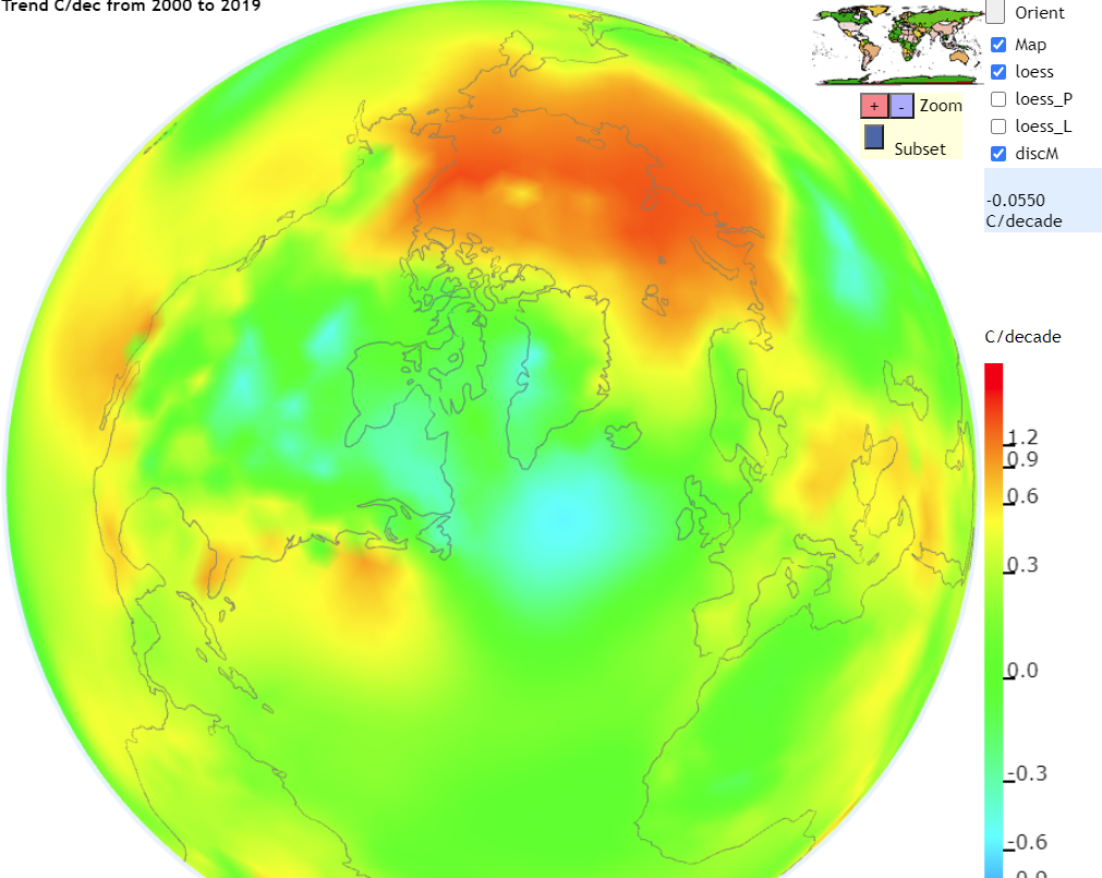
Nearly the whole world shows NO WARMING
Arctic trend is from the big El Nino event which is now dissipating
But you knew that didn’t you
Disingenuous as always.
2000 to 2019 is weather. A pulse not a ”trend”
Not my choice. It is the time period this WUWT article is based on.
Mike,
Short term trends many times become long-term trends. With nothing in the offing that would cause a change in the past twenty year trend exactly what is to keep it from becoming a long term trend?
Your chart shows these numbers -0.055C/decade
That means NO warming at all.
That is just a single point – the last point where I clicked. It is not the global average.
It is what it is since it is prominently displayed on YOUR chart.
The chart clearly says decade trend from 2000-2019.on left side of the chart and the -0.055C/decade on right side of the chart.
You have trouble reading the chart, Nick?
I made the chart. If you click on the link, you’ll see that it is an active device. You can trackball the Earth, and it will show the temperature at the point you click. I took the screenshot which showed that.
You keep avoiding the FACT that it shows -0.055C PER DECADE. right on YOUR chart for the years 2000-2019
I am going by YOUR chart, Nick, you deny what it says ON IT?
Unbelievable!
Nick – on your map, please can you add the physical temperature recording station locations along the north Siberian coast along with in-comment links to their temperature record of the past 20 years?
Thanks
I can’t on the trend map. But this version from the same source shows temperatures from last month with the stations marked.
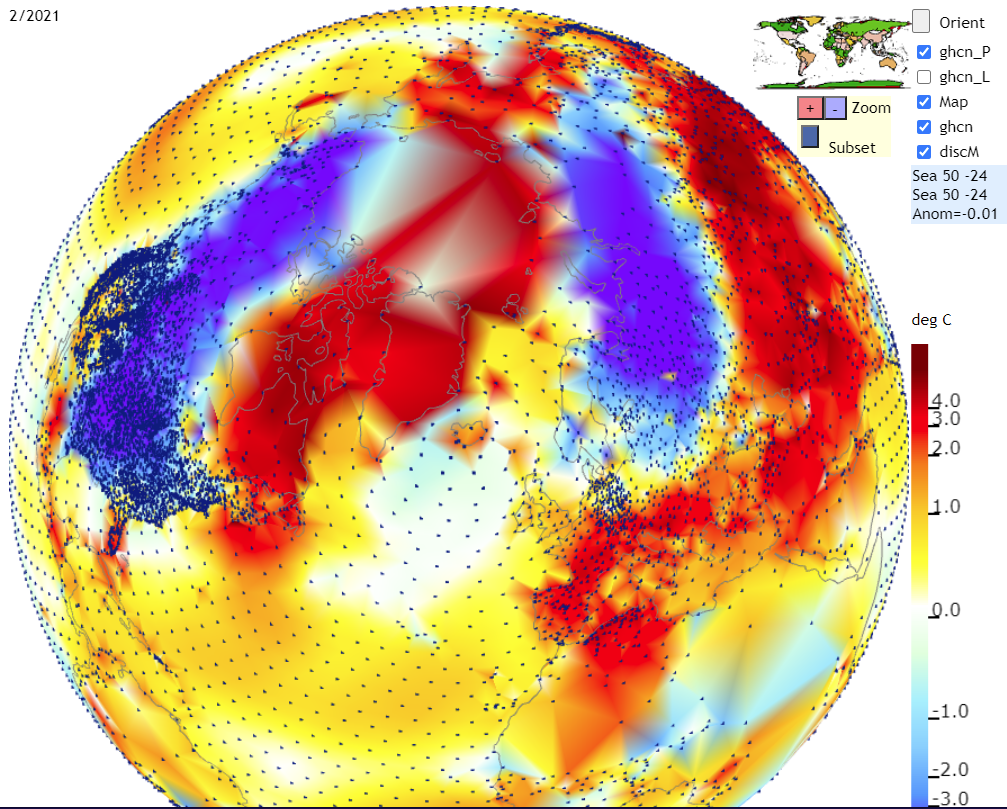
Thanks for trying Nick but I’m not sure that helps. It again looks like interpolated data and an unidentified temperature metric for the single month of February 21? At the resolution it shows here I cannot distinguish between a grid point(?) and an actual temperature recording station. What I was after was the physical station locations and their identities with (if possible) links to their actual 20 year record history.
Is this really surprising? The above data line up with this:
The surface of Greenland’s ice sheet could lose more mass than it gains by 2055, a new study says
“If you follow the high-warming scenario, then by the middle of the century this [surface mass balance] would become negative. (this implies that it is positive now) And this would mean that if warming stays at that level or even increases, then there is no way the Greenland ice sheet will come back,” he said.
Once the ice is melting faster than it is replenished, it will steadily lose mass, he said.
https://www.arctictoday.com/greenlands-ice-sheet-could-begin-losing-more-than-it-gains-every-year-as-soon-as-2055-a-new-study-says/
So, what to think about this and hundreds more like it:
All-time record melt: Greenland loses 532 billion tonnes of ice
https://www.smh.com.au/world/europe/all-time-record-melt-greenland-loses-532-billion-tonnes-of-ice-20200821-p55o28.html
SO WHAT DOES THIS ALL IMPLY?
Article #1: If Greenland has not reached the negative (ice loss) threshold, which will happen in 2055 if you follow the high-warming scenario; so, it has either been in a “steady state” or has been “gaining” ice these past few decades. Furthermore, if you don’t follow the high-warming scenario, this means that Greenland will remain in a “steady state” or will continue to “gain” ice. (so, where is the crisis?)
Article #2: This is essentially an old accounting trick, where you publish expenditures as losses, without factoring in the income. The fact that APPLE had 4.9 billion dollars in expenditures is meaningless, unless you compare that to income. And such a headline like “Apple loses 4.9 billion dollars” is meaningless and only designed to scare ingenues away from investing in Apple stock. Furthermore, if you did the math, you could reword that second headline to read: “Greenland continues to gain ice, but a slower pace.”
——-
I suppose this is all workable when you are dealing with folks that won’t inquire about details or who have abandoned critical thinking?
“This is essentially an old accounting trick, where you publish expenditures as losses, without factoring in the income.”
No, the bad accountancy is yours, where you look at only part of the expenditure. As the article you link says
“Greenland is losing ice both from surface melt and from glacier discharge.”
In its usual state, the ice sheet gains at the surface (snowfall exceeds melting) and this is balanced by glacier discharge. What the article is saying is that not only will surface gain not balance the glacier loss; it will become negative.
And when in the future do you guarantee that will happen? (pause while he checks with Al Gore and Jim Hansen) Or is the money so great, any old date will suffice?
Or were you channeling Stephen Schneider?
“On the one hand, as scientists we are ethically bound to the scientific method, on the other hand, we are not just scientists, but human beings as well. And like most people, we’d like to see the world a better place, which in this context translates into our working to reduce the risk of potentially disastrous climatic change. To do that, we need to get some broad-based support, to capture the public’s imagination. That, of course, entails getting loads of media coverage. So we have to offer up scary scenarios, make simplified, dramatic statements, and make little mention of the doubts we might have. Each of us has to decide what the right balance is between being effective and being honest.”
Or the CRU at East Anglia:
One researcher foresaw some very troubling consequences: “What if climate change appears to be just mainly a multi-decadal natural fluctuation? They’ll kill us probably…”
Back in the scientific world, one doesn’t publish if they can’t at minimum convince themselves.
Some interesting private doubts and accounting going on there… (lol)
Greenland Ice mass since 1900.
.
Greenland Ice area last 8000 + years
.
Greenland SMB lower in the 1930s
Off topic- sorry, but:
“Los Angeles now has a road map for 100% renewable energy”
https://www.latimes.com/business/story/2021-03-24/los-angeles-now-has-a-roadmap-for-100-renewable-energy
“Los Angeles is one of the last places in California still burning coal for electricity — and if all goes according to plan, it could become one of the country’s first major cities to nearly eliminate fossil fuels from its power supply.
In a first-of-its-kind study commissioned by the city and released Wednesday, the National Renewable Energy Laboratory concluded L.A. is capable of achieving 98% clean energy within the next decade and 100% by 2035, meeting one of President Biden’s most ambitious climate goals. And it can do so without causing blackouts or disrupting the economy, the federal research lab found, undercutting two of the most common arguments used by opponents of climate action.
The path forward for the next decade is clear, NREL found: Build solar farms, wind turbines and batteries as fast as possible. Get solar panels on rooftops, electric cars in garages and electric heat pumps in homes. And invest in energy efficiency and “demand response” programs that pay people to use electricity during times of day when solar and wind power are plentiful.”
duh… I presume the NREL and the “green industrial complex” will profit mightily if the city follows this advice.
I’ll believe they are close’ish to carbon neutral once they stop importing cols based power from WY and ID.
“Build solar farms, wind turbines and batteries as fast as possible.”
Again with the batteries! Who is going to install them and maintain them? How will they provide power over an extended outage, e.g. days during a wildfire? Who is going to make them?
They are betting on the come – just like the poker guy drawing four cards in 5-card regular poker. Do they know how often that results in a winning hand?