News/Opinion by Kip Hansen – 5 March 2021
Flat-earthers all over this flat Earth are rejoicing now that “a brash new world map [is] vying for global domination.” This brand new world map is gloriously flat . . . absolutely flat. In fact, it is a two-sided, two-dimensional disc. To have your very own copy, you need only use your color printer to print out either of the files available at these links: Click here to download the .docx file or choose this one as a .pdf.
The wonderful news is reported in The New York Times in a piece titled: “Can This New Map Fix Our Distorted Views of the World?” written by Joshua Sokol. Now, I don’t know if Mr. Sokol really thinks that the maps we find in our families’ prized World Atlases actually lead us to have distorted views of the world. But it is certainly not true about our children and grand-children who have to be physically forced to open a real printed book for any purpose. All of mine would much rather whip out their SmartPhone™ or their tablet or laptop computer and pull up Google Earth or any one of the hundreds of other rotatable- and zoomable digital globes of our planet (take your pick from this Google search results list or this DuckDuckGo search).
So, introduction complete, here’s the new map:
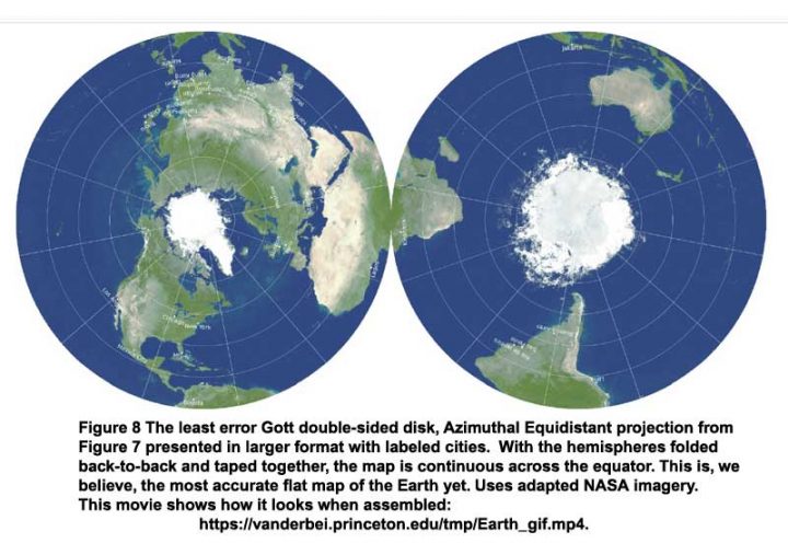
Here’s the link for a very cool little mp4 movie showing that Flat-Earthers have been right all along.
The neat thing about this “disc-Earth” is that if you were a very tiny person and you were to walk south from any point in the Northern Hemisphere, when you got to the edge – the very very edge – and were to take one more step further (even a half-step) you find yourself on the other side of the Earth!
Now, you may think that a whole lot of effort has been put into the creation of this questionably-useful Map of the Earth. Joshua Sokol at the Times quipped that “Cartographers who regularly study world maps — perhaps fewer than 10 people — will now have time to react.” That sounded about right to me – I mean, how many people care even a little bit about such things. Boy, was I surprised when I looked up the topic of Map Projections. There are literally hundreds of these, all with their reported advantages and faults. To do a little exploring, try these links:
- From the United States Geological Survey, their 1989 Professional Paper 1453, “An Album of Map Projections” 262 pages. (.pdf)
- Wolfram MathWorld site offers a list of about 60 different types of projections – each type having many individual examples.
- Radical Cartography offers a list of Wall Maps with thumbnails.
- The “Compare Map Projections” site has a very extensive list of projections, with a tool that allows one to compare any two projections against one another. There are three from Dr. Gott, but not the latest one discussed here.
- MapRef has a very fine discussion about map projections, more than you will ever want to know (unless you are one of the 10 or so World Cartographers…)
Of course, the best reference for the new projection is the original draft of the study “Flat Maps that Improve on the Winkel Tripel” by Richard Gott, David M. Goldberg and Robert J. Vanderbei. (on arxiv.org, .pdf available) There are “lots of pictures” even if you don’t read much of the text.
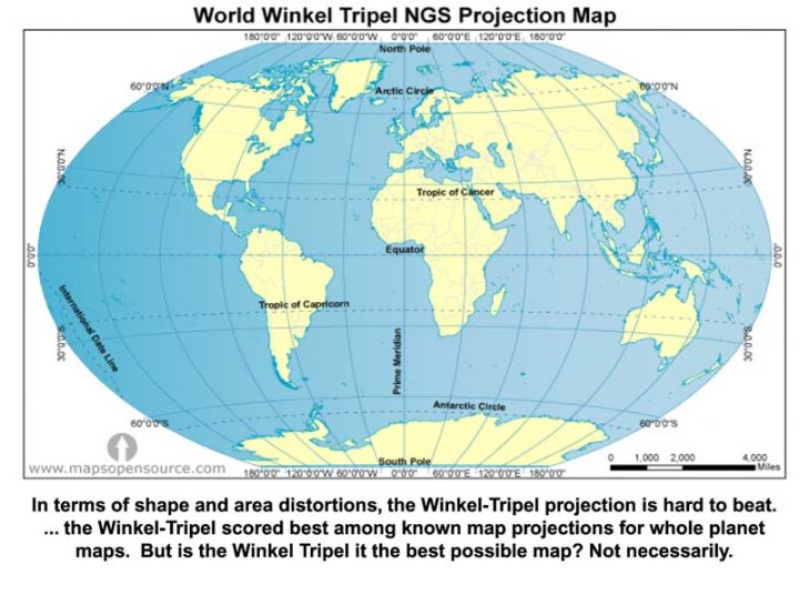
The Winkel Tripel in the title? That’s this one:
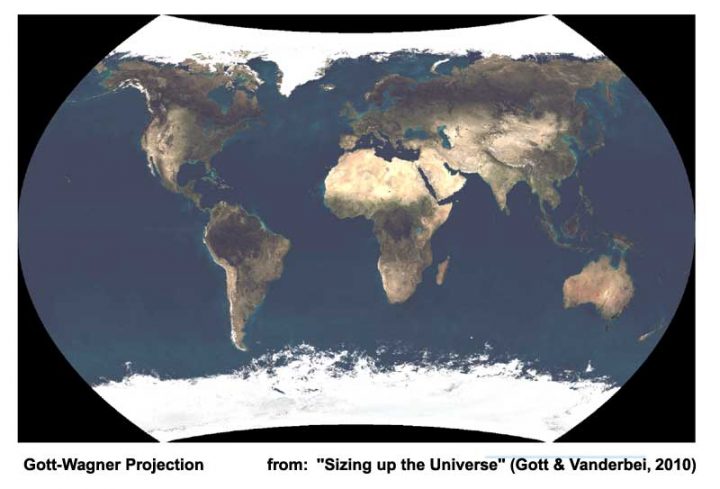
This is the previous improvement on the above from Richard Gott and Karlheinz Wagner:
If you read Gott et al. paper, you will discover that Gott claims to have made a similar map of the entire Universe. What could go wrong with that?
# # # # #
Image Credit: The “It’s flat bro…” mug image from Etsy. LovedOnesGifts made this item with help from Mug Printing and Warehouse Partner, Bristol, PA. You can buy one here.
# # # # #
Author’s Comment:
Dr. Gott, you can have this suggestion free-of-charge. Quickly secure the rights to your disc-Earth image (and all the others from your paper: The Moon, Jupiter, Mars, Venus and the Universe) and farm the rights out to manufactures to make plastic disc-Earths and moons and planets for sale in all the science and natural history Museum Shops around the world. You are right, they will make wonderful additions to the bedrooms of little boys and girls, hanging by a little strings from the ceilings or combined to make Alexander-Calder-like mobiles above babies cribs. Better yet, make the entire set of the planets to make solar system mobiles! (I want one, please).
I’m going to make a paper one for my three-year old grandson.
# # # # #
This Map of the World Just Won Japan’s Prestigious Design Award
The 2016 Good Design Award results were announced recently with awards going to over 1000 entries in several different categories. But the coveted Grand Award of Japan’s most well-known design award, given to just 1 entry, was announced today. Last year the winner was a personal mobility chair and the year before that it was a robotic arm. This year, the grand prize went to a world map.
About AuthaGraph World Map
A work-around about
Krishna ==> Yes, that is one of the very interesting projections….there are so many, some bizarre and some almost useful.
And just like that, Australia is no longer ” the land down under” – according to the original post’s new map reprinted.
I want that mug, seriously, I would buy that now.
Mike ==> You CAN buy it . . . I had to give the link for the mug — don’t usually link to commercial interests — because I used heir image without expressed permission. Here it is:
“Image Credit: The “It’s flat bro…” mug image from Etsy. LovedOnesGifts made this item with help from Mug Printing and Warehouse Partner, Bristol, PA. You can buy one here.”
I prefer the DYMAXION MAP !!!
https://www.google.com/search?q=dymaxion+map+projection&sxsrf=ALeKk01sHqnzlXEaaabR3hFjGZGqnHgBlg:1614805124682&source=lnms&tbm=isch&sa=X&ved=2ahUKEwiC7tnugZXvAhXAGTQIHV3UAagQ_AUoAXoECBMQAw&biw=1366&bih=600
https://en.wikipedia.org/wiki/Dymaxion_map
Jon ==> Yes, Richard Buckminster Fuller’s map is interesting — but almost entirely useless for anything other than impressing your friends by hanging a copy on the wall.
Most of his stuff is much less interesting if you think of him as “Dick Fuller.”.
Joseph Postma probably isn’t buying into the flat earth theory anytime soon.
https://principia-scientific.com/the-fraud-that-is-climate-science-and-its-flat-earth-theory/
Sigh. This map doesn’t deserve all the attention it has gotten.
OTOH, one of the three people cited in
has a far more interesting web site than the clueless NY Time article.
Check out https://vanderbei.princeton.edu/ instead of this article. He has some amazing looks at stable “N-body” orbits, maps, Questar photography from New Jersey, and a rather nifty derivation of the Earth’s diameter from a photo of the sun setting on Lake Michigan.
Lake Michigan prove is a fine thing and well done !
But to convince a flat-earther that earth is a sphere is certainly as difficult as to convince a “Climate Scientist” that CO2 isn’t relevant for climate.change 😀
CO2 is relevant, it just appears to be overstated by 2X-3X.
Ric ==> For sure, these are three really bright interesting people . . . . and I agree about the over-hyping of the “new map”. Sokol of the Times alludes to that aspect in his article when he says that it is of interest to maybe ten people in the world.
Like much of the “science” presented in today’s mass media, it is simply “click bait”.
I though it was FUN and would make an amusing and interesting topic for a short essay. Much more fun than climate science.
Come on people…this debate has to end….it’s not flat and it’s not round…the Earth is a cube….end of story.
I have always loved Buckminster Fuller’s Dymaxion map which is a projection of a world map onto the surface of an icosahedron. It can be unfolded and flattened to two dimensions, in various ways.
https://en.wikipedia.org/wiki/Dymaxion_map
https://xkcd.com/977/
And Bucky Fuller created the Dymaxion Map in 1943 and was issued a patent on it in 1946!
Relevant https://xkcd.com/977/
Duncan ==> BEST LINK OF THE DAY! Thank you.
About 4 decades ago I drove a stick shift for the first time.
I came to a stop sign at the top of a steep hill.
I wished the Earth really was flat!
Gunga Din ==> You shoulda tried driving my Dad’s 1949 Studebaker Champion in San Francisco as a 16 year-old. Absolutely terrifying.
How about the Ferguson Square and Stationary Map …Reminds me of a roulette table.
 &f=1&nofb=1
Saveenergy ==> I’d like to see that reproduced in hardwood and used as a nut bowl. (well, without the angels….)
Well technically according to some physics professors we are a projected shadow on a two dimensional plane. Let’s see that map.
The flat Earth map still shows Greenland to be as large as Australia (my home).
I prefer https://thetruesize.com/ where you can drag any country to another to see the real relative size. This shows Greenland to be about 1/3 the size of Oz.
Let’s hope holograms can be improved and ubiquitous soon so that the gadget-obsessed can get perspective.
I have this crazy idea of printing a map of the earth on a ball. Think it will sell?
I was gonna suggest a globe, ten sentences in to your article Kip, and prior to reading any other comments.
I have a bunch of them.
One of my favorites is a magnetic levitating dealio, but it is small.
I want to buy one of those huge ones like 3 feet in diameter, but OMG have you ever seen what they cost?
I have considered making one and including the ocean floor on it.
But it would be very complex to do.
I also have in mind a scale model outside, of the Earth and Sun and Moon, in a sort of sculpture that would also be a sundial.
But yeah sure I will ever get around to that!
And BTW…those different projections matter to more people than cartographers.
Pilots, and sailors…people who need to travel around the Earth and want to head in the correct direction…matters to them too.
When I took physical geography in college, the subject of map projections of course was a big topic.
Back then there was one called Lambert Equal Area.
It was sold as a substitute for the ones they had on the wall when I was in grade school, where everything towards the poles was hugely enlarged in size.
Alaska was half as big as the rest of the US on those ones.
And Greenland was as big as South America, or close to it.
That last one was called the Mercator Projection, and was the standard flat map for centuries, because it preserved directionality:
“The Mercator projection is a cylindrical map projection presented by Flemish geographer and cartographer Gerardus Mercator in 1569. It became the standard map projection for navigation because it is unique in representing north as up and south as down everywhere while preserving local directions and shapes. The map is thereby conformal. As a side effect, the Mercator projection inflates the size of objects away from the equator. This inflation is very small near the equator but accelerates with increasing latitude to become infinite at the poles. So, for example, landmasses such as Greenland and Antarctica appear far larger than they actually are relative to landmasses near the equator, such as Central Africa.”
https://en.wikipedia.org/wiki/Mercator_projection
Mercator projection:
Guess no one told them that Gerard Valck actually produced the same thing in 1672 🙂
Just fold the image down the middle and trim.
If the Earth was round and not flat wouldn’t all the water run off the bottom?
As an exercise in critical thinking, please watch the 25 minute 1990 documentary “In Search of the Edge” at https://www.youtube.com/watch?v=trrgPOJCPe8 . George Vanderkuur, interviewed in the film, was a teacher in Toronto, Canada, and worked for the Ontario Science Centre.
Most projections are ugly due to the London problem. I have a solution:
http://phzoe.com/2019/12/09/why-we-should-move-the-prime-meridian/