Reposted from Dr. Roy Spencer’s Blog
January 21st, 2021 by Roy W. Spencer, Ph. D.
As part of my Jan. 19 presentation for Friends of Science about there being no climate emergency, I also examined surface temperature in Canada to see how much warming there has been compared to climate models.
Canada has huge year-to-year variability in temperatures due to its strong continental climate. So, to examine how observed surface temperature trends compare to climate model simulations, you need many of those simulations, each of which exhibits its own large variability.
I examined the most recent 30-year period (1991-2020), using a total of 108 CMIP5 simulations from approximately 20 different climate models, and computed land-surface trends over the latitude bounds of 51N to 70N, and longitude bounds 60W to 130W, which approximately covers Canada. For observations, I used the same lat/lon bounds and the CRUTem5 dataset, which is heavily relied upon by the UN IPCC and world governments. All data were downloaded from the KNMI Climate Explorer.
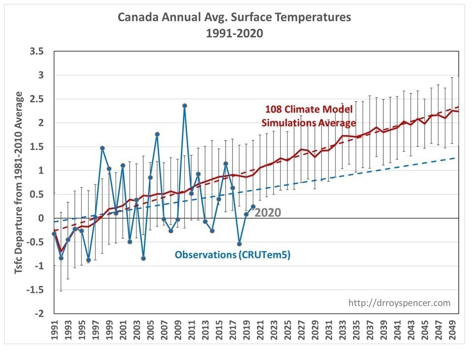
First let’s examine the annual average temperature departures from the 1981-2010 average, for the average of the 108 model simulations compared to the observations. We see that Canada has been warming at only 50% the rate of the average of the CMIP5 models; the linear trends are +0.23 C/decade and +0.49 C/decade, respectively. Note that in 7 of the last 8 years, the observations have been below the average of the models.

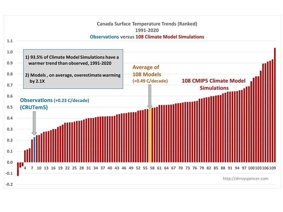
Next, I show the individual models’ trends compared to the observed trends, with a histogram of the ranked values from the least warming to the most warming, 1991-2020.

Note that the 93.5% of the model simulations have warmer temperature trends than the observations exhibit.
These results from Canada are generally consistent with the results I have found in the Midwest U.S. in the summertime, where the CMIP5 models warm, on average, 4 times faster than the observations (since 1970), and 6 times faster in a limited number of the newer CMIP6 model simulations.
Implications
The Paris Climate Accords, among other national and international efforts to reduce greenhouse gas emissions, assume warming estimates which are approximately the average of the various climate models. Thus, these results impact directly on those proposed energy policy decisions.
As you might be aware, proponents of those climate models often emphasize the general agreement between the models and observations over a long period of time, say since 1900.
But this is misleading.
We would expect little anthropogenic global warming signal to emerge from the noise of natural climate variability until (approximately) the 1980s. This is for 2 reasons: There was little CO2 emitted up through the 1970s, and even as the emissions rose after the 1940s the cooling effect of anthropogenic SO2 emissions was canceling out much of that warming. This is widely agreed to by climate modelers as well.
Thus, to really get a good signal of global warming — in both observations and models — we should be examining temperature trends since approximately the 1980s. That is, only in the decades since the 1980s should we be seeing a robust signal of anthropogenic warming against the background of natural variability, and without the confusion (and uncertainty) in large SO2 emissions in the mid-20th century.
And as each year passes now, the warming signal should grow slightly stronger.
I continue to contend that climate models are now producing at least twice as much warming as they should, probably due to an equilibrium climate sensitivity which is about 2X too high in the climate models. Given that the average CMIP6 climate sensitivity is even larger than in CMIP5 — approaching 4 deg. C — it will be interesting to see if the divergence between models and observations (which began around the turn of the century) will continue into the future.
Hmmm… but what about ARCTIC Canada?
What about Arctic Canada?
Good question, Griff. I thought you had it solved.
First, it is not warming 2-3 times as fast as the rest of the world that the fear mongers say but cannot prove.
Now, Griff, where is your analysis??????
The starving polar bear ate his analysis … besides one does not need evidence you just have to feel the eco guilt.
That’ right. With the increase in Polar Bears, you cannot leave your work in the igloo.
I do wild land fire weather forecasting for the Northwest Territories. I am always interested in what the temperatures are doing. I used the UAH satellite data and masked out the mainland NWT area. I found the since 1980 the NWT temperature trend is 0.13 deg/decade, very similar to the global trend.
70°N is about 450km inside the Arctic circle. There’s a lot of arctic Canada included in this analysis.
I wonder why Roy chose Canada?
If you had followed the links to the Friends of Science that Dr. Spencer provided, you could’ve learned that it was located in Alberta, Canada. What choice could possibly be more relevant to the listeners?
What I don’t wonder is why you aren’t pointing at all those countries that are warming much faster than the models predict. I don’t think you know of any.
One of MANY places that is no warmer now than in the 1940s,
You KNOW that Loy.. so don’t be so dumb.
And do you have ANY evidence what so ever, that the SLIGHT but HIGHLY BENEFICIAL global warming since the LIA has any human causation at all, except for UHI smearing and data adjustments?
Here’s two simple questions for you.
Try not to continue as a complete and utter failure. !
1… Do you have any empirical scientific evidence for warming by atmospheric CO2?
2… In what ways has the global climate changed in the last 50 years , that can be scientifically proven to be of human released CO2 causation?
Perhaps you would like to try to answer this question as well
Why are there SO FEW people living in the darker grey areas on this map?
Why not? If you’d actually read the article, you would have found out that Canada isn’t the only place he’s analyzed.
If you were actually keeping abreast of the climate alarmist NEWS, you’d know that the Canadian media, Canada’s socialist Prime Minister as well as his past “climate change minister”, Climate Barbie have been loudly claiming that Canada has been warming twice as fast as the rest of the world.
Would Townsville would be better?
I’m sure you can find some places in Canada you can cherry pick to show how the models are real.
One of the frauds perpetrated by the “Canada in a Changing Climate” report is that the Canadian Arctic is warming three times as fast as the globe.
This is a comparison of Canada’s Arctic LAND temperature to the global LAND/OCEAN average.
It’s warming, but not as fast as the models predict.
No, its been cooling since the effects of the 1998 El Nino
The article covers the last 40 years.
Yes, but the trend comes from the El Nino event.,
…. not from gradual warming.
I went to the KNMI website and put in the lat/lons that Roy Spencer used, and it gave me this chart
http://jonases.org/Misc/KNMICanadaTemperature1880-2020.png
There appears to be no warming since 1990. The sudden drop around 1990 looks very suspicious, but even if you remove it by shoving up the later part of the chart, the overall warming of the last 140 years is approximately stuff all.
Hi Griff I just elsewhere onthis post uploaded a DropBox link with every Temperature record I could find on the GISS Website a couple of years ago. Have a look and give me the benefit of your learned opinion
griff, why not suggest that Mikey Mann be called on to propose a solution?
Griff why do you want people to be cold?
All the Canadian climate refugees are in FL right now.
Not this year, their insurance isn’t valid in the US so they mostly stayed up north this year. I will be staying in a condo in February and March normally rented by a Canadian (relative of a friend).
But that hasn’t stopped those from NY, CT, OH, ILL, MI from infesting our warm comfortable area.
Fight Climate Fear. Warmer is Better.
False. Our out of country insurance covers Covid. My wife is flying tomorrow to KS for the arrival of our ninth and last grandchild.
A better question would be to wonder why all of the warming happened before 1997. Put your finger over the part of the graph before 1997. Now, what does the trend look like? Kind of hard to see any warming at all and most likely would show 100% of climate models produce more warming.
So, what happened around 1997? Oh yeah, that would be after the AMO index went positive.
Look at your record 😀
According to the Arctic Council, 40% of Canada is in the Arctic Circle, but surely you knew that before you posted!
He did, but you shouldn’t call him Shirley.
If you start after the El Nino step in 1998, Canada has been COOLING
Sea ice in the Canadian Archipelago has been been above normal basically all of the sea ice growth period.
So yep, what about ARCTIC Canada? Nothing untoward.. just NORMAL COLD.
Tell us all griff, oh great know-nothing fool….
Why are there basically NO PEOPLE on most of the grey area on this map of Canadian population density ?
It figures, the folks who really COULD use some Global Warming aren’t getting it…
Some say Canada is getting it good and hard.
https://www.washingtonpost.com/opinions/2021/01/21/keystone-pipeline-biden-canada-trudeau-wrong-foot/
That is so sad…what a stupid decision.
It’s gonna get a whole lot worse in the next few years.
Right, Kpar, 80% of Canadians live within 100 miles of the southern border with the USA. If it warmed up some they could spread out. However, I am not sure the wheat farmers in Alberta think this is a good idea and would Canadians stay south in the big cities.
And don’t forget we have less than the population than California so of course we don’t want to spread out across a vast area of nearly 6 million sq. km. CA is about 424,000 sq. km. Yes we also like it warmer like most people so stay fairly close to the US border.
Another model prediction trashed by reality. I was surprised to read recently that a different climate change prediction used 27 models to get it wrong. One would think, in light of the absolutism and claimed certainty coming the climate crisis crowd, that given such “consensus” models would start to consolidate. Instead proliferation seems to be the rule.
What happens if the models are backcast by 90 years or so?
Then they’re 90 years behind the times and equally worthless for that reason. Models are only useful if they can project an accurate analysis of what will happen. There’s no point to a model that has been running for a few years and has already diverged wildly from real world observations.
One could argue they’re worse than worthless.
Being CONSISTENTLY WRONG in the same direction.
I guess they do tell us something, 😉
If the science was settled, there would only be one model.
There’s something a bit odd about starting at 51N, seeing as 95% of Canadians live south of that latitude.
Also–someone might do an analysis of Siberia this winter; there are large areas that have been below -50C, and some below -60C, for extended periods of time. All it would take is a few changes in circulation patterns for that to shift over to Canada. I hope it stays where it is. But the plight of permafrost in Siberia seems to be just fine.
Since there is a nice straight line at 49 for a good bit, that would seem to be the place to start.
I did the KNMI chart again using 49N instead of 51N. It started a little bit higher and ended a little bit lower. Seems odd. Maybe someone else would like to take a look at KNMI?
I assume you are using your own program to do the calculation summary?
I would guess that he’s trying to minimize the impact of UHI, by excluding most of the population from the study area.
Avoiding the higher population centers keeps UHI from contaminating the results. A very smart move on Dr. Roy’s part.
Okay, I can accept that–but then if ‘Canada’ has moveable borders such that UHI centres can be avoided or rejected, and then is compared with other parts of the world where UHI is included…someone might start to see strange colours of orange in what should be a cherries-to-cherries comparison of how fast Canada is or is not warming. Is cherry-picking areas any different than cherry-picking dates?
To my other point–please do have a look around Siberia these days–if the planet is warming, where did the thermal energy go that those poor folks should be enjoying? It’s the same atmosphere, and CO2 has long been claimed to homogenize around the planet in 4 hours (sarc) of being produced anywhere; why is there so large an area below -40C, even -50, and some spots below -60?
The forecast low tonight for Yakutsk is -53C. Its population is over 300,000; there will be an UHI effect included in that temperature. Anyone who proposes that humans should survive in those temperatures without conventional fuels should be sent there–tonight–with a tent, a solar panel and a windmill. I would like to see at that temperature how long it takes the greenest individual from southern California to embrace a hot oil or gas furnace.
And I’d be most interested, after a couple of winter meetings there, to see what a Yakutsk Climate Agreement would look like.
Half-speed warming will not do when you need full-speed emergency for full-carbon tax revenue lust. It also strains the media story line themes and political talking points.
Maybe climate science needs to learn curvilinear fitting.
More like just looking at EVENTS and their effect on the temperature data
Curve fitting won’t help with that.
Climate is NOT LINEAR, nor is it CURVILINEAR.
There is no reason to assume either.
Yes, there are sections that could be described as pseudo linear, pseudo-cyclic or maybe fit a polynomial, but it is also heavily affected by “events” such as strong El Ninos which cause step-like changes over a few years.
Putting linear trends across these events is not sensible.
Looking at the broadened uncertainty range in the Equilibrium Climate Sensitivity estimate in AR6, I calculated the probable impact of the Canadian Federal Carbon Tax on global temperatures.
The governments predicts a 80 – 90 megatonne reduction in emissions by 2022. A questionable assumption that will be impossible to verify.
The optimistic case will result in a global temperature reduction of 0.00027⁰C / year.
The pessimistic case is 0.000077⁰C / year.
These are equivalent to one degree Celsius in 3,729 and 13,021 years respectively.
Who’s going to tell the Canadian taxpayers?
The smarter ones have already figured this out.
Thanks, Roy.
Now to see what the warmistas will say here.
The Environment Canada analysis starts in 1948 during a cooler period. They ignored the warmer 1930’s and 1940’s so they get a higher fictional warming. That is what was presented to Trudeau right after the election in 2015 before they sent 300 people to Paris.
That report (Canada’s Changing Climate Report 2019), is a travesty to science, and a big con on Canadians. Once you see the cherry pick, you know they are lying to you. That takes 30 seconds.
Bad Canada! . . . bad, bad Canada!!
I just have this image now of Celine Dion being spanked!
That could be be deadly or at least it could break some bones.
In the hand, or in the buttocks?
That’s between me and my imagination! Butt out of my fantasy please!
I have been recording Temps for environment Canada for over 30 years, just south of a large urban area. My station has risen .1C during that time….the town i live in, population has risen from 3000 to 30,000 during that time frame…draw your own conclusions
There appears to be a spec of dust in front of the 1C rise you have recorded.
I put much greater faith in local temperature measurements than those that get homogenised by people paid to find warming or come from complex inferences from satellite observations deployed also to find warming.
I am very suspicious of any warming trend over 3 or 4 decades to centuries. My first thought is to find the fault in the measurement system because I know the surface temperature on Earth is under automatic control.
The climate models are wrong for sure – they are pure fantasy based on nonsense. I would really like to look under the hood of the trend that shows some warming over 3 decades as it is most likely flawed.
So cold there, even a 0.1C rise is attractive.
Is there anyplace on the planet that is warming as fast as the models predict? Much less faster.
The inside of my oven? Hey, I’m just trying to be helpful!
It is always instructive to look at data as close to source as possible. A couple of years ago I downloaded from GISS all the thermometer plots for the following areas as a set of PDF files
1) All Arctic thermometers
2) All Antarctic Thermometers
3) All Canada Thermometers
4) All North Sea Thermometers
5)All Alpine thermometers
They can be viewed at the following link
https://www.dropbox.com/sh/mszpqay4vl9d3mn/AADYnvNvnHy7_vlYkYada6FHa?dl=0
Surprising how few hockey sticks one sees and lots of warm 1930s stuff all over the polar regions
Re 3) All Canada Thermometers. There are still some missing such as Winnipeg.
I’ve said it before, but it bears repeating…
“The biggest problem with computer models is getting them to match-up with reality.” – ScienceABC123
Would that be Polar Bears?
Never fear, the Data Adjustment Bureau is on the case.
When I just look at the chart posted by Roy, something obvious pops up. Roy used 30 years in coming up with a straight line which suggests temperatures are increasing.
However, if you chop off the first 5-7 years, you get a curve which suggests temperatures peaked 10-15 years ago. So we are actually COOLING!!!
That would be declared as cherry picking 😀
I made the same observation in my comment to griff. What’s even more interesting is that jump at 5-7 years correlates perfectly with the AMO changing states.
See my graph in a few other places
Yes, COOLING since 1998 El Nino.
It is that El Nino event that causes Roy’s graph to have a positive trend
Since CO2 does not cause El Ninos, there is no CO2 warming signal in the data, AT ALL !
Is the CRUTem5 data “adjusted” If so, I would like to see the analysis using raw data.
All analysis should be compared to raw (actual written temperature records) data.
We need to take our climate emergency medicine. The doctor hands you a pill explaining; “This $400 trillion pill contains 108 noxious ingredients. At best one of them is correct. They may all be incorrect. Now pay up and swallow.”
And by the way, I’m not sure you’re even ill in the first place.
We’re not “ill” now, but we will be when the climate policy poison pill goes down.
Uh, sadly, its not a pil. It is a suppository.
Somehow that temperature graph seems to have some similarity with the latest peak of North Atlantic surface temperatures. I guess the temperatures in Canada are going down in few years.
Your graphical analysis is what I believe GISS boss James Hansen knew in the mid-1980’s. That climate was on ~65 to 70 year cycle of warming and cooling, and about 1980 he had 35 year run of warming global temperatures as an opportunity.
Hansen, being a Noble Environmentalist before scientist, turned GISS away from a space weather charter and put it primarily on a path of climate modeling to further the anti-coal environmental scam. So he started the climate scam along with Tim Wirth and Al Gore in his June 1988 Senate testimony. Coal for electricity generation was their main target. They knew then the US has a 150-200 year supply of that fossil fuel energy for electricity and they had to break that first and foremost. Strip mining, mountain top removal coal mining, sulfur-dioxide emissions, and fly ash disposal were what the environmentalists were focused on stopping in 1980’s and 90’s. Then they weren’t worried about oil and natural gas as they saw those conventional resources as rapidly depleting with “peak oil” projections by 2000-2010.
Of course they never saw coming the shale gas fracking and unconventional oil re-birth of the oil and gas industry. Hence the #ExxonKnew strategy was dredged up from tort bar litigation firms as a way to throttle oil and then natural gas. Alberta tar sands oil extraction was another of their targets, now they are working on keeping it from getting to refineries.
But back to your graph – Hansen left GISS in 2013 when he knew the global temp curve would start flattening and eventually dipping thus making data adjustments, as being demanded by the Obama WH, increasingly difficult. The only thing that save their butt was the 2015-2016 Big El Nino, but now that has faded and the inevitable La Nina series has started. The scam is running on fumes temperature-wise as the models projections continue to race upwards (CMIP6 craziness) and the temps stagnate. So the race is on to cross the socialism finish line before the climate clock runs out on the scam.
Background of that graph is explained behind the link to a full analysis paper on North Atlantic surface temperatures: https://www.researchgate.net/publication/339274895_Increasing_Carbon_Dioxide_Concentration_in_Atmosphere_Has_Negligible_Effect_on_North_Atlantic_Sea_Surface_Temperature
I have grave doubts about the accuracy of any data from NOAA over such a long time span. There needs to be allowance for the density of readings as well as the location of readings.
I put more faith in the moored buoys and they have not been around for very long. But the Pirata set in the Atlantic do not show any warming over this century..
Unless my aging Mk 1 eyeballs fail me, it appears there has been an estimated approximately 0.4C increase in Atlantic Ocean SST over an approximately 130 year period, with 75 year sinusoidal ups and downs. What conclusions should one draw considering that the graph starts roughly about the end of the Little Ice Age?
Of course there is good agreement. The models were tuned to match the past record.
CMIP5 models “future” projections started in 2006. Which is exactly where the divergence starts on Dr Spencer’s chart of Canadian temps.
Its funny how they keep resetting the start point so as to hide the massive divergence of the models from reality. 🙂
Please, a vertical line marking the year the models are run would help establish which part of a graph is potentially a result of “tuning” and which part was actually a test of the model.
After the FoS had shown Dr Spencer’s pre-recorded 30 minute presentation, he was on live with the FoS host via Skype for about 90 minutes. Dr Spencer’s Skype connection kept freezing and dropping audio. At one point the call video call dropped and the FoS folks had to re-dial to Dr Spencer.
I suspect some Libtard on the Skype back-end was trying to throttle his Skype bandwidth to the FoS host and Cancel Dr Spencer’s live Q&A since they couldn’t do anything about the FoS streaming of his pre-recorded presentation.
We could also look at Canadian maritime temperatures
COOLING from 1947 to 1990
And we know the Arctic in general was as warm or warmer in the mid 1940s
What CO2 problem? 🙂
The evidence that CO2 is not a problem is right in front of our eyes, but the Alarmists want to distract us with the bogus Hockey Stick charts that distort the temperature record.
It was just as warm in the Early Twentieth Century as it is today which means CO2 is a minor player in the atmosphere and is not a problem that needs to be regulated.
If you removed the first 5 years of that trend, the best fit line would be horizontal or downward sloping I reckon.
Post 1998 Canadian temperatures.. COOLING !!
And over the longer term
This is obviously flawed! Canada is supposed to be Warming Twice as Fast as the rest of the world!! What ever happened to staying on message?!? How dare you!!!
/sarc
Everywhere is warming twice as fast as the average!
Off subject- sorry- but a new MSNBC news clip stars 2 of our favorites: Saint Thunberg and Mickey Mann: https://www.msn.com/en-us/news/politics/thunberg-time-will-tell-if-biden-administration-fulfills-climate-promises/vi-BB1d0vhS