Guest Post by Willis Eschenbach.
I saw an article’s headline the other day. It said “Is COVID Or Nature Slowing The Increase In CO2”.
So I thought I’d take a look. Here’s the Mauna Loa data. Top panel is the increase in CO2. Bottom panel is the month-over-month change in CO2.

Go figure. One thing is clear.
The rate of increase of CO2 hasn’t changed in the slightest. I offer up no explanation for this … but it doesn’t bode well for those claiming that we need COVID-style lockdowns to reduce the CO2 levels.
Best of the New Year to all,
w.
Willis
Atmospheric CO2 rise has not altered despite claims – But …. What about the…
“Warming already baked in will blow past climate goals”
https://apnews.com/article/climate-climate-change-pollution-3f226aed9c58e36c69e7342b104d48bf
We cant measure it now, because its baked in and will only cause the warming in the future.
This is really great stuff and explains the undulating monthly temperature profile. So when the temperature “average” went down in December, it wasn’t cooling, it was simply related to a previous year when the rise in CO2 was not as high, that’s all. Its very simple really.
Have a wonderful day – just in case – sarc
Once a trace gas – still a trace gas. The hair on the tip of the tail of the sauropod that is allegedly wagging the sauropod got a little longer.
These people estimate that anthropogenic CO2 fell by 7% in 2020, yet the Keeling curve shows not even a tremble.
https://essd.copernicus.org/articles/12/3269/2020/
(That paper must be in the running for the longest list of authors, ever!)
As already pointed out here, the influence of the COVID-19 virus has had no effect on the rise in global CO2 levels, despite the drop in industrial activity. Not only that, but the El Nino event of 2015/16 when the earth warmed sharply, caused a spike in the rate of increase in global CO2.
https://tinyurl.com/y3xryp2u
A feature of the Keeling curve that has always intrigued me, is the
kink at around 1991/92 https://tinyurl.com/y53epw3n If CO2 really is a
problem, then the cause of that kink is worth investigating.
At about that time, there were two major volcanic eruptions, the
largest of which was Mount Pinatubo in the Philippines, described by
Wikipedia as the “Largest stratospheric disturbance since Krakatoa
eruption in 1883, dropping global temperatures and increasing ozone
depletion.” https://tinyurl.com/yxbf738c Despite adding some 50
million tonnes of CO2 to the atmosphere, https://tinyurl.com/y4pkbcmq
(and scroll down about half way) the rate of increase of global CO2
actually fell significantly. It’s the only time that has been seen on
the Keeling curve, https://tinyurl.com/y3xryp2u again.
So, we have an increase in global temperatures linked to an increase
in the rate of atmospheric CO2 concentration (2015/16 El Nino), and a
decrease in global temperatures linked to a decrease in atmospheric
CO2 concentration (1991 Mount Pinatubo). If CO2 is supposed to be
driving global temperatures, I cannot see how it can be linked to
Mount Pinatubo erupting nor the El Nino of 2015/16, but I can see that
it would work the other way, i.e. global temperatures driving changes
in atmospheric CO2.
Thank you!
Willis, are you mad? There is an obvious downtrend starting in 2016./sarc
1) According to Trenberth each ppm of CO2 in the atmosphere has a mass of 2.13 GT
Ref https://cdiac.ess-dive.lbl.gov/pns/faq.html#:~:text=Using%205.137%20x%201018,2%3D%202.13%20Gt%20of%20carbon.
2) CO2 has increased from 286 to 415 ppm over a period of 170 years so it increases at a rate of less than 1 ppm per year
3) According to IEA World energy consumption 14.4 GT of oil equivalent per annum ( https://www.iea.org/reports/world-energy-balances-overview)
This energy in the form of coal, gas, and oil will yield 3 tonnes of CO2 for every tonne of carbon
Therefore, we emit about 45 GT of CO2 per annum
Therefore, I infer that every year we emit enough CO2 to increase CO2 content of the atmosphere by 20 ppm i.e. 20 times the observed rate of Co2 increase.
Well it sure as hell does not stay in the atmosphere
So where does all that CO2 that we produce land up? Presumably natural sinks Total biomass has increased by about 15% according to NASA satellite observations over a 30-year period.
This demonstrates that we certainly have the capability to increase CO2 content in the atmosphere. So what? Seems like our contribution is dwarfed by natural sources and sinks.
I hope the figures I quoted are right. I just googled them
Energy can come from burning diamonds, coal, methane, gasoline, diesel, or wood – with differing amounts of CO2 produced.
Alastair, the problem is in your first statement, viz:
You go on to make calculations as if each ppmv of CO2 has the mass of 2.13 GT of CO2 …
But that’s not what Trenberth said. He said:
Not 2.13 GT of CO2.
2.13 GT of C.
Carbon has a molecular weight of 12. Oxygen has a molecular weight of 16. CO2 has a molecular weight of 44.
So 2.13 GT of carbon is the equivalent of 2.13 * 44 / 12 = 7.81 GT of CO2.
And that miscalculation is why you find such a large discrepancy in the CO2 budget.
Best regards,
w.
https://www.esrl.noaa.gov/gmd/ccgg/trends/gr.html
Annual change data for the past 60 years indicate that human net contribution may be about 0.5 ppm per year.
At this rate, mankind will manage to double atmospheric CO2 concentration within the next 800 years, and that might increase the average temperature of our planet by up to 2 C, according to Happer et al.
Imminent crisis!
“LISTEN TO THE SCIENCE!” 🙂
dagpaz wrote, “Annual change data for the past 60 years indicate that human net contribution may be about 0.5 ppm per year.”
That’s incorrect. Anthropogenic CO2 emissions in 2019 are estimated to have been around 10.3 PgC, which is about 4.7 ppmv CO2. But the measured year-to-year CO2 level increase was only a little over haft that fast.
The sum of anthropogenic CO2 emissions 1958-2019 was about 376,216 PgC = 1,379.459 Gt CO2. That’s equivalent to 171 ppmv CO2. (Note: that link will take you to an Excel spreadsheet which has been exported as a web page, but which can be directly loaded into Excel, in case you want to check the figures, adjust the range of years, etc.; the data sources are linked at the end.)
But the actual measured CO2 level increase was only about 98 ppmv.
So, the human net contribution to atmospheric CO2 was about 171 ppmv, and nature’s net contribution was -73 ppmv, which summed to a net increase of 98 ppmv.
Why all this fuss about CO2. Measurements show that about 7 water vapor molecules are added to the atmosphere for each CO2 molecule. Simple calculations using data from Hitran show that the increase of water vapor has been about 10 times more effective than the increase of CO2 at ground level warming.
Measured water vapor trend has been increasing faster than is possible from feedback. https://watervaporandwarming.blogspot.com
“Simple calculations using data from Hitran,” eh? I think that’s an oxymoron!
Several sources indicate that atmospheric water vapor levels are increasing more slowly than expected, not more rapidly.
There are, of course, local exceptions to that rule, typically due to agriculture. E.g., a healthy corn crop pumps a lot of water vapor into the the air.
If you had looked at the link you would see the simple calculations. The graphic output from Hitran that was used is shown there and here.
The WV level is global not local and is measured using satellite instrumentation and reported monthly by NASA/RSS. Again, you would have discovered this and the link to the NASA/RSS site if you had looked at the link provided. The 1.5% per decade WV increase from the NASA/RSS data is consistent with that reported by NCEP. The comparison is shown at https://wattsupwiththat.com/2018/06/09/does-global-warming-increase-total-atmospheric-water-vapor-tpw/
Saying “several sources” and not listing them is useless.
Changes in CO2 at Mauna Loa track changes in the Ocean Nino 3.4 Index.
So now we know that Niño 3.4 Pacific temperature is caused by human CO2 emissions!
/sarc
The problem with that statement is that out of 400 ppmv, the swing due to the ocean temperature changes is only about plus and minus 0.5% of the total. And of that, the ONI only explains about 20% of that, or about 0.1% plus and minus of the total.
That’s a swing of 0.4 ppmv each way, or 0.8 ppmv peak to peak.
Hardly a major factor …
w.
Its not a statement, its data. .5% of 400 ppmv is 2 ppmv, which is about the annual change in CO2. The level of CO2 is a nonstationary time series. Taking appropriate differences leaves you with residuals that have variance. The point is that there are natural processes that correlate with the variances we observe in de-seasonalized CO2 changes. Its a very simple point. .
Yes, correct interpretation.
Nelson, those are not “de-seasonalized CO2 changes” in your graph. You not only removed the seasonal signal, you also detrended the CO2 graph. I.e., you removed everything that matters, leaving only short term deviations from the trend.
What matters for its climate effects is exactly the part that you subtracted out: the long term trend. In your graph the vertical axis spans only about 5 ppmv, yet you subtracted out a 100 ppmv difference from the left end to the right end! Here is what the graph would look like if you hadn’t done that:
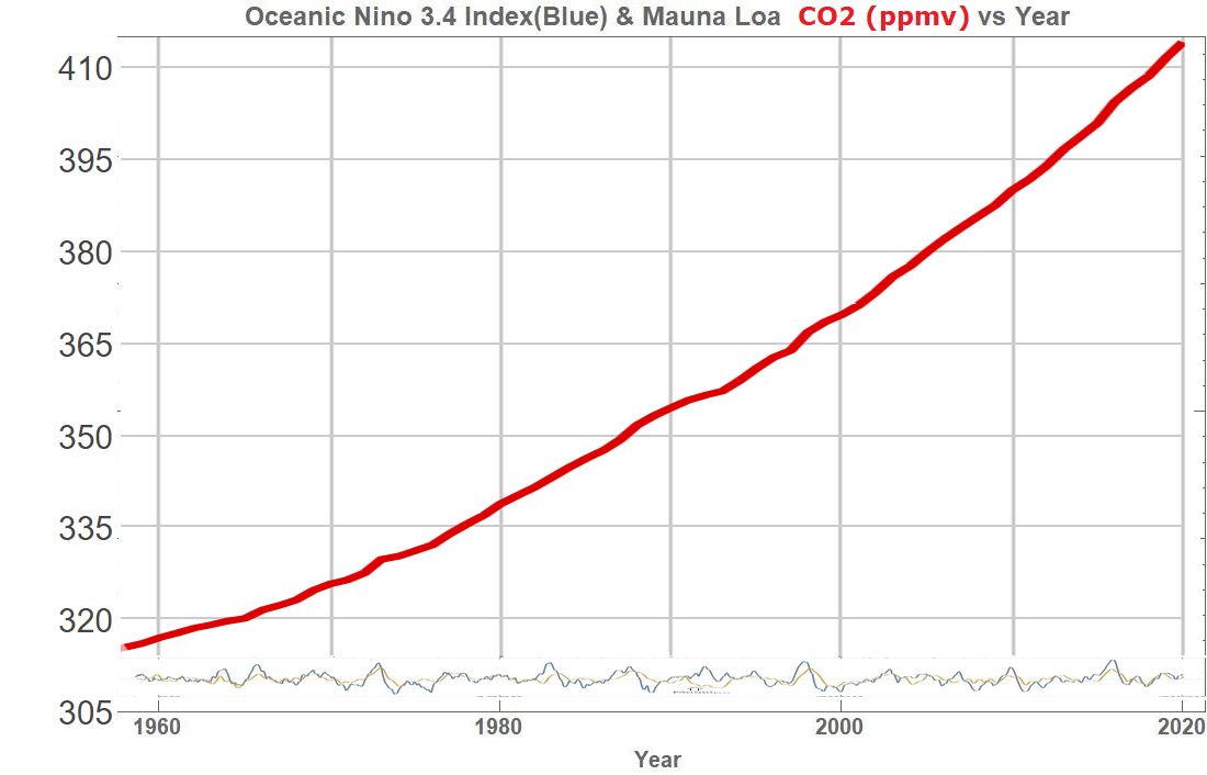
That insignificant squiggle near the bottom is your graph, scaled to match the non-detrended CO2 graph.
Changes in CO2 at Mauna Loa do not track changes in ENSO.
You’ve detrended CO2 in that graph, and you removed the seasonal signal. If you hadn’t detrended it then your graph would show that the atmospheric CO2 level increased every year, regardless of ENSO.
It is only the very short term deviations from the long term CO2 trend which track ENSO.
Dave Burton,
What Nelson’s plot clearly shows is that changes in CO2 growth rate are linked to ENSO, ‘growth rate’ being the key words. So, as you agree, the short term deviations from the long term CO2 trend do indeed track ENSO. The reason for detrending the CO2 growth rate when investigating a possible correlation with ONI should be obvious, given that ONI is itself detrended. (This is achieved by using “centered 30-year base periods updated every 5 years” for the calculation of temperature anomalies, which are the basis for determining ONI. But you knew that already, of course.)
Your view that these variations in CO2 growth rate due to ENSO (and also apply to Pinatubo) are an “insignificant squiggle” is surprising. Understanding the physical reason(s) why atmospheric CO2 growth rate increases (doubles) due to a major El Niño, but decreases (to less than half) following a La Niña or as a consequence of a major eruption, is an essential part of understanding the general increasing trend in atmospheric CO2.
Every year (since 1973), even during the strongest El Ninos (2016), nature is a net remover of CO2 from the atmosphere. According to my arithmetic, it was even true (barely) in 1998. So even the strongest ENSO variations have less effect on the CO2 trend, even in the very short term, than mankind’s emissions have.
If you click on that graph, you can expand it to the point where you can distinguish the insignificant blue ENSO squiggles and the insignificant tan CO2 squiggles. You can even line up the largest of those squiggles with slight perturbations in the red CO2 trend. But they really have no significant effect on the long term CO2 trend, and thus on CO2’s effect on the Earth’s climate.
I thought my question was simple enough, but let me try again. What is your physical explanation for the variations in CO2 growth rate that are caused by ENSO or Pinatubo?
Both ENSO and the Pinatubo eruption have/had multiple effects which influence CO2 fluxes
ENSO most obviously affects ocean surface water temperatures, but it also affects CO2 fluxes by affecting rainfall patterns, and ocean biology.
Large volcanic eruptions also affect temperatures, through “dimming” from particulates in the upper atmosphere, and it is likely that when those particulates “rain out” into the oceans they have a fertilization effect, increasing CO2 uptake.
None of that is of any relevance to “understanding the general increasing trend in atmospheric CO2.”
I’ve always thought the dead straightness of the CO2 rise seems suspicious. If it was caused by human CO2 emissions there should be more structure and variation.
Of course, CO2 is a “greenhouse” gas. Is it an important forcing or just another sidebar compared to water vapor? The question in my mind, is CO2 relevant in the overall global temperature scheme of things? Is there a side-by-side comparison of: atmospheric CO2 and global temperatures? I don’t pretend to know, yet, a while back, when climatologists said we don’t have another earth on which to do a controlled experiment, it seems that COVID-19 has provided that global experiment in shutting down CO2 emissions, by at least 7%, and the response? I don’t see it in the continued temperature escalation nor global CO2 atmospheric concentrations. Global temperatures continue rising and atmospheric CO2 is rising and…emissions have been falling.
I am certainly willing to be educated. However, it does seem to me that the experiment on earth has be achieved. It’s just the result was not expected.
Nature seems to be going on her merry way irregardless of the scientific minds’ outputs.
No. Emissions have been rising! And Temperatures have been rising! From 2015-2016. The question is not about temperature rising. It did. The question is, did the temperature rise because human emissions of CO2? I don’t think so, but you can look at some data here. Graphs presented by Willis are not informative, but you can look at very good data to inform you as given below, too many factors are involved.
The graphs by Willis are not informative. This surprised me.
1 Go to this site:
https://www.esrl.noaa.gov/gmd/ccgg/trends/
2 Click on Interactive plots on opening page
3 A graph will open showing monthly CO2 average
4 Bottom left of this graph, there is a Slider
5 Move this Slider to the right until about 2010 is the beginning
6 Look at the steady yearly rising , low and high levels until 2015-2016
7 At 2015-2016 there is an abrupt increase still steady today due to ENSO, El Nino
8 We can see the same when moving the slider to previous El Nino, but not as pronounced.
9 Note that all the earlier increases in CO2 did return, this is important.
10 If the current EL Nino returns, as ENSO started moving to Neutral and now slightly toward El Nina and CO2 also comes back to the earlier, this would be quite interesting.
11 It would be possible to imply that CO2 increased due to El Nino.
12 This site would help to do this since both CO2 and temperature anomalies are plotted:
https://www.climate4you.com/
13 At this site, under Keep Updates: click on Temperature and CO2 listed items
14 A graph will open showing both Temperature and CO2 for several El Nino prior to this major one
15 The temperature was rising before CO2 was. The temperatures as with ENSO have now beginning to decrease, but not yet CO2 in this last episode. If ENSO continues to decrease as well as this baseline increase in CO2 seen after El Nino, it would be plausible that variations in CO2 can be due to ENSO. Not that this is a major contribution but certainly a lot more important that “human industrial emissions” of CO2.
Don’t we take remote readings of CO2, like mauna loa in order to be far from most human sources of CO2 emissions and therefor get a mixed homogenous reading without spikes?
I’ve seen many posts regarding the unnoticeable effect of covid on CO2 but isn’t it a little too early to be sure?
Maybe. However if “human sources” are estimated to be contributing only 3 to 5% of total CO2 emissions, why would we see a noticeable effect.
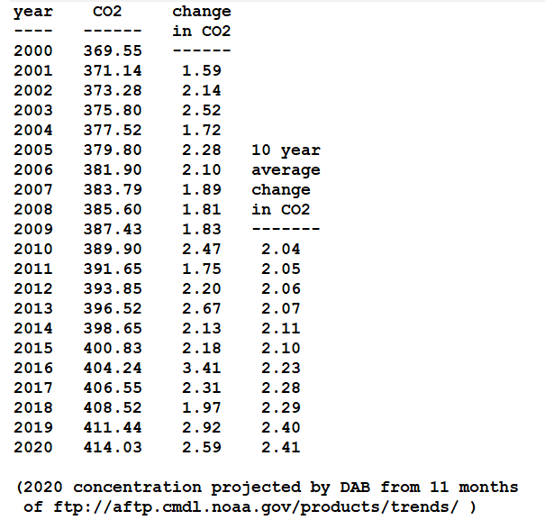
The reason there’s no apparent “Covid effect” on the CO2 trend is that the effect of Covid shutdowns on CO2 emissions is small compared to the usual variability. I’ve seen an estimate that Covid might lower 2020’s global anthropogenic CO2 emissions as much as 7%, but that’s not enough to notice.
Anthropogenic CO2 emissions in 2019 are estimated to have been around 10.3 PgC, which is about 4.7 ppmv CO2. That means 7% of that is only 0.33 ppmv.
That’s dwarfed by the usual seasonal cycles, ENSO variations, and other normal fluctuations. Some years average CO2 concentration rises less than 2 ppmv, other years it rises more than 3 ppmv. 0.33 ppmv is much smaller than that typical variation.
Here’s a graph:
https://sealevel.info/co2.html
Here’s a little spreadsheet:
https://sealevel.info/co2_yearly_2000-2020.xlsx
https://sealevel.info/co2_yearly_2000-2020.txt
Let’s see if I can make it format in a PRE block:
Or, as an image:
Agree
Nice and simple Willis, excellent. How about plotting their monthly chart they have on their front page https://www.esrl.noaa.gov/gmd/ccgg/trends/ and ask this question, why does CO2 fall between summer and winter? They will be telling us next CO2 makes the seasons, not as well as Vivaldi though.
Noaa addresses the question here https://www.esrl.noaa.gov/gmd/ccgg/covid2.html and concludes that the cuts in emissions would have to be deeper and longer to show up against the natural variability. I’m not convinced but I lack the time and the skills to prove them wrong.
yeah remember, bad assumptions about the relationship between emissions and concentrations were the main reason Hansen’s 1989 “bsiness as usual” emissions Scenario A got its temperature predictions so badly wrong (around 3x actual)
lol plot Mauna Loa against emissions, I mean come on
have always maintained there are way too many facile assumptions in the consensus view
rises in CO2 levels are far too smooth and seasonal
and since the 1800s 45% of new emissions always disperse despite emissions increasing 100x
relationship between emissions and levels must be at best highly contingent on numerous exogenous factors
Important to know.
During the lockdown the atmosphere is still filled up with 90 to 95 % of the normal anthropogenic CO2 flow. We can expect an increase about 2.3 to 2.4 ppm/year instead of 2.5 ppm/year.
Kind regards
Anders Rasmusson