By Andy May
The simple answer is that the portion of the ocean, roughly 54%, that has HadSST values is getting cooler. But Nick Stokes doesn’t believe that. His idea is that the coverage of the polar regions is increasing fast enough that, year-by-year, the additional cooler cells are causing the “true” upward trend in ocean temperature to decrease. I decided to examine the data further to see if that makes any sense.
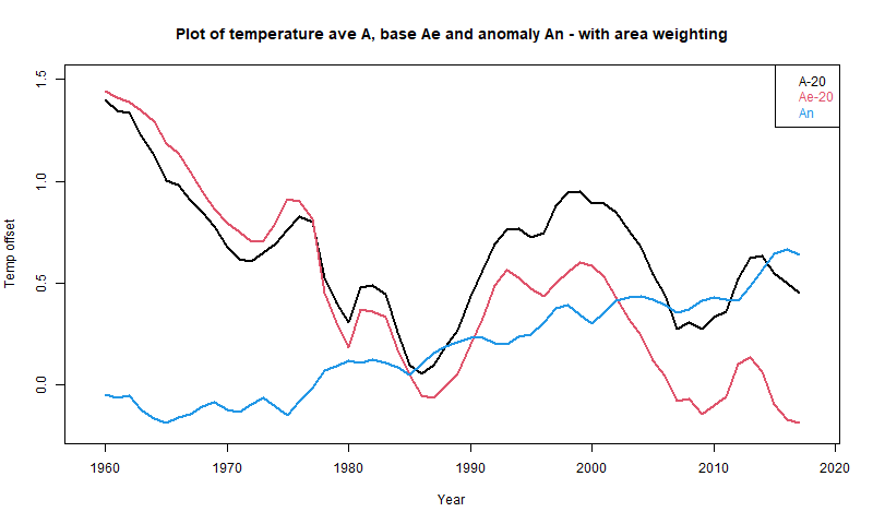
First, let’s look at the graph in question in Figure 1. It is from our previous post.

Figure 1. This post shows the global average temperature for the portion of the ocean covered by HadSST in that year. Both the HadSST temperatures and the ERSST temperatures are shown, but the ERSST grid values are clipped to the HadSST covered area.
As we discussed in our previous posts, the populated HadSST grid cells (the cells with values) have the best data. The cells are 5° latitude and longitude boxes. At the equator, these cells are over 300,000 sq. km., larger than the state of Colorado. If Nick’s idea were correct, we would expect the cell population to be increasing at both poles. Figure 2 shows the percentage of the global grid (including the 29% with land) covered with populated SST (sea-surface temperature) cells by year. The number of missing cells doesn’t vary much, the minimum is 44% and the maximum is 48%. There might be a downward trend from 2001-2008, but no trend after that. Figure 1 does flatten out after 2008, but you must work hard to see an increase from 2008 to 2018.

Figure 2. The number of monthly null cells in the HadSST dataset, as a percent of the total global monthly cells per year (72x36x12=31,104).
So, mixed message from that plot. Let us look at the nulls by year and latitude in Figure 3.

Figure 3. The number of monthly nulls, by year and latitude.
Figure 3 shows that the nulls in the polar regions are fairly constant over the period from 2001 to 2018. I’ve made 2018 a heavy black line and 2001 a heavy red line so you can see the beginning and the end of the series more clearly. The real variability is in the southern Indian, Pacific and Atlantic Oceans from 55°S to 30°S. These are middle latitudes, not polar latitudes. Neither 2018 nor 2001 are outliers.
The same pattern can be seen when we view a movie of the changing null cells from 2001 to 2018. Click on the map below to see the movie.

Figure 4. Map of the number of monthly null cells in the HadSST dataset for the year 2001. To see where the null cells are in all the years to 2018, click on the map and a movie will play. As before, the white areas have no null months in the given year, the blue color is either one or two null months and the other colors are more than two null months. Red means the whole cell is null.
Conclusions
The number of null cells in the polar regions does not appear to change much from 2001 to 2018. The changes occur in the southern mid-latitudes. The number of null cells, as a percentage of the globe, does decline a bit from 2001 to 2008, but only from 48% to 44%, not enough to reverse a trend. After 2008, there is no trend in null cells. From 2008 to 2018, the temperature trend is flat, and not decreasing, but given where the number of cells are changing, it is hard to say this is due to the number of populated cells in the polar regions.
The reader can make up their own mind, but in my view, we still have no idea what the global ocean surface temperature is, or whether it is warming or cooling.
You are on the right track Andy. In the SH, SST has not changed much. In the NH, SST is going up, especoally more so in rhe arctic. That explains the zig zag of the CO2 content.
Henry
There are signs of widespread cooling in the SH at certain specific locations and currents:
https://ptolemy2.wordpress.com/2020/09/12/widespread-signals-of-southern-hemisphere-ocean-cooling-as-well-as-the-amoc/
Great collection of papers, I found this quote interesting:
The Ice Age Cometh.
I had a reply here?
Do you think we have enough good data to know anything yet?
I think we can be reasonably certain that the average surface temperature, in the oceans where we have HadSST data, is between 20 and 22.5 degrees. The overall average ocean temperature is probably around 18 to 18.5 degrees (MIMOC and U of Hamburg). The climatic trend in temperature?? Is the ocean warming or cooling? I don’t think we know.
With polar sea ice is the temperature the top of ice or water under the ice.
It seems you could have both.
And if have 1 meter thickness of sea ice, the water would be 1 meter below the surface of ocean {or I guess due density, .9 meters}.
But it’s top of ice which mostly related to surface air. And it seems excluding ocean covered with polar sea ice as being ocean surface {or counting as ocean] makes some sense {or seems make it “unnecessarily complicated”- but I imagine needed in regards to weather forecasting}.
I would choose to count/consider polar sea ice as growth or reduction of land surface.
We certainly don’t know anything by presenting a single line for all of the oceans. It’s a physically meaningless concept.
Totally agree, it’s like the average temperature of your refrigerator – totally useless number. One needs to know the temperature in the freezer section and in the refrigerator section, but the average of the 2 is useless. An oversimplification to impress the idiot political scientists that control the greedy natural scientists’ grants
“… we still have no idea what the global ocean surface temperature is, or whether it is warming or cooling.”
If the masses of water below the SSL and their average temperatures are taken into account, we will hardly ever get a correct answer to the question.
Thanks Andy for doggedly following this important question.
As you move poleward toward colder ocean, the area (and volume) of ocean decrease sharply, as a simple consequence of the world being a sphere.
So growing coverage would be more likely to increase sampling of warmer rather than colder ocean. There would have to be a very directed poleward trend to overcome that. And the data don’t indicate any such trend.
“As you move poleward toward colder ocean, the area (and volume) of ocean decrease sharply, as a simple consequence of the world being a sphere.”
Phil,
I too have a problem with this analysis.
The HADSST Null cells 2001 chart (Fig 4) shows a diagram of the surface of the earth laid out as a rectangle. The x-axis of this diagram represents 360 degrees of longitude and the y-axis represents 180 degrees of latitude.
By my count there are 72 equally sized cells on the x-axis and 36 equally sized cells on the y-axis, so each cell covers an arc of longitude 360/72= 5 degrees and each an arc of latitude 180/36 = 5 degrees. (Andy reports this but I like to check these things).
In his conclusion Andy states:
“The number of null cells, as a percentage of the globe, does decline a bit from 2001 to 2008,”
Now for the arc of latitude each cell has roughly the same north /south length (if we ignore the tropics stretch due to the equatorial bulge). However, for the arc of longitude for each cell there is a significant latitudinal dependent reduction in east west distance as we go towards the poles.
Therefore, it is totally unwarranted to give equal weight to high latitude cells compared to equatorial ones. There is an absolute requirement for a latitude dependent scalar to be applied so there are less cells in the arctic regions. The cells on the surface of a sphere must be counted according to the physical size of their surface area and not by an equal angle measure of their subtending arcs.
Philip, Figure 1 is weighted by area. The others are just cell counts, I see no reason to weight them by area.
Andy,
The point I am making is this: you cannot do integer comparison count of squares which have different surface areas.
The surface area of the 5-degree polar cap for the earth between latitude 85 degrees and the pole is 966,000 sq. km for a polar radius of 6,356 km.
The surface area of the latitudinal band between the equator and 5 degrees north is 22,277,000 sq. km for an equatorial radius of 6,378 km.
The ratio between these two surfaces is 23 to 1 – OK we don’t have any icecap data. If we assume instead that the polar band that we do have HADSST data for lies between 75 to 80 degrees for the arctic then the surface area of this latitudinal band is 4,794,000 sq. km (polar radius calculation).
The ratio between this 5-degree band and the 5-degree equatorial band is 4.65 to 1
So, for the 72 latitudinal squares at the equator there are only 15.5 squares of equivalent size at latitude 77.5 degrees north.
Not all latitudinal squares are equal so you must scale down the integer count for the arctic data.
Philip
The point I was making was in support of Andy’s argument, not against.
The spherical contraction of the earth surface with increasing latitude makes the criticism by Nick Stokes – that more sampling increases sampling bias toward cooler regions – unlikely by simple geometry. Providing sampling was random. There’s a lot more warm ocean surface than cold.
Phil.
We are on the same page. The correct way to display these data is with a Mollweide equal area projection.
“Providing sampling was random. ”
Sampling isn’t random. It is a fixed grid, modified by unvailability. Unavailable readings are those in places difficult to measure. Cold oceans have little shipping traffic and intermittent ice. With ongoing effort, difficulties are overcome.
But anyway, the numbers tell the story. If you look going from 2001 to 2018; 2180 stations were added, at average temperature 6.865C. That’s cold. It’s partly countered by 1023 stations that reported in 2001 but not 2018, average temperature 10.52C. But only partly; they weren’t as cold, and were only half as many.
Thanks. I suspected that the “random” assumption may have been unsafe.
If the data you use for input actually has varying sources over time, how TF can you put that on a time-series graph? It is dishonest practice and the graph is not valid for the purpose.
I agree Rhoda. This point is driven home when reading Hunag, et al. (2017). Boyin Hunag is the lead author of the ERSST v5 paper. The difference between the buoy and Argo float data, which is most of the data used since 2005, and the ship data (most of the data pre 2005), is large. ON AVERAGE, 0.08 deg. from 1990 to 2010.
But, the average disguises huge variability in both time and space (see Huang’s figure 8).
Yet, Nick and others claim that the average from 1961-1990 (HadSST) or 1971-2000 (ERSST) is a magical “climatological” constant that can be subtracted from modern temperature measurements, cell-by-cell, to give us a suddenly pristine temperature anomaly, with a value less than 0.6 degrees, that is accurate enough to provide a trend that is less than 0.02 degrees per year. I think not.
Statistical malpractice.
Andy,
Your last sentence is very important. With the accepted uncertainty for the Argo floats being +/- 0.5C how can you determine a trend in the hundredths digit? You have to ignore the uncertainty and significant digits completely – which is what climate scientists today are wont to do. It’s the same with the land temperatures. With station uncertainties of +/- 0.5C (actually the federal government accepts +/- 0.6C in its stations) how do you determine annual and decadal trends in the hundredths digits? Again, you ignore uncertainty and significant digits.
It is really difficult when the data have been adjusted in the first decimal place, especially since the adjustments are not random and therefore the errors are not random.
People, who don’t know as much about statistics as they think they do, smugly insist that if you have a large number of samples you can get a really accurate average. As you point out that’s only true if certain conditions are met.
Kip Hansen wrote a wonderful series of articles about averages.
link: https://wattsupwiththat.com/2017/07/24/the-laws-of-averages-part-3-the-average-average/
My guess is that 99% of people who average data are making assumptions they don’t even know they’re making.
You also aren’t supposed to average intensive properties from different locations.
Rhoda, Here is a link to Huang’s 2017 paper. It is not paywalled.
https://journals.ametsoc.org/view/journals/clim/30/20/jcli-d-16-0836.1.xml?tab_body=fulltext-display
Actually, the varying sources may be ok depending on their distributions. There are two terms that are important for trending time series of data, heteroskedasticity and homoskedasticity. Read the following to learn about these. Heteroskedasticity Definition (investopedia.com)
These are important assumptions to be made when statistically analyzing data and in trending . Ask yourself how these apply to large bodies of ocean such as the Pacific and Atlantic. Ask yourself if you have ever seen these applied to climate projections by climate scientists and why not.
Last sentence — “we have no idea” — a jarring and subversive comment in a science thread.
BallBounces, “jarring” I understand. Why “subversive?”
Generally, science tends to be subversive
I’m having a twitter conversation with the Hadley Centre’s SST expert, John Kennedy on this post. A key tweet is here:
In other words, John is saying that the dataset I downloaded, which was clearly labeled “actual” contains computed numbers. First the measurements were corrected, turned into anomalies, and then the Hadley Centre used the anomalies and the 1961-1990 averages to compute what they call the “actual” temperature. Merry Christmas Andy
I’m a bit shocked at this admission, but some odd things I’ve seen make more sense now. Nick’s confusing comment with this plot, from my last post, :
Is now totally understandable. The actual was computed from the reference average and the anomaly, so if you subtract the reference average you get the anomaly. John and Nick are deep into circular reasoning here. I’m very disappointed.
Nick’s comment is here:
https://wattsupwiththat.com/2020/12/23/ocean-sst-temperatures-what-do-we-really-know/#comment-3151078
Climate science is riddled through and through with circular reasoning logical errors. Another (huge) circular error in CliSci are the CO2 attribution studies like SAR fraudster Benji Santer likes to produce.They are using climate models engineered to show warming due to CO2 that then “miraculously” show no warming when the atmospheric CO2 rise is removed.
CliSci is a junk discipline corrupted by too many science pretenders for 30 years now.
BTW, John’s twitter handle is above, mine is @AndyMay87495297, if you want to read the whole conversation. I tried imbedding the tweet, but can’t get it to work.
It’s easy to find. Thanks for the imbed attempt.
I’ve been posting notes like the following since May2020. We are now seeing the beginnings of decades-long record cold temperatures in several locations around the world.:
https://wattsupwiththat.com/2020/12/06/uah-global-temperature-update-for-november-2020-0-53-deg-c/#comment-3141024
Check out NIno34 anomaly temperatures, now down to minus 1.2C – in a few months, winter should be cold.
Check the beautiful La Nina in the equatorial Pacific Ocean – the blue stuff.
In the absence of major century-scale volcanoes:
UAHLT Anomaly four months later = approx. 0.20*Nino34SSTAnomaly + 0.15 = 0.20*(-1.2) + 0.15 = minus 0.09 = approx. minus 0.1C
The above decades-old strong relationship has been a bit wobbly lately – let’s see if it holds up this winter.
Reference:
https://wattsupwiththat.com/2019/06/26/part-of-the-pacific-ocean-is-not-warming-as-expected-buy-why/#comment-2732128
The constant part (0.15 here) is probably time-varying on a multidecadal scale, like the AMO or PDO.
Hi Joel,
This formula works reasonably well back to 1982, which is the limit of my data availability.
UAHLT (+4 months) = 0.2*Nino34Anomaly + 0.15 – 5*SatoGlobalAerosolOpticalDepth
See Figs. 5a and 5b in this paper:
CO2, GLOBAL WARMING, CLIMATE AND ENERGY
Allan MacRae, 15Jun2019
https://wattsupwiththat.com/2019/06/15/co2-global-warming-climate-and-energy-2/
The relationship has been a bit wobbly just recently – there seems to be an additional source of heat that is not accounted for in this formula.
Best personal regards, Allan
The “additional source of heat” that I hypothesized in my above post would be located in the far North – that is where the anomalous warmth is located, Would the “Newly Discovered Greenland Hot Rock Mantle Plume” be of sufficient magnitude to be the primary cause? Is there more than one such plume in the North?
NEWLY DISCOVERED GREENLAND HOT ROCK MANTLE PLUME DRIVES THERMAL ACTIVITIES IN THE ARCTIC
By Tohoku University December 24, 2020
https://scitechdaily.com/newly-discovered-greenland-hot-rock-mantle-plume-drives-thermal-activities-in-the-arctic/
Andy,
Here is the breakdown of the change from 2001 to 2018 in HADSST, without area weighting. Note that it is just sorting out the actual arithmetic. No basis period or anomalies are used.
H1 is the set of values in 2001, H2 in 2018.
The grid is 72*36, and there are 12 months. So for each year, there could be 31104 data points, one for each cell/month (abbrev cemo)
R0 is the subset of N0 cemos with data in 2001 and 2018)
R1 is the subset of N1 cemos with no data in 2001, data in 2018)
R2 is the subset of N2 cemos with no data in 2018, data in 2001)
N=N0+N1+N2
S0 is the sum of 2001 values (H1) in R0
U0 is the sum of 2018 values (H2) in R0
S1 is the sum of 2001 values in R1
S2 is the sum of 2018 values in R2
Andy’s averages for 2001 and 2018 are A1=(S0+S1)/(N0+N1), A2=(U0+S2)/(N0+N2)
So
A1*(N0+N1)=S0+S1
A2*(N0+N2)=U0+S2
and
A1*N=A1*(N0+N1+N2)=S0+S1+A1*N2
A2*N=A2*(N0+N2+N1)=U0+S2+A2*N1
and so
(A2-A1)*N = U0-S0 – (S1-A2*N1) + (S2-A1*N2)
A2-A1 = (U0-S0)/N – (S1-A2*N1)/N + (S2-A1*N2)/N ###The breakdown
In fact, the data are
N0=15026, N1=1023, N2=2180
A1=19.029, A2=18.216
(U0-S0)/N0=0.254
S1/N1=10.52 # average for R1
S2/N2=6.865 # average for R2
Let’s look at the three components which make up Andy’s decrease of 0.813 going from 2001 to 2018 (A2-A1).
R0: (U0-S0)/N= (U0-S0)/N0 * w0, w0=N0/N
(U0-S0)/N0 is the average difference between 2001 and 2018 of cells that have data in both. It is a genuine increment term and is 0.254. The weight N0/N is 0.824, reflecting the fact that the majority of cells that have any data have data in both.
R1: (S1-A2*N1)/N = (S1/N1-A2)*w1, w1=N1/N
(S1/N1-A2) reflects the difference between the average in cells that dropped out (10.52) and the 2018 average A2. w1 is the fraction in R1, 0.056
R2: (S2-A1*N2)/N = (S2/N2-A1)*w2, w2=N2/N
(S2/N2-A1) reflects the difference between the average in cells that were new in 2018 (6.865) and the 2001 average A1. w1 is the fraction in R1, 0.120
The overall arithmetic is
A2-A1= 0.210+0.431-1.455=-0.813
The first component is the genuine difference between cells. The second and third, which are larger, just reflect whether the cells entering (R1) and leaving (R2) the average were warmer or cooler than average. They were cooler, but the cells gained (R2) were a lot cooler than those lost (R2), and there were more of them. That is why A2 (2018) was less than A1 (2001), despite the cells that had data in both having warmed by 0.21. And the reason has nothing to do with climate change.
Hi Nick, Maybe you didn’t see the twitter exchange I had with John this morning. But, he told me that the “actual” HadSST grid cell temperatures are not gridded actual temperature monthly averages after all. They are the reference temperature for the cell with the computed anomaly added to it. Thus, your calculations are baked in. That is, he reversed the original calculation used to get the anomaly, then you reversed that. So your answer has to be correct.
I’m uncertain whether ERSST computes their “actuals” from their anomalies or their measurements, so I don’t know how to evaluate their trend.
Unfortunately, your calculation doesn’t add any information, but it did lead us to finding out that the “actual” temperatures are not actual, at least from HadSST.
Either way, my conclusions are still solid, I think. We do not know if the global average SST is increasing or decreasing. The reason we don’t know is the temperature trends in the Southern Hemisphere oceans are so uncertain.
Andy
<i>”They are the reference temperature for the cell with the computed anomaly added to it. Thus, your calculations are baked in.”</i>
What I have done here is just accountancy. It rearranges your arithmetic to show the parts that relate to R0 (the common set), R1 (2001 only) and R2 (2018 only). It can’t tell you anything about what those numbers really mean, and is not affected by that. It is just an examination of your calculation of the average of a set of numbers.
It shows that there are three parts
R0 – the common set, contributes an increase of 0.21 from the actual increases observed, 2001 to 2018.
R1, R2, The other parts contribute a net decrease of 1.023. But they have no information about change from 2001 to 2018. The decrease happens basically because the added observations (R2) have an average of 6.865C. That is well below the average of the remaining cells in A1, and so adding those new observations brings the average down. That isn’t because any places got colder. It is because you added places that were already cold, and weren’t in the 2001 average.
For the HadSST dataset you are probably correct, although I did not independently check. It almost has to be that way considering how the HadSST “actuals,” which are not measurements, were calculated.
We don’t know much about the Southern Hemisphere ocean trends, and that is where cells are changing rapidly. I don’t know how long it will take to get enough good data to establish a trend.
Nick,
I have never understood why the climate science industry uses anomalies calculated by taking differences from some averaging period. My background (PhD)is econometrics, though I’ve been doing Finance for years.
If I was asked to analyze climate data, I would would first de-seasonalize it. Land temperatures clearly have a strong seasonal component that is easily removed. For monthly data, I would take the 12th difference. I would do this for all raw series.
There are lots of ways to test for a time trend. Most simply, Use a dummy variable for time in a linear regression. I would be much more interested in seeing the distribution of trends around the globe than the mess the climate industry makes by trying to produce a single time series for the Earth’s temperature.
If I were working with the data and wanted to analyze the times series properties, I would reach out to someone like Jim Hamilton at UCSD. His book of Time Series Analysis is a classic.
The other thing that bothers me is that the climate temperature data is panel data. There are tools of cross-sectional/time series analysis that are begging to be brought to bare.
“I would would first de-seasonalize it”
You need to check on how anomalies are calculated. From each month’s reading is subtracted the mean for that month. That takes out seasonality.
“I would be much more interested in seeing the distribution of trends around the globe”
OK, here they are
https://moyhu.blogspot.com/p/blog-page_9.html
Andy
<i>”But, he told me that the “actual” HadSST grid cell temperatures are not gridded actual temperature monthly averages after all.”</i>
I think you are getting muddled with some really elementary stuff here. What he said was
“HadSST actual SSTs are just anomalies added to a fixed climatology”
That is just the equation I wrote earlier, which is true for HADSST, any environmental temperatures, pretty much anything at all
T = Te + Tn
You can partition the data into a base level Te, which doesn’t change, and an anomaly Tn, which includes the changes over time. That is just arithmetic you choose to do. It helps because it largely separates the space varying Te from the time varying Tn, although Tn has some variation in space as well.
T, today, is determined by using the best available technology and techniques. CliSci then pollutes T with Te, an inaccurate value determined by averaging measurements using unreliable, older technology and techniques over some distant past time period (plus a little Climategate secret sauce).
One might, just might, get something more accurate if one used the past 15 years or so of directly measured Argo and bhouy data to determine Te. But that would necessitate delaying the declaration of a climate emergency for a couple of years, putting off the worldwide imposition of Marxism (or total ChiCom control).
Nick, John confirmed what I said. Did you see his later tweet:
He clearly said the “actual” file was created from the anomalies, not averaging the monthly temperature measurements. Check with John, he’ll confirm it. I’m not so sure about ERSST, it may be averaged/interpolated measurements.
Andy,
It is still just partitioning. You create the anomalies by subtracting the base, and that is the primary useful information. You can recreate the absolute by adding the base back in.
In any case if you form an anomaly by subtracting out a base, and then add a base back in, you are back to where you started. There may be a subtlety in that the base valuess subtracted were for more finely divided subregions than the whole cell. However, the base added in must surely be very close to the average of those, if not exactly equal.
Here is another, also clear:
Nick,
Thank you for this very nice analysis. It beautifully shows the biases introduced by changes in sampling without resorting to any complicated processing beyond simple algebra.
Thanks, Tim
And also demonstrates how extrapolated/interpolated data really isn’t data at all.
It doesn’t demonstrate anything like that. It can’t. I took just the set of numbers that Andy chose to analyse, and sorted the arithmetic that he did to show where the faults are. That is all.
You have to get math methods right, otherwise you will get wrong answers with good or bad data.
Typos
R1 is the subset of N1 cemos with no data in 2001, data in 2018)
R2 is the subset of N2 cemos with no data in 2018, data in 2001)”
I got these the wrong way round. R1 is the set with data in 2001, R2 with data in 2018. The rest proceeds on this basis.
In the R2: section
“w1 is the fraction in R1, 0.120”
should be
w2 is the fraction in R2, 0.120
Andy
I have posted at Moyhu
https://moyhu.blogspot.com/2020/12/how-averaging-absolute-temperatures.html
setting out this accountancy with tables and more explanation, as well as explaining how anomalies retrieve the situation, even using approximate base values.
Nick, I edited your comment to make the link stand out better.
Thanks for this instructive analysis. I did not duplicate it, but it looks solid and I see no problem with it, as far as it goes. Other considerations are important however.
My analysis used yearly averages of cells with at least 11 monthly values. Due to the Hadley Centre’s strict limits, these would have been each year’s best data. ERSST and HadSST share (mostly) the same data. The differences between their records are in their respective corrections and gridding processes. Yet, over this area, with the best data, their estimates of the actual SST are 1.5 degrees different in every year.
HadSST computes their actuals by adding their final anomaly to their 1961-1990 base value. The anomaly was created by subtracting the base value from an average of corrected measurements. All of their ocean cells have 1961-1990 reference or base values. The data in that period is not very good, compared to today, and the period begins with a rapid drop in temperatures, followed by a rapid rise. All cells do not have data for all months in the reference period, and temperatures were changing over much of the world fairly rapidly then.
Further, the anomalies were changed, using correction and gridding algorithms after they were computed, and before they were added back to the reference value.
The ERSST documentation is unclear on how their actual value “sst,” long name=”Extended reconstructed sea surface temperature” was computed. I assume it is gridded and corrected measurements, but it could have been computed like HadSST. Either way it is very different from the HadSST estimate over the same portion of the ocean, with up to 20% of the cells moving in and out as you describe.
Comparing my figure 1 to my figure 2 shows a correlation of the number of cells with both the HadSST temperature estimate and the ERSST temperature estimate. HadSST is essentially their anomaly, rescaled, with some corrections applied. The strong correlation does not prove anything, but it suggests making the anomaly did not help much with the cells moving in and out. And the difference between ERSST’s magnitude and HadSST suggests a problem in determining the average temperature.
Your anomaly:
Making the numbers smaller and more homogenous does make the results “look better,” but it does nothing to improve the accuracy of the resulting temperature calculation or the resulting trends. Instead, it masks the complexity of the data and the lack of accuracy. It is a cosmetic. It improves the error statistics and the appearance of the plots, in my opinion, but is of little scientific value.
I still maintain that the underlying data, with or without converting it to anomalies, is insufficient to tell us what the average ocean surface temperature is, or whether the world ocean is warming or cooling at the surface.
Andy,
Your Figure 1 (averaged absolute SST) correlates EXTREMELY well with Figure 2 (percentage of null cells). This suggests that the “average temperature” in Figure 1 is mostly just a reflection of changing measurement composition, as Nick Stokes suggests. And that if you use some method to remove the influence of changing measurement composition (i.e. anomalies), you would be able to get a much more accurate measurement of the true average trend.
Correct. See above answer to Nick. It turns out that the HadSST “actual” temperature dataset is not constructed from the actual measurements. John Kennedy admitted to me this morning that the “actual” HadSST temperatures are the sum of their anomaly and the reference temperature. Nick calls the reference temperature the “expected” temperature. So while I thought I was comparing measurements to anomalies, they were both anomalies.
I’m not sure if the ERSST data is the same. I suspect that the ERSST “actuals” are gridded measurements, since they agree well with MIMOC and U. of Hamburg though. But, I cannot confirm that.
Andy, Nick is just wrong if he thinks his Te is an expected value. It isn’t. First, if you believe temperatures are trending higher, you have a nonstationary time series where the mean is undefined. Second, the anomaly calculation is ad hoc. I’m not sure of the seasonality of the SST, but clearly land temperatures should be de-seasonalized as a first step using the entire series. The whole effort to create a single series to represent the Earth’s temperature is a huge waste of time that throughs out lots of interesting information.
Nelson, It also bothers me that the period that the Hadley Centre chose, 1961-1991, begins with rapidly cooling temperatures and ends with rapidly increasing temperatures. Plus the data during that period is poor compared to today. It is not a good time to estimate Te.
Andy,
I’m not sure of the specifics of how the HadSST data is processed, but I don’t think it affects my point.
To me the primary lesson from this post is that spatial averages of temperature can create large biases when measurement stations move around, but using anomalies is effective at removing this bias. The correlation between Figures 1 and 2 (and the lack of correlation with the averaged anomalies) is a beautiful demonstration of this fact.
This suggests a good reason why the grid averages in HadSST are computed as anomalies. As you point out some grid cells are the size of Colorado, and Argo floats drift freely across them. This drift could create large biases (akin to moving a land temperature station around randomly by hundreds of miles). But we have now seen that anomalies fix this problem. So to create an accurate dataset, using anomalies is really the only choice available to the people of the Hadley Centre.
Thank you for this interesting discussion.
Tim
Tim,
While I agree that anomalies are used by the Hadley Centre and NOAA to attempt to overcome the problem of moving instruments, I do not agree they are effective at doing it. There is a correlation between Figure 2 and Figure 1, but that only suggests that sampling affected the estimated temperature, not that the creation of the HadSST anomalies fixed anything.
I’m not sure if the ERSST data plotted came from anomalies, it may be gridded actual measurements. But, the HadSST data plotted in Figure 1 are their anomalies added to their reference (1961-1990) data. Both estimates are affected by the number of HadSST populated cells. They are affected by a similar amount, but the two estimates of SST are 1.5 degrees different for the same area of the world ocean, the area with the best data.
The correlation between the number of cells and both estimates in Figure 1 + the difference in the two estimates, suggests we have not fixed the moving instrument problem and we don’t know what the temperature of this area is, or whether it is increasing or decreasing.
Andy,
Are the cell temperatures and/or anomalies linearly averaged or is T^4 averaged as the laws of physics requires?
Owing to the significant average temperature difference between the poles and the tropics, a linear average exaggerates trends and will produce misleading results. While a 1C increase takes the same amount of work (energy) to acheive anywhere on the planet, a 1C increase at the tropics takes a lot more work to maintain than a 1C increase at the poles and in the steady state, only the
work required to maintain the temperature matters since the temperature has already changed!
CO2isnotevil, These are both temperature averages. The “conservative temperature” or the enthalpy or heat content difference you are talking about is more useful. Temperature averages don’t mean very much from a global warming or cooling perspective.
The NOAA MIMOC dataset provides us with the conservative temperature (or enthalpy) value of the ocean. See my earlier post here:
https://andymaypetrophysicist.com/2020/12/12/the-ocean-mixed-layer-sst-and-climate-change/
Andy,
Enthalpy is irrelevant to SUSTAINING any change in the temperature and the ability to sustain an average temperature change is all that matters relative to the steady state. One definition of the steady state is that the average change in enthalpy integrated across time is zero. That is, the average temperature has already changed and all that must happen going forward is to maintain that changed temperature which requires W/m^2 proportional to T^4 and not W/m^2 proportional to T. This means that the only physically relevant average temperature that properly quantifies temperature changes as a consequence of changes to the radiant balance (i.e. forcing) is calculated as the fourth root of the average of T^4.
A linear temperature average is not a physical temperature which over emphasizes the poles while under emphasizing the tropics and which over estimates trends. For example, a steady state +1C change in a cell at the poles and a -1C change in an equal area cell at the equator do not cancel relative to a physically relevant average temperature, but instead would represent a cooling planet since the net emissions of the surface will drop.
The ONLY relevant average temperature of matter in thermal equilibrium with a source of W/m^2 is the Stefan-Boltzmann temperature corresponding the the average emissions of that matter which will be equal to the W/m^2 it’s receiving. I know of no other law of physics that can modify the 4 in T^4. Only the emissivity can vary between an ideal radiator (black body) and a non ideal radiator (gray body). The Earth is most definitely a non ideal radiator, none the less, T^4 must still apply.
HadSST is a hack to support an agenda like all these global records. The ridiculous -0.5 deg C step down they stuffed in after 1945, then replaced with an exponential slide when this got too much attention, shows how they work. They arbitrarily decided a 2% per year change from bucket samples to engine room samples, and then ALTERED written records to conform to this assumption when the records did not fit.
And that is what the climate community regard as being the “gold standard” database.
The following comments are based on an evaluation of HadSST3 a couple of years ago, so I would be very happy for Andy, or anyone else for that matter, to check for mistakes by me or identify significant changes in the database of HadSST4 versus HadSST3. I would really like Andy to ‘drill deeper’ to try to get to the bottom of his identified issues.
As Andy mentioned above, there are 31,104 monthly cells per year, which corresponds to 2,592 cells globally for each month (72×36 5x5deg cells). However, there are 597 cells globally that are 100% land so have no bearing on any SST calculations. There are, therefore, 1,995 cells for any specific month that could contain observations of which many are coastal, i.e. they are partially land and partially ocean. Interestingly, 1,995 the cells which could contain SST observations are evenly distributed between hemispheres: 998 in the northern hemisphere and 997 in the southern hemisphere. Since 2000, the number of cells containing one or more observations averages around 1,400 or 70% of coverage.
As I have mentioned before, there is some misunderstanding regarding data coverage for the 1961-1990 base period, otherwise known as the climatology. These data are determined on a monthly basis and are supposed to reflect the average temperature for that cell/month combination by calculating the average over the 30 years. Andy refers to the data coverage during this time as follows: “The area covered in 1961-1990 was very different from the area covered today”. But few people appear to realize that in HadSST3, there are temperature values for every single cell (all 1,995) for each monthly average, which are then used to determine anomaly values. This is despite the fact that there are cells which did not have a single observation in any of the 30 years for a specific month. There are also cell/month combinations where less than half of the years between 1961 and 1990 had any observations. And yet there are no gaps in the base period 30-year average temperature values. This appears to have been achieved (mostly? entirely?) by assuming that a lack of observations is due to 100% ice coverage and hence a value of -1.8C is assigned.
This approach, if I am correct, leads to a positive bias in anomaly values, since there should not be any values below -1.8C. Consequently, if a future cell/month has any observations at all they will always have a positive value for the anomaly, but if there are no observations (e.g. due to still being ice-covered) no anomaly is recorded. Shouldn’t it be recorded as an anomaly of zero? Or should the climatology value (based on zero observations) be blank?
One other point. I mentioned above the average number of cells with anomaly values is around 1,400. This number hides a much more important fact. There are major variations in the number of cells with observations from winter to summer. In the northern hemisphere, these range from around 650 in winter to as much as 850 in summer, and the latter has been increasing from 750 in the year 2000, which correlates with increasing anomaly values in the northern hemisphere summer as shown here: https://www.woodfortrees.org/plot/hadsst3nh/from:1990/plot/hadsst3sh/from:1990
It seems to me that there is a positive bias to the anomaly data caused by additional sampling during the summer. There are similar swings in the southern hemisphere winter-summer cell counts, but no obvious bias in the anomaly values.
No other discipline of science would even think to try to get away with the data “creation” and manipulation steps done by the climate sci community as accepted practice. It’s scientific malpractice all the way through much of CliSci.
Jim, I think all the points you have made are correct and I think they all apply to version 4. I very much appreciate your point about winter/summer cell values. I tried to avoid that problem by insisting that a cell not have a yearly value unless it had 11 or 12 values in the year. I did not count all the cells with ocean in them, but your numbers sound correct.
I did not know that every ocean cell had a reference value, but they probably all do. Kennedy spends a lot of time in his paper talking about the problems in the reference period.
OK, let’s see if these plots will work:
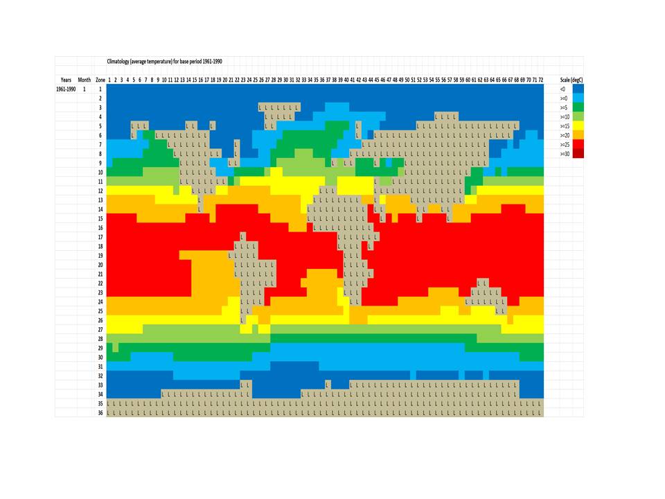
The first one is the January ‘reference’ temperatures for the 1961-1990 period, which are the basis for deriving anomaly values. The map looks a bit strange because the ‘L’ cells are only those that are 100% land; coastal cells have SST values. Scale is in degrees C.
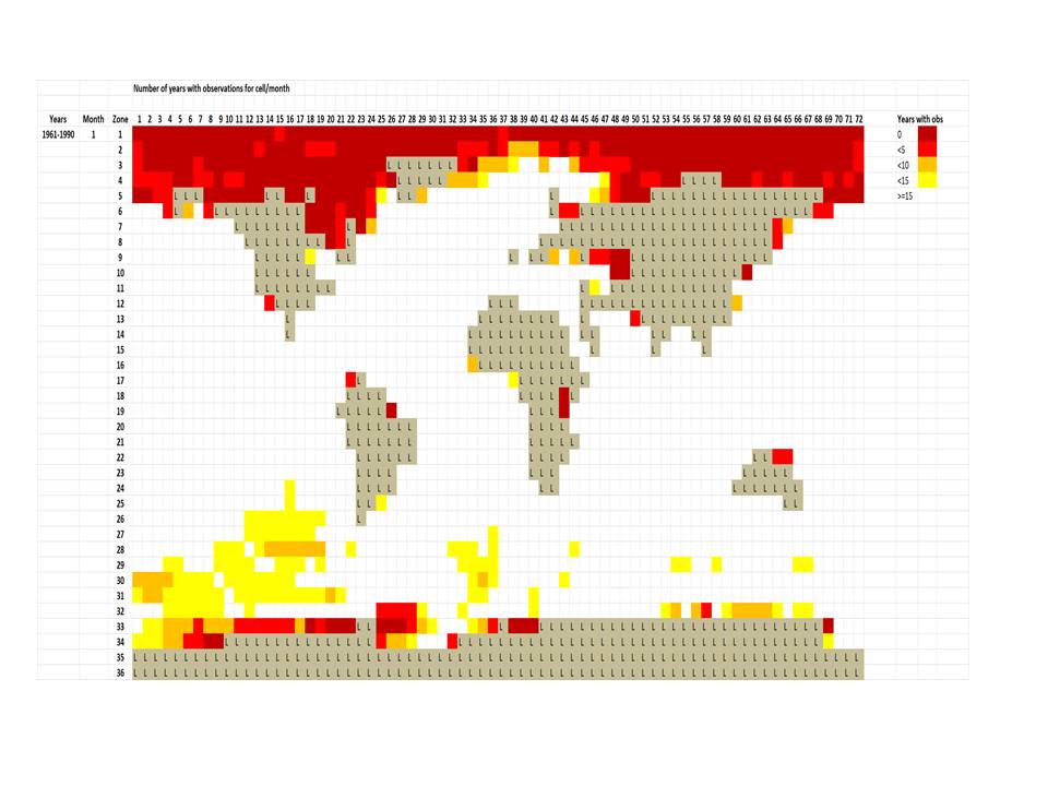
The following plot reflects the number of number of years in the 30 year base period for that cell that contain observations during January.
If the scales are not legible at this size, I will be happy to provide the details.
Actually, you just need to click on the plot and it will (should) enlarge.
Thanks Jim, really helpful. The Southern Hemisphere is a huge problem, as is the far north in winter.
Jim, do you have the same plot for July?
I have all the months ‘off-the-shelf’ for the ‘reference’ temperatures, but for the observations (is that the one you are looking for?) I have August, but could generate one for July later, if required.
Sorry, I have them for resent years. I meant for the reference period, sorry I should have specified.
No problem, but there are two plots for the reference periods: the number of observations and the value of the reference (average climatolgy) temperature.
The number of observations
Andy, the plot immediately above shows the number of years in the 30 year base period for that cell which contain observations during August. It would be quite a lot of work for me to generate one for July, so hopefully this one will suffice for illustrating the NH summer and SH winter situation through the reference period.
Great, this will do fine.
Now that you mention it, we have discovered an error in our instrumentation that causes temperatures to be recorded lower than actual over time.
We will fix this error in the next update.
It’s a reporting error.
Andy May, once again, does a great service to those who want to know the truth. Lifting the wizard’s curtain by applying considerable skills, intellect and hard work.
This post and comments comprise a stunning reveal of part of the most extensive corruption of science and public policy in history. CAGW is a global political campaign and it is very dangerous and discouraging that many politicians, the media, learned institutions, government agencies, non-profit organizations, NGOs, social clubs, the entertainment industry, professional organizations, unions, financial institutions, public broadcasting, and so forth can be so easily transformed into agents of evil.
I write this with sadness but also with optimism that one day soon the evil, flawed CAGW agenda will be diminished and eventually extinguished.
Or you could just go to the ICOADS database and specify that you only want data in a specific latitude band (and within certain longitudes) during a specified time, and only specific parameters.
The ICOADS folk do a got job of replying to data requests, they even service requests 24 hours a day, or they certainly did last time I requested the data.
Just be aware that it could be easier to request a large amount of data and then slice it up yourself (e.g. request a full year and then when it arrives, divide it into months).
Individual observations via https://rda.ucar.edu/datasets/ds548.0/
Monthly summaries, including obs counts, at https://rda.ucar.edu/datasets/ds548.1/
Thanks John, John Kennedy suggested the same thing. If I decide to pursue this further that is the next logical step. Thanks very much for the links. I have another project pending on a back burner, but I will think about it. So much to do, so little time.
The mathematics that Nick Stokes is using overlaps with a June 2020 paper from Australia’s Bureau of Meteorology, BOM. The report deals with rainfall gridded averages but it is quite relevant to Andy May’s post on surface sea temperatures. Study it to better comprehend what Nick is driving at.
http://www.bom.gov.au/research/publications/researchreports/BRR-041.pdf
The BOM announced that “Australian Gridded Climate Data (AGCD) is the Bureau of Meteorology’s official dataset for monthly gridded rainfall analysis. AGCD combines all available rainfall data from Bureau rain gauges with state-of-the-art computer modelling and the latest scientific methods to provide accurate information on monthly, seasonal and annual rainfall across the country. Gridded analysis is used by major meteorological organisations across the world.”
Simply, there is a problem with the accuracy of rain gauges. Factors like wind velocity and turbulence can affect the amount of rain actually entering the gauges. Yet, using their methods, the BOM presents graphs of bias that have performance of better than 1 mm per month accuracy, with a mean of zero bias. Lovely outcome. (Except that the new values do not agree too well with the older math of the AWAP data in the report). The methodology to allow this is to downplay the inherent accuracy of the rain gauges and to discuss accuracy in terms like Nick’s, using a reference period and an anomaly figure, with the bias related to their difference. In the construction of these values, there are guesses at data values, so they are not data at all. The perturbing effects that would otherwise show up in estimates of uncertainty are minimised by choice of values in the reference period, even though these can lack actual data but be populated by interpolations that can be derived from guesses. You cannot determine accuracy unless you can find a “correct” value for comparison. The correct value has to include overall error, not just selected error.
So we read — “The accuracy of the spatial analyses for reproducing station data has been determined through generalised cross-validation at stations.” And – “It is clear that the SI analysis shows significant improvement across all these measures when compared to AWAP.” And – “The quality assurance using the SI algorithm is part of the new analysis, so the deletion of erroneous data outliers is part of the analysis improvement.” And – “It is interesting that while the rainfall network has improved somewhat through time, the analysis errors tend to slightly increase over the ~120 year period. There are a number of likely reasons for this trend. The expansion of the rainfall network has tended to be greater in the more convective (tropical and inland) parts of Australia where rainfall is harder to analyse and errors are greater. In addition, Australian area-averaged rainfall has shown an increase, particularly since around 1970 driven by positive rainfall trends in inland and northern parts of the country.” Finally — “The background estimate, commonly called the “first-guess” background field in meteorological analysis is a field against which observational increments and the associate correlations structures are defined. The closer the first guess field, generally the better the analyses.”
Quotes like these are not found in hard science research. Their use indicates a post-normal type of analysis, where inconvenient data can be ignored and made-up guesses can be inserted. The people who derive and use the mathematics are clever when they want to be, but like new-born babes when it comes to science integrity.
Thank you, Andy May, for your emphasis on classical science.
You are very welcome Geoff. I am very distressed at the recent use of statistical methods, like gridding or Monte Carlo modeling, to determine the “error” in estimates. It causes researchers to devise ever more elaborate datasets so they can “beat” the error bars they set for themselves. They care very little about accuracy or relevance, only the statistical measures of error that often have very little to do with actual error, which is normally systemic and unmeasured anyway.
Climate science was once a recognizable Earth Science and quite respectable. Now it is becoming a social science, a science that revolves around constructing a dataset that can pass statistical muster.
To elucidate on what Geoff started it is necessary to start at the beginning of the whole anomaly mess. Andy, I believe it was in one of your articles that you mentioned that anomalies are small differences in large numbers. That is more than a trite phrase.
Let me quote something from the Chemistry department at Washington University at St. Louis.
“Significant Figures: The number of digits used to express a measured or calculated quantity.
By using significant figures, we can show how precise a number is. If we express a number beyond the place to which we have actually measured (and are therefore certain of), we compromise the integrity of what this number is representing. It is important after learning and understanding significant figures to use them properly throughout your scientific career.”
http://www.chemistry.wustl.edu/~coursedev/Online%20tutorials/SigFigs.htm
Most of the temps recorded for the reference period and for actual temps up until the 1980’s are integer values. This allows one decimal digit to be used in interim calculations in order to limit rounding errors but precludes using the “guard” decimal place as part of stating the actual resulting measurement. Adding a decimal place of precision is “expressing a number beyond the place to which we have actually measured” and compromises the integrity of what the number truly means. No engineer and no scientist would (nor should) be allowed to do this.
The Central Limit Theory, statistics, or sampling theory can not add precision beyond that actually physically measured. It is simply not possible. The dead giveaway that you are dealing with a mathematician rather than a scientist or engineer is the lack of understanding about physical measurements. The best way to stump Nick or other mathematicians is to ask why they stop at 1, 2, or 3 decimal places. What rule of metrology do they follow when determining the precision increase allowed by statistical manipulation? They should have a concrete rule that is followed to insure adequate attention is payed to precision. I have yet to obtain an answer to this simple question.
Recording to the nearest integer automatically produces a minimum uncertainty of ±0.5 degrees. Temperature measurements are non-repeatable measurements. Each measurement is the only one you will ever have. Every additional measurement in the flow of time is a new measurement and can not be used to assess either the accuracy or the precision of previous or future measurements. Consequently, every measurement recorded as an integer will have a similar uncertainty interval. What is an uncertainty interval? It is the interval in which a measurement may lie but you can not know and will never know what the actual value was. Statistical treatment of a population of measurements will never be able to remove or even reduce this interval for any of the individual measurements. This has a profound effect on the standard deviation and variance, in essence widening the distribution.
How does this affect anomalies? A simple demonstration will show this. Assume 9 number from 71 – 79. The average is (71 + 72+73 … + 79) / 9 = 75. What are the anomalies? -4, -3, -2, -1, 0, 1, 2, 3, 4. Now how about including the uncertainty? You’ll end up with -4 ± 0.5, -3 ± 0.5, … In other words the anomalies also carry the original uncertainty. This is never, ever, mentioned in the scientific literature. It ends up dwarfing most of the early temperatures up until the 80’s. Even with the new thermometers, the uncertainty at a minimum will be ± 0.05 which dwarfs anomalies at a precision of 1/100ths of a degree.
Andy,
Do you have any idea why there was such a large jump in null cells in 2013?
I don’t know. But, I haven’t looked for an answer either.
The cell count with observations (opposite of null cells) shows a relatively ‘normal’ winter-summer variation for the northern hemisphere (650-800), though with a slightly lower summer peak than adjacent years, but a significantly lower count for the southern hemisphere both during the winter low point and the adjacent higher values for the summers before and after the winter of 2013. I’ll see if I can post a plot later.
Just remember that I am using HadSST3.
Here is the plot:
Note the strong correlation between Northern Hemisphere summer cell count peak and summer anomaly peak seen here:
https://www.woodfortrees.org/plot/hadsst3nh/from:2000/plot/hadsst3sh/from:2000
The ocean surface temperature is stuck where it is for the next few millennia unless there is a dramatic asteroid hit that alters the surface geography. The ocean surface temperature is thermostatically controlled between two hard limits set by the phase change of water on the surface and in the atmosphere. These thermostats are powerful regulators of the ocean energy balance.
If you see a SST trend other than zero you can guarantee the measurement is flawed. The SST does not change.
There is these absolutely silly trends that indicate the globe has warmed since the little ice age. It was cooler in a tiny portion of the northern hemisphere as are any so-called glaciation. They are are hemispherical phenomena. Claiming “global cooling” simply demonstrates a lack of appreciation of the globe. No one was measuring “global” temperatures in 1850.
Even now, the measurements that purport to be global temperature are so far removed from a measurement of temperature that they make such claims fraudulent.
Because it takes years for the warm water from the tropics to get to the north pole. DSW peaked around 2003, tropical SSTs have been cooling since then, but the arctic still warming. For now…
Who cares about Nick Stokes opinion? Seriously. The man works for the Autralian bureaucracy that insures it’s increased funding by being alarmist, and his income and pension (a pension that is guaranteed by taxpayer contributions) depend on that funding. He’ll bend over backwards NOT to see the bleedin’ obvious if he has to. I don’t think he’s a stupid man, but he’s motivated, just as are Kevin Trenberth, Michael Mann, Ben Santer, and all the stupid rummies at CRU. If we can ever manage to cut of the research funding for CAGW, a goal I hold dear, the existential problems of CO2-caused catastrophe will go away in the blink of an eye. Of course, like any government sponsored brainwashing program, it will never die off completely, not until after all the school children who have been brainwashed to believe it grow up, get old, and die off.
I have not got time to go through all this, but have scanned it. It seems to miss the point for me, sail past it in fact, because the HADSST data are legacy data from multiple inconsistent sources, not homogenous Satellite SST readings?
https://www.metoffice.gov.uk/hadobs/hadsst4/
Why is anyone discussing ARGO buoy readings and other bucket brigade and engine intake etc data, which seems awfully random and SO Victorian when we have satellites measuring with the same instrument over consistent surface areas everywhere on the globe on a 4pi basis without fear or favour? Too unbiased? Hard to manipulate?
It seems to me the satellite SST values are the definitive observations, given their readings are checked against actuals over their range .
So why is there even a discussion about inferior, inconsistent and probably wrong data set?
Perhaps I am wrong regarding the data sources? Do tell if so. And we have the satellite data which answers the polar claim.
I suggest the UAH SST temperature record Ron Clutz gave me the address of, and I plotted unadjusted using Excel as attached, is a better way to understand what is going on without all the data wangling from multiple disparate detectors at unevenly space locations the Met office use.
In particular the Poles are not discriminated against, Polar Life Matters.
Excel Graph: ?dl=0
?dl=0
EXxcel Data set and Graph:
https://www.dropbox.com/s/px948vd2lisw50o/UAH%20SST%20MOnths%20Years%201978.xlsx?dl=0
Just sayin’.
PS To me this is another pointless waste of time response to misdirection, like arguing about incremental CO2’s effect on the overall natural lapse rate while not pointing out it is a small effect that varies heat transfer to space while implying this is a control and there is no natural control feedback to stabilise such a change, which is utter rubbish. Also that the 21st Century ice core records show all the claims regarding today’s temperatures WRT the interglacial record are FALSE IN FACT. Most of the the IPCC.s theoretical “science” is shown wrong by the observations of the 21st Century science. But no one says this simple science out loud. Except John Christy.
And then there is the actual massive negative feedback to any change in the lapse rate components.
Any changes in lapse rate perturb SST within the global control system that is known to be controlled by the various negative feedback consequences of oceanic evaporative response to SST change, mostly in the tropics, that currently provide around 100W/m^2 of negative evaporative feedback and 50W/m^2 of albedo through the resulting clouds, which response varies considerably with SST, hence the saturation response levels at the Tropics as the glacial era equatorial temperatures rise the 5 degrees or so to interglacial levels and the 30 degrees that flat line the interglacial warming while its cause is still at work, etc. But that’s another story, still WIP: http://dx.doi.org/10.2139/ssrn.3259379
Brian Catt I read the linked paper on a Milankovitch volcanic cycle and found it very interesting. If I remember correctly from my geochemistry course mid oceanic ridge basalt – MORB – is around 0.7% CO2 by weight. So years back I did a rough calculation on spreading ridges and thought that the volcanic output of MORB and CO2 had to be much higher than all the official estimates. Your linked article, which is more detailed than my quick back of envelope scribbling, brought me back to thinking about that in a new way.
Another interesting fact of the Ice age of the greatly steepened lapse rate in the tropics with snow lines a mile or so below todays levels even though CLIMAP showed tropical SST’s to be the same or even warmer than today. It’s all very interesting. Here is Lindzen on tropical lapse rates:
https://www.researchgate.net/publication/23599016_Water_vapor_feedback_and_the_ice_age_snowline_record