By Andy May
This is the last in my current series of posts on ocean temperatures. In our previous posts we compared land-based measurements to sea-surface temperatures (SSTs) and discussed problems and contradictions in the land-based measurements (see here). This first post was overly long and complicated, but I needed to lay a foundation before getting to the interesting stuff. Next, we covered the basic thermal structure of the ocean and how it circulates its enormous heat content around the world (see here). This was followed by a description of the ocean surface or “skin” layer here. The ocean skin is where evaporation takes place and it is where many solar radiation wavelengths, especially the longer infrared wavelengths emitted by CO2, are absorbed, then evaporated away, or reflected.
The next post covered the mixed layer, which is a layer of uniform temperature just under the skin layer. The mixed layer sits above the thermocline where water temperature begins to drop rapidly. The next post discussed the differences between various estimates of SST, the data used and the problems with the measurements and the corrections. The emphasis was on the two main datasets, HadSST and NOAA’s ERSST. The most recent post discusses SST anomalies, the logic was, if all the measurements are from just below the ocean surface, why are anomalies needed? Why can’t we simply use the measurements, corrected to a useful depth, like 20 cm?
The theme of all the posts is to keep the analysis as close to the measurements as possible. Too many corrections and data manipulations confuse the interpretation, remove us from the measurements, and homogenize the measurements to such an extent that we get a false sense of confidence in the result. This illusion of accuracy, due to over-processing data, is discussed by William Brigg’s here. His post is on smoothing data, but the arguments apply to homogenizing temperatures, creating anomalies from the mean, of bias correcting measurements utilizing statistical techniques. All these processes make “the data look better” and give us a false sense of confidence. We come away not knowing how much of the resulting graphs and maps are due to the corrections and data manipulation and how much are due to the underlying measurements. We progressed step-by-step though all the processing we could and examined what the temperatures looked like at every step. We are trying to pull back the wizard’s curtain, as much as possible, but probably not as well as Toto.
Area-Weighting
The data used in all these posts, except the earliest posts on the land measurements in CONUS (the conterminous United States, or the “lower 48”), were all from latitude and longitude grids. Gridding the measurements is needed globally because the measurements are mostly concentrated in the Northern Hemisphere, and very sparse elsewhere and in both polar regions. As we’ve previously shown, Northern Hemisphere temperatures are anomalous, the rest of world is much less variable in its surface temperature. See here for a discussion of this and some graphs. See this post by Renee Hannon and this one by the same author, for more detail on hemispheric variations in temperature trends.
While gridding is probably not necessary, and may be misleading, in areas like the United States, that are well covered with good weather stations, to produce a global average SST, we need to grid the available data. This is not to say that gridding replaces good measurements or improves the measurements, just that with the data we have it is necessary.
Each grid cell represents a different area of the ocean. The difference is a function only of latitude. Each degree of latitude is 111 km. A degree of longitude at the equator is also 111 km. but decreases to zero at the poles. So, to compute the area of each grid cell we only need to know the latitude of the cell and size of the grid cells in latitude and longitude. The solution is provided and derived by Dr. Math (National Council of Teachers of Mathematics), here. I won’t interrupt the narrative with an equation, but the R code linked at the bottom of the post shows the equation and how it was used.
It might seem odd to do such an obvious correction to the data last, but I honestly wanted to see if it made much difference. It turns out to make a substantial difference in the computed average temperature, but little difference in the trends. Below in Figure 1 is the original figure from the mixed-layer post, comparing various estimates of SST and the mixed layer global average temperature. Normally, especially at night, the mixed layer and the SST are very close to one another, so plotting them all together is valid.

Figure 1. The comparison of mixed layer and SST global temperature estimates from the mixed layer post. For an explanation of the plot see the post here.
The curves in Figure 1 are all corrected to a depth between 20 cm. to one meter. They are grid averages, that is averages of gridded values, but they are not corrected for the area represented by each grid value. Figure 2 is the same graph but constructed with area-weighted grid cell values. We’ve also added one new curve, the NOAA ERSST curve, after nulling the ERSST values corresponding to null values in the HadSST dataset. That way we are comparing ERSST and HadSST over the same global ocean areas. The normal ERSST dataset (the lower green line in Figure 1 and the lower brown line in Figure 2) uses interpolation and extrapolation to populate grid cells that have insufficient data, these cells are null in HadSST.
At first glance the two graphs look very similar but notice the vertical scale has changed. Everything is shift up two to four degrees since the polar regions have cells with smaller areas. The NOAA ICOADS SST line is in the same place since it was already area corrected. It is also the line that is closest to the measurements, the processes used to make this line are much simpler and less complicated than those used by HadSST and ERSST. The difference between HadSST and ERSST is still there, but smaller. These two temperature records use similar data, but, as described above, their gridding is different and they cover different areas. Once the ERSST grid is “masked” to conform with HadSST, it pops up to 22 degrees, from 18.2.

Figure 2. This is the same plot as in Figure 1, except all the grid values in the records are weighted by the grid cell areas they represent. Notice the vertical scale has changed.
The NOAA MIMOC and University of Hamburg multiyear grid averages plot on top of the NOAA ERSST record in both plots, but are warmer by about 4.5°C after applying the area weighting algorithm. NOAA MIMOC and the University of Hamburg create their grids using more than 12 years of data, so they populate much more of their grid than the single year datasets. They also weight Argo and buoy data heavily, just like NOAA ERSST.
As we saw with the unweighted data in the last post, The HadSST measured temperatures trend downward. When the ERSST grid is masked with the HadSST nulls, it also trends downward. This is seen in Figure 3.

Figure 3. Declining SSTs over the HadSST covered area are apparent in both the HadSST and ERSST datasets.
The HadSST dataset only has grid values where sufficient measurements exist to compute one, they do not extrapolate data into adjoining grid cells like ERSST. Thus, the HadSST data represents the portion of the ocean with the best data, and this area is clearly declining in temperature, when only the measurements are used. The ERSST suggests a decline of 2.5 degrees/century. The HadSST decline is 1.6 degrees/century.
The ERSST line, with no mask applied (Figure 2), has an increasing trend of 1.6 degrees/century. Thus, the interpolated and extrapolated areas show warming that does not show up in the cells with the best data. As we saw in the last post and show again in this post as Figure 4, the HadSST and ERSST anomalies show none of the complexity it took six posts to cover. They show a joint trend of warming, of about 1.7 degrees/century.

Figure 4. The HadSST and ERSST anomalies.
Conclusions
The best way to analyze data is to use the absolute minimum statistical manipulation required present it in usable form. Every correction, every computation, all smoothing operations, every gridding step must be fully justified. It is an unfortunate fact of scientific and engineering life today that our colleagues are forever coming up with “this must be corrected for,” that must be corrected for,” and so on. Little thought is given to how the corrections affect our perception of the resulting graphs and maps. With enough corrections one can turn a pile of manure into a castle but is it really a castle?
I had a boss once who was very smart, he eventually became the CEO and chairman of the board of the company we worked for. I was much younger then and I was one of the scientists in the peanut gallery who kept asking “What about this?” “What about that, have you corrected for these things?” My boss would say, “Let’s not out-science ourselves. What does the data say, as it is?” After he became CEO, he sold the company for five times the average strike price of my accumulated stock options. I was still a scientist, albeit a wealthy one. He was right, so is Dr. William Briggs. Study the raw data, keep it close to you, don’t “out-science” yourself.
I reprocessed a lot of data to make this post, I think I did it correctly, but I do make mistakes. For those that want to check my work, you can find my new area-weighting R code here.
None of this is in my new book Politics and Climate Change: A History but buy it anyway.
“Let’s not out-science ourselves. What does the data say, as it is?”
Statistics tip: Always try to get data that’s good enough that you don’t have to do statistics on it.
XKCD: https://www.explainxkcd.com/wiki/index.php/2400:_Statistics
Yep.
The moment you make adjustments to recorded measurements, it’s not “data” any more.
It’s a numerical value construct, that will reflect your assumptions and biases.
And any reporting you present should not claim references to sources of “data”, but rather to sources of “values constructs”.
Then provide detailed rationale for resultant departures from actual “data”
Sure it is data. It’s no longer raw data and is now adjusted data.
“Hi. I’m Mr. My pronouns are he, him, and his. Recorded measurements are data, and reporting are value constructs.”
If I could fathom wtf you’re on about Michael, I’d offer to retort.
But all I’ve got now is –
“Hi. I’m Michael. Can anyone help me figure out wtf I’m on about?”
The moment you begin to change data, i.e. add to, subtract from, modify, extrapolate, interpolate, or average you are no longer using real, measured data to obtain an answer. You are using calculated results, or in other words a metric, to pursue answers to questions. The Global Average Temperature is not data nor is it a measurement, it is a metric devised to provide a certain calculated result. When referring to it, scientists should analyze the assumptions behind it and justify using it for their own research.
Too many times you simply see a reference to global warming causing a specific result in a specific location. This is so wrong as to be unethical. I challenge warmists to show that each and every point on the globe is rising like the GAT. Basically, the same challenge stands for global SST or land surface temperatures. I believe we all know that that challenge can not be met. Different regions and even localities have different temperature profiles. Biologists and environmentalists must be held to account to show that the areas of land or ocean they are studying have a temperature profile that matches the GAT profile. They should be using temperatures adjacent to the things they are studying. At that point they should have to justify using temperatures that have been homogenized or have other adjustments.
It’s even more wrong when you have weather broadcasts, or scientific programs on TV, comparing a local daily, measured, value with a monthly average.
CommieBob-
Years ago, when I was a young engineer, a statistician I was working with said to me (rather pointedly): “Too many engineers think statistics is a black box into which you can pour bad data and crank out good answers. It is not.”
It seems the same is true for “climate scientists”.
I remember when my father’s organization was getting its first computer. The installation didn’t go well and the place was eventually crawling with IBM engineers. One of them explained GIGO (Garbage In Garbage Out) to me. It was my first lesson in computers. It stuck and the knowledge has saved me piles of grief.
<br><br>
The other early lesson that stuck with me was from the guy supervising my buddy’s masters degree. It was that students, given a formula, will attempt to apply it in the most inappropriate ways possible. It didn’t take long after entering the working world to realize that it didn’t just apply to students.
<i>”Always try to get data that’s good enough that you don’t have to do statistics on it.”</i>
You don’t have a choice. This post is all about a global average. Average is a summary statistic. Unless you just want to end your understanding with a jumble of a few million monthly readings, you have to derive a summary statistic. That necessarily involves getting the sampling right.
You can’t avoid statistics; you can only do it well or badly. These posts do it badly.
In what ways?
Nick, I agree with CommieBob, you need to show where I used statistics badly. My posts were about the misuse of statistics. I showed where and why I think NOAA and the Hadley Centre have “done it badly.” Now it is your turn. The goal is to use the measurements of ocean temperature to determine, as accurately as possible the average ocean temperature and the temperature trend. How do anomalies help? Explain please.
Nick –> You explanation does nothing to refute what has been said. You even refer to GAT as a “summary statistic”. That IS a metric, not a measurement. Yet scientists everywhere along with the media use it to describe local and regional effects. You of all folks should be discouraging this use of the GAT metric. When papers and journal articles are written that describe local or regional changes and then use GAT as the only reason you should be abusing them of that use.
Likewise, homogenization and extrapolation/interpolation is primarily done to assist one in calculating a GAT. The scientific use of databases that use these temperature points are using calculated results that are not measurements and that fact should be justified in each study using them. An explanation of why raw measurements are not used versus why calculated results are used is the only scientific way to insure that proper information is available.
I believe this is what Andy is trying, and succeeding in, to show in his posts. Statistics can only give you metrics about the data you have. It will not give you actual measured data. I learned long ago that statistics will only let you know about what has already occurred but it can not provide concrete information about what will happen next especially in a chaotic system.
“Statistics tip: Always try to get data that’s good enough that you don’t have to do statistics on it.”
Good, vapid, advice. Those problems were solved long ago. Virtually NO modern processes, in any industry or public endeavor, could continue to operate without modern statistical analyses.
With respect to the polling industry, they do continue to operate, so your statement is technically correct.
I’m guessing that you have opinions on flood plain management; that specific public endeavor continues to operate … so again, your statement is technically correct.
But there is not necessarily a correlation between that entity/endeavor (that continues to operate) and honest/accurate statistical analyses. Just because a entity or endeavor continues to operate simply means ‘that it continues to operate’.
Mann & others used ‘modern’ statistical analyses (privately they called it a trick). Another guy showed that 97% of scientists had their heads up in the dark … I think that guys ‘modern’ analyses was even peer reviewed.
What did you mean by ‘modern’?
“But there is not necessarily a correlation between that entity/endeavor (that continues to operate) and honest/accurate statistical analyses.”
I think the Army Corps of Engineers would disagree. many of my fellow “Mines” school grads have been using honest/accurate statistical analyses for their 30-40 years career in Mississippi river studies, with very, very, good results.
“What did you mean by ‘modern’?”
Successful statistical analysis processes predate modern computers. The basic tenets have been well understood for the this century, and the last.
Does Andy May claim to be a petrophysicist? Interesting, because all of the processes he decries are those that he supposedly applied professionally. And if he’s truthin’, then he must know that they are also the bases for most extant reservoir engineering, and the geostatistical inputs they rely on for the spatial integration of the dozens of reservoir rock and fluid parameters used in (ubiquitous, commercially successful) reservoir modeling. And modern, incremental petroleum economic analyses, and petroleum facilities designs, tubular drilling and completion recommendations and lift equipment design/sizing and …… you get it yet?
Feel free to Cliffie Clavin me on “spatial integration”. Then, replace with “spacial interpolation”.
You can click on the little cog to fix your initial laziness … new format allows edits.
I think I get it … you then must agree with the authors concerns ….
BigOilBob, I’m not against statistics, you are setting up a strawman. I used statistics, in my job, for 42 years. I’m against misusing statistics to “homogenize,” “smooth,” and hide data to mislead people. I think all my posts are very clear on this point. Anomalies and gridding can be used this way. The key is to get as close as possible to the real measurements. Some use of statistics is necessary, too much can be called “lying with statistics.”
Not so vapid as you think. We have the replication crisis and, at the root of the replication crisis is the misunderstanding and misuse of statistics. People purport to have found phenomena based on tiny effect sizes and tiny sample sizes. They hack away until they get a p-value worthy of publication. The result is that the vast majority of published research findings are wrong. In a discouraging number of cases, scientists can’t even reproduce their own experiments.
link: https://www.explainxkcd.com/wiki/index.php/882:_Significant
link: https://blogs.sciencemag.org/books/2017/04/03/a-journalist-shines-a-harsh-spotlight-on-biomedicines-reproducibility-crisis/
If I say that hammers aren’t the tool to use for cracking walnuts, nobody will be impressed if you assert that modern society wouldn’t even be possible without hammers.
But the statistical analysis you speak of is not done to replace real physical measurements. I can assure you as an engineer, using statistics to create measurements requires reams of paper work to justify doing so, and that doesn’t include the math required to perform the statistical analysis.
You appear to confuse using statistics to analyze real data with using statistics to make up “new data”.
It appears the sign of the anomaly has been reversed. That is the only way I can make sense of a downward trend in measurement resulting in an upward trend for the anomaly!
Ha. That would be too funny . I made a similar error in excel. ( Ref – New ) in one column, then (New – Ref ) in another. Doh.
Using 1961-1990 as a baseline for the anomolies must be the problem. The data were very poor in those days so larger anomolies dominate the calculation. Presumably the larger ones are at higher latitudes giving this result (poles warming but tropics cooling).
gdt, The area covered in 1961-1990 was very different from the area covered today. Nick has made this point and it is true, but I’ve been unable to verify that it is the cause of the trends in Figure 3. With an unknown this big, using anomalies with a 1961-1990 reference period is just wrong.
<i>”downward trend in measurement”</i>
The downward trend is not in the measurement. It is a trend in the variably sampled average of the absolute temperature. It trends down because, as time goes by, more and more cold places are included in the sample. Not because places themselves are getting colder.
The ocean surface temperature is basically stuck where it is. It is thermostatically controlled.
Can you show data for a significant patch of tropical ocean that has warmed in the last 40 years.
Nick, I checked into that theory of yours. I don’t see it. You need to come up with some evidence.
Nick, As Rick notes, the ocean is not monolithic. We only have good measurements on a small part of the upper ocean, over the last 20 years or so. Those are the parts covered by the HadSST grid. And calling these “good measurements” may be overstating it.
That portion is cooling, I think that is very clear. Also 20 years is not a very long period of time, not a climatic period, for sure. The data before 2000 is not worth considering IMHO.
So, are the widely disseminated graphs showing ocean warming constructed with corrections and statistical data manipulations? We don’t know, do we? Anomalies make everything appear so certain. A real scientist would show the measurements, put the anomalies in context, warts and all. But, we are not dealing with real scientists, are we. So, I had to step in and show the warts.
Andy,
You remark, “The data before 2000 is not worth considering IMHO.” It depends on what it is one is trying to accomplish. Notable 20th century oceanographers like Sverdrup pretty much got the big picture right, based on sparse, random sampling. There have been no big surprises other than Black Smokers. So, I suppose the question should be, “Does a snapshot of the ocean temperature distributions from 100 years ago differ significantly from what oceanographers think the world is like today?”
IMHO, the question is:
The answer to that question is “No.”
What you don’t realize that you’re saying is that current absolute averages are biased high. Adding more information in the form of real physical MEASUREMENTS is providing a more ACCURATE assessment of the true temperature. Be honest, you are trying to justify the GAT trend as accurate when you don’t really have sufficient evidence of that. You should be applauding the investment to have more real physical measurements.
Nick writes “It trends down because, as time goes by, more and more cold places are included in the sample. Not because places themselves are getting colder.”
Post hoc arguments are rife in climate science. There is an underlying assumption that issues wiith the data cancel out when the data heading in the expected direction and issues with the data need to be corrected when its not.
We see this behaviour time and time again.
I wonder if one used only Argo and contemporary bhouy data (beginning early 2000), what the anomaly trend would look like. It would avoid polluting our most modern data with pre-2000, inaccurate data in the anomaly baseline.
Occasionally when data were very messy we used to convert the scores to ranks for testing with nonparametric methods. What happens to the sea surface estimates if, for example, the temperatures in each grid cell over different years are ranked? The advantage of this is that extreme values are given less weight.
Anomalies from an “average’ baseline do nothing but hide reality in order to push an agenda. First off a “global average temperature” is a joke. It is meaningless. I’ve yet to meet anyone that can explain what it actually tells you about the real world. The uncertainty interval for the GAT is wider than most of the anomalies. In other words it’s impossible to actually identify any trends because you can’t identify the actual true value of the anomaly.
Climate is determined by the temperature profile, the ENTIRE temperature profile. The only way to really compare two locations is to compare the integral of the temperature profile at each location. The only sites that I actually know of that do that are ones that calculate heating/cooling degree-days or growing degree-days.
Anyone that looks at the USDA Hardiness Zone map can quickly tell that it is meaningless to calculate an average baseline temperature across the US using anomalies from an arbitrary baseline which is based on daily averages calculated using historical minimum and maximum temperatures.
Climate is local. It is not even regional. The central plains are usually considered part of the same region. Yet it spans at least 5 and possibly 6 different hardiness zones. Trying to expand this into some kind of a “global” climate is a con game.
Andy,
<i>”The most recent post discusses SST anomalies, the logic was, if all the measurements are from just below the ocean surface, why are anomalies needed?”</i>
The need for anomalies has nothing to do with local aspects of the measurement. The need is because of heterogeneity, in this case mainly on the Arctic-tropical latitude scale, and on the seasonal timescale when averaging over the year, as you are. It comes back to sampling error.
As I have been saying in response to earlier posts, you can express every monthly local temperature reading T as
T=Te+Tn
where Te is an expected value, say a 1961-90 average for than month and location, and Tn is the anomaly. The point of this partition is that Te is constant for that location over years, and so contains no information about climate change or weather. That is all in the anomaly Tn, which has change over time.
Then you can apply the averaging process that you applied to T, separately to Te and Tn. The point is that each averaging must be done just to the locations that had data for that month, so the average Ae of Te is time-varying. The time variation has no information about climate change (because Te had none). That is all in the average An of Tn. The overall average A=Ae+An.
What you have been showing us is dominated by the artefact change in Ae from the happenstance change in grid cells that have data. Here is the graph, with the necessary area weighting:
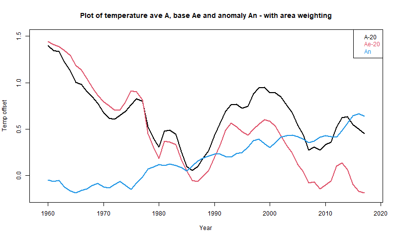
Your average of T is shown in black; the artefact Ae in red. The anomaly average is what you get when you take out the artefact, and is the blue anomaly average.
Nick, Thanks for the work. I much appreciate it and understand the graph and explanation. What you say is true enough, but it is irrelevant.
In my opinion, after studying the data, your graph and those put out by NOAA and the Hadley Centre, I think they hide the underlying problems with the data. You can always find a statistical construct such as you (and they) have devised to show whatever you want.
But, it is a house of cards. You constructed an anomaly of measurements of a constantly moving area, measured with constantly changing instruments of unknown accuracy and your reference is a thirty-year period with hugely inferior data. Then claim that this anomaly, of a small and constantly changing portion of the ocean, shows overall ocean warming.
You have greatly overstepped your data, the underlying data is not good enough for this sort of manipulation. I would argue it is so bad that only the simplest summary statistics should be used and this is what my posts are about.
Andy,
“I would argue it is so bad that only the simplest summary statistics should be used and this is what my posts are about.”
Your statistics are simple, but wrong, and give wrong results with good or bad data. As I showed, you can partition the data into a constant climatology and an anomaly, and your result is the sum of the two averages, taken on the same measurement points. Your result A reflects the average of the constant component Ae. This is just a property of the averaging arithmetic. It would be true for good or bad data. And Ae cannot be telling you anything about climate change, because for each location Te is not changing. The decline in Ae, and hence A, can only be due to a change in the locations that are included in the average. That is all that varies.
Nick,
Te is not changing, but it is based on very poor measurements taken between 1961-1990. It doesn’t change, but it is not accurate. It is just a set of averages over less than 1/2 of the ocean. The error in those computed reference values, according to the Hadley Centre, is +-47%. Look it up. Ae cannot tell us anything about climate change because the underlying data aren’t good enough. You are saying your statistical construct can, and I dispute that.
<i>”Ae cannot tell us anything about climate change because the underlying data aren’t good enough.”</i>
Well, I’m telling you that Ae cannot tell about climate change because it is the average of numbers which, at each location, do not change over time. There is no change. But whatever, the point is that arithmetically, your result A is Ae. So it isn’t telling you about climate change either. So it is a useless calculation.
To emphasise that my graph does not represent any fancy statistics, but just a rearrangement of he arithmetic, look at it this way. Suppose for one month you have a table with the reported T values in a column. Your A is the average of that column. Then in the next column you write Te, the set of base values for each location, say the 1961-90 average. The third column is the first minus the second.
Then Ae and An are just the averages of cols 2 and 3, and of course add to A, since that is true for each row. It just makes a partition of the numbers and does the averaging arithmetic on each part. They add to the whole.
It just exhibits components of the result. Ae, the sum of locally constant values, is the diminishing component and the major variation that you show in A. An (anomaly) is a smaller variation but increasing, and is the only component that actually has local components varying in time.
Where in that was it critical that Te be accurate? For what? You could replace the 1961-90 average with 1981-2010 or whatever, and get the same result. The point is that there is a set of constant values that are sufficient to discriminate between cold and warm places, and if you substitute them in your calculation, you get the descending SST that is your result. That establishes that the result is due to changing selection of the grids in the average, not change of climate. For the major Ae component of your A, it can’t be anything else.
Nick,
You state: “The point of this partition is that Te is constant for that location over years”
Then you state: ” the average Ae of Te is time-varying”
So which is it? Te can’t be both a constant and a time-varying variable.
“Te can’t be both a constant and a time-varying variable.”
You are missing the point that I have tried to spell out in many ways. Te is not time varying; the average Ae is. That is because Ae is the average of constant Te’s over a varying set of locations. Suppose in one year you average HADSST over the cells that report data, and in the following year, when temperatures are exactly the same in all locations (say) you get data from more Arctic cells, then the average Ae will reduce. It isn’t because any place got colder; it is because you included more cold places in the average.
And that is what is happening here. HADSST coverage of cold oceans is improving. More cold cells are included in the average Ae, so it decreases. Places are getting warmer, as shown by An. But you are tracking an average which includes more cold places.
The lesson here is that when you extrapolate data and later measurements change your understanding then you shouldn’t be surprised. And this generally happens. The problem is that prior to obtaining that data people are far too confident that the extrapolated data is accurate. Its not and never will be. Climate science is rife with beliefs their extrapolated data is valid enough to make predictions with.its not and never will be.
But is it an accurate assessment after the addition of real measured data. You are muddying the waters by, in essence, claiming that averages over a large area provide an accurate view.
I’ve said this before, the parts add up to the whole. You need to begin the process of breaking GAT down to regional and local calculations. For instance, if Greenland has had little to no warming for 30 years, where is the offsetting region that has a large amount of warming to make GAT come out? If the Indian Ocean has not warmed, where is the offsetting area of ocean that shows unusual warming? At some point, scientists will be required to analyze this in smaller and smaller areas. Why don’t you start now.
Nick,
“You are missing the point that I have tried to spell out in many ways. Te is not time varying; the average Ae is. That is because Ae is the average of constant Te’s over a varying set of locations.”
I’ll repeat – If Te is constant then Ae is constant. It doesn’t matter if you are averaging several Te’s to come up with Ae. If all the components in the average are constant (i.e. all the Te ivalues areconstant) then you will ALWAYS get the same Ae.
“you get data from more Arctic cells, then the average Ae will reduce.”
Of course it will reduce. It will also be a more accurate reflection of reality!
” Places are getting warmer, as shown by An”
Where are “places”? I can assure you that maximum temperatures in the central plains of the US are DECREASING. Where I live we didn’t have a single day over 100degF this past year. The trend for maximum temperature has been going down for a decade. What has been going up is the minimum temperature. Does a higher minimum temperature make “places” warmer? Is warming from minimum temperatures bad? Does it mean the earth is going to burn up, crops are going to fail, and growing seasons are going to decrease?
Andy May,
This statement is a gem: “… an anomaly of measurements of a constantly moving area, measured with constantly changing instruments of unknown accuracy and your reference is a thirty-year period with hugely inferior data. Then claim that this anomaly, of a small and constantly changing portion of the ocean, shows overall ocean warming.”
Your good work and insightful discussion is greatly appreciated.
Bill Rocks
Stokes
You remarked, “… where Te is an expected value, say a 1961-90 average for than [sic] month and location, …”
What is a typical standard deviation for that time period, and how does it compare in magnitude to the anomalies derived from the mean?
Clyde,
The average anomaly in HadSST, 1961-1990 (using absolute value) is 0.12 deg. C. The average uncertainty is 0.06. +- 47%. In 2018 it is +-9%.
Nick might say that doesn’t matter, but the 2018 anomaly is 0.616. At the upper end of 1961-1990 uncertainty it is 0.56 at the lower end it is 0.68. A spread of .12. Can we add the uncertainty of the 2018 estimate? It is 0.05 deg C. Then we have a range of 0.51 to 0.73. Kind of puts the anomalies into perspective doesn’t it?
Andy,
You remarked, “The most recent post discusses SST anomalies, the logic was, if all the measurements are from just below the ocean surface, why are anomalies needed?”
I’m not a fan of using anomalies, but they are probably warranted for land/air temperatures for things like compensating for the lapse rate and microclimates. However, I agree with you that if one is dealing with just surface ocean temperatures, there isn’t really an analogue to the lapse rate in air. However, currents, such as the warm Gulf Stream, might be similar to microclimates. Although, currents are probably more variable in position than microclimates and an attempt to correct for that may just introduce error. If the goal is to get an average number for all oceans, or just a region such as the West Coast of North American, I’d go with the raw data.
Clyde, Remember the measurements are mostly made with moving devices, drifting buoys, ships, Argo floats, etc. There are a few tethered buoys making measurements from fixed positions, but not many. The ERSST grid boxes are up to 49,000 sq km., the HadSST boxes are up to 300,000 sq km (larger than the U.S. state of Colorado!). That is a pretty large microclimate! The gulf stream is only 100 to 200 km wide, three would fit inside one HadSST box, almost two in one ERSST box.
Making anomalies will make the result “look better.” It will give the viewer more confidence in the result, but it doesn’t help get a more accurate trend or average ocean temperature. It just builds a false confidence. Anomalies are a propaganda tool. I think my posts show that clearly.
Someone should be checking out the Arctic at the moment looking at the undersea mountain range at 140 degrees east. The temperatures have been higher there for ages and the sea ice now will not thicken . there has to be something going on under the water!
There is no mountain range at 140 east, there is the shallow East Siberian shelf. Flat as a pancake. The temperature has been higher probably because Siberia was so anomalously warm for so long.
https://twitter.com/mikarantane/status/1324286992071446529/photo/1
See how useful anomalies are.
Something like this?
https://scitechdaily.com/newly-discovered-greenland-hot-rock-mantle-plume-drives-thermal-activities-in-the-arctic/
For „Area-Weighting“, time and circumstance may help to understand climatic changes better. Here is a Christmas story worth to be taken serious by all concerned with climate matters. The NYT reported on soldiers that “turned to wax” on Christmas Eve 1939. An unsolved climate case: Why?
Here a brief abstract:
“The cold numbs the brain in this Arctic hell, snow sweeps over the darkened wastes, the winds howl and the temperature is 30 degrees below zero (minus 34.4° C). Here the Russians and Finns are battling in blinding snowstorms for possession of ice-covered forests….…I reached the spot just after the battle ended. It was the most horrible sight I had ever seen. As if the men had been suddenly turned to wax, there were two or three thousand Russians and a few Finns, all frozen in fighting attitudes. Some were locked together, their bayonets within each other’s bodies; some were frozen in half-standing positions; some were crouching with their arms crooked, holding the hand grenades they were throwing; some were lying with their rifles shouldered, their legs apart…” CONT
The very cold Christmas in Finland 1939 was only the beginning of a dramatic winter in Europe. It became the most severe in many parts of Europe for more than one-hundred years. There are plenty indication that the war contributed heavily. There are even more indication that naval war in the North- and Baltic Sea and other regional seas, were the source to blame in particular.
Full read (~4min.) here: https://oceansgovernclimate.com/
A very healthy and prosperous NEW YEAR 2021
ArndB: a quick internet check reveals that in Finland the coldest temperatures in winter are from -45°C to -50°C in Lapland and eastern Finland; from -35°C to -45°C elsewhere; and -25°C to -35°C over islands and coastal regions.
Typically extremely cold during any winter!
On 11th January 1940 Poland got its coldest temperature ever. That was only 3 weeks after the NYT-Christmas Story from Finland.
What happened in winter 1939/40 in Europe here are few links:
https://oceansgovernclimate.com/katowice-on-climate-change-adolf-hitler-did-it-and-the-conference-ignores-it/
https://oceansgovernclimate.com/how-climate-gets-europe-winter-free/
https://oceansgovernclimate.com/what-is-a-winter-in-europe/
ArbdB: I quote from your link: ‘the rampage of climate can be easily attributed to the warmonger Adolf Hitler, who started WWII’ – well, fancy that, who’d have thought it? – humans control how hot the planet gets, and how cold it gets. Absolutely amazing.
Marcel Crok, of Clintel.org, which also has this post up, asked me:
Here is my answer:
The very best data is represented in that figure. But, it only represents a portion of the world ocean, and the area represented is constantly changing. That constantly changing area is showing declining measured temperatures. The ships, floats, and buoys measuring temperature are constantly moving and changing in each cell. The cells with measurements are constantly changing. The “reference” period, between 1961-2000, has very poor data.
The only way to get a positive anomaly with this crappy data is to create monthly anomalies, from the populated cells, in that month, and then present them as one record. But, it is a record of a constantly changing area, what good is it?
Less than half the ocean has good data and that half is constantly changing as the instruments and ships move about. All I did was do a yearly average, to avoid seasonal anomalies. Thus, the yearly average temperature of the cells with the best data (wherever they are) is declining over the last 20 years. This has been confirmed by Nick Stokes, an Australian climatologist in the WUWT comments in the past few hours.
The creation of anomalies, especially the way HadSST and ERSST have done it, removes all the underlying complexity in the data and presents a misleading graph based on very, very poor and unrepresentative data.
My personal conclusion, after doing all this work? We don’t have a clue what the average temperature of the world ocean is, nor do we know whether it is warming or cooling.
“We don’t have a clue what the average temperature of the world ocean is, nor do we know whether it is warming or cooling.”
Too true, and this is why we need to stop all this fiddling with surface temperature data and rely instead on the only good. long term data set: the Antarctic ice core data which covers 3 glacial-interglacial cycles and demonstrates without equivocation that temperature changes the CO2 concentration in the atmosphere, disproving the climate hysteric hypothesis.
This phrase falsifies Anthropogenic Global Warming and is extremely important.
The downwelling infrared emitted by CO2 is absorbed by the first water molecule it impinges on raising its energy level then evaporated away cooling the surface as the latent heat of evaporation is removed by the evaporating molecules.
Therefore, 71% of the Earth’s surface which is water covered is cooled by downwelling infrared and not warmed. A further ~20% of the Earth’s surface is covered by transpiring plants which are also cooled in the same way.
The humid air into which the water molecules evaporated will then convect upward as it is lighter than dry air this has the effect of drawing in drier air over the water surface increasing evaporative cooling.
When the humid air convects upward it cools and eventually the water in the air will condense out into droplets and the latent heat of condensation is released warming the surrounding air and increasing/maintaining convection or radiating away. Some of the radiated infrared energy will radiate away to space some will reach the ocean surface to repeat the cycle, and some will continue convecting upward in warmed air or water droplets. The cloud of droplets increases albedo and during the day will reflect solar short wave light/heat energy away to space reducing short wave heat energy reaching the surface so stopping surface warming.
As droplets coalesce into larger droplets they fall out of the aerosol and if the convective up currents are not sufficient they will fall as cold rain. Further cooling the atmosphere they drop through due to evaporative cooling or directly cooling the ocean skin or plants.
So ‘downwelling’ infrared from CO2 in the atmosphere will cool (reduce the energy content of) 90% of the Earth’s surface that is water or plant covered both directly by increasing evaporation and also indirectly by clouds formed from condensing water raising albedo.
The delay in the energy absorbed and reradiated by CO2 reaching space does not raise temperatures as it is either radiant energy or latent heat.
The Anthropogenic Global Warming hypothesis is falsified
Amid all the nonsensical hand-wringing, hypothetical warming scary stories and statistical manipulation, in the real world no-one would survive long in for example the North Sea at this time of year:
https://www.seatemperatu.re/seas-and-oceans/north-sea/
The biggest problem with the CAGW crowd is that they don’t understand thermoclines move in the vertical column. And they move quickly sometimes. They are not static, nor is the ocean even 22cm – 3 feet down. I’ve been on dives where the thermocline was at 10 feet one dive and 2 hours later is now at 15 feet in the exact same location(and any diver will tell you exactly where that thermocline is–because we check our instruments going down as well as up–and if you don’t, you don’t get to dive with me. Period. I’ve rescued too many divers from going too deep because they couldn’t be bothered to watch their depth gauge).
What just gets to me is this: we know so LITTLE of the dynamics of the ocean column that to predict anything from it is ludicrous. And instead of spending our time exploring it and finding out the truth, CAGW wants everyone to believe they know everything, the science is done, nothing new can be learned, and the end of the world is neigh. It is the complete opposite of science. And its nothing new. In the late 1800’s physics took the same hit–everything was known about physics that could be known, so best study something else because we know it all. The sheer arrogance of that statement is now being used once again, when the truth is; we know very little. Unfortunately, that scares the crap out of those that don’t understand how exciting that notion is to a real scientist. And their fear of how little they know puffs them up to grandstand about how they are right in their little knowledge.
CAGW believers are the epitome of the Dunning-Krueger effect. (and yes I know the irony of that statement but I am not proclaiming to be an expert, this is merely an observation of human behavior and my opinion).
“Ocean Temperatures, what do we really know?”
Ocean surface temperatures, what do we really know.
I have heard the average ocean surface is about 17 C, and apparently
this article suggests otherwise.
But regardless of the surface ocean temperature and what you want to call the ocean
surface, the skin temperature of ocean {which apparently can only be wildly guess at}
is global average air temperature. And I think average land surface temperature is proxy
for global surface air temperature.
But what call the true global temperature is temperature of entire ocean, which is claimed
to average about 3.5 C.
The temperature of entire ocean determines where Earth is, in terms of it’s global air temperature. Or why Earth is in a Icehouse climate, rather than the other “extreme” global climate of a Greenhouse or Hothouse climate.
I been said, that Earth ocean could been as warm as 25 C, but I generally say if ocean were 10 C, rather than 1 to 5 C, that Earth would have definitely left the Ice Age {Icehouse climate] and could be said to be in a Greenhouse Climate. Or if Earth has what could called a “normal climate” with the ocean temperature being about 6 to 10 C. had ocean which was as warm as 25 C, it seems would have to be warmed mostly by volcanic activity or something like impactor hitting Earth and in terms of Earth time periods, would been a brief period of time.
Or if Earth’s ocean ever got above 20 C, it indicate something big was happening on Earth, and “it” was probably nothing to do with any kind variation of the Sun’s activity. Or seems if our Sun was hit by say a Mars size space rock, that could not warm Earth ocean by significant amount though I suppose it could have something to do with some kind of galactic event [near supernova or something}.
One has headline news stories of Earth swallowing it’s ocean {and currently doing this to some extent]. If such such dramatic event happened {in time periods hundreds of thousands of years making it “dramatic”, that would count as something big happening on Earth.
If our ocean ever become 20 to 25 C, such warm ocean is not the end of everything, but whatever “caused it” could be “the end of everything”.
But in terms of human existence, there seems little chance of ocean becoming 2 C warmer-
about 3.5 + 2 = becoming about 5.5 C.
The “greenhouse effect theory” is the doctrine of a cargo cult.
Or it’s not merely pseudo science, it’s a religion.
And it’s includes anti-science as part of it’s religious doctrine.
It’s narrative of idiots.
And seem everyone an idiot, if can’t know what ocean surface temperature is AND
be talking about global average surface temperature.
It seems we could say that global average land surface temperature is about 10 C and if ocean average surface temperature is not 17 C, one can’t say the global average air surface
is somewhere around 15 C.
I tend to cut the world in halves, tropics extended to about 35 degree latitude north and south and the two halves +35 degree north and south.
If make middle half larger, 50 degree north and south, what is ocean surface temperature
of that part of the ocean?
“… if all the measurements are from just below the ocean surface, why are anomalies needed? “
While there are certainly many valid reasons for using anomalies, there are also dishonest ones.
Anomalies allow for the separation of data from physical reality and its consequences.
Thus, for example, if one reported that a given location has warmed by, say, 2 Celsius over a defined period, then a casual observer might accept it at face value. However, if the same location was reported as having warmed from -1 degrees to +1 degrees then the same observer might question why the local ice hasn’t melted.
Generally, world “mean temperatures” could thus be reported as rising indefinitely without the person on the street ever stopping to ask the question “So why aren’t we all fried yet?”.
Although less likely, an honest climate scientist could also inadvertently deceive themselves by making calculations based on assumptions that reported temperature anomalies really did bear a proper relationship with real absolute temperatures. I’m sure readers can think of other examples.
Nick Stokes,
Earlier I referenced statistician William Briggs. From that, “You often read—not just in papers in this controversial topic—that people smooth the series “to reduce” or “to remove noise.” Again, barring measurement error, what is noise? It’s usually the part of the real data that is hard to model, or that doesn’t fit preconceptions, or whatever. Smoothing does toss this data out, or reduces its influence, with the end result that you will be too certain of yourself.”
https://wmbriggs.com/post/195/
Nick, in your words above “This post is all about a global average. Average is a summary statistic. Unless you just want to end your understanding with a jumble of a few million monthly readings, you have to derive a summary statistic.“
Your fundamental error, that colours your thinking, is your assumption that a meaningful global average can be measured. Andy May shows a graph suggesting that HADSST and ERSST display ocean warming of 0.3 ⁰C between years 2000 and 2015. If you adopt a reasonable estimate that the overall error of these temperatures is more than +/- 0.5 ⁰C, then you have these official figures swimming without meaning in a turbulent sea of noise. Similar comment applies to the global average sea temperatures guesswork.
Even with future science, through more instruments and more wisdom, comes up with a credible figure for global average change of SST, what is its purpose? We cannot, should not attempt to change this sea temperature by geoengineering. Man is puny compared to Nature. It might be the case that those like you, interested in a global average, are centrally interested in global social engineering, which is a concept that I personally find so deplorable that it can be classed as away with the fairies.
The work that has been done of global SST can be regarded as an exploration of how much we know and how much we need or do not need more research.
This global SST should never, ever be used to influence global policy on modification of the environment of the Earth – or its people. Its errors are simply too large and probably impregnable in real life.
So, I agree with Andy May who inter alia wrote “Less than half the ocean has good data and that half is constantly changing as the instruments and ships move about. All I did was do a yearly average, to avoid seasonal anomalies. Thus, the yearly average temperature of the cells with the best data (wherever they are) is declining over the last 20 years. This has been confirmed by Nick Stokes, an Australian climatologist in the WUWT comments in the past few hours.
The creation of anomalies, especially the way HadSST and ERSST have done it, removes all the underlying complexity in the data and presents a misleading graph based on very, very poor and unrepresentative data.
My personal conclusion, after doing all this work? We don’t have a clue what the average temperature of the world ocean is, nor do we know whether it is warming or cooling”. Geoff S
Geoff,
“Your fundamental error, that colours your thinking, is your assumption that a meaningful global average can be measured.”
No, I believe it can be calculated. But Andy’s four posts have all been about calculating a global average. He does it for absolute temperature, and claims that SST is decreasing. You say it can’t be done. WUWT?
Everything we know about the real world comes from sampling, followed by induction. The amount of sampling required to know about a field variable like temperature depends on homogeneity. We have enough spatial data to resolve global anomalies, which are homogeneous, but not absolute temperatures, which are far less homogeneous (though absolute SST is better, and something could be done with a lot more science than Andy puts in).
If the resolution is enough, we can calculate an average. It is not everything, but it is the most meaningful single summary statistic. If the GAT is going up, there is a good chance (no certainty) that your part of the world is going up too.
No Nick, I claim we don’t know if global SST is going up or down. I do claim that the average temperature of the populated HadSST grid cells since 2001 is going down. This is the best data we have in the oceans. But, as you say, the area covered by HadSST changes constantly, however it doesn’t change much between 2001 and 2018. It stays between 44% and 48% of the total global cells (31,104 monthly cells).
Here is a map of the null cells in 2002.
Map in 2018:
So Nick, I understand your claim that the change in coverage in the polar regions might cause the trend to reverse, I just don’t see any evidence it is happening. I have maps of coverage for every year between 2001 and 2018, it hardly changes.
Andy,
“I understand your claim that the change in coverage in the polar regions might cause the trend to reverse”
I have demonstrated that it causes the trend to reverse. I did your exact calculation, but replacing data with the constant climatology of each cell. The trend was exactly the downtrend that you have minus the trend in the anomaly – ie an even greater downtrend. And so resulting only from the shift in the climatology of the cells that were included in the average. I don’t get that from eyeballing a graph. I emulate your calculation with fixed data.
What you are plotting here is not the same as what you use in your time series calculation. There you take the average of all monthly readings over a year. Each missing month has its own effect effect. Here you plot annual missing data, which I think means no data at all for that cell in the year.
In fact, seasonal effect within months is another whole source of possible bias in averaging the absolute temperatures. Not just latitude. But your maps are inconclusive anyway in what they show, and they are mapping the wrong thing.
Perhaps you had better define “constant climatology.” I may have misunderstood what it was.
Nick, I don’t think you “have demonstrated that it causes the trend to reverse.” But, perhaps the combination of your exercise, which I find unconvincing, and the work I did, have shown that the Southern Hemisphere is hideously under-sampled. I don’t see any significant changes in the sampling near the poles. Certainly nothing that could cause what you are speculating about.
But, the HadSST sampling between 30S and 55S is ever changing. That alone supports my conclusion that we don’t have a clue about the true surface ocean temperature trend. Thanks for the mathematical exercise, but it is meaningless IMHO given the quality of the data, especially in the Southern Hemisphere. You are applying a micrometer to a brick.
Certainly adding additional cold temperatures to an average will make the average colder. However, the use of anomalies DOES NOT prove anything because you do not know what the trends are in the newly added cells.
The problem that Nick won’t admit is that these new cells could have either no trend or even a downward trend which will obviate the prior use of anomalies “to prove” a warming trend. If they are colder, one must ask why they are that way and why before making a judgement one way or another.
The other problem I see arising is the ultimate affect on ocean heat content. This won’t please warmists either. Obviously adding colder temps will reduce the average ocean heat content, lowering the effect that CO2 is presumably causing according to the warmists. Oh woe is me!
“Obviously adding colder temps will reduce the average ocean heat content,”
How do you feel Nick, reading that? That’s how ingrained it is, more data and more evidence is just evidence of an even bigger conspiracy. I sincerely admire your patience ‘though.
As for you Andy “I may have misunderstood” May, even after Nick demolishes your mangled graphs and patiently and politely explains five different ways why they are mangled, you have the shameless nerve to say you still think there is doubt about whether the ocean average temp is rising or not. WTH?
Ocean temperatures, What do we really know? Ahh ffs this is all a pile of confected, doubt-mongering bs. What, do you think the ocean is non-thermally expanding? Do you think abrupt sea-ice decline actually might be from from those earthquakes? Do you believe these data sets are all wrong too, in the same way because, well, we can’t trust those sneaky, statistical anomaly thingumees?
Orr, that’s right, its not the anomalies that’s the problem there, its those nefarious adjustments and manipulation, or is it those nasty ‘models’ or is it just because the bastards want to blame that harmless .00004% trace gas CO2, that’s miraculously greening the planet and miraculously bringing abundant life to the sterile Arctic?
There is about as much chance the ocean is cooling as there is earthquakes causing sea-ice loss 15 years later, 2000km away.
F-all and you should give yourself an uppercut for even hinting its a possibility
Loydo: 0.00004% CO2? Are you sure about that?
I was being sarcastic
Loydo,
“There is about as much chance the ocean is cooling as there is earthquakes causing sea-ice loss 15 years later, 2000km away.”
The ocean does vary in temperature as reading any graph will tell you.
So yes there is a chance that the ocean is cooling.
Think of it like a bike ride with hills.It goes up and down.
You may say you meant over a certain number of years that you cherry pick?
You may mean since we keep records?
Here the problem is 3 fold. Reconstructions back to 1760 show large cooling episodes for the ocean for years possibly decades.
Take 1780 to 1820.
Two big dips and 1 rise.
The Loydo back in 1820 would be saying
“There is about as much chance the ocean is cooling as there is…”
The range in uncertainty rises dramatically as you go back even 250 years.
Our best source of OHC and Ocean Temperature change is ARGO,
which sadly has lost a lot of data recording despite being only 15 years old.
Reliable?
“Earth’s energy imbalance (EEI) drives the ongoing global warming and can best be assessed across the historical record (that is, since 1960) from ocean heat content (OHC) changes. An accurate assessment of OHC is a challenge, mainly because of insufficient and irregular data coverage”. Trenbath 2017 Mar.
Still if you and Nick wish to homogenize data that is insufficient and irregular according to a main source and make claims that it is the gospel go ahead.
Nick wrote “As I have been saying in response to earlier posts, you can express every monthly local temperature reading T as T=Te+Tn where Te is an expected value, say a 1961-90 average for that month and location, and Tn is the anomaly. The point of this partition is that Te is constant for that location over years, and so contains no information about climate change or weather. That is all in the anomaly Tn, which has changed over time.”
Here is the source of your large error. Even though your Te might be constant, it cannot be estimated accurately. In fact, there are huge errors.
Analogy. Australia’s BOM have just released a paper recalculating Australian gridded rainfall monthly data.
http://www.bom.gov.au/research/publications/researchreports/BRR-041.pdf
They use methods like yours, with gridding and interpolation and expected values and give graphs like Figs. 14 & 20, showing their final estimate of bias, which is a fluttery line that sits around zero bias, with departures in the sub-millimeter range. This implies that their appartus is capable of measuring rainfall to better than a part of a mm each month. Think of Cape Leeuwin, where westerly gales drive climatology up the cliff next to the rain gauge, with some of the rain going upwards past a device designed to measure rain going down. This is simply not capable of accuracy to sub-mm per month. Too turbulent.
Likewise, your expected values for SST have large measurement errors, analogues to upward rain, that you seem to want to ignore. Too turbulent. It is hard enough to hold water temperature constant to a tenth of a degree in controlled conditions in a lab. Open ocean has to be harder. Yet, you claim credibility for SST graphs that seem to use figues to 0.001 degrees C. Even 0.01 is, I suggest, not achieved. That is, there is no real meaning in such graphs as the HADSST and ERSST ones Andy showed.
The only way to ignore these large errors is to use an over-active imagination. This leads to comments like this from the BOM paper:
“However, the other may relate to the use of an anomaly-ratio for SI, compared with just a ratio (total rainfall/climatology rainfall) for AWAP. In the earlier period of record, when the station network is relatively sparse compared with present time, the background (first-guess) field used in the AWAP analysis is zero. This contrasts with SI where, due to the anomaly-ratio method, the background field, while zero, is actually climatology. In data-sparse regions (i.e. far away from observations) AWAP will have lower rainfall totals than the same region using SI, with the difference forced by the first guess field. ”
How do you calculate the error of a guess? Do what the BOM does and not reveal the size of the error?
Science does not work this way. Geoff S
Presumably we know or can estimate the total amount of heat captured by CO2 in the air. This much radiation is emitted by the Earth, this much is captured by the increased (say, for argument, by mankind) atmospheric CO2 and either re-emitted downwards or expelled in warming the air, etc. This heat could be used to warm the atmosphere, warm the oceans, or warm both to an extent. The skin of the oceans has a thermal mass approx 30 times (?) that of the atmosphere – if the total heat generated could heat the atmosphere by, say, 1degC and a similar amount of heat were absorbed in the sea, it would raise the ocean temperature by 0.03degC which would be undetectable. Is this in any way right? Is it possible that human-caused global warming could warm the oceans by 0.5 to 1degC? Would this be equivalent to warming the atmosphere by 15 to 30degC?
Nick,
“Everything we know about the real world comes from sampling, followed by induction. The amount of sampling required to know about a field variable like temperature depends on homogeneity. We have enough spatial data to resolve global anomalies, which are homogeneous, but not absolute temperatures, which are far less homogeneous (though absolute SST is better, and something could be done with a lot more science than Andy puts in).
–
“The amount of sampling required to know about a field variable like temperature depends on homogeneity.”
No, it depends on where, what time, what latitude and longitude , what elevation and what instruments and why you are doing it.
The number of samples compared to the size of the averaged field.
Assigning homogeneity to it is making a lot of assumptions that the only things affecting the temperature are the very things that you are measuring.That your instruments are correct and your science is correct in the assumptions that you put into assessing and modifying those data sets.
Large scale earthquakes and tidal waves. Small scale tornado and whirlywinds [very small Australian localised wind disturbances]. Urban Heat effect. Position of measuring devices.
Do we really want the temperature of the earth at all airports around the world?
What you are trying to say is that the more and better measurements we have the closer we can come to an understanding of the temperature at the measuring sites we use, full stop.
Homogenization is another word for averaging out.
How funny that you should attack Andy for averaging one sample saying that averaging is a ridiculous method prone to error and then say but if we do more ridiculous averaging it will get better because it is , miracle of miracles, homogenous. Or is that averaged?
This is clearly a matter of your opinion, not science, and wrong anyway by definition
“Homogenous most generally means consisting of parts or elements that are all the same. Something that is homogenous is uniform in nature or character throughout.”
Think about it. If global anomalies were homogenous you would not need to do more than 1 sample the rest would all be reacting the same way, being homogenous.
In fact you could stop at one as it is not going to change.
The world and the atmosphere and the ocean are clearly not homogenous.
Taking measurements from so many different sites and elevations on an uneven rotating world and then claiming to have homogeneity is funny.
At least Andy has consistency, simplicity and the right application of science on his side.
Free plug. Nick does do some great graphs with his own variations.The Moyhu NCEP/NCAR index .