Guest Post by Willis Eschenbach
My last two posts, one on Gavin’s claims and the other on the Urban Heat Island (UHI) effect, have gotten me to thinking about the various groups producing historical global surface temperature estimates. Remember that the global surface temperature is the main climate variable that lots of folks are hyperventilating about …
In particular, in the earlier post, Steven Mosher has been defending how the Berkeley Earth folks handle the Urban Heat Island effect. I remembered that Berkeley Earth had data about cities, so I went and got it from here. The data shows the trends for the period after 1960.
I graphed it up, but I wanted to have something to compare it to, so I also got the data for Berkeley Earth global surface temperature trend since 1960. Figure 1 shows the result:
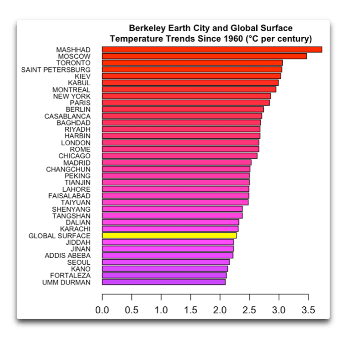
Figure 1. Berkeley Earth trends for various cities, along with the global surface temperature trend over the same period.
There were a couple of things that I found unusual about this. First, there are some indications that the Berkeley Earth method of removing the Urban Heat Island distortion of the global temperature record is … well … perhaps not all that accurate. However, more research would be needed to determine that.
The bigger surprise to me, however, was the size of the Berkeley Earth global surface temperature trend. I had remembered the global trend as being around two-thirds of the value shown in Figure 1. I thought “Over two degrees per century? That’s over two-tenths of a degree (0.2°C) per decade! How did it get that high?”
The answer is, that’s land-only Berkeley Earth data … the global Berkeley Earth data is less than that. A lot less.
So, being addicted to data, I went and got the temperature records from a variety of organizations. I wanted to include the satellite-measured temperatures of the lower troposphere, which only started in 1979, so my analysis covered 1979 to the present. I got the data from Berkeley Earth, the Hadley Centre (HadCRUT), the Goddard Institute of Space Sciences (GISS LOTI), Remote Sensing Systems (RSS), the University of Alabama Huntsville (UAH) and the Japan Meteorological Agency (JMA). I smoothed them all with a 6-year Gaussian average and graphed them up.

Figure 2. Surface and lower troposphere temperature records from six different groups.
For me, the best part of science is my first look at some batch of numbers that have been converted into a graph. It’s always so exciting waiting for the unknown surprises. In this case, I cracked up laughing when I saw the graph. If there were ever an indictment of the current state of climate science, it’s shown in that graph.
People are all up in arms about the surface temperature … but thirty years after James Hansen started madly beating the alarm bell about “global warming”, and after thirty years of endless claims about some mythical “97% scientific consensus”, the sad truth is that the climate scientists have not even been able to come to a consensus regarding how much the globe has warmed in the last 60 years. I mean, the answers differ by a factor of 1.5 to 1!
And mainstream climate scientists wonder why people don’t pay much attention to them? …
Here’s a protip. It’s not a communications problem. If you want people to listen to what you say, first you have to centralize your fecal material.
My best wishes to everyone,
w.
My Usual: Please quote the exact words that you are discussing in a comment. Otherwise, we can’t tell what you are referring to, and misunderstandings multiply.
Willis – knowing your love of graphs, a good one to try is one of our longest standing continuous surface temperature records – from central England (https://www.metoffice.gov.uk/hadobs/hadcet/cetml1659on.dat). Plot the series 1533 – 1711, 1712 – 1890, 1891 – 2069 and overlay on the same graph. You will see that at about 30 and 70 (and possibly125 years) into this cycle there appears to be a superimposed temperature drop followed by a broad recovery where the recovery rate approximates 0.11 – 0.24 degC/decade between the major drops and plateaux, except for the Maunder minimum where temps dropped at -0.3 degC/decade. Could this be a clue to our natural pre-industrial warming rate (for central England anyway).
Willis I’ll try again and I don’t want to be a pest, so here’s my previous inquiry.
Willis another very interesting post, thanks for having the nerve to take on the true believers. BTW have you heard of the work of the Connollys over the last 5 years? Nic Lewis has promised to look at the Connolly’s work , when he has the time. He has met them and seems impressed. See his answer at Climate Audit.
They’ve looked at co2 as the driver of climate and actually checked the atmospheric data and evidence over a long period of time using the balloon data.
Here’s the links. http://oprj.net/
https://blog.friendsofscience.org/wp-content/uploads/2019/08/July-18-2019-Tucson-DDP-Connolly-Connolly-16×9-format.pdf
It’s not immediately clear what the problem is, but your link to friends of science.org got to their home page, but said the file doesn’t exist. Searching for “Connolly” did get a link. That led to another link. That downloaded the pdf from https://blog.friendsofscience.org/wp-content/uploads/2019/08/July-18-2019-Tucson-DDP-Connolly-Connolly-16×9-format.pdf — which looks the same as your link to me.
No clue why I had trouble or if others will also.
Don K–
I had the same results–a 404 error on Neville’s link but your worked.
Neville’s link worked for me w/Firefox using “save link as”.
I have to correct — Neville’s link only dloaded a partial (unviewable) pdf, Don K’s link dloaded the pdf properly.
Neville’s original link has a UTF-8 code for a multiplication symbol, ‘x’, while Don’s working link has a plain ‘x’ in the ’16×9′ portion of the URL.
Neville: OK, I read through the Balloons in the Air pdf. It’s very well done. The math is minimal and seems clear. A lot of effort seems to have gone into explaining clearly and avoiding BS.
A lot of the material is clearly solid , and some of the criticisms of conventional climate modeling seems likely to have at least some merit . Or at least to be worthy of discussion. Some stuff is going to take rereading and some research.
It’ll be interesting to see what others think.
Neville: I looked at the Connolly stuff some more before bedtime last night. Much of it seems well done, but there are a couple of areas that seem sort of hazy.
1. They, the Connollys, make some assertions about how climate modeling is done that may or may not be correct. For example, they seemed to assert that climate modeling improperly assumes a constant lapse rate. Could be. …. Or not. I have no way to check. Even if they are right, is the discrepancy significant?
2. More important, they seem to be invoking a previously unknown energy transfer mechanism in the atmosphere. That claim is clearer in this paper
http://oprj.net/oprj-archive/atmospheric-science/25/oprj-article-atmospheric-science-25.pdf than the main link. Basically, they seem to be claiming that substantial amounts of energy can move around in the atmosphere by a mechanism that is neither conduction, convection, nor radiation. Is that possible? Way beyond my pay grade. But to the extent that I understand it, it seems rather an extraordinary assertion. Surely, if true, it would show up in the lab, and would at least mentioned as an odd experimental anomaly? Or maybe I completely misunderstand.
Anyway, thanks for bringing the matter up.
Don K,
Both of your links worked for me. Interesting read. I hope to find time to read a couple areas again if I can find time. Connolly is clearly looking outside the box and seems to back up his claims/hypothesis. A lot of groundbreaking thought and research.
Thanks Neville for bringing this forward.
It will come worse, believing alarmisting views
Global heating: London to have climate similar to Barcelona by 2050
Looking at the trends Willis is showing us, that Tom Crowther can’t be rigjht at all.
I’m sure Londoners are quaking in their wellies at the prospect.
Yeah, instead of turning Japanese, they’d be turning Spanish.
I can’t figure out why HADCRUT and your own UAH curves show little difference at 2019 but the decadal warming rate is so different. Don’t the curves provide an almost identical warming rate?
Fuzzy data give fuzzy answers. The precision claimed by CAGW advocates is unfounded. Let me count the ways …
Average global temperature trend is up because the water vapor trend is still up. https://watervaporandwarming.blogspot.com
That’s what Joe Bastardi says — increased water vapor from the oceans is the main driver behind current warming, particularly in the Arctic & subarctic.
http://www.weatherbell.com/premium
The WV increase is greater than POSSIBLE from ocean warming. The extra is from increased irrigation.
If there was a political bias (conscious or not) on the temperature adjustments and hence the final temperature trends… where would it show?
My guess is that the “typical” city would be culturally significant to the ‘west’. Therefore the centre of the trend spread should be the mean of London and New York,
What is the centre of the UHI trends? And what cities-being-averaged hits that point?
I guess I don’t understand. Isn’t the bar graph showing a increase of 2.2 degree C/century (global surface) and the spaghetti graph is indicates about .7 per/decade which is 7 degrees C/century?
The key says .20 +/- degrees C/decade or 2 degrees C per century.
Obviously I am not reading the spaghetti graph correctly?
“the spaghetti graph is indicates about .7 per/decade”
It indicates about 0.7°C in 40 years.
A more basic approach would report temperatures as measured, not anomalies, and without man-made adjustments. That is the starting point for calculations of differences. Then, you introduce adjusted data, firstly after acceptable adjustments like rejection of 5 sigma outliers. The you introduce adjustments peculiar to the managing body like GISS and Hadley. Then you look at anomaly data.
Willis in no way am I critical of your essay here. The managers of the global warming scare cherry pick their methods to add (false) credence to their manipulated numbers. Geoff S
Geoff Sherrington
1. “A more basic approach would report temperatures as measured, not anomalies…”
Mr Sherrington, this makes no sense at all. How do you want to compare data measured at the surface with data measured in the lower troposphere, if you use absolute values instead of departures from a common mean? They differ by over 20 K.
The same applies when comparing the lower troposphere with the lower stratosphere far above it.
*
2. “… without man-made adjustments… ”
Do you really want, for example, to compare bulks of station data coming from places where there are over 300 stations per 100,000 km² with corners having a couple of them?
The very first man-made ‘adjustment’ therefore is averaging over a grid.
I generate time series out of raw GHCN daily data. Such time series have a trend lower than those computed by professionals.
Why? Simply because I don’t interpolate anything, what automatically results in a bias: the grid cells containing no data let the whole behave as if their data was the average of that whole. This is bad work.
Rgds
J.-P. D.
P.S. Recently we had here a little discussion with Nick about the very small effect of baseline modifications due to inclusion / modification / exclusion of data sources.
Nick was obvioulsy right! A look at the own software was quite convincing.
Bindidon,
Nck tends to regard errors as being those shown by statistical variation, spending less of his effort on fundamental uncertainties such as the real errors involved in reading a variety of thermometers in a variety of housings by a variety of observers. Whereas the total error approach seems to give a range of about +/- 1 degree C for routine daily values, the application of optimistic and enthusiastic numerical methods seems to reduce this range to +/- 0.1 degrees C, depending on the author.
Society is already paying a huge penalty for climate research methods like poorly restrained extrapolation (making up numbers where none exist) and improper consideration ot the total error of original observations.
One thing is clear, the land based indices are warming faster than the global indices indicate.
I guess that’s because the slowness with which the oceans warm up delays the global index.
Willis–
How did Seoul fall so far from #1 on your UHI graph to below the global increase?
A “surfeit” of temperature?
Sorry, this sounds a bit too polemic for me.
And… what is this strange 6-year reference period, please? Does not look very professional imho.
I am a layman, but anomaly construction using such a baseline? Who would do that?
Anyway I was, like at least another commenter, wondering a bit about your trend estimate of 2.1 °C / decade concerning GISS-LOTI.
This trend is wrong: the correct one is
0.19 ± 0.04 °C / decade.
The trends of HadCRUT4.6 and JMA are wrong as well: the correct ones are
0.17 ± 0.03 °C for HadCRUT and
0.14 ± 0.004 °C for JMA.
The reason for JMA’s lower trend compared with other surface series simply is due to the fact that the Tokio Climate Center does not interpolate. That results in each ‘grey’ grid cell getting the global average. This is their choice.
As known since longer time, UAH6.0 LT disconnects from the rest by about 2003. Why? No se!
The other trends for BEST, RSS and UAH are correct.
That may sound like pedantry, but if we criticize the data resulting from other people’s work, we should imho do it on the basis of a correct interpretation of that data.
I added NOAA land+ocean with a trend of 0.17 ± 0.04 °C / decade.
*
Here is a chart showing the monthly anomalies – of course wrt the mean of 1981-2010:
https://drive.google.com/file/d/1tPi5YqHMe3jslz7zdXEah-Gg1JZytkO7/view
This looks by far less dramatic than your graph upthread.
*
Sources
GISS
https://data.giss.nasa.gov/gistemp/tabledata_v4/GLB.Ts+dSST.txt
BEST
http://berkeleyearth.lbl.gov/auto/Global/Complete_TAVG_complete.txt
NOAA
ftp://ftp.ncdc.noaa.gov/pub/data/noaaglobaltemp/operational/timeseries/aravg.mon.land_ocean.90S.90N.v5.0.0.201907.asc (the suffix behind 90S.90N unluckily changes on every update)
HadCRUT
https://www.metoffice.gov.uk/hadobs/hadcrut4/data/current/time_series/HadCRUT.4.6.0.0.monthly_ns_avg.txt
JMA
https://ds.data.jma.go.jp/tcc/tcc/products/gwp/temp/list/csv/mon_wld.csv
RSS
http://images.remss.com/data/msu/monthly_time_series/RSS_Monthly_MSU_AMSU_Channel_TLT_Anomalies_Land_and_Ocean_v04_0.txt
UAH6.0 LT
https://www.nsstc.uah.edu/data/msu/v6.0/tlt/uahncdc_lt_6.0.txt
Regards
J.-P. Dehottay
“If you want people to listen to what you say, first you have to centralize your fecal material” it would be easier to centralize if the subject wasn’t held hostage by CO2 emissions politics…..
Arrg.
1. The city data we post is pretty old. Circa 2013. In 2013 we lost our access to the Lawrence livermore
super computer and basically an update that would do charts and graphs for all the cities and all
the states and all the countries ( 100s of thousands of plots ) would take months. Send money!!
2. How did you process UAH?
The reaosn I ask about UAH is that there are some little known and rarely talked about issues with UAH over land. Did you consider all of UAH? or UAH over land only, or UAH over land only where the signal
is not contaminated? ( Psst I have never see anyone do it right, not even Roy )
Lastly. Folks still don’t get spatial averaging.
“There were a couple of things that I found unusual about this. First, there are some indications that the Berkeley Earth method of removing the Urban Heat Island distortion of the global temperature record is … well … perhaps not all that accurate. However, more research would be needed to determine that.”
Interesting list Willis.
Rule number 1.
When a skeptic shows you data, you can be SURE he will only show you data that fits his story.
That’s why WE show all the data. It lets us see who cherry picks.
Notice willis list ends at at city showing 2C
What did he leave out?
Tokyo 1.63C
Ho Chi Minh City 1C
Pune India 1.26C
cape town 1.39
Chengdu. 1.29C
Chongqing 1.1
Rangoon 1.06
Calcutta .98C
Santiago 1.26C
Bangalore 1.36C
Bangkok 1.1 C
Dhaka .84C
Bogotá 1.32
And a bunch of others.
the city list is a trap of sorts. We list all the largest cities and then wait for skeptics to show their skills
at picking the highest numbers to “prove” their point.
next point, the method does not REMOVE all the UHI. what the method does is REDUCE THE BIAS.
It does that in two ways.
A) sites in urban areas are compared with sites in rural areas. IF the urban site shows artefacts that are inconsistent with the surrounding rural areas the urban site is WEIGHTED DOWN for its quality.
this downweighting doesn’t change the data, it changes how much weight is ascribed to the station.
So lets look at a station that Willis didnt mention
Tokyo.
Here is the tokyo AREA (emaphasis on AREA which is what the city list shows)
http://berkeleyearth.lbl.gov/locations/36.17N-139.23E
see that URL? thats the AREA we call tokyo.
Click on it
Now go here
http://berkeleyearth.lbl.gov/station-list/location/36.17N-139.23E
That’s all the stations in that area.
Now pick a long station in that area
http://berkeleyearth.lbl.gov/stations/156178
Raw monthly anomalies 1.46
After quality control 1.45
After breakpoint alignment 1.12
Whats that mean?
That means the alogorith REDUCED THE WARMING to 1.12 C
take another long station
http://berkeleyearth.lbl.gov/stations/156183
Raw monthly anomalies 2.05
After quality control 2.04
After breakpoint alignment 1.14
OMG, we reduced the warming AGAIN!!! stupid algorithm
here is a chart WILLIS WILL NEVER SHOW YOU
http://berkeleyearth.lbl.gov/stations/156164
Raw monthly anomalies 2.59
After quality control 2.58
After breakpoint alignment 0.94
WHAT THE HELL, why is berkeley earth REDUCING THE TEMPERATURE AT TOKYO?
Will wont show you that. here is what he would never do. he would never take the time to study all the data from all the cities to see those places where the algorithm was working to reduce UHI.
Me? I do that all the time. But I look for the OPPOSITE THING. i look for places where the algorithm is not working. And then try to figure out how to improve it. Trust me if you look you will find places were the algorithm doesnt do what you expect it to do. But you will also find Tokyo. And an honest person looks at
both and makes a considered judgment
What did we do here?
http://berkeleyearth.lbl.gov/stations/156185
Reduced the warming
What about this location?
http://berkeleyearth.lbl.gov/stations/156163
Raw monthly anomalies 0.82
After quality control 0.81
After breakpoint alignment 1.08
Here the algorithm found that the site was Out of wack in the other direction.
Imagine that! an algorithm that looks at the data and adjusts some up and some down.
http://berkeleyearth.lbl.gov/stations/156148
Adjusted down
oh look! an airport
http://berkeleyearth.lbl.gov/stations/156160
Adjusted down
http://berkeleyearth.lbl.gov/stations/156188
Adjusted up
So, you get the idea. The algorithm is not designed to just add warming. Adjustments go both directions
depending on ALL THE DATA.
How Else does the method REDUCE THE BIAS
B) The method reduces the bias by AREA WEIGHTING. people tend to think that temperature averages
are like other averages. if you have 10 records, and 2 of 10 are in big cities, then 20% of your average
will be infected by UHI! WRONG WRONG WRONG. temperature averages dont work that way because
NO ONE AVERAGES TEMPERATURES! you dont add up the 10 records and divided by 10.
The records have to be spatially averaged. in short, urban areas represent a tiny area of the globe
and when you SPATIALLY AVERAGE their contribution, the bias will nearly vanish.
So TWO things work to REDUCE THE BIAS.
A) The algorithm that downweights stations that disagree with their neighbors.
B) the spatial interpolation that downweights urban areas. They are small.
So if 2 out 10 stations are in urban areas, and urban areas, are 2% of the entire land area, then
that “urban bias’ gets diluted to less than 20%.. a lot less.
How do we test this?
Simple: we REMOVE ALL THE URBAN STATIONS and re calculate the average.
So bottom line: UHI is not a problem in the GLOBAL MONTHLY RECORD because.
1. There are not that many urban stations in dense urban environments
2. the algorithm works to REDUCE ( not eliminate) that bias.
3. Area weighting reduces the residual bias to de minimus values.
Micro site bias ( as willis as argued before !) remains an open issue. UHI? not an issue.
Interesting and informative reply Mr Mosher, thank you.
Mr Eschenbach didn’t write your team pushes up the urban temperatures. Just that he suspects that the UHI is not perfectly eliminated and that further examination would be interesting.
You confirmed essentially that your algorithm isn’t perfect. In good faith , but imperfect.
There’s no proof that the errors cancel automatically, nor that they do. We simply don’t know.
So the ‘product’ of the algorithm shouldn’t be trusted 💯% .
Regards
Despite everything that Mr Mosher says, they end up with a “Modelled” temperature for each station called their final data set that bares no resemblance to the original data.
It completely fails to work for Coastal v Inland Stations, they superimpose the land mass temperature on the original data.
Take a look for yourself, start with Valentia in Ireland, then check Mumbles in Wales, Cardiff & Greenwhich Maritime.
The “finals” are all basically the same and ar nothing like the actual station data.
I will quote Mr Mosher.
“Steven Mosher | July 2, 2014 at 11:59 am |
“However, after adjustments done by BEST Amundsen shows a rising trend of 0.1C/decade.
Amundsen is a smoking gun as far as I’m concerned. Follow the satellite data and eschew the non-satellite instrument record before 1979.”
BEST does no ADJUSTMENT to the data.
All the data is used to create an ESTIMATE, a PREDICTION
“At the end of the analysis process,
% the “adjusted” data is created as an estimate of what the weather at
% this location might have looked like after removing apparent biases.
% This “adjusted” data will generally to be free from quality control
% issues and be regionally homogeneous. Some users may find this
% “adjusted” data that attempts to remove apparent biases more
% suitable for their needs, while other users may prefer to work
% with raw values.”
With Amundsen if your interest is looking at the exact conditions recorded, USE THE RAW DATA.
If your interest is creating the best PREDICTION for that site given ALL the data and the given model of climate, then use “adjusted” data.
See the scare quotes?
The approach is fundamentally different that adjusting series and then calculating an average of adjusted series.
in stead we use all raw data. And then we we build a model to predict
the temperature.
At the local level this PREDICTION will deviate from the local raw values.
it has to.
”
This is true for every single station, not just Amundsen, they make it what they think it should be.
Lastly. Folks still don’t get spatial averaging. Steven Mosher
I think I understand spatial averaging and I know of one giant elephant and that’s the one splashing about the boundary between land and sea!
Living in a land “girt by sea” and having lived in several of its cities and places that are so typically representative of the coastal urban sprawl of The Land Down Under. It does make me wonder just how anybody can spatially average the temperature of the land/sea boundary without conflating the urban heat island with the ‘island’ itself. The local Sea Breezes* alone would confound measurement, making separation of the land from the sea, let alone the urban from the rural an intractable if not impossible problem – in reality!
* Sea breezes are a local and emergent patterns documented to be affected, enhanced and even produced by urban heat islands.
At last, someone has stated that, to allow for the UHI effect in the global average, simply remove all the urban stations from the average. But then you are left with a high percentage of rural stations that have encroaching urbanization. Airport stations are the worst…then newer station installations with faster electronic probes that show higher peak temps with a minor puff of convection…these effects adjusted downward by people very confident of their confirmation bias….
“When a skeptic shows you data, you can be SURE he will only show you data that fits his story.”
Goose, meet gander.
Mosher, could be that your above list of cities would’ve cooled if not for UHIE.
In many science disciplines, data with known substantial errors are rejected.
Climate researchers spend a lot of time retaining wrong data, then massaging it to get their best guesses about what it would have been without errors. Sadly, there is no way to confirm if the massaging works. The massaging goes on, regardless. In some industries, massaging like this is a reason for dismissal.
The fundamental philosophy is fatally flawed.
Geoff Sherrington
What about coming along with some real proof of what you pretend here?
There is so much evidence that you need to choose your pet topic. If, for example, you choose UHI, you can see ample evidence in a WUWT post I made a year or so ago.
Your problem seems to be that you have not read enough previous evidence. Read first, then ask me to spend more of my unpaid time.
Geoff S
Geoff Sherrington
“If, for example, you choose UHI, you can see ample evidence in a WUWT post I made a year or so ago.”
“Read first, then ask me to spend more of my unpaid time.”
Present a link to something more valuable than the superficial, polemic stuff above, Mr Sherrington, and then MAYBE I’ll spend myself more of MY unpaid time.
If at least you were able to exactly describe what you understand under ‘massaging’…
Just a hint.
Some years ago I had a fruitful discussion with a French woman working in the highway context.
She had such a big laugh about these ridiculous ‘pseudoskeptics’ (her wording) who never and never used any kind of interpolation technique, but feel the need to criticize its use in the climate context.
I can’t recall the list of enterprises and administrations in France (which she recited by head) where work without e.g. kriging is absolutely inimagineable. Mining exploration, highway construction, river contamination estimates, etc etc).
You remind me a strange WUWT commenter (I forgot his ‘name’), who was 100% convinced that grid averaging of station data would be data wrangling (!!).
People like you and him are simply incredible.
J.-P. D.
The CAGW hoax survived the 19-year hiatus (mid 1996~mid 2015) by removing many rural temperature stations from the Land temp database, and concentrating the land temp data in urban areas (especially at airports with massive UHI effects: huge parking lots, massive landing strips, hot jet engine exhaust, exhaust heat from gigantic AC units, etc.).
CAGW advocates also got “lucky” from: 1) the natural 2015/16 Super El Niño event, 2) a delay in the start of the next 30-year PDO cool cycle, 3) a strong La Niña event hasn’t occurred since 2010.
CAGW advocates’ “luck” is about to run out when: the PDO and AMO enter their respective 30-year cool cycles, a strong La Niña event occurs, and perhaps additional global cooling from a 50-year Grand Solar Minimum event which has already started…
It will also become increasingly difficult for CAGW advocates to justify the growing disparity between UAH satellite global temp data and GISS and HADCRUT datasets…
SAMURAI
1. “… especially at airports with massive UHI effects: huge parking lots, massive landing strips, hot jet engine exhaust, exhaust heat from gigantic AC units, etc.”
What a dumb comment, so far from reality as is possible, but copied and pasted everywhere ad nauseam by persons probably having never inspected any station data set.
Here is a chart using the raw GHCN daily data set, and comparing the data of
– 71 well-sited USHCN stations, selected by surfacestations.org
with the data of
– all CONUS airport stations (over 800):
https://drive.google.com/file/d/1Ifbok0sBDyz7cKMyyzQH8tvXjDRk0iaQ/view
Sources
– well-sited stations
https://drive.google.com/file/d/14_1wVIyZ1k2cuKMu6fPEs9NsvFD-OhST/view
– GHCN daily
ftp://ftp.ncdc.noaa.gov/pub/data/ghcn/daily/
*
2. “It will also become increasingly difficult for CAGW advocates to justify the growing disparity between UAH satellite global temp data and GISS and HADCRUT datasets…”
Yes indeed.
But… if you would consider that UAH differs as much from all satellite-based measurements than it differs from nearly all surface data sets (the only exception being the Japanese JMA), then you might yourself become motivated to think a bit about how to really interpret what you write.
But be all sure that SAMURAI-san nonetheless will continue to replicate his superintelligent message!
Bindidon-san:
“If you torture numbers enough, you can get them to confess to anything.”
The silly links you provided are evidence of the above truism..
To quantify the disparity between airport temp stations and rural temp stations, one must compare data between rural stations (in perfect compliance to temp station specs) near airports.
NOAA went back and added heat to all raw temp data to make the line go up and save the biggest scam in human history:
You’ll notice they stopped updating their temp fiddling in 2000, and because it was so embarrassing, they removed this evidence from their website in early 2017…
After this ridiculous CAGW scam crashes and burns, real scientists will have to try and correct all the fiddling CAGW grant grubbers inflicted on US land temp data— providing the raw data even exists anymore, but more likely, all the temp data somehow ended up on Lois Lerner’s or Hillary’s hard drive ..oops…
SAMURAI
1. “The silly links you provided are evidence of the above truism..”
That is the very first mechanism used by Pseudoskeptics: to discredit and denigrate the work made by others, instead of scientifically proving it’s wrong, and to call ‘silly’ all what they are absolutely unable to do by their own.
*
2. “To quantify the disparity between airport temp stations and rural temp stations, one must compare data between rural stations (in perfect compliance to temp station specs) near airports.”
See (1) for my appreciation of your ‘thoughts’.
Here is a comparison example of an airport station at Anchorage, AK, with a rural station (Kenai, belonging to CRN) located about 50 km from that airport, in ‘the middle of nowhere’:
https://www.google.de/maps/dir/61.1689,-150.0278/60.7236+-150.4483/@60.8520105,-150.6230064,104127m/data=!3m1!1e3!4m7!4m6!1m0!1m3!2m2!1d-150.4483!2d60.7236!3e2?hl=en
To avoid bias due to a possible abuse of homogeneity by CRN processing, the comparison was made using raw GHCN daily data, a data set you very probably never have seen at any moment (and anyway, even when having a look at it, you would pretend it’s ‘adjusted’, ‘fudged’ etc etc).
Anch AP: USW00026451 61.1689 -150.0278 36.6 AK ANCHORAGE INTL AP 70273
Kenai: USW00026563 60.7236 -150.4483 86.0 AK KENAI 29 ENE CRN 70342
Here is a graph comparing the two stations via absolute temperatures:
https://drive.google.com/file/d/1D6Plbj3pZiYE3kQS05B6_6mcgOLxNB5n/view
What is immediately visible is – ha ha – that the airport’s station permanently measures ‘something like’ 2 °C more than the rural context (and indeed: the average difference for 2011-2019 is 2.2 °C).
That alone leads inexperienced persons to think ‘Oh Noes there is something wrong in Anchorage’.
But… a very first hint should be that the linear estimates nonetheless are nearly equal:
5.22 ± 3.30 vs. 5.16 ± 3.38 °C / decade. Hmmh.
{ The high standard deviations are due to (a) absolute data including sesonal cycles and (b) single station comparisons. }
*
Now let us switch to the anomalies (what a bloody word for ‘departures from a mean’).
https://drive.google.com/file/d/1OhCuDiAFUT80Ws4S8XopciaWQTp4rorn/view
The difference plot is absent, because the mean difference now is… 0.03 °C.
And the linear estimates still are nearly equal:
3.41 ± 0.81 vs. 3.34 ± 1.07 °C / decade. Hmmh.
Years ago, I computed that using Excel for numerous site comparisons within GHCN V3 (unadjusted and adjusted), and found similar things for nearly all tests.
Feel free to communicate real site data (and not what so-called experts ‘created’ out of it), and differing from what I have shown here!
*
3. “You’ll notice they stopped updating their temp fiddling in 2000, …”
So? Are you sure? Or are you simply… guessing?
“… and because it was so embarrassing, they removed this evidence from their website in early 2017…”
So? It took me a few seconds to find

You seem to suffer under what is termed ‘conspiracy syndrome.
Your last paragraph isn’t worth any answer.
As said, SAMURAI: I’m sure you will continue to discredit and denigrate other people’s work, mainly because you are unable to do what they did.
What remains for you therefore is to be ad vitam aeternam the gullible follower of those who impress you, regardless of their real qualification. In Germany they are called ‘Flötenspieler von Hameln’.
I wish you all the best!
J.-P. D.
SAMURAI,
If the CONUS trend divergence between USCRN and ClimDiv should be taken as evidence for UHI, the UHI is actually significantly negative and quite large (-0.12 C/decade) during the years 2001-2018.
https://pbs.twimg.com/media/D3pQojzXsAAJInx?format=png&name=medium
USCRN = state of the art instruments located in pristine rural areas
ClimDiv = The big adjusted met station network including mixed quality urban sites
I will update the graph as soon as NOAA update ClimDiv trough 2019
Sorry, typo, the period for USCRN should start 2005, not 2001
The changes between versions of the same groups is a bigger eye-opener. Ignoring the swap in hemispheres, HadSST make large changes to the base period but large parts outside the 1940-1970 period remain the same. All 4 – HadSST SH and NH, v2 and 3 meet at the maximum anomaly of 1998. Its too large a coincidence when it’s important that 1998 is not the hottest year 20 years later. They’re not doing what they claim to do.
Am I wrong that I read recently on this blog that about 40% of the warming in the satellite era (from 1979 to the present) is due to two major volcanoes that erupted in the early 80’s which suppressed the baseline against which we are measuring? If so, when we take .6 times the average do we get about 1.1 degrees C per century? That 40% number seemed to be supported by multiple analyses.
What am I missing?
At the end of the day, nothing scary about the temperature increases being recorded. Virtually certain that folks in the higher latitudes aren’t complaining and I can’t personally think of any time in history when all of us could be more thankful for being alive. Warming is good for the soul as well as the body.
Can anyone say why UAH data looks very different when graphed at woodfortrees.org : http://www.woodfortrees.org/plot/uah6/from:1998/to
That is nothing like the UAH curve in the graph in this article, why the huge difference?
Probably because Mr Eshenbach is using a 6 year Gaussian Average.
Ahh, thanks for that
Matthew Sykes
1. You start in 1998. Why? Mr Eschenbach shows data starting in 1979.
2. You show monthly anomalies. He shows smoothed data to have a more comprehensive picture, but you can’t let WFT do this Gaussian filtering of data. The best you can do there imho is a running mean over 72 months = 6 years:
http://www.woodfortrees.org/plot/uah6/from:1979/to/plot/uah6/from:1979/mean:72
Willis,
Figure 1, the first thing that struck me was that the furtherNorth/South a city is or if it has had rapid expansion the greater is the trend. Confirmation of your earlier post on UHI?
As long as Trump is just acting ! .using false hope the sellout of our environment will be prioritized as well as our constitution and prosecution of oppossed citizen of just his party the judges are deaf blind and stupid.is the normal.normal God save America
In 1966, the population of Mashhad was 400, 000. Now its 3 million.
An annual 20 million pilgrims now visit the city.
Now why would Mashad be getting hotter?
Don’t forget to check out:
https://phzoe.wordpress.com/2019/12/30/what-global-warming/
https://phzoe.wordpress.com/2020/01/17/precipitable-water-as-temperature-proxy/
As well as understanding how all climate scientists are geothermal deniers:
https://phzoe.wordpress.com/2019/12/04/the-case-of-two-different-fluxes/
https://phzoe.wordpress.com/2019/12/06/measuring-geothermal-1/
The last 2 are paradigm changers. You won’t read about this biggest science scandal anywhere else.
Even geologists don’t understand the difference between conductive and radiative flux.
Please refer to my post “Energy causes global warming” at https://hotgas.club
It’s a bit long to post here.
Eddie Banner
Eddie Banner
As you can see in the comment above, you are obviously facing strong competition.