Guest article by Dr Michael Chase

Map above: Changes in maximum temperatures (Tmax) in Australia since 1910, according to the Australian Bureau of Meteorology (BoM)
SCOPE and PURPOSE
At face value this article is about why the region of Australia centred on the city of Mackay in Queensland has appeared to have warmed more than its surroundings since 1910. The short answer is that this hotspot, and almost certainly all the other hot and cool spots on the BoM map shown above, reflect errors in homogenised data. This article starts by revealing clear and irrefutable errors for the specific example of Mackay, with minimal explanation, and then goes on to provide some technical details of the analysis method. The simple validation procedure outlined here is applicable to all homogenised surface air temperature datasets.
ACORN-SATv2 minus BEST
ACORN-SATv2 is the latest (2018) version of homogenised Surface Air Temperatures (SAT) produced by the Australian Bureau of Meteorology (BoM), intended to indicate how air temperatures in Australia have varied from 1910 to the present time. BEST stands for Berkeley Earth Surface Temperatures.
The following figure shows [ACORN – BEST (Cairns)] Tmax data, as 12-month moving averages, for a cluster of 4 nearby ACORN-SATv2 stations:

These nearby stations are all on or near the coast, so should have very similar climate histories. Thus, the figure above is sufficient on its own to invalidate the ACORN-SATv2 version of Mackay, which has strong warming relative to BEST, not seen in the others, which explains the hot spot on the comedy BoM map shown above. The trend consistency of the other datasets, including BEST (Cairns), and the small size of residual fluctuations in the difference plots, provides strong evidence of their mutual validation.
Diehard BoM fans may want more proof of errors, and the following figure provides it for Mackay Tmax data:

In the figure above the data shown are as follows:
· BLUE = RAW – ACORN-SATv2. This shows the adjustments that have been made to raw data.
· RED = RAW – BEST (Cairns). This shows the variations of the non-climatic influences on the raw data, such as station moves, equipment changes, and observer errors.
If the ACORN-SATv2 adjustments were correct the blue data would match the moving average of the red data. The difference between the blue and red curves shows the adjustment errors, a positive blue-red indicating excessive cooling of raw data. The figure above shows that the raw (red) data only really needs adjustment between 1938 and 1959, and before 1915. There is no justification for the ACORN-SATv2 adjustments in 1995 and 1970, and for the additional adjustment of around 0.5C accumulated between 1960 and 1935. The net error for early data is an over-cooling by around 1.2C.
The figure above shows examples of ACORN-SATv2 making invalid adjustments. The following figure, for the Mackay minimum temperature (Tmin) data, shows an example where there is a failure to make a necessary adjustment:

In the figure above it can be seen that the accumulated error of around 0.5C in 1910 arises from a failure to detect/correct the onset of a transient non-climatic warming in 1990.
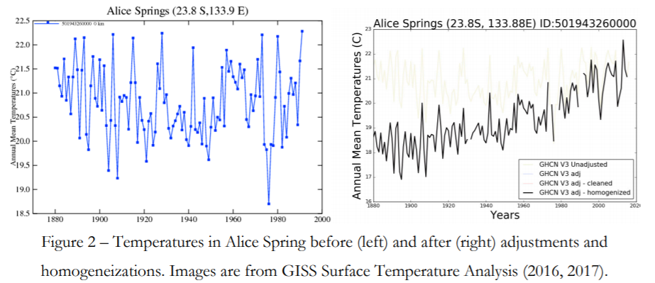
The apparent hotspot in the centre of Australia on the BoM map arises from errors in the ACORN-SATv2 version of Alice Springs. I am working to produce a compilation of all the worst case errors, all of which (so far) involve excessive cooling of early data.
APPENDIX
Technical notes are given here, further details and examples can be found at: https://diymetanalysis.wordpress.com/
BEST data is used in the validation tests as a “reference series”. A reference series has to have a good approximation to the regional average weather fluctuations, so that its subtraction increases the signal (steps/trends) to noise (weather) ratio. Ideally a reference series must have no more than “small” inhomogeneities. By design as regional averages over many stations, ready availability, and near global coverage, BEST is a very convenient source of reference series, at least for the post 1910 period in Australia. BEST Tmax data for New Zealand appears to fail to match raw data weather fluctuations before around 1942, the extent of this problem is unknown.
ACORN-SATv2 daily data from CSV files was converted to monthly averages, requiring no more than 6 missing days of data in a month. Missing months of data were automatically infilled, up to a maximum gap size of 3 years, using BEST data, and the raw data either side of the gap, for the month in question. The infilling is not essential, but it makes the plots easier on the eye.
” the figure above is sufficient on its own to invalidate the ACORN-SATv2 version of Mackay”
All it shows is a discrepancy between ACORN and BEST. How do you know that BEST is right and ACORN wrong?
OK, so BEST is wrong. Ask Steven what he thinks. But you have to pick one of them to be wrong.
Or both
with “climate science” all three of two data sets can be wrong
Or right. One size fits all, and everything proves CAGW. Just ask NIck.
Amen.
and correct at the same time
ACORN is wrong for Mackay because it has a very inconsistent trend with respect to its near neighbours, and the following plot shows that its adjustments are invalid.
The article doesn’t plot the ACORN trend relative to its neighbors. It only shows the difference with BEST. BEST could be inconsistent with its neighbors.
Or it could just be that, as the map suggests, Mackay just did warm a bit faster. That can happen.
Take a look at ACORN 2 vs Raw Data for Mackay and other Queensland sites here
http://waclimate.net/acorn2-qld/index.html
Mackay is a large coastal town surrounded by sugar cane fields. It hasn’t exactly changed much over the years from that.
If it has warmed relative to other towns nearby, there should be a reason for it.
“warmed relative to other towns nearby”
“nearby” is relative here.
Townsville is 388 km by road from Mackay. Charters Towers is 465 km. Cairns is 735 km.
Whenever I check the BOM observation history (highs and lows) for Mackay for the current month, the graph shows about the long-term average, also shown on the graph.
Whenever I check the figures, the averages (high and low) are significantly higher than the long term averages.
I was confused for some time, until I noticed that the graph is from the data at the racecourse, a fairly clear bit of land, and the figures are from the airport!
So, I suspect that this hotspot may be something to do with the rather significant increases in jets at Mackay airport, since they used to be mostly prop planes, and fewer of them. I also suspect that this is not unusual.
“So, I suspect that this hotspot may be something to do with the rather significant increases in jets at Mackay airport”
It has nothing to do with that. The location is at the Met Office, nowhere near the airport. None of the previous sites were near the airport.
Nick, ““warmed relative to other towns nearby”
“nearby” is relative here.
Townsville is 388 km by road from Mackay. Charters Towers is 465 km. Cairns is 735 km.”
Alice Springs 1600km
Close enough for government work. 😉
Nick Stokes
“So, I suspect that this hotspot may be something to do with the rather significant increases in jets at Mackay airport”
It has nothing to do with that. The location is at the Met Office, nowhere near the airport. None of the previous sites were near the airport.”
–
Nick, I believe you are wrong and should make a retraction and correction or substantiate your claim better.
–
The Met Office equipment only does clouds and sunshine, not temperature.
There are two listed and used BOM sites in Mackay, one at the racetrack and one at the airport.
If they are using the airport one preferentially then Zig Zag Wanderer may well be correct in his comments and you have railed at him wrongly.
Perhaps the use the racetrack one for the locals to be locally correct and use the air port figures to gee up the Australian and International figures.
Since you do a lot of this drive by putdowns with dodgy claims will you admit you are wrong on this one occasion and apologise??
–
Facts
–
Mackay Airport, Qld – Daily Weather Observations – BoM
http://www.bom.gov.au › climate › dwo › IDCJDW4077.latest.shtml
Temperature, humidity, wind, pressure and rainfall observations are from Mackay Aero {station 033045}. Cloud and sunshine observations are from Mackay M.O {station 033119}. Some cloud observations are from automated equipment; these are somewhat different to those made by a human observer and may not appear every day.
–
Mackay MACKAY M.O 033119
Mackay Airport MACKAY AERO 033045
Mackay Racecourse OORALEA RACECOURSE (MACKAY TURF CLUB) 033329
–
Australian Reference Climate Stations
Station Name Station Number W.M.O. Number MACKAY M.O 033119 94367
Mackay M.O. station 033119 (MO = Met. Office) with data from 1960 and the other is Mackay Aero station 033045 at the airport with a decade of data in the 1950’s then a 30 odd years gap to 1996.
The hottest Jan day claim for the 28th was fom Mackay Aero – there was no hot Jan day record at Mackay M.O. the BoM purpose built official meteorological station for Mackay which had longer continous data than Mackay Aero.
–
BoM blatant cherry picking and ignoring urban warming effects to claim hottest January day for Mackay Queensland February 7, 2013 Warwick Hughes
–
Sounds like the Met Office uses the racetrack temperatures as it has no temp recording facilities and is lower than the airport?
Perhaps someone from BOM , Austraia could deign to comment and clarify.
“Nick, I believe you are wrong”
This post is about Acorn data. BoM is quite explicit about the stations they used. I quoted their statement here. Airport data is not used.
Nick Stokes December 7, 2019 at 7:40 pm
“Nick, I believe you are wrong”
This post is about Acorn data. BoM is quite explicit about the stations they used. I quoted their statement here. Airport data is not used.”
–
Nick, I apologise, you are right.
Airport data forms a majority of the Acorn data, but not for Mackay.
The same thing … BEST(Cairns) … is being subtracted from all 4 ACORNS, it wouldn’t matter if it were wrong, but 3 of the ACORNS agree with it, hence they validate it, and all together they kill Mackay stone dead, but 3 ACORNS emerge unscathed.
It can? How? Over a long period, how?
Even if there was an area with a micro-climate, it will have had that before any warming, so why would it warm more than surrounding areas?
The idea that a small area can warm more than the vast areas surrounding it, including areas with very similar features, over a long period, is extremely unlikely.
That’s the wrong question. The problem for the scientist is to know if either is right and if not , which parts of each has validated data.
This leaves open that both could be wrong.
‘Because of its greater proximity to the coast and its hilltop location, the Meteorological Office has substantially lower maximum temperatures, and higher minimum temperatures (especially in winter) than any of the other sites that have existed historically in the Mackay area.”’
So lets start asking the usual hard questions.
Where is the raw data/
[Here millions of numbers are downloaded if available]
[That’ll show em]
Is such data available in its original form?
[was it burned?]
Usually no, ‘no need to retain it.’
What was the actual method of ‘correction’ that can now be looked at to see why the present warmed so much?
Were temperatures taken from both sites at the change to measure the correction factor?
Yes. See below.
‘The Meteorological Office site (33119) commenced observations in 1959, and no known site moves have taken place. An automatic weather station was installed in October 1995, although manual observations continued until 2001 under the site number 33297.’
Were there similar readings taken to validate automatic vs manual thermometers.
Please state assumptions.
Please show all calculations.
Show proof of validation.
“So lets start asking the usual hard questions.”
And the usual lazy process of asking with no interest in answers. But anyway
Here are the raw daily max data for the Mackay post office. Each day. Here are the data for the Met Office site.
“Were there similar readings taken to validate automatic vs manual thermometers.”
As they clearly said, yes, over at least six years. The AWS data is above, the comparison manual data is here.
‘Please state assumptions.
Please show all calculations.
Show proof of validation.’
All I am after is your protocol or method of validation.
The BOM must have such a reference.
After the Goulburn incident I am still interested in your QC.
Incidentally I report that your first link is off line.
Sorry about the link. The Mackay Post Office data is “http://www.bom.gov.au/jsp/ncc/cdio/weatherData/av?p_nccObsCode=122&p_display_type=dailyDataFile&p_startYear=1949&p_c=-218610327&p_stn_num=033046”
There is a BoM overview paper for ACORN 2 here. It has lots of references to past papers with more detail on the methods.
Or again:
The Mackay Post Office data is here.
I would have preferred it if you had compared Acorn 2 to Pre Acorn and Acorn as others have done.
They have also looked a dozens of Srations which are badly sited and do not meet BOM’s own requirements.
“I would have preferred it if you had compared Acorn 2 to Pre Acorn and Acorn as others have done.
They have also looked a dozens of Srations which are badly sited and do not meet BOM’s own requirements.”
I am one of the “others”. This coming Wednesday I will have an index of 300 Australian stations that do not meet siting specifications. (Mackay is one.) It will be at https://kenskingdom.wordpress.com/
The ACORN station catalogue says: (my bold)
“The earlier part of the Mackay dataset uses data from the Post Office (33046). This site had a temporary move due to building in late 1922, and further moves in 1939 and 1941, the latter placing it in a rather enclosed location. The Post Office site closed in 1950.
Data from the Te Kowai Experimental Station (33047) located 5 km west of the town were used between 1947 and 1959, with data from 1959 to 1965 used to merge the record with that at the Meteorological Office. This is a small but apparently good-quality subset of the full record from this site.
The Meteorological Office site (33119) commenced observations in 1959, and no known site moves have taken place. An automatic weather station was installed in October 1995, although manual observations continued until 2001 under the site number 33297.
Because of its greater proximity to the coast and its hilltop location, the Meteorological Office has substantially lower maximum temperatures, and higher minimum temperatures (especially in winter) than any of the other sites that have existed historically in the Mackay area.”
Homogenisation and composites are supposed to deal with temperature differences between stations. They clearly don’t do so in the case of Mackay, but the problem could be fixed easily if the adjustments were guided by the reference series, rather than the error-prone tunnel vision approach of ACORN-SAT.
“Homogenisation and composites are supposed to deal with temperature differences between stations.”
No, they aren’t. They are supposed to ensure that the measured temperature is right for that location. Comparison with neighbors is usually just to validate or reject apparently suspicious local changes.
In this case, the homogenisation is based mostly on stations in Mackay, for which there are substantial overlap periods to measure discrepancies. The big change around 1959 was based on a 6 year merge process, with data from both sites.
Yet amazingly the vast majority of homogenisation cools the past and warms the present. Which is entirely not what you would see with random errors and averaging.
Yiu would only see that with systematic errors. Yet that’s not what is claimed. It never ceases to amaze me why you defend bad science? We have decent satellite data, why defend this stuff?
“Which is entirely not what you would see with random errors and averaging.
You would only see that with systematic errors. Yet that’s not what is claimed.”
No, the opposite. Unbiased random error is not the target of homogenisation. The aim is to remove bias, which is the systematic component.
The extent to which correction goes one way is exaggerated; people here like to focus on individual cases of that kind. But there is some tendency, and for two main reasons. One, in the US, is TOBs. Observers moved from afternoon reading to morning. This, and its effects are recorded and quantified. The other is the general upgrading of screening early last century. This removed spurious radiant heat load, and caused thermometers to run cooler.
Nick. So after all changes of site and merged data and adjustments…you’re quietly confident that the discrepancy between Mackay and the neighbouring sites is real and reflects local warming?
Your faith is indeed strong…Greta is proud of you.
Thx. I’ll stop reading right now.
As a coastal dweller, I can state that climate and average temperatures can vary greatly by driving just a mile or two in any direction, depending on whether you drive uphill or downhill. Microclimate, Mr. Maguire.
The only thing I’m interested is whether it’s said “Mac-Kay” or “Mac-Aye.”
‘Aye’.
No argument on that, it’s a Scottish name, pronounced in the Scottish way.
Nobody here would ever pronounce it ‘kay’.
Oh you’d be surprised. I have a number of people that irritate me with Mac-Kay.
And I’d guess Proserpine is the nearest town if memory serves me correctly
Thank you for confirming my suspicions. Och, aye, “MacAye”, it is.
It’s Mackay with an eye. As per a newspaper article and comments by the founders daughter that states her father found the alternate an “abormoration” on display at Greenmount Homestead.
Nick, Can you please tell us why BoM changed some ACORN -2 “data” for “statistical reasons”?
The thing that is missing is graphs showing the raw data.
Yesterday a skeptic published a map of Canadian temperatures (basically saying, not much of in issue, etc.).
Alarmist posted something saying “are we just going to ignore that big red splotch in the Arctic?”
Now of course, even skeptics (or lukewarmers, anyone but alarmists) knows that, indeed, a “melting” Arctic isn’t nothing.
The difference is: most skeptics would ask “just how many accurate temp readings do we have for such a large area, and for how long”.
True. The comment about questioning the Alice Springs station numbers points out in rural areas one station may be responsible for determining the temperature of vast areas of land. Low earth satellites see more area but one spot of earth has to rotate into range which also introduces errors.
But run the computers, print the maps with all the pretty colors and state it is all fact.
Just looked at the NOAA GHCN-Monthly summary inventory, and there are 61 stations above 75°N. A check of the first five in the list against the monthly data showed one with data to present, two that hadn’t reported since 2006, and two with no record at all.
Gotta be lots of fake data — I mean “infilling” — going on there.
“all the other hot and cool spots on the BoM map shown above”
Cool spots? What “mysterious” cool spots? Oh wait the whole map is red, how inconvenient.
Cool relative to the average, these are not genuine climatological features, they are merely errors in ACORN-SAT. An error free map would be pretty uniformly pink, at about 0.15C/decade.
Whoa! The pretty-in-pink map is supposed to represent the “Annual Trend”, not per decade, over the 108 year period. That would mean that the Outback is now measuring Tmax about 38K higher than in 1910. even the “cooler” regions would be measuring Tmax up by 5-10K. Now THAT would be climate warming!
“The pretty-in-pink map is supposed to represent the “Annual Trend”, not per decade,”
No, it repesents the trend in the annual average (daily max). Units, as clearly stated, are °C/decade.
The more interesting feature is the biggest trends that is the darkest red are in McKay, Jurien Bay/Cervantes in WA and the rest in the middle of nowhere.
So let me take a guess without looking at Jurien Bay and Cervantes heat trend since I know the area well. They were small crayfishing towns until the 1980’s when they became popular summer holiday home area for people from Perth. I would be surprised if they had BOM record because they were largely seasonal pre-1980 so that would mean the record is constructed from Morawa and Dalwalinu. In 1999 Morawa and Dalwalinu were flooded so I am going to have a guess the BOM sites have been relocated.
Loydo, the hues attributed to constructed temp maps are entirely the creation of the BoM, to suit their own storylines.
These shadings have absolutely zero scientific significance.
(Much like Al Gore’s slideshows)
Chase says he sees “cool” spots. I pointed out there aren’t any and the only response you can come up with is a parrotted an adhom attack on the BOM.
Yeah? So if you printed out their maps in grey-scale, they would just show varying shades of grey.
Which would not be nearly so “scary” as shades of red.
The BoM has a warming alarmism agenda, as revealed in the Climategate emails.
Don’t be such a den1er of their blatant perfidy.
Yeah, depicting warming in red and cooling in blue, so blatant. Like bath taps are blatant, what a give away.
This cool spot
http://joannenova.com.au/2019/12/excuses-coldest-summer-day-snow-in-australia-and-suddenly-bom-remembers-how-short-their-records-are/
Ja. Decay at Mackay.
Sorry to be ignorant but there’s a website in the depths of the internet which reports met stations 1000km around Alice Springs and shows no raw data warming for a hundred years near enough.
Raw data in general needs adjusting, but ACORN-SAT overdoes it biggly:
ACORN2, which was released without fanfare in December 2012, has made even more inexplicable adjustments in historical raw temperature data in Australia. Here is a further example, from a different site, that looks at the adjustments for three stations in the Northern Territory, including Alice Springs:
http://www.waclimate.net/acorn2-nt/index.html
A consistent cooling of historical temperatures prior to 1970, reaching a maximum adjustment of 1.5 degC cooling in 1910, because as far as ACORN2 is concerned, Australia didn’t exist before then! Tony Heller has some excellent charts that show the older data from Australia and the changes the BoM made to the raw data by homogenisation:
https://realclimatescience.com/2019/09/australia-shows-no-warming-since-1876/
Apologies, ACORN2 was released in December 2018.
I asked the online Wolfram-Alpha Guru this question: “What is average temperature in Australia over last 100 years?”
Response: The W-A Guru picked Alice Springs for the ‘average’ location, with mean annual temp of 75F
Record low: 21F (1919) Record high: 117F (2005) Avg low: 31F Avg high: 109F
The plot showed results only from 1955 to current, with surprisingly constant levels (around 70F, so the maybe the unseen past values were hotter?). No visible correlation to rising CO2 emissions in the past 50 years!
The data came from a number of sources, including CIA, Met Office, Unidata, NWS CWOP etc. (click on “sources” to see the entire list)
Try it yourself!
https://www.wolframalpha.com/input/?i=what+is+average+temperature+in+australia+over+last+100+years&wal=header
Weatherstations are not suited for climate science.
They are the only data available, but the data was certainly not gathered for climate-change purposes. It is a challenging problem to extract genuine temperature variations, the BoM have been trying for 40 years, and still don’t have the right answer. Sceptics won’t like this, but BEST does get it right for Oz, at least post 1910.
When the correct answer can never be known, how is “right” defined?
“Most plausible” is probably better wording than “right”.
least implausible would be closer to the truth.
Ken Stewart has been checking Australian meteorological data for some time. Here is his recent review of the Mackay meteorological office, Station 33119:
https://kenskingdom.wordpress.com/2019/09/24/the-wacky-world-of-weather-stations-no-113-mackay-qld-2/
He found that it is non-compliant to the BoM siting standards with many deficiencies. However, more importantly, Ken has been checking the bizarre temperature results generated by the unpublished homogenization methodology of the BoM. Here is his summary of the changes made as a result of the release of ACORN-SAT in 2012:
https://kenskingdom.wordpress.com/2014/11/03/the-bizarre-case-of-mackay-33119/
Note that the above article by Dr Chase is based on the ACORN-SATv2, which was released in December 2018.
And this:
———
GISS manipulates climate data in Mackay (3rd Edition)
Another Smoking Gun from Australia? How GISS adjusts temperature records in two adjacent sites
Ken Stewart, January 2010 (Updated November 2010 with better graphs)
Introduction
Despite its assurances, GISS has adjusted the temperature records of two sites at Mackay to reverse a cooling trend in one and increase a warming trend in another. This study presents evidence that this is not supportable and is in fact an instance of manipulation of data.
(see link)
https://kenskingdom.wordpress.com/2010/02/05/giss-manipulates-climate-data-in-mackay/
———
They seem to be adding error to errors, to hide prior errors.
Charles, please see moderation bin re:
“S m o k i n g G u n”
Thanks for the work from Dr Chase – we need more people tracking down BoM (searching for words here).
There are other oddities in BoM temperature anomaly maps.
Over a decade ago I found the Australian “National Night-time Hotspot” – here is a recent link –
http://www.warwickhughes.com/blog/?p=3129
and my gif animation of six annual minimum anomaly scenes from 2002 is still blinking balefully away in cyberspace
http://www.warwickhughes.com/agri14/nnths.gif
enjoy and marvel.
“The net error for early data is an over-cooling by around 1.2C.”
This is a commonly seen correction for homogenised BOM ACORN-Sat temperature series all around Australia, not just for Mackay. It basically makes all of the map red.
Also, the trick of commencing the series in 1910 neatly avoids the very high temperatures of the Federation Drought of 1896-1903, where measured temperatures were higher than today, and there was a significant human death toll in the remote country regions.
Layer upon layer of deception.
What the graphs and the commentaries show is that movements in temperature data has so many issues associated with accuracy that it is ludicrous for governments to formulate global energy and social and economic systems on whether we can maintain temperature increases to less than 1.5 degrees against some figure we weren’t certain about using data we thought we were certain about but not so sure, using adjustments and homogenisations that we think might be ok but have never been explained by the bureaucracy which may or may not have an agenda implemented by a government unsure whether it is politically prudent to have green policies just in case they need votes from constituents who from assessment of probably biased polls think that global warming / climate change could be the most urgent and pressing issue in electors minds.
If you think that the issue of Mackay is an issue when trying to assess the accuracy of the mechanisms used to determine a global temperature. Think about the fact that 80 % of the world is ocean sparsely monitored by temperature measurements. The real error bars for temperature data both historical and continuing would I believe ( and I’m no statistician) exceed the amount of global warming claimed over the last 150 years. In these circumstances how can it be appropriate to formulate potential socio- economic policies that could have the impact of changing global political dynamics on such uncertainty.
Just like the toss of a coin the errors should even out over time, but if such temperatures went up, then its the work of persons in the MET working for the “”Cause””.
MJE VK5ELL
The naked, misguided assumptions made here are quite staggering.
There simply is no physical basis for the assertion that “these nearby stations are all on or near the coast, so should have very similar climate histories.” Air temperatures simply are not that tightly coupled with sea temperatures, which by no means vary very similarly themselves over hundreds of kilometers. Station siting, local topography and the presence of persistent oceanic gyres and fronts can create stark differences, such as often seen between Oceanside and San Diego, California cities only ~50km apart!
Nor does the “trend consistency of the other datasets, including BEST (Cairns), and the small size of residual fluctuations in the difference plots, provides strong evidence of their mutual validation.” Long-term trends are strongly influenced by local UHI and difference plots provide nothing more than point comparisons–not any serious validation. And when BEST data is used in the validation tests as a “reference series,” one simply indulges in tendentious, circular reasoning.
the bullseye in the middle is a giveaway for ‘government -think’. Hotter trends away from the coast, in a nice circle. As if nature conforms to our prejudiced pattern-seeking.
I am trying to decide weather this is just incompetence or deliberate malfeasance.
It’s right by the coast…maybe they’ve found some of Trenberth’s missing heat?
Although the Australian BOM has acquired an unsavoury reputation for its treatment of data, I think that one should take seriously Nick Stoke’s suggestion that the Mackay data represents a genuine anomaly and look for a natural, geographic, reason.
I am not an expert in interpreting Google Earth images, but looking at the shoreline (where the anomaly appears to be centred) it looks as if there is a much larger expanse of beach , sand , shallow sea compared to other parts of that coast line. Even in England one can feel the additional heat retained in shallow, extended beaches compared to those where the sea (cooler than the beach) comes close to the shore line. If that is so in England where the sun is an infrequent and reluctant visitor, is it not more likely in Australia, blessed with far more sun.
Temperatures vary considerably from place to place, even over short distances, but that is not the issue here. The issue is the CHANGE in relative temperatures in the 20th century. If it is the beach what did it, the beach would have to be drastically different to what it was in 1910.
Yes climaterecon , I did appreciate that it is the difference in change. But despite concerns about BOM figures for temp anomalies there does seem to be overall a small rise in Australian temperaturesin the last few decades. I wondered if the different topography at Mackay , compared to the rest of the East Coast, might have exacerbated that rise.
Also, not far south of Mackay, the GBR terminates. I don’t know the currents around Australia, but if there was a south flowing warm current flowing down the East coast it would be held away from the Northern Quenland coast by the GBR , but could curl around the end of the Reef and pool in Mackay bay. In a warming ocean, (albeit very slightly), that could perhaps produce the differential.
That would be true if the records were taken from the same spot over that length of time. Mackay weather station is on a hill within a klm of the ocean. Mackay airport is about 3m above sea level within a klm of the ocean, Mackay racecourse is about 6m above sea level about 5 klm from the ocean. The winter temp around the airport where i work and live is always colder then the rest of Mackay City. Mackay sits at the mouth of the Pioneer river in the Pioneer Valley. The MWS is to the North of the river, the MAP is to the South. There is no other city within 500 klm that has a local geography close to Mackay.
@mikewaite
“…I think that one should take seriously Nick Stoke’s suggestion that the Mackay data represents a genuine anomaly and look for a natural, geographic, reason….”
But anomaly charts are useless for comparing temperatures in neighboring regions, unless you have access to the “mean absolute temperature” charts from which the anomalies are computed.
For example, two neighboring regions with the same shade of color may actually have different absolute mean temperatures. And regions with different colors might have the same absolute means. You need to look at the mean absolute chart to reconstruct the absolute mean temperature differences. Unfortunately those charts are never presented.
So, it’s possible that there is no difference in mean temperature between MacKay and its neighboring regions, but historically MacKay may have been slightly cooler. Then MacKay would be rendered as “hotter” on these kinds of charts.
Nick Stokes, can you render for us the actual mean absolute temperature chart which generated this anomaly chart? Thanks.
“Nick Stokes, can you render for us the actual mean absolute temperature chart”
I don’t think mikewaite is using “anomaly” in the sense used in global averaging. Anomalies aren’t being used here – the only similar step was the author’s subtraction of BEST Cairns data to remove seasonal effect.
The “anomaly” here is the relocation to a hilltop near the sea. There is nothing intrinsically good or bad about that site; it is just different to the previous location in the town, and to have a meaningful continuous record, you have to make an adjustment for the difference. Fortunately BoM is careful about these changes, and they have for each move several years of overlapping readings. So you don’t need to speculate on what GBR currents might have done etc; BoM has the measurements and can use the difference as the basis for adjustment.
“The “anomaly” here is the relocation to a hilltop”
On re-reading, I see that MW really meant the “anomaly” of higher warming at Mackay relative to further along the coast. One can look for reasons why that might be, but there is general variation in the picture, and I don’t think the Mackay variation is extreme enough to say something is wrong.
Actually, I was not addressing the homogenization issue for Mackay, but was merely commenting how one interprets these gridded anomaly charts. Which is: you cannot say “Mackay is historically warmer than location X”. But you can say “Mackay and location X have both warmed historically”. etc.
So, I do not see how you can compare absolute temperatures at different locations by looking at anomaly trends. You need to look at the absolute temperatures.
But, getting back to homogenization, I too am skeptical of the adjustments made to the temperature record, which seem to cool the past and warm the present. For example, the BOM made adjustments to the previously “flat” GHCN V2 record, which induced a big warming trend:
https://www.preprints.org/manuscript/201712.0054/v1/download
My post above also shows a flat temperature record for Alice Springs:
https://wattsupwiththat.com/2019/12/06/the-mysterious-warmth-at-mackay/#comment-2864114
Just as modern warming occurs most often between thermometers. Strange hot spots in trend maps are often a sign of missing historical data.
St Lawrence is south of Mackay. The BoM online data for St Lawrence starts at 1938 and is only daily digitised from 1957.
So what is this from 1918?
http://soda.naa.gov.au/record/31156963/206
And what is this from 1921?
http://soda.naa.gov.au/record/9062440/202
Nick Stokes has kindly shown me an example of the collating of data from one format to another and a link within the article to original data.
‘There is a BoM overview paper for ACORN 2 here. It has lots of references to past papers with more detail on the methods.’
However what I would like to see is a worked example which explains the actual variance and orders of accuracy for ,say, the Mackay site, or any would do, just to obtain the method of homogenisation.
There is a flow chart available in Nick Stokes’reply.
It is peer reviewed so presumably the peers understand the process.
Does such a worked example exist?
If not, it may take a FOI or Ministerial to obtain one.
I am assuming you are an Australian like most discussing the Mackay subject.
You may appreciate that we Australians have been visited by a ‘march through the institutions’ with a series of ongoing Royal Commissions and test cases.
Many are seriously worried about the quality of our science at primary, secondary school level and university.
After all your work, which smacks of diligence and concern, it would be better to try and ward off another Royal Commission into this aspect of our national science.
Such a Commission would ask hard questions about the BOM data breaches,
access through BOM to Defence and the use or this data by a ‘Foreign Power’.
This would ‘muddy the waters’
We need sunlight, the best disinfectant.
Best confine things by making the system actually work.
One would expect a swift respond from a ministerial to a simple, not hard question.
‘Choosing a typical series of ten sites[ name them] explain the methodology,assumptions and expected outcomes for each site of temperature measurement.
Calculate order of accuracy.
Show all workings.
Validate.’
Alice Springs, central Australia.
I have been playing with temperature rewcords here since about 2007 or earlier.
Here is a view of the emergence of ‘credible’ adjustments at the time.
My, how sophisticated we have become, to reduce error bounds of +/- 2 degrees C, down to claimed +/- 0,2 deg C, or even better by some.
The whole process of homogenization is ludicrous. If we had tried it in my main work (finding new mines) we would expect to be put in jail.
Look at this –
http://www.geoffstuff.com/early_alice.docx
Some comments. Probably rubbish.
Acorn data represents 112 stations?
Divided into 99 districts.
Most of them now airports although probably no airports in 1910 as such.
Mackay MO is on top of a hill hence has colder data than that from previous sites used for Mackay in the Acorn history.
This makes the existence of a warmer anomaly for the surrounding area, based on BOM M.O data even more curious.
Why?
Anomaly changes should be lower for coastal regions due to ocean buffering.
Coastal sites have a lower range of variance and so any anomaly that develops should be much less than for a warming inland site.
Particularly since there are no cooling anomalies over this time.
Which there can never be since adjustments had homogenised the whole 1910 data start to a 1.8 C ? lowering for the 2012 starting Acorn data set.
The data is homogenised, that is the data listed is adjusted in 3 ways and after a year cannot represent the temperature actually listed originally at the site ( unless recent, raw and in italics).
Happy to be proven wrong.
((See Zeke statements re USA data homogenisation and adjustment).
The past temperatures have to be constantly adjusted downwards.
A little at the start and slowly greater to reflect the fact that CO2 warming is a factor over time.
As the data set grows the past anomalies become greater in a semi restricted set
–
The figures given represent multiple adjustments of previous data.
First the old data has to be reduced ( warmer, lower stations to match the newer MO data.
This should not make a difference.
Then that data has to be reduced again to take off the adjustments for time of observation bias and thermometer change overs.
Minimal effect.
Most other stations are on the same altitude so only get the basic reductions in the past whereas Mackay has also had an elevation adjustment.
Somehow the adjustments have made what should be a minimum warming anomaly at Mackay a major anomaly.
Perhaps with the incorporated Airport Bias of all the other sites the 1.8 C adjustment down to the cooler Mackay site leads to a greater percentage increase in the anomaly for this area, hence the warm blob.
Who knows?
The Mysterious Warmth at Mackay –
Charles Rotter / 1 week ago December 6, 2019:
– always ready for new surprises, time and again.
____________________________________
MacKay Surname Definition:
The surname McKay is of Scots origin, coming from the Scots Gaelic MacAoidh which means ‘son of Aodh’. The original meaning of the first name Aodh remains uncertain, but the most probable translation is ‘fire’.
https://forebears.io › surnames › ma…
https://www.google.com/search?q=etymology+Makkay&oq=etymology+Makkay+&aqs=chrome.