Global climate trend since Dec. 1 1978: +0.13 C per decade
September Temperatures (preliminary)
Global composite temp.: +0.61 C (+1.10 °F) above seasonal average
Northern Hemisphere.: +0.64 C (+1.15 °F) above seasonal average
Southern Hemisphere.: +0.58 C (+1.00°F) above seasonal average
Tropics.: +0.60 C (+1.08°F) above seasonal average
August Temperatures (final)
Global composite temp.: +0.38 C (+0.68 °F) above seasonal average
Northern Hemisphere.: +0.33 C (+0.59 °F) above seasonal average
Southern Hemisphere.: +0.44 C (+0.79°F) above seasonal average
Tropics.: +0.45 C (+0.81 °F) above seasonal average
Notes on data released October 3, 2019 (v6.0)
September’s globally-averaged, bulk-layer atmospheric temperature anomaly of +0.61°C (+1.10°F) represented the warmest September reading of the past 41 Septembers in our satellite record. The jump from August was substantial (+0.23°C) and ranks among the largest month-to-month changes. (Several previous jumps were greater than 0.3°C however.) The warmth was global in extent with warmest September temperatures posted for both hemispheres and the tropical belt. This month-to-month heating is possibly related, at least in part, to the tropical Pacific Ocean’s loss of heat energy to the atmosphere in the recent months as El Niño conditions declined.

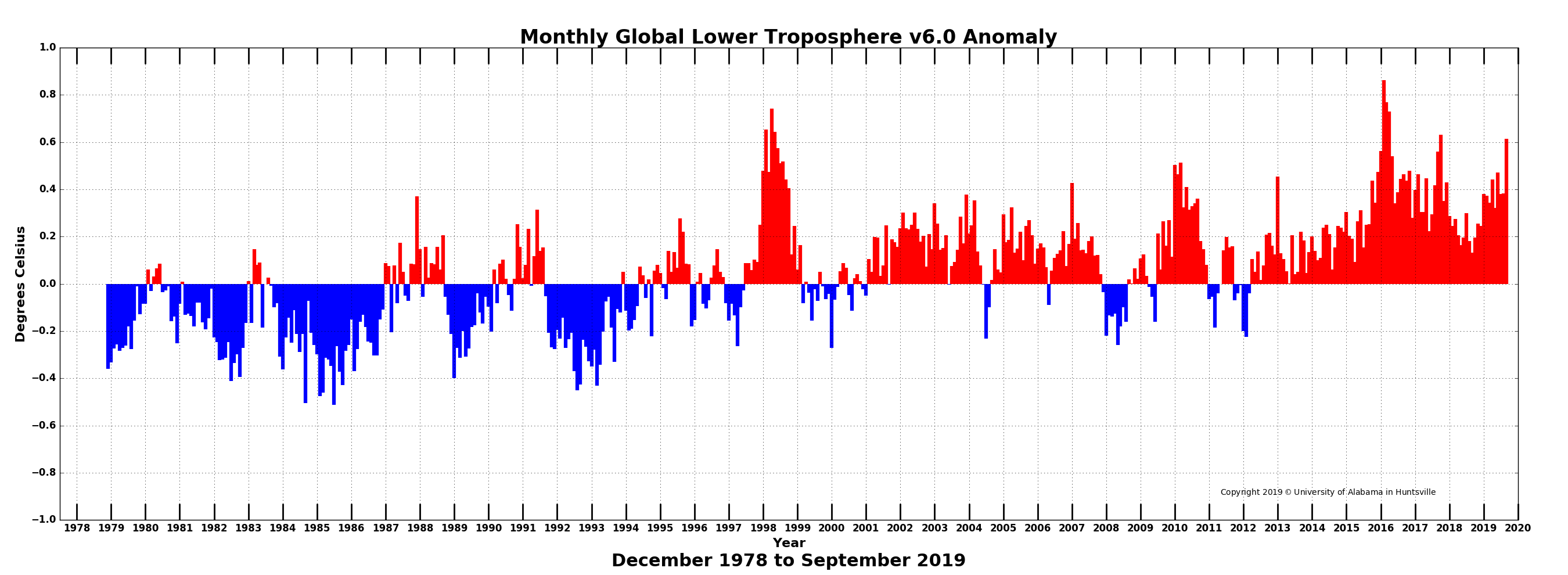
The impact of additional greenhouse gases in the atmosphere over the last 41 years plays a role as well in terms of the slow, longterm rise, though the magnitude of this effect is uncertain. Though this is the warmest September departure from average recorded by satellites, other months, especially those in the heart of the El Niño cycle (Feb-Apr) achieved departures exceeding 0.7 °C.
The conterminous U.S. experienced one of its warmest Septembers (+1.14 °C, +2.05 °F) though well below the warmest from 1998 (+1.78 °C, 3.20 °F). The Northwest was below average but a larger area of the Eastern half of the lower-48 (and Alaska too) was above average.

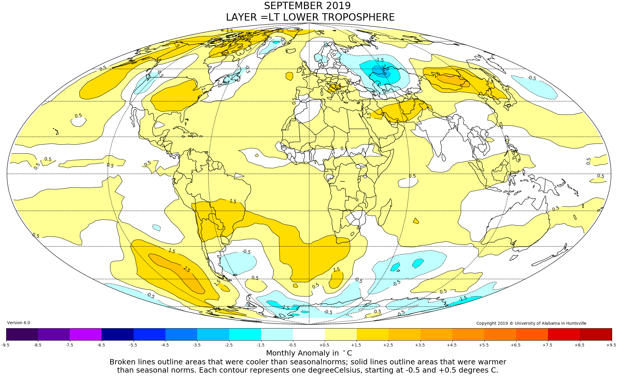
Globally, locations with sustained warmer-than-average temperatures for the month appeared over the SE and NE Pacific Ocean (the latter known as the warm “blob” by coastal residents there). The Arctic warmth in the western hemisphere was associate with the warmest local temperature anomaly in Northern Greenland of +3.2°C. Other warm spots were central South America eastward across the South Atlantic to South Africa, parts of the Middle East and much of central China.
The planet’s coldest departure from average this month was -2.9 °C in western Russia near Khmelevka on the Kazakshstan border. Other cool areas were seen on the south Greenland Plateau, South Indian Ocean, NW Pacific Ocean and portions of Antarctica.
NOTE: It appears some of the raw data from the satellites are problematic for September 2019. The values should be used with caution as they appear to be too warm in the lower troposphere and too cold in the stratosphere. We are investigating.
Spoiler Alert first published March 2019: As noted over the past several months in this report, the drifting of satellites NOAA-18 and NOAA-19, whose temperature errors were somewhat compensating each other, will be addressed in this updated version of data released from March 2019 onward. As we normally do in these situations we have decided to terminate ingestion of NOAA-18 observations as of 1 Jan 2017 because the corrections for its significant drift were no longer applicable. We have also applied the drift corrections for NOAA-19 now that it has started to drift far enough from its previous rather stable orbit. These actions will eliminate extra warming from NOAA-18 and extra cooling from NOAA-19. The net effect is to introduce slight changes from 2009 forward (when NOAA-19 began) with the largest impact on annual, global anomalies in 2017 of 0.02 °C. The 2018 global anomaly changed by only 0.003°C, from +0.228°C to +0.225°C. These changes reduce the global trend by -0.0007 °C/decade (i.e. 7 ten-thousandths of a degree) and therefore does not affect the conclusions one might draw from the dataset. The v6.0 methodology is unchanged as we normally stop ingesting satellites as they age and apply the v6.0 diurnal corrections as they drift.
To-Do List: There has been a delay in our ability to utilize and merge the new generation of microwave sensors (ATMS) on the NPP and JPSS satellites. As of now, the calibration equations applied by the agency have changed at least twice, so that the data stream contains inhomogeneities which obviously impact the type of measurements we seek. We are hoping this is resolved soon with a dataset that is built with a single, consistent set of calibration equations. In addition, the current non-drifting satellite operated by the Europeans, MetOP-B, has not yet been adjusted or “neutralized” for its seasonal peculiarities related to its unique equatorial crossing time (0930). While these MetOP-B peculiarities do not affect the long-term global trend, they do introduce error within a particular year in specific locations over land.
As part of an ongoing joint project between UAH, NOAA and NASA, Christy and Dr. Roy Spencer, an ESSC principal scientist, use data gathered by advanced microwave sounding units on NOAA, NASA and European satellites to produce temperature readings for almost all regions of the Earth. This includes remote desert, ocean and rain forest areas where reliable climate data are not otherwise available. Research Associate Rob Junod assists in the preparation of these reports.
The satellite-based instruments measure the temperature of the atmosphere from the surface up to an altitude of about eight kilometers above sea level. Once the monthly temperature data are collected and processed, they are placed in a “public” computer file for immediate access by atmospheric scientists in the U.S. and abroad.
The complete version 6 lower troposphere dataset is available here:
http://www.nsstc.uah.edu/data/msu/v6.0/tlt/uahncdc_lt_6.0.txt
Archived color maps of local temperature anomalies are available on-line at:
Neither Christy nor Spencer receives any research support or funding from oil, coal or industrial companies or organizations, or from any private or special interest groups. All of their climate research funding comes from federal and state grants or contracts.
-30-
That Warming does not correlate with SST. Allmost whole southern hemisphere waters has been cool.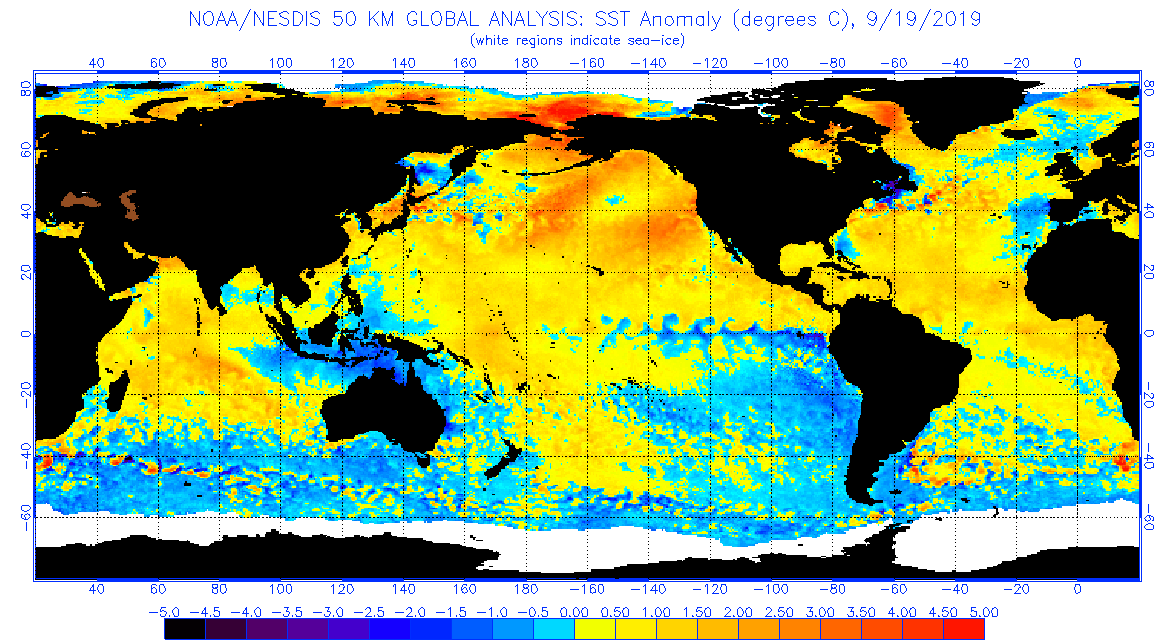
Olavi Vulkko
You are comparing one day of SST data with one month of global lower troposphere data.
What is your point?
My point is HTF CARES?
all fake bullshit, this was a cold september with heavy snow hitting the USA and europe already in september.. so wtf it was such a ‘hot’ month? .. hot where? it’s not very hot where i live either and i’m in the tropics..
I’m curious as well. The map shows my region as “above normal”. Not by much mind you but still on the positive side. And that’s utter crap. We were about 5C on average below normal for September at the surface and we’ve been below normal since April with no signs of abating.
There is a simple reason for that, the Satellites measure the Heat leaving the Earths Surface, so when it is cold the heat is going out to space, it could have tracked from a warmer area, thus masking the cold beneath it.
The satellites hardly ever agree with what we experience.
Apologies for the slight hijack…
Regarding the ‘scientific consensus’ issue, has anyone presented an in-depth analysis of all the factors that contribute to this meme?
For example, the effects of:
– selective funding
– silencing of dissent
– self-silencing, e.g. for sake of preserving a job/career
– disinvitation / deplatforming / persona non gratis from things like boards, conferences,
– science media bias
– mainstream media bias
– search engine bias
– etc.
Such an analysis would be useful to share with those under the spell of the ‘97% consensus!’ mantra.
Thank you.
The oceans. The Arctic. Siberia.
Notice how the biggest warming is always where there are no people. Odd coincidence.
Where the people are it seems like a different story:
https://www.iceagenow.info/temperatures-15-to-30-degrees-below-average-across-much-of-northwest/
https://www.iceagenow.info/record-smashing-september-snowstorm-dumps-up-to-4-feet-of-snow-on-montana/
https://www.iceagenow.info/nevada-winnemucca-snowfall-breaks-142-year-old-record/
https://www.iceagenow.info/chile-snow-surprises-inhabitants-of-la-araucania-in-full-spring/
It looks like the climate data script-writers in their smoke-filled backroom are following the old WW2 approach – “hit em where they ain’t”.
Phil Salmon
Double cherry-picking:
– you only refer to infos published by a web page whose ideology is known to intentionally exaggerate cooling;
– you only refer to single geographic sites experiencing abnormal weather conditions having few in common with long-term climate observations.
Some hints
– (1) Cotton, Minnesota, USA experienced in Feb 2019 two days with very harsh absolute temperatures near to -50 °C;
– (2) The station’s average anomaly wrt the mean of 1981-2010 for Feb 2019 as a whole was -9.50 °C, indicating that these extremely unusual temperatures happened only during 2 days;
– (3) Minnesota’s average anomaly for Feb 2019 was -5.22 °C, indicating that the state as a whole was by no means so cold;
– (4) In comparison, the average anomaly for Feb 1956 in Germany was -10.18 °C.
Sam Khoury
“… with heavy snow hitting the USA and Europe…”
…and Europe…
Can you tell us where there was heavy snow in Europe during September – outside of high mountains like the Alps and the Dolomites of course?
Anyway, you are comparing here a few little % of land with the entire Globe. Does that make sense?
So, it was a warm August and September. Where I am, we had a VERY COOL May and June, one of our coolest on record. We did have a noticeably warm September, but our July and August were noticeably cooler as we never did hit 100 this summer. Having a warmer than usual summer doesn’t mean anything if the temperatures dip back to “normal” or “average” in coming months or years. Unless this is found to be the new normal over the next few decades, there’s nothing to report. Speaking of nothing to report, where’s the sea level rise? Where’s the increase in fires, hurricanes, and tornadoes if we indeed had such a warm August and September??? Why wasn’t there catastrophic increasing melting?
Excerpt from article:
“YUP”, they are absolutely, positively, double-down 100% cross their heart sure that the atmospheric CO2 is causing near-surface warming …….. and they are actually going to provide physical evidence to prove said, …… one of these days (in the near future).
Greenland must be a very peculiar place, full of very different anomolous anomalies!
UAH is no better than the rest, GIGO , or to put it more scientifically , a crock of sh*t.
Putting UAH into context…

RCP2.6 and RCP4.5 are scenarios in which humans basically undiscover fire.
What is UAHv6.0 doing on the graph headed “Global average surface temperature change”?
The greenhouse effect occurs in the atmosphere, not just at airports.
Here’s the airports forecast…
As I mentioned earlier this may be a repeat of the 2017 September/October temporary jump. Most likely an aftereffect of the El Nino. If I am correct then we will see a drops in November and December with the global average in 2020 returning to values similar to 2018.
We are not likely to see a strong cooling until both the PDO and AMO go negative. Right now they are both moderately positive which is actually high when not in an El Nino. For those of us who think the oceans are a big factor in global temperature, this explains what we are seeing.
Richard M
1. “If I am correct then we will see a drops in November and December…”
You publish the same stuff all the time, only the month names differ.
2. “We are not likely to see a strong cooling until both the PDO and AMO go negative.”
PDO does, but for AMO you will have to wait some little time.
https://drive.google.com/file/d/10lF1TFlp3J4p3FuipbepMULarSXqkviy/view
(As you know, PDO anomalies are by far smaller than AMO’s, and were here scaled up by a factor of 5 to make them comparable.)
3. “For those of us who think the oceans are a big factor in global temperature, …”
YES!
“… this explains what we are seeing.”
NO.
Please excuse my ignorance, but what is the use of a “global average” temperature? How is it calculated? How are readings from different sources and locations weighted?
It’s ENSO.
Hottest September evah:
http://www.drroyspencer.com/2019/10/uah-global-temperature-update-for-september-2019-0-61-deg-c/
During which
https://www.iceagenow.info/historic-winter-storm-breaks-century-long-records-in-montana-video/
https://www.iceagenow.info/new-zealand-snow-and-ice-close-south-island-highways/
https://www.iceagenow.info/unprecedented-cold-on-lower-volga/
https://www.iceagenow.info/temperatures-15-to-30-degrees-below-average-across-much-of-northwest/
https://www.iceagenow.info/chile-snow-surprises-inhabitants-of-la-araucania-in-full-spring/
Maybe global warming is what causes ice ages.
When it comes to the “global average temperature” and its changes, determined with an accuracy of 0.01 °C, it would be nice to recall some facts.
1. The error of the initial data of measuring the temperature of the atmosphere can be of the order of 0.2 -0.3 ° C. (X.Lin, K.G.Hubbard. Sensor and Electronic Biases/Errors in Air Temperature Measurements in Common Weather Station Networks. Journal of Atmosphere and Ocean Technology, Vol. 21, 1025 – 1032, (2004). https://journals.ametsoc.org/doi/pdf/10.1175/1520-0426%282004%29021%3C1025%3ASAEEIA%3E2.0.CO%3B2 )
2. Temperature measurements at weather stations, instruments on satellites and weather balloons give different results because air temperature varies with altitude.
3. Meteorological stations are located unevenly, and with an increase in the surface area of the site, the error in determining the temperature in this area increases.
4. Averaging temperature over time (daily, monthly, annual) is a statistical procedure that, in addition to calculating the average value, provides for calculating the standard error. An example. The daily average temperatures in New York were calculated from hourly values for 4 randomly selected days, and the values of the mean-square error of the arithmetic mean were found with a confidence interval of 0.90. Results of calculations (in oC): 19.7 +/-1.13, 22.2+/- 1.12, 24.2 +/- 1.07, 20.1+/- 0.98. Accordingly, the error is determined when calculating the average monthly temperature from daily values and the average annual temperature from monthly average values. in the vast majority of cases, calculations show that these errors are not less than 1 °C.
5. The error in determining the average global temperature, obviously, cannot be less than 1 °C. Therefore, according to the rules for determining significant figures, calculations where operations are carried out with values on the order of tenths and hundredths of a degree cannot be considered reliable.
aleks
A somewhat lengthy comment, probably the 1,000 th of the same vein published here during the last years.
To you too, the reply is much more concise than what is replied to.
Please have a look at the graph below
https://drive.google.com/file/d/1p1Cjw4L7WqCZCGKUnNth1lVwergBk-tt/view
and try to explain the correspondence between
– the global averaging of the temperatures measured by ten thousands of weather stations all around Earth,
and
– the global averaging of all measurements made by satellite-on board devices about 5 km over land in the lower troposphere, and evaluated by UAH’s team around Roy Spencer.
My guess: you make, like some very, very PhDeed persons, a typical mistake in not appreciating enough the simple fact that the errors you list mostly cancel out.
If that was not the case, it would never be possible to compare these two time series over the long term: they would look different all the time.
Well, So far this has been the coldest year in living memory here in Calgary, Canada. Please send us some of that “3rd warmest” or whatever.
Jeff in Calgary
Maybe you live in some unusually cold Canadian corner…
In September I generated a time series out of an average of all Canadian weather stations present in the GHCN daily data set, and sorted the months in ascending order. Here is the top10:
1936 2 -9.17
1933 12 -8.76
1917 12 -8.56
1885 2 -7.69
1979 2 -7.42
1904 2 -7.16
1888 1 -6.65
1885 3 -6.38
1893 2 -6.22
1907 1 -6.07
2019 appears in the list at position 234 (of 1675).
Somewhat later I did the same for the Prairies (Alberta / Saskatchewan / Manitoba) and obtained this:
1936 2 -16.48
1950 1 -14.75
1916 1 -12.49
1937 1 -11.22
1982 1 -10.83
1907 1 -10.74
1979 2 -10.66
1904 2 -10.32
1969 1 -10.32
1966 1 -9.90
But… in this list, 2019 moved from position 234 to position 14. So yes, it’s a bit cold actually at your place.
Here in Germany, we enjoyed in 2018/19 two superwarm summers in sequence, each preceeded by a supermild winter.
It was indeed a warm Sept here in the central Appalachians (USA). Quite nice, in fact. But the last summer-like 80F+ day was yesterday (Oct 3rd) — unfortunately no more until next year.
What we are in now will be known as the TWP — “Trump Warm Period”.
“The impact of additional greenhouse gases in the atmosphere over the last 41 years plays a role as well in terms of the slow, longterm rise, though the magnitude of this effect is uncertain.”
This is the mandatory C02 Genuflection. It’s disgusting and from where I sit, makes all this into a joke.
Andrew
A lot of Midwestern farmers are probably thankful for the warm September, to prolong the growing season after an unusually cold and snowy April delayed planting their crops. Sometimes a little warming can be beneficial…
Another snow storm heading for northern Rockies/Plains mid to late week along with a freeze in its wake for much of the Central Plains to the Upper Mississippi Valley. Oh goody! (ugh).. We need to control weather and climate better, anyone got any ideas to make it warmer?
I must of missed the evidence that the average of the Earth’s temperature does not fluctuate over multi-decade time periods. All the evidence that I have seen says that it has in the past, must be doing so in the present, and will continue to do so in the future.
I find it hard to care about a few tenths of a degree spread out over the past 40 years. If the governments were not using it as a pretext to destroy what is left of our freedoms, I think most people would not care in the slightest.
Without the fear-mongering, this is a non-story that sends the climastrologists back into the bowels of academia, were they can argue among themselves about average temps that have no interest to anyone else, except farmers to a small degree, because they are swamped by daily and yearly variations in the temperatures that do matter to us.
This is the government – academia complex, that we weren’t warned about. And four more years of an administration that exposes it for what it is, will be a welcome trend that I will care about.
The term ‘anomaly’ can be misleading. Do you mean that temperatures show how far away they are from the mean of the 30 year period?
Surely it would be clearer to express the data as p-values. What is the probability of the observed temperature assuming the 30 year average is from a normal distribution.
I compared the UAH V6 lower troposphere anomaly chart from 1978 to Sept 2019 against the ENSO trend chart and the SST for the ENSO 3-4 region. Whilst the SST charts and ENSO charts show the cold and warm phases roughly equally distributed during that period the lower troposphere anomaly since 1998 has been almost entirely positive. That is, the cold surface water phase does not show up as strongly as you might expect in the satellite record .
Is this because the increased amount of CO2 in recent decades is indeed acting as a mechanism for the increased storage of the heat flowing from the relevant area of the Pacific during, or just following the warm phase of el nino and is showing up as a relatively high anomaly in the atmosphere in the region that the satellites are probing?
mikewaite
“I compared the UAH V6 lower troposphere anomaly chart from 1978 to Sept 2019 against the ENSO trend chart and the SST for the ENSO 3-4 region.”
What exactly do you mean with the ‘the ENSO trend chart’?
The ENSO 3-4 region itself (5N-5S – 170W-120W) is the main component of any ENSO chart, be it ONI, NINO3+4, JMA, MEI, etc.
Yes you are correct. I did not explain very well. The 2 plots I was interested in really are the ENSO3-4 and the UAH plot . I got the impression that the periodic changes in the surface water temperature in that part of the Pacific failed to be matched after 1998 by the changes in the UAH probe measurements in the atmosphere. Almost as if , as theory predicts, the effect of the radiation from the water surface in a strong El Nino is more slowly dissipated to space if the CO2 concentration increases steadily.
One explanation for the Pause, therefore would be that the effect of the strong El Nino would, in the absence of subsequent strong events be gradually dissipated and both UAH and HAdcrut anomalies would decline through the 2000s as CO2 is lost by natural means. However if it is continually renewed and actually increases, the loss of the El Nino heat would be slowed, producing a Pause untl the next strong El Nino in 2016.
(I appreciate that the UAH is a global measure and the ENSO3-4 is a local area , but that local area is significant enough to have global consequences).
Probably all rubbish on my part, but the difference in the variations in ENSO3-4 and UAH could be a proof of the heat retention properties in the atmosphere of CO2. However that effect should not continue at the same rate if the textbooks are correct about climate sensitivity curves.
mikewaite
I don’t want to go into any CO2 / pause discussion here. Let me just pinpoint what I think might not be quite correct:
“I appreciate that the UAH is a global measure and the ENSO3-4 is a local area , but that local area is significant enough to have global consequences.”
I wonder every time about such sentences. How could a few km² have such an effect? The ENSO area is no more than a diagnostic instrument, and not the origin of what it displays.
If you generate, out of UAH’s grid data, a time series for this ENSO area, you see that it reflects ENSO signals with less intensity than does a time series for the whole Tropics (20N-20S).
Conversely, if you select, out of that grid consisting of 9504 cells filled with useful data, say 256 evenly distributed cells, and generate a time series out of them, you see that there is few difference between the grid and about 5 % out of it, and above all you see also that the ENSO signals are perfectly reproduced as well:
https://drive.google.com/file/d/1Ij_jKmyrBJOMUdwtRP6NYqyGXibNPnRb/view
El Nino is everywhere…
Rgds
J.-P. D.
Sudden stratospheric warming (SSW) is not a sign of warming but on the contrary a prelude to an outbreak of very cold weather with stratospheric incursions. Roy tells us that a big SSW just happened in Antarctica. People living in South Africa and South America and Australia-NZ should pay attention.
From the article: “The satellite-based instruments measure the temperature of the atmosphere from the surface up to an altitude of about eight kilometers above sea level.”
What do you have to say about this, Roy? Does UAH measure surface temperatures? Or are you limited in how close to the ground you can measure, as Nick Stokes insinuates? Are UAH surface temperatures comparable to the surface temperature charts in what they measure? Or is it apples and oranges as Nick Stokes implies?
Tom Abbott
“Does UAH measure surface temperatures? Or are you limited in how close to the ground you can measure, as Nick Stokes insinuates?”
The best for you is to inform yourself by reading appropriate documents, e.g.
https://www.drroyspencer.com/2015/04/version-6-0-of-the-uah-temperature-dataset-released-new-lt-trend-0-11-cdecade/
Therein, you find this:
The major goal of this computation is to avoid the inevitable intrusion of surface data into the lower troposphere’s temperatures.
Nick Stokes does not insinuate anything, Tom Abbott.
Rgds
J.-P. D.
Yes it is cold and snowy here, overall, but just chilly and wind-blasted at our northern end. ACTUAL Sept T av negative for Sept, and remaining so. Aussie may be worse.
The changes now upon us will blast away silly ideas of radiative dominance too, and sensible scientists should go back to Maxwell/Poisson eg Theory of Heat pp330-350 for starters. Thermdynamics’ giant was not fooled……… Regards from Brett in NZ
“Aussie may be worse.”
Fourth warmest September on record. 1.19°C above average.
Nick
“1.19 °C above average” ???
Could you perform a check using GHCN V4 unadjusted?
The GHCN daily anomaly average (wrt mean of 1981-2010) over more than 600 AS stations gives -0.48 °C. Only one of all these station appears in the sorted top 50 anomalies for the September month.
Rgds
J.-P.
Bindidon,
“Could you perform a check using GHCN V4 unadjusted?”
Here is the regular Moyhu plot, from here.
Unadjusted GHCN V4 data says 0.75°C above 1961-90 average, for Australia/NZ.
Nick
Thanks. That probably would give 0.5 °C wrt 1981-2010.
Hmmmh. Three evaluations that are a lot more apart than makes sense …
Buona notte, J.-P.