guest post by Clyde Spencer
Abstract
Tmax and Tmin time-series are examined to look for historical, empirical evidence to support the claim that heat waves will become more frequent, of longer duration, and with higher temperatures than in the past. The two primary parameters examined are the coefficient of variation and the difference between Tmax and Tmin. There have been periods in the past when heat waves were more common. However, for nearly the last 30 years, there has been a reversal of the correlation of increasing CO2 concentration with the Tmax coefficient of variation. The reversal in differences in Tmax and Tmin indicate something notable happened around 1990.
Introduction
There was much in the press this Summer about the ‘global’ heat waves, particularly in France and Greenland. For an example of some of the pronouncements, see here. The predictions are that we should expect to see heat waves that are more frequent and more severe because of Anthropogenic Global Warming, now more commonly called “Climate Change.” The basis for the claim is unvalidated Global Climate Models, which are generally accepted to be running to warm. The simplistic rationale is that as the nights cool less, it takes less heating the next day to reach unusually high temperatures. Unfortunately, were that true, that would lead one to conclude that heat waves should never stop.
One agency that hasn’t erased the 1930s heat is the US Environmental Protection Agency. It clearly shows the 1930s with the largest heat wave index values!

Fig. 1. U.S. Annual Heat Wave Index, 1895-2015
https://www.epa.gov/climate-indicators/climate-change-indicators-high-and-low-temperatures
If the predictions of worse future heat waves were valid, one might expect to be able to discern a change occurring already, inasmuch as it is commonly accepted that Earth has been warming at least since the beginning of the Industrial Revolution. That is, if the Summer heat waves are occurring more frequently, and they are getting hotter, one might expect that the maximum daily temperatures would exhibit larger statistical variance.
Because humans live on land, and we are concerned about the impact on humans, such as comfort and excess heat-related deaths, it would seem to be most appropriate to look at just air temperatures over land. There is an unfortunate tendency in the climatology community to conflate sea surface temperatures with land air temperatures, which tends to dampen changes because it takes a lot more energy to change the temperature of water than air or even land. Thus, with more than 70% of the surface of the Earth covered with water, small changes or trends in energy will be more difficult to identify in the weighted-averages of water and land temperatures.
Analysis
To explore the situation, I used the Berkeley Earth Surface Temperature (BEST) project data. I wanted to get as close as reasonable to the raw data, minimizing the averaging that us usually employed in such data, and which raises concerns about subsequent statistical analysis. To that end, I downloaded an experimental data set that has the maximum and minimum daily air temperatures for the land-only surface of Earth. Figure 2, below, shows the coefficient of variation (CoV) of the maximum daily temperatures (Tmax) as a time-series from 1880 through mid-2019. There are two traces shown: 1) a 30-year moving-average* of the standard deviation (SD) divided by the 30-year arithmetic mean, with daily steps; 2) a 1-year moving-average of the SD divided by the annual arithmetic mean, with daily steps. The division by the mean normalizes the SD, creating the CoV.
I converted the BEST temperature anomalies to estimated Celsius temperatures by adding the calculated 1951 through 1980 average Tmax, to avoid an issue of dividing by zero. I then converted the temperatures to the Kelvin scale to allow the Tmax and Tmin CoVs to be comparable. The metadata accompanying the Tmax temperatures shows the estimated uncertainty of the baseline mean (14.41° C) to be ±0.11° C. Strictly speaking, the precision of the calculated anomalies should then be no greater than that value, and probably less, taking into account the uncertainty of individual measurements from which the anomalies are obtained. Nevertheless, BEST reports the anomalies to 3-significant figures to the right of the decimal point, rather than just the one (1) warranted. Ignoring that issue, and moving on ―
The annual moving-average of the Tmax CoV is not particularly informative, other than showing large annual changes in what is essentially the standard deviation. However, the 30-year moving-averages smooths the data considerably, albeit truncating the first and last 15 years of the data. Between about 1895 and 1950, there is no obvious trend. However, after that, the CoV shows a distinct upward trend as might be expected if Summer heat waves were increasing in frequency, duration, and/or temperature. However, something unexpected shows up around 1996 – the CoV starts to decline! The annual CoV values also suggest that there is a decline after about 2000. Surprisingly, the infamous 1930s U.S. heat wave is only weakly reflected in the annual Tmax CoV.

Fig. 2. Tmax Coefficient of Variation Time-Series (http://berkeleyearth.lbl.gov/auto/Global/Complete_TMAX_daily.txt)

Fig. 3. Tmin Coefficient of Variation Time-Series (http://berkeleyearth.lbl.gov/auto/Global/Complete_TMIN_daily.txt)
Interestingly, the CoV moving-average time-series for the Tmin looks different, as shown in figure 3, above. As with the Tmax time-series, it is a 30-year moving-average, with daily increments. Essentially, there is a decline in the variance from at least the mid-1890s, to about 1952, followed by an increase until about 1990, and then a return to the decline, at about the initial rate. The declines can be explained in the context of Earth’s radiative cooling being impeded by increasing ‘greenhouse gases.’ That is, it doesn’t get as cold at night, thereby decreasing the diurnal temperature drops, and consequently the Tmin variance. The almost 40-year interruption in the decline is a little more difficult to explain because there has been no similar change in the accumulation of CO2 in the atmosphere! (See Fig. 6, below.) That is a suggestion that any effects of long-lived CO2 are over-ridden easily, possibly by aerosols, short-lived clouds, and water vapor, if not actually being the dominant drivers.
What is happening? To explore further, I examined the most recent Tmax and Tmin data from BEST. Because the daily data are so noisy, I decided to use the monthly time-series to examine the behavior of the temperatures.

Fig. 4. Monthly Averages of High and Low Temperatures Time-Series
(http://berkeleyearth.lbl.gov/auto/Global/Complete_TMAX_complete.txt)
[ I have addressed the issue of temperature changes previously, here: https://wattsupwiththat.com/2015/08/11/an-analysis-of-best-data-for-the-question-is-earth-warming-or-cooling/ ]
Again, Figure 4 is not very informative. It looks as though there may have been a slight increase in the slope of Tmax after about 1975, which is difficult to attribute to the effects of CO2. The rise in Tmin may have decreased slightly after about 1998, with the exception of the 2016 El Niño. Plotting the anomalies [not shown], instead of actual temperatures, accentuates the post-1975 increase in the slope of Tmax; however, the Tmin appears more uniform. Note that the theory of ‘Greenhouse Gas’ warming predicts that the effects should be most apparent in the Tmin. However, neither provides insight on what is happening with the CoVs around 1990!
However, a time-series plot of the monthly data showing the differences between Tmax and Tmin is much more interesting! As reported earlier, the difference has been declining since about the beginning of the 20th Century. However, as with the CoVs, there is a distinct change about 1990! After a decline in the differences for about a century, the differences start to increase. The 3rd-order polynomial regression, shown in purple, is of no particular importance other than to accentuate the change in the difference between the high and low temperatures. Albeit, it is suggestive of a possible 200-year cycle.
It appears that something subtle happened about 30 years ago that isn’t readily apparent in temperature (or temperature-anomaly) data alone. Figure 4 indicates that Tmax and Tmin are both increasing. Inasmuch as Tmax is much larger than Tmin, it will tend to dominate the resulting change, for a similar percentage change in both. It appears that both Tmax and Tmin were impacted similarly by the 2016 El Niño. The slope of Tmax is larger than Tmin between about 1985 and 2005. If Tmax is increasing more than Tmin, then it would argue against CO2 being the primary driver of global warming!

Fig. 5. High and Low-temperature Difference Time Series
The question is, “What is causing the changes around 1990, and is it of any climatological significance?” One possible explanation is that the apparent change in temperature relationships is somehow an artifact of processing; however, I’m not familiar enough with the details of the BEST processing methodology to speculate just how this might occur. Ignoring the rules of precision and error propagation comes to mind though.

Fig. 6. CO2 Concentration from 1958 through 2019
(http://scrippsco2.ucsd.edu/data/atmospheric_co2/primary_mlo_co2_record)
Figure 6 is a plot of the Mauna Loa measurements of CO2, from Scripps Oceanographic Institute. Looking at the figure, there seems to be little to explain the behaviors noted above other than a slight apparent decrease in the growth rate of CO2 after about 1990, for about two or three years. That is, if CO2 is the main driver of temperature changes, there doesn’t seem to be anything in the behavior of the CO2 concentrations that would obviously explain the recent long-term decline in the CoVs or the differences in Tmax and Tmin.
Assuming that the demonstrated CoV behavior is not an artifact and is real, the examined data suggest that if the global-average high temperatures are increasing, a consequence might be increased frequency or severity of heat waves. However, figures 2 and 4 only show the effects of the El Niño phenomenon, at best.
Summary
Extrapolations are always fraught with risk. However, based on the behavior of the Tmax CoV, which appears to be declining, there does not seem to be strong empirical support for the prediction that future heat waves will be worse and more frequent than in the recent past.
Clearly, Tmax has increased in the last 40-odd years. However, the CoV peaked about 30 years ago, and appears to still be in decline, based on the annual CoV values. Because Tmax is typically the result of direct solar heating, a decline in the so-called ‘solar constant’ variance could result in a decline in the Tmax CoV.
While Tmin is clearly increasing, almost monotonically, the CoV suggests that the increase is by increasing the floor, or base level, of the minimum temperatures.
One might be tempted to dismiss the effects that I have illustrated as being so small as to be inconsequential. However, the temperature differences, and the 30-year moving-average standard deviations, on which the CoVs are based, have a long-term duration and a magnitude comparable to several decades of average global temperature change. I believe that an explanation is warranted. Do any of the Global Climate Models show these secondary effects?
I would like to invite thoughts on the behavior of the coefficient of variation, and differences in the high and low temperatures, with respect to global temperature changes.
References
C. D. Keeling, S. C. Piper, R. B. Bacastow, M. Wahlen, T. P. Whorf, M. Heimann, and H. A. Meijer, Exchanges of atmospheric CO2 and 13CO2 with the terrestrial biosphere and oceans from 1978 to 2000. I. Global aspects, SIO Reference Series, No. 01-06, Scripps Institution of Oceanography, San Diego, 88 pages, 2001.
*It is more accurate to refer to the CoVs as a “sliding sample” because only the denominator is actually a moving average.
Clyde
looking at the Elmendorf graph, you must remember that I did that investigation in 2013, so it would have included all data from 2012. I just looked at the latest results and indeed I did find Tmax rising again over the past 5 years at a rate of 0.04K/annum. That is not too far off bad from what I could have predicted back in 2014.
Indeed, I am not a mathematician, and so you might battle a bit reading my graphs. The one that might interest you is the first graph in this document here;
https://documentcloud.adobe.com/link/track?uri=urn:aaid:scds:US:42f86fb5-bd3a-4bce-a1d2-2e33fe3fa66b
it is an estimate of the drop in the speed of warming on Tmax (global)
Important to note here is that this investigation was done in 2015 and included all results up until and including 2014.
Given this information, and solving the equation: 0.039 ln (x) – 0.1112 = 0 you can figure out the point in time where Tmax started declining,
i.e where the energy we get from the sun, that passes through the atmosphere as noticed on earth, started declining.
– do not confuse that with the energy coming from the sun measured TOA or anywhere in between TOA and sea level
Looking at the results of my doc. there, some of you might want to ask me: but why is it not cooling?
It is indeed very puzzling to try and figure out what is happening. Remember we (in this case Clyde and me ) are evaluating air temperature and the statistic analysis I did is only one picture, just like any picture, frozen in time.
What actually happened since 1995 is best shown in this graph here:
http://woodfortrees.org/plot/hadcrut4gl/from:1995/plot/hadsst3nh/from:1995/plot/hadsst3sh/from:1995/plot/hadsst3nh/from:1995/trend/plot/hadsst3sh/from:1995/trend
For some reason, completely different to what I had expected, it appears that especially the sea waters in the NH became much warmer than anyone could have predicted.
IMHO there is no other explanation for this than that of increased volcanic activity and heat coming from the bottom up…… (Remember the eruptions in Iceland, Italy, Hawaii, Indonesia?)
but if someone here has another explanation?
Either way, I don’t think that we will escape the coming droughts. (click on my name to read my full report on that)
henryp
You said, “I did find Tmax rising again over the past 5 years at a rate of 0.04K/annum.” I’m not sure how reliable that rate is. BEST says that their baseline ‘climatology’ for computing Tmax anomalies has an uncertainty of 0.11 deg C. There is no associated uncertainty for the daily anomalies. However, the monthly data has anomaly uncertainties typically greater than 0.5 deg C for the early data and ~0.1 deg C for recent data. I can’t vouch for the veracity of the uncertainty data, but I would tend to believe that anything less than 0.1 deg C is of low reliability. That is, only several years of observations would substantiate that the trend is even positive, and not a statistically random trend.
Looking at the results of my doc. there, some of you might want to ask me: but why is it not cooling?
It is indeed very puzzling to try and figure out what is happening. Remember we (in this case Clyde and me ) are evaluating air temperature and the statistical analysis I did is only one picture, just like any picture, frozen in time.
What actually happened since 1995 is best shown in this graph here:
http://woodfortrees.org/plot/hadcrut4gl/from:1995/plot/hadsst3nh/from:1995/plot/hadsst3sh/from:1995/plot/hadsst3nh/from:1995/trend/plot/hadsst3sh/from:1995/trend
For some reason, completely different to what I had expected, it appears that especially the sea waters in the NH became much warmer than anyone could have predicted.
IMHO there is no other explanation for this than that of increased volcanic activity and heat coming from the bottom up…… (Remember the eruptions in Iceland, Italy, Hawaii, Indonesia?)
but if someone here has another explanation?
Either way, I don’t think that we will escape the coming droughts. (click on my name to read my full report on that)
henryp
While I suspect that the contribution of CO2 and heat from ~45,000 miles of undersea spreading centers is under appreciated, speaking as a geologist, it is my feeling that the impact on water is going to be too subtle to readily see in a simple temperature graph of surface waters. Typically, up-welling coastal waters from the depths are cold, and temperature readings from submersibles in proximity to Black Smokers continue to show low temperatures except in close proximity to the hydrothermal vents. So, yes, there are submarine heat sources, but I don’t think that there is compelling evidence that it overpowers what is going on at the surface, which is what we monitor.
Interesting, I am amazed that most geologists do not want to attribute any extra heat simply coming from below (especially in the NH, especially the past 6 years or so)
yet what is your/ their explanation for the ordinary speed by which our magnetic north pole is shifting, particularly going more northward?
https://www.nature.com/articles/d41586-019-00007-1
This has no effect on the heat coming from below?
My finding was that Tmin in the SH is going down – here where I live Tmin has dropped by 0.8K over the past 40 years – whereas Tmin in the NH is going up. How do you explain this except for acknowledging the movement of earth’s inner core? Come down two km into a goldmine here, and soon notice the sweat on your face. Then you begin to wonder: how big is this elephant, exactly?
henryp
Heat moves through solids as vibrational energy transferred to neighboring molecules — conduction. You would have to demonstrate that non-magnetic silicates, and magnetic metals above their Curie point, can have their vibrations directionalized, or aligned, such that the heat does not propagate isotropically from the hot core.
Just because there is a correlation does not mean that one of the variables is dependent on the other. That gets mentioned frequently here with respect to CO2 and temperature. It is formally called “spurious correlation.” If you can demonstrate some way that heat can be directionalized, then I’ll take notice. Being able to channelize heat with a magnetic field would be immensely useful for, among other things, being able to insulate components from destructive heat.
henryp,
I don’t have an explanation for the extra warming in the NH, but I think the following observation is important.
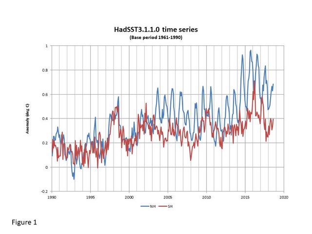
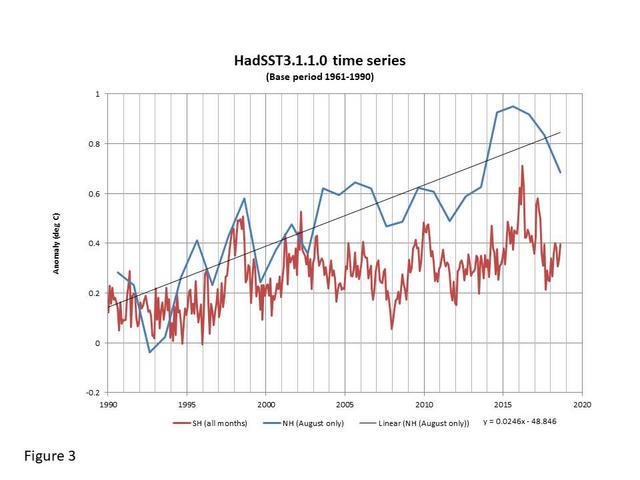
If you remove HadCRUT4 from your plot just for clarity, you should see something even more surprising. The reason that HadSST3 NH shows a much higher warming rate than HadSST3 SH is a consequence of excess warming, obviously, but it is only during the summer months. The NH winter months show warming at roughly the same rate as the SH. There are issues with data coverage, but it looks like the divergence (particularly since early 2003) is real. The fact that the anomalies since then are showing major influence of the annual cycle in the NH raises other questions, but the impact is not just in overall temperature trend; it seriously contaminates the short term signal due to ENSO as well.
I will try to link to my plots (with apologies for the ads on Postimage):
All monthly data since 1990 (SH and NH):
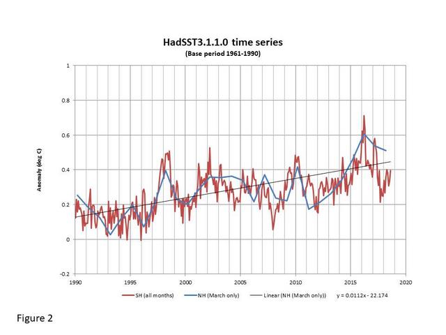
All SH data but only March values for NH:
All SH data but only August values for NH:
Jim
Thanks very much for the reply.
But this leaves me even more puzzled.
I thought it was earth. You say it is the sun.
What happens if you check January (SH – summer)
Jim. Thx so much for ur comment. But nog it leaves me more puzzled. What happens if you look at SH January results to SH or NH?
Puzzled is good! At the end of the day that is surely why most of us are here. We want to learn and we know that the view that the “science is settled” is rubbish.
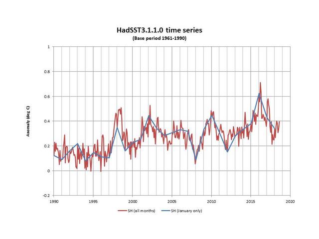
I did not say specifically that “it is the sun”, but your inference is valid … what else could it be? I am a bit reluctant to jump in too deep yet as I have been looking at HadSST3 for a while now and there are a lot of “issues” that make me uncomfortable. I will take a closer look at SH January tomorrow, but a quick look suggests that it is more strongly influenced by ENSO, which seems to “peak” (high or low) around January. Look at 2008 for the response to La Niña, for example.
henryp,
Hopefully, this is what you were looking for. First, SH all months with SH January only:
Second, NH all months with SH January only:
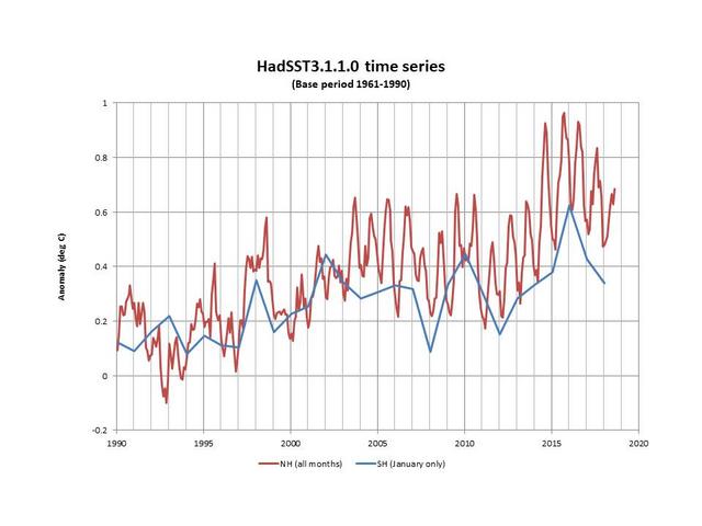
TBH, I don’t see this adding much information but would be interested in any feedback. The NH winter months (whether January or March) show the same sort of growth rates as the SH. The January SH data is strongly reflective of ENSO, a well-known correlation.
What is not shown here is the fact that the NH divergence caused by the increased impact of the seasonal cycle beyond that captured in the base period (1961-1990) only dominates from 50/60N northwards. This is exactly in line with the plots shown by Willis here:
https://wattsupwiththat.com/2019/07/21/the-charney-report-revisited/
He shows both satellite data and HadCRUT, the latter being a combination of HadSST and land data. At least one question must be to what extent is land temperature data driving the increased warming trend in higher latitudes versus the impact of the sea surface data. I believe that the approach of disaggregating global trends into land/sea data, seasons and latitude bands is hugely important in trying to understand the process(es) behind the warming.
Hi Jim
Very interesting!!
At this stage one has to realize that there are 4000 stations sampled in the NH and only 400 in the SH. Never mind the fact that in this 4400 sample there obviously is no balance in latitude, like I had in my sample;
I also suspect that there are very few stations sampled at the high latitude in the SH (or should I say: very low latitude; very confusing\ with the + and -)
Assuming my results are correct, (I showed them somewhere earlier up the thread), we are currently already in a period of global cooling. If so, it follows that as the temperature differential between the poles and equator grows larger due to the cooling from the top, very likely something will also change on earth. Predictably, there would be a small (?) shift of cloud formation and precipitation, more towards the equator, on average. At the equator insolation is 684 W/m2 whereas on average it is 342 W/m2. So, if there are more clouds & rain in and around the equator, this will amplify the cooling effect due to less direct natural insolation of earth (clouds deflect a lot of radiation). Furthermore, in a cooling world there is more likely less moisture in the air, but even assuming equal amounts of water vapour available in the air, a lesser amount of clouds and precipitation will be available for spreading to higher latitudes. So, a natural consequence of global cooling is that at the higher latitudes it will become cooler in winter and warmer and drier in summers.
Hence, somehow your results do make sense to me now. In summer there will be more sun hours at the [higher] latitudes and because we have many more stations recording at the higher lats in the NH it explains the results you are getting now….
You get it it, too?
Again, I say, that all of this will not free us of the natural climate change, i.e big droughts coming up, at the high lats, just about now… (Click on my name to read my report on that)
Henry,
Your reference to the distribution of stations between the northern and southern hemispheres indicates that you are discussing land-based observations. Sea surface temperature data do not have quite the same distribution problem, but they certainly do suffer from a number of sources of potential bias.
Sorry Jim. Yes I was still referring to HadCrut4 which, in any case, was showing an extraordinary correlation with the NH SST, albeit not exactly in tandem. I thought the heat might come from below but now you have convinced me otherwise.
It is just such a pity that nobody realizes that all their estimates of energy coming in are wrong.
IOW
HadCrut4 is wrong because the stations sampled are not balanced to zero latitude & chosen 70% @sea and 30% @in-land. The sats are probably also wrong. I think they have underestimated what is coming down from the sun at the moment and what is busy deteriorating their instruments. Obviously the lower the solar polar magnetic field strengths, the more of the most energetic particles are coming lose from the sun. Earth is defending us from these particles by forming ozone, N-oxides and peroxides. In its turn, this changes the atmosphere, TOA. And hence it is globally cooling.
It is all one big paradox, is it not? The sun gets hotter and we are getting cooler. But that is the reason why we exist…..the earth’s atmosphere is our first defense.
Hence, do not go to Mars before you have created some kind of atmosphere.
No problem, Henry.
I have only investigated HadSST3 in any detail and I have no idea how they merge the land and sea surface data to get HadCRUT4. When I get some time …
Anyway, thanks for your feedback.
Or something more fundamentally physically related to the collection and selection of the data to be processed.
michael
There are certainly many issues with climatological data, most of which have been addressed here on WUWT. However, the person most acquainted with the BEST data isn’t defending it. In his typical manner of ‘drive-by’ criticisms, he drops in to make an unsupported claim of “Wrong,” and then disappears into the ether.
My coefficient of variation plots show an abrupt offset in the Tmax and Tmin around 1908 that I strongly suspect is evidence of a bad splice in data sets. Not a peep out of the person who should be quickest to notice that. Might there be other more subtle errors in the data processing? The science can only be as good as the data available to work with.
1934 had the same solar driver type as the heatwaves of 1948-49, 1976, 2003, and 2017-18.
https://www.linkedin.com/pulse/major-heat-cold-waves-driven-key-heliocentric-alignments-ulric-lyons/
Note that as Tmax goes down, Ozone (& others) goes up.
1990? 1995?
@ur momisugly Jim Ross
thanks for a very illuminating discussion.
God bless you all.
Hi Clyde
I was impressed by your post.
I downloaded the data sets and did some initial data exploration in Python.
If you are interested, you can find my musings at https://thatsenoughofthat.com/2019/09/13/python-analysis-berkley-earth-surface-temperature-data-set-bubble-gum-data/
Finn
Thank you for sharing. It was interesting to see what you have done. Throughout my career I have programmed in Fortran, several dialects of Basic, Lisp, and Turtle Graphics. However, once I started using spreadsheets, I just walked away from the other languages. I’ve thought about learning Python, but I’m reluctant to invest the time. I don’t have many years left to get proficient.
The K-Means clustering was interesting in that it suggests there are distinct periods of time in which the temperatures are different from the other periods.
You asked some questions, which I’ll try to answer quickly.
1) For the more aggregated sets, Mosher averages (arithmetic mean) the Tmax and Tmin daily values for monthly and longer periods of time. However, the base period is actually a mid-range value of Tmax and Tmin, not a true mean; the mid-range values are then averaged to create a 30-year average. The various anomalies available in other BEST data sets are the difference between the baseline average mid-range values and the monthly (or annual) Tmax and Tmin.
2) There are historical data sets going back well before 1880. I think that Mosher’s claim to fame is finding and splicing these data sets together. He shows much larger uncertainties for the early data. However, I don’t know how he determines the uncertainties.
3) The temperatures have been converted to ‘anomalies’ for purposes of interpolation and infilling of missing data. It is one of the more controversial practices of climatology.
4) I don’t know the reason for the change in slope around 2000. The increase in CO2 has been a fairly smooth exponential growth, so jumps must be attributed to something else. This is one of the issues that I was exploring. If CO2 is the ‘control knob’ on temperature, how does one explain abrupt changes?
As to the confidence interval for 1883, the best I can suggest for you is to look at one of the monthly data sets to at least get a feeling for the magnitude of uncertainties he is assigning. Some of the data sets have been plotted, saving you the trouble of doing it yourself.
Finn
You asked about the calculation of uncertainties in the BEST data sets. Take a look at this:
https://www.scitechnol.com/2327-4581/2327-4581-1-103.pdf
Hi Clyde,
Thanks for that. I haven’t had time to go through the paper in detail, but using KNA to analyse the data is an interesting concept. I first used it in the early 90’s in geological modelling to create block models of coal seams. I preferred Delauney triangulation mainly because coal is fairly straight forward to model. In highly faulted areas, kriging was slightly better in calculating coal to overburden rations for mine planning.
In the real world, confidence intervals can be highly misleading and misused. I tried to explain to my son, an AGW believer, that, although I have 95% confidence that some bloke at the bar is between 45 and 55, I have only 5% confidence that he is 51.
I also noticed a paper in WUWT today https://wattsupwiththat.com/2019/09/15/unlocking-pre-1850-instrumental-meteorological-records-a-global-inventory/ which is relevant to your reply above.
As an aside, I understand your use of spreadsheets. Excel and the likes of Tableau and Power BI are wonderful tools. But..
It is more easy to make mistakes in a spreadsheet.
Sometimes impossible to find the mistakes.
Calculations are horrendously tedious to construct.
Calculations can be obfuscated by using undefined variables.
Difficult to run ‘while’ loops without adhoc Basic code.
Calculations and results are hard to critique.
Limited data analysis methods.
….
At the end it boils down to what you are comfortable with. Try Jamovi. It’s a spreadsheet style interface to R.
Many thanks for the link, Clyde.