Guest essay by Kip Hansen
 What we call a graph is more properly referred to as “a graphical representation of data.” One very common form of graphical representation is “a diagram showing the relation between variable quantities, typically of two variables, each measured along one of a pair of axes at right angles.”
Here at WUWT we see a lot of graphs — all sorts of graphs of a lot of different data sets. Here is a commonly shown graph offered by NOAA taken from a piece at Climate.gov called “Did global warming stop in 1998?” by Rebecca Lindsey published on September 4, 2018.

I am not interested in the details of this graphic representation — the whole thing qualifies as “silliness”. The vertical scale is in degrees Fahrenheit and the entire range change over 140 years shown is on the scale 2.5 °F or about a degree and a half C. The interesting thing about the graph is the effort of drawing of “trend lines” on top of the data to convey to the reader something about the data that the author of the graphic representation wants to communicate. This “something” is an opinion — it is always an opinion — it is not part of the data.
The data is the data. Turning the data into a graphical representation (all right, I’ll just use “graph” from here on….), making the data into a graph has already injected opinion and personal judgement into the data through choice of start and end dates, vertical and horizontal scales and, in this case, the shading of a 15-year period at one end. Sometimes the decisions as to vertical and horizontal scale are made by software — not rational humans — causing even further confusion and sometimes gross misrepresentation.
Anyone who cannot see the data clearly in the top graph without the aid of the red trend line should find another field of study (or see their optometrist). The bottom graph has been turned into a propaganda statement by the addition of five opinions in the form of mini-trend lines.
Trend lines do not change the data — they can only change the perception of the data. Trends can be useful at times [ add a big maybe here, please ] but they do nothing for the graphs above from NOAA other than attempt to denigrate the IPCC-sanctioned idea of “The Pause”, reinforcing the desired opinion of the author and her editors at Climate.gov (who, you will notice from the date of publication, are still hard at it hammer-and-tongs, promoting climate alarm). To give Rebecca Lindsey a tiniest bit of credit, she does write “How much slower [ the rise was ] depends on the fine print: which global temperature dataset you look at”…. She certainly has that right. Here is Spencer’s UAH global average lower tropospheric temperature:

One doesn’t need any trend lines to be able to see The Pause that runs from the aftermath of the 1998 Super El Niño to the advent of the 2015-2016 El Niño. This illustrates two issues: Drawing trend lines on graphs is adding information that is not part of the data set and it really is important to know that for any scientific concept, there is more than one set of data — more than one measurement — and it is critically important to know “What Are they Really Counting?”, the central point of which is:
So, for all measurements offered to us as information especially if accompanied by a claimed significance – when we are told that this measurement/number means this-or-that — we have the same essential question: What exactly are they really counting?
Naturally, there is a corollary question: Is the thing they counted really a measure of the thing being reported?
I recently came across an example in another field of just how intellectually dangerous the cognitive dependence (almost an addiction) on trend lines can be for scientific research. Remember, trend lines on modern graphs are often being calculated and drawn by statistical software packages and the output of those packages are far too often taken to be some sort of revealed truth.
I have no desire to get into any controversy about the actual subject matter of the paper that produced the following graphs. I have abbreviated the diagnosed condition on the graphs to gently disguise it. Try to stay with me and focus not on the medical issue but on the way in which trend lines have affected the conclusions of the researchers.
Here’s the big data graph set from the supplemental information for the paper:
Note that these are graphs of Incidence Rates which can be considered “how many cases of this disease are reported per 100,000 population?”, here grouped by 10-year Age Groups. They have added colored trend lines where they think (opinion) significant changes have occurred in incident rates.

[ Some important details, discussed further on, can be seen on the FULL-SIZED image, which opens in a new tab or window. ]
IMPORTANT NOTE: The condition being studied in this paper is not something that is seasonal or annual, like flu epidemics. It is a condition that develops, in most cases, for years before being discovered and reported, sometimes only being discovered when it becomes debilitating. It can also be discovered and reported through regular medical screening which normally is done only in older people. So “annual incidence” may not a proper description of what has been measured — it is actually a measure of “annual cases discovered and reported’ — not actually incidence which is quite a different thing.
The published paper uses a condensed version the graphs:

The older men and women are shown in the top panels, thankfully with incidence rates declining from the 1980s to the present. However, as considerately reinforced by the addition of colored trend lines, the incident rates in men and women younger than 50 years are rising rather steeply. Based on this (and a lot of other considerations), the researchers draw this conclusion:

Again, I have no particular opinion on the medical issues involved…they may be right for reasons not apparent. But here’s the point I hope to communicate:

I annotate the two panels concerning incidence rates in Men older than 50 and Men younger than 50. Over the 45 years of data, the rate in men older than 50 runs in a range of 170 to 220 cases reported per year, varying over a 50 cases/year band. For Men < 50, incidence rates have been very steady from 8.5 to 11 cases per year per 100,000 population for 40 years, and only recently, the last four data points, risen to 12 and 13 cases per 100,000 per year — an increase of one or two cases [per 100,000 population per year. It may be the trend line alone that creates a sense of significance. For Men > 50, between 1970 and the early 1980s, there was an increase of 60 cases per 100,000 population. Yet, for Men < 50, the increased discovery and reporting of an additional one or two cases per 100,000 is concluded to be a matter of “highest priority” — however, in reality, it may or may not actually be significant in a public health sense — and it may well be within the normal variance in discovery and reporting of this type of disease.
The range of incidence among Men < 50 remained the same from the late 1970s to the early 2010s — that’s pretty stable. Then there are four slightly higher outliers in a row — with increases 1 or 2 cases per 100,000. That’s the data.
If it were my data — and my topic — say number of Monarch butterflies visiting my garden annually by month or something, I would notice from the panel of seven graphs further above, that the trend lines confuse the issues. Here it is again:
[ full-sized image in new tab/window]
If we try to ignore the trend lines, we can see in the first panel 20-29y incidence rates are the same in the current decade as they were in the 1970s — there is no change. The range represented in this panel, from lowest to highest data point, is less than 1.5 cases/year.
Skipping one panel, looking at 40-49y, we see the range has maybe dropped a bit but the entire magnitude range is less than 5 cases/100,000/year. In this age-group, there is a trend line drawn which shows an increase over the last 12-13 years, but the range is currently lower than in the 1970s.
In the remaining four panels, we see “hump shaped” data, which over the 50 years, remains in the same range within each age-group.
It is important to remember that this is not an illness or disease for which a cause is known or for which there is a method of prevention, although there is a treatment if the condition is discovered early enough. It is a class of cancers and incidence is not controlled by public health actions to prevent the disease. Public health actions are not causing the change in incidence. It is known to be age-related and occurs increasingly often in men and women as they age.
It is the one panel, 30-39y , that shows an increase in incidence of just over 2 Cases/100,000/year that is the controlling factor that pushes the Men < 50 graph to show this increase. (It may be the 40-49y panel having the same effect.) (again, repeating the image to save readers scrolling up the page):
Recall that the Conclusion and Relevance section of the paper called this “This increase in incidence among a low-risk population calls for additional research on possible risk factors that may be affecting these younger cohorts. It appears that primary prevention should be the highest priority to reduce the number of younger adults developing CRC in the future.”
This essay is not about the incidence of this class of cancer among various age groups — it is about how having statistical software packages draw trend lines on top of your data can lead to confusion and possibly misunderstandings of the data itself. I will admit that it is also possible to draw trend lines on top of one’s data for rhetorical reasons [ “expressed in terms intended to persuade or impress” ], as in our Climate.gov example (and millions of other examples in all fields of science).
In this medical case, there are additional findings and reasoning behind the researchers conclusions — none of which change the basic point of this essay about statistical packages discovering and drawing trend lines over the top of data on graphs.
Bottom Lines:
- Trend lines are NOT part of the data. The data is the data.
- Trend lines are always opinions and interpretations added to the data and depend on the definition (model, statistical formula, software package, whatever) one is using for “trend”. These opinions and interpretations can be valid, invalid, or nonsensical (and everything in between)
- Trend lines are NOT evidence — the data can be evidence, but not necessarily evidence of what it is claimed to be evidence for.
- Trends are not causes, they are effects. Past trends did not cause the present data. Present data trends will not cause future data.
- If your data needs to be run through a statistical software package to determine a “trend” — then I would suggest that you need to do more or different research on your topic or that your data is so noisy or random that trend maybe irrelevant.
- Assigning “significance” to calculated trends based on P-value is statistically invalid.
- Don’t draw trend lines on graphs of your data. If your data is valid, to the best of your knowledge, it does not need trend lines to “explain” it to others.
# # # # #
Author’s Comment Policy:
Always enjoy your comments and am happy to reply, answer questions or offer further explanations. Begin your comment with “Kip…” so I know you are speaking to me.
As a usage note, it is always better to indicate who you are speaking to as comment threads can get complicated and comments do not always appear in the order one thinks they will. So, if you are replying to Joe, start your comment with “Joe”. Some online periodicals and blogs (such as the NY Times) are now using an automaticity to pre-add “@Joe” to the comment field if your hit the reply button below a comment from Joe.
Apologies in advance to the [unfortunately] statistically over-educated who may have entirely different definitions of common English words used in this essay and thus arrive at contrary conclusions.
Trends and trend lines are a topic not always agreed upon — some people think trends have special meaning, are significant, or can even be causes. Let’s hear from you.
# # # # #
A trend is only useful when measuring a physical cause, e,g. I did a physics experiment at university to calculatie the heat conductivity of sand.
Also… Velocity gradients, production decline curves, any variables that exhibit mathematical functions.
Placing/analyzing a particular sample within a well defined relationship, based on understood, consistent, physical properties is somewhat different than making a claim, or projection, about something dependent upon many poorly understood variables, such as wide scale temperatures surface temperatures, sea level changes, and other sacred tenants of climate science, no?
Of course it is… Which is why you should rarely plot a graph without trend line analyses… 😉
AndyHce ==> ah, at last, someone who understands the difference!
Kip
Makes you wonder why Excel has a trend function (-:
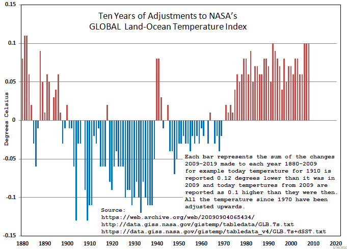
Here’s two graphs one with and one without a trend line:
NASA 2019 minus 2009 Data
NASA Trend Comparison 1997-2018
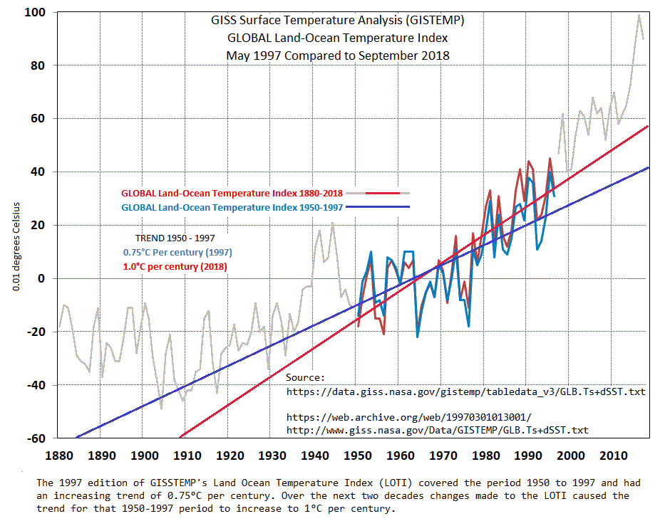
One graph requires a trend line to see the difference, and looks like your point is that an increase of 0.25 deg C in 100 years is just that, 0.25 deg and so what.
The other graph shows a pattern that looks suspicious.
Steve ==> Gotta say that the graph with trend lines is a good illustration of the problem.
Kip
One problem seems to be that one shouldn’t make a big deal about 0.25 deg/century. OK
The issue not addressed is the pattern of changes. That graph don’t need no stinking trend line.
Both graphs address the same issue, every month NASA’s LOTI changes over 40% (1st 6 mo of 2019) of their monthly entries and over time it has produced that pattern. So, is that a probloem?
You could readily create an ‘uptrend’ by taking data calculated from a sinusoidal expression, i.e. y = a sin x, start it at a trough and finish it near a crest and hey presto, the end of the world is upon us!!
Don’t draw trend lines on graphs of your data. If your data is valid, to the best of your knowledge, it does not need trend lines to “explain” it to others.
Are you opposed to publishing calibration curves? Using the functions fit to instrument calibration data? How about age-related reference regions for diagnostic interpretation of lab results?
To me, this is roughly equivalent to staying home when the advice is to “drive carefully!”
What do you think about nonlinear transforms of the data, for example to make log-log plots?
Matthew R Marler ==> “Calibration curves” are not “trend lines” — they just look like a trend line.
See some of my replies above, and the links to the Button Collector series and my replies below those essays.
Kip Hansen: “Calibration curves” are not “trend lines”
I disagree. They are generally estimated via least squares, same as most other trend lines. There may or may not be tests of linearity and homogeneity of variance, but they are trend lines.
None of my electronic equipment is evaluated using least square curve fitting. The calibration curve is determined by comparison of my instruments against a known calibration instrument or element. The curve thus generated is the calibration curve. If at some point my instrument deviates a large amount from the calibration standard due to non-linear factors just happening to coincide then the calibration curve goes through that point, it is not ignored.
Tim Gorman: None of my electronic equipment is evaluated using least square curve fitting. The calibration curve is determined by comparison of my instruments against a known calibration instrument or element.
Measuring instruments are always calibrated against something. It is the calibration curve that allows the value of the measured quantity (pH, volts, temperature) to be calculated from the indicator (usually current flow, but could be mercury extent in a common thermometer) — from the inverse of the calibration curve. Your phrase “comparison of my instruments” hides all the details of what “comparison” is actually carried out — most likely a least squares fit to the (possibly log or log-log transformed) calibration data. Your electronic measuring instruments have a calibration curve (or curves, along with expected accuracy) that may be supplied in the paperwork that is in the boxes the devices came in, or may be obtainable from the manufacturer.
“It is the calibration curve that allows the value of the measured quantity (pH, volts, temperature) to be calculated from the indicator (usually current flow, but could be mercury extent in a common thermometer) — from the inverse of the calibration curve.”
I’m not even sure what you are saying here. The value of the measured quantity is not calculated from the inverse of the calibration curve. The calibration curve gives an adjustment factor to be applied to the instrument reading. If my power meter reads 1db low at 144Mhz according to the calibration curve then I must add 1db to my reading in order to have an accurate measurement.
“Your phrase “comparison of my instruments” hides all the details of what “comparison” is actually carried out — most likely a least squares fit to the (possibly log or log-log transformed) calibration data.”
I’m not even sure we are talking about the same thing. Calibration is done by applying a standard input to my equipment and to the calibration standard equipment. The difference then becomes the next point on the calibration curve. There is no “least squares fit”. The calibration curve goes through all the points that are measured for calibration. If you don’t do that then there isn’t much reason to calibrate your instrument against a standard.
Tim Gorman: I’m not even sure we are talking about the same thing. Calibration is done by applying a standard input to my equipment and to the calibration standard equipment.
I am sure that we are not talking about the same thing. My Micronta 43-Range Multitester displays the result of the measurement via a needle that swings in an arc from left to right. What is literally driving the needle is the magnetic field generated by the flow from a coil. To get the numbers on the dial, the developers put known standards to the test, and for the known standards marked the appropriate values on the dial (actually, the process is more complicated, but that’s the gist of it). They used 10 – 20 standards in the range. Points on the dial between the marked standards were interpolated. There is then a function relating the standard value to the magnetic field strength. Developing that function is what I mean by “calibration” of the measurement instrument. Inferring the value of the measured attribute from the position of the needle is effectively reading the inverse of the value of the magnetic field strength.
For an HPLC to measure a blood constituent, the standards are vials filled with aliquots that have known quantities of the analyte. The result of the HPLC run is the function relating the known concentrations to the area under the curve of the absorption function (or perhaps the maximum of the absorption function — n.b. it is the absorption function, smoothed data, not the raw absorption data). Then the area is computed for a sample of unknown concentration, and the functional inverse of that is used as the estimate of the measured quantity.
What you have described to me reads like “adjustments to the calibration curve”, which is probably perfectly well shortened, in this context, to “calibration”. Or you have some other well-defined usage for your setting.
“There is then a function relating the standard value to the magnetic field strength. Developing that function is what I mean by “calibration” of the measurement instrument.”
The magnetic field strength will vary from instrument to instrument for various physical reasons. You *must* develop a calibration curve for each instrument individually by determining the difference between the instrument readings and the readings of a standard.
This has *nothing* to do with doing a linear regression of data points as was initially proposed. Not even *your* description has anything to do with developing a linear regression of the data points! Interpolation is not regression.
If your absorption function does not match the data exactly then integrating the function to find the area under the curve winds up with an error bar all of its own related to the error bars associated with the measurement of the data.
“estimate of the measured quantity.” The operative word here is “estimate”. Calibration of measurement devices is meant to provide for eliminating “estimating”.
Tim Gorman: If your absorption function does not match the data exactly then integrating the function to find the area under the curve winds up with an error bar all of its own related to the error bars associated with the measurement of the data.
That is true. You have error either way, and the maximum or area computed from the fitted curve will have smaller mean square error than the area computed from only the data — if the model fits well enough, which can generally be checked.
But if you only use data in calibration, not the model, you restrict your calibration to the subset of values actually used in the calibration, not the full range of expected values.
Interpolation is not regression.
Do you do “linear” interpolation, based on a straight line fit to two data points?
You *must* develop a calibration curve for each instrument individually by determining the difference between the instrument readings and the readings of a standard.
If you do this with a subset of values, and then apply it to the full range of values expected to be encountered, then you are developing a calibration curve relating the new instrument to the “gold” standard. What you use in practice is the full calibration curve (which may be a higher order polynomial or sum of exponentials or b-spline approximation, or something from other families of functions), not just the relatively few values tested.
Kip Hansen: “A trend line (also called the line of best fit) is a line we add to a graph to show the general direction in which points seem to be going.”
“The line of best fit” gives away the story. How is “best” determined, least squares? “Best” among what — best low order polynomial, best among 2-compartment diffeqn models, best exponential decay model, best subject to continuity or parsimony constraints, etc?
Trend lines can not be depended on to predict the future accurately, but if you are trying to predict the future at least approximately, then you depend on the trend line, not the data.
Your cautionary remarks are the usual cautionary remarks about “believing” the trend line of a single data set without testing. There is no good case that trend lines should always be avoided.
Matthew ==> If you are following comments here, you see many examples in which trend lines obscure data — there are plenty of reasons for avoiding simplistic trend lines, given in this essay and in the essays I have linked in comments.
Kip Hansen: you see many examples in which trend lines obscure data
Sure.
Everything that can be done well can be done badly, including graphing trend lines. The solution is not to abjure trend lines altogether, but to use them thoughtfully.
What you are doing is “throwing the baby out with the bathwater.”
Matthew ==> I have specifically denied “throwing the baby out with the bath water” in the Epilogue above.
Kip Hansen: I have specifically denied “throwing the baby out with the bathwater”
Then you need to rewrite this: Don’t draw trend lines on graphs of your data. If your data is valid, to the best of your knowledge, it does not need trend lines to “explain” it to others.
Otherwise the denial is hollow.
My advisor told me, that absent very good data, in special cases, anyone making log-log plots should be shot.
It is too easy to hide the noise or scatter.
a_scientist -==> Less Stalinisticly , they can be re-educated.
a_scientist: absent very good data, in special cases, anyone making log-log plots should be shot.
That’s absurd. They are just one of many transforms of the data that may be informative beyond merely eyeballing the raw data.
Kip Hansen said:
Exactly 100% Absolutely Wrong!
The trend line is derived 100% exactly from the data. The information represented by the line comes from nowhere else.
Allow me to explain.
The Situation In One Dimension:
We have a set of numbers, all measurements of the same thing. We have simply conducted our measurement multiple times so as to generate an average of some sort. There is much information in the whole data set. Maybe we care, maybe not.
A) We report the mean. It is the figure of merit and all we care about. What is lost is any information about the dispersion of the individual points about the mean. We do not care.
B) We report the mean and standard deviation. Some information about the dispersion is retained, some is lost. For instance, there may be a tendency for the measurements to systematically increase as the experiment proceeds. This will be lost.
C) We report the mean, standard deviation, and sample size, which is the best condensation we can typically do. Of this is still not good enough, no sense trying to condense the data, back to the raw data you go.
In all cases, no information is magically added to the system. Just the opposite, information is discarded for the sake of brevity.
The Situation In Two Dimensions:
The case, and issues are the same. The mean becomes the slope and intercept. Two values instead of one.
A) Just the same as above, slope and intercept reported, dispersion lost.
B) Just the same as above, slope, intercept, and confidence intervals reported.
C) A Little Different! Show all the Raw Data AND the summary Trend Line. Keep everybody happy.
100% of the data and the information contained within is displayed. No information is discarded, and none is magically conjured up ad added.
TonyL ==> If only it was that simple. Of course, the trend is derived from the data.
The practical problem is we never have all the data, there are start points and end points — there is the matter of scale — which definition and formula for trend we might use — there are a lot of variables and thus your decision to use and show one of them is an OPINION about the data, even if it is derived from the data.
The statistical mean is not a trend line — it is the statistical mean. It may or may not be useful. In multiple measurements of one unchanging thing — it is how we reduce measurement error.
Your 2-D example only works for trivial situations — like mechanical processes with short simple data sets.
For physics problems, sometimes a “slope” can be useful information — a “slope” is not exactly the same as statistical trend line laid over a set of data — but looks like one.
So which bit of the data describes the beginning and end of the trend lines?
I honestly do not even know what you are attempting to say, you seem to be so far off the point.
So how do we determine the end points of a trend line?
The mathematician tells us that a point is infinitely small, and also that a line is an infinite collection of points. We also find out that a line extends infinitely in both directions.
We know that a line is fully and uniquely described by the slope and the intercept. Nothing else is needed. A line does not have endpoints, nor does it does not need them.
If your trend line is truly a line, it has the above described properties of a line. If your trend line has endpoints, it may be because you added them.
TonyL ==> Any trend line derived for an existing data set is ONLY valid for the data points known. the trend is the trend of the existing data — not of unknown past data and not of unknown future data.
Fooling around with the geometrical definition of “a line” does not change that, That’s just silliness.
Past performance is no guarantee of future results. Corrolary: short term trends can become long term trends, how does linear regression capture this?
Tim == Trends only inform us about data already known.
I’ll make it simpler.
There are numerous trend lines on the temperature graph. It is an editorial decision – a political decision – to choose that many trend lines.
You could just draw a straight line over the whole data set. But that is making a choice that the data is homogenous and no new factor has come into play over that period. That choice is not in the data.
You could draw inflexions when something changes, such as the moon entering the house of Aquarius. But choosing to prioritise astrology is again, not in the data set.
Now, you are clearly fluent in the language of statistics; you know your stuff. But that means you can understand the ‘words’ even when they are untrue.
And you seem to not realise that you are being misled.
Ah, I see. I honestly did not see what you were getting at.
If you want to be this strict about it then still no, I am merely accepting the null hypothesis of no change. This is not making a decision and adding information to the data set.
If I were to break the data set into two or more portions, and plot two or more trend lines, then yes, I have added to the system. I am well aware of that. Whenever anybody does that, the howls and cries of “Cherry Picking” bombard your ears. You have to be ready for that. So you are correct for a split graph. But I would never claim that all the information is contained within the data for a split graph.
Nick: “A) We report the mean. It is the figure of merit and all we care about. What is lost is any information about the dispersion of the individual points about the mean. We do not care.”
Of course we care. If what you have determined is the mean length of 1000 steel girders then the dispersion of the individual points about the mean is *very* important and we *very* much care about it!
TonyL The trend line is derived 100% exactly from the data. The information represented by the line comes from nowhere else.
I would not say it that way. Information is provided from other research showing that some member of a parameterized family will fit the data well, and that the specific estimated parameter is physically meaninful. With radioactivity counts, for example, the linear trend estimated from the log-transformed data can be transformed to the half-life of the sample. Likewise for the terminal portion of a concentration curve from a pharmacokinetic experiment; parameters from the fit of a compartment model can used to devise a dosing schedule for experiments on the efficacy of the drug.
Kip Hansen’s essay does not distinguish between fields where such evidence of applicable models has been verified, fields where verification has barely begun, and fields where no such verification has been done but the experiment under consideration may be a pathfinder in the field.
Before even arriving at meaningful trends, you need accurate enough and consistent enough data over a “long enough” interval.
Prior to the 1940’s we don’t know what Global Average Temperatures were with a high enough accuracy to calculate trends as accurately as they are often stated.
Prior to the 1940’s there wasn’t enough data to know the 1° Grid temperatures of over 75% of the world to with better than +/- 2 C accuracies…if that. For 3/4 of the world, it was all extrapolations and guesswork. Prior to 1920 it was considerably worse. With that level of uncertainty there is no way to append the old data onto the better new data to generate meaningful trends for the last century.
The minimum temporal interval for discussing climate is 30-50 years FOR INDIVIDUAL DATA POINTS. Noise from decades long ocean and air circulation cycles and decades long energy transfer lags define about a half century interval FOR Detecting ANY CLIMATIC CHANGES…let alone trends…else we are really only talking about weather trends.
UAH GAT’s have risen 0.28 C the last 30 years. Or 0.09 C per decade. The previous 30 years (cludged together with far less certain data sources) the GAT’s rose 0.19 +/- 0.09 C. For the 30 years prior to that (1928-1958), the data is too sparse and too uncertain to produce any meaningful trend values. “Meaningful” here being trends accurate to +/- 0.25 C per decade for INCLUSION IN THE DISCUSSION about trends in the GAT.
So, we really only have 2 useful data points and one of those is “shaky” for CLIMATIC trends (60 to 100 years for 2 or 3 points) in GAT’s. The average of this insufficiently small data set indicates a century trend in GAT of less than + 1 C.
DocSiders ==> Shaky is a good word — and I agree. Wait til yu read the new SLR Acceleration paper!
Temperature can be considered an output variable of the climate system and is dependent on many input variables. Any scientific analysis of the trend in an output variable must include analysis of the input (KIVs) variable(s) having the most impact on the output variable to provide a complete picture of observed trend.
While determining statistical trends in data is sometimes necessary, it is important to keep in mind the confidence in the estimated trend. Usually when working with continuous data (e.g. temperature), 25 to 30 data points are necessary to establish a confidence estimate of 95% that you are seeing a true behavior in the output data. In the temperature data example, the use of 15/point trends significantly reduces the confidence that you’re seeing a true behavior in the data (as this particular data set clearly shows).
Joel Brown ==> When one does not know the cause of the measured data — then the trend of the existing data does not inform us of anything not already apparent in the data — the set starts at 1 then 2 then 3 then 10 then 5 then 8 then 9 then 2……one could draw a trend line — which will tell you nothing other than what the data did in the past seven measurement periods — but you already knew that. You only need look at the graph….
The trend, calculated from sufficient data points, only tells you what the system being measured did over the period covered by those data points — and I repeat — that is something you already know because you have the data points.
Trend lines are useful for addressing clearly defined questions.
The questions need to be clearly defined so as the viewer can then consider of the trend line is:
A) Important.
B) Pertinent.
C) Significant.
If the question isn’t important the trend won’t be.
If the trend line doesn’t relate to the question then the trend line won’t be pertinent.
If the data doesn’t support the trend line sufficiently for the question being addressed then it’s meaningless.
The question being asked in the climate data is about the Pause and can be written as:
“Has there been any Global Warming in Greta Thunberg’s lifetime?”
When you know what the question is you can judge whether the trend lines are fit for purpose.
M Courtney ==> Your Greta question is answered by simply by listing or graphing the data from her birth date to present — then look at it. It is either warmer now or not. But your real question is not so simple….you want some kind of statistically determined “trend” line to tell you “has it been getting warmer”… even though you have access to the original data.
If the data itself can’t tell you by simple looking — then you are asking a question that maybe the data can’t really honestly tell you.
By most measures, the “global average surface temperature” (as measured and manipulated) is higher now than 16 years ago…marginally.
What you have noticed is the irony of the word “Significant”.
Statistically the graph is asking a question that the data can’t really honestly tell you.
But that assumes the graph was created with “really honestly” being a consideration. Not necessarily so.
M Courtney ==> The issues involved in “most research findings are false” and that some CliSci practitioners are advocates first is not the topic of this essay…. 🙂
Point taken. I wasn’t directly on the point of the essay. Nor was I first though.
Yet, as the topic of this essay was why trend lines are didactic and illustrative I thought that summarising when being didactic is acceptable would be helpful.
Not in the case you used for example.
Flow charts can also be misleading and/or useless.
Hey Kip,
Part of the ‘replication crisis’ in some branches of science is misuse of statistical techniques. For instance, small change in a treatment of outliers may lead to different conclusions.
This ‘pause’ in global warming is interesting. As such it contradicts severity of the greenhouse effect – despite steady increase of CO2, what supposedly should lead to proportional retention of thermal energy in the atmosphere, we did not observe increase in averaged ‘global’ temperature. I can see at least two possible explanations:
1. Another large-scale physical effect temporarily contracted greenhouse effect. The question is then why not attribute most of the observed warming to such naturally occurring effects, other than greenhouse effect?
2. Local events skewed averaged ‘global’ temperatures, dragging it down. In such case we should ask for the detailed ‘heat map’. Again, the question would be why chain of such local events is not responsible for most of the observed warming, pushing ‘global’ averages up?
Paramenter ==> You’ve got good questions — always the most important part of thinking about something.
The majority of CliSci researchers are trying to figure out the answers — some minority are just pushing alarmism.
Kip,
I will agree that trend lines are often misused or abused. However, they do have utility in data analysis. Perhaps the greatest value is to emphasize the “opinion” of someone making conjectures about the meaning of the data.
Succinctly, if one has a data set with a lot of scatter, and there is a need for a best guess for the Y-value at a certain X-value for which there is no measurement, the equation for the regression line gives a quantitative interpolation that is better than a visual guess. Extrapolations are more risky, but it may be the only way of predicting. Linear extrapolations are better behaved than polynomial extrapolations and may be acceptable if one has other reasons to believe that the relationship is actually linear.
Calibration curves ARE a form of regression that minimizes the effect of scatter in a set of measurements.
Clyde Spencer ==> Guessing may be important in some fields — fooling oneself that the guesses are “scientifically provided answers” is rife and unfortunate.
That said, guessing for hypothesis formulation is an important part of science — but we mustn’t confuse our guesses, no matter how much math is involved, with actual measurements and reality in the physical world.
Guessing that the Global Average Surface Temperature anomaly is XX.xx degrees C is pretentious and dangerously foolhardy. (not that you did it, of course, just an example.)
@Kip/ Michael/A C Osborn
I show another example:

Rainfall versus time. Measured at a particular place on earth, it is of course looking highly erratic measured from year to year. Not a high correlation…
But the point in showing the straight trend line was to prove a relationship over time i.e. the 87 year Gleissberg cycle.
This topic of trendlines needs a qualifier. Sometimes the data is following known physical laws and its continuation by extrapolation with trend lines is predictable. For example, oil well production follows a predictable exponential decline, as does groundwater contaminant extraction, natural attenuation and many other things. Drawing a trendline and extrapolating helps to obtain the “K” factor or half-life of the decline curve and forecast the economic limit of extraction.
S curves are common in technology waves, for example a new smart phone or digital TV resolution. At first sales are slow, then accelerate, then taper off. The trouble comes when a trend line extrapolation is used to extrapolate a phenomenon that has no tangible reason to continue to follow the trendline. To put it simply, “statistics are descriptive, not explanatory”.
Even the Hubbert curve or “peak oil” is useful as long as we keep in mind that it applies only to current technology. The old Hubbert Curve was for oil production from sandstone and limestone. Hydraulic fracturing in oil shales in horizontal wells was a major technology change, new source of oil reserves and curve disrupter. Nevertheless a new Hubbert curve should form for this relatively new technology and the old curve is still good if limited to sandstone and limestone reserves.
On the other hand, extrapolation of high dose toxicology studies to low dose remains controversial. The most difficult of all is known as the “single fiber theory” with asbestos fibers. According to the theory, if a million people were each exposed to a single asbestos fiber, there is someone out there so sensitive that they will develop mesothelioma. Or so the theory goes. This enables extrapolation down to zero exposure level. The reality is the body has defenses to keep particulates out of the lungs (sinuses, mucous, nasal hair, etc), which must be overwhelmed to induce disease, so most likely there is a minimum threshold exposure value and extrapolation to zero is invalid. The fact we can’t identify a threshold value does not mean it does not exist. Extrapolation of high dose exposures to low dose and trans-species studies (mice as surrogates for people) are done all the time. This enables us to make at least conservative estimates of toxicity. But it should be remembered that these are nothing but worst-case estimates. Occupational exposure studies are the most trustworthy toxicological studies and even then should be limited at low dose to interpolation, not extrapolation. The most ridiculous thing we do is apply a risk value of 1:100,000 adverse health consequence to a rural area where no one is exposed. Or a maximum contaminant limit to an aquifer that no one drinks.
Extrapolating a temperature trend that is known to be cyclical is risky business. Complex data usually has three components, all scale dependent, a trend (not necessarily linear), a cyclical component, and a random variation. Unfortunately, random variation (variance) is extremely high with weather compared to the others. Put simply, if the average high is 80 and the record is 110, and the average low is 50 and the record is 20, what difference will it make if the average low changes to 51? When making trend lines, different trends should be tried (linear, exponential, quadratic, step change, etc) and the highest correlation coefficient should be found. Correlation coefficients should always be stated with trend analysis.
Jim ==> I am not saying there can be no extrapolation — that is an important part of may science-based fields.
But what those extrapolations are arenot simple “trend lines” — they are projections of future values based on known and well-understood underlying “systems” (how oil wells work, how contaminants move through soils, etc. Like the projection of the trajectory of a cannon ball. Those are not TRENDS.
Jim said: Correlation coefficients should always be stated with trend analysis.
True. But even if R=0 the trend line might still say something…
https://wattsupwiththat.com/2019/08/06/why-you-shouldnt-draw-trend-lines-on-graphs/#comment-2763217
While fitting a trend, linear or otherwise, to data often involves some subjective choices, it definitely is NOT just an opinion. It is entirely an objective mathematical exercise performed upon the data. The onerous part is that few have the mathematical capability to recognize the appropriateness of their choices. Bad ones can indeed produce grossly misleading results. Contrary to William Briggs’ misguided admonition, however, good ones can reveal quantitative features that are not apparent simply by looking at the data. In either event, trend-fitting is not a proper time-series analysis tool. Almost invariably, there’s no recognition that linear (regressional) trends are very crude band-pass filters, whose desired function can be achieved far more objectively and powerfully through other analytic methods.
1sky1 ==> See https://www.xkcd.com/2048/.
You’ve read Briggs — it is not to say there there are no valid analysis tools that can be used to take a closer look at data sets.
But what we have been referring to as “trend lines” is pretty specific (with expressed examples) and not to be confused with all of that.
While your link shows various examples of curve-fitting, you deal only with linear ones. Nothing presented here truly specifies the exact nature or source of the pitfalls.
1sky1 ==> Read the links given in the essay if you’d like more background material — some are to my previous work, some to that of others.
Your links are for total laymen. They fail to get to the analytic core of the issue.
1sky1 ==> This blog is for the general public. If you want more technical discussion, you need to look elsewhere. Remember, I am talking of simple straight (sometimes curved) trend lines drawn over times series graphs.
Kip:
You continue to miss the point. Of course WUWT is for the general public. But it doesn’t require going into abstruse technical weeds to identify what the heart of the problem is with “trend lines drawn over times series graphs.” See:
https://wattsupwiththat.com/2019/08/06/why-you-shouldnt-draw-trend-lines-on-graphs/#comment-2763555
1sky1 ==> Well, I agree with Peter
1) “Trend lines are very bad signal processing technique, and belong in the same category as Mann’s attempt at signal processing resulting in bogus hockey sticks.”
2. Signal processing engineers don’t ‘draw’ trend lines, we ‘draw’ sine waves. (we probably haven’t drawn them since Fourier’s time, we calculate them).
He seems to have understood what I was talking about, and signals his agreement.
Say what you will, but Peter specifies the nature of the pitfalls in a rigorous way that you never did.
Kip,
The claim that “The data is the data” is nonsense. Take for example the temperature graph
from Dr. Spencer that you like and ask what was actually measured. The answer is the number
of electrons flowing through a wire over a period of time. If anything that is the data. Then to
get a temperature there are a large number of processing steps. Firstly the number of electrons
is converted to a voltage using a trend line (i.e. Ohm’s law) then that is converted to a photon
flux. That photon flux is then converted to a ratio of intensities at different wavelengths. Then
using another calibration curve you get a “temperature”. You then need to correct for the speed,
and height of the satellite, the angle of inclination of the sensor (so you know how much of the atmosphere
you are looking at) the time of day etc. Then the UAH group averages that over a month and releases
the final result.
Compared to all of that processing complaining about someone else drawing a straight line on top of
part of the graph seems a little silly. So unless you want Dr. Spencer to release graphs showing the
number of electrons versus time (and even time is measured in electrons if you get right down to it) you
have to accept that scientists process data all the time for valid reasons. And say “the data is the data”
is nonsense.
Izaak ==> There are a lot of reasons to question CliSci data of all sorts, and the more they have been derived from other sorts of data, the more suspect they are.
That does not change the simple fact that once presented — it is what it is. Drawing lines on it will not change it and will not (usually) give us any more information than we already had.
Trend lines are just a form of SMOOTHING data sets.
Then explain how these trend lines “smooth” the data sets.
David ==> You are conflating sophisticated data analysis mthods, which even the authors have their doubts about, with the concepts of simple trend lines discussed in this essay.
b
There’s nothing “sophisticated” about AVO trend lines. They are all linear regressions and can be used to differentiate oil from gas from brine on seismic data.
David ==> You are talking about something entirely different, and I think you know it.
Advanced statistical techniques of squeezing guesses out of existing data based on well understood physical systems (like cannon ball trajectories) are not “trend lines” even if they use the word”trend” to describe them.
I’m sure you can come up with an endless list of things that are not trend lines to support your position that ….whatever your position is….
All of the examples I cited were trend lines, Kip. Trend lines, without which the graphs would be useless.
The purpose of cross-plotting two or more variables on a graph is to determine if a mathematical relationship exists. The trend line is the mathematical relationship.
While trend lines are often misused and/or intended to deceive, this is simply ridiculous generalization: “Don’t draw trend lines on graphs of your data. If your data is valid, to the best of your knowledge, it does not need trend lines to “explain” it to others.”
Kip,
Suppose I get an undergraduate student to plot voltage against current for a
simple resistor. They will get a good approximation to a straight line. Surely in
that case plotting a trend line will tell them what the value of the resistor is. And
using that information the student will be able to predict what the value of the voltage
will be for new values of the current. Do you really want to claim that in that case a trend line is useless or that it doesn’t add anything?
Now of course not everything is as simple as a resistor. But trend lines can still be used to
extract useful information from a graph. They can also be used to mislead or can be complete nonsense (see http://www.tylervigen.com/spurious-correlations for excellent examples). But if Dr. Spencer chooses to average the UAH data over time periods of one month why shouldn’t I choose a different averaging period? What makes monthly smoothly correct while decadal smoothing wrong?
Izaak: “Suppose I get an undergraduate student to plot voltage against current for a
simple resistor. They will get a good approximation to a straight line. Surely in
that case plotting a trend line will tell them what the value of the resistor is.”
Why do you have to plot a line? R=V/I All you need is one measurement, i.e. a POINT, to determine the value of the resistor.
The trend line *is* useless and doesn’t add anything.
“Now of course not everything is as simple as a resistor. But trend lines can still be used to
extract useful information from a graph.”
Really? What useful information can be extracted from a trend line of temperature, for instance? Can it tell you what is happening in the atmosphere? What if the data used to generate the trend line is an average? Does the trend line tell you what is happening in reality? Can the trend line be extended past the last data point to give a reliable prediction?
Tim,
do you really believe that one point is sufficient for measuring the value of a
resistor? All real measurements have errors and those need to be accounted for.
Which can be done by taking different measurements and fitting a curve to them.
Again with temperatures trend lines are useful if applied correctly but can be
misleading if extended too far. Knowing the temperature in May and June might
allow me to predict the temperature in July but I would get it wrong if I tried to
extrapolate through to December.
Izaak,
Yes, I believe one point is sufficient to determine the value of a resistor. If your measuring devices have a systemic error built-in then no quantity of measurements at different points will result in a more accurate measurement of the value of the resistor. If the error is in reading the devices output (i.e. an analog scale) then you just read it multiple times using the same values for voltage and current.
“Knowing the temperature in May and June *might* allow me to predict the temperature in July” (asteriks mine, tim)
The word *might* is quite telling in your statement! If extending the trend line only *might* allow future predictions then of what use is extending the trend line? Extending the trend line and expecting it to come true just becomes an article of faith, not a scientific article of fact.
Izaak ==> Your line on the resistor graph is not a trend line — your resistor is not a time series. It is simply a visual representation of the known physical relationships involved in the formula for voltage and resistance.
The overall topic and discussion of smoothing is not part of this essay. The only link is that drawing linear trend lines across a time series graph is Ultimate Smoothing….
Can I draw a hockey stick instead them? thats not really a trend line
yarpos ==> Hate to tell ya . . . someone already did that.
Michael Mann clearly says it is a trend line and it’s his creation. 🙂
Dear Readers:
Depending on a trend line cost Dr Richard Feynman a Nobel Prize.
You can read about it in his biography.
He was attempting to participate in the discussion about what happens in “weak” decay of nuclear particles. He extrapolated from published data and ignored the last two known points.
Had he not extrapolated, he would have been first off the mark and gotten a second Nobel.
DON’T DO IT!
Graphed data is a valid approximation when used between known data points.
Almost no physical phenomena are linear. Nature isn’t like that.
The error bars outside of known measured data are all over the place.
Best story of extrapolation: Mark Twain, “Life on the Mississippi”, describing the length of the Mississippi River. Bleed-through of oxbows had resulted in a shortening of 200 miles in 100 years. So Twain projected forward and back. He ended up with New Orleans a suburb of Chicago!
Tom ==> Great stories . . . . and illustrative of some of the intent of this essay.
New Orleans and Cairo actually, Chicago not being on the Mississippi even in Twain’s day. His observation on science in this connection is well worth remembering:
“There is something fascinating about science. One gets such wholesale returns of conjecture out of such a trifling investment of fact.”
Two books:
How to Lie with Maps
How to Lie with Charts
Both have multiple editions
And Tufte’s books, on selling your position with attractive charts and graphs.
To paraphrase Benjamin Disraeli…
There are lies.
There are damn lies
And there are people who don’t understand statistics.
😉
Lost or created information. Inference, certainly, but inference from a limited, circumstantial set of data, is especially prone to misinterpretation and interpretation.
n.n. ==> You got this “especially prone to misinterpretation and interpretation.” right!
Kip ==> Good job. You pulled up one of the three types of alarmist “science” (as I classify them).
This is a Type One: Take your data set concerning a bad thing and plot a trend line (it doesn’t matter whether it is linear or some other kind). Report your mathematically valid, but in reality meaningless trend as something to be alarmed about (exaggeration is sometimes necessary in your graphical presentation, as here, but not always). Summarized as “This bad thing is increasing, be afraid. Very, very afraid. (Send us money.)”
Type Two is: Take your Type One trend line and correlate it with another thing that you think is bad. Whether it is the burning of fossil fuels, or consumption of sugary soft drinks, or eating asparagus – you can probably find a correlation between the acknowledged bad thing and what you want other people to agree with you is bad.
Type Three, of course, is: “Alter the contents of one (or both) data sets as necessary to create the required correlation between acknowledged bad thing and what I think is a bad thing.
The first two are mathematically defensible, and even when deceptively presented (as in your source study) can be detected by a thinking and reasonably well educated person. The third entirely fraudulent alarmism is where we have real trouble.
Writing Observer ==> Very nice — we see a lot of that!
Meant to add to that comment, but it was rather long already…
The disease in question (um, your hiding didn’t work all that well) – all of those incidence changes are completely due to medical advances.
The younger cohorts show an increasing “trend” thanks to a lowering of the cost of a biochemical test for the disease markers. Insurers (whether private or the government run one in Canada) have hit the “magic point” where paying for wider deployment of the test is equal to or less than treatment for the small number of cases that were previously missed. (The test is only indicative, not conclusive – but it allows the insurer to target a much smaller group for more expensive testing).
In the older cohorts, the drop is thanks to an outpatient surgical procedure that detects and removes the disease precursors and is also becoming more routine. (Again, having the precursors doesn’t absolutely mean that you will develop the disease – but removing them vastly increases the odds that you will not. If you are in one of those older age cohorts, talk to your doctor!)
WO ==> The original authors discuss some of these points, but are bamboozled by the trend lines.
Additionally I’d point out that a straight line isn’t a “trend” at all, it’s a slope that’s been forced by the compilation of anecdotes because the margin of error for each datum is not only different but differs depending on sensitivity and response of a device.
In atmospherics that means that a spurious electrical discharge suddenly becomes a 135°F “high” for the day.
There is no on-going margin of error study for ANY of the sensing devices used in meteorological data collection. That means their readings are no more accurate than the old 2°F marked thermometers in boxes covered with snow. Their margin of error was +- 2.5F+(.1F per year of use) and many were used until they broke… making history colder due to diminishing heat response.
Prjindigo ==> Do yo have a handy reference for that last bit “Their margin of error was +- 2.5F+(.1F per year of use) and many were used until they broke…”? If so, can you post a link or a cite? thanks….
Kip,
Thank you for this much needed essay.
Relatedly, another failure that needs to be stressed is the improper use, or lack of use, of statistics that demonstrate error bounds.
For over a year now, I have been trying to extract from our BOM an estimate of the uncertainty of measurement for routing daily Tmax temperatures. I have even simplified my ask to frame it as “How far apart should temperatures from 2 stations be so that their difference is not because of statistical noise, but can be stated confidently as a real difference?” or words to that effect.
The BOM gives me semantic lectures with few useful figures. I think that some of their authors, like many others in the climate domain, simply do not know enough of the basics of statistics, errors and uncertainty to give a useful response.
The subjects of your essay are intertwined with error measurement, so there are two problems needing repair.
Geoff S
Geoff Sherrington ==> Thanks, Geoff. Yes, the failure to report, and often to even consider, real measurement error is huge for human reported temperatures — and needs to be considered scientifically for Automated Weather stations.
I have done a couple of pieces on measurement error — which the stats-men complain about (they seem to believe that stats will make measurement error disappear.).
The latest trick is anomalization of data sets, pretending that by reducing the data set to anomalies of means that they eliminate (by an order of magnitude) the original measurement error.
Geoff ==> Let us know how that goes….and Good Luck!
Nice Kip
I will expect less grief here when I remind people that the data is the data and the trend is in the model selected, not the data
Steven Mosher … at 6:37 pm
…the data is the data…
Except when 40% of the data gets re-written every month.
https://postimg.cc/MnHTSH7x
Steven ==> Always glad to oblige.