The short answer, is not all that well.
On June 23, 1988, NASA scientist James E. Hansen testified before the Senate Committee on Energy and Natural Resources, where he expressed his “high degree of confidence” in “a cause-and-effect relationship between the claimed CO2 induced “greenhouse effect and observed warming.”

The 30th anniversary of Mr. Hansen’s predictions affords an opportunity to see how well his forecasts have turned out.
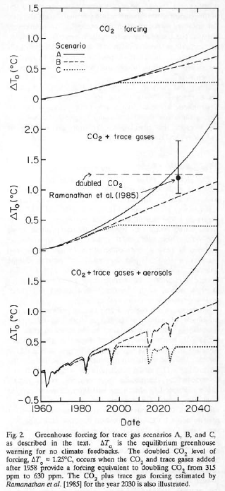
In an article in the Wall Street Journal today, climatologist Dr Patrick Michaels and meteorologist Dr. Ryan Maue compare Hansen’s predictions to actual reality over the past 30 years. Instead of the gloom and doom we heard in 1988, we have an earth that is only moderately warmer, and closer to Hansen’s “scenario C”, the bottom graph below, which is overlaid with actual global temperature data in red.

Here’s some excerpts from the article by climatologist Dr. Pat Michaels and meteorologist Dr. Ryan Maue:
“Thirty years of data have been collected since Mr. Hansen outlined his scenarios—enough to determine which was closest to reality. And the winner is Scenario C. Global surface temperature has not increased significantly since 2000, discounting the larger-than-usual El Niño of 2015-16. Assessed by Mr. Hansen’s model, surface temperatures are behaving as if we had capped 18 years ago the carbon-dioxide emissions responsible for the enhanced greenhouse effect. But we didn’t. And it isn’t just Mr. Hansen who got it wrong. Models devised by the United Nations Intergovernmental Panel on Climate Change have, on average, predicted about twice as much warming as has been observed since global satellite temperature monitoring began 40 years ago…”
“Several more of Mr. Hansen’s predictions can now be judged by history. Have hurricanes gotten stronger, as Mr. Hansen predicted in a 2016 study? No. Satellite data from 1970 onward shows no evidence of this in relation to global surface temperature. Have storms caused increasing amounts of damage in the U.S.? Data from the National Oceanic and Atmospheric Administration show no such increase in damage, measured as a percentage of gross domestic product. How about stronger tornadoes? The opposite may be true, as NOAA data offers some evidence of a decline. The list of what didn’t happen is long and tedious.”
It turns out that global surface temperature has not increased significantly since 2000, discounting the larger-than-usual El Niño of 2015-16.
And it isn’t just Hansen who got it wrong, models devised by the IPCC have, on average, predicted about twice as much warming as has been observed since global satellite temperature monitoring began 40 years ago.
What about Hansen’s other claims? He claimed that the late ’80s and ’90s would see “greater than average warming in the southeast U.S. and the Midwest.” No such spike has been measured in these regions.
In 2007, Hansen stated that most of Greenland’s ice would soon melt, raising sea levels 23 feet over the next 100 years. Subsequent research published in Nature magazine demonstrated this to be impossible.
Several more of Mr. Hansen’s predictions fizzled. Have hurricanes gotten stronger, as Mr. Hansen predicted? No.
Satellite data shows no evidence of this in relation to global surface temperature.
Have storms caused increasing damage in the U.S.?
No. Data from NOAA show no such increase.
How about stronger tornadoes?
No. In fact, the opposite may be true, as NOAA data offers some evidence of a decline.
“The list of what didn’t happen is long and tedious,” say Michaels and Maue.
“On the 30th anniversary of Mr. Hansen’s galvanizing testimony, it’s time to acknowledge that the rapid warming he predicted isn’t happening.”
The WSJ article:
‘Thirty Years On, How Well Do Global Warming Predictions Stand Up?’
https://www.wsj.com/articles/thirty-years-on-how-well-do-global-warming-predictions-stand-up-1529623442
The article appeared in the Wall Street Journal print edition as
‘A Hot Summer on Capitol Hill.’
See also this summary from Willis Eschenbach: The Thirty Year War
Intentions and deceit are what these people are about, not results. This is a political movement, not a scientific movement.
Bingo, the practice of offering assumed science deference to warming agenda claims has to wind down. There was never a proof or testable model for a physical climate claim and co2.
Models as evidence are part of the rigged system of climate propaganda.
I have a model that proves Hillary Clinton actually won the Electoral College. /sarc
They’re all about power. Watermelons, green on the outside and red in the middle.
James Hansen was one of the first computer climate modellers that in 1988 predicted warming scenarios. Because he actually published 2 papers in 1981 on CO2 forcing and went to Congress twice to testify in 1987 and again in 1988 in favour of global warning you may accurately say that he James Hansen is the father of computer climate modelling . However he is the father of a scientific discipline that started with a scam as Willis has pointed out and has had to tell one lie after another just to keep the scam going. Billions have been wasted on this scam and billions more will be wasted before the scam ends.
The only consolation we skeptics have is that each one of us is contributing the hastening of that end. I ask everyone I meet “Have you seen global warming yet? I have been looking for it for 30 years and cant seem to find it. Do you know where it is? If they mention something like the Arctic or Greenland I give them statistics that I have learned in 6 months of studying this for 8 hours a day.
TELL EVERYONE YOU MEET THAT IT IS A SCAM AND WHY.
1 WUWT contributer said, this scam in comparison makes Bernie Madoff look like a petty thief. Bernie Madoff in the end caused losses 0f ~$7 billion to his investors. As least they had a choice to invest or not. The world’s poor DO NOT have a choice. They are paying for James Hansen and others’ scam every day so that the end result might be $7 trillion down the drain before it is all over.
Now for some comments about James Hansen
It boggles the mind how truly deranged this man is. He is completely unstuck mentally and a bonafide nut case, devoid of any common sense or rational thought. To think he was the director of the Goddard Institute of Space Studies(GISS) a division of NASA for a large % of time of the 32 years that he worked there. Before he retired in 2013, he turned that agency into an agency of global warming. He was arrested 5 times for protesting illegally for green causes.
Some of his predictions and some statements in his own words, and hallmarks of his life are as follows:
1) In 1988 he predicted that the Hudson River would overflow because of rising sea level caused by CO2 and New York would be underwater by 2008.
2) In 1986 he predicted that the earth would be 1.1C higher within 20 years and then by
3) 1999 he said that the earth had cooled and that the US hadn’t warmed in 50 years
4 He had also said that the Arctic would lose all of its ice by 2000.
5) In december 2005, Hansen argued that the earth will become “a different planet” without U.S. leadership in cutting global greenhouse gas emissions.
6) He then reversed course again and said in march 2016 that the seas could rise several metres in 50 to 150 years and swamp coastal cities .
7) He also said that global warming of 2C above preindustrial times (~ 1850) would be dangerous and that mankind would be unable to adapt.
8) in 2009 Hansen called coal companies criminal enterprises and said that Obama had 4 years left to save the planet.
9) In 2012 Hansen accused skeptics of crimes against humanity and nature.
10) Hansen is involved with a 2015 lawsuit involving 21 kids that argues that their constitutional rights were interfered with by CO2
11) in 2017 he has admitted that CAGW does not happen with burning fossil fuels.
“One flaw in my book Storms of My Grandchildren is my inference you can get runaway climate change on a relatively short timescale. ”
“Do you think that’s possible on a many-millions-of-years timescale?
It can’t be done with fossil-fuel burning.”
12) Then he said “But if you’re really talking about four or five degrees, that means the tropics and the subtropics are going to be practically uninhabitable.”
He doesnt seem to know that their average temperature is 28C.
13) But then he said that climate change was running a $535 trillion debt
14) He has been quoted many times that equates climate change to all sorts of extreme weather events. No database in the world shows any more than there ever were.
15) Hansen has published way over 100 fraudulent climate studies with almost all of them using results from computer climate models that are woefully inadequate and that have never been validated except by the human modeler.
Obviously the man just doesnt know when to shut up.
Alan…that’s one of the best posts I’ve seen in a while
Thank you!
Actually the theory of CO2 (that’s the global warming theory) is over 100 years old…
…in 100 years, they have never gotten one prediction right
“that’s one of the best posts I’ve seen in a while”
You haven’t been reading carefully. There are essentially identical posts, over the last few days here, here and here. None give any links or references.
well…you didn’t either so it stands
I knew all of them anyway….didn’t you?
Nick ……….it is AXIOMATIC …………NONE of the dire “predictions”
has proven correct or accurate or happened……”we” have been here !
IF you haven’t NOTICED then where the hell have you been ?
And since you seem so unobservant why should “we” bother any
further with your pestilential propaganda ?
Put up or Shut up PLEASE !
Then don’t bother.
latitude said:
“…in 100 years, they have never gotten one prediction right”
I don’t know about predictions 100 years ago,
since few scientists made climate predictions,
but since the 1970’s and 1980s
predictions of warming have been generally right.
I have no idea why you would make that statement.
We have no scientific proof CO2 caused
any of the warming, but even if CO2 caused
ALL the warming since 1950,
there is nothing to fear from more CO2
in the air.
In fact, adding CO2 to the air
is greening our planet
and could be causing warmer
nights in colder climates,
such as Alaska — I doubt if
people in Alaska have a problem
with that.
Hansen proves that if you make
enough predictions, some are
bound to be right, or close
although his poor batting average
may prove that self-proclaimed experts,
especially goobermint bureaucrats,
make the worst predictions of all !
My climate change blog:
http://www.elOnionBloggle.Blogspot.com
The Global Warming … SCAM … is built on statistical ju jitsu. Trim a little timeframe here, remove some anomalous temps there … and voila! The earth is DYING … because of man’s SINS against the planet. But it is all smoke and mirrors.
Oh … and the EVIL greedy filthy oil executives are baaaaaad too … mmmmKay?
Hansen, along with Schlesinger, were primarily responsible for the feedback scam which provided the theoretical basis in AR1 for a climate sensitivity large enough to justify the formation of the IPCC, thus enabling the UNFCCC and its repressive agenda of wealth redistribution under the guise of climate reparations.
Hansen, this time along with Lebedeff, were responsible for erroneously validating the homogenization of sparse data to ‘approximate’ the behavior of the whole.
Hansen hired Gavin Schmidt as his chief propagandist to run the Real Climate web site and he did such a good job, Hansen hand picked him as his suckcessor.
It’s pretty clear who’s at the nexus of this evil …
Bravo, Alan!
re: Not knowing when to shut up — Hansen is a fanatic by Winston Churchill’s definition: “Someone who can’t change his mind, and won’t change the subject.”
Fanatics can make a handsome living in the modern world, just as they have always been able, when they build a big enough following who buys the books, attends the lectures, etc. Once you’ve become a career fanatic, it’s too costly to quit, because you’d have to find a duller job that didn’t bring you fame & fortune.
Plus, nobody likes to admit they’re wrong. The longer you’ve been wrong, and the more fame you’ve garnered from it, the harder it is to admit. Your cause, no matter how bogus, becomes part of your identity. That’s why it’s just as difficult for followers to quit as for the humbugs who start the movements in the first place. Nobody likes to admit they’ve been snookered. Better to conjure up false accusations against the critics.
In the 1950s, longshoreman/philosopher Eric Hoffer wrote an insightful book on this phenomenon, “The True Believer.” My father placed that book in my hand when I was 17 years old, with the cryptic sales pitch, “You might like this,” about two weeks before I set out for U.C. Berkeley freshman year in 1967. Without my father’s help, I might have turned into a total zombie during those crazy times.
Maybe I’d be raking down millions like cynical Albert Gore and fire-and-brimstone Bill McKibben by terrifying the un-mathed with bogus doomsday scenarios. However, I’m conforming to the higher ethical standard attributed to British actress Mrs. Patrick Campbell: “My dear, I don’t care what they do, as long as they don’t do it in the street and frighten the horses.”
Gore did not make his millions from climate related speeches or investments.
Chris, he was already rich (born with a silver spoon), but he has also profited from the carbon scam. For blue-bloods like him, it’s never enough. He doesn’t give a damn about the environment, as evidenced by his hypocritical behavior (private jets, mansions, etc).
Dan, it is false that Gore has profited from his green investments. Oh, he might have made a bit on one or two of his investments, but he also lost money on other green investments. He has made nearly all of his fortune on his shares of Apple stock (both purchased as well as given to him as a long term Director of the company) and the sale of Current TV, which happened a few years ago.
http://business.financialpost.com/news/how-al-gore-amassed-a-200-million-fortune-after-presidential-defeat
Would be great if we could stick to the science and bin the ad hominems. Would also be very helpful if there were references and context for all of these claims. I’m a genuine sceptic by the way, as all of my previous comments will confirm.
And, a general point not directly related to your post: people like Nick Stokes. We should be grateful for them. We need to have our ideas and arguments tested by intelligent, knowledgeable and independently minded people. People who agree with us teach us little, except to be very careful abour being persuaded by our own opinions.
I remember when people with opposing views, from opposite ends of the ideological spectrum, could debate civilly, with mutual respect. Now we have these internet echo chambers where too many people can’t stand to hear any views but those that agree with their own, and where those who dare to disagree are abused and demeaned. The pursuit of objectivity in approach to understanding, with objective knowledge as the end, is a noble endeavour.
Mr. Hogg: You offer healthy caution against the neo-tribalism that has been exacerbated by the development of internet “echo chambers.” There has also been broad, systemic failure in the education industry. Higher education especially, has been using Orwell’s “1984” as an instruction manual rather than a warning for at least two generations. CO2 as a poison hurtling Mother Earth towards doomsday, rather than an atmospheric gas necessary for all life, is one example.
The pursuit of objectivity and critical thinking in the ed biz seem to have taken a back seat to careerism, and the politics, politics, politics that have seeped into everything. Light bulbs, grocery bags, eggs and a whole lot more, have become political. So-called “organic” food is not science-based, but it holds enormous potency as tribal insignia, just like electric cars, hatred of plastic and shedding crocodile tears for Third World peasants while you actively support policies that make those peasants’ lives harder. Sabotaging the introduction of “golden rice” is a case in point.
When I was a kid, back before The Flood, an assigned-reading essay was, “How to tell the difference between information and propaganda,” or something like that. The gist of it was: information provides facts that you can consider calmly; propaganda is either cherry-picked facts or arresting images designed to arouse your emotions, and make it difficult to think.
Michael Crichton’s 2003 speech/essay, “Environmentalism as Religion,” states in the first paragraph, “The greatest challenge facing mankind is the challenge of distinguishing reality from fantasy, truth from propaganda. Perceiving the truth has always been a challenge to mankind, but in the Information Age (or as I think of it, the disinformation age) it takes on a special urgency and importance.” His thoughts on the urban fantasies about farming are especially poignant to this career farmer.
Crichton doesn’t have all the answers. NO ONE DOES. That’s key to science, and to keeping free of destructive adherence to dogma.
“The greatest challenge facing mankind is the challenge of distinguishing reality from fantasy, truth from propaganda.”
That’s true. Some people are better at meeting the challenge than others.
One can never view this 2 minute video enough times to realize its importance to man/woman kind.
https://ca.video.search.yahoo.com/yhs/search?fr=yhs-rogers-rogers_001&hsimp=yhs-rogers_001&hspart=rogers&p=orwell+final+warning#id=1&vid=ef290521c6ec87415c3713154da6ec38&action=click
indeed. the reality is global warming is a bit meh.fantasy is cooling the data of the past and warming the present data to create a line on a chart that allows snake oil salesmen to claim we told you it was warming.
Jim Hogg wrote:
“Would be great if we could stick to the science
and bin the ad hominems.”
My comment:
You must be new to modern climate “science”.
There is almost no real science.
There are a few laboratory experiments
to prove CO2 acts like a greenhouse gas
in a laboratory.
Everything else is one unproven assumption
on top of another, accented with wrong
predictions from computer games,
for thirty years in a row.
Modern climate “science”
is junk science
“defended” by leftists
using character attacks
on skeptics — there is
very little real debate,
or real science.
This is just the beginning of the end for this theory. Global temperatures moving forward from here will be falling. I have elaborated on this in many times not going to do it again, other then say very low solar equates to overall lower sea surface temperatures and a slightly higher albedo result will be global cooling.
I don’t know if global temperatures moving forward will go up or down. The past records weren’t “global” to begin with and have been so buggered with that no ones knows what the past local records really were.
Will temperatures go up or down?
Who knows.
The cause of it?
We know who doesn’t know.
Agreed.
I consider that there is only respectable data covering the Northern hemisphere, and I am far from convinced that the temperature today in the Northern hemisphere is any warmer than it was at the highs of the late 1930s/early 1940s.
None of the data sets (particularly those for temperature) are fit for scientific purpose, and that is why no one knows what is going on, still less, why if something is happening, the cause as to why it is happening.
Nobody has enough long term data to determine or refute climate trends. We have inferential knowledge from tree rings, pollen deposits at the bottoms of lakes, and ice cores from glaciers, but no accurate records of temperatures, rainfall, drought, flood and storm frequency. Instruments change all the time, so we have no meaningful comparisons from data collected a century ago vs. now.
This leaves the field wide open for propagandists to cherry-pick and distort data to their hearts’ content, in order to serve any sort of agenda. For instance, a hurricane off the coast of Mexico a few years ago, was breathlessly reported as “the most powerful hurricane ever recorded.” The basis for the claim was a low barometric pressure measured from a satellite. That low reading only lasted an hour. By the time the hurricane made landfall, it was a run-of-the-mill hurricane that weakened quickly and did little damage.
We didn’t have satellites that could measure barometric pressure from remote orbits until 10 – 15 years ago. For all we know, storms like that have been forming and dissipating twenty times a century approximately forever. No meaningful trends or comparisons can be inferred.
…I told you….the WSJ has been taken over by Trump supporters!
Anthony didn’t post the take home….
“These corrected climate predictions raise a crucial question: Why should people world-wide pay drastic costs to cut emissions when the global temperature is acting as if those cuts have already been made?”
On Jo Nova’s site there is an article suggesting that all the installed solar in Australia has resulted in a curbing of CO2 emissions of just 1%.
It is not clear how much has been spent (including subsidies) on solar installation but perhaps in excess of Aus$13 billion, and all that has happened is that CO2 emissions have been reduced by a paltry 1%, and the cost of electricity has sky rocketed, and the grid is becoming unstable. The toll on the competitiveness of industry is beginning to bite, and heavy industry is now often being asked to halt operations to help the grid out in times of peak demand.
What a waste of money for no return.
Surprise – Surprise, Hansen was dead wrong as many predicted up front. Meanwhile, billions were likely spent around the world because of it. “The sky is falling, the sky is falling,” he said. And too many folks fell for it.
I hope I know how to insert a graphic. I fiddled a little with Matlab and learned how to plot data superimposed on a background image. The result is Figure 3 from Hansen’s 1988 testimony with GISS land ocean global temperature annual mean anomalies superimposed. I thought it was illustrative. GISS is plotted as large blue dots. Here it is:
I think something has gone wrong with the x-axis there. It isn’t the marking on the original plot, in which the last data point was 2019. I think at this point the blue dots are about 2 years to the right of where they should be. And it is stretching a bit to point to 2017 as El Nino.
But the general point is that It has come out between scenarios B and C, which is pretty much how gas concentrations evolved.
Nick, I think you are right. This is the first time I tried fiddling with that matlab feature and I think the x axis is shifted a year or two. You have to put in the axis limits by hand the way I did it and there is a little trial and error to match the image. I was just looking at your plot below and coming to that conclusion myself. I might redo it, but already spent too much time not doing what I should be doing. I think it is still a fair observation that the observations hugged the Scenario C line until the recent uptick. I don’t have any pony in this race and will leave it to others whether any interpretation is better than others. It looks like another case where folks will argue about what intervals are important for averaging, trends, and the like.
fah,
You can be certain that if there is any question about how to interpret the data, Stokes will come down on the side of alarmism.
Mr. Stokes: Ah, so emissions of co2 were capped, and have not risen since…. When did they stop increasing? Hope it wasn’t before 2016. That would make that spike up in temps (you know, the one that pushed it from “below c” to “between b & c”) pretty hard to explain. CO2 wise.
No, CO2 followed scenario B fairly closely. That was basically exponential increase to 2000, then linear. In fact, the difference in CO2 between A and B is still small. The main difference is that A made no allowance for volcanoes. B postulated two big ones – in 1995 and 2015. Pinatubo stepped up to be the first, but we haven’t really had the second.
“B postulated two big ones – in 1995 and 2015. Pinatubo stepped up to be the first, but we haven’t really had the second.”
Does this mean B would have run hotter if he had based it on only one volcano? If so, incorrectly guessing the number of volcanoes worked to his advantage in that it makes B look better than it would have had he correctly guessed the number of volcanoes.
“Does this mean B would have run hotter”
A bit. The second volcano was 2015. You can see a bit of a dip following 2015.
The fact that there is discussions of these fine differences is an indication that the predictions were good.
“The fact that there is discussions of these fine differences is an indication that the predictions were good.”
I don’t follow the logic that comes to that conclusion. If he had correctly guessed that there would only be one volcano, B would be much closer to A and it would be pretty obvious that his model was running hot. Making the incorrect guess of 2 volcanoes got him close enough to what really happened so that his supporters could claim he got it right. In other words, his model only works if it includes an incorrect guess for the number of volcanoes. If you correct that guess, his model runs too hot.
Hansen included volcanic eruptions in B and C to illustrate the effect of stratospheric aerosols. Again A is portrayed as the extreme case with no further eruptions: “The stratospheric aerosols in scenario A are thus an extreme case amounting to the assumption that the next few decades will be similar to the few decades before 1963,”
Making the incorrect guess of 2 volcanoes got him close enough to what really happened so that his supporters could claim he got it right. In other words, his model only works if it includes an incorrect guess for the number of volcanoes. If you correct that guess, his model runs too hot.
As Hansen pointed out, and his Fig 2 bears out, the effect of the volcanoes was transient: “Stratospheric aerosols have a substantial effect on the net forcing for a few years after major eruptions , but within a few decades the cumulative CO2/trace gas warming in scenarios A and B is much greater than the aerosol cooling.”
Since Fig 2 also shows the effect on forcing without the stratospheric aerosols it’s easy to see what the effect would be if the eruptions didn’t occur, and the model doesn’t run hot! The reduction in forcing due to the hypothetical eruption would be gone after ~2yrs and normal service would be resumed.
So then you disagree with Mr. Stokes that scenarios A and B are essentially the same scenario except that A has no volcanoes and B has two of them. Scenario A runs much hotter than B and if the only difference between them is the number of volcanoes then the number of volcanoes is what determines how hot B runs compared to A. To review, here is what Mr. Stokes said:
“No, CO2 followed scenario B fairly closely. That was basically exponential increase to 2000, then linear. In fact, the difference in CO2 between A and B is still small. The main difference is that A made no allowance for volcanoes. B postulated two big ones – in 1995 and 2015. Pinatubo stepped up to be the first, but we haven’t really had the second.”
“if the only difference between them is the number of volcanoes “
I didn’t say it was the only difference. I said it was the main difference. I might have overstated that; the differences in methane and CFCs are important too. I showed the graphs.
OK, then A runs hotter than B because of the number of volcanoes and also differences in methane and CFCs but not because of differences in CO2 in the two scenarios. That does make the differences between the two scenarios clearer. Thanks for your patience in answering my questions.
Very nice RicDre…well done.
I agree with Nick that there is a relatively small difference between the CO2 concentration of A and B. The other differences were no volcanoes in A (transitory effect) and A included some ‘speculative OTGs’ which B and C did not.
Nick, you do realize…the temp history Hansen plugged into his model…is not the same temp history we use today
The past has been adjusted down to show a greater slope up….
…Hansen would have run a lot hotter
In fact it is. In that original plot I have been showing, GISS Ts, the purple curve, lies almost exactly on top of the black curve which is his historical temperature. It is virtually unchanged, 30 years later. And it is the one that rose faster than scenario B.
Nick, are you saying GISS has not adjusted past temperatures since 1988?
..you got 2 choices
1. Hansen used the right temp history to tune his model…and GISS should not have adjusted past temps
2. GISS was right to adjust past temps…..and Hansen’s model is garbage and no one should even be discussing it
1. Hansen did not use a temperature history to tune the model
2. People greatly exaggerate the effect of adjustments. I simply superimposed modern data on a 30-y-o plot, and it is hard to tell the difference.
The temp history being used here shows 1998 as much cooler than the UAH and RSS satellite charts show 1998. The satellite charts show 1998 as 0.1C cooler than 2016. Which means 1998 is the second hottest year in the satellite record behind 2016.
The Hockey Stick creators didn’t like the looks of that since it conflicted with their “Hotter and Hotter” meme, so they set about cooling 1998 in relation to the other years. And did it right before our eyes.
Make your comparisons using the UAH chart instead of using those bogus, bastardized Hockey Stick charts. The satellite charts are much closer to reality.
The RSS TLT satellite data set is the fastest warming of all the global temperature records, surface or satellite, over their joint period of measurement (since 1979). Even warmer than GISS: http://www.ysbl.york.ac.uk/~cowtan/applets/trend/trend.html
RSS TLT disagrees markedly with UAH TLT, even though both use the same input data. Previously UAH has had to make at least two corrections to its adjustment methods because of work done by the producers of RSS.
What makes you think it’ll be any different this time?
The GCMs are worse than worthless GIGO which aren’t worth the electrons used to gin them up.
Except to show how inept the models are.
correct….in 1988 the past had not been cooled enough
If he had plugged in todays numbers, he would have been a lot hotter
The only reason he looks close…is he was using temp history that had not been cooled as much
Very good point.
Nick,
I may be mistaken, but I am fairly certain that I have read that manmade CO2 emissions were nearer that assumed under scenario A.
Perhaps you would list what the manmade CIO2 emissions Hansen assumed for each of the scenarios, A, B and C, and also what is the estimated manmade CO2 emissions for the past 30 years, so that we can all make a comparison.
Isn’t the reason why you assert that CO2 emissions lie between B and C, down to the fact that Hansen did not envisage the impact of C02 greening on the biosphere, and he failed to appreciate that the CO2 sinks would thereby grow in size, naturally reducing the overall increase in atmospheric CO2 levels, without the need for man to so substantially curb the growth of his CO2 emissions. The greening of the planet has had the same impact as a partial curbing of manmade CO2 emissions, and is a negative feedback, which in error, was not foreseen when Hansen made the predictions.
That coupled with the volcano point that others have mentioned.
Richard,
“the manmade CIO2 emissions Hansen assumed for each of the scenarios, A, B and C”
This is the point that people get wrong. Hansen made no assumption about man-made emissions as such. It sometimes sounds as if he did, but he cited no data on tonnage emissions. None at all. What he calls emissions are increases in ppm in the air. His situation then was just as ours is now with methane. We infer emissions from the observed concentration increase. People are so used now to having the data on emissions gathered as a result of the UNFCCC agreements that they forget this situation. Tonnage emissions were not reliably known.
So Hansen did not make faulty assumptions about where CO2 was going. He had no measure of what was coming in.
He sets out the arithmetic in Appendix B of the paper. Here is an example
Note that it is all in concentrations (and forcings, derived from concentrations). He gives the formulae for how those are assumed to increase; the numbers are here. You can verify that those numbers follow from his formulae. And they are the numbers that I showed plotted from Gavin (and for which Phil. showed the older plots from Steve McIntyre).
The formula gave exponential increase (in rate) for scen A, and for scen B, linear from 2000, but the curve is tangent to A. So A and B diverge rather slowly, and till now are very similar. I showed the plot below, but here it is again:
It’s very close to B. That also puts it close to A; the differences between the scenarios are in the other gases and volcanoes.
Here is Steve McIntyre’s plot. You can see that the data is older, but the scenarios are identical
Nick
Many thanks for that. I appreciate the time you spent, very useful response.
It does appear (as I suggested) that I might have been mistaken. I shall dig into it a little bit more (and in particular review his appendices).
As you say, Scenarios A and B track closely together, and only begin to diverge around 2005/07. Even at 2015, the divergence is not that large, especially given the annual variations in CO2, and minor variations around the globe of say about +/- 8 ppm.
This will be something which will be easier to judge in 2030, especially as the industrialisation of the Far East (China, Indonesia and India) will probably have bounced back from the impact of the near decade long financial downturn of 2009, which slightly curbed BAU emissions.
Nick.
So let’s get some of our definitions and applications straight. The purpose of this discussion is to assess the accuracy of Hansen (1988), so let’s stick to the article. Hansen (1988) defines the 3 scenarios thusly:
Scenario A assumes that growth rates of trace gas emissions typical of the 1970s and 1980s will continue indefinitely; the assumed annual growth averages about 1.5% of current emissions, so the net greenhouse forcing increases exponentially. Scenario B has decreasing trace gas growth rates, such that the annual increase of the greenhouse climate forcing remains approximately constant at the present level. Scenario C drastically reduces trace gas growth between 1990 and 2000 such that the greenhouse climate forcing ceases to increase after 2000.
He adds later the effects of volcanos, other trace gases, etc. on his model as you pointed out. But, the primary variable and the one of most consequence in the three scenarios is human emissions. Except for some down years in emissions during the Obama economic “recovery,” global emissions have followed the definition of Scenario A. https://insideclimatenews.org/news/12112017/climate-change-carbon-co2-emissions-record-high-2017-cop23 (The money quote in the article is: “Overall, human-caused carbon emissions have grown at an average annual rate of 3.5 percent since 2000, but at a slower pace of 1.8 percent between 2006 and 2015, according to the Global Carbon Project.”)
This is well above Hansen’s Scenario A definition of 1.5% annual emissions growth. So in assessing the predictive value of Hansen (1988), any comparison of actual global temps should be applied to his Scenario A. Even the “adjusted” / Pause-buster global temp data is well-below Hansen’s Scenario A as demonstrated by fah’s graphs.
With regard to your nifty graph, “CO2 projections vs reality,” you perform a little sleight of hand. You have used the actual atmospheric CO2 levels, not the ones Hansen predicted on the basis of his Scenarios. What were those predictions? Hansen says:
“Scenario A reaches a climate forcing equivalent to doubled CO2 in about 2030, scenario B reaches that level in about 2060, and scenario C never approaches that level.”
And just what is that doubled atmospheric CO2 level we are to reach in the year 2030? He defines it in the description of his Fig. 2 that Phil showed above:
“The doubled CO2 level of forcing, AT0 “‘ l.25°C, occurs when the CO2 and trace gases added after 1958 provide a forcing equivalent to doubling CO2 from 315 ppm to 630 ppm.”
Hansen’s model has grossly over-predicted the relationship between global CO2 emissions and atmospheric CO2 levels. So if the purpose of this discussion is to assess the accuracy of Hansen (1988), your graph of Scenario A atmospheric CO2 levels will need to go from ≈ 416 ppm in 2020, to 630 ppm in 2030: or ≈ 214 ppm in the next 10 years! (Steve McIntyre’s graph that you show is also in error in this regard!) Considering it went up only ≈ 22 ppm in the last 10 yrs, I’d say your blue Scenario A graph line needs to be adjusted upward if it is to reflect what Hansen (1988) actually predicted what atmospheric CO2 levels would be in 2030. This also supports Richard Verney’s comment above:
“Isn’t the reason why you assert that CO2 emissions lie between B and C, down to the fact that Hansen did not envisage the impact of C02 greening on the biosphere, and he failed to appreciate that the CO2 sinks would thereby grow in size….”
This is all to say that there was much in Hansen (1988) that was unknown. This is understandable. Those unknowns, however, were handled by conjecture or ignored, but were presented as facts. (e.g. Climate Sensitivity = 4.2°C)
As for your presentation of the data, I am in awe of your abilities. You, like Hansen, are a genius in processing and presenting mountains of information. And in that tsunami of data lies much truth; but buried in the minutia are the small, not-so-accurate details that twist the arc of the argument to your position. In your fervor to defend a particular point of view, I fear you use your talent and skill only to fall prey to conformational bias.
Note: Bold texts and underlinings are my additions for emphasis only.
William,
“Except for some down years in emissions during the Obama economic “recovery,” global emissions have followed the definition of Scenario A. “
No, you are switching to a different definition of emissions. It is easy to do, because since the UNFCCC, these statistics of tonnage emissions have become familiar. But in 1988 they weren’t. Everything of Hansen you have quoted, and everything in the paper, expresses emissions in terms of observed increase in gas ppm.
This makes irrelevant your later talk of Hansen not taking into account greening and growth of CO₂ sinks. He did no arithmetic on gas fluxes. He had no source measure, so the sinks are irrelevant. His scenarios were defined just in the progress of gas ppm, just as we still do with methane.
So when you say “This is well above Hansen’s Scenario A definition of 1.5% annual emissions growth. “, it isn’t. It is irrelevant to it. Hansen’s definition is exactly what is shown on Gavin’s “CO₂ projections vs reality” graph. That is all there is. And it was around Scen B, although that is very close to A.
So when you say
“you perform a little sleight of hand. You have used the actual atmospheric CO2 levels, not the ones Hansen predicted on the basis of his Scenarios.”
that is not true at all. I do use the actual ppm of course, but the scenario ppms plotted are the true figures of the scenarios. It actually comes from a Hansen file. Steve McIntyre, who made a similar plot, discusses a lot of this.
“Hansen’s model has grossly over-predicted the relationship between global CO2 emissions and atmospheric CO2 levels. “
Same again. Hansen said nothing about that relationship. He had no data on the tonnage emission levels.
Nick
The normal interpretation of the term “emissions” is a measure of the stuff that comes out of tailpipes and smokestacks. But Hansen (1988) is not a paper about grammar. It is a scientific paper that requires specific definitions for each of the terms used. Unfortunately, Hansen did not define his term, “emissions,” complete with the appropriate units.
But while it is true Hansen (1988) does not specifically state what he means by “emissions,” he does give us very clear hints as to what he is talking about. In his definition of Scenario A, he says that the annual increase in “emissions” are averaging 1.5%, “typical of the 1970s and 1980s.” So was he equating measured atmospheric CO2 with “emissions” as you so confidently state? Let’s check that out. The CO2 levels were readily available to him at the time, and from 1975-1984 the average annual increase in atmospheric CO2 was 1.44 ppm https://www.co2.earth/co2-acceleration . The CO2 level in 1975 was ≈ 330 ppm. So the approx. annual increase percentage was only ≈ 0.43%. Not particularly close to the 1.5% increase in annual “emissions” cited by Hansen in his definition of Scenario A. Surely he was better at math than that.
So what was Hansen referring to when he cites “emissions” of 1.5% annual increase as his defining metric for Scenario A? The “hot button” issue in 1988 was the burning of fossil fuels for energy and transportation. I remember. I was there. Let’s see how carbon emissions from burning of fossil fuels typical of the 70’s and 80’s work out. According to EPA data https://www.epa.gov/ghgemissions/global-greenhouse-gas-emissions-data global carbon emissions from the burning of fossil fuels between 1975 -1985 increased from about 4600 to 5400 million metric tons of carbon. That works out to an ≈ 1.7% annual increase. I don’t believe it is just an amazing coincidence that emissions of the 70’s and 80’s in the generally accepted grammatical meaning of the word (i.e. the amount of carbon put out through tailpipes, etc.) would statistically correspond so closely to the 1.5% definition of “emissions” in his text. It is my belief that Hansen’s original Scenario A was based on emissions in the true sense of the word. But when it became apparent that the assumed correlation between global emissions and atmospheric CO2 levels was inaccurate*, the defining metric for Scenario A morphed from emissions to atmospheric CO2 levels. Which is all fine and dandy. As I hope you believe, science is never settled, and adjustments must always be made. But this discussion is specifically about what was said in Hansen (1988), not about tweaks and changes made later on.
* They may have known this before 1988, which would explain why such an important term as “emissions” was not defined in the paper.
William,
““statistics of tonnage emissions… (were unavailable) in 1988” is not true. “
I didn’t say they were unavailable. That is your interpolation. I said they weren’t familiar. But the relevant fact is that Hansen didn’t use them.
“Nowhere in the paper is the term “emissions” described in ppm.”
Its true that he speaks of emissions in terms of % increase. But it is %increase in the annual increment in ppm. In your own quote
“If human CO2 emissions continue to increase at 1.5% annually (which they have and then some), atmospheric CO2 levels will reach a level of 630 ppm by 2030.”
An accumulation of emissions in % (of something) leads to a ppm value. Clearly the emissions are in ppm. But he never speaks of emissions in tons.
“it is highly relevant because if he indeed did base his Scenario A on emissions as his own words suggest”
His words can’t suggest that, because there is never any indication that he used, or was even aware of, data for emissions in tons. But what he did base it on is very clear, and we have the actual numbers:
2028 a1=447.521742088551
2029 a2=450.709568219879
2030 a3=453.945211743177
and if you want to know where that absurd precision is coming from, it is the 1.5% formula
(a3-a2)/(a2-a1)=1.015000000
That is exactly what he is applying the 1.5% to. In fact the exact formula for scen A gas concentrations is
ppm= 235 + 117.1552*1.015^n
where n is the number of years after 1980.
I think you are being conspiratorial about Hansen’s secret knowledge of emissions in tons. There is no evidence of such a switch. In fact, scenario A is much older, and first surfaced in 1983.
“where n is the number of years after 1980”
should be
where n is the number of years after 1988
Nick
I am amazed by your familiarity and skill with the data, but simultaneously your blindness to the implications that stare you in the face.
I don’t think anyone would deny that Hansen’s Scenario A was supposed to represent what would happen if the world continued on industrial and energy expansion typical of the 1970’s and 1980’s. As I’ve presented before, he defined Scenario A in terms of an “annual growth average about 1.5% of current emissions.” This was a reasonable statement since emissions (the stuff coming out of tailpipes and smokestacks) were, indeed, increasing at about 1.5% annually during the 70’s and 80’s. However, if Hansen had written what you claim he really meant, he would have said that the situation typical of the 70’s and 80’s was an “annual growth average about 1.5% of current atmospheric CO2 levels.” But that was not anywhere close to true. In fact the annual increase of atmospheric CO2 during the 70’s and 80’s was <0.5%. A 300+% error in the basic definition of Scenario A would have been noticed immediately and caused unwanted criticism of Hansen (1988). Better to avoid controversy and continue to use the term “emissions,” but just not define it.
But it gets worse, and this is where you expose your blind bias. You state that in his computations, Hansen used atmospheric CO2 levels using the 1.5% formula. While I have no way of corroborating this, I actually don’t doubt it. By using the 1.5% figure with the term “emissions” in his definition of Scenario A, Hansen strongly implies he’s referring to the stuff coming out of tailpipes/smokestacks as I have demonstrated before. You have not been able to refute the logic of this likelihood. But now Hansen pulls a “bait and switch” by doing his computations with atmospheric CO2 levels instead of emissions. And to make matters even worse, Hansen uses the1.5% annual growth rate figure (which was appropriate for describing typical emissions in the 70’s and 80’s) to describe the annual growth of atmospheric CO2 “typical of the 70’s and 80’s.” This is patently wrong no matter what his intentions were. Annual % increase in atmospheric CO2 levels has NEVER approached the 1% level even for a single year, much less averaged 1.5% over 10-15 years. This error is then compounded by projecting it decades into the future and presenting it as our future if we continue as we did in the 70’s and 80’s. The portrayal of Scenario A in this manner is indefensible.
Any way you slice it, Hansen (1988) is pretty messed up no matter how you try to finesse the data, blow smoke, or make excuses for it.
Nick
So why does any of this really matter? The implications of using a 1.5% annual growth of atmospheric CO2 as the metric for Scenario A go far beyond an issue of its being just plain wrong.
Scenario A was supposed to predict our future world if we continued our energy-consuming ways of the 70’s and 80’s. If you used emissions in the true sense of the word (the amount of carbon coming out of tailpipes, etc.) as the defining metric of Scenario A, you would use the 1.5% annual growth rate figure to project forward, because that’s what it was in the 70’s and 80’s. On the other hand, if you chose to use atmospheric CO2 levels as the metric, the annual growth rate figure to project forward in Scenario A should be ≈0.5%, because that’s what it was in the 70’s and 80’s. But as you revealed, Hansen used a 1.5% annual growth rate of atmospheric CO2 to calculate the effects of “business as usual” into the future. This resulted in an absurd inflation of the predictions of Scenario A, or “business as usual.”
But beyond the gross scientific error are the more far-reaching political effects. When reporting to the public/Congress, the alarmists can point to our emissions and say, “We haven’t decreased our global emissions. (This is correct. Our annual % growth of global emissions from fossil fuels actually are now >1.5 %.) Therefore, we are on the path of doom as predicted by Scenario A. We can see clearly the prediction of catastrophe for our energy gluttony and the desperate need for radical political/social change if there is any hope of saving our planet.”
On the other hand, when global temps are not following Scenario A and the models are called into question, the analysis is switched from emissions to atmospheric CO2 levels. The argument is that atmospheric CO2 levels and global temps are both closely following Scenario B, so the entire model must be correct. However, annual % growth in atmospheric CO2 levels is the same as it was in the 70’s and 80’s, about 0.5%. So as far as CO2 levels are concerned, we are actually in a “business as usual” mode (i.e. Scenario A) when compared to the real data of the 70’s and 80’s. It’s true that we aren’t following Scenario A as computed by Hansen because he used an absurdly high factor (1.5%) to produce the graph; Scenario A as designed by Hansen actually represents a level of human carbon production that is ≈ 3x the level seen in the 70’s & 80’s, and will probably never occur in the future.
So there you have it. It’s is a classic case of “having your cake and eating it too.” When you need to sow fear and trembling, you point to emissions and Scenario A as the “business as usual” model that predicts catastrophe, and demand radical change to save the planet. But when global temps are not following Scenario A and your model is in trouble, you switch to actual atmospheric CO2 levels and point out how they are close to the temps of Scenario B as the model predicted, implying that the model as a whole, including Scenario A, is correct. This is not just an honest scientific mistake. This is deceit with profound societal consequences.
P.S. Your “CO2 Projections vs Reality” graph misrepresents what Hansen predicted in Scenario A. Your graph says atmospheric CO2 levels in 2020 for Scenario A will be ≈ 415 ppm. Hansen (1988) very clearly predicts CO2 levels of 630 ppm by the year 2030 for Scenario A. In support of that statement, by taking a start date of 1988 and the corresponding atmospheric CO2 level of ≈ 352 ppm, and projecting it forward 42 years with a 1.5% annual growth rate (as you state was done to compute Scenario A), you get 658 ppm. This is much closer to Hansen’s stated level of 630 by 2030 than your graph implies.
William,
” In fact the annual increase of atmospheric CO2 during the 70’s and 80’s was <0.5%."
You really should read Steve McIntyre’s post on this. He goes through the arithmetic that people get wrong, and he also shows the scenario plots. You’ve attributed these to me, but what I showed was actually from Gavin and SM. And while Gavin has 10 years more data, the scenario plots are exactly the same, and based on Hansen’s numbers and description. Steve says
“One idiosyncrasy that you have to watch in Hansen’s descriptions is that he typically talks about growth rates for the increment , rather than growth rates expressed in terms of the quantity. Thus a 1.5% growth rate in the CO2 increment yields a much lower growth rate than a 1.5% growth rate (as an unwary reader might interpret).”
Hansen spells out his arithmetic in and around Fig B2. The increment in the 1980s was 15.6 ppm, and that in 1970s was 12.6. In fact (15.6/12.6)^(1/10) is 1.02, but he seems to have scaled back to 1.015 because the rate had been falling.
” The portrayal of Scenario A in this manner is indefensible.”
No, you just have the arithmetic wrong.
“. Hansen (1988) very clearly predicts CO2 levels of 630 ppm by the year 2030 for Scenario A.”
I don’t know where you get this from. Hansen mentions 630ppm only once:
“The equilibrium sensitivity of this modelf or double dCO2 (315 ppmv -. 630 ppmv) is 4.2øC for global mean surface air temperature”
It’s the figure for doubled CO2, and isn’t any kind of prediction; no date is specified. It is just explaining how ECS was calculated (with an instantaneous increase).
“So why does any of this really matter?”
Well, indeed. You seem to base your case entirely on Hansen using the word emissions in a way different from how you would use it. You say that he must really have meant it your way, even though all the arithmetic contradicts that, and there is no indication that he was even aware of reliable tonnage figures.
And again, all that really counts is whether the scenario he actually used happened. It doesn’t matter, for the prediction, if he really thought A was BAU, or even, as he really did say, that B was more plausible. Now we know.
Nick
Let me first say that I appreciate all the time and effort you have put into setting me straight about the realities of Hansen (1988).
I spent all day yesterday thinking about our exchanges and what the implication are for Hansen (1988) and Hansen personally. I will write later about that.
But for now, I would like to ask a favor of you. Except for small differences in atmospheric CO2 levels, the main elements that differentiate Scenario A from B are the inclusion of other forcings like volcanic eruptions, CCl3F, CCl2F2, methane, and N2O in Scenario B. These are the only factors that he specifically sites under Scenario B, although it is implied that he used all the items from Fig. B1. But we have seen what happens when I go with what the paper implies. Certainly buried in the actual calculations for Scenario B are the numbers that reveal what variables he really used, and how he assumed they would change over time. I am confident that you know all this information. So my questions to you are: 1. What variables were used in Scenario B that were not included in A, and how did Hansen assume they would change over time in Scenario B? 2. How have these assumptions for Scenario B played out in the real world over the last 30 years? (e.g. He assumed 2 major volcanic eruptions in Scenario B, but only 1 has occurred. This has had the effect of making the actual global temp measurements at some point temporarily warmer than Scenario B assumed.) In other words, when the forcings used by Hansen to differentiate Scenario B from A are substituted for the actual measured values over the last 30 years, does it change the actual measured global temperature curve; if so, in what direction and by how much? If you don’t know the answers to these questions, please let me know.
Once I have this information, I’ll share with you my overall thoughts and conclusions about Hansen (1988).
William,
Thanks. I’ll try to respond tomorrow – probably late Sunday where you are. I’m thinking of a post at my blog here where I can show plots better.
William,
I have written that new post here. It doesn’t really answer you questions, which I’ll come back to. But it helps me get the basic facts and sources together.
Nick
Thanks for the post and the graphs on you blog. It’s taken me awhile to digest them and understand their significance vs what is widely believed (including my misconceptions). My purpose here is to understand precisely how the scenarios were really made and therefore understand what they truly represent. So I would like to write in plain English my understanding of them. If you would comment on my understanding, I would be very appreciative. When I compare Scenario A (“A”) to Scenario B (“B”), I’m only taking them out to 2020, since your graphs generally only go to that date and not beyond.
While it is widely believed that “A” largely represents the forcing effect of a “business as usual” increase in atmospheric CO2 levels as compared to the 70’s & 80’s, that doesn’t appear to be completely true. “A” also includes the forcings of CFC’s, methane, N2O, and several other trace gases. They are incorporated in “A” at a significant higher amount than in “B” (See pp. 9361 & 9362). The forcing of all these parameters has a warming effect on global temperatures. The other parameters listed in Fig. B1 have a generally cooling effect on the climate, and I assume are largely included in “B” via the volcanic eruptions (2) assumed for “B” but not “A”. I can’t tell from the text how or if solar irradiation or land albedo parameters were used in “A”, “B”, both, or neither. Perhaps you can set me straight on this one. Since the atmospheric CO2 levels of “A” & “B” out to 2020 are very close to each other, the forcing effect of CO2 on “A” & “B” is likewise very similar out to 2020. (I assume he used the same forcing value for the CO2 levels in “A” & “B”.)
So the difference in forcing between “A” & “B” as shown in your “Anthropogenic Drivers in Hansen et al 1988 vs CMIP5” graph is almost entirely due to all the non-CO2 parameters that were included in “A” & “B”. Is this an accurate interpretation?
William,
Yes, I think that is all correct. One thing to remember about Scenario A is that it is much older than the others. It was described in 1983 (I don’t currently have the ref) and was basically the first thing they used to project their early model. GCMs in those days took weeks to run. But yes, as far as CO2 is concerned, A and B are scarcely different, and both turned out to be good guides to the evolution of CO2.
That is the usefulness of the forcing plot that Gavin shows. It is how CMIP5 would combine the various effects.
The fact that Scen A was developed long before Montreal discussions probably explains its pessimism about CFCs, which actually diminished faster than Scen C. However, in scen A Hansen also included some miscellaneous forcings, which it seems didn’t turn out to be so great.
Nick
Thanks for the feedback. I appreciate you taking the time.
How about the other parameters listed in Fig. B1: Strato. H2SO4, Tropo. H2SO4, Tropo. desert aerosols, Tropo. soot aerosols, Solar irrad, and Land albedo? Were they used in “A”, “B”, & “C”, and if so, how were they configured?…or were they just listed as “other forcing parameters” but not actually used in the computations? I ask this because they aren’t listed in Fig. B2: “Decadal Increments of Greenhouse Forcing”. I can image that albedo might be included in his Climate sensitivity value, but I can’t tell if the others were included in the scenarios in any way.
William,
Sorry about the late reply – a few other things happening here. Fig B1 I think relates to the 1D model used to give the forcing figures in his table. Not all are expected to increase. Hansen mentions that Scen A includes allowance for ozone, stratospheric water vapor and minor CFC type compounds. The problem with these is that they are poorly measured, and it was hard to know if hey were increasing. He included them by simply doubling the effect attributed to CFCs. As I mentioned, Scen A was an early effort, and I think he simply thought better of it in B and C.
Nick
Once again you offer a bit of truth, but then bend the details to fit your needs. It is true that the UNFCCC database was not available to Hansen in 1988, but to say, “statistics of tonnage emissions… (were unavailable) in 1988” is not true. There were ongoing measures and estimates of global CO2 emissions at the time (e.g. Marland et al 1985), and Hansen was undoubtedly aware in 1988 of the estimated annual % increase in global CO2 emissions.
Then there is the smoke you blow into your argument, perhaps hoping nobody will take the time to check it out. You say that “everything in the paper, expresses emissions in terms of observed increase in gas ppm.” That is blatantly untrue. Nowhere in the paper is the term “emissions” described in ppm.
Your grand finale simply is to be dismissive of the entire matter by saying that my contention that his original Scenario A was based on emissions and not atmospheric CO2 levels is “irrelevant.” Quite the contrary, it is highly relevant because if he indeed did base his Scenario A on emissions as his own words suggest, the model in Hansen (1988) predicted the following: If human CO2 emissions continue to increase at 1.5% annually (which they have and then some), atmospheric CO2 levels will reach a level of 630 ppm by 2030. In addition, his model predicted the resultant global temperature in 2030 would increase ≈ 2°C from 1960. None of this is likely to happen. So in evaluating the accuracy of Hansen (1988), we must use the words and figures he used in the actual manuscript, not ones we would like to see, or ones that have been adopted later on to lessen the blow of its inaccuracy.
Based purely on circumstantial evidence and the observation of Hansen’s historical behavior, it is my belief (i.e. I have no proof) that in 1988 Hansen already knew that the assumed relationship between global emissions and atmospheric CO2 levels was inaccurate (or at least uncertain). But in 1988 the public concern was primarily about emissions/pollution/smog/etc. and not atmospheric CO2 levels. So in order to gain more public attention, he opted to use the term “emissions” in the definition of his Scenarios, even though he probably knew this was dubious. To cover his tracks and protect himself in the future, he created ambiguity by simply neglecting to define the all-important term, “emissions.” Such a gross scientific oversight was not just an “honest mistake” in my opinion. Over time, Scenario A came to be defined in terms of atmospheric CO2 levels, but that’s not how it was originally defined in Hansen (1988).
As a final word, I’d like to express my disappointment in your level of scientific honesty. You are obviously very bright and talented. But by using tactics as you have demonstrated above, you seem to value winning the argument over getting at the truth of the matter. Sad.
I’ve placed a reply above that should have gone here.
It was a quadratic increase in concentration to 2000, then linear since. The fly in the ointment is that total emissions never stopped increasing super-linearly.
If somebody wanted to spend way more time than is warranted, one could digitize Hansen’s plot and compute the sum of the square differences between his predicted values and the observed values and misuse some statistics to test which was “better” but I personally think that should only be done by someone who has nothing better to do.
I think this is it corrected and I already spent more time on it than is warranted.
Yes, that looks right.
No need to digitize. The temperature numbers, with scenarios, are on a zipfile here. Detailed description here.
Curious that just provision of data gets a down-vote.
Yes.
Your comment was more hard hitting because of its understated tone.
Today’s list of things to do. Not understand what Stokes is saying as it’s over my head, then down-vote them.
Hansen was right for 30 years, to the extent that temperature went up instead of down. 428,000 years of isotopes and CO2 in the Vostok ice-core, however, show that Hansen just got lucky on one coin-flip. As many scam-artists have.
He was right for ten years. For the past 20 years, GASTA has been flat, but for super El Nino spikes.
He probably knew that Earth had entered a slight warming cycle, regressing to the LIA mean after a long cooling cycle from the ’40s to ’70s. The PDO flip in 1977 initiated a warming cycle.
If one looks at what were the previous natural cycles, occurring during the instrument record, given the cooling cycle of 1940 to mid 1970s, it was a better than 50/50 guess that the warming cycle that began in around the mid 1970s would continue for at least 25 to 30 years thereby running through to around the end of the century (ie., 1975 + 25 years), and perhaps even into the early 21st century.
They don’t stand up now!
https://rogerfromnewzealand.wordpress.com/2018/05/09/ever-been-told-that-the-science-is-settled-with-global-warming-well-read-this-and-decide-for-yourself/
Cheers
Roger
In charity one must accept that his lower range predictions were near enough right.
It’s just the nominal and high end predictions that were silly.
If he had only stuck to the science and reported the range that he thought realistic then he would be honoured. He would have advanced human knowledge.
But he didn’t.
He realised that the high end – even the nominal – was potentially scary and thus exciting. He saw a chance to get the world’s attention.
He grabbed it.
And in the process Hansen dropped his integrity.
He figured this out way back in the 1970s. His ECS WAG of 4.0 was ludicrous on its face. Manabe was in the ball park with 2,0, but still too high.
From these two guesses, Charney concocted the range of 1.5 to 4.5 degrees C per doubling of CO2, with the “canonical” central value of 3.0, which is at least about two high by a factor of two.
“His ECS WAG of 4.0 “
It wasn’t a wag. It is an output of his model. And that model predicted pretty well the warming that has occurred as a result of the rise in GHGs.
His model assumptions were WAGs. Obviously, since they produced a GIGO output so at odds with Manabe’s.
His model has predicted nothing of the kind. We can’t even know what part, if any, of the warming since 1988 can be attributed to GHGs.
Quite.
And we cannot even be reasonably confident that the temperature in the NH is any warmer than the highs of the late 1930s/early 1940s, notwithstanding that about 95% of all manmade CO2 emissions has taken place since that period. There is no worthwhile historic data for the SH, as Phil Jones quite candidly made clear in the Climategate emails with his unguarded comment regarding SH data below the tropics and bounding Antarctica being largely ‘made up’. Further we know from Climategate that there has been a concerted effort to get rid of the 1940s blip, and we have seen the many reworked reconstructions over the past 20 odd years gradually little by little (with each reworking) smoothing and reducing the 1940 blip.
I suspect that if the temperature in the NH was properly measured, by retro fitting say the 200 best sited stations (which have undergone the least environmental change) with the same type of LIG thermometers set in the same type of enclosures, painted with the same type of paint as used in the late 1930s/early 1940s at that station, and we now take measurements at those stations in accordance with the practice and procedures that was used at the station in question in the late 1930s/early 1940s, so that present day unadjusted RAW data could be directly compared to historic unadjusted RAW data, without any adjustments whatsoever, and without engaging in any homogenisation, spatial adjustments, etc, instead simply comparing each individual station with itself, we would find that there has been no or little increase in temperature over the stations own previous highs of the late 1930s/1940s.
I doubt that it is any co-incidence that unadjusted data from the contiguous US, Iceland and Greenland all show that to be the case. And recent unadjusted data from China also suggests that that may well be the case. There is also evidence that the high latitude Russian data also points in that direction.
But what is needed is retro fitting of LIG thermometers in the best sited stations least impacted by UHI and/or by other environmental factors to answer the question.
” And that model predicted pretty well the warming that has occurred as a result of the rise in GHGs.”
You sound so sure the cause is CO2. Must be nice to be sure of things.
What caused the similar warming from 1910 to 1940? Why couldn’t the current warming be caused by the same factors that caused the 1910 to 1940 warming?
The temperaures increased from 1910 to 1940, then decreased from the 1940’s to the 1970’s, and then increased from the late 1970’s to today at the same magnitude as the previous warming and the current warming never reached the highs of the previous warming. We are in a temperature downtrend since 1934.
Something besides CO2 caused the warming from 1910 to 1940. But you want us to believe that the warming today is mostly caused by CO2 yet the current warming is no more than the warming from 1910 to 1940, and current warming didn’t even get as hot as previous warming.
There is nothing unusual going on with the climate. It looks like a natural cycle to me. Up a little, down a little, up a little, down a little.
Until someone can prove otherwise I say all warming has been caused by the increase in world population from 2.6 billion in 1950 to 7.6 billion today
The current warming from about 1980 to the present is of the same magnitude as the warming that took place from 1910 to 1940, and the present warming is no hotter than the 1910 to 1940 warming, yet the population numbers were much lower during the 1910 to 1940 period.
It makes sense that triple the population would have some effect but no more heat has been added to the atmosphere when we examine the temperature record and compare it to the past so population effects don’t seem to show up except with UHI effects.
With respect, your unsupported assertion is easily shown false, merely by the most cursory, back of the envelope, order of magnitude calculations.
There is no way I will ever believe that a climate model….that many years ago….got all of those ups and downs
Hansen extended a trend line….and jiggered it up and down to make it look authentic
Latitude
“Hansen extended a trend line….and jiggered it up and down to make it look authentic.”
________________________________
Extending the trend line in HadCRUT3 (the oldest HadCRU version I have data for) from the period 1960-1988 out to 2017 would have resulted in warming at a rate of 0.08C/dec. What was observed in HadCRUT3 over that period was a rate of 0.13C/dec. Hansen correctly forecast that the warming rate between 1988 and 2017 would be faster than it was between 1960 and 1988.
If you use the data…temp history…that Hansen used at the time…to tune his model..you would get a different result.
Since then, GISS has adjusted the past temp history…which makes Hansens model garbage
Latitude
“If you use the data…temp history…that Hansen used at the time…to tune his model..you would get a different result.”
___________________
Can you provide a reference for that please? What data did Hansen use? If you don’t know than why are you confident that there would be a different result?
All surface temperature producers, not just GISS, adjust data and describe their methods in peer reviewed articles that are open for comment or rebuttal. They all came up with broadly the same temperature charts.
But it cooled between 1940 and mid 1970s.
If he projected the mid 1970s warming at the same rate as the 1920/1940s warming, (up to the period of the pause) he would have been nearly spot on since as Phil Jones, who was in charge of HADCRUT, confirmed, when interviewed by the BBC (following Climategate) that there is no significant difference in the rate of warming between 1860 to 1880, 1910 to 1940 and 1975 to 1998.
In fact the early 20th century warming episode did not start as early as 1910 and by using this as the start date, it reduces the rate of the early 20th century warming episode.
On the basis of the IPCC’s own admission, CO2 did not drive the 1860 to 1880 warming episode, nor the 1920 to 1940 warming episode.
It is therefore extremely material to the efficacy of CO2 driven warming that the rate of the late 20th century warming episode (ie., post 1975 to 1998) is not statistically different to the two earlier warming episodes (which were not driven by CO2).
richard verney
“…there is no significant difference in the rate of warming between 1860 to 1880, 1910 to 1940 and 1975 to 1998.”
________________________________________
All the periods you mention are of different duration with none shorter than 20 years. Taking that as the yardstick, you would also have to conclude that there is no significant difference between the previous warming rates and the warming rate in the ~20-year period since 1998.
1998-present was slower than the period 1975-1998; but you say above that there is no statistical difference between a rate of 0.11 C/dec (1860-80) and a rate of 0.20 C/dec (1975-1998); so presumably there’s no statistical difference between 1975-98 and 1998-present (0.14 C decade) either.
(These rates refer to HadCRUT4, which you are presumably using too, since your first period starts in 1860).
By using periods of minimum 20-years duration and starting the latest one in 1998 we effectively eliminate the ‘pause’; because the period since 1998 has already seen faster warming than either 1860-1880 or 1910-1940, which you’ve already accepted where periods of warming.
“were” periods of warming… (sigh).
There has been virtually no warming from 1998 to now.
The peak of the 1998 super El Nino was insignificantly lower than that of the 2016 super El Nino, from the effect of which Earth is currently rapidly cooling.
1998 and 2016 are actually in a statistical tie for hottest year in the satellite record. 2016 was 0.1C hotter than 1998 which is within the margin of error.
Of course, if you look at the Hockey Stick charts, they have cooled 1998 signifcantly in recent years and it is no longer in a tie with 2016, which was their objective.
They cooled the 1930’s/40’s and then cooled 1998 in an effort to fool the public into believing it is getting hotter and hotter and hotter because CO2 is rising. Such a big, expensive lie.
Mann and his unindicted coconspirators are the real “climate criminals”, mass murders and thieves on the grandest of scales.
“1998 and 2016 are actually in a statistical tie for hottest year in the satellite record.”
___________________________
That’s true in UAH but not in RSS. The satellite data error margin is normally quoted as being ~0.05 C. In UAH TLT 1998 was 0.48 C warmer than the 1981-2010 average and 2016 was 0.51 C warmer. 0.51-0.48 = 0.03, which is less than the error margin, so not statistically significant.
Setting RSS TLT to the same base period, 1998 was 0.45 C warmer than the 1981-2010 average and 2016 was 0.62 C warmer. 0.62-0.45 = 0.17, which is well above the error margin and therefore statistically significant.
“There has been virtually no warming from 1998 to now.”
___________________________
All the surface data sets show statistically significant warming since 1998 already (all values in °C/decade at 2σ):- http://www.ysbl.york.ac.uk/~cowtan/applets/trend/trend.html
GISS: 0.19 ±0.10
BEST: 0.18 ±0.10
HadCRUT: 0.14 ±0.10
NOAA: 0.17 ±0.10
The satellite data are much more volatile, so while neither RSS or UAH show statistically significant warming, both show a ‘best estimate’ warming trend since 1998. The best estimate trend in RSS is actually faster than that in HadCRUT and getting very close to statistical significance:-
RSS: 0.15 ±0.17
UAH: 0.07 ±0.16
Thanks for your input, DW Rice.
Your figures are correct as far as they go. But the problem I have is you are using what I consider to be fictionalized surface temperature data that I have absolutely NO confidence in.
I’ll have to stick with the UAH satellite data as the only reliable data available since 1978, and Hansen 1999 for temperature data before 1978. That would make the 1930’s hotter than any year in the 21st century.
I trust UAH to at least be making a good faith effort to get it right. I have no trust in the others, and with good reason: I have seen the temperature profiles before the CAGW Charlatans decided to rewrite the temperature records and none of them look like the Hockey Stick charts in the list above.
Instead, unmodified temperature charts from all over the globe resemble the Hansen 1999 temperature chart with the 1930’s/40’s showing to be as hot or hotter than any subsequent year.
We know how the Hockey Stick charts came about. We saw the Climategate conspiracy among the gatekeepers of the temperature data to minimize the heat of the 1930’s/40’s and later the heat of 1998. These Hockey Stick charts were bastardized for political reasons. They do not resemble reality. They are a lie. Deliberately perpetrated on humanity.
So I’ll go with Hansen 1999 and UAH. That’s about as accurate as we can get. The Hockey Sticks are garbage.
To me, the important takeaway from Dr Michaels et al WSJ article is that “actual” temps (assuming they were not altered) track one of Hansen’s 3 separate scenarios, specifically (c); if CO2 emissions were capped 18 years ago.
Since they were NOT capped, and the observed temps are near that level, one possible conclusion is that if the rest of his calculations were correct, CAPPING CO2 WOULD HAVE HAD NO SIGNIFICANT IMPACT.
In that context I cannot agree that Hansen’s “lower range” predictions were “near enough right”. They were not part of a range; they describe a very specific scenario that did not occur.
(Apparently I’m not as charitable as the Honorable Mr Courtney.)
George D.: You are correct, which helped me ask Mr. Stokes above. Also correct re: honorable M. Courtney.
But I may be biased.
In fact what happened is that temperature was following Scen B (they were much the same) until about 2005. Then there were two big La Ninas and it fell behind. Then there was a big El Nino and it caught up again. ENSO events are an oscillatory processes superimposed on forcing; GCM’s do not claim to predict them (yet). They are part of the bumpiness you expect in a prediction. It still warmed.
It has not warmed anything like predictions. Epic fail!
And there is no basis for assuming that all or most of whatever warming actually has occurred is due to human activity. We don’t even know the sign of net human effect, since much of what we do cools the air.
Since world population in 1950 was 2.5 billion and it has tripled to 7.6 billion couldnt some of the warming be due to that increase? And if that is true it is up to the alarmist modellers to tell us how much before any carbon taxes are applied.
Among many other differences, such as urbanization and generally clearer air.
But IMO natural cycles still rule. Since alarmists can’t say how much of whatever warming they imagine to have happened would have happened anyway, in the absence of more plant food in the air, then they have no basis for demanding the end of industrial civilization.
“Since world population in 1950 was 2.5 billion and it has tripled to 7.6 billion couldnt some of the warming be due to that increase?” What specific impact are you referring to? CO2 exhalation?
https://ourfiniteworld.com/
Everyone has to cook and everybody in northern climates has to heat their homes in winter. Plus there is more air travel more transportation of every kind more burning of forests more of everything. Since 1950 world energy use is now 5 times what it was . All of that energy except solar, geothermal, nuclear, wind and hydro has been because of burning things 80% fossil fuels which have to be burnt to create energy with most of the energy being lost as heat. That heat has to show up in the thermometer measurements. It just doesnt magically disappear into space immediately. I am astonished that no one else has put forward this explanation.
The Pope thinks so. Forgotten is that billions have no power. Then Obama in South Africa telling “folks” they would melt the planet if they ever tried air conditioning. To think this British lawn jockey is now invited to speak on Mandela’s 100th aniversary!
Argue on OHC or atmospheric temperature trends, not on end points, Nick.
OK, here is a bar graph of trends. It shows that most observations cluster just below scenario B, well above C. The scenario that evolved (B-) sits exactly among the observations.
When I use wood for the trees choosing linear trend on HADCRUT 4 Global Mean from 1958 to 2017, I see a 0.8C Temp increase over the 60 years. That is the “actual” data you should be using to form the trend, not from 1988. Hansen had access to it and used it after all.
http://www.woodfortrees.org/plot/hadcrut4gl/from:1958/to:2017/trend
That results in about a 1.3 C/Century figure and that is about Scenario C.
Which falsifies CACA, yet again.
If even cooked books show warming no more than was projected under the scenario of no growth in CO2 after 2000, despite accelerated CO2 this century, then CACA’s goose is cooked, along with the “data”.
That is the “actual” data you should be using to form the trend, not from 1988.
If you do insist on comparing from 1958, you should use the Scen C trend from 1958 too for comparison.
Nick writes
Indeed. And for projection of the evils of warming too.
But why spoil a good scare story, eh?
aren’t we more than half-way from 2015 to 2020? asking for a friend
Never mind
The BBC had an interview with Hanson on this subject today and portrayed him as the most accurate prognosticator of doom since… well, I was going to say since Nostradamus, but he wasn’t very good either… maybe since Edgar Cayce? Paul Ehrlich? Jeanne Dixon? Caesarius of Heisterbach?
Nah, come to think of it, there never have been any who were any good. Maybe H.G. Wells?
Reading “The Shape of Things To Come” or “The World Set Free” might dissuade you from thinking that H. G. Wells was very good at prognostication.
How about Casandra? 🙂
“How about Casandra?”
Yeah but nobody ever believed her. In Mr. Hansen’s case we may be dealing with an Anti-Cassandra.
Maybe George Orwell, 1984
There was one, the 20th Century’s mephistophles – Bertrand Russell. For sheer evil the others fade. Problem is the evil still operating from inside Bertrand Russell’s corpse, wandering the hallowed halls of academia and power.
Dr. Hansen belongs to a class who think they know better than the rest of us. All arrogance and no humility … no accountability either.
The public no longer trusts experts with good reason. It’s time for policy makers to quit automatically them. The rule should be: The expert is probably wrong. The exception is for people with demonstrated skill. If the chief building inspector says a sewer line is undersized, believe her. If some academic demands 250 different compulsory pronouns for supposedly different sexes and genders, politely tell him to go away. 99.99% of the time you will be right to do so.
Never mind the word salad and logic you can’t immediately refute. Go by the record. These people are almost always wrong. Their prognostications are no more accurate than could be produced by a drunk dart-throwing monkey.
Heinlein wrote, in The Puppet Masters, “In the Country of the Blind, the one-eyed man is in for a hell of a rough ride.”
quit automatically them.quit automatically trusting them.“Dr. Hansen belongs to a class who think they know better than the rest of us.”
Those seeking a deeper dive on this topic can check out Vision of the Annointed by Thomas Sowell (h/t Tom Naughton)
The excerpts from the article by climatologist Dr. Pat Michaels and meteorologist Dr. Ryan Maue show that they should have read Hansen’s paper more carefully.
“Thirty years of data have been collected since Mr. Hansen outlined his scenarios—enough to determine which was closest to reality. And the winner is Scenario C. Global surface temperature has not increased significantly since 2000, discounting the larger-than-usual El Niño of 2015-16. Assessed by Mr. Hansen’s model, surface temperatures are behaving as if we had capped 18 years ago the carbon-dioxide emissions responsible for the enhanced greenhouse effect.
About half of the forcing was expected to be due to CO2 and the rest due to ‘other trace gases’.
As it turned out CO2 followed Scenario B fairly closely (slightly above), the OTGs followed Scenario C however (N2O, CH4, Freons etc). So since we did cap those GHG emissions things have panned out as Hansen suggested, between B & C. By the way they should refer to him as Dr Hansen, not Mr.
No plot for N2O but current levels are between Hansen’s predicted B and C.
Actually…Phil..
surface temperatures are behaving as if we had capped 18 years ago the carbon-dioxide emissions
https://climateaudit.org/2008/07/28/hansen-update/
Gavin, at RealClimate, has just posted an updated version of the concentrations in the scenarios and how they evolved
He also showed what that amounted to in terms of forcing. It shows the result definitely between scenarios B and C
Can’t access the links.
Did Gavin use GISS’ cooked books to show a result between those scenarios, or actual data?
There’s one piece of this I don’t get. Didn’t China’s CO2 emissions shoot the moon in a way no one predicted? Didn’t that overwhelm everybody’s predictions for the atmospheric CO2 concentration?
No, China’s emissions were expected to rise. They were exceedingly low in 1988, and are still less than half of US per capita.
“They were exceedingly low in 1988, and are still less than half of US per capita.”
Which means complete bollocks if their total output as of 2015 is 30% of the entire world, when the US is 14%.
When talking about a GLOBAL problem, the per capita amount is the wrong metric! The percentage of total emissions is what should be used for each and every country. I must say that you have a phenomenal capacity for cherry picking the measurement that best supports your view and makes the US look bad.
“I must say that you have a phenomenal capacity for cherry picking the measurement…”
Indeed. This is the same man that admits an infinite number of factors could be influencing the warming climate but that CO2 is the only thing that explains it.
Cherry picking on parade…
“The percentage of total emissions is what should be used for each and every country.”
So Qatar is OK. Denmark can burn what they like. It’s all China’s problem.
It is indeed all China’s problem.
If China sincerely wishes to limit atmospheric CO2, China will have to take the lead. In that regard, it truly does not matter what Denmark does.
America’s emissions are dropping. India and China’s are soaring.
So China could solve its problem by dividing itself into provinces. That would pass the problem to the US.
Which it ought to do, anyway.
But that won’t solve the problem, which is that China and India, whether unified states or split up, a la Europe and Africa, are where the growth in emissions originate.
If you consider CO2 emissions a problem, which I don’t. Quite the opposite. But real pollution is a problem. Our braindead Greens could help solve it by allowing sales of high BTU clean US coal to China instead of fighting “death trains” from Wyoming to Columbia River ports. It’s also cheaper than China’s low grade, dirty coal.
“But that won’t solve the problem, which is that China and India, whether unified states or split up”
Indeed. The problem is per capita emission, not how national boundaries are organised.
So it doesn’t matter whether India and China are each one state or thirty. The problem is how much CO2 their territory produces, which is growing, while the US is falling.
Not that CO2 is a problem. More plant food in the air is indubitably a good thing. And whatever warming it produces, if any, is also beneficial, as recognized by Arrhenius and Callendar.
“Indeed. The problem is per capita emission, not how national boundaries are organised.”
This emperor speaks of boundaries when his clothes are nowhere to be found?
Don’t you contradict yourself?
“So China could solve its problem by dividing itself into provinces.”
Could China’s problem be solved by merely dividing itself into provinces, such that 30% of the total world’s carbon emissions were then distributed amongst its various provinces, or could China solve its problem by reducing its 30% of total world CO2 emissions to something less????
Assuming, of course, that CO2 means anything in an infinite set of possibilities.
It would seem that the graphs presented imply that the other trace gasses would carry equal weight with CO2 and all the OTGs for their influence on temperature. However, if any one or all of the OTGs were doing somersaults, and their weighted influence was negligible, then it wouldn’t matter. The vertical axes should be in CO2 equivalents or some similar weighting to indicate their potential influence. Do you not understand the concept of weighted influence, or are you being disingenuous?
Incidentally, the title of doctor is not required. (The Constitution forbids official titles of ‘nobility.’) It is offered as a sign of respect for those who have earned it. In this group, Hansen does not command any respect. Hence the purposeful use of Mr.
The total forcing graph above does just that. It shows the combined effect in W/m2 of forcing.
It would seem that the graphs presented imply that the other trace gasses would carry equal weight with CO2 and all the OTGs for their influence on temperature. However, if any one or all of the OTGs were doing somersaults, and their weighted influence was negligible, then it wouldn’t matter. The vertical axes should be in CO2 equivalents or some similar weighting to indicate their potential influence. Do you not understand the concept of weighted influence, or are you being disingenuous?
As shown in Appendix B to the paper the OTGs and CO2 carry ~equal weight in Scenario A and in Scenarios B and C the OTGs are about 75% of the CO2. Which is why the capping of the OTGs to Scenario C and below has had such a significant effect. Unlike you I have read Hansen’s paper and understood what the weightings actually were. As Nick points out the forcing curves in Fig 2 of Hansen also clearly show the weightings. My comment was that Michaels and Maue were being disingenuous by pretending that Hansen’s results only depended on CO2.
“Assessed by Mr. Hansen’s model, surface temperatures are behaving as if we had capped 18 years ago the carbon-dioxide emissions responsible for the enhanced greenhouse effect. But we didn’t.”
Something they must have known wasn’t true.
Regarding the use of Dr., Hansen earned it when he achieved his PhD, the use I objected to was Michaels and Maue (PhDs themselves) referring to him as Mr in their article.
While Hansen earned his ‘Sheepskin,’ that doesn’t mean that he has earned the respect of his peers. They are two different things!
You are right, I have not read Hansen’s paper.
You are right, I have not read Hansen’s paper.
And yet you comment on it and argue about it with those who have!
Its impossible for any one person, other than perhaps those working in the field, to read everything published. I have more than a passing acquaintance with the general topic and I’m familiar with the main points made by Hansen. You did a poor job of defending Hansen with your graphs and I was commenting on what appeared to be weak evidence. One does not have to be a PhD ichthyologist to know when a dead fish stinks.
In the figure, red line is not global warming. How much of the red line is global warming? Also, rural cold-island effect is not accounted by red line.
Dr. S. Jeevananda Reddy
But, but, I read an article by Seth Borenstein that said Hansen’s predictions were scarily accurate. How could Hansen be so wrong?!? 😂
Well, we went through all this, just a few days ago. I posted then my plot from 2016, showing that in terms of the scenario that actually evolved, the prediction was remarkably accurate. I have now updated that data, and written a new post. Again it is interactive; you can choose the dataset to superimpose. Here is is with the GISS Ts that he was using at the time (purple), and with the more recent and familiar GISS land/ocean (brown):
Nick, one needs to be careful to plot apples with apples. It looks like you have plotted the lowess smoothed GISSS data, which is fine. However to compare to the point by point data Hansen produced, the unsmoothed data is a bit more illustrative. Looking at the unsmoothed data (see my plot to that effect above) it is apparent that until about 2013, the GISS annual means more or less hugged the Scenario C (drastically reduced GHG emissions), essentially no or little AGW influence of CO2. Once the El Nino kicked in, a couple of points upticked and may or may not be coming back down (other folks can argue about that, not me). Just looking at the data plotted unsmoothed it is fairly clear that the observations diverged more and more from the mainstream AGW prediction (Scenario B) until the El Nino closed the gap a bit, but not completely. What happens in the future is anybody’s guess (or belief) but if one took Feynman’s attitude one would conclude that the model did not predict the time behavior at all and only a couple of points are even close. That of course begs the question of what accuracies are considered necessary.
The brown (it looks red to me) data is the set that should be meaningful since it represents what the current best guess observations are. The purple just muddies the water.
” It looks like you have plotted the lowess smoothed GISSS data, which is fine.”
No, I’ve just plotted the annual data, joined with lines, as Hansen did.
“the mainstream AGW prediction (Scenario B)”
Scenarios are not predictions, else there would be only one. They are alternative patterns of how society might decide to burn FF. Hansen did say that he thought B was the most plausible, but he didn’t claim to kn ow for sure.
“The purple just muddies the water.”
The purple (GISS Ts) is what Hansen shows as the measured to date in his plot. It is reasonable to say that it is what he was predicting. The idea of a global index as being a mix of thermometer and SST did not really exist at the time.
fah and Nick,
A Reference of interest:
“Storms of my Grandchildren”(Bloomsbury,2009) by Dr.James Hansen,The World’s Leading Climate Scientist,p.44,
“ It may seem that I am harsh on climate models when I rank their value below paleo climate studies and ongoing climate observations.But I am not really;I have worked on climate models for more than thirty years.I realise they are needed to help us define which processes are more important,which less so;what observations are needed; and how we might extrapolate into the future.
Global climate models do a decent job of demonstrating certain feedbacks, such as water vapour and sea ice, even though they failed to predict the recent rapid Arctic sea ice loss. Yet when Jule Charney used existing climate models to estimate climate sensitivity for doubled carbon dioxide,he could say only that it was probably between 1.5 and 4.5 degrees Celsius.And by “ probably”, he meant that there was only a 65% chance that it was in that range.
Thirty years later, models alone still cannot do much better.Here is another killer.Even as our understanding of some feedbacks improves,we don’t know what we don’t know-there may be other feedbacks.Climate sensitivity will never be defined accurately by models.”
Dr. Hansen’s remarks are reminiscent of Freeman Dyson’s views on climate models.
Any comments?
The context there is climate sensitivity and feedbacks. And the fact that GCMs have trouble pinning down ECS is well-known.
Nick,
The reference to “…the recent rapid Arctic sea ice loss” seems to relate his comments to more than just ECS.
It appears that he corrected the Watts graph. This is also what others have seen.
https://www.carbonbrief.org/analysis-how-well-have-climate-models-projected-global-warming
I see your point…only the high temp points line up 🙂
…but what about the places like 1983, 1998…when he went one way…and temps went the other?
I still think he extended a trend, and put jiggles in it to make it look real
Stokes,
How about providing some quantitative metrics to compare the result to? I don’t trust your subjective assessment that” the prediction was remarkably accurate.” You have a track record of always coming down on the side of alarmism. I’d like to see a little more objectivity.
I provide the graphs, including options to use other datasets. You can make your own judgement.
You can give people a set of ink blots and everyone will come up with a different interpretation. I’m asking that you defend your claim of “remarkably accurate” with objective, quantifiable measures that will support your interpretation. You know, things like standard deviation, percent error, residuals, correlation, all those things that statisticians and real scientists have worked on for years to avoid subjectivity and personal bias! Is that asking too much?
Clyde,
Trends from 1988 to 2017 incl were, for Hansen 88:
A 2.64 °C/Century
B 2.09 °C/Century
C 1.37 °C/Century
Observations
GISS Ts 2.21 °C/Century
GISS LO 1.83 °C/Century
HADCRUT 1.78 °C/Century
TempLS 1.86 °C/Century
Cowtan&Way 1.98 °C/Century
NOAA LO 1.78 °C/Century
BEST LO 2.00 °C/Century
Scen B averages about 10% higher than those, C about 20% lower.
Nick,
Surely you must realize that B and C don’t count, since CO2 has followed Scenario A.
IOW, Hansen’s WAG has been shown preposterously too hot.
” CO2 has followed Scenario A”
No, scen B. You give no substantiation. I showed the full evolution of gas concentrations here. In fact B and A are close, but it is definitely following B. The main scenario difference comes from other gases. Here is the CO2 plot
Your own comments show that Hansen’s high scenario most closely matches the Keeling Curve.
Funny…Tamino claimed a few years ago that forcings were following Scenario C https://tamino.wordpress.com/2014/03/21/hansens-1988-predictions/ . I guess maybe cherry-picking CO2 only would provide something along the lines of Scenario B.
It is funny how claims of accuracy in both forcings and comparisons between observations and model results keep switching between Scenarios B and C to suit “the cause.”
Providing data is not responsive to my challenge to you of sharing with us the objective, quantitative metrics that you used to conclude that the Hansen predictions were “remarkably accurate.” Am I to take it that you are more comfortable with data processing than data analysis?
I think the trend plot is a pretty good metric. In case you missed it:
It’s a good metric, if the calc is right. Unfortunately, my earlier plot calculated scenario trends from 1958 instead of 1988. Fixed above, and it now places the observations rather squarely between B and C, with land/ocean rather closer to C.
the model skill is covered at realclimte.
it is skillful.
ryan should know better
The vast majority of GCMs lack any skill at producing an ECS estimate in line with observations.
They’re almost all for scheit, and the few that aren’t are just accidents.
Untold treasure squandered. Worse than worthless, except to show how bad are the assumptions of CACA pushers.
“the model skill is covered at realclimte.
it is skillful.”
Mosh, that is simply not possible
The comparison chart above is a good example of how much this temperature record has been bastardized by NASA climate charlatans over the years.
Hansen originally shows 1934 as being 0.5C hotter than 1998, which means 1934 was 0.4C hotter than 2016. So any of those trend lines on that chart that show to be higher than 1934 (GISS 1980) are bogus. As of today we have not exceeded the heat of 1934 so any chart that shows we have is a Lie. A lie meant to promote CAGW.
… splitting frog hairs.
Hi Nick,
Why would we choose to test Hanson’s “predictions” against his own agency’s constantly adjusted data-set? Like grading your own paper, don’t you think? By clicking through on your link and pressing the option for UAH (or RSS if you like) paints a much different picture of Hanson’s accuracy.
The only thing I find questionable with the satellite data-sets are that they were tuned using the screwed up terrestrial data-sets! =) So while you didn’t show the data-set I would in your static post image, I appreciate that you included that option on your site.
How’s this?
” pressing the option for UAH (or RSS if you like) paints a much different picture of Hanson’s accuracy”
Hansen was predicting surface temperature, not lower troposphere. You can also click on TempLS. That uses unadjusted GHCN temperatures – makes very little difference.
Satellite data are not tuned using terrestrial datasets. There is some calibration using particular surface observations.
Thanks for the reply Nick.
We’re talking about anomalies, right? So, is it common knowledge that the satellite data-sets give no indication of how the climate may be changing below? If so, I did not know that (specifically, that we should not consider the satellite data sets when looking for climate trends). Seriously. In fact, I thought we were supposed to get a hot spot in order to prove the CO2 theory (maybe that goal post was moved or the theory nuanced)? I say “tuned”, you say “calibrated”… it’s same to me (one of them got adjusted to match the other… guess which one?). =) But from that moment on… they have diverged (until, it seems, that politics or peer pressure got added into the RSS data-set recently, or maybe not…).
Honest question: Do you think that the process that creates the terrestrial data-sets…
(my interpretation starts here) Starting with the inconsistent time-series of geographically sparse yet lopsided data, Increasing and then drastically declining number of stations, gridding, infilling, adjustments (NOAA), un-adjustments of the (NOAA) adjustments (GISS), Time of Day/Observation adjustments, more adjustments for urban heat island (based on what may be decades old night-time satellite imagery – not sure how/if this has changed?), sparse Southern hemisphere representation, even more sparse ocean representation, and even more sparse polar representation (crazy infilling), incredibly shoddy historical terrestrial and ocean records (dubious bucket/bag techniques – I like how these were probably influenced by ship engine warranty claims)… adjustments, adjustments, adjustments… actual data lost… more adjustments, political, personal and proprietary influences (why would I show you my data if all you’re doing is trying to find something wrong with it? attitudes)… and on and on… (end of my interpretation)
… is producing better global temperature anomaly estimates today than either the UAH or RSS satellite process?
If so, I’d like to understand why? Maybe my skepticism of the sausage-making that is the terrestrial data-set process is unfounded?
Sorry, if that sounded like a rant. My stubborn reliance on common sense gets the better of me sometimes. =)
“So, is it common knowledge that the satellite data-sets give no indication of how the climate may be changing below?”
Common knowledge is that it isn’t the same. And Hansen was predicting surface. So as far as LT and surface are different, the difference may be a point of curiosity. But it isn’t any part of Hansen’s predictive process. He was trying to get surface right, and he did.
“… is producing better global temperature anomaly estimates today than either the UAH or RSS satellite process?”
I think it does. And one reason is that I do it myself. I start with the raw data, process it by my own methods, and post a monthly result, in advance of GISS. The methods are spatial integration and I have tried a few; the better ones give very similar results. I use unadjusted GHCN data; it makes very little difference, and still matches GISS well.
As to relative reliability of LT, I have noted that both indices made radical changes in the last three years, to the extent that RSS went from being a universal skeptic favorite to a pariah. I plotted the differences between versions here, along with changes that have happened to GISS since 2005. A typical plot is below, with everything set to a 1981-2010 anomaly base:
Changes to the satellite sets were very much larger than to GISS.
Interesting. I think you’re giving Hansen quite a pass.
“He was trying to get surface right, and he did.”
Assuming your analysis/chosen data-set means Hansen does get it “right”, but then he does for the wrong reasons… that’s not really “right”, is it? And why are we calling them predictions? I thought they were just model runs and had no predictive value? Or was his model somehow different from today’s models (with the mealymouthed wiggle words and disclaimers)? =) He probably smoked unfiltered Camels too… JK.
I think you’re giving GISS quite a pass too. What does your adjustment chart look like if you run GISS back to 1880? My feeling is that… there’s not much adjustment left in the GISS product. It has been running at volume 11 for quite some time. In fact, didn’t we just get “the pause” erased (posthumously) by having the ocean numbers rejiggered? More emphasis given to the historical (and hysterical) bucket readings, and less on the ARGO buoys? Yes, yes I believe I read that somewhere. Seemed like a naked attempt to end the pause. The un-critical lapped it up.
As an aside, there was an insightful comment on WUWT by a person who worked for marine engine company. It seems that it was quite common practice to report/log cooler ocean temperatures back in the day. The ships facing deadlines (and head-winds) often ran their engines over the manufactures’ specs, thereby running them too hot and breaking down the engines prematurely. The bucket temperatures were used to “prove” that they hadn’t run out of spec (or too hard given the ambient ocean/engine coolant). Warranty fraud. In fact, they eventually moved the thermometers to the intakes (another dubious measurement, given the various boat drafts, intake locations… and any salting of the data by latent engine heat) and captured the data automatically to reduce the fraud. Indeed today they collect that and GPS data to boot via satellite. Yet another bit of man made cooling of the past! And this data was prioritized over our ARGO data. Hmmm…
So, strangely enough, it would seem that GISS hasn’t needed to make many adjustments to it’s satellite era numbers!? I think that’s a direct influence from the world having satellite data to compare. Literally a satellite radar gun on the GISS adjustment highway. But pre-satellite… wild west. I’m guessing we’d find quite a bit of cooling in the past.
I still find it funny that NASA clings to GISSTEMP in the satellite era. I guess I’m thankful that all of our climate eggs are not in the same NOAA/GISS basket (there’s a Chicken Little pun in there somewhere, but I’m too tired to see it).
I haven’t had a chance to look at TempLS, but if you’re using the same limited data (compromised, in my opinion, as listed previously), is it surprising that you’re getting similar results? I’m not bashing, truly. I cannot do what you say you’re doing. Respect. But if you’re going through the same basic steps (with your own version of adjustments/decisions), then don’t you end up with the same gridding and infilling… There’s just such a dearth of quality raw data historically (when considering the enormity of the planet and the lack of quality stations). Oh, and doesn’t the “raw” data you’re using already have the TOBs, UHI and other adjustments pre-baked from NOAA (for there part)? Maybe not the raw GHCN (or whatever it’s called now)? And if these numbers are daily averages, then how can we be sure any stated increase (in this case) is related to more heating and not to less cooling (in the case of UHI)? It’s like closing one eye to look at the data. Daily averages make no sense to me (if we’re going to keep splitting hairs like this).
Thanks again for the response. I regularly read your take on things as a counter to rampant conspiracy theories. However, I’m still quite skeptical of the underlying data. And no matter how nuanced the approach to “correct” things… just ends up being more adjustments to an already compromised set of data.
Take care,
PS- Didn’t the manger of RSS data-set come out and say he believes in man made global warming and hates that skeptics cling to his data-set for validation? And THEN didn’t he make that big adjustment in his next version? I think if he’s a pariah now, it’s because he made it sound like his changes were driven by peer pressure… political “science”. Just my take… After Climategate, it’s pretty hard to give anybody a pass as having pure motivations. Impression, not data/fact.
” I thought they were just model runs and had no predictive value? “
No, they predict climate, not weather. That is, they quantify the response to changes in GHG. But they have to be told what the changes in GHG will be.
“What does your adjustment chart look like if you run GISS back to 1880?”
You can see all that on the GISS history page. Back to 1880. There is adjustment, of course, but not nearly as much as people think. Remember, though, that the differences of the early versions are not adjustment so much as being land only vs land+sst, or for the very early ones, being basically just a few NH stations.
” More emphasis given to the historical (and hysterical) bucket readings, and less on the ARGO buoys? Yes, yes I believe I read that somewhere. Seemed like a naked attempt to end the pause. The un-critical lapped it up.”
No, you’re being uncritical there. It had nothing to do with ARGO buoys. There was an observation, by many people over a long time, that drifter buoys were reading slightly lower than ships (0.12°C). You can tell because as data accumulates, there are enough cases where they are reading the same temperature, because a ship reads when there is a buoy nearby. And when a discrepancy is established, you have to adjust. There is no choice. It is just calibration.
“And this data was prioritized over our ARGO data.”
No, it wasn’t. Not ARGO data at all. And it wasn’t prioritised. Just got right.
“same limited data (compromised, in my opinion, as listed previously)”
I’m using unadjusted GHCN. That is raw data. I don’t do it by choice – I think the adjustments are right. But I think it is useful to show that they give much the same answer. I use ERSST, which is a calculated product (it has to be, like satellite data). Despite the weird wailing about “Karlization”, there is no evidence there that adjustments have a warming trend. In fact, it is usually seen as the opposite.
“Oh, and doesn’t the “raw” data you’re using already have the TOBs, UHI and other adjustments pre-baked from NOAA (for there part)? “
No. It is raw data.
Hi Nick,
I’m kind of impressed how you can/do just bat any counter arguments/thoughts away. Hansen is “right”. Karl is “right”. And sorry I confused “drift buoys” with the “Argo buoys”… not very accurate, I admit.
I’m not up on my drift buoy data, but I’m assuming that the thermometers were placed on them specifically to read ocean temperature. I would also assume that there were some standards used in deploying that equipment. Hmmm… maybe that’s a bad assumption? We know how the CERN ground station “standards” worked out, right?
Say, wasn’t Karl in charge of those too? Didn’t he circle the wagons when our host here (Anthony Watts) started cataloging the actual state of the stations? Then, to his credit, was forthcoming about the problems (after they were busted, but still…). Same guy, right? Same guy who in some reports “rushed” out the pause buster, using shoddy methods (bashed by Dr. Bates for violating his data standards and documentation rules) and then promptly retired? Right?
Anyway, to my comment above (incorrectly implicating the ARGO data)… Karl prioritized the ship data over the buoy data. Clearly, that was the case, right (among other changes)? You said “calibrated”… because it didn’t match the ship data. And the buoy data was adjusted up.
So, (I’ll skip the bucket/bag method) the “modern” era ship-board thermometers, from any number of engine manufacturers, mounted somewhere along the engine cooling line inlets, pulling in ocean water from various depths based upon each boat’s draft, load and design… ultimately connected to a very large internal combustion engine (or 8), mounted in a conductive steel structure (probably with a hull painted black)… THAT data. THAT data is THE data we should put our confidence in. THAT data with a purpose other than reporting back to NOAA (or any other US or international agency)… THAT is the data to use to adjust the purpose designed drift buoy data. Yep. And then… drop the mic, walk away. Just in time for Paris, was it? Think so.
A stink was raised and communications demanded. But, yet again, the public/Congress was denied this information and without it not able to provide any meaningful oversight if there was any political influence. If there was no there, there… just release the internal communications. These are public employees. The public is footing the bill. Oversight is appropriate. Nope. Kind of a pattern, I would say.
So, while there may be (has to be) a myriad of rationale for any of the adjustments… Under tremendous political pressure, Karl “objectively” opted to make changes to bust the pause (broke his agencies internal data handling rules)… (retroactively… “nope, never was a pause”) weeks before the Paris Climate Accord. THAT, in my opinion, is a “political” science adjustment. Team! Maybe payback for him holding the bag when Anthony’s project shown a not-so-flattering light on the temperature data/state of the US temperature stations (if the US climate network is strewn with BBQ’s, asphalt and AC exhaust ducts… how is the rest of the world faring). Just a theory.
Oh well, I wish you, TempLS, Karl and even Hansen well. I hope that climate science can divorce itself from the political realm (IPCC Summary for Policy Makers, etc.). That Al Gore kicked all of this off (in earnest) just about sums it up for me. Not to mention that the answer is always more taxes, with complete disregard for the efficacy of the proposed solutions (see Paris Accord for example).
PS- Regarding TempLS… I still don’t see how you’re pulling in the daily/monthly GHCN data and doing all of the spacial representation (gridding, right? So you don’t over-sample one region?), infilling missing data (data drop-outs), interpolating data for grids with no data… over time, setting the base period and generating global anomalies. How do you qualify the stations you use (how do you keep the bulk of the compromised stations out; I see a lot of available codes for surroundings, etc., but are they universal in the data?)? Can you break it down to show average high and average low anomalies? Is that even possible? I think that would be insightful (or not, as I never see that done). Why? Just to see if it’s actually warming, or if it’s not cooling off as much (would tend to indicate UHI/land use changes, I would think). Or if both are diverging apart, might indicate humidity changes, no? It still seems to me that averaging high and low data is needlessly removing what is already limited resolution (why close one eye, or more correctly close both eyes and just sniff it). Have you ever run without ERSST? Compare to Land only data-sets? In the end, what percentage of your output is by necessity manufactured by the process (assuming the majority? of the grids don’t actually have any physical sensors/data)? Oh well, there is much I don’t understand (like maybe I’m conflating modelling with what you’re doing?). Regardless, good luck!
” interpolating data for grids with no data”
No, I mostly use a triangular mesh, which connects in each month just the locations with data. It is just spatial integration, in this case finite element style.
“How do you qualify the stations you use”
Generally, I use all stations in the data set. I’m sure lots would complain if I started selecting the ones I think are good.
“Can you break it down to show average high and average low anomalies? Is that even possible?”
On land it is, and GHCN produces files in the same format. But it doesn’t make much sense with SST.
“Have you ever run without ERSST? Compare to Land only data-sets?”
Yes. You can see the results here. Click the Land/SST button to see TempLS Land and SST compared with other similar. If you look further down at the Latest TempLS Update, it has graphs of the breakdown for the last few months. And further down, here, you can interactively graph them.
“Assuming your analysis/chosen data-set means Hansen does get it “right”, but then he does for the wrong reasons… that’s not really “right”, is it?”
Nope, it isn’t right. Well done for pointing this out.
What’s this?
that is the data. and the choices you need to make wrt to observations.
skeptics hide these choices.
bad skeptics.
You can click on a radio button to plot that dataset on the Hansen background.
Hansen is famous and influential because he made the detection claim. Gore and Wirth were struggling to find a scientist to break rank and say what could never be said based on science. Not Schneider, Revelle, nor even Hansen would do it in 1981, not even Hansen in the paper on which the 1988 testimony is based. What is often forgotten today is the acrimony that broke out across the scientific community after Hansen finally gave Gore and Wirth what was not his to give, namely the authority of science. See more here: https://enthusiasmscepticismscience.wordpress.com/2018/06/23/remembering-hansens-congressional-testimony/#more-2048
It’s not just Hansen. Every prognostication about impending AGW doom that was published by the MSM and scientific journals then promoted by the politicians failed. Every one. There’s much more to this scam than Hansen.
they did their chart wrong and they failed to note that hansens model was ecs 4.2.
bad skeptics
Which is about three times higher than reality.
overly certain skeptic.
bad skeptic, fake skeptic
No. Good scientist. I go with the data, ie observations of nature. Not GIGO computer games.
you are overly certain.
Mosher,
That sounds strange coming from you!
I am certain that the so-called “models” aren’t models in the scientific sense of the term. They are grossly simplified, GIGO simulations based upon faulty assumptions.
I’m certain that they can’t come close to “modeling” the real climate system because we don’t yet know enough about how it works, nor do we have the computing power to simulate future climate even if we did understand everything.
The science is not only unsettled, but largely unknown. Such predictions as have been made however, have been shown false. Hence, the hypothesis of dangerous man-made global warming has been repeatedly falsified. The null hypothesis, that nothing out of the ordinary is happening with our climate, cannot be rejected.
GCMs aren’t even close to fit for the purpose of policy-making, let alone ending industrial civilization.
The fact that you lump all climate related modeling into a single category and call it “GIGO games” shows you are not an open minded scientist.
Climate models cannot predict the future climate because the solution is not a point. Mathematically it is a PDF. A probability distribution function.
Throw a pair of dice. There is no single answer that is correct. The same is true of stock markets and climate. Many futures are possible. We will arrive at only 1, but which one remains physically impossible see until we get there.
No, it shows that GCMs aren’t science. And those which have accidentally come closest to forecasting the real world derive the lowest ECS.
CACA is not just unscientific but antiscientific, since it rejects the scientific method.
ecs is a range. anyone who thinks they know the exact value is a fool
Steve you are right but for the wrong reason. ECS appears to be a range because the future state of the climate is a range when viewed from the present. And, due to the 1/f noise present in the climate system, the law of averages does not hold and the future climate cannot converge on a single ECS.
The IPPC know this and went from prediction to projection to try and calculate the future as an average of the PDF, which is mathematical nonsense in the face of 1/f noise because your long term average does not converge.
In effect there is no long term average climate. The climate shifts all the time and the longer you record the climate the bigger the shift you can expect. Climate change is not actually a change in climate it is a change in the length of time we have been measuring climate. Couple this with faulty statistical assumptions regarding 1/n vs 1/f noise and climate science itself becomes voodoo science.
“you are overly certain.”
“How about stronger tornadoes?
No. In fact, the opposite may be true, as NOAA data offers some evidence of a decline.”
What did Hansen actually say about tornadoes. Does anyone have a quote?
https://www.ecowatch.com/james-hansen-hurricanes-2479572165.html
That’s about hurricanes, not tornadoes.
“And then, the third thing is the strength of storms. Thunderstorms, tornadoes, tropical storms all get their energy from the latent energy of water vapor. And because the atmosphere now holds more water vapor, the strength of those storms can be greater. And so, there are substantial human-made effects on these storms. It’s not debatable now. These are all well-established facts.”
Well, its’ pretty tangential. He says tornadoes get their strength from LH. But it’s hard to see it as a definite prediction of more or stronger tornadoes.
It’s not hard to see at all, it’s there in plain English.
How much clearer can it be? Are you in this much of a “denial” mode, or are you just flat-out lying?
Nick, Nick, Nick – Please consider just for a moment the following:
It’s simply amazing what the mainstream media can brainwash into people’s minds.
The “Programming” of the people works on about 50% of the population while the other 50% can see right through it and withstand the indoctrination. Global Warming (then it became “climate change”) has been fed daily through multiple avenues (TV, Print, Radio, Movies, etc.) into the life of everyone in the USA. Half soaked it up and became believers and half spit it out.
The MSM is absolutely adept at massaging the masses minds into achieving their desired political aims.
They now have done this with Trump Derangement Syndrome.
Some people’s minds are so fragile and so easily manipulated while others are able to resist.
The tool of propaganda has been used on populations since the dawn of time.
Haven’t we evolved enough to recognize that and started thinking rationally for ourselves?
https://www.theguardian.com/environment/datablog/2017/jan/19/carbon-countdown-clock-how-much-of-the-worlds-carbon-budget-have-we-spent
MY FAVOURITE SITE
Love watching the carbon emissons go up. 1300 tons /second. yahhhhhhhhhhhhhhhhhhhhhhhhhhhhhhhhhhhhhhhhhhhhhhhhhhhhhhh We need more CO2 NOT less. Even though the carbon dioxide emissions are going up thanks to China (the only thing I applaud China for doing) and India; the actual CO2 in the air is going down at this time of year in Hawaii because of photosynthesis. So we have to keep pumping enough CO2 in the air to have enough in storage when photosynthesis ends in 3 months.
China, whilst certainly no saint, are doing a lot of good things. In particular, they are taking millions and millions of people out of poverty. There has been an incredible sea change in that regard these last 30 years.
Capitalism works every time it is tried.
Comments on the IPCC’s failed predictions, and our successful predictions, dating from 2002:
http://wattsupwiththat.com/2011/12/21/ben-santers-damage-control-on-uah-global-temperature-data/#more-53471
The essence of any competent practitioner’s credentials is the ability to predict a result.
However, NOT ONE of the scary predictions of the global warming alarmists has materialized.
The global warmists have NO PREDICTIVE SKILL!
In fact, their predictive skill is negative – to date, their dire predictions have all been FALSE!
Anyone who still listens to them is clearly unaware of this critical fact, or is so brainwashed that facts no longer matter.
Given the negative track record of the warming alarmists, just ask yourself one question:
Would you hire someone with this dismal track record to paint your house, tow your car, or fix your toilet?
https://wattsupwiththat.com/2016/08/12/the-moral-case-for-fossil-fuels/comment-page-1/#comment-2277431
[excerpt]
I have an excellent predictive track record, dating back to my first publications on this subject in 2002. In contrast, none of the scary predictions of the IPCC and the global warming gang have materialized – they have been consistently wrong.
The global warming gang have perfect negative credibility and yet they have caused our society to squander trillions of dollars of scarce global resources on a false crisis.
It is a professional and ethical obligation to speak out against such destructive nonsense.
Cheap abundant reliable energy is the lifeblood of society. When misinformed politicians fool with energy systems, innocent people suffer and die.
Regards, Allan
https://wattsupwiththat.com/2016/05/28/greens-blame-donald-trump-for-crumbling-paris-climate-accord/comment-page-1/#comment-2225581
[excerpt]
2002 DEBATE ON THE KYOTO ACCORD
Here is our predictive track record, from an article that Dr. Sallie Baliunas, Dr. Tim Patterson and I published in 2002 in our debate with the Pembina Institute on the now-defunct Kyoto Accord.
http://www.friendsofscience.org/assets/documents/KyotoAPEGA2002REV1.pdf
Our eight-point Rebuttal includes predictions that have all materialized in those countries in Western Europe that have adopted the full measure of global warming mania. My country, Canada, was foolish enough to sign the Kyoto Protocol, but then was wise enough to ignore it.
[Our 2002 article is in “quotation marks”, followed by current commentary.]
1. “Climate science does not support the theory of catastrophic human-made global warming – the alleged warming crisis does not exist.”
NO net global warming has occurred for more than 18 years despite increasing atmospheric CO2.
2. “Kyoto focuses primarily on reducing CO2, a relatively harmless gas, and does nothing to control real air pollution like NOx, SOx, and particulates, or serious pollutants in water and soil.”
Note the extreme pollution of air, water and soil that still occurs in China and the Former Soviet Union.
3. “Kyoto wastes enormous resources that are urgently needed to solve real environmental and social problems that exist today. For example, the money spent on Kyoto in one year would provide clean drinking water and sanitation for all the people of the developing world in perpetuity.”
Since the start of global warming mania, about 50 million children below the age of five have died from contaminated water, and trillions of dollars have been squandered on global warming nonsense.
4. “Kyoto will destroy hundreds of thousands of jobs and damage the Canadian economy – the U.S., Canada’s biggest trading partner, will not ratify Kyoto, and developing countries are exempt.”
Canada signed Kyoto but then most provinces wisely ignored it – the exception being now-depressed Ontario, where government adopted ineffective “green energy” schemes, drove up energy costs, and drove out manufacturing jobs.
5. “Kyoto will actually hurt the global environment – it will cause energy-intensive industries to move to exempted developing countries that do not control even the worst forms of pollution.”
Note the huge manufacturing growth and extremely polluted air in industrial regions of China.
6. “Kyoto’s CO2 credit trading scheme punishes the most energy efficient countries and rewards the most wasteful. Due to the strange rules of Kyoto, Canada will pay the Former Soviet Union billions of dollars per year for CO2 credits.”
Our government did not pay the FSU, but other governments did, bribing them to sign Kyoto.
7. “Kyoto will be ineffective – even assuming the overstated pro-Kyoto science is correct, Kyoto will reduce projected warming insignificantly, and it would take as many as 40 such treaties to stop alleged global warming.”
If one believed the false climate models, one would conclude that we must cease using fossil fuels.
8. “The ultimate agenda of pro-Kyoto advocates is to eliminate fossil fuels, but this would result in a catastrophic shortfall in global energy supply – the wasteful, inefficient energy solutions proposed by Kyoto advocates simply cannot replace fossil fuels.”
Governments that adopted “green energy” schemes such as wind and solar power are finding these schemes are not green and produce little useful energy. Their energy costs are soaring and many of these governments are in retreat, dropping their green energy subsidies as fast as they politically can.
IN SUMMARY:
All the above predictions that we made in 2002 have proven correct in those states that fully adopted the Kyoto Accord, whereas none of the global warming alarmists’ scary warming projections have materialized.
One more prediction, for imminent global cooling starting by 2020 to 2030, also made in 2002:
http://wattsupwiththat.com/2009/03/05/pielke-sr-no-climate-heating-in-%e2%80%9cthe-pipeline%e2%80%9d/#more-6048
GLOBAL COOLING IN THE PIPELINE?
Here is a prediction of global cooling made in 2002, based on my conversation with paleoclimatologist Dr. Tim Patterson, and published in my article in the Calgary Herald.
Also included below is a paper by Dr. Patterson et al. Tim’s prediction was based primarily on the Gleissberg Cycle.
Whether we fully understand the mechanism or not, there seems to be a cyclical nature to warming and cooling, and an argument for a relationship to solar activity.
Let’s see who turns out to be more correct – the IPCC, who predicted catastrophic global warming, or Tim, who predicted cooling.
Given the IPCC’s dismal track record of prediction, I’d bet on natural global cooling in the near future. Maybe it has already started.
Humanity has historically fared much better under global warming than cooling conditions.
It is regrettable that so much of recent climate “research” has obsessed with demonizing CO2, a waste of time and resources, rather than developing real predictive skills.
If cooling is severe, we should start preparations now. Nobody farms north of us.
Regards, Allan
_____________________________________________________
Excerpt from:
KYOTO HOT AIR CAN’T REPLACE FOSSIL FUELS
September 1, 2002; Allan M.R. MacRae; Calgary Herald
Over the past one thousand years, global temperatures exhibited strong correlation with variations in the sun’s activity. This warming and cooling was certainly not caused by manmade variations in atmospheric CO2, because fossil fuel use was insignificant until the 20th century.
Temperatures in the 20th century also correlate poorly with atmospheric CO2 levels, which increased throughout the century. However, much of the observed warming in the 20th century occurred before 1940, there was cooling from 1940 to 1975 and more warming after 1975. Since 80 per cent of manmade CO2 was produced after 1940, why did much of the warming occur before that time? Also, why did the cooling occur between 1940 and 1975 while CO2 levels were increasing? Again, these warming and cooling trends correlate well with variations in solar activity.
Only since 1975 does warming correlate with increased CO2, but solar activity also increased during this period. This warming has only been measured at the earth’s surface, and satellites have measured little or no warming at altitudes of 1.5 to eight kilometres. This pattern is inconsistent with CO2 being the primary driver for warming.
If solar activity is the main driver of surface temperature rather than CO2, we should begin the next cooling period by 2020 to 2030.
Until someone proves that the small increase in global temperature from 1950 to 2018 was NOT caused by the tripling of global population from 2.5 billion in 1950 to 7.6 billion today, I absolutely and categorically say that AGW is a huge scam . However even if you can prove that population is not a factor, then you still have to separate out the natural factors and AGW factor. The IPCC refuses to do so because they can’t . No one can and we have been asking that question for 30 years.
Hi Alan and thank you for your posts.
Hope you have time to read this.
https://wattsupwiththat.com/2018/06/11/nasas-jimbridenstine-has-reversed-his-position-on-climate-change-and-can-no-longer-be-trusted/#comment-2376151
I’ve added a few points to my 2008 and 2015 papers that “close the loop” on my observed ~9 month delay of atmospheric CO2 trends AFTER global temperature trends.
Regards, Allan
Who are you to place the burden of proof on 5 billion people?
Shades of the Royal “white man’s burden” again!
Tomalty,
I made the point in my guest posting ( https://wattsupwiththat.com/2016/02/26/analysis-of-the-relationship-between-land-air-temperatures-and-atmospheric-carbon-dioxide-concentrations/ ) that the correlation between temperature and world population is higher than between temperature and different measures of CO2. The CO2 concentration only explains about half the variance in temperature, while the population explains more than 80%. That is, population is a better predictor of temperature than CO2, despite there being an almost perfect correlation between population and CO2. While that may mean that other human activities are at least as important as CO2 in driving temperatures, it may also mean that humans have thrived because of the increasing warmth.
Sorry to quibble Alan T, because I generally agree with you that alleged CO2-driven catastrophic global warming is nonsense, but:
Fossil fuel combustion increased strongly after about 1940, and since then there was global cooling from ~1945 to ~1975, global warming from ~1975 to ~1996, and relatively flat global temperatures since then (with a few El Nino and La Nina upward and downward spikes). This so-called “Pause” is now about 22 years in duration, as long as the previous global warming period.
The correlation of global temperature with increasing atmospheric CO2 has been negative, positive and near-zero, each for periods of ~20 to ~30 years. The same can be said for the correlation of global temperature with global population – “down, up, and sideways”.
Atmospheric CO2 has increased annually since ~1940, as has global population. I suppose one could hypothesize that increasing CO2 is driving increased global population – now that correlation would be excellent – but I would not recommend it. I am surprised the warmists have not tried that one – you know how they allege that “CO2 is the miracle molecule – that can do anything their little minds can dream up – as long as it is bad!”
Best regards, Allan 🙂
Thirty years on they still haven’t found that missing heat and their models haven’t improved much. Maybe we will have fusion by the time they do.
The political left has many causes that are utterly foolish and destructive to society and the environment – global warming alarmism and green energy scams are prime examples.
Witness the energy idiocy of recent politicians in Western Europe, Britain, Canada, the USA, and Australia. These idiots have squandered tens of trillions of dollars of scarce global resources on costly, intermittent green energy schemes that are not green and produce little useful (dispatchable) energy, all to save us from imaginary catastrophic global warming – all in a (probably) cooling world.
Fully 85% of global primary energy is still generated from fossil fuels – oil, natural gas and coal. The remainder is largely generated from nuclear and hydro. Hardly any useful energy is generated from green sources, despite tens of trillions in wasted subsidies – enough money to buy too many corrupt politicians, civil servants and academics.
Anti fossil fuels, anti pipelines, anti fracking, anti oilsands, pro green energy, etc. etc. – these scams are all promoted by the same people, all deliberately harming our economies while wrapping themselves in the cloak of phony environmentalism.
These people are not pro-environment – many of their programs such as clear-cutting of tropical rainforests to grow biofuels, draining the Ogallala aquifer to grow corn for fuel ethanol, clear-cutting eastern US forests to provide wood pellets for British power plants, erecting huge wind power towers to slice up birds and bats, etc are ALL anti-environmental.
The popularity of global warming mania in the media and the general population is explained by the Dunning Kruger effect, as defined below.
THE DUNNING–KRUGER EFFECT – DEFINED
By Wikipedia
https://en.wikipedia.org/wiki/Dunning%E2%80%93Kruger_effect
In the field of psychology, the Dunning–Kruger effect is a cognitive bias in which people of low ability have illusory superiority and mistakenly assess their cognitive ability as greater than it is. The cognitive bias of illusory superiority comes from the metacognitive inability of low-ability people to recognize their lack of ability; without the self-awareness of metacognition, low-ability people cannot objectively evaluate their actual competence or incompetence.[1] On the other hand, people of high ability incorrectly assume that tasks that are easy for them are also easy for other people.[2]
As described by social psychologists David Dunning and Justin Kruger, the cognitive bias of illusory superiority results from an internal illusion in people of low ability and from an external misperception in people of high ability; that is, “the miscalibration of the incompetent stems from an error about the self, whereas the miscalibration of the highly competent stems from an error about others.”[1]
By George Carlin
https://www.youtube.com/watch?v=AyifuNC0MT8
“Think of how stupid the average person is; and then realize half of them are stupider than that!”
They’re still making the same predictions on nothing more than speculation-
https://www.msn.com/en-au/news/techandscience/crikey-crocs-heading-south-and-other-changes-forecast-for-australias-wildlife/ar-AAz26AK
I grew up in the tropics in Darwin as a boy in the 50s and 60s and we could safely swim in Darwin’s beaches although there was a sea wasp season. There were crocs across the top end in remote estuaries and mangrove swamps but none around inhabited areas as explained well here-
http://www.qhatlas.com.au/crocodile-hunting
You stop shooting crocs completely in the 1970s and they’ve simply bred up to plague proportions and being territorial they spread out to the very extremities of their habitat again.
This reminds me one of those magician’s tricks. It looks clever and then when you know the logic/maths behind it you realise it was nothing. Temperatures will go up or down so that’s a 50% chance of getting it right even if you don’t measure it. Next draw three lines on a graph: one goes up slightly one goes up exponentially and a random one between then two. Now take it to some one and tell them they are your predicted scenarios: global population, global stock market performance, number of fleas on my dog or…global temperatures. They will be amazed when one of them turns out to be nearly right.
…It turns out that global surface temperature has not increased significantly since 2000, …
Ah, well – let’s forget about that. It’s old news, in the past. Nothing to do with today….
Today, we have just found out that …er…um… using chlorine for water purification may be causing Fields’ disease! More expensive..whoops I mean extensive research is urgently needed, and in the meantime all water purification plants should be closed down as a precaution. Chlorine is a deadly gas, and should be completely banned. We are going to have a big UN conference about this in Bali shortly.
In the meantime, won’t somebody think of the children!!!
Some people will cover for AGW if indeed the transition /shift in climate takes place (which I think it will) trying to say it happened in the past.
NO- it has not happened , all the climate did in the past(1850-2017) was vary within a specific climatic regime. The key being all the temperature changes in the past were temporary this time this will not be case.
If I am correct the climate when in the new regime is still going to shift up and down but around a lower average. Like it has always done accept this time the underlying trend will be down not up. How much lower will the lower average be then today ? I like to see -1c or more to make it definitive. Even a climatic shift like happened in the late 1970’s to warmer but this climatic shift if it come would be to colder maybe on the on the order of -.5c I think effectively ends AGW theory.
If AGW were real the global temperatures would be higher then what we have now despite ENSO /VOLCANIC ACTIVTY etc but they are not.
The climate today is not even in a different climatic regime(post 1850) much less unique.
If AGW were real monthly departures BY NOW (because so much time is going by) would not be like they have been(satellite data), they would have to be at least showing a monthly departure of at least +.50c , more likely approaching +1c month after month. It is not happening not even close and as each month ticks away and it does not happen, not to mention a possible cooling trend I think the time is fast approaching to say AGW is no longer a viable theory.
Let me add overall oceanic sea surface temperatures have been in a down trend for the past year, and if that remains intact no global warming is going to take place.
Why past year? What about 2 years? Three? 10? 20? 30?
Let’s go with May 2017 through 2018. That’s what a real scientist would do.
From the Texas Policy Foundation:
What to Know: The carbon tax is back, this time in a Massachusetts bill.
“This legislation is a forward looking plan that prepares Massachusetts for the inevitable obstacles that will come with climate change, according to the release,” the Wicked Local Wareham newspaper reports. “The policies and programs will protect public health, increase the use of renewable energy, reduce greenhouse emissions, implement a price on carbon, and create jobs in the innovative green-energy economy… The legislation raises renewable portfolio standards, lifts the cap on solar net metering, authorizes additional hydropower and offshore wind procurement, establishes market-based greenhouse-gas emission limits, and implements statewide energy storage goals.”
The TPPF Take: Carbon taxes remain bad policy, both expensive and ineffective.
“The result of this legislation will be higher living costs and associated lower standards of living with limited effect on the environment,” says TPPF’s Vance Ginn. “Many of the policy changes are sold as market-based measures, such as a carbon tax, but having the government create a market is the antithesis of a free market, negating its benefits. Instead, history proves that increased economic prosperity supported by limiting government’s influence in our lives promotes innovation that reduces toxic pollutants.”
How come we hear the phrase “man made global warming” but one never hears the phrase “man made climate change”?
This is actually a serious question because it implies that only humans can change the climate and there is no natural climate change.
I recommend everyone on WUWT start using “man made climate change” rather than “climate change”. Words are important.
Coal and Jew hater
“It doesn’t matter how beautiful your theory is, it doesn’t matter how smart you are. If it doesn’t agree with experiment, it’s wrong.”
Feynman
Truer words have never been spoken !!
We agree.
https://www.carbonbrief.org/analysis-how-well-have-climate-models-projected-global-warming
So where did Watts get that red-line graph? It’s wrong.
“So where did Watts get that red-line graph?”
________________________
Good question. The Hansen chart quotes ‘Gistemp’ 5-year running averages with the start centred on 1960, so it must be that, right?
Wrong.
It can’t be that, because the Gistemp 5-year running average anomaly with the start centred 1960 is currently sitting at 0.85 C; whereas the red line on the featured chart only goes up to 0.50 C. Whatever that red line represents, it’s not a Gistemp data.
If Gistemp data were used for that chart, then the red line would currently be sitting just below scenario B and well within the error range of it.
Ironic that folks here are quoting Richard Feynman. Feynman who was notorious for never just accepting other peoples’ results; who always sourced the raw data and carried out the calculations or the experiments himself to verify someone else’s work.
Yet the same people quoting Feynman haven’t raised a single question about the chart referred to above. The one comparing a red line claiming to be “actual global temperature data” to Gistemp anomalies, but which has no cited source and which clearly isn’t Gistemp data, because it’s easy to check that Gistemp isn’t a good fit for it (see above).
Here’s another Feynman quote:
“The first principal is the you must not fool yourself – and you are the easiest person to fool”
If we accept other people’s work without at least giving it a rudimentary check, then we are already falling foul of Feynman’s “first principal”.
I wish Feynman were here to tell this site to straighten up or fold up. He would certainly yell them to stop using his quotes.
The red line graph is from here. I think it is right, although the scale is awkward. Here is my version:
The GISS numerical data is here.
Temps since 1960 have gone up about 1.0°C. I think Watts clipped the graph and did some Monckton adjustments to it.
Good to see the chart showing “forecast” and actual temp updated and published. It is a wonderful condemnation of “modeling” based upon spurious notions about CO2.
Actually, such forecasts essentially become forecasts of the amount of carbon dioxide in the atmosphere.
Ironical!
Bob Hoye
Mr. Hansen initially predicted global cooling in the sixties. Since he couldn’t EVER be wrong he had to find something/someone to blame.
That seems very unlikely, care to support that claim with data?
In 1970 or ’71, two other “scientists” applied Hansen’s model of Venus’ atmosphere to Earth’s, and “confirmed” the then dreaded global cooling.
http://scottishsceptic.co.uk/2015/03/25/hansen-was-part-of-the-global-cooling-consensus/
I don’t know if Hansen at that time publicly agreed with the cooling consensus or not.
https://earthobservatory.nasa.gov/Features/GISSTemperature/giss_temperature2.php
For climate science you don’t have to be factually correct; you just have to be ideologically correct.
It’s simply amazing what the mainstream media can brainwash into people’s minds.
The “Programming” of the people works on about 50% of the population while the other 50% can see right through it and withstand the indoctrination. Global Warming (then it became “climate change”) has been fed daily through multiple avenues (TV, Print, Radio, Movies, etc.) into the life of everyone in the USA. Half soaked it up and became believers and half spit it out.
The MSM is absolutely adept at massaging the masses minds into achieving their desired political aims.
They now have done this with Trump Derangement Syndrome.
Some people’s minds are so fragile and so easily manipulated while others are able to resist.
The tool of propaganda has been used on populations since the dawn of time.
Haven’t we evolved enough to recognize that and started thinking rationally for ourselves?
THE DUNNING–KRUGER EFFECT – DEFINED
By Wikipedia
https://en.wikipedia.org/wiki/Dunning%E2%80%93Kruger_effect
In the field of psychology, the Dunning–Kruger effect is a cognitive bias in which people of low ability have illusory superiority and mistakenly assess their cognitive ability as greater than it is. The cognitive bias of illusory superiority comes from the metacognitive inability of low-ability people to recognize their lack of ability; without the self-awareness of metacognition, low-ability people cannot objectively evaluate their actual competence or incompetence.[1] On the other hand, people of high ability incorrectly assume that tasks that are easy for them are also easy for other people.[2]
As described by social psychologists David Dunning and Justin Kruger, the cognitive bias of illusory superiority results from an internal illusion in people of low ability and from an external misperception in people of high ability; that is, “the miscalibration of the incompetent stems from an error about the self, whereas the miscalibration of the highly competent stems from an error about others.”[1]
THE DUNNING–KRUGER EFFECT – DEFINED
By George Carlin
https://www.youtube.com/watch?v=AyifuNC0MT8
“Think of how stupid the average person is; and then realize half of them are stupider than that!”
“Global Warming (then it became “climate change”) …”
The UN IPCC was set up in 1988 and hasn’t changed its name since. What do you reckon the ‘CC’ bit stood for Mike?
DW Rice
When politicians and others talk about “Climate Change”, you are hearing the prattling of scoundrels and imbeciles. The term Climate Change was selected because it is a NON-FALSIFIABLE HYPOTHESIS – it can mean anything – hotter, colder, wetter, drier, windier, etc. etc. Climate has always changed – naturally.
To be precise, the threat alleged by the global warming alarmists is from CATASTROPHIC MANMADE GLOBAL WARMING (“CAGW”), allegedly driven by increasing atmospheric CO2, and that hypothesis was effectively FALSIFIED by the natural global cooling that occurred from ~1945 to ~1975, AT THE SAME TIME THAT ATMOSPHERIC CO2 STRONGLY INCREASED.
Fossil fuel combustion increased strongly after about 1940, and since then there was global cooling from ~1945 to ~1975, global warming from ~1975 to ~1996, and relatively flat global temperatures since then (with a few El Nino and La Nina upward and downward spikes). This so-called “Pause”.is now about 22 years in duration, as long as the previous warming period. The correlation of global temperature with increasing atmospheric CO2 has been negative, positive and near-zero, each for periods of ~20 to ~30 years.
This so-called climate sensitivity to CO2 (aka “ECS”) has been greatly exaggerated by the warmists in their climate computer models – in fact, if ECS exists in the practical sense, it is so small as to be insignificant – less than 1C/(2xCO2) and probably much less. That means that THE ALLEGED GLOBAL WARMING CRISIS IS A FICTION – IN REALITY, IT DOES NOT EXIST.
The warmists have responded by “adjusting” the temperature data record to exaggerate global warming. Here is one USA dataset, before and after adjustments:
http://realclimatescience.com/wp-content/uploads/2015/12/2015-12-18-12-36-03.png
Im in a cooling trend where i live, huh-whats up with that!??
Similar here in the mountains of N California. Today and tomorrow are set to hit in the low 100s. Otherwise temps have been great so far this year with average day temps in the mid 80s. Great for the tomatoes, and very different from the previous 6 years where the heat would arrive maybe as early as late April, or certainly in May. The reason for this, imo, is the continued extensive cloud formation across the Northern Pacific Ocean. This has been the main pattern over the last 9 months. Conditions almost resemble winter a bit with the moderate sized ARs moving across the ocean.
https://earth.nullschool.net/#current/wind/surface/level/overlay=total_cloud_water/orthographic=-158.83,40.27,887/loc=-129.443,42.984
If you thought that temps in all regions have to increase at the same rate, you would be wrong. It’s just that more places will show a warming trend than not.
If you thought that cold records would cease to exit, you would be wrong. Hot records outpace cold records by about 2:1, which is expected to happen in a warming system.
Most people are experiencing a warming trend. Nothing odd about that when the planet is warming.
And democrats want us to spend HOW MUCH? To correct a problem that doesn’t exist?
If there is a buck to be made then somebody will try to take advantage like: Al Gore, Bill Nye, and David Suzuki. These guys hang out with jet setters flying all over the world preaching their false climate BS and get paid for it. How have they diminished their carbon footprint. A lie 30 years ago is still a big one now!
How well? Extremely well. So well that the temperatures climbed above the B scenario in the past few years for the paper published in 1988.
Now THAT’S what we call a slam dunk. Or for this site, we look at some random red line that is supposed to be the earth’s average temp. No need to know how that graph was created, because you really don’t want to know how well it did.
https://www.carbonbrief.org/analysis-how-well-have-climate-models-projected-global-warming
Oh well. Facts to the rescue once again.
I don’t have official data but I have a hard time believing today is warmer than 30 years ago. 30 years ago we were breaking records set in the 30’s. We still have records from the 30s though
And then there is this review, obviously biased as it is (What is reality?):
This scamming jackass was on Yahoodie’s front page last week, saying that all his predictions came true. Both he and Yahoodie are shameless.
You will only confuse those that believe Al Gore and others. No one wants to look at facts only drama and hyperbole.
Hansen rubbed my fur the wrong way by “adjusting” temperatures.It is one thing to propose a scary theory, but quite another to falsify public records. But some good did come out of it.
First, in August 2007 I heard about a site called “Climate Audit” after reading someone named Steve McIntyre had exposed Hansen’s “adjustments” in the Toronto Star. (I actually did know about Climate Audit before that, but found the site far too technical for me. The post referred to by the Toronto Star was the first post I read and found I could understand:)
https://climateaudit.org/2007/08/08/a-new-leaderboard-at-the-us-open/
When I gleefully told friends and family about a government stooge (Hansen) getting caught red-handed, I figured we could all get a good laugh, but then learned a second thing that perhaps was not good, but it was good I became aware of it. Rather than gleeful, certain people became more irate than I would have thought sanity allowed. I discovered some people had rabies of a new sort, and that I was a “denier”.
The McIntyre post was mentioned by Rush Limbaugh, and Climate Audit then received such a flood of visitors that it crashed. Some feared the government had closed it down, and there were some anxious hours on the web as people became paranoid and advanced conspiracy theories. It was during that time, as we all cast about for reliable sources, that I heard of a new site called Watts Up With That.That was the third good thing.
Before that we all were lost souls, in some ways. Some credit should be given to John Daly, who passed away in 2004, for his early skeptical site, which still exists, and still rings true:
http://www.john-daly.com/index.htm
In those early days, especially before 2000, Hansen had it easy, for some of us were just getting our first computers and just learning the ropes. But learn we did, and that is the fourth good thing.
A fifth good thing is that some of us learned to control our outbursts of ire. Or, in some cases, at least to spell a certain word “Phrawd”, in order to avoid being automatically deleted or snipped by auto-moderators.
However, despite these good things, I think dealing with Hansen for thirty years has been a huge waste of time. I’m tired of being polite. For the simple fact of the matter is that Hansen, right from the start, has been a Phrawd and a Phoeknee and a Phake and a Phool and an a$$.
Strips this a-clown of his degree. He doesn’t know jack.