Guest post by David Middleton
The current draft of the report can be found here:
Fourth National Climate Assessment (NCA4), Fifth-Order Draft (5OD)
After a cursory review of the document, a few items are worth noting.
Representative Concentration Pathways (RCPs)
A third difference between the RCPs and previous scenarios is that while none of the SRES scenarios included a scenario with explicit policies and measures to limit climate forcing, all of the three lower RCP scenarios (2.6, 4.5, and 6.0) are climate-policy scenarios. At the higher end of the range, the RCP8.5 scenario corresponds to a future where carbon and methane emissions continue to rise as a result of fossil fuel use, albeit with significant declines in emission growth rates over the second half of the century (Figure 4.1), significant reduction in aerosols, and modest improvements in energy intensity and technology (Riahi et al. 2011). Atmospheric carbon dioxide levels for RCP8.5 are similar to those of the SRES A1fi scenario: they rise from current-day levels of 400 up to 936 parts per million (ppm). CO2 16 -equivalent levels (including emissions of other non-CO2 17 greenhouse gases, aerosols, and other substances that affect climate) reach more than 1200 ppm by 2100, and global temperature is projected to increase by 5.4°–9.9°F (3°–5.5°C) by 2100 relative to the 1986–2005 average. RCP8.5 reflects the upper range of the open literature on emissions, but is not intended to serve as an upper limit on possible emissions nor as a business-as-usual or reference scenario for the other three scenarios.
Page 190
First the good news:
“RCP8.5… is not intended to serve as… a business-as-usual or reference scenario.”
That said, a text search of the document returned the following:
| Representative Concentration Pathways | |
| Scenario | Occurrences |
| RCP2.6, RCP 2.6 | 17 |
| RCP4.5, RCP 4.5 | 32 |
| RCP8.5, RCP 8.5 | 75 |
One might think that the business-as-usual or reference scenario would be the most commonly referenced scenario. However, RCP 8.5 is referenced more than all the other scenarios combined. While RCP 6.0, “a mitigation scenario, meaning it includes explicit steps to combat greenhouse gas emissions (in this case, through a carbon tax)” which most closely matches “business-as-usual,” is only referenced once.

A Sampling of Key Findings
3. Detection and Attribution of Climate Change
Key Findings
1. The likely range of the human contribution to the global mean temperature increase over the period 1951–2010 is 1.1° to 1.4°F (0.6° to 0.8°C), and the central estimate of the observed warming of 1.2°F (0.65°C) lies within this range (high confidence). This translates to a likely human contribution of 93%–123% of the observed 1951–2010 change. It is extremely likely that more than half of the global mean temperature increase since 1951 was caused by human influence on climate (high confidence). The likely contributions of natural forcing and internal variability to global temperature change over that period are minor (high confidence).
Page 160
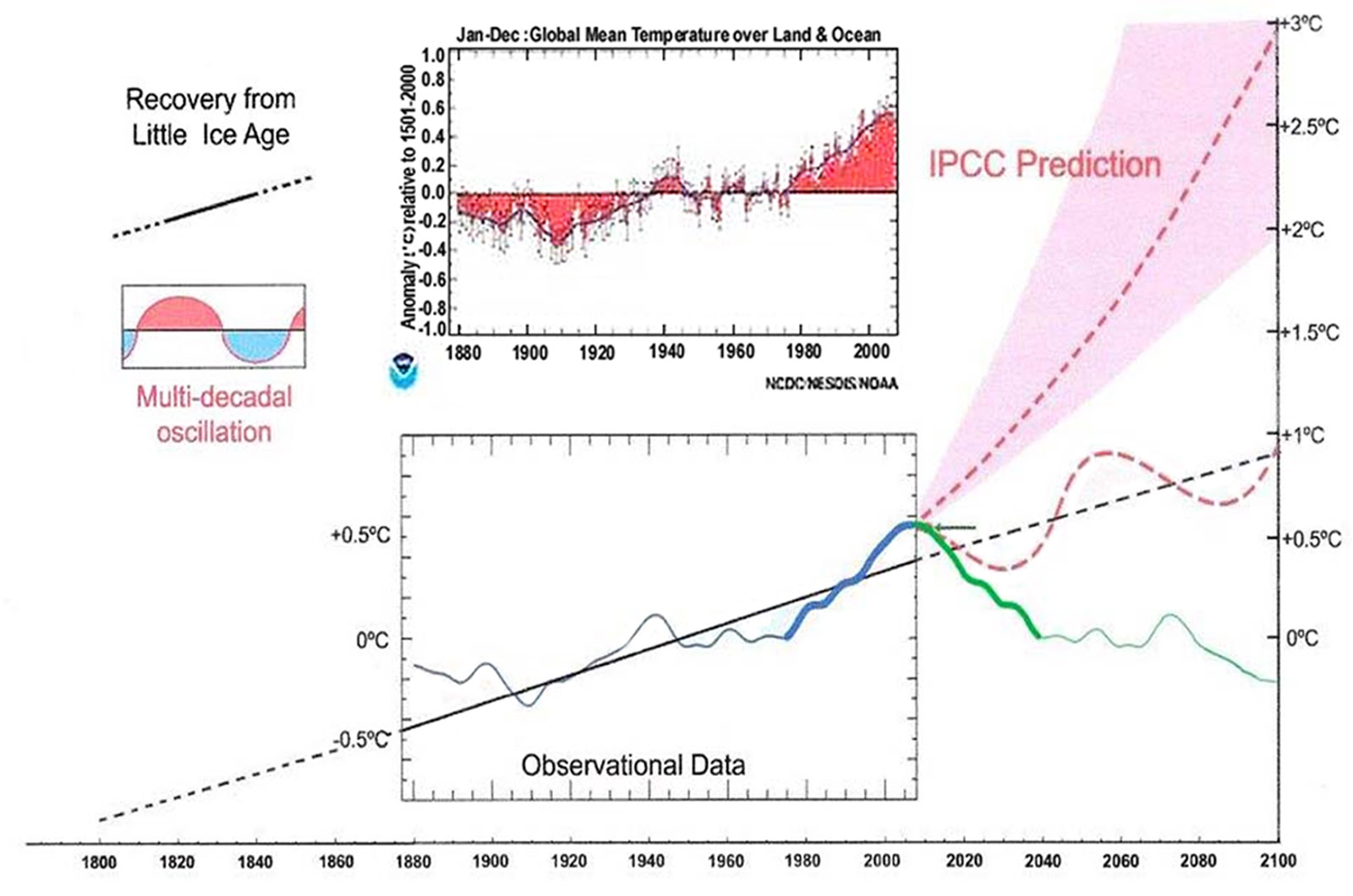
Over the past 2,000 years, the average temperature of the Northern Hemisphere has exceeded natural variability (defined as two standard deviations from the pre-1865 mean) three times: 1) the peak of the Medieval Warm Period 2) the nadir of the Little Ice Age and 3) since 1998. Human activities were unlikely to have been the cause of the first two deviations. 70% of the warming since the early 1600’s clearly falls within the range of natural variability.

On a climatology basis, the modern warming only exceeds Common Era pre-industrial natural variability by a maximum of 0.216° C

6. Temperature Changes in the United States
KEY FINDINGS
1. Average annual temperature over the contiguous United States has increased by 1.2°F (0.7°C) for the period 1986–2016 relative to 1901–1960 and by 1.8°F (1.0°C) based on a linear regression for the period 1895–2016 (very high confidence). Surface and satellite data are consistent in their depiction of rapid warming since 1979 (high confidence). Paleo-temperature evidence shows that recent decades are the warmest of the past 1,500 years (medium confidence).
Page 267
“Medium confidence” is equivalent to a Scientific Wild-Ass Guess (SWAG).

The lame-stream media took “suggestive evidence, limited consistency, models incomplete, methods emerging, competing schools of thought and turned it into a statement of fact:
Just as troubling were draft findings destined for the quadrennial National Climate Assessment. Scientists from 13 federal agencies found that a rapid rise in temperatures since the 1980s in the United States represents the warmest period in 1,500 years.
A “medium confidence” Mannian Hockey Stick became: “Scientists from 13 federal agencies found that a rapid rise in temperatures since the 1980s in the United States represents the warmest period in 1,500 years.”
They based this assertion on one hockey-stick climate reconstruction, Mann et al., 2008.

None of the spectrally consistent reconstructions (Moberg, Esper, Ljungqvist, etc. were cited)… I wonder why?
So, what would it mean, if the reconstructions indicate a larger (Esper et al., 2002; Pollack and Smerdon, 2004; Moberge t al., 2005) or smaller (Jones et al., 1998; Mann et al., 1999) temperature amplitude? We suggest that the former situation, i.e. enhanced variability during pre-industrial times, would result in a redistribution of weight towards the role of natural factors in forcing temperature changes, thereby relatively devaluing the impact of anthropogenic emissions and affecting future predicted scenarios. If that turns out to be the case, agreements such as the Kyoto protocol that intend to reduce emissions of anthropogenic greenhouse gases, would be less effective than thought.

12. Sea Level Rise
KEY FINDINGS
1. Global mean sea level (GMSL) has risen by about 7–8 inches (about 16–21 cm) since 1900, with about 3 of those inches (about 7 cm) occurring since 1993 (very high confidence). Human-caused climate change has made a substantial contribution to GMSL rise since 1900 (high confidence), contributing to a rate of rise that is greater than during any preceding century in at least 2,800 years (medium confidence).
2. Relative to the year 2000, GMSL is very likely to rise by 0.3–0.6 feet (9–18 cm) by 2030, 0.5–1.2 feet (15–38 cm) by 2050, and 1 to 4 feet (30–130 cm) by 2100 (very high confidence in lower bounds; medium confidence in upper bounds for 2030 and 2050; low confidence in upper bounds for 2100). Future emissions pathways have little effect on projected GMSL rise in the first half of the century, but significantly affect projections for the second half of the century (high confidence). Emerging science regarding Antarctic ice sheet stability suggests that, for high emission scenarios, a GMSL rise exceeding 8 feet (2.4 m) by 2100 is physically possible, although the probability of such an extreme outcome cannot currently be assessed. Regardless of emissions pathway, it is extremely likely that GMSL rise will continue beyond 2100 (high confidence).
Page 493
“Global mean sea level (GMSL) has risen by about 7–8 inches (about 16–21 cm) since 1900, with about 3 of those inches (about 7 cm) occurring since 1993 (very high confidence)”… And?
Sea level has been rising at a secular rate of about 1.9 mm/yr since the end of neoglaciation (~1860 AD).

About 3 inches of sea level rise has occurred since 1993. About 4 inches of sea level rise occurred from 1930-1950. There was very little sea level rise from 1951-1992.

“Human-caused climate change has made a substantial contribution to GMSL rise since 1900 (high confidence)”… Based on what???
“Contributing to a rate of rise that is greater than during any preceding century in at least 2,800 years (medium confidence)”… Another SWAG based on another hockey stick (Kopp et al., 2016).

“Relative to the year 2000, GMSL is very likely to rise by 0.3–0.6 feet (9–18 cm) by 2030, 0.5–1.2 feet (15–38 cm) by 2050, and 1 to 4 feet (30–130 cm) by 2100 (very high confidence in lower bounds; medium confidence in upper bounds for 2030 and 2050; low confidence in upper bounds for 2100).”
At least they get this one somewhat correct.
“Relative to the year 2000, GMSL is very likely to rise by… 1 to 4 feet (30–130 cm) by 2100 (very high confidence in lower bounds… low confidence in upper bounds for 2100)”
Sea level is very likely to rise a bit less than 1 foot over the remainder of this century.

Figure ES.8b is simply bat schist crazy.

And, of course, the lame-stream media turns this into…
The report, by more than 450 scientists from 60 nations, also found that greenhouse gases in the atmosphere and global sea levels are at their highest levels on record.
It all depends on when you start the record.

Life in the Adjustocene
Yesterday, I authored a post about NCA3’s model projections and I noted that the observations had falsified their models…

Well, it appears that NCA4 will address this issue by adjusting the observations to match the models…

They adjusted the observations to match the model in the current draft report.

NCA4 shows the observations tracking the model-mean prior to the 2016 El Niño and then spiking above the mean during it. Nick Stokes provided the following image in one of his very astute comments:

Conclusions
NCA4 paints a picture of the climate basically behaving within the general bounds of Late Holocene natural variability, accompanied by lots of rhetoric about being certain that humans have caused at least half of whatever happened since 1950…
“Same as it ever was”…
Basically the assessment attempts to state what the previous administration would find useful regardless of the limited real world evidence in support. Unfortunately any review under the current administration, even if it is totally objective and limits conclusions to what the evidenced really shows, will likely be labeled as right wing propoganda by much of the media and the entire green fraternity.
“”Global mean sea level (GMSL) has risen by about 7–8 inches (about 16–21 cm) since 1900″”
You know….I’m having a real problem with this
I’m on a rock island…..there’s a rock quarry on it…..the quarry was built for boats to pull up and load/unload
There’s a dock with steps carved into the rock…and the steps were designed so at high tide you didn’t get your feet or equipment wet with salt water…..
8 inches is one whole step……
High tide stills hits right below the bottom step…like it was designed over 100 years ago
“Global” is an average. Local sea level changes can vary from falling to rising faster than the global average.
The two closest gauges to me….one 80 miles north….and one 80 miles south….both show the same sea level rise…and this island is not moving up or down…otherwise, they would be too
An ‘average’ would imply that there are places where sealevel has risen much more than the 7-8 inches mentioned. Do they indeed exist and if so why don’t we hear more about them?
Well the use of the word “average” as something that has some meaning, also implies that the system is LINEAR.
The average value of a variable that grows exponentially, is completely worthless information.
OOoops ! I forgot. There’s no such thing as the average of a variable.
Average is statistics, and there are NO variables in statistics; only exactly known finite real numbers. There aren’t even any units or dimensions in statistics; just numbers, so there is no connection between the real physical universe and statistics.
All real universe things have dimensions, like LMT and the like.
G
Probably due to isotactic rebound, otherwise the land is lifting at about the same rate as sea level is rising at your location.
Wouldn’t that be a remarkable coincidence? What, if anything, is so special about Latitude’s location?
That is the question isn’t it. Is there anywhere that anyone knows that has had close to a 1 foot rise in sea level since 1900 and it’s documented with evidence.
I Googled “visual evidence of sea level rise.”
One of the links was to a NatGeo sea level rise photo gallery…
http://ocean.nationalgeographic.com/ocean/photos/sea-level-rise/
None of the photos present any evidence of sea level rise.
yep…right on top of sea floor volcanoes……..gravity
http://image.made-in-china.com/2f0j00KeNTPWQnZhku/Water-Slide-Hill-Side-WS-038-.jpg
After the mines and tank traps had been cleared from my local beach, we children were allowed access.
Seventy years on and I can see no perceptible difference in the tideline from that we finally enjoyed all those years ago.
I now live on a coast 300 miles north of my south coast youth and postcards of this undeveloped beach from the beginning of the 20thC are remarkably similar to today.
I think we are educating far too many children beyond the limits of their intelligence.
Perhaps all the sea level rise is hiding in the middle of the oceans not at the coasts. If so all container ships may have to navigate around the humps or get more powerful engines. /s
Sea level “rises” just due to the West to East rotation of the earth (land) and the viscosity of water, but then there are ocean currents that are like rivers without real banks, and those rivers meander randomly, and that random meandering interferes with the simple West-East movement resulting in a meandering sea level rise.
So I’m sure that as far as tide gauges are concerned, Nyquist is very unhappy.
So you know the relative land water altitude at some spot where somebody stuck a stick in the ground. Whoopee !
G
Humans influence the primary measurement of climate change (temperature) in three ways: emissions; land use changes; and, temperature “adjustments”. It should be no surprise that the combination of these three influences might exceed half of the reported changes.
Can we sign up somewhere to comment or provide another input to this assessment?
You can apply to be a “review editor”…. http://www.globalchange.gov/notices
I started reading the report, have not finished yet. In the introduction, I’m surprised that no CDC emergency was created from all the dislocated shoulders from all these “experts” so vigorously patting themselves on the back.
This is what IPCC wrote about the so-called Representative Concentration Pathways:
“..Representative Concentration Pathways, are referred to as pathways in order to emphasize that they are not definitive scenarios, but rather internally consistent sets of time-dependent forcing projections that could potentially be realized with more than one underlying socioeconomic scenario. The primary products of the RCPs are concentrations but they also provide gas emissions. They are representative in that they are one of several different scenarios, sampling the full range of published scenarios (including mitigation scenarios) at the time they were defined, that have similar RF and emissions characteristics. … The primary objective of these scenarios is to provide all the input variables necessary to run comprehensive climate models in order to reach a target RF … »
IPCC;WGI;AR5;Page 1045
By this paper, the scenarios presented by IPCC seem to be wildly exaggerated: The implications of fossil fuel supply constraints on climate change projections: A supply-driven analysis (See figure 2 and 4 for a quick overview. SD-PC = supply-driven peak conventional fossil fuels’scenario. SD-PCU= supply-driven peak conventional & non-conventional fossil fuels’scenario)
From the abstract: «Climate projections are based on emission scenarios. The emission scenarios used by the IPCC and by mainstream climate scientists are largely derived from the predicted demand for fossil fuels, and in our view take insufï¬cient consideration of the constrained emissions that are likely due to the depletion of these fuels. This paper, by contrast, takes a supply-side view of CO2 emission, and generates two supply-driven emission scenarios based on a comprehensive investigation of likely long-term pathways of fossil fuel production drawn from peer-reviewed literature published since 2000.»
RCP 8.5 is the green blob’s monster under the bed.
David Middleton
Lots of very busy charts & graphs.
Why do we even bother when we know the data is bad & the models are (also) bad?
Always have to look behind the curtain or the wizard gets to keep pretending.
https://youtu.be/_h4DZeBleLs
Surely more accurate to say “…exceeds ‘the upper bounds of’ Common Era pre-industrial natural variability…”? The 0.216 figure is the amount ‘above’ the upper 95% confidence margins according to the second chart. Average NH pre-industrial temperatures are given as around -0.23 on that chart, meaning the HadCRUT figure.
Some other questions/points:
The second chart is from a paper dated 2010 but purports to show HadCRUT4 values. HadCRUT4 wasn’t released until 2012. Has the cart been retrospectively updated? Might this actually be HadCRUT3 data, which had less NH (specifically Arctic) coverage than HadCRUT4 and was therefore cooler?
Does the data stop in 2010 or earlier, thus missing out on the 3 warmest years in the HadCRUT NH data set (2014, 2015 & 2016)? If so, then we must presume that the 0.216 C above the upper 95% confidence level has increased somewhat since the chart was made.
Lastly, by HadCRUT’s own admission, their data set contains a cool bias for NH temperatures due to its continued sparse coverage of the Arctic. Actual NH temperatures are therefore likely higher than those suggested by HadCRUT.
The reconstruction is from 2010. HadCRUT4 is simply posted on the same graph at the same scale. Ljungvist used a subset of HadCRUT for his instrumental tie-in in his paper.
The 0.216 C is from HadCRUT4. It includes the recent years. But it is a 30-yr average to reflect climatology rather than weather.
The Mann Hockey Stick basically shows something similar. The unidentified “thermometer record” goes up to 2015. And shows 0.3 C deviation from pre-industrial variability.
What warming has there really been since 1950?
Mann had to ditch the tree ring data post 1960 because it diverged fr the adjusted thermeter record and did not show the adjusted warming.
The Climategate emails specifically highlight and discuss that the tree ring data showed no 1970 warming.
We know fr the satellite data that there was no significant warming between inception (1979) and the run up to the super El Nino of 1997/98. There is a very slight positive trend but not statistically significant.
The satellite data suggests that the only significant warming events are the super El Nino of 1997/98 and the strong El Nino of 2015/16. The latest ENSO cycle has yet to complete and if there is a La Nina at the end of 2017/early 2018 it is likely that the 2016 spike will be a very short lived affair.
These two El Nino were not manmade but rather were natural events.
I would suggest that it is quite likely that the Northern Hemisphere is about the same temperature today as it was in around 1940 and hence the likelihood that man has contributed to any real warming ( as opposed to manmade adusted data perceptions) is rather low.
DWR brings up an interesting thought. Hadcrut 3 ran cooler due to less of the Arctic being added in. That makes me think that this shows how meaningless a global average temp is for the most part. To most everyone, plus plants/animals, in the NH there is little global warming with the exception of slightly warmer evenings. I would bet that the plants and animals welcome the warmer evenings.
Thanks David.
“Hadcrut 3 ran cooler due to less of the Arctic being added in”
There are two major problems regarding this.
Firstly, more of the Arctic can’t be added in the past so there is no comparison to make.
Secondly, the difference in Arctic coverage between that and satellite data doesn’t explain this because the 0.43% coverage area above 82.5N, makes virtually no difference to the global average. The warming needed to occur in 0.43% of the planets surface just to increase global temperature by 0.1c is ridiculously high.
All it has been was an excuse to alter the data samples to show more warming where there was none, by comparing with samples in the past that didn’t even exist.
I would like to see open discussion. So maybe the red team blue team concept should be instituted. Thanks for your work David.
Had a look at the summary of the last one… the very definition of dysfunctional thinking.
Relentless doom, gloom and negativity and all because of humankind. Just incredible.
How do you ‘put it nicely’? Those folks are mentally ill. Their thinking is so warped and they go through dozens of self-contradictions in order to keep the negativity flowing.
I get to thinking they’re like little children. Painting a picture so bad, gloomy and of such pitiful helplessness, presumably to some ‘higher power’ (parents)) that they just have be swept up and rescued.
Its a plea for help.
Meanwhile, show them this and see if any heads explode.
https://cleantechnica.com/2017/08/15/researchers-create-new-passive-cooling-material-uses-no-energy-water/
Clever stuff huh?
I wonder, just like you are wondering now, that if some (special high emissivity) glass beads in a transparent sheet 50um thick can radiate away infra-red radiation and hence have a cooling effect – what effect would some (special high emissivity) molecules in a transparent sheet 10,000 metres thick have?
Carbon dioxide may be a very good absorber of infra-red but it cannot absorb forever.
It has to be a good emitter at the self same time..
So, who has got it wrong? These guys or believers in the green house gas effect?
These lads have some stuff and can do actual experiments with What do warmists have apart from endless appeal to authority and a pitiful (mis)understanding of what Tyndall did, Planck said and Einstein wrote on his blackboard?
And that is precisely where Red Team Blue Team need to go – right back to Square One and re-examine this entire Green House Effect and cut this monster off clean at its roots.
Until these clowns (Hayhoe, anyone?) can explain the 1880-1940 warming, I don’t believe a word they say
Until these clowns can explain the 1940-1975 cooling, I don’t believe a word they say
Until these clowns can explain the abundant wave-cut benches worldwide that are about 2m above modern sea level (and date to the Holocene Optimum), I don’t believe a word they say about “unprecedented” sea level
Until these clowns quit adjusting temperature data from the 1930s downward, I don’t believe a word they say about “unprecedented” high temperatures
Pretty much, I see no reason to believe them at all
The graphs show CO2 rocketing toward 800 ppm. They are ignoring global greening which has greatly increased the uptake of CO2. link
If we’re going to be quoting from that Talking Heads album…
You may find yourself living in that shotgun shack….
Gotta love the Talking Heads… “There is water at the bottom of the ocean”… Who would have guessed?
“I’ve changed my hairstyle so many times now I don’t know what I look like”
Hmmmm, very similar to past temperature record adjustment.
Yea! Griff is finally posting to WUWT to warn us of the dangers had we stayed in the Paris Climate accords.
I too have a problem with believing we can measure “global average sea level” rises so accurately. It seems to me you are either taking the mean of tidal gauges, which like proxies, have different confounding influences like natural and man-made land deformations, or you are taking data from satellites over a much smaller amount of time and those measurements could be rough due to wave height or other non-sea level rise related factors.
I do not dispute that sea level is rising, but our “confidence” in the way measurement data is used and accuracy assigned always makes me pause.
Better to just keep adapting as necessary and then in 2100 we can actually tell if the seas rose 1 foot or 20. It’s really moot since we have no control over it.
I keep wondering if I will live long enough to see the end of the warm period we now live in. The likelihood of a new cold period starting is very high over the next few hundred years. I bet they won’t be complaining about CO2 by then, they will have moved on to the relationship of too much fire causes global cooling because ever since it started getting cold they have correlated more fire use. The only way to save ourselves will be to put a tax on heat to limit its use.
The funny part is we were around in 1850 and you were look at that figure 7 graph, Griff would be swearing that the oceans were going to run out of water next year.
Here is a set of historical temperature charts scattered about the globe that all show 1930s-40s temps are the hottest to date. Dave maybe your the guy to do a post on this and dig up others. The charts in the climate report are total garbage and all the models tuned to garbage are the same. This would make the need for all the angst and suspense over the past 40yrs totally unnecessary.


Reykjavik, Iceland
http://notrickszone.com/wp-content/uploads/2012/03/Caryl1.gif
Nuuk Greenland
USA
South Africa
There is an obvious spurious temp in Iceland in 2010, a year of no note.
In 2010 there was a cute little volcano eruption. The expelled dust only stopped half the air traffic in Europe for a week.
But the melting of a lot of ice before and during the eruptions can’t have been the cause for the unusual warm year. /s
I consider it quite probable that the Northern Hemisphere is today about the same temperature as it was back in around 1940.
Indeed even Biffa/Mann’s tree ring data suggested that.
The only warming in today’s data sets is the result of adjustments to the data. This raises a very simple question: are the adjustments sound.
That is an easy question to answer if we conduct the necessary experiment. All we need do is audit all the stations and select the best 150 to 200 stations that are best sited, have no station moves, no changes in nearby land use, no encroachment of UHI, best practices of maintenance, observation practice and record keeping, and the retrofit them with the same LIG thermometer as used by each station in question. We then observe using the same practice (eg, TOB) as used by each station in question.
Preferably these stations would be reasonably well spatially distributed and no attempt is made to create a hemisphere data set. Merely confirm RAW data collected today at each station with the station’s own historic 1930/40 RAW data. There would then be no need for any adjustment since like is being compared with like.
We merely note how many stations show warming and by how much. This would quickly provide us with an indication as to how much, if at all, the Northern Hemisphere has warmed.
Since there is all but no historic data for the Southern Hemisphere we would not llok at that..
A comparison with the highs of the 1930s/1940 is a good one since not only do we know this was a warm period but also some 95% of all manmade CO2 has been emitted since then. Thus this would identify whether man may have contributed to any real warming.
Since CO2 is a well mixed gas (at least at high altitudes, +/- about 10ppm) if pur CO2 emissions have not caused the Northern Hemisphere to have warmed then we cannot have caused the Southern Hemisphere to have warmed (if indeed it has).
Let us conduct some proper science and carry out the observational experiment required to determine whether the Northern Hemisphere has really warmed these past 70 years or so.
The mistake of blaming CO2 for climate change reminds me of the joke about a person who lost something in the dark but was looking for it under a streetlight because he could see better.
Radiation from gas molecules is completely different from radiation from solid or liquid surfaces. Thermalization (the conversion of photon energy into heat energy) and the Maxwell-Boltzmann distribution of molecule energy explain why CO2 gas molecules do not, never have and never will have a significant effect on climate.
Water vapor is a ‘greenhouse gas’. Its presence in the atmosphere has made the planet warm enough for life as we know it. But it is now increasing at about 1.5% per decade. It has increased about 8% since the more rapid increase began in about 1960. The rising WV coincides with rising irrigation, especially spray irrigation on fields and lawns. WV is rising more than twice as fast as expected from the temperature increase of the water (feedback).
The warming from the increasing water vapor (perhaps explaining the slight rise as shown in the UAH temperature trend) is welcome (countering the average global cooling which would otherwise be occurring as a result of declining net effect of ocean surface temperature cycles and a declining proxy which is the time-integral of SSN anomalies). It will certainly mitigate and perhaps prevent decline into another little ice age . . . or worse.
On the down side, the added WV increases the risk of precipitation related flooding. How much of recent flooding (with incidences reported world wide) is simply bad luck in the randomness of weather and how much is because of the ‘thumb on the scale’ of increasing water vapor? This threat can be partially addressed by attending to adequacy of water retaining infrastructures such as dikes, dams, etc.
GCMs have demonstrated “epic fail”. They aren’t going to get any better until the ‘climate scientists’ take the blinders off, stop blaming CO2, start inputing measured local water vapor as an initial condition and rationally calculating it during execution.
I love this idea. Any time I meet a Warmist with scientific pretensions I tease them with it…and ask them if we should ban irrigation?
Right at the end I (just to mess with their minds) I point out that Water Vapour is of course the main coolant in the atmosphere through convection and transportation of heat!
Note: Torturing Warmists is the only form of sadism I practice.
I like it.
If you’re serious about stopping man-made warming, then put all the nasty, sunlight-blocking pollution back in the air and quit irrigating food, lawns and golf courses.
NATURAL CYCLES DRIVE CLIMATE CHANGE.
A recent paper emphasizes the importance of the Millennial Cycle and supports my earlier forecasts of a coming long term cooling .
Harmonic Analysis of Worldwide Temperature Proxies for 2000 Years
Horst-Joachim Lüdecke1, *, Carl-Otto Weiss2
The Open Atmospheric Science Journal
ISSN: 1874-2823 ― Volume 11, 2017
Year: 2017
Volume: 11
First Page: 44
Last Page: 53
Publisher Id: TOASCJ-11-44
DOI: 10.2174/1874282301711010044
“Abstract
The Sun as climate driver is repeatedly discussed in the literature but proofs are often weak. In order to elucidate the solar influence, we have used a large number of temperature proxies worldwide to construct a global temperature mean G7 over the last 2000 years. The Fourier spectrum of G7 shows the strongest components as ~1000-, ~460-, and ~190 – year periods whereas other cycles of the individual proxies are considerably weaker. The G7 temperature extrema coincide with the Roman, medieval, and present optima as well as the well-known minimum of AD 1450 during the Little Ice Age. We have constructed by reverse Fourier transform a representation of G7 using only these three sine functions, which shows a remarkable Pearson correlation of 0.84 with the 31-year running average of G7. The three cycles are also found dominant in the production rates of the solar-induced cosmogenic nuclides 14C and 10Be, most strongly in the ~190 – year period being known as the De Vries/Suess cycle. By wavelet analysis, a new proof has been provided that at least the ~190-year climate cycle has a solar origin.”
The paper also states “……G7, and likewise the sine representations have maxima of comparable size at AD 0, 1000, and 2000. We note that the temperature increase of the late 19th and 20th century is represented by the harmonic temperature representation, and thus is of pure multiperiodic nature. It can be expected that the periodicity of G7, lasting 2000 years so far, will persist also for the foreseeable future. It predicts a temperature drop from present to AD 2050, a slight rise from 2050 to 2130, and a further drop from AD 2130 to 2200 (see Fig. 3), upper panel, green and red curves.”
Climate is controlled by natural cycles. Earth is just past the 2003+/- peak of a millennial cycle and the current cooling trend will likely continue until the next Little Ice Age minimum at about 2650.See the Energy and Environment paper at http://journals.sagepub.com/doi/full/10.1177/0958305X16686488
and an earlier accessible blog version at http://climatesense-norpag.blogspot.com/2017/02/the-coming-cooling-usefully-accurate_17.html
Here is the abstract:
“ABSTRACT
This paper argues that the methods used by the establishment climate science community are not fit for purpose and that a new forecasting paradigm should be adopted. Earth’s climate is the result of resonances and beats between various quasi-cyclic processes of varying wavelengths. It is not possible to forecast the future unless we have a good understanding of where the earth is in time in relation to the current phases of those different interacting natural quasi periodicities. Evidence is presented specifying the timing and amplitude of the natural 60+/- year and, more importantly, 1,000 year periodicities (observed emergent behaviors) that are so obvious in the temperature record. Data related to the solar climate driver is discussed and the solar cycle 22 low in the neutron count (high solar activity) in 1991 is identified as a solar activity millennial peak and correlated with the millennial peak -inversion point – in the UAH6 temperature trend in about 2003. The cyclic trends are projected forward and predict a probable general temperature decline in the coming decades and centuries. Estimates of the timing and amplitude of the coming cooling are made. If the real climate outcomes follow a trend which approaches the near term forecasts of this working hypothesis, the divergence between the IPCC forecasts and those projected by this paper will be so large by 2021 as to make the current, supposedly actionable, level of confidence in the IPCC forecasts untenable.”
The forecasts in Fig 12 of my paper are similar to those in Ludecke et al.
It is well past time for a paradigm shift in the forecasting methods used by establishment climate science. The whole dangerous global warming delusion is approaching collapse.
NATURAL CYCLES DRIVE CLIMATE CHANGE.
A recent paper emphasizes the importance of the Millennial Cycle and supports my earlier forecasts of a coming long term cooling .
Harmonic Analysis of Worldwide Temperature Proxies for 2000 Years
Horst-Joachim Lüdecke1, *, Carl-Otto Weiss2
The Open Atmospheric Science Journal
ISSN: 1874-2823 ― Volume 11, 2017
Year: 2017
Volume: 11
First Page: 44
Last Page: 53
Publisher Id: TOASCJ-11-44
DOI: 10.2174/1874282301711010044
“Abstract
The Sun as climate driver is repeatedly discussed in the literature but proofs are often weak. In order to elucidate the solar influence, we have used a large number of temperature proxies worldwide to construct a global temperature mean G7 over the last 2000 years. The Fourier spectrum of G7 shows the strongest components as ~1000-, ~460-, and ~190 – year periods whereas other cycles of the individual proxies are considerably weaker. The G7 temperature extrema coincide with the Roman, medieval, and present optima as well as the well-known minimum of AD 1450 during the Little Ice Age. We have constructed by reverse Fourier transform a representation of G7 using only these three sine functions, which shows a remarkable Pearson correlation of 0.84 with the 31-year running average of G7. The three cycles are also found dominant in the production rates of the solar-induced cosmogenic nuclides 14C and 10Be, most strongly in the ~190 – year period being known as the De Vries/Suess cycle. By wavelet analysis, a new proof has been provided that at least the ~190-year climate cycle has a solar origin.”
The paper also states “……G7, and likewise the sine representations have maxima of comparable size at AD 0, 1000, and 2000. We note that the temperature increase of the late 19th and 20th century is represented by the harmonic temperature representation, and thus is of pure multiperiodic nature. It can be expected that the periodicity of G7, lasting 2000 years so far, will persist also for the foreseeable future. It predicts a temperature drop from present to AD 2050, a slight rise from 2050 to 2130, and a further drop from AD 2130 to 2200 (see Fig. 3), upper panel, green and red curves.”
Climate is controlled by natural cycles. Earth is just past the 2003+/- peak of a millennial cycle and the current cooling trend will likely continue until the next Little Ice Age minimum at about 2650.See the Energy and Environment paper at http://journals.sagepub.com/doi/full/10.1177/0958305X16686488
and an earlier accessible blog version at http://climatesense-norpag.blogspot.com/2017/02/the-coming-cooling-usefully-accurate_17.html
Here is the abstract:
“ABSTRACT
This paper argues that the methods used by the establishment climate science community are not fit for purpose and that a new forecasting paradigm should be adopted. Earth’s climate is the result of resonances and beats between various quasi-cyclic processes of varying wavelengths. It is not possible to forecast the future unless we have a good understanding of where the earth is in time in relation to the current phases of those different interacting natural quasi periodicities. Evidence is presented specifying the timing and amplitude of the natural 60+/- year and, more importantly, 1,000 year periodicities (observed emergent behaviors) that are so obvious in the temperature record. Data related to the solar climate driver is discussed and the solar cycle 22 low in the neutron count (high solar activity) in 1991 is identified as a solar activity millennial peak and correlated with the millennial peak -inversion point – in the UAH6 temperature trend in about 2003. The cyclic trends are projected forward and predict a probable general temperature decline in the coming decades and centuries. Estimates of the timing and amplitude of the coming cooling are made. If the real climate outcomes follow a trend which approaches the near term forecasts of this working hypothesis, the divergence between the IPCC forecasts and those projected by this paper will be so large by 2021 as to make the current, supposedly actionable, level of confidence in the IPCC forecasts untenable.”
The forecasts in Fig 12 of my paper are similar to those in Ludecke et al.
It is well past time for a paradigm shift in the forecasting methods used by establishment climate science. The whole dangerous global warming delusion is approaching collapse
The sustained increase of water vapor of about 1.5% per decade (my estimate 8% since 1960) is a recent factor which is countering the expected cooling. I expect that cloud cover, especially low altitude clouds, is or will be occurring to help the cooling. The planet is entering new and uncertain territory.
Fig 11 from the paper linked above shows the clear relationship between tropical cloud cover and temperature. The millennial inversion point at the turn of the century +/- marks the temperature peak of the millennial cycle. Cooling should continue until about 2650.

The territory is not new – it is similar to the previous millennial peak at about 990 and the coming total NH decline may be reasonably forecast at about 1.7 degrees C+/-
Note also the annual variability about the 50 year moving average when making short term
forecast / outcome comparisons.
Refs.
Humlum O. Climate4you graph. Tropical cloud cover and global air temperature, http://www.climate4you.com/ (2011, accessed 16 December 2016).
Christiansen B and Ljungqvist FC. Clim Past 2012; 8: 765–786, http://www.clim-past.net/8/765/2012/ (accessed 16 December 2016
DR N – I am familiar with the climate4 graph. Because it provides data prior to about 1980 it must be from ground observation and substantially uncertain with respect to global coverage. Also, cause and effect could go either way. I am still looking for credible numerical global cloud cover including cloud elevation.
The other graph is somewhat different from the graph by Loehle at http://www.econ.ohio-state.edu/jhm/AGW/Loehle/Loehle_McC_E&E_2008.pdf Both graphs had to be from proxies which makes them a bit fuzzy. Fraction of total surface area covered is necessarily low and the 71% of earth’s surface covered by oceans is excluded.
The increasing water vapor, particularly since 1960, makes it ‘new territory’ beyond any otherwise similar. The numerical data is NASA/RSS satellite based measurements thru June at http://data.remss.com/vapor/monthly_1deg/tpw_v07r01_198801_201706.time_series.txt (if that doesn’t work, change 06 to 07 and get another month). I graph this in Fig 3 of my blog/analysis.
I have an extremely high confidence that these people have not one iota of appreciation of what is nature and natural variability. They are just lost in their own evil virtual world of alarm, foolishness, and fantasy.
I know from watching UK Met Office, ECMWF, various parts of NOAA, Meteociel France, Beijing Climate Center, Canadian, German and many other that weather models, that they can barely hold together for much longer than 7 days without gross errors creeping in. Not one of the weather models holds up well for the seasonal forecast, except for the most broad-brush possible probabilities. If anyone believes that climate models can do better, and for decades at a time, then all that can be said is that they are very deluded.
Estoy emocionado porque MI TEORÍA sobre Calentamiento Global – Cambio Climático se esta cumpliendo. MI TEORÍA lo envié en el 2013 al presidente Obama,a Bill Clinton,a Al Gore,a Bill Gates,a Geologos cientificos de la universidad de Insubria en Como Italia. Nadie mi hizo caso y hoy todos están de acuerdo con mi Teoría. Estoy aumentando datos y escribiendo como la Comunidad Científica Internacional exige para ser publicada.
” “Medium confidence” is equivalent to a Scientific Wild-Ass Guess (SWAG).”
The confidence level terminology adopted within climate science would be laughable if it wasn´t so sad. To refer to something described as: « Suggestive evidence ( a few sources, limited consistency, models incomplete, methods emerging, etc.), competing schools of thought » as “medium confidence” is beyond absurd.
Anyhow, there is no sound scientific of philosophical basis for that kind of expression within a sound scientific practice.
The confidence level terminology was adopted to place a facade of objectivity over the subjective opinions of the authors.
The GAT linear trend 1900 – 1950 when human CO2 emissions were insignificant is steeper than the trend 1950 – 2000 when human emissions are assumed to be the dominant climate forcing agent.
http://www.woodfortrees.org/plot/hadcrut4gl/from:1900/to:1950/trend/plot/hadcrut4gl/from:1950/to:2000/trend
If land use can account for the warming before 1950, it can account for the warming after.
No comments that I have seen so far about CO2 optimum level, which I have seen given as 2000 ppm; at 400 ppm now, it is about one-fifth of optimum. In past ages it was much higher than 400; in falling to c. 280 ppm it approached perilously near the point at which life begins to die. At nearer optimum, plant growth would skyrocket, helping to cool the earth with shade, water vapor transpiration, and the like. The alarmists seem to think the earth was made without thermostats; Willis Eschenbach has written eloquently about thunderstorms as a thermostat even at our current low level of CO2.
According to this summary, the method of climate change attribution used in the report seems to be more primitive than was acceptable within the IPCC detection and attribution science community in the 1990s.
Back then, Hansen’s 1988 attribution claim was rejected because it was primarily based on instrumental-based GMT standard deviation from a norm to find the abnormality (and so attribution) to 99% likelihood. This attribution claim was roundly rejected by the scientific community, including by the authors of IPCC first assessment (Wigley and Barnett), because it was not an adequate way to determine deviation from natural variability. In fact, Hansen’s method is a strategy used in a situation of absolute ignorance: to say that things will stay the same except varying in a purely random way (eg it has been raining the last few days, so it will probably rain on tomorrow’s parade). Even in situations of almost absolute ignorance there are those who have argued that, while the presumption of normal distribution over any other presumption is convenient, the case for this presumption is weak (eg., John Maynard Keynes in 1921).
Even on this presumption: to acknowledge MWP and LIA as two natural events at the limits of normal distribution within such a short time frame and to still use this method to show that this third one is unnatural — this is even more silly. In the 1980s and 1990s it was generally agreed that warming ‘pattern analysis’ was more suitable to the task of attribution, and so for the IPCC second assessment Santer used this method to make the case. When, using the short instrumental record, this was shown to fail (missing ‘hotspot’, not much distinction between CO2-driven warming and other drivers of warming patterns, no pre-emissions benchmark etc.), it has pretty much been abandoned as the basic for attribution claims. This is why the hockey stick proxy+instrument GMT 1000-year graph was so important for the IPCC third assessment. There, the anomaly of recent decades was so wildly out of range that one could hardly question that something strange and unnatural is going on.
Now, in this report and perhaps elsewhere, with the measured retreat from the Hockey Stick, it seems we are back very close to Hansen in 1988, only without the furor in the scientific community that occurred back then.
Port Arthur (Tasmania) 1841 benchmark mean tide mark in geologically stable rock shows about 3cm rise.
Real inconvenient data!
Sea level DOWN TREND for MSM’s doomed islands of NAURU, KIRIBATI and VANUATU.
Very inconvenient data from automatic tide gauges verified by high-resolution satellite altimeter measurements.
Antarctic sea levels in long term DOWN TREND.
Wait . . . isn’t that where billions of tonnes of ice are turning to water?
Extremely inconvenient data so yep the UN stopped AU Gov publication between 2008 – 2010.
AAD data did not support IPCC’s warnings of impending catastrophic sea level rise.
You guessed it . . . to this day AAD sea-level data remains un-published.
Fraudsters all!
Attribution in models is a circular argument. The models don’t prove the ascertion because the attributed to human warming is an input.
👍🏿
“with about 3 of those inches (about 7 cm) occurring since 1993 (very high confidence).”
Sorry, the satellite altimetry record was revised downward from an average of 3.2 mm/yr to 2.4 mm/yr. That reduces 7 cm to 5.2 cm and 3″ to 2.2″. And it should reduce the confidence level from very high to perhaps likely. The problem with satellite altimetry (which makes thousands of measurements a day) is not noise, but systematic error.
You are correct!
Single figure representing a temperature of the earth tells anyone NOTHING about the climate and how it is changing. It may get warmer in the tropic while cooling at the poles and the ‘global temperature’ could stay the same.
Climate and climate effects are only ever regional or zonal.
Note: these projections on future CO2 concentrations are a fairy tale, nothing more.
With an increase of CO2 levels in the atmosphere from 280 to 400ppm, natural uptake (CO2 sinks) has increased by roughly 20 Gt per year. As compared to annual anthropogenic emissions of about 36Gt this is a major factor, strongly flattening the Keeling Curve. Otherwise we might see an annual rise of 4.5ppm per year, rather than just 2ppm.
The science of doom wants to suggest that CO2 sinks will stop their work in the near future for … well who knows? Like we have been evil and diserve it or so.
Those 20 Gt are indeed a massive figure, but are easily dwarfed by some 700Gt in natural Co2 turnover. So if we compare these figures, natural uptake of CO2 has only increased by 20/700 = 3%, which is a very modest figure as compared to a 43% increase of atmospheric Co2 (400/280 – 1 = 0.43). This relation should well demonstrate how natural CO2 sinks have yet of of healthy potential to work even stronger in the future.
So the question is, how strongly CO2 sinks will work once we achieve like 500, 700, or even 900ppm, as suggested? If we would suggest a linear relation, at 700ppm it would yield (700 – 280) / 120 * 20 = 87Gt. Sure this may be over optimistic, and more likely we will see diminishing returns. But 50Gt might be a reasonable guess. At that point Co2 levels in the atmosphere would be 2.5times the preindustrial level, with natural uptake only increasing by 50/700 = 7%.
So only to maintain a level of 700ppm, mankind would need to emit 50Gt per y<ear. Even though that might well be possible, an additional increase of 5ppm p.a. as indicated, would require another 40Gt of CO2 emissions, totaling that figure to 90Gt. This figure might be hard to achieve.
If the world held a population of 10 Billion by 2100, that would correspond to 9t per capita. By comparison: the EU is emitting 6.8t per capita today.
For these reasons, the "RCP 6.0" scenario seems highly unlikely, almost impossible to achieve, even if we were seeking to maximize our CO2 output. "RCP 4.5" looks more like a realistic base scenario in the absence of "climate saving", while "RCP 8.5" is pure fiction.
Btw. you might not have seen this yet. I wanted to know for some time, how well CO2 sinks scale with the elevation of CO2 in the atmosphere. So I took the amount of CO2 in the atmosphere according to the Keeling curve minus the natural level. By now we have added over 900Gt of CO2 to the atmosphere.
The other part of course was about determining the effect of CO2 sinks over a longer period. So I took data on global CO2 emissions and subtracted the increase in atmospheric CO2 levels from it. Even though I smoothed the chart a bit by averaging 3 years, it is still pretty erratic.That should not be much of a surprise, as there are strong variations in the mighty natural CO2 cycle (vulcanic activity, better or worse years for plant growth in the northern hemisphere, El Nino and so on..).
Yet the outcome is quite conclusive. CO2 sinks scale almost perfectly with the increase of atmospheric CO2. In fact this relation seems to work almost linearly, and they show no sign of weakening whatsoever.
http://i736.photobucket.com/albums/xx10/Oliver25/Keeling%20vs.%20CO2%20sinks_2.png
(Note: I multiplied the effect of CO2 sinks by 50 to match the scale)
From the article: “Over the past 2,000 years, the average temperature of the Northern Hemisphere has exceeded natural variability (defined as two standard deviations from the pre-1865 mean) three times: 1) the peak of the Medieval Warm Period 2) the nadir of the Little Ice Age and 3) since 1998.”
Hansen’s U.S. surface temperature chart (before bastardization) shows the 1930’s as being 0.5C hotter than 1998.
RC- 8.5 = 960-1400ppm of CO2. (I have seen 1400 before. Did they lower it?)
We have gotten 100ppm in 70 years. We are growing at 2ppm/year. In 80 years we get 160ppm at current rates. From the 400 we are at now it is 560-570 not 960. To get to 960 would require 550ppm in 80 years = 7ppm/year = 3.5 times the current rate.
Granted CO2 production is growing but over the next century energy use will peak and population will peak and we will get more efficient. It is extremely unlikely we will continue to see exponential energy for the rest of the century or that all that energy would be from fossil fuels. Thus rcp8.5 at 960 or 1400 is absurd.
It requires an exponential assumption that is the reason all predictions of the future end up failing. From Malthus to Club of Rome the main problem has been the rate of technology growth.
In the last century we went from 2,000,000 per year dying from natural disasters to 40,000 by the end of the century and 20,000 by the next decade. Harvey has killed 5 people so far. There are sure to be more but we are getting so good at so many things simultaneously any prediction 80 years hence is absurd.
In 80 years we will probably be traveling at near zero cost and energy in 5,000 mph tunnels and our electronics will be so efficient and food production that we will probably be using less energy than today overall and none of it will come from fossil fuels. We will do this without justice warriors.