The Permanent Service for Mean Sea Level (PSMSL) is perhaps the best source for sea level data.
Established in 1933, the Permanent Service for Mean Sea Level (PSMSL) has been responsible for the collection, publication, analysis and interpretation of sea level data from the global network of tide gauges. It is based in Liverpool at the National Oceanography Centre (NOC), which is a component of the UK Natural Environment Research Council (NERC).
I recently downloaded the data from their 2014 sea level reconstruction:
Jevrejeva et al, 2014, Global Mean Sea Level Reconstruction
This page provides a short description and file with data of global sea level reconstruction for the period 1807-2010 by Jevrejeva, S., J. C. Moore, A. Grinsted, A. P. Matthews and G. Spada. All questions about the data themselves should be addressed to Dr. Svetlana Jevrejeva.
Authors have used 1277 tide gauge records of relative sea level (RSL) monthly mean time series from the Permanent Service for Mean Sea Level (PSMSL) database [Holgate et al, 2013]. Detailed descriptions of the RSL time series are available from the data page at the PSMSL. No inverted barometer correction was applied. RSL data sets were corrected for local datum changes and glacial isostatic adjustment (GIA) of the solid Earth [Peltier, 2004].
More information about data and methods for the calculations of global sea level and errors can be found in:
Jevrejeva, S., J.C. Moore, A. Grinsted, A.P. Matthews, G. Spada. 2014. Trends and acceleration in global and regional sea levels since 1807, Global and Planetary Change, vol 113, doi:10.1016/j.gloplacha.2013.12.004
The data file can be downloaded by clicking here.
Description of the file:
The file has five columns:
- time (year, month)
- rate of sea level rise (mm)
- error of the rate (mm)
- global sea level (mm)
- error of global sea level (mm)
The data are sampled monthly; so I smoothed them with a 13-month running average to approximate annual variability. I also added a picture of a 12″ (30 cm) wooden ruler for scale.

The key features of Jevrejeva et al, 2014 (J14) are a falling sea level near the end of Holocene neoglaciation phase and then a steady, secular rise of about 1.9 mm/yr since 1860 as the Earth warmed up from the Little Ice Age.
The steady rise from the Little Ice Age is punctuated by a multi-decadal quasi-periodic fluctuation (a cycle to a geologist)…

If someone only looked at the data from the early 1990’s onward, they might be tempted to declare an acceleration in sea level rise.
J14 is definitely an improvement relative to J08; which failed to capture the falling sea level of the neoglaciation phase.
Fun With Sea Level
No post of mine would be complete without sarcastic and/or sophomoric humor… So here it is:


Further Reading
Oh say can you see modern sea level rise from a geological perspective?
Addendum

So Woodworth used measured data for Liverpool, andJevrejeva et al is a reconstruction. And Liverpool tides do not reflect global sea level
Jevrejeva is a reconstruction from 1,277 tide gauges around the world. Woodworth isn’t even a tide gauge record. It’s a long, but irregular record of “high waters” in a single location. See my revised comment above.
Complete bollox! A recent article in Scientific American proves that, after adjustimating, satellite data confirms super duper scary and accelerating sea level rise.
https://www.scientificamerican.com/article/satellite-snafu-masked-true-sea-level-rise-for-decades/
See this thread…
https://wattsupwiththat.com/2017/07/17/tales-of-the-adjustocene-satellite-sea-level-edition/
I guess I shoulda used the /sarc tag after all….
I knew you were being sarcastic. I just thought you’d like the thread.
david–
I took the Jevrejeva monthly data and used her values for the monthly changes and cumulative sea level rise.
Since the intial rise started in 1855, I used that as the starting point. Got the same answer as Jevrejeva did for acceleration (using just the trendline for the 2000 or so monthly changes)–0.002 mm/yr/yr. However, I can also calculate the uncertainty, with the exact values being 0.00184 +- 0.00130 mm/yr/yr. In other words, not significantly different from zero.
Excel file with this graph and others here:
https://dl.dropboxusercontent.com/u/75831381/Jevrejeva%20sea%20level%20change.xlsx
David–
I just noticed your addendum. I got the same result, but the LINEST function in Excel gives the uncertainty as well: 0.0024 +-0.0016–Again not significantly different from zero.
So whether you start from 1820 or 1855, no acceleration
Strange the data for Stockholm and Amsterdam do not show this dip in 1860 either ref Woodworth.
Seen a graph by Jerejeva issued in 2007 see debunk house does not show the dip either.
Also 1277 tide gauges operating in 1860, I’ll have to check them out as well
Debunk House is me. That’s why I wrote this in the post:
Jeverejeva 2008 (J08) was extremely “noisy” prior to about 1900. A generally falling sea level from about 7,000 years ago up until the end of neoglaciation (~1860) is a feature of most Holocene sea level reconstructions. Globally advancing glaciers generally necessitate falling sea level.
A global reconstruction from multiple stations usually won’t look like the individual stations.
I did not say that all 1,277 tide gauges go back to 1860. Clearly a handful of tide gauges go back that far.
Stockholm and Amsterdam are essentially the only good quality long records, particularly Stockholm which is in a tectonically stable area with no subsidence issues. If it doesn’t show a decline before 1860 there wasn’t any.
It should be noted that the sinking sea-level (actually isostatically rising land) has always been well known to coastal people in the Baltic area, and has been of keen interest to local scientists since the early 18th century, hence the very long and high quality records.
Stockholm exhibits a steadily falling sea level since at least the late 1800’s due to crustal rebound
http://www.psmsl.org/data/obtaining/rlr.annual.plots/78_high.png
http://www.psmsl.org/data/obtaining/stations/78.php
The long-term Stockholm record (Ekman 1988) also shows a steadily falling sea level since the 1700’s.
http://www.psmsl.org/data/longrecords/ekman.1988
The Amsterdam record goes back to 1700. The lowest point is in 1788…
http://www.psmsl.org/data/longrecords/amsterdam.sea.level
Tide gauges are a combination of eustatic (water moving up and down) and isostatic (land moving up and down) sea level changes.
The reconstruction is of eustatic sea level change only.
The highest sea levels of the Holocene occurred during the Holocene Climatic Optimum. Eustatic sea level fell from the HCO to the end of neoglaciation…
Amsterdam exhibited no sea level trend from 1700-1823, step-shifted up, and then exhibited no trend until 1875. Sea level at Stockholm has steadily fallen since 1774…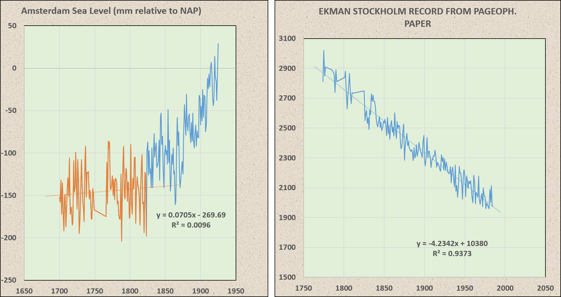
Would you oblige us with a copy of Jeverejeva’s unadjusted graph of results before this post becomes cold. Also how many of the tide stations were operational for 20 years either side of 1860,
Thank you
I have no idea what you mean by “unadjusted graph.”
I don’t have any more access to the raw data than you do. Links to the available data and contact information to the author are here…
http://www.psmsl.org/products/reconstructions/jevrejevaetal2014.php
My purpose in this post was not to defend or attack the data and methods. My purposes were:
1. Demonstrate that there was no evidence of a recent acceleration in sea level rise.
2. Place the magnitude of sea level rise into meaningful context.
The observation that the reconstruction reflects the termination of neoglaciation was just lagniappe.
Something to keep in mind about sea Levels, is back up. For example, researchers found evidence of Viking docks in Lake Superior and, thus, Minn. Vikings. We see these funny little models and wonder what they smoked on the way to work. Let’s remember, every cavity the shoreline has, every little water way must be backed up. Every osmosis of salt, brackish and fresh water must be accounted for. We should take bets on who leaves the shoreline first, Al Gore or Rush Limbaugh. I won’t be around.
It’s interesting to compare this with Holgate 2007:
http://wcrp.ipsl.jussieu.fr/Workshops/SeaLevel/Posters/2_3_Holgate.pdf
There’s a large discrepancy. For the 20th century Holgate obtained a value of 1.67 mm/yr.
For the same period Jevrejeva et al give a value of about 3 mm/yr, which is almost double – and, perhaps slightly suspiciously – is closer to the satellite values.
I see it includes a glacial isostatic adjustment (GIA). I seem to recall that GIA’s are a little controversial. It’s almost as if you can choose any GIA you like. Could they have chosen a GIA that places it close to the satellite value?
Does anyone have any ideas as to why the two studies are out by a factor of almost 2?
Chris
Holgate used 9 tide gauge records and Jevrejeva used 1,277. Over the 20th Century, Jevrejeva had an average rise of 1.97 mm/yr. Holgate used the earlier ICE-4G model for GIA. Jevrejeva used ICE-5G. Holgate applied an inverse barometer. Jevrejeva did not.
The 3 mm/yr “spurts” were from 1930-1950 and 1993-2010. Sea level was relatively flat from 1950-1993.
The divergence is after about 1945. This is probably a function of the number of tide gauges increasing over time.
Jeverejeva and Holgate at the same scale…
The Dutch got fed up with rising sea level. They got water pumps and drained the sea and created Flevoland, a province 80% larger than New York City. It’s more fun in Flevoland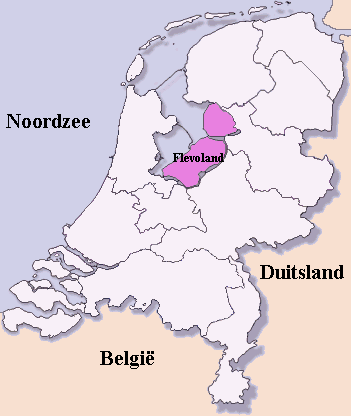
I offer this for what it is worth. The initial graph in the post grabbed my interest due to the negative slope in the early portion. I was unaware of these data so I simply had to take a look.
I started with the Optimal Fourier Transform to get my initial guesses. I used the monthly data too and not something that was smoothed. I was quite surprised at how well it turned out. See the figure below:
https://1drv.ms/i/s!AkPliAI0REKhgZIcbvUHLZfHQawi8w
Here is a sampling of some of the frequencies that I found:
https://1drv.ms/i/s!AkPliAI0REKhgZId9ccN3xVYXdHuRw
I have seen some of these cycles before in some of the other datasets I look at. I do see a lunar cycle. I know I have a 67-year cycle in my analysis of H4. There is also a prominent 60-year cycle.
The anova table is here.
https://1drv.ms/i/s!AkPliAI0REKhgZIe1T1-J_O41vScLw
For a very modest projection I get this.
https://1drv.ms/i/s!AkPliAI0REKhgZIfnDuDgDgmkBAS9g
In a way it looks quite similar to what I am showing for Nino region 3.4 except it missed the magnitude of the recently passed El Nino. Note in the first figure that the El Nino in 82 is featured but not the one in 97-98.
I just finished this and have not really looked at it. It took all night to do this.
I just hope someone can make use of this and that is why I offer it.
Very interesting. The 60-yr cycle shows up in a lot of places. It’s even in the Holocene portion of the GISP2 ice core in Greenland.