Guest Post by Werner Brozek, Excerpts from Barry and Edited by Just The Facts
At Dr. Roy Spencer’s site, regular commenter Barry posted seven very interesting comments, begining here, with respect to the requirements for the UAH pause to resume. He has graciously allowed me to use whatever I wished in this blog post. Everything that appears below is from him until you see the statement “Written by Barry.” below:
___
Since the el Nino rose last year there have been many predictions here that a la Nina would form shortly afterwards and once again return the trend since 1998 to a flat line or cooling. I decided to check the change in trend from 1998 to each month past the el Nino peak (determined by warmest month last year in UAHv6 data).
My prediction is that for each month added past the el Nino peak the trend will be ever so slightly warmer, also when including December and January values in UAHv6 TLT data.
The warmest month of last year was February in the UAH dataset. I’ll start with that as the benchmark and see how the trend evolved from 1998 to then, with each successive month of cooler temps.
Feb 2016: 0.011 /decade
Mar 2016: 0.020 /decade
Apr 2016: 0.028 /decade
May 2016: 0.034 /decade
Jun 2016: 0.036 /decade
Jul 2016: 0.038 /decade
Aug 2016: 0.041 /decade
Sep 2016: 0.045 /decade
Oct 2016: 0.047 /decade
Nov 2016: 0.050 /decade
Dec 2016: 0.050 /decade (higher to 4 decimal places than Nov)
Jan 2017: 0.054 /decade
Even with la Nina conditions over the last few months, the trend has increased slightly month by month since the peak in Feb last year.
Testing to see how cool Feb would need to be to make the trend flatline….
-5C
You read right – not -0.5, but -5C.
What would the trend since 1998 be if 2017 annual was the same as January 2017 (0.30)?
0.063C /decade – warmer than current trend.
What would the annual anomaly of 2017 need to be to get a flatline trend since 1998?
-0.16
How likely is it that 2017 would have an annual anomaly of -0.16C?
Coolest years post 1998:
2008: -0.10
2000: -0.02
Before 1998 there were 8 years of average annual anomaly less than -0.16. Starting from the most recent year where this was so:
1993: -0.20
1992: -0.28
1989: -0.21
1986: -0.22
1985: -0.36
1984: -0.24
1982: -0.30
1989: -0.21
ENSO conditions relevant to the above were:
2008 – nina
2000 – nina
1993 – neutral
1992 – nino
1989 – nina
1986 – nino
1985 – nina
1984 – nina
1982 – nino
1989 – nina
With predictions of a ENSO-neutral or Nino 2017, that would make it unlikely that the annual anomaly would go as low as -0.16C, and thus unlikely that the trend since 1998 would flatten.
I tested another line of inquiry.
For 30-year averages, every year where this can be achieved in the UAH 6.0 data, each year added (and one dropped off the beginning to keep the averages 30-year only), the 30-year average has gone up.
For this to fail to happen due to the 2017, the annual anomaly for that year would have to be < 0.05C.
Just possible, but very unlikely, I think.
————-
Written by Barry
In the sections below, we will present you with the latest facts. The information will be presented in two sections and an appendix. The first section will show for how long there has been no statistically significant warming on several data sets. The second section will show how 2017 compares with 2016, the warmest year so far, and the warmest months on record so far. The appendix will illustrate sections 1 and 2 in a different way. Graphs and a table will be used to illustrate the data.
Section 1
For this analysis, data was retrieved from Nick Stokes’ Trendviewer available on his website. This analysis indicates for how long there has not been statistically significant warming according to Nick’s criteria. Data go to their latest update for each set. In every case, note that the lower error bar is negative so a slope of 0 cannot be ruled out from the month indicated.
On several different data sets, there has been no statistically significant warming for between 0 and 23 years according to Nick’s criteria. Cl stands for the confidence limits at the 95% level.
The details for several sets are below.
For UAH6.0: Since November 1993: Cl from -0.009 to 1.784
This is 23 years and 2 months.
For RSS: Since July 1994: Cl from -0.005 to 1.768 This is 22 years and 6 months.
For Hadcrut4.5: The warming is statistically significant for all periods above four years.
For Hadsst3: Since March 1997: Cl from -0.003 to 2.102 This is 19 years and 9 months.
For GISS: The warming is statistically significant for all periods above three years.
Section 2
This section shows data about 2017 and other information in the form of a table. The table shows the five data sources along the top and other places so they should be visible at all times. The sources are UAH, RSS, Hadcrut4, Hadsst3, and GISS.
Down the column, are the following:
1. 16ra: This is the final ranking for 2016 on each data set. On all data sets, 2016 set a new record. How statistically significant the records were was covered in an earlier post here: https://wattsupwiththat.com/2017/01/26/warmest-ten-years-on-record-now-includes-all-december-data/
2. 16a: Here I give the average anomaly for 2016.
3. mon: This is the month where that particular data set showed the highest anomaly. The months are identified by the first three letters of the month and the last two numbers of the year.
4. ano: This is the anomaly of the month just above.
5. sig: This the first month for which warming is not statistically significant according to Nick’s criteria. The first three letters of the month are followed by the last two numbers of the year.
6. sy/m: This is the years and months for row 5.
7. Jan: This is the January 2017 anomaly for that particular data set if available.
8. rnk: This is the 2017 rank for each particular data set assuming the January anomaly stays that way all year. Since the January GISS and HadCRUT4.5 are not out yet, I ranked the December anomaly in ( ).
| Source | UAH | RSS | Had4 | Sst3 | GISS |
|---|---|---|---|---|---|
| 1.16ra | 1st | 1st | 1st | 1st | 1st |
| 2.16a | 0.504 | 0.574 | 0.773 | 0.614 | 0.99 |
| 3.mon | Feb16 | Feb16 | Feb16 | Jan16 | Feb16 |
| 4.ano | 0.830 | 0.996 | 1.070 | 0.732 | 1.35 |
| 5.sig | Nov93 | Jul94 | Mar97 | ||
| 6.sy/m | 23/2 | 22/6 | 19/9 | ||
| 7.Jan | 0.300 | 0.409 | 0.488 | ||
| 8.rnk | 4th | 4th | (3rd) | 3rd | (3rd) |
| Source | UAH | RSS | Had4 | Sst3 | GISS |
If you wish to verify all of the latest anomalies, go to the following:
For UAH, version 6.0beta5 was used.
http://www.nsstc.uah.edu/data/msu/v6.0/tlt/tltglhmam_6.0.txt
For RSS, see: ftp://ftp.ssmi.com/msu/monthly_time_series/rss_monthly_msu_amsu_channel_tlt_anomalies_land_and_ocean_v03_3.txt
For Hadcrut4, see: http://www.metoffice.gov.uk/hadobs/hadcrut4/data/current/time_series/HadCRUT.4.5.0.0.monthly_ns_avg.txt
For Hadsst3, see: https://crudata.uea.ac.uk/cru/data/temperature/HadSST3-gl.dat
For GISS, see:
http://data.giss.nasa.gov/gistemp/tabledata_v3/GLB.Ts+dSST.txt
To see all points since January 2016 in the form of a graph, see the WFT graph below.
 - 1979 to Present")
As you can see, all lines have been offset so they all start at the same place in January 2016. This makes it easy to compare January 2016 with the latest anomaly.
The thick double line is the WTI which shows the average of RSS, UAH, HadCRUT4.5 and GISS.
Appendix
In this part, we are summarizing data for each set separately.
UAH6.0beta5
For UAH: There is no statistically significant warming since November 1993: Cl from -0.009 to 1.784. (This is using version 6.0 according to Nick’s program.)
The UAH January anomaly is 0.300. This would rank in fourth place if it stayed this way. 2016 was the warmest year at 0.504. The highest ever monthly anomaly was in February of 2016 when it reached 0.830.
RSS
For RSS: There is no statistically significant warming since July 1994: Cl from -0.005 to 1.768.
The RSS January anomaly is 0.409. This would rank in fourth place if it stayed this way. 2016 was the warmest year at 0.574. The highest ever monthly anomaly was in February of 2016 when it reached 0.996.
Hadcrut4.5
For Hadcrut4.5: The warming is significant for all periods above four years.
The Hadcrut4.5 average anomaly for 2016 was 0.773. This set a new record. The highest ever monthly anomaly was in February of 2016 when it reached 1.070.
Hadsst3
For Hadsst3: There is no statistically significant warming since March 1997: Cl from -0.003 to 2.102.
The Hadsst3 January anomaly is 0.488. This would rank third if it stayed this way. The highest ever monthly anomaly was in January of 2016 when it reached 0.732.
GISS
For GISS: The warming is significant for all periods above three years.
The GISS average anomaly for 2016 is 0.99. This set a new record. The highest ever monthly anomaly was in February of 2016 when it reached 1.35.
Conclusion
Do you think UAH will ever have a pause of over 18 years again? Why or why not?
I wish people would stop crediting CO2 with an ability to warm the planet in any detectable way. Such mention somehow keeps the idea afloat.
It does not in any way add up if you consider the wide range of factors affecting ‘warmth’. To pick out CO2 as having any effect that matters or could matter, is just nuts. I will celebrate extra plant growth and wait for the brainy ones to home in on and quantify the real effectors in climate, if that is even possible. It is yet to be established that CO2 rises before temp, let alone cause any rise – some even suggest it cools. Lots of other much more impressive mechanisms, volcanic eruptions – gases released & particulate circumnavigation, solar system geometry, sun variance/spots/magnetics, ice cover, cloud cover, extra solar system high energy radiation, ocean activity, subsea floor activity, forest coverage, forest fires, ozone, none CO2 coal emissions, oil emissions, aircraft fuel, animal farts, warmist excitement, Al Gore’s jet, Michael Mann’s bald spot. I liked the way they named the scientist that falsified the data in Jupiter ascending, Mann.
CO2 has an ability to warm the planet. Recognizing reality is usually regarded as a good thing.
It’s ability to warm is small, probably only a few tenths of a degree, but it is there.
Atmospheric large semi-permanent pressure systems and jet streams do not turn on a dime. It takes months post-elNino onset before temperatures peak and large weather pattern systems are fully affected. It takes months post-peak temperatures before those pressure systems return to a semblance of a previous state. Predictions of temperature trends (up, down, stagnant) are fraught with unknowable chaos. I wouldn’t touch what amounts to weather predictions with a 10 foot pole with acid on the end.
I can say this, we are at/near the wonderful peak of an interglacial. These present discussions on minutia are invisible in the 800,000 oscillation, even when brought to a finer scale. Can’t see the hockey stick (unless you use that trick). So enjoy the interglacial, even if it gets warmer. Our great-great-great grandbabies are the ones who may have to struggle to keep their children warm.
The trend has been downwards for the last 5 to 10K years. I believe the peak of the interglacial was probably somewhere between the Holocene Maximum and the Minoan Warm Period.
@ur momisugly Latitude – “Why do people still give credence to temp data they know has been “adjusted” constantly changed?”
Totally agree. It’s mystifying why we continue to see a series of articles based on these discredited stats. Or why Dr Curry is still referred to as a skeptic, albeit lukewarm, when she writes (recently) about human-induced climate change and has so far, refrained from elucidating what part of the changing climate is due to man.
..take out the damn adjustments…and there’s no global warming at all
Which makes all these exercises look stupid
The raw global temp data has a warming trend quite similar to the adjusted sets.
“The raw global temp data has a warming trend quite similar to the adjusted sets.”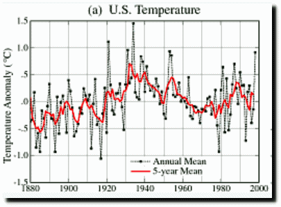
How is that possible when the temperature data from all over the world, before adjustments, shows the 1930’s as being as hot or hotter than today. That “raw” data obviously isn’t the original data. Maybe you are just talking about the satellite era, from 1979, to the present.
Hansen’s 1999 chart shows the 1930’s as being 0.5C hotter than 1998, which makes it hotter than 2016, too.
So the real trend has been a downtrend from the hot 1930’s to today. We need to get 0.5C hotter than today to even match the 1930’s. We are NOT in a warming trend. Not yet.
That’s not global data, it’s USA only.
TA on February 19, 2017 at 7:15 pm
How is that possible when the temperature data from all over the world, before adjustments, shows the 1930’s as being as hot or hotter than today.
You can repeat such statements as often as you want, TA. That won’t make them true.
Have a look at Japans Met Agency, known to have by far the “coolest” surface temperatures (nearer to UAH than to GISTEMP):
http://ds.data.jma.go.jp/tcc/tcc/products/gwp/temp/map/temp_map.html
Here is what you see there when selecting “annual” and moving to 1934, 1998 and 2016:
http://fs5.directupload.net/images/170220/ha3d58jk.png
http://fs5.directupload.net/images/170220/3d7qt42k.png
http://fs5.directupload.net/images/170220/47jqruly.png
All the time you are confounding in parallel:
– (1) CONUS with the world;
– (2) ‘https://realclimatescience.com’ with ‘real climate science’.
The “pause” or whatever you want to call it doesn’t matter. The failure of every GCM to predict observations does matter. The ACGW hypothesis is disproven. Back to the drawing board.
Never in the history of mankind has so much been wasted on a non existent problem for no reward whatever.
Jim – I would say “is being wasted”. Should temps stabilise and cool, how many years before the carbon tax laws will be scrapped? I would say at least 20, on average. Not in my lifetime.
This is CAGW inventor James Hansen’s 1981 GAT projections under different ‘scenarios’ which is almost indistinguishable from the IPCC’s 2014 ‘scenarios’ (back in 1981 he apparently assumed ‘peak oil’).
So far the satellite and radiosonde linear temperature trend is ~1.2C per century a bit below the non-fossil no growth line.
Pause or no pause if the diagram represented the model flight path of Hansen’s solar-powered passenger jumbo by now during the inaugural flight (packed with merry climate change™ practitioners and hangers-on) of up in the cockpit red lights would be flashing and buzzers blaring but it’s worse than that.
Hansen’s ‘Spruce Goose’ looks like belly-flopping.
http://www.vukcevic.talktalk.net/UAHt.gif
50% chance 2017 will break the 2016 record.
Hopefully.
I hope so too. We had non-stop snow, sub-zero temps, and ice in the Northwest this year. We need a warm spring and summer to balance this.
Wow. Good prediction. How many times did you flip a dime to get to your conclusion?
☺
Dang. 60 year old eyes cannot see emoticons that small.
Control and mouse wheel helps
And equally, a 50% chance it won’t.
But I hope it does, up in North Yorkshire we could really do with a bit of Global Warming.
Too bad we can’t split reality and test your claim.
How do you calculate that, Steve? My guesstimate is lower.
That’s how stupid this whole thing is. Mosher hopes he’s right about a bad thing (the world getting warmer), so he can be right. I hope he’s right about a good thing (the world getting warmer) because a slightly warmer world would be a wonderful thing. Despite our wishes it doesn’t matter because CO2 does sweet bugger all!
So you are predicting another massive El Nino.
Very good .
It always gets me when some local bio event is claimed to be caused by global warming without presenting the record of local temperature .
“Do you think UAH will ever have a pause of over 18 years again? Why or why not?”
Anyone answering that is basically claiming to own a crystal ball. It will be what it is. It might “resume” it might not resume. My belief is that chances are greater that it will NOT resume than the chances that it will because overall, climate is generally not stable on multi-decadal scales. Climate almost always is in a process of warming or cooling. So the chances are better that it will either cool or warm than it they are that climate will remain flat.
Anyone answering that is basically claiming to own a crystal ball.
I tend to agree, but one could posit some likelihood based on statistics.
When I wrote my post, I was basing it on the many predictions I’ve read hither and yon. Mainly, that a la Nina following the recent el Nino was a dead cert, and that it would ‘extend the pause’ in short order.
Doesn’t look like there is going to be a La Nina. Looks like “La Nada” conditions and current forecasts are for another El Nino condition but since the western Pacific warm pool has not recharged to any significant degree, it shouldn’t be a powerful one. Also note that an El Nino event is actually a COOLING event. Yes, the atmosphere warms but only because the ocean is dumping heat. It takes a La Nina event to recharge the western Pacific warm pool with warm water.
Most people are interested in how ENSO events affect surface/troposphere temps. El Ninos cause warming, la Ninas the opposite. It was within this context, where most interest is focused, that I investigated the predictions I’d been reading.
This is not directly related to this post but it does relate to the idea that climate, long term weather, is warmer or at least “different” than it was a hundred or so years ago,
I noticed that the movie “Groundhog Day” is on TV today where I live.
“Groundhog Day” with the idea that a rodent seeing his shadow could forecast 6 more weeks of winter (or the end of winter weather) goes back a long way.
http://www.smithsonianmag.com/smart-news/short-history-groundhog-day-180958018/
https://en.wikipedia.org/wiki/Groundhog_Day
http://www.groundhog.org/about/history/
Point being, if early springs and late end of winters were the norm way back then, why all the fuss about them now? The superstition/tradition/excuse to party would have never caught on.
(Maybe if Punxsutawney Phil came out and, instead of looking to get a tan, chewed on a tree ring instead he’d have won a Nobel Prize!)
” JCH February 19, 2017 at 8:52 am
There is no observable that portends cooling [or warming]. It’s just not there.”
–
So much wisdom. JCH is right. The future can never be observed. Then he spoils it by saying
“Looks to me like for a very long time.”
–
Werner “Do you think UAH will ever have a pause of over 18 years again? Why or why not?”
–
There are now 2 pauses to consider.
The first, for 18+ years has gone due to the new El Nino.
The second 18 months, dates from the new El Nino but runs at a higher temperature then the previous one.
A pause by definition can only start in the present and extend into the past*.
Because we have a high point to go back to it is very likely that we are going to have a new pause for quite a while.
If we have more La Nina’s first than El Nino’s of comparable value in the next 18 years we will certainly have a pause of 18 plus years in that time.
See SM above – 50% chance]
In fact it would take only take 15 years to reach it because as the pause lengthens it goes backwards in time through the El Nino peak.
The interesting thing then is whether the original pause can “return”.
It would take a La Nina bigger than the recent El Nino to do so.
12 months of 0.5C lower than the current average.
Or two extra La Nina’s of equal value to the 2016 values. before an El Nino.
If it does of course the ramifications are enormous.
The pause would then extend for 36 years if it happens in 15 years and well over 20 years if it happens in the next 12 months.
I do not expect the 20 year pause to return in the next 12 months. As for what happens in 15 years, will it still be an issue then for those who are still alive at that time?
Werner, why measure the trend from 1997 or 1999?
Because these periods show no or very few warming.
We defined the pause as the longest period of time that we can go back from the present month and have a slight negative slope. We do not have a negative slope for any period of time above a few years right now. However the lowest slope is from December 1997 for any period above 18 years.
That was meant to be: why NOT measure the trend from 1997 or 1999?
“We do not have a negative slope for any period of time above a few years right now.”
You answered it anyway.
The ‘pause’ is utterly inconsequential and to focus on it detracts from any meaningful debate on whether Co2, never mind man made Co2 has any detrimental/beneficial effect on climate change.
To the best of my knowledge, no meaningful study has ever empirically proven that Co2 does actually cause global temperatures to rise.
That is the basis of the alarmist’s position, but that single fact has never been proven by observational studies. If it were the case we would be awash with incontrovertible, reliable, peer-reviewed studies which demonstrate that single fact alone.
Do we have any? No. After 40 years, millions of scientific man hours and billions of £/$ there should be hundreds, if not thousands, but there are none.
Just ask the leftist green crackpots for that single piece of evidence and they crumble. They make innumerable excuses, present data that ‘points’ to Co2 as the culprit, they bluster, stall and divert the subject, but never come up with the evidence.
So where’s the effing debate?
There is some truth this. However if you were to say that there has been no statistically significant warming at the 95% level for 23 years, many eyes might glaze over. But a “pause” of 19 years is much more straight forward.
The ‘pause’ is utterly inconsequential and to focus on it detracts from any meaningful debate on whether Co2
Maybe so, but the OP was based on thousands of comments and articles, here and elsewhere, on the topic. The ‘pause’ was of great consequence (and still is) to many people in the climate debate. The topic even reached the US Congress.
Barry, really appreciate your comment over at dr roy’s “fan mail”. Nobody should tolerate that kind of abuse. In fact, i only weighed in years ago at his site to take on some of that abuse. Always loved his posts, eventually began reading the comment section which i found surprisingly worthy. Eventually still, i realised that he had quite a problem with abusive posters. One day i got fed up with it and decided to take some of these guys out and, henceforth, “fonzie” was born. Cleared things up for a while, too! (kind of like having a cat around a house full of mice) It’s good to see he’s blocking people more now. He’s still enamored toward that “democracy thing” though. Blogs are monarchies and bloggers need not be fair. We can always leave, but a blogger has to put up with the nonsense day in and day out. AND that’s not healthy. (it’s probably morally wrong as well) i think dr roy would do well to follow anthony watts’ model of intolerance, especially since he lacks moderation. He’s also not doing his readers any favors by allowing personal insults toward himself as it can be quite the grotesque spectacle. Dr Roy deserves better than that (and so do we)…
Maybe trend lines are not the way to go in determining the pause… Warming essentially stopped circa 2002. Let’s suppose that temps get back to ’02 levels and stay there indefinitely. The trend line (because of the el nino) would be higher, but temps would be right back where they were when warming stopped. One could then objectively say that the pause is back if temps are still no higher than they were in ’02. (i guess what i’m saying is that by using trend lines we’re getting a little too “heady” about the pause) This very issue keeps popping up a number of times. Bottom line being that temps are right back where they were before the el nino (and right back where they were in ’02 as well)…
Barry, would you like to have a similar post next month? Only if you enjoy it and are interested, would you be willing to do what we published for UAH for RSS after the February RSS numbers are out?
Possibly. See reply at Dr Spencer’s.
Thank you! It will be interesting to see how different RSS will be.
What kind of evidence would convince you HotScot? Give me an example.
Werner,
you miss the point. The discussion is about Co2’s effect on warming, irrespective of the pause.
If alarmists can’t produce empirical evidence of Co2’s warming effect on the atmosphere, which they can’t, the discussion is a non-starter. The ‘pause’ in climate change is as big a mystery as it ever was.
Werner,
sorry, this discussion is about the pause but the general, global discussion is about Co2’s effect on atmospheric warming, for which there is no empirical evidence.
Damn, I wish I were a scientist then I could express myself better.
I agree. The former long pause along with steadily rising CO₂ levels indicated that the affect of CO₂ was relatively small if any.
effect…
Trends for individual locations are analysed. That’s what makes up the global average. Most individual locations show long-term warming (ie, since 1900/1950), some show cooling. The longer the time-period, the fewer places show flat or cooling trends. Compare 1900-2013 with 1950-2014.
If you’re interested in specific locations there are databases online with long-term weather station data.
This is a good place to start:
https://climateaudit.org/station-data/
Global raw is pretty much the same long-term trend as adjusted. No data thrown away, no adjustment.
But how would you do it, exactly? You’ve got a few thousand trends from raw data. Now what?
I’m not sure what you’re asking for. You don’t like averaging?
If I compute the stats for a single location, then I’ve learned something about that location and learned nothing about the global average.
If I compute the stats for a large number of locations, spread around the globe, then I learn a little about the global average.
If I do the last exercise many times with different subsets of all the data, each spread around the globe, I corroborate or invalidate my first attempt (with a few hundred stations, corroboration occurs each time).
Far as I can make out you seem to think that stats for one specific location will have something to say about global. That makes no sense. No one expects uniformity. You can’t extrapolate from a single sample.
The earth has been warming since the last ice age, so “record temperatures” would be expected even without human involvement. The question is: How much warming is human caused and how much is natural variation. The natural warming is confirmed by a steady (non-accelerating) sea level rise.
Who knows? Highly paid climate “scientists” certainly don’t know all of the factors which affect climate and the relationships and feedbacks between them.
We shall see, but my money is still on a sharp drop in the not too distant future.
http://i1136.photobucket.com/albums/n488/Bartemis/temps_zpsf4ek0h4a.jpg
I have a beef with the headline “How Imminent is the UAH Pause? (Now Includes Some January Data)”. It implies that January data for UAH is incomplete, which it is not.
Sorry! What I meant was that of the five data sets for which I give data, I did not have January data for all of them. HadCRUT4.5 is still not in and GISS was not in when I sent it off.
For future posts, if I say it includes January and February data, it means that for some data sets (like the satellite data sets) the February data is in, but most of the others will only have January data.
Here is a comment I made on FB last week. It has to do with the recent uptick in ENSO temps. This is related to my speculation of a solar influence which drives ENSO region changes which I came upon 3 years ago this month. ….”.”I should have taken a look back at the data which I have used in determining ENSO region changes over the last several years. Right there in front of me my data source show what should be a warm spike occurring now. If my supposition is correct, then this should extend into March at the latest before declining, {before} heading back to negative conditions. Also, the regions should stay negative at least until around Sept/October of this year, before another warm spike sets in. Now this should be very interesting as it should either verify or disprove my entire contention on the matter of having some ability to forecast future ENSO conditions”..”
So this will be of interest for me. This is a go, no go moment for my idea.
Aye, a bit of local knowledge helps. The monthly satellite data are reported within a few days of the month ending. GISS and NOAA take 2-3 weeks, and the UK Met Office takes about a month or more. UAH is usually out of the gate first.
I wonder if ‘probability’ applies to a chaotic system…at all!
One of the characteristics of such a system is although it is deterministic, it is so sensitive tat the past is simply no real guide to the future.
Just because it happened that way earlier.
More akin to throwing two dice and coming up with 13, 15, 16, 17…
Weather is random. Climate (average weather) is much less chaotic.. We’re all familiar with this on an intuitive/experiential level – Summer/Winter. If we exclude our knowledge of the physics, the past is an excellent guide to the future regarding seasonal differences.
chaos is not random
the statistics of random distributions do not apply.
chaos is not linear: the mathematics of linear systems do not apply.
My point is simple, ClimbIt CyanTits are using the wrong analytical tools to make predictions that cannot be made
Then I’ve misunderstood you. What of the ‘system’ is chaotic? I thought you meant weather.
If you mean weather, how is it that we can measure the difference between Winter and Summer statistically, even if we lived perpetually underground and only received the temperature data from the surface?
If not weather, what is chaotic?
As far as I’m concerned it’s the ocean warming the atmosphere. That’s why we see these periodic spikes in atmospheric warming. Oscillations and mini-oscillations. Spikes in warming fairly quickly dissipate over the following year. Like it did in 2016 (as observed by satellite data). The steep fall in surface air temperature in 2016 tells me that the GHG effect is not nearly as efficient at keeping heat as I’m told it is. Measuring the air temperature (a secondary effect) and expecting to find a trend is surely deluded. Climatologists need to start measuring the ocean. It’s currents and heat transfers, and heat gradients. Start looking at the cause, rather than obsessing over the side effect. Maybe then, climatologists might be able to explain or predict something.
RSS + UAH5
Climatologists need to start measuring the ocean. It’s currents and heat transfers, and heat gradients.
That’s been going on for decades. Salinity, pressure, sea level and a host of other factors, too.
As far as I’m concerned it’s the ocean warming the atmosphere.
Would you then expect to see that reflected in lower ocean temps over time as the heat is transferred out, or higher ocean temps over time concurrent with the warming?
“For Hadsst3: There is no statistically significant warming since March 1997: Cl from -0.003 to 2.102.”
Look at the 95% confidence interval. It says the period is so short and the data is so noisy and autocorrelated that you CAN’T TELL THE DIFFERENCE between NO WARMING and the AMOUNT OF WARMING AOGCMs predict. It doesn’t say no warming.
The absence of statistically significant warming does not demonstrate the absence of warming. Idiocy.
Exactly, Frank.
Yes, when uncertainty in the trend is factored the discrepancy is mitigated. The error bounds in observed temps overlap with the models.
At the same time, because few cared to factor – or cared to understand – the uncertainty, they agreed that the pause was over just because the mean trend had a slight positive slope from early 2016 onwards. While I always thought the analysis is incomplete without it, I credit the consistency – uncertainty just isn’t factored.
Once 2016 became the warmest year in all global temp records, however, statistical uncertainty became a subject of much interest. Perhaps this interest will one day be applied to trends as well as annual anomaly differences.
That is true. However climate scientists have come up with certain rules regarding significances and I am merely applying them. I did not make the rules.
Werner: You aren’t following the rules, you are abusing them! My favorite description of statistics is “Getting Meaning from Data”. You are deliberately trying to mislead readers about the meaning of the data.
If I want to make the scientific claim that the planet IS warming in a journal article (but not necessarily for policymakers or the public), I need to show that the 2.5-97.5% confidence interval for the warming trend is greater than zero. If it is warming and I can’t prove it, I’m making a Type II error, a false negative. That is common in science; I suspect sometime is true but I can’t demonstrate it beyond a reasonable doubt. In that case, I scientifically won’t be able to draw any conclusion about warming – so I’m expected to shut up about the subject of warming in scientific forums (or at least present the situation clearly).
However, YOU aren’t trying to prove the planet is warming. You are trying to prove that there is NO WARMING or perhaps NEGLIGIBLE WARMING. To prove no warming, the 2.5-97.5% confidence interval for the trend must be less than zero. That probably hasn’t happened in the last two centuries for any period longer than 10 years. To prove negligible warming, you need to pick a warming trend that you can justify as being negligible (perhaps half or less of what the IPCC predicts), and show that the 2.5-97.5% confidence interval is less than this value. You can come close to doing this for a few cherry-picked periods, but cherry-picking isn’t allowed in statistics. In any analysis, 5% of the results will generally like outside the 2.5-97.5% confidence interval! Statistics isn’t valid when you cherry-pick – which is exactly what you are doing by choosing specific periods. So you should also shut up about no warming and negligible warming in scientific forums. WUWT is supposed to be a scientific forum. That way, neither of us will be making scientific claims without reasonable confidence we are right.
In the phony world you have created, I’m allowed to claim that it is NOT cooling, simply because I can demonstrate the absence of statistically significant cooling. You can claim that it is NOT warming, simply because you can demonstrate the absence of statistically significant warming. However, a situation where it is NOT WARMING and NOT COOLING at the same time is a LOGICAL INCONSISTENCY. (The temperature certainly isn’t staying the same!)
The CENTRAL ESTIMATE from all but a few of these regressions is that it is warming. Any statement that implies or suggests the opposite is deception. It is your responsibility to be sure than no reader ends up with the misleading impression that our planet is cooling or remaining at a constant temperature. For short periods, temperature is so variable that we can say for CERTAIN what is happening. It is your job to ensure that no reader is misled! MEANING from data, not misapplied rules!
The burden of proof in science lies with the person making the claim – he has to provide statistically significant evidence in support of his contention. The ABSENCE of statistically significant evidence doesn’t demonstrate anything at all. It simply means as a scientist that I am expected to shut up about any claims that lack appropriate evidence – or discuss the subject clearly so that everyone understands the data. I can discuss central estimates and confidence intervals in the discussion section of my paper, but I can’t make any statements in the abstract that might mislead someone who only reads the abstract.
So what do I do when I suspect something is true, but my data is not statistically significant. I get more data. Repeat the experiment. In the case of global warming, LOOK AT A LONGER PERIOD OF TIME.
In GW, we have the fairly insane situation that we can’t prove that it has been warming for the 18 years since the 1998 El Nino, we can’t prove that is was warming for the 18 years before that El Nino, but we can prove that is has been warming for the last 36 years! And the central trend for all three period is nearly the SAME! And most people believe warming in these two period was dramatically different. Speaking scientifically, it is your obligation to make this situation clear to readers – to make sure they come away from your articles with the correct meaning. The absence of statistically significant warming does not demonstrate the absence of warming!
(Don’t try saying that you are only claiming the “absence of statistically significant warming”. Where is the 2.5-97.5% confidence interval that backs up this statement. A least squares linear regression implies that there is a linear relationship between two variables and that the deviations from this relationship represent noise, not another relationship. If you randomly redistributed this noise and re-analyze, you expect the central estimate for the trend to fall within your first confidence interval 95% of the time. (For temperature, we have auto-correlated noise.) You haven’t done that. If you try, you won’t get the answer you want.
My section 1 gives numbers for three of the data sets using numbers from Nick Stokes’ site. He had some trouble posting things this time, but he had many comments last time here:
https://wattsupwiththat.com/2017/01/26/warmest-ten-years-on-record-now-includes-all-december-data/
If your concerns are not addressed there, please raise them with my post next month and hopefully Nick will be able to respond.
Frank,
To prove no warming, the 2.5-97.5% confidence interval for the trend must be less than zero. That probably hasn’t happened in the last two centuries for any period longer than 10 years.
HadCRUt4 30-yr trend:
1874 – 1914 : -0.063 C/decade (+/- 0.046)
HadCRUt4 52-yr trend:
1863 – 1914: -0.037 C/decade (+/- 0.033)
Trends beginning mid 1990s or later all fail statistical significance, as you say. Regardless of which dataset is used.
“Conclusion
Do you think UAH will ever have a pause of over 18 years again? Why or why not?”
___________________________________________
There’ll be a lot of UAH pauses lesser / more than 18 year’s again – if acknowledged / convincing contemporary green belivers is the next question.
Regular sine wave/s + positive trend = occasional ‘pauses’, or steps each higher than the last. Eg,
http://www.drroyspencer.com/2013/11/the-magical-mystery-climate-index-luis-salas-nails-it/
You could convince the greenies that there is cyclicity, but would that convince them that there isn’t a trend?
Barry, it would cut the rate of warming in half. In other words, instead of it being .6C warming from, say, 1970 – 2000, it would be .6C warming from 1940 – 2000. Further, ipcc models don’t allow for such oscillations. It’s all about warming…
http://m.spiegel.de/international/world/a-906721.html#spRedirectedFrom=www&referrrer=
We already have regular fluctuations and long-term cycles. These have already produced short-term pauses, lots of them, if you pick your start and end points carefully. We already have a long-term pause (multidecadal) in the middle of the 20th century. Are you saying that if we took those away the trend would be twice as high?
Barry, no exactly sure what you’re getting at here… if you go about a dozen comments above, you can see that bart has a graph of hadcrut4gl detrended (which presumably shows the oscillating cycle). What i am saying is that in order to find/calculate the underlying trend, you need to go from peak to peak. Bart took out the trend, so we can see that peak to peak warming without the trend is zero. What we have in reality is peak to peak warming of .6C. (temps being flat from 1940-1970 and rising .6C from 1970-2000) That would be .1C/decade of warming, not warming of .2C/decade that you would get by just looking at the upside of the cycle…
afonzarelli,
no exactly sure what you’re getting at here
You said the trend would be half as much if you “convince the greenies that there is cyclicity.” That’s what i made out of your comment anyway – you weren’t more specific so i took it to refer to the last thing I said.
You’ve clarified since.
I agree that natural cycles tend to cancel out over the long term, but disagree that an apparent natural cycle has been shown in Bart’s graph, and hence that there is a definite problem with the start/end points. Also, you are using simple subtraction to discern a trend rate, if i’m reading you right. That’s not statistically legitimate.
This deserves a longer conversation. I’m rushing off to work.
Yes, i agree that bart’s graph could be termed an “apparent” cycle, as many have contested it. (that’s why i used the word “presumably” myself) i’m more interested in your second point here. “…using simple subtraction to discern a trend rate… …That’s not statistically legitimate.” So… assuming that the cycle as depicted by bart is real (for the sake of argument), why is it not legit to subtract from peak to peak? Looking at the data using other data sets the warming peak to peak would be more like .4C. It’s also been noted that peak to peak from 1880 to 1940 only produces .2C. So the trend appears to be increasing (but arguably not by much). You would be the first i’ve come across to dispute this particular point, so i’d be glad to hear what you have to say. Feel free to enumerate on your first point (“…disagree that an ‘apparent’ natural cycle has been shown…”) as your take on that would be nice, too. But, i’m really more interested in your second point. (thanx)…
“You could convince the greenies that there is cyclicity, but would that convince them that there isn’t a trend?”
There is definitely a trend. The problem is, it extends back well before rising CO2 could have been its causative agent. It is merely the recovery from the LIA. We don’t know what caused the LIA. We don’t know what ended it. But, we do know it was not anthropogenically sourced CO2.
Bart, andy may did an interesting piece a while back that examined the slopes of past cycling and compared it to the recent cycle. From that he calculated the anthro component as being no more than about 25% of recent warming. Ironically, the more the gate keepers adjust away mid twentieth century cooling, the greater the similarity there exists between that period and the recent pause. (if there were anthro warming, we might expect to see a difference between the two periods)…
Barry, i wrote out a reply to you late last night that appears to have disappeared into cyberspace. i don’t really feel like composing another in light of that. You might say that i’m “punting”… ☺ (it’s carnival time here in new orleans, so i think i’ll just pour me a drink instead) You might want to elaborate on this point:
“Also, you are using simple subtraction to discern a trend rate… …That’s not statistically legitimate.”
(thanx)…
HA! My comment finally showed up. A day late (and if it’s anything like me) a dollar short…
afonzarelli,
I’ll answer you with a graphic.
http://www.woodfortrees.org/plot/hadcrut4gl/from:1998/to:2011/plot/hadcrut4gl/from:1998/to:2011/trend
I chose the period from peak el Nino of 1998 to the el Nino of 2010/11.
Even though temps for 1998 were warmer than for 2010/11, the slope is still positive. Largely because of the cool years following 1998. Ignoring the cool years throws out data that affects the trend. The less information you have, the less reliable your trend estimate. Your method throws out most of the data available for a given period.
Have a read on how trends are calculated and what they represent. To put it in a simple way, it calculates a straight line through data where the sum of differences between every data point and the trend slope is smallest. (That’s not a perfect description, but one that most can understand).
https://en.wikipedia.org/wiki/Linear_trend_estimation#Fitting_a_trend:_least-squares
https://en.wikipedia.org/wiki/Linear_regression
Barry – A linear, least squares regression is not magic. It doesn’t “know” if the data have cyclic components. If your data set exhibits fractional periods of a strong short term cyclic phenomenon, it is ill suited for determining the long term trend. Fonzie was recommending a way to discern the long term behavior. His recommendation is a better method than naively applying a least squares regression.
Bartemis, his approach cannot possibly discern cyclicity because it uses only two points (2 peaks), not any kind of fit to data. He discards the majority of the information between the points. The only way you could get less information is if you chose one point instead of two. This is rudimentary stuff.
Not so. In the first place, he isn’t trying to discern “cyclicity”, he is trying to suppress it so as to discern the long term trend. In the second, the use of the entire series is implicit, as he is viewing the entire series, and picking out the local maxima to use for estimating the long term trend.
A better way would be to perform a general nonlinear regression including cyclical harmonics, but that is a complicated process that would take a lot more time and yield only minor improvement. What he has suggested is much better than naively performing a linear regression on data with cyclical components.
You should not so readily dismiss the evidence of your eyes. Too many young researchers tend to imbue numerical estimation methods with unwarranted reverence. But, a canned routine cannot think. It gives you exactly the answer you are telling it, whether realizing it or not, to tell you. A conscious, rational person can take in the entire spread of data and make logical inferences about it. A robust analysis always considers sanity checks on the results of numerical algorithms against the visual evidence of the plotted data.
Bart, i might add that not only was i not trying to discern cyclicality, i was merely assuming that there is a cycle for the sake of argument. Peak to peak, trough to trough or any comparison of the data 60 years apart gives us a nice ball park figure. If there is indeed a cycle, we can rest assured that the underlying trend from 1940 to 1970 is greater than zero. And, also, that the underlying trend from 1970 to 2000 is less than .2C/ decade. The “happy median” between the downside and the upside of the cycle would be .1C/ decade for the entire cycle (assuming there is no increase in the underlying trend over time). Even if the trend were increasing over time, we can infer that it hasn’t been increasing by much given the numbers involved…
As an aside, Bart, keep an eye on the federal reserve going forward… The WSJ had a big headline this past week that the fed plans on rigorously raising rates. This could be Trump’s worst nightmare and it should be interesting to see how he handles it. (how much does the billionaire president actually know or not know about economics?) My biggest curiosity is who he’ll pick to replace yellen when her term is up early next year. That would be THE most revealing thing about “Trumpanomics”…
Bartemis, fonzarelli,
Here is how I would work out a trend from 1940 to 2000.
http://www.woodfortrees.org/plot/hadcrut4gl/from:1940/to:2001/mean:12/plot/hadcrut4gl/from:1940/to:2001/trend
Trend is 0.33C/decade
What fonzarelli seems to be doing is taking two points (peak to peak) and ignoring all the other data. If I take ‘peak to peak’ as an average of the 3 years around 1940 and 2000, this is what the data looks like.
http://www.woodfortrees.org/plot/hadcrut4gl/from:1939/to:1942/plot/hadcrut4gl/from:1999/to:2002
We’ve removed 90% of the data. Now we subtract the difference and divide by 6 to get a decadal ‘trend.’
I think this is a far more naive way to estimate a trend than linear regression. And, as I showed above, you can get spurious results from using so little data.
I agree completely that using “their” language of a “pause”, only reinforces the propaganda of c02 driven warming. A peak of a natural warming period, or average of a natural warming cycle is much more appropriate. With this, I imply that as has been the reality for the 20th century, temps have occilated from warm to cool (relative to a time series), and this will continue, predictions on when cooling starts are varied, and there is solid evidence 2000 may have been the year, but it’s not easy to predict. The idea that 120 ppm, the difference between arbitrary “safe” levels, and very questionable background volcanic sensors, smoothed just like cherry picked ice core samples by a 70 year smoothing average, when c02 reading’s can change up to 600ppm in a single day, no matter where the measure it drives climate is ludicrous. Thus using the term pause implies it will again warm and keep warming as again function of c02, not good to play their games. An unaltered record of the 20th C and 21st, show 15 to about 35 year periods of warming again cooling…..cooling during very large increases in man made c02, completely destroyed any idea that co2 levels, in any way over idea natural causes.
Please – CO2 (C-Oh-2), not C02 (C-zero-2) or Co2.