Guest Post by Werner Brozek, Excerpts from Barry and Edited by Just The Facts
At Dr. Roy Spencer’s site, regular commenter Barry posted seven very interesting comments, begining here, with respect to the requirements for the UAH pause to resume. He has graciously allowed me to use whatever I wished in this blog post. Everything that appears below is from him until you see the statement “Written by Barry.” below:
___
Since the el Nino rose last year there have been many predictions here that a la Nina would form shortly afterwards and once again return the trend since 1998 to a flat line or cooling. I decided to check the change in trend from 1998 to each month past the el Nino peak (determined by warmest month last year in UAHv6 data).
My prediction is that for each month added past the el Nino peak the trend will be ever so slightly warmer, also when including December and January values in UAHv6 TLT data.
The warmest month of last year was February in the UAH dataset. I’ll start with that as the benchmark and see how the trend evolved from 1998 to then, with each successive month of cooler temps.
Feb 2016: 0.011 /decade
Mar 2016: 0.020 /decade
Apr 2016: 0.028 /decade
May 2016: 0.034 /decade
Jun 2016: 0.036 /decade
Jul 2016: 0.038 /decade
Aug 2016: 0.041 /decade
Sep 2016: 0.045 /decade
Oct 2016: 0.047 /decade
Nov 2016: 0.050 /decade
Dec 2016: 0.050 /decade (higher to 4 decimal places than Nov)
Jan 2017: 0.054 /decade
Even with la Nina conditions over the last few months, the trend has increased slightly month by month since the peak in Feb last year.
Testing to see how cool Feb would need to be to make the trend flatline….
-5C
You read right – not -0.5, but -5C.
What would the trend since 1998 be if 2017 annual was the same as January 2017 (0.30)?
0.063C /decade – warmer than current trend.
What would the annual anomaly of 2017 need to be to get a flatline trend since 1998?
-0.16
How likely is it that 2017 would have an annual anomaly of -0.16C?
Coolest years post 1998:
2008: -0.10
2000: -0.02
Before 1998 there were 8 years of average annual anomaly less than -0.16. Starting from the most recent year where this was so:
1993: -0.20
1992: -0.28
1989: -0.21
1986: -0.22
1985: -0.36
1984: -0.24
1982: -0.30
1989: -0.21
ENSO conditions relevant to the above were:
2008 – nina
2000 – nina
1993 – neutral
1992 – nino
1989 – nina
1986 – nino
1985 – nina
1984 – nina
1982 – nino
1989 – nina
With predictions of a ENSO-neutral or Nino 2017, that would make it unlikely that the annual anomaly would go as low as -0.16C, and thus unlikely that the trend since 1998 would flatten.
I tested another line of inquiry.
For 30-year averages, every year where this can be achieved in the UAH 6.0 data, each year added (and one dropped off the beginning to keep the averages 30-year only), the 30-year average has gone up.
For this to fail to happen due to the 2017, the annual anomaly for that year would have to be < 0.05C.
Just possible, but very unlikely, I think.
————-
Written by Barry
In the sections below, we will present you with the latest facts. The information will be presented in two sections and an appendix. The first section will show for how long there has been no statistically significant warming on several data sets. The second section will show how 2017 compares with 2016, the warmest year so far, and the warmest months on record so far. The appendix will illustrate sections 1 and 2 in a different way. Graphs and a table will be used to illustrate the data.
Section 1
For this analysis, data was retrieved from Nick Stokes’ Trendviewer available on his website. This analysis indicates for how long there has not been statistically significant warming according to Nick’s criteria. Data go to their latest update for each set. In every case, note that the lower error bar is negative so a slope of 0 cannot be ruled out from the month indicated.
On several different data sets, there has been no statistically significant warming for between 0 and 23 years according to Nick’s criteria. Cl stands for the confidence limits at the 95% level.
The details for several sets are below.
For UAH6.0: Since November 1993: Cl from -0.009 to 1.784
This is 23 years and 2 months.
For RSS: Since July 1994: Cl from -0.005 to 1.768 This is 22 years and 6 months.
For Hadcrut4.5: The warming is statistically significant for all periods above four years.
For Hadsst3: Since March 1997: Cl from -0.003 to 2.102 This is 19 years and 9 months.
For GISS: The warming is statistically significant for all periods above three years.
Section 2
This section shows data about 2017 and other information in the form of a table. The table shows the five data sources along the top and other places so they should be visible at all times. The sources are UAH, RSS, Hadcrut4, Hadsst3, and GISS.
Down the column, are the following:
1. 16ra: This is the final ranking for 2016 on each data set. On all data sets, 2016 set a new record. How statistically significant the records were was covered in an earlier post here: https://wattsupwiththat.com/2017/01/26/warmest-ten-years-on-record-now-includes-all-december-data/
2. 16a: Here I give the average anomaly for 2016.
3. mon: This is the month where that particular data set showed the highest anomaly. The months are identified by the first three letters of the month and the last two numbers of the year.
4. ano: This is the anomaly of the month just above.
5. sig: This the first month for which warming is not statistically significant according to Nick’s criteria. The first three letters of the month are followed by the last two numbers of the year.
6. sy/m: This is the years and months for row 5.
7. Jan: This is the January 2017 anomaly for that particular data set if available.
8. rnk: This is the 2017 rank for each particular data set assuming the January anomaly stays that way all year. Since the January GISS and HadCRUT4.5 are not out yet, I ranked the December anomaly in ( ).
| Source | UAH | RSS | Had4 | Sst3 | GISS |
|---|---|---|---|---|---|
| 1.16ra | 1st | 1st | 1st | 1st | 1st |
| 2.16a | 0.504 | 0.574 | 0.773 | 0.614 | 0.99 |
| 3.mon | Feb16 | Feb16 | Feb16 | Jan16 | Feb16 |
| 4.ano | 0.830 | 0.996 | 1.070 | 0.732 | 1.35 |
| 5.sig | Nov93 | Jul94 | Mar97 | ||
| 6.sy/m | 23/2 | 22/6 | 19/9 | ||
| 7.Jan | 0.300 | 0.409 | 0.488 | ||
| 8.rnk | 4th | 4th | (3rd) | 3rd | (3rd) |
| Source | UAH | RSS | Had4 | Sst3 | GISS |
If you wish to verify all of the latest anomalies, go to the following:
For UAH, version 6.0beta5 was used.
http://www.nsstc.uah.edu/data/msu/v6.0/tlt/tltglhmam_6.0.txt
For RSS, see: ftp://ftp.ssmi.com/msu/monthly_time_series/rss_monthly_msu_amsu_channel_tlt_anomalies_land_and_ocean_v03_3.txt
For Hadcrut4, see: http://www.metoffice.gov.uk/hadobs/hadcrut4/data/current/time_series/HadCRUT.4.5.0.0.monthly_ns_avg.txt
For Hadsst3, see: https://crudata.uea.ac.uk/cru/data/temperature/HadSST3-gl.dat
For GISS, see:
http://data.giss.nasa.gov/gistemp/tabledata_v3/GLB.Ts+dSST.txt
To see all points since January 2016 in the form of a graph, see the WFT graph below.
 - 1979 to Present")
As you can see, all lines have been offset so they all start at the same place in January 2016. This makes it easy to compare January 2016 with the latest anomaly.
The thick double line is the WTI which shows the average of RSS, UAH, HadCRUT4.5 and GISS.
Appendix
In this part, we are summarizing data for each set separately.
UAH6.0beta5
For UAH: There is no statistically significant warming since November 1993: Cl from -0.009 to 1.784. (This is using version 6.0 according to Nick’s program.)
The UAH January anomaly is 0.300. This would rank in fourth place if it stayed this way. 2016 was the warmest year at 0.504. The highest ever monthly anomaly was in February of 2016 when it reached 0.830.
RSS
For RSS: There is no statistically significant warming since July 1994: Cl from -0.005 to 1.768.
The RSS January anomaly is 0.409. This would rank in fourth place if it stayed this way. 2016 was the warmest year at 0.574. The highest ever monthly anomaly was in February of 2016 when it reached 0.996.
Hadcrut4.5
For Hadcrut4.5: The warming is significant for all periods above four years.
The Hadcrut4.5 average anomaly for 2016 was 0.773. This set a new record. The highest ever monthly anomaly was in February of 2016 when it reached 1.070.
Hadsst3
For Hadsst3: There is no statistically significant warming since March 1997: Cl from -0.003 to 2.102.
The Hadsst3 January anomaly is 0.488. This would rank third if it stayed this way. The highest ever monthly anomaly was in January of 2016 when it reached 0.732.
GISS
For GISS: The warming is significant for all periods above three years.
The GISS average anomaly for 2016 is 0.99. This set a new record. The highest ever monthly anomaly was in February of 2016 when it reached 1.35.
Conclusion
Do you think UAH will ever have a pause of over 18 years again? Why or why not?
GISS Update:
GISS for January came in at 0.92. This is the third warmest January GISS on record. It is below the 0.98 average for 2016 so it would rank second if the anomaly stayed this way for 2017. A short and weak La Nina seems to have had little affect on GISS so far.
“A short and weak La Nina seems to have had little affect on GISS so far.”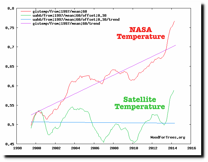
Yeah, the “real’ weather has little affect on GISS. GISS has a human thumb on the scale making things look hotter than they are as demonstrated by the chart below. Gavin systematically adjusts the temps higher continuously, so it’s not a surprise that La Nina had little affect on his chart. His chart does not represent reality. The satellites are the only charts that can be depended on to be uncontaminated.
The trends shown here are those of the mean samples (60 months), not the monthly values. Using the monthly data only, the GISS trend is much less steep and the satellite trend (UAH is used in your chart) is clearly warming since 1997 (+0.06 C/dec): http://www.woodfortrees.org/graph/gistemp/from:1997/offset:-0.43/plot/gistemp/from:1997/trend/offset:-0.43/plot/uah6/from:1997/plot/uah6/from:1997/trend
(Note: GISS is offset by -0.43, which is its average anomaly value over the UAH reference period, 1981-2010.)
A mean of 60 does not affect the slope. However where an old graph ends is important as well as adjustments that have been made since the old data was graphed.
Werner Brozek
“A mean of 60 does not affect the slope.”
It does if you ask WfTs to find the trend of the mean samples, as the above poster did. Check it for yourself using any data set on WfTs.
Take UAH, for example, starting Jan 1997 to the present: http://www.woodfortrees.org/plot/uah6/from:1997/plot/uah6/from:1997/trend
The slope on the monthly data is equal to 0.06 per decade.
Here’s the same data with a running centred mean of 60 months, but with the linear trend still based on the monthly values (0.06 C/dec), which is the correct way to show the data: http://www.woodfortrees.org/plot/uah6/from:1997/mean:60/plot/uah6/from:1997/trend
And here’s what the above poster did by instead plotting the trend of the 60 month averages: http://www.woodfortrees.org/plot/uah6/from:1997/mean:60/plot/uah6/from:1997/mean:60/trend
Compare the two and you can see right away that the trend of the 60-month averages is distinctly different from the true trend, the one you reported on above, which is found from the raw monthly data: http://www.woodfortrees.org/plot/uah6/from:1997/mean:60/plot/uah6/from:1997/mean:60/trend/plot/uah6/from:1997/plot/uah6/from:1997/trend
Thank you for correcting me! I did your versions 1 and 2 and found no difference without realizing a different version would yield a difference.
No problem Walter. It’s a tricky one! Always enjoy reading your posts.
That’s Werner, not ‘Walter’! Sorry!
It’s not a pause, warming stopped in the in around 2000. Calling it a pause at this state is abuse of language
Ugh what was that I just typed :{
Warming stopped, it did not pause. The term pause is simply propaganda.
Mark,
“The term pause is simply propaganda.”
“Pause” is the term used by climate scientists in the peer-reviewed literature ((less often, “hiatus”) during the past decade. They get to choose the appropriate language. Not activists.
The attempt by activists to conceal the large literature about the “pause” from the public shows their contempt for climate science.
Editor.. My favored approach for the science is to just note the difference in trends. There is no benefit
to labeling a period as a pause, hiatus, slowdown, etc tec.. same goes for periods where the trend became steeper.
Of course thats hard to do.
I note there are always short time periods through out the record where the local trend is lower than the long term trend, or higher than the long term trend or even close to zero. There is nothing unprecedented in this, nothing requiring attention or barrells of ink. These short periods are expected, but not predictable. Some folks may decide that these short periods need explanation.. and there will always be multiple theories to explain transient episodes in the march toward a warmer world. There must be a multitude of theories to explain these episodes because the theories are underdetermined by the data. Pausology won’t advance until we have a good collection of “pauses” to examine. As for now, it’s most a sideshow and every clown shows up to perform.
“The term pause is simply propaganda.”
Of course it is. “Pause” clearly implies that future warming is a certainty. Reminiscent of the contemptible claim that “the science is settled”. Editor of the Fabius here says that “pause” is the term used by climate scientists in the pal, er, peer reviewed literature. Well who’d u thunk?
I prefer the term ‘stasis’.
The OED gives :pause….a temporary stop”, so I have to agree that halt or stop is more appropriate. A pause has a certainty of continuance once the stop stops! Can anyone predict the future?
I prefer quit….
Steven
Laudable of you to press for use of common terms and to de-emphasise mundane events.
But then, why spoil it all by the phrase “March towards a warmer world”?
Nobody knows where the world is heading. We both know we can cherry pack a past date and then claim we are marching to a cooler world than that.
Keep to objective science. There is an overabundance of prose rendolent with belief values.
Cheers. Geoff
A pause is a stop that has ended. That does not mean it ended with a resumption of some previous behavior, it just means it isn’t stopped any longer.
But the stopped state could be replaced by a cooling phase or a warming phase. The word pause in itself does not imply a resumption of some previous behavior or trend; it just isn’t stopped any longer.
And if it is still stopped, then it is a stop, and not a pause. It may never move again. We won’t know until that happens.
G
Is the “march towards a warmer climate” anything like the “march towards desertification” in California?
Steven Mosher
February 19, 2017 at 12:14 pm
The so-called Pause lasted about as long as the alleged warming which preceded it from 1977 to 1996. The Pause endured from 1997 to 2016. The spurious warming cycle was preceded by the long cooling cycle from the 1940s until 1977, so if there is an outlier trend, it’s the supposed late 20th century warming, which is nearly indistinguishable from the longer early 20th century warming, which preceded the mid-century (modern) cooling.
Pause is a hold on a linear progression, like playing an AVI file. It is not applicable to a non linear progression like earth’s non linear climatic systems.
You may be right. But if “pause” is good enough for a man of letters like Lord Monckton, it is good enough for me.
Werner – MOB (Monckton of Brenchley) would point out that you have made an appeal to authority. link
A rose by any other name….
Is something wrong with that?
Yeah, commie, but MoB might also point out that if you’re going to appeal to an authority it might as well be him!
One day a long time ago, I decided to try and get a section into wikipedia global warming covering the various predictions. I started with temperature and tried to find the least objectionable way to say the temperature had stopped warming.
I hit on the word “pause”, which in a tape mechanism, means the mechanism had stopped but the motor continues running. As this concept suggested a temporary stay rather than a permanent stop, I though it was the most likely to be accepted.
Of course it was not. But the extremely hostile reaction from the editors convinced me that despite it being a pretty simple thing which any sceptic could if they wanted dismiss as “the effect of noise”, the alarmists absolutely hated it. That clearly showed it had huge propaganda value, so I decided to ensure that as many people as possible started talking about it and for the next few year I used the phrase in any conversation I was able (with the result there were many a livid alarmist responses).
The whole point about the “pause” is that from a scientific view, it’s a fairly benign thing that we expect to happen quite often. Scientifically – when you accept natural variation exists – it is just one of those things you expect.
But from the eco-activist view, from the view of those who deny natural warming exists, it was intolerable to hear the phrase. That is because they were desperate to keep the message going out about “never ending warming” … and all that propaganda value could be undone, by simply referring to the fact we are currently in “the pause”.
In other words, it really only exists in the minds of alarmists for whom it has become the anti-thesis of “never ending warming”.
Again, I do wish I could simply “Like” some of these comments. I have been saying this for years – the pause is great propaganda for the sceptic side, but otherwise not deeply significant.
Of much more moment is the lack of a tropospheric “hot-spot” and the sheer difference between the IPCC projections and the actual temperature record.
Like many sceptics, I’m not so much hostile to the idea of climate change, or even man-made climate change, but rather to the pretensions of infallibility of the alarmists, backed up by their almost willful addiction to pseudoscience.
The GHG warming theory predicts steady and steadily increasing warming. Which makes natural variability, never mind a pause, a problem, because it means at times the climate system loses more heat than it gains from GHG warming. Therefore you would have to propose that GHG warming causes warming on average over extended periods. A rather dubious proposition IMO, requiring an explanation of why the climate accumulates heat at times and not at other times. Ocean cycles might do this, but our understanding of them is poor. You could also argue, it is sampling noise, but each monthly figure comprises many thousands of data points, and I have a hard time believing noise would be significant.
I tried to add the word theory to have a wiki paragraph so it would read “Global warming theory” and was the comment was constantly editied out by W. Connelly until he banned me. Even Einstein only rates a “Theory of Relativity”.
I use ‘plateau’
I used to use “plateau”, but now that I know the use of “pause” causes stomach ulcers in the alarmist community, I will use pause as much as I can.
The temperature had been climbing for a while. It got tired and paused to refresh. Now it has begun climbing again. It does not appear to have been taking artificial stimulants.
It has actually been going down since February. So we have pauses of only a year and a half which are not really worth mentioning.
Werner: “…[temperature] going down since February.”
But now it looks like another El Niño is developing. Didn’t some Climatastrophist prophet predict this as prelude to the apocalypse?
In any case, whenever the climbing temperature finally reaches the summit of the interglacial, I hope the downslope isn’t a precipice.
Who knows? Did you see:
http://www.tropicaltidbits.com/analysis/ocean/nino34.png
It jumps by about 1.4 in 6 days, then drops by about 0.4 in
about 2 days. What will happen over the next 4 days?
I don’t even wish I could tell you. But I’ll probably be watching more closely than before.
The above graphic gets updated every 6 hours and clicking it gives the latest update. (Over the hours from 12 to 18, it dropped from 0.364 to 0.309.)
That’s very helpful Werner. Much thanks.
@ur momisugly Werner:
Niño 3.4 SST anomaly has plummeted from about 0.8 to zero, while 1+2 has dropped from about 1.0 to 0.7.
http://www.tropicaltidbits.com/analysis/ocean/nino34.png
http://www.tropicaltidbits.com/analysis/ocean/nino12.png
Joe Bastardi claims a 1+2 anomaly higher than 3.4 anomaly is a sure forecast of an upcoming El Niño. By that criterion an El Niño is still a sure thing. Do you agree?
Stupid WordPress has cached the Feb 19 3.4 chart. Click for latest.
I have no clue! Ask Bob Tisdale when he has his next post.
Using the word “Pause” indicates knowledge of that is going to happen next. I don’t think anyone has that knowledge.
You are walking along a mountain trail. You round a corner and suddenly see the trail has washed away, leaving a sheer drop of thousands of feet. Do you pause?
NO… you “stop”. (were you to “pause” you would then commence to walk off the cliff)
The “you” in my analogy is Temperature, plodding along a trail up a mountain. The trail sometimes dips, then rises, but the general direction is uphill toward the summit.
Temperature encounters some natural forcing that blocks its path. It pauses its uphill plod to consider its options. The trail has switchbacks. Temperature looks up and sees that it can bypass the washout. It paces about seeking another route, then clambers up suddenly and resumes its plodding course toward the summit.
Just then, up above, a dam breaks!
Using the word “Pause” indicates knowledge of that is going to happen next. I don’t think anyone has that knowledge.
It refers to the past, not the future. In the satellite record there was warming until 1997. ‘The pause since 1998’ had been one of the most common talking points in the general debate on global climate change over the last few years.
Since we persist in taking these things out to hundredth’s of a degree and hang on every month, I would suggest we revisit this Feb 19th, 2022 and see where we are.
So what are poor mortals to think? There has been a stop in warming and its still going on, or it is a pause and it will hot up again? Either way, does it justify the warmists’ alarms?
Nothing could justify the alarmists claims.
We just don’t live in their universe. It’s like Star Wars. We don’t have artificial gravity or FTL drive, we can’t make a light saber, and you’re never going to meet a Wookie.
Likewise, we can’t calculate the climate decades ahead using computer simulations. We just don’t know enough.
Even if we do enter a period of catastrophic warming, (hard as it may be to believe), this will be purely coincidence, because they have *no way of knowing*!
The more and more data that comes out about the ground measurements, the less credible the main source of the IPCC Data is. ?w=894&h=680
Climate “Science” on Trial; Cherry Picking Locations to Manufacture Warming
https://co2islife.wordpress.com/2017/02/18/a-tale-of-two-cities-cherry-picking-locations-to-manufacture-warming/
It is worth nothing that the Satellite data hasn’t been implicated by the NOAA Whistleblower and Climategate emails. This gap is guaranteed to grow is the IPCC continues to focus on CO2.
The first part of the article is based on UAHv6 data.
The book cookers at NASA, NOAA and HadCRU may never allow another “pause”. RSS may now join the anti-scientific c0nspiracy. UAH, if it’s able to stay open, will IMO not only show a temperature flatline but cooling in coming years.
The first part of the article is based on UAHv6 data. For a flatline to emerge in the coming years we’d need to see temps like they were in the 1990s. 1993 was the last time we saw the kind of temps needed to produce a flatline into the future.
Just to clarify something. That is only true if the pause is to resume this year, right? So if we give it two years, the drop does not have to be quite as much. Correct?
I was replying to the notion of “coming years.” Temps would have to proceed as they did in the (early) 90s for a flatline/negative slope to emerge and to continue. By contrast, a flatline would not emerge or continue if temps were much like those of the 2000s
More detail than that is a lengthier post, with much supposition about individual years. Too much work for too much speculation.
If temps return to where they were in the 2000s (and stay there) then the hiatus would have returned EVEN THOUGH TREND LINES WOULD INDICATE OTHERWISE (!)
Excellent point! Perhaps we need new definitions.
Playing with a fixed length decade long record is a joke. As you move forward in time, you go into a lower period at the beginning, and so the continual rise is without meaning (lower at the beginning raises the slope as does increasing at the end of a decade record). Go from a fixed start, say 1998 with increasing number of years and you go up a little, down a little, but trending flat. The term pause may mean before going up again, or it could also mean before going down. It is just a statement that it stopped going up in general, and putting more meaning than that is not useful.
The El Niño impact is over now but we have had a mild La Niña afterward and this has not fully made its way through the monthly temperature numbers yet. There is still another 0.1C or so to come from the La Niña. March or April will be the low point, then stabilize for several months.
Even if it drops to 0.2 for the rest of the year, the slope since 1998 will be no lower at the end of 2017.
We have some possibilities:
In former temperature records we saw a certain influence of the AMO. According to this, we should see a decline. But we do not see it yet.
1. CO2 ha an effect and adds a certain amount of warming, so the temps will stay like this or go up a bit.
2. The ocean is a big heat bufffer, so it needs some time for the heat to come down.
3. A number of EL Ninos have added additional heat to the climate system, so we need also some time to get rid of the heat. This can be seen with the warmer Arctis and Antarctis this year.
4. Dr David Evans suspects that there is a delay of about 10-14 years from the sunspot number to an effect on global temperature. It depends on the magnetic cycle of the sun which is reversing about every 11 years. As we have now SSC 24, its effects will be seen 10-14 years later. According to this, we will see now the effect of the SSC 23, which went down starting from 2003. 2003+14=2017. If not this year, then next year we should see a decline, even overruling CO2 and El Nino. And the effect of SSN 24 should make it really cold around 2030.
What I not think is that we will have an accelerated temperature rise in the long run.
What I think, all four effects described above have a certain influence. So we will have the pause of 18 years again. And in the long run, it will be a flat summit in the temperature graphs, when we will see the decline because of:
AMO down
El Nino heat down
SS cycles down
I just hope CO2 will have a small warming effect.
That may well be the case. But unfortunately it does not help Trump’s cause right now.
We skeptics should not despair bc of some El Ninos. Even with them the warming is not alarming or dangerous. A good communication and an insight in all records would show there is no problem with a mild warming.
But a good communication is a problem for Trump. Sometimes he should just keep his big trap shut… ;-).
And too much success for Trump is also not so good for him. Small problems will help him to stay on the carpet. Otherwise he will start to hoover and fly away…
The biggest impact from the AMO is in the Arctic (and adjacent regions) due to loss of sea ice. This impact is highest during the NH winter months since that is when the temperature difference between open water and ice is the highest.
This was the reason 2016 winter months were higher than 1998 but not the summer months. The same factors are still in place and will remain in place until the AMO goes negative and sea ice returns. That is probably still 5-8 years away.
This also works against the mild La Nina conditions in the global anomaly data. This is clear when one looks at the north polar anomaly data (~ 1 C) vs. the tropics (~ 0 C).
From #4 above:
“4. Dr David Evans suspects that there is a delay of about 10-14 years from the sunspot number to an effect on global temperature. It depends on the magnetic cycle of the sun which is reversing about every 11 years. As we have now SSC 24, its effects will be seen 10-14 years later. According to this, we will see now the effect of the SSC 23, which went down starting from 2003. 2003+14=2017.”
The grandkids are here today so there’s limited time for research – how / what properties make this happen? Such a considerable lag time.
Dr Evans doesn’t know, he just found out an statistical connection with sunspot and global temp later.
Temperature is going up and down with sunspots, but sometimes temp raises earlier than supspots.
So sunspots can’t be the cause – but maybe for a temp swing later.
The idea is like following:
Sunspot numbers are fluctuating – the magnetic field of the suns switches about every 11 years – 11 years later the sun releases rays and solar wind – according to that fluctuation – solar wind protects earth more or less from cosmic rays – less cosmic rays few clouds / more rays more clouds.
less sunspots > less solar wind > more cosmic rays > Cosmic rays make seeds for clouds (Svensmark) > More clouds > makes earth colder.
Latest research from CERN re cloud nucleation from galactic cosmic rays:
…the relatively weak dependence on ion concentrations indicates that for the processes studied variations in cosmic ray intensity do not significantly affect climate via nucleation in the present-day atmosphere.
http://eprints.whiterose.ac.uk/107269/1/Global%20atmospheric%20particle%20formation.pdf
GCR and temp variations correlate pretty well until 1981, whereupon they sharply diverge.
” CO2 has an effect…adds a certain amount of warming. And in the words of Dr. Martin Hertzberg:
“ In comparison to water in all of its forms, the effect of the carbon dioxide increase over the last century on the temperature of the earth is about as significant as a few farts in a hurricane!”
Read the full article in carbon-sense.com.
Testing to see how cool Feb would need to be to make the trend flatline….
-5C
You read right – not -0.5, but -5C.
This is a modestly worthwhile variation on Lord Monckton’s game. But it is too soon to know whether the 2015/2016 el Nino produced a step increase in temperature as the 1997/1998 el Nino did.
Correlation is not causation. It is just as likely the AMO going positive led to the increase. We just didn’t see it in the noisy data due to the active ENSO years from 1997-2001. That is why it looked like a step increase but could just as easily have been due to a slow decrease in the ice.
If my alternative view is right we shouldn’t see any step increase this time since the sea ice appears to have bottomed out.
Richard, the step rise also follows the solar cycle. i’m never in favor of alleged correlations based on one instance which is what people do when they allude to the step up as being caused by the ’98 el nino. (not a one of us should be in favor of that) It should be interesting to see what follows the recent el nino as we are now headed toward a solar min (following a weak solar max). Will there be another step rise or will temps follow the sun?
BTW, always enjoy your comments. (whatever you got, i think alot of us need)…
http://www.drroyspencer.com/wp-content/uploads/TSI-est-of-climate-sensitivity2.gif
Personally, I think this is one of big misconceptions. The warming from the 97-98 El Niño quickly went away… not completely, but a lot of it… the 98-01 La Niña… long and deep. It was the back-to-back El Niño events in the early 21st century that form the step up.
There is no observable that portends cooling. It’s just not there. For how long? Looks to me like for a very long time.
I don’t think UAH provides much that is useful in terms of the surface of the earth. GISS and NOAA and BEST are far more relevant. But in terms of your question, I can’t imagine an 18-year warming pause for the rest of this century in OHC data, surface data, satellite data.
JCH,
But do you concede that some investigation would be called for if satellite TLTdata continued to diverge monthly from the land sets? In your opinion how many degrees C of divergence might you call instrumental or method noise and how much a real difference arising from two different attempts land and aloft to measure a similar property?
Assuming that integrating under the curve is a possible means to identify total heat flow, you would find that not to be the case.
If every subsequent el Nino was followed by a ‘step’ upwards in temperature, would you begin to believe that el Ninos were the cause of global warming?
We’ve been having El Ninos for millenia. Why did El Nino’s only start causing global warming 100 years ago?
Yep, you figured out the point.
There was a nice commentary in yesterday’s American Thinker by Dennis T. Avery, called Democrats Real Global Warming Fraud Revealed.
http://www.americanthinker.com/articles/2017/02/democrats_real_global_warming_fraud_revealed.html
Avery cited the December 2016 Cern Bulletin about the latest results from the CLOUD experiments which are producing clouds in the laboratory. So I looked up that Cern Bulletin. They have found:
(1) Cosmic rays are responsible for about 1/3 of the ions that seed clouds.
(2) There is a normal process within the upper atmosphere that is responsible for much of cloud formation. This process does not involve anthropogenic sources.
(3) Sulfur does not seed clouds unless ammonia or organic compounds are present.
One of the exciting aspects of these CLOUD studies is that they could lead to greatly improved methods for seeding clouds, perhaps to alleviate droughts. The other exciting aspect is that the cloud theory is presenting a very strong alternative to the carbon-dioxide-based global warning hypothesis. Clouds cool the earth by reflecting sunlight back into outer space. Anything that creates clouds tends to cool. The absence of clouds results in warming. Here’s the relevant summary from the Cern Bulletin:
Thanks to CLOUD’s unique controlled environment, scientists can now understand precisely how new particles form in the atmosphere and grow to seed cloud droplets. In the latest work, published in Science, researchers built a global model of aerosol formation using extensive laboratory-measured nucleation rates involving sulphuric acid, ammonia, ions and organic compounds. Although sulphuric acid has long been known to be important for nucleation, the results show for the first time that observed concentrations of particles throughout the atmosphere can be explained only if additional molecules – organic compounds or ammonia – participate in nucleation. The results also show that ionisation of the atmosphere by cosmic rays accounts for nearly one-third of all particles formed, although small changes in cosmic rays over the solar cycle do not affect aerosols enough to influence today’s polluted climate significantly.
Early this year, CLOUD reported in Nature the discovery that aerosol particles can form in the atmosphere purely from organic vapours produced naturally by the biosphere (CERN Courier July/August 2016 p11). In a separate modelling paper published recently in PNAS, CLOUD shows that such pure biogenic nucleation was the dominant source of particles in the pristine pre-industrial atmosphere. By raising the baseline aerosol state, this process significantly reduces the estimated aerosol radiative forcing from anthropogenic activities and, in turn, reduces modelled climate sensitivities.
“This is a huge step for atmospheric science,” says lead-author Ken Carslaw of the University of Leeds, UK. “It’s vital that we build climate models on experimental measurements and sound understanding, otherwise we cannot rely on them to predict the future. Eventually, when these processes get implemented in climate models, we will have much more confidence in aerosol effects on climate. Already, results from CLOUD suggest that estimates of high climate sensitivity may have to be revised downwards.”
It has been 45 years since I studied World Climatology at school and a lot of things have changed in that time including a substantial shift of heavy industry from Western Europe to Asia. I’ve often wondered what implact this has had on cloud formation over these respective regions and in turn what impact if any this has had on surface temperatures?….
HR,
Thank you for this.
From what I have read in CERN publications so far, I infer that the standard of the work is so high that it gladdens the heart of this retired scientist. This is how thorough our research used to be.
I lament the poor standard of much climate research and I hope that the CERN work shall continue to be productive, repeatable and credible.
Geoff
Thank you for the summary and especially the comment about induced cloud formation. Inducing clouds is the first step to inducing precipitation. I had a brainstorm thought a week ago that needed man induced precipitation, but I hadn’t thought about man-induced precipitation being a near term possibility.
My brainstorm:
Sea level rise has been occurring since the LIA (little ice age). We are building cities on the seashore, so it would be great if geo-engineering could be used to stop the sea level rise.
There are 4 places I can think of to sequester water for millennia (or longer):
– Greenland ice sheets
– Antarctica’s ice sheets
– Deserts that were formally oceans and can still hold water if water could be brought to them
– Aquifer’s that have been slowly drained over the last few hundred years by wells.
==
Your comment obviously leads to:
If CERN’s CLOUD experiment eventually leads to large amounts of man-induced rain/snow causing water/ice to accumulate in any of those areas, it will be one of the most successful applications of science in history.
Thanks for the Avery link–great article–and the CERN info.
http://cerncourier.com/cws/article/cern/66876
Interesting, but if a line can’t be drawn from temps to CO2 it’s all rather moot.
Interesting observation Nicholas. As an engineer, if anyone came to a presentation claiming increasing X is significantly linked to increase in Y and the data shows a frequent lack of correlation for extended periods up to 18 years without a plausible explanation (for the lack of correlation) , the presenter would be laughed out of the room and possibly dismissed. No wonder “they” concocted a temperature adjustment to eliminate the pause, they knew their claims were in jeopardy.
All global temp data sets currently have a positive slope, including UAHv6. I strongly doubt Roy Spencer and John Christy are trying to eliminate the ‘pause’.
With reduced Solar Output for the next ten years, of course there will be a new pause. Based on Solar EUV, as indicated by the actual energy reaching the Earth’s surface, i.e., the Solar Flux, we can expect the Earth’s Oceans to cool.
Solar Flux at 75 for ten years will produce a decrease in World temperatures of 0.1 C/2.5 years.
This is exactly the kind of prediction that prompted my remarks in the OP. Good to have something to refer to on this very thread when people ask why any bother was taken.
A new El Nino is in the offing, so possibly we are entering one of Mandelbrot’s “Joseph” periods where El Ninos are frequent and a few are strong. Now with regard to confidence intervals, on what statistical basis are these (Nick’s) calculated? If the answer is on the basis of assumed normal distribution based on some thirty year period, then I doubt it has much inferential power.
On my last blog post here:
https://wattsupwiththat.com/2017/01/26/warmest-ten-years-on-record-now-includes-all-december-data/
Nick Stokes had a number of comments. In case he does not weigh in here, you may find answers there.
I see. They are based on Student’s t, which is to say from a sample drawn from a normal population with unknown population parameters that have to be estimated from the sample. Now, I suppose this represents a tradition in climate science, and was undoubtedly behind Hansen’s 1988 claim about 95% certainty of human caused warming, but tradition does not mean it is correct.
A number of commentators to this site will speak about climate variation having fat tails–fat in comparison to normal expectations, suggesting something non-normal about climate signals. I would put this differently–that climate seems like gaussian noise run through an integrator or two integrators, or even more in parallel. It behaves like a random walk with apparent trends and occasional persistence. Now people can make confidence intervals any way they please, but when observations exceed, or fail to exceed certain expectations, and the intervals aren’t based on a credible foundation, then what should one conclude?
Indeed. Student’s t is based on an assumption of independent identically distributed (i.i.d.) Gaussian variates. It is pure folly to apply it here.
What we can see there was a temperature decline from 2002 to 2015.
http://www.woodfortrees.org/plot/rss/from:2002/to:2015/plot/rss/from:2002/to:2015/trend
Even 2015 there was already a pre-start of the big 2016 El Nino. So a lot of heat was pumped into the climate system. Maybe we need another two or three years to get rid of the excess heat and we will see the decline again.
Or… we will have another El Nino…
BTW, are there any records of an influence of Solar cycles or AMO to El Ninos?
The first part of the article was concerned with the most popular and enduring claim about temp trends since 1998.
You can find negative slopes for smaller time periods throughout any of the global temp records.
As a side note, the only change to flat/negative slope that is different from previous warming to statistical significance in the instrumental records is the mid-20th century. That’s a ‘true’ pause. IE, the uncertainty envelopes don’t overlap with previous and subsequent multidecadal warming periods. They are distinct, even with the 95% uncertainty.
Johannes, you made an excellent post earlier (which was closed for replying) which contained the following:
All good.
You may be interested there is another step at the very beginning, please see:
https://wattsupwiththat.com/2016/10/13/solar-cycle-mystery-solved/
For those interested in the could, see the work by Svensmark and Shaviv on this:
http://www.thegwpf.com/henrik-svensmark-cosmic-rays-and-clouds-anno-2016/
Preprint paper is here:
https://dl.dropboxusercontent.com/u/51188502/CCN_Svensmark_PhysicsLettersA.pdf
And earlier on WattsUpWithThat
https://wattsupwiththat.com/2016/08/25/svensmark-publishes-solar-activity-has-a-direct-impact-on-earths-cloud-cover/
I just thought you might be interested in the link between the Gas Giant planets and the solar cycle. It’s a long way from Gas Giants to terrestrial climate !
Nothing is really “closed for replying”. If three steps have been used, then just scroll UP to the first “reply” button that you see. Then click that and reply there.
Please help me out, how does one do tests for statistical significance on data that is time phased and clearly sticky (I.e. not random)?
Look at ARMA or ARIMA models to analyse time sequences of an auto-correlated signal (the next data point depending on the current and therefore also on the previous) and noise.
There’s an online app that calculates the uncertainty for you. It doesn’t yet include UAHv6 satellite data, but probably will when the methods are published (soon).
http://www.ysbl.york.ac.uk/~cowtan/applets/trend/trend.html
Linear regression type is ARMA (1,1) to account for autocorrelation.
I’ll repeat what I said last month. The only proper way to measure the global trend is using ENSO neutral conditions. If we look at the data going back to 1997 and only plot the ENSO neutral months the trend is about .01 C/decade. IOW, the pause is still very much in play.
Keep in mind this eliminates most of the months before 2001 and after 2015. So, it may not be right to call it a 20 year pause. We really need a good years worth of ENSO neutral conditions to see where we are.
Whilst we’ve not yet plunged into a deep La Nina and may even appear to be coming out of the recent small La Nina into El Nino, the simple fact remains that most large or long El Ninos are followed by a substantial La Nina period. It’s also true that strong La Ninas tend to happen in Autumn/winter. But perhaps because of the timing of the 2016 El Nino, the winter La Nina did not have time to develop and it was smaller than expected. If however La Nina like or neutral conditions hang around in 2017, it may herald a larger La Nina peak developing as we approach Xmas.
However …mother nature does not like doing anything predictable.
So what we have is a series that is supposed to illustrate the warming of the planet. In the first half of this series we have two unrelated cooling events, volcanic eruptions El Chichón and Pinatubo. In the second half of the series we have two unrelated warming events, big El Niño 1998 and 2016.
http://www.drroyspencer.com/wp-content/uploads/UAH_LT_1979_thru_January_2017_v6.jpg
Now if by chance the two warming events would have taken place in the first half of the series and the two cooling events would have taken place in the second half, would we be looking at the same warming trend? The answer is clearly no. The warming trend has been affected by processes that we know are unrelated to global warming.
In the same line, discussing about the pause ignoring that at the end is a big El Niño that skews the mathematical analysis is meaningless.
Since there has been no La Niña (or barely depending on dataset) after 2016 El Niño, the question is how the temperatures at one side of El Niño relate with the temperatures at the other side. We will have to wait at least three years for that, but if temperatures at both sides are at the same level, what the mathematical analysis says is irrelevant. There would have been no warming in the world since about 2003. We have to ignore EL Niño, La Niña and volcanic eruptions to analyze the real warming trend.
Javier on February 19, 2017 at 9:38 am
We have to ignore EL Niño, La Niña and volcanic eruptions to analyze the real warming trend.
I can’t imagine a commenter Javier ignoring anything of the work done in 2014 by Santer, Bonfils & alii.
What you write exactly reflects what they did, with as result for RSS3.3 TLT a residual warming of 0.086 °C / decade, i.e. 70% of RSS’ trend in 2014 (0.124 °C / decade).
http://fs5.directupload.net/images/170219/dfeergne.jpg
But there are so many many people who generally do not trust in such results…
Bindidon,
I can see why they are not trusted. Look at 1992-93 in that graph. There is a big jump in the residuals that suggests abrupt warming. Where is it coming from? We have a strong Pinatubo cooling at the time and the end of an El Niño. So the mathematical adjustment has turned two coolings into a strong warming because the observed cooling was not as intense as expected. Turning a cooling into a warming, what is there not to trust?
And then clearly there is a breakpoint in the trend at 1998. The left side is warming and the right side is cooling. It is quite obvious so any breakpoint analysis should pick it. Yet the authors just do a straight line through it. Again, what is there not to trust?
If I were to do this I would just take out the data for volcanic eruptions and big El Niño/La Niña periods as if it was lacking. Whatever warming has taken place should reflect in what is left. No fuzzy adjustments as if we knew how to subtract an El Niño. We don’t.
Javier on February 19, 2017 at 3:44 pm
1. I can see why they are not trusted. Look at 1992-93 in that graph. There is a big jump in the residuals that suggests abrupt warming. Where is it coming from?
This answer is incredibly disappointing. Simply because here you leave science and move to supposition.
It is impossible for me to believe that you did not understand that when you
– (1) remove ENSO warming & cooling represented in plot B resp. C out of the data which led to plot A, the result can’t contain either anymore, and that when you
– (2) remove volcano cooling represented in plot E out of the data which led to plot D, the result can’t contain that cooling anymore!
Thus there is some evidence that the residuals very well might show a warming spot where there has been cooling before. You seem to accept results only when they show cooling.
Where are we here Javier? My lady was a non science teacher but she immediately understood that. So there must be some evidence that you very well understood the whole chart from A to F, but refute it for rather ‘political’ reasons…
2. And then clearly there is a breakpoint in the trend at 1998.
No: there are no breakpoint in trends, that’s unscientific nonsense. There is a breakpoint in the data, what you can see in WFT’s RSS3.3 TLT plot below when computing and plotting the subtrends for the two periods before and after the breakpoint in the original data:
http://fs5.directupload.net/images/170220/c2tqhprb.png
Do you really suppose that “the authors just do a straight line through it” in order to manipulate? Didn’t hey just draw the linear estimate to show how 0.086 °C / decade looks like? Does Roy Spencer show the 1998-20xx trends in each of his UAH monthly charts?
3. If I were to do this I would just take out the data for volcanic eruptions and big El Niño/La Niña periods as if it was lacking.
This is exactly what they did (like Foster and Rahmstorf did in 2011 with surface data).
I apologise, Javier: I have some little doubt about your real ability to do the same job…
Santer and Bonfils didn’t seem to have published their code, but feel free to download Foster/Rahmstorf’s R stuff and to redo their experiment!
I would enjoy that 🙂
Curse me for a blind fool, but what I see in plot “f” is a recovery from the cooling period of the 40’s to 70’s followed by a return to approximate equilibrium. If the Warmists need their “I told you so” moment so they can ride off into the sunset, it would be the slight overshoot into warming territory in the 90’s. Other than that the whole thing has been a fantastic waste of time and a disgusting waste of money.
John Harmsworth on February 19, 2017 at 6:21 pm
Curse me for a blind fool…
Certainly I won’t!
… but what I see in plot “f” is a recovery from the cooling period of the 40’s to 70’s followed by a return to approximate equilibrium.
I agree. But it is other peoples’ job to discover what the recovery is due to, and they do the job, that’s all. The rest is nothing else than noise generated by media campaigns financed by those interested in.
Other than that the whole thing has been a fantastic waste of time and a disgusting waste of money.
I do not aagree at all. Please compare the costs of getting out of this ridiculous burning of fossile stuff with e.g.
– the hundreds of billions of $ spent worldwide yearly by arms build-up;
– the hundreds of billions of $ spent for space activities (moon landings etc etc; even trips to Mars are in preparation).
Bindidon,
I am not interested in the least in your opinion about me. We are discussing estimations and decisions on how to process data. There is little science in that. More like a numerological procedure within a predetermined set of rules. That the final outcome has any relationship with reality is by all means not given.
“Thus there is some evidence that the residuals very well might show a warming spot where there has been cooling before.”
I have no doubt that the residuals can show warming when there was cooling, as they are a simple mathematical calculation, so a change of sign is possible. However there is no evidence whatsoever that a significant global warming increment took place in 1992-93 and was turned into cooling by the volcanic eruption and the decaying El Niño. In fact it does not make any sense that the world would experience a significant warming like the one proposed by the residuals with the upper atmosphere full of sulphates and with an El Niño ending. It is a lot more probable that we are seeing an artifact of the procedure, and the volcanic cooling affected the El Niño. If ENSO and volcanic are not independent then their added subtraction will give rise precisely to the type of artifact we are contemplating. The spike in residual warming when both coincide.
The existence of a breakpoint in the residuals time series trend determination is quite obvious.
“Do you really suppose that “the authors just do a straight line through it” in order to manipulate?”
I don’t like suppositions. I just point that they ignored a quite obvious result of their analysis. That the trend is negative since 1998. If I had been a referee of that article you can be certain I would have raised that point.
“If I were to do this I would just take out the data for volcanic eruptions and big El Niño/La Niña periods as if it was lacking.
This is exactly what they did”
No. That is not what they did. They performed a subtraction that requires certain assumptions to be correct, for example the mentioned one about the independence of ENSO signal and volcanic signal to be subtracted.
What I just proposed was the opposite. Take into consideration only temperature data for periods when it is known that ENSO signal and volcanic signal are small. In other words data from periods where the noise is known to be small to boost the signal to noise ratio of the analysis.
“feel free to download Foster/Rahmstorf’s R stuff and to redo their experiment!”
Why would I want to do that? I do not believe they made a mistake in their calculations. I believe their calculations are based on unwarranted assumptions and therefore are not to be trusted to represent global warming rate better than the source.
“I would enjoy that”
I care for that as little as I care about your opinion of me.
In the same line, discussing about the pause ignoring that at the end is a big El Niño that skews the mathematical analysis is meaningless.
By the same token, is it meaningless if the trend starts in 1998 – the largest el Nino of the 20th century?
Of course. 1998 is also a bad year because it was a big El Niño. No doubt about it. 2002-2014 gives a better idea of what has been going on lately. A lot less warming than from the early 80’s to the late 90’s. When we get 2017-2022 we will see how the warming is continuing… or not.
Well, that remark obliterates the meaningfulness of thousands and thousands of comments and articles over the past 6 years or so!
Don’t tell the US Congress. They relied on testimony about temp trends since 1998. 😉
“Don’t tell the US Congress.”
I won’t unless asked.
Barry, there has been at least one post here at wuwt in support of javier on that. (it was kind of a rebuttal to MoB) There is some division over whether the pause begins in ’98 or ’02. i think it’s best to go with ’02 because some of these loti data sets don’t show as significant an amount of warming in ’98 (as compared with, say, the satellite data). Plus, it can be argued that ’98 is a cherry pick…
Actually, it started in 1996, not 1998.
Plus, it can be argued that ’98 is a cherry pick…
That has long been argued. Same applies to 2002. If things continue to get warmer, a new year further ahead is eventually chosen, wherever you find a flat trend. That is cherry-picking.
Javier, a large volcanic eruption (like Pinatubo) is certainly a one-off cooling event. But I wouldn’t categorize an El Nino as a warming event in the same way – not even if it were in isolation from La Ninas (which you seem to have ignored). El Ninos just temporarily redistribute the in situ heat and are overlayed on the longer trend, they don’t warm like a volcano cools.
Tony, I do not ignore Las Niñas. I said very clearly above:
“If I were to do this I would just take out the data for volcanic eruptions and big El Niño/La Niña periods as if it was lacking.”
However you are incorrect, because if you are determining surface temperatures, or lower tropospheric temperatures, an El Niño is a source of heat and a La Niña is a sink of heat. As ENSO has not been linked convincingly to climate change and is considered by IPCC as interannual variability, it has to be considered as a source of noise that masks the signal. When the noise is so big and irregularly distributed, it affects the trend, and therefore the mathematically calculated trend is not the global warming trend. Since 2015 the trend is being risen artificially by the noise from ENSO.
And to further Javier’s statement, the trend of ENSO neutral months is completely flat since 1997. No possibility of cherry picking when El Nino and La Nina events are ignored.
As far as the data goes it appears the only warming that we have seen in the satellite era occurred at the switch from the negative AMO to a positive AMO.
And to further Javier’s statement, the trend of ENSO neutral months is completely flat since 1997. No possibility of cherry picking when El Nino and La Nina events are ignored.
I’m guessing this is done by simply removing ENSO years from the record. This gives about 9 years of data, total. The statistical significance of a 9 year trend in global surface data is far larger than any trend that arises. You’ve lost half your information.
It’s still cherry-picking. For example, why start in 1997, and not 1981, or 2010? If the answer is, “that gives us the longest period with a flat trend,” then you’re selecting on that basis, without any physical underpinning or statistical analysis of the uncertainty (which if you included, results in no firm claim at all, cooling, flat, warming or otherwise).
You get an actual pause (statistically significant) if you choose the period from about 1940 to 1970. That’s a solid trend change on firm statistical basis.
Why do people still give credence to temp data they know has been “adjusted” constantly changed?
You can jiggle the numbers all you want…but what you find today….will be totally different in the future
…waste of time
It’s just a cultural/political food fight at this point
Most of the adjustments would never have been produced if there were no political customer,
(There is not much food to throw, so they have to pick it up off the floor, re-serve it, and then throw it again.)
The algorithm for this is simple.
Repeat indefinitely:
1) Lower older global temperatures.
2) Increase recent global temperatures.
3) Scare the sheeple by projecting the ‘increasing’ trend for decades into the future.
noaaprogrammer on February 19, 2017 at 11:35 am
1) Lower older global temperatures.
2) Increase recent global temperatures.
http://fs5.directupload.net/images/170220/nmeysg4i.jpg
If you were right with your supposition, noaaprogrammer, then I’m sure the GISTEMP people would have left their homogenised data exactly at the original GHCN station level… but they didn’t.
And NOAA didn’t as well: their final trends are a tick below those of GISTEMP.
The first part of the OP (by me) is based UAHv6 global temp data. This dataset is run by Roy Spencer and John Christy. Their general views are very much in line with WUWT.
All datasets undergo review and improvement. I chose to work with UAH because it is the global temp dataset considered most valid by skeptics.
I am increasingly irritated, as a lay-person, by the use of acronyms, such as — in this case — “UAH”. WTF IS “UAH”?
It may be obvious to 100% of yr expert-level readers, but it’s a “read-no-further” put-off to people like me, who are eager to learn & understand.
Could authors please make one top–of-article clarification.
p.S. Glancing above, what do I see? ENSO, IOW….. Less jargon, please.
P.P.S. UAH = University of Alabama Huntsville perhaps? If author had complied with my request, “UAH (Uni.Al.Hunts)” up-front wd have sufficed.
Putting search term “UAH dataset” in google gives you reference that explains everything in simple and clear language as very first result, and it takes about 10 sec.
Some amount of effort on part of reader is assumed when reading about science matters.
With the vast readership here, it makes sense, as in any reporting, to identify the first use of such. It would take 10 seconds and save hundreds of others 10 seconds and their frustration
If you don’t know what UAH means, you would certainly not know to google ‘uah dataset’. ‘UAH pause’ is oft mentioned in the article ‘n’ title but does not return any 10 second revelation of the meaning in google. Those writing articles are expected to know and write for the audience intended.
Udar that works fine for UAH. Try ENSO and you get wedding rings, a winery, a bar in Portland, Oregon, along with El Nino Southern Oscillation. While I don’t agree that it’s a “read no further” Ross does have a point. Most style manuals for news writers require an even more strict usage of abbreviations. For example if I wanted to write a news story about an action by my state’s wildlife agency I’d have to use its full title followed by its abbreviation in parenthesis in the first sentence that referred to it. It would look like this, “Agents from the Tennessee Wildlife Resources Agency (TWRA) are investigating the killing of two bald eagles in as many days.” From that point on I’d be free to use ‘TWRA’. It’s certainly true that this isn’t a major news outlet but it is open to the public and it does disseminate information therefore making that information as accessible to as many visitors as possible is worth some consideration. I well remember inquiring about sources of information about solar cycles and receiving the terse reply, “Google is your friend,” from an acknowledged authority. Frankly, Google ain’t my friend. It’s the friend of advertisers and the others who pay them and I’m the commodity they sell. So yeah, there are plenty of experts here and that’s why some of us come here to learn. A small gesture of consideration for we lesser mortals does not diminish anyone’s stature.
Just have this website provide an easily assessable link to a glossary of abbreviations in alphabetical order along with the words that they stand for and a brief explanation, and/or another link to an in-depth explanation.
That’s a fair point, Udar.
Werner copied some posts of mine (with permission) from Dr Spencer’s site. I was speaking to a home audience then and the acronyms were understood. I had no idea when I posted that the remarks would eventually get posted here. Werner could have altered my remarks to clarify, but I imagine he wanted to preserve their integrity (thereby heading off any complaints about fiddling with the original).
Adding word “climate” or “AGW” or “climate change” or “global warming” to either UAH, ENSO or anything else produces correct explanation. The “art” of google search is not that complicated, really.
We can argue how much effort the author need to put into explaining terminology – but given that terms like UAH , RSS, GISS and ENSO are used in virtually every article on the site, so adding explanation to them (and it would have to be added to every one of them) would be a pain for authors and for readers who know what those acronyms mean. And it would become annoying really fast even for newbies after first few articles.
Again, it is my opinion that requiring some minimal effort on reader to understand what is written is ok.
I do agree that adding acronyms section to WUWT would be helpful.
WTF does WTF mean? /s
BTW what’s an acronym? I’ll look it up. 🙂
Well WFT is WoodForTrees. That’s what you meant to ask, right? For other acronyms see the glossaries, here:
http://www.sealevel.info/resources.html#references
IMO, DCD is the best, overall. But some of the others are useful, too — even mine.
What the Fudge
A complaint which comes up from time to time.
WUWT : Main Menu : Reference Pages : Glossary
You will find a comprehensive list of all the acronyms and abbreviations used.
Open the page in a separate browser tab for handy reference.
Put the Glossary link at the top.
Articles written here may be referenced on other sites. It is good practice to write every article in a way that it can be understood on its own. This sort of clarity will help readership, after all, anyone writing an article usually wants it to reach and inform a specific but often wide, audience. This site sets the scene and is visited by a wide audience so articles should be written for same. The whole point is to get the message out and reveal/spread a fundamental issue, debate it, prove it, disprove it, support and convince others of its value or otherwise.
Fair enough. I could have written UAH (University of Alabama in Huntsville).
But would that have helped without also mentioning that the UAH data set is one of two main global satellite data sets?
Almost everyone makes some assumptions about their audience. However one exception is Bob Tisdale whose latest article is here:
https://wattsupwiththat.com/2017/01/23/december-2016-global-surface-landocean-and-lower-troposphere-temperature-anomaly-update-with-a-look-at-the-year-end-annual-results/
If you are brand new, I would highly recommend that you read his post. It goes into detail about how various data sets come up with their numbers.
The science is settled and the consensus is clear: we don’t know 🙂
I’m not an educated man so my opinions are barely valid. However, I utterly fail to understand how Co2, a trace gas, of which man contributes something like 0.0004ppm of the entire atmosphere, can overcome the influences of atmospheric water vapour and, moreover, the entire contents of every ocean, sea, lake and river.
Under any other conditions, in any other environment, medical, business, engineering etc. man-made atmospheric Co2 would be dismissed as inconsequential.
So the planet is warming, big deal. There is a reason for it, of course there is, so how about trying to find that rather than pinning it on a single trace gas and hoping to get away with conning the world with an entirely wacky theory that’s never been proven empirically.
The number of 0.0004 ppm is not valid.
Man has contributed something more than 100 ppm CO2 to the original amount of about less than 300 ppm. Natural CO2 plays some role in atmospheric processes.
Lab research indicates that this could add some tenths of a °C to the global average. But as you said – there are a lot other things are going on.
But during discussion with others we cannot dismiss CO2 completely – it’s just here and its increasing.
@Johannes Herbst
“Man has contributed something more than 100 ppm CO2 to the original amount of about less than 300 ppm.”
In the meantime, how much has nature contributed to atmospheric Co2?
100 years ago atmospheric Co2 was around 280ppm. At 200ppm plant life struggles to survive. At 150ppm, meaningful (to man) plant life dies. The planet was within 80ppm of suffering the beginnings of extinction.
According to climate alarmists, man is adding around 2ppm every year to atmospheric Co2 (to the best of my understanding) so over the last 100 years, man should have added around 200ppm. You maintain it’s 100ppm……so where’s the extra 100ppm gone?
“Lab research indicates that this could add some tenths of a °C to the global average. But as you said – there are a lot other things are going on.”
Lab research frequently tells us a lot of nonsense. Did lab research, or computer predictions anticipate the planet would green by 14%? Two continents the size of mainland USA worth of extra vegetation, 70% of it thanks to increased atmospheric Co2 (NASA study).
Where, in the portfolio of anticipated natural disasters at the hands of increased atmospheric Co2, far less man made Co2, is there anything approaching a 14% increase over the last 30 years of that study? Sea levels? Nope. Hurricanes? Nope. Droughts? Nope. Tornadoes? Nope. Ocean acidification? Nope etc. etc. etc.
There is not one single, credible, empirical study that proves increased Co2 causes climate change. After 30 years, there should be hundreds, if not thousands, but there are none. Why not? But there is now considerable evidence that increased atmospheric Co2 is providing observable benefits to mankind.
Simple conclusion: If anyone believes Co2 is harmful in any way, or that it is responsible for climate change, they ought to have their head examined.
That 2 ppm is relatively recently. A hundred years ago it would have been almost zero. Few planes and cars were around then.
And what about the rest of the debate I proposed. As usual, an alarmist will nit pick a single item from an entire argument and focus on that.
What about the 14%. Nothing you mob have ever predicted, which have never occurred over the past 40 years, has come close to that.
But no. You entirely ignore the real point and zero in on an inconsequential detail thereby shooting yourself in the foot.
You simply can’t ignore the observed scientific reality that, despite your hysterical proclamations, have never materialised. You utterly failed to predict that the benefits of increased atmospheric Co2 would outweigh any possible downsides by a huge margin.
You have been so obsessed with grubbing around looking for minute detail to prove your insane hypothesis, the reality has utterly passed you by. And yet you still ignore what’s staring you in the face.
Get over yourself. Face the facts and accept reality.
Hot Scot,
It can be calculated which amount of CO2 we add to the atmosphere. This makes a certain increase per year. half of this is collected from the ocean and the biomass.
Even if nature contributes something, it collects it also. We have the figures.
“I’m not an educated man so my opinions are barely valid.”
If you vote, your opinions are valid; educated or not.
@Phil’s Dad,
thank you for that, but I am a dummy and can only present what is obvious to me. My opinions may be valid, but they are frequently wrong. In this case, however, I’m entirely convinced they are right.
Man made Co2 is not the cause of climate change, nor is Co2 the principle cause of climate change; to believe that is to consign oneself to the flat earth society.
The concept is entirely illogical. And I have heard all the comparisons with viruses and bacteria, but Co2 does not reproduce itself like viruses and bacteria. It is a benign, beneficial, trace gas the planet has been starved of through its accidental, but natural sequestration over millennia.
The planet would die without it and if I believed in God I might suggest that humankind was put on this planet to rectify the situation, burn fossil fuels, thereby releasing Co2 to save the planet.
But I don’t believe in God so I believe it’s just a happy coincidence man might have contributed to saving the planet by not allowing Co2 to drop below 280ppm, where it was 100 years ago.
HotScot
“I am a dummy… My opinions… are frequently wrong.”
Same. People like us should probably be cautious about expressing our opinions too vehemently and clinging to them too desperately.
HotScot on February 19, 2017 at 4:47 pm
… it’s just a happy coincidence man might have contributed to saving the planet by not allowing Co2 to drop below 280ppm…
http://fs5.directupload.net/images/170220/l4b6u5av.png
Perfect, efficient mankind work indeed 🙂
It seems reasonable that if CO2 has some effect, that we should see a bit of warming every now and then, given the amount we’ve added to the atmosphere. The temperature does not need to fall to previous levels to become another pause. Every delay reduces the chances of dangerous warming. Whether we will see another pause or resume the old one or see another rapid rise is a matter for those with a crystal ball.
The limiting factor in whether we can detect a CO2 signal in the climate data are the natural variations over the same time period. If the natural variations are say 10 times greater than the CO2 signal, then we will need thousands of years of very accurate global records to tease that signal out of the noise.
The annual variation in atmospheric CO2 at Mauna Loa is about 10 parts per million, very regular. CO2 increase since 1960 is 88 parts per million. The signal is 8 times larger than the variation.
Monthly atmospheric CO2 index
Annual atmospheric CO2 index
The largest annual variation in the HadCRUt4 global surface temp index is less than 0.4C. Variation is stochastic, unlike CO2 variation. 20th century trend for HadCRUr is 0.63C. Trend from 1900 to present is 0.78C. The latter signal is twice that of the largest annual variations.
HadCRUT4 annual data
The pause (or not) has been a good talking point, but in my opinion over rated. The much stronger point is the divergence between what climate models predicted and what has transpired. There are a number of simple graphical ways to portray this, most starkly in the tropical troposphere, something even Santer’s new (and erroneous) stratospheric corrections paper could not disappear. Christy’s Feb 2016 congressional testimony chart.
That the models demonstrably run hot calls their sensitity into question, and that is the heart of the matter.
Yes that’s the point. But It’s easier to show folks a flat graph, than a slightly inclining one. Therefore we skeptics are clinging to the pause…