2016: The Warmest Year on Record, with a Dip in the Second Half of the Year
2016 was the warmest year since humans began keeping records, by a wide margin. Global average temperatures were extremely hot in the first few months of the year, pushed up by a large El Nino event. Global surface temperatures dropped in the second half of 2016, yet still show a continuation of global warming. The global warming “pause”, which Berkeley Earth had always stressed was not statistically significant, now appears clearly to have been a temporary fluctuation.

Robert Rohde, Lead Scientist with Berkeley Earth, said “The record temperature in 2016 appears to come from a strong El Nino imposed on top of a long-term global warming trend that continues unabated.”
In addition, 2016 witnessed extraordinary warming in the Arctic. The way that temperatures are interpolated over the Arctic is now having a significant impact on global temperature measurements. Zeke Hausfather, Scientist at Berkeley Earth said, “The difference between 2015 and 2016 global temperatures is much larger in the Berkeley record than in records from NOAA or the UK’s Hadley Centre, since they do not include the Arctic Ocean and we do. The arctic has seen record warmth in the past few months, and excluding it leads to a notable underestimate of recent warming globally.”
Elizabeth Muller, Executive Director of Berkeley Earth, said, “We have compelling scientific evidence that global warming is real and human caused, but much of what is reported as ‘climate change’ is exaggerated. Headlines that claim storms, droughts, floods, and temperature variability are increasing, are not based on normal scientific standards. We are likely to know better in the upcoming decades, but for now, the results that are most solidly established are that the temperature is increasing and that the increase is caused by human greenhouse emissions. It is certainly true that the impacts of global warming are still too subtle for most people to notice in their everyday lives.”
Richard Muller, Scientific Director of Berkeley Earth, said: “We project that continued global warming will lead us to an average temperature not yet experienced by civilization. It would be wise to slow or halt this rise. The most effective and economic approach would be to encourage nuclear power, substitution of natural gas for future coal plants, and continued improvement of energy efficiency.”
Additional figures on Berkeley Earth’s 2016 temperature results are available at www.BerkeleyEarth.org
Source: http://berkeleyearth.org/a-second-half-dip-but-2016-hottest-on-record/
Two issues:
One: BEST is using the “new and improved” Apples and Oranges — Fruit salad — metric of Land and Ocean temperatures, which is non-physical. This will always spike in El Nino years.
Two: BEST sent me the press release to my personal email acct — to my knowledge, I have never signed up for any newsletter from them. This is the first one I have ever received.
Marketting indeed!
Chimp style, indeed.
“Recorded history” began with the satellite era in 1980 and is valid only until the adjusters get their hands on it.
+10
+20
Temp rise doesn’t look unabated to me.
Besides, temp rise can be unabated until it isn’t.
Meanwhile… Global Warming Spam by The Same Group of Trolls continues unabated.
Andrew
Nick Stokes: I don’t think Trump will be able to silence BEST. They are not reliant on Federal funding.
But, hello: “Berkeley Earth has been supported in part by the Director, Office of Science, of the U.S. Department of Energy. The Lawrence Berkeley National Laboratory (Berkeley Lab) has administered the financial support provided by the Department of Energy (Contract No. DE-AC02-05CH11231), and Berkeley Lab is a participating institution. Many of the participants work for Berkeley Lab.”
A Found from their website: http://berkeleyearth.org/participating-institutions/
And also, they work with: http://www.future500.org/#
Hum?
Hmmm–how can we have had four consecutive hottest-year-ever records when the satellite and balloon data show no global warming for the past ~20 years? And what happened to the warmest decade of the century (the 1930s). Take a look at https://realclimatescience.com/2017/01/2016-was-one-of-the-least-hot-years-on-record-in-the-us/ and explain how the % of days warmer than 100, 90, 80, 70 F is much higher in the 1930s than anytime since.
What has happened is that NASA/NOAA significantly reduced temperatures in the 1930s to erase the hottest decade. To see what a farce their claims are, take a look at the discrepancy between the tampered HADCRUT surface temps and satellite and balloon temps at http://www.woodfortrees.org/plot/gistemp/from:1996/mean:60/plot/uah6/from:1996/mean:60/offset:0.38/plot/uah6/from:1996/mean:60/offset:0.38/trend/plot/gistemp/from:1996/mean:60/trend
When you look at the satellite and balloon data, and see how they have tampered with surface data, it is quite apparent that the NASA/NOAA claims of the ‘hottest ever’ years are a joke.
“how can we have had four consecutive hottest-year-ever records when the satellite and balloon data show no global warming for the past ~20 years?”
Satellites measure (not very reliably) a different place. But both indices reported a record for 2016. As for balloons, RATPAC A posted a huge record anomaly of 1.31°C, clearing the previous record in 2015 by 0.25°C.
“What has happened is that NASA/NOAA significantly reduced temperatures in the 1930s to erase the hottest decade.”
I’m surprised to find Don Easterbrook staging this familiar switcheroo between global and US data. Globally, the 1930’s were never close to being the hottest decade.
SALESPERSON…… Indicate your conflict of interest.
I’m surprise you keep getting away with out doing that.
You know Ratpac A is a Tom Peterson “fabrication™™” to try to help out the GISS, farce.
“You know Ratpac A is a Tom Peterson “fabrication™™””
I don’t believe it has anything to do with Peterson. But the post said:
“when the satellite and balloon data show no global warming for the past ~20 years”
If not RATPAC, what is he talking about?
“Globally, the 1930’s were never close to being the hottest decade.”
So the Climategate international conspir@cy to change the surface temperature record of the world to conform to the CAGW theory was all for nothing?
There wasn’t any need to lower the “40’s heat blip” because there was no “40’s heat blip” to begin with? Is that what you are saying?
” when the satellite and balloon data show no global warming for the past ~20 years”
Someone is getting it correct. And he is talking about real , in mal-adjusted balloon data.
Ratpac A is adjusted to follow the AGW meme,, just like the BEST fabrication is.
NOAA is responsible for one farce. Muller and her apostles are responsible for the other farce.
Changes from 2011 ballon data (Angell) to 2016 Ratpac A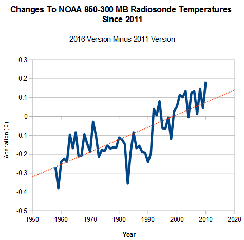
Another “Hockey Stick” of data MANIPULATION..
ALWAYS in the warming trend of the Dodgy Bros AGW agenda that Nick is an SALESMAN for.
“Changes from 2011 ballon data (Angell) to 2016 Ratpac A”
Yes, that how it goes:
DE: “satellite and balloon data show no global warming for the past ~20 years?”
NS: “RATPAC A posted a huge record anomaly of 1.31°C
AG: “Ratpac A is adjusted to follow the AGW meme, just like the BEST fabrication is.”
So what are we left with?
UAH6.0 had adjustments, but those are very good adjustments. UAH5.6 had adjustments but they were very bad adjustments. RSS had very good adjustments, but now has very bad adjustments. And so on.
With daily and even hourly temperature swings of 20, 30, or more degrees F, it will be difficult to sell the prophecy of Catastrophic Anthropogenic Global Warming to people who have lived all (or most) of their life on Earth.
However, if Al Gore and his Nobel Prize film “An Inconvenient Truth” were to go, every coastal inhabitant of the United States, whether on the west or east coast, would have to feel the effects of climate change. However, just the opposite is the case, the situation appears to have calmed so far so far that since Kathrina no heavy hurricanes hit the shores at all. So just the opposite of the predicted. When a comparatively lukewarm breeze named Sandy hits New York, the Hurricane-starved Liberals licked after the catastrophe. This, however, all told the state of mind in times of a hurricane drought.
Yeah. Unfortunately, for the Profits… I mean, prophets, the system is incompletely, and, in fact, insufficiently, characterized, and unwieldy (i.e. chaotic). Thus the establishment of a scientific logical domain, scientific philosophy, and scientific method, that are an implicit acknowledgement that accuracy is inversely proportional to the product of time and space offsets from an observer’s frame of reference.
Well, people want to believe. People will have to choose; but, the conflation of logical domains promises progressive corruption.
nn: Very fortunately many humans beings have the attention span of a gnat. If it wasn’t colder or hotter in their lifetime, then it never happened. How they remember this is greatly influence by the news and climate prophets. Actual evidence is rarely sought, few ever bother to check.
Co2 is not the driver of surface temperature https://micro6500blog.wordpress.com/2016/12/01/observational-evidence-for-a-nonlinear-night-time-cooling-mechanism/
Dew point sets daily min temp over most of the planet, for most of the year.
“global warming is real and human caused”
This is always stated like an indictment and calamity. In the absence of humans, what “would” the global temperature be? Is Muller telling us the planet would remain in a permanent Mini-Ice Age? That trends in climate before say 1950 would have ended?
What does the BEST climate model look like, and what temperatures is BEST predicting a century from now? Is BEST predicting a straight shot of non-stop warming?
Interesting question. What do the model runs without human CO2 contributions show? A continuing drop in temperature until the Little Ice Age becomes the Big Ice Age?
Did I miss something? For a long time I thought 1998 was the hottest year, (not including 2016). Now there are several years hotter. I must have been asleep.
Don’t be silly. BEST have now corrected their homework and 1998 was cold,cold,cold.
Perhaps it is the budgets that need ‘adjusting’ rather than the data sets?
It’s time to reallocate taxpayer funding on the basis of urgent, real priorities.
Exactly! Scientific evidence means they have identified a physical condition that can be measured. This doesn’t mean some concocted data series that supposedly indicates a global temperature. Scientific evidence also means the mathematical basis for how that physical condition works. Neither of these appear to be available.
Elizabeth Muller: “…. for now, the results that are most solidly established are that the temperature is increasing and that the increase is caused by human greenhouse emissions.”
Santer et al’s most recent paper (“Comparing Tropospheric Warming in Climate Models and Satellite Data”) reviews the “discrepancy” between models and observations. In particular, the prediction that an Enhanced Greenhouse Effect requires amplified warming aloft in the tropical troposphere (a scaling factor of about 1.6). This should be the source of increased “back radiation”. Santer’s paper discusses and evaluates the discrepancy, but it also confirms that the discrepancy exists and describes this as a matter of “scientific concern”
If Elizabeth Muller is correct, the above chart should be accompanied by a chart for the tropical troposphere which shows circa 1.6 degC anomaly in 2016 (for same reference period). Does anybody know if this exists?
Someting is very wrong with that extra high El Nino of 2016 you highlight in this paper. For that matter, somehting is wrong with your entire temperature curve starting with 1980. First, that El Nino of 2016. Its peak stands half a degree Celsius above the super El Nino of 1998. That is an impossibility. 1998 was a super El Nino, not part of the preceding group of five that belong to the ENSO. Satellites prove it was twice as high as these five preceding El Ninos were. You arbitrarily demoted it to the same height as the five that preceded it. But to reach a half a degree Celsius difference in height in only twenty years is nonsense. Let me remind you that changing actual temperature curves without publishing an explanation is falsification of scientific data, a scientific crime. And a large-scale crime exists here because a horizontal stretch of flat global temperature between 1979 and 1997 was changed into warming. A new warm period called “late twentieth century warming” was created thereby and the hiatus of the eighties and nineties that was there was erased. Fortunately, I was able to use the original data in my book “What Warming” and the hiatus that was over-written by warming later can be seen as figure 15 of my book. Fortunately, they still do not control satellites and the original hiatus data can still be obtained from satellite archives. But this is not the only wrong thing that was done. To change vthe official temperature curve took three participants, at least. I have spotted NCDC (NOAA), GISS, and the Met Office as three of them. Having changed their raw data to a common curve they next decided to make their corresponding data curves identical, It was done by using the same computer program on all three data sets. And it did a fine job except that it left the presence of itself to be known to all who use these data. This is because the computer left sharp spikes all over the three publicly accessible falsified data curves. Most spikes are placed near the ends of temperature segments, but one sits right smack on top of the 1998 super El Nino and gives it a boost of 0.1degrees Celsius. In your graph you have demoted the super El Nino of 1998 to the same height as the five previous EL Ninos that belong to the ENSO group. I have not checked directly but it looks like the warming introduced in the eighties and nineties was continued after the 1998 super El Nino left. If so, it would explain how the 1916 El Nino reaches its unbelievable height. Now let’s look at the bottom part of the super El Nino of 1998. In satellite view you can see that the two temperature dips on two sides of it are of equal depth. But this is not true of your current temperature chart. In your chart the right-hand dip next to 1998 is shallower than the left-hand dip by 0.1 degree Celsius. That makes it look like the El Nino is climbing a hill. Furthermore, the beginning of the twenty-first century warming is shown as having equal height with the 1998 super El Nino. Satellite data that are accurate show that the twenty-first century warming only reaches to half height of the 1998 super El Nino if correctly represented. On satellite scale that means a temperature jump of 0.45 degrees Celsius in only three years – an unbelievable rise at the rate of 15 degrees per century. I recommend that you withdraw this temperature chart from public use and get to work on all the unsatisfactory aspects of this data set and any similar ones you may be stuck with. If you for any reason should hand out a wrong temperature chart, other scientists using it can come to wrong conclusions.
. . . correct
BEST junk science all the way down
” Let me remind you that changing actual temperature curves without publishing an explanation is falsification of scientific data, a scientific crime.”
Yeah, where are all the explanations for all the changes that have been made to the surface temperature record?
Less than 24 hours. 🙂
I still subscribe to the old analogy that, as a x48 year-old :-), I am probably at the tallest in my life I have ever been – and ever will be. Therefore, the last ten years can be described as being the tallest ten years of my life. I now worry that I need to buy a new bed and raise the doorways in my home as it is beyond doubt that I shall be over seven feet tall pretty soon (according to the logic of climate statisticians).
That said, I note that my mother-in-law achieved her tallest in her 70s and then fell back by a few inches due to spinal problems, so nature seems to have a remedy, and she didn’t become a seven foot ogre.!
The likes of Nick Stokes and Mosher are wed to the the theory of AGW because they can work with the numbers. They love that bitch so much that they don’t want to have her dissed, so no matter what, she will always be right, and always respected. Anyway, satellites, shatellites. Huh!
“The likes of Nick Stokes and Mosher are wed to the the theory of AGW because they can work with the numbers”
That’s proably true. You can learn a lot by actually doing the arithmetic.
Am I going to respect you more after I do the arithmetic or less?
Sheri,
Try it and see.
Okay, Nick, thank you. I’ll give a try. I have R on my computer. I’ll see where this goes.
Satellite measurements–the only geographically complete data available for the globe–show 2016 to be only trivially warmer than 1998.
Fluctuations, by definition, are short-term phenomena. It’s not the 18–year pause, but the temperature spike of the last El Nino that is a proper fluctuation.
Including data-deficient regions such as the Arctic Ocean in the global average results in the substitution of theoretical projections for hard data–scarcely the stuff of “compelling scientific evidence,” claimed by Elizabeth Muller. It’s little more than an attempt to put a positive face on a convenient fiction–a common posture in post-modern academia.
“Satellite measurements–the only geographically complete data available for the globe–show 2016 to be only trivially warmer than 1998.”

Not really. UAH5.6, equally global, averaged 0.591, compared with 0.42 for 1998. Here is the cumulative record plot:
RSS V4 TTT was similar, breaking the record by 0.17°C. Here is their plot:
What is the value used as the GAT? I don’t care about the anomalies unless there’s a numeric value for what the anomalies are measured from. Otherwise, anything can be shown to be true and correct. What is the GAT VALUE in degrees for 1980-2009 period shown, not the anomalies? Where can I find the values for GAT for other periods? Is there any rule about which period to use? I see 1880-2015, 1961-1990, etc, etc and all seem to be used to create the prettiest, scariest graph? Who decides what period to use?
(I can’t do the math because I need raw values, the weighting system and maybe a bigger computer, at least according to most warmists. It’s too complicated for mere mortals to actually calculate.)
Sheri,
“I can’t do the math because I need raw values, the weighting system and maybe a bigger computer, at least according to most warmists.”
This post and it’s linked predecessors tell you where to get the code, how I weight it, and the R code I use. I have a very ordinary PC.
The essential thing to realise about anomalies is that you take anomalies before averaging. Each data value has an expected value (usually that base average) subtracted before averaging. That gain in homogeneity is what it is all about. The period itself doesn’t matter much. Usually they were the most recent three decades when the index began.
TTT ist not the surface. A new TLT from RSS is not available til now.
“TTT ist not the surface.”
Nor is TLT – glad you noticed. The thing is, satellites can’t measure at the surface – there is a blinding glare of microwave from the surface itself. So they do various higher levels and subtract, which is a dicey business numerically. I think there is a general realisation that TLT went too far. You won’t see John Christy citing TLT now – it’s always TMT. And I don’t think RSS will release a new TLT; TTT as in the release is their preferred version. It sin’t surface, but neither was TLT; it’s just more reliable.
And remember, too, Sheri, when you take an anomaly, the uncertainty in the result goes up by the sqrt[sum of (systematic measurement errors in the base and datum)^2]; a nicety that seems to systematically escape the notice of these many practitioners.
To improve this uncertainty my anomaly is based on that stations prior day’s value. And as you move forward tomorrow can not be both plus and minus to subsequent days, so the error term for longer strings is ~error/2.
Now I have no specific temp reference point, but that’s less important than change.
Sheri you can find my stuff here http://wp.me/p5VgHU-13
The actual area reports are here http://sourceforge.net/projects/gsod-rpts/
But the important part is that warming isn’t from a rising minimum temp, that would be needed for co2 to cause the warming, what we do see is min temp follows dew point temperature.
Okay, you have the math covered and I’ll try. I still want to know the exact value of the 1980-2009 GAT used on the graph. NOT the anomalies. The real, calculated value. You’re using the graph, you should know the value.
“The essential thing to realise about anomalies is that you take anomalies before averaging. Each data value has an expected value (usually that base average) subtracted before averaging. That gain in homogeneity is what it is all about. The period itself doesn’t matter much. Usually they were the most recent three decades when the index began.”
This does not make sense. You can’t subtract the difference from the average before averaging. “An expected value”—expected because?
The period certainly does matter. Using the entire period or colder periods gives a lower value for the average—which still is hidden and no one seems to want to give an actual number. Otherwise, why would it matter if one starts with 1998 and goes forward? Yet I’ve seen hysterics (not from you) over that practice. It must matter or many, many warmists are who are screaming “cherry picking” are lying.
0.591, 0.41, 0.17 – numbers that = zilch.
Get a life!
Might as well measure the heat coming from my butt every time I fart.
I’m a proud member of Farts Anomalous.
Nick, Is it all true?
Sheri,
The anomaly arithmetic goes like this. You have a whole lot of stations with histories, and you want to get a global average for Dec 2016.
Step 1. For each station, calculate its average 1981-2010, or whatever. These are called normals.
Step 2. For each station, subtract its normal from the Dec temperature. That is the anomaly.
Step 3. Average the anomalies as if you were calculating a numerical spatial integral – ie area-weighted. That is when you are combining things.
So you never compute a global average temp, nor should you. The reason is that the anomalies are integrable, and the normals often not. Suppose you live in a hilly state. If it has been a warm month, it has probably been warmer than average everywhere. But the normals vary up hill and down dale. This matters particularly if you have diffrent data in each month (some goes missing). For abs temp, that really matters, but not for anomaly, because of that homogeneity. That is why proper index makers only average anomalies.
Sheri,
I’ve written a reply on anomaly arithmetic which disappeared, but will probably show up in a few hours. Meanwhile
“Otherwise, why would it matter if one starts with 1998 and goes forward?”
I think that is mixing up the period of graph that you should show and the anomaly base. In the end, a different anomaly base only adds a constant. It’s a bit like whether you use F or C; the graph still looks the same. Some say that a base might be scarier, but is 100F really scarier than 40C?
Looking at the prior day’s anomaly doesn’t do anything to remove systematic error from either measurement.
Any existing systematic error at the start of record collecting is either fixed, and since I started at zero it’s gone, it’s also not changing for tomorrow’s measurements. If it’s not fixed, how is taking an anomaly from an average that has the same if not more averaged systematic error, and is then compared against an average with far larger uncertainty.
If I take the day to day change for an area and average them together, is that not the best possible data showing how that collection of surface stations records changed? If I sum a year of those changes, they should sum to zero, right? What about taking the slope of that day to day change? Is there not an undeniable seasonal change that we can then pull from a half year of data?
And we can see what has actually been measured. You know none of the published temperature series are not infilled with linearized data, over a nonlinear field (temp is not specially linear). It junk that they can make do whatever they think is supposed to be happening. Oh, and they are righteous in their series being the best humans have to offer.
micro6500, your argument has a chance if you’re using only aspirated sensors.
Otherwise, the systematic measurement error is environmentally determined by sun and wind, and varies hour-by-hour, day-by-day, and annually. It’s not constant, its magnitude is unknown, and taking anomalies doesn’t subtract it away.
Unfortunately the sensors are what they are.
I only use daily summary(NCDC GSoD), far from perfect, but I think there is info to be found.
I like seeing more than a dozen stations for an area, as long as they respond the same to the same input within reason, systematics are easier to ignore. And for many calculations I use a 30 day running mean to get the slope as the length of day changes, and measure the response of the atmospheric to a well defined amount of solar.
Thanks to Nick and everyone else who added to the anomaly/averaging answer. More research on my part will be needed, as well as testing of the mathematics and how changes affect it. I realize that to Nick and others, this is “obvious”, but nothing is obvious to me until I can work through the math and the reasoning. Again, thanks for the input. I appreciate it and will study the information you provided.
Nick:
Try selling the notion that 2016 was significantly higher than 1998 to the keepers of satelltite indices
1sky1
“Try selling the notion that 2016 was significantly higher than 1998 to the keepers of satelltite indices”
RSS needs no convincing. Their news release is headed
“Analysis of mid to upper tropospheric temperature by Remote Sensing Systems shows record global warmth in 2016 by a large margin.”
Now you’re shuffling the pea to indices at other levels and no longer talking about TLT, which is the level most strongly coherent with the surface. As Werner Brozek reported here a week ago for TLT: “In 2016, RSS beat 1998 by 0.573 – 0.550 = 0.023 or by 0.02 to the nearest 1/100 of a degree.” A nearly identical TLT comparison was reported by Roy Spencer of UAH.
1sky1,
“Now you’re shuffling the pea to indices at other levels and no longer talking about TLT, which is the level most strongly coherent with the surface.”
The other levels are all just as global. And the usual complaint here is that TLT is not coherent with the surface. In fact, V5.6 TLT was weighted to peak at 2km above the surface; V6 is 4 km above. And V5.6 showed a big rise.
But RSS has more to say on this. They have for some time had an advisory on V3.3 TLT, saying that it had known problems and use with caution. In the latest announcement, they say:
“RSS TLT version 3.3 contains a known cooling bias. We are working to eliminate the bias in the new version of TLT. Even with these known cooling biases, 2016 was a record warm year in TLT v3.3. In fact, 2016 was a record warm year in all RSS tropospheric temperature products (TLT v3.3, TMT v3.3, TTT v3.3, TMT v4.0 and TTT v4.0”
On a yearly average basis, I get R^2 > 0.8 for UAH TLT vs. my own estimate of surface temperature using only thoroughly vetted station records. To what unvalidated GAT indices RSS compares its results is of little scientific interest.
1sky1 on January 18, 2017 at 12:51 pm
Including data-deficient regions such as the Arctic Ocean in the global average results in the substitution of theoretical projections for hard data…
I guess with “data-deficient” you mean here solely surface data, don’t you?
Because UAH6.0 goes up/down to 82.5N / 82.5S. And there – yes yes – you exactly see what Elizabeth Muller is telling us about. But… not only at the surface; in the troposphere as well.
Have a look at UAH’s 2.5° grid data (it is in the same directory as the ncdc files), and you will find interesting things in it:
1. While UAH’s NoPol column in the ncdc file shows for 60N-82.5N a trend of 0.25 °C / decade, the splitting in single latitude stripes tells us the following for the top 5 (I omit the 2σ stuff):
– 82.5N-80N: 0.420
– 80N-77.5N: 0.346
– 77.5N-75N: 0.278
– 75N-72.5N: 0.256
– 72.5N-70N: 0.241
2. We all know that the GHCN station population is sparse at such latitudes, especially at 82.5N-80N: there are no more than 3 stations in the stripe.
But nevertheless you can compute a monthly times series out of that data, showing a trend of 0.692 °C / decade.
3. Additionally, you may compute a times series out of those 3 UAH grid cells encompassing the stations; you obtain 0.446 °C / decade.
4. If now you compute the trend over 1979-2016 for each of the 9,504 UAH grid cells, you see that of the 100 cells with the highest trends, 96 are in the Arctic, within 82.5N-80N… 2 are in the Antarctic, and 2 in Kamchatka.
So yes, 1sky1: the Arctic is warming a very little bit. I know: it did in the Golden Thirties as well. But is that the point here?
There’s a woeful lack of appreciation here of thermodynamic basics in attaching great significance to latitude-dependent temperature variations. Since the fourth power of surface blackbody temperature is proportional to internal kinetic energy density, it should come as no surprise that fairly uniform poleward transport of heat produces “polar amplification.” Of course high latitudes are more variable than lower zones! But temperature is merely an intensive variable, and the much-more densely sampled sub-polar latitudes provide far more reliable estimates of the variability of globally thermalized solar energy than the sparsely sampled polar regions that thermalize very little while acting as exhaust pipes for terrestrial heat.
How much more evidence do you DENIERS need? We are ruining the planet we live on! WE NEED A CARBON TAX NOW!
Some evidence would be nice. So far you have presented none.
Are you some sort of pantomime horse who walks on stage, looks really silly, and walks off?
Or am I being the silly one and missing a huge dollop of sarcasm?
I wish we had a posting history function here. If there was one you would be able to see that Cliff’s post was not sarcasm. That actually is how he thinks.
Forgotten your daily medication again Cliff?
That’s naughty! Your mummy will be cross!
So say the Psychics of America Climate Science Association.
“”We are ruining the planet we live on””‘
There’s a very good chance that without human interference…
…this planet would already be dead
So how much tax for each carbon atom in your body?
Cliffhanger – Really? Why? Governments use taxes to pay their cronies. What good will a carbon tax do? Look where they have them and look at who benefits and who gets exemptions. It’s POLITICAL. Remember that.
In Middle Aged England they had a tax on window size. Guess what happened; people started building houses with mini windows and lived in semi darkness. Tax income didn’t go up too much.
Blind carbon tax had its blind predecessors.
Are adjusted temperature records used for these studies, if so is it possible to get a study of “raw” temperature data for the same period?
Nick referenced some links in a different post. I don’t recall which one. The data is reportedly out there. Now, doing the gridding, figuring out the estimates, etc, that may be another story.
Firey on January 18, 2017 at 1:16 pm
Are adjusted temperature records used for these studies, if so is it possible to get a study of “raw” temperature data for the same period?
For Berkeley Earth you find all their sources in
http://berkeleyearth.org/source-files/
For the sources of GISS / NOAA series, consult the GHCN V3 dataset
https://www1.ncdc.noaa.gov/pub/data/ghcn/v3/
Be careful: the raw data is sometimes really raw! It contains errors which were first removed in adjusted datasets.
Agreed! Actually discussing this “compelling scientific evidence” is what we should be doing rather than volleying pithy retorts back and forth. Nick Stokes has a very fine mind and appears to be as informed as anyone as to the actual existence of ANYTHING that supports the Climate Alarm meme. I feel he very much improved the discussion at Climate Audit challenging statistical methods/conclusions there. I would equally much welcome a guest posting from him on any of the science that he considers a compelling reason for alarm and have him defend it. Starting with the most compelling. But for a lay person who has really tried to get to the “truth” regarding human CO2-caused climate change, every time I learn more I get more skeptical and more distrustful of the “science”. And all you need is your own common sense to question the integrity of the “leading lights” promoting CAGW alarm, and recognize the flashing neon signs of conflict of interest. But, like that old hamburger commercial: Where’s the Science!
Agreed Scott, but the “flashing neon signs of conflict of interest” of the (elite and powerful) forces arguing against need also to be recognized too. Big Carbon and its business interests for example.
Most reasonable people, including Anthony Watts it seems, would agree as a starting point that:
-CO2 is rising quickly (on geological time frames)
-that is probably contributing to an overall planetary warming,
– there is at least a correlation between CO2 and temperature behavior in the atmosphere, and
-that humans are partly responsible for the increasing CO2 (and other GHG like CH4) levels.
But they can see that there is uncertainty about how much warming, how fast and will it matter.
If that is a reasonable position, it would be helpful if Anthony jumped in right here to confirm that is a correct reading of his position of uncertainty, or otherwise.
+1. Human caused? Because the IPCC was set up to study only that?
Think of the children !
Look at Cliffy just a few posts above. We are ruining the planet.
Yes, let’s give the children something to play with.
The New York Times ran an article entitled “How 2016 Became Earth’s Hottest Year on Record“.
This question brings to mind a story I sometimes share from when I was a personal counselor in the 1970s — counseling people about improving their lives by improving their behaviors. I had a client from Las Vegas — annual income above $250 K. Profession? Professional poker player. His life was a mess, just couldn’t seem to move forward. I worked with him for a couple of weeks and just couldn’t find out what he was up to that was wrecking his life — under the philosophy that bad personal behaviors make one’s life miserable. I finally gave up on sorting him out. But I had one last question — just out of curiosity. I said “Poker is a game of chance and skill — I know — but over time, even the best players go through periods of bust and boom. How is it that you win big so consistently?” He answered, surprised by the question, “Oh, that’s easy. I cheat.”
So many delusional idealogues here. How many times does it need to be said. 2016 was the warmest year since humans began keeping records – 3 years in a row. The global warming “pause” appears to have been a temporary fluctuation. 2016 witnessed extraordinary warming in the Arctic that is having a significant impact on global temperature measurements. The next trench to overcome is “its a good thing”.
Speaking of delusional ideologues, here comes tony again.
2016 was only a few hundredths of a degree warmer than 1998, the previous 2 years came nowhere close to 1998.
2017 is already shaping up to be way cooler than 2016. Which according to you is impossible.
CO2 has gone up 30% since 1998, and the temperature only went up by 0.02C, this despite the AMO and PDO both being in their warm phases.
Humans started keeping records during the depths of the Little Ice Age. Of course it has warmed since then. Thank God it has.
The arctic is warming because the El Nino dumped it’s heat there.
Such warming is normal, has happened before and will abate shortly, just like it did after every other el nino.
“‘ 2016 witnessed extraordinary warming in the Arctic””
So you didn’t notice that it went there and didn’t come back…
Where did it go Tony?
Warming is better than cooling. Only a total moron would deny that. So much for your “trench”. That fact is completely separate from whether or not we are currently warming, which itself is dependent on what time period you want to cherry-pick, what regions of the earth you want to cherry-pick, and which charts you want to cherry-pick. With you Warmists, it’s always cherry-picking season.
Apart from the first sentence these are Anthony’s ideas from above, I’m just repeating them.
Tony, you’re worried about the Arctic, I’m worried why there is snow on the beaches in the Mediterranean.
It’s the warmest year since humans began keeping records—less than 150 years ago. So 150 years out of 4.5 billion is very, very significant it seems.
The answer to your question? It can be said over and over and over, but the reality is 2016 may have been the warmest and 2014 and 2015 next warmest, but that means nothing except they were the warmest. Until a trend line becomes reality (as in NEVER), it matters not. Three record years in a row are just that—three record years in a row. Means nothing more than 3 record cold years in a row or 15 cold years in a row. Nature and reality are not bound by trend lines.
How long has it been since there was just a below average year Sheri?
Tony, no scientist is saying that there hasn’t been warming. It’s the cause of that warming that is in question. Further, the warming is so far below projected models as to render the AGW theory null and void. Adjusting the data hasn’t helped much in that regard either. You’re screaming about 0.01 C of warming ? Record crops and less severe weather that’s the reality. Let’s revisit the predictions made in the year 2000. Who put the C in catastrophic? You realize not one prediction/projection by the IPCC and associates has happened ( outside of a slight warming trend). The only way you can get every prediction wrong is using the wrong math.
1) I remember the 1970’s 2) co2 follows temperature . If it weren’t for that, actual temperature might have fallen in my view. And that could still be the case. The perception of warming maybe long term weather related and not climate.
@tony mcleod January 21, 2017 at 4:05 am
Try to have some historical perspective.
See this study:http://onlinelibrary.wiley.com/doi/10.1029/2011JC007255/abstract
which has this image:
http://onlinelibrary.wiley.com/store/10.1029/2011JC007255/asset/supinfo/jgrc12191-sup-0010-fs09.pdf?v=1&s=79e93e124ca1fd8a33753fc667ff17deaa20b3e6
Present temperatures are the lowest in the last ~84 million years. In those days the temperatures were some 15-20K higher then today.
So let’s start worrying when the temperatures have risen let’s say 10K and see if something unusual may be starting to develop…..
“How many times does it need to be said. 2016 was the warmest year since humans began keeping records”
Saying something repeatedly doesn’t make it true.
Andrew
2017 is going to be several tenths of a degree cooler than 2016. This will be an order of magnitude more cooling than the amount of warming from 1998 to 2016.
I’m wondering how our various trolls are going to spin that?
I’l have a go.
A few tenths less than last year but several tenths more than nearly every other year since 1980. As in it will still be true to say 9 hottest years in the satellite record have occurred in the last 10.
Tenths of a degree measured globally, really?
MarkW January 18, 2017 at 2:02 pm wrote: “2017 is going to be several tenths of a degree cooler than 2016. This will be an order of magnitude more cooling than the amount of warming from 1998 to 2016.
I’m wondering how our various trolls are going to spin that?”
tony mcleod January 18, 2017 at 9:18 pm replied: “I’l have a go.
A few tenths less than last year but several tenths more than nearly every other year since 1980. As in it will still be true to say 9 hottest years in the satellite record have occurred in the last 10.”
Wrong on both points if you go by the UAH satellite chart, shown below:
http://www.drroyspencer.com/wp-content/uploads/UAH_LT_1979_thru_December_2016_v6.jpg
Why so much emphasis on El Nino years? These temperature spikes are caused by short term climate events not necessarily associated with the cause of the longer term rise in temperature that has occurred periodically in the post 1880 measurements. The current pause in warming appears to have begun in 2002. If a horizontal line is drawn forward to the present from the reading for 2002, and if the unrelated El nino temperature reading for 2016 is ignored then the pause is evident.
“Since keeping keeping records” sure sounds like temperature records (thermometers and stuff), NOT recorded history.
Yet we then have this:
That phrase sure sounds more like recorded history (Roman, Minoan, Medieval etc.) rather than just the tamperedature records…..unless he means “civilization” didn’t begin until somebody noticed what happens when you put mercury in a glass tube.
So why does warming only appear as an increase in the southern hemisphere ocean minimas…. And more so in winter… . Must be regional effects. Nothing makes sense using global avergaes..Hoyt naiked it earlier.