Guest essay by Jeff Patterson
Temperature versus CO2
Greenhouse gas theory predicts a linear relationship between the logarithm of CO2 atmospheric concentration and the resultant temperature anomaly. Figure 1 is a scattergram comparing the Hadcrut4 temperature record to historical CO2 concentrations.

UPDATE: Thanks to an alert commenter, this graph has now been updated with post 2013 data to present:

At first glance Figure 1a appears to confirm the theoretical log-linear relationship. However if Gaussian filtering is applied to the temperature data to remove the unrelated high frequency variability a different picture emerges.
Figure 1b contradicts the assertion of a direct relationship between CO2 and global temperature. Three regions are apparent where temperatures are flat to falling while CO2 concentrations are rising substantially. Also, a near step-change in temperature occurred while CO2 remained nearly constant at about 310 ppm. The recent global warming hiatus is clearly evident in the flattening of the curve above 380 ppm. These regions of anti-correlation were pointed to by Professor Judith Curry in her recent testimony before the Senate Subcommittee on Space, Science and Competitiveness:[6]
If the warming since 1950 was caused by humans, what caused the warming during the period 1910 –1945? The period 1910-1945 comprises over 40% of the warming since 1900, but is associated with only 10% of the carbon dioxide increase since 1900. Clearly, human emissions of greenhouse gases played little role in causing this early warming. The mid-century period of slight cooling from 1945 to 1975 – referred to as the ‘grand hiatus’, also has not been satisfactorily explained.
A much better correlation exists between atmospheric CO2 concentration and the variation in total solar irradiance (TSI). Figure 2 shows the TSI reconstruction due to Krivova[2] .

When the TSI time series is exponentially smoothed and lagged by 37 years, a near-perfect fit is exhibited (Figure 3).

Note that while in general correlation does not imply causation here there is no ambiguity as to cause and effect. Clearly the atmospheric concentration of CO2 cannot affect the sun spot number from which the TSI record is reconstructed.
This apparent relationship between TSI and CO2 concentration can be represented schematically by the system shown in Figure 4. As used here, a system is a black box that transforms some input driving function into some output we can measure. The mathematical equation that describes the input to output transformation is called the system transfer function. The transfer function of the system in Figure 4 is a low-pass filter whose output is delayed by the lag td1 . The driving input u(t) is the demeaned TSI reconstruction shown in Figure 2b. The output v(t) is the time series shown in Figure 3a (blue curve) which closely approximates the measured CO2 concentration (Figure 3a, yellow curve).

In Figure 4, the block labeled 1/s is the Laplacian representation of a pure integration. Along with the dissipation feedback factor a1 it forms what system engineers call a “leaky integrator”. It is mathematically equivalent to the exponential smoothing function often used in time series analysis. The block labeled td1 is the time lag and G is a scaling factor to handle the unit conversion.
In a plausible physical interpretation of the system, the dissipative integrator models the ocean heat content which accumulates variations in TSI; warming when it rises above some equilibrium value and cooling when it falls below. As the ocean warms it becomes less soluble to CO2 resulting in out-gassing of CO2 to the atmosphere.
The fidelity with which this model replicates the observed atmospheric CO2 concentration has significant implications for attributing the source of the rise in CO2 (and by inference the rise in global temperature) observed since 1880. There is no statistically significant signal of an anthropogenic contribution to the residual plotted Figure 3c. Thus the entirety of the observed post-industrial rise in atmospheric CO2 concentration can be directly attributed to the variation in TSI, the only forcing applied to the system whose output accounts for 99.5% ( r2=.995) of the observational record.
How then, does this naturally occurring CO2 impact global temperature? To explore this we will develop a system model which when combined with the CO2 generating system of Figure 4 can replicate the decadal scale global temperature record with impressive accuracy.
Researchers have long noted the relationship between TSI and global mean temperature.[5] We hypothesize that this too is due to the lagged accumulation of oceanic heat content, the delay being perhaps the transit time of the thermohaline circulation. A system model that implements this hypothesis is shown in Figure 5.

As before, the model parameters are the dissipation factor a2 that determines the energy discharge rate; input offset constant Ci representing the equilibrium TSI value; scaling constants G1, G2 which convert their inputs to a contributive DT, and time lag td2. The output offset Co represents the unknown initial system state and is set to center the modeled output on the arbitrarily chosen zero point of the Hadcrut4 temperature anomaly. It has no impact on the residual variance which is assumed zero mean.
The driving function u(t) is again the variation in solar irradiance (Figure 2b). The second input function v(t) is the output of the model of Figure 4 which was shown to closely approximate the logarithmic CO2 concentration. Thus the combined system has a single input u(t) and a single output- the predicted temperature anomaly Ta(t). Once the two systems are combined the CO2 concentration becomes an internal node of the composite system.
Y(t) represents other internal and external contributors to the global temperature anomaly, i.e. the natural variability of the climate system. The goal is to find the system parameter values which minimizes variance of Y(t) on a decadal time scale.
Natural Variability
Natural variability is a catch-all phrase encompassing variations in the observed temperature record which cannot be explained and therefore cannot be modeled. It includes components on many different time scales. Some are due to the complex internal dynamics of the climate system and random variations and some to the effects of feedbacks and other forcing agents (clouds, aerosols, water vapor etc.) about which there is great uncertainty.
When creating a system model it is important to avoid the temptation to sweep too much under the rug of natural variation. On the other hand, in order to accurately estimate the system parameters affecting the longer term temperature trends it is helpful to remove as much of the short-term noise-like components as practicable, especially since these unrelated short-term variations are of the same order of magnitude as the effect we are trying to analyze. The removal of these short-term spurious components is referred to as data denoising. Denoising must be carried out with the time scale of interest in mind in order to ensure that significant contributors are not discarded. Many techniques are available for this purpose but most assume the underlying process that produced the observed data exhibits stochastic stationarity, in essence a requirement that the process parameters remain constant over the observation interval. As we show in the next section, the climate system is not even weak sense stationary but rather cyclostationary.
Autocorrelation
Autocorrelation is a measure of how similar a lagged version of a time series resembles the unlagged data. In a memoryless system, correlation falls abruptly to zero with increasing lag. In systems with memory, the correlation will decrease gradually. Figure 6a shows the autocorrelation function (ACF) of the linearly de-trended unfiltered Hadcrut4 global temperature record. Instead of the correlation gradually decreasing, we see that the correlation cycles up and down in a quasi-periodic fashion. A system that exhibits this characteristic is said to be cyclostationary. Despite the nomenclature, a cyclostationary process is not stationary, even in the weak sense.

With linear detrending, significant correlation is exhibited at two lags, 70 years and 140 years. However the position of the correlation peaks is highly dependent on the order of the detrending polynomial.
Power spectral density (spectrum) is the discrete Fourier transform of the ACF and is plotted in Figure 6b. It shows significant periodicity at 71 and 169 years but again the extracted period will vary depending on the order of the detrending polynomial (linear, parabolic, cubic etc.) and also slightly on the data endpoints selected.
Denoising the Data
From the above it is apparent that we cannot assume a particular trend shape to reliably isolate the “main” decadal scale climatic features we hope to model. Nor can we assume the period of the oscillatory component(s) remains fixed over the entire record. This makes denoising a challenge. However, a technique [1] has been developed for denoising data which makes no assumptions regarding the stationarity of the time record which combines wavelet analysis with principal component analysis to isolate quasi-periodic components. A single parameter (wavelet order) determines the time scale of the retained data. The implementation used here is the wden function in Matlab™. The denoised data using a level 4 wavelet as described in [1] is plotted as the yellow curve in Figure 7.

The resulting denoised temperature profile is nearly identical to that derived by other means (Singular Spectrum Analysis, Harmonic Decomposition, Principal Component Analysis, Loess Filtering, Windowed Regression etc.)
Figure 8a compares the autocorrelation of the denoised data (red) to that of the raw data (blue). We see that the denoising process has not materially affected the stochastic properties over the time scales of interest. The narrowness of the central lobe of the residual ACF (Figure 8b) shows that we have not removed any temperature component related to the climate system memory.

The denoised data (Figure 7) shows a long-term trend and a quasi-periodic oscillatory component. Taking the first difference of the denoised data (Figure 9) shows how the trend (i.e. the instantaneous slope) has evolved over time.

There are several interesting things of note in Figure 8. The period is relatively stable while the amplitude of the oscillation is growing slightly. The trend maxed out at .23 ⁰C /decade circa 1994 and has been decreasing since. It currently stands at .036 ⁰C /decade. Note also that the mean slope is non-zero (.05 ⁰C /decade) and the trend itself trends upward with time. This implies the presence of a system integration as otherwise the differentiation would remove the trend of the trend.
A time series trend does not necessarily foretell how things will evolve in the future. The trend estimated from Figure 9 in 1892 would predict cooling at a rate of .6 degrees-per-century while just 35 years later predict 1.5 degrees-per-century of warming. Both projections would have been wildly off base. Nor is there justification in assuming the long-term trend to be some regression on the slope. Without knowledge of the underlying system, one has no basis on which to decide the proper form of the regression. Is the long term trend of the trend linear? Perhaps, but it might just as plausibly be a section of a low frequency sine wave or a complimentary exponential or perhaps it is just integrated noise giving the illusion of a trend. To sort things out we need to approximate the system which produced the data. For this purpose we will use the model shown in Figure 5 above.
Model Parametrization
As noted, the composite system is comprised of two sub-systems. The first (Figure 4) replicates the atmospheric CO2 whose effect on temperature is assumed linear with scaling factor G1. The parameters of the first system were set to give a best-fit match to the observational CO2 record (see Figure 3).
The remaining parameters were optimized using a three-step process. First the dissipation factor a2 and time delay td2 were optimized to minimize the least-squares error (LSE) of the model output ACF as compared to the ACF of the denoised data (Figure 10, lower left), using a numerical method [7] guaranteed to find the global minimum. In this step the output and target ACFs are both calculated from the demeaned rather than detrended data. This eliminates the dependence on the regression slope and, since the ACF is independent of the scaling and offset, allows the routine to optimize to these parameters independently. In the second step, the scaling factors G1, G2 are found by minimizing the residual LSE using the parameters found in step one. Finally the input offset Ci is found by solving the boundary condition to eliminate the non-physical temperature discontinuity. The best-fit parameters are shown in Table 1. The results (figure 10) correlate well with observational time series (r = .984).

Figure 10- Modeled results versus observation
| Dissipation Factor | a1 | .006 |
| Dissipation Factor | a2 | .051 |
| Scaling Parameter | G1 | .0176 |
| Scaling Parameter | G2 | .0549 |
| CO2 Lag (years) | td1 | 37 |
| TSI Lag (years) | td2 | 84 |
| Input Offset (W/m2) | C0 | -.045 |
| Output Offset (K) | C1 | .545 |
Table 1- Best fit model parameters
The error residual (upper right) remains within the specified data uncertainty (± .1⁰C) over virtually all of the 165 year observation interval. The model output replicates most of the oscillatory component that heretofore has been attributed to the so-called Atlantic Multi-decadal Oscillation (AMO). As shown in the detailed plots of Figure 11, the model output aligns closely in time with all of the major breakpoints in the slope of the observational data, and replicates the decadal scaled trends of the record (the exception being a 10 year period beginning in 1965), including the recent hiatus and the so-called ‘grand hiatus’ of 1945-1975.

Figure 12 plots the scaled, second difference of the denoised data against the model residual. The high degree of correlation infers an internal feedback sensitive to the second derivative of temperature. That such an internal dynamic can be derived from the modeled output provides further evidence of the model’s validity. Further investigation of an enhanced model that includes this dynamic will be undertaken.

Climate Sensitivity to CO2
The transient climate sensitivity to CO2 atmospheric concentration can be obtained from the model by running the simulation with G2 set to zero, giving the contribution to the temperature anomaly from CO2 alone (Figure 13a).

A linear regression on the modeled temperature anomaly (with G2 = 0) versus the logarithmic CO2 concentration (Figure 13b) shows a best fit slope of 1.85 yielding an estimated transient climate sensitivity to doubled CO2 of 1.28 ⁰C. Note however that assuming the model is relevant, the issue of climate sensitivity is moot unless and until an anthropogenic contribution to the CO2 concentration becomes detectable.
Discussion
These results are in line with the general GHG theory which postulates CO2 as a significant contributor to the post-industrial warming but are in direct contradiction to the notion that human emissions have thus far contributed significantly to the observed concentration. In addition, the derived TCR implies a mechanism that reduces the climate sensitivity to CO2 to a value below the theoretical non-feedback forcing, i.e. the feedback appears to be negative. Other inferences are that the observed cyclostationarity is inherent in the TSI variation and not a climate system dynamic (because a single-pole response cannot produce an oscillatory component) and that at least over the short instrumental time period, the climate system as a whole can be modeled as a linear, time-invariant system, albeit with significant time lag.
In a broader context, these results may contain clues to the underlying climate dynamics that those with expertise in these systems should find valuable if they are willing to set aside preconceived notions as to the underlying cause. This model, like all models, is nothing more than an executable hypothesis and as Professor Feynman points out, all scientific hypotheses start with a guess. The execution of a hypothesis, either by solving the equations in closed form or by running a computer simulation is never to be confused with an experiment. Rather a simulation provides the predicted ramifications of the hypothesis which falsify the hypothesis if the predictions do not match empirical observations.
An estimate of the future TSI is required in order for this model to predict how global temperature will evolve. There are some models of this in development by others and I hope to provide a detailed projection in a future article. In the meantime, due to the inherent system lag, we can get a rough idea over the short term. TSI peaked in the early 80s so we should expect the CO2 concentrations to peak some 37 years later, i.e. in a few years from now. Near the start of the next decade, CO2 forcing will dominate and thus we would expect temperatures to flatten and begin to fall as this forcing decrease. Between now and then we should expect a modest increase. This no doubt will be heralded as proof that AGW is back and that drastic measures are required to stave off the looming catastrophe.
Comment on Model Parametrization
It is important to understand the difference between curve fitting and model parametrization. The output of a model is the convolution of its input and the model’s impulse response which means that the output at any given point in time depends on all prior inputs, each of which is shaped the same way by the model parameter under consideration. This is illustrated in Figure 14. The input u(t) has been decomposed in to individual pulses and the system response to each pulse plotted individually. Each input pulse causes a step response that decays at a rate determined by the dissipation rate, set to .05 on the left and .005 on the right. The output at any point is the sum of each of these curves, shown in the lower panels. The gain factor G simply scales the result and does not affect the correlation with the target function. Thus, unlike polynomial regression, it is not possible to fit an arbitrary output curve given specified forcing function, u(t). In the models of Figures 4 and 5 it is only the dissipation factor (and to a small extent in the early output, the input constant) which determine the functional “shape” of the output. The scaling, offset and delay do not effect correlation and so are not degrees of freedom in the classical sense.

References:
1) Aminghafari, M.; Cheze, N.; Poggi, J-M. (2006), “Multivariate de-noising using wavelets and principal component analysis,” Computational Statistics & Data Analysis, 50, pp. 2381–2398.
2) N.A. Krivova, L.E.A. Vieira, S.K. Solanki (2010).Journal of Geophysical Research: Space Physics, Volume 115, Issue A12, CiteID A12112. DOI:10.1029/2010JA015431
3) Ball, W. T.; Unruh, Y. C.; Krivova, N. A.; Solanki, S.; Wenzler, T.; Mortlock, D. J.; Jaffe, A. H. (2012) Astronomy & Astrophysics, 541, id.A27. DOI:10.1051/0004-6361/201118702
4) K. L. Yeo, N. A. Krivova, S. K. Solanki, and K. H. Glassmeier (2014) Astronomy & Astrophysics, 570, A85, DOI: 10.1051/0004-6361/201423628
5) For a summary of many of the correlations between TSI and climate that have been investigated see The Solar Evidence (http://appinsys.com/globalwarming/gw_part6_solarevidence.htm)
6) STATEMENT TO THE SUBCOMMITTEE ON SPACE, SCIENCEAND COMPETITIVENESS OF THE UNITED STATES SENATE; Hearing on “Data or Dogma? Promoting Open Inquiry in the Debate Over the Magnitude of Human Impact on Climate Change”; Judith A. Curry, Georgia Institute of Technology
7) See Numerical Optimization from Wolfram. In particular, the NMinimize function using the “”NelderMead” method.
8) See wden from MathWorks Matlab™ documentation.
Data:
Hadcrut4 global temperature series:
Available at https://climexp.knmi.nl/data/ihadcrut4_ns_avg _ 00_ 1850:2015.dat
Krivova TSI reconstruction:
Available at http://lasp.colorado.edu/home/sorce/files/2011/09/TSI_TIM_Reconstruction.txt
CO2 data
Available at http://climexp.knmi.nl/data/ico2_log.dat
In support of your results:
1. changes in atmos co2 not related to the rate of emissions
http://papers.ssrn.com/sol3/papers.cfm?abstract_id=2642639
2, rate of warming not related to the rate of emissions
http://papers.ssrn.com/sol3/papers.cfm?abstract_id=2662870
4. rate of ocean acidification not related to the rate of fossil fuel emissions
http://papers.ssrn.com/sol3/papers.cfm?abstract_id=2669930
5. uncertainty in natural flows too high to detect fossil fuel emissions in the IPCC carbon budget
http://papers.ssrn.com/sol3/papers.cfm?abstract_id=2654191
6. The much hyped correlation between cumulative emissions and surface temperature is spurious
http://papers.ssrn.com/sol3/papers.cfm?abstract_id=2725743
Jamal,
Sorry, but that doesn’t hold. Your first reference shows the following sentence:
A statistically significant correlation between annual anthropogenic CO2 emissions and the annual rate of accumulation of CO2 in the atmosphere over a 53-year sample period from 1959-2011 is likely to be spurious because it vanishes when the two series are detrended.
By detrending you simply removed the influence of human emissions out of the equation! The remainder is only the noise caused by the influence of fast temperature variations on (tropical) vegetation, with a high correlation but hardly any (even negative!) influence on the CO2 trend: vegetation is an increasing net sink for CO2…
“Sorry, but that doesn’t hold.” ?w=680
 ?w=680
 ?w=680
 ?w=680
Whether it holds or not depends completely on the variance of the uncorrelated components. The figures below compare two identical exponential functions with different added Brownian noise (so that the valiance keeps pace with the exponential). The adjusted NOVA stats are given for sigma (the std dev of the noise prior to integration) = .01,.05,1 and 1. The top of each panel shows the two functions and their scattergram. The bottom panel shows the same for the linear detrended data.
As you can see, the correlation survives detrending for sigma < .1. By eyeball, the CO2 v emissions regression loos a lot closer to the first plot than the last.
The first paper is interesting. It confirms two results printed here; no correlation between human emissions and CO2 concentrations and the slope of the regression of CO2 v Temp (he gets 1.88, I get 1.85).
Jeff Patterson,
The correlation between temperature and the CO2 rate of change survives detrending, because most of the trend is not caused by temperature (it has some influence, but very limited), but temperature causes almost all of the variability in the CO2 rate of change. That is mainly the reaction of tropical plants on ocean temperatures (El Niño) and volcanic events (Pinatubo). That vegetation is responsible for most of the variability is visible in the opposite CO2 and δ13C changes:
http://www.ferdinand-engelbeen.be/klimaat/klim_img/temp_dco2_d13C_mlo.jpg
If the oceans were responsible, CO2 and δ13C changes would parallel each other.
The problem for the trend is that vegetation is a proven net -increasing- sink for CO2 since at least 1990:
http://science.sciencemag.org/content/287/5462/2467.short
That doesn’t prove that humans are the main cause, but it definitively proves that the trend and the variability around the trend are caused by different processes, where the variability is certainly heavily influenced by temperature, but the trend may be or not caused by temperature, anyway by a different process than what caused most of the variability.
The variability is also peanuts compared to the trend, even with an overblown 5 ppmv/K short term reaction of CO2 to temperature variability in Wood for Trees: +/- 1.5 ppmv around a trend of 70+ ppmv 1959-2012.
Human emissions show very little variability, even not detectable with the current accuracy in the atmosphere after detrending. Thus shows no correlation with the variability in rate of change. Detrending the CO2 rate of change thus effectively removes any influence of human emissions…
As human emissions are about twice what remains in the atmosphere and fit all observations, there is little doubt about what is cause and effect in this case…
@ferdinand meeus Engelbeen February 10, 2016 at 9:54 am “but temperature causes almost all of the variability in the CO2 rate of change.”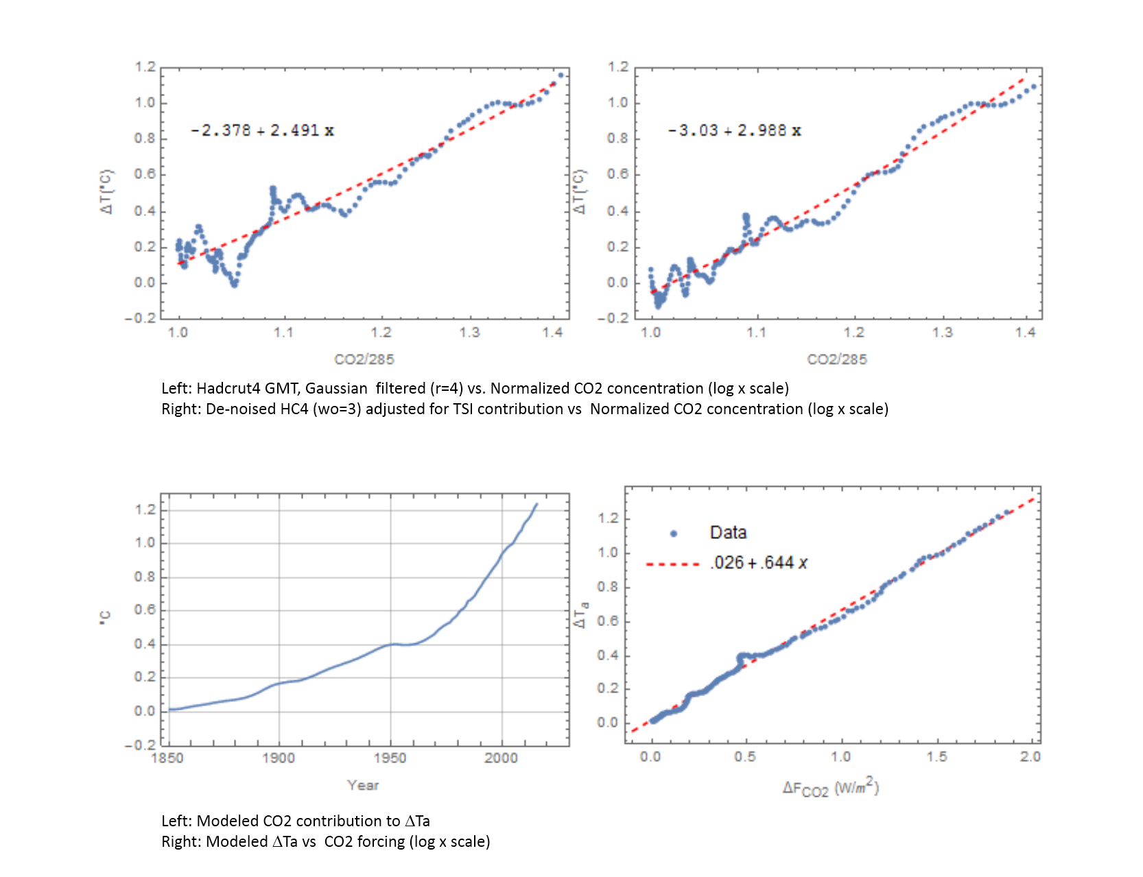 ?w=529
 ?w=529
I disagree. First let’s examine the reasons for the de-correlations shown in fig1 of the original post, repeated in the upper left panel of the plot below.
Comparing the two graphs in the top row we conclude the large de-correlation near x=1.06 in the upper left panel can be attributed to TSI variance which has been removed from the left graph by subtracting the modeled TSO contribution from the de-noised Hadcrut4 data. The lower right graph plots the modeled temperature anomaly vs the post-lag CO2 concentration converted to power density, assuming 3.7 W/m2 for 2x CO2. We conclude the oscillatory de-correlation that remains in the upper right are due to the 11 year CO2 forcing lag which has been removed in the final plot (lower right).
Now let’s look at the rate of change in the anomaly vs rate of change in CO2, again with the 11 year lag removed
This shows clearly that on this multi-year time scale 1) temperature lags CO2 (remember the lag has been removed in the plot by shifting it by 11 years) and that temperature follows the change in CO2 forcing immediately when the forcing arrives (after an 11 year delay). Thisould appear to contradict the long CO2 residency time meme.
It could be that on the shorter time scales you are looking at temperature can cause variance but on longer time scales it doesn’t appear to be so.
Regards,
JP
Human emissions growth fell (went negative) at the time of the global financial crisis (GFC) but the global growth rate of atmospheric CO2 composition continued positive. Human emissions do not drive atmospheric levels of CO2.
The IPCC provides a conversion factor that enables a direct comparison in ppm when given GtC:
2.12 GtC yr–1 = 1 ppm
From:
7.3.2 The Contemporary Carbon Budget – IPCC
https://www.ipcc.ch/publications_and_data/ar4/wg1/en/ch7s7-3-1-3.html
Emissions data source:
Annual Global Carbon Emissions
https://www.co2.earth/global-co2-emissions
Growth declined from 2008 to 2009 due to the global financial
crisis (GFC) driven recession:
2008 9.666 GtC
2009 9.567 GtC
Change: -0.099 GtC = -0.047 ppm (0.099/2.12 GtC x 1 ppm)
This human emission change can then be directly compared to the global
atmospheric level change from ESRL:
Annual Mean Global Carbon Dioxide Growth Rates
http://www.esrl.noaa.gov/gmd/ccgg/trends/global.html
2006 1.74
2007 2.11
2008 1.77
2009 1.67
2010 2.39
2011 1.69
2009 -0.047 ppm – human emissions declined
2009 +1.67 ppm – global levels increased
Negative growth cannot drive positive growth.
“2009 -0.047 ppm – human emissions declined
2009 +1.67 ppm – global levels increased”
Elementary fallacy here. The second figure is a growth, ppm/year. The first is a change of growth rate, ppm/year/year. The figure that corresponds to 1.67 is 9.567/2.12=4.51 ppm. It’s bigger because of airborne fraction.
richardcfromnz,
As Nick Stokes already said: the growth rate of human emissions declined and so did the growth rate of CO2 in the atmosphere, but both still were positive, so O2 still increased in the atmosphere, be it at a slower speed:
http://www.ferdinand-engelbeen.be/klimaat/klim_img/dco2_em2.jpg
Nick Stokes
>”Elementary fallacy here. The second figure is a growth, ppm/year. The first is a change of growth rate, ppm/year/year”
No. The first is the human emissions growth rate (-0.047 ppm/year) in respect to 2008 i.e. the rate of growth for the 2009 year with respect to 2008 gross flow, or, with 2008 gross flow as the base year..It is simply the difference in gross flows.
The second is the total atmosphere growth rate (+1.67 ppm/year) for the 2009 year as per ESRL (see below). Again, it is simply the difference in gross totals.
>”The figure that corresponds to 1.67 is 9.567/2.12=4.51 ppm”
No. 4.51 ppm is the gross flow of human emissions in 2009. Growth (or decline) is a change in the gross flow. There was negative growth in human emissions in 2009 (-0.047 ppm). Yes there was a positive gross flow in 2009 but it was LESS than the gross flow in 2008.
The total atmospheric CO2 level increased as a result of all the combined gross flows including human emissions:
2008 384.78
2009 386.29
Change +1.51 ppm
ESRL calculates the growth rate:
“The annual mean rate of growth of CO2 in a given year is the difference in concentration between the end of December and the start of January of that year”
January 2009 is the base month for the 2009 growth rate (+1.67 ppm) which is a difference in gross amounts January/December. This differs slightly to the growth rate where 2008 is the base year (+1.51 ppm).
So a restatement would be simply in terms of changes from a 2008 base:
2009 -0.047 ppm – human emissions declined in respect to 2008.
2009 +1.51 ppm – global CO2 levels increased in respect to 2008.
In respect to 2008, it is impossible for human emissions to have produced the following increase in global CO2 levels in 2009 if human emissions were the sole cause of the increase. To have done so, human emissions would have to have increased by +1.51 ppm but they didn’t, they decreased -0.047 ppm. Obviously gross flow(s) other than human emissions caused the total increase from 2008 to 2009.
Ferdinand Engelbeen
>”As Nick Stokes already said:”
Nick has his wires crossed. See my reply to him above.
“….the growth rate of human emissions declined and so did the growth rate of CO2 in the atmosphere, but both still were positive”
No, both were NOT still positive. You are confusing gross flow with growth rate (or change in gross flow).
My example is in respect to 2008. It is the GROSS FLOW in human emissions that was still positive in 2009, but the GROWTH RATE with respect to 2008 was negative. I repeat from my reply to Nick:
In respect to 2008, it is impossible for human emissions to have produced the following increase in global CO2 levels in 2009 if human emissions were the sole cause of the increase. To have done so, human emissions would have to have increased by +1.51 ppm but they didn’t, they decreased -0.047 ppm. Obviously gross flow(s) other than human emissions caused the total increase from 2008 to 2009.
richardcfromnz,
You are comparing the changes in the second derivative of CO2 emissions with the first derivative of the increase in the atmosphere… If you use the right dimensions, it may be clear what is going on.
Emissions:
2008: 9.666 GtC/year = 4.56 ppmv/year
2009: 9.567 GtC/year = 4.52 ppmv/year
growth rate change: -0.047 ppmv/year/year
Increase in the atmosphere:
2008: 1.77 ppmv/year
2009: 1.67 ppmv/year
growth rate change: -0.1 ppmv/year/year
If you compare emissions per year with increase per year in the atmosphere (the “airborne fraction”):
2008: 38.8%
2009: 36.9%
Conclusion: the growth rate change in the atmosphere and the airborne fraction both are more negative in 2009 compared to 2008 than the growth rate change of human emissions…
That doesn’t say much in itself, as the growth rate in the atmosphere is heavily influenced by temperature fluctuations, which influences the CO2 uptake rate by oceans and especially by vegetation…
If it is not known why the LIA ended, and what powered temperature rise ever since and at what a degree (at least to 1900s, or perhaps 1950s), all the calculations of the CO2 forcing etc. are just a simple waste of time.
“No. 9.567 Gtons is the gross flow of human emissions in 2009”
Yes, it’s the amount of extra carbon that humans added to the air that year. And 3.54 Gtons (=1.67*2.12) is the amount by which C in the air increased. Those are the comparable figures.
Nick Stokes says:
…it’s the amount of extra carbon that humans added to the air that year.
Thanks for the good news, Nick! More CO2 is better in our CO2-starved atmosphere. The biosphere heartily approves.
Interesting alternate modeling–I wish I had the math to really understand it.
In a nutshell it means that global warming is caused by an increase in the energy coming from the sun (who’d a thunk) acting indirectly through increased GHG being released naturally, most likely from the ocean and that thus far, human emissions have had no detectable impact on the climate.
Jeff Patterson
February 8, 2016 at 4:14 pm
In a nutshell it means that global warming is caused by an increase in the energy coming from the sun (who’d a thunk) acting indirectly through increased GHG being released naturally, most likely from the ocean and that thus far, human emissions have had no detectable impact on the climate.
—————————————-
Hello Jeff.
A very interesting post of yours…
But I think, in my opinion and understanding that you have over-run with your interpretation.
Don’t misunderstand me, your approach is very helpful as far as I can tell in contributing to prove that the CO2 concentration increase has being due and because of solely due to natural CO2 emissions mainly from the oceans.
But never the less your interpretation suffers from the problem that it can not be true for other instances and periods like LIA for example, or even for much longer periods of time.
The main base and the logical construct that holds all of your argument (the main link in the chain) is that the sun can warm the oceans, in climatic term, a long term.
A basic guff that Nick Stokes had it as the base line in one of his arguments against Lord Monkton.
Both the paleoclimate data and the latest modern climate data plus the GCMs do not support, confirm or validate it, while the pleoclimate data and the GCMs do actually contradict it.
A very weak indeed link.
What you actually most likely have proved there, and which is very amazing in its own term, is that the CO2 concentration pattern (in the increasing at least) shows to hold and reflect clearly the TSI signal for the period in question, meaning that the CO2 emission is purely natural and coming from the oceans,,,,, as in short term, like minutes long, hours long or even days or weeks long the TSI will effect or affect most probably the SST and therefor force the pattern of CO2 emissions to carry the TSI signal,, but remember the TSI can not influence the heat content of the oceans in long term and therefor cause the CO2 emissions to increase…there is a lot standing against it. TSI does not cause or control the warming of the oceans in the climate term, either in short or long term meaning of the climatic periods. It simply effects the pattern of the emissions path or trend, it does not cause it.
Never the less, to me it seems that you most likely have proved that the period in question the overall CO2 emissions and the CO2 concentration is purely natural. To me this much seems very promising to hold out.
Hopefully this helps and hopefully at least you understand my point made, regardless of finding it acceptable or not.
Please do not be another Nick Stokes in this by stating as undeniable truths and basic facts some complete fallacies. .
Thank you..:)
cheers
Patterson: YES, There is most likely a cause and effect of the sun warming the oceans which then release CO2 and then the trees and plants eat this up and we have these wonderful ‘Interglacials’ which happen to be the NORMAL climate in the past.
Then the sun energy output drops and so does the CO2 and it is drier and colder and huge glaciers form mainly over Canada and parts of Europe and we have Ice Ages. This is logical, clean, clear cause and effect.
I would say that global warming (if it occurs at all) is caused NOT by how much TSI is coming from the sun; (yes it varies over the year due to earth orbit, but they compute an annual average value for the whole year) but it would result from changes (increases) in the amount of that TSI (over the year) gets captured by the earth, rather than returned to space, by reflection from clouds (60% global cloud cover), scattering by the atmosphere (the blue sky), and reflections from the earth surface.
None of your fancy “feedback” system diagrams covers the feedback due to solar energy absorbed by the oceans (mainly) modulating the cloud cover through evaporation and precipitation. There is no need to invoke any minor GHG change such as possible ocean outgassing of CO2, when the direct feedback due to water is so obvious.
And such direct feedback to the TSI attenuator (clouds) can easily take care of any fluctuations in solar output, that affect TSI.
Satellite measures of TSI cycling over solar cycles only amounts to about 0.1% of mean TSI value, which works out to about 72 milli deg. C change in black body equivalent Earth Temperature. That is before the cloud feedback takes over control.
Any CO2 changes simply result in a slightly different water feedback signal.
G
Jeff Patterson,
A little late in the party and already 270 reactions…
As usual, there are 101 mathematically possible causes for the recent increase in CO2, but there is only one that fits all observations: human emissions.
Correlation is not causation. Indeed, in this case many items are going up together with CO2. Solar activity and ocean heat/temperature is only one of many. Mathematically strong, observationally wrong:
– The ocean surface temperature may have been warming with about 1°C since the LIA. That gives an increase of ~16 ppmv in dynamic equilibrium with the atmosphere. That is all. That is the change in solubility of CO2 in warmer seawater per Henry’s law, confirmed by over 3 million seawater samples over several decades.
That makes that from the 110 ppmv CO2 increase since ~1850, maximum 16 ppmv comes from the ocean warming and near 100 ppmv from human emissions, which were over 200 ppmv in the same time span.
– Further, the increase can’t be from the oceans, as the 13C/12C ratio in the oceans (0-1 per mil δ13C) is (much) too high. Any extra release of CO2 from the oceans would give an increase of the 13C/12C ratio in the atmosphere, but we see a firm decrease in complete ratio to human emissions: -6.4 per mil δ13C pre-industrial to below -8 per mil today…
Last but not least, the many million samples over time show that the oceans are a net sink for CO2, not a source. See the compilation made by Feely e.a.:
http://www.pmel.noaa.gov/pubs/outstand/feel2331/exchange.shtml
and following pages…
Ferdinand Engelbeen @ur momisugly February 9, 2016 at 11:08 am
“The ocean surface temperature may have been warming with about 1°C since the LIA. That gives an increase of ~16 ppmv in dynamic equilibrium with the atmosphere. That is all.”
It isn’t, because this is a dynamic flow, and throttling the egress of CO2 within the THC causes an imbalance which produces continuous accumulation in the surface system.
“Further, the increase can’t be from the oceans, as the 13C/12C ratio in the oceans (0-1 per mil δ13C) is (much) too high.”
There are many potential explanations for the isotope ratio.
“Last but not least, the many million samples over time show that the oceans are a net sink for CO2, not a source.”
Studies which begin with assumptions tend to confirm those assumptions. But, there is no guarantee that these tallies are exhaustive.
I do not have time to spar with you today, and regular denizens are no doubt already familiar with our epic battles here, Ferdinand, so I will let it go at that.
Bart,
Indeed we have been there many times…
Dynamic: a lot of CO2 (~40 GtC/year) is released by the upwelling waters near the equator and absorbed by the downwelling waters near the poles.
The dynamic equilibrium between ocean surface and the atmosphere changes with about 16 ppmv/°C, no matter if that is static of a sample in a closed bottle or dynamic over the global oceans. That is a matter of (area weighted) average pCO2 difference between the oceans surface and the atmosphere.
There is no “throttling” of CO2 in the surface waters anywhere, as any temperature change only changes the pCO2 of the surface waters locally with 16 μatm/°C. An increase of ~16 ppmv in the atmosphere fully restores the outflow of CO2 into the deep oceans at the THC downwelling area after a 1°C increase in local temperature of the surface waters.
There are many potential explanations for the isotope ratio
No, there are none which changes the sign of adding something with a higher level into a lower one in the atmosphere. It is like adding an acid to a solution and expecting that the pH goes up…
Studies which begin with assumptions tend to confirm those assumptions. But, there is no guarantee that these tallies are exhaustive.
Observations are what they are. pCO2 measurements of the ocean waters (surface and down to 2000 m depth) were already done in the ’30s of last century, long before any climate change hype.
Except for the upwelling zones, almost all of the ocean surfaces are net sinks for CO2 over a full year. See:
http://www.pmel.noaa.gov/pubs/outstand/feel2331/maps.shtml
and next section.
Well when x goes up, so does log(x).
So you can’t have Temperature go down and CO2 go up if it is a log relationship, and then both go the same way.
So it certainly isn’t a log relationship in practice. Isn’t in theory either because the captured photons don’t stay dead.
Beer’s absorption Law presupposes that captured radiant energy (absorbed) doesn’t propagate any further, so it doesn’t apply to materials which reradiate (even if it is at “heat” wavelengths)
It might be non-linear, if they are even related at all; but it certainly is not logarithmic.
A logarithm is a very precisely defined mathematical function; not just some bent line.
g
@ur momisugly Tom, 3:58 pm feb 8. I am in the same boat Tom, but the one graph that stood out was fig 9 where the time span between the highs and lows seems (to me anyway) tho be lengthening. The bottom of the graph at year 1850 to the next one 1895 appears to be 45 years the next low point shows a 65 year difference (1895 -1960), from 1960 to the next one seems to imply a 70- to 80 year difference, @ur momisugly Jeff is there something there? Does this mean there is a slow down in the cycle due to the sun slowing down a bit? As I said I am not a math guy so can you try to simplify this a bit?, Thanks., Tobias.
@whitten – Your point regarding time scales is well taken. The underlying assumptions of this model is linearity and time invariance, neither of which is valid for the climate system over the long term. Over the instrumental period covered here, the assumptions seem to be validated by the results but I should have been clear that the model’s utility is limited by these assumptions.
Regarding the little ice age, I’ve back casted the model against the CET time series which, while not global, is the only one I know of that provides real data back to the 17th century. It hold up remarkably well to about 1710 prior to which the spin-up period of the simulation doesn’t provide valid output.
Unfortunately, the TSI reconstruction in Figure 2 is probably not correct, as the reconstruction is based on the now obsolete Hoyt&Schatten Group Sunspot Number. A modern reconstruction based on the revised Groups Numbers [and the reconstruction of the magnetic field in the solar wind] looks more like this:
http://www.leif.org/research/TSI-from-GN-and-B.png
The reconstruction finds support from an unexpected source: The Waldmeier Effect:
http://www.leif.org/research/The-Waldmeier-Effect.pdf
Should be easy for Jeff to enter the revised TSI reconstruction in his model; looking forward to the result.
“Then become sure by actually doing it”
I’d love to. Is the latest TSI reconstruction available online somewhere?
It is basically a function of the Group Number GN:
TSI = 1360.43 + 0.24 * GN ^ 0.7
You can get the GN here: http://www.sidc.be/silso/groupnumber
Click on the TXT icon which gets you to http://www.sidc.be/silso/DATA/GN_y_tot_V2.0.txt
Thanks, Leif. I knew TSI was closely estimated by a simple function of the Group Number, but I’d lost the resource.
w.
I’ve re-run with your tsi time series. Not sure how to post an image in a comment here but you can see it at https://montpeliermonologs.wordpress.com/2016/02/09/re-run-with-updated-tsi-values/
I optimized manually (the optimizer takes about 8 hours to run) so this should be considered preliminary. Some initial observations:
The residual is slightly larger and more periodic
The biggest change aside from the expected scaling was to move the CO2 lag value from 37 years to 3 years which seems more likely
There is more TSI ripple in the but they actually time align pretty well with the raw (not denoised) data (lower right)
I’ll look at the CO2 correlation later today
Perhaps, your calculation just shows that TSI has nothing to do with it. No matter what you put in, you always get the desired result.
Take the TSI series from 1700 to today and reverse it, so that you use 2015’s value for 1700, 2014’s for 1701, and so on. Then repeat your analysis. Show us what you get.
“No matter what you put in, you always get the desired result.”
Seriously? The transfer function is a single pole low pass filter with scaling and some lag. You think such a system can create an arbitrary output with a random input??
Try it and you’ll know.
@Jeff Patterson – just cut and paste the link to the image on a line by itself, and WordPress will do the rest … like this …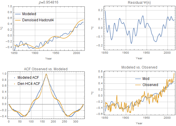

a2 = .059 (.051)
g1 = .041 (.018)
g2 = .061 (.055)
d1 = 3 years (37 years)
d2 = 73 years (84 years)
Ci = -.041 degs
Cheers,
Tom
@”Take the TSI series from 1700 to today and reverse it, so that you use 2015’s value for 1700, 2014’s for 1701, and so on. Then repeat your analysis. Show us what you get.”


Here’s the reversed, demeaned TSI series
Running the simulation with the (manually) optimized values from the original series we get:
We get the expected negative correlation.
Step one of the optimization (fit to ACF) works just fine because it is insensitive to scale including a scale factor of -1!
but at this point the residual is not so hot 🙂
Step 2 (minimize the residual fails). The optimizer can find no solution where the correlation is positive. It dutifully sets both scaling factors to zero and calls it a day (but at least it finds the “solution” quickly 🙂
Removing the step 1 restriction and let the optimizer have control over all paramters (I cheat here a little and use a method not guaranteed to find a global minimum. Takes too long with all parameters)
Very clever, but you did not do the test as I prescribed: TSI reversed from 1700 not from 1600.
@lsvalgaard “Take the TSI series from 1700 to today and reverse it, so that you use 2015’s value for 1700, 2014’s for 1701, and so on. Then repeat your analysis. Show us what you get.” ?w=529


Here’s the reversed TSI series used below.
Using the parameters from the prior optimization, correlation is negative as expected.
First step of the optimization (match the acfs) works because it is insensitive to scaling, including a scaling of -1 :
The fit though is not too is not too hot 🙂
Let’s skip the first step and give the optimizer control of all parameters, best fit (not guaranteed global minimum – that method takes too long)
…and it took a TSI lag of 147 years to do that well and ‘course now the acf is all horked up
Convinced?
You still didn’t start in 1700.
Ha ha, very funny. How long did it take yo to find the magic year?
Our records really only begin around 1700. Before that, the data is extremely poor; so poor that Wolf didn’t dare assign a sunspot number to each year. Nothing magical about that.
You still don’t do it right. Let me be a bit more pedestrian:
For the year 2015 use the value for 1700
For the year 2014 use the value for 1701
For the year 2013 use the value for 1702
For the year 2012 use the value for 1703
For the year 2011 use the value for 1704
…
For the year XXXX use the value for 3715-XXXX
….
For the year 1702 use the value for 2013
For the year 1701 use the value for 2014
For the year 1700 use the value for 2015
start the integration in 1700. I don’t think values from 400 years ago are useful.
I haven’t done anything yet. Like I said above I, I duplicated my post. Sorry for the confusion.
Apologies for the duplicate post. For some reason it took a long time for the 1st on to show up and I thought it had gone into the bit bucket.
So the fact that the original series and its reverse lay on top of each other over most of the record is coincidental?? Is there some reason why this should be so?
It is a small coincidence, related to the fact that the sunspot cycles have on the average about the same length ~11 years. For the next test we’ll of course shift the series a bit, etc. My point is that since there is no trend over the years 1700-2015, there will be no trend in the source function. If you need to, you can replicate the 315 years as many times in the past as you need to get a stationary state.
No need to be pedestrian. The plot I posted at 3:12 above is the series reversed from 1700 (yellow) plotted against the unreversed series from 1611 or whatever. I haven’t simulated it but it is so highly correlated to the original that I won’t bother.
From the previous thread about the Solar Dynamo:
lsvalgaard February 1, 2016 at 12:43 pm
“Yes, all solar cycles look alike as far as solar activity is concerned. By that I mean that if shown a picture of solar activity [the solar disk] from a given day you can’t tell which cycle it is from.”
I would hazard to say that if shown a picture of meteorologic activity of the Earth disk from a given day you can’t tell which cycle it is from either. The earth climate system is remarkably stable also.
Earlier I posted some preliminary results with the correct TSI series which I had attempted to manually optimize. The optimized results with the correct TSI series are much better. The divergence 1965-1975 divergence I got with the old series is no longer there.
Here’s the zoomed results for the above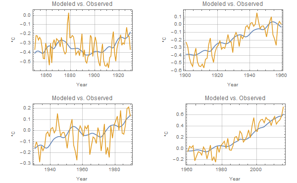
I encourage you to highlight how it is the INTEGRAL of solar insolation (TSI) that causes the change in temperature because of heat capacity in the ocean and atmosphere. e.g., see David R B Stockwell
Key Evidence for the Accumulative Model of High Solar Influence on Global Temperature 2011
Accumulation of Solar Irradiance Anomaly as a Mechanism for Global Temperature Dynamics
The integral will suffer from the same problem with using an obsolete TSI [or Sunspot] series.
I certainly am anxious to get the correct data but looking at your plot I’m not sure it will effect things much. The differences seem to be mostly in the peak values, not the timing of the break points in slope which are most determinative. The new data would most likely result in a different scaling parameter but since the ACF is invariant to scale it should not affect the fit (and who knows, may improve the 1965-1975 divergence)
I’m not sure
Then become sure by actually doing it [and your original analysis – rather than with the integral straw man] with the corrected data. Otherwise it is just hand waving.
You have to at least get the physics right – temperature varies as the integral of TSI. Then address the issue of how closely sunspot counts approximate TSI.
Not at all. As usual, who like to inject a poison pill. The physics is not right. The integral is always increasing towards infinity as time goes on.The integral of the difference between the mean and the series is always zero. If you use something else than the mean to subtract from the series, then that value becomes a free parameter that you can vary until you get the desired curve fit. No physics involved.
Isvalgaard.
Which “series”? I referred to Stockwell integrating TSI to get actual temperatures as necessitated by heat capacity of the ocean, land and atmosphere.
The integral increases towards infinity IF it is always positive.
BUT a physically realistic solar insolation (TSI) bounded by black body T^4 radiation to ~4K space temperature is ALWAYS bounded for the reasonably forseeable future (e.g., the next million years, and before the sun decays into a red giant.)
(The integral only becomes unbounded if you use the always positive surrogate of sunspot counts.)
Using actual physics of albedo (surface absorptivity/emissivity, and /cloud reflectivity) does not give a “free parameter”. The challenge is to get the reasonable models on the rest of that physics to model reality.
The integral only becomes unbounded if you use the always positive surrogate of sunspot count
Which you say you do. You do not mention the all-important free parameter you subtract before integrating, nor over how long the integral is taken, so you are just curve fitting without physics.
About sun spots: way back when the Kitt Peak Solar Observatory was built (it was the first to focus only on our local star) the best way to see if the sun is active versus quiet was via sun spots. We have a much longer sun spot activity data due to astronomers starting with Galileo tracking this off and on, mostly on after 1850, but now we have much better space-based observations as well as from observatories and we can see many more solar activities.
Generally speaking, when the sun is quiet, the climate changes here on our planet and when it is very active, our planet as well as the other planets reflect this by warming up. So, to see if it will be warmer or cooler, we track solar activity.
Now…thanks to humans, during this slow down in solar irradiation, we don’t see CO2 dropping due to us burning stuff. But…it is too early to tell if the oceans will soak up even human CO2 levels but I think we will see if this is true if we slide into another Little Ice Age again.
“The integral is always increasing towards infinity as time goes on.”
The system modeled here contains _no_ pure integration. The impulse response is a decaying exponential, not a step.
You miss the point: sunspot numbers and TSI are always positive so the integral will always increase with time, unless you constrain it with yet another free parameter.
But Leif, if the offset is a step into a pure integrator the output is a linear ramp, the slope of which as you not is a free parameter. But the step response of the system here is not a ramp, it’s a decaying exponential. It’s a transient whose impact on the output dies away. The TDI series starts something like two hundred years prior to the start of the fit comparison in 1850. The transient is long gone by then for the alphas we’re modeling.
JP
Thanks for the work, Jeff. Unfortunately, bad news … your chosen TSI reconstruction is based on the old sunspot numbers, and if you use the new sunspot numbers your whole claim completely falls apart. The new numbers are available below. I encourage you to redo your work using the correct numbers.
My best, and your post is appreciated even though it’s incorrect.
w.
daily
monthly
yearly
Are the new numbers converted to TSI available somewhere?
IIRC it’s mainly in increase of 20% before 1947 or something similar. There’s a global rescaling which is just a case of definition and would not change the outcome. Dr S willl probably give the details.
Stop……, you all seem to have forgotten something: – what about the exaggerated and accumulating anthropogenic CO2- contribution to the syste….? (Sarc…)
The ‘new numbers’ distort past data! Way back in 1960, the sun spot data was a lot thinner and more casually accumulated. So today, thanks to modern observations, we see much more ‘activity’ and like ALL the major data accumulations, all of this is post-1975 or so.
The fact here is obvious: when the sun is quiet, temperatures on earth fall. When it is very active, temperatures rise. This is due to the sun being a hot object which is the main reason our planet hasn’t frozen solid like more distant bodies in orbit around this star.
No, this is not correct. Sunspots today are still counted with the same type of telescopes used 180 years ago [even including the very same physical telescopes that Rudolf Wolf used since the 1850s and used in Zurich until 1981 and used by Friedli today]:
http://www.leif.org/research/Wolfs-Telescopes.png
@Willis – I posted some manually optimized results above with the correct TSI series. Overnight I ran the optimize and the results are much better (surprise). With the correct series the divergence from 1950-1970 is gone. I really would like to somehow re-submit the whole article or at least post an update rather than have it buried in the comments and the incorrect data in the main post. Advice?
JP
Thanks, Jeff. As I pointed out above, the “correct” TSI series still has a totally model based and unverified trend in it. The authors of the study themselves say that the trend is “speculative” and that it may be zero.
It is that speculative trend which forms the backbone of your study. This brings up the old rule called GIGO. We have no observational evidence that the TSI has increased as is claimed by the authors of the TSI reconstruction. Why should we pay any attention to their claims?
Next, I see that you have diagnosed an 84-year parameter in a 165-year dataset … setting Nyquist aside, in natural datasets I am very, very cautious about ascribing a repeating cycle unless I have four full cycles to look at … and even then I’ve been fooled. So the maximum length cycle I’d put any weight on would be 165 / 4 = about forty years or so. Beyond that it is speculation.
Next, I hadn’t discussed parameters because we were working on data. I have huge problems with 8-parameter models. I suppose it is time to reprise Freeman Dyson’s visit with Enrico Fermi.
Fermi’s objection to the lack of a “clear physical picture” is important in your case. I have no idea, for example, how there might be a 37 year lag between changes in the sun and resulting changes in surface temperatures.
Most importantly, please note the point at which Fermi talked about parameters. It was when Dyson asked if Fermi was impressed by the agreement between Dyson’s model and the observations. Fermi was not impressed.
By the same token, you must understand that I am not impressed in the slightest by your correlations and your matches between your model and the observations. In fact, with eight tunable parameters, I’d be impressed only if you could NOT match your model to reality.
I know you’ve put lots of time and work into this, and the good news is that I’m sure that you’ve learned heaps in the process.
But fitting arbitrarily chosen data to an arbitrarily chosen dataset using an arbitrarily chosen transformation function in an eight-parameter model is meaningless.
It didn’t impress Fermi, it doesn’t impress me, it won’t impress anyone paying attention. I cannot advise you strongly enough to take the temperance pledge, rid yourself of chimeric indices and surds, and abjure such intoxicating multi-parameter methods …
Finally, I know that my tone is sometimes rougher than I intend. So please take all of this in the intended spirit, which is to support you in making the best use of your time.
Regards,
w.
CODA:
Yet what are all such gaieties to me
  Whose thoughts are full of indices and surds?
     x2 + 7x + 53
        = 11 / 3
Part of a poem by Lewis Carroll
Willis,
IMO there are clear physical pictures behind solar activity and climate. Variations in the sun’s irradiance and magnetism are demonstrably linked to changes in the climate systems of its planets. This is especially true of earth.
For instance, in Dr. S’s UV data at February 10, 2016 at 9:01 am, the warm and cooling cycles observed since the end of the LIA are clearly visible. Taking the time integral of sets of three or so of the sequentially higher or lower solar cycles produces a pretty good fit for the mid-19th century warming, late 19th to early 20th century cooling, early 20th century warming, mid-20th century cooling, late 20th century warming and present cooling. There is an anomalous cycle in the mid-20th century, so the fit isn’t perfect. But the effects of UV flux on ozone and seawater heating aren’t the only solar parameter than matters.
Small fluctuations over decades add up to observable changes.
IMO there are clear physical pictures behind solar activity and climate. Variations in the sun’s irradiance and magnetism are demonstrably linked to changes in the climate systems of its planets
The physics tells us that the effects are less than 0.1C and such changes have not been demonstrated as they are buried in the noise.
Gloateus Maximus February 11, 2016 at 2:19 pm
Thanks, Gloateus, but that’s not responsive to what I said. I said there was no clear physical picture behind his theorized 8-parameter model.
w.
But there are physics behind TSI variations as a rough approximation for major drivers of climate change. Connecting those with the model parameters should be possible.
For instance, Kepler used Tyco’s observations of the orbits of Mars to conclude its curve fit an ellipse rather than a circle. He didn’t have a good physical model to explain this curve fitting exercise. It took Newton a whole mathematical book to provide and demonstrate one, based upon his theory of universal gravitation, latter refined by Einstein, an upgrade recently reconfirmed.
Ha ha great minds think alike. I was pounding away on Kepler in response to Willis before I see you beat me to it.
Maybe this will help:
On the left the optimizer was run pretending we’re in 1976. The CO2 sognal is just barely detectable at this point. On the right, simulate to present with the same parameters found in the training run. You can consider the post 1976 blue curve to be the prediction we would have made in 1976 based on the model. It was never off by more than .1 degs.
parameters; training/final
alpha -> 0.0356 / 0.0365,
g1 -> 0.0543 / 0.0510,
G -> 0.770 / 0.788
tau1->11 / 11
tau2->80 /81
What would it take beyond this to convince you there is something here worth looking at?
With the large difference between the ‘new’ TSI and the ‘old’, you should find large difference in the result. If you do not, that signal that you are not doing what you think you are doing
The differences are quite substantial and much improved. The bias in the old data caused too much of the total forcing to be attributed to TSI. With the new bias free data the TCS 2x is substantially higher. With the old data, training had to go to 1995 to get a reliable prediction. Now we are getting excellent results from 1976 and I haven’t yet gone any farther back. Also the divergence circa 1965 is gone.
I want to thank you for setting me straight on the correct data to use. You’ve been immensely helpful!
JP
So, the climate is no longer TSI-driven…
Yep, you’re off the hook 🙂
Rather, YOU are off the hook, and should ask for the title of your post [and coming paper] to A TSI-Driven (solar) Climate Model, NOT.
:). As I told Willis I’d like to retract it or post an errata but I’m not sure how that’s done around here. At some point though I’d like to show you the co2 v TSI curve I get with the new series. It looks the same as before after 1900 but before that falls off a cliff. Do you have confidence in the TSI data from say 1800-1900?
[To make an edit (to an original thread posting) or a retraction (to a comment or reply) ,
(1) Be absolutely clear about what is to be edited, retracted, or changed. Line nbr, paragraph, date-time group id, etc)
(2) Be absolutely clear about what the corrected words or paragraph or graphic should be.
(3) Once the change is clear, and on approval and review, the original words are either
lined through(the usual and preferred way with a thread header) or replaced within [sq brackets]. .mod]Do you have confidence in the TSI data from say 1800-1900?
Yes, because we have EUV data to back it up. Before 1700, I am not so sure that we understand what goes on. You could make the argument that with few visible sunspot to drag down TSI during the Maunder Minimum, TSI might have higher rather than lower. We don’t know.
With the old data, training had to go to 1995 to get a reliable prediction. Now we are getting excellent results from 1976 and I haven’t yet gone any farther back
This sounds very suspicious to me. The limits on what to use should be set before the analysis, not just stop when things ‘look good’.
Agreed. I attributed the issue to a signal to noise problem (which it was if you consider a spurious bias in the input signal as noise). My original target was 1976 because I read somewhere that this is the year mentioned by the IPCC as when theory said CO2 forcing should become detectable. When that failed with the old series I moved the end date up until I could get decent parametric stability.
the results are much better
Before the correlation was something like 0.95. Nothing can be ‘much better’ than that, only ‘marginally better’.
Thanks Willis. Just to make sure we’re on the same page, I thought your comments re trend were referencing the G. Kopp, N. Krivova, C.J. Wu study which Leif and you warned me off of. The results posted above used the SSN pointed to me by Leif after appling his conversion (to TSI) formula. I’m assuming that’s the best we can hope for.
Re: 85 years. Its actually the 405 year record TSI record that’s of import. I left pad the CO2 record to match, assuming a constant 285 ppm prior to 1732. Error in this assumption have a negligible effect by 1850 when the comparison starts.
Re # of parameters: Calling it an eight parameter model (setting aside the fact that its a convolution) ignores that there are 4 different functions being match independently (autocorrelation of model vs denoised temp, CO2 vs TSI, T vs TSI, and boundary condition). But in any case, I’ve abandoned for now the CO2 generation system and am just driving with the second input with actual CO2 time series directly. The CO2 vs, TSI correlation falls apart prior to 1900 with the “correct” TSI series and you all have convinced me that it’s probably non-physical anyway so I’ve set that puzzle aside for the time being and am retracting the CO2 vs TSI hypothesis. I’ve also eliminated the TSI input offset parameter as the optimizer comes up with zero to 4 decimal places anyway. I’ve also set the CO2 scaler to 5.4, assuming 3.7 W/m^2 for zero-feedback doubling of CO2. So long story short, the above results were optimized on five parameters, the TSI dissipation factor,the TSI scaler, the output sensitivity scaler which converts the forcing sum to delta T and the two lags, Of these, obviously the two lags and alpha are optimized against the acf and the output sensitivity to minize the residual LSE. In the end, it’s not like setting the pole position of a single-pole low pass (via alpha) can add artifacts that aren’t in the input signal. After that its just time shifts and scales. And then there’s figure 12…
I’ll see your Fermi and raise a Kepler. He took the Tycho Brahe’s data on the position of the planets and derived the “law” of gravity by trial and error. He finally found the equations that fit the data (he almost had it one time but Mercury was off by a few arc-seconds so he rejected that equation) and when he did many said “but it doesn’t fit what we think we know”, and in fact we still don’t know _why_ two masses attract (or why a mass bends the space-time continuum if you’d rather). He let the data and the fit and the predictions it made speak for themselves. Most of the great advances in science have come that way. Someone notices a pattern (a correlation) and find an equation that fits. From the equation comes predictions that are either confirmed or falsified by observation. If confirmation happens and the equations don’t fit into the current understanding of the way things are, something’s got to give. Substitute for “equation” in the above the system under consideration (which easily enough can be converted to differential equation form) and you’ll understand how I see the matter. I think climate science more than any I’ve ever encountered suffers from the hubris of thinking they’ve got the physics all figured out.
All that said (whew) I’m not claiming the model correct (even in the sense that no model is correct). I’m sharing an interesting correlation that deserves the attention of someone who can figure out why the model fits the data so well.
Thanks for the ear. I can’t begin to tell you how much admiration I have for your work.
Best
JP
“The recent global warming hiatus is clearly evident in the flattening of the curve above 380 ppm.”
Fig1a seems to be have data only to 2013. And the “flattening” is clearly affected by the endpoint treatment, since it goes right to the end. I suspect there is a reflective boundary treatment which forces zero gradient at the end. IOW, if the data was trending up, it is smoothed as if the trend is about to reverse. That is pure arbitrary assumption.
Fig 7 doesn’t look at all flattened, although there is still an issue of how it is smoothed to the end. The default for matlab wden is “sym” or symmetric padding, which again enforces zero gradient at the end.
Gaussian filtration does not suffer from the latency issues of a FIR and indeed does give results right to the end.
The denoised data from wden was only used as the target for the optimizer. In any case if you follow the matlab link in the references you’ll find examples which show now end point effects. And the slope data in figure 9 show the present trend is near zero.
Jeff, gaussian can also be done by FIR, you should probably specify what you are doing.
BTW , I like the all engineering approach. Real filters instead of running averages. The ‘leaky integrator’ or exponential is the same as negative feedback, eg Planck +/- some also rans. Not sure I agree with all you’ve done but I like the method.
Sorry, response misplaced below.
A running average is a FIR filter.
“I suspect there is a reflective boundary treatment which forces zero gradient at the end. ”
No the exponential convolution is not a symmetric kernel. It does run up to the last data point. I missed what length gaussian he was using, that may explain 2013.
It isn’t exponential, it is Gaussian and symmetric. A 5 point filter would explain ending at 2013, but I don’t believe it would achieve that degree of smoothing. Anyway, it’s not a reason to omit the unsmoothed data for those years in Fig1a.
“Fig1a seems to be have data only to 2013.”
Good catch. This plot was from some earlier work and I neglected to update it with the latest data. I sent a revised plot, hopefully Anthony will indulge me and include it. BTW, The Gaussian filter is the Mathematica implementation with radius 4, fixed padding.
Jeff,
Thanks for the details. I assume “fixed” means padding the future with the final value. That can also damp the final trend, although I think if you end with 2015, the end trend will shift to sharply upward.
” I sent a revised plot”
Doesn’t seem to be appearing. You could include it in a comment.
An estimate of the future TSI is required in order for this model to predict how global temperature will evolve.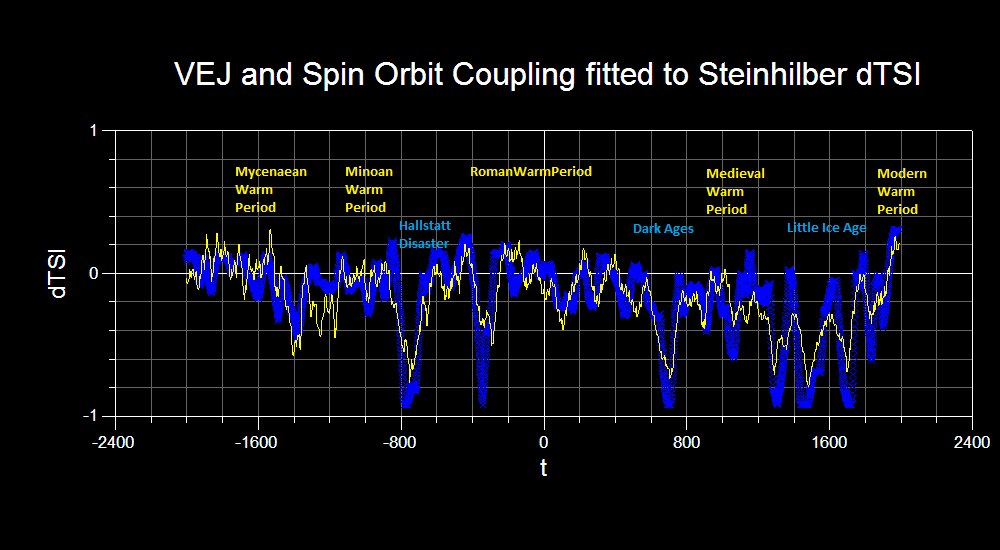
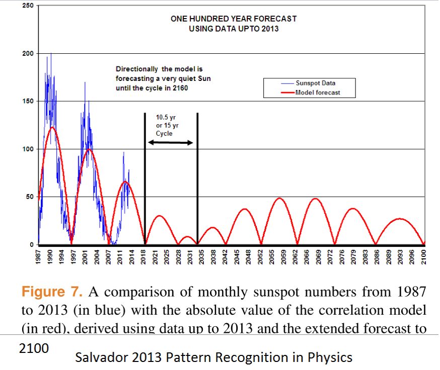
Our simple orbital resonance model successfully replicates 4000 years of Steinhilber et al’s 10Be based solar reconstruction:
And predicts this out to 2100
Details available on request.
The forecast for cycle 25 seems already to be wrong.
http://jsoc.stanford.edu/data/hmi/polarfield/
“As of Nov 2015, the south has exceeded the 2010 level, suggesting that Cycle 25 would be no weaker than 24”
Such is the destiny of all spurious correlations.
From Fig 1 annotation of your linked document: “As of Nov 2015, the south has exceeded the 2010 level, suggesting that Cycle 25 would be no weaker than 24.”
From Fig 2: “The evolution is highly N-S asymmetric.”
Do you think the ~4:1 asymmetry may result in a lower Cycle 25 SSN outcome, disproportionate to dipole strength? The butterfly diagram doesn’t seem to indicate that north will strengthen much further and reduce the asymmetry.
We measure the dipole moment as the difference between North and South. This removes the asymmetry, but as always it is difficult to predict the future, but it seems highly unlikely that the cycle will be as small as Tallbloke predicts, because the magnetic flux is already there. We can even see it in the North on its way to the pole. Look at the blue flux in the second Figure.
Sure, but it appears patchy and not very dense. Maybe that’s just a red/blue perception difference. Thanks.
” the south has exceeded the 2010 level”
Didn’t the same type of precursor based predictions over estimate the strength of cycle 24?
No, the prediction was right on.
tallbloke February 8, 2016 at 4:16 pm
Thanks, tallbloke. I hereby request the details, which I assume would include a link to your data and code.
w.
PS: 10Be is a very poor proxy for solar strength. See e.g. A COMPARISON OF NEW CALCULATIONS OF THE YEARLY 10Be PRODUCTION IN THE EARTHS POLAR ATMOSPHERE BY COSMIC RAYS WITH YEARLY 10Be MEASUREMENTS IN MULTIPLE GREENLAND ICE CORES BETWEEN 1939 AND 1994 – A TROUBLING LACK OF CONCORDANCE by W.R. Webber , P.R. Higbie and C.W. Webber for one look at the reasons why. As the title suggests, the 10Be records don’t agree with each other, much less with the sun. Heck, the 10Be records don’t show even a trace of any ~11-year cycles …
I second the request for details 🙂
It is now more and more accepted that the climate [e.g. circulation] has a large influence on the 10Be record from a given site, as large or larger than the solar influence.
“Earth is in no great peril from the extra cosmic rays. The planet’s atmosphere and magnetic field combine to form a formidable shield against space radiation, protecting humans on the surface. Indeed, we’ve weathered storms much worse than this. Hundreds of years ago, cosmic ray fluxes were at least 200% higher than they are now. Researchers know this because when cosmic rays hit the atmosphere, they produce an isotope of beryllium, 10Be, which is preserved in polar ice. By examining ice cores, it is possible to estimate cosmic ray fluxes more than a thousand years into the past. Even with the recent surge, cosmic rays today are much weaker than they have been at times in the past millennium.”
“The space era has so far experienced a time of relatively low cosmic ray activity,” says Mewaldt. “We may now be returning to levels typical of past centuries.”
http://www.nasa.gov/topics/solarsystem/features/ray_surge.html
Thanks for publishing my comment and for the replies. 10Be is a good proxy for Solar according to the data I use, which are the internationally accepted sunspot numbers from SIDC rather than Leif’s version, and Ken McCracken’s 10Be data.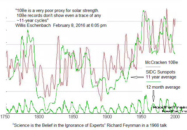
Leif says: “it seems highly unlikely that the cycle will be as small as Tallbloke predicts, because the magnetic flux is already there.”
Just to be clear, our model predicts sunspot numbers, not magnetic flux. They are usually closely correlated, but when solar activity is anomalously low, as during the Maunder, Dalton, and Current deep minima, there is likely to be more of a disparity between TSI and sunspot numbers. Time will tell.
Willis says: Thanks, tallbloke. I hereby request the details, which I assume would include a link to your data and code.
The model we use is specified in R.J. Salvador’s 2013 PRP paper. If Jeff drops a comment at the talkshop, I’ll email him some data he can test his model with. There is no ‘code’, just an excel spreadsheet and planetary orbital data as specified. I assume Willis can drive excel better than Phil Jones can.
the internationally accepted sunspot numbers from SIDC rather than Leif’s version
You are a bit behind the curve as SIDC has accepted my [and other’s work on this], see http://www.sidc.be/silso/home and the papers
http://www.leif.org/research/Revisiting-the-Sunspot-Number.pdf [long]
http://www.leif.org/research/Revision-of-the-Sunspot-Number.pdf [short]
McCracken has also seen the light and have revised his data, as shown on Slide 21 of
http://www.leif.org/research/The-Waldmeier-Effect.pdf
Thanks for the links Leif. I agreed with you that there is a Waldmeier effect some time ago. It doesn’t affect our model-data correlation much in any case.
It means that you are not using the Official International Sunspot Number as you claim.
Tallbloke: “10Be is a good proxy for Solar according to the data I use, which are the internationally accepted sunspot numbers from SIDC rather than Leif’s version, and Ken McCracken’s 10Be data.”
From the figure you posted above, it does appear that McCracken 10Be and SIDC sunspot number are related, but I there are periods of time in that figure that leave me skeptical about how good of a proxy it would be. Shortly after 1800, for example, there’s a 10be peak that is a SSN trough. Likewise right before 1900, there’s a SSN peak that corresponds to a 10Be trough. I’m open to being convinced, though. Could you please plot the 10Be record against the SSN record? Likewise, could you please plot the actual SSN and the 10Be-derived SSN on the same graph? Thanks!
Jimmy says: Shortly after 1800, for example, there’s a 10be peak that is a SSN trough. Likewise right before 1900, there’s a SSN peak that corresponds to a 10Be trough.
Yes. As I said earlier, the relationship between sunspot numbers and TSI doesn’t seem so good when the Sun is in a deep minimum, as it was at the times you mention. The TSI is what affects the amount of 10Be synthesized in Earth’s atmosphere.
The a0Be curve is inverted to make a solar proxy, as they are inversely correlated. so the ‘peak’ after 1800 is actually less 10Be not more. This might indicate that the Sun was magnetically very active with lots of flares blowing cosmic rays away from the inner solar system, even though there were few sunspots at that time. It going to be very interesting to watch what happens over the next two decades as the current deep minimum progresses towards the nadir in 2035.
Thanks much for that info, tallbloke. However, I’m still unable to track down the source of the data in your graphic. You refer it to “McCracken 10Be” in your graphic above, but your link to Salvador’s paper makes no mention of 10Be.
Following McCracken down the rabbit hole, I find his 2004 paper to be the most cited. It is entitled “A phenomenological study of the long-term cosmic ray modulation, 850–1958 AD”, and is available here. However, in that study he is using a 22-year running average of the data, viz:
YIKES! That method is guaranteed to badly munge the data. You should never use an 11-year or 22-year running mean on sunspot data, it distorts it beyond recognition. And they’ve made it even stranger, using an overlapping 22-year average “centered” on a moving target of a seven OR eight year original sampling. I can’t even begin to imagine what that does to data.
But in any case, that is clearly that is NOT the “McCracken 10Be” data you refer to in your graphic, because a 22-year running average of the data won’t ever show an 11-year cycle. In addition, their figure 1 showing the Dye 10Be data and the So at this point I have no clue which 10Be dataset you are using.
This is why I generally request a link to the data as well as to the study. A link to the actual 10Be data used in your graphic would be much appreciated.
Regarding the model you linked to, it is a multi-parameter fitted model. The author says:
Seriously? Even the author says the model can be tweaked to fit anything. Of course he says it in a nicer and more sophisticated manner, he says the model can be “modulated to create an infinite possibility for sunspot formation” …

He’s tweaked it to fit the historical sunspots … and we are supposed to be impressed by that? And the results are even less impressive.
I’m sorry, but as a sunspot forecasting method (red line), I can only laugh. It was out by more than 50% on the cycle peaking around 2001. But it was just getting started. Then it forecasted a teeny, tiny six-year!! cycle peaking in 2007, which in the event was actually not even a peak but a trough in the sunspots. That’s so bad it’s not even wrong.
w.
Thanks for the reply Tallbloke!
You said “the relationship between sunspot numbers and TSI doesn’t seem so good when the Sun is in a deep minimum”.
Pardon my ignorance, but how does one go about validating the hypothesis that the relationship between SSN and TSI falls apart at during minima?
“Since the half-life of Be-10 is longer, by many orders of magnitude, than its atmospheric residence time, its only sink is deposition onto the surface of the Earth. As tropospheric Be-10 concentrations are very small compared to stratospheric concentrations, the flux of Be-10 from the troposphere into the stratosphere is negligible compared to the in situ production from GCR. At steady state, the entire middle atmospheric production is balanced by the stratospheric flux of Be-10 into the troposphere where it is removed. The residence time of Be-10 in the middle atmosphere, calculated as the ratio of its burden to its production, is slightly more than 11 months. For the troposphere, there are two sources, the GCR-driven production and the stratospheric flux, and hence the residence time has to be calculated with respect to the total source. The residence time is then about 9 d (compared to 23 d if calculated with respect to only the tropospheric production).”
http://www.tellusb.net/index.php/tellusb/article/view/28582
Why would cycle 25 be wrong? Perhaps you are thinking of cycle 22. The best projection for cycle 23 at the time was exactly like 22. No one can argue that the long duration quite after cycle 22 caught many by surprise. Further, the current cycle activity is half of cycle 22. Simply comparing the butterfly diagram, it looks very similar to the decay in the early 1900’s.
I would say that modern solar physics isn’t paying enough attention to recorded history. Or long term solar cycles. If the current decline in solar activity is correct, it will be very interesting indeed to see if climate is affected. The difference between the actual and the shrill that claim it is “the hottest year ever” will be the biggest problem.
Because there are a lot of factors that go into solar activity, this current downturn in solar activity was anticipated in the 1970’s when we had that cold spell based on previous solar activity. Which can be reproduced. The current low count and duration of cycle 24 is roughly on time. Nobody expected a direct relationship between temperature and the initial decline in solar activity. The duration of solar quite, repeated lengths of quite, the peaks of activity, ocean heat content, lunar and planetary postions, ( the list goes on) were all thought to be contributing factors in climate.
In any event, global warming is no where as bad as global cooling. We came pretty close to food rationing during the 1970’s. And it wasn’t as cold as the next few decades are suppose to get if the solar model stands. We haven’t done a thing to prepare for global cooling. Is this going to be like the projection for solar cycle 23, whoops we were wrong? Here’s the thing about a major cooling, it doesn’t matter where you are or how much money you have, it’ll be completely random whether you survive or not. Many will not. Poor or no planning ensures it.
I would say that modern solar physics isn’t paying enough attention to recorded history. Or long term solar cycles
And you would be wrong. We care very much about this and the issue is under intense research and scrutiny.
So that you know I understand the divide. I know the difference between seeing a shape in a cloud or on Mars, and definitive science. Yes that is a dog, and that looks like a dog but isnt. AGW says I’m seeing the shape of a dog and not the dog itself.
Until proven otherwise, as in a pronounced down turn in solar activity, I’ll stand by the original research that solar activity is a major player in climate. Unfortunately, we don’t have a control earth where can control the variables. Certainly solar activity is not the only variable. I find it strange that I am willing to say that and AGW is not. Whatever happens politically I have little or no control over. I do think the current path that the main scientific community is pursuing is wrong. The disaster that AGW is claiming from warming will be far worse from cooling. Time will tell.
I’ll stand by the original research that solar activity is a major player in climate
What ‘original research’?
There was/is a lot of research into solar activity and climate before AGW. It’s all over the place. It was also talked about extensively in the ham radio world. There are a lot of detailed records. The connection between solar activity and climate was fairly evident. Like I said, it depends on whether you are looking at a real dog or one in the clouds or pyramids on Mars. You’ve seen the canals right? Or the greening of Martian NH? More of a green tint wouldn’t you say? Of course it doesn’t do that anymore, and hasn’t in quite awhile. It must be because we have better telescopes or we can now photograph it in color.
Time will tell. You tell me, if it starts to get really cold in the next decade, what will happen to AGW? So far none of the predictions put forth by AGW has occurred. Scientifically speaking, the predictions don’t match the observed result, it’s not a valid theory. It doesn’t work that way in any other science. I can accurately predict the outcome of a chemical reaction. I can accurately predict a moon shot with a slide rule. What do you think the problem is with climate science? I am a reasonable person, if AGW were correct, I would defend it. The last 20 years it has fallen down. I’m pretty sure the real temperature has fallen. It is definitely not as warm as it should be.
I fully anticipate that politically AGW will prevail in this argument.
I hope that in my lifetime and in the far foreseeable future, that the world does not see another LIA.
I would also like to point out that in lieu of poorly understood cooling in the past, that there could be other major factors. A dust cloud for instance that is in orbit around the sun. Additionally, their is the possibility that the sun expels a quality of super cooled gas. Evidently they can extract super cooled gas from nuclear reactors. I am not ruling out other factors. Solar activity could just be a huge coincidence that coincides with another event. What I am certain of is that without an explanation of the recent past cooling and warming AGW is a very flawed theory. To make matters worse, it seems that the data is being tampered with. The chain of command from 1997 to now is suspect. They’ve adjusted the records to indicate that it is warmer now than in 1997. If that’s the case, what was the actual gat in 1997. I have no way of knowing. They compared temperatures in 1997 based on previous adjusted temperatures, then adjusted them again now. The original records are in a landfill. I don’t understand that. At the physics museum in Princeton, they keep everything they possible can.
I suspect that somebody knows that is in a deep dark basement. In my view a lot of this is smoke and mirrors. ( I’ve actually seen a show with smoke and mirrors). If the agenda is to kill a lot of people off, AGW will definitely work .
lsvalgaard February 10, 2016 at 8:44 am
rishrac February 10, 2016 at 12:56 pm
rishrac, when a scientist asks “What original research”, he is asking for links or citations to the research itself. All you’ve done is to repeat in varied forms your claim that there’s original research out there … but where?
If you could provide a link to whatever it is that you are calling the “original research”, that would move the conversation forwards.
w.
Whatever I put up would be redundant. In fact some of the information here exceeds what was produced in the 1970’s.
As far as predictions of solar cycles, I printed them off and for a long time had them plastered to the wall which caused a lot of snide comments (such a denier ). I took them down when prediction of cycle 23 looked just like 22 with double peaks and all.
” we are questioning your ability to make decisions based on science “…
” solar cycles have absolutely no correlation to climate”
Are there 2 scientific communities in this country? Yes, the prediction was for a weaker cycle 24 AFTER cycle 23 failed to reach the level of 22. The year long quite period was definitely not even thought of.
The prediction was done following a procedure suggested in our 1978 paper, and a row of successful predictions since 1978. Nothing to do with cycle 23. Since 23 was smaller than 22 and because an even smaller 24 would presage a long cycle 23, this what not a big surprise [to me at least]. You can find a short explanation here http://www.leif.org/research/swsc130003p.pdf
So you thought that starting with solar cycle 23 would begin to weaken in 1978? I couldn’t say for certain. It could have been 2 or 3 cycles beyond cycle 23…. or how long it would last. However, I still think that a prolonged downturn in solar activity, whether direct or coincidence, has a direct influence on climate. The current downturn is related to several longer term cycles that ended at roughly the same time with cycle 22/23. In my mind, it is a huge concern.
TSI may be constant but an orbiting dust cloud that remains in a geostationary orbit for awhile that filters 10% of sunlight would make all these ideas useless. Of course, depending on position, if it were behind the earth reflecting, you’d have a condition of dawn through the night.
Do you remember the great tree ring debate? Did you know about the paper published in 1976 about isotopic data in tree rings before, during or after the width of tree rings were determined to correlate with temperature.. And I was shocked that Penn State peer reviewed it. The tree ring width not the isotopic data in the tree rings . So was that information material to the debate about global warming or not? The data from the isotopic tree rings supports the warming and cooling periods, but is in direct opposition to AGW. it also supports the case for solar activity. Not unless of course the isotopic caused the sun to change. It appears from recent news releases anything is possible with global warming.
“Gaussian filtration does not suffer from the latency issues of a FIR”
Really? How do you implement it other than as an FIR? Are you just using smoothts with a ‘g’ flag?
Any process that smooths to the end must make some assumption of what the future holds. It looks to me as if, as with wden, the assumption is symmetric – ie if it was going up, it is about to turn down.
But again, the denoised data was only used as the optimization target. Any endpoint effects would have only minor effects on the best-fit parameters. This is supported by how well the modeled results match the raw data which was not used in the parametric fit.
“But again, the denoised data was only used as the optimization target.”
No, you use it to make direct deductions from the plot. As in:
“Figure 1b contradicts the assertion of a direct relationship between CO2 and global temperature. Three regions are apparent where temperatures are flat to falling while CO2 concentrations are rising substantially.”
Two of those regions are at the ends, where you have padded with reflected data forcing zero endpoint trend.
“Any process” OK, I should say any symmetric process. You have the choice of padding the future or having a smooth that is based on lagged values.
You are confusing the denoised (wden) data (not used in figure 1a) with the gaussian filtered (r=4, fixed padding) data used in figure 1.
Agreed, there’s no magic wand here. This is one of the problems with pre-packed stats tools, it’s easy to use them without knowing what they do. Anyone programming a filter will know what it does.
If the gaussian is running to the end there is a problem. One of silly things these kind of packages to is start screwing around with the data without telling you. They “assume” you’d like some padding and reflection because you “need” the result to go to the end … and as we all know the end justifies the means.
This sort of stuff is written for econometrics where that kind of crap gets a free pass. Not so good in science.
[Well, then, do the means between the ends justify padding the means of the ends? .mod]
“gaussian filtered (r=4, fixed padding) ”
What is a “radius” . This is presumably a 3-sigma low-pass gaussian , what is sigma?
does fixed padding mean duplication of the last data point, ie it will end up flat?
@Mike. Radius is used in two dimensional (i.e. image filtering) applications. r = 2 sigma. The Mathematica documentation for this function is available at https://reference.wolfram.com/language/ref/GaussianFilter.html
Yes this is known as a gaussian blur in image processing. It produces a misty, soft look. Thanks
Maybe you could run it with “Padding->None” to eliminate questions of it flattening the ends.
Maybe you could run it with “Padding->None”
No, padding can’t be avoided with a centered filter. That would probably just pad with zeros, which would probably be much worse.
Nick Stokes
Of course you can avoid padding , you just don’t to it !! You end up with a shorter time series. R probably won’t like that and will try to silently extend your data but there is nothing in the maths of FIR filters which requires that to happen.
If the doc says “Padding->None” I would expect exactly that not “Padding->Zeroes”
If you can’t trust your software package to do what you ask, do it yourself. Gaussian is just a weighted mean. Anyone with a brain and two working fingers should be able to code that.
https://climategrog.wordpress.com/2013/12/08/gaussian-low-pass-script/
Mike,
If you want to smooth to the end with a symmetric filter, as done here, you must have padding. If you leave out, you are using an unsymmetric filter near the end. Not a Gaussian, and not centered.
How do you decide which fluctuations are “signal fluctuations”, i.e. actual real signal values that aren’t all the same, and which fluctuations are “noise” i.e. fluctuations in the measured values that are the result of random processes not related to the signal at all ??
I understand how noise can be removed from repetitive signals by processing multiple repetitions of the same signal, but that doesn’t work for an entirely unknown signal which only occurs once.
I’m not aware of ANY climate / weather data signal, which ever happens more than once.
Only in the mathematical world does anything happen more than once.
G
Nick Stokes February 8, 2016 at 4:36 pm
Thanks, Nick. Actually, it is possible to make an accurate estimate of the end-point uncertainty by examining simulated end-points throughout the body of the data. This allows us to select between competing smoothing algorithms for any given dataset. See my paper here for details of the method.
Best regards,
w.
This is interesting. It is a linearised model that will describe relatively small variations in temperature, pCO2 etc.
In reply to whiten, major excursions of climate such as ice ages may be driven be non-linearties and so this model would not be applicable.
Wow, you should forward that story to Mark Steyn. His legal team might find it useful :>)
Good analysis. This type of analysis was carried out in 70s & 80s after WMO manual on climate change was brought out in 1966. I [IMD, Pune] also followed them along with Dr. B. Parthasarathy from IITM/Pune. But here we used raw data uncorrupted precipitation data.
In the present article the analysis was carried out using the global average temperature anomaly which was corrupted-mutilated. Also, the data covers only 20-25% of the globe. The temperature anomaly consists of several components, mostly local-regional in nature. Even the greenhouse effect is not global in nature but it is also local-regional in nature. Prior to 1960s both the temperature and greenhouse gases were measured at very few locations. Thus, with the time the network changed. The greenhouse composition changed with the time.
Weather is interactive with climate system and general circulation patterns. Sunspot cycles and cycles in global and net [balance] radiation show a clear cut 11 year and its multiple cycles.
With all these, the fittings show exactly one to one relation. How???
Dr. S. Jeevananda Reddy
Thank you Tony & DR SJR. Try with raw data and back out the CO2 to Temperature tampering.
And here is the smoking gun of fraud. The adjustments being made correlate almost perfectly to the rise in atmospheric CO2. The data is being tampered with to match greenhouse gas warming theory.
http://realclimatescience.com/wp-content/uploads/2016/01/2016-01-14-04-18-24.png
NASA US temperatures are based on NOAA USHCN (United States Historical Climatology Network) data. The graph below shows the average of their measured temperatures in blue, and the average of their “adjusted” temperatures in red. The entire US cooling trend over the past century is due to data tampering by NOAA and NASA.
http://realclimatescience.com/wp-content/uploads/2016/01/2016-01-12-06-46-13.png
http://realclimatescience.com/2016/01/the-history-of-nasanoaa-temperature-corruption/
DD More: thanks. There is a much more effective way of tampering with data than making adjustments. If you are doing an experiment with a group of subjects, you may adjust data but you can also send home those subjects who do not behave as you wish. They have become invisible. GHCN data base. Period 1940-1969: on duty at the start 4266 stations, included 6074, dropped 696. Period 1970-1999: on duty at the start 9644 (of course), included 2918, dropped 9434. Have a look at human beings: a new-born baby does not have a life-history. You can select newcomers as to geography but not on the basis of future behavior. Precisely for that reason you will find no inclusion effects in the GHCN base beyond geography. However, you will find an impressive relationship between drop-out risk and life history: the more a station’s time series deviates from the series of neighboring stations, the higher the risk. Thousands of stations did not disappear at random but were dropped by people who knew those histories. It does not matter how sophisticated you models are if you are using this kind of data.
That’s a real eye opener. Is the raw uncorrupted data available somewhere? It would be interesting to rerun the optimization against that data.
Outrageously, the so-called “raw data” have now already been tampered with.
I’m interested in your first graph of adjustments versus CO2.
The Mauna Loa CO2 data started in the IGY of 1957/58 at a value of 315 ppm CO2.
So where does your data from 295 ppm up to 315 ppm come from?? Or just what CO2 data source are you using, since it clearly isn’t Mauna Loa ??
G
Thanks DD very revealing. I’ll save those graphs.
why would one do that?
The exponential treatment is not just a “smoother” for visual convenience, it implies a negative feedback and introduces a lag in it’s own right ( though much smaller than your 37 years ) .
Why would SSN drive CO2. I can see logic in temperature drive CO2 ( rate of change of CO2 is proportional to temperature ) and possibly hypothesising SST as an exponential response to SSN but way it is presenented does not seem to be saying that.
Why does SSN drive CO2?
From the post:
“In a plausible physical interpretation of the system, the dissipative integrator models the ocean heat content which accumulates variations in TSI; warming when it rises above some equilibrium value and cooling when it falls below. As the ocean warms it becomes less soluble to CO2 resulting in out-gassing of CO2 to the atmosphere.”
I refer to exponential smoothing only as shorthand for the model implemented in figure 4 which includes the integration and feedback you point to.
Thanks Jeff.
What does the power spectrum of the residuals look like? By eye, I’d say there is a strong 60y and 30y component and probably the circa 9y peak seen in figure 6.
Jeff Patterson February 8, 2016 at 5:36 pm
From the post:
Interesting, Jeff.
Mmmm … that has a bit too much what-if and not enough numbers for my plausibleometer. My immediate concern is that on a global average basis the ocean temperature doesn’t vary much. Even at the surface, where it varies the most, the global average temperature of the ocean only changed by less than one degree C over the 20th century.
The ice core records indicate an increase in CO2 of about 16 ppmv per degree C of warming. This number is in general agreement with Henry’s Law. With less than a degree of warming, that is on the order of a 10 ppmv thermally driven change in CO2 over an entire century … not enough to explain much of anything.
Regards,
w.
“The ice core records indicate an increase in CO2 of about 16 ppmv per degree C of warming.”
Indeed. There is also the problem that there is a perfectly satisfactory reason why there is now about 230 Gtons of extra C in the air – we have burnt about 400 Gtons. And while you might try to argue that TSI driving CO2 from the sea is a better explanation (can’t see how), you then have to explain where the 400 Gtons went, if not into the sea. It’s a lot to hide.
“””””…..
Willis Eschenbach
February 8, 2016 at 10:22 pm
Jeff Patterson February 8, 2016 at 5:36 pm
From the post: …..”””””
I’m in complete agreement with Willis’s cautional reticence on this.
As I have described several times at WUWT, the ocean Temperature gradient versus depth (at least above the thermocline), and the CO2 solubility versus Temperature, results in a CO2 pumping to the ocean depths that keeps the near surface waters depleted of CO2 relative to the surface interface Henry’s Law equilibrium value.
Consequently “small” surface Temperature increases, such as Willis mentions, do NOT necessarily result in ANY outgassing of CO2. Larger Temperature increases probably do; but small ones simply reduce the amount of depletion that exists at the surface.
I don’t believe that the ocean/atmosphere interface is in any way involved in a net zero sum game of CO2 ping pong. It is a net one way transport of atmospheric CO2 to the ocean depths from whence it likely never ever sees the light of day again; well in our lifetimes.
G
What means ” exponentially smoothed ” , since exponential is just the reverse of
” logarithmic “, and both of those are precisely defined and well known mathematical functions ??
I see flashing red flags, whenever I see either of those words anywhere near a story relating to weather or climate; or almost anything else in the real universe.
G
“Greenhouse gas theory predicts a linear relationship between the logarithm of CO2 atmospheric concentration and the resultant temperature anomaly. ”
err NO.
Theory predicts a linear relationship between the log c02 and the resultant FORCING!!!
look at the fricking formula
The temperature is the result of ALL FORCINGS..
In short. There are many sources of forcings: positive and negative. C02 is one forcing.
“Theory predicts a linear relationship between the log c02 and the resultant FORCING!!!”
Huh? 5.4 log(Co2/Co) ) _is_ the forcing. The relationship in question is between that and temperature. Are you saying feedback explain the significant regions of non-correlation pointed to by Prof. Curry?
Jeff Patterson February 8, 2016 at 5:14 pm
Jeff, Steven’s claim is that in the long-term evolution of the climate, there is a linear (more precisely lagged linear) relationship between the totality of all forcings and the temperature, and NOT between just CO2 forcing and the temperature.
He is right. The relevant linear formula is not the one you gave, but
∆T = λ ∆F
where ∆ is the “change in” operator, T is temperature, F is forcing, and lambda (λ) is climate sensitivity. And as Steven points out, the F is NOT just CO2 forcing, it is the sum of all the forcings.
Me, I think both claims are wrong, because at a thermal steady state like the earth is in (± 0.1% change in temperature over the 20th century), changes in temperature are regulated by emergent phenomena, not by forcing … but that’s just me.
w.
Willis Eschenbach,
Our present ‘thermal steady state of the 20th century’ was thanks to a more active sun. During the Little Ice Age, a number of astronomers (using the new-fangled ‘telescope’ Galileo invented) thought he was hallucinating when he claimed to have seen ‘spots’ on the pristine sun. Co-incidental to this was the fact that the Little Ice Age was a ‘steady state’ set at a cooler level and these two events were considered ‘normal’.
Indeed, others were furious with Galileo for saying the sun was besmirched with spots and they wished to never see any spots and when spots returned regularly in the second half of the 19th century, this was disturbing news to everyone who worried about what these spots meant.
This worry has been translated into hysteria in the 20th and even more so, early 21st century which is sad to me. We have little perspective when it comes to the climate/solar relationship due to having direct access to incoming information only the last few decades.
@Willis Eschenbach “The F is NOT just CO2 forcing, it is the sum of all the forcings.”
Sure but that’s what figure 5 represents. The final summation is summing forcings. I’ve simply pushed the final gain block that converts forcing to temperature through the summer and lumped it in with G1 and G2. I’ve probably confused everyone with with my labeling but I wanted to show what I simulated, not the physical equivalent. This of course assumes linearity – and the associate law of arithmetic 🙂
EMS,
To pick a nit, Galileo didn’t invent the telescope, but was among the first to train one of his own devising on the heavens.
“””””….. 20th century), changes in temperature are regulated by emergent phenomena, not by forcing … but that’s just me. …..”””””
Willis is quite wrong on this !
That is NOT just Willis; it IS ME too !!
G
“Greenhouse gas theory predicts a linear relationship between the logarithm of CO2 atmospheric concentration and the resultant temperature anomaly. “
Quite untrue. I wish people here would reference stuff. As Mosh says, it’s a linear relation to a forcing. That’s a flux. The temperature response is gradual; relates if anything to the integral of flux.
Nick Stokes February 8, 2016 at 6:54 pm
Thanks, Nick. According to the climate models, temperature can be modeled very accurately as a lagged linear response to the forcing. Whether this is true of the real world is open to much question. I say it is not true for a regulated system at or near thermal steady state, such as the earth.
Regards,
w.
Nick, whether gradual or not, the resultant temperature anomaly would be linear to log CO2, right?
MikeN,
The integral is a linear operator, but it isn’t just a multiple.
Yes, I agree. In my haste I said the same thing.
What theory predicts what formula ??
g
Also as to Willis comment above ” February 8, 2016 at 10:44 pm ”
I’m under the impression relative to the climate models that ALL of them have one fatal problem.
That is they do not (NONE of them) accurately model the Temperature. Which is no surprise, since none of them is a model of any real planet.
That’s why I don’t believe ANY of the climate models.
g
I don’t see the justification for this “attribution” , just because you can fit a curve with arbitrary parameters and a huge arbitrary lag. You have done a curve fit you have not shown attribution. That would require at least a hand-waving account of partial pressures and some chemistry.
Not saying it’s wrong but I see no justification for calling this attribution.
Not really a curve fit (see the final section on parameterization), The convolutional nature of the time domain response drastically limits the degrees of freedom. One way to look at it is to imagine you were doing the fit in the frequency domain (where convolutions become multiplications) and you have two parameters + a scaling constant to fit the complex spectrum. Good luck!
You don’t run across r^2=.995 too often in nature. At some point (lower than this IMHO) the burden of proof shifts to those who deny causality.
You don’t run across r^2=.995 too often in nature
You ignore that your TSI record is not correct.
“””””….. You don’t run across r^2=.995 too often in nature. …..”””””
Seems like a pretty good reason to be skeptical of the conjecture.
G
Jeff Patterson:
You don’t run across r^2=.995 too often in nature.
Human emissions do even better: R^2 of 0.9977 (*):
http://www.ferdinand-engelbeen.be/klimaat/klim_img/acc_co2_1900_cur.jpg
The difference: human emissions are very plausible as cause and fit all observations, while TSI/temperature/ocean releases violate several observations…
(*)
CO2 data before 1959 from ice cores, from 1959 on from Mauna Loa.
CO2 emissions from fossil fuel sales (taxes!) and burning efficiency.
@ferdinand meeus Engelbeen Hmm, measured data regressed to measured data versus measured data regressed to (econometric) modeled data. Color me unconvinced.
@Jeff Patterson,
CO2 levels are measured data, with reasonable accuracy: +/- 1.2 ppmv, resolution less than 10 years in ice cores, very accurate +/- 0.2 ppmv since 1959 with daily to hourly resolution.
CO2 emissions are from sales inventories, which were collected from sales by the financial departments in the past, because of tax revenues. Nowadays specifically from normalized inventories of sales. Accuracy +1/-0.5 ppmv in the past decades, probably more underestimated than overestimated due to human nature to avoid taxes…
The average remaining CO2 (the “airborne fraction”) is around 50-55%, the rest is absorbed by vegetation, ocean surface and deep oceans. All three main natural sinks/sources are net absorbers for CO2. There is simply no room for any substantial net release from oceans or vegetation.
Your “source” is far more questionable: data, smoothing, lag,… Just curve fitting, which is mathematically correct but lacks any physical explanation that is confirmed by observations. To the contrary: the observations show that your theory is wrong…
@ferdinand meeus Engelbeen
See my reply to you above http://wattsupwiththat.com/2016/02/08/a-tsi-driven-solar-climate-model/#comment-2141555. First, the referenced paper finds a much lower correlation (r2=.973) than you show and secondly, provides pretty convincing evidence that the correlation is spurious as it doesn’t survive detrending.
The process outlined here is standard system identification techniques. Throwing mud does not constitute a valid critique. If you have objections to the method, state them clearly and provide a mathematical basis for your rationale.
My criticism is that your model claims very high correlation between two data series (TSI and Temps) that are both wrong. I don’t think that two wrongs makes a right. You can test your model and method on something we [hopefully] could agree is wrong [TSI in reverse time-order]. Please do as this kind of sensitivity testing is an important part of doing science. If I were a referee of your paper [if submitted] I would recommend and insist that such analysis be done. The expected result should be that there is no correlation.
@lsvalgaard February 10, 2016 at 9:15 am My criticism is that your model claims very high correlation between two data
I re-did the analysis with the TSI you claim is right and got similar results- but you know that.
The bootstrap you suggest is on my todo list. The optimizer takes a day to run and I haven’t had time yet.;
So, it doesn’t matter what TSI you use. That shows to me that TSI is not important for your correlations with the other wrong data (temps).
Jeff Patterson:
First, the referenced paper finds a much lower correlation (r2=.973) than you show and secondly, provides pretty convincing evidence that the correlation is spurious as it doesn’t survive detrending.
Jamal shows the correlation between the derivatives of CO2 emissions and increase in the atmosphere, I do compare accumulated emissions with accumulation in the atmosphere… The latter is extremely high, much better than with temperature:
http://www.ferdinand-engelbeen.be/klimaat/klim_img/temp_emiss_increase.jpg
and
http://www.ferdinand-engelbeen.be/klimaat/klim_img/temp_co2_1960_cur.jpg
Where a short term temperature change of halve the scale has hardly any influence on CO2 levels, but the full trend would give + 80 ppmv? Even without any temperature increase in the past 1.5 decade, still increasing CO2?
The process outlined here is standard system identification techniques.
One need to take into account the limits of any method used to identify cause and effect.
In this case one has two causes of what happens with CO2 in the atmosphere: temperature with a lot of variability and little trend and human emissions with twice the observed trend in the atmosphere and little variability.
If you choose an identification based on variability, you will simply miss the cause…
My math is very rusty, but as a practical engineer have been involved in trouble shooting of a lot of chemical processes. Mostly finding the cause of trouble much faster by eliminating the impossible causes than by looking at the possible causes…
Temperature is a small cause at not more than 16 ppmv/°C for the oceans and negative for vegetation. Both are impossible causes for the bulk of the 110 ppmv increase since the LIA…
We have documented instances of “curve fitting” if you will or number fidgetation, that has matched well known “data” or values of very accurately known real universe numbers; like as close as theory matching measured data to eight significant figures.
Those theories were total hogwash; sheer balderdash, with absolutely no information from the real physical universe anywhere in their derivation. So those theories were completely wrong, although received significant acceptance when first published.
So yes; without justification for attribution, you CAN say it is wrong.
Getting the right value for the wrong reason, is no better than getting the right value for no reason at all.
G
Did you try creating a model based on a subset of the data, and see if you get the same 37 year lag? This looks like just curve fitting.
BREAKING NEWS!
The greenhouse conjecture about CO2 has now been smashed by experiments.
It has been discovered that the assumption that 390W/m^2 of solar radiation and radiation from the colder atmosphere is not enough to explain the mean surface temperature of 288K because we now know by experiment that the Earth’s surface is not a flat blackbody upon which the Sun shines uniformly night and day from equator to pole, as would be required to get 288K. Sadly (for those whose income depends on the old 20th century false assumption by James Hansen) we now realize that the Earth is spherical and thus receives variable flux which, even if it did have a mean of 390W/m^2, would only produce a mean temperature less than 5°C. This comes from new understanding (never apparently known in climatology circles) that the Stefan Boltzmann calculations are based on temperature being proportional only to the fourth root of flux. Hence all the high (well above average) flux in the tropics isn’t pulling its weight as it doesn’t drag the mean temperature up in proportion to its contribution to the mean flux. It’s not hard to understand – except by those with pecuniary interests in not understanding. In fact we shouldn’t add the cold atmospheric “back” radiation, but never mind. You may read about other experiments with centrifugal force and sealed cylinders of gas showing temperature gradients if you search for them.
I really do appreciate Jeff’s hard systems engineering analytic to this problem of CO2 and temperature.
But Dr Alex you hit on the head with, “except by those with pecuniary interests in not understanding”.
The Free World and science desperately need regime change in Washington DC to sweep out the dishonest “pecuniary interests”.
Then initiate outside independent data investigations at NASA/GISS, NOAA/NCEI, LLNL, etc, and watch the number of staff resignations, retirements, and 5th Amendment pleadings soar, while computer hard drives crash and get mutilated.
Then actual science can return to Climate Science practiced at NOAA, NASA, DOE. Then UKMO, Aussie BOM can follow.
Oh, Hello again Doug (Cotton) – that’s a new sock.
simply run a correlation between temperature and CO2 over the past 50 to 150 years and run a correlation between CO2 and temperature before that time. My bet is the relationship between CO2 and temperature before and after the man make CO2 remains basically non-existent.
Jeff, let me recommend the following:
The Impact of the Revised Sunspot Record on Solar Irradiance Reconstructions
G. Kopp, N. Krivova, C.J. Wu
However, I’d be quite cautious about their conclusions. Their prior reconstruction followed the sunspot cycle very closely, as one would assume given the very high measured modern correlation between TSI and sunspots.
Their new reconstruction, on the other hand, is not a whole lot different from their previous one … but is quite different from the new sunspot record. I can see nothing in their paper to explain this difference. so it makes me … mmm … well, “inquisitive” is a good word.
w.
Thanks for the link. I’m a bit confused though. The header on the reconstruction data file I used reads
; TSI Reconstruction from IPCC AR5 (based on Krivova et al., JGR, 2010, Ball et al., A&A, 2012, & Yeo et al., A&A, 2014)
; Offset -0.2529 W/m^2 to match SORCE/TIM absolute value
; from Kopp & Lean (GRL, 2011)
; Extended using SORCE/TIM annual averages from 2003 onward
; Computed by Greg Kopp using TIM V.17 on Mon Jun 22 13:07:38 2015
This is mostly greek to me but it looks like they are using a recent model. Is the one you are pointing too more recent than this?
The Svalgaard readjustment of the pre-1947 portion has only recently been accepted by SIDC. He has been pushing it for a number of years.
Jeff, that is from 2012. The paper I linked to is from 2015. Krivova et al. used the old sunspot numbers in the study you quote.
Best regards,
w.
Figure 5 of the Kopp et al. paper:
http://www.leif.org/research/Kopp-et-al-New-TSI.png
shows a very large difference.
Now, the rest of the paper is a somewhat desperate attempt to ‘save’ their old models and everything [grants, students, etc] depending on them.
BTW all these FIR filters exponential “lags” , spectral analyses all REQUIRE and assume a linear system. You cannot apply these techniques to a bastard mix of land air and SST data.
Land and sea have very different specific heat capacity and can not be meaningfully added or combined in a linear way as is done when taking a global mean.
https://climategrog.wordpress.com/land-sea-ddt/
You should probably just use SST .
“all REQUIRE and assume a linear system”
What does that even mean? The filter is just a linear operator applied to a series of numbers. There’s no assumption about “linearity” of the data. Is the signal from a radio station “linear”. Soprano and bass guitar? Is an image “linear”?
EM waves , acoustic waves and thermal energy are linear systems, so they can be analysed using linear techniques. Temperatures do not add ( unless they represent equivalent volumes the same medium in which case they can be taken as a proxy of energy which is additive.).
Land and sea temps are not additive and the mean global temp derived from them is already physically meaningless as a quantity in terms of energy budget, which since this is about TSI causing the warming is what he’s doing.
One could *define* climate sensitivity as dRad vs dT relationship with a linearised T^4 feedback over a small range. But since CS is not the same for land and sea either , that is fudge as well.
The maths does not have any knowledge of the physical system but that does not mean that you can apply it without considering whether it makes sense for the physical system.
Approximating CO2 forcing as logarithmic, you cannot take the average of 10 ppmv concentrations then take the log to find the ‘average’ forcing. You need to take logs then take the mean.
If you calculate the frequency spectrum of wind speed and wind speed squared you don’t get the same result , so which is correct? They can’t both be right.
@Mike
> EM waves , acoustic waves and thermal energy are linear systems,
> so they can be analysed using linear techniques.
Correct, IOW, the superposition principle applies. Wave equation is linear, which means the sum of all the solutions to the wave equation is also a solution to the wave equation.
https://en.wikipedia.org/wiki/Superposition_principle
The 37y lag is a bit of cheat unless you can give some clear reason for doing it ( rather than a post hoc excuse ). It effectively shifts the problematic, post 1970 decline in TSI off the end of the temperature record.
Sort of ‘hide the decline’ trick 😉
But it makes a prediction that time WILL test.
Hi Jeff,
You mentioned the 37 year lag which you used to correlate TSI and CO2, and then you mention various periodicities in your spectral analysis. Do you have any thoughts on what would cause the lag?
I was looking at the PDO and AMO, as the cyclicity is within the ballpark of both the 37 yr lag and the periodicities that you mention.
-Sun heats up ocean
-ocean circulates
-colder CO2 laden water rises and warms
-releases CO2 to atmosphere
Very thought provoking,
Thank You,
John R.
Yes I think it is something like that. One additional rank speculation come from the fact that the dissipation factor models energy that is decoupled from the climate. It seems plausible that subducted equatorial water warmed by UV become decoupled because IR is absorbed by the opacity of the water above. It cools as it transits poleward but the heat is transferred to the ocean depths.
Could you explain what you mean by decoupled? The exponential convolution is what you see in the presence of a linear negative feedback. This could be simple the Planck feedback
Explained in more detail here:
https://judithcurry.com/2015/02/06/on-determination-of-tropical-feedbacks/
http://climategrog.files.wordpress.com/2014/04/tropical-feedback_resp-fcos.png
I have an issue with the 37 year lag too. Unless you can really explain a mechanism that makes it relevant, I think you really just have a random good fit. That is even a non-symmetric fit 2+ solar cycles away. Either that or you found that missing ocean heat. And if you have a full cycle PDO/AMO, that would seem to negate any mechanism? I think you want to focus on why 37 years comes up to point to how this fits to better explain the mechanism.
@Mike “Could you explain what you mean by decoupled?”
Imagine an impulsive increase in the TSI. If a=0, this would result in a step change in forcing at the integrator output. For 0<|a|<1, i.e. a (passive, dissipative system) the response is an decaying exponential (see fig. 14). The difference between a step and the real output represent energy that entered the system but did not result in an increase in temperature. That's what I mean by decoupled.
@Mike,
The system Greg describes in the paper you linked (thanks) is identical to the leaky integrator used here. In time domain form it is described by the differential equation dX/dt= -k*X ; where k is a constant of proportionality. It’s operation is easier to see in the Laplacian domain shown in my figures. The integrator (the 1/s block) having infinite DC gain, holds the mean value of its input at zero at equilibrium. Input perturbations cause a deviation and the response will be a return to the equilibrium at a rate determinedby the dissipation (relax) time constant, The time constant in Greg’s paper is much shorter that that derived here.
One of the advantages of using the ACF as the target function is that it itself is a convolution-like operator on the input forcing with the system response. Thus “events” in the data not related to either the input or the system response gets pushed into the residual (where it belongs :>). This helps to keep the optimization from trying to follower short time scale events like Greg is showing. You can see this in the detail plot. The huge temperature spike in 1878 was not TSI related and so ends up in the residual because it had virtually no impact on the ACF.
Does it matter at all to anyone, that only 25% of a black body spectrum energy is at wavelengths below the spectrum peak (say 500 nm for the sun (on a wavelength scale)), and only 1% of the BB energy is at less than half the spectrum peak wavelength (250 nm).
So when you talk of equatorial water heated by UV, you are talking about a small part of a small part of TSI that can even make it through the equatorial atmosphere in the UV, and reach the ocean surface, where it gets absorbed at least as quickly as does the longer wavelength visible spectrum (red).
Not a lot of deep heating going on by UV in the equatorial oceans. Solar spectrum absorption in ocean water is very well documented and available everywhere. Just look in ” The Infrared Handbook ”
How do equatorial UV heated waters get subducted ?
g
BTW. You have missed one number from your parameter list: the SSN average you subtracted. This is in fact just an additional constant. That makes it a 9 parameter model. None of which seem to be empirically based.
I suspect you could do as well with three harmonic functions ( requiring three params each ) periods would likely be 9.1 ; 22; 60 years.
but are in direct contradiction….
I’ve always found it odd…..that when you plot a CO2 graph over a temp graph
…if you shift the CO2 graph to the right…you can easily show that CO2 follows temps
I thought Al Gore had a world wide patent on that one . 😉
And the Lunar climate Model!
Oh well. Our NASA, NOAA, East Anglica, Met Off et al. climate model ignore the Moon!
Thanks to the Moon we have Plate Tectonics!
Ha ha [pruned] Climate Geneses !
Ha ha
[Cut out that kind of language. .mod]
The circa 9y peak in fig is lunar 😉
https://judithcurry.com/2016/01/11/ace-in-the-hole/
Also in SST and cyclones ( ACE )
http://climategrog.files.wordpress.com/2016/01/ace_sst_spd.png
Sorry, that’s figure 6.
I’ve been thinking so hard about the post here that my fork stuck to my forehead and stayed there until I yanked it off. Electromagnetism is a wonderful thing.
Electromagnetism
Yes, ordinary sunlight
Sometimes I wonder if the ancients knew a lot more than we usually give them credit for concerning their gods and their descriptions of them. Our ignorance of our ignorance is probably, one day, going to be a reason for a big laugh for our descendants… Hopefully.
OT
Recently I have noticed an odd pattern. Via Weather Underground. It is very cold for the tropics right now. The low temperatures in real time are in the lower 50Fs. The uppers in the mid to 75. And this is reported as such in real time. It also corresponds to the thermometer. However when reported in the almanac, each low and high is reported as 3F higher. In spite of the media early reporting of the first set on a contemporaneous basis .
Just thought I would mention it.
This ultimate corruption of science–cooked book “observations”–has been noted here before. “Adjusting” the “data” after being reported just wasn’t working well enough to support “climate” Lysenkoism. I hope that someone is keeping clean books somewhere, for the benefit of future generations of real meteorologists, climatologists and atmospheric scientists.
So here’s a little high school physics lesson.
The typical atmospheric heat balance is figured in watts per square meter, W/m^2. Technically this is not a heat balance, but a power flux balance. A watt is a power unit, not energy, i.e. 3.412 Btu/h. So using power flux really confuses the issue. Is that power flux spread out over a spherical surface or a circular surface? And over 24 hours for a complete rotation? Does it consider day time only when the sun is shining or does it consider the negative outward power flux during the night or is a total net? Pretty confusing, huh, but that’s their point.
What counts is the energy input to the system. Energy is Btu or kilo Joules. Energy, heat, work same-same.
So let’s assume a spherical surface and 24 hours. 340 W/m^2 ToA (top of atmosphere) equals 1.43E19 Btu of energy. CO2’s 2 W/m^2 of RF equals 8.39E16 Btu of energy. That’s 0.6% of ToA. Third or fourth decimal point, lost in the magnitudes and uncertainties of the major fluxes.
The heat capacity of air is 0.24 Btu/lb-°F. That’s means that 1 Btu will raise 0.24 pound of air 1 °F. Air is a terrible heat transfer medium.
The heat capacity of water is 1.0 Btu/lb-°F. That’s means that 1 Btu will raise 1 pound of water about 1 °F. Water does a much better job of moving heat which is why it is so popular in industrial applications.
You have seen those pictures of the water vapor clouds over power plants. Water is being used to condense the steam turbine exhaust and release it to the atmosphere. Why water? Because evaporating a pound of water absorbs 1,000 Btu. Wow!!!!! This is how evaporative swamp coolers so popular in the southwest cool the air.
IPCC says the added radiative forcing caused by the CO2 increase between 1750 and 2011 is about 2.0 W/m^2. The same IPCC AR5 report says clouds have an RF of -20 W/m^2. That’s ten times a much cooling as CO2’s 261 years of heating. And by IPCC’s own admission in AR5 TS.6 they don’t really understand how the water vapor cycle works.
Bottom line:
1) Anthropogenic CO2 is trivial
2) CO2’s RF is trivial
3) IPCC’s GCMs can’t model a system as complex as the atmosphere.
IPCC’s GCMs can’t model anything because we don’t understand evaporation, convection, condensation or precipitation well enough to model it. end of.
The rest is just : if you can’t dazzle ’em with science , baffle them with BS”.
“The heat capacity of air is 0.24 Btu/lb-°F. That’s means that 1 Btu will raise 0.24 pound of air 1 °F. Air is a terrible heat transfer medium.” Nearly right. 1BTU will raise a pound of air 4.166°F. So much for High School Physics!
Hamish
I said 0.24 pound up 1 F, OR 1 lb up 1/0.24 or 4.166 F. Same-same.
i think you just re-phrased the original statement.
Wait, wait! That’s not correct either. 1 Btu isn’t going to raise more pounds to a higher temp.
0.24 Btu/lb-F
1 pound increases 0.24 F OR 0.24 pound increases 1 F
OK, I think that’s correct now.
What high school [did] you go to, and when, that [used] Rod, Stone, Fortnight system of units ??
Ok, ok, ok.
Sometimes those of us who wander are actually, really lost. I know how to do this if not explain it well.
Air heat capacity=0.24 Btu/(lb-℉)
1.0 Btu*(lb-℉)/(0.24 Btu)
4.167 (lb- ℉)
With an energy input of 1.0 Btu, 1.0 lb of air will have a temperature increase of 4.167 °F.
With an energy input of 1.0 Btu, 2.0 lb of air will have a temperature increase of 2.084 °F.
Etc.
With an energy input of 1.0 Btu, 4.167 lb of air will have a temperature increase of 1.0 °F.
With an energy input of 1.0 Btu, 2.084 lb of air will have a temperature increase of 2.0 °F.
Etc.
Consider 1.0 watt or 3.412 Btu/h.
One watt will raise 1.0 lb of air 14.22 °F (3.412*4.167) in one hour.
One watt will raise 14.22 lb of air 1.0 °F in one hour.
So, up for more R&C.