Guest Post by Bob Tisdale
This post provides an update of many of the ENSO-related variables we presented as part of last year’s 2014-15 El Niño Series. The reference years for comparison graphs in this post are 1997 and 2014, which are the development years of the strongest recent El Niño and the last El Niño. I have not included animations in this post. In their place, I’ve compared present-day maps from the NOAA GODAS website to the same time in 2014.
Note: In addition to the standard time-series presentations of global, NINO3.4, hemispheric and ocean basin sea surface temperature anomalies, I’ve also added an updated graph of the sea surface temperature anomalies for The Blob to the standard format of the monthly sea surface temperature updates at my website.
INTRODUCTION – NINO3.4 SEA SURFACE TEMPERATURE ANOMALIES ARE AT THE 1.5 DEG C THRESHOLD OF A STRONG EL NIÑO
NOAA defines a Strong El Niño as: “Episode when the peak Oceanic Niño Index (ONI) is greater than or equal to 1.5°C.” (See the footnotes of the NOAA ENSO blog post here.) And NOAA’s Oceanic Niño Index is a three-month running average of NINO3.4 sea surface temperature anomalies.
Weekly NINO3.4 sea surface temperatures for the week centered on July 8, 2015 are at 1.5 Deg C, the threshold a strong El Niño. Of course, the running 3-month average of the monthly NINO3.4 sea surface temperature anomalies would have to remain at or above that threshold for a number of months in order to register as a strong El Niño on NOAA’s Oceanic NINO Index.

Figure 0
Sea surfaces for the NINO regions east of the NINO3.4 region are warmer. In fact, last week, the anomalies in the NINO1+2 region had risen sharply and are now above 3.0 Deg C, reminding us we’re seeing an East Pacific El Niño, not an El Niño Modoki (Central Pacific El Niño).
ENSO METRIC UPDATES
This post provides an update on the progress of the evolution of the 2015/16 El Niño (assuming one continues into next year) with monthly data through the end of June 2015, and for the weekly data through early July. The post is similar in layout to the updates that were part of the 2014/15 El Niño series of posts here. The post includes 17 illustrations so it might take a few moments to load on your browser. Please click on the illustrations to enlarge them.
Included are updates of the weekly sea surface temperature anomalies for the four most-often-used NINO regions. Also included are a couple of graphs of the monthly BOM Southern-Oscillation Index (SOI) and the NOAA Multivariate ENSO Index (MEI).
For the comparison graphs we’re using the El Niño evolution years of 1997 and 2014 (a very strong El Niño and the last El Niño) as references for 2015. The 1997/98 El Niño was extremely strong, while the 2014/15 event was extremely weak and intermittent.
And since there is another downwelling (warm) Kelvin wave making its way east along the equator in the Pacific, also included in this post are evolution comparisons using warm water volume anomalies and depth-averaged temperature anomalies from the NOAA TOA project website.
Then, we’ll take a look at a number of Hovmoller diagrams comparing the progress so far this year to what happened in both 1997 and 2014.
Last, we’ll compare maps and cross sections (2014 and 2015) from the GODAS website of a number of ENSO-related metrics.
NINO REGION TIME-SERIES GRAPHS
Note: The weekly NINO region sea surface temperature anomaly data for Figures 1 and 2 are from the NOAA/CPC Monthly Atmospheric & SST Indices webpage, specifically the data here. The base years for anomalies for the NOAA/CPC data are referenced to 1981-2010.
Figure 1 includes the weekly sea surface temperature anomalies of the 4 most-often-used NINO regions of the equatorial Pacific. From west to east they include:
- NINO4 (5S-5N, 160E-150W)
- NINO3.4 (5S-5N, 170W-120W)
- NINO3 (5S-5N, 150W-90W)
- NINO1+2 (10S-0, 90W-80W)
As of the week centered on July 8, 2015, the sea surface temperature anomalies for the NINO1+2 region were about 3.3 deg C, the highest they’ve been since the 1997/98 El Niño. And NINO3 region anomalies are at 2.1 deg C. Again, it looks like an East Pacific El Niño this year. They’re typically stronger than Central Pacific El Niños, a.k.a. El Niño Modoki.

Figure 1
Note that the horizontal red lines in the graphs are the present readings, not the trends.
EL NIÑO EVOLUTION COMPARISONS FOR NINO REGION SEA SURFACE TEMPERATURE ANOMALIES
Using weekly sea surface temperature anomalies for the four NINO regions, Figure 2 compares the goings on this year with the 1997/98 and 2014/15 events. All of the NINO regions this year are warmer than during the same times of the 2014/15 El Niño, and, while the NINO1+2 is lagging slightly behind the 1997/98 El Niño, the other regions are comparable to or warmer than the 1997/98 El Niño. Then again, we started this year in weak El Niño conditions, while we didn’t during the two reference years.
 Figure 2
THE MULTIVARIATE ENSO INDEX
The Multivariate ENSO Index (MEI) is another ENSO index published by NOAA. It was created and is maintained by NOAA’s Klaus Wolter. The Multivariate ENSO Index uses the sea surface temperatures of the NINO3 region of the equatorial Pacific, along with a slew of atmospheric variables…thus “multivariate”.
According to the most recent Multivariate ENSO Index update discussion, strong El Niño conditions exist:
The updated (May-June) MEI has risen by 0.49 standard deviations in one month to +2.06, to reach the 3rd highest ranking above the ‘strong’ El Niño threshold possible (upper 10%ile). This is also the highest MEI value in more than 17 years, surpassing the peak of the 2009-10 El Niño by more than 0.5 standard deviations. The current El Niño has ranked above the weak El Niño threshold for five months in a row, and above the strong threshold for three months running. Thus, it has become the first El Niño event since 1997-98 with at least three months registering in the upper 10%ile.
There’s something else to consider about the MEI. El Niño and La Niña rankings according to the MEI aren’t based on fixed threshold values such as +0.5 for El Niño and -0.5 for La Niña. The MEI El Niño and La Niña rankings are based on percentiles, top 30% for the weak to strong El Niños and the bottom 30% for the weak to strong La Niñas. This is difficult to track, because, when using the percentile method, the thresholds of El Niño and La Niña conditions vary from one bimonthly period to the next, and they can change from year to year.
The Multivariate ENSO Index update discussion and data for May/June were posted back on July 10th. Figure 3 presents a graph of the MEI time series starting in Dec/Jan 1979. And Figure 4 compares the evolution this year to the reference El Niño-formation years of 1997 and 2014.

Figure 3
# # #

Figure 4
EL NIÑO EVOLUTION COMPARISONS WITH TAO PROJECT SUBSURFACE DATA
The NOAA Tropical Atmosphere-Ocean (TAO) Project website includes data for two temperature-related datasets for the waters below the equatorial Pacific. See their Upper Ocean Heat Content and ENSO webpage for descriptions of the datasets. The two datasets are Warm Water Volume (above the 20 deg C isotherm) and the Depth-Averaged Temperatures for the top 300 meters (aka T300). Both are available for the:
- Western Equatorial Pacific (5S-5N, 120E-155W)
- Eastern Equatorial Pacific (5S-5N, 155W-80W)
- Total Equatorial Pacific (5S-5N, 120E-80W)
Keep in mind that the longitudes of 120E-80W stretch 160 deg, almost halfway around the globe. For a reminder of width of the equatorial Pacific, see the protractor-based illustration here.
In the following three illustrations, we’re comparing data for the evolution of the 2015/16 “season” so far (through month-to-date July 2015) with the data for the evolutions of the 1997/98 and 2014/15 El Niños. The Warm Water Volume data are the top graphs and the depth-averaged temperature data are the bottom graphs. As you’ll see, the curves of two datasets are similar, but not necessarily the same.
Let’s start with the Western Equatorial Pacific (5S-5N, 120E-155W), Figure 5. The warm water volume and depth-averaged temperature anomalies show the Western Equatorial Pacific began 2015 with noticeably less warm water than during the opening months of 1997 and 2014. Both western equatorial datasets now, though, are higher than in 2014 but less than 1997.

Figure 5
Both warm water volume and depth-averaged temperature anomalies in the Eastern equatorial Pacific (5S-5N, 155W-80W) have fallen behind the values of 1997, but are greater than the 2014 values. See Figure 6.

Figure 6
The total of the TAO Project eastern and western equatorial subsurface temperature-related data, Figure 7, are as one would expect looking at the subsets. Warm water volume and depth-averaged temperature anomalies in 2015 are higher than they were in 2014, but lower than they were in 1997.

Figure 7
SOUTHERN OSCILLATION INDEX (SOI)
The Southern Oscillation Index (SOI) from Australia’s Bureau of Meteorology is another widely used reference for the strength, frequency and duration of El Niño and La Niña events. We discussed the Southern Oscillation Index in Part 8 of the 2014/15 El Niño series. It is derived from the sea level pressures of Tahiti and Darwin, Australia, and as such it reflects the wind patterns off the equator in the southern tropical Pacific. With the Southern Oscillation Index, El Niño events are strong negative values and La Niñas are strong positive values, which is the reverse of what we see with sea surface temperatures. The June 2015 Southern Oscillation Index value is -12.0, which is a greater negative value than the threshold of El Niño conditions. (The BOM threshold for El Niño conditions is an SOI value of -8.0.) Figure 8 presents a time-series graph of the SOI data. Note that the horizontal red line is the present monthly value, not a trend line.

Figure 8
The graphs in Figure 9 compare the evolution of the SOI values this year to those in 1997 and 2014…the development years of the 1997/98 and 2014/15 El Niños. The top graph shows the raw data. Because the SOI data are so volatile, I’ve smoothed them with 3-month filters in the bottom graph. Referring to the smoothed data, the Southern Oscillation Index this year is ahead of the values in 2014, but behind 1997.

Figure 9
Also see the BOM Recent (preliminary) Southern Oscillation Index (SOI) values webpage. For the past week (through July 14), SOI values had started closer to “normal”, after reaching into the -40s earlier in the past 30 days. But they have worked their way more negative again in recent days. The current 30-day running average is a greater negative value than the -8.0 threshold of an El Niño based on the Southern Oscillation Index, as is the 90-day average.
COMPARISONS OF HOVMOLLER DIAGRAMS OF THIS YEAR (TO DATE) WITH 1997 AND 2014
NOTE: The NOAA GODAS website has not yet added 2015 to their drop-down menu for Hovmoller diagrams. For the following illustrations, I’ve used the Hovmolller diagrams available for the past 12 months, deleted the 2014 date and aligned the 2015 data with the other 2 years.
Hovmoller diagrams are a great way to display data. If they’re new to you, there’s no reason to be intimidated by them. Let’s take a look at Figure 10. It presents the Hovmoller diagrams of thermocline depth anomalies (the depth of the isotherm at 20 deg C. Water warmer than 20 deg C is above the 20 deg C isotherm and below it the water is cooler). 2015 is in the center, 1997 on the left and 2014 to the right. (Sorry about the different sizes of the Hovmollers, but somewhere along the line NOAA GODAS changed them, but they are scaled, color-coded, the same.)
The vertical (y) axis in all the Hovmollers shown in this post is time with the Januarys at the top and Decembers at the bottom. The horizontal (x) axis is longitude, so, moving from left to right in each of the three Hovmoller diagrams, we’re going from west to east…with the Indian Ocean in the left-hand portion, the Pacific in the center and the Atlantic in the right-hand portion. We’re interested in the Pacific. The data are color-coded according to the scales below the Hovmollers.

Figure 10
Figure 10 is presenting the depth of the 20 deg C isotherm along a band from 2S to 2N. The positive anomalies, working their way eastward early in 1997, 2014 and 2015, were caused by downwelling Kelvin waves, which push down on the thermocline (the 20 deg C isotherm). You’ll note how, each year, the anomalies grew in strength as the Kelvin wave migrated east. That does not mean the Kelvin wave is getting stronger as it traveled east; that simply indicates that the thermocline is normally closer to the surface in the eastern equatorial Pacific than it is in the western portion.
The El Niño conditions were much stronger in 1997 than they were in 2014 and so far in 2015.
An upwelling (cool) Kelvin wave followed the initial downwelling (warm) Kelvin wave in 2014 and suppressed the development of the El Niño last year. So far that has not happened in 2015.
Figure 11 presents the 2015-to-date along with the 1997 and 2014 Hovmollers for wind stress (not anomalies) along the equator. The simplest way to explain them is that they’re presenting the impacts of the strengths and directions of the trade winds on the surfaces of the equatorial oceans. In this presentation, the effects of the east to west trade winds at various strengths are shown in blues, and the reversals of the trade winds into westerlies are shown in yellows, oranges and reds. To explain the color coding, the trade winds normally blow from east to west; thus the cooler colors for stronger than normal east to west trade winds. The reversals of the trade winds (the yellows, oranges and reds) are the true anomalies and they’re associated with El Niños, which are the anomalous state of the tropical Pacific. (A La Niña is simply an exaggerated normal state.)

Figure 11
The two westerly wind bursts shown in red in the western equatorial Pacific in 2014 are associated with the strong downwelling Kelvin wave that formed at the time. (See the post ENSO Basics: Westerly Wind Bursts Initiate an El Niño.) Same thing with the three westerly wind bursts early in 2015 (January through March: they initiated the Kelvin wave this year. Throughout 1997, there was a series of westerly wind bursts in the western equatorial Pacific. We didn’t see the additional westerly wind bursts later in 2014, which suppressed the evolution of the 2014/15 El Niño. The most recent westerly wind burst happened in late-June/early-July of 2015 and helped to strengthen the El Niño this year.
We’ll need more westerly wind bursts this year, too, in order for this El Niño to continue to develop throughout the year.
Figure 12 presents the Hovmollers of wind stress anomalies…just a different perspective. But positive wind stress anomalies, at the low end of the color-coded scale, are actually a weakening of the trade winds, not necessarily a reversal.

Figure 12
NOTE: There are a number of wind stress-related images on meteorological websites. Always check to see if they’re presenting absolute values or anomalies.
And Figure 13 presents the Hovmollers of sea surface temperature anomalies. Unfortunately, the Hovmoller of sea surface temperature anomalies is delayed a few weeks at the GODAS website. Refer again, also, to the comparison graphs in Figure 2.

Figure 13
Notice how warm the eastern equatorial Pacific got during the evolution of the 1997/98 El Niño. While the sea surface temperatures this year have reached the threshold of a strong El Niño, they’ve still got a lot of work to do to reach the strength of the 1997/98 El Niño.
GODAS MAPS AND CROSS SECTIONS – EARLY JULY 2014 AND 2015
As opposed to presenting animations from NOAA’s GODAS website of maps and cross sections of a number of metrics as I did in the 2014/15 El Niño series, I thought it would be better (more informative) to compare the most recent maps and cross sections from this year to those from the same time last year. So let’s start with the cross sections of temperature anomalies along the equator.
Figure 14 compares the subsurface temperature anomalies along the equator (2S-2N) for the pentads (5-day averages) centered on July 7, 2015 (left) and July 7, 2014 (right). The equatorial Indian Ocean is to the left in both Illustrations and the equatorial Atlantic is to the right. We’re interested in the equatorial Pacific in the center. The illustrations confirm what was shown in the depth-averaged temperature anomaly graphs in Figures 5 and 6. The subsurface temperature anomalies in the western equatorial Pacific are cooler this year than last, but in the eastern equatorial Pacific, they’re warmer this year. By July 2014, an upwelling (cool) Kelvin wave had traveled east and lowered the subsurface temperature anomalies along the equatorial Pacific.

Figure 14
Figure 15 presents global maps of the depth-averaged temperature anomalies to depths of 300 meters (a.k.a. T300 anomalies). Looking at the tropical Pacific as a whole, not just the equator, the downwelling Kelvin wave this year has definitely reached the shores of South America. This year’s Kelvin wave has traveled eastward into an eastern tropical Pacific that’s warmer than last year, a product of the additional downwelling (warm) Kelvin waves later in 2014. Keep in mind, though, that the downwelling (warm) Kelvin wave this year started later than in 2014 and that there was an upwelling (cool) Kelvin wave last year by this time that suppressed it. Also note that the western tropical Pacific is much cooler this year than last. Are those cool anomalies in the west setting up for a strong La Niña next year? We’ll have to wait and watch.

Figure 15
Sea surface height anomalies, Figure 16, are often used as a proxy for temperature anomalies from the surface to the ocean floor. They are showing lower sea levels in the western tropical Pacific this year than last and showing that the downwelling Kelvin wave has arrived in a warmer eastern tropical Pacific.

Figure 16
The sea surface temperature anomaly maps at the GODAS website lag by a few weeks. Figure 17 shows the sea surface temperature anomaly maps for 2014 and 2015 for the pentads centered on July 2nd. The sea surface temperature anomalies along the equatorial Pacific are warmer this year than last, concentrated this year just east and west of the dateline. The eastern North Pacific is also warmer this year, with the remnants of “The Blob” and the coastally trapped Kelvin wave(s) from last year.

Figure 17
Let’s hope a very strong La Niña follows the El Niño this year and finally overcomes the effects of the “blob” on the North Pacific. Even then, there may have been an upward shift in sea surface temperatures there, which would impact the entire east Pacific. We’ll have to keep an eye on it over the next few years.
I’ll provide an update on The Blob in a few days. It’s stronger than last year.
EL NIÑO REFERENCE POSTS
For additional introductory discussions of El Niño processes see:
- An Illustrated Introduction to the Basic Processes that Drive El Niño and La Niña Events
- El Niño and La Niña Basics: Introduction to the Pacific Trade Winds
- La Niñas Do NOT Suck Heat from the Atmosphere
- ENSO Basics: Westerly Wind Bursts Initiate an El Niño
Also see the entire 2014-15 El Niño series. We discussed a wide-range of topics in those posts.
WANT TO LEARN MORE ABOUT EL NIÑO EVENTS AND THEIR AFTEREFFECTS?
Or, yay, a commercial!
My ebook Who Turned on the Heat? goes into a tremendous amount of detail to explain El Niño and La Niña processes and the long-term aftereffects of strong El Niño events. Who Turned on the Heat? weighs in at a whopping 550+ pages, about 110,000+ words. It contains somewhere in the neighborhood of 380 color illustrations. In pdf form, it’s about 23MB. It includes links to more than a dozen animations, which allow the reader to view ENSO processes and the interactions between variables.
Last year, I lowered the price of Who Turned on the Heat? from U.S.$8.00 to U.S.$5.00. And the book sold well.
A free preview in pdf format is here. The preview includes the Table of Contents, the Introduction, the first half of section 1 (which was provided complete in the post here), a discussion of the cover, and the Closing. Take a run through the Table of Contents. It is a very-detailed and well-illustrated book—using data from the real world, not models of a virtual world. Who Turned on the Heat? is only available in pdf format…and will only be available in that format. Click here to purchase a copy.
My sincerest thanks to everyone who has purchased a copy of Who Turned on the Heat? as a result of the 2014-15 El Nino series.
Thanks Bob, for that interesting ENSO update.
I second that. Thanks for all your hard work old bean. In my opinion you are the go-to authority on this subject.
So I noticed that MEI and SOI went wildly in opposite directions in 1983.
Izzere some simple reason for that ??
I’m slowly getting used to these shorthand textations, and all of a sudden I think I now have some idea just what the heck NINO3.4 refers to.
Dunno why I thought it was some new release of some software product.
So without looking at a map I get the distinct feeling that NINO1+2 is synonymous with the Galapagos Islands.
Is that a correct interpretation ?? It would seem that the GIs would be a good location to have a fixed data gathering site, as nobody is going to mess with that place too much.
Thanks for all the info here Bob; looks like a lot of work.
g
Thank you Bob. Do you think the pause will end, due to this El Niño, in time for the Paris conference to use as propaganda?
I’m certain someone would ensure it will.
If Karl hadn’t already demonstrated that there is no pause.
Robin.W., global surface temperatures are already showing the effects of the El Nino and The Blob.
“The Pause”, as defined in various articles by Christopher Monckton, will almost certainly last until November in the satellite data sets (UAH V.6 and RSS), and so will be intact for the Paris conference.
Its survival throughout 2016 needs temperature anomalies to drop from last month’s level, otherwise it will vanish sometime during the first half of the year.
And…this is all due to the double peak solar cycle. The second peak was much more active than the earlier peak. Direct solar energy acts on the ocean by yes, warming it up. And as the sun spot activity declines, there will be less energy for warming the ocean’s surface and thus, less chances of any el Ninos occurring. Just like the news that the sun is heading towards a less active series of solar cycles, the present el Nino will be weaker than the 1998 one and the chance of future el Ninos is: little to none.
The sun’s level of activity determines our climate. An active sun means warmer earth and a reduction in sun spot activity translates very quickly in a cooler climate and we still don’t know how all those many Ice Ages begin but I very strongly suspect it is entirely caused by changes in solar activity.
There are stories coming out today that are trying to kill the story about the sun going quiet. I found one this morning in the Washington Times. One of the quotes from the article was about the Thames freezing during the Maunder Minimum. This is the quote from the article….
“As for that image of Londoners frolicking at “frost fairs” on the frozen-over Thames? Those had less to do with the activity of the sun than the activities of humans. Historical climatologist George Adamson told the BBC last year that the river used to freeze because of the architecture of the old London Bridge, whose arches prevented salty sea water from passing upriver and lowering its freezing point. The construction of a new bridge in the 19th century, and other landscape changes that made the river flow faster, brought an end to those festivals — less so than the end of the Maunder minimum”.
Thought you would enjoy that!
HAHAHA.
The London Bridge, the old one he is talking about, existed during the Medieval Warm Period and the Thames never froze over during that time.
Hilarious.
Kenny …
Not trying to be picky, but it was the Washington Post, not the Washington Times.
https://m.washingtonpost.com/news/morning-mix/wp/2015/07/14/news-about-an-imminent-mini-ice-age-is-trending-but-its-not-true/
Wikipedia says:
“London Bridge refers to several historical bridges that have spanned the River Thames between the City of London and Southwark, in central London. The current crossing, which opened to traffic in 1973, is a box girder bridge built from concrete and steel. This replaced a 19th-century stone-arched bridge, which in turn superseded a 600-year-old medieval structure. This was preceded by a succession of timber bridges, the first built by the Roman founders of London.”
But the Thames did not freeze over every year of these 600 years that the “600-year-old medieval structure” was in existence, it only froze over during the years of the Little Ice Age.
“less to do with the activity of the sun than the activities of humans”
Just read an article about climate change and bees. Wait for it…yes, climate change kills bees.
The positive comments on the article were all about the science (stop snickering), and when anyone brought up things like man-made habitat loss, man-made insecticides, etc. the response was all the same: but that stuff doesn’t have as much to do with killing bees as climate change. Why? If it were important, the science in the paper would have looked at such things. It didn’t, so it can’t…
Seriously, I’m not making that up.
Combotechie…..
Thanks for the correction!
Combotechie: “But the Thames….only froze over during the years of the Little Ice Age”
Or to put it another way, only while the “Old London Bridge” stood. 24 recorded times https://en.wikipedia.org/wiki/River_Thames_frost_fairs
Ummm . . . now . . . .
More-or-less synchronous ( -ish!) with the slow, stuttering ascent from the horrors of the Little Ice Age, London created the two Embankments – Victoria and Albert [no, no prize for guessing . . .] – that did also narrow the Thames, and consequently speed up its flow.
The Strand – now a shopping thoroughfare, was once the strand – the beach.
How much embankments – and how much temperature – I certainly don’t know.
But the Thames froze less often.
With the growing population – and so growing volume of sewage to be disposed of – may the physical composition of the water of the Thames have had any – even tiny – effect. gain – I don’t know.
Or soot from the million coal fires? Not for nothing was London called ‘the Smoke’ into the 1950s and – residually – 60s. You guessed – I don’t know.
But I would not wish to choose one of those factors – to the utter exclusion of the others (and a l l others) absolutely for ever and ever amen.
Thought I’d mention it.
Auto
Wikipedia has this to say about the Thames:
“River Thames frost fairs were held on the tideway of the River Thames at London in some winters between the 17th century and early 19th century, during the period known as the Little Ice Age, when the river froze over. During that time the British winter was more severe than now, and the river was wider and slower, and impeded by Old London Bridge.
“Even at its peak, in the mid-17th century, the Thames freezing at London was less frequent than modern legend sometimes suggests, never exceeding about one year in ten except for four winters between 1649 and 1666. From 1400 to the removal of the now-replaced medieval London Bridge in 1835, there were 24 winters in which the Thames was recorded to have frozen over at London; if “more or less frozen over” years (in parentheses) are included, the number is 26: 1408, 1435, 1506, 1514, 1537, 1565, 1595, 1608, 1621, 1635, 1649, 1655, 1663, 1666, 1677, 1684, 1695, 1709, 1716, 1740, (1768), 1776, (1785), 1788, 1795, and 1814. So, of the 24, the by-century totals are: 15th 2, 16th 5, 17th 10, 18th 6. Frost fairs were far more common elsewhere in Europe, for example in the Netherlands. The Thames freezes over more often upstream, beyond the reach of the tide, especially above the weirs, of which Teddington Lock is the lowest. The last great freeze of the higher Thames was in 1962-63.
“During the Great Frost of 1683–84, the worst frost recorded in England, the Thames was completely frozen for two months, with the ice reaching a thickness of 11 inches (28 cm) in London. Solid ice was reported extending for miles off the coasts of the southern North Sea (England, France and the Low Countries), causing severe problems for shipping and preventing the use of many harbours. Near Manchester, the ground was frozen to 27 inches; in Somerset, to more than four feet.
“One of the earliest accounts of the Thames freezing comes from AD 250, when it was frozen solid for nine weeks. As long ago as 923 the river was open to wheeled traffic for trade and the transport of goods for 13 weeks; in 1410, it lasted for 14 weeks.[citation needed]
“The period from the mid-14th century to the 19th century in Europe is called the Little Ice Age because of the severity of the climate, especially the winters. In England, when the ice was thick enough and lasted long enough, Londoners would take to the river for travel, trade and entertainment, the latter eventually taking the form of public festivals and fairs.
“The Thames was broader and shallower in the Middle Ages – it was yet to be embanked, meaning that it flowed more slowly. Moreover, old London Bridge, which carried a row of shops and houses on each side of its roadway, was supported on many closely spaced piers; these were protected by large timber casings which, over the years, were extended – causing a narrowing of the arches below the bridge, thus concentrating the water into swift-flowing torrents. In winter, large pieces of ice would lodge against these timber casings, gradually blocking the arches and acting like a dam for the river at ebb tide.”
Anyone who has viewed the old bridge and knows a bit about fluid dynamics would have strong doubts about its ability to stop salt water migration…..however Lake Havasu is lacking in salt water so……..
London Bridge has a well known history and the footings were changed many times. There is no salt water at the bridge. The Thames froze because it was frigging cold. Similarly rivers in France and the Netherlands froze in those same years.
I do not know if this is the case, but in North Italy rivers freezing is often due to the coupling of not only long-lasting cold conditions in winter, but also a dry fall-winter season: as recently happened in winters 2001/’02 and 2011/’12, when some major river (partly) froze over as well as large parts of Venice Lagoon (unfortunately, not enough to walk on them out of a few meters).
So just what is George Adamski;s explanation; excuse me that Adamson, not Adamski, for Iceland during the Maunder Minimum winter season, being surrounded by sea ice for 100 miles or more.
I don’t recall anyone building new bridges around Iceland.
But we already had the Maunder minimum, and the Dalton minimum and some others, so what BS to talk about having more “Maunder” minimi .
The statement regarding the Thames is in fact correct. The Thames didn’t only freeze over in the LIA there are several occasions during the MWP when it froze for several weeks at a time. George Adamson is correct to say that there is much less chance of the Thames freezing bow because of the faster flow of the river.
emsnews says, assumedly with respect to the El Nino: “And…this is all due to the double peak solar cycle.”
Do you have anything to support that claim?
“Scientists have found other indications of global cooling. For one thing there has been a noticeable expansion of the great belt of dry, high-altitude polar winds —the so-called circumpolar vortex—that sweep from west to east around the top and bottom of the world. Indeed it is the widening of this cap of cold air that is the immediate cause of Africa’s drought. By blocking moisture-bearing equatorial winds and preventing them from bringing rainfall to the parched sub-Sahara region, as well as other drought-ridden areas stretching all the way from Central America to the Middle East and India, the polar winds have in effect caused the Sahara and other deserts to reach farther to the south. Paradoxically, the same vortex has created quite different weather quirks in the U.S. and other temperate zones. As the winds swirl around the globe, their southerly portions undulate like the bottom of a skirt. Cold air is pulled down across the Western U.S. and warm air is swept up to the Northeast. The collision of air masses of widely differing temperatures and humidity can create violent storms—the Midwest’s recent rash of disastrous tornadoes, for example.”
This summer the weather?
http://web.archive.org/web/20060812025725/http://time-proxy.yaga.com/time/archive/printout/0,23657,944914,00.html
https://stevengoddard.wordpress.com/2015/07/13/nasa-daily-fraud-reminder/#comment-529988
emsnews says: “Direct solar energy acts on the ocean by yes, warming it up. And as the sun spot activity declines, there will be less energy for warming the ocean’s surface and thus, less chances of any el Ninos occurring.”
The fuel (warm water) for the 1997/98 El Nino was created during the 1995/96 La Nina….which was near the solar minimum between Solar Cycles 22 and 23. Your hypothesis has a great big hole right there.
The downward shortwave radiation reaching the surface of the tropical Pacific supplies the warm water for ENSO and the solar cycle does not equate to the downward shortwave radiation at the surface of the tropical Pacific.
PS, emsnews.
You wrote, “Just like the news that the sun is heading towards a less active series of solar cycles, the present el Nino will be weaker than the 1998 one and the chance of future el Ninos is: little to none.”
The sunspot count in 1996 and 1997 (leading up to and including the evolution of the 1997/98 El Nino) was lower than the sunspot count in 2014 and 2015 (leading up to and including the evolution of the 2015/16 El Nino):
Your hypothesis is flawed.
SOMETHING heats up the oceans. It isn’t the atmosphere nor your SUV. It has always been the sun. Before humans, it was the sun, other elements like massive volcanic rift events also changes the climate not to mention asteroid strikes, etc.
But the overall grinding truth is, it is the sun that heats our planet up and our vast oceans smooth out the weather otherwise we would be more like Mars or the moon when the sun shines, it is very ‘hot’ momentarily and then in shadow, it is utterly cold.
The sun, if it is GENERALLY active both at the height of the cycles and bottoms, creates a warmer climate than when it is GENERALLY lower levels of activity which is why these super cycles are so important to understand.
The effect of the sun is partially smeared by the water/land/air of our planet unlike say, Mars where it is instantaneous. Mars has had warmer periods and colder periods and more ice on the poles and less ice and even times when it was liquid and flowed across the planet. And this was all caused by the sun being either more or less active.
So sunspots are a poor marker for ocean heating incoming radiation. Good to know. I learn new stuff all the time on this site.
emsnews, you have no idea what you are talking about regarding your thesis. You have not done any calculations about solar parameter measurements at the top of the atmosphere. You have no idea how much our atmosphere changes those measurements by the time they reach the ocean surface, and have no idea how ocean parameters change the depth solar parameters penetrate to warm the ocean. Take a course or read a book on solar parameters, then learn how our atmosphere works as a clouded or clear gaseous medium that solar parameters must penetrate. Finally, read a book or take a course in ocean dynamics, especially at and near the surface. Without that background knowledge your posts betray a simple minded view best left in the dark ages.
as the name indicates, I’m a noob when it comes to this stuff but if, as solar experts suggest, less solar activity leads to a cooling planet, and a cooling planet leads to more volcanic activity, would it be too much of a stretch to think that a warmer ocean during a cooler period could easily be possible due to the increased volcanic activity?
Jetstream meridianal due to low solar activity reduce the effects of El Niño to the tropical zone.
Winter in Peru is very sharp.
Solar change effects occur over thousands of years, very difficult to surmise that because solar is going down today it will be cooler tomorrow!!! If solar changes affected humans on a yearly basis, we would have disappeared a long time ago LOL
Alas, the sun does affect us daily. Ahem.
We may not notice instantly the changes in energy levels from the Local Star but it does show up eventually. Why else do we have periodic Ice Ages? And you can bet you will notice the next Ice Age when it happens. This will occur when the Hudson Bay ice doesn’t melt in summer and when 90% of Canada doesn’t see the previous winter’s snow melt, either. All Ice Ages began suddenly.
I believe the correct counter to your argument that solar changes don’t affect humans on a yearly basis is – how much does the incoming solar radiation affect humanity every day?
Or do you spend your entire life only on the sun-lit polar regions where night doesn’t exist?
Well where I live, in Silicon Valley we have a lot of clear sky days, and I am normally up during morning twilight, and it is always cold then.
And the moment the sun appears above the hills East of San Jose, I feel that warmth in nanoseconds. It’s the solar near IR working over the water molecules in my skin and flesh. The sun needs to get maybe 5 degrees above the hills (about 20 minutes) to hit the ground, in my front yard, and it takes only a few more minutes for the direct conduction to the atmosphere to create enough thermal gradient, to start the convection elevator; and then poof ! the air chill has gone for the day.
Later in the day in Summer, the blacktop on the road is too hot to walk on barefoot, but otherwise OK; but long before sunset, the LWIR thermal radiation from that blacktop has caught up with the reduced solar insolation, and the road starts to cool rapidly.
The road is quite cool to the touch before the sun hits the horizon, and if there had been any moisture around during the warm day (maybe muggy) then there will already be high wispy scattered clouds well before sunset. Yes it will again be quite chilly next morning twilight.
Somehow, I don’t think the sun needs anything like a year to cause changes that humans become aware of.
Even more obvious is how all Ice Ages not only end suddenly, the hottest times of all of these is right at the beginning of the Interglacial, not the middle. Just as we see today as the sun slowly winds down from its previous high activity levels 10,000 years ago, we are ‘stepping downwards’ relentlessly just like all previous Interglacials and like them all, the sudden drop into an Ice Age is easily foreseen.
There is no real explanation for all this except changes in solar activity of all sorts which we still little understand. The idea that our local star is less steady state than we humans desire is a powerful force for denying the primacy of the sun as the driver of our climate.
Reblogged this on The Next Grand Minimum and commented:
Here is an El Niño Update for all the readers that are hoping for a break in the our 4 year California drought. Please remember, after the El Niño is over there will be more drought when the Pacific returns to it’s long term cool phase PDO. When the precipitation comes we need to store every drop, as the next El Niño maybe more than four years in the future.
Bob,
What would a trend line look like in Figure 0?
… and what the hell would a trend line tell us?
This obsession with meaningless “trends” is probably the biggest problem in climatology. The simplest statistic is probably the mean. The next most trivial is the trend. If that’s all you have in your analytic tool-kit, you are not going anywhere with trying to understand a complex chaotic system.
Climatologists should be banned from talking about “trends”, then they would have to do some real work or just shut up.
Mike brings to bare an important point. A noisy system that DOES NOT cancel out (IE random walk) cannot be best displayed with a linear trend. In fact valuable information is lost when such metrics are applied. It is in the noise that knowledge is gained.
I agree about the illegitimate fixation on trends.
My only reason to ask was for the purpose of noting there is no uptick for alarmists to point to.
I would swear (sometimes do) that every so-called climatologist is working his fingers to the bone, on his X-box trying to discover the perfect P value that will prove CAGWMMCC is real and will win him a Nobel Prize in Physics for publishing that value in the peer reviewed literature.
I have never seen so much squirming and prestidigitation, trying to pry out of quite random and erratic anomaly “data” some imaginary scientific truths.
With climatists trying to make nothing out of something, and the new generations somehow believing that facebook and tweeter actually matter, rather than send perfectly ordinary persons into a befuddled stupor playing on their finger toys; I’m afraid that humankind is heading for a new dark ages; where nobody has the capability of surviving unassisted, and nobody knows how to actually do anything useful any more.
Well the biblical tower of Babel was put there to scramble communications so that nobody could accomplish anything useful; but today, Mark Zuckerberg makes a fortune doing the same thing.
Mind you; I don’t begrudge him a penny. If people are that stupid to waste time with such nonsense, they deserve to have their pockets picked, and the sooner the better. When they wake up poor, it will be far too late for them to be able to learn how to do anything useful, with themselves. Well they can always join a focus group; sort of like alcoholics anonymous.
G
Steve Oregon, a trend line for the weekly NINO3.4 SSTa data starting in 1991 shows a negative trend: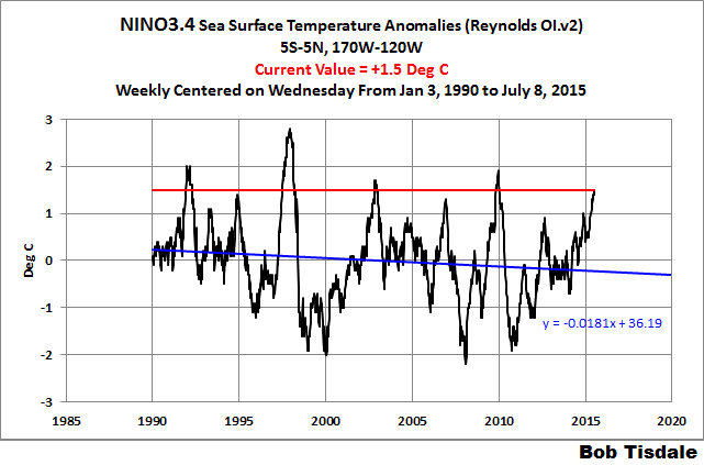
We’ve gone from a period when El Ninos dominated to a period when La Ninas were dominant.
I’m hanging onto that warm Indian Ocean and warm East Coast water to stave off the effects of this El Nino on the East Coast of Australia this summer.
During typical El Nino years those waters go cold, Australia gets a big high pressure system right over the middle the clears away all the clouds and hell on earth begins.
If our local waters stay warm, we will have rain and a much cooler spring and summer than a typical El Nino year brings.
So Bob, if I am understanding correctly, we are heading to a near 1997/8 el-Nino and probably greater than 2010 but with a blob interfering with west coast precipitation? A very snowy winter in store for the east and a very dry but warmer winter out west?
Where is Joe Bastardi when you need him? 🙂
Keep your eye on the waters around Australia. Currently warm. If they go cold, we’ll get a 1997/98 El Niño.
History of global temps illustrate a sustained drop following el nino’s just like after 1998. Temps are stepping down after these events since the el nino of 1998 as illustrated by Joe Bastardi.
The slower trade winds allow for the warm water to pool rather than be more dispersed.
Also, there is no question that the sun is the driver of climate and temperatures. After all, one only has to recognize the seasons and day/night temps. Take the sun out of the equation and we have the coldness of deep space. Find a deep cave or mine to to find some heat from earth’s core!!!
“A new model of the Sun’s solar cycle is producing unprecedentedly accurate predictions of irregularities within the Sun’s 11-year heartbeat. The model draws on dynamo effects in two layers of the Sun, one close to the surface and one deep within its convection zone. Predictions from the model suggest that solar activity will fall by 60 per cent during the 2030s to conditions last seen during the ‘mini ice age’ that began in 1645. Results will be presented today by Prof Valentina Zharkova at the National Astronomy Meeting in Llandudno.” http://phys.org/news/2015-07-irregular-heartbeat-sun-driven-dynamo.html#jCp
So, el nino’s are realative to other sea water temps, that affect over all global temperature. It will be interesting to see the conversation change over a period of several hundred years.
I saw that one about the dual dynamo nature of the sun as well. I’m hoping to get Leif’s take on it at some point here. I do hope they are wrong because that would be fatal for tens of millions of people.
Leif will poo-poo it, if his record on all this electromagnetic are a measure of his present thoughts. The accuracy of the model be damned.
“Sea surfaces for the NINO regions east of the NINO3.4 region are warmer. In fact, last week…”
No, they are actually cooler. If you look at the Sea Surface Temperature animations at
http://www.cpc.ncep.noaa.gov/products/precip/CWlink/MJO/enso.shtml
You will see the east equatorial water surface temperatures are still cooling from the southern hemisphere being in winter & the warming water is still spreading north. The only thing is, it is cooling *slower* than normal so the *anomalies* show it is warmer (got all that?).
I wish someone, with all these graphs & plots, would show the *actual* surface temperature in these NINO regions with the anomalies also plotted…like the polar ice trends.
Jeff
+1
As a resident of South-western BC I say bring on The Blob™! We have been having a marvellous summer this year for a change.
And quite a few forest fires farther east. We are seeing the effects of all that smoke here in eastern Nebraska.
Even in New Hampshire – hazy skies and we can even smell it during the vertical mixing during the day time.
Pretty impressive, but not unique.
Amen…and those poor chaps in the Great Lakes area and east Canada are in for another whopper of a winter with “the blob” promoting a west coast blocking high resulting in cold dry continental air to slip south into the plains and east. Oh well… Recall people not being able to get propane deliveries? They should stock up while it’s cheap and be self reliant with stores of dry food goods. Freezing and starving to death sucks. Better yet….move to Greece! …swim in the warm Mediterranean….they need new money… 🙂
No Shit Sherlock. As a resident of Southern Vermont, I can readily attest to the effect of last year’s winter. Burned a LOT more wood, even had a propane furnace freeze (the condensate froze in the exhaust fan), which never happened in the past 25 years.
Bastardi sez this next winter is the same as the last. Seriously thinking about heading South for this winter.
Heh, or just stay here, hunker down and wait for the Spring.
oh Lord, it takes longer and longer…
Is there data as to the ENSO state from March to September 1966? I was flying in the Western Pacific at that time and the tropical storms were seemingly on a conveyor belt from at least the Central Pacific westward. There were multiple storms simultaneously covering a great deal of the Western Pacific through the summer of 1966.
We badly need a real El Nino winter (or 3), here in Desertfornia.
What is needed is a better way of measuring La Nina and La Nada solar penetration that would then allow us to determine how much heat oceans have absorbed. With current knowledge about currents, we should then be able to estimate how much heat can potentially surface, and where they might surface, during El Nino-like conditions. That way nothing much is a surprise and instead we see increasing temperatures for what they are, natural ocean discharge.
A case in point, notice the strength of past La Nina’s. Compare that to current La Nina’s. What does that tell us about what is in store for us in the near future? Unless of course La Nina’s come back with a vengeance.
http://www.esrl.noaa.gov/psd/enso/mei/
So then Pamela, armed with that information you say is needed; what would your next step be ??
What would you do if you knew exactly how much heat is in the ocean ??
g
One of the issues related to 30 to 60 year oscillations in the discharge/recharge system is how it affects flora and fauna. There are many benefits that can arise from this kind of teleconnected knowledge and mitigation. Here is my back of the envelope:
1. Farmers and ranchers can adjust their necessarily long term plans accordingly.
2. Allowed sport and commercial harvest tonnage of ocean, fresh water, and land based noncultivated plants and animals can be adjusted to reflect their paired waxing and waning to the discharge/recharge oscillation.
3. Municipal management of water resources over time spans longer than their nose can be improved.
4. California, if they planned accordingly would stop whining about not having enough water and give the rest of us some frickin peace and quiet!
There is an old story in the old testament related to Joseph’s coat of many colors. 7 years of plenty and 7 years of famine can be mitigated by long-term thinking that is based on an accurate understanding of Earth’s processes.
Pamela Gray says: “What is needed is a better way of measuring La Nina and La Nada solar penetration that would then allow us to determine how much heat oceans have absorbed.”
Bingo! We needed it for all of the ocean basins decades ago.
Very cool weather in southern Australia for the last two months and a very strong cold outbreak recently. Not typical for a strong El Niño. Is the expanded Antarctic sea ice zone the cause?
Phil B., July 14, 2015 at 8:41 am
I’m hanging onto that warm Indian Ocean and warm East Coast water to stave off the effects of this El Nino on the East Coast of Australia this summer.
During typical El Nino years those waters go cold, Australia gets a big high pressure system right over the middle the clears away all the clouds and hell on earth begins.
If our local waters stay warm, we will have rain and a much cooler spring and summer than a typical El Nino year brings.
==============================
Those waters don’t go cold during a typical El Nino year:
http://www.goes-r.gov/users/comet/tropical/textbook_2nd_edition/media/graphics/elnino_lanina_sst.gif
A typical El Nino does bring hotter summers, milder winters, and less cloud and precipitation to Australia, but we haven’t seen much evidence for that yet.
http://www.theguardian.com/australia-news/2015/jul/13/queensland-gets-first-snow-in-two-years-as-nsw-waits-for-new-cold-front-to-hit
Remembering that the weak 2006 El Niño had a dramatic effect on Australian rainfall and general climate.
If you’re trying to communicate science to a lay audience, then you have failed.
Please first describe your hypotheses, then how your experimental results shed light on these hypotheses , and finally your conclusions (which can even be the title).
There is a reason that we like to see an abstract.
[When you publish, you may publish in any format that you choose, and any format that your editor and publisher choose to permit. .mod]
Data descriptions do not need a hypothesis. I don’t read any attempt at an experiment in Bob’s post. Nor would one be necessary. Observation description is a key component of the scientific method.
This post is terrible. Where is the abstract, where is (are) the hypothesis(es), where is (are) the conclusion(s)?
Unreadable.
[Per site policy, use only one user_id and email address .mod]
I agree that posts should have an abstract, start with aims, end with conclusions.
Jeremy, If you are a fan of secret societies with secret handshakes, then you can revel in your niceties. Like before the British Parliament meets in session there is a tradition that the “beefeaters” form up and march down into the underground (dungeons) just to make sure that some modern day Guy Fawkes is not attempting to blow the place sky high (gunpowder plot)
People used to write letters with a properly indented heading announcing who the author is, with address and date, and then a properly indented identification of the intended recipient.
Only then did one start with the Dear Sir / Madam / Ms / Mrs / Mr / LGBT / Write in your own gender/ / To whom it may concern / whatever,
It has come to my attention blah blah blah ….
Nowadays we get by with just Yo ! , ROFLMAO …..
They even used to have debates, where a formal proposition was given and one side, took up the support of that proposition, while the opposing tema argued against the proposition.
They don’t do debates that way any more.
Maybe some busybody self important “news” anchor like Ted Koppel or such makes up a set of questions designed to embarrass anyone taking the more conservative side of the argument and lauding the socialist side, and they ask the questions, instead of the debaters asking their own questions of the other team.
So evidently you use the same formalism to openly discuss science matters.
I’ve worked as a Physicist in Industry for well over half a century, and I can’t recall ever stating a hypothesis to any of my bosses.
I did have one boss, who didn’t believe in standard textbook theory (say circuit theory), and he believed even less in computer simulations based on such theories, that everybody used to design such circuitry. He only believed in the results of laborious and expensive testing, and preferably testing things that were manufactured on a production line, rather than prototypes built in a controlled lab environment. (I believe in those things too).
So on one occasion, when I did a 20 minute design task that took six different production products and reduced them to a single product that could be shipped as six different products, with a two minute step, prior to packing them into a shipping box, my boss declined to implement the changes until I took him under my wing, and schooled him in circuit theory, until he was able to grasp in some way the concept of the changes I had come up with. Only then when he himself had decided it might be worth pursuing, based on what he now thought he understood about the design di he authorize getting the off shore manufacturing facility to build a dozen each of the six different products, but using the single design concept that could be customized two minutes before shipment.
With the prior situation, Marketing had to give manufacturing an accurate breakdown by product at the beginning of the month as to how many of each product to build that month.
They could not be converted after building, without a lot of expensive rework.
With my design. the production line only needed the total of all six products, for the month and they just built the same identical object up to the installation of the last two components, which were one of three sets, and inserting into one of two different cases to give the six varieties. All of them then got a 24 hour burn in to be sure they all worked, before they were shipped.
So manufacturing made 12 of each species, and shipped them to me, and I spent the next three months with a $30,000 multichannel oscilloscope, recording multiple hand generated outputs from these 72 items, and digitally recording those waveforms.
Then I collated all the information and related it to the premise on which I had done the original 20 minute back of an envelope design.
I spent more than half an hour at a Xerox machine printing out 30 copies of a 60 page double sided (120 page) report, in time for a meeting with 25 people present, only three of whom were even competent to understand the nature of the changes I had instituted, in order to decide whether to implement the new design in production.
The meeting was chaired by the VP of manufacturing.
I put up my first slide which simply stated that the purpose of my proposed new design was to make the six different products as a generic common design, with last minute customizability into the six different products.
The VP of manufacturing excused himself saying he had another meeting to attend, and he left simply saying: “You all see to carrying this out.”
An hour later after I had dragged everyone through that 120 page report, in three times the time it had taken to do the design, in the first place; they decided to do what the veep had just told them to get done.
You see, sometimes it simply isn’t possible to explain some elements of science (any kind of science to a “lay” audience.
That generally is why companies tend to hire people who already know how to get a job done.
That company which I worked at for almost a complete climate cycle, was once a giant of innovation.
Now they are a basket case of MBA mismeddling.
Your costumery may fit in with academia Jeremy; but it isn’t necessarily an effective path to progress, in the real world.
You can witness it in action every day in Washington on CSPAN.
g
Thanks Bob.
Figures 5 and 6 show that the system is poised between a real el Nino (1997) and a pseudo el Nino (2014). The next month or two should show which way it will go.
Figure 7 is interesting and informative – it shows that, up to month 11-12, the pseudo and real el Ninos have about the same total heat across the equatorial Pacific. What is different is in months 12-14 where, following a 1997-type real el Nino the reactive counter-stroke of La Nina pumps the accumulated heat away from the equatorial region, poleward. Thus the dip in warm water volume at the end. This does not happen with the pseudo el Nino.
This accords with Willis Essenbach’s description of ENSO as a heat pump, with el Nino and a following La Nina representing the stroke and counter stroke like a 2 stroke engine.
Willis also believes that the ENSO is currently in a more quiescent phase where poleward heat transport is reduced. Thus full-on el Nino-La Nina cycles are less likely. I share this opinion. This difference in states is in the literature referred to as different “ground states” of the Pacific.
You can lead a horse to water but you cant make it drink.
Why do I believe that this current Pacific state is a Pseudo, not real, el Nino?
A real el Nino is driven by the Bjerknes feedback, comprising slackened and reversed trade winds and interrupted Peruvian upwelling. Neither have happened convincingly. So, to date its not the real thing.
What will “validate” it as a real el Nino is the following La Nina. Interestingly for the global warming that, as Bob has pretty much persuaded the serious climate community (grudgingly and without acknowledgement) is driven by ENSO, it is the La Nina that is more critical for the poleward pumping of warm water, than the el Nino itself although it is the latter that gets all the headlines.
What are the units for Fig. 16 (sea level height anomalies)? mm, cm, inches?
A question. El Nino usually develops starting from summer, reaches a maximum peak in mid-winter, and decades through spring; if I am not wrong. This year we were starting with weak El Nino conditions, which persisted to develop to a stronger El Nino event, which should be similar to 1987 and 1953 events of “all year round” Nino. Both were then followed by strong La Nina events – post-1953 was even a “double” La Nina event. Am I right? Which can be the causes of such behaviour? Also, do you expect PDO to turn back to negative phase within mid 2016?