CMIP5 Model Temperature Results in Excel

Guest Post by Willis Eschenbach

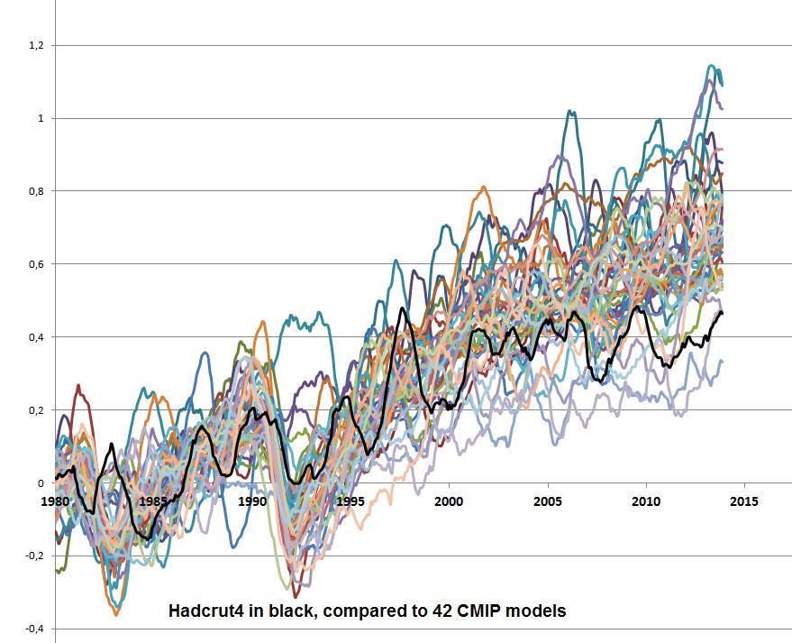
I’ve been looking at the surface temperature results from the 42 CMIP5 models used in the IPCC reports. It’s a bit of a game to download them from the outstanding KNMI site. To get around that, I’ve collated them into an Excel workbook so that everyone can investigate them. Here’s the kind of thing that you can do with them …

42 CMIP5 climate models and HadCRUT4

You can see why folks are saying that the models have been going off the rails …

So for your greater scientific pleasure, the model results are in an Excel workbook called “Willis’s Collation CMIP5 Models” (5.8 Mb file) The results are from models running the RCP45 scenario. There are five sheets in the workbook, all of which show the surface air temperature. They are Global, Northern Hemisphere, Southern Hemisphere, Land, and Ocean temperatures. They cover the period from 1861 to 2100, showing monthly results. Enjoy.

Best to all,

w.

[UPDATE] The data in the spreadsheets is 108 individual runs from 42 models. Some models have only one run, while others are the average of two or more runs. I just downloaded the 42 individual runs data. The one-run-per-model data is here in a 1.2 Mb file called “CMIP5 Models Air Temp One Member.xlsx”. -w.

[UPDATE 2] I realized I hadn’t put up the absolute values of the HadCRUT4 data. It’s here, also as an Excel spreadsheet, for the globe, and the northern and southern hemispheres as well.

[UPDATE 3]

For your further amusement, I’ve put the RCP 4.5 forcing results into an Excel workbook here. The data is from IIASA, but they only give it for every 5-10 year span, so I’ve splined it to give annual forcing values.

Best wishes,

w.

Get notified when a new post is published.
Subscribe today!
0 0 votes
Article Rating
240 Comments
Inline Feedbacks
View all comments
JamesS
December 23, 2014 4:52 am

Models be damned, I still don’t see any physical evidence that CO2 is behind any of the warming we’ve seen to this point. From my point of view, it appears that climate science took a slight correlation between increased CO2 and increased temps (possibly exaggerated increased temps, at that), stated “This must be the cause,” and “ad’d” ever-increasing levels of “absurdium.”
Other periods of warming, identical in length and amplitude, that occurred before the possibility of CO2-induced warming, were ignored. Other possible causes were ignored. The entire line of reasoning reminds me of “the God of the gaps” of creationism, with CO2 standing in for the deity: “We don’t know what caused it, but here’s our favorite Prime Mover, so that must have been the cause.” The fact that this Prime Mover was a result of wasteful and non-sustainable Western Civilization only added to its attraction among a certain percentage of the population.
So we end up with an entire body of “science” built around a slight correlation, with no other possible causes investigated, and WE’RE the crazy ones?
To quote Brigadier General Anthony McAuliffe on the eve of the 70th anniversary of his famous reply to the Germans surrounding Bastogne and the 101st Airborne: “Nuts!”

Brandon Gates
Reply to  JamesS
December 23, 2014 6:57 am

JamesS,

Models be damned, I still don’t see any physical evidence that CO2 is behind any of the warming we’ve seen to this point.

What physical evidence have you observed?

From my point of view, it appears that climate science took a slight correlation between increased CO2 and increased temps (possibly exaggerated increased temps, at that), stated “This must be the cause,” and “ad’d” ever-increasing levels of “absurdium.”

Were the temperature records being jiggered in 1896 when Svante Arrhenius did his correlation analysis, yielding up a remarkably prescient prediction?
http://www.rsc.org/images/Arrhenius1896_tcm18-173546.pdf

Other periods of warming, identical in length and amplitude, that occurred before the possibility of CO2-induced warming, were ignored.

Which periods of warming? For how long? If they’ve been ignored, how is it you know of them in the first place?

Other possible causes were ignored.

Like what?

So we end up with an entire body of “science” built around a slight correlation, with no other possible causes investigated, and WE’RE the crazy ones?

I’ll reserve judgement on that until I see your list of possible causes which have gone ignored.
PS: send more Germans.

Reply to  Brandon Gates
December 23, 2014 11:23 am

Why bet the world’s economy on unsupported allegations of spurious correlations?

I said, “All we have is an assumed correlation between (change in temperature) and (the effect of CO2) + (the unknown causes). ” That supports the allegation of a spurious correlation between Temperature and the effect of CO2 alone.
The proposed green policies (that every Government rightly rejects) would gamble the world’s economy on trying to deal with CO2 – alone.
We agree that “The effect existed so the causes (whatever they were) must exist “.
We agree that “The effect of CO2 could be zero for all we know”.
We agree that “the null hypothesis here is still that humans are NOT causing warming”.
That’s pretty good agreement for anyone on any subject on the internet.
Guesses on the effects of Ocean movements are not that important. The models have no predictive power and thus no explicatory power. They may be about as wrong now as 100 years ago or as right… but who cares? They advance human understanding nought and won’t until the UNFCCC is abandoned with its predetermined assumption that man is responsible. The field of Climatology is in big trouble because the null hypothesis was reversed by the politicians (and Kevin Trenberth).

Brandon Gates
Reply to  Brandon Gates
December 23, 2014 2:06 pm

MCourtney,

I said, “All we have is an assumed correlation between (change in temperature) and (the effect of CO2) + (the unknown causes). ” That supports the allegation of a spurious correlation between Temperature and the effect of CO2 alone.

Supporting an allegation with an allegation is not support. What we have is a non-assumed correlation between temperature and CO2 alone. The question at this point is whether that correlation is strong enough to reject the null hypothesis.

The proposed green policies (that every Government rightly rejects) would gamble the world’s economy on trying to deal with CO2 – alone.

Another circular argument, this time with an appeal to popularity.

We agree that “The effect existed so the causes (whatever they were) must exist “.
We agree that “The effect of CO2 could be zero for all we know”.
We agree that “the null hypothesis here is still that humans are NOT causing warming”.
That’s pretty good agreement for anyone on any subject on the internet.

I suppose so. It’s rare that I think someone is wrong about everything.

Guesses on the effects of Ocean movements are not that important.

You know this how?

The models have no predictive power and thus no explicatory power.

Model skill is not assessed in such binary fashion. In any field.

They may be about as wrong now as 100 years ago or as right… but who cares?

I didn’t realize we’d elected you spokesperson of the planet … 😉
The rest of your comments are opinion about the UN, etc., not the science. My order of operation is decide on the factual basis first, then delve into policy, not the other way ’round. Otherwise the decision-making process goes less than nowhere real quicklike.

Reply to  JamesS
December 23, 2014 8:08 am

Brandon Gates, I think you missed his point. The correlation is spurious so why bet the world’s economy on it? All the world’s governments keep discussing this and keep coming to the same conclusion. You don’t take that bet.
The rise in T in the first half of the 20thC was the same rate as the second half – what caused the rise in the first half?
Who knows?
But it happened. it was real. A lack of imagination about causes doesn’t mean you can stretch your imagination and say it didn’t happen. It did. So we don’t need to know what the causes are to say they exist. The effect existed so the causes (whatever they were) must exist too.
The correlation in the second half of the 20thC doesn’t matter if the unknown causes can explain all the warming. The effect of CO2 could be zero for all we know.
All we have is an assumed correlation between (change in temperature) and (the effect of CO2) + (the unknown causes). Saying that the correlation proves the importance of the known CO2 rise is a bit of a logic failure, as has been pointed out by JamesS.
You also point out that Arrhenius first speculated about the warming effect of CO2. Yet he got the numbers wrong too. A venerable history of rubbish calculations does not inspire confidence in a glorious future.

Reply to  M Courtney
December 23, 2014 8:13 am

Sorry, you asked for which periods and I didn’t show my working. Here is a graph showing the rise in Temperature pre-1950 and after.
The emissions kicked in after 1950 – so that is curious.

Brandon Gates
Reply to  M Courtney
December 23, 2014 10:56 am

M Courtney,

The correlation is spurious so why bet the world’s economy on it?

Why bet the world’s economy on unsupported allegations of spurious correlations?

The rise in T in the first half of the 20thC was the same rate as the second half – what caused the rise in the first half?

A bunch has been written about ocean/atmosphere couplings. Check out AMO:
http://climexp.knmi.nl/data/iamo_ersst.png
That has some familiar looking wiggles in it I think.

The effect existed so the causes (whatever they were) must exist too.

On that much we agree.

The correlation in the second half of the 20thC doesn’t matter if the unknown causes can explain all the warming.

Until those putative causes become known, we can’t explain anything by them. You’re getting the cart before the horse here.

The effect of CO2 could be zero for all we know.

A logical possibility, yes.

Saying that the correlation proves the importance of the known CO2 rise is a bit of a logic failure, as has been pointed out by JamesS.

Careful now. I said nothing about proof, nor would I. Proof is for math and logic, not non-trivial empirical science based on statistical inference. Despite some discussions about changing it, the null hypothesis here is still that humans are NOT causing warming.

You also point out that Arrhenius first speculated about the warming effect of CO2. Yet he got the numbers wrong too.

Ya’ think? It was 1896 after all. One of the first papers written on the subject. But see Table VII, carbonic acid = 2.0, the values range from 5.95-6.05 K/2xCO2. So he is off by a factor of about 2 compared to today’s mean estimate. Within an order of magnitude for the first paper published isn’t exactly what I’d call shabby.

Here is a graph showing the rise in Temperature pre-1950 and after.

Man, it really drives me nuts when people strip out the full context of a dataset. Here’s all of HADCRUT4GL, same two linear trends as your original, but with your 0.4 ℃ offset removed from the first interval to show what really happened:
http://www.woodfortrees.org/plot/hadcrut4gl/plot/hadcrut4gl/from:1905/to:1950/trend/plot/hadcrut4gl/from:1969/to:2014/trend
The astute reader will notice that the latter interval ends up about 0.4 ℃ higher than the former. Linear trends are senstitive to endpoints, so they can be fun to play with, and one can tell lots of different stories with them. Let’s split this timeseries exactly in half and see what we can see:
http://www.woodfortrees.org/plot/hadcrut4gl/plot/hadcrut4gl/to:1932/trend/plot/hadcrut4gl/from:1932/trend

cd
December 23, 2014 4:53 am

Willis
I’m surprised at the data scatter of the models. Visually, it looks as if the observations lie within the 95% confidence interval of the spread at any given time (even post 2000) – even if only just.

cd
December 23, 2014 4:54 am

BTW Willis
Your plots always look great so I’m guessing you produced it in something other than Excel ;).

December 23, 2014 5:51 am

What’s the ‘excuse’ for the reduced warming trend (models) since ~2000? CO2 emissions are growing at ~2%/year (since ~2000) and it was ~1% in the 1990s.
http://cdiac.ornl.gov/GCP/images/global_co2_emissions.jpg

ferdberple
December 23, 2014 6:15 am

If you look at the data, the max temperature predicted by the models in 1861 is 286.3 K, while the min temperature predicted by the models in 2100 is 285.5 K
Therefore the models are telling us that it is possible that there will be a 0.8 C drop in temperatures between 1861 and 2100 even if we keep on producing CO2.
The models are also telling us that in the period between 1861 to 2100, on average temperatures the difference between the high and low prediction in any one year is 3.26 C, with a STD of 0.36.
In other words, the models are telling us that global temperatures can vary as much as 3.3 C on average due to natural causes in a single year, and 99% of the time natural variability will be within 4.33 C in a single year.
Thanks Willis. This data is extremely valuable because the models are not just telling us about CO2. They are also telling us about natural variability, which at first glance is huge.
Because we know that CO2 was not an issue before 1950 according to the IPCC and climate science, by analyzing the data from 1861 to 1950, we should be able to firmly establish the range of natural variability.
Once natural variability is nailed down, once can then analyze the data from 1950-2014 to see how likely it is that something other than natural variability is at work. how much difference is there in the std and trend for example.
if the std and trend for example, remains unchanged from 1861-1950 as compared to 1950-2014, then it is hard to see how there could have been any climate change. We would need to see an increase in both the trend and std to be consistent with the predictions of climate science.
A comparison of average temp from 1861-1950 as compared to 1950-2014 is not in itself evidence of climate change, because it could simply reflect a continuing trend. What is required is a change in the trend or the variability.
I’m off to the salt mines. Hopefully some other lazy butt and do the calculations and tell us if the climate models do in fact show evidence of climate change, or is it natural variability we are seeing.

December 23, 2014 7:04 am

This was so interesting so I had to test it.comment image
I took a sample from 1980 and it gives the same trailing off tendency.
My conclusion is that the tendency in the last 15 years indicates a climate sensitivity in the lower end of the IPCC estimate. The estimate in AR5 gives a likely range from 1.5 to 4.5 Celsius, and a value less than 1 Celsius is considered extremely unlikely. The lower end is then around 1 to 2 degrees Celsius.
It also clearly shows the slowdown in the global warming, it does not show a stop as it is often claimed that we have.
/Jan

James Strom
Reply to  Jan Kjetil Andersen
December 23, 2014 7:54 am

Interesting graph. I see that about 1992-93 virtually all the models are significantly below the observed temperatures. Is that Pinatubo at work, indicating that the models overweight the effect of vulcanism?

Reply to  James Strom
December 23, 2014 8:16 am

Yes, you are right James.
Bob Tisdale has described it here earlier: http://wattsupwiththat.com/2013/02/28/cmip5-model-data-comparison-satellite-era-sea-surface-temperature-anomalies/
/Jan

The Ghost Of Big Jim Cooley
Reply to  Jan Kjetil Andersen
December 23, 2014 8:20 am

Jan, it does show a stop (actually a fall), if you pick certain years, like 2002. This is HadCRUt4 since 2002…
http://www.woodfortrees.org/graph/hadcrut4gl/from:2002/plot/hadcrut4gl/from:2002/trend

Reply to  The Ghost Of Big Jim Cooley
December 23, 2014 8:46 am

Ghost,
You can almost always show a decline if you cherry pick the starting points. Even in the end of 80’ies and mid 90’ies when there was a quick warming you can find declining trend lines, see:
http://www.woodfortrees.org/plot/hadcrut4gl/from:1980/mean:3/plot/hadcrut4gl/from:1982/to:1987.5/trend/plot/hadcrut4gl/from:1988/to:1995/trend/plot/hadcrut4gl/from:2001/to:2014.1/trend
/Jan

December 23, 2014 7:15 am

Thanks, Willis, for the gift of this dataset. It appears we have 42 different models, each attempting to estimate a monthly global mean temperature in degrees Kelvin backward to 1861 and forward to 2101. It will be an interesting analysis to see what patterns there are in the different time series.

Lance Wallace
December 23, 2014 7:17 am

Graphing all 42 models from 1881-2100 seems to show discontinuities affecting some (most? all?) models in 1881 and 1961. WUWT?
https://dl.dropboxusercontent.com/u/75831381/Willis%20graph.pptx
Subtracting 1881 from 2100, Model 17 showed the maximum increase of 3.79 K , while Model 19 was the minimum at 1.73 K.
Willis, do you have a key relating your model numbers to the names?

Fredrik
December 23, 2014 7:26 am

In 1965, Marvin Minsky (MIT) said: “To an observer B, an object A∗ is a model of an object A to the extent that B can use A∗ to answer questions that interest him about A”
According to this for computer scientist classic definition of a model, the climate projections are not even worthy of the label models in their current abilities to predict global temperature. They might reliably model other aspects of the climate system, but that is not what they are used for.

Dodgy Geezer
December 23, 2014 7:36 am

There seems to have been a discussion concerning which of these models is the ‘best’.
All things, including models, are made for a reason, an intention.The ‘best’ of anything is that thing which most closely fulfils the reason for its manufacture. Sometimes these intentions are complex balances, sometimes they are very simple single aims – for instance, the aim of an F1 car is to win a championship race, and the ‘best’ car is clearly the one which wins most races.
My understanding of climate models is that they have one very clear aim. This is to obtain grant funding for the team which develops them.
So the ‘best’ model is clearly the one which has attracted the most funding.
I trust that settles the argument…

rgbatduke
December 23, 2014 8:02 am

It’s a bit of a game to download them from the outstanding KNMI site. To get around that, I’ve collated them into an Excel workbook so that everyone can investigate them.
Ah, sir, bless you. A “bit of a game” is a massive understatement, and it became quite clear that I didn’t have time for it while teaching, and I haven’t had a chance over the last four or five days since I (finally) stopped after getting grades in. You have saved me much time, and I will respond by performing the long awaited model by model analysis. In fact, they’ll fit right into the “paper” I’ve been working on.
rgb

catweazle666
December 23, 2014 8:07 am

Good one, Willis, thanks.
And Happy Christmas!

December 23, 2014 8:38 am

Thanks, Willis.
These models of a world controlled by CO2 all behave in quite the same way, they do not even try to emulate Earth’s climate system, but hey want to regulate its politics.

David in Texas
December 23, 2014 8:59 am

Thanks, Wills. I very much appreciate the amount of work involved.

rgbatduke
Reply to  Willis Eschenbach
December 23, 2014 12:40 pm

And it shall be so, but I’m not sure when. I’ve now screwed around all day with this, and have to actually get up and start to make Xmas happen. Sigh. But I expect to have some time over the week or two ahead to maybe finish the post/paper I’m working on centered on the curve plotted (again) up above. Because the big question is how do the CMIP5 models compare to this effectively one parameter model?
Any ideas on what a good measure of performance might be? I think it would be pretty simple to do a pointwise computation of chisquare (given the per point error bars of HadCRUT4, not that they should be taken terribly seriously) not to use Pearson to compute p (as the samples are not independent) but to at least rank the models in terms of their weighted average deviation from the data. A second measure I’ve been thinking about is to examine (obviouly) the skew — form the signed \Delta T = T_{model} - T_{H4} and compare it to a zero-centered symmetric Gaussian. If the model is at least a reasonable candidate, one ought to be able to assert some reasonable limits on the number of “independent samples” in 164 years of data and turn it into a p-value at least for the assertion “this model has zero bias”. I think that one will instantly reject nearly all of the models in CMIP5 all by itself.
The thing I really don’t understand is why I’m doing this, why this isn’t all done in the literature already. Why isn’t there a paper entitled “Why we can reject 40 out of 42 of the models in CMIP5” or whatever it turns out to be?
rgb

Alan Robertson
December 23, 2014 11:01 am

Chaos math teaches us that accurate long term climate predictions can not be made unless:
a) all beginning input conditions are accurately and precisely known and modeled
b) emergent phenomena are also known and modeled
My take is that conditions a) and b) above, dictate that climate models are doomed to yield inaccurate results. Also, existing climate model outputs are regularly “back adjusted” with recent- past data to prevent the model outputs from appearing too wildly divergent from real world measurements.

ferdberple
Reply to  Alan Robertson
December 23, 2014 5:46 pm

and you have infinite precision in your calculations.

Danny Thomas
December 23, 2014 11:28 am

Willis,
Thank you for your work and then for providing the work product. Says much.

rgbatduke
Reply to  Willis Eschenbach
December 23, 2014 1:08 pm

But what we lack almost any evidence for is the idea that the changes in temperature follow the changes in forcing. And I have given a number of reasons to think that such a relationship doesn’t exist. These include the paltry response of global temperatures to volcanoes, the reversion of the temperature to the previous levels (or higher) following eruptions, the lack of any climate response to the 11-year sunspot cycles, the lack of temperature change from the ~ 5% increase in solar strength over the last half billion years, the ~ 30°C maximum of open ocean temperatures, and the like.

This is simply untrue, as the graph I post above makes perfectly clear. Not only is there evidence, but one can actually produce a remarkably accurate fit of the entirety of HadCRUT4 using only cCO_2 as input.
The physical basis for this model is enormously simple. It is the bog-standard radiative model that predicts a temperature forcing somewhere in the ballpark of 1 C per doubling, where I would assert that we don’t know the physics to do much better even with line by line computations e.g Modtran (as it is a hard problem already at this point, involving assumptions about temperature and line broadening and pressure in the entire atmosphere between the ground or sea surface and TOA escape). In addition, I assume that if there are any feedbacks, they are directly proportional to the cCO2 forcing, and hence follow the same logarithmic curve. Maybe water is net positive feedback, maybe it is negative feedback, maybe it can be considered separately from methane or aerosols or soot. I ignore it all. I actively ignore volcanoes as I have done computations (like you) that show that they are awesomely ignorable. I lump it all together and assume that it is some percent modification of the CO_2 driven forcing. It could double it! It could halve it! I don’t assume that I know what it will do, only that it the linear terms in the multivariate Taylor series of any response function are likely the most important and ultimately one has to sum over them and hence lose which medium makes what contribution.
In the end, 2.62 ln(cCO_2) works to describe the data very, very well. This is not a lack of evidence. It is pretty good evidence, as far as it goes. Furthermore, it decribes the data very well with no lag and little room for natural or unnatural variation outside of maybe 0.1 to 0.2 C of “noise” and possible systematic variation around it. It symmetrically splits the data and is neither warm nor cold biased. The big question is why we need any sort of more complex model, especially when the more complex models have many, many parameters and still don’t perform as well. Same reason that I conclude that I don’t need to worry about volcanic aerosols, as even R can barely find a reason to include them, and then only produces a tiny divot in temperatures if the volcano in question is VEI 5 or 6 (or, presumably, higher).
With that said, I am as hampered as you are by two things. One is that HadCRUT4 may be the BEST we can do (pun intended) or maybe BEST is, but our best is mostly likely terrible back to 1850 (neither of us believe HadCRUT4’s error bars in 1850) and probably more terrible across any times prior to that, no matter who is doing the computation and how. Nobody seems willing to acknowledge just how poorly we know global temperatures, global temperature “anomalies”, and how much worse our knowledge of things like specific atmospheric chemistry or state of the ocean in the still more remote past is. So I have no good reason to believe that my enormously simple and successful 164 year model will work all the way back to 1750, 1650, 1000, 0, 9000 BCE, or whatever. Somewhere in there there are truly ponderous things that drive the climate over very long time scales (and possibly, drive it rapidly due to nonlinear feedbacks) and my model accounts for none this and even if I tried to include it, there simply isn’t any reliable data to use to do the model building. At some point the error in the data becomes greater than 1 C, the error in the possible CO_2 concentration exceeds 10 ppm, Milankovitch can no longer be ignored, multivariate stuff we can’t even GUESS at could be dominant, state evolution comes into play…
So I in no way assert that my simple one+one parameter model is correct, only that it works to describe the data it was fit to very convincingly, certainly well enough that you can’t point to it and tell me that it doesn’t work! It does not fail a hypothesis test, although it does leave room for additional hypotheses as long as they are rather smaller in their aggregate effect. But it could be the other way around — the temperature might best be explained by the additional (unspecified) hypotheses and CO_2 could be a much smaller fraction of the total effect. The only thing I can say is that the additional hypotheses are a) unspecified; b) will have more parameters; and hence c) the inferrable “meaning” of the fit will take a hit from covariance as the input parameter list increases. Simple pictures are the best.
rgb

pouncer
December 23, 2014 12:17 pm

Willis has made a great contribution. Mosh poses a great question. RGB makes an great promise. Anthony runs a great site.
Most, but not all, of the comments are great.
I would be interested in seeing the spreadsheet include a run of the numbers out of the “Callendar” simple formula model Steve McIntyre referenced recently. Is a formula output typically closer to the measurement than the grid-cell simulation outputs? One criteria for “best” — pace Mosher — is whether or not the results are worth the money spent to obtain them; are the new results better or more accurately predictive of measurements than the old results? If not maybe the next round of funding ought be allocated to provide more measurements (in harder to reach regions) than on new models.
On balance, life is great. Merry Christmas to all.

December 23, 2014 12:34 pm

Wonderful, it will have a place of honor in a directory somewhere between “Asteroids” and “Zork.”</sarc>
Seriously, thanks for your hard work, it is appreciated by those of use with limited “spare” time.

highflight56433
December 23, 2014 12:36 pm

Lots of energy and resources put into “climate” …maybe spend the resources something useful. The average useful idiot will never see any climate change that is meaningful.

Brandon Gates
December 23, 2014 1:32 pm

ferdberple,

If you look at the data, the max temperature predicted by the models in 1861 is 286.3 K, while the min temperature predicted by the models in 2100 is 285.5 K
Therefore the models are telling us that it is possible that there will be a 0.8 C drop in temperatures between 1861 and 2100 even if we keep on producing CO2.

Oh dear. Well as it happens, HADCRUT4 recorded a 0.88 K range in monthly means for the year 1868. Granted, the error bars get bigger the further back we go, but I’m looking at anomaly data which aims to remove seasonal signals based on means for some reference period — which in the case of HADCRUT4 is 1961-1990.
The data Willis provides is absolute monthly means, not anomaly, so the seasonal variations haven’t been removed. Which is not a bad thing until someone comes along and compares summer of 1861 to winter of 2100 …

The models are also telling us that in the period between 1861 to 2100, on average temperatures the difference between the high and low prediction in any one year is 3.26 C, with a STD of 0.36.

I get the exact same answer. Thing is, that’s against the high/low within any given MONTH, not year. For the annual min/max predictions you should get 3.55 °C range, 1σ = 0.31.

In other words, the models are telling us that global temperatures can vary as much as 3.3 C on average due to natural causes in a single year, and 99% of the time natural variability will be within 4.33 C in a single year.

Well not exactly. Comparing to reality means comparing to anomalies, which means seasonal signals have been reduced by subtracting out monthly means over some reference period. So for HADCRUT4 the range is 0.39 °C, 1σ = 0.15. CMIP5 range is 0.90 °C, 1σ = 0.22. That’s using 1985-2005 for the baseline reference period, and descriptive stats from 1861-2014 for an apples to apples comparison.
Next thing, the min/max values you’ve chosen for CMIP5 are outliers … min/max tends to pick those out, yes? The better thing to do is do the anomaly calcs on each ensemble member, then take the standard deviation of the ensemble members within a given month, then use that to build a confidence interval around the monthly ensemble mean.
Even then, monthly resolution is kind of a mess to look at, so I often do annual averages from there.
Do all that and the results should look like this:
https://drive.google.com/file/d/0B1C2T0pQeiaScmgxQW5nRHFJN2s
Which looks a lot more reasonable than what you describe.

HAS
Reply to  Brandon Gates
December 23, 2014 3:08 pm

I fear that using your anomalies you just needlessly threw away a lot of information. You can control for seasonal variation (and it is worth pausing to think about what that means in a global temp series) without using them.
Of more interest as I noted above is the range of absolute temps being modeled by the various models. This aspect gets diminished when anomalies are used. The problem is that the physical behaviour of the atmosphere and oceans is often a function of absolute temperatures (as an example I mention phase changes above). If different models are running at different temperatures then they will be exhibiting different physical behaviours.

Brandon Gates
Reply to  HAS
December 23, 2014 4:35 pm

HAS,

You can control for seasonal variation (and it is worth pausing to think about what that means in a global temp series) without using them.

Ok, how would you control for seasonal variation?

Of more interest as I noted above is the range of absolute temps being modeled by the various models. This aspect gets diminished when anomalies are used.

I agree it’s quite instructive to look at them in the “raw” because yes, the anomaly calc I used (which I believe to be the “standard” method) does tend to quash annual range.
For comparing to the instrumental record, there’s really no choice but to take anomalies because that’s how the observational data are published. [1]

The problem is that the physical behaviour of the atmosphere and oceans is often a function of absolute temperatures (as an example I mention phase changes above).

Sure. That’s the reason the model output is made available in K. Keep in mind those temperature outputs are the result of whatever physical processes are being simulated in the first place, all of them being temperature-dependent.

If different models are running at different temperatures then they will be exhibiting different physical behaviours.

Yup. The whole idea behind CMIP is to be able to compare model to model in a standardized way so differences in behavior can be readily identified and quantified.
———————
[1] I do have gobs of surface station absolute temperature data, but the less database math I have to do, the less database math I can screw up.

HAS
Reply to  HAS
December 23, 2014 6:00 pm

“How would you control for seasonal variation?”
It depends on the problem you are confronting.
If you are comparing MINs and MAXs then doing it by month as well as annual averages is informative. If you do that for ferdberple calculations you find his point still holds. For each month in 1861 the MAX model is consistently lower then the MIN model for the corresponding month in 2100.
Anomalies are a convenience but you need to be aware of the hidden assumptions you are making. Here in comparing different models you are assuming that the models are invariant under a linear transformation. My point again is that the physics tell us this isn’t so.

Brandon Gates
Reply to  HAS
December 24, 2014 3:36 pm

HAS,
My comments to ferdberple on seasonal variation were an unintentional red herring. The variation in any single model member (monthly or and annual) are far less than range of the absolute means across the entire ensemble. I wasn’t aware, though I should have been, how big that spread is so I’ve not been engaged in the proper discussion.
The case for model ensembles is that they produce similar trends under the same input parameters. The outputted trends are not linear over any arbitrary period of time and neither are the input parameters — there are inflection points all over the place. How they arrive at such similarly shaped curves but at different absolute temperatures is the thing which interests me at the moment, if I may put it so mildly. It is those wide differences in absolute temps which serve as the partial impetus to use anomalies when constructing an ensemble.
Unambiguously yes, there are 1861 max temps greater than or equal to 2100 min temps when looking at the absolute output. That is not meant to be taken as a meaningful result. How I’ve already plotted it — which is how the IPCC does it — is. Whether one thinks that’s method or madness is a different discussion.

Reply to  Brandon Gates
December 23, 2014 3:11 pm

Probably a dumb question Brandon, but above you say: ” Which is not a bad thing until someone comes along and compares summer of 1861 to winter of 2100 …” . But if these are Global Average Temperatures, how can we have a “winter” and a “summer” temperature? Apogee and perigee?

Brandon Gates
Reply to  Wayne Delbeke
December 23, 2014 4:15 pm

Wayne Delbeke,
Actually, that’s a brilliant question. When looking at global averages, the planet is warmer at the surface during the NH summer. This is a function of there being more land area in the NH than SH, and land is more responsive temperature-wise than ocean. This holds true for multi-annual trends as well:
http://www.woodfortrees.org/plot/hadcrut4gl/mean:120/plot/hadcrut4nh/mean:120/plot/hadcrut4sh/mean:120
During cooling cycles, the NH temps decrease more rapidly than the SH. Converse is true during warming cycles.

richard verney
Reply to  Brandon Gates
December 24, 2014 2:09 am

We can be fairly confident that on a global basis, there has been some uneven warming since the 1850s, with the 1880s, the 1930s, and the late 20th century being peaks in that uneven warming trend.
The fact is that we do not know whether, on a global basis, it is warmer today than it was in the 1880s or the 1930s, and anyone who claims that it is warmer today than it was in the 1880s and/or the 1930s is over stretching the bounds of the data..
We can be fairly confident that as far as the US is concerned (and I accept that this is not a global assessment), it is not as warm today, as it was in the 1930s.
There is very little high quality global data in the 19th century, and this means that we just do not know what the position, on a global basis was, and this is compounded by large measurment errors.

ferdberple
Reply to  Brandon Gates
December 24, 2014 6:10 am

then take the standard deviation of the ensemble members within a given month, then use that to build a confidence interval around the monthly ensemble mean
==============
temperature time series are fractals. it has neither a constant average nor deviation. you cannot sample them and arrive at a normal distribution. anomalies have no physical meaning in such a system, because the average is a meaningless illusion. instead they mislead, making the system appear more predictable and less variable than it really is.
the small differences in global temperature that result due to orbital parameters cannot be average away. they are what they are. if the global temperature is warmer some time in 1861 than some time in 2100, it was warmer. plain and simple. what we are looking at is the natural variability. that variability exist in the underlying data for many reasons, such as orbital parameters, and needs to be accounted for, not eliminated in the analysis through artificial averaging.

ferdberple
Reply to  Brandon Gates
December 24, 2014 6:20 am

build a confidence interval around the monthly ensemble mean
==========
and what is your PDF? the problem is that your argument is circular. you are assuming you know the PDF for global average temperature. what I’m saying is that we don’t, so we cannot make any calculations that assume we do, because the confidence levels will be incorrect.
ensemble means work because there is an underlying physical mean that the data is actually trying to converge to. but when you look at paleo history it is plain the earth does not have a global mean temperature, except at the limit, and this mean temperature is closer to 22C than it is to the 15C we use today.

Brandon Gates
Reply to  ferdberple
December 24, 2014 2:32 pm

ferdberple,

temperature time series are fractals. it has neither a constant average nor deviation. you cannot sample them and arrive at a normal distribution.

I understand and agree. I don’t ever do that to a temperature timeseries, and that’s not what I’m doing here. What I am doing is treating each monthly CMIP5 GMT value as an “observation” and doing descriptive stats on the set of those monthly values. They do fit a gaussian normal distribution, quite well it turns out:
https://drive.google.com/file/d/0B1C2T0pQeiaScDVBX29jRTlyV2M
I was flat out wrong I was when I wrote this statement to you: Which is not a bad thing until someone comes along and compares summer of 1861 to winter of 2100 … because that’s NOT what’s going on here at all, and I’m none too happy about missing it: https://drive.google.com/file/d/0B1C2T0pQeiaSSGFhdjlnd3hkX0U
It isn’t seasonal variations causing the wide range of absolute temps, it’s that the range of means for entire ensemble members is so broad. That does warrant some sharp-pointy questions.

December 23, 2014 1:49 pm

And yet the warmists still claim that the temperature records support the model expectations.
An interesting article would be why the warmists say that observations support the narrative, while us skeptics do not. If we are to counter their arguments, we must first understand them – and not inadismissive, disrespectful way.

Reply to  Doug Proctor
December 23, 2014 3:15 pm
ferdberple
Reply to  Jan Kjetil Andersen
December 24, 2014 6:25 am

from AR5:
The simulation of clouds in climate models remains challenging.
There is very high confidence that uncertainties in cloud processes
explain much of the spread in modelled climate sensitivity.
=============
this is an interesting turn of phrase. we have very high confidence that our lack of understanding explains our failure to arrive at the correct answer.
why does the lack of understanding not explain the spread between models and observation? why limit your remarks to the spread between models only?

December 23, 2014 2:22 pm

These models can be thought of as 42 “proxies” for global mean temperature change. Without knowing what parameters and assumptions were used in each case, we can still make observations about the models’ behavior, without assuming that any model is typical of the actual climate. Also we assume that the central tendency tells us something about the set of models, without being descriptive of the real world.
So the models are estimating monthly global mean temperatures backwards to 1861 and forwards to 2101, a period of 240 years. It seems that the CHIP5 models include 145 years of history to 2005, and 95 years of projections from 2006 onward.
Over the entire time series, the average model has a warming trend of 1.26C per century. This is compares to UAH global trend of 1.38C, measured by satellites since 1979.
However, the average model over the same period as UAH shows +2.15C. Moreover, for the 30 years from 2006 to 2035, warming is projected at 2.28C. These estimates are in contrast to the 145 years of history in the models, where the trend shows as 0.41C per century.
Clearly, the CHIP5 models are programmed for the future to warm more than 5 times the rate as the past.

DocMartyn
December 23, 2014 5:57 pm

Willis, do you think you could stick a link on WUWT, top right?