Guest Post by Willis Eschenbach
Recently there have been a number of accusations and bad blood involving myself, David Evans, Joanne Nova, Lord Christopher Monckton, and Leif Svalgaard. Now, I cannot speak for any of them, but on my part, my own blood ended up mightily angrified, and I fear I waxed wroth.
However, I see no point in rehashing the past. What I want to do is to return to the underlying scientific questions. In that spirit, I apologize sincerely and completely for wherever I put in “something extra” in the previous discussion. In Buddhism, there’s a concept called “something extra”, and one is enjoined to avoid putting in “something extra”.
It is explained in the following way:
If I say “I am angry” that is simply a true statement.
But if I say “You made me angry”, that is something extra.
So I ask any and all of you to please accept my sincere apologies for whatever what I said that was something extra, so that we can move past this difficult time and get back to discussing the science. Both sides have legitimate grievances, and I am happy to make the first move to get past all of them by apologizing to all of you for whatever my part was in the bad blood. I hope that the other participants accept my apology in the spirit of reconciliation in which it is offered, and that we can move forwards without rancor or recriminations.
Regarding the science, let me go back to the original question, and see what I can do in the way of making my claims in a more Canadian manner. I’ll start by looking at the recent record of the “TSI”, the total solar irradiance:
 Figure 1. Monthly total solar irradiance as measured by the CERES satellite. Vertical blue line shows mid-2004.
Now, if you don’t like the data from the CERES satellite, here’s the SORCE satellite data:
 Figure 2. Daily total solar irradiance as measured by the SORCE satellite. Vertical red line indicates mid-2004. SOURCE
Note what is happening in both graphs after mid-2004 (vertical lines in both plots). As in every solar cycle, the TSI declines somewhat, and bottoms out. Then, it starts to rise again. And by the end of the datasets, in both cases the TSI is higher that it was in 2004.
So what was the scientific dispute all about, the discussion that underlies all of the bad feelings?
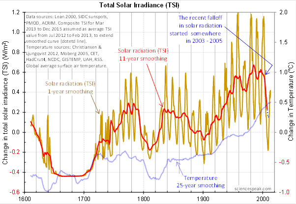
It revolved around the following graph from David Evans, referenced by both Leif Svalgaard and Lord Monckton, showing the basis of his predicted upcoming global cooling :
 Figure 3. David Evan’s graph of TSI (gold line), along with a centered 11-year moving average of the TSI data (red, with dotted blue extension), and a 25 year unspecified smooth of temperature, presumably a trailing average (blue line). (Click to enlarge)
Now, as you can see, the bright red line basically falls off the edge of the earth around 2004. The note says “The recent falloff in solar radiation started somewhere in 2003-2005″.
However, a look at both the SORCE and the CERES data shows no such “falloff in solar radiation”, neither precipitous nor otherwise. In fact, both datasets agree that by 2013 the TSI was well above the level in mid-2004.
Since there is no fall in the underlying data of any kind, why does the red 11-year average line show abrupt cooling starting around 2004?
The answer lies in the various problems with the graph.
• The TSI data is a splice of three datasets, with two of them showing the post-2000 period. This is a huge source of potential error in itself. However, it gets worse.
• One of the spliced datasets is the Lean TSI reconstruction, an outdated dataset that the authors of the reconstruction themselves admit is inaccurate.
• Another is the PMOD dataset. It is known to be reading low by 0.2 W/ms at the solar minimum, introducing a spurious apparently strong recent “cooling” where none exists.
• The 11-year centered average is an extremely bad choice for a filter for sunspot/TSI data. Because the solar cycle varies both longer and shorter than 11 years, at times the 11-year average actually reverses the sense of the data, converting peaks into valleys and valleys into peaks. Look at the period from 1760-1800 in Figure 3, for example. What is happening is that the frequency data is getting strongly aliased into the amplitude data. As a result, the average can end up far from the reality, particularly at the ends of the dataset.
For another example, look at the period just after 1740 in Figure 3. The 11-year average takes a huge vertical jump … but meanwhile back in the real word, the TSI itself is not rising at all. It is falling. Clearly, the large vertical jump in the red line is totally spurious.
• The TSI data has had about 900 days of “data” added to it using an arbitrarily chosen value. This is shown by the blue dots which indicate a continuing drop in the temperature.
So regarding the question of why the red line is acting so strangely, the answer is that we have a perfect storm of spliced data, bad data, arbitrary “data” added to the spliced bad data, and an extremely poor filter choice.
And as a result, the red line doesn’t represent reality in any shape or form. There is no precipitous drop in TSI starting around 2004. It doesn’t exist. Sure, the 11-year average says clearly that there is a huge drop starting around that time … but the actual data says something entirely different, as shown in Figures 1 and 2.
Now, in the heat of the moment Leif described the red line as being “almost fraudulent”. I think this was an over-reaction, but perhaps an understandable one. After all, if the red line were flipped over vertically it would make a lovely hockeystick, and if someone claimed warming was coming based on that hockeystick, people would call them alarmists … and calling someone an alarmist is certainly a close relative of calling them “almost fraudulent”.
However, my guideline is, never ascribe to malice what is adequately explained by error and misunderstanding. So I do not call their red line fraudulent, nor did I do so in the original discussion. Instead, I say that it is an error resulting from a misunderstanding. In any case, let me suggest that we leave out all ascription of motive and intent, that goes nowhere, and that we return to the science.
A more scientifically neutral description of the red line is that it is highly inaccurate and potentially misleading, because the apparent drop starting in 2003-2005 is simply an artifact of a combination of bad data and bad filtering.
Finally, to the degree that David Evans’ model predicts future cooling based on the red line, it is already falsified.
That is what I was trying to say, and I believe (subject to correction) that was what Leif was pointing out as well.
In closing, I will endeavor in this thread to keep my comments on as scientific a basis as possible, to avoid any personal references, and to not ascribe motive or intent. I request that everyone do the same. Many toes have already been stepped on in this discussion. Let’s see if we can simply discuss the science.
My best to all,
w.
VERY IMPORTANT: It is important in general, and in this discussion in particular, that you QUOTE THE EXACT WORDS THAT YOU DISAGREE WITH. Note that this doesn’t mean just referencing their entire comment. Quote the exact words of their comment that you think are in error, and tell us why you think those words are wrong. If you do not quote the exact words that you disagree with, none of us will know what you are referring to … and out of such misunderstandings grows animosity and misunderstanding.
Finally, please don’t delve into the rights and wrongs of what has happened in the previous discussions. I am not interested in the slightest in ascribing blame or responsibility. I have accepted my own responsibility for my own actions and apologized for wherever I was over the line. What I or the others did in the past is a blind alley, so please confine your comments to the science, and as the saying goes, “Let the dead past bury its dead”.
I’ve seen the “time will tell” comment many times in connection with this notch solar model, but it won’t, just as The Pause has not (yet) done for the CO2 model.
Despite many claims to the contrary there is no such such thing as a climate prediction, just estimates of the “strengths” of all the possible variables, how much will temperature change if this one variable is changed, ALL OTHER THINGS STAYING CONSTANT.
Nobody can (yet) determine the effect of changing one variable on all the other variables.
What would tell for the notch solar model is some evidence NOW that this notch exists. David Evans has presented some graphs about filters that relatively few understand. AFAIK none of those who do understand filters have supported the claims.
All this crying and shouting is based on VERY limited real data.
When talking about the sun, much of the past is reconstructed, not observed. The sun was not studied very closely until the first Solar Observatory was built on my childhood playground, Kitt Peak in Arizona and this was only half a century ago and it only recorded sun spot activity, not all the more sophisticated data.
The collection of any hard data is recent. So using this to draw conclusions about fine details in climate events is not adequate and thus the debates about fine details used to make projections is a waste of time.
There is one major thing to always remember: the #1 driver of our climate is the sun. There are other things that impact but the sun is the strongest and has the most immediate cause/effect.
And small changes in solar activity cause huge dislocations in climate. And yes, we are now entering a cooler cycle and yes, we are on the edge of another Ice Age due to the fact that these Ice Ages have cycled in and out repeatedly for over 2 million years and we are still pretty clueless as to why this is happening over and over again and why the cold cycles are ten times longer than the warm cycles.
We can guess and I would suggest due to the sudden start and equally sudden end to these cold cycles that a huge part of this is due to the sun and its internal interactions and its relationship with all the other forces in our galaxy which isn’t stationary nor stable but dynamic and restless.
Reality …
Monthly (distorted by SSN pre-averaging):
http://s29.postimg.org/u3v2nkbs5/SSNM.png
Daily:
http://s29.postimg.org/iq8jcd19h/SSND.png
A work in progress; needs peak-to-peak sliding window algorithm similar to David Evan’s smoothing (see his spreadsheet) but unlikely to make a scrap of difference. Moving SD takes care of most of the frequency variability, temps are not about to fall off a cliff. See integral plots.
However, ocean heat will be increasingly propping up atmospheric temperatures which means greater seasonal variability as the whole thing switches around to drawing on the big heat sink. We’ve seen a little of that already. Longer term if cycle 25 is also low (as looks likely) it means deeper winters. Particularly in the northern hemisphere where there is less ocean to equilibrate. Global annual averages may drop a tad but not by much. Winter temperatures will though be bitter on occasion. In the UK expect repeats of 1947/1963 sooner or later. Solar Max is now about done. It’s all downhill from here and probably quite rapidly. There is little or no dipole strength, late for it to build going into the next cycle and seemingly little upcoming stimulus (heretically or otherwise):
http://s29.postimg.org/8ew6jp9k5/Heretical.png
You can believe what you like; while there isn’t enough of it yet I’ll stick with the data until it says otherwise. If you think it’s physically impossible explain to me why minute tidal forces would not affect the shape and evolution of the magnetic containment of a fusion reaction fighting its own gravity at the ephemeral plasma boundary where net forces otherwise are essentially zero. Meridional flux migration to the poles appears to be moderated by minute tidal containment distortion. We will see whether that holds true in 2015 and 2017 (but not before about 2019).
“in a more Canadian manner” ?? Have you ever seen a hockey game? So you are going to drop the gloves and go at it bare knuckle style? 🙂
I want tickets!!!!
Greg Goodman says:
July 17, 2014 at 8:11 am
Mr. Evans’ graph (Figure 3) is not a running mean, it is a centered average. Therefore the signal does not invert. It does blur the data: that’s it’s purpose. With so many data points bouncing around the chart, the eye cannot easily discern trends or changes in trend. Summary techniques such as averaging are primarily visualization aids.
If you have a better filter, use it.
Leif aka Salvatore says
I rather depend on what happened in the past to predict what will happen in the future when it comes to climate.
Henry says
So do just that.
Tell me
1) what this graph will look like 40-50 years from now
http://ice-period.com/wp-content/uploads/2013/03/sun2013.png
2) what will be the speed of warming/cooling be 40 years from now, where will it go?
http://blogs.24.com/henryp/files/2013/02/henryspooltableNEWa.pdf
(especially note the last graph at the bottom of the minima table)
I agree with Leif, the Evans curve is almost fraudulent. Scientists have an obligation to accuracy and truth, and Evans missed far enough to deserve censure. Evans does not deserve the benefit of a doubt, because he has not repudiated the curve, at least not to my knowledge. Let him issue a mea culpa and a retraction, and then he will have come clean.
Agnostic says:
July 17, 2014 at 2:06 am
Thanks, Agnostic. I have not said there is “no reduction in solar activity”, and I don’t think Leif has either.

I’ve said that there is bad data, an incorrect splice, and an incorrect choice of filters. These have combined to greatly exaggerate the situation.
However, a look at the overall picture is very instructive …
This data is from their model. As you can see, the sun is very stable.
Finally, it’s not clear what you mean by “their [David and Jo’s] conclusion” . Their conclusion about what?
w.
Willis says
http://wattsupwiththat.com/2014/07/16/mending-fences/#comment-1688122
Henry says
Willis, you say there is no change in TSI from 1600
and you are most probably right.
So, do you agree with me now that TSI is a useless proxy for anything?
Willis Eschenbach says:
July 17, 2014 at 9:08 am
As you can see, the sun is very stable.
Because the distance to the Sun varies through the year, TSI as observed at the Earth varies too [and quite a lot – about 70 times more than the variation of TSI that the Sun puts out]. Here is the TSI observed since 2003. http://www.leif.org/research/TSI-through-a-year.png . TSI is plotted for every day through the year starting at the beginning of each year, so the plot shows about 12 years of data. You can see the annual variation as the nice smooth [almost sinusoidal] curve. Solar activity is also visible: the tiny, tiny wiggles you sometimes can see on top of the curve due to varying distance. Bottom line: the Sun is very stable.
Stacey says:
July 17, 2014 at 2:24 am
Thanks, Stacey. You are correct that there are many valid reasons for posting anonymously—job, family, public position, concern for personal safety, the list is long.
And I have no problem with any of them. But there is a price that you pay for anonymity.
When you embrace anonymity, you lose credibility because you never have to take responsibility for your words.
This is not a value judgement on my part. It is a simple fact. You and other anonymous posters never ever have to apologize for what you’ve said, because you can just change your alias and walk away. I cannot do that. I have to take responsibility for what I’ve said, and either defend my words or admit that they were wrong or apologize for them.
You don’t have to do that. You can show up tomorrow as “John316” and never apologize for anything. I can’t.
As a result, while I’m happy to have a scientific discussion with anyone, anonymous or not, I will not take moral instruction from someone like you or “dp”. Whoever “dp” might be, he is not commenting with the same constraints that I operate under, so his opinion on personal responsibility, or on apologizing, is meaningless to me.
Again, I say that I have no problem with anonymity. You are welcome to be anonymous … but you have to pay the price. What I do have a problem with is someone operating behind the shield of anonymity, and then as dp does, criticizing the morals or the ethics of other people’s actions who are operating unprotected in the open. Sorry, but when you choose to become anonymous, you lose the moral standing to do that.
Regards,
w.
NikFromNYC says:
July 17, 2014 at 3:15 am
Nik, when I say it like that, folks don’t get it. Even when I try to hammer it in they often don’t get it.
Heck, even you don’t get it. The core message is not “only attack me in detail”, nor is it aimed at buffoons.
The core message is, QUOTE MY EXACT WORDS THAT YOU DISAGREE WITH.
So perhaps I could just put that in … but the people have busted me in the past for saying that because it’s too harsh or something.
Can’t win for losing sometimes …
Thanks in any case,
w.
geronimo says:
July 17, 2014 at 3:48 am
Great, it’s another member of the anonymous apology police. When you are willing to sign your own name to your words, and you are the offended party to whom I’m apologizing, I’ll listen to your complaint.
Until then … talk to the hand.
w.
Henry says:
”Perhaps you can explain for me the data for the drop in minima that showed a perfect curve (100% correlation) indicating that there is no AGW or earthly influence?”
Correlations over the short term while interesting are hardly definitive. Before I could venture any confidence in the relationship I’d want to see the correlation continue for several cycles at least.
Willis…
When you embrace anonymity, you lose credibility because you never have to take responsibility for your words.
Really?
Credibility is in the content, or not, nothing to do with anonymity or responsibility.
Also, that, your, statement is inconsistent with other comments you make
Willis
…QUOTE MY EXACT WORDS THAT YOU DISAGREE WITH…
How about…
QUOTE THE EXACT WORDS THAT YOU APOLOGIZE FOR… rather than deny knowing what you did/said wrong or to offend.
My name is Gerry Morrow (geronimo geddit?) you can find me in Ipswich in England and I don’t understand what you believe to be precious about identity, unless you want to insult people you don’t know. Personally I don’t give a FF, but Mrs Geronimo likes her privacy.
Now you are clearly offended by what I said. Calm down, I’m a nobody, who happened to read your self-serving “apology” and try to tell you how it looked to people not involved in your personal attempt to be seen as “very clever”. Above all else in life the way you interact with strangers is the most important. So now I’m not anonymous what does that mean to you? Are you going to put me down with your ( self-convinced) superiority, or are you going to accept that an apology that blames the victim isn’t an apology.
If it would help you be more ill-mannered than you’ve already been I’ll add my personal email and home address for all to see . Would that do it for you?
Re: Willis @ur momisugly July 17, 2014 at 9:33 am
“Sorry, but when you choose to become anonymous, you lose the moral standing to do that.”
I can only assume you approach science with a similar use of logic. The opinion expressed by a person you do not know still has validity and the morals remain whether you recognize them or not. It seems you can’t help yourself when it comes to “adding something extra”. A continuous, free flowing fire hose of “extra.”
I encourage you to take your own advice and stick to the science alone. Perhaps you suck less at it than at making apologies.
“to whom I’m apologizing…”
Now you know I’m Gerry Morrow it might help you to know you weren’t apologisng by any definition of the word, At least that’s how it seemed to those not having a dog in your egotisticlal fight.
Would you like my home address before you gave my views credence?
http://stream1.gifsoup.com/view/418787/train-wreck-o.gif
Willis, it is very good to keep the debate going constructively with good people.
Do note that a feeling of anger is a proper emotional response to an evaluation that an injustice has been done. The challenge is what to do in response.
As for your “extra”, naming behavior is proper. Even less likely to be received well, so I’d only use it with bad people.
(With evil people best tactic may be to avoid, as such scum will make false accusations against you.)
Edith Packer’s lectures on psychology http://www.amazon.com/dp/B00ENAPR3S include Anger.
Chris: “Mr. Evans’ graph (Figure 3) is not a running mean, it is a centered average. ”
thanks Chris, now refer to Dr. Evans’ spread sheet, to my article explaining the defects of running mean (linked above) and come back and explain the difference you see between a running mean and what you want to call a “centered average”.
“If you have a better filter, use it.”
I did , and provided this graph above ( more than once ).
http://climategrog.wordpress.com/?attachment_id=983
Not only do I used it, I’ve explained the issue in plenty of detail and provided several alternatives with code to do it.
lsvalgaard says:
”You can see the annual variation as the nice smooth [almost sinusoidal] curve. Solar activity is also visible: the tiny, tiny wiggles you sometimes can see on top of the curve due to varying distance. Bottom line: the Sun is very stable.”
1) The graph linked is titled:
“Total Solar Irradiance over a Solar Cycle”
Most people would consider a solar cycle the Sun’s 11 year (or so) cycle not our annual trip around the Sun.
2) TSI is very stable but the components of TSI are not.
3) Note that Northern Hemisphere Summer is during the lower TSI values, the angle of incidence and surface characteristics (more land & less ocean compared to the Southern Hemisphere) trump this less energy input variation. Now consider how this effect is amplified / negated as the orbital cycle moves through Milankovitch cycles and how PUNY the supposed 3.7 W/m2 “forcing” from 2XCO2 really is.
John West says
Correlations over the short term while interesting are hardly definitive. Before I could venture any confidence in the relationship I’d want to see the correlation continue for several cycles at least.
Henry says
What cycles do you expect?
Are you not asking yourself when the [global] cooling will stop?
I am sure Leif knows but he is not telling, trying to stay in no one’s land, as many do, that expect a salary from the global warming nonsense/ scare
My best guess is that this graph from 1972-2016:
http://ice-period.com/wp-content/uploads/2013/03/sun2013.png
will continue in the future becoming a mirror of itself.
That means a slow increase in solar magnetic field strengths from 016 onward
but what causes the actual [electrical] switch?
Anyone for a guess?
MarkD: A continuous, free flowing fire hose of “extra.”
LOL 😉
John West: Most people would consider a solar cycle the Sun’s 11 year (or so) cycle not our annual trip around the Sun.”
I think the point of that graph is that it IS 11 years of data overlaid each year.