Guest Post by Willis Eschenbach
Recently there have been a number of accusations and bad blood involving myself, David Evans, Joanne Nova, Lord Christopher Monckton, and Leif Svalgaard. Now, I cannot speak for any of them, but on my part, my own blood ended up mightily angrified, and I fear I waxed wroth.
However, I see no point in rehashing the past. What I want to do is to return to the underlying scientific questions. In that spirit, I apologize sincerely and completely for wherever I put in “something extra” in the previous discussion. In Buddhism, there’s a concept called “something extra”, and one is enjoined to avoid putting in “something extra”.
It is explained in the following way:
If I say “I am angry” that is simply a true statement.
But if I say “You made me angry”, that is something extra.
So I ask any and all of you to please accept my sincere apologies for whatever what I said that was something extra, so that we can move past this difficult time and get back to discussing the science. Both sides have legitimate grievances, and I am happy to make the first move to get past all of them by apologizing to all of you for whatever my part was in the bad blood. I hope that the other participants accept my apology in the spirit of reconciliation in which it is offered, and that we can move forwards without rancor or recriminations.
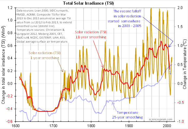
Regarding the science, let me go back to the original question, and see what I can do in the way of making my claims in a more Canadian manner. I’ll start by looking at the recent record of the “TSI”, the total solar irradiance:
 Figure 1. Monthly total solar irradiance as measured by the CERES satellite. Vertical blue line shows mid-2004.
Now, if you don’t like the data from the CERES satellite, here’s the SORCE satellite data:
 Figure 2. Daily total solar irradiance as measured by the SORCE satellite. Vertical red line indicates mid-2004. SOURCE
Note what is happening in both graphs after mid-2004 (vertical lines in both plots). As in every solar cycle, the TSI declines somewhat, and bottoms out. Then, it starts to rise again. And by the end of the datasets, in both cases the TSI is higher that it was in 2004.
So what was the scientific dispute all about, the discussion that underlies all of the bad feelings?
It revolved around the following graph from David Evans, referenced by both Leif Svalgaard and Lord Monckton, showing the basis of his predicted upcoming global cooling :
 Figure 3. David Evan’s graph of TSI (gold line), along with a centered 11-year moving average of the TSI data (red, with dotted blue extension), and a 25 year unspecified smooth of temperature, presumably a trailing average (blue line). (Click to enlarge)
Now, as you can see, the bright red line basically falls off the edge of the earth around 2004. The note says “The recent falloff in solar radiation started somewhere in 2003-2005″.
However, a look at both the SORCE and the CERES data shows no such “falloff in solar radiation”, neither precipitous nor otherwise. In fact, both datasets agree that by 2013 the TSI was well above the level in mid-2004.
Since there is no fall in the underlying data of any kind, why does the red 11-year average line show abrupt cooling starting around 2004?
The answer lies in the various problems with the graph.
• The TSI data is a splice of three datasets, with two of them showing the post-2000 period. This is a huge source of potential error in itself. However, it gets worse.
• One of the spliced datasets is the Lean TSI reconstruction, an outdated dataset that the authors of the reconstruction themselves admit is inaccurate.
• Another is the PMOD dataset. It is known to be reading low by 0.2 W/ms at the solar minimum, introducing a spurious apparently strong recent “cooling” where none exists.
• The 11-year centered average is an extremely bad choice for a filter for sunspot/TSI data. Because the solar cycle varies both longer and shorter than 11 years, at times the 11-year average actually reverses the sense of the data, converting peaks into valleys and valleys into peaks. Look at the period from 1760-1800 in Figure 3, for example. What is happening is that the frequency data is getting strongly aliased into the amplitude data. As a result, the average can end up far from the reality, particularly at the ends of the dataset.
For another example, look at the period just after 1740 in Figure 3. The 11-year average takes a huge vertical jump … but meanwhile back in the real word, the TSI itself is not rising at all. It is falling. Clearly, the large vertical jump in the red line is totally spurious.
• The TSI data has had about 900 days of “data” added to it using an arbitrarily chosen value. This is shown by the blue dots which indicate a continuing drop in the temperature.
So regarding the question of why the red line is acting so strangely, the answer is that we have a perfect storm of spliced data, bad data, arbitrary “data” added to the spliced bad data, and an extremely poor filter choice.
And as a result, the red line doesn’t represent reality in any shape or form. There is no precipitous drop in TSI starting around 2004. It doesn’t exist. Sure, the 11-year average says clearly that there is a huge drop starting around that time … but the actual data says something entirely different, as shown in Figures 1 and 2.
Now, in the heat of the moment Leif described the red line as being “almost fraudulent”. I think this was an over-reaction, but perhaps an understandable one. After all, if the red line were flipped over vertically it would make a lovely hockeystick, and if someone claimed warming was coming based on that hockeystick, people would call them alarmists … and calling someone an alarmist is certainly a close relative of calling them “almost fraudulent”.
However, my guideline is, never ascribe to malice what is adequately explained by error and misunderstanding. So I do not call their red line fraudulent, nor did I do so in the original discussion. Instead, I say that it is an error resulting from a misunderstanding. In any case, let me suggest that we leave out all ascription of motive and intent, that goes nowhere, and that we return to the science.
A more scientifically neutral description of the red line is that it is highly inaccurate and potentially misleading, because the apparent drop starting in 2003-2005 is simply an artifact of a combination of bad data and bad filtering.
Finally, to the degree that David Evans’ model predicts future cooling based on the red line, it is already falsified.
That is what I was trying to say, and I believe (subject to correction) that was what Leif was pointing out as well.
In closing, I will endeavor in this thread to keep my comments on as scientific a basis as possible, to avoid any personal references, and to not ascribe motive or intent. I request that everyone do the same. Many toes have already been stepped on in this discussion. Let’s see if we can simply discuss the science.
My best to all,
w.
VERY IMPORTANT: It is important in general, and in this discussion in particular, that you QUOTE THE EXACT WORDS THAT YOU DISAGREE WITH. Note that this doesn’t mean just referencing their entire comment. Quote the exact words of their comment that you think are in error, and tell us why you think those words are wrong. If you do not quote the exact words that you disagree with, none of us will know what you are referring to … and out of such misunderstandings grows animosity and misunderstanding.
Finally, please don’t delve into the rights and wrongs of what has happened in the previous discussions. I am not interested in the slightest in ascribing blame or responsibility. I have accepted my own responsibility for my own actions and apologized for wherever I was over the line. What I or the others did in the past is a blind alley, so please confine your comments to the science, and as the saying goes, “Let the dead past bury its dead”.
as a matter of fact
http://en.wikipedia.org/wiki/File:Solar_Spectrum.png
why [on earth] are we concentrating on knowing TSI (the yellow area)
instead of knowing ESI (the red area)
which is relevant for knowing what heat is actually getting on my head?
Does anyone have an answer to this question?
AJB says:
July 17, 2014 at 11:04 am
Chris4692 says July 17, 2014 at 8:45 am
Mr. Evans’ graph (Figure 3) is not a running mean, it is a centered average.
What’s the difference? It uses a weighting scheme determined by SSN peak and trough metadata (either official max/min times from an input table or derived) to suppress variable frequency edge distortion that results from using a fixed averaging window. Read the code.
The comment I was addressing was about the signal being inverted. As I understand it, a running mean is placed on the graph at the end of the period being averaged. If that is the case, of course the cycles near the length of the average will appear to be inverted. That’s an artifact of how the results were chosen to be presented, not a characteristic of the data, and not specifically of the method of analysis. It is a characteristic only of the chosen method of presentation. If it bugs you, center the mean.
Jon says:
July 17, 2014 at 12:25 pm
Why does not the extra 100W/m2 show up in the data?
Because the ‘data’ shows the ‘anomaly’, that is the deviation from a long-term [30 years] average.
On much longer term the 100 W/m2 do show up, namely in glaciations, where the 100 W/m2 shows up as a 5 degrees C difference in temperatures.
Bill Illis says:
July 17, 2014 at 8:19 am
Bill, as always your comments are thought-provoking. I find no fault with your figures. However, there are a couple of caveats.
First, as I’ve shown in a large number of ways, and as David Evans agrees, there is no evidence of any ~ eleven year sunspot related cycle in any of the climate datasets. Since the peak to peak variation in TSI is much larger than the change from one cycle to the next, this indicates that the sun is NOT affecting the earth.
David Evans explains that with a hugely complicated theory invoking a notch filter, atomic bomb testing, and an 11-year delay.
I explain that with the idea that the temperature is thermostatically controlled and thus not a function of forcing.
Second, you say the ~ 0.1 W/m2 decrease in forcing would be meaningful if “it accumulated over 5 or 11 years”. But since the variation in TSI from solar minimum to solar minimum is small, the average change in TSI is only have the size of the instantaneous difference at the peak.
Finally, we have no evidence that the accumulated effect of the sun has any effect. While claims have been made about the Maunder and Dalton minima, the pattern of the cooling does not correspond with what we would expect—in both cases, the warming started well before the sun’s output ramped up. Until someone can answer that question, I hold that the effect is coincidental. Heck, according to most reconstructions the Maunder wasn’t at the beginning of the Little Ice Age, nor was it the coldest part of the LIA, so the claim that the Maunder was the cause of the LIA doesn’t hold water.
So while your idea is certainly appealing, and theoretically possible, I fear that we have no evidence that such a small change in insolation has any effect.
w.
Chris: ” As I understand it, a running mean is placed on the graph at the end of the period being averaged….. ”
You don’t understand it. I have pointed out that you need to read the information provided but you prefer to continue posting your ill-informed comments. Please feel free to come back when you know enough about the subject to comment.
Willis Eschenbach says:
July 17, 2014 at 12:01 pm
Thanks for your response, Christopher. I will let Leif respond to this part. However, given the number of charges of actual fraud against alarmist scientists that you have leveled against scientists in the past, I find it curious that you are so sensitive when your own side is accused of being “almost fraudulent” … and I find it odd that you advocate “minimum standards of courtesy in scientific discourse”. You were happy to accuse the IPCC of using a “fraudulent statistical technique” for using what you thought was an inappropriate statistical method in FAQ 3.1 but which they defended as being appropriate for the purpose. It’s OK for you to yell FRAUD! when you disagree with someone’s statistical analysis, but not for anyone else?
I thoroughly endorse these remarks Willis, I hope Monckton’s ‘minimum standards of courtesy’ include eschewing the use of the ‘ad hominem’ attack, which he resorts to at the slightest provocation.
neillusion says:
July 17, 2014 at 10:02 am
So sayeth the anonymous man who can walk away from that very claim if it proves incorrect …
w.
further to my previous comment
I am assuming that most here understand that TSI is the yellow+red
ie everything under the chi square type distribution (blue line)
geronimo says:
July 17, 2014 at 10:08 am
Neither one. My apology was clear and complete and blamed no one. Sorry you don’t like it, but as you are not among the people I’m apologizing to … so what?
By the way, is there some sort of test you have to pass to become part of the Apology Police, or do you just appoint yourself? And is there a uniform and a badge? Do you have to make an test apology for e.g. getting on my case without quoting my words, just to prove you know how to apologize in the official approved fashion? Did you have special training in the proper method?
Gotta say, my friend, your assumed moral superiority is … well … assumed, whether you are anonymous or not. I’ve apologized in the best manner and as completely and thoroughly as I know how. You don’t like it? You think your way of apologizing is the only right, correct and proper way? As Anthony said … tough noogies.
Now, can we get back to the science?
w.
MarkD says:
July 17, 2014 at 10:18 am
So sayeth the anonymous man, who can walk away from those very words at any time …
Mark, I listen to a man with skin in the game far more than I listen to someone anonymous like yourself. Sorry, but that’s the way of the world. My reputation is on the line. Yours isn’t, and your claim that that makes no difference in the real world is simply not true.
Science is different, as I specifically said, because scientific statements are subject to falsification. But anonymous opinions? Not the same in any manner.
w.
Willis says
Now, can we get back to the science?
henry says
eishhh
this is what I have been saying all along…
Cannot get no reaction..
“lsvalgaard says:
“Jon says:
Why does not the extra 100W/m2 show up in the data?”
Because the ‘data’ shows the ‘anomaly’, that is the deviation from a long-term [30 years] average.
On much longer term the 100 W/m2 do show up, namely in glaciations, where the 100 W/m2 shows up as a 5 degrees C difference in temperatures.”
http://www.leif.org/research/TSI-through-a-year.png
Your graph showes the effect of the Earth being closer to the sun in Winter than during summer. Earth gets up to 100 W/m2 more radiation during Winter, october-march, than during summer, april-september.
This shows the actual global annual temperature month for month
http://wps.prenhall.com/wps/media/objects/2513/2574258/pdfs/E17.9.pdf
Why is Earth warmer in the summer, April-september, when it gets up to 100 W/m2 less radiation fromthe Sun?
Chris says:
July 17, 2014 at 10:58 am
Great. Now the anonymous Apology Police have a member who knows what I am thinking, and that I am “deliberately” doing bad things. I guess there’s no limit to their powers …
w.
“From my position, I’m damned if I do, damned if I don’t.”
I suppose that is true, although Willis could always get his own blog and make everyone happy.
I’m not going to bring anything up with Willis, he’s made it clear he doesn’t care what commenters think (despite the fact he wastes an awful lot of words for someone who doesn’t care.) Isn’t this YOUR blog? Reclaim it!
Jon says:
July 17, 2014 at 12:58 pm
Why is Earth warmer in the summer, April-september, when it gets up to 100 W/m2 less radiation from the Sun?
When is it summer in Australia?
It has to do with the angle at which sunlight strikes the ground.
http://www.enchantedlearning.com/subjects/astronomy/planets/earth/Seasons.shtml
You can’t read it seems. I plainly said that I stopped reading your stuff, but did read this one. It was the title. I just knew you would not really apologize and I was right. But if you can fell better about yourself after making the ridiculous claim that I made “such an obviously false claim” then so be it. No doubt you will quote the Buddha in defense of your blatant projection. But the only “discredit” is in your own small and insecure mind — and I don’t see that as much of a problem to me.
You can also make all the demands you want to make, but your glee at the closure of the physics journal was open and blatant. Your every word dripped of your ill concealed pleasure that those people were silenced. Just as your “apology” in this post was not an apology (not one at all) for the horrendous accusations you made at JoNova’s site. You got hammered there because there was no kid glove moderation to protect you. What you fail to understand is that you are making an impression on thousands of people with your antics. It is their judgment that you need worry about — not mine. You lost me a long time ago even though we agree on a lot in regards to science.
No one could damn you more than you did yourself in the above quote from this thread. Dr. Evans laid out how he was going to make his data, code, and methods available from the get-go. Only an idiot (or a disingenuous person) could compare what he did to Dr. Mann’s actions.
Keep digging fellow, this is something to watch.
Jon says:
July 17, 2014 at 12:58 pm
Good question, Jon. The main reason is the unequal distribution of the land, with most of it being in the Northern Hemisphere. The land warms and cools much more rapidly than the ocean, so the globe as a whole is warmer in the NH summer.
The second reason is more subtle. Despite the fact that the instantaneous insolation is largest in January when the southern hemisphere is tilted towards the sun, in fact over the year both hemispheres receive the same amount of total energy. This is because when the earth is close to the sun, it is moving faster and so it spends less time close to the fire. And on the other hand, when it’s further from the sun it moves more slowly, and so it spends more time collecting sunlight. Because of the immutable laws of physics, these two exactly balance out, and so both hemispheres get the same energy. At that point, the unequal distribution of the land makes all the difference.
w.
Dr. Jay Cadbury, phd.
@Leif
“Why is earth warmer in the summer when it gets up to 100W/m2 less radiation from the sun”
That is a bad question. Depending on where you live, you will be getting more radiation from the sun in the summer months.
Willis “I explain that with the idea that the temperature is thermostatically controlled and thus not a function of forcing.”
That is as simplistic as “it’s the sun stupid”.
I think you are essentially correct for the tropics where you started. Extending that to whole planet is IMO so far unjustified.
My volcano stack graphs show clear differences in response between tropics and ex-tropics.
I know you’ve seen them, but I’ll include a link for reference:
http://climategrog.wordpress.com/?attachment_id=312
Tropics maintain degree.day product, ex-tropics simply return to previous temps but loose degree.days.
You make the logical error in confounding no correlation with no statistically significant correlation, it is not identically the same thing. If there is sufficient noise and other variability, there may be a correlation that is not “statistically significant” on one time scale, that does not prove that the effect does not exist or is not statistically significant on a different time scale.
You hang your hat on the idea that if you can show that the 11y cycle has no statistically significant correlation, the sun has no effect on any time scale.
That is not necessarily true. Your test is neither necessary nor sufficient ( in the mathematical sense of the terms. ).
I can find a fairly good match to the Pinatubo volcanic forcing in SST but it’s not significant in relation to surrounding variability. So I did not use it. That does not mean it does not exist, it just means it can not be used to draw conclusions of any certainty. If there is a feedback controlling tropical SST there must be an effect to trigger the feedback. Even when the ‘governor’ kicks in the control variable ends up slightly displaced.
http://climategrog.wordpress.com/?attachment_id=884
That study shows that volcanic forcing is being played down in order to make the models work without giving up the high sensitivity and +ve feedbacks.
I think that is direct proof of your thermostat hypothesis for the tropics. That result can not be automatically extended to the entire planet.
Dear Willis,
I can understand critiques of smoothing processes on time series data. That can easily go wrong. But somehow it must be possible to assess whether the cumulative tsi over a window of x years shows any trend. What if we took the area under the tsi graph and slided a window of x years over the whole graph? Do it for all x and see which one resembles the temperature record the most. For x = 11, would it look vastly different that the smoothed graph from Evans? Furhermore, for all x, make a delay of y years to see if that makes the result fit better with the temperature record. One particular pair of x and y would lead to the best fit. Then we would very much like to see how this “Best” graph looks like compared to temperature.
Just an idea
Regards Thorsten
Mark Stoval (@MarkStoval) says:
July 17, 2014 at 1:08 pm
I can’t make any demands at all, nor do I. However, since despite repeated requests you haven’t come up with a quotation showing my purported “glee” … sorry, not interested.
As to whether the people were “silenced”, as near as I can tell their claims only got louder. And as I said at the time, they got more publicity for their ideas because of the contretemps than they would have ever gotten from publishing them in some obscure journal. As John Robertson said on that thread:
Truly, Mark, you’re way off base here. I didn’t think that they were silenced, that’s your fantasy, along with everything that flows from that flawed interpretation of my (unquoted) words.
In any case, folks, unlike Mark I do provide citations and quotations. That discussion is here. I leave it to the reader to discern my purported “glee”, I can’t find it.
w.
A note on the accusations that those who use a “handle” or “nom de plume” or a “screen name” are anonymous cowards whose opinions are “worthless”.
I have read this sort of defense here often. It is a version of the ad hominem rhetorical technique. It is going after the man and not addressing the argument itself. I would hope that those who use this technique all the time realize that only the easily fooled person buys into that argument. I hate to see it used here as it debases the whole tone of the site.
I see it said that only those “with skin in the game” have opinions worthy of respect. Heifer dust! No opinion is worthy of respect without logical backing and that backing does not depend on the name of the person. (or else that is an appeal to authority is it not? There is a name for that fallacy also)
So: could we cut the crap about screen names reducing a person’s worth here?
RE: “I fear I waxed wroth.”
Who is “Wroth”?
“Nor is it surprising that you think this post of yours was “mending fences”. ”
Hey, you know a cowboy’s idea of mending fences starts with a hammer and lots of barbed wire 😉