Guest Post by Willis Eschenbach
Recently there have been a number of accusations and bad blood involving myself, David Evans, Joanne Nova, Lord Christopher Monckton, and Leif Svalgaard. Now, I cannot speak for any of them, but on my part, my own blood ended up mightily angrified, and I fear I waxed wroth.
However, I see no point in rehashing the past. What I want to do is to return to the underlying scientific questions. In that spirit, I apologize sincerely and completely for wherever I put in “something extra” in the previous discussion. In Buddhism, there’s a concept called “something extra”, and one is enjoined to avoid putting in “something extra”.
It is explained in the following way:
If I say “I am angry” that is simply a true statement.
But if I say “You made me angry”, that is something extra.
So I ask any and all of you to please accept my sincere apologies for whatever what I said that was something extra, so that we can move past this difficult time and get back to discussing the science. Both sides have legitimate grievances, and I am happy to make the first move to get past all of them by apologizing to all of you for whatever my part was in the bad blood. I hope that the other participants accept my apology in the spirit of reconciliation in which it is offered, and that we can move forwards without rancor or recriminations.
Regarding the science, let me go back to the original question, and see what I can do in the way of making my claims in a more Canadian manner. I’ll start by looking at the recent record of the “TSI”, the total solar irradiance:
 Figure 1. Monthly total solar irradiance as measured by the CERES satellite. Vertical blue line shows mid-2004.
Now, if you don’t like the data from the CERES satellite, here’s the SORCE satellite data:
 Figure 2. Daily total solar irradiance as measured by the SORCE satellite. Vertical red line indicates mid-2004. SOURCE
Note what is happening in both graphs after mid-2004 (vertical lines in both plots). As in every solar cycle, the TSI declines somewhat, and bottoms out. Then, it starts to rise again. And by the end of the datasets, in both cases the TSI is higher that it was in 2004.
So what was the scientific dispute all about, the discussion that underlies all of the bad feelings?
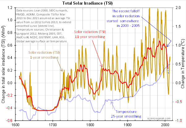
It revolved around the following graph from David Evans, referenced by both Leif Svalgaard and Lord Monckton, showing the basis of his predicted upcoming global cooling :
 Figure 3. David Evan’s graph of TSI (gold line), along with a centered 11-year moving average of the TSI data (red, with dotted blue extension), and a 25 year unspecified smooth of temperature, presumably a trailing average (blue line). (Click to enlarge)
Now, as you can see, the bright red line basically falls off the edge of the earth around 2004. The note says “The recent falloff in solar radiation started somewhere in 2003-2005″.
However, a look at both the SORCE and the CERES data shows no such “falloff in solar radiation”, neither precipitous nor otherwise. In fact, both datasets agree that by 2013 the TSI was well above the level in mid-2004.
Since there is no fall in the underlying data of any kind, why does the red 11-year average line show abrupt cooling starting around 2004?
The answer lies in the various problems with the graph.
• The TSI data is a splice of three datasets, with two of them showing the post-2000 period. This is a huge source of potential error in itself. However, it gets worse.
• One of the spliced datasets is the Lean TSI reconstruction, an outdated dataset that the authors of the reconstruction themselves admit is inaccurate.
• Another is the PMOD dataset. It is known to be reading low by 0.2 W/ms at the solar minimum, introducing a spurious apparently strong recent “cooling” where none exists.
• The 11-year centered average is an extremely bad choice for a filter for sunspot/TSI data. Because the solar cycle varies both longer and shorter than 11 years, at times the 11-year average actually reverses the sense of the data, converting peaks into valleys and valleys into peaks. Look at the period from 1760-1800 in Figure 3, for example. What is happening is that the frequency data is getting strongly aliased into the amplitude data. As a result, the average can end up far from the reality, particularly at the ends of the dataset.
For another example, look at the period just after 1740 in Figure 3. The 11-year average takes a huge vertical jump … but meanwhile back in the real word, the TSI itself is not rising at all. It is falling. Clearly, the large vertical jump in the red line is totally spurious.
• The TSI data has had about 900 days of “data” added to it using an arbitrarily chosen value. This is shown by the blue dots which indicate a continuing drop in the temperature.
So regarding the question of why the red line is acting so strangely, the answer is that we have a perfect storm of spliced data, bad data, arbitrary “data” added to the spliced bad data, and an extremely poor filter choice.
And as a result, the red line doesn’t represent reality in any shape or form. There is no precipitous drop in TSI starting around 2004. It doesn’t exist. Sure, the 11-year average says clearly that there is a huge drop starting around that time … but the actual data says something entirely different, as shown in Figures 1 and 2.
Now, in the heat of the moment Leif described the red line as being “almost fraudulent”. I think this was an over-reaction, but perhaps an understandable one. After all, if the red line were flipped over vertically it would make a lovely hockeystick, and if someone claimed warming was coming based on that hockeystick, people would call them alarmists … and calling someone an alarmist is certainly a close relative of calling them “almost fraudulent”.
However, my guideline is, never ascribe to malice what is adequately explained by error and misunderstanding. So I do not call their red line fraudulent, nor did I do so in the original discussion. Instead, I say that it is an error resulting from a misunderstanding. In any case, let me suggest that we leave out all ascription of motive and intent, that goes nowhere, and that we return to the science.
A more scientifically neutral description of the red line is that it is highly inaccurate and potentially misleading, because the apparent drop starting in 2003-2005 is simply an artifact of a combination of bad data and bad filtering.
Finally, to the degree that David Evans’ model predicts future cooling based on the red line, it is already falsified.
That is what I was trying to say, and I believe (subject to correction) that was what Leif was pointing out as well.
In closing, I will endeavor in this thread to keep my comments on as scientific a basis as possible, to avoid any personal references, and to not ascribe motive or intent. I request that everyone do the same. Many toes have already been stepped on in this discussion. Let’s see if we can simply discuss the science.
My best to all,
w.
VERY IMPORTANT: It is important in general, and in this discussion in particular, that you QUOTE THE EXACT WORDS THAT YOU DISAGREE WITH. Note that this doesn’t mean just referencing their entire comment. Quote the exact words of their comment that you think are in error, and tell us why you think those words are wrong. If you do not quote the exact words that you disagree with, none of us will know what you are referring to … and out of such misunderstandings grows animosity and misunderstanding.
Finally, please don’t delve into the rights and wrongs of what has happened in the previous discussions. I am not interested in the slightest in ascribing blame or responsibility. I have accepted my own responsibility for my own actions and apologized for wherever I was over the line. What I or the others did in the past is a blind alley, so please confine your comments to the science, and as the saying goes, “Let the dead past bury its dead”.
Mods:
My comment at July 17, 2014 at 6:46 am went into moderation. I can see no reason for that as I tried to not use any of the names that trigger this sort of thing. I must have missed a word or name that I did not know about.
I also see that all changes in solar input is most intense in the tropics, where it heats the ocean. All the ocean data shows a cooling of the upper 100 meters starting around 2003, most say a cooling in the upper 300, and a few see cooling in the upper 700. That seems to be a most interesting correlation.
John Finn: “The problem is any agreement breaks down after about 1980 – which agrees EXACTLY with the warmist claim that CO2 increases caused climate changes outside the range of natural variability..”
No it doesn’t.
I see what you are arguing but it does not. Certainly not EXACTLY. There should be significant AGW by 1960. If it starts in 1980 there’s a problem.
One thing that does fill the gap is the warming effect [sic] of volcanoes:
http://climategrog.wordpress.com/?attachment_id=902
http://climategrog.wordpress.com/?attachment_id=955
Now that looks to me like direct observational evidence of a change in energy flux large enough to account for most of the OMG run away global warming that was freaking everyone out at the end of the century. It also has the added benefit of being flat since 1998 , which matched the temp record rather well.
BTW there are some here that are interested in determining the science of what is driving climate, if that ends up determining the effect of AGW as significant , that’s the way it is. I’m not going to refuse to accept a solar model because it might give the wrong answer.
We’ve seen enough of that mentality already.
Greg Goodman says @ur momisugly July 17, 2014 at 5:59 am:
Reminds me of a lecture I read a few years back:
I have been using the same nom de plume since the Usenet days. The usage of such has been common since at least the 18th century. I’m keeping it.
John Slayton says “He was in fact not at all upset when the speakers raised their voices and pounded the podium, because only then could he be sure that they really believed the ridiculous things they were saying.”
Yes — passion indicates conviction and belief. Challenge exists to test your conviction. Do you REALLY believe it or are you just trying to sell me a used car? This has been on the front of my mind since Climategate — who are the True Believers and who just wants more government grants?
But it can go either way. The really certain person might realize it is “impossible to fill a cup that is already full” and not bother to try. I’m that way with the Nikon/Canon digital camera feud or the Microsoft/Apple religious battles. Use whatever you like and I will do likewise. Libertarian!
I am going to say one thing. There are those who do not believe in solar/climate connections and those who do believe in solar/climate connections and neither side is going to be able to convince the other side they are correct.
For my part I will keep showing the latest research and past data which shows clearly there is a solar/climate connection.
Mark Stoval (@MarkStoval) says:
July 17, 2014 at 6:55 am
===
Mark, it was in your quote from MoB…..
had accused Dr Evans of being “almost (word)
Mending “fences”?
Freud would have had a moment with that choice of titles.
“I should be surprised to see a substantial cooling over the coming decade, but I should not be surprised to see a little cooling. Nor should I be surprised to see a little warming. But I can see no basis at all for the unjustifiable hostility that Dr Evans’ suggestion of forthcoming cooling has provoked.”
I don’t like colder climate so I pray to God, Allah and Buddha that Evans’ theory is wrong? 🙂
As far as TSI there are so many different data sets it makes arguing over this factor an exercise in futility.
As far as models go in predicting the climate , they are all bad because the data put into them will never be accurate or complete enough to account for all the feedbacks and possible thresholds that are in the climate system.
I rather depend on what happened in the past to predict what will happen in the future when it comes to climate.
Damn – it’s just like business. Pioneers are the ones with arrows in their backs, critics sit and pontificate, and some busy bees not in the conversation are standing on the shoulders of the innovators ready to profit handsomely.
I think we have transferred our emotions generated by anger at the billions of public funds chasing the co2 myth to one another in a quest to understand something way to complicated for the data and tools we have now.
SInce I’m a barely scientifically literate layman, I try to generalize in terms I am comfortable with.
Jo et al are pioneering, and think the sun has something to do with are climate cycles, and have made a first pass at quantifying it. Theory is predicting “cooling” and they’ll wait and see.
W et al don’t think the data is good enough, or the manipulations are good enough, to make the prediction.
Time will tell, if we ever have a temperature data set and an irradience data set we can all believe.
Hard to get when folks like NASA are consumed with ‘Muslim outreach’.
Hey, as long as they aren’t asking for an appropriation, corrupting our schools, silencing good people in the universities, distorting public policies, and diverting enormous efforts to repealing taxes that never should have been passed in the first place, I’m good with a little argument — then we can all go out for a beer.
I, like a lot of us, wish you all would get along better. For Americans, various baseball teams used to win pennants despite locker room fights and personal quarrels. The team could always get together when the game was on the line. And win. I hope this is like that cause I enjoy all of you and have made this knows through the tip jar from time to time.
Finally, to the degree that David Evans’ model predicts future cooling based on the red line, it is already falsified
Willis, you don’t understand, this statement is wrong, the artifact makes the prediction suspect, it does not make the MODEL falsified. The model is derived from the relationship between insolation and temperature over many cycles, there has to be errors in both the magnitude and timing of the sunspot cycle in the insolation data over many cycles to have any significant effect on the model, an artifact like this just gets averaged out, it has insignificant impact on the model itself. Any constant bias in any direction likewise comes out at zero frequency in the FFT and is irrelevant to the notch delay model. You need to be much more precise with your language, the model has NOT been falsified, the prediction has problems. The model as produced can be used with any dataset, use one of your choosing and let’s discuss the outcome.
On the other hand, the red line is as I recall not model output, David used this analysis to cross validate his models prediction, the prediction from the model may yet be valid even if the cross validation attempt has flaws. It’s quite possible that the large changes in solar peaks between the last 2 cycles is driving the model prediction.
Finally I’d like to say that you have somewhat redeemed yourself in apologising, there really was no reason to play the man at all, and calling David names and accusing him of fraud and concealing the model was just over the top. Please recall this next time and try to listen to what your peers here are trying to tell you, both myself and Lord Monckton were counselling you to cut the rhetoric and wait for the science but you would not LISTEN. Even now I still am repeating myself for the 4th time on how insensitive this method is to noisy signals, it has to be, it’s the way us EE’s analyse real systems and design inverse filters for controlling them, without understanding this you were at a significant disadvantage.
Well, most of your posts are not truly scientifically well thought out or deal with more than a correlation – which would never be published under per review. You do need to raise the bar.
Willis,
I have no idea what you are apologizing for because I haven’t followed it but you have clearly identified yourself as the adult in the room and for the naysayers here who haven’t had the experience of people attacking you for everything under the sun, Willis exhibited class, try to follow suit.
BTW, I enjoy your writing style as much as anything. There is always a bit of something that makes me smile.
Tom West says
With the current state of the instrumental temperature record and the shortness of the satellite data there is absolutely no way to either confirm or deny a solar connection or cycles in GAST
Henry says
Perhaps you can explain for me the data for the drop in minima that showed a perfect curve (100% correlation) indicating that there is no AGW or earthly influence?
http://blogs.24.com/henryp/files/2013/02/henryspooltableNEWa.pdf
It all begins and ends with the sun, and it starts up again,
I hope….
Monckton of Brenchley says:
July 17, 2014 at 3:56 am
Mr Eschenbach says it was “understandable” that another contributor had accused Dr Evans of being “almost fraudulent”. It was not “understandable”.
And that pretty much sums up my feelings.
I have a basic type of question concerning:
“The 11-year centered average is an extremely bad choice for a filter for sunspot/TSI data. Because the solar cycle varies both longer and shorter than 11 years, at times the 11-year average actually reverses the sense of the data, converting peaks into valleys and valleys into peaks. Look at the period from 1760-1800 in Figure 3, for example. What is happening is that the frequency data is getting strongly aliased into the amplitude data. As a result, the average can end up far from the reality, particularly at the ends of the dataset.”
Can the “11” year cycles be made time invariant? (Each cycle is assigned a start and end date and only the amplitude is considered as a metric.) This might make the prediction aspect more fuzzy but it might help on the magnitude side…
jim Steele says:
July 17, 2014 at 7:04 am
I also see that all changes in solar input is most intense in the tropics, where it heats the ocean. All the ocean data shows a cooling of the upper 100 meters starting around 2003, most say a cooling in the upper 300, and a few see cooling in the upper 700. That seems to be a most interesting correlation.
====
The ERBE data I based the volcano work on fizzles out at the end of the century. Until that point it looks fairly flat. However, since 2002-2003 there has been a gentle drop in TLS. too. That could also be a consequence of the reduction in TSI, though the effect is way smaller than the two changes of around 0.5K induced by volcanic events.
Willis Eschenbach:
Thanks for sharing your ideas and for giving me the opportunity to comment on them. You say that “…to the degree that David Evans’ model predicts future cooling based on the red line, it is already falsified.” Falsification of a model, though, takes place when the predicted relative frequencies of the outcomes of events fail to match the associated observed relative frequencies. For Dr. Evans’ model, though, there is no such thing as a relative frequency. Thus, this model is insusceptible to being falsified.
eqibno says:
I have a basic type of question concerning:
“…. What is happening is that the frequency data is getting strongly aliased into the amplitude data……”
What is happening here is that running mean actually leaks and inverts part of the signal , in a broad peak maxing at about 7.7 years.
So we see some of the shorter “cycles” like 1980-1990 end up being inverted in the running mean. http://climategrog.wordpress.com/?attachment_id=983
The solution is to use a better filter, it’s that simple.
The last solar max TSI was about 1361.8 W/m2 in 2001.
This solar max TSI is coming in at about 1361.25 W/m2.
It is, therefore, down 0.55 W/m2.
Divide by 4 and multiply by 70% (for Albedo) and the Earth is receiving 0.1 W/m2 less energy than it received at the last solar max.
That translates into a reduction of 0.15 * 10^22 joules/year of energy less that the Earth is receiving now than at the last solar max.
By way of contrast, the Oceans are warming at 0.6 * 10^22 joules/year and the land/atmosphere/ice-melt is only accumulating 0.05 * 10^22 joules/year of energy.
0.15 * 10^22 joules/year less is a meaningful amount. If it accumulated over 5 or 11 years, it would produce a cooling impact (versus current trends).
Back to the science …. or rather the math.
An 11 year moving average line moves up or down when the latest year added to the average is greater or lower than the 12 year old result that is falling out of the average. The gradient of the average line has nothing to do with whether the latest year was greater or less than the preceding year .. what matters is were those years greater or less that the 12th year old results that they replaced.
In Fig. 3, the decline in the average line around 2004 has the following notation:
‘The recent falloff in solar radiation started somewhere in 2003-2005’
This should read:
‘Around 2003-2004, the 11 year average of solar radiation started to fall off’
What this actually means is:
‘Around 2003-2005, the solar radiation significantly fell off compared to rates eleven years ago’
Though not a climate expert, I do accept that the graph truthfully tells me something interesting .. that the recent solar activity is significantly lower than a decade ago.
By the way, this is a great blog. Really interesting scientific debate with very good mediation which allows just the right amount of back and forth .. even over hurt feelings!
Rgds,
Bernie Lodge
“The new work will help advance scientists’ ability to understand the contribution of natural versus anthropogenic causes of climate change, the scientists said. That’s because the research improves the accuracy of the continuous, 32-year record of total solar irradiance, or TSI. Energy from the sun is the primary energy input driving Earth’s climate, which scientific consensus indicates has been warming since the Industrial Revolution.”
CONSENSUS STATEMENT OF THE SOLAR CYCLE 24 PREDICTION PANEL
“March 20, 2007
In light of the expected long interval until the onset of Cycle 24, the Prediction Panel has been unable to resolve a sufficient number of questions to reach a single, consensus prediction for the amplitude of the cycle. The deliberations of the panel supported two possible peak amplitudes for the smoothed International Sunspot Number (Ri): Ri = 140 ±20 and Ri = 90 ±10. Important questions to be resolved in the year following solar minimum will lead to a consensus decision by the panel.
The panel agrees solar maximum will occur near October, 2011 for the large cycle (Ri=140) case and August, 2012 for the small cycle (Ri=90) prediction.”
http://www.swpc.noaa.gov/SolarCycle/SC24/Statement_01.html