Guest Post by Willis Eschenbach
Recently there have been a number of accusations and bad blood involving myself, David Evans, Joanne Nova, Lord Christopher Monckton, and Leif Svalgaard. Now, I cannot speak for any of them, but on my part, my own blood ended up mightily angrified, and I fear I waxed wroth.
However, I see no point in rehashing the past. What I want to do is to return to the underlying scientific questions. In that spirit, I apologize sincerely and completely for wherever I put in “something extra” in the previous discussion. In Buddhism, there’s a concept called “something extra”, and one is enjoined to avoid putting in “something extra”.
It is explained in the following way:
If I say “I am angry” that is simply a true statement.
But if I say “You made me angry”, that is something extra.
So I ask any and all of you to please accept my sincere apologies for whatever what I said that was something extra, so that we can move past this difficult time and get back to discussing the science. Both sides have legitimate grievances, and I am happy to make the first move to get past all of them by apologizing to all of you for whatever my part was in the bad blood. I hope that the other participants accept my apology in the spirit of reconciliation in which it is offered, and that we can move forwards without rancor or recriminations.
Regarding the science, let me go back to the original question, and see what I can do in the way of making my claims in a more Canadian manner. I’ll start by looking at the recent record of the “TSI”, the total solar irradiance:
 Figure 1. Monthly total solar irradiance as measured by the CERES satellite. Vertical blue line shows mid-2004.
Now, if you don’t like the data from the CERES satellite, here’s the SORCE satellite data:
 Figure 2. Daily total solar irradiance as measured by the SORCE satellite. Vertical red line indicates mid-2004. SOURCE
Note what is happening in both graphs after mid-2004 (vertical lines in both plots). As in every solar cycle, the TSI declines somewhat, and bottoms out. Then, it starts to rise again. And by the end of the datasets, in both cases the TSI is higher that it was in 2004.
So what was the scientific dispute all about, the discussion that underlies all of the bad feelings?
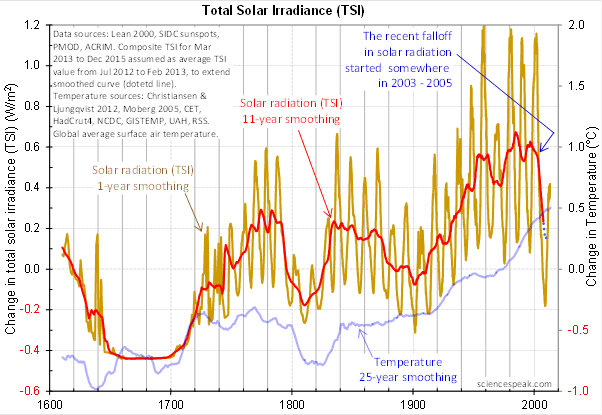
It revolved around the following graph from David Evans, referenced by both Leif Svalgaard and Lord Monckton, showing the basis of his predicted upcoming global cooling :
 Figure 3. David Evan’s graph of TSI (gold line), along with a centered 11-year moving average of the TSI data (red, with dotted blue extension), and a 25 year unspecified smooth of temperature, presumably a trailing average (blue line). (Click to enlarge)
Now, as you can see, the bright red line basically falls off the edge of the earth around 2004. The note says “The recent falloff in solar radiation started somewhere in 2003-2005″.
However, a look at both the SORCE and the CERES data shows no such “falloff in solar radiation”, neither precipitous nor otherwise. In fact, both datasets agree that by 2013 the TSI was well above the level in mid-2004.
Since there is no fall in the underlying data of any kind, why does the red 11-year average line show abrupt cooling starting around 2004?
The answer lies in the various problems with the graph.
• The TSI data is a splice of three datasets, with two of them showing the post-2000 period. This is a huge source of potential error in itself. However, it gets worse.
• One of the spliced datasets is the Lean TSI reconstruction, an outdated dataset that the authors of the reconstruction themselves admit is inaccurate.
• Another is the PMOD dataset. It is known to be reading low by 0.2 W/ms at the solar minimum, introducing a spurious apparently strong recent “cooling” where none exists.
• The 11-year centered average is an extremely bad choice for a filter for sunspot/TSI data. Because the solar cycle varies both longer and shorter than 11 years, at times the 11-year average actually reverses the sense of the data, converting peaks into valleys and valleys into peaks. Look at the period from 1760-1800 in Figure 3, for example. What is happening is that the frequency data is getting strongly aliased into the amplitude data. As a result, the average can end up far from the reality, particularly at the ends of the dataset.
For another example, look at the period just after 1740 in Figure 3. The 11-year average takes a huge vertical jump … but meanwhile back in the real word, the TSI itself is not rising at all. It is falling. Clearly, the large vertical jump in the red line is totally spurious.
• The TSI data has had about 900 days of “data” added to it using an arbitrarily chosen value. This is shown by the blue dots which indicate a continuing drop in the temperature.
So regarding the question of why the red line is acting so strangely, the answer is that we have a perfect storm of spliced data, bad data, arbitrary “data” added to the spliced bad data, and an extremely poor filter choice.
And as a result, the red line doesn’t represent reality in any shape or form. There is no precipitous drop in TSI starting around 2004. It doesn’t exist. Sure, the 11-year average says clearly that there is a huge drop starting around that time … but the actual data says something entirely different, as shown in Figures 1 and 2.
Now, in the heat of the moment Leif described the red line as being “almost fraudulent”. I think this was an over-reaction, but perhaps an understandable one. After all, if the red line were flipped over vertically it would make a lovely hockeystick, and if someone claimed warming was coming based on that hockeystick, people would call them alarmists … and calling someone an alarmist is certainly a close relative of calling them “almost fraudulent”.
However, my guideline is, never ascribe to malice what is adequately explained by error and misunderstanding. So I do not call their red line fraudulent, nor did I do so in the original discussion. Instead, I say that it is an error resulting from a misunderstanding. In any case, let me suggest that we leave out all ascription of motive and intent, that goes nowhere, and that we return to the science.
A more scientifically neutral description of the red line is that it is highly inaccurate and potentially misleading, because the apparent drop starting in 2003-2005 is simply an artifact of a combination of bad data and bad filtering.
Finally, to the degree that David Evans’ model predicts future cooling based on the red line, it is already falsified.
That is what I was trying to say, and I believe (subject to correction) that was what Leif was pointing out as well.
In closing, I will endeavor in this thread to keep my comments on as scientific a basis as possible, to avoid any personal references, and to not ascribe motive or intent. I request that everyone do the same. Many toes have already been stepped on in this discussion. Let’s see if we can simply discuss the science.
My best to all,
w.
VERY IMPORTANT: It is important in general, and in this discussion in particular, that you QUOTE THE EXACT WORDS THAT YOU DISAGREE WITH. Note that this doesn’t mean just referencing their entire comment. Quote the exact words of their comment that you think are in error, and tell us why you think those words are wrong. If you do not quote the exact words that you disagree with, none of us will know what you are referring to … and out of such misunderstandings grows animosity and misunderstanding.
Finally, please don’t delve into the rights and wrongs of what has happened in the previous discussions. I am not interested in the slightest in ascribing blame or responsibility. I have accepted my own responsibility for my own actions and apologized for wherever I was over the line. What I or the others did in the past is a blind alley, so please confine your comments to the science, and as the saying goes, “Let the dead past bury its dead”.
Greg Goodman says:
July 17, 2014 at 2:18 am
Here is what 5y time constant applied to SSN results in , compared to hadSST3.
http://climategrog.wordpress.com/?attachment_id=981
—————————————————————————
Holy Cow, Greg,
Willis has been digging hard to find any correlation between climate variables and the sun and you just posted a link to the most glaring example I have ever seen. My apologies for not showing the rest of your post, but this is important and needs to get Willis’ attention, in addition to many others.
Stan Robertson
Willis Eschenbach says:
July 17, 2014 at 1:10 pm
“Jon says:
July 17, 2014 at 12:58 pm
Why is Earth warmer in the summer, April-september, when it gets up to 100 W/m2 less radiation fromthe Sun?”
“Good question, Jon. The main reason is the unequal distribution of the land, with most of it being in the Northern Hemisphere. The land warms and cools much more rapidly than the ocean, so the globe as a whole is warmer in the NH summer.
The second reason is more subtle. Despite the fact that the instantaneous insolation is largest in January when the southern hemisphere is tilted towards the sun, in fact over the year both hemispheres receive the same amount of total energy. This is because when the earth is close to the sun, it is moving faster and so it spends less time close to the fire. And on the other hand, when it’s further from the sun it moves more slowly, and so it spends more time collecting sunlight. Because of the immutable laws of physics, these two exactly balance out, and so both hemispheres get the same energy. At that point, the unequal distribution of the land makes all the difference.
###########################
Well my starting point was Isvalgaard’s
http://www.leif.org/research/TSI-through-a-year.png
That shows that Earth is closer to the Sun during Winter. So much that during NH Winter Earth is reiving 100 W/m2 more than during summer. I think that should show up in the Data?
And I really have problems With Your story: “This is because when the earth is close to the sun, it is moving faster and so it spends less time close to the fire. And on the other hand, when it’s further from the sun it moves more slowly, and so it spends more time collecting sunlight. Because of the immutable laws of physics, these two exactly balance out, and so both hemispheres get the same energy.”
They, SH and NH spend 6 months each, and SH should according your graph collect the most radiation ?
Earths speed in Space is not a factor?
Jon says:
July 17, 2014 at 1:49 pm
That shows that Earth is closer to the Sun during Winter. So much that during NH Winter Earth is reiving 100 W/m2 more than during summer. I think that should show up in the Data?
Winter in the NH.
And it does show up very dramatically: we are no longer in a glaciation. When during NH Winter Earth is receiving 100 W/m2 less than during NH summer we have a glaciation with mile-thick ice sheets reaching down to Central Europe and past the Great Lakes in America.
The idea behind building a hypothesis is that it should be subject to the scientific method and tested ad infinitum to see if it is falsifiable. If it cannot be tested or subjected to the scientific method, then it is nothing more than conjecture.
So why does everyone get steamed when their hypothesis is tested and a peer determines it false? And why does the peer get steamed when someone else punches holes in the methods that he/she used to falsify it in the first place?
Why not, as scientists and professionals, can we not just learn from ours and others mistakes and use that knowledge (and wisdom) to perfect our science and hypothesis?
Because flaming and slaying everyone is so much easier. Isn’t it.
Isn’t it?
Greg Roane:
Thanks for sharing. You gave a partially but not completely accurate description of the scientific method. Under this method a conjecture is falsifiable and tested to see if it is falsified by the evidence. In climatology, supposedly scientific conjectures are not falsifiable thus not being truly scientific. These pseudo-scientific conjectures provide governments with their pseudo-scientific arguments for regulation of carbon dioxide emissions.
The only positive thing I can say about this thread is that it’s another example of Anthony’s willingness to present his blog warts and all with very little censorship. And this thread is one bad-ass wart.
Anonymously yours,
sleeper
Isvalgaard says
“And it does show up very dramatically: we are no longer in a glaciation. When during NH Winter Earth is receiving 100 W/m2 less than during NH summer we have a glaciation with mile-thick ice sheets reaching down to Central Europe and past the Great Lakes in America.”
When talking about the possible effects of CO2 its about 3-4 W/m2 for a doubling.
Due to Earths noncircular orbit THE EARTH for the moment receives 100 W/m2 more during NH winter than during NH summer.
SH receives totally far more radiation than the NH.
I really expect that to show up in the annual Data for the SH?
Willis Eschenbach says:
July 17, 2014 at 12:59 pm
“Great. Now the anonymous Apology Police have a member who knows what I am thinking, and that I am “deliberately” doing bad things. I guess there’s no limit to their powers …”
Chris says:
July 17, 2014 at 10:58 am
“I do not expect you to take this post from me, another anonymous commenter, seriously (though Anthony may pass along my email to you if you care to discuss directly or want to know my full name).”
I guess I called it. Anyway, Willis, if knowing my last name would make you take my post to heart, you may, as I noted initially, retrieve my email from Anthony. I protect my anonymity on a skeptical blog because of my field of work. I choose not to put my wife and children in financial risk because I don’t believe in CAGW. I hope you can understand.
Again, I hope you enjoy Montana!
Chris
Jon says:
July 17, 2014 at 2:19 pm
SH receives totally far more radiation than the NH.
As Willis explained, it does not.
Mr Eschenbach continues to try to justify his support for the very foolish allegations by another commenter here to the effect that Dr Evans had been “almost fraudulent”. In his latest attempt at justification, he relies on the fact that I had reported the IPCC to the Swiss authorities for alleged fraud. That was because, in my opinion, the IPCC had, with wilful intent to profit and to cause loss to others, published a deliberately deceptive but highly influential graph. I had first obtained an independent report from a statistician recommended to me at arm’s length by a third party. The statistician confirmed my understanding that the graph was deceptive. The deception was intentional, because the IPCC, to which I then wrote, refused either to justify the graph or to correct it. Is Mr Eschenbach seriously suggesting he considers the graph to have been correct? Or that, if incorrect, the error was inadvertent?
There was no intent on Dr Evans’ part to deceive anyone, and certainly no attempt on his part to profit thereby. Instead, he has foregone his income for some years in order to concentrate on his research. Accordingly, none of the tests for fraud is satisfied.
Mr Eschenbach continues to state that Dr Evans had used a “reconstruction that is known to be incorrect”. The IPCC no longer uses that reconstruction, but, as best I can understand what it says in AR5, it does not say it is “incorrect”. Besides, all of the datasets show the same drop in TSI as the Lean dataset if Dr Evans’ method is used, so it is manifestly irrelevant at this point whether the dataset preferred by Mr Eschenbach is used or not.
Furthermore, Dr Evans has constructed and published a model, into which Mr Eschenbach may insert any dataset he prefers. The choice of a dataset not favored by Mr Eschenbach does not render the model inefficacious. That choice is supremely irrelevant, unless one has a propensity to pick nits.
Though Mr Eschenbach is entitled to his opinion about whether Dr Evans has used “a very bad filter”, I suspect that Dr Evans may have more experience in that field than Mr Eschenbach, who may, therefore, prefer to be a little more cautious and temperate in his criticism. It may well be Mr Eschenbach whom events will show to have exhibited the “ignorance and error” of which he twice unpleasantly accuses Dr Evans, while also continuing to support the baseless allegation that Dr Evans’ actions were “almost fraudulent”, to the extent of finding them “understandable”. If Mr Eschenbach is not aware of the legal tests for fraud, he should not lend support to that manifestly baseless allegation any longer. He is now in serious danger of finding himself on the wrong end of a libel suit that – on the evidence of his extraordinary conduct in this affair – he would be certain to lose.
Worse, Mr Eschenbach demonstrates the hollowness of his “apology” by saying of Dr Evans that “it’s hard to believe that there is not bad intent in there somewhere”. It would be best if Mr Eschenbach were to spend less time shouting the odds and accusing Dr Evans of “bad intent”, and more time quietly studying Dr Evans’ model.
Worse still, yet again Mr Eschenbach accuses Dr Evans of having added 900 days of “data” to his TSI dataset. By now it should be plain that no data have been added to the dataset. The dots on the graph, which merely represent the mean TSI value from mid-2012 to early 2013 and are not, therefore, smoothed data, simply indicate that Dr Evans does not expect the TSI to continue to fall beyond the end of the solid graph of 11-year-smoothed data. They are not incorporated into the dataset, so they have not been “arbitrarily” added “to the end of the TSI”; their purpose is explicitly stated; and it is manifestly harmless. Mr Eschenbach should cease to try to taint Dr Evans by suggesting otherwise.
Next, Mr Eschenbach complains that he could not himself show a graph starting 5.5 years before the inflection point in Dr Evans’ graph because there were insufficient data. It follows that he had insufficient data to justify his criticisms of the smoothing after the inflection point in Dr Evans’ graph by reference to the satellite data. That was an elementary error on his part, and a grave one in that he used it in a further attempt to malign Dr Evans.
Bizarrely, Mr Eschenbach continues to insist that Dr Evans has not published his full model, even though Dr Evans has done so. If Mr Eschenbach were to study the model and the related material that has been made available, he will find full explanations of the parametrizations chosen by Dr Evans. Should he be in any doubt, he can write – politely, if possible – to Dr Evans asking for any specific information he has been unable to locate in what is a large corpus of work, whereupon (provided that he ceases his imprudent and unjustifiable campaign here and elsewhere against Dr Evans), he will no doubt obtain the information he demands in so unfortunate, unpleasant and public a manner.
And what is all this about Dr Evans having “spent weeks gathering adherents to his cause”? Mr Eschenbach must now desist from such inflammatory language. Dr Evans was understandably anxious to explain his ideas in outline before releasing the full code and data that have now been released. It will be for those who have sufficient skill (I, for one, do not) to evaluate Dr Evans’ work and say whether they find it meritorious. But they should not be hasty to criticize his work until they have studied it.
Mr Eschenbach says Dr Evans is “sure in the knowledge that no one will be able to falsify what he refuses to make available”. But Dr Evans has never refused to make anything available. He has made very nearly everything available already. I believe there are one or two documents still to come, but they merely summarize what is in the model rather than adding anything to it. There is certainly enough material now available to allow people to start studying the formidable body of work that Dr Evans has carried out; or they may prefer to wait until he has published the remaining items. But there is certainly nothing to criticize him for in this regard, for he has promised to release everything and continues to release material at a steady rate, indicating that there is not yet any reasonable basis for doubting his word, and certainly none for comparing him with Mr Mann, who has utterly refused to release all the code and data for the hokey-stick graph in a decade and a half.
Mr Eschenbach should now cease his campaign against Dr Evans and apologize to him without reserve.
I note that another commenter here has accused me of fraud, and has cited a particular website much of whose contents I had not previously seen. My lawyers will be visiting me early next week to deal with some of the allegations on that website.
bones says:
July 17, 2014 at 1:48 pm
Thanks, Bones. I fear without the code and data, it’s not possible to comment on Greg’s result. I’ve kind of given up looking at Greg’s graphs because he frequently doesn’t post the code and the data, so it’s useless to me … does this sound familiar? If Greg posts those, I’m happy to look at it.
Purely from visual observation, however, I’m not impressed. While the major “v” shape occurs in both datasets, there appears to be little correlation between the 11-year cycles and the temperature. Much of the time they move in opposition to each other.
Next, the degree of autocorrelation is going to be through the roof due to the smoothing (or exponential decay) of the data, so although there may be a correlation, it is likely to not be statistically significant.
Finally, the early part of the HadSST is the output of a climate model, as we have little actual observations before the earth 20th century, and not that many even then … which makes any correlation less than useful. The climate models output linear transforms of their inputs, and since their inputs include solar, the outputs are almost guaranteed to contain a solar signal … but we have no such evidence for a purported linearity of the climate.
However, as I said, if Greg posts the data and code, or at a minimum the data plus a clear explanation of the process, I’m happy to take a look at it.
All the best,
w.
some tips from the new age department
The Four Agreements are:
1. Be Impeccable with your Word: Speak with integrity. Say only what you mean. Avoid using the Word to speak against yourself or to gossip about others. Use the power of your Word in the direction of truth and love.
2. Don’t Take Anything Personally
Nothing others do is because of you. What others say and do is a projection of their own reality, their own dream. When you are immune to the opinions and actions of others, you won’t be the victim of needless suffering.
3. Don’t Make Assumptions
Find the courage to ask questions and to express what you really want. Communicate with others as clearly as you can to avoid misunderstandings, sadness and drama. With just this one agreement, you can completely transform your life.
4. Always Do Your Best
Your best is going to change from moment to moment; it will be different when you are healthy as opposed to sick. Under any circumstance, simply do your best, and you will avoid self-judgment, self-abuse, and regret.
from Don Miguel Ruiz
“but they’re still keeping those results secret as well.”
Dang, there goes that “something extra again.”
sleeper says:
July 17, 2014 at 2:18 pm
The only positive thing I can say about this thread is ……
……
There is nothing positive I can say about this thread. Anthony has clearly sold out, looking now only for click bait ……. by allowing this to continue….ad nauseum.
This blog has fallen soooooo far…
Dave Day
Willis Eschenbach says:
July 17, 2014 at 12:36 pm
Bill Illis says:
July 17, 2014 at 8:19 am
…
Finally, we have no evidence that the accumulated effect of the sun has any effect …
w.
————————————
There is certainly an accumulation effect.
The 6 month slow change in the seasons is evidence enough as well as the lags from the June and December solstices. Land, atmosphere temperatures lag (a varying) 35 days behind it and the ocean sea surface temperatures lag about 82 days behind it.
Chris4692 says: July 17, 2014 at 12:28 pm
OK if that’s your distinction then fine, except [trailing] running means (like Excel produces by default) destroy the temporal meaning completely. But never mind, David Evans is doing neither. As I said, read the code. He is using an adaptive centred running mean which takes account of varying cycle length and reduces distorion either side of short duration strong cycles fairly well for presentation purposes.
Credibility is good. So is creativity. I appreciate the creativity that characterizes many user names.
But, now I’m going to have to mentally remove our colleague Geronimo from Cochise County and transport him half way around the world. Drat it, I hate to being disillusioned…
joannenova says:
July 17, 2014 at 4:19 am
“It is not true regarding 11 year smoothed data which is the conversation is about. I don’t know why you keep repeating the strawman as if it is in reply to us”
Ouch. I’ve always admired Joanne Nova, but with a single paragraph she destroys her credibility. That doesn’t make Eschenbach right about everything nor does it make Joanne Nova wrong about everything. But you simply can’t do what Joanne Nova just did.
And next, someone’s probably going to tell me that Apache Who Knows lives in Manhattan….
Maybe (probably) I just don’t get it. But isn’t Willis’ point that the gold line in Figure 3 is in error since it does not match up with the CERES or SORCE data sets? If that’s the case, then the red line (11-year smooth) based on the gold line will also be in error, and we really don’t need to talk about the red line (I noticed some commenters are discussing the merits of the red line). Sorry if my understanding is completely wrong; I hadn’t seen the original posts Willis mentions and I am merely a lay person.
David Andrew Cochrane, Sheffield, UK says:
July 17, 2014 at 3:23 pm
Thanks, David, but I fear you’ve lost me. Joanne has repeatedly refused to reveal the results of the out-of-sample tests. How is “they’re still keeping them secret” something extra? To me, it seems like a statement of fact … what am I missing?
w.
Bill Illis says:
July 17, 2014 at 3:41 pm
Thanks, Bill. Sorry for my lack of clarity. I meant that we have no evidence of an accumulated effect over decades, not over months.
w.
Dave says:
July 17, 2014 at 3:34 pm
Thanks, Dave, but I fear I don’t understand your objection. Are you objecting because I apologized and have attempted to return to the science? Are you objecting because bystanders with no stake in the game found fault with my apology? Are you objecting because of what Joanne and Lord Monckton have posted? Are you objecting because I won’t accept advice about the manner in which I take responsibility for my own words from folks who take no responsibility for their own words?
I fear that your lack of clarity does not serve your purpose. You obviously object to something … but what?
Best regards,
w.
AJB says:
July 17, 2014 at 4:10 pm
Chris, I can’t find that in the code. What I find is a module called “Smoothing”, which contains code described in the comments as:
This seems to me to be a simple boxcar filter, which simply averages fewer and fewer points when it comes to the start or the end of the dataset.
Which model and subroutine contains the adaptive filter you speak of?
w.
Chris says:
July 17, 2014 at 2:29 pm
Chris, you accused me without a scrap of evidence of acting in bad faith, viz:
OK, fair enough … although some clue as to what the mistake I supposedly made was would have been appreciated. However, you went on to say:
Ummm … which error is “that error”?
But set that aside, I’m not “deliberately turning that error” (whatever it may be) into anything. Not my style. If I see I’ve made an error, I admit it. For example, how many bloggers out there have a post entitled “Wrong Again”?
Since your unpleasant accusation is not true, and since you have no way of knowing my mental processes or what I may have done deliberately or inadvertently … how would knowing your real name change my opinion of your willingness to make an ad-hominem claim that I am deliberately twisting the facts to suit my purposes?
Finally, I take all comments from people about the science to heart, whether they are anonymous or not. That’s how science works—it doesn’t matter who said it, it only matters whether it can be falsified or not.
However, call me crazy, but I won’t accept advice about the manner in which I should take responsibility for my own words when they are wrong, from anonymous people who never have to take responsibility for their own words, right or wrong.
Best wishes,
w.
Willis Eschenbach says: July 17, 2014 at 5:16 pm
See Smoothing, SmoothIrregularTS(). Also, Interpolate, InitializeInterpolatorForIrregularTS().
Also on Comparisons sheet, scroll down to row 85. Note solar peaks table and three compute buttons.