We’ve already discussed Cowtan and Way’s infilling of HADCRUT4 data in the post On Cowtan and Way (2013) “Coverage bias in the HadCRUT4 temperature series and its impact on recent temperature trends”. The paper is available here. In that earlier post, I presented the following graph and noted:
If we compare the HADCRUT4 data to the CMIP5 models (historic and RCP6.0) for the period of 1997 to 2012, Figure 1, we can see that the models over-estimate the warming from 65S to 65N (the vast majority of the planet) and underestimate the warming at the poles. Therefore, if the Cowtan and Way (2013) data are increasing the warming in the Arctic, they are creating a greater divergence from the models there, but failing to reduce the differences between the models and data where the models overestimate the warming.

Figure 1
(I changed the above Figure number for this post. It was Figure 9 in the earlier post.)
The Cowtan and Way (2013) data do increase the warming at the poles and exaggerate the failings in the models there, while doing little to explain the hiatus in the non-polar regions, which make up about 90% of the planet.
Note: For those not familiar with the type of graph shown in Figure 1: It illustrates the warming and cooling rates of the HADCRUT4 data, and the average of the CMIP5 (IPCC AR5) climate runs for the period of January 1997 to December 2012…the hiatus period. The vertical axis (y-axis) is scaled in deg C/decade, so we’re showing the warming and cooling rates (that is, the trends). The horizontal axis (x-axis) is scaled in latitude, so the South Pole is to the left at -90 (90S) and North Pole is to the right at 90 (90N). From 1997 to 2012, the HADCRUT4 data show the very slow warming rates (and cooling at some latitudes) extending from the mid-latitudes of the Southern Hemisphere to the mid-latitudes of the Northern Hemisphere. Both poles continue to show warming, however. On the other hand, the models do not show the lack of warming in the non-polar regions during this period. That is, they do not capture the hiatus, the pause, the halt, the cessation of global warming in the non-polar regions. And the models underestimate the warming at the poles, especially in the Arctic, and that means the models do not properly simulate polar amplification. But we already knew the models cannot simulate polar amplification—we discussed and illustrated that failing in the posts here and here.
Back to the Cowtan and Way (2013) data:
In the earlier post, I had not presented warming rates (or lack thereof) for the Cowtan and Way data on a zonal-mean (latitude-average) basis (like Figure 1)because their data is not available on a gridded basis in an easy-to-use format. However, blogger Nick Stokes made the effort to determine those trends for the Cowtan and Way “hybrid” version, for the period 1997 to 2012. (Just what we’re looking for.) See Nick’s post Cowtan and Way trends. Nick was also very kind and he listed the trends in a table. (Thanks, Nick.)
Figure 2 presents the trends of the Cowtan and Way “hybrid” data (courtesy of Nick Stokes) versus the trends of the multi-model mean of the climate models used by the IPCC for their 5th Assessment Report (AR5), for the period of 1997-2012. I’ve also included the HADCRUT4 trends as a reference (dashed lines), because they’re the basis for the Cowtan and Way data. The Cowtan and Way infilling make the models perform worse at the poles, and they had performed very badly with the HADCRUT4 data without the “help” of Cowtan and Way. And the Cowtan and Way infilling did little to eliminate the hiatus in the non-polar regions. Most notably, Cowtan and Way reduced, but did not eliminate, the cooling taking place in the Southern Ocean surrounding Antarctica, a place where sea ice has been expanding in recent decades…and where sea surface temperatures have been cooling.

Figure 2
CLOSING
The Cowtan and Way (2013) revisions to the HADCRUT4 data do nothing to explain the absence of warming that is occurring in the non-polar regions during the hiatus period. Those non-polar regions cover about 90% of the planet and it’s there that climate models cannot explain the slowdown and absence of warming. The Cowtan and Way revisions also exaggerate the warming at the poles which further undermines the current generation of climate models, because the models are unable to explain the observed warming at the poles. That is, the models are still not capable of properly simulating polar amplification.
Those who promote the Cowtan and Way (2013) revisions to the HADCRUT4 data don’t understand where the hiatus is taking place and they don’t understand the model failings at simulating polar amplification—or—they are intentionally being misleading.
SOURCES
The HADCRUT4 data and the climate model outputs are available through the KNMI
rgbatduke says:
February 22, 2014 at 8:05 am
“Yes, one of the greatest sources of idiocy in climate science is the use of a lat/long grid both in CRU and in GCM’s. ”
It is a very cylindrical set of glasses to view the world indeed. Great care needs to taken at every step to ensure you do not get a very distorted view of the situation.
rgbatduke says:
February 22, 2014 at 8:05 am
“…an automagically rescalable icosahedral tesselation and did proper adaptive quadrature and interpolation on an unbiased adaptive grid. …
Sure, that’s easy for your to say! :=)
At the following, we have this quote:
http://wattsupwiththat.com/2013/12/03/cowtan-way-and-signs-of-cooling/
But is there a warming in the Antarctica? The UAH data-set (although contradicted by the majority of the Antarctica surface-stations especially those in inland and by the RSS data-set) shows a warming both for land and ocean there.
Can we further contradict the UAH data-set, not just for the land, but the ocean too? I think we can very well.
However your Figure 1 also shows that Hadcrut4 shows warming in the Antarctic. It therefore seems as if the only two sets that show warming in the Antarctic are UAH and Hadcrut4. Is that correct? If so, then any other two sets such as GISS and RSS would have given completely different results as Cowtan and Way. Is that correct?
My own results show that it has been cooling significantly in Alaska, at a rate of -0.55 degree C per decade since 1998.
http://oi40.tinypic.com/2ql5zq8.jpg
That is almost one whole degree C since 1998. And it seems NOBODY is telling the poor farmers there that it is not going to get any better.
NASA also admits now that antarctic ice is increasing significantly.
http://wattsupwiththat.com/2013/10/22/nasa-announces-new-record-growth-of-antarctic-sea-ice-extent/#more-96133
so what we are seeing is sharp cooling from the top latitudes down which necessarily causes more condensation at the lower latitudes. Due to energy coming free from condensation you might get a false impression at acertain places that earth is not cooling overall.
But it is.
http://www.woodfortrees.org/plot/hadcrut4gl/from:1987/to:2015/plot/hadcrut4gl/from:2002/to:2015/trend/plot/hadcrut3gl/from:1987/to:2015/plot/hadcrut3gl/from:2002/to:2015/trend/plot/rss/from:1987/to:2015/plot/rss/from:2002/to:2015/trend/plot/hadsst2gl/from:1987/to:2015/plot/hadsst2gl/from:2002/to:2015/trend/plot/hadcrut4gl/from:1987/to:2002/trend/plot/hadcrut3gl/from:1987/to:2002/trend/plot/hadsst2gl/from:1987/to:2002/trend/plot/rss/from:1987/to:2002/trend
sorry, in one of my previous comments on another thread I had asked Steven Mosher to show me the BEST data on Alaska trended from 1998 and he could or would not give this. Perhaps he will give it to me now?
bob, you are confused here. global warming certainly doesn’t require that all areas must warm equally. so there’s no point in talking about where the hiatus is taking place, etc. – there will likely always be a region that is in ‘hiatus’ somewhere. greenhouse gases cause a global energy imbalance, so assessing their impact requires a global temperature dataset. cowtan and way address the global need in a better way than do hadcrut4 or giss, and so it provides a better comparision for models.
wbrozek says: “However your Figure 1 also shows that Hadcrut4 shows warming in the Antarctic. It therefore seems as if the only two sets that show warming in the Antarctic are UAH and Hadcrut4. Is that correct?”
As you’ll recall, RSS ends their Southern Hemisphere data at 70S. So we can’t refer to it in this discussion.
From 1997-2012, GISS also shows warming in the Antarctic:
http://bobtisdale.files.wordpress.com/2013/11/figure-72.png
That graph is from the earlier Cowtan and Way post:
http://bobtisdale.wordpress.com/2013/11/19/on-cowtan-and-ray-2013-coverage-bias-in-the-hadcrut4-temperature-series-and-its-impact-on-recent-temperature-trends/
And in the post you provided, Jan Zeman showed that the GHCN (which is from the NCDC) also showed warming in the Antarctic since 1997.
Regards
In your conclusion you say,
1: “The Cowtan and Way (2013) revisions to the HADCRUT4 data do nothing to explain the absence of warming that is occurring in the non-polar regions during the hiatus period. ”
and I say, “ Cowtan and Way provided a more accurate method to include the areas that were not currently covered under the Hadcrut4 series. Their paper is only that and they don’t need to explain something that is currently well understood.”
Then you say,
2: “Cowtan and Way revisions also exaggerate the warming at the poles”
and I say, “you did not make a case for this in your article. nor has there been any reasoned critique of their methodology in the body of work. Their methods followed best practices for this type of work and they passed peer review. Your unqualified assertion, without providing any discussion on the accusation in your work, should be ignored.”
Then you say, finally,
3: “Those who promote the Cowtan and Way (2013) revisions to the HADCRUT4 data don’t understand where the hiatus is taking place and they don’t understand the model failings at simulating polar amplification—or—they are intentionally being misleading.”
and I say, “ The Cowtan and Way paper stands apart from any of the CMIP5 model runs. There is absolutely no correlation between the two. one is a model that is producing a projection of FUTURE temperatures the other is developing a more accurate way to understand the CURRENT earth’s temperatures.
–or, in other words,
Just because I say that my new electronic weather station in my backyard has a 40% better accuracy rating doesn’t mean that the weather forecast for next week is any better or worse because of it.
With regard to your southern ocean SST graph, this one is much more accurate
from http://www.hindawi.com/isrn/oceanography/2013/392632/
finally,
your critique of the CMIP5 model runs, on the gridded comparison, would be much more credible if you supplied the applicable error margins for the model projections at those latitudes. If you do, you will find that the error margins are well within region of temperatures that you are plotting from nick stokes.
[You will find the convention on this site is to “italicize” the original comment (or use blockquote html marks) and plain text for your own. Mod]
Hmmmmn.
Granted, summertime temperatures are not the only measure of whether the “Arctic” – somehow now expanded in the CAGW to include everything north of 60 latitude, but these models (deliberately ?) ignore the inconvenient fact measured by DMI at latitude 80 north continuously since 1959.
Summertime actual temperatures since 1959 have NOT increased at all. And, in recent years (since 1995) the summertime temperatures in the Arctic have been decreasing, not increasing! Now, winter temperatures have been higher and have a substantially higher standard deviation – and, from higher winter (no sun) temperatures, you can average the two and claim “Arctic temperatures are higher than ever!”
But you still have to explain why summertime temperatures have not changed through 60 years of ever-increasing CO2 levels. The theory is dead wrong. Logical of course, but dead wrong.
Now, about all those Arctic trees and grasses and bushes and flowering plants that ARE growing faster and higher and darker and longer than ever before up across the forest, taiga, tundra and grassy plains north of latitude 60….. Think THAT might increase the air temperature over land areas?
HenryP said:
“Due to energy coming free from condensation you might get a false impression at certain places that earth is not cooling overall.”
That is an interesting idea.
A cooling climate system reduces the amount of water that can be held in vapour form so the vapour condenses out.
The condensate then both increases global albedo to reduce solar input to the oceans AND radiates energy out to space faster due to the release of latent heat when the phase change occurs at a height above the surface.
That additional radiation out makes it appear that the surface is warmer but in fact it is not.,
There we have one of the pitfalls in trying to apply the S-B equation from a point within an atmosphere that contains GHGs (water vapour) capable of condensing.
The AGW theory really is full of flaws because radiative physics alone cannot account for the surface temperature beneath an atmosphere, especially if it contains a mix of condensing and non condensing GHGs.
The idea that radiative physics alone can predict surface temperatures beneath atmospheres is fundamentally flawed for a variety of reasons yet we are supposed to make global energy policy on that basis?
Madness.
.
Ric Werme says:
February 22, 2014 at 6:18 am
I think you are agreeing with me.
Am I right or have I missed something ?
C&W is an interesting exercise in not agreeing that Satellite and Thermometer can be aligned unless it is convenient to do so!
Try this for a fully aligned series of both.
http://climatedatablog.wordpress.com/combined/
If C&W can do it short term in a localised area, why not go the whole way and do it globally and for the full overlap period
Chet says: “bob, you are confused here. global warming certainly doesn’t require that all areas must warm equally. so there’s no point in talking about where the hiatus is taking place, etc…”
Nope. I’m not confused here at all. You’ve missed the obvious. Since 1997, ninety percent (90%) of the planet shows little to no warming, while the climate models indicate those regions should have warmed if (big if) they were warmed by manmade greenhouse gases.
Jai Mitchell says: “Cowtan and Way provided a more accurate method to include the areas that were not currently covered under the Hadcrut4 series. Their paper is only that and they don’t need to explain something that is currently well understood.”
Nonsense. Obviously, the absence of warming over 90% of the planet since 1997 is not well understood if the models cannot simulate it.
Jai Mitchell says: “you did not make a case for this in your article.”
Also nonsense. You obviously have difficulty comprehending Figure 2. The graph indicates that the Cowtan and Way revisions exaggerated the warming at the poles that is shown by the HADCRUT4 data.
Jai Mitchell says: “The Cowtan and Way paper stands apart from any of the CMIP5 model runs. There is absolutely no correlation between the two.”
That’s obvious. Thanks for confirming that the models perform like crap at simulating surface temperatures.
Jai Mitchell says: “one is a model that is producing a projection of FUTURE temperatures the other is developing a more accurate way to understand the CURRENT earth’s temperatures.”
Wrong again, Jai. Read the title block of the graph. The model outputs include simulations of surface temperatures based on “historic” forcings. They run through 2005. The “Future” portion (RCP6.0) is only for 2006 through 2012. Both of which are, to use your term, “current”. If the models can’t simulate the recent past, then there is no basis to view them as useful tools for predicting the future climate based on projections of future forcings.
And now, here is where you show your total and complete lack of understanding of the topics being discussed, Jai Mitchell.
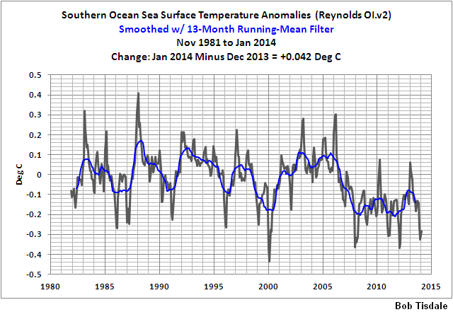
I linked the following graph at the end of my post.
http://bobtisdale.files.wordpress.com/2014/02/14-southern-ssta.png
To that, Jai Mitchell says: “With regard to your southern ocean SST graph, this one is much more accurate
from http://www.hindawi.com/isrn/oceanography/2013/392632/ ”
It’s the same dataset, Jai, or didn’t you bother to check. I presented the NOAA Optimum Interpolation sea surface temperature data (a.k.a. Reynolds OI.v2) in my graph, Jai. And the trend map you linked, assuming it’s from the paper you linked, is the NOAA Optimum Interpolation sea surface temperature data.
You waste your time every time you comment on one of my posts here at WUWT, Jai. And, more importantly to me, you waste my time because I feel obligated reply to you and show that what you’ve presented is nonsense.
Adios, Jai. Maybe you’d have a better audience for your nonsense at SkepticalScience or RealClimate or HotWhopper. They revel in that sort of stuff you spread.
Bob Tisdale says:
You waste your time every time you comment on one of my posts here at WUWT, Jai.
Jai wastes everyones’ time here. Bob is very careful with his words. That is a trait among skeptics; words matter. Assuming that words mean something else is where people like mitchell get into trouble.
Bob,
I notice you declined to mention the comment regarding the regional error boundaries for the CMIP5 models. That the current mid-latitude warming amounts are well within those uncertainty ranges. — why didn’t you speak to that???
You say that they “exaggerate” the polar warming, perhaps you need to review websters?
x·ag·ger·ate verb \ig-ˈza-jə-ˌrāt\
: to think of or describe something as larger or greater than it really is
: to make (something) larger or greater than normal
You did not show how their work was an exaggeration, and since they only more accurately captured the regional temperatures that were not previously included in the Hadcrut4 series by utilizing satellite data. This produced a reproducible increase in the testable accuracy of their method, as is described here:
For your information, “more accurate” is the opposite of “exaggerate”.
With regard to modeling, there is no discussion in Cowtan and Way regarding the accuracy of the models, they only deal with observed temperatures. Your attempt to discredit their work because of someone else’s work, on something that is completely unrelated to their work is laughable.
The reason that the graphic I produce is better is because it is more accurate, I know that this is hard for you to understand but actually using the gridded data to plot the actual graph instead of a regional average shows how much variability there is in different regions. Your graph acts like it is all one homogenous temperature pool, which is. . .
an exaggeration.
Jai Mitchell says:
February 22, 2014 at 1:27 pm
“and I say, “ Cowtan and Way provided a more accurate method to include the areas that were not currently covered under the Hadcrut4 series. ”
and I say
C&W filled in gaping holes in the thermometer series by patching in parts from the satellite series in the same way you nail planks in an emergency to make a very temporary patch for holes in a roof. Leaks like a ……
In the process they managed two remarkable things.
1. They used small subsections from the satellite series and aligned them to the thermometer series (which previously everybody has refused to align with at all) in some magical, sub section, only short term and local way. How’s that for cherry picking! Then they used sophisticated maths to try and convince everyone that what they had done was ‘proper and legal’.
2. They also managed to make the resulting trend larger in their result set than the trend in either of the two series they used as their sources. Magic indeed.
RACookPE1978, increasing ice melt in the summer could keep temps flat.
RichardLH
1. They successfully produced an accurate hybrid that utilized both thermometer and satellite data, they tested this methodology by removing about 40% of the known temperature data from the globe and reproduced the temperature series using their method. This was a successful test, they reproduced this test hundreds of times and proved that their methodology was accurate.
2. The UAH arctic temperature values are higher than the Hadrut4 values because the UAH covers about 5% more arctic area than Hadcrut4. The Cowtan and Way series is higher than both the UAH and the Hadcrut4 series because they cover the remaining 5% that the UAH does not accurately cover.
Now, this is a useful discussion regarding Cowtan and Way’s methodologies, as opposed to this tisdale piece that thinks that Cowtan and Way’s methods or work is somehow wrong because he thinks the CIMP5 2005 model runs are off.
Which, if you look at their uncertainty bands, are not.
The fact is that we know why the deeper oceans are warming at a higher rate, we know why some sea surface temperature areas are cooler than normal. We also know that the arctic is warming at a much higher rate than the UAH data (and HADCRUT4) shows.
jai mitchell holds a religious Belief that the oceans are heating up at an accelerating rate. Nothing can shake his Faith, and of course he only cherry-picks whatever supports his True Belief, and ignores all the rest.
It doesn’t matter that the ARGO buoy array doesn’t agree with his religion. jai Believes, and that is all that matters to him.
I just wish he would keep his nonsense to himself, instead of proselytizing here.
dbstealey,
You keep posting those graphics as though they mean something. your first one shows a 0-700 meter heat content that is supposedly graphed from NODC data, it says so right at the bottom of the graph.
But if I go to the ACTUAL NODC website, where you supposedly got that information, it shows this The amount of warming, with error bars, from the actual graphed measurements in this image is the same amount of warming that, if applied to the earth’s atmosphere, would raise the temperature by 38 degrees Fahrenheit (10 x 10^22 joules). This fact is incontrovertible.
also, please notice that this graphic is from the ACTUAL NODC.NOAA.GOV website, not some third-party source, like the one that you get your graphs from, but supposedly reference the nodc source.
so, yes, The oceans ARE heating up, significantly, this is what the people who actually produce the data say.
Jai Mitchell says:
February 22, 2014 at 6:30 pm
The Cowtan and Way series is higher than both the UAH and the Hadcrut4 series because they cover the remaining 5% that the UAH does not accurately cover.
The UAH data set covers 85° N to 85° S. See:
http://www.climate4you.com/GlobalTemperatures.htm#Zonal air temperature changes
With the circumference of Earth being about 40000 km, the distance from 85 to 90 would be 5/90 x 10000 = 555 km. So the area in the north NOT covered is pir^2 = 9.7 x 10^5 km2. So if we double this for the south, we get 1.94 x 10^6 km2. Dividing this by the area of the earth, 5.1 x 10^8 km2, we get about 0.38% NOT covered and 99.62% covered by UAH.
Are you suggesting that this 0.38% that we presumably do not know about can increase the real warming by the factor of 2.5 that Cowtan and Way calculated?
wbrozek,
If you follow this site (and I suspect that you do) then you know that Judith curry wrote about how the coverage in the arctic is very inaccurate due to sea ice and water vapor (dryness) issues in the arctic. She displays an image that shows very spotty treatment between 80-85 degrees north. As well as documenting other measurement error issues.
for example
So, not only is the satellite coverage distorted at the poles due to the look angle, the look angle issue actually causes the satellite to image a wider swath of an area known to produce noisy and highly uncertain microwave data. Basically, the higher the latitude of the satellite imaging past about 60N/60S, the more uncertain the data gets.
so 95% coverage for UAH is pretty damn generous.
jai mitchell,
I notice that you hid out from my proposal to let Long Bets handle this. Wassamatta, you don’t have the courage of your convictions? How you gonna get to eco-heaven like that!? Surely you can scrounge up ten kilobucks. You have friends, dontcha?
Now, you may actually believe that the government doesn’t play shenanigans with it’s public information. You may believe that the government doesn’t change their fabricated data at a later date, despite irrefutable evidence showing that they do just that. But if they didn’t show what you preposterously claim will be an upcoming “38 degree” temperature rise (!), how could they justify their $billions in taxpayer loot? I am just amazed at the credulousness of some folks who post here.
Your appeals to authority are amusing. But until you are willing to put your money where your mouth is, you have neither courage nor convictions.
Really, jai, do you take everything the government tells you at face value? Really?? That’s so cute. But if you really look at, and understand the link I posted here, you will see that the same government has deliberately, and provably, altered the temperature record in a way that claims to show faster and faster global warming. Note to jai: those records are “adjusted” in order to get people just like you on board. And you swallow their bait hook, line, and sinker.
But most of us here can see what’s happening. And it ain’t honest science.
You *do* know that ice sublimates, right? Any clue as to what that does to RH or atmospheric ‘water vapor’ content or ‘dryness’ as you put it? Bonus question: How did this ‘air’ over, or at the arctic become ‘dry’ in the first place? Any idea?
From the link you earlier cited, one finds this as well:
NOAA knows high latitude near-pole data will be noisy and not representative, so they don’t even try to display it. UAH is the same way. Between the look-angle problem and the noise generated by sea ice, their data analysis stops short of the pole. RSS does the same due to the same physical constraints of orbit and look angle.
wbrozek above also worked out some math on this: “we get about 0.38% NOT covered and 99.62% covered by UAH”
Speaking of governments, which one said “If you like your health plan you can keep your health plan”, and for bonus points, which one provided evidence before the UN for “WMD” yet (judging from all the talk) no WMDs were found?
.