Gee, the AGW meme seems to permeate everything these days. Here’s a place where I least expected it to show up, the venerable Astronomy Picture of the Day, one of the oldest running daily features on the Internet. The first blunder is obvious; the graphic of hurricane tracks for September 4th 2012 has nothing to do with astronomy or NASA, it isn’t even remote imaging, but rather a terrestrial data plot. WUWT?

They must be running out of actual astronomy content. The caption however, is the second blunder, worse than the first. Here’s the caption, complete with links:
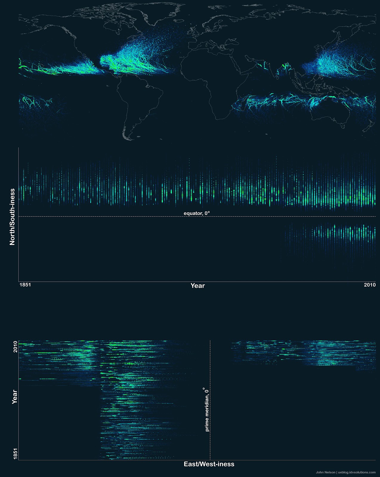
Hurricane Paths on Planet Earth
Image Credit & Copyright: John Nelson, IDV Solutions Explanation: Should you be worried about hurricanes? To find out, it is useful to know where hurricanes have gone in the past. The above Earth map shows the path of every hurricane reported since 1851, Although striking, a growing incompleteness exists in the data the further one looks back in time. The above map graphically indicates that hurricanes — sometimes called cyclones or typhoons depending on where they form — usually occur over water, which makes sense since evaporating warm water gives them energy. The map also shows that hurricanes never cross — or even occur very near — the Earth’s equator, since the Coriolis effect goes to zero there, and hurricanes need the Coriolis force to circulate. The Coriolis force also causes hurricane paths to arc away from the equator. Although incompleteness fogs long term trends and the prevalence of hurricanes remains a topic of research, evidence is accumulating that hurricanes are, on the average, more common and more powerful in the North Atlantic Ocean over the past 20 years.
==============================================================
The explanation is fine, until you get to the “more common” section, which links to a 2005 NPR story talking about Dr. Judith Curry’s husband, Peter Webster, and a paper he wrote then.
You’d think NASA could get more up to date facts to support their claim, or even use a trusted source, such as an actual paper, rather than the highly biased National Public Radio. The interview is telling for NPR’s advocacy:
Mr. WEBSTER: At all the other ocean basins, their hurricane number has sort of stayed around much the same or decreased slightly in the last 10, 15 years.
HARRIS: So there has been no increase in the total number of hurricanes, but there have been more strong hurricanes and fewer weak ones in the past decade.
Mr. WEBSTER: In all of the basins, including the Atlantic Ocean, the number of Category 4 and Category 5 hurricanes since 1995 have doubled compared to the 1970s and the early ’80s.
HARRIS: Webster says there’s a plausible reason for this. Hurricanes draw heat out of the oceans as they build, and the sea surface temperature in the tropics has warmed by 1 degree since 1972. That may sound like a very small number, but it represents a huge amount of energy.
Mr. WEBSTER: And the interesting thing about when the sea surface temperature gets warmer, it’s like the octane level of the fuel becomes higher and higher because, as you get warmer, you start to evaporate more and more moisture.
HARRIS: Because of this, some scientists have predicted that the biggest hurricanes will become even bigger, with faster and more ferocious maximum winds.
Mr. WEBSTER: We’re not seeing that, at least in the satellite observations that we have.
HARRIS: Still, Webster says that he is seeing a global increase in big storms. It’s not just a regional trend. So he suspects there’s a global cause, and that would be global warming heating up the surface of the world’s oceans. But Roger Pielke Jr. at the University of Colorado is worried about making that link.
Yes, “global increase in big storms”, even though just moments before, Dr. Webster says he’s not seeing any evidence of bigger storms.
To their credit, they do give Pielke Jr. some time, and he’s right to be concerned.
The quote of the week in this week’s Climate and Energy News Roundup from SEPP is fitting for this NASA blunder:
In God we trust; all others bring data! – Motto of the Apollo Space Team
Indeed, and we shall. From Dr. Ryan Maue’s Tropical web page:

Figure: Historical North Atlantic tropical storm and major hurricane frequency since 1970 from the HURDAT best-track dataset. Since 1970, there have been 465 tropical storms including 102 major hurricanes (22%). Since 1995, the ratio is slightly higher (26%) or 64 major hurricanes out of a total of 250 storms. Data File

Figure: Historical North Atlantic tropical storm Accumulated Cyclone Energy (ACE) since 1970 from the HURDAT best-track dataset. It is clear from the ACE metric that the active-era since 1995 in the Atlantic is well described with a marked step increase. This is partially due to a preponderance of long-lived Cape Verde origin major hurricanes that have higher intensity and longer duration which means more ACE. ACE is the convolution or sum of the reported wind speed squared (in knots) over the lifetime of the storm. Data File
So yes, there is a slightly higher ratio of storms since 1995, but as the accumlated Cyclone Energy shows, since 2005, the “more powerful storms” meme has evaporated, much like Al Gore’s influence.
The increase in the number of storms is easy to explain, with much of the increase due to better reporting and newer technology. There’s keen interest i the North Atlantic due to U.S. interests, and the U.S. has the best hurricane tracking program in the world.
Dr. Patrick Michaels points out last Friday in this excellent essay on hurricanes:
It’s been 2,535 days since the last Category 3 storm, Wilma in 2005, hit the beach. That’s the longest period—by far—in the record that goes back to 1900.
Quite a drought. He adds:
Aren’t there more whoppers—the powerful Category 4 and 5 monsters that will mow down pretty much anything in their path? As is the case with much severe weather, we simply see more than we did prior to satellites and (in the case of hurricanes) long-range aircraft reconnaissance. As the National Hurricane Center’s Chris Landsea (with whom I have published on tropical cyclones) has shown, if you assume the technology before satellites, the number of big storms that would be detected now is simply unchanged from the past.
There’s a pretty good example of this spinning in the remote Atlantic right now, which is Hurricane Kirk, far away from shipping channels, land, and nosy airplanes. Kirk is compact enough that it would likely have been completely missed fifty years ago. If it spins up into a Category 4 (which is currently not forecast), that would be another biggie that would have gotten away, back in the day.
There’s another reason that the increase in frequency is more apparent than real: “shorties”. That’s what Landsea calls the ephemeral tropical whirls of little consequence that are now named as storms more because of our detection technology than anything else. There’s also probably an overlay of institutional risk aversion in play, as it is now recognized that seemingly harmless thunderstorm clusters over the ocean can spawn decent floods when they hit land.
There is another driver for an increase in Atlantic hurricane frequency that isn’t operating elsewhere. In 1995, a sudden shift in the distribution of North Atlantic temperatures increased hurricane frequency. Landsea predicted—at the time—that the Atlantic would soon fire up from its hurricane doldrums of the previous two decades, which it did. This type of shift has occurred repeatedly in the last century, both before and during (modest) global warming from greenhouse gases.
The influence of technology on storm reporting is something I’ve talked about in great detail before:
h/t to WUWT reader Mike Leckie for pointing out NASA’s APOTD blunder.
Any idea why there are no tropical cyclones in the southern Atlantic?
Eli Rabett says:
September 4, 2012 at 7:25 am
“Well telescopes in space can point up and down. ”
That doesn’t make it astronomy. Words mean things.
1933 had 20 tropical storms and hurricanes in the Atlantic. That was the old record 2005 beat. The charts we see never seem to go back that far.
Frankly, I’m a bit nervous about this. I have read that global wind patterns respond to the temperature difference between equater and poles. A warming planet reduces global winds and resulting hurricanes but a cooling planet causes increasing winds and hurricanes. I have been expecting more hurricanes. My question is are the poles cooling or warming? SH seems to be cooling.
I made a post on asterisk begining with a link to this WUWT page and ending with this observation on representation of uneven data collection.
The very next reply was rather unscientific
Now that’s rather closed minded.
From Eli Rabett on September 4, 2012 at 7:25 am:
http://hubblesite.org/newscenter/archive/releases/1999/14
And on a page “Last Updated: November 30, 2007” (why can’t they put a date on the article?), from NASA:
http://www.nasa.gov/vision/universe/solarsystem/hubble_moon.html
So Hubble can successfully look at the Moon.
Curious side note: The article says:
Yet I found an entry on a blog done by someone called Phil Plait, who claims to have worked on the Hubble for ten years. The actual article was hardly loading, it was very slow and not showing up so I used the Google cache. There he calculated that Hubble couldn’t see the lunar landers because “…Hubble’s resolution on the Moon is about 200 meters!” That’s around three times worse than what NASA itself says is the resolution. WUWT?
@John West…
“Warmist rule #1: Any and all possible evidence of warming must be heralded as evidence of catastrophic anthropogenic global warming.”
Warmist rule #1: Any and all possible evidence of ANYTHING must be heralded as evidence of catastrophic anthropogenic global warming.
There, fixed that for you…
Looking at the picture, it is obvious
1. Its the sun stupid.
2. More in the North because the earth is closest to sun in summer there,(hope I got that the right way round)
3. The Atlantic and East Pacific seem to be part of the same system.
Why didn’t they color code these Hurricanes and Anti-hurricanes, so that we could tell them apart.
What fraction of these severe storms (what is the total number since 1851) are the reverse rotation anti-hurricanes like the ones shown in the cover photograph on Al Gore’s book ?
If a hurricane, or an anti-hurricane, were to follow a path that crossed the equator, how long would it take for the rotational reversal to take place ?
Apparently hurricanes on the sun (sunspots), take 11 years to reverse rotation, but they are much larger.
“””””…..Grey Lensman says:
September 4, 2012 at 10:36 am
Looking at the picture, it is obvious
1. Its the sun stupid.
2. More in the North because the earth is closest to sun in summer there,(hope I got that the right way round)
3. The Atlantic and East Pacific seem to be part of the same system……”””””
Actually Grey, you got it exactly wrong. Earth is closer to the sun in Northern winters; not summers.
Just remember that Antarctic winters are much colder than Arctic winters (for several reasons), and that will help you get it right.
Stephen Rasey said (2 posts up) “Now that’s rather closed minded.”
There are forums for discussing alternative beliefs. The Asterisk isn’t one of them, which you probably know, so why come back here and complain when someone reminds you of the rules?
From Rob Stevenson on September 4, 2012 at 10:50 am:
So science itself is now an alternative belief, with the discussion of scientific theories and evidence, including real-world scientific observations, now relegated to “alternative belief forums”?
Wow! asterisk just scrubbed 5 posts, two of mine, two from Chris Peterson calling WUWT pseudoscience and “denialist”, a reply from a “C in Canada” saying he’d believe something on WUWT before NPR.
Anthony says:
“My personal experience from NPR is different than yours”
Reply:
I said the story was relatively balanced, not NPR.
My concern about the NASA graphics is the way they indicate that hurricanes only hug the coast. Yet in 1954, Hurricane Hazel retained so much wind-force (110 kph winds), not to mention rain, that it caused the deaths of 81 people in Toronto, Canada.
see http://www.hurricanehazel.ca/
@ur momisugly Garrett
I love this wording, “offers a steady, incessant drumbeat of climate alarmism that ought to be embarassing to anyone ” flowing and beautiful. thanks.
astronomers seem to all be fearful of the big bad boogeyman of climate change. the blog ‘Bad Astronomy’ is filled with rubbish from the resident doctor
More than 90% of the recorded tropical cyclone tracks around Australia are not on the map.
If you want some idea of the real number back to 1906 try:-
http://www.bom.gov.au/cgi-bin/silo/cyclones.cgi?region=aus&syear=1906&eyear=2006&cyclone=all&loc=0
There were many pre 1906 with recorded landfall but not necessarily a known track.
Looks like accumulated cyclone energy has increased since temperatures have decreased. Oh, I forgot, it is still getting warmer.
“Owlice with her admin hat on”
Could just as easily be “Owlice in blunderland”…
I would say that they’re just a half-asterisk site…..
And besides being out of date, Webster’s comparison to octane measure is bogus, bogus, bogus.
Worthy of a day at APOD, these animations a friend did of Gale Crater on Mars are quite interesting. It is disappointing that APOD has begun greening their site.
http://www.youtube.com/watch?v=Xy0yvHblTyA&feature=player_embedded
FAIL:
“… has nothing to do with astronomy or NASA”
Go to NASA web page > About NASA > What does NASA do?
You should know these things without reading the ‘about-page… just sayin’.
George Smith thanks, you said
Quote
Actually Grey, you got it exactly wrong. Earth is closer to the sun in Northern winters; not summers.
Unquote
Absolutely correct, it was late, I was tired but Inspired by the view and the pattern it recorded. I thought dang, If memory has got it wrong, somebody will correct me but that process will open new perspectives on what we see.
Looking at how Mexico seems to be a black brush stroke across a single coherent system really makes me ponder. What if the cause is from above and not below?
The differences between North and South really are striking.
Regarding my earlier post that the image looked wrong-it is. Here is a more accurate picture of the relative frequency of tropical cyclones world wide.http://upload.wikimedia.org/wikipedia/commons/2/23/Global_tropical_cyclone_tracks-edit2.jpg