This is a combination of two posts elsewhere that illustrate just how much hype and how little substance the MSM and blogs like Grist, Climate Progress. and Capital Weather Gang have been pushing trying to make a run of the mill summer heat wave seem like an event of unprecedented global warming proportions. It isn’t, and not even close compared to weather records history of the past.
Spread these far and wide, anywhere the hype manifests itself.
First from the Real-Science blog, an analysis of the 3000 new high temperature records set that gets touted by the shrill alarmists as if this never happened before and is a direct consequence of CO2 in the atmosphere. It isn’t according to the data:
==============================================================
There have been 372,989 correctly recorded daily high temperature records in the US since 1895. 84% of them were set when CO2 was below 350ppm.

Compare the number of record highs in the 1930s to the past decade. You can see that the 1930s were consistently much hotter.


=============================================================
Bear in mind, that since the 1930’s, when the majority of America (and weather stations) were rural, we now have many more large cities and many weather stations compromised (~90% of USHCN stations in Category 3,4,5 from Fall et al) by affected by urbanization encroachment.

Next up, a much broader analysis from Joe D’Aleo of WeatherBell via ICECAP:
=============================================================
Records and Extremes – Updated
By Joseph D’Aleo, CCM, AMS Fellow
Following the super La Nina of 2010/11, we had a period of extremes – snow and cold to start, then floods and drought, tornadoes and heat and a landfalling hurricane.
As the La Nina faded but the eastern and northern Pacific water remained cold, a warm and dry winter followed in 2011/12 much as the warm winter of 1918/19 followed the super La Nina of 1917/18 which was the only colder, snowier La Nina this century.
The warmth peaked in March. With the exception of the Pacific Northwest, most of the nation was well above normal with many daily record highs. Warmest March in the record books for the lower 48.

The warmth has continued but gradually subsided since then.
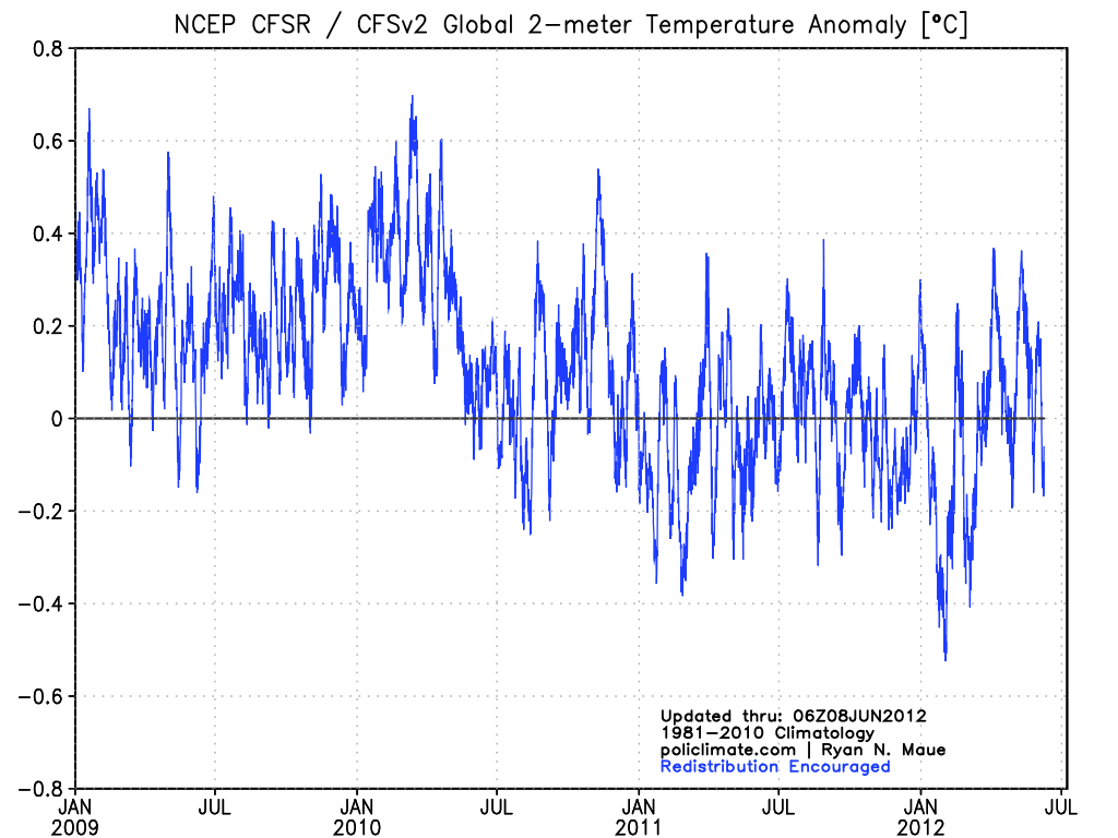
Despite the high number of record daily highs, this is a US centric warm event. The NCEP CFSv2 global anomalies from the winter through early June have been much of the time below the 1981-2010 average. The deep Eurasian cold wave shows in late January.

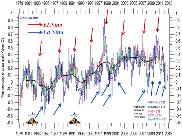
Looking back over the last century, you can explain global temperatures by ENSO and volcanism and the ocean multidecadal cycles that favor a particular ENSO state. Here is the plot since 1979 of all data sets with ENSO and volcanism indicated.

El Ninos bring a short term warming, La Ninas a dip in global temperatures. The warm mode of the Pacific from 1977 to 1998, led to a net warming. Major volcanoes produce a cooling as we saw in the early 1980s and early 1990s, lack of volcanism (like we have seen since the middle 1990s) means more solar radiation at the surface and enhanced warming.

In 1995, the Atlantic went into its warm mode, which means a warmer annual temperature in the Northern Hemisphere.

May for the US was warm again making the last year in the US allegedly the warmest in the record, but as John Christy of UAH noted from the satellite perspective, it was notable only in the lower 48 (see).
Again in the Pacific Northwest, it actually was colder than the 30 year mean for the fifth straight year.

•Spring temperatures across the Northwest Region have been trending downward at a rate of 0.59 degrees F per decade during the 30 years since 1983.
•Spring temperatures across the Northwest Region have been trending downward at a rate of 4.10 degrees F per decade during the 10 years since 2003.
A Cold west usually translates to warmth further east as we saw in the 2010 and 2011 summers.
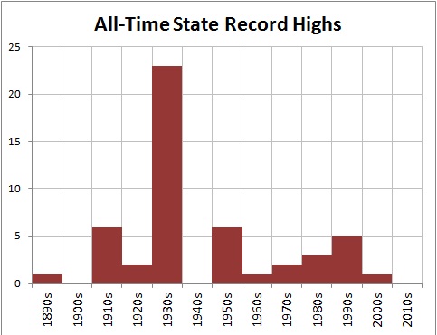
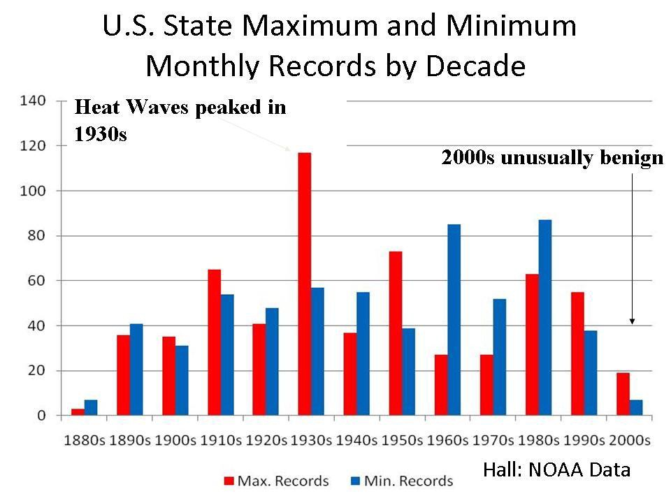
As hot as it has been the past two summers, the heat is not cracking all-time levels. Here is the latest decadal plot of all-time records for the 50 states. When multiple years are tied, the latest year/decade is used.

The 1930s stands out as the hottest decade, the 1910s and 1950s were second, 1990s third and 1980s fourth. This decade doesn’t rank although it is early.
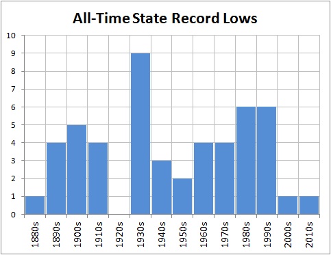
All time cold records look like this.

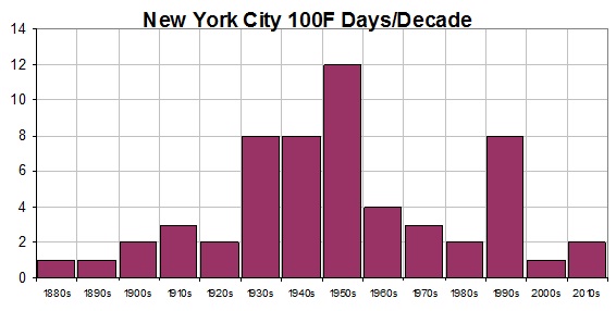
New York City reached 100F last summer, but that was common from the 1930s to 1950s.

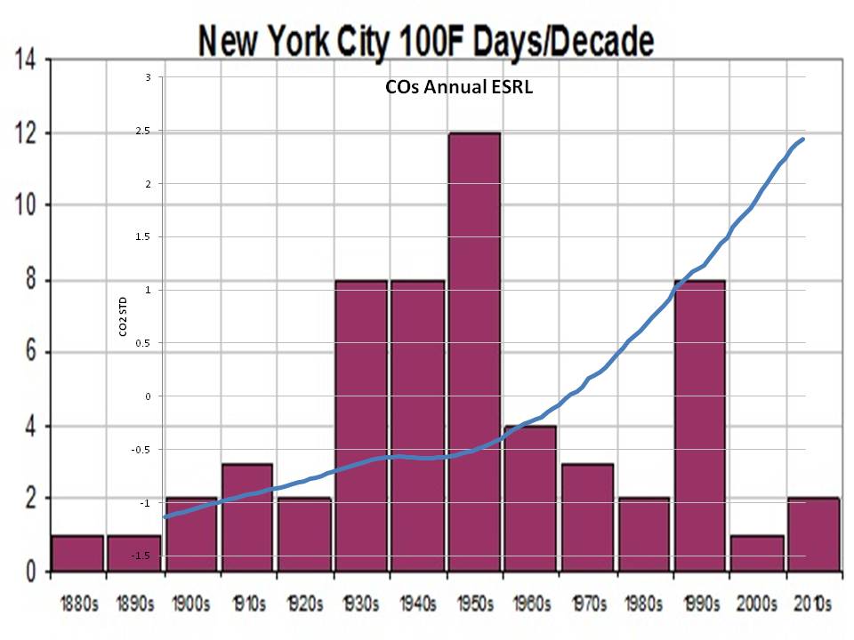
Oh by the way see how the 100 degree days compares with CO2.

Here is Des Moines which has seen fewer and fewer 100F days in recent decades.

As Steve Goddard reports “During the 1930s, 100 degree days were very common in Des Moines. They very rarely happen any more. It has been nine years since Des Moines hit 100F. By contrast, 1934 had thirty-one days over 100 – including five days over 110 and three days over 112.”
The state monthly records through the end of the 2009.. This depicts the 12 monthly records for the 50 states (600 data points). There were likely March heat records set in some states and perhaps some other months so the 2010s will show and take away from some prior years.

See Bruce Hall’s 2010 guest post on Roger Pielke Sr.’s Climate Science here.
ICECAP NOTE: ICECAP was one of the earliest ‘realist’ climate blogs that provided insight into natural factors and challenged the orthodoxy. Your donations helped us maintain the site and provide some support for the time invested in keeping it updated. One or more posts have been added a day for going on 5 years now now totaling 6,082 entries. 305,205 have enrolled as members with a total of 32,446,550 page hits. All the posts are archived. We maintain them in the archives and have a good search tool. I maintain the site as best I can – maintaining a secure site with high traffic is expensive. You can help with even small donations – see the DONATE button left or email me at frostdoc@aol.com for an address to mail a check if you prefer not using PAYPAL. Rest assure, we have never had an issue with Paypal although they get a piece of any transaction. I have had at times had to subsidize the site from month to month. I don’t like having to ask people for donations but our side despite all the claims to the contrary is not subsidized/ endowed with money and grants like the alarmist blogs like RealClimaate and Climate Progress. You will never see them ask for donations. They get all they need from their liberal foundations and eco groups.
You can also help by buying books in the Amazon store and/or enrolling as a Premium member of Weatherbell.com, where I am co-chief meteorologist with Joe Bastardi. recently Dr. Ryan Maue from FSU has joined our staff and is helping us provide model based value-added output. He maintains and has published on the ACE index. We have a weather radio show on Sunday nights 8pm to 9:30pm EDT called Wise Guys of Weather Radio. On the Weatherbell site we have the premium blogs and specialized forecasts for energy, agriculture, marine, snow, insurance and other applications on the Commercial site. Joe B has also posted on Icecap. Both Icecap and Weatherbell are 7 day a week jobs. I have also PRO BONO helped produce documents for comments to the EPA that enabled lawyers to file a science based AMICUS brief that went to the DC courts to try and stop EPA deadly overregulation. Thank you for you support over the years. Joe D’Aleo and Art Horn
Another thing to consider- record highs are for one day in the year, so we are not talking about record warmth for the year. You can have a record high on Jan 1st or August 1st so, obviously the max temperature will be quite different. So in one year at just one spot you have 365 opportunities for a record over a country with a slew (somewhere between 10,000 and 1,000,000,000) recording thermometers, some there forever and some recently in place.
I fell into the same trap as many with the logic that there should be a decline in records once one is set. But that assumes a perfect world of measuring stations (no change in locations, all starting at the same date and no new stations). Add that each can have a new record 365 times in one year and it may have only been there a few years. You only have to look at the difference in population in 1930 compared to today. That makes for a lot of new recording stations..
So the graph is a good tool for the general trend as there are just too many variables.
As a few are pointing out, re-read the graph as answering the question: how many stations had their highest temperature evah set in each decade?
Take station xyz; in the 1920s it set a record, which was eventually exceeded in the 1990s. It now counts as one station in the 1990s, but not in the 1920s. Station zyx, OTOH, had set a record in the 1940s, which was exceeded yesterday. It now counts as one in the 2010s, and one is deducted from the 1940s.
Not ambiguous.
(Consider, though, that if warming rebound after the LIA were monotonic/linear and universal, 100% of the stations would have set records this decade.)
Paul K2, I now see you posted quite a bit on the other threads about the theories of the jet stream being modulated by Arctic ice. Many of your references were to Johnny-come-lately climate alarmists who have very little background in jet stream dynamics but lots of training in low Arctic sea ice and other supposed disasters.
Mostly you and those alarmists have it backwards, the sea ice patterns are a consequence of weather patterns rather than the other way around. For example the exceptionally high levels of sea ice around Alaska this past winter were a consequence of the jet stream staying farther north with a slight dip over Alaska. That is in fact the consequence predicted by climate models which neither you nor your references are aware of. In fact low sea ice should cause less blocking as the E-W temperature differential increases and subsequently increases the jet.
It is a very poor reflection of the state of climate science when such scientists attempt to blame east coast snowstorms and other consequences of blocking on low sea ice. They simply have not studied the models from the past and are grasping at the straw that assigns the most blame to mankind.
alex,
I am sorry that you are having such a difficult time understanding such a simple concept. Perhaps this will help?
http://stevengoddard.wordpress.com/2012/07/09/alarmists-please-stop-being-idiots/
If you have further questions, please post them there.
alex says:
July 9, 2012 at 3:01 am
stevengoddard says:
July 8, 2012 at 9:19 pm
…
Every year has an equal chance of setting the daily record at each location, but in a warming world the right side would by trending upwards. According to Jeff Masters propaganda, it should be trending upwards rapidly. Obviously that is not the case.
——————————-
No, Steven.
In a non-warming world, the right side of the graph would FALL DOWN RAPIDLY.
In a warming world – as we have it! – the right side of the graph is steady. We continously get new records due to the warming trend.
=============================================
No Alex, you’re not understanding what you’re seeing. Try again. I’m not sure what you’re seeing, but if one puts a trend line on Steve’s graph you can clearly see a declining trend.
The graph is a graph of current records.
My goodness this isn’t a hard concept to grasp.
Let’s be a little patient here folks. I was a bit confused about the graph too before I read the comments. The graph seems to have been explained well by others in the comments above, but I’ll take an original stab at it myself, just in case anyone still doesn’t get it:
The numbers on the vertical axis refer to how many “reigning champion” hot days (i.e. days that had set the still-standing record for highest temperature in a particular region) happened in a given year. That means that every day since 1895 is in fair-and-sqare competition with every other day since 1895 for the record. The “winner” of the record – for each particular region being considered – is the day when the temperature was hotter than any other day between 1895 and the present. ( I will set aside the issue of ties.) The graph tells us how many of such “winners” happened in 1895, 1896, 1897, and so on.
The bottom line is that there is nothing misleading about the graph. The points for the past few years are lower than the points for most previous years because the past few summers have really not been as “impressive,” at least with respect to local daily maximums, as the summers of most past years.
Gee, I sure hope that makes things less confusing, not more! It might be worthwhile for Anthony to add a little blurb explaining the graph in the post itself, for future readers’ sakes.
In the period of 10 years including 1930 to 1939 I was able to stack a total of 62020 bricks. However, in the period of 10 years including 2002 to 2011 I was able to only stack 23951 bricks.
Of 372,989 total bricks available, in ten years periods compared to recent, most were stacked from 1930 to 1939. In fact, a rolling ten year average starting in 1936 may even show a declining trend…just maybe.
stevengoddard says:
July 9, 2012 at 5:43 am
alex,
I am sorry that you are having such a difficult time understanding such a simple concept. Perhaps this will help?
http://stevengoddard.wordpress.com/2012/07/09/alarmists-please-stop-being-idiots/
If you have further questions, please post them there.
—————————————
Sorry, Steven. No formula – nothing to discuss.
Anyway, your assertions are false.
The temperature recordings in the U.S. started earlier than 1900. That is why there is no “Y-asymptote” at the left of the graph.
REPLY: And NCDC, GISS, and others generally don’t highly cite pre 1900 records since they are most likely invalid due to improper thermometer exposure. The US Weather Bureau commissioned the Stevenson Screen at its inception in 1892, and it took a few years for them to make it the standardized exposure throughout the surface observing network. Prior to that there was a wide variance in thermometer exposure, including being mounted on the north side of buildings, under trees, out in the open with varying sizes of shelters, and even in direct sun. For this reason, pre 1900 records aren’t always representative of the true air temperature.
If you look at older plots pre-1900 you’ll see that they have a much wider variance (partly caused by this issue, some natural too) that post 1900 data.
See this:
Chenoweth, Michael, 1993: Nonstandard Thermometer Exposures at U.S. Cooperative Weather Stations during the Late Nineteenth Century. J. Climate, 6, 1787–1797.
doi: http://dx.doi.org/10.1175/1520-0442(1993)0062.0.CO;2
The nonstandard thermometer exposure practices at 118 United States cooperative weather stations in 1883 and at 394 stations in 1903 are documented from one unpublished source and one published source. Changes in the exposure practices that resulted from the introduction of the Cotton Region Shelter (CRS) in the 1880s are described. As of 1883, there were five types of thermometer exposure in use at cooperative stations: (i) screened thermometers in freestanding screens (9.9% of all exposures); (ii) screened thermometers attached to north-facing walls and windows (23.3% of all exposures); (iii) unscreened thermometers attached to walls and window casements (50.0% of all exposures); unscreened thermometers attached to porch columns and separated from the main body of the building (13.9% of all exposures), and (iv) “Glaisher-type” stands and exposures (2.7% of all exposures). By 1903, 77.7% of all stations used free-standing screens, and 14.5% used north wall screens; the remaining stations (7.8%) did not use a screen. Free-standing screens were almost certainly not in use at cooperative stations prior to 1881.
In addition, the following features of nonstandard exposures are documented: thermometer bulb heights above ground, the wall azimuth of thermometers, the construction material of the buildings on which the thermometers were exposed, the placement of thermometers with respect to the type of building material and to windows and walls, as well as the susceptibility to artificial heat bias. Based on the details of thermometer exposure practices in the nineteenth century, the published literature, and early results from new field studies in England, which attempt to reproduce historic nonstandard exposures, a positive average annual temperature bias of 0.2°−0.3°C is estimated for the years preceding the late 1890s; the bias probably falls to near 0°C by 1903.
Global climate change is not about the number of record highs or record lows in the United States. It is about an increase in the MEAN temperature WORLDWIDE. You can have, say, 20 record highs one year, and 10 record highs two decades later, but that does not mean that the mean temperatures two decades later are LOWER than the mean temperatures two decades earlier.
In fact, we could have an entire year with ZERO record highs broken, but the mean temperature for the year could still be higher than the mean temperature for a year in which 50 record highs were made.
This entire article is math and climate-illiterate.
Good job here. For the records, I think the tied years should have been added several times in the graph, and the total should have been divided by the number of valid measured temperature for the day.
I made an error in my previous comment. The total for each year should be divided by the number of valid temperatures measured during that year. So the graph would show the percentage of record breaking day for the year.
BTW, U.S. temperatures are an anomaly compared to GLOBAL temperatures.
THIS is what counts when it comes to global climate change:
http://data.giss.nasa.gov/gistemp/graphs_v3/
Note how for the most part global mean temperatures have been rising almost steadily, and CURRENT global mean temps are SUBSTANTIALLY HIGHER than the U.S. “record highs” in the 1930s.
“…Climate in a narrow sense is usually defined as the “average weather,” or more rigorously, as the statistical description in terms of the mean and variability of relevant quantities over a period of time ranging from months to thousands or millions of years. The classical period is 30 years, as defined by the World Meteorological Organization (WMO)…”
Of course, the WMO also suggests that if you’re going to observe climate, your averaging periods should be 30 years in length, and ending with the latest whole decade (2000, 2010 etc). That’s why the most believable of the datasets (GISS, because of their addition of an ESTIMATE of Arctic temps) still uses 1951-1980 as their reference period (a 30-year period, ending on a whole decade, but 32 years in the past).
If they ever did decide to follow WMO guidelines, their “zero” would rise, and today’s temps wouldn’t be as scary as the current .55 degrees above “zero”.
I mean, even HadCRUT4 uses a later averaging period – 1961-1990. Again, a 30 year period, but 22 years in the past. Of course, they don’t include the Arctic estimation, either.
At least the NCDC is closer – they state their anomalies are based on the period 1901 – 2000. Longer than a 30 year period, but ends 12 years in the past.
None of them base their anomalies on what the WMO would recommend: a period 1981 – 2010. Let’s use that period and see how the anomalies of the last 2 years stack up.
REPLY: And NCDC, GISS, and others generally don’t highly cite pre 1900 records since they are most likely invalid due to improper thermometer exposure. …
———————-
This all may be true. Yet, a record-setting of a normal random process saturates VERY FAST.
See, e.g., here: http://www-wt.iam.uni-bonn.de/~bovier/files/extreme.pdf and the formula (1.23) in there.
So that the plot of Steve would be nearly zero at the right part without a warming trend.
The daily “records” getting parroted in the media are such a mish-mash of events ….
The highest Utah June!
The highest June 13th EVA for the US!
The highest temp EVA recorded in [SNIP: C’mon, now. -REP], CA!
LOL!
Many thanks to the commenters who showed me my confusion with regard to cascade effect (lack of) in comparing record tempertatures on a year to year basis. I wouldn’t have thought it would be so hard for me to understand, but i can see i had it wrong.
rosaleeee says:
” CURRENT global mean temps are SUBSTANTIALLY HIGHER than the U.S. “record highs” in the 1930s.”
Please reconsider the above statement, which would imply (IMHO) that your Current Global Mean temperature would be over 100ºF .
Further;
“BTW, U.S. temperatures are an anomaly compared to GLOBAL temperatures.”
Are you sure about that ? Because I figger, if something os
Global” it should be happening here too.
If it isn’t, and we can all agree that the US is the most highly instrumented nation, Globally,
then I would have to ask, what they are doing wrong everywhere else.
[SNIP: Gunga, these lists are not really adding anything to the discussion. They need to be summarized and explained.. including an explanation of their relevence. -REP]
I await the day when an accepted method to subtract out anthropogenic waste heat and albedo modification effects is deployed. That would make anything from about 1920 onward “colder” with the most massive adjustments probably impacting 1990 – 2005. After 2005, stagnant growth in the advanced nations combined with overt efforts to cool the surface would somewhat lessen the required subtraction.
Now THESE are my kinds of adjustments! LOL!
[SNIP: Gunga, these lists are not really adding anything to the discussion. They need to be summarized and explained.. including an explanation of their relevence. -REP]
Understood.
[REPLY: Don’t get me wrong, I think you have something, but a comment needs to be… ahh pithy? If you need that stuff back I saved it to a file and can e-mail the attachment. -REP]
I didn’t get you wrong. I’d like to email the spreadsheet to someone who could use it but I don’t know how, meaning I couldn’t find a way to send an attachment, and of course, email addresses of commenters here aren’t made public. (And they shouldn’t be.) I took no offense. Maybe someday I’ll look at the lists and note the changes and summarize. I notice more all the time. Today was the first time I noticed some of the tied highs weren’t listed as ties. Only the later year was listed.
Thanks for the site.
PS I have the spreadsheet so I don’t need it back. Thanks.
[REPLY: Fine. Keep up the work and make it bite-sized. Maybe Anthony will accept it as a guest post. -REP]
The meteorologist Dr. Jeff Masters at Wunder blog has a post up showing that the heat wave has resulted in a third consecutive record hot rolling 12-month period for the US. The chance of this happening randomly is… wait for it… 1.6 million to one!
http://www.wunderground.com/blog/JeffMasters/show.html
The plot of record 12-month temps show that the recent 12-months had an average temperature over half a degree hotter than the hottest 12 months encompassing the super El Nino of 1998, a big margin when assessing 12 month averages.
The post also shows the key figure from a report showing the US Climate Extremes Index hit an all-time high. In spite of a great of reluctance to accept the data showing more extreme weather, the Index indicates that more extreme weather is hurting America.
stevengoddard
Who is talking about normal Guassian distributions? I remarked that the data looks distributed in a log normal distribution.
I will say that I’m now confused about what rules this data is assembled under. I was under the impression from reading the graph that this is data that is collected each time a record temperature has been broken.
rosaleee
No, I don’t think that’s how this works. The “daily record” portion of the title implies the record for each day of the year, measured against itself over many years; X given Y.
If mean temperatures were increasing that much, you’d still have a ton of records being set each year. The gains have to come from somewhere.