This is a combination of two posts elsewhere that illustrate just how much hype and how little substance the MSM and blogs like Grist, Climate Progress. and Capital Weather Gang have been pushing trying to make a run of the mill summer heat wave seem like an event of unprecedented global warming proportions. It isn’t, and not even close compared to weather records history of the past.
Spread these far and wide, anywhere the hype manifests itself.
First from the Real-Science blog, an analysis of the 3000 new high temperature records set that gets touted by the shrill alarmists as if this never happened before and is a direct consequence of CO2 in the atmosphere. It isn’t according to the data:
==============================================================
There have been 372,989 correctly recorded daily high temperature records in the US since 1895. 84% of them were set when CO2 was below 350ppm.

Compare the number of record highs in the 1930s to the past decade. You can see that the 1930s were consistently much hotter.


=============================================================
Bear in mind, that since the 1930’s, when the majority of America (and weather stations) were rural, we now have many more large cities and many weather stations compromised (~90% of USHCN stations in Category 3,4,5 from Fall et al) by affected by urbanization encroachment.

Next up, a much broader analysis from Joe D’Aleo of WeatherBell via ICECAP:
=============================================================
Records and Extremes – Updated
By Joseph D’Aleo, CCM, AMS Fellow
Following the super La Nina of 2010/11, we had a period of extremes – snow and cold to start, then floods and drought, tornadoes and heat and a landfalling hurricane.
As the La Nina faded but the eastern and northern Pacific water remained cold, a warm and dry winter followed in 2011/12 much as the warm winter of 1918/19 followed the super La Nina of 1917/18 which was the only colder, snowier La Nina this century.
The warmth peaked in March. With the exception of the Pacific Northwest, most of the nation was well above normal with many daily record highs. Warmest March in the record books for the lower 48.

The warmth has continued but gradually subsided since then.
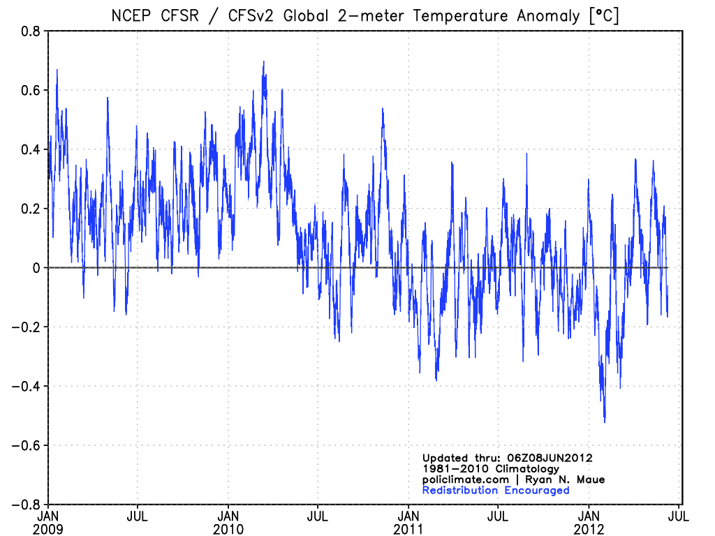
Despite the high number of record daily highs, this is a US centric warm event. The NCEP CFSv2 global anomalies from the winter through early June have been much of the time below the 1981-2010 average. The deep Eurasian cold wave shows in late January.

Looking back over the last century, you can explain global temperatures by ENSO and volcanism and the ocean multidecadal cycles that favor a particular ENSO state. Here is the plot since 1979 of all data sets with ENSO and volcanism indicated.

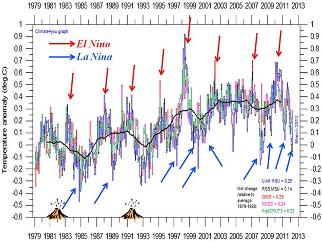
El Ninos bring a short term warming, La Ninas a dip in global temperatures. The warm mode of the Pacific from 1977 to 1998, led to a net warming. Major volcanoes produce a cooling as we saw in the early 1980s and early 1990s, lack of volcanism (like we have seen since the middle 1990s) means more solar radiation at the surface and enhanced warming.

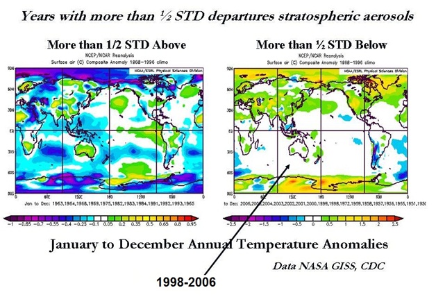
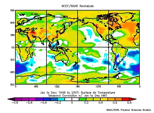
In 1995, the Atlantic went into its warm mode, which means a warmer annual temperature in the Northern Hemisphere.

May for the US was warm again making the last year in the US allegedly the warmest in the record, but as John Christy of UAH noted from the satellite perspective, it was notable only in the lower 48 (see).
Again in the Pacific Northwest, it actually was colder than the 30 year mean for the fifth straight year.

•Spring temperatures across the Northwest Region have been trending downward at a rate of 0.59 degrees F per decade during the 30 years since 1983.
•Spring temperatures across the Northwest Region have been trending downward at a rate of 4.10 degrees F per decade during the 10 years since 2003.
A Cold west usually translates to warmth further east as we saw in the 2010 and 2011 summers.
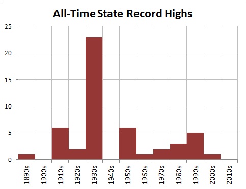
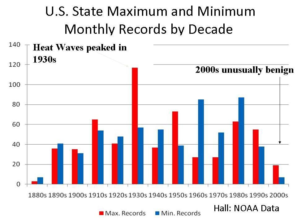
As hot as it has been the past two summers, the heat is not cracking all-time levels. Here is the latest decadal plot of all-time records for the 50 states. When multiple years are tied, the latest year/decade is used.

The 1930s stands out as the hottest decade, the 1910s and 1950s were second, 1990s third and 1980s fourth. This decade doesn’t rank although it is early.
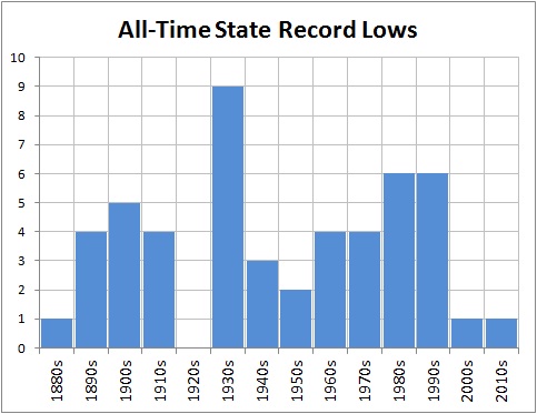
All time cold records look like this.

New York City reached 100F last summer, but that was common from the 1930s to 1950s.

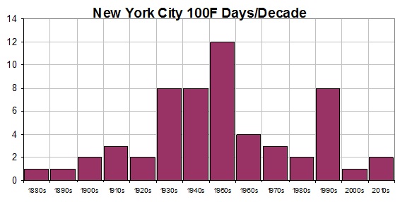
Oh by the way see how the 100 degree days compares with CO2.

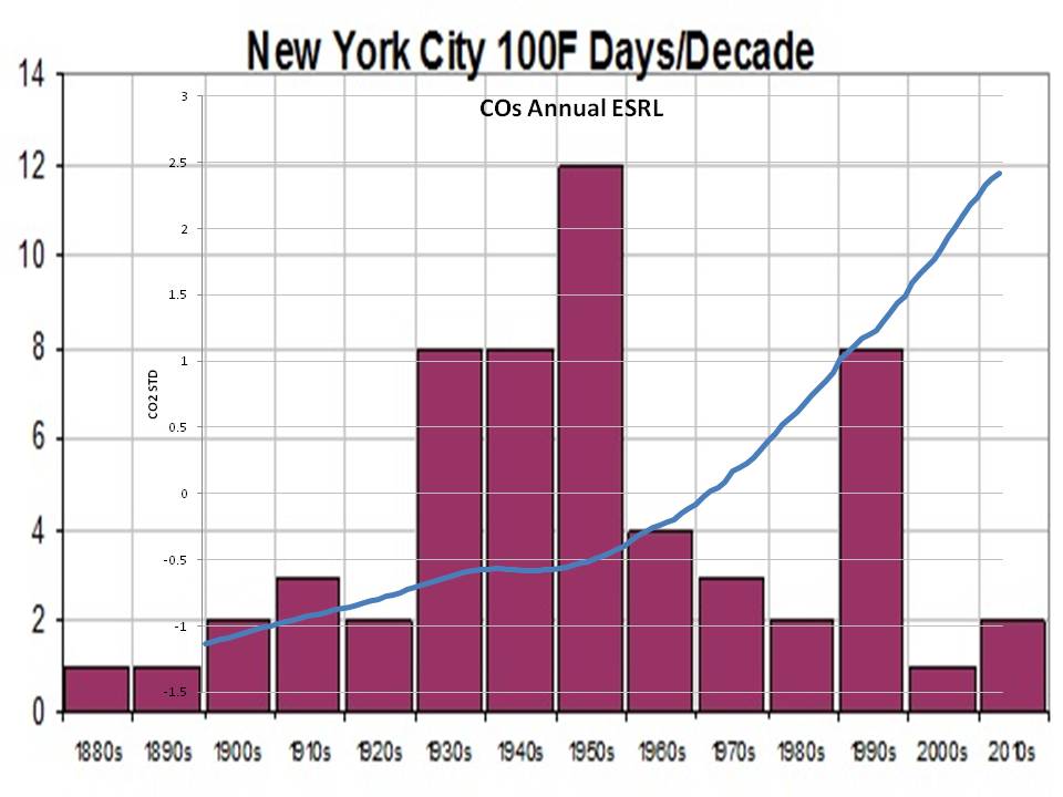
Here is Des Moines which has seen fewer and fewer 100F days in recent decades.

As Steve Goddard reports “During the 1930s, 100 degree days were very common in Des Moines. They very rarely happen any more. It has been nine years since Des Moines hit 100F. By contrast, 1934 had thirty-one days over 100 – including five days over 110 and three days over 112.”
The state monthly records through the end of the 2009.. This depicts the 12 monthly records for the 50 states (600 data points). There were likely March heat records set in some states and perhaps some other months so the 2010s will show and take away from some prior years.

See Bruce Hall’s 2010 guest post on Roger Pielke Sr.’s Climate Science here.
ICECAP NOTE: ICECAP was one of the earliest ‘realist’ climate blogs that provided insight into natural factors and challenged the orthodoxy. Your donations helped us maintain the site and provide some support for the time invested in keeping it updated. One or more posts have been added a day for going on 5 years now now totaling 6,082 entries. 305,205 have enrolled as members with a total of 32,446,550 page hits. All the posts are archived. We maintain them in the archives and have a good search tool. I maintain the site as best I can – maintaining a secure site with high traffic is expensive. You can help with even small donations – see the DONATE button left or email me at frostdoc@aol.com for an address to mail a check if you prefer not using PAYPAL. Rest assure, we have never had an issue with Paypal although they get a piece of any transaction. I have had at times had to subsidize the site from month to month. I don’t like having to ask people for donations but our side despite all the claims to the contrary is not subsidized/ endowed with money and grants like the alarmist blogs like RealClimaate and Climate Progress. You will never see them ask for donations. They get all they need from their liberal foundations and eco groups.
You can also help by buying books in the Amazon store and/or enrolling as a Premium member of Weatherbell.com, where I am co-chief meteorologist with Joe Bastardi. recently Dr. Ryan Maue from FSU has joined our staff and is helping us provide model based value-added output. He maintains and has published on the ACE index. We have a weather radio show on Sunday nights 8pm to 9:30pm EDT called Wise Guys of Weather Radio. On the Weatherbell site we have the premium blogs and specialized forecasts for energy, agriculture, marine, snow, insurance and other applications on the Commercial site. Joe B has also posted on Icecap. Both Icecap and Weatherbell are 7 day a week jobs. I have also PRO BONO helped produce documents for comments to the EPA that enabled lawyers to file a science based AMICUS brief that went to the DC courts to try and stop EPA deadly overregulation. Thank you for you support over the years. Joe D’Aleo and Art Horn
It’s a correct point that, in theory, number of records recorded should trend towards zero if temperatures are not actually increasing HOWEVER,…
Please note that the records do not say how they are based. If May 1 of 1930 is 99 deg and May 2 of 1930 is 98, but then May 2 of 1933 is 99, has a new record been set?
It’s quite possible, depending on how they’re counting. I don’t know. In all cases, the number of observations would still trend to zero at consistent temperatures, but because there are so many days in the year, and temperatures are recorded GIVEN a specific day, there’s enough places for new records to take place that you don’t see the descent for a prolonged time period; centuries as opposed to the decades of data that we have.
In any case, the distribution looks log normal, skewed to the right. If that’s the case it supports the article just fine. But we need more data, and we need to know how they’re scoring their mapping process.
That distribution looks log normal, skewed to right. How does that not support this article?
It’s a daily number aggregated into a year – so if May 1, 1930 is 99 degrees and May 2 1933 is 99 degrees, is that one record set, or two?
Those of you arguing that observations of record highs should trend to zero are forgetting that there are a lot of days in the year to set a daily record. Just because at stable temperatures, the observations should trend to zero, doesn’t mean that’ll happen quickly. It could take centuries of recorded datum, rather than the few decades we have now.
But, considering that this looks log normal, and log normal does trend to zero, I’d say we’re off to a good start…
For those arguing there should be an exponential decay in the number of records by year, I think you may be confusing what the chart shows. It doesn’t show the number of records *set* in a year, but the number of record *high temperatures* over the entire record that occurred in that particular year. There should be no expected exponential decay in this measurement.
j ferguson,
You aren’t understanding the graph. It shows what year the record high was set for each station and each date. There is no bias based on the date.
KevinM says:
July 8, 2012 at 7:26 pm
James,
If you are looking for a change on the order of 1C, and your temperature has a range of about 30C, then no, you are not looking for a record number of new records. You are looking for any statistically significant deviation from the expected decay trend.
I happen to believe global warming is horse shite, but that’s no excuse for bad math. You can model this with the RAND() function in an Excel sheet. It’s entry level science.
=====================================================
Sigh, let me try one more time. You guys are misinterpreting what is being presented, or rather why. We all understand the probabilities of records. We all understand the frequencies in which we would expect. This has nothing to do with temps, other than to illustrate that it was often times warmer in the past than today. You guys are focusing on the wrong graphs for the wrong reasons.
The alarmists are claiming that a record number of records are being broke. Please understand the semantics. Scroll back up and look at the first graph presented. Perhaps Anthony should have left it at that, but he presented the rest as to buttress the point, not for them to be the point.
Read Anthony’s intro…… 2nd para….
Now read the graphs in this context. …… a record number of records [it has] never happened before [this is a ] direct consequence of CO2. <================ This is what is being rebutted. I don't take it as a statement towards anything else.
cainthaler
This is not a distribution issue. If it were a Gaussian distribution of record highs by year, the line would be dead flat. The reason there is a spike in the 1930s is because there were a lot of all-time daily records set in the 1930s. This is the opposite of a normal Gaussian distribution – it is heavily biased towards the 1930s.
Mr. Cain Thaler says:
July 8, 2012 at 7:50 pm
It’s a correct point that, in theory, number of records recorded should trend towards zero if temperatures are not actually increasing HOWEVER,…
Please note that the records do not say how they are based. If May 1 of 1930 is 99 deg and May 2 of 1930 is 98, but then May 2 of 1933 is 99, has a new record been set?
============================================================
I’d say the record was tied, not a new record set. But what do i know?
PS The NWS 2007 list I put up did not include ties. The ones I have from 2009 and 2012 do list ties.
For Paul K2
http://stevengoddard.wordpress.com/2012/07/09/alarmists-please-stop-being-idiots/
@starzmom
You would have been right, thinking the 1930’s the hottest decade, as recently as 2000. However, it was subseqently discovered that man did not know how to properly read their thermometers back then. In fact, it was also discovered he did not know how to read them in the 90’s. Accordingly, the 30’s were adjusted down (because, that makes sense to somebody) and, the 90’s were adjusted upwards.
Amazingly, silly man did not learn his lesson about the need for accurate thermometer readings. So, temperatures measured since the end of the 90’s have also had to be adjusted several times in the last 12 – 13 years (you guessed it, upwards).
I am completely at a loss to understand the dissonance being displayed by some. Every day we hear that thousands and thousands of record highs are being broken. If that were the case, there would be a spike on the right side of the graph.
Every year has an equal chance of setting the daily record at each location, but in a warming world the right side would by trending upwards. According to Jeff Masters propaganda, it should be trending upwards rapidly. Obviously that is not the case.
Long time daily reader but never comment but found this interesting. http://www.usatoday.com/weather/wheat7.htm The all time high record for every state. Entire 1800s two 1900s zero 1910s five 1920s two 1930s twenty four 1940s zero 1950s five 1960s one 1970s two 1980s three 1990s five 2000s one.
wow.. any chance we can get a simple explanation of what “record” means in the context of the post? Presumably, a record can be set, the broken again by a new record. Just means that there was a temperature spike in the 1930’s relative to previous years, doesn’t it? Doesnt say anything about temperatures in subsequent years, does it?
tim wilson
The record for July 17 in Tucson Arizona is the hottest July 17 on record in Tucson Arizona.
Tim Wilson says Doesnt say anything about temperatures in subsequent years, does it?
Yes it means no year since then has been as hot or hotter. For example Oklahoma where i live has a record high of 120F set in 1936, 1943 and 1994. On ties it goes to the most recent year which makes it look warmer in recent years. Dont know how to make it any more plain on the meaning of all time record.
stevengoddard says:
July 8, 2012 at 8:50 pm
For Paul K2
http://stevengoddard.wordpress.com/2012/07/09/alarmists-please-stop-being-idiots/
=============================================================
Lol, but then if that happened, they wouldn’t be alarmists, would they.
I find it difficult to understand how so many of you people fail to understand the graph. It is not difficult , it does not require a course in statistics. Of all the records listed by the graph they are still the record. And more records were set in the thirties. Of course after adjustment by hansen and other hacks they won’t be records anymore.
Global warming does not cause Hurricanes. It doesn’t heatwaves. Nor climate change. Nor increased snowfall, nor does it cause tornadoes. Nor the endless lists of things which the press has said and continues to say is caused by global warming.
CO2 is call a greenhouse gas and is said to cause the average temperature earth to get warmer
A warmer world does not cause hurricanes, heatwaves, climate change, increased snowfall, or tornadoes.
The greenhouse gas CO2 is said it cause the the world be warmed, but the rising CO2 levels over the past 1/2 century is not known to cause a specified amount of warming. Over a century the measured temperature from many weather stations around the world indicate that the average temperature may have risen by less than 1 C. No scientist written any paper that provides evidence that .5 C or half [or more] of this warming has been caused by CO2.
But if rising levels of CO2 has cause .5 C rise in global temperatures, this would not cause more heatwaves, hurricanes, climate change, or the endless amount things that routinely said to be caused by Global Warming or Climate Change.
But what such small amount increase in temperature would have some affect upon is melting glaciers and after centuries of time this could have significant affect upon glaciers.
And globally glaciers have been mostly retreating, with few advancing. And about 150 years most glacier stopping advancing and began retreating. The retreat of glaciers [mostly in Temperate Zones] was most dramatic in the early part of 20th Century, and the glaciers are still retreating and may continue retreating for centuries into the future. And the Ice caps in arctic regions have much colder average temperature and are unlikely to have much melting within a 100 years.
For Warmists who are still convinced that the heatwave is a sign of climate change here is something from a recent WUWT post.
and
To the best of my knowledge the IPCC looks at years and not months or even a week as has been done with the current heatwave. It’s just the weather and not the climate.
I refuse to donate as ICECAP is obviously well funded by fossil fuel interests (unlike CRU which has chopped BP and Shell funds.)
http://www.cru.uea.ac.uk/cru/about/history/
/SARC
As others have pointed out, the graph of record daily maximums at the top of this post actually tends to confirm global warming, rather than suggesting that it was warmer in the past (the 30’s). After over a hundred years of record taking, one would expect that today’s record daily maximums would be rare if the average temperature had remained constant over the past century. In other words, we should see the data points for recent decades oscillating between zero and some arbitrary value, with that arbitrary value declining with time. Instead, we see them hovering between the 2000 and 4000 mark since the late 70’s.
Also, Anthony Watts, being well informed of such things, should be acutely aware of all this. So why did he publish something that he knows to be misleading?
“Records” are always set up at the very beginning of recording. No surprize, most of the records set in 1930-ies.
stevengoddard says:
July 8, 2012 at 9:19 pm
…
Every year has an equal chance of setting the daily record at each location, but in a warming world the right side would by trending upwards. According to Jeff Masters propaganda, it should be trending upwards rapidly. Obviously that is not the case.
——————————-
No, Steven.
In a non-warming world, the right side of the graph would FALL DOWN RAPIDLY.
In a warming world – as we have it! – the right side of the graph is steady. We continously get new records due to the warming trend.
Paul K2 said “Couple this with low Arctic ice pack influence on the jet stream Rossby
waves,”
Pure speculation. This alleged consequence of low sea ice was never predicted by all the glorious climate models before one GIGO study in 2006. Since then the alarmists have latched on like rabid bulldogs. There are lots of problems with this theory however, not the least of which is there is no correlation from sea ice patterns to blocking patterns.
Bill D said “Most of the biases discussed here would be overcome by using the ratio of new highs to new lws.”
That just compounds the siting problems. The extra gravel around Reagan National Airport ASOS for example will preclude new record lows (raises temps on radiational cooling nights). Other site and heat island effects will cause fewer record lows even if they don’t cause more record highs.
paul k2~ your non-response was entirely predictable. I shall have to trust your forecasts as much as I trust your hind-casting- that is to say, NOT at all.