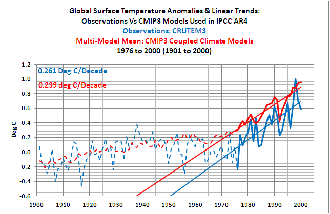
I’ve placed Bob’s Figure 21 at the top of this post, because it shows something quite interesting, note to caption in red, upper left. – Anthony
Guest post by Bob Tisdale

Figure 21
OVERVIEW
This post is a summary of the series of our recent posts that compared observed Surface Temperature data to the simulations of the coupled ocean-atmosphere climate models used by the IPCC in their 4thAssessment Report (AR4). The IPCC’s response to their Frequently Asked Question (FAQ) 8.1 serves as an introduction.
INTRODUCTION
The IPCC’s Frequently Asked Question 8.1 appears in Chapter 8 “Climate Models and their Evaluation” and in their separate Frequently Asked Questionspublication. FAQ 8.1 and the opening paragraph of the IPCC’s answer read as follows (my boldface):
“How Reliable Are the Models Used to Make Projections of Future Climate Change?
“There is considerable confidence that climate models provide credible quantitative estimates of future climate change, particularly at continental scales and above. This confidence comes from the foundation of the models in accepted physical principles and from their ability to reproduce observed features of current climate and past climate changes. Confidence in model estimates is higher for some climate variables (e.g., temperature) than for others (e.g., precipitation). Over several decades of development, models have consistently provided a robust and unambiguous picture of significant climate warming in response to increasing greenhouse gases.”
Later in that discussion, the IPCC continues their remarkably confident claims about the climate models, and they introduce FAQ8.1, Figure 1, which should look familiar. It served as the backbone for many of the recent posts. It’s the same graph as cell a of Figure 9.5 (my boldface):
“A third source of confidence comes from the ability of models to reproduce features of past climates and climate changes. Models have been used to simulate ancient climates, such as the warm mid-Holocene of 6,000 years ago or the last glacial maximum of 21,000 years ago (see Chapter 6). They can reproduce many features (allowing for uncertainties in reconstructing past climates) such as the magnitude and broad-scale pattern of oceanic cooling during the last ice age. Models can also simulate many observed aspects of climate change over the instrumental record. One example is that the global temperature trend over the past century (shown in Figure 1) can be modeled with high skill when both human and natural factors that influence climate are included.”

Figure 1 (FAQ 8.1, Figure 1)
After reading the series of posts here at Climate Observationsthat discussed and illustrated how poorly the IPCC’s ocean-atmosphere climate models simulate global surface temperatures over the 20th Century, many of you might find it odd:
1. that the IPCC has repeatedly used the word “confidence” in the same sentence and paragraphs as climate models,
2. that the IPCC has stated that the climate models have shown “high skill” and “provide credible quantitative estimates”, and
3. that the IPCC has stated the models “have consistently provided a robust and unambiguous picture of significant climate warming in response to increasing greenhouse gases”, etc.
Credible, consistently, robust, and unambiguous are words that were well chosen by the IPCC, and they are contained in well-crafted sentences. They help to instill reader confidence in climate models—there’s that word confidence again. But the antonyms of those well-chosen words; not believable, inconsistently, weak, and uncertain; are definitely more appropriate.
Many of you may wonder if the authors who wrote that part of AR4 had actually compared the multi-model simulation data to the observed surface temperatures. Some of you may think the IPCC’s reply to FAQ8.1 is a total fabrication or that it misrepresents the actual capabilities of the climate models. If we try to look at the IPCC’s reply to FAQ8.1 in a positive light, it’s an embellishment that is intended to help market a supposition, and that supposition is that anthropogenic greenhouse gases have played something more than a miniscule role in the rise in surface temperatures over the 20thCentury, especially during the late warming period–since 1976. And, of course the IPCC authors had reason to do this: in order for the IPCC to market their projections of future catastrophic warming, they needed to extend and accelerate the modeled surface temperature trend from the recent warming period. A lower, more realistic rate of warming would never have done.
Let’s take a quick look at those posts again,
1. to determine if the IPCC is believable when they state their climate models have “high skill”,
2. to determine if the IPCC is realistic when they use the words “credible”, “consistently”, “robust”, and “unambiguous” to describe climate model simulations, and
3. to determine if anyone anywhere should have “confidence” in those models.
A QUICK NOTE ABOUT THE DATA PRESENTED IN THIS POST
All data presented in this post is either available online to the public or is easily reproducible. The majority of the data is available through the Royal Netherlands Meteorological Institute (KNMI) Climate Explorerwebsite. To replicate the data presented in the IPCC graphs like Figure 1 above, there is software available online to perform this function, or the X-Y coordinates of a graphics program such as MS Paint can be used. In short, anyone with internet access, spreadsheet software, and a little bit of time can confirm what is presented in this post.
THE 20TH CENTURY MODEL-DATA SURFACE TEMPERATURE COMPARISON POSTS
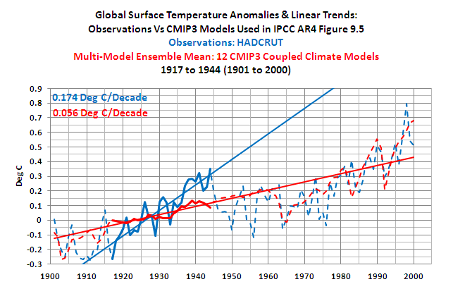
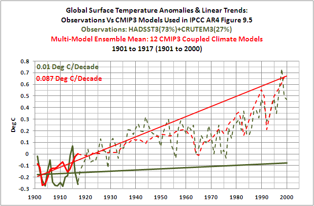
The post The IPCC Says… – The Video – Part 1 (A Discussion About Attribution) and the YouTube video presented in it included a replica of the IPCC’s comparison of climate model simulations and observed 20th Century Surface Temperature anomalies. The IPCC used the same graph in their Figure 9.5 cell a and their FAQ8.1, Figure 1, which is included in this post as Figure 1. The data in the replica was divided into four periods that the IPCC discusses in Chapter 3 Observations: Surface and Atmospheric Climate Change. Those periods are loosely defined by the IPCC as follows:
“Clearly, the changes are not linear and can also be characterized as level prior to about 1915, a warming to about 1945, leveling out or even a slight decrease until the 1970s, and a fairly linear upward trend since then (Figure 3.6 and FAQ 3.1).”
With respect to the model simulation data, the Model Mean represents the forced component of the model simulations when the models are forced by both natural and anthropogenic forcings.
NOTE: We confirmed that the replication of the data from Figure 9.5 cell a was realistic by comparing it to the ensemble member mean of the 12 climate modelsthat are available online. The trends of the early and late warming periods were used as reference in that comparison since those were the periods we were most concerned with in these posts.
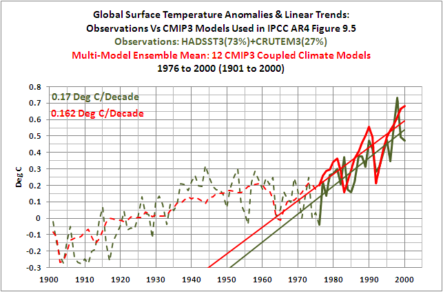
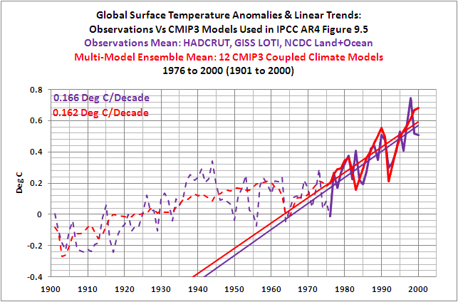
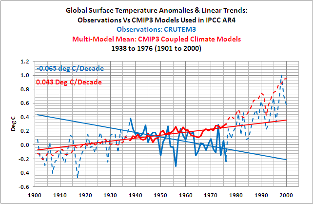
Figure 2 shows that the IPCC’s models did a good job of simulating the rate at which instrument-based (observed) global surface temperature anomalies actually rose during the late warming period of the 20thCentury. And Figure 3 shows that the models could also simulate the observed trend in surface temperature anomalies during the mid-century “flat temperature” period.

Figure 2
HHHHHHHHHHHHHHHHHHHHHHHHHHHHHHHHHHHHHHHHHHHHHHH

Figure 3
HHHHHHHHHHHHHHHHHHHHHHHHHHHHHHHHHHHHHHHHHHHHHHH
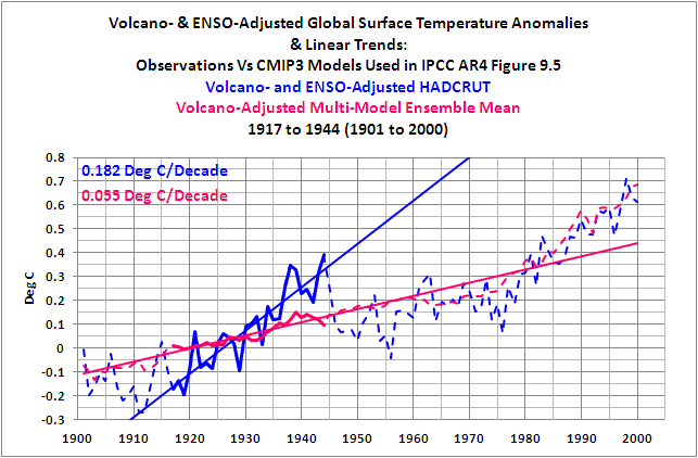
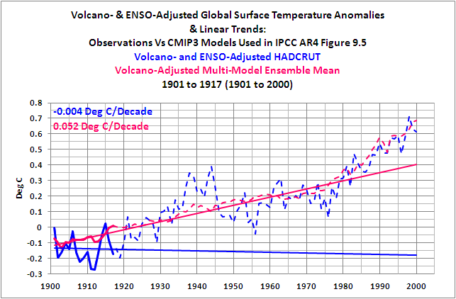
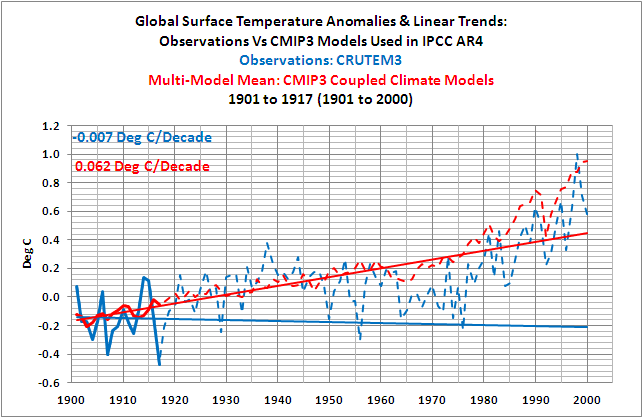
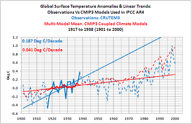
We also showed the models cannot simulate the observed trends in surface temperature anomalies during the early warming period (Figure 4) and during the early “flat temperature” period (Figure 5). In other words, the models do not come close to simulating the rates at which temperatures changed over those multidecadal periods.

Figure 4
HHHHHHHHHHHHHHHHHHHHHHHHHHHHHHHHHHHHHHHHHHHHHHH

Figure 5
HHHHHHHHHHHHHHHHHHHHHHHHHHHHHHHHHHHHHHHHHHHHHHH
Why is that important? During the early warming period, observed surface temperatures rose at a rate that was three times higher than the rate of the forced component of the models, as represented by the model mean. This suggests that the temperatures can rise over multidecadal periods at high rates without those rates being dictated by natural and anthropogenic forcings. But that’s not the message we hear from the IPCC.
Also understand that the rates at which global surface temperature anomalies rose during the early warming period and late warming period are comparable, as shown in Figure 6. The linear trend during the late warming period is only about 12% higher than the trend of the early warming period. But the rate at which the forced component of the models rose during the late warming period is far greater (more than 3 times greater) than during the early period. See Figure 7. The fact that the trend of the forced component of the models is so much higher in the late period, while trend of the observations is relatively unchanged, suggests any number of things. One is that the additional forcings had very little impact on the rate at which the instrument-based global surface temperature observations rose. And that also is not the message we hear from the IPCC.

Figure 6
HHHHHHHHHHHHHHHHHHHHHHHHHHHHHHHHHHHHHHHHHHHHHHH

Figure 7
HHHHHHHHHHHHHHHHHHHHHHHHHHHHHHHHHHHHHHHHHHHHHHH
In summary, instead of the models and data supporting the hypothesis of Anthropogenic Global Warming, they actually contradict it.
CONFIRMING AND CLARIFYING THOSE RESULTS
There were two initial follow-up posts:
And:
In Part 1, we replaced the replicated model-mean data with the multi-model ensemble mean data from the CMIP3 climate models that the IPCC used in their Figure 9.5, cell a. CMIP3 is the climate model archive used by the IPCC for AR4. The results were similar to those shown earlier in Figures 2 through 5. These links will bring you to the graphs for the late warming period, the mid-20th Century “flat temperature” period, the early warming period, and the early “flat temperature” periodfrom that first follow-up post.
Comparisons were also presented using the recently updated Sea Surface Temperature data from the Hadley Centre. That new Sea Surface Temperature data was combined with the land surface temperature data and then compared to the models. The results were similar to Figure 2 during the late warming period, inasmuch as the model-mean trend was close to the trend of the observations. And the comparison results with the new Sea Surface Temperature data were similar to Figures 4 and 5 during early warming period and the early “flat temperature” period, inasmuch as the models failed in their attempt to simulate the trends during those periods.
But the new Sea Surface Temperature data when combined with the land surface data made a significant difference during the mid-20thCentury “flat temperature” period, as shown in Figure 8. The models now failed to simulate the observations during this period too.

Figure 8
That means, if the global land+sea surface temperature observational data uses the new and improved Sea Surface Temperature data, then the models can only simulate the observed rate of warming during the late 20th Century warming period—from 1976 to 2000. In other words, of the 20thCentury’s two warming periods and two “flat temperature” periods, the IPCC model mean (the forced component of the models) can only simulate the trends of one of those four periods. Only one of four. But that’s not the message presented by the IPCC.
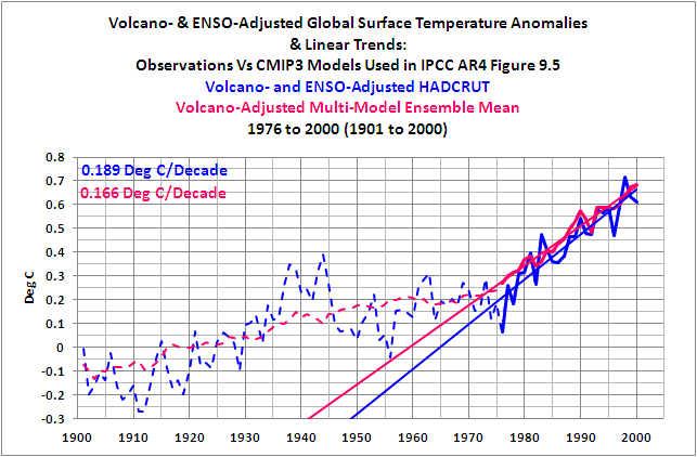
In Part 2 of the initial follow-up posts, there were a few clarifications before three more model-data comparisons were presented. In one of the comparisons, the model data and observations were adjusted for the linear impacts of volcanic eruptions and El Niño-Southern Oscillation (ENSO) events. The adjustments minimize the variations in the two datasets caused by volcanic aerosols, and the adjustments minimize the year-to-year variations in the surface temperature observations cause by El Niño and La Niña events. (Those adjustments do not account for the multiyear and decadal aftereffects of significant El Niño/La Niña events. I’ll illustrate those later in this post.) The bottom line: the adjustments had little effect on the trend comparisons for the late warming period, the mid-20th Century “flat temperature” period, the early warming period, and the early “flat temperature” period. That is, the results were similar to those shown in Figures 2 through 5 above.
And the results were similar to those shown in Figures 2 through 5 if the observational dataset the IPCC used (the Hadley Centre’s HADCRUT) was replaced with the average of the three land+sea surface temperature products that are available from GISS, Hadley Centre, and NCDC. The following links show the graphs for the late warming period, the mid-20th Century “flat temperature” period, the early warming period, and the early “flat temperature” period,using the average of the three observation datasets.
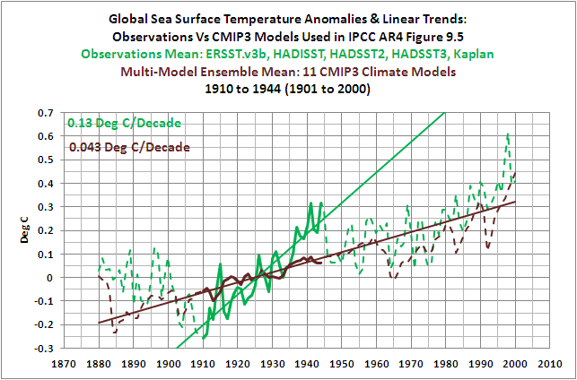
Part 2 also included comparisons of modeled and observed Global Sea Surface Temperature anomalies. Always keep in mind that the global oceans cover about 70% of the surface of the Earth. With the Sea Surface Temperature data, the comparisons started in 1880. The reason for the earlier start year was to determine how well the model mean (the forced component of the models) simulated the significant decrease in Sea Surface Temperature that occurred from the 1860s to 1910. If you’re not aware, with some datasets, the Sea Surface Temperatures in the 1860s and 1870s were comparable to those of the mid-20thCentury “flat temperature” period, as shown in Figure 9. It would have been nice to extend the comparison back to the 1860s but some of the models and other Sea Surface Temperature datasets do not have data available before 1880.

Figure 9
For the Sea Surface Temperature comparisons, we used the average of 5 different instrument-based Sea Surface Temperature datasets for the observational data. As expected, the models agreed reasonably well with the observations in the mid-20th Century “flat temperature” period and the late warming period. Those agreements during the latter part of the 20th Century do not appear to be as good as the other comparisons, but they would probably pass statistical scrutiny. The models also failed to simulate the rate at which temperatures rose during the early warming period. And as shown in Figure 10, the models did not hindcast the significant drop in Sea Surface Temperature anomalies from 1880 to 1910. The model mean indicated that, with the natural and anthropogenic forcings, Sea Surface Temperatures should have risen slightly, but the observations showed they dropped considerably.

Figure 10
And the last comparison of Part 2 included the models versus the updated version of the Hadley Centre’s Sea Surface Temperature data, HADSST3. The update created a significant negative trend during mid-20thCentury “flat temperature” period of 1944 to 1975. This was caused in part from a correction for a discontinuity in the data around 1945. The bottom line: the models can no longer simulate the observed Sea Surface Temperatures as a result of the updates during that period, as shown in Figure 11.

Figure 11
In short, with the latest and greatest Sea Surface Temperature data, the multi-model mean (the forced component of the models) only simulates the observed rate of temperature change during the last 24 years of the 20thCentury.
LAND SURFACE TEMPERATURE COMPARISONS
CMIP3 Models Versus 20th Century Land Surface Temperature Anomalies is the most recent follow-up post. As its title states, it compares observed changes in global Land Surface Temperature anomalies to the climate models from the CMIP3 archive, which is the source of the IPCC’s data for AR4. Not unexpectedly, the rate at which land surface temperatures rose during the late warming period was simulated well by the models. Also not unexpectedly, the models also failed to hindcast the trends during the early “flat temperature” period and the early warming period of the 20th Century. But the models also failed to simulate the rate at which land surface temperatures cooled during the mid-20th Century “flat temperature” period that lasted from 1938 to 1976 with land surface temperature data. So for another dataset, the models have illustrated that they are only capable of simulating surface temperatures during the last quarter of the 20thCentury.
IF NOT GREENHOUSE GASES, WHAT CAUSED THE RISE IN SURFACE TEMPERATURE OVER THE PAST 30 YEARS?
And that brings us to another follow-up post, IPCC Models Versus Sea Surface Temperature Observations During The Recent Warming Period.
To illustrate the cause of the rise in Surface Temperatures over the past 30 years, we shifted to a different dataset. For that discussion, we used satellite-based Sea Surface Temperature data (NOAA’s Optimum Interpolated Sea Surface Temperature data Version 2, which is also known as OI.v2) because it has the best coverage of the global oceans. Other Sea Surface Temperature datasets rely only on in situ observations from buoys and ships and do not have complete coverage over that time period. A few infill the missing data using statistical methods but observations are, of course, preferred.
Figure 12 compares Global Sea Surface Temperature anomalies to those hindcast (20C3M) and projected (SRES A1B) by the Multi-Model Mean of the CMIP3 Climate Models. Again CMIP3 is the climate model archive used by the IPCC for AR4. (Note that this graph was not presented in the linked post. I’ve provided it here as a reference.) The rate at which observed global Sea Surface Temperature anomalies rose over the past 30 years is only about 60% of the rate simulated by the models. The models aren’t looking very good over this time period, especially with those base years for anomalies, and for Figure 16, we used the same base years (1980-1999) that the IPCC used for its projections.

Figure 12
For the following discussions and in the linked post, the Sea Surface Temperature data and the model mean of the Sea Surface Temperature simulations both have the base years of 1982 to 2011. This was done to better align the observations and model simulation data over that time period. Additionally, both datasets have been adjusted for the impacts of volcanic eruptions. The adjustments affect the appearance of the data during the years when the aerosols emitted by the explosive volcanic eruptions of El Chichon and Mount Pinatubo caused global Sea Surface Temperatures to drop. It took a few years after those eruptions in 1982 and 1991 for surface temperatures to rebound. The linear trends of the data that has not been corrected for the volcanic eruptions have slightly different linear trends. We discussed the method used to adjust the data for volcanic aerosols in the post linked above, and it won’t be repeated here.
To illustrate why Sea Surface Temperatures have risen over the past 30 years, we’ll divide the global oceans into two subsets. These include the East Pacific Ocean from pole to pole (90S-90N, 180-80W), and the Rest Of The World from pole to pole (90S-90N, 80W-180). The areas are shown in Figure 13.

Figure 13
The East Pacific Ocean model-observation comparison is shown in Figure 14. The first thing that stands out is the difference in the year-to-year variability. The observed variations in Sea Surface Temperature anomalies due to the El Niño and La Niña events are much greater than those of the Multi-Model Mean. The large upward spikes are caused by El Niño events, and the lesser, but still major, downward spikes are caused by La Niña events. Keep in mind when viewing the model-observations comparisons in this post that the model mean is the average of all of the ensemble members, and since the variations in the individual ensemble members are basically random, they will smooth out with the averaging. The average, therefore, represents the forced component (from natural and anthropogenic forcings) of the models. And it’s the forced component of the model data we’re interested in illustrating and comparing with the observations in this post, not the big wiggles associated with ENSO.

Figure 14
The difference in the linear trends between the Multi-Model Mean and the observations is extremely important. That has been the focus of this series of posts. The linear trend of the model simulations is 0.114 deg C per decade for the East Pacific Ocean. This means, based on the linear trend of the Multi-Model Mean, that anthropogenic forcings should have raised the East Pacific Sea Surface Temperature anomalies, from pole to pole, by more than 0.34 deg C over the past 30 years. But the observed Sea Surface Temperature anomalies have actually declined slightly. The East Pacific Ocean dataset represents about 33% of the surface area of the global oceans, and the Sea Surface Temperature anomalies there have not risen in response to the forcings of anthropogenic greenhouse gases. The IPCC has overlooked that basic fact.
The Sea Surface Temperature anomalies and Model simulation data for the Rest-Of-The-World (Atlantic, Indian, and West Pacific Oceans) from pole to pole are shown in Figure 15. The linear trends show that the models have overestimated the warming by about 23%.

Figure 15
But that might give the wrong impression, leading some to believe that anthropogenic greenhouse gases were somehow responsible for the rise in the Rest-Of-The-World Sea Surface Temperatures. But that’s not what the instrument-based Sea Surface Temperature data shows. The observed Sea Surface Temperature anomalies only rose in response to significant El Niño-La Nina events, and during the 9- and 11-year periods between those ENSO events, the observed Sea Surface Temperatures for the Rest of the World are remarkably flat. This is illustrated first in Figure 16, using the period average Sea Surface Temperature anomalies between the significant El Niño events, and second, in Figure 17, by showing the linear trends of the instrument-based observations data between the 1986/87/88 and 1997/98 El Niño events and between the 1997/98 and 2009/10 El Niño events.

Figure 16
HHHHHHHHHHHHHHHHHHHHHHHHHHHHHHHHHHHHHHHHHH

Figure 17
HHHHHHHHHHHHHHHHHHHHHHHHHHHHHHHHHHHHHHHHHH
As you will note, the significant El Niño events of 1982/83, 1986/87/88, 1997/98, and 2009/10 have been isolated for the Rest-Of-The-World data. To accomplish this, the NOAA Oceanic Nino Index (ONI) was used to determine the official months of those El Niño events. There is a 6-month lag between NINO3.4 SST anomalies and the response of the Rest-Of-The-World SST anomalies during the evolution phase of the 1997/98 El Niño. So the ONI data was lagged by six months, and the Rest-Of-The-World SST data that corresponded to the 1982/83, 1986/87/88, 1998/98, and 2009/10 El Niño events was excluded from the trend analyses. All other months of data remain.
Note: The El Niño event of 1982/83 was counteracted by the volcanic eruption of El Chichon, so its apparent role in the long-term warming is minimal.
And what do the climate models show should have taken place during the periods between those ENSO events for the Rest-Of-The-World Sea Surface Temperatures?
For the period between the 1986/87/88 and the 1997/98 El Niño events, Figure 18, the model simulations show a positive linear trend of 0.044 deg C per decade, while the observed linear trend is negative, at -0.01 deg C per decade. The difference of 0.054 deg C per decade is substantial.

Figure 18
The difference in the linear trends is even more significant between the El Niño events of 1997/98 and 2009/10, as shown in Figure 19. The linear trend of the Rest-Of-The-World observations is basically flat, while trend of the models is relatively high at 0.16 deg C per decade.

Figure 19
Keep in mind that the model mean, according to the IPCC, represents the anthropogenically forced component of the climate models during the period of 1981 to 2011. Unfortunately for the models and the IPCC, there is no evidence of anthropogenic forcing in the East Pacific Sea Surface Temperature data (90S-90N, 180-80W), Figure 20, or in the Sea Surface Temperature data for the Rest Of The World (90S-90N-80W-180), Figure 21.

Figure 20
HHHHHHHHHHHHHHHHHHHHHHHHHHHHHHHHHHHHHHHHHHHHHHH
Figure 21
HHHHHHHHHHHHHHHHHHHHHHHHHHHHHHHHHHHHHHHHHHHHHHH
ADDITIONAL NOTES ABOUT THE SEA SURFACE TEMPERATURE COMPARSIONS
There have been and will be criticisms about the discussion above, because it shows that the El Niño-Southern Oscillation (ENSO) was responsible for most if not all of the rise in Global Sea Surface Temperatures over the past 30 years. Even though the data clearly shows what has been discussed, to counter the obvious contribution of ENSO, proponents of Anthropogenic Global Warming have and will continue to present the tired old argument that ENSO is a cycle and as such it cannot contribute to the long-term trend. Only those who do not understand the process of ENSO would try to use that or similar arguments. For who are not familiar with the El Niño-Southern Oscillation, refer the post An Introduction To ENSO, AMO, and PDO – Part 1.
With that basic understanding of ENSO, refer to following two posts. The first discusses, illustrates, and animates many of the variables that create the upward shifts in the Rest-Of-The-World data:
ENSO Indices Do Not Represent The Process Of ENSO Or Its Impact On Global Temperature
The second makes a clarification:
The post IPCC Models Versus Sea Surface Temperature Observations During The Recent Warming Period also divided the Rest-Of-The-World subset into two more subsets to isolate the North Atlantic from the South Atlantic, Indian, and West Pacific Oceans, because the Sea Surface Temperatures of the North Atlantic have an additional mode of variability called the Atlantic Multidecadal Oscillation. For more information on the Atlantic Multidecadal Oscillation refer to the post An Introduction To ENSO, AMO, and PDO — Part 2.
Two more model-observation comparison posts: Refer also to the comparisons of Sea Surface Temperature and model mean datasets (see here and here). As shown, the Multi-Model Mean of the CMIP3 coupled ocean-atmosphere climate models do not simulate the Sea Surface Temperature anomalies in any ocean basin with any skill. It does not matter if the data is presented on times-series basis or on a zonal mean (latitude-based) basis. The model simulations show no basis in reality.
CLOSING COMMENTS
The IPCC attempted to and failed to confirm the hypothesis of Anthropogenic Global Warming with climate models, and without the climate models, the IPCC has no means to verify that hypothesis. That obvious failure aside, the IPCC along with its contributors and disciples have done a masterful job at marketing the concept of Carbon Dioxide-driven anthropogenic global warming to the general public and to politicians. It really was a great job. The IPCC claims:
“Models can also simulate many observed aspects of climate change over the instrumental record. One example is that the global temperature trend over the past century (shown in Figure 1) can be modeled with high skill when both human and natural factors that influence climate are included.”
But the data actually shows the models are not able to reproduce the rates at which global surface temperatures rose or fell during first three multidecadal periods of the 20thCentury with any consistency. In other words, the model-data comparisons repeatedly show that the observed rates at which surface temperatures can vary over multidecadal time periods can be significantly different than the rates simulated by the climate models. The models and observations actually contradict the hypothesis of greenhouse gas-driven anthropogenic global warming.
In response to the IPCC’s FAQ8.1 “How Reliable Are the Models Used to Make Projections of Future Climate Change?, a more accurate answer would be:
There should be little confidence in climate models. The model simulations fail in their attempts to provide credible quantitative estimates of future climate change, on regional, or continental, or global scales. The models have shown little to no ability to reproduce observed features of current climate and past climate changes. Confidence in model estimates is greatly overstated by the IPCC for the most common of climate variables (e.g., surface temperature) used to present the supposition of manmade global warming. After several decades of development, models have continued to show no skill at establishing that climate warming is a response to increasing greenhouse gases. No skill whatsoever.
The only skill shown by the IPCC is their unlimited capacity to market a concept that has been shown to have little basis in reality.
ABOUT: Bob Tisdale – Climate Observations
SOURCES
Refer to the linked posts for the sources of the data presented in this summary post.
NK says: “what the warmist commenters seem to misunderstand is that the IPCC ‘models’ Tisdale is evaluating are look back models that supposedly describe the past temperature record– and they fail to get that right, yielding only a 95% accuracy record”
And how did you arrive at 95%?
NK says: “PS: just because Tisdale has proven that IPCC’s models fail, does not mean that Tisdale’s ENSO step up reasoning is correct. izen rightly points out that Tisdale’s reasoning is statistical correlation, it is not based on physical processes.”
izen and you have not bothered to read the posts linked under the heading of ADDITIONAL NOTES ABOUT THE SEA SURFACE TEMPERATURE COMPARSIONS. It’s there you will find the physical processes that cause what you called the “ENSO step up”.
izen says: “The problem with the hypothesis that El Niño events cause step-changes in the ocean heat content is the absence of a physical mechanism.”
The mechanism is clearly there. People simply have to stop thinking that ENSO is an index. Refer to the following post that was linked above under the heading of ADDITIONAL NOTES ABOUT THE SEA SURFACE TEMPERATURE COMPARSIONS:
http://bobtisdale.wordpress.com/2011/07/26/enso-indices-do-not-represent-the-process-of-enso-or-its-impact-on-global-temperature/
.
Theo Goodwin said @ur momisugly December 28, 2011 at 9:51 am
“If Bill Gates had not secured the cooperation of IBM in his work then no one would have heard of the DOS operating system.”
A little OT, but strictly it was t’other way around. IBM asked BillG to provide them with an OS for the PC and BillG didn’t have one. That’s why he purchased QDOS from Seattle Computer Products in December 1980.
Theo Goodwin said @ur momisugly December 28, 2011 at 10:03 am
“It is as if engineers were to attempt to construct a model of a bridge project by carefully recording the observable data from some existing bridges and the terrain in which they exist.”
That’s a remarkable observation. I also note that from the human POV, a tunnel has the same function as a bridge. What’s the average of a tunnel and a bridge? :-))))
KR says: “And, as izen points out, you are discussing statistical correlation, not cause-effect, and have not provided or suggested any physical manner in which ENSO could ‘shift’ the climate to long term warmer levels.”
Again, you have illustrated for all that you have failed to read and understand the post above and the ones linked to it. If and when you can grasp the mechanism I have described, illustrated and animated, please feel free to return and ask questions.
And thanks for the link to the SkepticalScience post. I forgot about it since it does not address my posts on this subject, which do illustrate and discuss the mechanisms that cause the upward shifts. That’s the difference between my earlier posts and the Jens Raunsø Jensen post that SkepticalScience elected to discuss. With respect to Tamino’s rebuttal posts, you have obviously failed to read and understand my responses to them. Tamino’s rebuttal posts are filled with his own misunderstandings and are typically intended as misdirection.
But I will agree with you on one thing. You and I will continue to disagree.
John Brookes: With respect to your OHC related comment, the impact of ENSO on the rise in OHC was presented in a post a couple of years ago:
http://bobtisdale.wordpress.com/2009/09/05/enso-dominates-nodc-ocean-heat-content-0-700-meters-data/
Bob Tisdale – In regards to ENSO and climate energy, from your own post (http://bobtisdale.wordpress.com/2010/08/08/an-introduction-to-enso-amo-and-pdo-%E2%80%93-part-1/):
“Note again that El Niño events discharge heat from the tropical Pacific and La Niña events recharge it.”
I completely agree with that statement. Which, unfortunately, prevents ENSO from being anything other than an acyclic variation – no new energy is created, which would be required for step changes. Nowhere in your posts can I find any references to a physical mechanism for this new energy, simply assertions of cause-effect.
We’ll have to continue to disagree. When someone claims “the obvious contribution of ENSO” (emphasis added) as you do, I find myself running the numbers. Sometimes that “obvious” bit bears out – often it doesn’t.
The “NEW ENERGY” argument is really good and counts! The steps are obviously due to
Bobs beloved ENSO – missing in this is the ice melt in Antarktica…i.e. the ice melts there and the resulting melting water goes down to the bottom ground, circulates along the bottom until the Aequator and comes out there by and by, causing (La Nina) and flat stepwise temp plateaus for 30-40 years, as I see it. So far, and no new energy is created by ocean circulation.
After passing of 30-40 years, the “new energy” is now stronger thus raising the temp step level within 20 years to the next higher plateau….
Where does the new energy come from: Its Earth’s orbital forcing, a 400 year cycle, which is created by the Earth’s real trajectory: pendulum swing movements (Librations) around the orbit axis….
Now, everything explained….
JS
KR:
“I would have to opine (again, personal opinion) that the fact that observations fall within the bounds of the model runs makes those models useful.”
No it doesn’t. In many cases, we don’t even know what differential equations specific climate “models” are solving and what numerical methods have been used to solve them (Model E is a prime example). The models have really no practical use except to keep the modelers employed…and to influence policy makers to make wrong decisions about our economy and society…
I can understand why scientist use multiple models to test disparate ideas on what may have caused past climate changes. However, if they wish to pretend to be “confident” forecasters of the future climate, they must produce ONE model. their best model (one that incorporates all they learned from multiple models) , and that single model mush show the known past. To say that a number of models show temperature swings as wide as past history is meaningless.
As someone who is not a statistician, I tend to take Dennis Nikol’s point of view.
I am inclined to accept Bob Tisdale’s general argument that the IPCC’s statements on credability and confidence in the models they use are at a minimum over stated. This is based primarily on the following factors:
– my understanding that to match past climate, data inputted to the models has to be adjusted
– my understanding that understanding of clouds remains very low and therefore any model requiring accurate behavior and impacts of clouds cannot be considered inherantly reliable.
To clarify my previous comment:
http://wattsupwiththat.com/2011/12/27/on-the-ipccs-undue-confidence-in-coupled-ocean-atmosphere-climate-models-a-summary-of-recent-posts/#comment-845860
When speaking of claims of “obvious” conclusions, I’m not specifically speaking of the ENSO, but rather any claim of an “obvious” conclusion. We are very capable of finding false patterns in anything (I suspect due to simple caution – a false recognition of a bear in the trees has low cost and potentially high benefit).
Suspecting a pattern is fine – but claiming that pattern is real requires actually checking.
El Nino is the flapping wings of a giant invisible butterfly.
thepompousgit says:
December 28, 2011 at 10:49 am
I am Laughing out Loud at that one. The average of a bridge and a tunnel is the same as the average of any two climate models.
KR says:
December 28, 2011 at 11:50 am
“I completely agree with that statement. Which, unfortunately, prevents ENSO from being anything other than an acyclic variation – no new energy is created, which would be required for step changes. Nowhere in your posts can I find any references to a physical mechanism for this new energy, simply assertions of cause-effect.”
You are stuck the mind trap of the Warmists. Of course no new energy is created. However, there is a set of natural processes that constitute ENSO and energy travels through those natural processes. Like all “radiation only theorists” you deny the very existence of the natural processes that the radiation travels through. You deny half the equation, so to speak. And Warmists must do that because their “radiation only” obsession forbids them to treat other natural processes as actually existing.
You are no different than Trenberth when he claims that the extra heat is hidden in the deep oceans. It never occurs to Trenberth that if the extra heat is hidden in the deep oceans then there must be one or more natural processes through which it moved and he has the duty to do the empirical research necessary to describe them.
thepompousgit says:
December 28, 2011 at 10:43 am
OK, but the point is that some corporation such as IBM was necessary to nurture DOS.
Bob Tisdale says:
December 28, 2011 at 10:21 am
“People simply have to stop thinking that ENSO is an index.”
Spot on. Someday some Warmist will wake up and realize that scientific method is something real that must be taken into account when doing science. Then maybe they will realize that what Mr. Tisdale offers requires recognizing that actual physical hypotheses always describe natural regularities. ENSO consists of natural processes and is something real, not merely an index.
KR: You quoted me from my introduction to ENSO post, “Note again that El Niño events discharge heat from the tropical Pacific and La Niña events recharge it.”
Then you wrote, “I completely agree with that statement. Which, unfortunately, prevents ENSO from being anything other than an acyclic variation – no new energy is created, which would be required for step changes. Nowhere in your posts can I find any references to a physical mechanism for this new energy, simply assertions of cause-effect.”
Actually, new energy is created. You missed the obvious reference to it in the quote “…and La Niña events recharge it.” Sorry that you couldn’t find “references to a physical mechanism for this new energy”. I’ve written so many posts about ENSO that it’s hard to keep track of them. For more information on that part of ENSO, refer to:
http://bobtisdale.wordpress.com/2009/11/26/more-detail-on-the-multiyear-aftereffects-of-enso-part-2-%e2%80%93-la-nina-events-recharge-the-heat-released-by-el-nino-events-and/
Theo Goodwin says: “You are stuck the mind trap of the Warmists. Of course no new energy is created.”
The warm water that fuels an El Nino is created by the (or a) La Nina event that preceeds it. Whether that fits into your definition of energy is another matter. Refer to the post I linked for KR: http://bobtisdale.wordpress.com/2009/11/26/more-detail-on-the-multiyear-aftereffects-of-enso-part-2-%e2%80%93-la-nina-events-recharge-the-heat-released-by-el-nino-events-and/
KR says:
December 28, 2011 at 10:03 am
“I would have to opine (again, personal opinion) that the fact that observations fall within the bounds of the model runs makes those models useful.”
Useful for what? Please give the specifics.
Are models not being used as substitutes for scientific theories (well confirmed sets of physical hypotheses)? How are they doing on the criteria used to judge scientific theory?
Are models not being used for prediction? (Yes, this is redundant, but the emphasis is important.) How are they doing on that standard?
What Mr. Tisdale clearly shows is that models cannot faithfully reproduce the historical numbers taken from lines on graphs of climate in the Twentieth Century. Just how bad can models be? (Are modelers as klutzy as individuals trying to balance their checkbooks? Is there some standard whose requirements they meet? What is it?
Bob Tisdale says:
December 28, 2011 at 3:10 pm
“Actually, new energy is created.”
How about something more like “One of the effects of these natural processes is to channel energy in such a way that heat is redistributed…”
I am trying to be “generic” here, purposely non-specific. I do not know what the natural processes are so I will not attempt to describe them here. But there is no reason to raise a question about whether energy is created or not. After all, energy does travel through natural processes and the manner of its distribution is what determines changes in the heat content of a thing.
Theo Goodwin says:
December 28, 2011 at 3:29 pm
How about something more like “One of the effects of these natural processes is to channel energy in such a way that heat is redistributed…”
The above statement made me think of making soup in a basket:
http://www.nativetech.org/recipes/recipe.php?recipeid=115
To substance ‘S’, input energy at point A. Move ‘S’ to point B.
B is unaware of the source of energy, still the temperature increases.
Bob Tisdale says:
December 28, 2011 at 3:16 pm
Thanks.
I hope everyone is aware that I do not disagree with Mr. Tisdale.
John F. Hultquist says:
December 28, 2011 at 5:28 pm
“The above statement made me think of making soup in a basket:”
OK, let me try again. I do not think that Mr. Tisdale means to say that energy is created with regard to Earth’s energy budget. He means to say that energy is created with regard to the physical processes that make up ENSO. And ‘created’ might not be the best choice of words. I would prefer to say something along the lines of “energy is redistributed and the result is creation of a warm “spot.” As in any physical science, what is important here is creation of reasonably well confirmed physical hypotheses that can be used to predict and explain the warmth that is “created” by ENSO. Those well confirmed hypotheses do not exist at this time.
Theo Goodwin: During a La Nina event (the recharge phase), tropical Pacific trade winds increase in strength, which causes a reduction in cloud cover. The reduction in cloud cover allows more downward shortwave radiation to warm the tropical Pacific to depth and that warm water accumulates in the West Pacific Warm Pool for release during the next El Nino. Those are well-known properties of a La Nina event. Sometimes a La Nina event “overcharges” the tropical Pacific Ocean Heat Content, inasmuch as the Ocean Heat Content rises more during the La Nina event than it fell during the El Nino event(s) that preceeded it. That happened during the 1973/74/75/76 La Nina, which provided the initial fuel for the 1982/83 and 1986/87/88 El Nino events. It also happened during the 1995/96 El Nino, which provided the fuel for the 1997/98 El Nino. So If you want to point a finger at what caused the ENSO-induced rises in Rest-Of-The-World Sea Surface Temperature that resulted from the 1986/87/88 and 1997/98 ENSO events, blame the 1973/74/75/76 La Nina and the 1995/96 La Nina. Those are the two La Nina events that produced the warm water that fueled those El Ninos.
KR whines about: “… not discussing the fact that observations lie within the range of values for those averaged [model] runs.”
It would seem that you would hold as ‘better models’ those that have wilder swings in values, since they are the ones that encompass the range of observational data.
Looking at the individual model runs simply reveals how sickeningly poor they are at replicating anything comparable to how the actual climate behaves. The reason the IPCC presented a 58 fold stack of different runs was to obscure the fact that the annual rates of change in the models lavishly exceed those of the real world. They jump up and down on a year to year basis as much as the total observed changes over decades.