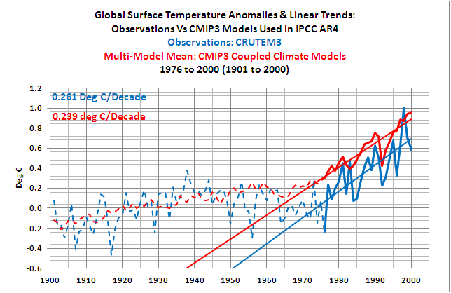
I’ve placed Bob’s Figure 21 at the top of this post, because it shows something quite interesting, note to caption in red, upper left. – Anthony
Guest post by Bob Tisdale

Figure 21
OVERVIEW
This post is a summary of the series of our recent posts that compared observed Surface Temperature data to the simulations of the coupled ocean-atmosphere climate models used by the IPCC in their 4thAssessment Report (AR4). The IPCC’s response to their Frequently Asked Question (FAQ) 8.1 serves as an introduction.
INTRODUCTION
The IPCC’s Frequently Asked Question 8.1 appears in Chapter 8 “Climate Models and their Evaluation” and in their separate Frequently Asked Questionspublication. FAQ 8.1 and the opening paragraph of the IPCC’s answer read as follows (my boldface):
“How Reliable Are the Models Used to Make Projections of Future Climate Change?
“There is considerable confidence that climate models provide credible quantitative estimates of future climate change, particularly at continental scales and above. This confidence comes from the foundation of the models in accepted physical principles and from their ability to reproduce observed features of current climate and past climate changes. Confidence in model estimates is higher for some climate variables (e.g., temperature) than for others (e.g., precipitation). Over several decades of development, models have consistently provided a robust and unambiguous picture of significant climate warming in response to increasing greenhouse gases.”
Later in that discussion, the IPCC continues their remarkably confident claims about the climate models, and they introduce FAQ8.1, Figure 1, which should look familiar. It served as the backbone for many of the recent posts. It’s the same graph as cell a of Figure 9.5 (my boldface):
“A third source of confidence comes from the ability of models to reproduce features of past climates and climate changes. Models have been used to simulate ancient climates, such as the warm mid-Holocene of 6,000 years ago or the last glacial maximum of 21,000 years ago (see Chapter 6). They can reproduce many features (allowing for uncertainties in reconstructing past climates) such as the magnitude and broad-scale pattern of oceanic cooling during the last ice age. Models can also simulate many observed aspects of climate change over the instrumental record. One example is that the global temperature trend over the past century (shown in Figure 1) can be modeled with high skill when both human and natural factors that influence climate are included.”

Figure 1 (FAQ 8.1, Figure 1)
After reading the series of posts here at Climate Observationsthat discussed and illustrated how poorly the IPCC’s ocean-atmosphere climate models simulate global surface temperatures over the 20th Century, many of you might find it odd:
1. that the IPCC has repeatedly used the word “confidence” in the same sentence and paragraphs as climate models,
2. that the IPCC has stated that the climate models have shown “high skill” and “provide credible quantitative estimates”, and
3. that the IPCC has stated the models “have consistently provided a robust and unambiguous picture of significant climate warming in response to increasing greenhouse gases”, etc.
Credible, consistently, robust, and unambiguous are words that were well chosen by the IPCC, and they are contained in well-crafted sentences. They help to instill reader confidence in climate models—there’s that word confidence again. But the antonyms of those well-chosen words; not believable, inconsistently, weak, and uncertain; are definitely more appropriate.
Many of you may wonder if the authors who wrote that part of AR4 had actually compared the multi-model simulation data to the observed surface temperatures. Some of you may think the IPCC’s reply to FAQ8.1 is a total fabrication or that it misrepresents the actual capabilities of the climate models. If we try to look at the IPCC’s reply to FAQ8.1 in a positive light, it’s an embellishment that is intended to help market a supposition, and that supposition is that anthropogenic greenhouse gases have played something more than a miniscule role in the rise in surface temperatures over the 20thCentury, especially during the late warming period–since 1976. And, of course the IPCC authors had reason to do this: in order for the IPCC to market their projections of future catastrophic warming, they needed to extend and accelerate the modeled surface temperature trend from the recent warming period. A lower, more realistic rate of warming would never have done.
Let’s take a quick look at those posts again,
1. to determine if the IPCC is believable when they state their climate models have “high skill”,
2. to determine if the IPCC is realistic when they use the words “credible”, “consistently”, “robust”, and “unambiguous” to describe climate model simulations, and
3. to determine if anyone anywhere should have “confidence” in those models.
A QUICK NOTE ABOUT THE DATA PRESENTED IN THIS POST
All data presented in this post is either available online to the public or is easily reproducible. The majority of the data is available through the Royal Netherlands Meteorological Institute (KNMI) Climate Explorerwebsite. To replicate the data presented in the IPCC graphs like Figure 1 above, there is software available online to perform this function, or the X-Y coordinates of a graphics program such as MS Paint can be used. In short, anyone with internet access, spreadsheet software, and a little bit of time can confirm what is presented in this post.
THE 20TH CENTURY MODEL-DATA SURFACE TEMPERATURE COMPARISON POSTS
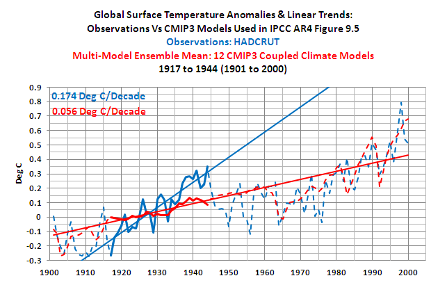
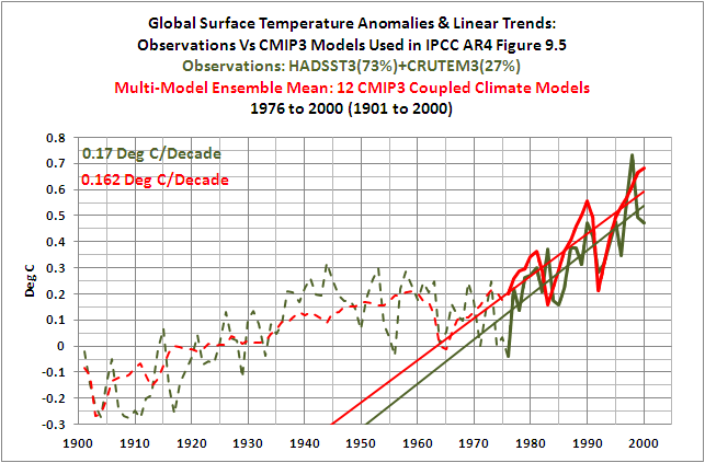
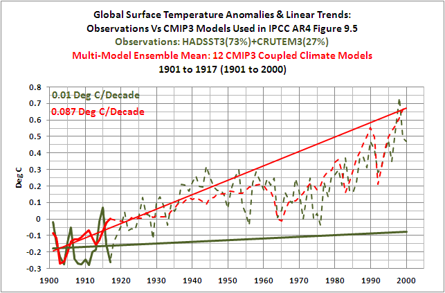
The post The IPCC Says… – The Video – Part 1 (A Discussion About Attribution) and the YouTube video presented in it included a replica of the IPCC’s comparison of climate model simulations and observed 20th Century Surface Temperature anomalies. The IPCC used the same graph in their Figure 9.5 cell a and their FAQ8.1, Figure 1, which is included in this post as Figure 1. The data in the replica was divided into four periods that the IPCC discusses in Chapter 3 Observations: Surface and Atmospheric Climate Change. Those periods are loosely defined by the IPCC as follows:
“Clearly, the changes are not linear and can also be characterized as level prior to about 1915, a warming to about 1945, leveling out or even a slight decrease until the 1970s, and a fairly linear upward trend since then (Figure 3.6 and FAQ 3.1).”
With respect to the model simulation data, the Model Mean represents the forced component of the model simulations when the models are forced by both natural and anthropogenic forcings.
NOTE: We confirmed that the replication of the data from Figure 9.5 cell a was realistic by comparing it to the ensemble member mean of the 12 climate modelsthat are available online. The trends of the early and late warming periods were used as reference in that comparison since those were the periods we were most concerned with in these posts.
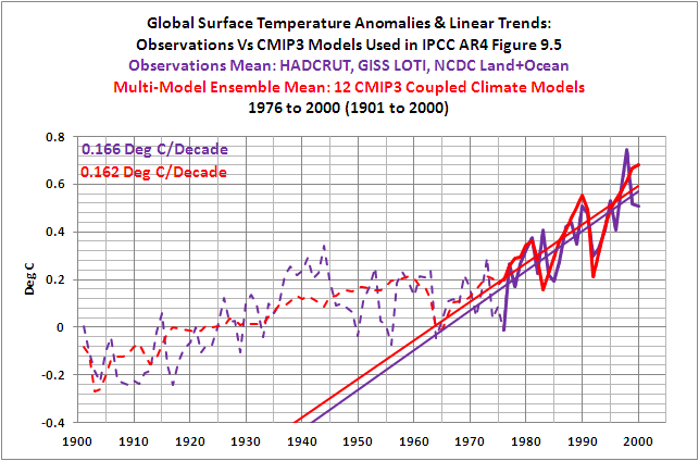
Figure 2 shows that the IPCC’s models did a good job of simulating the rate at which instrument-based (observed) global surface temperature anomalies actually rose during the late warming period of the 20thCentury. And Figure 3 shows that the models could also simulate the observed trend in surface temperature anomalies during the mid-century “flat temperature” period.

Figure 2
HHHHHHHHHHHHHHHHHHHHHHHHHHHHHHHHHHHHHHHHHHHHHHH

Figure 3
HHHHHHHHHHHHHHHHHHHHHHHHHHHHHHHHHHHHHHHHHHHHHHH
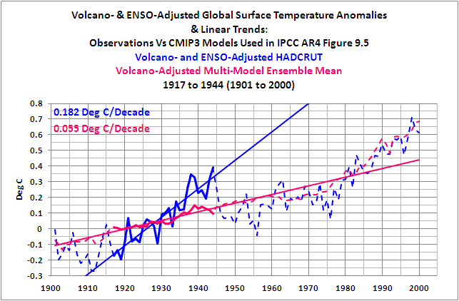
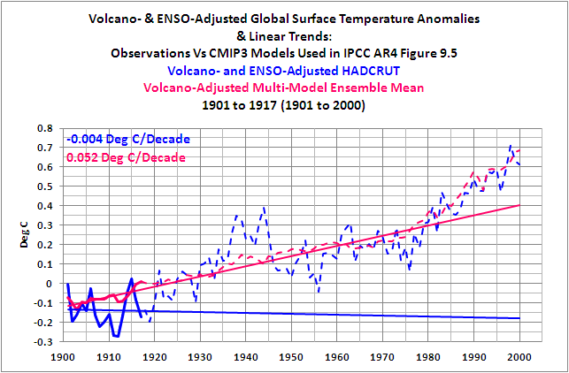
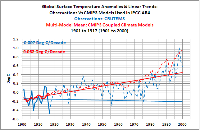
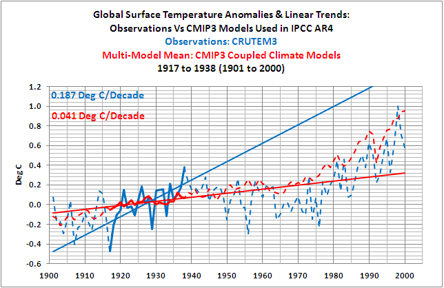
We also showed the models cannot simulate the observed trends in surface temperature anomalies during the early warming period (Figure 4) and during the early “flat temperature” period (Figure 5). In other words, the models do not come close to simulating the rates at which temperatures changed over those multidecadal periods.

Figure 4
HHHHHHHHHHHHHHHHHHHHHHHHHHHHHHHHHHHHHHHHHHHHHHH

Figure 5
HHHHHHHHHHHHHHHHHHHHHHHHHHHHHHHHHHHHHHHHHHHHHHH
Why is that important? During the early warming period, observed surface temperatures rose at a rate that was three times higher than the rate of the forced component of the models, as represented by the model mean. This suggests that the temperatures can rise over multidecadal periods at high rates without those rates being dictated by natural and anthropogenic forcings. But that’s not the message we hear from the IPCC.
Also understand that the rates at which global surface temperature anomalies rose during the early warming period and late warming period are comparable, as shown in Figure 6. The linear trend during the late warming period is only about 12% higher than the trend of the early warming period. But the rate at which the forced component of the models rose during the late warming period is far greater (more than 3 times greater) than during the early period. See Figure 7. The fact that the trend of the forced component of the models is so much higher in the late period, while trend of the observations is relatively unchanged, suggests any number of things. One is that the additional forcings had very little impact on the rate at which the instrument-based global surface temperature observations rose. And that also is not the message we hear from the IPCC.

Figure 6
HHHHHHHHHHHHHHHHHHHHHHHHHHHHHHHHHHHHHHHHHHHHHHH

Figure 7
HHHHHHHHHHHHHHHHHHHHHHHHHHHHHHHHHHHHHHHHHHHHHHH
In summary, instead of the models and data supporting the hypothesis of Anthropogenic Global Warming, they actually contradict it.
CONFIRMING AND CLARIFYING THOSE RESULTS
There were two initial follow-up posts:
And:
In Part 1, we replaced the replicated model-mean data with the multi-model ensemble mean data from the CMIP3 climate models that the IPCC used in their Figure 9.5, cell a. CMIP3 is the climate model archive used by the IPCC for AR4. The results were similar to those shown earlier in Figures 2 through 5. These links will bring you to the graphs for the late warming period, the mid-20th Century “flat temperature” period, the early warming period, and the early “flat temperature” periodfrom that first follow-up post.
Comparisons were also presented using the recently updated Sea Surface Temperature data from the Hadley Centre. That new Sea Surface Temperature data was combined with the land surface temperature data and then compared to the models. The results were similar to Figure 2 during the late warming period, inasmuch as the model-mean trend was close to the trend of the observations. And the comparison results with the new Sea Surface Temperature data were similar to Figures 4 and 5 during early warming period and the early “flat temperature” period, inasmuch as the models failed in their attempt to simulate the trends during those periods.
But the new Sea Surface Temperature data when combined with the land surface data made a significant difference during the mid-20thCentury “flat temperature” period, as shown in Figure 8. The models now failed to simulate the observations during this period too.

Figure 8
That means, if the global land+sea surface temperature observational data uses the new and improved Sea Surface Temperature data, then the models can only simulate the observed rate of warming during the late 20th Century warming period—from 1976 to 2000. In other words, of the 20thCentury’s two warming periods and two “flat temperature” periods, the IPCC model mean (the forced component of the models) can only simulate the trends of one of those four periods. Only one of four. But that’s not the message presented by the IPCC.
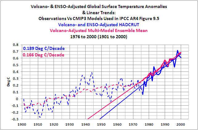
In Part 2 of the initial follow-up posts, there were a few clarifications before three more model-data comparisons were presented. In one of the comparisons, the model data and observations were adjusted for the linear impacts of volcanic eruptions and El Niño-Southern Oscillation (ENSO) events. The adjustments minimize the variations in the two datasets caused by volcanic aerosols, and the adjustments minimize the year-to-year variations in the surface temperature observations cause by El Niño and La Niña events. (Those adjustments do not account for the multiyear and decadal aftereffects of significant El Niño/La Niña events. I’ll illustrate those later in this post.) The bottom line: the adjustments had little effect on the trend comparisons for the late warming period, the mid-20th Century “flat temperature” period, the early warming period, and the early “flat temperature” period. That is, the results were similar to those shown in Figures 2 through 5 above.
And the results were similar to those shown in Figures 2 through 5 if the observational dataset the IPCC used (the Hadley Centre’s HADCRUT) was replaced with the average of the three land+sea surface temperature products that are available from GISS, Hadley Centre, and NCDC. The following links show the graphs for the late warming period, the mid-20th Century “flat temperature” period, the early warming period, and the early “flat temperature” period,using the average of the three observation datasets.
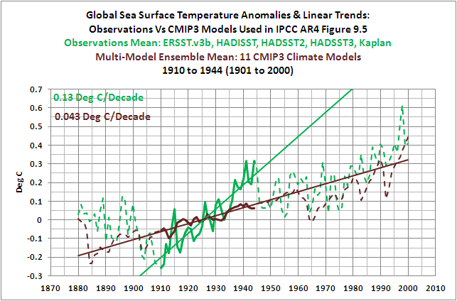
Part 2 also included comparisons of modeled and observed Global Sea Surface Temperature anomalies. Always keep in mind that the global oceans cover about 70% of the surface of the Earth. With the Sea Surface Temperature data, the comparisons started in 1880. The reason for the earlier start year was to determine how well the model mean (the forced component of the models) simulated the significant decrease in Sea Surface Temperature that occurred from the 1860s to 1910. If you’re not aware, with some datasets, the Sea Surface Temperatures in the 1860s and 1870s were comparable to those of the mid-20thCentury “flat temperature” period, as shown in Figure 9. It would have been nice to extend the comparison back to the 1860s but some of the models and other Sea Surface Temperature datasets do not have data available before 1880.

Figure 9
For the Sea Surface Temperature comparisons, we used the average of 5 different instrument-based Sea Surface Temperature datasets for the observational data. As expected, the models agreed reasonably well with the observations in the mid-20th Century “flat temperature” period and the late warming period. Those agreements during the latter part of the 20th Century do not appear to be as good as the other comparisons, but they would probably pass statistical scrutiny. The models also failed to simulate the rate at which temperatures rose during the early warming period. And as shown in Figure 10, the models did not hindcast the significant drop in Sea Surface Temperature anomalies from 1880 to 1910. The model mean indicated that, with the natural and anthropogenic forcings, Sea Surface Temperatures should have risen slightly, but the observations showed they dropped considerably.

Figure 10
And the last comparison of Part 2 included the models versus the updated version of the Hadley Centre’s Sea Surface Temperature data, HADSST3. The update created a significant negative trend during mid-20thCentury “flat temperature” period of 1944 to 1975. This was caused in part from a correction for a discontinuity in the data around 1945. The bottom line: the models can no longer simulate the observed Sea Surface Temperatures as a result of the updates during that period, as shown in Figure 11.

Figure 11
In short, with the latest and greatest Sea Surface Temperature data, the multi-model mean (the forced component of the models) only simulates the observed rate of temperature change during the last 24 years of the 20thCentury.
LAND SURFACE TEMPERATURE COMPARISONS
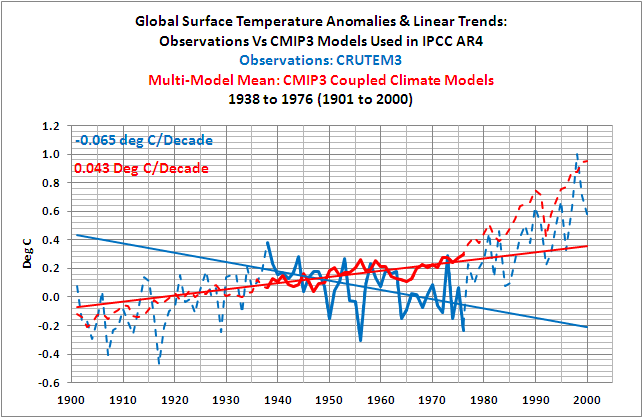
CMIP3 Models Versus 20th Century Land Surface Temperature Anomalies is the most recent follow-up post. As its title states, it compares observed changes in global Land Surface Temperature anomalies to the climate models from the CMIP3 archive, which is the source of the IPCC’s data for AR4. Not unexpectedly, the rate at which land surface temperatures rose during the late warming period was simulated well by the models. Also not unexpectedly, the models also failed to hindcast the trends during the early “flat temperature” period and the early warming period of the 20th Century. But the models also failed to simulate the rate at which land surface temperatures cooled during the mid-20th Century “flat temperature” period that lasted from 1938 to 1976 with land surface temperature data. So for another dataset, the models have illustrated that they are only capable of simulating surface temperatures during the last quarter of the 20thCentury.
IF NOT GREENHOUSE GASES, WHAT CAUSED THE RISE IN SURFACE TEMPERATURE OVER THE PAST 30 YEARS?
And that brings us to another follow-up post, IPCC Models Versus Sea Surface Temperature Observations During The Recent Warming Period.
To illustrate the cause of the rise in Surface Temperatures over the past 30 years, we shifted to a different dataset. For that discussion, we used satellite-based Sea Surface Temperature data (NOAA’s Optimum Interpolated Sea Surface Temperature data Version 2, which is also known as OI.v2) because it has the best coverage of the global oceans. Other Sea Surface Temperature datasets rely only on in situ observations from buoys and ships and do not have complete coverage over that time period. A few infill the missing data using statistical methods but observations are, of course, preferred.
Figure 12 compares Global Sea Surface Temperature anomalies to those hindcast (20C3M) and projected (SRES A1B) by the Multi-Model Mean of the CMIP3 Climate Models. Again CMIP3 is the climate model archive used by the IPCC for AR4. (Note that this graph was not presented in the linked post. I’ve provided it here as a reference.) The rate at which observed global Sea Surface Temperature anomalies rose over the past 30 years is only about 60% of the rate simulated by the models. The models aren’t looking very good over this time period, especially with those base years for anomalies, and for Figure 16, we used the same base years (1980-1999) that the IPCC used for its projections.

Figure 12
For the following discussions and in the linked post, the Sea Surface Temperature data and the model mean of the Sea Surface Temperature simulations both have the base years of 1982 to 2011. This was done to better align the observations and model simulation data over that time period. Additionally, both datasets have been adjusted for the impacts of volcanic eruptions. The adjustments affect the appearance of the data during the years when the aerosols emitted by the explosive volcanic eruptions of El Chichon and Mount Pinatubo caused global Sea Surface Temperatures to drop. It took a few years after those eruptions in 1982 and 1991 for surface temperatures to rebound. The linear trends of the data that has not been corrected for the volcanic eruptions have slightly different linear trends. We discussed the method used to adjust the data for volcanic aerosols in the post linked above, and it won’t be repeated here.
To illustrate why Sea Surface Temperatures have risen over the past 30 years, we’ll divide the global oceans into two subsets. These include the East Pacific Ocean from pole to pole (90S-90N, 180-80W), and the Rest Of The World from pole to pole (90S-90N, 80W-180). The areas are shown in Figure 13.

Figure 13
The East Pacific Ocean model-observation comparison is shown in Figure 14. The first thing that stands out is the difference in the year-to-year variability. The observed variations in Sea Surface Temperature anomalies due to the El Niño and La Niña events are much greater than those of the Multi-Model Mean. The large upward spikes are caused by El Niño events, and the lesser, but still major, downward spikes are caused by La Niña events. Keep in mind when viewing the model-observations comparisons in this post that the model mean is the average of all of the ensemble members, and since the variations in the individual ensemble members are basically random, they will smooth out with the averaging. The average, therefore, represents the forced component (from natural and anthropogenic forcings) of the models. And it’s the forced component of the model data we’re interested in illustrating and comparing with the observations in this post, not the big wiggles associated with ENSO.

Figure 14
The difference in the linear trends between the Multi-Model Mean and the observations is extremely important. That has been the focus of this series of posts. The linear trend of the model simulations is 0.114 deg C per decade for the East Pacific Ocean. This means, based on the linear trend of the Multi-Model Mean, that anthropogenic forcings should have raised the East Pacific Sea Surface Temperature anomalies, from pole to pole, by more than 0.34 deg C over the past 30 years. But the observed Sea Surface Temperature anomalies have actually declined slightly. The East Pacific Ocean dataset represents about 33% of the surface area of the global oceans, and the Sea Surface Temperature anomalies there have not risen in response to the forcings of anthropogenic greenhouse gases. The IPCC has overlooked that basic fact.
The Sea Surface Temperature anomalies and Model simulation data for the Rest-Of-The-World (Atlantic, Indian, and West Pacific Oceans) from pole to pole are shown in Figure 15. The linear trends show that the models have overestimated the warming by about 23%.

Figure 15
But that might give the wrong impression, leading some to believe that anthropogenic greenhouse gases were somehow responsible for the rise in the Rest-Of-The-World Sea Surface Temperatures. But that’s not what the instrument-based Sea Surface Temperature data shows. The observed Sea Surface Temperature anomalies only rose in response to significant El Niño-La Nina events, and during the 9- and 11-year periods between those ENSO events, the observed Sea Surface Temperatures for the Rest of the World are remarkably flat. This is illustrated first in Figure 16, using the period average Sea Surface Temperature anomalies between the significant El Niño events, and second, in Figure 17, by showing the linear trends of the instrument-based observations data between the 1986/87/88 and 1997/98 El Niño events and between the 1997/98 and 2009/10 El Niño events.

Figure 16
HHHHHHHHHHHHHHHHHHHHHHHHHHHHHHHHHHHHHHHHHH

Figure 17
HHHHHHHHHHHHHHHHHHHHHHHHHHHHHHHHHHHHHHHHHH
As you will note, the significant El Niño events of 1982/83, 1986/87/88, 1997/98, and 2009/10 have been isolated for the Rest-Of-The-World data. To accomplish this, the NOAA Oceanic Nino Index (ONI) was used to determine the official months of those El Niño events. There is a 6-month lag between NINO3.4 SST anomalies and the response of the Rest-Of-The-World SST anomalies during the evolution phase of the 1997/98 El Niño. So the ONI data was lagged by six months, and the Rest-Of-The-World SST data that corresponded to the 1982/83, 1986/87/88, 1998/98, and 2009/10 El Niño events was excluded from the trend analyses. All other months of data remain.
Note: The El Niño event of 1982/83 was counteracted by the volcanic eruption of El Chichon, so its apparent role in the long-term warming is minimal.
And what do the climate models show should have taken place during the periods between those ENSO events for the Rest-Of-The-World Sea Surface Temperatures?
For the period between the 1986/87/88 and the 1997/98 El Niño events, Figure 18, the model simulations show a positive linear trend of 0.044 deg C per decade, while the observed linear trend is negative, at -0.01 deg C per decade. The difference of 0.054 deg C per decade is substantial.

Figure 18
The difference in the linear trends is even more significant between the El Niño events of 1997/98 and 2009/10, as shown in Figure 19. The linear trend of the Rest-Of-The-World observations is basically flat, while trend of the models is relatively high at 0.16 deg C per decade.

Figure 19
Keep in mind that the model mean, according to the IPCC, represents the anthropogenically forced component of the climate models during the period of 1981 to 2011. Unfortunately for the models and the IPCC, there is no evidence of anthropogenic forcing in the East Pacific Sea Surface Temperature data (90S-90N, 180-80W), Figure 20, or in the Sea Surface Temperature data for the Rest Of The World (90S-90N-80W-180), Figure 21.

Figure 20
HHHHHHHHHHHHHHHHHHHHHHHHHHHHHHHHHHHHHHHHHHHHHHH
Figure 21
HHHHHHHHHHHHHHHHHHHHHHHHHHHHHHHHHHHHHHHHHHHHHHH
ADDITIONAL NOTES ABOUT THE SEA SURFACE TEMPERATURE COMPARSIONS
There have been and will be criticisms about the discussion above, because it shows that the El Niño-Southern Oscillation (ENSO) was responsible for most if not all of the rise in Global Sea Surface Temperatures over the past 30 years. Even though the data clearly shows what has been discussed, to counter the obvious contribution of ENSO, proponents of Anthropogenic Global Warming have and will continue to present the tired old argument that ENSO is a cycle and as such it cannot contribute to the long-term trend. Only those who do not understand the process of ENSO would try to use that or similar arguments. For who are not familiar with the El Niño-Southern Oscillation, refer the post An Introduction To ENSO, AMO, and PDO – Part 1.
With that basic understanding of ENSO, refer to following two posts. The first discusses, illustrates, and animates many of the variables that create the upward shifts in the Rest-Of-The-World data:
ENSO Indices Do Not Represent The Process Of ENSO Or Its Impact On Global Temperature
The second makes a clarification:
The post IPCC Models Versus Sea Surface Temperature Observations During The Recent Warming Period also divided the Rest-Of-The-World subset into two more subsets to isolate the North Atlantic from the South Atlantic, Indian, and West Pacific Oceans, because the Sea Surface Temperatures of the North Atlantic have an additional mode of variability called the Atlantic Multidecadal Oscillation. For more information on the Atlantic Multidecadal Oscillation refer to the post An Introduction To ENSO, AMO, and PDO — Part 2.
Two more model-observation comparison posts: Refer also to the comparisons of Sea Surface Temperature and model mean datasets (see here and here). As shown, the Multi-Model Mean of the CMIP3 coupled ocean-atmosphere climate models do not simulate the Sea Surface Temperature anomalies in any ocean basin with any skill. It does not matter if the data is presented on times-series basis or on a zonal mean (latitude-based) basis. The model simulations show no basis in reality.
CLOSING COMMENTS
The IPCC attempted to and failed to confirm the hypothesis of Anthropogenic Global Warming with climate models, and without the climate models, the IPCC has no means to verify that hypothesis. That obvious failure aside, the IPCC along with its contributors and disciples have done a masterful job at marketing the concept of Carbon Dioxide-driven anthropogenic global warming to the general public and to politicians. It really was a great job. The IPCC claims:
“Models can also simulate many observed aspects of climate change over the instrumental record. One example is that the global temperature trend over the past century (shown in Figure 1) can be modeled with high skill when both human and natural factors that influence climate are included.”
But the data actually shows the models are not able to reproduce the rates at which global surface temperatures rose or fell during first three multidecadal periods of the 20thCentury with any consistency. In other words, the model-data comparisons repeatedly show that the observed rates at which surface temperatures can vary over multidecadal time periods can be significantly different than the rates simulated by the climate models. The models and observations actually contradict the hypothesis of greenhouse gas-driven anthropogenic global warming.
In response to the IPCC’s FAQ8.1 “How Reliable Are the Models Used to Make Projections of Future Climate Change?, a more accurate answer would be:
There should be little confidence in climate models. The model simulations fail in their attempts to provide credible quantitative estimates of future climate change, on regional, or continental, or global scales. The models have shown little to no ability to reproduce observed features of current climate and past climate changes. Confidence in model estimates is greatly overstated by the IPCC for the most common of climate variables (e.g., surface temperature) used to present the supposition of manmade global warming. After several decades of development, models have continued to show no skill at establishing that climate warming is a response to increasing greenhouse gases. No skill whatsoever.
The only skill shown by the IPCC is their unlimited capacity to market a concept that has been shown to have little basis in reality.
ABOUT: Bob Tisdale – Climate Observations
SOURCES
Refer to the linked posts for the sources of the data presented in this summary post.
KR says:
December 27, 2011 at 5:20 pm
statistical analysis of the data variance indicates that a minimum of 17 years is needed to establish a linear trend with any confidence (Santer et al. 2011).
That is statistical nonsense. The maximum difference in the statistical error will be about 9.4% for a 16 year sample as compared to a 17 year sample.
Standard error of the mean varies as 1/sqrt(sample size). So, to double the confidence you must increase the sample by a factor of 4. If the confidence in a 16 year sample is zero, then it is zero in a 17 year sample.
The most precise instrument on the planet to measure energy accumulating in the climate system is Argo. The climate models all predicted Argo would see heat accumulating in the ocean. Argo showed that energy is not accumulating. This failure is scientific falsification of AGW.
It is the equivalent of Einstein’s theory of relativity predicting that gravity would bend light, and then no bending of light being observed. Had that been the case, the theory of relativity would have been discarded.
All it takes to disprove a theory is a single example where it is shown to be wrong. Argo has shown this. In stark contrast to AGW, General Relativity’s predictions have been confirmed in all observations and experiments to date.
http://en.wikipedia.org/wiki/General_relativity
I believe, that the Fig.5 trend is too short for any meaningful comparison. It would be better also to compare also just North Atlantic SST record vs models; the discrepancy is even more pronounced.
http://oi56.tinypic.com/wa6mia.jpg
KR says “a minimum of 17 years is needed to establish a linear trend with any confidence (Santer et al. 2011). … demonstrating that 17 years is a minimum requirement”
Any minimum period needs to be supported by broader physical reasoning. And the broader reasoning needs to be resilient when new data comes to hand. As somebody already mentioned above, climatologers do not appear to be capable of supporting any period for statistical aggregation. Analysis and arguments jump about to suit the latest set of circumstances.
Who’s gonna be convinced by arguments that simply drop some of the variance into a bucket labelled “noise”, and then propose a minimum aggregation period to filter away the “noise”. That’s a form of cherry-picking.
KR: “Looking at the temperature record against the range of the models shows that >95% of the observations are within the model range. That’s not bad at all.”
It’s hard to imagine a softer measure to claim that the models are “not bad”. I could model a simple mathematical process like sin(X) by producing a random number generator whose values lie in the range [-1.0,+1.0]. 100% of the random numbers would be within the range of sin(X). Surely an astounding result by your argument (beats 95%). Does that make my random number generator a good estimator of sin(X)?
KR says:
December 27, 2011 at 5:20 pm
Looking at the temperature record against the range of the models shows that >95% of the observations are within the model range. That’s not bad at all.
A straight line showing a 0.7C per century increase for the past 350 years performs equally well. Does it have skill in predicting the next century?
http://en.wikipedia.org/wiki/File:CET_Full_Temperature_Yearly.png
Any competent modeller can curve fit a parametrized model to fit the historical data. It it didn’t, you would be fired and the model parameters would be adjusted by your replacement(s) until it did. However, such a model typically has zero skill at forecasting, because of parameter sensitivity.
Like driving a car, even a small error in the steering will result in the car going off the road even on a perfectly straight road. The same with forecasting. Just a small error in the model will drive the forecast off the road. However, with a car the driver corrects course via feedback. There is no feedback available for the future, thus the longer the forecast, the less reliable.
What is notable about the models is that the errors increase as the length of the hindcast increases. this suggests that climate is not subject to the Central Limit Theorem – that the errors will not average out over time.
This has huge statistical implications for climate forecasting, because it suggests that accurate long term climate forecasting is not possible given our current mathematical methods. Inaccurate forecasting will of course still be possible.
Bob, The suggestion to turn these posts into peer-reviewed papers has been made before, and the answer given was that it is more important to disseminate the information on the web. I still think it is worth while publishing a series of papers with a view to advancing the debate in the formal scientific press. Easy for me to say, lots of work for you. best wishes,
KR says: “I think you could (cherry)pick multiple 4, 9, and 12 year periods from the data and get any slope you wanted.”
I explained how the periods were selected. Your need to classify them as cherry picked indicates you are arguing without having read the post. And that’s confirmed by your the rest of your arguments in your December 27, 2011 at 9:03 pm comment. I’ve discussed, illustrated and animated the processes that cause those upward shifts in Sea Surface Temperature in posts linked above. If you understood the topic of discussion, you might not feel the need to present such weak arguments.
Arno Arrak says: “As an example, Pinatubo eruption was followed by the 1992 La Nina which was quickly pronounced to be caused by its volcanic cooling power. But if the eruption takes place when a La Nina has bottomed out and an El Nino is beginning to form the eruption is not followed by any trace of cooling.”
There is no 1992 La Nina. There were no La Nina events during the 1990s until the 1995/96 La Nina.
You continued, “Had you bothered to read my book you would know this by now.”
As I have explained before, there’s no reason to read a book by an author who insists there was a La Nina event in 1992/93, when all ENSO indices indicate that no La Nina took place. Or did you invent a new ENSO index to go along with your conjecture that volcanic aerosols injected into the stratosphere do not cause cooling?
KR says: “And (3) In your discussion of IPCC models versus the temperature record, you properly should include both the mean and the range of the climate models.”
I explained why the model mean was used. Your comment is additional support for my belief you haven’t read the post. You also haven’t read the posts that are summarized by this one. In them, I explained why I was presenting the model mean. Refer to the discussion under the heading of CLARIFICATION ON THE USE OF THE MODEL MEAN here:
http://bobtisdale.wordpress.com/2011/12/12/part-2-do-observations-and-climate-models-confirm-or-contradict-the-hypothesis-of-anthropogenic-global-warming/
KR says: “Looking at the temperature record against the range of the models shows that >95% of the observations are within the model range. That’s not bad at all.”
Thank you for being so vague. It gives the readers here a better feel for your grasp of the discussion. Only someone who needs to believe in the IPCC’s conjecture would consider the additional ensemble member noise “not bad at all”.
Let me make a suggestion, KR. Go back to your SkepticalScience and ask them to prepare a rebuttal to my series of posts. You aren’t doing very well here on your own. You need some help.
@KR says:
December 27, 2011 at 9:03 pm
//////////////////////////////////////////////////
What length of time is required to falsify or raise concerns with a theory depends upon what the theory claims to be true and what the observational data shows to be the case.
For example, if we had a theory that claims that with every doubling of CO2 there will be a corresponding rise in temperature of 3 deg C then if the observational data say ober a 10 year period was as follows
Year 1 CO2 260ppm av tem 15 deg C
Yr 2 CO2 400 ppm Av tem 15 deg
Yr 3 C02 560ppm Av tem 14.9C
Yr 4 CO2 600pp Av tem 15 deg C
Yr 5 CO2 1000 ppm Av tem 14,8C
Yr 6 Co2 1400 ppm Av tem 14.8C
Yr 7 CO2 1900 ppm Av temp 14,7C
Yr 8 CO2 2600 ppm Av temp 14,5C
Yr 9 CO2 5000 ppm Av temp 14.5C
Yr 10 CO2 8300 ppm Av tem 14.4C
You would be hard pressed to argue that the time period was too short to suggest that there may be some problem with the rational underlying the claimed theoretical statement. In that time you have had five doublings of CO2 and yet no increase in temperature, to the contrary there has been a decline in temperatures.
Of course, it is a question of extracting the noise (including all forms of natural variations) from the signal. The longer the data stream, the easier it will become to eliminate the noice and extract the signal. The more accurate the data measurement, the easier it will be to eliminate the noise and extract the signal.
There is nothing magical in a 17 year period. Given what little we know about ocean cycles and given how unreliable the data measurement/quality is, and given that we know that there has been a roman warm period, a MWP and a LIA for reasons not fully known or understood by us one can see strong arguments that 1000s of years worth of data are required before firm and incontovertible conclussions can be drawn.
That said, if 17 years of sata are required given that for reasons unknown the warming has halted for approximately the last 10 or so years which was not foreseen in the 80s or early 90s such that we have more time than was at that time thought to be the case to mitigate/adapt, the sensible course would have been to have cancelled Durban, put AR5 on hold and just simply monitor and collect data for the next 8/9 years. If the hiatus to the warming continues, we can afford to collect the data. Once we have this data say in 2020 or 2022 we can then write AR5 and there will then be much more certainty about that document.
I have no problem in requiring a longer data set. The problem is that we are seeking to take disastrous steps when early indications suggest that the cAGW theory may (I emphasise the use of the word may) have been over-stated such that there may be no need to take steps to mitigate and perhaps only small steps of adaption are required.
We should just put everything on hold (including model runs) apart from the collection of observational data and lets see what that data suggests. Only then should we draw any conclusions and only then should we take any decisions on what (if anything) needs to be done.
I’m always confused. You take part of the ocean, and its temperature seems to go up in steps which correspond to El Nino events. But lets just say that the heat content of that bit of ocean is steadily increasing, and during El Nino events the heat appears in the surface layer – so the sea surface temperature suddenly jumps. Once the El Nino event is over, the extra heat is not stored in the surface layer, but deeper. So the temperature of the sea surface stabilises. Until the next El Nino comes along, and the heat comes to the surface, etc etc….
So you could be looking at a steady build up of heat in this part of the ocean – just as you’d expect with global warming. This seems an obvious way of looking at it, so why make it more complex? The trend in SST in the other bit of the ocean is a bit weird. Is there some physical reason for choosing the dividing line between the two bits of ocean?
IPCC: “This confidence comes from the foundation of the models in accepted physical principles and from their ability to reproduce observed features of current climate and past climate changes. ”
What rubbish. To any engineer involved in making simulation models of physical systems, such a statement is a joke – and a bad one at that.
If a model can’t even reproduce the data used to construct it, it is obviously useless.
But being able to reproduce the data used to make the model provides no confirmation of the correctness of its physical model, necessary (but not sufficient) to predict future observations.
And, even if a model is a good representation of physical reality, chaotic effects can mean that anything more than very short term predictions are meaningless.
The opposite case, ocean cooling is thus suggested but would take longer. A series of la ninas with mild conditions in-between would result in cooling land temperatures. The saving grace would be the knowledge that la ninas will eventually go away. Why? La ninas, if I use the correct understanding, serve to recharge the system. If there is one truth to adhere to it is this: store up our plenty from a warmed world to get thru the cold spells. Not the other way around. It is cold that causes famine and death, not warmth.
The problem with the hypothesis that El Niño events cause step-changes in the ocean heat content is the absence of a physical mechanism.
The 1LoT requires that the ~ 10^22 Joules that the ocean has accumulated over the last ~30 years must have come from somewhere. It didn’t come from solar input, the TSI has fallen over the same period. Therefore some physical process must have caused the retention of more of the solar energy as thermal energy in the oceans. I can find no coherent explanation of this physical process in Bob Tisdale’s ENSO descriptions.
Even if the El Niño events were responsible for the warming, it is difficult to see how they can be invoked to prevent the cooling back to the pre-El Niño level. Something that must have happened during the last few thousand years of ENSO cycles.
If three El Niño events in 30 years can raise the sea surface temperature by over 0.3degC then at the present rate of ENSO events warming would be comparable, or slightly greater, than that projected from the AGW theory by the end of the century….
fred Berple @12:34: BINGO– what the warmist commenters seem to misunderstand is that the IPCC ‘models’ Tisdale is evaluating are look back models that supposedly describe the past temperature record– and they fail to get that right, yielding only a 95% accuracy record. An engineering model measuring physical processes would be virtually 100% accurate; would you design a bridge using a structural engineering model or a new aircraft wing with an aerodynamic flow model that was 95% only accurate? Of course not — that failure rate is an utter disaster. With all the funding and computing power, how did the IPCC models fail when engineering and other database models routinely achieve virtually 100% accuracy? My opinion is instead of measuring physical processes the IPCC is locked into a political process that needs to deliver certain political results — so their ‘models’ fail.
PS: just because Tisdale has proven that IPCC’s models fail, does not mean that Tisdale’s ENSO step up reasoning is correct. izen rightly points out that Tisdale’s reasoning is statistical correlation, it is not based on physical processes.
izen says:
December 28, 2011 at 7:07 am
/////////////////////////////
What about a change in cloudiness during this period allowing more solar irradiance to impact upon the ocean?
I highly recommend Tisdale’s site to explore the mechanisms. I just did. OHC and other observational data sets are quite well covered in terms of mechanisms. CO2 certainly functions as a greenhouse gas, but hardly rises to the mechanistic strength of oceanic-atmospheric drivers of global temp over land and water. For that matter, neither do the tiny variations of solar output.
It is very apparent to anyone reading with an open mind that about 60 years, two thirty year periods, one dominted by La Nina, and one by El ninos, plus other ocan basin systems, is the needed time frame to begin to think one has an accurate trend. (17 years means nothing one ocean trends last several decades) The ensembled mean of the climate models only have one period correct, the last third of the 20th century. They missed a thee decade trend from about 1915 to 1975, they missed the cooling shown in the first decade and 1/2 of the 20th century. (Not certain what happened in the last 15 years of the 19th century) and they missed the first 12 years of this century. If the ocean sst continue as expected by observations of historic ocena basin trends, then expect the models to continue to get further off.
I am uncertain why the IPCC gets to use multiple models for anything other then research. If one is to express confidence in their understanding of a natural SINGLE system (the earths climate) Then they must produce ONE model, based on all that was learned from multiple models, and then that one model must match the ONE real world.
Bob graphs are good, showing the stepwise temp-increase since the 19 Cty. A step increase is followed by a flat step surface ( temp plateau) and it is plausible that the oceans play a role in this stepwise behaviour……
Now we are on the flat plateau step again…. no more temp rises to the end of the plateau in a few more decades…..
What will be different afterwards is that the next following step will not go upwards as before,
but downwards since we are on the maximum height top plateau of the wave-like and not of a hockstick climate development…. and this will be the end of the CWP (Current Warm Period, as
it is named already…..)
Bob Tisdale – Re: the model mean, and the model range.
The 17 year minimum period Santer 2011 discusses includes a rather detailed discussion of decadal reverses in trend, which are fully expected in the climate due to variations such as TSI, volcanic forcing, and, yes, the ENSO. Even a casual examination of the model results, and their range, indicate that individual runs show as much variability as the observed temperature record. Hence the fact that the models (driven by the physics incorporated into them, mind you) closely encompass the observations – indicate that they track quite well.
Side note: Personally, I would prefer ~20 years as a minimum, not 17, given the noise, for more certainty in establishing trends. But Santer 2011 is focused on the absolute minimum time-frame wherein you can draw a statistical trend conclusion, and is therefore more aggressive.
Your short term (4, 9, and 12 years, as far as I see from your graphs) “linear” trends are, to put it bluntly, not statistically supportable given climate variance. Your lack of consideration of the range of values still makes it an apples/oranges comparison.
And, as izen points out, you are discussing statistical correlation, not cause-effect, and have not provided or suggested any physical manner in which ENSO could ‘shift’ the climate to long term warmer levels. That requires a change in energy, and any warming by ENSO which did not include a change in incoming energy would rapidly fade away due to increases in thermal radiation to space. On the other hand, changes in GHG’s (along with other forcings) add up to just about the warming we see – based upon the physics.
You are welcome to disagree – but I will continue to note that your linear shifts are not based on physics, they are too short for statistical significance of trends, and that (as I believe Tamino has discussed multiple times) your issues with IPCC climate models do not address the differences in variance between a single observation track and the mean of multiple models.
—
Incidentally, Bob, if you are interested in SkS you might want to look at http://www.skepticalscience.com/its-a-climate-shift-step-function-caused-by-natural-cycles.htm, in particular Figure 1 (variance in short term trends) and Figure 4 (showing how artificial data with a linear trend and noise can be “eye-crometered” into false “climate shifts”).
izen says:
December 28, 2011 at 7:07 am
“The problem with the hypothesis that El Niño events cause step-changes in the ocean heat content is the absence of a physical mechanism.”
Common Sense Alert! Common Sense Alert!
Mr. Tisdale points to the natural process. In doing this pointing, he is pretty much limited to data points and statistics.
We should keep in mind that Mr. Tisdale is a private person who works fulltime and produces posts at WUWT. He does not have the resources of the IPCC.
To expect Mr. Tisdale to produce the well confirmed physical hypotheses that describe the natural processes that make up ENSO is like expecting an ingenious creator of a new operating system to have the resources of the corporation that will perfect and market the operating system. If Bill Gates had not secured the cooperation of IBM in his work then no one would have heard of the DOS operating system.
Mainstream climate science has said nothing about the natural processes that make up ENSO and similar phenomena such as cloud behavior. They attempt to use a radiation only model of the Earth – Sun system to account for all of global warming/climate change. Mainstream climate science has no well confirmed physical hypotheses that describe some natural process unless that natural process is the radiation exchange between Earth and Sun. They have no such hypotheses because they believe that no natural process such as ENSO has any role to play in global warming/climate change. In this belief, they are dead wrong. Even Arrhenius knew that the effects of increased atmospheric CO2, whether warming or cooling, depended entirely on natural processes such as cloud behavior.
Bob Tisdale – Regarding your comparison of a model mean to observations, I would suggest everyone read http://tamino.wordpress.com/2011/11/20/tisdale-fumbles-pielke-cheers/, where this particular issue is discussed.
And yes, Bob, I have read some of your replies. You have (in my view) correctly discussed the nature of those means. But – you then continue to compare a single observational record with that averaged value, not discussing the fact that observations lie within the range of values for those averaged runs. I consider that a significant omission.
And no, the models are not perfection by any measure. They don’t match terribly well to the details of turning points (1940’s, 1970’s), very few come anywhere close to tracking ENSO or other decadal variations. But if the criteria for modeling was perfection, we would never get out of bed.
“Remember that all models are wrong; the practical question is how wrong do they have to be to not be useful.” – George Box, http://en.wikipedia.org/wiki/George_E._P._Box
I would have to opine (again, personal opinion) that the fact that observations fall within the bounds of the model runs makes those models useful.
NK says:
December 28, 2011 at 7:20 am
“fred Berple @12:34: BINGO– what the warmist commenters seem to misunderstand is that the IPCC ‘models’ Tisdale is evaluating are look back models that supposedly describe the past temperature record– and they fail to get that right, yielding only a 95% accuracy record. An engineering model measuring physical processes would be virtually 100% accurate; would you design a bridge using a structural engineering model or a new aircraft wing with an aerodynamic flow model that was 95% only accurate? Of course not — that failure rate is an utter disaster. With all the funding and computing power, how did the IPCC models fail when engineering and other database models routinely achieve virtually 100% accuracy?”
The answer is very simple. Engineering models actually embody tried and true principles from engineering that are applied to the special case at hand by expert engineers who are overseeing the project. By contrast, mainstream climate science has no physical hypotheses about the natural processes that make up climate, except for their one grand hypothesis about radiation exchange between the Earth and the Sun. Mainstream climate models are nothing more than computer code that attempts to reproduce the various historical graphs of temperature change and related changes. It is as if engineers were to attempt to construct a model of a bridge project by carefully recording the observable data from some existing bridges and the terrain in which they exist.
The obvious question being begged is this:
‘If step changes in ocean temperature come from el Nino events, did step change coolings follow La Nina events?’
I guess the question to ask is what the threshold of event needs to be to trigger a change and whether major La Ninas in the 1970s or before triggered oceanic cooling or not.