By Steven Goddard
The Arctic sun has now passed its peak, and is starting its decline towards the horizon over the next 90 days.
")
All four (JAXA NSIDC DMI NORSEX) ice extent measurements now show 2010 as below 2007. You can see in the modified NSIDC map below that the regions which are below the 30 year mean (marked in red) are all outside of the Arctic Basin and are normally ice free in September, so it is still too early to make any September forecasts based on extent data.

The modified NSIDC map below shows ice loss (in red) during the last nine days. There has been very little change in the Arctic Basin.

The modified NSIDC map below shows ice loss (in red) since early April. According to JAXA, this is about 5 million km².

The modified NSIDC map below shows ice loss (in red) since early April. According to JAXA, this is about 5 million km².
The modified NSIDC map below shows ice loss (in red) since 2007. According to JAXA, this is about 500,000 km². Areas in green have more ice than 2007.

There has been a strong clockwise rotation of wind in the Beaufort Gyre, which is pulling ice away from the land around the edges of the Beaufort, Chukchi and East Siberian and Laptev Seas.

http://www7320.nrlssc.navy.mil/pips2/archive/mag/2010/mag_2010062200.gif
The video below shows changes in PIPS ice thickness and extent during June. You can see the ice rotating clockwise and concentrating in the center of the Arctic Basin.
During the last 10 days, PIPS shows that Arctic Basin ice volume has dropped close to 2007 and 2009 levels. Volume has increased by about 40% since 2008.

Average ice thickness is now the highest for the date during the last five years. This is due to the compression of the ice towards the interior of the Arctic Basin.

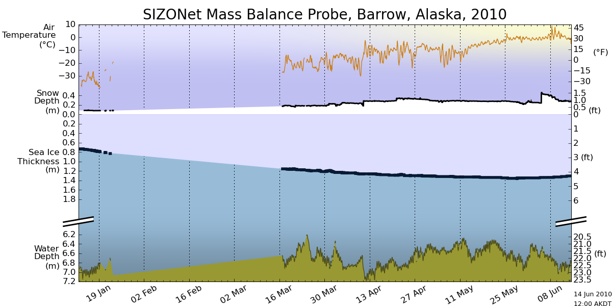
Ice offshore of Barrow, Alaska is showing little signs of melt so far.
") ‘
‘
http://seaice.alaska.edu/gi/observatories/barrow_sealevel/brw2010/BRW_MBS10_overview_complete.png
The current break up forecast calls for July 5.
")
http://seaice.alaska.edu/gi/observatories/barrow_breakup
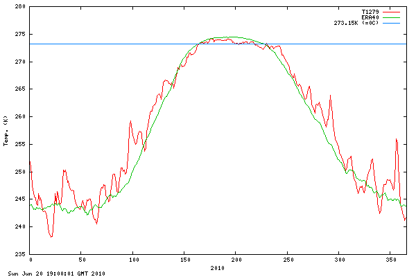
Temperatures north of 80N have been persistently below normal this summer.
")
http://ocean.dmi.dk/arctic/plots/meanTarchive/meanT_2010.png
There are still no signs of melt at the North Pole, with temperatures running right at the freezing point – and below normal. Normally there has been surface melting for several weeks already.
")
http://psc.apl.washington.edu/northpole/webphotos/noaa2-sml.jpg
Arctic Basin ice generally looks healthier than 20 years ago.

I’m forecasting a summer minimum of 5.5 million km², based on JAXA. i.e. higher than 2009, lower than 2006.
Meanwhile down south, Antarctic ice is well above “normal” close to a record maximum for the date.
")
http://arctic.atmos.uiuc.edu/cryosphere/IMAGES/seaice.recent.antarctic.png
The video below shows the entire NSIDC Antarctic record for the last 30 years.It looks like a heart beating
EFS_Junior says:
Do you see what I see?
http://psc.apl.washington.edu/northpole/webphotos/noaa1.jpg
__________
Yeah. Melt ponds. At the same North Pole that yesterday was proclaimed not to show any signs of melt. And the same one that several days ago I pointed out was covered in waterlogged snow that was within a week of turning into puddles.
stevengoddard,
I do not think that you have answered my questions regarding your ice volume/ice thickness graphs.
There is also another potential problem with them. If average thickness is 2.5 metres, how is volume 55,000 cubic kilometres (the metric that I am assuming that you are using for volume, as the units are not marked)? This would imply an area of over 20 million square kilometres, something which seems a little tricky as ice area in the arctic does not reach that far even in the depths of winter.
Further, PIOMAS (and I know that you do not like them, but bear with me) suggest that average ice volume for winter is less than 30,000 cubic kilometres, with recent years being much lower. 55,000 is quite different from 30,000, and your 55,000 figure is not even the winter one, but rather taken from the middle of June.
Again, I apologise if this has been discussed elsewhere, but what are the area figures that you are using to calculate volume? As you say, volume = thickness * area. We have your volume and thickness figures, and they are indicating that you are using an unusually large area figure. Is this correct, or have I made an error in my assumptions or calculations?
Thanks
David
R. Gates says:
June 24, 2010 at 3:48 pm
You probably weren’t around in 1959, before the C02 is supposed to have caused catastrophic global warming.
Sarah says:
June 24, 2010 at 4:04 pm
Yep. http://www.robertb.darkhorizons.org/0857806.jpg Melt ponds in 1959.
Wow.
FergalR says:
June 24, 2010 at 3:58 pm
We are the unwanted masses, as well as the unwashed masses, that cannot possibly understand the genius of the Agenda.
Remember what the Alien in Independence day said it wanted?
rbateman says:
June 24, 2010 at 3:34 pm
Dig deep within your pockets. Pull out a nickle if you have one.
Place nickle on side and view thickness.
That’s how much the average sea-level rise was last year.
Wow.
villabolo responds:
“The greatest shortcoming of the human race is our inability to understand the exponential function.” Albert Bartlett
Just think of it rbatement, sea level rise was about 1.5 mm a year in 2000. Now it’s 3mm a year. that’s a doubling within ONLY 10 YEARS!
Before you follow up on your “Wow” with “Gasp” please tell me the following:
How many 10 year periods can fit in the rest of, let’s say, this century?
Then tell me what a doubling continued every 10 years, for another year will come out to.
When you figure out the answer then realize that:
a) Greenland’s melt down doubled from 2002 (137 billion metric tons of ice) to 2009 (286 metric tons).
b) We have assuming that we magically stopped our CO2 today and it held steady at 390 pmm we still have a ways to go in our heat increase. It’s called Thermal Lag (or “time delay”). We have about 30 years or so for temperatures to increase another 1 degree Fahrenheit. That would make a total of about 2.5 degrees, including our current average.
Needless to say, that will accelerate any melting.
Nevertheless, by the time Miami and Manhattan get drowned, nobody is going to care. Those cities will probably be mostly abandoned before then.
What I like particularly of that submarine picture is to see that sea water that stretches all the way to the horizon. 🙂
But seriously: I used to think that the Arctic sea ice was one huge sheet of ice, like a skating ring. Now, thanks to the MODIS satellite images, I know that it actually consists of thousands of ice floes constantly grinding against each other, but with spaces in between them here and there. So it’s not that inconceivable that a submarine can pop up in a small strip of open water between ice floes on the North Pole. In fact, I see plenty of spaces in the North Pole area where a submarine could emerge and make pictures for the folks back home.
The probability that a submarine could have sailed all the way to the North Pole in the past is very low, however.
So, have I displayed the right kind of skepticism?
R. Gates says:
June 24, 2010 at 2:49 pm
___________
:)) If only it were that easy. I love your attempt, but even when the Arctic is seasonally ice free sometime in next few decades, AGW skeptics will claim it is natural variation and show us their pictures of submarines coming up in polynya at the north pole and claim it is evidence the Arctic was ice free in recent past. This isn’t a matter of science, but of belief, so there will never be any “settling it once and for all”.
But to your point, 6-23-2010 is far more similar to 2007 than 2006, and so shall the September minimum for 2010.
___________
Hey R. Gates.
I really like your efforts in countering the status quo here at WUWT, particluarly on Arctic sea ice extent.
Hope you realize why I chose 2006 and 2007, as these are the two closest years to the current 2010 season trend line at the moment (yes 2005 is also in there, but 2010 seems to be moving away from 2005 faster than either 2006 or 2007).
You should also notice that 2006 and 2007 bifurcate from each other in early July.
At this point in time, for a 5.5E6 km^2 prediction to hold, means that 2010 will almost have to follow the 2006 trend line to a tee.
May 2010 was a record, and it is almost a given that June 2010 will also be a record, or near record, in terms of sea ice extent loss.
July and August have historically seen the maximums in terms of negative trend line steepness (JAXA 2003-9).
Let’s see what happens in the next two weeks, at which time #12 Update will be posted, and I’ll have much more to say on the subject matter.
Got’s me one heck of a kick azz spreadsheet, totally blows away anything posted here to date at WUWT.
Cheers.
Phil. says: June 24, 2010 at 3:57 pm
RE: Ice, or lack of it or something
It might be helpful if you’d locate Barrow, Alaska on
http://ice-map.appspot.com/
for others?
On Firefox I can zoom in and click the chain-style icon in the upper left to get the location put in the address bar, then copy and paste from there. Here’s where I think (I’ve never been in Alaska) Barrow is:
http://ice-map.appspot.com/?map=Arc&sat=ter&lvl=5&lat=79.467223&lon=-117.133555&yir=2010&day=175
I’ve zoomed in a little and put a red dot near where I think Barrow is (I’m a bit tipsy, though, mind) hopefully it’s probably near thereabouts.
http://i45.tinypic.com/1zyems.jpg
If I’m somehow correct there seems to be a couple of km of sea-ice there, if shore-fast ice is qualitatively different but looks the same and extends visibly from the shore so much then please enlighten me. Thanks.
Actually, the Arctic in 1959, when the North Pole was ice free, doesn’t look much different than now.
But I guess some folks just aren’t happy unless they have something to worry about, even if it’s only natural variation due to wind and currents.
Oops, the 1959 graph didn’t come up. Just click on 1959 on that page, and compare it with 2010. Or any other year, for that matter.
Heck, click through all of them. Only takes a minute or two. You will see that 2010 isn’t much different than previous years. That means the current ice loss is not due to temperature, but to variable winds and ocean currents.
villabolo
I flew over western Greenland in early October, 2007. The most noticeable feature of the ice on the western side is how dirty it was. There must have been strong winds bringing soot to western Greenland that summer, which no doubt was largely responsible for the melting of the ice sheet.
Smokey says: June 24, 2010 at 3:08 pm
“When the Antarctic ice cover starts disappearing, wake me.”
This is an important point. Seeing the myriad of variables involved in Arctic sea ice makes me think that Antarctic sea ice might be a better thermometer of Earth’s temperature. Why is everyone so focused on the Arctic?
Villabolo, you should respond by being more critical of what you’re told.
Here’s the satellite measured annual rises in sea-level:
http://www.climate4you.com/SeaTemperatures.htm#GlobalSeaLevelAnnualChange
An El Nino now would seemingly have the rise near zero for the next 6 months. Anyway the sea level has been rising for 13,000 years with rare pauses like the Little Ice Age. Probably a little faster due to CO2 but most likely nothing to get your knickers in a twist about. I’ve only ever been in New York while in transit so I might not have as much attachment to it as you, or certainly the people who live there, have.
But there are few buildings in that city more than 100 years old. If there’s something really historic that needs saving you’ll have 100 years to pay for a big dam around it. Unless the IPCC is wrong. In which case you won’t have to bother.
In any case you’d most likely you’d let it sink like our ancestors did when they had to leave the disappearing shores when the last ice-age ended. Thankfully we’ll have lovely carbon dioxide to help our plants grow faster, so that even though we have more than double the arable land – right now (3.5 billion hectares)- necessary to feed 12 (20?) billion people, we’ll still be able to starve people to death in 2100 when the population is (according to UN estimates) 4 billion. Whilst growing loads of biofuel. And laughing evilly I presume.
Even with a 2/5/10m sea-level rise.
People are starving to death right now and there’s an excess of arable land. Open your eyes.
FergalR says:
June 24, 2010 at 3:58 pm
“We had the harshest winter in 40 years here. . . . because climatologists told them that harsh winters were a thing of the past.”
It forever amuses me to see people of a so called advanced culture/nation believe that their immediate environment is the center of the universe.
Last winter, according to NASA thermal imaging maps which display the Earth’s different temperatures in color coding, about 10-15% of it’s surface was cooler than usual. The other 85-90% was warmer, even blazing hot compared to our “back yard”.
The ARCTIC AREA was 10 degrees WARMER than usual, it appeared in two shades of dark red extensively overlapping each other.
The part of the Earth that was colder than usual, showing up as white in the heat images went, in our area, from approximately the Canadian border to slightly south of Cuba. Then it went all the way around the Earth from The US to Europe, Russia, Siberia, parts of China then back to the US.
The connection between the much warmer Arctic and the cooler band immediately south of it is clear and obvious to Meteorolists. There basically was a flip flop of heat and cold between the two areas.
This happened because, under unusual weather conditions, the Arctic basically spills it’s frigid guts down south as far as it will go and then sucks in warmer air from the south causing its temperature increase of 10 degrees.
South of this small cooler area and down to the equator, Global warming as usual.
Then you had the Southern Hemisphere which was in its Summer season. Which is allright, summers can be cooler than usual. But this Summer it suffered its greatest heat in all recorded temperature history. 122 degrees in South Africa, heat waves in Brazil and Australia.
MORAL OF THE STORY. THE BIG PICTURE IS WHAT COUNTS.
Pamela Gray says:
June 23, 2010 at 4:21 pm
Thank you Pamela. Well said.
I don’t know what will happen in September. But I’m quite sure it won’t matter.
Well, maybe one exception: If it goes below 4.0, Gore will be guzzling enzyte and no poodle will be safe.
villabolo June 24, 2010 at 5:55 pm
You’ve got it precisely ass-backwards. The negative Arctic Oscillation that brought cold weather to the Northern Hemisphere also increased ice production in the Arctic. The higher temperatures at the Pole this year were mostly due to the latent heat released when huge amounts of ice froze.
Villabolo, sorry, I missed the last part “122 degrees in South Africa, heat waves in Brazil and Australia.”
I’m stunned, I’ve never been to South Africa or Australia, but I’ve certainly been to Brazil during a heatwave. I was in bits (I must confess that I’m a little pale), but the inhabitants of Rio and Sao Paolo thought it was great! I probably needed a little more time to adapt. 122(F=50C) degrees in South Africa sounds a little more life-threatening. Was that in the whole of South Africa? Was it for an extended period? Did anyone survive?
As for Australia, well, I don’t mean to get on people’s nerves but that island is pretty much uninhabitable without highly advanced hunter/gatherer techniques and/or modern technology. Just kidding! 😉
stevengoddard says:
June 24, 2010 at 5:38 pm
“There must have been strong winds bringing soot to western Greenland that summer, which no doubt was largely responsible for the melting of the ice sheet.”
VILLABOLO:
Steve, thanks for the comment on Greenland.
If that soot was a steady feature throughout Greenland then you may have a point. However, if you look at the images below, you’ll notice the following:
http://www.sciencedaily.com/images/2010/03/100323161819-large.jpg
In 2005, Greenland had barely any melt in the West, except for one very limited spot. It also had a certain amount of melt in the East. Most curious of all, it had a very small growth in the center.
In 2008, however, it had a large growth of melt in the West. A much greater melt in the East and South. It also had a very expanded GROWTH in the center, high altitude regions.
On the basis of these observations, I ask the following questions concerning the possibility that soot is causing the melt:
!) Has this soot been a constant occurrence every year for the past 10+ years that
we have been having melt throughout Greenland?
2) Why is it that the fresh snow that falls throughout Greenland, fails to protect the
ice underneath by providing cover from the sun?
3) Why is it that the snow, covering the soot and then turning to ice, not compensate
for any previous loss of ice?
4) Why is it that the increasing area of the melting edges are spreading further
inland, throughout the years, as a result of soot?
5) Are the winds so constant and precise in their pattern throughout the years that
they happen to deposit soot equally throughout all of Greenland?
I look forward to further communicating with you Steve.
geo,
I agree that the thin ice melts first. However, the argument is about the evidence that exists for the ice being thick. At the moment, I would suggest that the only evidence that we do have – the speed of the ice melt – is not evidence for the ice being thicker than normal. I have also pointed out that there seem to be problems with stevegoddard’s analysis of ice thickness, ice volume and ice area in the Arctic Basin.
So, I agree that the Arctic Basin is the key. But I do not see at this point on what basis claims are being made that the ice in the Arctic Basin is thicker and has more volume than 2008. I know that stevegoddard uses PIPS to generate these estimates. But the estimates seem to be inconsistent with reality (greater than 20 million square kilometres of ice in the arctic basin, for example). I am hoping that stevegoddard clarifies this for me.
Günther Kirschbaum says:
June 24, 2010 at 5:14 pm
The probability that a submarine could have sailed all the way to the North Pole in the past is very low, however.
If the 1959 feat was claimed to have taken place by a submarine sailing on the surface, it’d be a farce.
They went under the ice, using upward looking radar, and surfaced in stages where the ice was very thin or non-existent.
Also, it was not the only such feat, as the Brits joined the U.S. Navy in many such forays in the years afterward.
This one is from 1962 : http://www.robertb.darkhorizons.org/0857805.jpg and you can see they had a bit of ice/snow to pop through.
The kicker for 1959 is that a series of pictures were taken along the way, under widely varying conditions. But the prize was in open water on March 17, 1959….before the sun had risen at the North Pole.
This is like trying to dismiss the Apollo Lunar Landings.
David Gould says:
June 24, 2010 at 7:40 pm
How do you differentiate between ice that has melted and ice that is bunched up by winds?
stevengoddard says: June 24, 2010 at 2:52 pm
“CO2 has risen from 280 to 400ppm with a 0.7C increase in temperature. That doesn’t extrapolate out to 3C at 560ppm. But math isn’t important to the politicians at the IPCC.”
How many are skeptical of Steven’s statement above? The reasoning is faulty and the misdirection to politics fails to rescue it.
A jug of water on the stove does not reach its final temperature straight away. It keeps heating as it absorbs energy until a balance is reached between the energy going in and the energy going out (assuming it doesn’t boil). The 0.7C rise mentioned above is a partial response so far to the increase in CO2, not an end-point. Extrapolating assuming it is an end-point yields an incorrect conclusion.
Ammonite,
Please provide empirical, testable measurements showing how much of that 0.7° rise is attributable to the recovery from the LIA.
Thanx in advance.
rbateman,
You can use concentration maps to examine that, but I imagine that it would be quite difficult to do. The only metric that we have available to us is the ice extent (which does include concentration in it). Ice extent is lower this year than in the years that we have on record and is dropping faster than in the years that we have on record. That cannot be construed as evidence for thicker ice.
If all you are saying is that I cannot prove that the ice is thin, fair enough: I agree. But the only evidence that we have is not something that points to the ice being thick.
Ammonite
The effects of CO2 are logarithmic. Further increases of CO2 have less effect than past increases. Expect the next 120ppm to have less than 0.7C effect.