
By Steven Goddard
The quest for the Holy Grail.
I have been looking for a reliable early predictor of September area/extent based on June ice data, and have found it – almost. Previously I established that current extent is a useless predictor, prior to August. The reasons for this are :
- Extent tells you nothing about thickness
- Many areas currently covered with ice, will normally have almost none in September (Hudson Bay, Barents Sea, etc.)
I eliminated the second issue by reducing the region of interest to the area shown in white below. That area corresponds approximately to the maximum extent of September ice in the 30 year NSIDC record.

Then I tried three different metrics to compare June 6 ice parameters vs. September extent and area, for the decade 2000-2009.
The first parameter was June 6 ice area. As expected, this correlated very poorly with September extent and area. The rsq value of June 6 ice area rankings vs September extent rankings is 0.02. The rsq value of June 6 ice area rankings vs September area rankings is 0.07.
The next parameter for comparison was June 6 ice volume (calculated from PIPS) vs September extent. This correlated much better. The rsq value of June 6 ice volume rankings vs September extent rankings is 0.22. The rsq value of June 6 ice volume rankings vs September area rankings is 0.37.
The final parameter for comparison was June 6 average ice thickness (calculated from PIPS) vs September extent. This correlated the best. The rsq value of June 6 average ice thickness rankings vs September extent rankings is 0.28. The rsq value of June 6 average ice thickness rankings vs September area rankings is an excellent 0.65.
So it appears that we have found a reliable predictor of September extent based on June ice thickness, which makes sense from a physical point of view. But it isn’t perfect! The graph and table below show the problem.

Average thickness on June 6, 2010 is 2.55 metres. The table below shows the June 6 rankings for the last 11 years. 2010 is in 7th place, behind 2006 and ahead of 2007, 2003, 2009 and 2008. Average thickness is more than half a metre thicker than 2008.
Date            Average Thickness

6/6/2004        2.95

6/6/2005        2.87

6/6/2001        2.86

6/6/2000        2.84

6/6/2002        2.76

6/6/2006        2.68

6/6/2010        2.55

6/6/2007        2.54

6/6/2003        2.5

6/6/2009        2.17

6/6/2008        1.96
Everything in that table makes sense, except for 2007. Ice thickness in the central Arctic on June 6, 2007 was nearly identical to 2010 and the top year – 2003.
Conclusion : Based on current ice thickness, we should expect September extent/area to come in near the top of the JAXA rankings (near 2003 and 2006.) However, unusual weather conditions like those from the summer of 2007 could dramatically change this. There is no guarantee, because weather is very variable.

No doubt some people are wondering how this can be true, given that extent is currently lowest in the record. The reason (again) is that June extent has almost no correlation with September extent. Imagine an ice cube floating in water. It occupies a much smaller area of water than a ground up ice cube. But which one melts faster? The ground up ice cube will of course melt faster. Having a wide extent in June is not necessarily a good thing, unless the ice is also thick.
Sea surface temperatures continue to run cold in the Northern Pacific. They also are cooling down some in Atlantic.
")
http://weather.unisys.com/surface/sst_anom.html
Arctic temperatures have been running cold for the last week or so.
From: http://www.esrl.noaa.gov/psd/map/images/fnl/sfctmpmer_01a.fnl.anim.html
")
http://ocean.dmi.dk/arctic/meant80n.uk.php
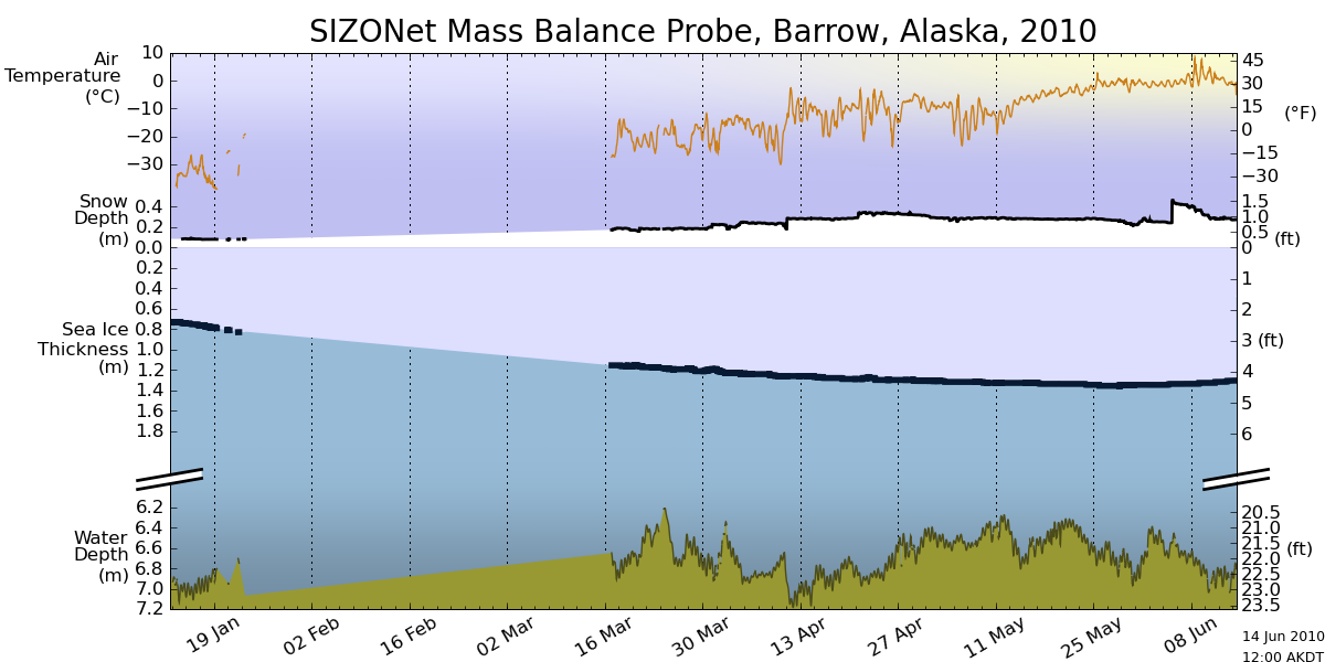
There is no indication of melt in the ice off Barrow, with ongoing cold temperatures and the deepest snow of the winter.

http://seaice.alaska.edu/gi/observatories/barrow_sealevel/brw2010/BRW_MBS10_overview_complete.png
Ice continues to look very concentrated in the Arctic Basin, as seen in this enhanced satellite photo.

http://ice-map.appspot.com/?map=Arc&sat=ter&lvl=7&lat=67.940426&lon=-168.991006&yir=2010&day=149
——————————————–
The disparity between ice indices continues to widen.DMI has 2010 ahead of 2007 and 2008. Other indices have 2010 lower. Given the analysis above, these numbers are relativelymeaningless this early in the summer.

The modified NSIDC graph below shows a comparison of 2010 ice extent vs. 2007. Areas in green have more ice than 2007. Areas in red have less ice.

The modified NSIDC map below shows ice loss since April 5, in red.

The modified NSIDC map shows changes in Arctic ice over the last week, using the same colour scheme.

The modified NSIDC image below shows the current anomaly. Areas in red have less ice than the 30 year mean, and areas in green have more ice.

Amino Acids in Meteorites says:
June 7, 2010 at 5:07 pm
R. Gates
do you know the difference between current data and model forecasting? You seem to have trouble with that.
Yeah R. Gates, do you understand what data from a SSM/I instrument is ?
SSM/I gives the sea ice concentration data.
And do you understand what model forecasting is ?
http://journals.ametsoc.org/doi/full/10.1175/1520-0426(2004)021%3C0944:FVOTPI%3E2.0.CO;2
“The goal of this study is not to denigrate PIPS, as it is one of the few examples of an ocean forecast system that is actually used operationally. Rather, the broader goal is to illustrate the importance and some of the basic issues involved in assessing the skill of ocean forecast systems.”
Journal of Atmospheric and Oceanic Technology 2004; 21: 944-957
Forecast Verification of the Polar Ice Prediction System (PIPS) Sea Ice Concentration Fields
Michael L. Van Woert and Cheng-Zhi Zou
NOAA/NESDIS/Office of Research and Applications, Camp Springs, Maryland
Walter N. Meier
United States Naval Academy, Annapolis, Maryland
Philip D. Hovey
NOAA/NESDIS/Office of Research and Applications, Camp Springs, Maryland
Ruth H. Preller and Pamela G. Posey
Naval Research Laboratory, Stennis Space Center, Mississippi
it was found that PIPS correctly made 24-h forecasts of decreasing sea ice concentration 10%–15% of the time (it also correctly forecast increasing sea ice concentration an additional 10%–15% of the time). However, PIPS correctly forecast melt-out conditions <5% of the time, suggesting that there may be deficiencies in the PIPS parameterization of marginal ice zone processes and/or uncertainties in the atmospheric–oceanic fields that force PIPS.
I hope that clears up any trouble you’ve been having with data vs. model, R. Gates.
rbateman says:
June 7, 2010 at 7:14 pm
…..PIOMAS prediction for September?
I already know what it will be: if JAXA, ROOS, and DMi show larger extent, and Cryosphere Today a higher concentration, in September 2010 than in September 2009 they will call it rotted ice that has decreasing volume and no matter what the Navy PIPS data for thickness says they will say it is wrong with only their climate modelling CICE, and PIOMAS being right. No matter how many ways they have to find to twist the truth around to make it look like Arctic ice is decreasing THEY WILL DO IT!
Why wait until September to find out what they will say regardless of their predictions now? Their predictions will be with omens and trepidations. September totals will be spun with omens and trepidations. We already know that.
Amino Acids in Meteorites says:
June 7, 2010 at 6:49 pm
no wonder some people believe in global warming—they think data itself is a model. nothing is real to them
=======================
Exactly!
Anu
of course you avoid talking about data and revert to talking about forecasts
par for the course
will you do it once again? after all they say if you say something three times it becomes true
Good job on this Amino Acids…you have been like labrador locked in on a downed goose throughout this thread.
On a side note about the USN and the importance of their opinion on the matter:
Today I was walking along the quartz sand beaches of Virginia Beach….gorgeous negative NAO early summer day. ENE winds bringing in fresh light green Atlantic water.
In addition….it was an obvious military operation day from the world’s mightiest, scariest, most bad-ass Navy there ever was….
F-18s flying seaward in formation. Helicopters buzzing up and down the beach. An aircraft carrier moving seaward on the horizon…..
And then….the only unrecognizable one: Escorted by a helicopter in the distance, a COLUMN OF SPRAY (as high as the relief of the aircraft carrier)….which would be approaching 24 stories high.
I watched it for 30 minutes as it very, VERY slowly moved out on the horizon, the helicopter hovering along its path, presumably to keep watercraft and aircraft from getting too close to it.
I have seen hovercraft before and it is usually visible (and very loud) even with the spray.
There was no craft whatsoever visible.
This was just a continuous curtain, a wall of spray 75 meters high…..that slowly meandered out into the Atlantic….and then came back.
Another day in the life of the US Navy, I guess. Spectacular to view, no doubt.
And, SINCE IT IS LIFE OR DEATH FOR THEM, what is important to them… (including the PIPS 2.0 model) is important to me.
Chris
Norfolk, VA, USA
correction: a labrador
Anu
will you be the one that provides the proof that the Navy stopped using PIPS to determine thickness of ice?
or are you going to stay on the forecast merry-go-round?
Anu says:
June 6, 2010 at 11:05 pm
===============================
Busted. You caught me with all my animal imagery in my writings.
🙂
Chris
Norfolk, VA, USA
savethesharks says:
June 7, 2010 at 8:15 pm
Good job on this Amino Acids,/i>
Thanks. But honestly it’s not so hard. I just want the proof about what they’re saying about the current thickness data. They continue to refer back to when forecast made by PIPS were found wanting. They go, without fail, to talk of forecasting. I simply want them to get on the real topic of this post which is current data and how it could possibly be used to make a forecast of summer melt minimum.
I can see on the Navy web site that PIPS 2.0 is still used for very short term data. But they go on and on about how it is not used in long term forecasting. They continue with the implication, that they want the reader to infer, that the Navy no longer uses PIPS 2.0 for current thickness. I simply want their proof for what they are saying. And until now they still have not done it. But I know they haven’t done it because they can’t. So until they admit that the current Navy Arctic ice thickness data is from PIPS 2.0 I guess I will have to continue to ask for it to show what global warming believers are really all about.
Hark, do I hear them saying something about CICE and PIOMAS already?
Anu
from SSM/I:
ice concentration in the Arctic for 6/6/2010
http://www7320.nrlssc.navy.mil/pips2/archive/retrievepic.html?filetype=Concentration&year=2010&month=6&day=6
very large red, i.e., 100% concentration area
and it’s from the Navy’s PIPS 2.0 web site.DOH!
Amino Acids in Meteorites says:
June 7, 2010 at 7:30 pm
Phil. says:
June 7, 2010 at 7:08 pm
I don’t buy it
So you guys have gone from attacking scientists to attacking PIPS and any other data that won’t show your rotted ice and your rotted ‘science’.
I’m not ‘attacking’ anything I’m pointing out that the predicted thick ice doesn’t match with the observations, comparisons like that are a part of real science.
Anu
you might be happy to know that I agree with you that PIPS forecasting is poor
look at the PIPS 2.0 model forecast compared the the PIPS 2.0 data from SSM/I:
http://www7320.nrlssc.navy.mil/pips2/archive/retrievepic.html?filetype=Concentration&year=2010&month=6&day=6
The image on the left was PIPS 2.0 forecast for 6/6/2010 made on 6/5/2010, just one day earlier. You are right Anu, it’s poor. The actual data show more concentration of ice than the forecast. 🙂
Amino Acids in Meteorites says:
June 7, 2010 at 7:04 pm
R. Gates
you still have not provided proof that the Navy has stopped using PIPS 2.0 in the ice thickness measurements. It is apparent you never will because you would have done so by now to save yourself this repeated embarrassment. The fact is is you made that up. The fact is is you don’t know what you are doing. The fact is you and your ilk are desperate. You are losing and you know it. Nothing is saving you.
__________
I’ve provided these before, and I hesitate to do so again, but the especially nasty tone you’re taking leads me to once more give these links. One thing to keep in mind, the Navy (and military in general) really tries to hide what they know and how they know it when it comes to strategic signficance. But if you read all of these links in detail, I think a pretty clear picture begins to emerge that PIPS 2.0, that is available to the public (from a very old website) is no longer the state of the art tool used by the Navy. You never let your enemies know how much you know. The Navy quite clearly distinguishes the kinds of data released for research and scientific purposes and that which may be used for daily operational military uses. PIPS 2.0 would not be available to the public if it had any real value (i.e. if it could help potential enemy nations navigate their way through the Arctic). I would think even a 5 year old could grasp that.
Anyway, here are many links that weave the story quite well on how PIPS 2.0 evolved into PIPS 3.0 which became G-HYCOM and who knows what it may really be called now. But the bottom line is that PIPS 2.0 is the only public face of what the Navy is going to let you and I and potential enemies of the U.S. know. All of these documents are unclassified but they provide you glimpses of how much better the data is that the Navy uses for true operational use then what they will release. If you expect the Navy to come out and say, “Oh, yeah, PIPS 2.0 is just our public face and we know it’s crap…here’s what we really have…” Well, it ain’t gonna happen… You’ve got to read between the lines a bit if want to get some notion of what the Navy (and military in general) are really up to. Note: Some of these are actual Powerpoint presentations and will require that software to view:
http://www.hycom.org/attachments/101_F.Bub.pdf
http://www.dtic.mil/cgi-bin/GetTRDoc?AD=ADA489794&Location=U2&doc=GetTRDoc.pdf
http://research.iarc.uaf.edu/presentations/ASM_08/presentations/CICE_ASM.pdf
http://www.godae.org/CSS-P18.html
http://www.earthsystemmodeling.org/presentations/pres_0507_rickallard.ppt
http://www7320.nrlssc.navy.mil/global_ncom/arc.html
http://www7320.nrlssc.navy.mil/pubs/2006/labstracts_sep_2006.pdf
http://www.star.nesdis.noaa.gov/star/documents/2009Ice/Day1/KruseNICSymposium_day1.pdf
Phil
was that the PIPS forecast or the real data you compared JAXA to?
Amino Acids in Meteorites says: The image on the left was PIPS 2.0 forecast for 6/6/2010 made on 6/5/2010, just one day earlier. You are right Anu, it’s poor. The actual data show more concentration of ice than the forecast. 🙂
================================
Well, in terms of international security, better funding to make a better model, is in order then.
Would rather my tax dollars pay for THIS… than to fatten Michael Mann’s or Gavin Scmidts’ checking account….thats for damn sure.
Chris
Norfolk, VA, USA
Amino Acids in Meteorites says:
June 7, 2010 at 4:24 pm
I used the ice age data from C. Fowler and J. Maslanik (see GRL paper by Maslanik et al. 2007 for more information on the data product). For the values I stated in my post, I used data from 1984 onwards so that the ice had aged at least 5 years (tracking begins in 1979). But I could have also provided percentages from 1979 onwards, it doesn’t make a difference.
Phil
As you can see the trolls have come out of the woodwork lately for Steven Goddard in his Arctic ice posts. If you really were just making a simple observation and not trying to fault find with him then please accept my apologies. I may have spoken to quickly.
julienne:
June 7, 2010 at 9:33 pm
But 20% MYI ice loss was the average?
stevengoddard says:
June 7, 2010 at 4:20 pm
Julienne ,
This video makes it clear where PIPS thinks the thick ice came from, in late summer 2007.
———–
Steve, thanks for posting the video. I am however more inclined to trust the ICESat derived thickness values than the PIPS2.0 model results. So in terms of actual ice thickness values, it looks to me that PIPS2.0 is overestimating the ice thickness.
For the record, I am not convinced that the PIOMAS results showing less ice volume today than a couple of years ago are correct. Since there was more survival of first-year ice the last 2 summers it would make sense that the overall thickness (and hence volume) is higher today than in May of 2008 for example. Even so, the Arctic Ocean saw more depletion of the oldest ice types out of the Arctic Basin this past winter (export out of Fram Strait was normal), so it is likely that the ice volume (and hence ice thickness) remain anomalously low.
R. Gates
reading between the lines is a relative undertaking. So you now admit that you had no real proof what you are saying.
Amino,
You said “I agree with you that PIPS forecasting is poor… look at the PIPS 2.0 model forecast compared the the PIPS 2.0 data from SSM/I”
You’ve missed the comment on the PIPS archive that I mentioned earlier: “… the SSM/I plots generally have significant variations from actual conditions.”
You also said “Tom P has a penchant for ignoring what’s happened in Arctic ice since 2007.”
Again, you’ve missed my earlier comments: “Here are the figures after 2007. I calculate the minimum ice volume for 2008 was 22% below the 2007 value, in excellent agreement with Posey’s published values based on PIPS 2.0. The corresponding average thickness dropped by 32%. In 2009 the minimum volume was 6% lower than 2007, with the thickness down 22%.”
You may find it helps to read the previously posted comments before adding your own.
R. Gates
so you are continuing to insist Arctic ice volume is less now than it was in 2008 and 2009? That there has been no recovery in Arctic ice volume in the last 2 3/4 years since the minimum of 2007? That Arctic ice though it has increased in extent and concentration that somehow equates to less volume?
stevengoddard says:
June 7, 2010 at 3:08 pm
Julienne ,
Thanks for the information. Are you aware of any better data set than PIPS 2 which is available with daily ice thickness numbers?
Also, do you have any reason to believe that PIPS 2 numbers are (relatively) inconsistent from year to year? I understand that the absolute thicknesses may not be precise.
________________
Steve, I don’t off-hand. Of course PIOMAS would be computing daily ice thickness numbers, but you’re not too keen on that model 😉
Honestly I haven’t looked into the detail of the PIPS2.0 model, nor have I worked with the model or done any comparisons with it to real data. I simply know what folks at NIC think about the model, which isn’t great. I would assume that some comparison with real data was made during development of the model and there must have been some “reasonable” performance of the model. But just looking at the thickness data during the time when ICESat was in operation or comparing it with ERS1/2 radar altimeter data, it does appear that the absolute values are off. Certainly it would be worth comparing the spatial patterns of the thickness distributions from PIPS2.0 and the ICESat and ERS1/2 retrievals. That would at least give you some confidence in how well the evolution of the thickness is modeled.
Amino Acids in Meteorites says:
June 7, 2010 at 9:00 pm
Anu
you might be happy to know that I agree with you that PIPS forecasting is poor
look at the PIPS 2.0 model forecast compared the the PIPS 2.0 data from SSM/I:
http://www7320.nrlssc.navy.mil/pips2/archive/retrievepic.html?filetype=Concentration&year=2010&month=6&day=6
The image on the left was PIPS 2.0 forecast for 6/6/2010 made on 6/5/2010, just one day earlier. You are right Anu, it’s poor.
Yes, the agreement is really not that good. It helps that they use tiny images, so any errors are minimized.
The forecast is especially poor, once you see the starting data for 6/5/10:
http://www7320.nrlssc.navy.mil/pips2/archive/retrievepic.html?filetype=Concentration&year=2010&month=6&day=5
That would be the measured, starting ice concentration data on the right, the input to their model. I don’t know why their simple model outputs all those oranges, yellows and greens.
Luckily, their forecasts for Arctic sea ice concentration aren’t that important, since every day the measurement is updated:
http://arctic.atmos.uiuc.edu/cryosphere/NEWIMAGES/arctic.seaice.color.000.png
This is what the measurement looks at higher resolution (1296 x 1296 pixels) – if their model used such resolutions, it would probably perform even worse – look at all the details they would have to predict each day.
A thumbnail image (354 x 354) that includes the Northern Hemisphere down to 40° N does not leave many pixels for the Arctic data/forecast. What is that, about 100 x 100 of data pixels ?
However, the sea ice thickness is not measured. It is derived by their model calculations. So with this aspect of Arctic sea ice, their model accuracy becomes very important.
What you seem to be unable to grasp is that the input data, sea ice concentration, is a 2D measurement – how much ice (0% to 100%) is in a measured data cell. This 2D data must then be transformed into a 3D guess of ice thickness, by the same model which you admit is a poor model of what happens to the very data they measure 24 hours later.
I’m sure R. Gates understands 🙂
You should probably pretend you didn’t read this, and go off to the next thread.
The actual data show more concentration of ice than the forecast. 🙂
Imagine that – the Navy model being so wrong. How many lives were lost by submarines expecting 45% open water, and finding an unbroken ceiling of thick ice ? Isn’t that the argument on this thread, that the Navy has lives riding on their “Arctic sea ice thickness data”, so it must be good ?
The horror…
I bet all those deaths are classified, so “the Enemy” doesn’t know where the Arctic sea ice really is.
savethesharks should be howling mad – all those submarines endangered like that.
Just The Facts said June 7, 2010 at 1:43 pm
“So what do you find more compelling, verifiable facts, or “many good papers” that seem to contradict the facts?”
But you have just posted images from two years there, what does that show. The scientists arguement is that compared to the longer trend the Antarctic gains ice more rapidly than it used to do, mainly in the Roos sea. This is nothing to do with maximum extent or a comparison of one year to another. A better graph would be this one
http://arctic.atmos.uiuc.edu/cryosphere/IMAGES/seaice.recent.antarctic.png
you can see the rapid rise in both 2008 and 2009 above the mean even though that has no correlation with the maxima. This year is following the same path as well and although I haven’t got the graph showing 2007 I bet that was positive too. So your comparison gives no conflict on those papers.
Andy