
By Steven Goddard
The quest for the Holy Grail.
I have been looking for a reliable early predictor of September area/extent based on June ice data, and have found it – almost. Previously I established that current extent is a useless predictor, prior to August. The reasons for this are :
- Extent tells you nothing about thickness
- Many areas currently covered with ice, will normally have almost none in September (Hudson Bay, Barents Sea, etc.)
I eliminated the second issue by reducing the region of interest to the area shown in white below. That area corresponds approximately to the maximum extent of September ice in the 30 year NSIDC record.

Then I tried three different metrics to compare June 6 ice parameters vs. September extent and area, for the decade 2000-2009.
The first parameter was June 6 ice area. As expected, this correlated very poorly with September extent and area. The rsq value of June 6 ice area rankings vs September extent rankings is 0.02. The rsq value of June 6 ice area rankings vs September area rankings is 0.07.
The next parameter for comparison was June 6 ice volume (calculated from PIPS) vs September extent. This correlated much better. The rsq value of June 6 ice volume rankings vs September extent rankings is 0.22. The rsq value of June 6 ice volume rankings vs September area rankings is 0.37.
The final parameter for comparison was June 6 average ice thickness (calculated from PIPS) vs September extent. This correlated the best. The rsq value of June 6 average ice thickness rankings vs September extent rankings is 0.28. The rsq value of June 6 average ice thickness rankings vs September area rankings is an excellent 0.65.
So it appears that we have found a reliable predictor of September extent based on June ice thickness, which makes sense from a physical point of view. But it isn’t perfect! The graph and table below show the problem.

Average thickness on June 6, 2010 is 2.55 metres. The table below shows the June 6 rankings for the last 11 years. 2010 is in 7th place, behind 2006 and ahead of 2007, 2003, 2009 and 2008. Average thickness is more than half a metre thicker than 2008.
Date            Average Thickness

6/6/2004        2.95

6/6/2005        2.87

6/6/2001        2.86

6/6/2000        2.84

6/6/2002        2.76

6/6/2006        2.68

6/6/2010        2.55

6/6/2007        2.54

6/6/2003        2.5

6/6/2009        2.17

6/6/2008        1.96
Everything in that table makes sense, except for 2007. Ice thickness in the central Arctic on June 6, 2007 was nearly identical to 2010 and the top year – 2003.
Conclusion : Based on current ice thickness, we should expect September extent/area to come in near the top of the JAXA rankings (near 2003 and 2006.) However, unusual weather conditions like those from the summer of 2007 could dramatically change this. There is no guarantee, because weather is very variable.

No doubt some people are wondering how this can be true, given that extent is currently lowest in the record. The reason (again) is that June extent has almost no correlation with September extent. Imagine an ice cube floating in water. It occupies a much smaller area of water than a ground up ice cube. But which one melts faster? The ground up ice cube will of course melt faster. Having a wide extent in June is not necessarily a good thing, unless the ice is also thick.
Sea surface temperatures continue to run cold in the Northern Pacific. They also are cooling down some in Atlantic.
")
http://weather.unisys.com/surface/sst_anom.html
Arctic temperatures have been running cold for the last week or so.
From: http://www.esrl.noaa.gov/psd/map/images/fnl/sfctmpmer_01a.fnl.anim.html
")
http://ocean.dmi.dk/arctic/meant80n.uk.php
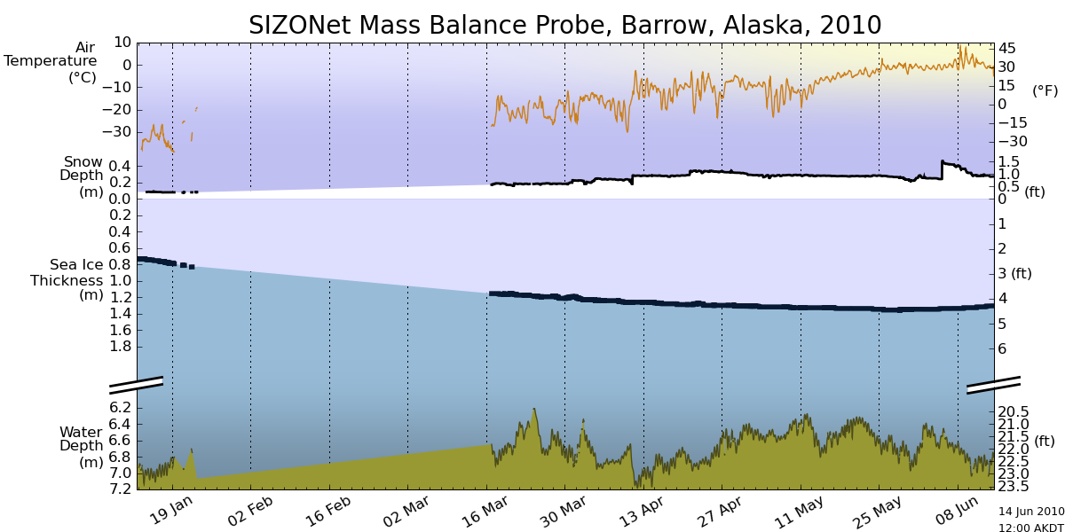
There is no indication of melt in the ice off Barrow, with ongoing cold temperatures and the deepest snow of the winter.

http://seaice.alaska.edu/gi/observatories/barrow_sealevel/brw2010/BRW_MBS10_overview_complete.png
Ice continues to look very concentrated in the Arctic Basin, as seen in this enhanced satellite photo.

http://ice-map.appspot.com/?map=Arc&sat=ter&lvl=7&lat=67.940426&lon=-168.991006&yir=2010&day=149
——————————————–
The disparity between ice indices continues to widen.DMI has 2010 ahead of 2007 and 2008. Other indices have 2010 lower. Given the analysis above, these numbers are relativelymeaningless this early in the summer.

The modified NSIDC graph below shows a comparison of 2010 ice extent vs. 2007. Areas in green have more ice than 2007. Areas in red have less ice.

The modified NSIDC map below shows ice loss since April 5, in red.

The modified NSIDC map shows changes in Arctic ice over the last week, using the same colour scheme.

The modified NSIDC image below shows the current anomaly. Areas in red have less ice than the 30 year mean, and areas in green have more ice.

rbateman said June 7, 2010 at 1:16 am
“What really takes the cake is not volume or extent of the Arctic, but rather the hard correlation between the Arctic and Antartic Sea Ice. Like this: http://www.robertb.darkhorizons.org/seaice.anomaly.Ant_arctic.jpg
Just so you know, and can’t say nobody told you so, what you see going on in the Antarctic right now is highly probable to be happening in the Arctic and N. Hemisphere come December. Given the last 2 years of Winter ‘top this’ hopscotch that Nature has been gaming on Planet Earth, it’s a good bet that those of us in the N. Hemisphere will be feeling December a lot more than we will be feeling a melted Arctic in September. ”
Why is what is going on now in Antarctica likely to be happening in the Arctic this December, apart from at the moment the anomaly of one roughyl matches the size, but not sign, of the other? Take last year for example, there was a positive anomaly in the Anctarctic and a negative one in the Arctic, but December 2009 was very warm in the Arctic basin so ice extent was low.
As mentioned by Steve Goddard in relation to the Arctic and myself in relation to the Antarctic, the value of ice cover now is not a good way of determining the maxima or minima values for both regions. It’s nice to paint a humanistic ying yang picture up, but there is no correlation on what the Arctic and Antarctic do in any one year that shows any connection whatsoever.
Andy
Dropping. Like. A. Rock.
http://www.ijis.iarc.uaf.edu/seaice/extent/AMSRE_Sea_Ice_Extent_L.png
BTW interesting discussion/flame war going on at digg.com over “Arctic Sea Ice at Lowest Point in Thousands of Years” – feel free.
Anu, it might be “dropping like a rock” right now but going by the link you provided it did something quite similar at about the same time last year (just a fraction earlier) and then recovered shortly thereafter.
But then you probably didnt notice that did you?
If anybody involved in these chest-thumping contests would like to bet on the matter of 2009 vs. 2010, the current odds are about 45% that 2010 will be icier than 2009, at https://www.intrade.com
I did a quick google search and found the following article dating 02/03/2010 on the US Navy’s homepage:
http://www.navy.mil/search/display.asp?story_id=51054
(Oceanographer and Navigator of the Navy and TFCC Director Rear Adm. David) Titley said the rate of global warming has not slowed, and the long term trend is rising. The Arctic is among the areas seeing the greatest impact from climate change, with sea ice coverage during summer months steadily diminishing, and the ice is thinner when the Arctic Ocean freezes again in the winter.
Titley said the ice volume has declined and is not coming back.
I don’t know which model Titley relies on but I guess he knows what he is talking about.
In comparison to Steve, Ron Lindsay’s a polar scientist who probably can calculate ice volumes. He released his latest predictions for 2010 a few days ago:
http://psc.apl.washington.edu/lindsay/prediction.html#2010predictions
Lindsay has found the best correlation, with an R^2 of 0.79, with September minimum extent to be the fraction of open water or ice less than 1 m thick, so-called G1.0m. Last year the G1.0m from May proved very accurate. This year his May prediction is for a minimum extent of 4.44 +/- 0.39 million sq. km, a little lower than the 2008 value.
Steve prognosticates a value comparable to 2003 (6.05 million sq. km) or 2006 (5.91 million sq. km). We’ll know in less than 3 months who is closer.
Anu
let’s get to the real issue. You and others are trying to convince people that ice has decreased in volume, or is ‘rotted’, since 2008 even though it has increased in extent and concentration. You are using all sorts of arguments to do this. But none of them work. I don’t think any of you really believe them either.
Some of you are trying to say what ice is doing now doesn’t matter but only the long term matters. But obviously you don’t believe that either because there is more than one blog talking about ice total data from today. Many are obsessing over every little thing that Arctic ice is doing. This shows that they aren’t thinking about long term but they are thinking about the moment happening now.
All of the arguments are in these type of Arctic ice threads are happening because people in your camp are trying to convince others that there is no recovery happening in Arctic ice since the minimum in 2007. But anyone that looks at the graphs will see that there has been.
I think all of you are nervous. You can see ‘ice free’ Arctic predictions are not happening. And you can see ice is increasing instead. So all of you you are whistling past the graveyard. I think all of you know the ice isn’t rotted. So you spend a lot of time trying to convince people it is.
rogerkni, how exactly does this intrade work. I would like to bet 50 euros if possible. This is a good time now with the alarmists thinking 2010 will break all the records. It would not surprise me if 2010 stays a lot above 2009. Are the odds good?
Amino Acids in Meteorites says:
June 7, 2010 at 9:54 pm
R. Gates
so you are continuing to insist Arctic ice volume is less now than it was in 2008 and 2009? That there has been no recovery in Arctic ice volume in the last 2 3/4 years since the minimum of 2007? That Arctic ice though it has increased in extent and concentration that somehow equates to less volume?
_____________
I make no such claim. I am simply saying that Steve’s +25% increase statement has no basis in actual measured real ice thickness and can’t be trusted if it is based on the PIPS 2.0 model data. If I had to make a guess, I would probably favor the PIOMAS model projections over PIPS 2.0, as it is tied into the CICE model and I think therefore far more likely to be accurate. I’ve heard mention by one other poster here that NIC doesn’t really trust the PIPS 2.0 data, and it sounds like she has some direct knowledge of that. Finally, as I ‘ve alluded to, I would strongly suspect that the Navy (as they had shown with their previously classified submarine measured ice thickness data) has far more accurate data than they are releasing to the public, and are simply content to let the research community use the PIPS 2.0 model (which is pretty much useless) and can be considered as a “downs scaled” product and not what the Navy uses for near real time navigation of the Arctic. I think the links I’ve given in my last post shows some glimpses of the much better information that that newer CICE g-ncom models can give, and I have confidence that is what the Navy uses on a daily basis, though their public face stays with their 2003 website (must have Internet Explorer 4.0 or better!) of PIPS 2.0.
Amino Acids in Meteorites says:
June 8, 2010 at 6:31 am
I suppose it depends on what your definition of recovery means. While failing to set a new record minimum, 2008 saw the largest decline of ice extent over a single melt season (defined as the difference in ice extent between March and September) recorded in the satellite era of 10.58 million km2. The reason 2008 had a greater total seasonal ice loss than in 2007 is that the melt season started out with greater ice extent than 2007. Had there been less ice at the beginning of the melt season, 2008 may have broken the record seasonal minimum of September 2007, despite less favorable atmospheric forcings, simply because so much of the spring ice pack consisted of first-year ice. In 2009, the total ice loss between March and September was 9.8 million km2, third largest behind 2007 and 2008.
So I suppose you could argue there was some recovery last summer, but the year-to-year fluctuations are not all that important, it is the trend that is of interest. It may or may not be noteworthy that May 2010 saw the fastest rate of ice loss during the satellite record. Since you had late ice growth in the Bering, you would expect rapid decline as that ice melted out so perhaps the fast rate of decline last month doesn’t say too much about the overall “health” of the ice pack. Summer circulation is the key wild card in defining the end of summer ice extent so we’ll just have to wait and see. If you have a summer circulation pattern such as seen in 1996, then some recovery would likely happen. But if this summer is anything like the last 3 summers, 2010 will continue the pattern of anomalously low September sea ice extents.
Dr. Zhang’s PIOMAS model now puts the September 2010 low ice extent at 4.7 million sq. km. I was projecting 4.5 million back in March here on WUWT, so it’s nice to see at least one other model in close agreement. Either one would of course be lower than 2008 or 2009, but not quite as low as 2007.
http://psc.apl.washington.edu/zhang/IDAO/seasonal_outlook.html
I can’t give all the details of how to register with the site and how to place bets on the various contracts there (several hundred, mostly on finance, politics, sports, and current events). Going to the https://www.intrade.com site and printing out the various help files there on those topics is necessary. It’ll take at least an hour to print and read them.
You should also print out samples of the full details of each bet (click on the purple name of the bet first). This will contain a chart showing the fluctuation in the odds over time, plus the full “order book” (in cases where it is too large to show up on the betting screen). The order book contains the bids of potential bettors — how many “contracts” they are willing to buy (or sell) and at what price.
Money can be sent to ones account either by mailing a personal check ($1 postage to Dublin) or by inter-bank transfer, which costs more, looks complicated, and requires a visit to ones bank.
I encourage betting on these matters, because, for one thing, it forces people to tone down their rhetoric if they aren’t willing to make bets supporting their claims, which they often aren’t. It thereby forces people to think harder about what they are saying. This in turn promotes civility and thoughtfulness, at least a bit.
Below this paragraph is a description I posted a few weeks ago on a different thread in response to another commenter asking about the Arctic ice bet. But please note that there are about ten other climate-related bets available. For diversification, bets should be spread among them. Also, the most sensible bets to make are the longer-term ones, as these relate more to climate than weather. However, nearly all the betting action is on the near-term bets.
=======================
You can read the terms (after navigating via “Climate and Weather” to “Arctic Ice Extent”) by clicking on the purple heading line “MIN.ARCTIC.ICE:2010>2009″, which takes you here:
https://www.intrade.com/jsp/intrade/common/c_cd.jsp?conDetailID=720038&z=1275555182467
Then click on “Contract Specific Rules”, which pops up the following text box:
Each “contract” is worth $10. If someone is “asking” 45 for a contract, it means 45%, so it costs $4.50, and ten of them cost $45.
The Arctic ice contract opened around May 10 at 50, fell to 35, climbed to 44, fell to 40, and is now being offered at about 45. (The chart of the price history of contracts is displayed when the purple bet-name is clicked, as mentioned above.) I’ve bet over $100 on this year’s Arctic being icier than last year’s.
The odds at Intrade aren’t set by the organization itself, which is a mere marketplace where individual bettors posts bids and offers (sell-short bids, in effect) on certain propositions, similar to bids and offers placed on the stock market. (I.e., the bettor specifies the price level and quantity of his bid/offer.) If a bid or offer is tempting enough to another bettor, he “covers” it, and the price at which he does so establishes the latest odds.
For instance, on the Greater Arctic Ice This Sept.? proposition, I currently have [had] a bid at 40% for five $10 “contracts.” (All contracts are for $10.) I had to post a margin of $20 (40% * 5 * $10 = 20). If someone wants to take my bet at those odds, he posts a “sell” order at 40 for 5 and posts margin of $30 (60% * 5 * $10 = 30). In October Intrade settles the bet one way or the other and places $50 in the winner’s account. That’s one nice thing about the site — the feeling that I’m punishing the other side (not a bookie).
Another nice thing is that if you change your mind on a bet you can sell it (or try to) at a partial loss before it goes totally bad. For instance, I could place a sell offer on my position at 30 and lose only a quarter ($5) of my bet ($20). You don’t have to put up extra cash to hedge yourself by buying a bet on the other side, the way you have to with a bookie. (Of course, Intrade charges commissions, but they aren’t onerous.)
PS: The above may be freely re-posted.
Julienne
Thanks much for your comments.
Would you be willing to do a Q&A article, along the lines of the ones that Walt Meier posted here?
Amino Acids in Meteorites says:
June 7, 2010 at 9:21 pm
Phil
was that the PIPS forecast or the real data you compared JAXA to?
Ask Steve, it was the data he put up I just compared the results to the ice coverage observations. Whichever dataset they were from they showed thick ice forming in improbable places, bear in mind that the predictions that are updated wrt observations are the coverage not the thickness.
On the Undeath Spiral thread, Tom P wrote (technical details omitted and emphasis added below),
“As I mentioned, your calculations are not giving the volume of the ice, as they do not take into account the ice concentration. You calculate:
VolumeGoddard = Sum(PixelArea x PixelThickness)
However, such numbers do not give good agreement with the Navy’s published volumes – in fact giving a negative correlation of -0.6.
I’ve had a chance now to derive the correct numbers, that is:
VolumePIPS = Sum(PixelArea x PixelThickness x PixelConcentration)
This did not need sophisticated software on a supercomputer, but free software, ImageJ, on my laptop, so anyone should be able to do these calculations.
The method is straightforward
….
Comparing my values to published values at http://www.nrl.navy.mil/content_images/09_Ocean_Posey.pdf
gives a correlation coefficient of 0.99999, so I’m pretty confident that this is how the PIPS volumes should be calculated.
These PIPS volumes give rather a different history to the arctic ice volume than you present. In fact both the 2008 and 2009 minimums had less volume than 2007. Hardly a recovery.
I hope this indicates the importance of understanding the numbers you are calculating before leaping to the conclusions that PIPS undermines the PIOMAS analysis and shows a multiyear recovery in ice volumes.”
This raises a fundamental point. Setting aside the question of whether PIPS accurately models Arctic ice, does Steve’s method accurately derive PIPS numbers from images on the PIPS website?
That is, has the PIPS-interpretation method at the heart of all these posts been validated against published PIPS numerical results? Or does it overlook ice concentration and thus negatively correlate with PIPS actual volume numbers, as Tom P reports?
As an interesting exercise, try downloading the data file for the IARC-JAXA sea ice graph and then plot only 2007, 2009 and 2010 YTD.
Most of the damage during the 2007 summer ice minimum occurred later in the year. In fact 2007 and 2009 were very similar at this stage but diverged sharply after July but then were back to even by the end of October.
I think as many have posted previously on this thread we will have a much clearer picture in 6-8 weeks time as to where were headed this year.
Julienne says:
June 8, 2010 at 8:15 am
The reason 2008 had a greater total seasonal ice loss than in 2007 is that the melt season started out with greater ice extent than 2007.
Wouldn’t that 2008 ice be first year ice which would melt quickest? It appears to have grown quickly from ~January 18, 08 to ~March 10, 08. Or do I have that wrong?
AndyW says: June 7, 2010 at 10:30 pm
“But you have just posted images from two years there, what does that show.”
It shows that jeff brown’s statement that, “Strong winds push the ice away from the coast in the Ross Sea, allowing new ice formation in the open water areas. The only place that shows strong decreases in Antarctic sea ice is the Bellinghausen/Admudsen Seas where there has been a strong warming signal. ” appears inaccurate because,
as compared to two years ago, the largest increase in sea ice area and concentration appears to have occurred in the Bellingshausen/Amundsen Seas (where there’s supposed to be a strong warming signal) whereas sea ice area seems to shrunk a little in the Ross Sea (where strong winds are supposed to be facilitating the creation of additional sea ice). Thus the reason for the current very high Antarctic Sea Ice Extent;
http://nsidc.org/data/seaice_index/images/daily_images/S_stddev_timeseries.png
and Area:
http://arctic.atmos.uiuc.edu/cryosphere/IMAGES/seaice.recent.arctic.png
appears to be due to factors other than what jeff brown cited, possibly that it’s getting colder…
“This is nothing to do with maximum extent or a comparison of one year to another. A better graph would be this one
http://arctic.atmos.uiuc.edu/cryosphere/IMAGES/seaice.recent.antarctic.png
you can see the rapid rise in both 2008 and 2009 above the mean even though that has no correlation with the maxima. This year is following the same path as well and although I haven’t got the graph showing 2007 I bet that was positive too. So your comparison gives no conflict on those papers.”
The facts are that sea ice area has been increasing more rapidly in recent years, and that the Ozone hole/Ross Sea ice explanation does not appear to be supported by the current data. The logical explanation is that something else is probably causing the increase in Antarctic sea ice area and extent, possibly that it’s getting colder…
Are you open to the possibility that the current very high Antarctic sea ice extent and area might not be the result of the hypothesized Ozone hole/Ross Sea ice process?
julienne says:
June 7, 2010 at 9:33 pm
I used data from 1984 onwards so that the ice had aged at least 5 years (tracking begins in 1979). But I could have also provided percentages from 1979 onwards, it doesn’t make a difference.
I was looking at this from your comment above:
When you look at survival rates of FYI versus MYI during summer you find that on average 60% of the FYI melts out and 20% of the MYI.
http://wattsupwiththat.com/2010/06/06/wuwt-arctic-sea-ice-news-8/#comment-404796
So it would seem to make a difference. Or do those percentages hold true every year, even in 2008 when it appears much of the rapid loss you pointed out was FYI and not MYI.
But again, am I wrong in that?
Julienne says:
June 8, 2010 at 8:15 am
In 2009, the total ice loss between March and September was 9.8 million km2, third largest behind 2007 and 2008.
Again, wouldn’t that be because of large extent of FYI which melts quickest?
Julienne says:
June 8, 2010 at 8:15 am
Had there been less ice at the beginning of the melt season, 2008 may have broken the record seasonal minimum of September 2007
If there had been less then I could see how you could say there is no recovery taking place. But there wasn’t. So isn’t that an indication of recovery taking place?
New Numbers out, since end of May
El Nino ratings (ONI went down from 1.2 to 0.8 for March-April-May)
http://www.cpc.noaa.gov/products/analysis_monitoring/ensostuff/ensoyears.shtml
Arctic Ocean air temp (uah: overseen by Dr Roy Spencer) (last 5 months’ anomaly: + 3.2 December, 1.6, 2.92, 2.53, 2.68 degrees C.) http://vortex.nsstc.uah.edu/data/msu/t2lt/uahncdc.lt
And PIOMAS updates on 05-30 (but will likely have another long Hiatus soon: they are close to dropping off the bottom of their chart — again )http://psc.apl.washington.edu/ArcticSeaiceVolume/images/BPIOMASIceVolumeAnomalyCurrent.png
PS: Lindsay & Zhang plug their Reasoning into PIOMAS, which spits out maps. Being Professional does not make Lindsay Perfect — Don’t forget they both are biased to predict that “every year AGW cuts the Ice down a little bit” e.g. a tenth the 2007 melt -off that I think is proportional to the El Nino strength & thus will be 4000 x 1.8/1.1 = Zero sea-ice left.
Just found where SUBMARINE ICE DRAFTS are compared to Piomas to (never scrolled down the page before) :
http://psc.apl.washington.edu/zhang/IDAO/retro.html#Satellite_ice
– – –
Steve, try comparing your model to the Past.
Does your model show the great 2007 Melt-off ?
The thicker Ice in Volcano years (e.g. the late 1960s) ?
The low ice every 60 years as in the 1890s (when Amundsen made the North-West Passage), 1950s, near 2010 … ?
Piomas does: either scroll even further down that page Or go to: http://psc.apl.washington.edu/zhang/IDAO/retro.html#NAO
… even though AGWers would prefer it didn’t.
I suppose that from reading the reasons given by some of how there is no recovery taking place some may come to the conclusion there is no recovery since the minimum of 2007. But I think everyone can agree there is no ‘death spiral’ taking place in Arctic ice.
Also, from looking at the data, and images, of Arctic ice and comparing them year by year it’s hard to come to the conclusion there is no recovery taking place. Any explanation that says no recovery is happening after looking at those data and images sounds like just ‘so many words’—after all, you can make data say anything.
But again, I can see from these explanations how someone may say there is no recovery happening—especially if that’s the conclusion they’d like to come to.