We’ve all seen that Arctic Sea ice area and extent has expanded and is back to normal. NANSEN Arctic ROOS just got their web page plots back online yesterday after an outage, and there’s a bit of a surprise when compared to NSIDC’s plot.

Sources:
http://arctic-roos.org/observations/satellite-data/sea-ice/observation_images/ssmi1_ice_ext.png
http://nsidc.org/data/seaice_index/images/daily_images/N_timeseries.png
Here’s a magnified view with the NANSEN graph zoomed and set to match the NSIDC scale, done with the help of my graphics program:

Both datasets use the SSMI satellite sensor, both datasets plot extent at 15%. Yet we have significant differences in the output which would seem to point to methodology. Note that in the magnified view, NANSEN has a peak “normal” of ~15.25 million square kilometers while NSIDC’s “normal” is higher at ~15.75 million square kilometers. You’d think there would be a standard for deciding what is the “normal” baseline wouldn’t you? [Note: The NSIDC average is for 1979-2000, NANSEN’s is for 1979-2006] Maybe the scientists can hammer this out at the next ice conference.
Regarding the plots above.
NANSEN says:
“Ice extent is the cumulative area of all polar grid cells of the Northern Hemisphere that have at least 15% sea ice concentration, using the NORSEX algorithm. Ice area is the sum of the grid cell areas multiplied by the ice concentration for all cells with ice concentrations of at least 15%. Ice extent and ice area are calculated for a grid resolution of 25 km.”
NSIDC says:
“Extent defines a region as “ice-covered” or “not ice-covered.” For each satellite data cell, the cell is said to either have ice or to have no ice, based on a threshold. The most common threshold (and the one NSIDC uses) is 15 percent, meaning that if the data cell has greater than 15 percent ice concentration, the cell is considered ice covered; less than that and it is said to be ice free.”
NSIDC also says:
“Other researchers and organizations monitor sea ice independently, using a variety of sensors and algorithms. While these sources agree broadly with NSIDC data, extent measurements differ because of variation in the formulas (algorithms) used for the calculation, the sensor used, the threshold method to determine whether a region is “ice-covered,” and processing methods. NSIDC’s methods are designed to be as internally consistent as possible to allow for tracking of trends and variability throughout our data record.”
Given that both NANSEN and NSIDC use the same SSMI sensor data, and calculate the extent based on 15% concentration, that half a million square kilometers difference in the “normal” sure seems significant in the context of the magnified extent view NSIDC presents. A half million here, a half million there, and pretty soon we are talking about real ice extent differences.
Another interesting difference is that NANSEN plots Arctic Sea ice area in addition to the extent. Here’s that graph:

Arctic Sea ice area is above the “normal” line as defined by NANSEN. As far as I know, NSIDC does not offer an equivalent plot. If I am in error and somebody knows where to find NSIDC’s area plot, please let me know and I will include it here.
One final thing to note about the difference between NANSEN and NSIDC. I don’t recall the director of NANSEN/Arctic ROOS ever coming out and saying something like “Arctic ice is in a death spiral” or making any sort of press announcements at all. They seem content to just present the data and let the consumer of the data decide.
In contrast, NSIDC has a whole section that addresses sea ice in the context of global warming. I haven’t found a comparable section on NANSEN Arctic ROOS.
Of course we know that NSIDC director Mark Serreze is very active with the press. Perhaps some of our media friends reading this should seek out someone at NANSEN for the next sea ice story so that there’s some balance.
The differences in the way each organization presents their data and views to the public might explain the differences in the way the output is calculated. One might take a “glass half full” approach while the other takes a “glass half empty” approach. Or it may have a basis in science that I’m not privy to yet. The point is that there are significant differences in the public presentation of sea ice data between the two organizations. One showed sea ice extent as normal, the other took sharp right turn just before it was expected to happen.
I welcome input from both of these organizations to explain the difference.
In related news, Steve Goddard writes:
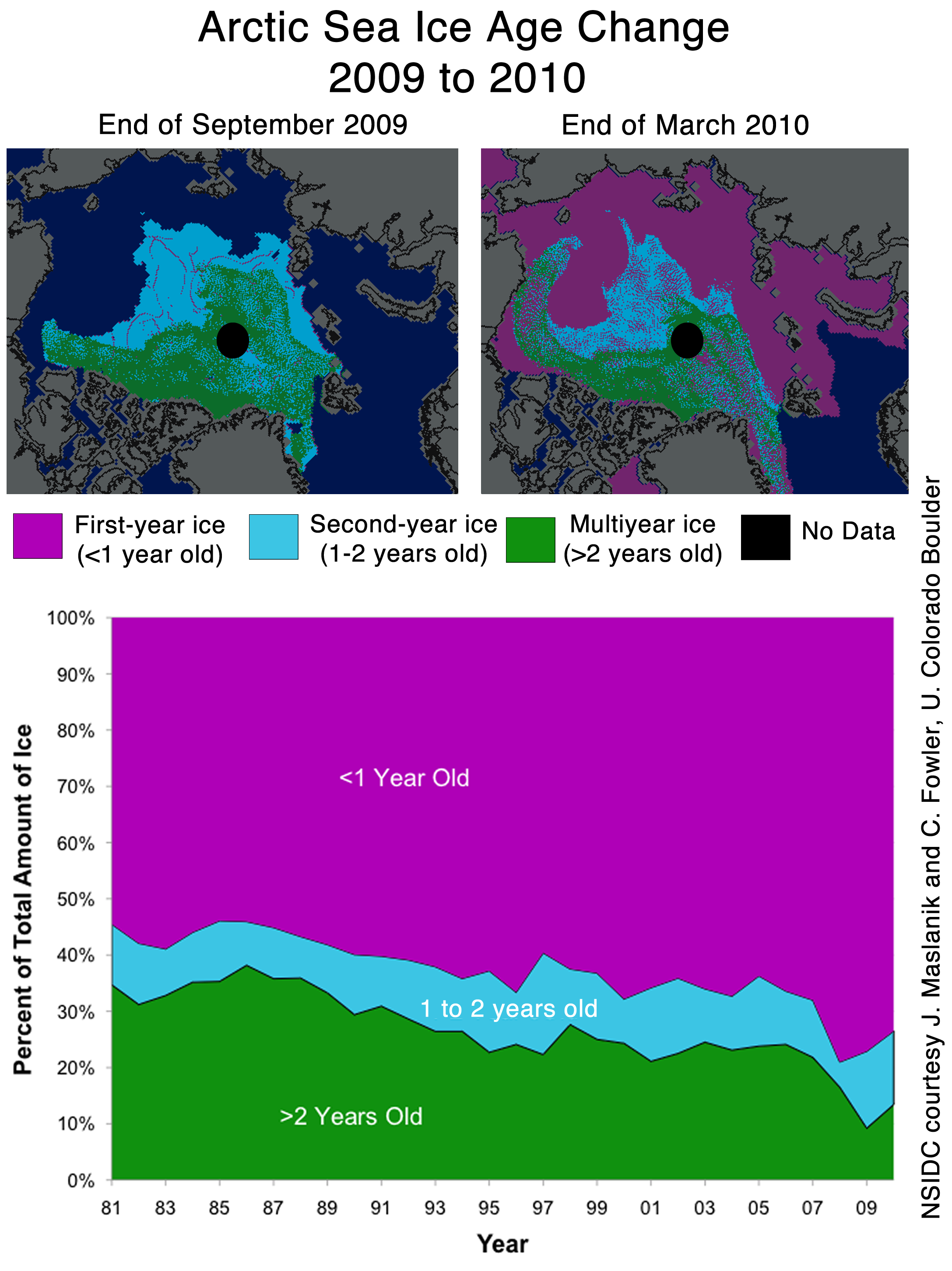
NSIDC seems to confirms the WUWT 12 Month Ice Forecast. Twelve months ago, WUWT forecast that 3 year old ice would increase during the next year, and explained why. NSIDC confirmed the accuracy of the forecast with their most recent Sea Ice News.

Source: http://nsidc.org/images/arcticseaicenews/20100406_Figure6.png
Note that 3+ (>2) year old ice has increased from 10% to about 14% during the past year, shown with the two black horizontal lines near the bottom. That shows an impressive growth of 40% relative to last year.
Ice older than one year has also increased by a substantial amount over 2008 and 2009. The implication being that ice thickness has been increasing for the last two years. Older ice is thicker ice.
So we will leave it up to the readers to do the math. Thickness has increased. Area has increased. What does that tell us about volume? What does that tell us about the “Arctic Death Spiral“?
Don’t be fooled though. “Decreasing ice is climate. Increasing ice is weather.”
I doubt they will solve the baseline issue at the next ice conference.
They will probably just skate around it.
I’ve been posting for yonks about this here, Blackboard and Mike Marinaralenas site… finally its being noticed. I believe it requires much more investigation ie icearcticgate. LOL. Once again DMI ice is live data
http://ocean.dmi.dk/arctic/icecover.uk.php with no suggestions/agendas
here is Mike’s records of ice re-adjusments for past 3 years
http://mikelm.blogspot.com/2007/09/left-image-was-downloaded-from.html
Arctic ice is much easier to fiddle with as each “slab” of ice lets call it can have different borders etc (eyes of beholder) old ice, new ice ect. No such thing in Antarctica so no fiddling there. Notice how SH has been in fact ABOVE anomaly for past 3-4 years! Even CT has been unable has been unable to play with that one. The AGW’ers cannot admit defeat on this one its far too important and would bring the edifice down much quicker than desired (until at least they can find new jobs for them). Another favorite (in this case) is to play with the average so current data always looks below (suspect who?). Anyway the whole thing is BS because its only 30 yrs data = meaningless so I dont care if it goes up or down it doesn’t mean AGW warming or Denier cooling haha
Normal….ya…for what its worth.
When i worked for Env. Canada, we used the last 30 years of temp data to define a ‘normal’. Over the next 10 years, those temps were used to show the difference from ‘normal’. Once you acccumulated another 10 years, you dropped off the oldest 10 and added in the new 10 years.
I don’t see ‘ICE’ being any different. use 1979 through to 2009 as your ‘normal’.
Then again GISS still uses 50-80 as their temp ‘normal’… must not show the decline…
just my 2 cents
anthony:
Note that in the magnified view, NANSEN has a peak “normal” of ~15.25 million square kilometers while NSIDC’s “normal” is higher at ~15.75 million square kilometers. You’d think there would be a standard for deciding what is the “normal” baseline wouldn’t you? [Note: The NSIDC average is for 1979-2000, NANSEN’s is for 1979-2006] Maybe the scientists can hammer this out at the next ice conference.
you are right. the exclusion of 2003-2006 data from the NSIDC avg number alone will increase the peak number for the historical avg(???) by 0.2 million km2. excluding 2001-2002 ( for which i have no data to do the calc ) probably will add less than 0.1 million km2, could be 0.05 million km2. So, only about half of the difference ( between 15.25 and 15.75 ) is explained by the exclusion of years 2001-2006. the rest has to come from somewhere else. and as you said, they both can/may explain that 0.25 million km2 difference.
KC (10:24:03) :
A bit off topic, but has anyone taken a look at the arctic death spiral propaganda being perpetrated by EDF?
“This is the story of a fictional polar bear family — Aakaga and her cubs Qannik and Siku — as they make their perilous journey in a melting Arctic world.”
http://www.edf.org/page.cfm?tagID=53590
This is hysterical!
———————-
I don’t think Aakaga and her fake babies find it “hysterical”!
LOL
I’ve got the Arctic sea ice extent very close to the 1979 to 2010 average at only 27,000 km2 (0.2%) below average.
This comparison will not be perfect as some adjustment was required to match up the datasets but it gives a reasonable indication of where 2010 sits now compared to other years.
http://img517.imageshack.us/img517/529/nhsieapril7.png
The natural ocean cycle appears to be in the order of 60 years. The average of any related effect, such as ice, should therefore be calculated over any whole number of 60 year periods. If there is no trend it should not matter which 60 year period you take. Given that the satellite record only starts in 1979 we will not know what “normal” is until 2039. However, if we have reason to believe that 1979 was at a maximum in terms of ice (since it was a temperature minimum) it would be a reasonable approximation to take the 30 year period between 1979 to 2009 where ( as looks to be the case) 2009 is close to the ice minimum. If my assumption is correct the “normal” thus calculated should be fixed until 2039. If more years are included the “normal” would gradually decrease until 2024 as more of the cold cycle is included. This would be good for the anti AGW argument but not good science.
“What Is Wrong With Science Today”
Googled on Cryosat 2, found this brief news piece.
With this picture (Caption: “Artist’s impression of CryoSat imaging an iceberg, image courtesy of EADS Astrium”).
*groan*
Dear Mods,
Re: kadaka (11:51:12) (awaiting moderation)
First time I’ve tried the CA-Assistant “Insert Image” option, looked good on Preview, didn’t seem to take on the actual submitting.
Is there a proper way to insert images here?
Thanks for the good work!
I do expect that NSIDC will go to a 30 yr baseline *eventually*, reclaiming their scientific self-respect. And it won’t be a sliding baseline (nor should it in my view), but it may or may not start in 1979.
I think they believe that the inexorable retreat of the arctic icecap will give them plenty of opportunity to switch to a 30 yr baseline a few years down the road, without creating that “confusion” they cite today, because the baseline line will still be comfortably above the reality at that time. It wouldn’t be today, no question.
What’s going to be embarrassing for them is if the arctic ice refuses to cooperate on that score over the next few years. Then they may be forced to take their scientific manhood in hand and bite the political bullet anyway eventually.
If 2010 ends up where I think it will, then perhaps they’ll consider using a 30 yr baseline ending at 2010. That might appeal to them because it will somewhat minimize the 2007/2008 dragdown effect.
If 2010 ends up where Anu and R. Gates think it will, perhaps that will give NSIDC the confidence to go to a 1979-2008 baseline, in the greater confidence that 2011 won’t cause that dreaded “confusion”. Tho I suspect they’ll want to wait until 2012 or so, even if retreat resumes below the 2007 line to be sure of not being embarrassed by “confusion”.
@ur momisugly Anu (11:13:40)
Thanks for your response on the sea ice average. I had asked the question in previous posts and had not yet got the answer. I do note that the NSIDC still frames it in a way that makes the more recent declines look more disastrous than needed
Per Lance (11:27:43), I would still like to see SOMEONE plot the 2009 – 2010 sea ice against the 1979 – 2009 average. I don’t buy the argument that you use a base that isn’t changing as it is self serving to the alarmist notion. Artic ice probably is decreasing, just like temperatures and sea levels are rising during the current interglacial, and using the average that shows recent decline will better demonstrate that there is no link to human activity.
My favourite line I picked up somewhere on WUWT – “Climate Change – not new, not much, and nothing to worry about” It applies equally to ice extent.
Steve Goddard (10:54:19) :
Looking at DMI’s data, which does not do any averaging, you can see that the trend since mid-March is still upwards. NSIDC’s short tail should turn upwards tomorrow or Saturday.
http://ocean.dmi.dk/arctic/icecover.uk.php
This is a great plot because they use a 30% sea ice threshold for their area. This gives a sense of how robust the 15% threshold figures are. They are, at this time, quite robust — encouraging. The trend is down over the last week or so but not dramatically.
This figure also bodes well for lots of sea ice over the next week or so:
http://nsidc.org/data/seaice_index/images/daily_images/N_daily_extent_hires.png
The rapid melt now would be in the Canadian Maritime provinces — but there’s not much there to melt. The areas with a current excess (e.g., the Bering sea) will hold for a while longer. This is why I expect the NSIDC average line to be breached in the near future.
I thought it was interesting that IARC-JAXC AMSR-E data shows that Arctic sea ice extent is the greatest since these measurements began in 2003.
http://www.ijis.iarc.uaf.edu/en/home/seaice_extent.htm
And all of this while CO2 has risen substantially…
…the only death spiral I can believe in is for the funding streams for climate science!!
Just wait, the spin will come.
Looking at the NANSEN unfiltered data in the graph, it appears to look more similar to the NSIDC. Anybody have a clearer picture of that?
FWIW, the posts on this website, and the subsequent discussions, are the reason I come here. It’s a wonderful little conclave of logic and reason, with intellectual arguments thrown in there. Thanks to all the scientists who continue to pursue the discourse of data and reason in a congenial environment.
Baselines being different don’t matter, nor does coverage area. The problem is that the actual numbers sometimes match and sometimes do not, sometimes by a million km2. Compare either the January start line of 2007 and 2010 extents or March 1 2007 and March 1 2010 extents. I can’t trust either source. Facts are verified data, this ain’t it.
Note that the difference in “baselines” is 500,000 square kilometers (about three percent or somewhat larger then the state of California). There are lots of relevant variables aside from “extent” and “area” and “thickness”, depending on what your study is in aid of. How continuous is the sea ice (open or close pack), what is its albedo (effects of snow cover, dust load, surface roughness, latitude), what are its movements (response to winds, currents, shorelines, shoals), etc. These aren’t just ice cubes in a glass. Coriolis and Ekman, anyone? The triple interface of ice, water and air, plus mobility and insolation (or the lack thereof) defies simplistic characterization.
Glad to see this. I was wondering why Nansen wasn’t reporting lately.
Using the 1979-2000 base seems OK as long as it is disclosed. That baseline does imply that those years were “normal” and later change is thus “abnormal.” But that is stretching. NSIDC shows what it shows and eventually will abandon their weak argument about the baseline.
Good to see another satellite launched today. I prefer several measuring the same ice but reporting through independent agencies.
Pardon my question. If there is only a small difference between the current measurements and the historical NSIDC “normal” curve, shouldn’t there be a statistical test that can characterize whether the current data (say over the last month) is statistically distinguishable from the “normal” population? Perhaps Steve McIntyre should be brought into this discussion.
Do they remove 2007, since it is an outlier?
Well, darn! My 722 to 0 streak finally has to be changed to 722 to 1. However, all this proves is that there is at least one government or university scientific organization which will actually publish publically something that a person skeptical of all of the other published climate science ‘facts’ in the last two years would view as encouraging or leaning to his or her viewpoint. Science might not be totally broken by the governments and universities after all. I probably need to end my paper right here before any chance of a trend-breaking flurry occurs for I then might need a statistician’s help to bolster my hypothesis. I know, I have to jump to political science for this one. 🙂
Maybe time for a better sig too, things are ‘a changing. Anthony, is this what they mean by ‘identity theft’? 😉
/sarc
or not
Some have mentioned a ‘change’ in baseline may be appropriate. While that may be true (using a 30yr spread seems consistent with other climate methodologies) it may give a false impression of what is going on.
Particularly with the general public – they will see these numbers jump all over the place, demonstrating some kind of inconsistency – and will fall back on what they believe, rather than what they know.
I’m no fan of ‘hiding the decline’; unfortunately, going to a 30 year span will do precisely that (basically shifting your baseline down). This will force people to look at the historical picture, putting them into information overload, and, once again, putting people into belief mode. Since we have so few measurements, it’s really an arbitrary line, anyway, and used for political purposes.
I would favor forcing the hand of the AGW alarmists to shift to the (perhaps proper) 30 year span. True, as always, the AGW sceptics are still in the reactionary position, but it’s not always a bad thing to be there.
Summarily, use an ‘average’ which gives us the best guess of consistent cyclical coverage rather than the 30 year span. This doesn’t mean the average is ‘normal’, but just a span in time where the coverage did not vary as much as it has over the past decade, and gives a reasonable point of comparison. This is what the human eye naturally does, anyway.
All this talk about spin…it’s interesting that this figure never gets posted here:
http://nsidc.org/images/arcticseaicenews/20100406_Figure3.png
Enjoy your return to “normal”. Me and my eco-fascist-warmist-greenie-halfwit-tree-hugging-sandal-wearing-dope-smoking-scientist buddies would like to see you all hide THAT decline…
REPLY: It gets posted here quite frequently in comments. And it was shown also last year. The ice aging graph above also shows the same trend. Point is that unlike you and your self described “buddies”, we simply aren’t that worried about it.
Watch for the reason why in a day or two. And yes, we’ll use that graph too. – Anthony