 Guest post by Steven Goddard
On the same day when President Obama and Prime Minister Brown separately warned of imminent economic catastrophe, the new US Energy Secretary Dr. Steven Chu issued a different catastrophe warning. The LA Times quoted him saying ““I don’t think the American public has gripped in its gut what could happen,” he said. “We’re looking at a scenario where there’s no more agriculture in California.” And, he added, “I don’t actually see how they can keep their cities going” either.”
This is a terrifying warning of drought, coming from a cabinet level official whom the LA Times describes as “not a climate scientist.” And perhaps a little surprising, since it was only two winters ago when the “world’s leading climate scientist” Dr. James Hansen, forecast a “Super El Niño” with severe flooding for California. Dr. Hansen has also warned of a return to wet El Niño conditions during the current year or so.
One of the commonly made claims from the AGW camp is that global warming is causing more El Niño events. Roger Pielke Sr. just did a web log on this topic.
El Niño Impacts: Weaker In The Past, Stronger In The Future?
“What about the future of El Niño? According to NCAR senior scientist Kevin Trenberth, ENSO’s impacts may be enhanced by human-produced climate change. El Niños have been unusually frequent since the mid- 1970s.
El Niño is famous for bringing copious amounts of rain and snow to California. I have spent several El Niño winters in the Bay Area where Dr. Chu lives, including the big one in 1998 when the rain was nearly continuous for months. Living Redwood trees were sliding across Highway 17 in the Santa Cruz mountains. I remember a wonderful weekend in LA in February, 2005 during their second wettest winter on record when they received six inches of rain in three days. It didn’t stop pouring for five seconds the entire weekend. According to NOAA:
(LA 2005) had its 2nd wettest rainfall season since records began in 1877 and the wettest season in 121 years. Over 37 inches of rain (37.25) fell downtown, just failing to reach the record 38.18 inches set during the 1883-1884 rainfall season. Average wet season rainfall for LA is 15.14 inches, making the 2004-2005 season 246% wetter than the 1971-2000 normal.
Snowfall in the Sierras is also normally high during El Niño years. Below is a graph of Lake Tahoe snowfall from 1918-2008 – official data taken from here. Not much of a trend, except to note that the Dust Bowl in the 1930s was dry, as Steinbeck and the Okies observed.
From: this spreadsheet El Niño years bring lots of water to the cities, farms and reservoirs, and allow for periods of high agricultural productivity. So I am not sure what it is that we are supposed to be terrified of – famously dry La Niña years in California, or famously wet El Niño years caused by “global warming?” The official horror story morphs so fast, it is often difficult to keep up. Reading Steinbeck, one might get the impression that dry periods are part of the normal climate cycle in California, rather than a recent invention caused by the burning of fossil fuels. President Roosevelt said at the time – “We have nothing to fear but fear itself.“Heavy rain and snow is forecast for California today.
Perhaps we now have the “Chu Effect” working in concert with the Gore Effect?

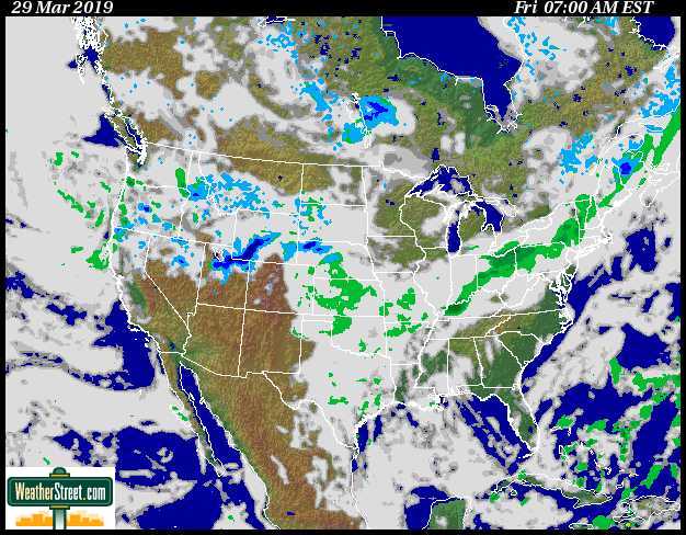
From weatherstreet.com
Reply to John Philip (13:06:55) :
Here is the UAH Global LT anomaly for 24 months, starting in January 2007. The high is +0.594C; the low is -0.183C. a range of ~0.8C.
Everything the warmists are panicking about is well within the range of natural variation, and we have seen good examples of that variation in just the past 24 months.
Remember the 1998 El Nino spike – from all the howling of the warmists, you’d think the world was going to burn up within days. Then the LT temperature dropped right down to where it was before.
End of panic. Also end of warmists’ credibility – and the 1998 Mann hockey stick fiasco did not help – “Hey, let’s just eliminate the Medieval Warm Period and Little Ice Age from the historic record – maybe nobody will notice!”.
*************************
Following is year, month, UAH global LT anomaly dC
Source: http://www.atmos.uah.edu/data/msu/t2lt/tltglhmam_5.2
2007 1 0.594
2007 2 0.450
2007 3 0.403
2007 4 0.244
2007 5 0.199
2007 6 0.203
2007 7 0.255
2007 8 0.286
2007 9 0.201
2007 10 0.231
2007 11 0.209
2007 12 0.114
2008 1 -0.046
2008 2 0.020
2008 3 0.089
2008 4 0.015
2008 5 -0.183
2008 6 -0.114
2008 7 0.047
2008 8 -0.007
2008 9 0.161
2008 10 0.166
2008 11 0.251
2008 12 0.183
Tim Clark (09:04:01) :
psi (06:13:45) :
I believe that Svensgard’s proposed mechanism for how decreased solar magnetosphere can produce increased cloud cover (which causes warming everywhere but in Antarctica)
Increased cloud cover causing warming everywhere but in Antarctica is not Svensmark’s theory.
Ok, if you say so.
If you mean that someone other than Svensmark originated the idea, I have no comment.
But if you mean that Svensmark does not endorse this theory, you are wrong.
On pages 82-90 of The Chilling Stars you will find extensive discussion of what Svensmark and Calder term the “antartic anomoly.”
The term is explained in the book as the theory that “when cloudiness decreases, the world will warm up and the southern continent will cool down” (88). Svensmark and Calder further assert that “Cloudiness is the only forcing agent that directly predicts the Antarctic climate anomaly, without the need for any further processes” (88).
Now where we?
I see, So the previous argument was ‘no net GW 1940-April 2008’, now you illustrate that April 2008 was nearly 0.6C cooler than Jan 2007, so you could have written ‘substantial net GW 1940-Jan 2007’!.
The relatively large interannual variation is well-known, and not expeced to disappear. It is the reason why ‘trends’ based on just individual start and end points are suspect. The problem is that this ‘weather noise’ is superimposed on a longer term, externally-forced risng trend, as revealed by smoothing out the noise using a linear fit, or a multi-year average.
Weather fluctuations or ‘noise’ have a noticeable effect even on monthly-mean global-mean temperature, especially in Northern Hemisphere
winter. Weather has little effect on global-mean temperature averaged over several months or more. The
primary cause of variations on time scales from a few months to a few years is ocean dynamics,
especially the Southern Oscillation (El Nino – La Nina cycle), although an occasional large volcano can
have a cooling effect that lasts a few years. The 10-11 year cycle of solar irradiance has a just barely
detectable effect on global temperature, no more than about 0.1°C, much less noticeable than El Nino/La
Nina fluctuations.
The past year (2007) witnessed a transition from a weak El Nino to a strong La Nina (the latter is perhaps beginning to moderate already, as the ocean waters near Peru are beginning to warm). January 2007 was the warmest January in the period of instrumental data in the GISS analysis, while, as shown in Figure 1, October 2007 was # 5 warmest, November 2007 was #8 warmest, December 2007 was #8
warmest, and January 2008 was #40 warmest. Undoubtedly, the cooling trend through the year was due to the strengthening La Nina, and the unusual coolness in January was aided by a winter weather fluctuation. The reason to show these is to expose the recent nonsense that has appeared in the blogosphere, to the effect that recent cooling has wiped out global warming of the past century, and the Earth may be headed into an ice age. On the contrary, these misleaders have foolishly (or devilishly) fixated on a natural fluctuation that will soon disappear.
James Hansen
JP and other warmists
Note to JP and other AGWarmists
Please see
http://hallofrecord.blogspot.com/2009/01/decadal-occurrences-of-statewide.html
This depicts the monthly record high temperatures by US State. Summary here
http://2.bp.blogspot.com/_b5jZxTCSlm0/SYSo9zKsjOI/AAAAAAAACr4/QDiDREshL5Q/s1600-h/Corrected+-+Table+1880s-2000s+High+Temperature+Frequency.JPG
The 1930’s have the greats number of “all-time” record high months (112).
Next is the 1950’s (72).
Next the 1980’s (61) and 1910’s (60) and the 1990’s (52).
The 2000’s have experienced only 19 to date.
This data provides significant evidence that at least in the USA, there has been no warming (and some probable cooling) since 1940.
John Philip (20:35:54) :
I wonder why Dr. Hansen didn’t say the unusual warmth in the other January was aided by a winter weather fluctuation.
Oh that’s right, warm months are AGW, cool months are fluctuations. I should know that by now.
John Philip (20:35:54) says (excerpt):
The past year (2007) witnessed a transition from a weak El Nino to a strong La Nina (the latter is perhaps beginning to moderate already, as the ocean waters near Peru are beginning to warm). January 2007 was the warmest January in the period of instrumental data in the GISS analysis, while, as shown in Figure 1, October 2007 was # 5 warmest, November 2007 was #8 warmest, December 2007 was #8 warmest, and January 2008 was #40 warmest. Undoubtedly, the cooling trend through the year was due to the strengthening La Nina, and the unusual coolness in January was aided by a winter weather fluctuation. The reason to show these is to expose the recent nonsense that has appeared in the blogosphere, to the effect that recent cooling has wiped out global warming of the past century, and the Earth may be headed into an ice age. On the contrary, these misleaders have foolishly (or devilishly) fixated on a natural fluctuation that will soon disappear.
– James Hansen
Allan says:
I am pleased to hear that someone still takes GISS ST data AND James Hansen seriously. I don’t.
My previous post is one effective counter to Hansen’s nonsense above. Repeating, the 1930’s have the greats number of US “all-time” record high months at 112, versus only 19 to date for the 2000’s.
The September-October 2008 “Hot Russia” data-swap fiasco finished me with GISS. There is no quality control at GISS. Details at
http://wattsupwiththat.com/2008/11/12/corrected-nasa-gistemp-data-has-been-posted/
GISS typically exhibits more warming than Hadley ST, UAH LT and RSS LT.
When I must use ST data, despite its warming bias, I use Hadley, not GISS.
Katherine: “As far as I understand, the AGW hypothesis is that man-made CO2 is the cause of the rapid increase in temperature. How do you test this hypothesis?”
You can take measurements of temperature. You can then test for scenarios that exclude and include anthropogenic factors, including CO2, and compare the results with observed temperatures.
http://www.ipcc.ch/ipccreports/tar/vol4/english/wg1figspm-4.htm
“…global temperatures have been declining for the past 10 years…”
The temperature level for the post-1998 years has been at a higher level than for pre-1998 years:
http://wattsupwiththat.com/2009/02/04/rss-global-temp-anomaly-makes-a-significant-jump/#comments
More importantly, temperatures have been rising for the past 150 years. AGW is about climate. The relevant factor is the long-term trend, and the long-term trend is upwards.
“How did man-made CO2 shut off the natural mechanism that caused the Medieval Warm Period and the Roman Optimum?”
Anthropogenic CO2 does not “shut off” natural mechanisms. Rather, it enhances or modifies existing mechanisms. So, for example, in a warmer world the El Nino effect is enhanced, dry areas may become dryer, wet areas wetter, and so on.
Or, net cooling since 1000ce-any time since…
Brendan H (22:57:47) : You can take measurements of temperature. You can then test for scenarios that exclude and include anthropogenic factors, including CO2, and compare the results with observed temperatures.
The estimated anthropogenic CO2 increase is but 3% of total atmospheric CO2,
or about 11 ppm. Do you seriously want the expenditure of trillions of dollars to remove this 11 ppm? If you believe that will stabilize world temps then I have some nice land in south Florida I would like to sell you.
Allan M R MacRae (22:06:18) :
GISS typically exhibits more warming than Hadley ST, UAH LT and RSS LT.
What do you mean by ‘typically’? The Hadley trend since the 1880 beginning of the GISS record is greater than GISS –
http://www.woodfortrees.org/plot/gistemp/from:1880/to:2009/trend/offset:-0.125/plot/hadcrut3vgl/from:1880/to:2009/trend
GISS is very slightly greater over the past thirty years, but it is UAH that is evidently the divergent record, with GISS, Hadley and RSS being tightly grouped:
http://www.woodfortrees.org/graph/hadcrut3vgl/from:1979/offset:-0.15/mean:12/plot/gistemp/from:1979/offset:-0.24/mean:12/plot/uah/mean:12/plot/rss/mean:12/plot/hadcrut3vgl/from:1979/offset:-0.15/trend/plot/gistemp/from:1979/offset:-0.24/trend/plot/uah/trend/plot/rss/trend
REPLY:Yes you can fit GISS to match the other three climate metrics, as you have done above, using offsets. But you miss the point: GISS has a presentation issue, they use a different (older) anomaly baseline than the other sets. If they used the same baseline as the others, this issue would disappear because their visual public graph would look like the others. Since you are a defender of GISS, why not ask them to conform? I’m sure that in the interest of fostering a correct graphical presentation to the public, they will use the more recent baseline like the other 3 climate metrics do. – Anthony
Tom in Florida says:
Estimated by who? That is just silly talk. The current levels of CO2 are about 385 ppm, or about 105 ppm above the pre-industrial baseline. The anthropogenic part is essentially that full 105 ppm (which is fortunately only about half of the amount of CO2 that we have actually released into the atmosphere from burning fossil fuels because the oceans and biosphere have been able to absorb some of it.)
Ric Werme says:
No, the warm months are AGW + fluctuations and the cool months are AGW + fluctuations. However, the “cool months” aren’t that cool compared to what they used to be because the AGW is added in…and the warm months are often record-breaking or close to it because the AGW is added in.
Anthony,
I’m sure that in the interest of fostering a correct graphical presentation to the public, they will use the more recent baseline like the other 3 climate metrics do. – Anthony
But the other three don’t use ‘the more recent baseline’ – HADCRUT3 uses Jan 1961 – Dec 1990 (30 years), UAH & RSS both use Jan 1979 – Dec 1998 (20 years). GISTEMP is Jan 1951 – Dec 1980 (30 years).
There is nothing ‘incorrect’ about a different choice of baseline, and nor does it make any difference whatsoever to the analysis of change in temperature. The only difference is in the anomaly figures themselves, these being all consistently higher or lower for the entire period. As for a “correct graphical presentation” I simply don’t know what you mean, unless you’re suggesting that either Hadley or RSS/UAH are somehow baselined to a “correct” zero anomaly?
This is not an issue to anyone with a simple understanding of anomalies relative to baselines, although it certainly does seem to feed the false perception that GISS ‘exhibits more warming’.
I am not a defender of GISS (what an odd idea – why should I be? It doesn’t even show the greatest warming over its record period!). Since it is evident that there is some divergence between the records, especially over short time scales, I favour looking at all of the records in the way that woodfortrees does in presenting its ‘temperature index’. Favouring only the highest or the lowest indicator of warming for any particular period without referencing the others would typically be an indication of cherry picking.
For all that’s written on this blog suggesting GISS adjustments introducing warming to their temperature record, there seems to be precious little evidence of them succeeding in doing so relative to the majority of records. If one wanted to examine what had been done to a record because one was concerned about its divergence one would start with UAH, that is entirely obvious (UAH may be perfect, of course, but it is clearly the least confirmed by others).
My previous post is one effective counter to Hansen’s nonsense above. Repeating, the 1930’s have the greats number of US “all-time” record high months at 112, versus only 19 to date for the 2000’s.
Allan, The Continental USA is just 2% of the surface of the planet, it’s regional warming during the 30s and 40s is actually well-known and the cause, while a source of some interesting speculation, is unlikely to tell us very much about the current global warming. The source of your figures admits as much:
I have excluded Alaska and Hawaii from this animation because they are distinct and separate climate zones
Quite.
GISS typically exhibits more warming than Hadley ST, UAH LT and RSS LT.
Actually, if you plot the linear trend in the four major global mean temperature since the inception of satellite data, you find that three of them agree well, with one clear outlier.
The temperature level for the post-1998 years has been at a higher level than for pre-1998 years
And contrary to a much-repeated claim, all the indices of global mean temperature show a significant rising trend over the last 120 months, this being the usual definition of a decade.
JP
“For all that’s written on this blog suggesting GISS adjustments introducing warming to their temperature record, there seems to be precious little evidence of them succeeding in doing so relative to the majority of records.”
You Sir, are willfully ignorant. Those of us who have looked into GISTemp no longer find reporting their results as ingenuous to be candid or honest in any fashion.
Joel Shore (08:59:21) :
“Tom in Florida says: The estimated anthropogenic CO2 increase is but 3% of total atmospheric CO2, or about 11 ppm.
Estimated by who? That is just silly talk. The current levels of CO2 are about 385 ppm, or about 105 ppm above the pre-industrial baseline. The anthropogenic part is essentially that full 105 ppm ”
The numbers come from here: http://www.geocraft.com/WVFossils/greenhouse_data.html
I used “estimated” because this is dated 2000.
Do you really mean to say that essentially all of the 105 ppm increase is man made?
Where do you come up with that idea?
@ur momisugly Tom in Florida,
For all I can see the site you quote pulls its numbers out of thin air. The references for the deciding data in table 1 on that site come not from the cited references. See below for details, I repost my entry from the “WaPo Pundits …” thread
———–
Monte Hieb, the author of that page, lists in his table 1 the “natural” and “man-made” additions to CO2 from pre-industrial levels to today, indicating that just 14% of the rise in atmospheric CO2 mixing ratio is man made. He claims that the data is from U.S. Department of Energy in the table description. Tough luck, the DOE page he references (or see an older version at Archive.Org) holds no such “man-made” vs. “natural” information, only the well-known GHG increase data, which constitutes the rest of table 1. At a minimum, the table description is misleading, as it attributes the numbers of “man-made additions” and “natural additions” to the DOE and takes its name to give it credibility. In the footnote 1 Hieb offers an additional source, namely the IEA Greenhouse Gas R&D Programme, where the data section is not publicly available. Cool, no source for the two data columns Hieb bases his entire argument on. But hey, if you look at the IEA pages you will find, that they defers readers to the IPCC for details. Now, if you look at sections 2.3.1 and 7.3.1.2 of the IPCC FAR WG1 report, the IPCC attributes the entire change from pre-industrial about 280ppm to todays about 370ppm in atmospheric CO2 to human activities.
So your “source” uses unsourced data, which is in stark contradiction to generally accepted findings, to make the argument that human contribution to climate change is negligible. You do not expect me to trust anything on that page, do you?
P.S.: Before you ask, yes, I have e-mailed the above info to Hieb, too, including a link to this discussion.
————
I have yet to hear of Hieb.
I failed to include the links of my post, sorry. Here they are:
1) <a href=”http://cdiac.esd.ornl.gov/pns/current_ghg.html”DOE page he references
2) older version at Archive.Org
3) IEA […] defers readers to the IPCC for details
4) IPCC FAR WG1 report
gary gulrud (11:24:48) :
“For all that’s written on this blog suggesting GISS adjustments introducing warming to their temperature record, there seems to be precious little evidence of them succeeding in doing so relative to the majority of records.”
You Sir, are willfully ignorant. Those of us who have looked into GISTemp no longer find reporting their results as ingenuous to be candid or honest in any fashion.
Would you care to give me evidence of my wilful ignorance, Gary, rather than just asserting the prejudice you have built up over time? I have given my evidence as follows:
Simon Evans (08:32:18) :
Allan M R MacRae (22:06:18) :
GISS typically exhibits more warming than Hadley ST, UAH LT and RSS LT.
What do you mean by ‘typically’? The Hadley trend since the 1880 beginning of the GISS record is greater than GISS –
http://www.woodfortrees.org/plot/gistemp/from:1880/to:2009/trend/offset:-0.125/plot/hadcrut3vgl/from:1880/to:2009/trend
GISS is very slightly greater over the past thirty years, but it is UAH that is evidently the divergent record, with GISS, Hadley and RSS being tightly grouped:
http://www.woodfortrees.org/graph/hadcrut3vgl/from:1979/offset:-0.15/mean:12/plot/gistemp/from:1979/offset:-0.24/mean:12/plot/uah/mean:12/plot/rss/mean:12/plot/hadcrut3vgl/from:1979/offset:-0.15/trend/plot/gistemp/from:1979/offset:-0.24/trend/plot/uah/trend/plot/rss/trend
What is your evidence to counter the above?
REPLY: Simon, as I pointed out earlier, you can make the data sets nearly match when you use offsets such as is available in the woodfortrees interface.. What Gary and many others speak of is the PUBLIC PRESENTATION that GISS puts out, using an older, outdated baseline that the other three metrics do not use. Plus, all of the adjustments they do which when examined in detail, seem nothing more than arbitrarily applied on a station by station basis. So, I don’t see you argument using links above as particularly convincing. I view GISS as an outlier on many levels, as do others, which is why it gets little respect here. – Anthony
Hey, would you guys clarify what point your are trying to make, so that the people who have not been following your arguements have a clue?
I will point this out, the person that used the term “willfully ignorant” is using
“loaded” language. I would have a tendancy to discount ANYTHING from that author.
Signed:
Worked in Nuclear Power for 20 years, experienced enough “loaded language” for one lifetime.
“” John Philip (15:49:27) :
<>
Inhofe’s list of ‘over 650 prominent international scientists’ has some elements of pure comedy, and maybe 30-40 actual dissenting scientsts. I leave others to judge their prominence. Read the entry on Alan Titchmarsh for example [note they misspell his surname] and you will see he says this I’m sure we are contributing to global warming, and we must do all we can to reduce that . Read the website of this TV gardening show presenter and popular novelist and marvel at how he manages to find the time also to be a ‘prominent international scientist’ and how he has managed to keep it quiet 😉 “”
So John; you have managed to dispose of precisely one of the “more than 650” on Inhofe’s list, which contains “maybe 30-40 actual dissenting scientsts “, so by my count, you now have only another 609 to disqualify according to your standards. And so far you have not proven the falsehood of even one of the scientific grounds on which ANY of the 650 chose to come out publicly and voice their dissent in some way or another.
I’ve read quite a few of those statements; and yes they range all the way from “maybe I believe in AGW, but I don’t know if it is any cause to worry.” to “no way in hell is any action of humans responsible for any global warming that may or may not be occurring.” and everything in between.
They include statements that “the AGW thesis has not been proven by any available observational data, to “So long as we have the oceans on earth, we can neither change the temperature of this planet either up or down, even if we wanted to.”
Why not try presenting scientific evidence against their arguments, instead a hollow blanket ad hominem assault on the persons; most of whom, you know absolutely nothing about.
I’m somewhat familiar with that last declaration; since I made that statement publicly; and several times.
I also predicted in June 2004, that when the floating sea ice melts, the sea level will go down; not up. That was published (Jan 2005 Physics Today). That was roundly ridiculed by none other than Spencer Weart, whose book “The discovery of Global Warming”, I was commenting on; actually I was commenting on Morrison’s review of that book.
It took till around June 2006 for a British/Dutch team of real live international climatologists, to report on ten years of actual real data measurement using a European polar satellite to prove that the sea level of the arctic ocean was falling at 2 mm per year (therby confirming that the floating arctic sea ice was indeed melting over that decade. They state, that they were “very confident” of their data, but did not know why that should happen; and they would “wait for the theoreticians to catch up with the real measured data.” Well at least one “theoretician” was a good two years ahead of them.
And all the available long term ice core proxy data, shows that the global surface temperature changes occur hundreds of years ahead of the atmospheric CO2 changes; which was the point on which I queried Morrison’s review of the Weart’s book.
So other than the fact that we have NO reliable global surface temperature data that predates about 1979-80, which is about when both the satellite temperature measurements started, and also when the ocean buoy experiments started, which prove that prior to then, all of the ocean surface water temperature data; which after all is only 70 % or so of the global surface; was completely false.
So other than the ground based surface temperature historic data are junk, and also that the surface temperature sampling regimen is in gross violation both spatially, and temporally with the Nyquist sampling Theorem; so that recovery of even an average value is impossible; we have the absurd realization, that even accurate knowledge of an accurate mean global surface Temperature, tells us precisely nothing about whether the earth is radiating more energy than it receives (cooling down) or radiating less energy than it receives from the sun, and hence warming up.
So John; try attacking the science arguments of any of Inhofe’s list of 650 “shysters”, instead of the persons; or alternatively present some actual measured data; rather than computer generated fiction. that passes for most of the IPCC scare mongering predictions. I’d be happy if you can reduce the three to one obligatory fudge factor in their wild predictions, to say a +/-30% error.
But I agree with you that the ad hominem mass attack is second only to the straw man debating technique.
George
George E. Smith (15:53:50) :
So John; you have managed to dispose of precisely one of the “more than 650″ on Inhofe’s list, which contains “maybe 30-40 actual dissenting scientsts “, so by my count, you now have only another 609 to disqualify according to your standards.
No, George – evidence of one example of dishonesty is evidence enough of dishonesty. There are many, many, many more, but I for one will not waste much time in trying to discover where your critical level of doubt kicks in. If I posted one statement that you knew to be dishonest (rather than simply mistaken) I would expect you to discount all else that I might say, and quid pro quo.
You can find plenty of debunking of the Inhofe list on the web if you are genuinely interested in knowing whether or not you’re being conned:
http://www.thedailygreen.com/environmental-news/latest/inhofe-global-warming-deniers-scientists-46011008
http://scienceblogs.com/deltoid/2008/12/how_many_inhofes_list_compared.php
http://blogs.tnr.com/tnr/blogs/environmentandenergy/archive/2008/12/15/inhofe-s-650-quot-dissenters-quot-make-that-649-648.aspx
http://climateprogress.org/2008/12/11/inhofe-morano-recycles-long-debunked-denier-talking-points-will-the-media-be-fooled-again/
– and so on and on.
RE: The alleged “pre-industrial level” of CO2 at ~280ppm is uncomfortably close to the fatal 200ppm. As CO2 is naturally sequestered in carbonates and fossil fuels over geologic time, it is reasonable to expect that all life on Earth will ultimately cease due to CO2 starvation.
Yes, this is a grave danger. When the Industrial Revolution commenced, we may have literally been nearing the ultimate disaster. So, perhaps a few centuries were bought. And now? Projecting conservatively, CO2 should peak out later this century. Then what?
SteveSadlov (18:22:54) :
“RE: The alleged “pre-industrial level” of CO2 at ~280ppm is uncomfortably close to the fatal 200ppm. As CO2 is naturally sequestered in carbonates and fossil fuels over geologic time, it is reasonable to expect that all life on Earth will ultimately cease due to CO2 starvation.
Yes, this is a grave danger. When the Industrial Revolution commenced, we may have literally been nearing the ultimate disaster. So, perhaps a few centuries were bought. And now? Projecting conservatively, CO2 should peak out later this century. Then what?”
Steve, no problem,
1. we simply produce more cement
2. we detonate a few nukes to promote volcanic eruptions.
3. We release all the CO2 again that the zealots are going to put in the ground for the next 30 years.
4. we increase the human population and make them drive bicycles 10 hours a day.
( a cyclist at speed produces the same amount of CO2 as a gasoline car driving at a speed of 30 mph. See: http://www.youtube.com/watch?v=Rvr6z8neCFk
I think this will do the job, nothing to worry about.
Two posts by meteorologist Joe d’Aleo
“Taking a Time Machine Ride Back to the 1960s or 1800s? ”
On temperature cycles and global cooling
http://icecap.us/index.php/go/joes-blog/taking_a_time_machine_ride_back_to_the_1960s_or_1800s/
On global cooling since 2002
http://icecap.us/images/uploads/MSUCRUvsCO2.jpg
Simon,
Much has been written about GISS ST data unreliability but I frankly haven’t the interest in finding the references for you – this dialogue is unproductive, like throwing sand.
Here is a response-in-kind to your and JP’s cherry-picking – the problem is we are now all covered in cherry juice, and are no wiser than before.
http://www.woodfortrees.org/plot/gistemp/from:1998/to:2009/trend/offset:-0.125/plot/hadcrut3vgl/from:1998/to:2009/trend