In New England, we could be chanting “We’re almost #1” except we’re exhausted from February.

Except for a heavy and wet snowstorm on Thanksgiving, winter got off to a late start in New England. At my home near Concord NH, the “White Turkey” snow was gone by Christmas. The lack of a January thaw and some small snowfalls made most of January unremarkable. That all changed in the last week of January – a series of snowstorms quickly left me feeling as though I was either dealing with snow or catching up on everything I had set aside to deal with snow. The storm track was south of Boston, so they got pretty much all snow, and more than me. They are just a few inches from setting a new record for the season and there’s a very good chance they’ll break it. The snow has been a big story, and continues to be so. However, regionally, the big story of the winter has been the cold temperatures.
A year and a half a ago, I wrote one of my historical posts looking back a the New England Hurricane of 1938 and the other extreme weather around then. One of my examples was February 1934 which set many records that still exist today. It was a truly awesome month, Mark Twain would have run out of superlatives to describe it, and I’ll try to refrain from using many more adjectives.
I didn’t know all that much about 1934 before then, and still don’t know as much as I should. It was in the middle of the Dust Bowl years, not a good time for much of the country. It was significant in my post because it was the coldest February in New England’s records and I expected I wouldn’t see a month like that in the rest of my life. That was then. Now I have – February 2015 was essentially a twin of 1934. While the old month remains the coldest on record for New England, the margin is minuscule. For example, Boston missed a tie by 0.1F°

It was a twin for much of the rest of the country. While Portland Maine did break their coldest February record, Portland Oregon broke their warmest February record. For both cities the old record holder was 1934! The driver for 2015 is a warm pool of water in the northwest Pacific, and that’s created the “Ridiculously Resilient Ridge” which has kept storms from California, brought warm weather to Alaska, and probably a lot of other things I’d know about if I hadn’t been moving snow for the last six weeks.
That ridge was a sign – we’ve seen it before. Last October a press release from the American Geophysical Union about the California drought observed:
“We noticed that 1934 really stuck out as not only the worst drought but far outside the normal range of what we see in the record,” said Benjamin Cook, an environmental scientist at NASA’s Goddard Institute for Space Studies in New York City and lead author of a new paper that has been accepted for publication in Geophysical Research Letters, a journal of the American Geophysical Union.
The new study also finds that the same atmospheric pattern of a high pressure ridge over the West Coast deflecting away storms laden with rain last winter was also present over the area during the winter of 1933-34.
The maps above are from NCDC’s Climate at a glance application, it’s an interesting site to visit.
Do you mean all this climate change is NOT unprecedented? /sarc
Unprecedented since 1935, I guess.
If you seek tenure, might you look at the last seventy (or fifty) years.
Ric Werme – many thanks. A clear disproof of truly ‘unprecedented’.
Appreciated.
Auto
I cannot top this remark for succinctness
its been a cold winter (Dec-Jan-Feb) for Maine but certainly no where near the coldest and there’s still a clear long-term warming trend of 0.4°F / Decade
http://i57.tinypic.com/2qnp18l.png
meanwhile, its been the hottest winter (Dec-Jan-Feb) in California for 120 years…
http://i58.tinypic.com/2ef3reb.png
data from http://www.ncdc.noaa.gov/cag/time-series/us/04/00/tavg/3/02/1895-2015?base_prd=true&firstbaseyear=1901&lastbaseyear=2000 and http://www.ncdc.noaa.gov/cag/time-series/us/04/00/tavg/3/02/1895-2015?base_prd=true&firstbaseyear=1901&lastbaseyear=2000
According to them there graphs, the warming trend started long, long before CO2 supposedly became a driver or forcer or whatever they’re calling it this year, back about 1950. They look a lot like one would expect if the globe were still coming out of a prolonged cold period that ended some time in the 19th century, with several known natural cyclical forces in play.
Bevan, you are displaying the new nClimDiv version from 2014. If you will check the previous Drd964x version from 2013, you would find that Maine had experienced no warming at all. It is an artifact of the nClimDiv processing. For the archived, ‘both official’ Maine records compared side by side, see essay When Data Isn’t in ebook Blowing Smoke.
Bevan,
Massive fail. Here is the way the Maine graph looked before the “adjustments” imposed last year.
A report on the chicanery is here
http://wattsupwiththat.com/2014/04/29/one-way-adjustments-the-latest-alteration-to-the-u-s-climate-record/
@TYoke
nope, you fail.
“The skeptical theory about adding more stations and moving to unadjusted data is busted.
Its been busted since 2010, not that folks noticed”
http://wattsupwiththat.com/2014/04/29/one-way-adjustments-the-latest-alteration-to-the-u-s-climate-record/#comment-1624496
OK, for the sake of argument, let’s say the trend lines are legit.
First off, where is the “hockey stick”? Looks like a pretty constant slope to me. Not tracking atmospheric CO2.
Second, so what if it’s getting warmer? No discernible trend toward danger or catastrophe. Extreme weather remains random, like it’s always been.
Third, do you know where that trend line will be in 50-100 years? No, you don’t. And neither does anyone else.
For California, the pre-“adjustment” trend was 0.07 degree increase per decade in the Drd964x data becoming a .18 degree increase per decade under the nClimDiv data, which is what you have chosen to illustrate.
The “adjustments” more than doubled the former trend (250%). That is fraud by any reasonable standard.
That “clear, long warming trend” is based on falsified global temperature. There was no [warming in the] eighties and nineties which were a a hiatus exactly like today and lasted for 18 years. But ground-based temperature curves from GISS, NCDC, and HadCRUT show it as a warming period. Their data sets show a warming of 0.1 degrees Celsius in the interval of 1979 yo 1997 which hides the fact that it is a no-warming, hiatus period. Worse yet, they cooperated in this venture by using identical computer processing which left its footprints on all three temperature curves. They consist of sharp upward spikes near beginnings of years, all in precisely the same locations in all three data-sets. We are talking here of supposedly independent data sources from two [sides] of the ocean. Satellite data are free of this junk and do not show any fake warming either. I have known and talked about it for five years but nothing happens. What is needed is a [thorough], independent investigation of these warming-data manufacturers.
Bevan, you’re refuting my point by quoting Mosher?! Let us say for the sake of argument that Mosher has part of a point (on a largely unrelated topic) and that adding more stations creates some additional warming. What does that prove exactly with respect to the altered Drd964x State records? Here are some questions.
– Are those otherwise discarded stations are especially vulnerable to UHI problems? Very likely.
– What is the amount of extra warming caused by Mosher’s added stations? Not nearly enough to account for the huge change in the adjusted slopes.
– Is the immense increase in the slopes in the adjusted nClimDiv data due to added stations? The answer is no.
In short, Mosher’s post does not refute Dan Travers 4/26/14 exposure of the massive adjustments of long standing state records. We are deep into Orwellian erasure of history with these adjustments.
you’re cherry picking regions, there are areas that had record cold.
Also it isn’t globally warmer. The word that begins with G in CAGW is, you guessed it…global. CO2 distributes as do gases and achieves a roughly homogenous coverage thereby evenly warming over the entire planet. The hot and cold anomalies are due to oceanic oscillations and atmospheric anomalies due to natural factors.
You will notice that it hasn’t warmed for 17 years, it was warmer globally in Mediaeval times, the Roman warm period and Minoan warm period, with much less CO2. It was an ice age during the Ordovican period with 11 times the CO2 of today. There is nothing unprecedented about the climate trend, it has all repeated before, the climb to the MWP was practically identical to the current plateau albeit a bit warmer back then.
The man made global warming scam has zero evidence to back it up.
The cooling of Contiguous US continues
The trend of United States annual and seasonal temperature anomalies has been declining for 18 years or since 1998. The only exception is the summer and more particularly, the month of June and the WEST
Seasonal trend of US temperatures since 1998
3 out of 4 seasons and the annual temperature anomaly show a cooling trend.
• WINTER (-1.44 F/DECADE) COOLING
• FALL (-0.50 F/DECADE) COOLING
• SPRING (-0.06 F/DECADE) COOLING
• SUMMER (+0.23 F/DECADE) WARMING
ANNUAL (-0.48 F/DECADE) COOLING
Regional trend of US Annual temperatures since 1998
8 out of 9 climate regions show a cooling trend
• OHIO VALLEY -0.9 F
• UPPER MIDWEST -1.5 F
• NORTH EAST -0.1F
• NORTHWEST -0.1 F
• SOUTH -0.5 F
• SOUTHEAST -.03 F
• SOUTHWEST -0.1 F
• WEST +0.7 F
• NORTHERN ROCKIES & PLAINS -0.1 F
Winter in California is hot?
The cooling of CONTIGUOUS US shows up not only in the ANNUAL temperature anomalies but also 9 months of the year.
The following are monthly temperature anomaly trends per decade for Contiguous US or 48 states as calculated by the NCDC/NOAA Climate at a Glance web page for the last 18 years [1998-2015]. The figures reflect the linear trend in Fahrenheit degrees per decade per NCDC/NOAA web page data using base period of 1998-2015. .
WINTER (-1.44 F/DECADE) – DECLINING
DEC -0.41F/decade (declining)
JAN -1.23 F decade (declining)
FEB -2.73 F/decade (declining)
SPRING (-0.06 F/DECADE) – DECLINING flat
MAR +0.57 F/ decade (rising) but dropped 10 degrees F since 2012 alone
APR -0.28 F /decade (declining)
MAY -0.47 F/decade (declining)
SUMMER (+0.23 F/ DECADE)-RISING)
JUN +1.02 F/decade (rising)
JUL -0.10 F /decade (declining)
AUG -0.24 F/decade (declining)
FALL (-0.50) F/DECADE)-DECLINING
SEPT +.08 F/decade (declining) flat
OCT -0.03 F/decade (declining) flat
NOV -1.53 F/decade (declining)
@sabretruthtiger
Your assertion on CO2 isn’t holding up well in the OCO data. There are plumes and ducts and anything BUT a uniform distribution showing up on those graphs. You can keep the assertions but the data isn’t buying it.
Brrr
http://www.ncdc.noaa.gov/cag/time-series/us/17/00/tavg/1/02/1895-2015?base_prd=true&firstbaseyear=1901&lastbaseyear=2000&trend=true&trend_base=10&firsttrendyear=1980&lasttrendyear=2015
Lane Core, Jr – Clearing forests for agriculture likely had a significant impact on CO2 levels as far back as the 1850s. So not fossil fuels, but still AGW.
Wow! Sure is a delicate little egg we live on, looks like man has been the enemy longer than we even have imagined.
Looks like 10ppm to 1900. Doesn’t seem that significant to me.
Please show me a chart demonstrating the considerable impact on CO2 in the 1850’s.
Humans have been clearing forests for agriculture since the neolithic so one can hardly point to 1850 as a start. In fact looking at the 19th record CO2 concentrations measured varied between 550 ppm and 190 ppm due largely to fairly crude physical chemical methods then in use. Ice Core and plant derived models point to 19th century levels being pretty contant around 290 ppm. Trouble is ice core data cannot capture short term changes so direct comparison with measured values isnt really sensible. In short we really dont have good evidence for atmospheric CO2 levels outside Europe and the east coast of North America before 1900 so we really cannot say what global levels were.
What we do know from proxies of course is that CO2 levels have varied enormously during geological time with levels in the Cambrian reaching as much as 5000 ppm in the Cambrian and 1500 ppm during the Jurassic. 400 ppm is a very low level over these time frames and is in fact perilously close to levels that adversely affect plant productivity and which are usually associated with ice ages.
Alarmists claim no significant change in CO2 atmospheric concentration before 1950 (that is, before the post-WWII industrial ramp-up) so your speculation would seem to be an outlier even among them.
Usually associated with ice ages? Keith, were are IN an ice age right now. An interglacial period, true, but still an ice age. And if the lengths of past ice ages are any indication, we have several hundred millions years left before it’s over (which will occur when there is no more year-round ice anywhere on the planet). Just 15% of Earth’s history has been ice ages, so for 85% of the time, the Earth has been WARMER than it is right now. Even if we could, via human CO2 emissions, cause an early end to the current ice age, it would just be return to Earth’s NORMAL weather.
@TREVOR WILLARD: THANK YOU. I were a geologist, once. The short-term thinkers drive me batshit.
So is this “Ridiculously Resilient Ridge” caused by or related to the unusual El Squibbo (very weak El Nino) that’s been kind of detected in the Pacific?
I think it’s called “El Niño Modoki” 😉
I thought El Niño Modoki was when the warm water didn’t travel the whole width of the Pacific (just covering the middle) before spreading out.
This year we have a normal El Nino but with very little warm water.
The same fireworks, but a squib.
The current El Niño appears to be a Modoki El Niño, the warm water isn’t reaching South America. That may be coupled to the RRR as a general westward shift of weather systems. It may be a pretty lame Modoki El Niño too. I’m not an expert, Bob Tisdale, you out there?
@mCourtnet, that ‘ridiculously RR henceforth called the three R’s) has been very noticeable here in Southern BC Canada, I am getting really tired of writing my 2x daily wind obs as “calm” for the past, oh 3 weeks (if not longer). We had a winter storm mid Jan. but since then nothing, every day the same.2x/day a few scattered clouds, calm. (50.03 north 119 24’ west)
It is interesting how the record low temperatures in 1934 were followed just 5 or 6 years later by record high temperatures. And how those temperatures were driven by ocean and atmosphere circulation patterns. Those temperatures feed into the global temperature calculation, meaning that the global temperature can change significantly without there having been any change to the net inflow or outflow of heat, ie. without any of the forcing that is the one and only factor considered by the IPCC.
There was the big El Niño starting in 1939. I think it was a triplet.
http://www.esrl.noaa.gov/psd/enso/mei.ext/ext.ts.jpg
From Klaus Wolter, at http://www.esrl.noaa.gov/psd/enso/mei.ext/index.html
Is it my imagination or are there more, and more extreme, El Ninos since 1975?,
[Reply: The Pacific Decadal Oscillation shifted to its positive phase between the late 1970s and late 2000s. El Niños are associated with the positive PDO, during the negative PDO phase, La Niñas predominate and El Niños are rarer and weaker. Note the graph above ends in the late 2000s. -Ric]
Note the graph above ends in the late 2000s. -Ric]
and that the larger more frequent El Niños followed the 1975 ‘climate shift’. Ie PDO shift. In 2005 it appears that the ‘climate shifted’ again and certainly recently the AMO has turned colder.
global temperature can change significantly without … any of the forcing
==========
radiation varies as the 4th power of temp. that means that you can have an infinite number of different global average surface temperatures for the exact same forcing. for example, divide the globe into two equal halves, a and b:
forcing energy ~ a^4 + b^4
avg temp = (a+b)/2
earth 1
forcing energy ~ 2^4+2^4 = 32.
avg temp = (2+2)/2 = 2
earth 2
forcing energy ~ 1^4+3.6^4 = 32
avg temp = (1+3.6)/2 = 2.3
two different earths. exact same forcings. two different average temperatures.
average global surface temperature is a meaningless metric, because the exact same forcings can generates an infinite number of different global average surface temperatures.
ferdperple
Now, go little a little further with that thought. You missed the effect of area x the change in temperature.
A 1/2 degree change in the equatorial zone is going to dominate a much larger change in the Arctic.
Split the earth into, say, 9 bands of 10 degrees in each band.
Or, North pole to 71 north (picks up all of the Arctic Ocean = 14.0 Mkm^2),
71 north to 45 north = 60.7 Mkm^2,
45 north to 23.5 north = 78.6 Mkm^2,
23.5 north to 23.5 south = 203.4 Mkm^2,
23.5 south to 45 south = 78.6 Mkm^2,
45 south to 71 south (stops at nominal edge of the Antarctic continent) 60.7 Mkm^2, then
71 south to the south pole = 14.0 Mkm^2.
So, what is more important? 204 Mkm^2 at 33 deg C (land) and 25 deg C water?
or 14.0 Mkm^2 at -25 deg C, half the time not receiving any radiation at all?
You can look at the IPCC “main forcing factor” here.
We are safe now.
Go to: climate4you.com.
When it opens, on the home page, look for the list of Key Updates and click on CO2 and temperature.
A graph will open. We have been safe for a while from CO2 and just hope it will stay that way.
Thanks, Ric Werme. Very good article.
One thing should be clear by now; it is impossible to predict the weather based on the IPCC climate models. Not just because their scenarios don’t even resemble reality, once it happens, but because weather is not the “noise” on “climate”;
“Weather is climate. More specifically, aggregations of weather are climate. Means, averages, and distributions of daily weather comprise climate.”
From Actually, Weather Is Climate (William M. Briggs, Statistician & Consultant. Jan. 22, ’10), at http://pjmedia.com/blog/actually-weather-is-climate/
Joe Bastardi’s Saturday Summary for March 7 (3/7) is forecasting a 20 days return to deep winter conditions for the Northeastern USA starting from March 18-22.
See http://www.weatherbell.com/
Joe Bastardi’s Saturday Summary for March 7 (3/7) is forecasting a 20 days return to deep winter conditions for the Northeastern USA starting from March 18-22.
Oh please no! In Ottawa, we have unrelenting cold, so cold that there was little snow, and this week is going to be above zero. We surrender!
“We’ve seen it all before”
####
Indeed, we have and it is worthwhile noting that the IPCC considers AGW to have occurred after 1950. Thus the warming trend circa 1920-45 was a natural trend, in the view of the IPCC.
There is a cogent reason for the IPCC assumption: when that warming trend began, circa 1920, man had contributed only an estimated 20 ppm of CO2, more or less (according to hind cast projections) to the atmosphere. By 1945, there were only a few more ppm. These amounts, in the view of the IPCC, were insignificant in regards to affecting global temperatures.
Well, if indeed it is true that the IPCC considers AGW to have occurred after 1950 we are safe now.
See here for safety:
http://www.climate4you.com/
If clicking on it does not open the graph showing the relationship between CO2 and temperature since 1959, just go to the site. After the site opens at the home page, look under Key updates and then on the list, click on CO2 and Temperature, the safety graph will open.
No more increase in temperature due to CO2 increase after about, I will let you decide.
The authors decided to use monthly data, not annual data. They are willing to wait (and so do I) but waiting one month to update is better than waiting one year.
I also tried their approach with the GISS data. Same results, in fact a little better if I use the annual data instead of monthly data. I also verified that plotting CO2 on the X axis is perfectly fine instead of using years (years are shown on the graph at climate4you as corresponding to CO2 and I agree with this), since as you can verify CO2 increased every year since 1959.
Not sure how I can make this “safety graph” open here. Trying again.
Climate for you temperature anomalies vs. CO2
http://www.climate4you.com/
To investigate the potential significance of this visual impression, all monthly HadCRUT3 temperatures were plotted against the monthly Mauna Loa measurements in the diagram below.
Diagram showing HadCRUT4 monthly global surface temperature estimate plotted against the monthly atmospheric CO2 content according to the Mauna Loa Observatory, Hawaii, back to March 1958. The red line is a polynomial fit with key statistics listed in the upper left part of the diagram. Last month shown: January 2015. Last diagram update: 2 March 2015.
The diagram above shows all HadCRUT3 monthly temperatures plotted against the monthly Mauna Loa CO2 values, since the initiation of these measurements in 1958. As the amount of atmospheric CO2 have risen steadily since 1958, although with annual variations, the oldest values of temperature and CO2 are plotted close to the left side of the diagram, and more recent values are progressively plotted towards the right side of the diagram.
By this, the diagram illustrates that the overall relation between atmospheric CO2 and global temperature apparently has changed several times since 1958.
In the early part of the period, with CO2 concentrations close to 315 ppm, an increase of CO2 was associated with decreasing global air temperatures. When the CO2 concentration around 1975 reached 325 ppm this association changed, and increasing atmospheric CO2 was now associated with rising global temperatures. However, when the CO2 concentration at the turn of the century reached about 378 ppm, the association changed back to that characterizing the period before 1975. Thus, since 2000, increasing concentration of atmospheric CO2 has again been associated with decreasing global temperature.
The diagram above thereby demonstrates that CO2 can not have been the dominant control on global temperatures since 1958. Had CO2 been the dominant control, periods of decreasing temperature (longer than 2-5 years) with increasing CO2 values should not occur. It might be argued (IPCC 2007) that the CO2 dominance first emerged around 1975, but if so, the recent breakdown of the association around 2000 should not occur, either.
Consequently, the complex nature of the relation between global temperature and atmospheric CO2 since at least 1958 therefore represents an example of empirical falsification of the hypothesis ascribing dominance on the global temperature by the amount of atmospheric CO2. Clearly, the potential influence of CO2 must be subordinate to one or several other phenomena influencing global temperature. Presumably, it is more correct to characterize CO2 as a contributing factor for global temperature changes, rather than a dominant factor.
The breakdown of the positive temperature-CO2 relation since about 2000 (diagram above) have now lasted 10-11 years. This suggests that the recent global temperature development might deviate significantly from previous short-lived (2-5 years) periods of cooling derived from oceanic and volcanic activity as seen several times between 1975 and 2000. There are two possibilities: 1) Global air temperatures may again begin to increase in a short while. 2) The recent development may represent the beginning of a more thorough and long-lasting cooling, perhaps similar to the cooling period after 1940. As usual, time will show what is correct.
Well trying again does not work. I can only get the text to show here, not the graph. I did it before on a previous thread. So if someone can show the graph by going to climate4you.com and then under Key updates on the home page, click on CO2 and temperature the graph should open. Or maybe the moderator can do this and display the graph to my post. Sorry.
It’s unclear (to me) which graph you are trying to post. You might try copy/pasting the image location (rt click on image for URL.)
For instance:
http://www.climate4you.com/images/AllCompared%20GlobalMonthlyTempSince1958%20AndCO2.gif
or this one:
http://www.climate4you.com/images/HadCRUT4%20GlobalMonthlyTempSince1958%20VersusCO2.gif
To Alan Robertson.
Thank you Thank you.
Yes the bottom one is the one I was trying for.
But the top one you posted from the same site is also showing the same thing if you have a good pair of eyes and a good processing brain, no polynomial needed!
Thanks again
OK. I get you, right click is probably what I did when posting before.
The more things change, the more they stay the same.
In climate science, the more things stay the same, the more climate change is definitely happening.
Not true. See the safety graph above.
“The current El Niño appears to be a Modoki El Niño, the warm water isn’t reaching South America. ”
I am not so sure. I follow changes in upwelling and related sea bird fatalities. Sea birds were washing up on Chilean shores due to an El Nino like flow of warm water late summer 2014. Then October 2014 we saw a similar die off from Washington to California for a the Cassin’ Auklet that feeds on plankton and only dives to about 30 meters depth. But it appears the die off only affected that species, and its unique ocean niche.
That suggests warm water made it to both shores, but it was of such low volume? low impact?, there was only a very muted effect. If the west coasts of the Americas have already experienced a subtle El Nino event, what does that mean for the coming year?
It’s been abnormally warm in those waters for other reasons.
Check out the wind pattern. Normally the borderline between the westbound trades and the eastbound westerlies is somewhere near the Mexican border. The atmospheric warmth produced by an El Nino must be picked up by the westerlies for us to feel it. But this can be sidetracked if the global wind pattern changes or the flow path of an El Nino wave is blocked. The latter happens when the equatorial countercurrent somehow gets blocked and the warm water never reaches the coast but spreads out in mid-Pacific. The reult is an El Nino Modoki. I had a suspicion that something was influencing the wind pattern when we did not see a regular El Nino or La Nina for the first seven years of this century. Then finally the 2008 La Nina appeared, followed by the 2010 El Nino. But now we seem to be back in the early century doldrums. I originally blamed the extra warm water from the super El Nino for this change but its influence should be over by now as these two ENSO events show. The warm water today still gets picked up in the Nino3.4 region but the expected atmospheric warming does not follow. Someone ought to check out its full path, along with the winds. How about those Argo buoys in strategic locations?
We had deep winter conditions in the NE after a brief spring pause all the way to April 18th back in 1977. I remember it well because I yanked out the entire heating system of my brownstone on April 13th and then the blizzards came in.
The bird can dive to 30M? That’s incredible!
I remember in grad school the buzz phrase du jour was: the rate of change is accelerating constantly.
Well the rate of change is the first time derivative. And acceleration is the second time derivative. So the phrase says that the third time derivative is constant. But the third time derivative is the impulse, or jerk function.
See Wikipedia: jerk (http://en.wikipedia.org/wiki/Jerk_%28physics%29)
I would tell everyone who used the phrase — professors and students alike — that unlike the hip meaning that they envisioned, they were actually saying that we are being jerked around constantly (which is true). I got so tired of the phrase that I even wrote an article about it in the school newspaper — but no one ever understood what I was talking about.
Jerks.
From wiki:
“It has been shown that a jerk equation, which is equivalent to a system of three first order, ordinary, non-linear differential equations, is in a certain sense the minimal setting for solutions showing chaotic behaviour.”
climate is thus the minimum average jerk over 30 years.
[Rather, “Climate is the average of the all of the jerks of the past 30 years.”? .mod]
ferdberple,
As usual, your post is interesting. That wiki quote makes sense because whereas chaos can arise in discrete-time systems with only a single variable — such as in the logistic equation — at least three variables are required for chaos in continuous-time systems.
So simple jerk functions and the 3-body problem (special case of the n-body problem) are related.
While I was munching on my lunch I was enjoying this nifty little article:
Some Simple Chaotic Jerk Functions
http://sprott.physics.wisc.edu/pubs/paper229.pdf
* * * * *
BTW, I’ll say it again: I think fiddling around with the logistic equation using a spreadsheet is an awesome project to do with young people. That damn little equation is utterly fascinating.
You can be sure climate alarmists have never played with it.
And the derivative of jerk with respect to time is jounce. And, if I recall correctly, the next three are snap, crackle, and pop.
By the way, the 1930s were a challenging decade, both hot, cold, besides drought. I think the NCDC would like it if they just disappeared. NCAR tried that once, see http://wattsupwiththat.com/2009/11/16/why-ncars-meehl-paper-on-highlow-temperature-records-is-bunk/ where they used data since 1950 to support a claim of warming conditions. shows how extreme the 1930s were.
http://davidsmith1.files.wordpress.com/2009/01/0126093.jpg
“extreme the 1930s were.”
My browser put the words “shows how” over to the extreme right side of the screen, so for a moment I thought you were channelling Yoda 🙂
And yet it is singularly apt.
Globally, February 2015 is very warm.
[Reply: I would expect so – between the pause (or at least substantial slowdown) in warming at the end of a warming period, the developing weak El Nino, and the warm patch in the NW Pacific, it should be warm. I wouldn’t say very warm though.
I see Roy Spencer’s February update is out – 0.3K above the 1981-2010 average. I think that’s substantially less than IPCC projections. -Ric]
Care to elaborate?
There’s a report here. February was likely warmer than in any month of 2014. Russia and NE Europe were very warm.
Both UAH and RSS declined, and look nothing like the surface record anymore.
https://notalotofpeopleknowthat.wordpress.com/2015/03/07/satellite-temperatures-decline-in-february/
Shed a layer.
My father, who was a meteorologist who grew up in Oklahoma in the 1920s-30s, always said that the 1930s were both the hottest and the coldest decade of his life.
amen brother, my dad would tell me all the time how bad the 30s through the 50s were and he is meteorologist too. I used to think it was the old when I was a kid we walked barefoot both ways in snow up a hill to school, but then when I researched it.. Dad is right.. and unlike me with weather debates with my son now, always is.
Gees. I know. I had to refill the swimming pool and break out the sun block, and I live in Winnipeg! (sarc)
I’ve been listening to the frogs singing… singing in the snow! It’s not so unusual. Spring has arrived, about wet my pants!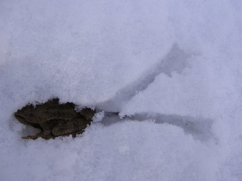
Cute! That gives a whole new, extreme meaning to “cold blooded animal.”
The 1930’s were very volatile elsewhere on the planet as well. In my part of New Zealand weather records began in 1928. The hottest “hot seasons,” (beginning of Nov to the end of April) have been in order, 1934-35, 1937-38, 1974-75 & 1998-99. 1935 was both the wettest year(until 2004 came along) and the sunniest. When I looked at the monthly data it must have seemed a crazy year to those who experienced it. My father who was around then has no memory of it unfortunately because he was only 3 at the time. When it was sunny it was very sunny & when it was wet it was very wet. The following year we experienced the most damaging ex-tropical cyclone to strike New Zealand. In 1937 & 1939 the whole country was hit with snow, especially in July ’39, the likes of which weren’t experienced again until August 2011. When people tell me the weather is extreme these days I let them know about the 1930’s. That was extreme!
Bevan, The dudes at NOAA don’t have good data as of late. They use temp stations affected by “Urban Heat”. Anthony Watts cut his gums on this whole subject matter. The effect on these stations as Anthony has referred to many many times is “UHI” short for Urban Heat Island. The graphs are nice but the last few years don’t reflect true temps at ground level. By including “UHI” stations or stations that are located near airport tarmacs, blacktop and concrete roads, flat roofs, NOAA poisons or influences the temp readings that favor the story line of manmade global warming. If you do your homework and research what I’m talking about you will understand. You can start by referencing this website blog, specifically Anthony Watts early work in this area. Good Luck!
@MC
“You can start by referencing this website blog”
Alternatively, I could reference the more recent work of David Parker (‘Urban heat island effects on estimates of observed climate change’), who has considerably more expertise (published studies) in the area of UHI effects than Mr Watts.
From Parker (2010): “The urban heat island has had only a minor impact on estimates of global trends of LSAT (land surface air temperature). Its impact is much smaller than the 0.74◦C global warming between 1906 and 2005”
Article available at http://wires.wiley.com/WileyCDA/WiresArticle/wisId-WCC21.html
Or I could cite the recent work Charlotte Wickham, Judith Curry et al. comparing trends in urban and rural areas using the Berkeley Earth temperature dataset compilation and who’s work “supports the key conclusion of prior groups that urban warming does not unduly bias estimates of recent global temperature change.
Article available at http://climatechange.procon.org/sourcefiles/influence-of-urban-heating-on-global-temperature-land-average.pdf
I think you need to do your homework and get up to date with the current literature.
Without reading the studies…how much urban warming contributed to the 0.74C global temp increase?
Publishing papers does not make one expert.
Until after climategate, real experts weren’t allowed to publish!
Could you please stick to common sense? There’s satellite data for the temperature history of the last 36 years, which is certainly not contaminated by UHI, not even over land. Trend of surface temperature over land as measured by meteorological stations is about 50% higher than trend of lower tropospheric temperatures measured by satellites. Computational climate models predict the opposite relation, according to them global average surface temperatures are expected to increase at a rate some 20% lower than tropospheric temperatures.
The difference should be attributed to UHI, which is about 44% of the full trend as measured by surface stations.
Over ocean it is a different story. In that region there is a better match between surface and tropospheric measurements, although surface trends are still overestimated by some 25% (probably due to changing measurement methods &. protocols).
Therefore global rate of surface warming is overestimated by 30%, which accounts for the lack of “hot spot” high in the troposphere.
It’s weird to me about the complete focus on the cold and snow in the Boston area considering the Cleveland area had it’s coldest February since records started in the 1870s. Coldest February in at least 150 years!
[Reply: I noticed the #1 regions in Ohio and Pennsylvania, but assumed they must be close to #2s given all the #2s around them. However, I grew up in Painesville, 25 miles east of Cleveland. Love that lake effect snow. Let’s see, http://forecast.weather.gov/product.php?site=NWS&product=CLM&issuedby=CLE says Cleveland had 26.0″ of snow (61.4″ for the season), low and high temps of -17°F and 47°F.
http://forecast.weather.gov/product.php?site=NWS&product=CLM&issuedby=BOS says Boston had 64.8″ of snow (102.0″ for the season), low and high temps of -3°F and 39°F. While that high temp was late in the month, it’s not warm enough for any significant melting. Perhaps enough to convert some snow into ice that night, but that’s about it.
Away from the ocean the low temperatures were lower, I reached -16.6°F on one of the twelve sub-zero days I had, but had one of the lower snow totals in the region, only 37.2″, 19″ on the ground this AM. Cleveland could handle 64.8″ of snow better than Boston. Their rail transit was crippled by snow and ice packing into railroad switches, some of what passes for major roadways are little more than paved cowpaths, the residential areas are often best navigated in subcompact vehicles – in the summer.
South Boston has a major St Patricks Day parade – they’ve shortened and relocated the route for this year and have pay loaders, trucks, and volunteers digging out the route this week. See http://www.necn.com/news/new-england/Crews-Working-to-Clear-South-Boston-St-Patricks-Day-Parade-Route-295476191.html . The forecast? 70% chance of snow. They’re only a couple inches from breaking Boston’s official snowfall record, St. Patricks Day may do it.
Sorry, but it sounds like Cleveland had it relatively easy last month. -Ric]
Winter 2015 had a more extreme temperature gradient across the U.S. than 1934. Likely the only reason there were not more cold records set is that the baseline temperature is now higher than 70 years ago. There is more and more evidence that the extreme temperature gradients are due to more variability in the path of the Jet Stream, as a result of Arctic amplification.
The baseline temps have increased in part by urbanization and relocation of many temperature recording to airports. It’s still impressive how large of an area was at #2 and #3 despite these effects.
With the March jet in a more zonal flow over the US I guess the arctic amplification is over!
Nonsense Barry. All time record warm and cold have zero to do with baselines or anomalies. The 1930 were far more extreme and easily set the most all time records. They also had the greatest droughts.
Also the artic amplification” aka, loopy jet stream is not new.
Major droughts…

https://notalotofpeopleknowthat.wordpress.com/2015/03/07/20thc-major-droughts/
Ratio of record highs to lows, yes the 30s dominate but many years were average.
So lets us look for a trend Lets us check the number f 100 degree days, and 0 degree days
We live in mild times…
The changes to regional and global surface narrative are mind blowing, and TOBs is a tiny factor in these changes.
https://stevengoddard.wordpress.com/alterations-to-climate-data/
In fact, the TOBs adjustment should be easy to check, at least in the US. If one were to compare all USHCN stations against those that only took there readings at night or in the am, when TOBS was not a factor, one would expect the non TOBS observation times stations to match the current USHCN trend.
However there is no difference in the trend.
https://stevengoddard.wordpress.com/2015/02/16/sinking-the-tobs-excuse/
Bevan, I notice the link you provide is “Wires Climate Change”. Let me help you out. Anytime you reference material that uses “Climate Change” please beware. This is the term morphed out of “Global Warming”. When the “warming” the “AGW” crowd failed to materialize, then the term “Climate Change” was used to deflect their stupidity. So X that one out.
But the thing you say that puzzles me the most is the reference to David Parker having more experience than Anthony watts relative to the subject of UHI. Hell, Anthony is the one responsible for discovering this effect and as a result chumps like Parker were tipped off to the whole idea of UHI. Anthony doesn’t have to publish a paper to be respected in the field, he just has to have a good head on his shoulders and be willing to be truthful, all of which are true.
Judith Curry? wouldn’t she be one of those “Climate Change” people.
Be careful Bevan, you never know what’s in the cool-aid!
“Hell, Anthony is the one responsible for discovering this effect and as a result chumps like Parker were tipped off to the whole idea of UHI.”
Here is a 1911 paper titled “IS THE HEAT GENERATED BY GREAT CITIES CHANGING THEIR CLIMATES?”
Here is a 1967 paper titled “City size and the urban heat island“.
Nick, could you explain these adjustments. Yes, .01 degrees to the past is small, but a death by a thousand cuts is exceedingly painful to endure. Please do not say, There is a reason, but explain the reason.
Bill Illis comment
“Here are the changes made to GISS temperatures on just one day this February. Yellow is the new temperature assumption and strikeout is the previous number. Almost every single monthly temperature record from 1880 to 1950 was adjusted down by 0.01C.
I mean every freaking month is history suddenly got 0.01C colder. What the heck changed that made the records in 1880 0.01C colder. Did the old thermometer readers screw up that bad”
http://s2.postimg.org/eclux0yl5/GISS_Global_Adjustments_Feb_14_2015.png
David,
I don’t know the reason for that particular change. But the hullabaloo about “every freaking month” is just dumb. Adjustments are made backward. If a station was adjusted for the reason of some detected event, then all previous values are adjusted.
I’ve given the example of stock indices, and stock prices history shown by stock exchanges etc. These are constantly being adjusted for events such as stock splits and dividends. When that happens, all past prices are adjusted to put them in line with current prices. And yes, it’s happening all the time.
Nick Stokes says:
March 9, 2015 at 10:18 pm
“I’ve given the example of stock indices, and stock prices history shown by stock exchanges etc. These are constantly being adjusted for events such as stock splits and dividends. When that happens, all past prices are adjusted to put them in line with current prices. And yes, it’s happening all the time.”
Stocks do NOT adjust changes in prices due to dividends. When a stock trades on the day following the issuance of the dividend, the price will naturally drop by the dividend amount at opening, but that doesn’t restate the previous close, nor is the data “adjusted” to reflect the ex-dividend price, as the actual trade values are still recorded, which may or may not reflect the exact amount of the dividend drop. Graphs that show trending prices will typically footnote dates of dividends to explain value changes due to dividend issuance, but no values are adjusted.
Stocks do keep two sets of records on splits and reverse splits, one with the raw trade information and one with the split-adjusted price, but this is not changing data. If on Tuesday there are 20M shares trading at $60 per share, total market equity is $1.2B. If the stock splits 2-for-1, on Wednesday the price will open (all other things being equal) at $30 per share for the 40M shares outstanding, which is still $1.2B, with each shareholder that held the stock through the process getting double the shares at half the value.
No total or relative value change has really changed, with each shareholders personal valuation and percentage equity remaining unchanged. The prices are reported through history as “split-adjusted” for purposes of trending analysis and adjusting relative cost basis, but the original data is not lost, nor the meaning of the data fundamentally changed.
This is not a direct comparison to adjusting the temperature records, where actual data is discarded in favor of manipulated data, fundamentally altering the value. There may (or may not) be good reason to adjust the data, and the method of adjustment may (or may not) be sound to account for the needed change, but the fact remains that actual data is being replaced with artificial values. That should make the hair on the back of the neck of any scientist stand upon end.
It was the Rediculously Resilient Ridge (RRR) that blocked the Jet stream in the North Pacific causing it to go up and over Alaska, through Central Arctic and cascade down over the Great LakES, bringing bitterly cold winter temps aNd massive snowfall to US Central/East Coast regions this winter. CO2 had nothing to with it.
The RRR also caused above normal ocean temps in the North Pacific, which inhibited North Pacific sea ice formation, which, of course, alarmists are blaming on Gloooobal Waaarming….
Eventually, the North Pacific Gyre will move this RRR warm water into the California Current, bringing some much needed rain to California and the U.S. MId-West. The warm ocean water will eventually feed into the North Equatorial Current and perhaps extend the weak 2014 El Nada through 2015 and eventually leading to La Niña event in 2016.
The PDO entered its 30-yr cool cycle in 2005, so the next La Niña event may well be quite spectacular.
We’ll see soon enough.
The fact that in 2010 these large number of adjustments were made is very poor reflection on the science before 2010. I guess all the settle science prior to 2010 we very unsettled. Seems amazing that these data sets need such continual adjusting. If anything, it only substantially weakens the arguments of warmist. “See it is warming! (Now that we have corrected fixed the past!)” The very sound of it would require very sound ideas and science. As of yet, I have some serious issues with adjustments made on data analysis when each site is quite unique and different histories.
As mathematician the day of the adjustments needs to end.
When a site moves so be it. It is now a different site. They are not comparable enough to change one to another; no site is. Don’t care if they a 100meters apart or 2km they are now two sites.
You want to make TOBS adjustments, then you carefully detail it for every single site on an individual basis.
We have lots of people who can do site specific research.
Almost Lastly, a serious large precise study of UHI needs to be done with careful many sites and monitoring. I would love to see various cities gridded with stations so we can see it. But no one really seems to want to. Strange.
Lastly, the warmist have missed too many predictions, made to many ad hom. attacks, kept too many private emails while in public service, become to much of an activist set of voices for any reasonable group of people to trust them. We have crashed billion dollar satellites into moons and destroyed financial companies with models. We have heard professors tout the evil oil but won’t take steps themselves to reduce their own footprint of carbon. Heard about conspiracies rather that the real science and data. Heard people say that of 10000 papers some 380 of 400 spoke (poorly defined) about human C02 and get an inane 97% statement from that.
The fact of the matter is common people who vote will control the purse strings and the money train will come to an end!
“…For example, Boston missed a tie by 0.1F°”
Differences far greater than that have been arranged by those who tend the data.
No you must be wrong. This is the first time for everything and it’s all our fault. As for 1934 it’s irrelevant. Any year before the birth of Al Gore is meaningless because as with the internet, he also invented climate, weather, and of course global warming. Lol.
Reblogged this on SiriusCoffee and commented:
History may not repeat, but it often rhymes.