By: Geoff Sherrington.
Scientist, Australia.
…………………………………………………………………………………………………………………………………………………………….
Part 2 of this article starts with the simple concept equation for UHI raised in Part 1.
Tuhi = Turban – Tpristine
Part 1 showed some scatter in the temperature trends of 45 “pristine” candidate stations. For the equation to work, urban stations need be examined in similar ways, so that their subtraction means something. This can be done on broad scale – here the whole of Australia – or detailed scale, such as a city centre measured against its suburbs.
We start with broad scale.
From a tabulation of the start dates of more than 1,500 Australian weather stations, I did a subjective selection of “urban” candidates based on the length of the data and the amount of missing data (while avoiding already selected “pristine” stations). There are many short-term stations and many with large amounts of data missing, so the number of stations came down to a mere 37. This selection was done correctly before calculation of temperature trends and was not affected by them.
Some relevant properties of these 37 stations, plus the 45 pristine stations from part 1, are tabulated here. (The table does not fit well into this .docx Word article). The properties include latitude, longitude, altitude, distance from the ocean, population, rainfall, length of data years, % of days with missing values, RMS error estimates, to name some of them. Readers can enter the lat/long numbers directly into Google Earth to view the surroundings.
https://www.geoffstuff.com/final82properties.xlsx
The derived time trends for urban temperatures, years 1910 to 2020, are summarised below:
| URBAN | URBAN Trend Tmax deg C/Century, daily data. 1910 to 2020 | URBAN Trend Tmin deg C/Century, daily data. 1910 to 2020 | URBAN Tav trend ⁰C per century, derived. | URBAN Tmax RMS ERROR all years | URBAN Tmin RMS ERROR all years |
| Adelaide | -0.1 | 0.0 | 0.0 | 6.49 | 4.65 |
| Alice_Springs | 1.5 | 0.4 | 1.0 | 7.38 | 7.52 |
| Bathurst | 1.4 | -0.6 | 0.4 | 7.05 | 5.85 |
| Boulia | 0.7 | 1.8 | 1.3 | 6.89 | 6.91 |
| Bourke | 0.3 | 0.6 | 0.5 | 7.66 | 6.86 |
| Broome | 0.7 | 0.3 | 0.5 | 3.19 | 5.38 |
| Bundaberg | 0.7 | 1.2 | 1.0 | 3.49 | 4.81 |
| Burketown | 1.4 | 1.3 | 1.4 | 3.67 | 4.98 |
| Cairns | 0.3 | 1.2 | 0.8 | 2.74 | 3.24 |
| Charters_Towers | 0.4 | 1.3 | 0.8 | 4.44 | 4.62 |
| Cobar | 0.4 | 1.4 | 0.9 | 7.91 | 6.62 |
| Darwin | 0.1 | -0.3 | -0.1 | 1.84 | 2.77 |
| Deniliquin | 0.8 | -0.6 | 0.1 | 7.55 | 5.74 |
| Esperance | 1.2 | -1.1 | 0.1 | 5.18 | 3.95 |
| Gayndah | 0.6 | 2.2 | 1.4 | 4.82 | 6.07 |
| Georgetown | 1.1 | 1.1 | 1.1 | 3.67 | 5.15 |
| Geraldton | 2.0 | -1.1 | 0.4 | 5.74 | 4.67 |
| Inverell | 0.6 | 0.9 | 0.7 | 6.18 | 6.73 |
| Kalgoorlie | -0.1 | 0.1 | 0.0 | 7.39 | 5.73 |
| Kerang | 0.8 | 0.9 | 0.8 | 7.53 | 5.33 |
| Longreach | 0.8 | 1.2 | 1.0 | 6.21 | 6.68 |
| Marble_Bar | -0.1 | 0.8 | 0.4 | 6.19 | 5.96 |
| Melbourne | 1.2 | 2.2 | 1.7 | 6.15 | 4.13 |
| Mildura | 0.5 | 0.0 | 0.2 | 7.44 | 5.65 |
| Miles | 0.7 | 1.1 | 0.9 | 6.06 | 6.96 |
| Normanton | 0.2 | 1.2 | 0.7 | 3.51 | 4.39 |
| Perth | 2.7 | -0.7 | 1.0 | 6.07 | 4.51 |
| Port_Macquarie | 2.0 | 0.0 | 1.0 | 3.68 | 4.98 |
| Richmond_Qld | 0.6 | 1.7 | 1.1 | 5.29 | 6.19 |
| Sale | 0.4 | 0.1 | 0.2 | 5.69 | 4.63 |
| Snowtown | 0.9 | -0.5 | 0.2 | 7.34 | 5.08 |
| Sydney | 1.5 | 1.6 | 1.5 | 4.53 | 4.41 |
| Tennant_Creek | 0.2 | 1.9 | 1.1 | 5.87 | 5.61 |
| Tibooburra | 0.9 | 1.8 | 1.3 | 7.84 | 6.97 |
| Wagga_Wagga | -0.3 | -0.2 | -0.2 | 7.76 | 6.21 |
| Walgett | 1.1 | 0.0 | 0.5 | 7.29 | 7.02 |
| Yamba | 1.3 | 0.7 | 1.0 | 3.43 | 4.44 |
| Simple average | 0.8 | 0.7 | 0.7 | 5.71 | 5.44 |
A graphical representation of the urban stations Tmax with linear trend lines follows:

As for pristine stations in Part 1, here are the lightly smoothed trends derived from the daily maximum temperatures Tmax of the 37 urban stations. Readers are invited to imagine their own form of UHI effect, to see how easy it might be to find among these lines.

The wriggles do not match well from station to station, thought there might be a negative dip in years 2010 or 2011, which we examine later in this article.
Compared to the pristine data set, the urban data set from Part One shows lower trends with time, as in the simple average.
| SIMPLE AVERAGES OF TRENDS | |||||
| Tmax trend | Tmin trend | Tav trend | Tmax RMS | Tmin RMS | |
| PRISTINE | 1.5 | 1.3 | 1.4 | 4.54 | 4.14 |
| URBAN | 0.8 | 0.7 | 0.7 | 5.71 | 5.44 |
Overall, a naïve interpretation is that warming is slower in urban places than in pristine places, so that UHI might affect remote places more than cities. This might be because UHI had already affected the urban stations before 1910, but was still happening after 1910 at some of the pristine stations. It would depend on the magnitude of the UHI being large enough to be seen through the noise in the data. Noise is expressed by the various wriggles that are out of phase with each other from station to station. There is interest in the cause of the noise.
So far, the article has dealt with national scale illustrations. Moving now to local scale, as an example for only one city, we look at Melbourne station, 86071 and seek an explanation for the dip in 2010-11. This was a Regional Office until 2014, when Olympic Park 86336 some 2.6 km distant, replaced it in early June, 2013.
By a Press Release on 9th December 2014, the BOM announced:
Tarini Casinader, Victoria Regional Director, said the Bureau had opened the upgraded weather station at Olympic Park in November 2013, and had kept the two sites running in tandem for over twelve months to ensure a smooth transition.
“The La Trobe Street weather observation station, located at the Royal Society of Victoria, has been operating since 1908. However, wind recordings were stopped in 2009 due to the poor quality of readings as a result of nearby building development at the city location,” said Ms Casinader.
“The location at Melbourne Olympic Park represents an improvement in the quality of meteorological observations available, and meets international observing standards set out by the World Meteorological Organisation.”
The following graph shows the overlap period when both stations were recording temperatures in parallel. This is for Tav, which is (Tmax + Tmin)/2. Note the “gap” of about 1.5 ⁰C in the overlap time.

It had been obvious that since 1910, Melbourne Regional was observing too hot. Here is a graph with 22 stations within 80 km or so of Melbourne Regional. Daily surrounding station observations are here subtracted from Melbourne Regional daily observations to show the difference. It is probable that Melbourne is the odd-man-out, the one station rather different to most of the other 22.

When Australia’s Bureau of Meteorology started adjustments to its records with the ACORN-SAT methods in late 2018, Melbourne Regional was adjusted. This next graph shows the raw Melbourne daily data minus the ACORN-SAT adjusted data, to highlight the difference. Years 1970 to 2020 are shown for brevity.

It is difficult to derive reasons for step change adjustments of this magnitude, to near 1⁰C from equality for Tmax here. Automatic weather station apparatus (MMTS for some) using electronic thermocouples instead of Liquid-In-Glass thermometers, could explain some of the 1991-1993 event, but not why they change at different dates for Tmax and Tmin; the 2013 event coincides with the station move from central Melbourne to the more suburban Olympic Park.
On the other hand, it is easy to concoct a narrative that the Melbourne Regional observations were becoming artificially too hot over the years, that something had to be done to cause a decline. Why not change the instruments and the location of the station? Why not join the new Olympic Park data to the end of the old Regional Office data and label it as Melbourne Olympic Park, for that is the title of its data that can be downloaded from the BOM ACORN-SAT web site. It covers years 1910 to the present under that name, despite Olympic Park starting in 2013.
The theme of these articles is whether the historic temperature record is useful for understanding Urban Heat Island Effects. For Australia, Melbourne is important because it has been situated close to a major BOM office, with research facilities, a huge computer and access to CSIRO and universities for some years. It should produce an example an example of high quality, minimal error, dependable observations, among the best in Australia.
It will be interesting in coming years to observe how that 1 ⁰C or so difference is smoothed to a respectable appearance. It is also interesting to speculate how one can find evidence of a UHI effect in this noisy and plausibly misleading data.
In humour, could this be named “Hide the Incline?” (END)
When surface temp data is fiddled by about 1C, it is VERY hard to take the ‘official’ global 1.5C ‘cliff event’ seriously.
What we know:
Yet green alarmist wishful thinking continues. IMO for three reasons. There is much money in it for researchers. There is much money in it for renewable suppliers. And politicians hate to admit they were wrong—net zero.
The solutions are to cut off academic grant money (after all, if the science is settled, why spend more on it), set renewable subsidies to zero (earn your keep since you claim to be economic), and ‘fire’ most conventional politicians. Joe Biden and Gavin Newsom in the US come readily to mind. All three things will slowly come about. As just one example, the farmer tractor protests now in the EU are having an outsized impact on politicians.
Maybe pitchforks aren’t safe, but they can be effective.
On my Wisconsin dairy farm, we use various sized pitch forks (4-6 tines) to move cow manure, horse shit, and urine contaminated straw cow bedding out to where the tractors can pick it up and spread it on the fields as fertilizer.
Poking those same tools into politicos would soon have the desired sepsis effect.
Good experiment.
Rud,
Thank you for your comments. I am writing on WUWT to evolve a narrative about UHI, patiently step by step, so you have jumped my gun a little. Nonetheless, the comments you make are valid and in need of wider acceptance.
This Part 2 tries to say that if you calculate UHI by subtracting rural temperatures from urban, as has often been done, there is no surety that you will get a subtraction of the expected magnitude, or even the expected sign. Thanks Geoff S
“I am writing on WUWT to evolve a narrative about UHI . . . .”
Back when WUWT was relatively new, there was an excellent post about UHI. The author made several great points that he demonstrated were probably true. I wish I could find that posting. There are so many posts on WUWT, that finding a particular post is nearly impossible. However, I wish you luck in your endeavors with UHI.
I posted to the wrong account
Jim,
In a blatant act of self-promotion, is it possible that this was the article?
Geoff S
https://wattsupwiththat.com/2018/12/20/the-science-of-the-urban-heat-island-effect-is-pathetic-and-misleading/
100%
It seems that the weather supremacists want to make you a slave.
Notice Alice Springs.
Which data did you use ??
The Temperature Data Mannipulators are busy little beavers.
The unmodified (raw) data shows the Early Twentieth Century was as warm as it is today.
Then the Temperature Data Mannipulators of GHCN got hold of the data and bastardized the hell out of it and turned it into a bogus Hockey Stick “hotter and hotter and hotter” temperature profile.
They do this kind of data bastardization all over the world. Their only problem is they haven’t destroyed the raw data, so the temperarture data deception is plain to see.
bnice,
I seldom use adjusted data. Sometimes, I use adjusted data to show how different it is to raw.
So, all of those graphs are using raw data unless adjusted ACORN-SAT is specifically mentioned.
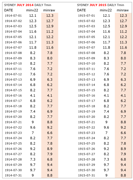
Whether raw data are actually raw is a topic that could go on forever. The next big Australian station, with Melbourne Regional, is Sydney Observatory, which also has quality problems.
Here is an example from Sydney. Mathematicians can calculate the probabilty that temperatures in July 1914 were exactly the same as those in July 1915, for all 31 days, in the same order from day to day. Geoff S
roflmao.. that really is bizarre, isn’t it.
At a rough guess I’d say the probability was “totally IM”
Guess there was no such thing as “climate change” back then. 😎
Looking at that graph, I got to thinking…no one could ever put hard start/stop dates on the beginning or end of the Miocene, Pliocene, Pleistocene, Holocene etc, but we can always determine the beginning of the Adjustocene. It always begins with the first year in any data set!
It would be safe to say that the Holocene interglacial began in earnest at the end of the Younger Dryas. But the Adjustistas have relabeled the Holocene an epoch while the Eemian remains an interglacial. I guess Anthropocene was too obvious.
There might be a few pristine weather stations (e.g., Stevenson Screens) to be found in dusty attics of technical museums or abandoned military facilities, along with brass/ebony/ivory sextants and brass transit-levels.
as attached is why historic stations ran cool and why modern ones run warm.
Because the old and original Stevenson Screens and cabinets would have been made out of wood.
And wood would do what trees do to moderate climate and weather, it traps and stores moisture. Modern cabinets and screens would not – being made of metal or plastic would be relentlessly dry.
So as per the tree, through the night the wooden structure of the screen/cabinet would be absorbing moisture.
Come the morning, when El Sol comes out and and a breeze picks up (that’s the important bit – the breeze), the wooden cabinet would release its water and in doing so cool itself.
Exactly as the ceramic wine coolers work.
And bang in the middle of (a wooden version of) this well established cooling device, just like the wine bottle, is your thermometer.
The breeze would hugely magnify the cooling. So dependant what time of day it picked up, your readings are gonna be ‘all over the place‘
With plastic or metal screens there’d be minimal effect. ##
It wasn’t the change from Mercury/glass to Platinum resistance, it was the box they were put inside.
## I do in all honesty have to qualify that, there could be a very large effect and it might explain what I see in my local Wunderground stations.
i.e. Extreme dips in the temperature graphs through the night.
Because and around here on The Fen, extremely heavy dews come down through summer nights
This will obviously ‘attract’ to the outside surfaces of a metal enclosure/cabinet/screen.
Even without El Sol to promote it, if any breeze picks up, that metal cabinet is gonna become, for ‘some number of minutes’, extremely cold while the dew is evaporated away by the breeze/wind.
and how many times has it been commented on, certainly around here, that average temps are rising not esp because The Highs are rising very much but because The Lows are rising faster.
The wooden box wine cooler (effect) explains that perfectly
Peta,
Observations such as this are welcomed, because there is not much effort to include them in studies of causes of variations in temperature observations which can be severe.
They are even more valuable when you show actual data and the simple calculations needed to draw conclusions.
Geoff S
Story tip:
Greta gets off again
https://www.msn.com/en-gb/news/world/greta-thunberg-s-public-order-charge-dropped-as-judge-criticises-police-action/ar-BB1hFWZW
Separated at birth?
“For Australia, Melbourne is important because it has been situated close to a major BOM office, with research facilities, a huge computer and access to CSIRO and universities for some years.”
So it got first go at the fiddle?
“ However, wind recordings were stopped in 2009 due to the poor quality of readings as a result of nearby building development” And no wind no air movement and warmer temperatures. At least my take on it.
Several hours after I emailed this article to the WUWT team, Dr Roy Spencer posted on his web site an article he had written, “Gavin’s Plotting Trick: Hide the Incline“.By sheer coincidence, we both used the same term unknown to each other.
Seems like there is a bit of hiding going on.
Geoff S
UHI analyses needs it’s very own……..Lol!!
You mean like this…
Mate – You can never get enough hockey sticks…Hockey 1 Hockey 2….Just ask old mate Micky Mouse. err, sorry Mann.
I copied, and BRIEFLY reviewed the spreadsheet you included. To me, your analysis was through, well studied, and well-conceived. Congratulations! So then, why did it give a result so different from what was expected by you and me, and many others?
First, you can’t rule out that the expectation was wrong. However, broad acceptance of a ‘UCI’, an Urban Cold Island effect would take far more than one paper, analyzing one country, to gain broad acceptance around the world and completely replace the UHI effect.
I’ve found that many of the times my results been other than expected, have been due to selection of inaccurate data sets. For temperatures, the general rules are that “it’s easy to read a thermometer, it’s quite difficult to measure temperature”, and “you usually have errors with temperature data.” The genesis of digital data from written temperature data sheets to computer files is ripe for errors and adjustments and is quite possibly prone to differences between pristine and urban settings. This is quite true for appending written data, to recorded data, and adjusting for the differences between data sensors. You can’t rule out that the researchers making these data sets might have had “expectation bias”. You simply can’t rule out that the data itself has biases in it. Finding them is another story.
I have experienced that the selection process for rejecting incomplete data, based on the data itself, has been subject to differences that went unnoticed. Sometimes data that appeared bad was actually good, and data that appeared good was actually bad. In large data sets it’s difficult to resolve the differences.
I commend your effort and keep up the good work.
Tom,
Thank you for your comments.
Part 3 starts to answer your valid question about the unexpected outcome to date.
It is not simple. I wrote part 3 a while back, changed it a little and up popped another puzzle.
So far, the tentative conclusion is that I am not coping well with noise in the data.
Geoff S