By Chris Hall
Ever since that launch of the first Orbital Carbon Observatory satellite (OCO), I’ve been intrigued by the possibility of being able to directly observe where CO2 in the atmosphere comes from and goes to. Unfortunately, I’ve not seen much information in the press about the results from any of the three satellites launched so far. Maybe I’m just not looking in the right places, or maybe the researchers are unusually shy. In any case, I decided to have a look at some of the data myself. One of the things I wanted to check was how well mixed this so-called “well mixed gas” really is. What follows is a collection of visualizations of OCO-2 data. The cool thing about OCO data is that the satellites provide truly global coverage with a spatial resolution, in the case of the second satellite OCO-2, of 0.5 degrees of latitude and 0.625 degrees of longitude.
The original data is in the form of XCO2, or mole fraction of CO2 in dry air, which is equivalent to the volume fraction. For brief details of “how I did it”, see the Appendix below.
First, let’s look at a movie of the reported CO2 concentration from the monthly OCO-2 data.
Well, that’s not all that helpful. The general pattern is for a gradual increase in global CO2 concentration, mostly originating in the Northern Hemisphere and propagating into the Southern Hemisphere. Note that there is considerable seasonal variability, no doubt driven by the cycle of plant growth and decay each year in the Northern Hemisphere.
Another problem with looking at CO2 data is that there is a temptation to blow up any increase, possibly for dramatic effect, i.e., “we’re all gonna fry”. To try to put things into perspective, here’s the same data but presented as latitude averages. This time, I scaled the concentrations from preindustrial levels (~280 ppmv) to double that value. This should roughly correspond to a global temperature rise of ~1.5° to ~3°C, depending on whose climate sensitivity value to believe.
To make the thing a bit more human in scale, I wanted to be able to calculate the mass of CO2 in the atmosphere per square meter. To do this, I also needed an elevation model for the Earth and a reasonable global gravity model, as both you and the atmosphere weigh more at the North Pole than at the equator. Everything got sampled into a compatible 576 x 360 longitude-latitude grid, which enabled me to convert between XCO2 and mass per square meter on both a grid cell and global scale. The average CO2 concentration map in kg/m2 is shown in Fig. 1.
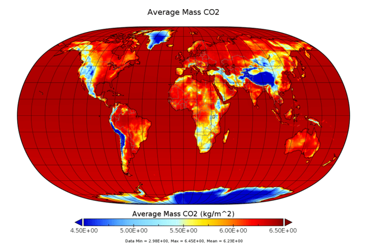
Well, that’s interesting. It looks more like a map of elevation, and it should, because high elevation sites have less CO2, mostly because they have less air due to the drop off of pressure with altitude. When you add up all the atmosphere that sits over land, it only accounts for 28.8% of the total, despite the fact that land area is about 30.6%.
Now let’s see how much CO2 sits over your head. On average, at the end of 2021, the average value was 6.36 kg/m2. That may sound like a lot, but you need to consider that the average mass of air that the CO2 resides in is about 10,080 kg/m2, which is an average over the whole earth, and is slightly less than the sea level value. It turns out that most of the mass of CO2 in the air really comes from O2 via its reaction with carbon and hydrocarbons, so the average mass of C in the air (neglecting methane, etc.) was 1.73 kg/m2. The increase of CO2 in the atmosphere from the beginning of 2015 to the end of 2019 was a whopping 263 grams of CO2 per m2, or 71.7 g/m2 of C. The increase of CO2 in the atmosphere per m2 over 7 years is approximately the same amount that an adult human exhales in about 7 hours.
Getting back to where CO2 comes from and goes to, there’s a global increase of CO2 that tends to swamp the details. I needed to detrend the data so I could see where the major deviations from the overall global pattern occur. I tried several methods, including subtracting off a linear fit to global average concentration record over the first 84 months (7 years) of the record. I also tried subtracting off the residue (i.e. low frequency component) of the global CO2 concentration average after decomposition using the Hilbert-Huang transform (hht library in R), and both of these methods gave similar results. But it bothered me that there was no physical basis for these detrending schemes.
I then came up with a brilliant idea. Why not assume that there was some magical CO2 concentration in pre-industrial times, let’s say 280 ppmv, and that all was in perfect equilibrium then, with the amount of the gas released into the atmosphere being exactly balanced by plant growth, weathering, etc., so that Earth had achieved that sublime concentration? After that, once we started pumping CO2 into the atmosphere, some, but not all, of that excess would raise the concentration above 280 ppmv (global average of 4.97 kg/m2), but if we stopped emitting CO2, the Earth would gradually settle back down to the Utopian level of 280 ppmv. I assumed that all of the increase from preindustrial levels was due to anthropogenic emissions, and that the restoration to 280 ppmv would be via a simple single exponential time constant. This assumes that the ability to fix CO2 is not somehow “poisoned” by rising concentrations.
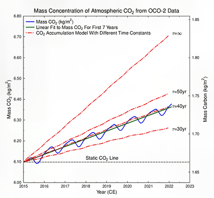
Sadly, I found that this elegant, simple model had already been espoused by Dr Roy Spencer. Drat, I hate it when that happens. Anyway, I had global emission data for the 84 months of the first 7 full years of OCO-2 data and the results of models with different assumed time constants τ are shown in Fig. 2.
The least squares fit of the model to the data gives a value 38.24 yr for the time constant, which is equivalent to a half-life of 26.5 yr. It is possible to calculate an “instantaneous” value of τ from the data, and aside from a blip in 2015, the value is quite stable, suggesting that, at least for these 7 years, the efficiency of CO2 fixation was relatively constant. It should be noted that this model assumes that all of the increase of CO2 is due solely to anthropogenic emissions. If there are any other unaccounted-for sources, the true time constant will be shorter, so a half-life of 26.5 yr can be reasonably regarded as an upper limit. There may or may not be an “eternal” anthropogenic CO2 reservoir in the atmosphere, but it’s not apparent in any of the data that I’ve seen.
The next step was to take this simple model of CO2 growth and assume that it is evenly distributed across the globe. This was then used as the model to detrend the data, to see where the CO2 sources and sinks reside. This detrended data also has a lot of seasonal variability, which still tends to obscure things. However, you can do a sort of spectral analysis of this data, and the method I applied was the Hilbert-Huang transform. This decomposes a time series into a series of intrinsic model frequencies (IMFs), along with a low frequency “residue”. When you do this exercise over the 84 months of the detrended data, you find that grid cells have a minimum of 2 IMFs and a maximum of 6 IMFs. Places like Siberia and regions around the Arctic tend to have large numbers of IMFs, while Antarctica and the Southern Ocean tend to only vary slowly, resulting in few IMFs. In the following video, I show the results of plotting latitude averages of the detrended data, along with the detrended data minus the first two IMFs, i.e., residues with a maximum IMF value set to two.
As you can see from this video, most of the CO2 concentration variability is in the Northern Hemisphere, especially north of 60°N. This variability “whips” its way towards the southern hemisphere. There is also a persistent “bulge” in the concentration of CO2 that resides in a zone between the equator and about 45°N, and this is particularly apparent in the low pass “residue” plot. This is the region where excess CO2 comes from, and the Southern Ocean along with Antarctica is the predominant area where CO2 “goes to die”, so to speak.
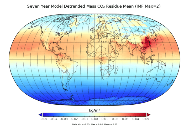
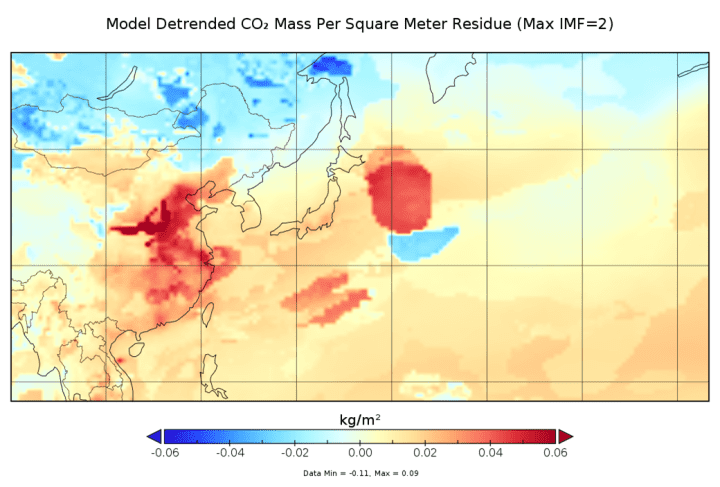
This point is further illustrated in Fig. 3, which shows the mean of the low frequency residue from the global detrended CO2 concentrations. From this figure, we can see that the elephant in the room is clearly China, which acts as a major hot spot that sends CO2 across the Pacific and even into the Atlantic. India is also a significant hot spot, but its emissions bump into the Tibetan Plateau. The US is a very minor hot spot, and despite Canada’s relatively high emissions per capita, the original Dominion barely registers at all. I’m afraid that all the angst about emissions from the 2nd and 3rd Dominions, Australia and New Zealand, is hard to justify from this plot, as both countries are on average below the mean and appear completely featureless. Europe is “meh”, but major petroleum producing areas do register a bit above average. It is also interesting to note that the generally accepted figure for CO2 content is based on measurements on the island of Hawaii, but in Fig. 3, we can see that it averages about 20 g/m2 higher than the global average, which is roughly a bias of 0.3% for this “well mixed gas”.
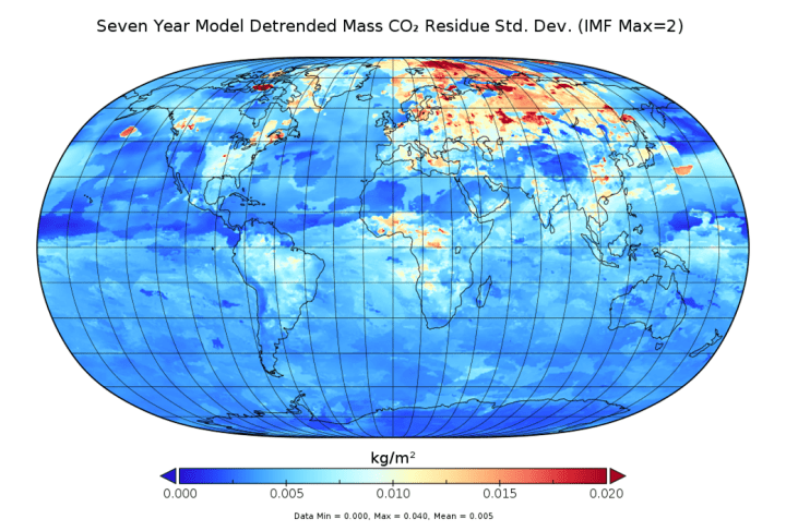
While Fig. 3 shows the mean of the detrended residues, Fig. 4 shows their standard deviations. This map illustrates where there is the greatest variability in CO2 concentrations over the seven-year period.
The places with the least variability in CO2 concentrations include:
- Antarctica and the surrounding Southern Ocean.
- A zone near the Inter Tropical Convergence Zone (ITCZ) running through the Pacific and Atlantic.
- The Sahara.
- The Tibetan Plateau
- Mountain ranges in the Western USA and Central Mexico.
- Portions of the N. Pacific east of Japan.
Places with very high variability include:
- Russia, especially Siberia.
- The Arctic north of Russia.
- Parts of the Canadian Arctic Archipelago.
- The Canadian Maritime Provinces.
- A small part of W. Europe centered on the Netherlands, the breadbasket of Europe.
- Parts of Sub-Saharan Africa, especially the Congo Basin.
- Southern British Columbia, Alberta, Ontario, and Quebec.
- A hint of variability in the Mississippi Valley.
- Some strange “blobs” in the N. Pacific. More on these later.
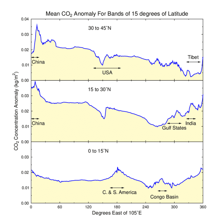
It’s clear from Figs. 3 and 4 that all the “action” is in the Northern Hemisphere, specifically between the equator and 45°N. In Fig. 5, I’ve plotted the average CO2 mass anomaly from the detrended and low pass filtered data for three separate bands spanning 15° of latitude. The plots start at 105°E longitude, which is roughly at the western edge of China. Here you can see that China is by far the biggest anomaly, with concentrations generally falling as you go further east.
In the bottom panel of Fig. 5 (equator to 15°N), you can see that concentrations are relatively flat, with a bump up near Venezuela (northern S. America), and a later bump around the Congo Basin. In the second panel (15°N to 30°N), concentrations start high in China, with a gradual decline until we get to the Gulf States and India, where there is a rise in CO2. The exception to this general pattern is about 150° from the starting point, which corresponds to the Sierra Madre mountains of Mexico. In the top panel (30°N to 45°N), there is an early rise in China, followed by a steady decline until the Tibetan Plateau, after which CO2 rises again in the vicinity of western China. Within the USA, there is a sharp dip near the Rocky Mountains, which is similar to the pattern seen in Mexico for the middle panel.
It seems that mountain ranges are regions where CO2 concentrations sharply decline. One might be tempted to think that this is solely due to their lower overall concentration values, but this same pattern is exhibited when molar fractions are plotted instead of kg/m2. Some of this drop might be due to weathering, but Liu et al. (2004) suggested that rainwater is also an important mechanism for soaking up CO2 from the atmosphere, and this idea is compatible with the pattern we see in the USA and Mexico, where the concentration of CO2 drops in the area west of the mountains where one might expect orographic rain, and it rises again sharply in the rain shadow.
Now let’s see how the low pass filtered detrended data evolved over the seven years of OCO-2 data from 2015 to the end of 2021. The video is at a speed of 4 months per second.
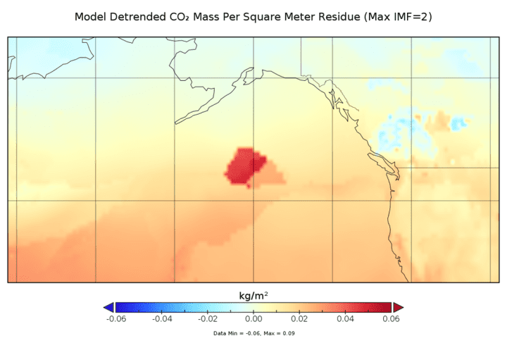
The video has four different views: global views centered on 0° longitude and 180°E longitude, and polar views centered on 90°N and -90°N. Besides the persistent excess centered on China, there are some other intriguing features. At the beginning of the movie, there is a strange hot spot “blob” in the Pacific east of Japan, with a smaller region of CO2 deficiency just to the south of the zone of excess. This smaller subsidiary blob later becomes a region of excess concentration. This is illustrated as a single frame in Fig. 6. Another strange transitory oceanic region of CO2 release is shown in Fig. 7, which is centered in the N. Pacific south of Alaska.

I have no idea what these “blobs” of gas represent. They do not correspond to important fishing zones, so I doubt that they are “biologics” in the sense that Seaman Jones explains in The Hunt for Red October. Although there are seamounts in these areas, as is true for much of the Pacific, these areas are not especially active either volcanically or seismically. The best guess I have this that some methane clathrates became liberated from the sea floor for some reason and then quickly oxidized to form CO2. The location and size of these emissions might be controlled by deep ocean currents. I welcome any suggestions as to the mechanism for these seemingly random releases of significant quantities of non-anthropogenic gas.
Similar strange anomalies occur in the Arctic, well away from people and even significant plant growth of any kind. These can be seen in the North Pole projections of the detrended low pass filter video. Note that there are significant positive and negative anomalies near Svalbard and a very intense positive anomaly that pops up near Axel Heiberg Island in the Canadian Arctic Archipelago. Similar large-scale anomalies are totally absent in the Southern Ocean.
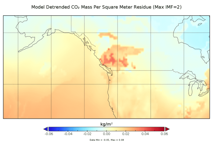
Other notable anomalies that I think I do have explanations for involve wildfires. Some of these are “anthropogenic” in the sense of fires being deliberately set for the purpose of clearing land for agriculture (e.g., the Amazon Basin), but many are likely purely natural. Areas of the eastern provinces of Canada as well as large parts of Siberia appear to be susceptible to significant wildfires. The large fire in British Columbia in 2017 is shown in Fig. 8. I can also almost convince myself that in the video, one can see the development of the large Greece and Balkans fires from 2021.
There’s no real “moral to the story” here, other than the fact that natural variations in concentrations caused by plant growth and decay, almost totally in the Northern Hemisphere, completely swamp all other features. By detrending the data and putting it through a low pass filter it is possible to see more subtle details. The “well mixed gas” carbon dioxide takes a while to get mixed and there are long term excesses and deficiencies throughout the planet. Barriers to the mixing appear to be the ITCZ and the Sahara Desert. Antarctica, the Southern Oceans, and to a lesser extent the Tibetan Plateau and high mountain ranges seem to act as CO2 sinks, while most other variations on land tend to correlate with agricultural land use and large-scale hydrocarbon production.
Wildfires are the likely cause of many large CO2 emissions, especially in the northern parts of the Northern Hemisphere. There are many transient positive and negative concentration anomalies in the Pacific and Arctic, and I have no explanation for them except they must be somehow related to degassing and absorption controlled by large scale ocean currents. As for large scale obviously anthropogenic emissions, China is the sore thumb. The Southern Hemisphere barely registers.
Appendix
This is a brief description of how I accessed the data, the steps used to put things into single georeferenced packages and what tools were used. This is for nerdy types who might want to tackle this sort of thing on their own.
I downloaded monthly data from the OCO-2 satellite, which covers the period from the beginning of 2015 until the first two months of 2022, just a bit over seven years. This forced me to learn something about how to handle NETCDF files, and with a little effort I was able to stitch the 86 spatial “XCO2” (molar fraction of CO2 of dry air) data arrays together to form a single 3-dimensional array, with the indices representing latitude, longitude and time.
Although daily data is available for OCO-2, I chose monthly data instead for a couple of reasons. One, the size of the downloaded data is a lot smaller, and two, there is complete data for every part of the Earth in the monthly datasets, while there is missing data from daily files. The downside is that gases in the atmosphere can travel quite large distances in the space of days or weeks, meaning that any patterns that might exist in the daily data could be hopelessly smeared out, obscuring any information about possible sources and sinks. I hope to show, however, that this is not the case, and we can definitely see spatial patterns for both CO2 sources and sinks.
I wanted to convert the OCO-2 data into a measure of the mass of CO2 per square meter so that I could get a better feel for how much C and CO2 we are talking about on a more human scale. This presented a little problem as I had to interpolate the OCO-2 data into the mid-points of their grid cells. The original data goes from -90°N to 90°N (361 latitude values), which is a bit awkward as the endpoints have zero area, so concentrations would be infinite. This is the classic fence post vs. fence rail problem, and it reduced the number of latitude values to 360. I shifted the longitude data, but I didn’t have to decrease the number of points, because as Arkady Darrell says in Isaac Asimov’s Second Foundation, “a circle has no end”.
The tools I used for this study were a moderately old laptop, the program RStudio, the R language, the MATLAB work-alike programming language Octave, GLE Graphics Layout Engine, the video editor Shotcut, and a very neat Java program provided by NASA called Panoply, which lets you make nice pictures and movies of NETCDF datasets.
Embedded Videos:
Raw data in ppmv: https://youtu.be/L1Dic2813zk
Raw ppm latitude averaged from 280 to 560 (pre-ind to x2): https://youtu.be/1fOvYYe9UyI
Model detrended low pass (residues) mass per sq. m.: https://youtu.be/IlNj4Vd-w0k
Model detrended mass and residues, low pass latitude averaged: https://youtu.be/LRXHuLqtTwc
References
IEA-EDGAR CO2, a component of the EDGAR (Emissions Database for Global Atmospheric Research) Community GHG database version 7.0 (2022) including or based on data from IEA (2021) Greenhouse Gas Emissions from Energy, www.iea.org/statistics, as modified by the Joint Research Centre. (https://edgar.jrc.ec.europa.eu/dataset_ghg70).
KNMI Climate Explorer and Global Carbon Project, Friedlingstein et al, 2019, https://doi.org/10.5194/essd-11-1783-2019.
Lesley Ott, Brad Weir, OCO-2 GEOS Level 3 daily, 0.5×0.625 assimilated CO2 V10r, Greenbelt, MD, USA, Goddard Earth Sciences Data and Information Services Center (GES DISC), Accessed: [Data Access Date], doi: 10.5067/Y9M4NM9MPCGH
Lesley Ott, Brad Weir, OCO-2 GEOS Level 3 monthly, 0.5×0.625 assimilated CO2 V10r, Greenbelt, MD, USA, Goddard Earth Sciences Data and Information Services Center (GES DISC), Accessed: [Data Access Date], doi: 10.5067/BGFIODET3HZ8
Mauna Loa CO2 Data: Data processed by www.woodfortrees.org. Data from NOAA Earth System Research Laboratory http://www.esrl.noaa.gov/gmd/ccgg/trends/ Time series (esrl) from 1958.2 to 2023.12
Liu, C.J., Ilvesniemi, H., Kutsch, W., Ma, X.Q., Westman, C.J. and Kauppi, P., 2004. An estimate on the rainout of atmospheric CO_2. Journal of Environmental Sciences, 16(1), pp.86-89.
Panoply was developed at the NASA Goddard Institute for Space Studies. More information about Panoply is available at www.giss.nasa.gov/tools/panoply.
This is truly excellent work. I’m not quite up to following the methodology right now (somewhat under the weather), so I am looking forward to input from other people here.
My first comment got sucked into a cyberspace black hole. But it essential said the carbon dioxide is mixing but not “ well mixed or even- not by a long shot. So mechanisms could be radically different than modeled. ?
See my comment below. Yup.
Very interesting. Thanks for the post. Like Willis, you have done a great job presenting actual data in a very interesting way
The massive CO2 flows to and from the natural environment must dwarf fossil fuel emissions. The latter cannot possibly have any effect on the long wave radiation absorbed in the atmosphere which is rapidly absorbed to extinction – man made emissions have no effect on the heat balance.
OK people, here’s your big chance to see what a bunch of low down lying crooks NASA is/are by how much they adjusted the data from this sputnik.
On the end of this link is a pdf I created (about 5 years ago) from the original OCO image gallery that NASA put up
It’s at my Dropbox, some of you may have seen it before.
The notable thing I saw was how there was so much CO₂ hanging over (what’s left of) the big forests = exactly where there should NOT have been very much, an observation made doubly worse by NASA’s insane Global Greening claim.
How did Green Sputnik see the ground when OCO (originally could but gave the wrong result) couldn’t?
NASA subsequently changed their image gallery and No Data was available for the big forests.
They claimed that because it was soooo cloudy there, the OCO Sputnik couldn’t get any readings.
Odd that isn’t it, considering how Global Greening Sputnik got such a good view.
But now we see in the video provided that the CO₂ is exactly where it should be – all hanging over China and not the rainforests as it was back in 2015 – ain’t that just soooo sweet?
It’s all completely fabricated. Cancel NASA now.
Make your own mind up = My Dropbox pdf (about 6.5Mbytes)
NASA is run by the government and the government is run by politicians getting big campaign contributions from the rich who are planning on getting much richer from “climate change” spending.
Bloomberg’s green energy team estimated $US200 trillion needs to be spent to stop warming by 2050.
Did you happen to notice at what time of day the readings over the forests were taken? Or was it the average over some time? Trees transpire during the day so there should be less CO2 around them but respire at night so exhale quantities of CO2. Because of the latitude (and other factors), available sunlight will determine how long a plant transpires or respires – it can either be carbon neutral (equal respiration/transpiration), a carbon sink (more transpiration than respiration) or a carbon source (more respiration than transpiration).
D’oh, meant to say both latitude and time of year are major factors.
The data I plotted are monthly averages. Satellite coverage depends on the inclination of the orbit and how it precesses over the Earth. I doubt that even daily date (it does exist) would be able to answer this question.
Well, we don’t need actual data or rigorous analysis.
The “smartest”, most (socially) credentialed among us know that Climate Change is still the fault of the so-called Western nations, especially the deplorables, farmers, energy companies, etc..
Facts and reason are so misleading.
Only 3 days ago, we WUWTers saw, in the first chart of https://wattsupwiththat.com/2023/11/28/cop28-who-matters-follow-up/, how China is rapidly transitioning from fossil fuels to renewables. I find it amazing how much CO2 those renewables produce.
Ummmm . . . that would be sarc^6, or something like that, right?
Perhaps it is obvious even to you but China is where all the “renewables” are made, meaning the place producing all the CO2 that other areas pretend they are reducing.
I am pretty sure that RT’s final sentence is pure tongue-in-cheek.
This is great work. Show China to your warmist friends that want to destroy the west. Contemplate the possible causes of the anomalies. Shows there is more to discover. And of course obsessing on a mountain top in Hawaii may not be a very scientific process.
Pretty certain the “blob” mentioned is just east of Japan, not west.
You are right!. I must have been standing on my head when I wrote that.
Fixed
Looks to me like most of this “well-mixed gas” doesn’t make it to the Antarctic. You know, the place where they measure historical levels and compare it to the tropics where it seems to accumulate..
very theory/model depends on it being well mixed … its obviously not and thus all of the wonderful number crunching done is almost useless for predictions … or even a basic understanding of the climate … even here at WUWT the brilliant authors seem to skip right past the “assumptions” and crunch away … all wonderful exercises in statistics and/or modeling … but just that “exercises” in number crunching … in no way able to contribute to understand why the weather/climate does what it does in the real world … not for lack of trying but really just spinning in circles as it all starts with faulty assumptions (well mixed gas)
“Every theory/model depends on it being well mixed … its obviously not and thus all of the wonderful number crunching done is almost useless for predictions … or even a basic understanding of the climate”
I think that’s why NASA has not shared much data from the OCO (Orbiting Carbon Observatory)’s.
This article here is the first extensive look I have had at this OCO data, and I’ve been at WUWT for a very long time. There was very little discussion of this particular issue in the past.
A lot of the material originally released to the public was put up on the OCO-2 website and has now been removed.
Whoever is removing information from government websites obviously has an agenda. No one with a brain ever removes information without an agenda.
My suspicion is that OCO-2 and the early maps derived from it were not reinforcing the accepted paradigm and, rather than try to find out why, they just deleted the embarrassing evidence.
Which also has a very significant implication for the ice core samples that were taken from both Greenland and Antarctica, I believe. Looking at the chart of how the CO2 is spread out, Greenland and Antarctica must show different concentrations; if they roughly agree then the concentrations in the ice cannot be representative of historic atmospheres and must be an artefact of the ice formatiin.
Formation obviously – I seem to mess that i/o combination up fairly often.
Not sure. The ice cores go back many millenia, before there was any anthropogenic CO2. So doubt their resolution resolves to this scale.
CO2 from Greenland ice cores do show different concentrations and higher standard deviations than CO2 from Antarctic ice cores.
https://wattsupwiththat.com/2020/01/07/greenland-ice-core-co2-concentrations-deserve-reconsideration/
https://wattsupwiththat.com/2021/07/02/greenland-ice-core-co2-during-the-past-1000-years/
If you look at the concentration graph you’ll see that it is well mixed, variation <10ppm out of 400. It does make it to Antarctica, just a slight delay in crossing the equator.
By the looks of it, it seems to cross the equator quite readily, it’s crossing the southern oceans that appear to cause the slight dip in concentration.
How is it moving? There are known cells such as the Hadley and Brewer-Dobson cells that transport air. Are you suggesting that one or both of these are moving CO2 south across the Equator? Usually, air rises at the equator and sinks at the poles. What would cause CO2 to make a bee-line from the NH across the Equator into the SH?
Same mechanism by which CFCs follow the same path, there is a delay of about a couple of years
It gets absorbed into the ocean surface waters long before it can get to the Antarctic. As surface water cools by radiation to outer space (lower temp closer to the poles you go) it’s capacity to absorb CO2 greatly increases. See table 3 of this paper at 101.325 kPA and various temps.
https://srd.nist.gov/JPCRD/jpcrd427.pdf
“it’s capacity to absorb CO2 greatly increases.”
It about doubles between 20ªC and 0ªC
Very nice. I just skipped through it quickly, will come back later. Have you seen this ‘pumphandle’ animation?
https://youtu.be/gbxEsG8g6BA?si=GmkgzLPs-pXCO8ae
Edim,
This appears to ignore the hundreds of early measurements of CO2 in air documented by G Beck. If so, it is invalid because it should use explanation not cancellation. Geoff S
Geoff, I mean direct measurements since 1979 at various latitudes and the pumping action and how the amplitude is highest at high northern latitudes. I don’t find ice core CO2 records certain at all.
http://www.seafriends.org.nz/issues/global/co2_distribution.jpg
See the following:
Edim,
My bad. I had a mind full of the assertion that pre-industrial was 280 ppm or so. I did not note the time axis on your graph well enough. Apologies.
Geoff S
Edim, the problem with many of the old measurements was not the accuracy of the method (+/- 10 ppmv) but where was measured: in the middle of towns, forests, etc… A lot of places completely unsuited for “background” measurements. The late Beck lumped them all together without much quality control.
If you take only the measurements taken over the oceans or coastal with wind from the seaside, these are all around the ice core CO2 levels…
See: https://scienceofclimatechange.org/wp-content/uploads/Engelbeen-2023-Beck-Discussion.pdf
Sorry, reaction was meant for sherro01…
This is very similar to my latitude averaged video. Thanks. To me, it’s weird that the highest amplitude of the variation happens “north of 60”.
The heresy against CAGW! How can this be?
Seriously though, interesting stuff.
Congratulations on your work with this Chris Hall.
If atmospheric CO2 is the nemesis we’re told to believe is going to annihilate all life on earth, it’s best we understand how this devil actually weaves its “evil”.
It seems from your analysis that this “Devil’s Playground” is concentrated in the zone Equator to ~ 40 North?
So again we see from your work that “global average” atmospheric CO2 content is a useless metric, just as “global average” temperatures are.
The Sahara desert has greened so much that the new green area is the size of France and Germany combined.
The Sahara Grasslands sounds much more welcoming compared to an inhospitable desert!
Very good. I think we need to take a deeper look at this. I didn’t understand all of it but it seems to counter what we have been told by the experts.
This is a great addition to the original 2014-2015 mapping. Too much for the short attention spanners who continually lament the alleged carbon footprint (of others), but some locally might realise that it is a big nothing here at ~19°S 146°E.
I noticed another mistake I made. Hawaii is ~0.3% high on concentrations, not 3% high. That’s what you get when you do back of the skull calculations.
Thanks for that clarification, I noticed no-one picked up on it in the thread though, seems like all of us were thinking along the same lines.
fixed
Story tip.
Rice paddies and rice terraces in China have been speculated to be among the largest world-wide sources of methane entering Earth’s atmosphere. I’m just wondering if the excellent data presented by Chris Hall in the above article concludes that those same paddies and terraces are also be among the largest sources of (natural) CO2 emissions.
It seems like that might be the case.
My understanding is the the OCO satellite series is able to distinguish radiation from methane (CH4) separately from radiation from carbon dioxide (CO2). This being the case, I would hope (and do look forward to) a similar detailed analysis, with comparable graphics/videos, showing methane variations across Earth.
Methane is just 180 parts per billion and covers none of the infra red spectrum that water vapour doesn’t. WV is variable, but usually in the range of 2-4% (20,000-40,000 ppm) of the atmosphere. Methane is a non-player in the “global warming” game.
Sorry to upset your belief system, but methane consistently ranks as the #2 most significant greenhouse gas, behind CO2 if you exclude water vapor from consideration.
This is because the methane (CH4) molecule is some 80 times “more powerful” than CO2 as a LWIR-absorbing greenhouse gas:
“Methane has more than 80 times the warming power of carbon dioxide over the first 20 years after it reaches the atmosphere. Even though CO2 has a longer-lasting effect, methane sets the pace for warming in the near term.”
“At least 25% of today’s global warming is driven by methane from human actions.”
— https://www.edf.org/climate/methane-crucial-opportunity-climate-fight
As for your last sentence, both CO2 and methane are, in reality, non-players in the “global warming” game.
Theory and practice in disagreement yet again.
Not my “belief system”, just simple fact:
https://wattsupwiththat.com/2014/04/11/methane-the-irrelevant-greenhouse-gas/
Your link appears to be from another snout-in-the-trough opportunist organisation. Environmental Defense Fund? It even has a “donate” button. Charlatans.
Speaking of simple facts . . .look on the list if links on the far right side of this webpage, third item down. There is a “donate to WUWT” clickable button.
Now, you were saying something about charlatans?
Yes, one consistently reads that from the hand wavers and those at NASA looking for more research money. I don’t think that you have read the following:
https://wattsupwiththat.com/2023/03/06/the-misguided-crusade-to-reduce-anthropogenic-methane-emissions/
My closing sentence, as posted in my first comment to RH Shark in this thread:
“As for your last sentence, both CO2 and methane are, in reality, non-players in the ‘global warming’ game.”
It appears that you and others didn’t bother to read that far.
I did read that far. It was the lengthy repetition of the false characterizations of methane that induced me to provide you with a URL that debunked them.
Really . . . so, you are debunking my concluding statement that “. . . both CO2 and methane are, in reality, non-players in the ‘global warming’ game”?
I had thought your position to be just the opposite. Thank you for the clarification.
I’ll look into this. My wife dug out some images of the rice production distribution in China and it seems to match the CO2 hotspots quite well. So some of the Chinese production of CO2 may very well be agricultural rather than industrial. I’d not seen the OCO-2 methane data, but I’ll look into it.
👍
Thank you!
It would take an extra 5.38 KJ/m2 to raise the temperature 1 C. Using your 6.36 Kg/m2.
Impressive work.
I am located at 37S and have a low cost gas monitoring meter in the house. I got it to determine if the wood burner altered the atmosphere in the house appreciably.
I have wondered about its calibration because it usually sits around 403ppm. It has never gone below 400ppm that I have observed but is often as low as 403 and high as 407 unless I turn to face it and it will pick up on my breath. A fellow with a similar low cost instrument in England gets higher readings. Your work indicates the cause rather than instrument error.
every model/formula depends on CO2 being a well mixed gas … its obviously not and thus ALL models/theories are invalid for predictions …
The within year variation in atmospheric carbon dioxide in the northern hemisphere is caused by the freezing and thawing of the Arctic sea ice (not vegetation). A simple vertical flow model with only a source and a sink zone in each hemisphere is very strong evidence of that fact. Use your Kg/m^2 data but keep at sea level pressure (1013mb). The input at the top of the Arctic air mass is equal to the output at the top of the tropical air mass source zone. Those values are calculated as 13 month running averages. I get a better than 0.99 R^2 fit regressing the sea level data on just fraction of arctic ocean that is not frozen and the 13 month running averages. I believe that running average change with time is a global signature for natural emissions.
Agree.
So, you don’t think that the boreal forests respiring from their roots are contributing? What happens with your model if you use monthly data to resolve the seasonal variation, which (in the case of Mauna Loa) shows most of the growth during the Winter months? I’m concerned that using 13-month averages you are seeing a spurious correlation.
Does you ice model account for this?
“Global distribution of atmospheric carbon dioxide” reduced to a single “representative” numerical value having a precision of 1 part in about 360, or about 0.3%?
I think not.
And note that precision in reporting a given value cannot be automatically assumed to represent accuracy in reporting that same value.
Just curious as to the statistical methodology used to average CO2 over the whole planet over the course of a year, given the wide ranges of spatial and temporal variations of concentration seen in the excellent videos provided by Chris Hall in his above article?
Hardly ‘wide ranges’, the data shows ~10ppm variation in ~400ppm total across the planet.
My problem is that I don’t see why the CO2 comes out mostly near Svalbard and Axel Heiberg Island. There’s nothing in Hudson Bay. So there most be other controls out there.
Outstanding work. Kudos. I had been hoping for something like this to be produced by USG, but never found anything after the initial Amazon basin ‘high CO2’ fiasco got suppressed years ago.
My initial 3 takeaways:
Separate info about the CO2 ocean ‘blob’ just east of Japan. That area is known to have a very large extent, high concentration (30% of ocean sediment volume) methane clathrate deposit several hundred meters down. I wrote about it in essay ‘Ice that Burns’ in ebook Blowing Smoke, as well as about serious Japanese experiments towards eventual commercial extraction—it is that big a deal. Simple ocean current warming would cause some natural release, and methane gets consumed by methanotrophs in the water column (Gulf Macondo disaster proof), leaving CO2 gas to exit the ocean in that region. Facts support your clathrate speculation.
Your #3 point is very interesting!
Would be quite revealing to look at upwelling IR for a single point in space above CO2 sources that have a very strong seasonal variation.
Surely the periods of high CO2 above a temperate forest would look different at the TOA compared to the periods of low CO2.
I wonder if Mr. Eschenbach could tease out that specific data?
Your post also raises an interesting point – we know it isn’t evenly mixed horizontally, but what about vertically? The article mentions CO2 as being a heavy molecule but how does that translate into concentrations between the ground and TOA? It probably doesn’t matter from a practical perspective but I’m quite interested.
NASA has produced at least one animation showing how the CO2 concentration varies with altitude.
It is difficult to get agreement on whether CO2 is “well-mixed” without an agreed upon definition of “well-mixed.”
The following is one of the images I was thinking of:
“This puts the definitive lie to Murray Salby and his three nonsense video lectures still floating about confusing skeptics.”
Dr. Salby was right, ocean temperatures regulate atmospheric CO2 level via Henry’s Law:
CO2 ocean outgassing mainly occurs within the yellow SST boundaries, net sinking outside:
Except for the fact that the world’s ocean’s do not conform with Henry’s Law due to their pH being consistently basic (alkaline), in the range of 7.6–8.2. Bjerrum plots of the carbonate system show how CO2 gas dissolved into seawater rapidly breaks down into carbonic acid, bicarbonate and carbonate ions as a function of water pH.
One cannot apply Henry’s Law independent of considering chemical reactions between the gas and the liquid that is absorbing it, and the fact that in Earth’s oceans chemical buffering prevents such chemical reactions from being completely reversible.
— see https://wattsupwiththat.com/2023/12/01/un-refutable-evidence-of-alarmists-ocean-acidification-misinformation-in-3-easy-lessons/#comment-3823544
BTW, Henry’s Law relates to equilibrium partial pressure relationships at a constant temperature, not over varying temperatures of either the gas and/or the liquid.
“Except for the fact that the world’s ocean’s do not conform with Henry’s Law due to their pH being consistently basic (alkaline), in the range of 7.6–8.2. Bjerrum plots of the carbonate system show how CO2 gas dissolved into seawater rapidly breaks down into carbonic acid, bicarbonate and carbonate ions as a function of water pH.”
The pH of the oceans doesn’t determine whether Henry’s law operates or not. Also CO2 doesn’t ‘break down’ it reacts with H+ ions to form those species via reversible reactions. Change the temperature and the equilibrium concentration of all the species changes as a result.
Wow.
Now I’m wondering just how many climate hystericals it would take, holding their breaths, to achieve nut zero.
Chris Hall,
What a fascinating analysis. Thank you.
It does rather rely on the accuracy of the input data, though. Any ideas about error bounds on these CO2 numbers?
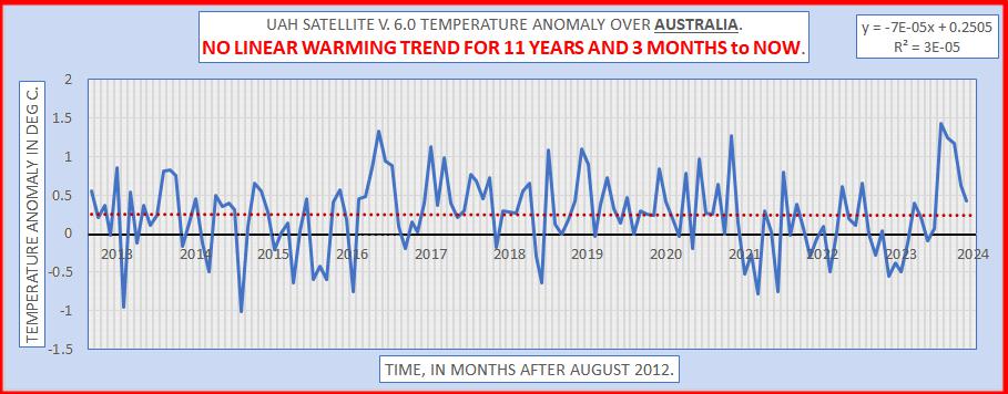
To add to the “quietness” of the Southern Hemisphere, here is the UAH satellite anomaly graph over Australia to end Nov 2023.
Not much sign of a Hunga Tonga?
Not much sign of recernt CO2-induced warming?
Geoff S
Beat me to it 🙂
I would not rule out seismic activity, the blob off of North/Central Japan was well established before the video starts and fades away (The 2011 earthquake?). A second smaller blob forms and grows a bit south of the first and disappears over time after the second major Fukushima earthquake in November 2016. Unfortunately the data stops before the quake of 2022, it would be interesting to see if it appeared before the 2022 earthquake and subsequently disappeared.
A+ on this scientific inquiry and writeup. IMO your work is a gold standard effort and template on how to interogate a dataset.
A+ effort on this scientific inquiry. IMO your work and writeup is a gold standard… and template on how to complete a dataset investigation.
How great is that ! Thank you, Chris Hall, for putting in the will and the wit to present this very valuable data in such an accessible way.