One of the most frightening aspects of global warming, aka “climate change” is the graphs produced from temperature data for public consumption and trumpeted by an unquestioning and compliant media. When it comes to measuring climate, in order to actually see any temperature differences over the last century, they must be highly magnified using the temperature anomaly method.
The most often cited global temperature anomaly graph is from the NASA Goddard Institute of Space Studies (GISS), showing yearly average temperatures since 1880, as seen in Figure 1 below.

To the untrained and uninitiated (i.e. the general public) it looks like Earth’s temperature is on a trajectory for a hot and terrible future.
Sometimes, media outlets such as the daily-doom newspaper known as The Guardian, will take that data and make their own graphs, making them look even steeper and scarier, such their highly statistically amplified graph from their 2019 article as seen in Figure 2.

Written by the ever-alarmed and always unreliable Damian Carrington, it is no wonder some children think they have no future due to “climate change”.
But in the real-world, people don’t experience climate as yearly or monthly temperature anomalies, they experience weather on a day to day basis, where one day may be abnormally warm, and another might be abnormally cold. Sometimes new records are set on such days. This is normal, but such records are often portrayed by the media as being evidence of “climate change” when if fact it is nothing more than natural variations of Earth’s atmosphere and weather systems. In fact, is doubtful humans would even notice the mild warming we’ve had in the last century at all, given that the human body often can’t tell the difference between 57°F and 58°F in any given moment, much less over a long term.
Essentially, what we know as climate change is nothing more than a man-made statistical construct. You can’t go outside and hold an instrument in the air and say “I’m measuring the climate.” Climate is always about averages of temperature over time. It’s a spreadsheet of data where daily high and low temperatures are turned into monthly averages, and monthly averages are turned into yearly averages, and yearly averages are turned into graphs spanning a century.
But, such graphs used in press releases to the media and broadcast to the public don’t really tell the story of the data honestly. They omit a huge amount of background information, such as the fact that in the last 40 years, we’ve had a series of El Niño weather events that have warmed the Earth; for example, 1983, 1998 and in 2016. The two biggest El Niño events are shown coinciding with temperature increases in Figure 3.

These graphs also don’t tell you the fact that much of the global surface temperature measurements are highly polluted with Urban Heat Island (UHI) and local heat-sink related siting effects that bias temperatures upward, such as the wholesale corruption of climate monitoring stations I documented in 2022, where 96% of the stations surveyed don’t even meet published standards for accurate climate observations. In essence – garbage in, garbage out.
But, all that aside, the main issue is how the data is portrayed in the media, such as The Guardian example shown in Figure 2.
To that end, I have prepared a new regular feature on WUWT, that will be on the right sidebar, combined with the long-running monthly temperature graphs from the state of the art (not polluted or corrupted) NOAA operated U. S. Climate Reference Network and the University of Alabama Huntsville (UAH) satellite derived temperature global record.

I’m utilizing the NASA Goddard Institute of Space Studies GISTEMP global dataset. The difference is simply this – I show both the absolute (measured) and the anomaly (statistically magnified) versions of the global temperature. This is accomplished by doing the reverse procedure as outlined in UCAR’s How to Measure Global Average Temperature in Five Easy Steps.
In this calculation, the “normal” temperature of the Earth is assumed to be 57.2°F. and that is simply added to the anomaly temperature reported by NASA GISS to obtain the absolute temperature. The basis of this number comes from NASA GISS itself, from their FAQ page as seen in August 2016 as captured by the Wayback Machine.

Of course GISS removed it from that page as seen today, because they don’t want people doing exactly what I’m doing now – providing the absolute temperature data, in a non-scary graphical presentation, done in the scale of how humans experience Earth’s temperature where they live. For that I’ve chosen a temperature range of -20°F to +120°F, which is representative of winter low temperature near the Arctic Circle and high summer temperature in many populated deserts, such as in the Middle East.


Can you tell which graph visually represents a “climate crisis” and which one doesn’t?
Feel free to check my work – the Excel spreadsheet and the calculations are here:
To create the graphs above in Figures 5 and 6, I used the data from the Excel Sheet imported into the graphing program DPlot.
Note: some typos in this article were fixed and some clarifications added within about 30 minutes of publication. -Anthony
I did more or less the same thing once in a twitter conversation
great piece anthony.
343 comments and rising.
judging from the volume of comments from our usual group of alarmists, you are right over the target.
joe x ==> Ah, its a “ye olde bloggers” trick though — the post is a sticky at the top of the page for days, every occasional reader ends up seeing it before it it “buried” by more recent posts.
It is a great post, in any case.
This graph helps demonstrate the significance of Anthony’s efforts and should dispense with some of the arguments here about the scale of the “Y” axis.
The graph shows the global average temperature and its relationship to the diurnal temperature range in the warmest and coolest months of the year in Wichita, Kansas as well as the historical range of maximum and minimum temperatures in Wichita.
Wichita was chosen because it is located very close to the geographic center of the contiguous US and its annual average temperature is approximately equal to the global annual average temperature.
And all the discussion doesnt seem to even question the practice of measuring the anomaly to .01 degrees while the confidence interval of the temperature measurement itself is going to be at absolute best +- 1 degree, and 2 degrees is probably much more realistic.
If you used 2 degrees, there would be no significant change at all.
Also, don’t forget that the anomalies are “adjusted”, so 0.01 degrees is just silly.
GISTEMP uncertainty for annual means is between ±0.15 C early in the period and ±0.05 C later in the period. [Lenssen et al. 2019]
It is bull crap. It is based on averaging integers for most of the 20th century and carrying decimal digits forward. It totally ignores significant digits and the resolution of measuring devices.
You can not in good conscience quote numbers with better resolution than what was measured.
If you do what is done with temperatures through averaging we could know the speed of light accurately to 10^-20. We could know accurately how far the nearest star is down to 10^-6 meters.
Averaging can not increase resolution!
“GISTEMP uncertainty for annual means”
These uncertainties are *NOT* uncertainties. They are the standard deviation of the sample means (SDOM), i.e. a measure of how close you are to the population mean. The SDOM does *not* tell you how accurate that population mean is. And it is the accuracy of the mean that is the uncertainty.
The accuracy of the mean cannot be better than the data used to calculate the mean. Since the uncertainty of even modern field temperature measuring devices is considered to be approximately +/- 0.5C, the uncertainty of the mean can not be any better than that. Since uncertainty compounds when you are measuring different things the final uncertainty is undoubtedly much higher than +/- 0.5C.
From Possolo: “If repeated measurements are made of the same quantity,
statistical procedures can be used to determine the uncertainties in the measurement process. This type of statistical analysis provides uncertainties which are determined from the data themselves without requiring further estimates. The important variables in such analyses are the mean, the standard deviation and the standard uncertainty of the mean (also referred to as the standard deviation of the mean or the standard error of the mean).” (bolding mine, tpg)
Temperature measurements from different stations are *NOT* repeated measurements of the same quantity. Therefore statistical analysis of the variation of the data cannot determine the uncertainty. And the SDOM (SEM) is *not* a measure of the uncertainty for temperature.
This makes the GAT simply not fit for purpose. Neither are the so-called “uncertainty” values given for it.
It seems that hardly anyone in climate science understands this simple truth. Climate scientists are apparently mostly statisticians that believe that all measurement uncertainty is random, Gaussian, and cancels whether the data is from repeated measurements of the same thing or single measurements of multiple things.
Any apprentice machinist would be able to explain the difference between the two scenarios. Apparently there are a lot of PhD’s that can’t.
Tim Gorman,
Any chance we can swap data and methods privately? Geoff S
sherro 01 at outlook dot com
Why not just use well established methods like what is documented by JCGM and implemented via the NIST uncertainty machine?
Did you bother to read what I wrote?
NIST basically does exactly what Possolo described.
““If repeated measurements are made of the same quantity,
statistical procedures can be used to determine the uncertainties in the measurement process. This type of statistical analysis provides uncertainties which are determined from the data themselves without requiring further estimates. The important variables in such analyses are the mean, the standard deviation and the standard uncertainty of the mean (also referred to as the standard deviation of the mean or the standard error of the mean).” (bolding mine, tpg)”
It assumes that there are no systematic biases in any temperature measurement, that you have repeated measurements of the SAME THING, and that statistical analysis of the stated values of the measurements can be done.
More from Possolo:
“The most likely or ‘true’ value may thus be considered as the
measured value including a statement of uncertainty which
characterises the dispersion of possible measured values. As
the measured value and its uncertainty component are at best
only estimates, it follows that the true value is indeterminate
(VIM, GUM). Uncertainty is caused by the interplay of
errors which create dispersion around the estimated value
of the measurand; the smaller the dispersion, the smaller the
uncertainty.
Even if the terms error and uncertainty are used somewhat
interchangeably in everyday descriptions, they actually have
different meanings according to the definitions provided by
VIM and GUM. They should not be used as synonyms. The ±
(plus or minus) symbol that often follows the reported value
of a measurand and the numerical quantity that follows this
symbol, indicate the uncertainty associated with the particular measurand and not the error.”s
(bolding and italics are mine, tpg)
from the NIST user manual:
“If the input quantities are uncorrelated, then this amounts to assigning a Gaussian distribution to each one of them, with mean and standard deviation equal to the corresponding estimate and standard uncertainty;”
Mean and standard deviation apply only to repeated measurements of the same thing where you can use the stated values of the measurement while ignoring the measurement uncertainty.
This has bee covered with you MULTIPLE TIMES. Yet you always fall back on the NIST as being some kind of proof that single measurements of different things is the same as repeated measurements of the same thing.
When are you going to learn?
I find it quite droll that bgw quit quoting Possolo after Jim pointed what this estimation method really shows…
Let me provide this excerpt from the GISTEMP uncertainty model document:
“Station uncertainty encompasses the systematic and random uncertainties that occur in the record of a single station and include measurement uncertainties, transcription errors, and uncertainties introduced by station record adjustments and missed adjustments in postprocessing. The random uncertainties can be significant for a single station but comprise a very small amount of the global LSAT uncertainty to the extent that they are independent and randomly distributed. Their impact is reduced when looking at the average of thousands of stations.” (bolding mine, tpg)
They recognize that systematic uncertainties exist in the measurements but then totally ignore them. They make the usual assumption in climate science that all uncertainty is random and Gaussian and therefore cancels.
Where is their analysis of systematic bias in the measurements from thousands of stations due to calibration drift?
bgw fervently believes the fraudulent “adjustments” remove all systematic error.
No, I think they just don’t understand physical measurements at all. They’ve never overhauled an engine, machined a precision part, designed a bridge, or built a staircase.
Remember, I emailed for advice the person who maintains the NIST uncertainty machine, and as soon as I mentioned temperature records he dropped the conversation immediately.
That was disappointing. I wish he would have responded.
use tgorman22 at gmail dot com
Ta
Geoff S
Great and wise way to present realities, but please add Celsius scale on the rigth side ogf the graphs (for the majority of the readers?).
Since I have access to site statistics, I can tell you that your are wrong. The majority of our readers are from Fahrenheit using regions. Aka the land of measuring asteroids by number of alligators.
Petter Tuvnes ==> Unfortunate world we live in and unfortunate that the whole wide world doesn’t have one temperature measuring and reporting system.
Even more difficult for those that write here than those who read here. Reporting about news or journal papers, which use both: sometimes simultaneously in the same article, or just one or the other. Writers have to convert all those measurements: inches and cms; C and F, miles and kms, on and on.
We TRY to include conversions…it is a real pain.
😎
I have old Texas Instruments TI-36X Solar that has a function that would convert F and C automatically with just a couple of button pushes. It also cm to inches.
I started to keep it handy again while reading “The Encyclopedia of Weapons of WW2”. It had the annoying habit of switching back and forth between mm, inches, cm, caliber (referring to barrel diameter and not barrel length), kilometers, miles, yards and feet when describing guns and armor thickness.
(At least we all seem to use hours and seconds instead of some using centons!)
another ignorant diatribe against anomalies
if i told you that everest was 29,032 feet tall would you complain this is an anomaly
anyone confused by the concept of feet above mean sea level?
mean sea level is a human construct!!
only sceptics think anomalies are anefarious plot.
only skeptics ignore that centigrade is an anomaly.
it gets worse
Mosher ==> You are better than that. I know you are a great believer in temperature anomalies — but every measurement is an anomaly in that sense, and yet they are not anomalies in the sense that CliSci uses it.
“Only sceptics think” .………………..YEP. Well done. Perhaps you should try it.
Anomalies are necessary because the elevation of the measurement site must be taken into account. The change in atmospheric pressure with different elevations will give different temperatures. But that is unlikely to be the only effect. Perhaps you could give the residuals from forming the anomalies as a function of elevation to should how much error is still left.
I really can’t take any of this discussion seriously until we start getting our daily weather reports expressed to 3 significant figures. Really how does anyone know if its going to be a cold day if they just report 18c where it actually might be 17.6c.
This whole topic is nonsense. Wake me up when tomorrow is going to be 10c warmer so I can go to beach.
I wonder how the anomaly graph would look when compared to growth in population in cities and large urban areas.
The graph really should be scaled in °C since that is what most of the world uses.
If Americans get too bent out of shape by that Idea, maybe °K?
I see what you did there. But it’s not “°K” it’s just “K”.
But don’t worry; the Americans doing science on this site are perfectly used to working in the metric universe.
Frozen weather in North America.

“Climate is always about averages of temperature over time”
This raises the question of “climate events” which is meme-speak for “human-induced global warming-related weather”.
If the climate is the average of weather, then there are no climate events. They are weather events. It is not frightening when they are weather events (as they used to be).
When feasting on the dead arguments of alarmism, it is nice to have a word salad on the side.
There may be a lot of snow.
https://earth.nullschool.net/#2023/03/18/2100Z/wind/isobaric/500hPa/overlay=mean_sea_level_pressure/orthographic=-102.87,50.21,709
If the graph of atmospheric CO2 level were based on percentage of atmosphere, then the 1/100th of one percent growth of atmospheric CO2 from 1960 until 2023 would be represented as an almost flat line.
It depends on how you scale the y-axis.
A realistic scaling would be zero to one hundred percent.
Is 0% or 100% a realistic value for CO2 realistic? When was the last time it happened?
In geology, we’re taught to use a natural scale of 1:1.
Can you give me an example?
More snow in California.
https://earth.nullschool.net/?fbclid=IwAR3uTaYFe1WA9ZI1zR0uIzEAyohsq-xbVgQJa5r6CIDgGqcIhHYjkEn_gqI#2023/03/22/0400Z/wind/isobaric/850hPa/overlay=temp/orthographic=-118.21,52.17,563
Will an El Niño form in the coming Southern Hemisphere winter? This is doubtful due to the large winter temperature drops in the South Pacific.
http://www.bom.gov.au/cgi-bin/oceanography/wrap_ocean_analysis.pl?id=IDYOC006&year=2023&month=03
US temperatures on the night of March 18.

Interesting. How would you homogenize such a varying gradient in temperatures?
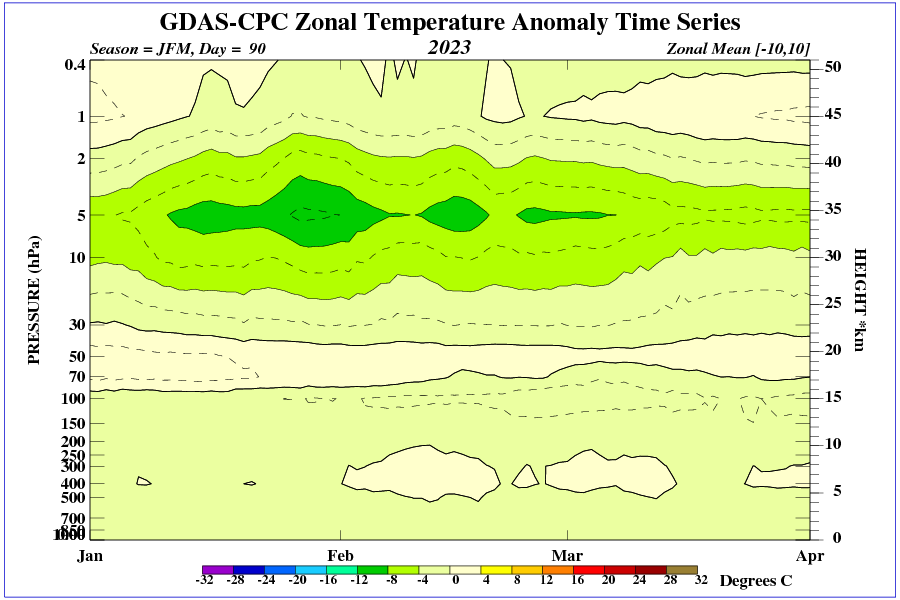
Why doesn’t it occur to scientists that the troposphere above the 60th parallel is very thin, and the winter stratospheric polar vortex is unpredictable? It is possible for large areas in the mid-latitudes to freeze at any time during the winter season. It is then the circulation in the stratosphere, not the troposphere, that decides.
Circulation in the stratosphere in winter can change very rapidly.

I haven’t commented here in years but I see the same issues about data precision and context continue because frankly we have the same bunch of theorists trying to push a conjecture as fact onto the real world.
One point to note in the absolute temperature graph is that you should add the real world errors.
Systematically I think it’s at least +/- 1.5 F ( ~ 1 degrees C) at best.
The hypothetical anomaly data has it as 0.1 degrees C but that’s because they assume the instrument readings are truly representative of the underlying signal even within the noise limits. Even though the instruments were never designed, calibrated or maintained to have such precision and less to meet signal to noise considerations
Which however is fine theoretically as you play in what ifs
But a WMD if applied to the real world.
And as we’ve seen with the Great Panic of recent years exaggeration and reliance on nonsense models is not solely confined to climate science.
The theorists always assume that measurement uncertainty is random, Gaussian, and cancels. No systematic bias in any measurement and no hysteresis in any device that might cause a non-Gaussian random error.
But they never STATE that assumption. They just hope no one notices. But more and more people *are* beginning to notice I hope.
I agree with 99% of the core positions outlined on WUWT, but this is frankly a misguided stand. There is nothing wrong with displaying data on a time series graph where the Y axis does not intersect at 0. Temperature scales are completely arbitrary anyway, as is their zero. Choosing the point at which water freezes at standard atmospheric conditions as your zero (or as 32deg) is arbitrary, is it not? You want to be able to zoom in to show the variation in the data. There’s nothing wrong with the Y axis not intersecting the X axis at 0, and zooming in to show the variation in the data.
I will agree though that using anomolies instead of raw temperatures may allow people to lose sight of the big picture…but that’s more on the ignorance and gullibility of the masses when it comes to math and statistics.
However, the biggest problem I have with using anomolies is it allows activist scientists to nefariously adjust historical data with impunity, since one day “0” could mean 55d, and the next it could mean 54d.
Anomalies don’t describe climate. The monthly average high temp when average annually in Miami and Las Vegas are nearly the same. But the monthly average high temp in Vegas can be as high as 103F while in Miami its only about 89F. Big difference. You’d think the climates were the same but the variances tell a different story. It’s even worse when you consider enthalpy (i.e. the humidity) at each location.
There is a reason why you never see climate scientists propagating variances throughout their averaging. The variance would be huge by the time you get done averaging everything together (variances add when combining random variables). Since variance is a measure of uncertainty it would make their results look like the guesses they are.
It doesn’t seem like your comment is replying to anything I wrote.
Very low tropopause height (stratospheric intrusion) over the Great Lakes.

A series of fronts with precipitation is heading to California.

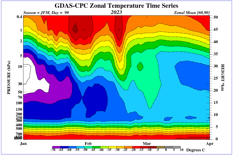
Very low temperatures in the upper stratosphere above the equator.
In three days, a very cold front will bring a lot of precipitation to California.

The magnetic activity of the 25th solar cycle is very weak.

The solar wind exceeded 600 km/s only in late February and early March. Now the solar wind speed is decreasing again.
I hate to sound like a layman but I’ve lived in this house for 40 years ! I notice NO difference in the climate over those years !! Some years are hotter some are colder. Some years are wetter and some are dryer !!
Also as far as global temps are concerned you can’t name one place on earth where there is not another place that 2 degrees hotter or colder and yet people still live there!!
Newbie here.
How about depicting Global temperature vs land & ocean temperature?