Guest Essay by Kip Hansen – 30 August 2022
One of the major misleading claims being pushed by The Climate Team and the various climate propaganda cabals is the “general mantra that has emerged in this area of climate science: “A small change in the average means a large change in extremes.” (see also here and here).” Patrick Brown at The Breakthrough Institute wrote about the issue recently in “Effective Climate Communication on Extremes Should Not Sacrifice Clarity in the Name of Persuasion”.
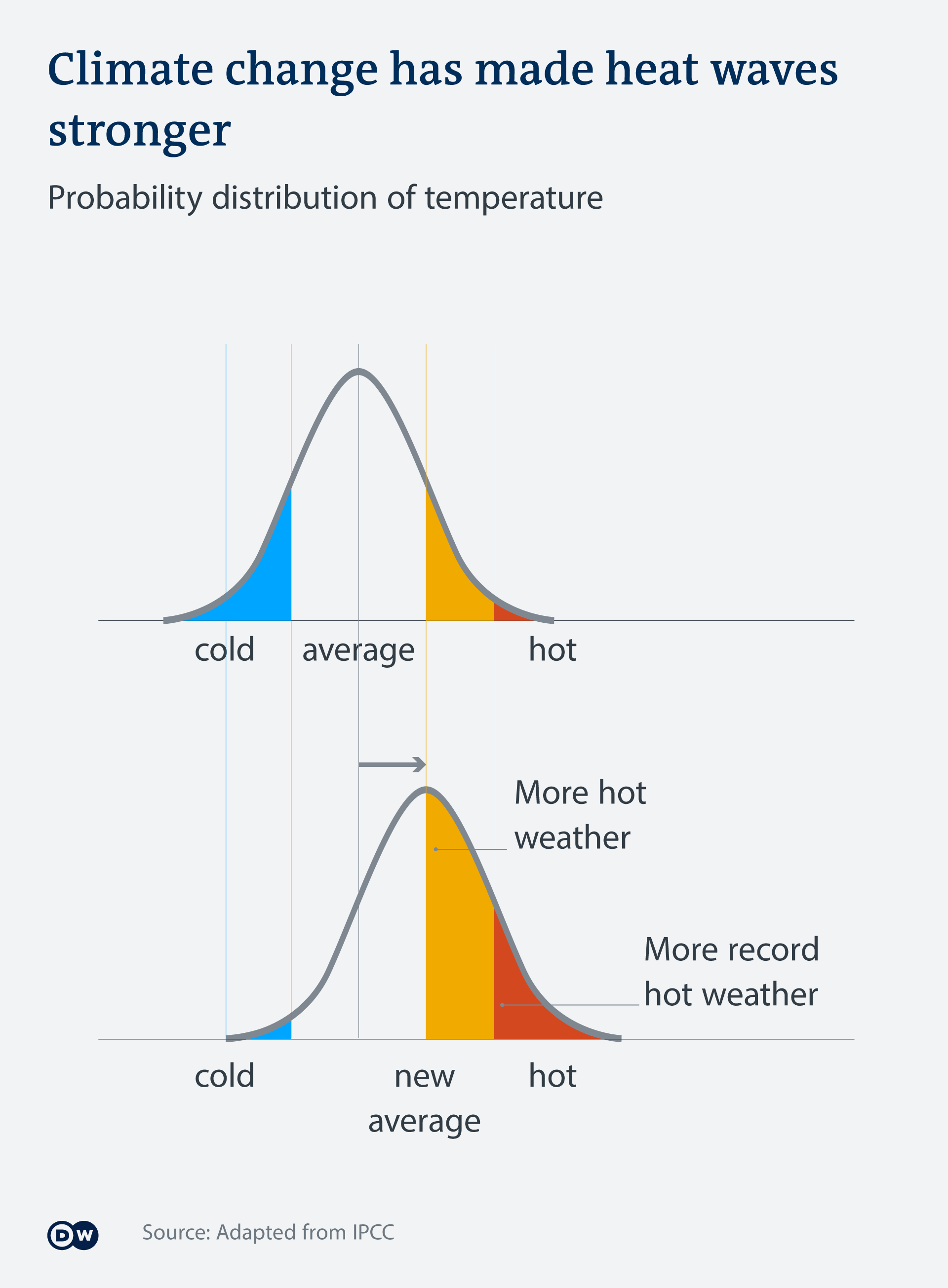
This mantra is supported and promoted with images such as these (there are quite a few, readers can just scan down through them, but should notice the obvious differences):


Pretty convincing, isn’t it? That’s the problem – it is convincing without being true.
What does the temperature distribution of a real weather station look like? I picked one at pseudo-random from the National Centers for Environmental Information feature called Daily Summaries map. I choose a station near the center of the United States – Atlanta Missouri, station code: USR0000MATL. I downloaded daily summaries (including TMAX, TMIN, and TAVG ) from August 2003 through August 2022, nineteen years, and, after removing the error codes in the TAVG column (values of 600 and 599) and converting values (listed in tenths of a degree C) to degree C with decimals [ 241 to 24.1°C ] had MSExcel create a histogram of the values. I use a histogram, an “approximate representation of the distribution of numerical data”, with 2 degree C bins to clearly illustrate a real world example of the distribution of temperature data.

We are interested in hottest of the hot summer days. In 19 years, they have seen only 15 days with an average above 30°C (86 °F)…less than one day a year.
Let’s compare this actual station data distribution, above, to the theoretical “normal distribution” used by the climate enthusiasts in their graphics at the beginning of the essay —

Not a very good match is it? Not sure, page up to see the normal distributions used in the propaganda messages which all look like this. (image on left)
Seems right to the folks on the street, if they are not paying close attention.

This is the dw.com version, shifted to show “small increases in the average”. But what they show is moving the whole distribution a full 20 to 25% to the right. They fail to mention that this eliminates almost all very cold weather – but that wasn’t their point. The Climate Central folks use the same trick – shift the average a full 25% to the hot side.
If we are talking the 1 °C that is claimed for Global Warming in the last 100 years, this is what happens to real station data:

What changed when we added one degree centigrade to each and every daily average? The whole shifted to the right, to the warmer side. The long-term (all daily values) average also increased by 1 degree.
How many extra hot days – extreme hot days? NONE
Before the small increase in the average, there were 15 days above 30 °C (86 °F) only one of those above 33 °C (about 90 °F).
After the small increase, there were would still have been only 15 days (out of 6860 days) with averages above 30 °C and still only one above 33 °C, still less than one per year.
Why? Two reasons: 1) a small change only produces a small change in linear systems like daily average temperature and 2) the shape of the real distribution looks like real temperatures in middle America and nothing like a normal distribution.
Summer days average between 21 and 29 °C (70 and 85 °F) with very few really hot days, with averages above 31 °C (88 °F), only 15 out of 6860. And, visually, Spring, Fall and some Winter days average 0 to 20 °C in about equal numbers. The cold days, 0 down to -21 °C far outnumber the hot days.
Long fat tail on the cold side, short steep tail on the hot side. Increasing the average by 2 °C doesn’t change the result very much…and the effect depends entirely on were one draws the line (in degrees) between hot summer days and extremely hot summer days. The hotter days are still only increased a single additional degree.
Looking at Tmax and Tmax+1, we see a slightly different shape, but similar overall pattern:

Very few (27 out of 6860) hot days greater than 37 °C (99 °F) for the 19 years shown (about 1.5 days per year) and when the average is increased by 1 °C, the same number of days (still about 1.5 days per year over 38 °C or 100 °F) but a highest temperature of 42 °C (107 °F), one day in 19 years.
To create a change that would be important to the people of Atlanta, Missouri, a big change in the number (or temperature) of hottest days per year, the daily average in Atlanta, Missouri would have to shift about 6 °C to the hot side; thus moving the taller column of 27 to 29 °C over into the 33 to 35 °C range and a similar shift of the Tmax hottest days into the high 90s and low 100s.
Bottom Line:
Looking at the real distribution of daily temperatures at a actual weather station, over a period of 19 years, we find that a small change in the average temperature causes only a small change in hotter days.
Small changes in the climate averages do not produce large changes in temperatures.
Temperature averages are not normally distributed.
# # # # #
Frequent readers will know that I don’t think temperature averages are quite proper for evaluating climatic changes, even short term and local. Here I use a long-term average only to follow the conventions of CliSci and to illustrate the falsity of their meme.
A better way to look at temperatures, in my opinion, is to look at Tmax and Tmin shown on the same image. It is acceptable to show Tavg ( Tmax+Tmin/2 ) as a visual tool, though it is not particularly meaningful as it does not translate into the temperature profile of the day, which would be far more informative. Here is the year 2004 for Atlanta Missouri:

We see that Atlanta had a late December week-long thaw that year, which then dropped back into very cold temperatures -10 to -20 °C. An “Annual Average” would have missed this potentially agriculturally important fact.
# # # # #
Author’s Comment:
Philosophically, the problem is the climate enthusiasts have pretended that the “climate average” (of any metric) is random normally distributed data. As in “A random variable with a Gaussian distribution is said to be normally distributed, and is called a normal deviate.” There is no scientific reason to believe that is true, the evidence is to the contrary, and yet they use it to try and make a [false] point about changing climate.
Only in non-linear dynamics, in which systems can exhibit sensitive dependence on initial conditions, do we find small changes producing large changes. For general climate temperature, the reverse is suspected, that is that temperature may exhibit uncanny long-term stability with variability that is self-similar over different time scales.
Start comments with “Kip…” if addressing me.
Thanks for reading.
# # # # #
BINNING ==> It is interesting that there is quibbling about the 2° bins — there is only one choice (in whole degrees) less than 2 and that is one. Nick Stokes’ comment about the bins hiding a long tail on the hot side might have been true if I had originally used ten degree bins.
This issue is an incredible quibble. (Incredible means “unbelievable”).
In the 1 ° bin version, the only difference is that each single degree has its own bin! So for very hot days, we see a columns for 37, 38, 39, 40, 41 and 42. Instead of the two-degree combinations.
For those interested in reality, here is the “1° bins” version:
“For those interested in reality”
Again, Kip, this is not reality. It is a particular sampled approximation, expressed in bins. It is a very poor representation of the gradient. You can see the artificiality by the steep dips in every fifth bin. I think this is caused by a combination of F to C conversion and rounding convention. Whatever it is, it isn’t reality.
You need a proper representation of the gradient at the leading edge. That is what determines the response of frequency to a shift in base temperature.
Nick ==> Again, you focus on the leaves on the ground instead of the forest. It is the general shape that is in question.
I have invited you to show that this random-sample-of-one is not generalizable. Or simply to show from measured station temperature data that daily temperatures are normally distributed.
When you present evidence — even another randomly selected single sample, we will have something to discuss.
Kip
“ It is the general shape that is in question.”
No, it isn’t. Again, for hot extremes what matters is the shape of the leading edge, and in particular, the gradient.
It’s all in the way you define extreme … wink wink 🙂
The funny part is if you define extreme as an temperature top 5% of a distribution then if it moves without change the extremes are still the top 5%.
If Nick tells you how he is defining “Extreme” you will see the game being played. If you play Nicks game any upward adjustment of data automatically gives you more extremes 🙂
Given that cooling from the established radiation laws are based on the fourth power of the absolute temperature, the last thing to be expected is a normal distribution of maxima and minima about the mean.
Kip,
This is one your best so far, which is high praise given your high standards. Clear, timely. Brilliant debunking of a common alarmist belief.
This is disturbing because prominent alarmists often say this – and climate scientists must know it is bogus. Yet I have never seen them criticize it. This is flushing their credibility down the toilet.
Larry ==> Thank you, sir. This particular twisted reality is so common that I can’t blame the general public, with their low levels of science and math education, from swallowing it. It is a just a propaganda Talking Point and not a truth at all.
Non-statisticians often assume that a distribution is normal – without checking the data. Even experts in other fields do so.
Horrific examples litter the field of finance. Prices of financial instruments, such as stocks, are seldom normal. They are skewed in several, often exotic, ways.
Otherwise brilliant investment investment strategies that assume normal distributions usually fail, often disastrously.
Larry ==> I suspect that you already know that even “SCIENTISTS” assume normal distributions without checking data and use techniques suitable for normal distributions on data that is NOT normally distributed. CliSci is likewise rife with such silliness.
This and misapplying (nearly always) “the law of large numbers“.
Kip,
”even “SCIENTISTS” assume normal distributions without checking data and use techniques suitable for normal distributions on data that is NOT normally distributed.”
That is an example of a large weakness of climate scientists. It’s an inherently multi-disciplinary field. But climate scientists too seldom bring scientists from other disciplines – and statisticians and software engineers – onto their teams.
It is a common human failing to keep out experts from other fields who would criticize one’s weaknesses in processes and limitations in knowledge. But given the large significance of climate science to public policy, pressure from appointed and elected officials – who fund the game – would be nice.But unlikely to happen.
“We don’ need no steekin’ deestribution!”
Monte ==> Have you seen the movie? Almost older than I am. The actual message of the movie is quite different.
I’ve seen parts of Sierra Madre, but it was eons ago.
“Prices of financial instruments, such as stocks, are seldom normal.”
Exhibit A — small unprofitable deli in rural New Jersey
HWIN
Market capitalization $327 million at the last trade of $9 a share — the 52 week high was $14.90
I have never seen anything like that in 45 years of investing
The statistics are interesting and local weather affects people’s lives, unlike a single global average temperature … but the interesting questions are not asked:
“Did people notice changes in their weather?” “Did people like the changes in their weather?” The answers may be anecdotes, rather than numbers, but the answers would be data.
ff TMIN has a rising trend, and most people are sleeping at the time, who notices? If TMAX has a rising trend, and most people are indoors at the time, who notices?
What temperature change is large enough to be noticed? One degree C.?
Two degrees C.?
If noticed, what percentage of people liked a higher TMIN?
If noticed, what percentage of people liked a higher TMAX?
We have noticed a higher TMIN during SE Michigan winters since the 1970s and we want more of that.
There is little evidence to support the claim that heatwaves in the US are becoming stronger or more frequent:
https://wattsupwiththat.com/2019/09/06/the-gestalt-of-heat-waves/
Kip==> Nice take down. Obviously the use of normal curves is entirely inappropriate as the data is not normally distributed. Tellingly the alarmist propaganda graphs don’t include a numerical scale so lets fix that. If temperatures were normally distributed the mean would be about 15 C and the upper/lower 3-Sigma limits would be about 40 and -10 C respectively. That would make 3 x Sigma 25 C and sigma 8.33 C. So when they shift the mean by something close to 0.75 Sigma, that’s about a 6 C increase in the mean. More than 6 times the alleged warming of the last 100 years.
Nothing short of scientific and mathematical malpractice. The organizations promoting this crap should be labelled as creators and distributors of misinformation and propaganda.
Rick ==> Thanks for the detailed analysis. You come to a similar result, though mine was only visual guessing.
“Obviously the use of normal curves is entirely inappropriate”
No-one has assumed a normal distribution here, and it is in no way required. Someone drew a gaussian looking plot in an illustrative diagram.
As defense for the claim that “Small changes in the mean are the result of large changes in the extremes.” That defense relied on the assumption that the distribution was Gaussian. Because the distribution is not Gaussian, the defense is invalidated.
Where does it rely on that assumption? Nowhere! They drew a diagram of a distribution for illustrative purposes.
Looking at the real distribution of daily temperatures at a actual weather station, over a period of 19 years, we find that a small change in the average temperature causes only a small change in hotter days.
Small changes in the climate averages do not produce large changes in temperatures.
a sample of ONE?
jesus
Stephen ==> Gads, I have asked readers — and you are invited to participate — to run other stations through the same process….it only takes about an hour per station once you’ve located the data…Do your damnedest to show that real temperature data — measured and reported temperature data — at real individual weather stations is normally distributed.
I look forward to your results.
you know kip
if you wrote a program rather than using excell.
you could process every station rather than cherry picking a non normal one.
the real case is this.
the small change in mean is driven by rare large changes in tmin.
pssst the reason we use average is because we get longer records that way
tmin and tmax records are shorter. and we like more data, not less
however to make a point sceptics will ALWAYS pick smaller noisier data.
ALWAYS
Steven ==> In fact, I choose a station near the center of the country at random, and didn’t test any other stations — so NO , not cherry picking, just a random pick.
Can you show that the distributions for other stations are vastly different, that the actual daily temperature data from weather stations is normally distributed? or show actual data for real weather stations that back up point? or are you just generalizing from your own personal biases?
I am well aware that the general shift to higher means is driven by rising Tmins….that does not explain the issue at hand, nor support (in fact, is contrary to) the CliSci propaganda talking-point being discussed in the essay and the rest of us here, which is about small changes in averages producing more and more extreme Tmaxs.
What average do you (all, as in “we”) use to produce longer records? as the station record Tavgs are overwhelmingly produced using Tmax and Tmin.
Bluntly, what the heck are you talking about?
It would have been useful to mention that several other stations selected at random had similar results to the one presented in the article. Even if their data were not included in the article. That doesn’t matter to me, because I trust you as an author, but it obviously matters to The Stroker.
Mosh, how exactly are you getting longer Tavg records with shorter Tmax’s and/or Tmin’s? That’s a conjuring trick I’d love to see!
They calculated the average temperature, and then a dog ate the TMIN and TMAX papers?
Steven,
Are you the same person who did not exaggerate like this 10 years ago? What has changed, my friend?
Charles the Mod has part two of my article on uncertainty in T measurements in front of him to see if it is good enough to publish on WUWT.
Unknown to Kip and me, we wrote on an overlapping topic, both showing histograms.
My choice of histogram data was to look at the distribution in daily changes immediately before and after the move in the 1990s from LIG to PRT thermometers. I had a daily data file from Alice Springs open on the PC at the time, so I used it. No evidence whatsoever of cherry picking. So, you might have to put a caveat on “ALWAYS”. (Like, Geoff is not a sceptic by Mosher definitions).
…………
Who would expect a normal distribution? Some reasons, for daily data, you have effects from seasons, from a few dominant weather systems each with their own shape, from methodology that captures a fleeting Tmax and Tmin (thereby injecting guaranteed noise into the system) and an alleged warming trend to give a moving baseline. When you study skew and kurtosis causes, you find big influences from missing data, big influences from homogenization adjustments and all sorts of errors in the raw input data, such as stations that have no Sunday records for month after month, stations that report T in whole numbers with no fractions, blocks of data from one year cut and pasted into another year ….. The kurtosis guides you to outliers that, in many cases, represent highly unlikely conditions that might be errors or, in the mad era of chasing record heating, even EXAGGERATIONS.
Alarmists use exaggerations, ALWAYS.
“Charles the Mod has part two of my article on uncertainty in T measurements in front of him to see if it is good enough to publish on WUWT.”
Your first article was excellent, so I find it hard to believe that Charles Rotten is delaying your second article by more than 10 minutes, unless he is drunk … again
Moderator Bait
Gs –>. I only saw your post today after I left one. It is refreshing to see someone mention descriptors of a distribution. I really, really want to see variances!
To be fair, there are many times on this site when a program would provided more insight than an Excel spreadsheet. That said, your claim that sceptics “always pick smaller noisier data” is difficult to take seriously.
Your broad-brush generalization betrays your lack of objectivity. It also makes it easy to demonstrate that your claim is false because all a critic has to do is find one example where it isn’t the case, and your claim is demolished.
It’ true that one station, even chosen at random, could be deceptive, and a few weather stations would have been better. But no one lives in an average temperature, so TMAX and TMIN trends are more important. In fact, most people are sleeping when TMIN happens, so perhaps TMAX is more important than TMIN?
If you write your own programs why don’t you include calculating the statistical descriptors that go along with a mean? What are the variances by month, annual, and global means? How about skewness and kurtosis? Do you feel those are useful to describe the distribution?
kip
A better way to look at temperatures, in my opinion, is to look at Tmax and Tmin shown on the same image. It is acceptable to show Tavg ( Tmax+Tmin/2 ) as a visual tool, though it is not particularly meaningful as it does not translate into the temperature profile of the day, which would be far more informative.
what makes you think we dont look at tmin and tmax.
problem. is it doesnt let you see seasonal changes. and its super noisy. it might be acceptable as a visual tool if your interested in weather!
but if your interested in climate. you better work with monthly data or seasonal data. and tavg is very meaningful. when i see a change in tavg. i know its driven by a change in tmin or tmax
i know when i was a rookie i started backwards by looking at daily tmin and daily tmax.
thinking that the detailed picture was most informative. its not.
finally you got cause and effect backwards. well climate science hasnt helped.
a shift in extreme values is what drives the shift in averages.
or changes in weather show up as changes in climate.
because climate is just the stats of weather. a small change in mean will create small changes ib in extrmes
a big change in extremes, will have a small effect on means.
normal distributions? plot the histograms for 40000 statons as i have and manually review them
or run them all through Kolmogorov-Smirnov to test for normality.
Steven,
When I was first introduced to statistics, I was fortunate to have a tutor (a senior mathematician in CSIRO) who said to the effect that “Above all, understand you distribution. Do not start an analysis until you understand distributions and their causes for your data.” Easy to say, harder to do.
Even Kolmogorov-Smirnov has riders and caveats that affect how valid it is to use it.
Geoff S
I don’t think any point is more important, or less understood/appreciated.
Steven ==> Great! Show us a sample few — all daily values from the station, say 20 years worth as histograms — you may use 1° bins….
Show here or link to your histograms….show us that they are normally distributed.
But is it obvious whether the change is driven by Tmin, Tmax, or some proportion of both? That information should be obvious to even a ‘rookie’ when looking at overlain graphs of Tmin and Tmax. If Tavg leads you to suspect that there has been a change in Tmax or Tmin, you have to plot both anyway to determine what is causing the change.
“ is it doesnt let you see seasonal changes. and its super noisy.”
Noisy? Where is the noise coming from? Are you actually trying to say uncertainty? Uncertainty isn’t noise. Since everything is temperature, what interfering signal is there that could be considered as noise?
I suspect you are actually speaking of variation. Guess what? Temperature *DOES* vary, from year to year, month to month, day to day, hour to hour, minute to minute, even second to second! Trying to smooth that variation away only hides data that is necessary to actually understand what is going on with the temperature!
“it doesnt let you see seasonal changes. “
So what? Do your analysis on a season-by-season basis instead of a jan-dec basis! Set the models up to forecast on a season-by-season basis!
“tavg is very meaningful. when i see a change in tavg. i know its driven by a change in tmin or tmax”
How do you know which? How do you determine the temps that drove that average? Lot’s of different combinations of temperatures can give the same average while describing significantly different climates!
“i know when i was a rookie i started backwards by looking at daily tmin and daily tmax.
thinking that the detailed picture was most informative. its not.”
It’s *very* informative. Just one example. Think about radiative balance. During the day the Earth radiates a *lot*, its being driven by solar insolation. At night, the radiation is an exponential decay since the sun is no longer a driver. How do you average a daytime temperature curve, a quasi-sinusoid, with a nightime temperature curve, an exponential decay, and get an average that means anything? In order to actually get anything meaningful the daytime temperature should be integrated and so should the nighttime temperature to get the area under the curves. Find the averages from those integrations and use *those* to determine actual radiation.
“normal distributions? plot the histograms for 40000 statons as i have and manually review them”
A sinusoid is not a normal distribution. Neither is an exponential decay. Why would you expect their combination to be a normal distribution?
Word salad extraodinaire!
Seasonal? You like most, don’t use seasons, you use calendar years. You split winter/summer seasons between years. Look up equinoxes and soltices to see how combinations should be done.
Normal distributions? Even assuming all stations have normal distributions, when you combine northern and southern hemispheres, you can not possibly have a normal distribution. The very fact that land surface areas are vastly different ensures that.
Noise? Noise is extraneous interference that is not part of what you are measuring. The “noise” you describe is not noise, it IS THE SIGNAL! More explicitly, it is THE VARIANCE in the data. Why do you ignore the variance?
The UK Met Office say that heatwaves like in 2003 and 2018 will happen every other year by 2050. I can only see one of that type before 2050, very similar to the 1976 one.
https://docs.google.com/document/d/e/2PACX-1vQemMt_PNwwBKNOS7GSP7gbWDmcDBJ80UJzkqDIQ75_Sctjn89VoM5MIYHQWHkpn88cMQXkKjXznM-u/pub
Is there clear evidence that that CO2 increase is causing more US heatwaves? Not according to EPA Heat Index graph.
After downloading the EPA 1895-2021 Heatwave index data that produced the above referenced graph, I then looked for the 30 year average index trends to separate climate trends from weather variability. The results:
• Highest 30 year running average was 1926 – 1955 with an average index value of .200. There was a 137% increase in heatwave index over that period.
• The lowest 30 year average was 1958 – 1987 with an average index value of .043. There was a 78% decline in heatwave index over that that period.
• The last 30 year running average index (1992 thru 2021) was .100. That represents a 77% increase in the 30 year average index over the period and about half the rate of increase seen between 1926 and 1955.
As is obvious, these trends don’t align well with CO2 increases, which IPCC acknowledges did not significantly increase until about 1950.
In the Working Group 1 portion of the AR6 Report, IPCC has systematically and very helpfully gone through a large list of extreme‐weather phenomena. Their results are quite surprising: floods, hurricanes, tropical cyclones, meteorological and hydrological droughts are not more frequent. Nor are tornadoes, hail, lightning or strong winds more frequent. However, they do list heat waves as more frequent, but do so by excluding data prior to 1950, in a typical data “cherry picking” process.
This data is available on the EPA website (www.epa.gov/climate-indicators/climate-change-indicators-heat-waves)
Very powerful Kip, nice job.
As some other commenters have mentioned, given most warming of the last century is in the northern hemi-sphere, during winter, and at night, how can a change in T-avg be used to argue for increases in extreme heat? Will all future modelled warming suddenly change to show up as increases during summer for daytime highs? Or are they redefining extreme heat to mean slightly less cold nights in winter?
Well no, because water vapour limits Tmax. Deserts have a high Tmax because of low water vapour compared to a neighbouring tropical zone.
ALL ==> With so many objections to the sample-of-one issue, I ran a few more stations.
Three out of four have very distinctive, non-normal distributions.
I finally found one, in southern Oregon, that has a distribution that looks more “normal” — ROSEBURG, OR USC00357331. The nearby Roseburg Airport has a similar normal-ish looking distribution.
So it is not impossible to have daily temperature distributions that have a “normal shape” — but it certaintly isn’t required or the general rule.
Still, if some clever reader wants to run up a dozen or so international stations — daily temperature distributions — from differing climate zones, and Northern and Southern hemispheres it would be interesting.
Note: The hardest part of this effort, using Excel or R, is the cleaning of the data so that one isn’t tripped up by blanks, error codes that look like data (999 in some data bases or 600 or 599 in a Tmax or Tmin column — actual example) or other inconsistencies. I found temperatures listed at over 150°C….not a likely accurate temp.
Kip:
This is something at which LabView is highly useful, all you have to do is substitute the missing/bad code for “NaN” (Not a Number), and LabView will not use it. Unfortunately LV is uber-expensive…
“So it is not impossible to have daily temperature distributions that have a “normal shape” — but it certainly isn’t required or the general rule.”
What a totally futile effort! I repeat, after many times – nobody has ever proposed such a general rule. Or indeed, is ever quoted here mentioning normality for the days of a whole year. They are dominated by seasonal variation; they aren’t any kind of random distribution.
If you diminished known non-random effects, by restricting to July, say, there might be a glimmer of interest in whether it is normal. But again, nobody has assumed normality, and nothing depends on it.
“But again, nobody has assumed normality, and nothing depends on it.”
Again, *everything* depends on it! If you don’t have a normal distribution then the mean is not a useful statistical descriptor of the distribution.
Hand waving and magic won’t change that truth in any way.
Kip,
Attached are some graphs of my personal wx station from July, 2012 through part of Sept, 2022. Somewhere I’ve got data back to 2002 but I’m unable to find it on my computers right now. These are based on max temps, not mid-range temps.
Anyway, the max temp graphs shows 2012, 2013, and 2016 as having high temps. The rest of the years, not so much. In some of the years we never had a day over 100F.
The histogram for the max temps looks a lot like your mid-range graph.
I see little growth in the max temps so if the average is going up it is from min temps. If I get a chance I’ll plot the min temps and the mid-range temps.