Guest Essay by Kip Hansen – 30 August 2022
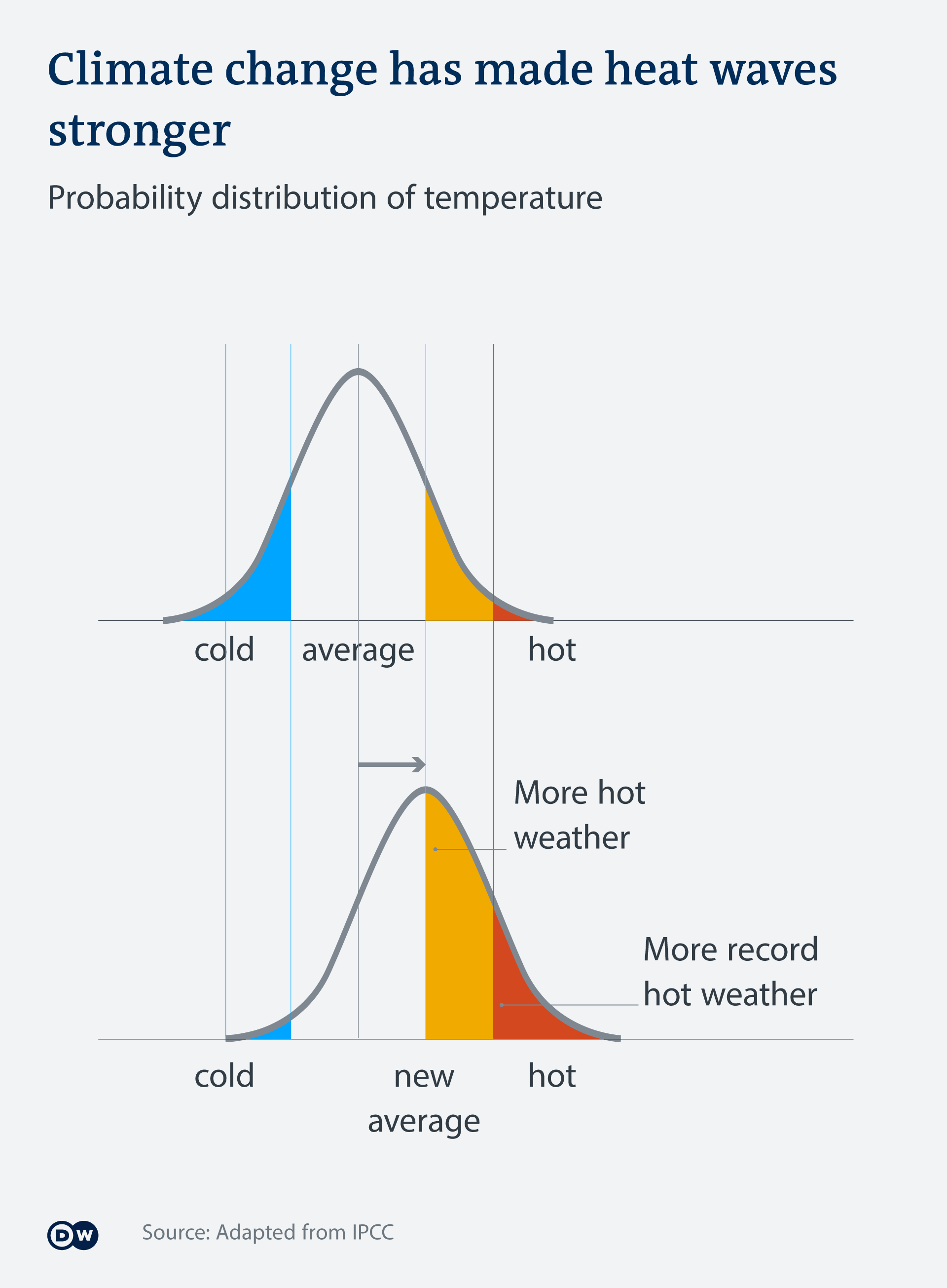
One of the major misleading claims being pushed by The Climate Team and the various climate propaganda cabals is the “general mantra that has emerged in this area of climate science: “A small change in the average means a large change in extremes.” (see also here and here).” Patrick Brown at The Breakthrough Institute wrote about the issue recently in “Effective Climate Communication on Extremes Should Not Sacrifice Clarity in the Name of Persuasion”.
This mantra is supported and promoted with images such as these (there are quite a few, readers can just scan down through them, but should notice the obvious differences):


Pretty convincing, isn’t it? That’s the problem – it is convincing without being true.
What does the temperature distribution of a real weather station look like? I picked one at pseudo-random from the National Centers for Environmental Information feature called Daily Summaries map. I choose a station near the center of the United States – Atlanta Missouri, station code: USR0000MATL. I downloaded daily summaries (including TMAX, TMIN, and TAVG ) from August 2003 through August 2022, nineteen years, and, after removing the error codes in the TAVG column (values of 600 and 599) and converting values (listed in tenths of a degree C) to degree C with decimals [ 241 to 24.1°C ] had MSExcel create a histogram of the values. I use a histogram, an “approximate representation of the distribution of numerical data”, with 2 degree C bins to clearly illustrate a real world example of the distribution of temperature data.

We are interested in hottest of the hot summer days. In 19 years, they have seen only 15 days with an average above 30°C (86 °F)…less than one day a year.
Let’s compare this actual station data distribution, above, to the theoretical “normal distribution” used by the climate enthusiasts in their graphics at the beginning of the essay —

Not a very good match is it? Not sure, page up to see the normal distributions used in the propaganda messages which all look like this. (image on left)
Seems right to the folks on the street, if they are not paying close attention.

This is the dw.com version, shifted to show “small increases in the average”. But what they show is moving the whole distribution a full 20 to 25% to the right. They fail to mention that this eliminates almost all very cold weather – but that wasn’t their point. The Climate Central folks use the same trick – shift the average a full 25% to the hot side.
If we are talking the 1 °C that is claimed for Global Warming in the last 100 years, this is what happens to real station data:

What changed when we added one degree centigrade to each and every daily average? The whole shifted to the right, to the warmer side. The long-term (all daily values) average also increased by 1 degree.
How many extra hot days – extreme hot days? NONE
Before the small increase in the average, there were 15 days above 30 °C (86 °F) only one of those above 33 °C (about 90 °F).
After the small increase, there were would still have been only 15 days (out of 6860 days) with averages above 30 °C and still only one above 33 °C, still less than one per year.
Why? Two reasons: 1) a small change only produces a small change in linear systems like daily average temperature and 2) the shape of the real distribution looks like real temperatures in middle America and nothing like a normal distribution.
Summer days average between 21 and 29 °C (70 and 85 °F) with very few really hot days, with averages above 31 °C (88 °F), only 15 out of 6860. And, visually, Spring, Fall and some Winter days average 0 to 20 °C in about equal numbers. The cold days, 0 down to -21 °C far outnumber the hot days.
Long fat tail on the cold side, short steep tail on the hot side. Increasing the average by 2 °C doesn’t change the result very much…and the effect depends entirely on were one draws the line (in degrees) between hot summer days and extremely hot summer days. The hotter days are still only increased a single additional degree.
Looking at Tmax and Tmax+1, we see a slightly different shape, but similar overall pattern:

Very few (27 out of 6860) hot days greater than 37 °C (99 °F) for the 19 years shown (about 1.5 days per year) and when the average is increased by 1 °C, the same number of days (still about 1.5 days per year over 38 °C or 100 °F) but a highest temperature of 42 °C (107 °F), one day in 19 years.
To create a change that would be important to the people of Atlanta, Missouri, a big change in the number (or temperature) of hottest days per year, the daily average in Atlanta, Missouri would have to shift about 6 °C to the hot side; thus moving the taller column of 27 to 29 °C over into the 33 to 35 °C range and a similar shift of the Tmax hottest days into the high 90s and low 100s.
Bottom Line:
Looking at the real distribution of daily temperatures at a actual weather station, over a period of 19 years, we find that a small change in the average temperature causes only a small change in hotter days.
Small changes in the climate averages do not produce large changes in temperatures.
Temperature averages are not normally distributed.
# # # # #
Frequent readers will know that I don’t think temperature averages are quite proper for evaluating climatic changes, even short term and local. Here I use a long-term average only to follow the conventions of CliSci and to illustrate the falsity of their meme.
A better way to look at temperatures, in my opinion, is to look at Tmax and Tmin shown on the same image. It is acceptable to show Tavg ( Tmax+Tmin/2 ) as a visual tool, though it is not particularly meaningful as it does not translate into the temperature profile of the day, which would be far more informative. Here is the year 2004 for Atlanta Missouri:

We see that Atlanta had a late December week-long thaw that year, which then dropped back into very cold temperatures -10 to -20 °C. An “Annual Average” would have missed this potentially agriculturally important fact.
# # # # #
Author’s Comment:
Philosophically, the problem is the climate enthusiasts have pretended that the “climate average” (of any metric) is random normally distributed data. As in “A random variable with a Gaussian distribution is said to be normally distributed, and is called a normal deviate.” There is no scientific reason to believe that is true, the evidence is to the contrary, and yet they use it to try and make a [false] point about changing climate.
Only in non-linear dynamics, in which systems can exhibit sensitive dependence on initial conditions, do we find small changes producing large changes. For general climate temperature, the reverse is suspected, that is that temperature may exhibit uncanny long-term stability with variability that is self-similar over different time scales.
Start comments with “Kip…” if addressing me.
Thanks for reading.
# # # # #
Kip very informative article
Roy Spencer has previously stated that adding 1-2 degrees could create the extreme outcome of extending the use of his swimming pool by 1 to 2 days per year.
Waza ==> Here in the Northeast U.S., an extra day in the pool is important — we get only about 60 days of nice hot summer (by then, we are sick of it).
Kip,
Thank you so much for addressing this. We’ve had an absolute tsunami of this type of drivel in Britain (from the likes of the BBC, Sky TV etc) of late after what, for us, was a long warm summer inclusive of a July heat bomb producing a 40C “record” (if that is to be believed – much of the data quoted hysterically by the media is at massively UHI’d sites like Heathrow Airport). Worse, we are still getting this garbage thrown at us to “educate” us on a daily basis.
I make two points (based on other people’s work):
1) (I think from Cliff Mass) a 150 year increase of 1 to 1.5C (or K) in total cannot possibly drive a 15-20C extremely short term anomaly. The latter is just a weather perturbation and cannot be scientifically linked to the former.
2) (I think from Paul Homewood) what warming we have had in the U.K. has tended to be strongly biased toward lower end figures – Tmin if you will. So, broadly, it’s the lowest day-time to seasonal temperature averages that have been raised, not the day to seasonal average highs. So, very slightly warmer nights and very slightly warmer winters, on average. My point is this – these studies of the data give no validation whatsoever to the oft-repeated claims that high temperature “extremes” like our 40C are clearly the result of the “climate emergency”. The highest temperature averages are not showing an upward trend (except possibly in UHI affected sites but most of the worst ones have been removed from the more sensible records such as the CET anyway).
Keep up the good work!
The coming climate crisis propaganda is not scaring people as much as in the past 50 years. The only way to claim the climate crisis is already here, is to claim every bad weather event is a climate crisis. Bad weather is now climate. Good weather is just weather. The worst heatwave “ever” is announced with hysteria and panic. The truth is it was the worst heat wave since the last worst heat wave. But scary headlines seem more important than climate history. And the average IQ is 100.
Actual global warming since the 1970s has reduced the temperature differential between the Arctic and the tropics of the Northern Hemisphere = more moderate weather in the Northern Hemisphere.
Kip and Richard Greene (Richard you got the picture right)
“A small change in the average means a large change in extremes.”
I find it always interesting to try to look behind the statements made to ‘see’ what motivated the statement. I know it is bad manners to assign motives in a discussion in science (taking out the person instead of the argument sort of thing). However, when there is desperation to convince people of your position, then the reason is bigger than the statement itself! In high stakes poker, this part of the play is the ‘tell’.
The ‘tell’ in the failing mainstream consensus science statements these days
is so strongly telegraphed, that what is behind the statement is even to be found IN the statement! Read the statement above in quotations and tell me what is really on the mind of this player.
Proof that alarmists are math-challenged.
Average is average. It does not identify a range. Different ranges of temperatures can have the same average. Slight changes are simply noise or evidence of overall cycle change.
Yes! An average or mean tells you nothing about anything. Look up statistical descriptors. They are things like variance, skewness, and kurtosis. They tell you what the shape of the distribution looks like.
I think it is simply amazing that climate scientists forebear quoting these descriptors. They keep people in the dark about what means are describing for a reason or because they are ignorant. Either one doesn’t speak well of the quality of science.
When one accounts for traumatic brain injuries from vehicle crashes and combat, brain cell destruction from alcohol and recreational drug overdoses, and inevitable senility of aging, the average IQ of adults is much less than 100.
drivel (noun) (archaic) Saliva, drool.
A tsunami, indeed.
I recommend item 3) The rise in CO2 followed the rise in (some regional average) temperatures. When not ignored this simple fact is vociferiously denied by the sainted givers of scientism, as they are right to do. Were they to accept it, the narrative would be that an increase in frequency and severity of weather events is in fact caused by minor, infrequent, upward variatons in readings in a small subset of weather monitoring devices.
I have plotted the sales of ice cream and temperature and have noted a correlation between them. Maybe ice cream is the real control knob we are looking for 😉
I have noted a correlation between the sale price of rock salt and the frequency of icy road vehicle accidents. We should get a grant and create a model. Icecream -> hot ; “sidewalk melt” -> cold. Climate solved.
If you and derg get a grant for a proposed study involving ice cream, I’ll work as a lab assistant free of charge.
Oh and Kip, good work as usual.
The correlation is spurious. Clearly, ice cream causes senility in aging presidents.
All attempts at attributing extreme hot weather give the same results: the observed trend actually EXCEEDS the predicted (models+statistical analysis) trend by a wide margin, as is the case with the recent two day extreme ‘heatwave’ in the UK. So even assuming a normal distribution of temperature and a relatively large extreme value shift due to increasing mean global temperature, it still does not account for the observed increase in extreme temperatures in Europe and elsewhere. Something else is going on: I suggest land use changes, increasing urbanisation and a change in meteorological circulation patterns. I wrote about the recent attempt to attribute the the 40C+ temperatures recorded in July in the UK to climate change here:
https://jaimejessop.substack.com/p/uk-heatwave-attribution-ii
Jaime Jessop ==> Thanks for the link to your substack post. Weather event climate change attribution studies are ALL nonsense.
An excellent article that everyone should read. If typical of the author’s work, his substack account will be very good
Climate and Covid seems to be a strange combination
How about a free link to a Covid article in payment for my complement?
R Greene
Resident Cheapskate
You want a complementary link in return for your compliment? Correct spelling might have helped.
Ian ==> Yes, I believe you are right. Remember, increased human development always leads to warmer nighttime temperatures, as concrete and houses, and roads, and buildings and runways (ad infinitum…) absorb heat during the day and release it slowly into the air at night. (at local levels, the first few meters of atmosphere). Far more than pastureland or forest.
And tall buildings reduce the view factor of the cold sky from ground level, thus leaving ground temps warmer due to radiative effects alone…plus tall buildings cause turbulent air to reach ground level which also detracts from the nightime temperature inversion effect…and we build taller and more buildings continuously.
Ban all buildings to fight global warming !
Right after Nut Zero
But UHI only affects the 1% to 2% of the planet where most people live, although a higher percentage of weather stations.
And data indicates that the temp rise is minimum night time temps not day time peaks.
Do other stations have similar curves to this ? the curve shape is interesting to say the least
Global warming since the 1970s was mainly in the upper half of the Northern Hemisphere, mainly during the six coldest months of the year, and mainly at night (TMIN). Think of warmer winter nights in Siberia = good news!
All details hidden by the use of a single global average temperature
It’s a form of meta-stable distribution you have two main states one with sun, one without 🙂
Very observant, LdB. Try making an average daytime and average nightime Trenberth-type diagram to get a real eye-opener….
H B ==> I thought so too. If someone has the time, I’d like to see the same histograms for a lot of different stations in different climate zones.
I made the claim that global temperatures are highly skewed with a long, fat tail on the cold side in this article:
https://wattsupwiththat.com/2017/04/23/the-meaning-and-utility-of-averages-as-it-applies-to-climate/
You may see a blank space where the temperature distribution figure is supposed to be and will then have to click on it to have it display.
Clyde ==> This should also address Steve Mosher’s fake point.
Thanks for linking to your post and the graph. It is surprisingly similar to that of Atlanta Missouri (2003 – 2022).
Well at 1 AU distance from the sun, sunlight which isn’t magnified can only reach a certain
temperature. Magnified sunlight melt brick.
The problem is that Venus surface exceed how hot the sunlight can heat something.
Anyhow in insulated box with transparent top one can get temperature of about 80 C.
A car with window rolled up, can also get hot surfaces and hot air.
This can described as preventing convection heat loss.
And solar pond which a salt gradient also prevents convectional heat and water under the
surface of solar pond can likewise reach the temperature of about 80 C
Now any warm summer day can heat a sidewalk up to 60 C. And in very warm day, the sidewalk can heated up to around 70 C, because warmer air prevent convectional heat loss.
But anyhow we live in world which has surface which mostly ocean and unlike a sidewalk and ocean surface temperature is limited to the highest temperature of about 30 C.
And since 70% of Earth surface is ocean, the ocean surface temperature determines global average surface temperature.
But point is there are limits of highest possible temperature due to the distance from the sun.
And Venus appears to violate the rules.
And everyone say Venus has greenhouse effect. And it doesn’t- unless very sloppy about
what greenhouse effect is.
Earth is mostly heated by sunlight at the surface, Ozone heating is in upper atmosphere, but this small part of what warms Earth. And Venus is not heated at it’s rocky surface and only heated in it’s upper atmosphere.
Venus has different mechanism of warming it’s surface. And different than the greenhouse effect of Earth.
One could imagine that Earth could be warmed like Venus. But I would say that is impossible
at Earth’s distance from the sun.
I would say that most people don’t understand why Venus surface is so hot and and they fail to understand how different Earth is compared to Venus.
So I have a challenge, what would Venus surface temperature be if Venus was 1 AU distance {Earth distance] from the sun?
I would say that Venus wouldn’t have greenhouse effect and therefore it’s surface temperature would be colder than Earth surface temperature.
Or, if you use a solar shade to block sunlight reaching Venus so it only gets as much sunlight as Earth gets from the sun, Venus would become colder than Earth.
Whereas people wrongly assume Venus has a stronger greenhouse effect [which similar to Earth’s greenhouse effect] as compared to Earth’s {which is wrong, rather it’s a different kind
of greenhouse effect}.
There are so many unanswered questions about Earth’s climate, and you are concerned about Venus? Why?
Well I think unanswered questions about Earth, are best resolved by exploring our Moon and then Mars.
And also think Venus orbit is important to explore Mars and would important if we were ever have settlements on Mars.
But Venus has been a focus of global warming and I think early robotic
exploration Venus is directly connected to global warming.
The Discovery of Global Warming
In the 1960s and 1970s, observations of Mars and Venus showed that planets that seemed much like the Earth could have frightfully different atmospheres. The greenhouse effect had made Venus a furnace, while lack of atmosphere had locked Mars in a deep freeze. This was visible evidence that climate can be delicately balanced, so that a planet’s atmosphere could flip from a livable state to a deadly one.
https://history.aip.org/climate/Venus.htm
–Global warming was not what Hansen set out to study when he joined NASA in 1972. The Iowa native studied Venus—a planet with a runaway greenhouse-effect run—when he got interested in Earth’s ozone hole. As he created computer simulations, he realized that “this planet was more interesting than Venus.”–
https://phys.org/news/2018-06-james-hansen-wasnt-global.html
I am not sure if Venus ever had runaway greenhouse-effect. But that is a common assumption.
I am not even sure how Earth formed, but tend to go with the idea that our Moon was formed by very large impactor hitting Earth.
I think interesting aspect about Venus is it’s global wind which effective gives it’s upper atmosphere a day of 4 to 5 earth days- otherwise the venus rocky surface has very long day- apparently Venus has the slowest rotation of any known planet.
Though as we find more planets and get better observation of them, that should change in the future.
And it seems to me this somewhat fast rotation of upper atmosphere is connected to a “runway effect” and it seems if Venus gets less sunlight this global wind would slow down.
See the NASA fact sheets for Venus and for Earth. They explain that…
But facts mean nothing to climate alarmists. See the claims that Earth might experience a runaway greenhouse effect Just Like Venus!
https://fabiusmaximus.com/2016/07/07/stories-climate-doom-shape-public-opinion-98147/
IIRC, the point in Venus atmosphere where the pressure is about 1 atm, has a temperature much as the one on Earth’s surface.
Therefore the atmospheric pressure is the main, or probably only, driver.
Why Venus’ atmosphere is so dense is unknown, but it was attributed at that planet having no plate tectonics
Good article on an important subject.
What does climate change mean concerning the local weather where people live, rather than an average temperature that no one lives in. Answer: Not Much.
Here in SE Michigan our winters are not as cold as in the 1970s. Good news, Easy to notice because we have lived in the same home since 1987, and shoveled snow off the driveway manually for all 35 years. So little snow this year, the lowest ever, that I “let” the wife shovel our 100-foot driveway — only required three times. At age 72 she claimed it was great exercise. I retired my snow shovel, claiming too high a risk of a heart attack from the effort. I also admit to being a lazy retired bum — the snow will melt in the Spring, so just leave it alone, is my theory.
As the US climate warms:
COMING CLIMATE CHANGE CRISIS PROPAGANDA IS SO EFFECTIVE THAT IT PREVENTS MOST PEOPLE FROM ENJOYING TODAY’S WONDERFUL CLIMATE.
U.S. HURRICANES MAKING LANDFALL HAVE BEEN IN A DOWNTREND SINCE THE LATE 1800s.
MAJOR US TORNADOES HAVE BEEN IN A DOWNTREND SINCE THE 1950s.
US HEAT WAVES, DROUGHTS AND FOREST FIRE ACRES BURNED PEAKED IN THE 1930s.
THE 1930s STILL HAVE THE MOST US STATE MAXIMUM HEAT RECORDS OF ANY DECADE, BY FAR.
We should be celebrating our current climate, not fearing the future climate
Today is the last day of August and where are all the Atlantic hurricanes, eh?
Atlantic hurricanes have disappeared due to climate change, which is evidence of a climate emergency, that can only be prevented by building more windmills and solar panels, and driving electric cars. And don’t you forget it.
Source:
Scientists say, including Al “the climate blimp” Gore and John “why the long face?” Kerry
If we only had 2 this year and 5 next year, next year’s headlines would read “Hurricanes Up 250% due to Climate Change”…
Biggest increase in history
Proof of climate change
Think about 0 this year and 1 next year! Infinite increment!!
Now they’re claiming that the lack of hurricanes to date are a result of climate change. A quote from the following article from Trudumb’s propaganda arm…”He says climate change may be playing a part in the reduction of the number of hurricanes.”
https://www.cbc.ca/news/science/hurricanes-weather-no-named-hurricanes-yet-august-september-nasa-sahara-winds-1.6567049
Tomsa ==> The frequency or numbers of Atlantic Hurricanes (note: they count “tropical storms” but hurricanes can be separated out) is not a function of overall climate change — I don’t think. Living in the Northern Caribbean on our rather small (42 ft) sailboat for 12 years made me very aware of hurricane during that period. General warming may act to reduce the number of tropical storms.
“the shape of the real distribution looks like real temperatures in middle America and nothing like a normal distribution”
No, it doesn’t. It looks like a binned distribution, which is what it is. The real distribution would have a tapering tail, just as the normal does, and that is what matters here. Your artifice of binning in 2° blocks has nothing to do with reality. And it is the binning artifice that underlays your claim that a 1° shift doesn’t make more hot days. That is because it doesn’t take you out of your artificial bin.
Obviously a 2° shift takes you to the next bin – ie 14 days in the 32:34 range instead of 1.
Isn’t this the wrong way to put it?
A one degree shift in the average cannot cause anything, neither rises in the number of extreme days nor falls. The one degree shift is itself a function of the change in temperature readings, whether at either extreme, in the middle, or uniformly across all.
The question is not whether the 40C temperatures in the UK in July was due to rising average temperatures. It cannot have been, that is not a thing that can cause anything.
The question is whether those temperatures were sufficiently rare in the historical record to be evidence that something has changed in the climate so as to make such events more common in future.
I am not seeing why the fact that the average temperature has risen by one degree since (eg) 1950 should justify the inference that temperatures of 40C will be more frequent in future, and don’t think its a valid argument. To start to make the argument, you would have to show that the rise in average temperatures was mathematically due to higher extreme temperatures. In fact however it seems to be due to rising temperatures at the lower extreme.
So why should a rise in temperatures at the lower extreme be thought to cause episodes of very substantial rises at the higher end? You’d have to show some causal mechanism to make this plausible. Is there one?
The 40C temperatures were definitely unusual. We know what caused them, it was the combination of a blocking northern high and a strong southwest low, which drew hot air up from the Sahara. To make the argument you have to show what caused this combination at this strength, and relate it in some way to the rise in CO2 levels. I don’t believe it has been or can be done.
Similarly Pakistan. One hears and reads that the extreme floods in the last month are due to climate change. The argument seems to be that the high temperatures earlier in the summer were unprecedented, and that the current monsoon is also unprecedented in amount of rainfall.
Therefore, the argument goes, the extreme rainfall must be due to something called climate change, by which people seem to mean that its due to a rise in average temperature of about 1C.
In that case, why did it not happen last year or the year before? And again, what exactly is the causal mechanism? I can see that if the air over Pakistan is warmer, then it can contain more water vapor, and that can lead to more rainfall. What I cannot see is what is thought to have caused the heat wave in Pakistan. Its not the small rise in average global temperatures. What is it?
“To start to make the argument, you would have to show that the rise in average temperatures was mathematically due to higher extreme temperatures.”
No, the argument is that weather is a variability superimposed on climate. Circulation patterns cause winds to blow sometimes from N, sometimes S, sometimes maybe from Sahara. If the base climate warms by say retaining radiant heat, then there is no reason to expect that pattern of variation to change much. So the whole distribution slides along, as Kip has it.
Yes, understand that, but surely that is the question.
Is the rise in the average caused by all temps rising uniformly by the same amount?
If so, we would indeed expect the distribution to slide to the right, and that will lead to more extreme heat episodes.
But if the rise in the average is caused by warmer lower temps, then we would not expect that at all. We’d then expect a succession of warmer winters and no increase in frequency of hotter summers.
This is an empirical question, its what the underlying observations are which lead to the rise in the mean. Everything I have read suggests that the rise in the mean is not caused by a rise in summer temps, but by a rise in winter temps. I haven’t come across any argument or evidence that the rise in the mean is due to uniform rises across both highs, lows and middles.
Maybe there are such studies. It would be interesting to get links.
If the rise is mainly in low temps then you would not expect any increase in frequency of hotter summer temps. In the case of the UK, I don’t see any evidence that there is any general increase in temperatures. Paul Homewood occasionally posts charts to this effect.
So the explanation of the recent UK heat wave cannot be that the same weather phenomena have happened, but against a higher background temperature, so leading to higher highs. It must be just that unusually strong and persistent southwest low and northern blocking high have coupled with unusually high temps in the Sahara.
But what has caused this? I don’t think anyone knows. To claim that its ‘global warming’ or ‘climate change’ without a causal mechanism is just arm waving.
“ It would be interesting to get links.”
The Met Office has a page here where you can draw graphs of max or min, for UK, England, Wales etc for any month or season. Here is UK summer Tmax. It has been warming at about the regular rate.
Do they have a data set that separates urban from rural stations? Are the urban stations getting hotter while the rural stations are not?
Looks very much like the old UHI again.
nick ==> Your graph compares the Tmax of the Little Ice age in the UK with today. Truthfully, I think the Brits are glad to have that little bit of increase in temperatures.
… and it really is only a little bit as any sane person that lives there will tell you.
CB ==> You know full well that the left half of the graph is guess-work, maybe +/- 2 degrees.
But yes, I suppose the multi-generational population is thankful for the warmth in present days.
Why did you not also show Tmin so that readers could confirm your claim?
BEST global temperatures show that warming rates vary over time, but that generally, Tmin has been climbing faster than Tmax.
http://wattsupwiththat.com/2015/08/11/an-analysis-of-best-data-for-the-question-is-earth-warming-or-cooling/
See Fig. 2, especially between about 1890 and 1990.
I gave a link to the Met Office page where you can generate any such plot (where mine came from).
The onus falls on the shoulders of the person making a claim to provide evidence for its validity.
The main reason for increasing mean maximum temperatures for the UK Summer is below.
Higher temperature years are associated with higher duration of sunshine.
“If the base climate warms by say retaining radiant heat, then there is no reason to expect that pattern of variation to change much.”
That from a man with a whole page on strange attractors 🙂
“a man with a whole page on strange attractors”
I wrote it for people who are strangely attracted to my blog.
Not me sorry .. I made the mistake of following several links you have posted over the years and just rolled my eyes at the stupidity.
Given you had played with classical chaos examples it is amusing you don’t see the problem with your statement. Like much of climate science as the result is “right” never stop to question the premise.
Kip I personally think you should have anticipated this line of attack.
Sqrt method would give you 83 bins of 0.67 degree width – a joke when you consider the precision of the measurements
Sturge’s method would give you 9 bins with a bin width of 6.22 degrees. 2 degrees therefore seems quite sensible. But you could repeat the analysis with 1, 4 and 6 degree bins to see if it makes any difference and shut up idiots like Nick, I would.
It might be interesting to see Summer and Winter distributions separated because that would reduce the SD and steepen the curve shape.
In fact it looks like some form of power law, which makes sense for a chaotic phenomenon like weather.
andic ==> “this line of attack” is just attacking an unwanted reality. I have posted the 1° bins version here somewhere in comments. It can’t change the shape because changing the shape would require changing the reality.
These temperature averages are accurate to +/- 0.5 degrees. 1° bins are therefore a little too narrow as they ARE the uncertainty.
One of the points is that the shift shown by alarmists such as yourself is up to 25%, not one or two degrees. And binning isn’t that large an issue, especially as the bin size isn’t that far from the resolution of the long term record.
Duh, Stokes has no idea how a histogram is constructed.
Nick ==> You’re welcome to look at the single digit binned histogram, it does look any different than the 2 degree bins — just the columns are narrower. It is not the bins that make the physical reality — it is the reality. A 1° shift produces only a 1°shift, and the “number of days over x°”stays the same.
Kip, binned distributions are not the reality. At best they are a sampled version of it. The key thing is the slope of the distribution near the leading edge. That is what determines the response of frequency to a shift. A binned distribution makes no attempt to represent slope. It sets it to zero, with occasional excursions into being infinite. To do this analysis you need some approximation to the distribution that has continuous slope.
Incidentally, talk of a normal distribution in this thread is a red herring. No-one said it has to be normal, and it doesn’t. The authors used a normal just for illustration. All that matters is the slope of the leading edge of the distribution, which may vary rapidly.
ROFL lucky you aren’t in particle physics and try to tell them it isn’t reality 🙂
You can argue there are problems with bin sizes but arguing it isn’t reality is actually really funny.
Please stop posting.
Agree that the bin size makes a difference, but that’s no how ye make a Normal distribution.
It would be interesting to see if the distributions for, say, Melbourne, Brisbane and Moree are similarly skewed.
Normal distribution has no role here. The key is the behaviour of the slope near the leading edge. That is what determines how the frequency changes with a base temperature shift.
A histogram gives a very poor representation of slope.
I probably should have read more of the comments before clicking “Post”.
Actually, the distribution does make a difference, because this particular distribution has a far steeper leading edge than trailing edge, so right-shifting it will have more of an effect than left-shifting.
You’re quite correct that aggregation such as a histogram loses fine-grained information. The closer to actual resolution the better.
The misconception comes from the Central limit theorem
Central Limit Theorem (CLM, a cornerstone of statistics) states that as long as a distribution has a finite/stable mean value and a finite/stable variance, as the number of samples from that distribution increases the distribution of the mean of the sample becomes normally distributed.
People always misunderstand it simply says the mean becomes normally distributed not the data itself. There are also distributions that totally fail CLM a common one is cauchy distributions. The number of times Nick Stokes has fallen into that hole is funny.
And we should add, “climate” data ARE NOT SAMPLES of the same distribution. Data collected as a time series DO NOT belong to the same distribution.
…
… unless one considers climate as a fixed, immutable object with NO EVOLUTION, with NO external disturbing influences.
I think the opening of that Wikipedia entry for the CLT is longer but clearer than LdB’s summary:
”In probability theory, the central limit theorem (CLT) establishes that, in many situations, when independent random variablesare summed up, their properly normalized sum tends toward a normal distribution even if the original variables themselves are not normally distributed.
“The theorem is a key concept in probability theory because it implies that probabilistic and statistical methods that work for normal distributions can be applicable to many problems involving other types of distributions.”
Perhaps Kip or someone else with a deep knowledge of statistics can explain the applicability of CLT to Kip’s post.
Larry ==> I have denied being a statistician many times. But, temperature is not, ever I believe, to be considered an independent random variable. It is simply a spot measurement of some specific place at a specific time.
I’ve always considered it to be the product of a series of changing variables in that specific place and time. A rough indicator to how the variables change over time but not really a measurement of any of the variables.
^^^^ THAT and it has lots of locality to it because geography and natural influences make massive differences. 2 sites just a few kilometers away will have vastly different temperatures based solely on those factors.
10 feet distance can make 10 degrees F difference (maybe more) through different environmental variables with no artificial heating or cooling elements.
As comedian Demetri Martin once observed: “Every room is at ‘room temperature’.”
Be careful about what wiki is saying.
Although it says “independent random variables”, it is actually talking about the distribution of singular random variables, which may or may not be normal. If the distribution is not normal (or at least identically distributed) the CLT may imply that the sample means will cluster around a mean, but that mean may be meaningless. A bimodal distribution (northern hemisphere plus southern hemisphere temps) may have a mean but what does it tell you?
None of this addresses the uncertainty of the mean the sample means cluster around. That mean may be *very* inaccurate (i.e. lots of uncertainty) even thought the standard deviation of the sample means may be small.
““The theorem is a key concept in probability theory because it implies that probabilistic and statistical methods that work for normal distributions can be applicable to many problems involving other types of distributions.”
This is *very* misleading. If a population is not a normal distribution then the mean and standard deviation are not good statistical descriptors, no matter what the CLT may imply. The 5-number statistical description should be used with non-normal distributions, minimum, first quartile, median, third quartile, and maximum.
From the Britannica:
”Central limit theorem, in probability theory, a theorem that establishes the normal distribution as the distribution to which the mean (average) of almost any set of independent and randomly generated variables rapidly converges. The central limit theorem explains why the normal distribution arises so commonly and why it is generally an excellent approximation for the mean of a collection of data (often with as few as 10 variables).”
https://www.britannica.com/science/central-limit-theorem
Just remember that the IID requirement applies to each random variable, i.e., each sample drawn from a population. If each weather is considered a sample, then the annual average becomes the sample mean. Does each station meet the IID requirement?
I was not expecting what I see here, but that might be because my mind was too busy rewriting the headline:
“Will isolated but very extreme weather events have a small, slight, third decimal point influence on the useless metric called Global Average Temperature?”
Only if it changes local temperature over an area wide enough to register on the “right” weather stations, I guess. And only for a day or two…
But as usual, Kip goes and points out the graph wearing no clothes, which is waaaay more entertaining!
cilo ==> The modern world doesn’t want to see Science without its clothes, only Hollywood stars.
What about all the assaults on high school girls’ locker rooms?
Kip… “Temperature averages are not normally distributed.”
But temperature averages are not meaningful, except as a hand-waving proxy for heat (Joules). That’s because temperature is an intrinsic property of matter and the world is composed of different materials, in different phases, is heated on one side and rotating.
Q.What is the average temperature of an iceberg, a lake, some water vapor and a large rock? You can add up the temperatures and divide by four but it doesn’t mean anything. Yet everyone (including “Scientists”) still does just this and treats the answer as though it were a real thing 🙁
gareth ==> I include my position on averages of temperatures near the end of the essay. . But the point of these “daily averages” is just that they are used in CliSci and are an indication of the generalized temperatures of the day-to-day weather. Shifting the temperature of the day-to-day temperature 1 of 2 degrees just does not create lots of more extreme temperatures as claimed by the CliSci propaganda.
Agreed – and presumably a shift of n degrees in the “average” just results in a shift of a similar n in measured temperature of “hot” days. I.e. whereas previously there were x days above 100F/40c, there will be the same number x days above <old average +n>.
So, if “The Globe” warms by 1c you will see many more “Hot Days” because the threshold for “Hot” is unchanged. But, if you change the threshold of “Hot Day” by the same 1c, there might well be no increase in the actual number (x) of hot days. It’s just that what would previously have been a “Hot” day is slightly warmer, say 102F instead of 100F. And “Cold” days get just a bit less chilly 🙂
gareth ==> And, since many many more people die from being or getting too cold than from too warm, it is a good thing that the Earth seems to have come up out of the Little Ice Age.
Kip,
Using “pre-industrial” temperatures as the golden age to which we should return is a wonderful example of the Big Lie as a political tool (first described by AH) and the Left’s effective use of their “information dominance” (first described by the US military) – allowing them to lie with impunity.
Kip,
Thank you for this. It partly overlaps and strengthens Part Two of my series on uncertainty, which is being considered by WUWT mods as I write. You sure have found some doozy distributions.
Elsewhere, I have studied 8 of the larger Australian cities with long years of weather records to see what heatwaves do. The link below shows the top 40 hottest 5-day Tmax heatwaves each year. Against better judgement I have added a linear best fit to save eyeball wear. The question I test is this: Australia is alleged to have warmed 1+ deg C over the last 100 years. This baseline change should make heatwaves progressively hotter as we near the end of that 100 years. These graphs DO NOT show that effect. Overall, these 7 out of 8 of these stations show a cooling of the hottest heatwaves over time.
Can anyone create a more convincing test?
Geoff S
http://www.geoffstuff.com/eightbyfive.xlsx
Geoff ==> Thanks for the link — interesting. Each area seems to have its own “upper limit”.
To be clear, these are five-day long periods being compared?
Yes, 5 consecutive 5 day periods in this example. I also did 1, 3 and 10 day cases. The outcomes are noisy, sometimes you find odd misfits to the generality, but as you can see, there is no case for Australian heatwaves to be getting more extreme as shown by this set of graphs.
Published papers that claim the opposite are commonly cherry picked for complex definitions of heatwave and commonly for start and end dates and sometimes with adjustments that suit. It is a swamp.
Here is the full set of 128 graphs. Pls be patient, download can be slow.
http://www.geoffstuff.com/eightheatwave2022.xlsx
Geoff S
Kip,
Thank you for posting this.
It overlaps a little with Part Two of my WUWT article on uncertainty, which the mods are considering now. You sure have found some doozy temperature histograms.
Apart from that, in studies of heatwaves in 8 Australian cities, I have looked for. Increased extremes that might, in theory, become warmer because of the underlying alleged 1+ deg C of national warming over the last 100 years. There is a little support at 1 of these 8 stations, but the absence of such an effect at the 7 other stations is compelling. In some cases the heatwave maxima each year are even getting cooler over time.
My bad. Please skip the second comment which was the start of a draft.
Might add, though, that many heatwaves form in inland desert areas then can move under prevailing weather system to the weather station being studied, often a seaside one in Australia. So, it is false to imagine the heatwave being closely related to the statistics of the station. You can see this on the graphs I just posted. Melbourne and Adelaide hottest heatwaves are hotter than Sydney and Brisbane but are far further from the Equator. The heatwaves blow in from Alice Springs way, in the desert centre.
Heat is not a problem if summer temperatures go up say by 5C as long as there is a good source of water. Plants flourish with adequate water and heat. Cold is what slows down growth. Water is also not a problem if we move the surplus in wetter areas to drier. If the Romans could build aqueducts two millennia ago with modern technology and insights there is no good reason we cannot provide adequate water to hot dry areas – indeed it is happening in many places.
NO. Your statement only applies to a reduced range of temperature (span and position of that range depending on the organism, biological process, etc.).
High temperature also reduces growth rates.
There IS such a thing as thermal death. At a smaller scale, it boils down (no pun intended) to irreversible thermal changes in biochemistry (metabolism).
That is why in biology too oftem we see the expression “optimum temperature” (of a process, of the growth of an organism,…). I avoid calling it “optimum”: it is a “maximum” of a process, most often we do not know if it is good or bad (for what?), nor its long(er) term consequences.
“Optimum temperature” means that when increasing temperature the rate of a biological process will also increase until a point (“optimum”) when a further increase in temparature has as a consequence a decrease of the rate of said process.
But:
In physiology, the reduction of rates due to lower temperature is a DIFERENT process than the reduction of rates due to high temperature: in the first case, most processes are REVERSIBLE, meaning that they can slow down but recover when the cold period ends, while in the second case (higher teperature) most processes are IRREVERSIBLE, meaning that a reduction of the temperature will not “restart” them.
It is good to look at a science text book and biological processes however we also need to look at the real world. Not only did I grow up in a hot semi-desert area but have visited other hot climate zones and seen the same thing – plants and trees flourishing because of having adequate water. The heat is tempered by breezes and rainfall. Higher humidity plays a role as does the type of plant or tree.
I believe that even if average temperatures were to increase by as much as 5C in certain areas that this would not necessarily translate into desertification of those areas. There are various mechanisms in nature that result in an equilibrium so that hotter in some areas does not translate into hotter in all areas*. Because we have such a complex weather system, I think many speculative models together with limited scientific insight into climate and weather confuse more than clarify the issues.
* From UAH satellite data there has been no linear warming trend for eight years for the planet and in Australia for ten years.
I agree with most; my comment was only a precision. I studied a lot the effects on living beings of temperature and humidity (well, actually as gross metrics for heath and water activity).
You are right when stressing the role of water: metabolism is biochemical reactions in water solutions: no water, ou low water activity, lower metabolic rates; the maximum is reached at very high values of water activity, so it is very difficult to measure the effect of “excess” water activity (a very diluted solution of nutrients reduces their availability for bacteria, for instance, and thus reduces their growth rate; in higher living beings it is more complex and so more dificult to observe).
I agree with your assertion that a small (5 C or less) increase in temperature in most of the world surface (and oceans) will as a rule increase biomass production, and will not be deleterious or catastrophic, as alarmists claim: that is also my “feeling” which I cannot substantiate scientifically (no direct observation and no stuy of the relevant literature concerning the growth/productivity with temperature consistently out of the “average” for a given location), the best argument that I can give is fruit production in the same orchards in diferent years, with a wide range of summer temperatures: yes, very cold (here, usually with cloudy sky, so also with less light for photosynthesis) will reduce productivity; and yes, higher temperature with adequate increase in irrigation will increase productivity.
But:
This should not be generalized: some tropical crops can be carried to higher and higher latitudes and go on producing well, but there is a latitude limit for their expansion (ex.: sugar-cane). The same for temperate/cold or “continental” crops (esp. fruits, i.e., long-lived, not only annual): they can be carried towards lower latitudes, but there are limits (higher temperature): see pears and apples, for instance: in my opinion (I must stress “opinion”, subjective) they are already off their geographical/climatic limits in the southern countries of Europe (south of Portugal and Spain, south of Italy, parts of Greece).
And yes, I agree with your last paragraph: diversity, a change in one place does not mean the same change everywhere, etc.
Joao
To adapt we need to measure regularly, observe closely and keep meticulous records. I noticed how some farmers by planting a row of strategically planted trees had an adjacent area that was frost free in winter. This helped with some crops. I also remember maize farmers who wanted to harvest dried kernels waiting till the first good winter frost. There is no reason for farmers not to benefit from all the insights and modern technology, not to fear climate change but use the weather conditions for their benefit.
Australia for 10 years:
http://www.geoffstuff.com/uahaug2022.jpg
Geoff S
Kip, I think this must be incorrect, or at least incorrectly phrased:
Better and clearer to put it as
Your basic point however, if I have understood it, seems correct. You can’t just assume a normal distribution, then assume that a change in the mean can only result from all values moving to the right. The value of the mean can change because lower values rise, or because middle values rise, or because higher values rise, or any combination.
The scientific procedure, confronted with a rise in the mean, would be to find out where it comes from. It seems that recent rises in the global mean temperature are due to rises in the lower temperatures and not due to rises in extreme high temperature readings. And that they are not due to a uniform increase across all temperatures.
You still have to explain why there have been the extremes of high temperature this summer. But whatever the explanation, it cannot be that a rise in the mean caused it. That is a result and not a cause.
michel ==> ah, an interesting point. I show the daily Tmax, Tavg, Tmin for every day of the year 2004. The Tavg vales don’t cause anything, they are nothing but an effect of averaging the Tmaxs and Tmins. But the details don’t affect the point being made.
If Atlanta Missouri generally warmed a bit (1 or 2 degrees), it would not cause a big change in Extremely Hot Days, as claimed in the CliSci meme being discussed.
Actually, the mid-range or median of the two extremes. I would prefer to restrict the term “averaging” to three or more samples, with or without weighting.
The Northern Hemisphere is undergoing greater difference in extremes of solar EMR. Right now is the lowest difference between July and January at 30N in the precession cycle. July average is 473W/m^2 and January 235W/m^2. Difference 238W/m^2
Go back 10K years and July was 509W/m^2 and Jan 216W/m^2. difference 295W/m^2 so almost 25% increase in difference relative to now.
The coming extremes are not that severe – July gets to 495W/m^2 and Jan down to 229W/m^2. difference 266W/m^2 about 10% increase in difference..
The Mediterranean and Gulf of Mexico are significant bodies in the North Atlantic and these will undergo noticeable change. The Med will experience increasing monsoon – maybe even real cyclones rather than the Medicanes. The GoM will see more cyclones and they will be inclined to travel further north.
The Southern Hemisphere is moving toward less extremes. Worst is past.
Since the members of these groups pushing these fake curves are allegedly scientists, what are the chances that they just didn’t know, that their allegedly scientific curve sifting was an honest mistake? For any mathematician and real climate scientist, it is ZERO. Yet none of their mathematicians and climate scientists aid a word. Yet they are basing governmental policy on this. Criminal negligence!!!
jimmy ==> Like many of the memes (not sure that term is right, maybe “talking points”) of CliSci propaganda are kind of theoretical with a illogical twist, like the one discussed today.
They say ““A small change in the average means a large change in extremes.” then make a BIG change in the average but only in one direction which produces a BIG change under the hot-side tail.
If they had shown a small change to warmer, there would be a small change under the hot-side tail.
It is just a propaganda technique built on a trivial truth — but turned into a lie.
Kip, great work! Chaotic weather has a far from normal distribution.
David ==> I was surprised by the specific shape though — and have to do some more thinking about the result.
I knew it would not be a classic normal distribution but really had no other expectations.
Why do you think the hot side doesn’t have a longer tail?
Why do thunderstorms tend to form during hot Summer weather? It may be related to Willis’ observation that it is rare for tropical oceans to get warmer than 30 deg C.
Clyde ==> I think w.’s observation is valid, I am not sure about his larger theory.
Ooops, Sorry Clyde, I wrote before I read your similar comment. My bad. Geoff S
Kip, I think it is some sort of power law distribution. A long tail and a flat nose. These are common in nonlinear dynamics. It may just be that the nonlinear negative feedback that keeps it from getting hot is faster acting than the one that keeps it from getting cold. The hot block is obviously very fast. I would say amazingly so.
You may have happened upon a major scientific question. First need to see if this pattern is widespread of course. A cool critter!
David ==> I like this : “A long tail and a flat nose.” If I get a sick day (forced to stay in bed) I’ll run a few more stations through the histogram process — then maybe we’ll see. I admit that this is a single randomly chosen station — a random sample of one — but no reason to believe it is exceptional in any way.
The exceptional thing is that there seems to be a temperature cap of some sort…..
“A long tail and a flat nose” – some kind of bulldog, perhaps?
Richard > I knew a young woman like that once…..a girl really. Grew up to be a truly beautiful woman.
Kip, before running more stations, you might need to do what is usual in cases like this and to select your data base so you have the fewest perceived factors influencing the distribution.
Like, start with daily data. Use Tmax or Tmin, not Tmean. Correct for seasons by using e.g. one constant week each year. Correct for rainfall by filters using rainfall data. Correct for days of the week using e.g. only Wednesdays. Correct for cloud cover using observed data. Correct for humidity using wet bulb data.
Finally, trash the exercise because you cannot adequately control for these variables and accept that you have a distribution that has limited use.
Geoff S
Geoff ==> But real station data (measured temperatures) as Tmax and Tmin And their artificial Tavg ( which is
Tmax + Tmin / 2
) all have factors that affect temperatures therefore affect their distribution. By restrict stations to artifical eliminations, then we have altered the real world distribution.
I have showed both Tmax and Tmin distribution as well – which show a similar shape.
I suspect, and please do not blame me, that you are pulling our collective legs.
The distribution I produced for this essay are not expected to be “useful”. They are illustrative, which is their purpose — simply to show that using all days over a 19-year period at one station produce a non-normal distribution.
David, Kip,
Why does the hot side not have a longer tail?
Over oceans, many times we see a sharp cutoff of 30 deg C. That stops a long tail on the hot side.
The mechanism likely is cloud and rain formation as Rick Willoughby and Willis and others are investigating.
I am now suggesting a similar mechanism that operates on land, but land does not have that big reservoir of water, so there a major difference.
In general, it is not uncommon for Nature to have mechanisms that limit. The human body has some.
“Why do you think the hot side doesn’t have a longer tail?”
My guess:
For any one station the temperature increases with insolation, clear skies, and still air. Energy is removed at night. The temperature extreme for a single episode is determined by the length of days the situation lasts but restricted (limited) by the nighttime loss.
A place near the Tropic of Cancer with greater solar intensity should show a higher maximum but a similarly shaped hot side.
That is something that can be examined. I have not done so.
John ==> I am going to look a few more stations, each in a different climate zone. I may be surprised but I doubt it. There is no scientific reason that daily temperatures should be normally distributed.
Just logically, it means that it gets colder for slightly different reasons than it gets hotter…the range of colder temps is wider than the range of hotter temps…something along that line.
I am uncertain why or two CliSci boosters insist that temps are normally distributed. It doesn’t add anything to the global warming/climate change story.
By ‘similarly shaped hot side’, I meant the flat-nose or bulldog face, as stated by Richard Page.
Sorry, if I wasn’t clear about that.
“I am uncertain why or two CliSci boosters insist that temps are normally distributed.”
A large part of this thread is based on this fantasy. They don’t. Nobody does that.
If the distributions are not normally distributed then the mean of the distribution is questionable at best, meaningless at worst.
If it isn’t normal then what is it? And what is the 5-number description of the distribution?
minimum, first quartile, median, third quartile, and maximum?
“If the distributions are not normally distributed then the mean of the distribution is questionable at best, meaningless at worst.”
Absolute nonsense. The existence of a mean is in no way dependent on being normally distributed.
But the histograms Kip is drawing are not of something that anyone thinks is even random, let alone normal. It contains a large periodic seasonal component.
“Absolute nonsense. The existence of a mean is in no way dependent on being normally distributed.”
I didn’t say you couldn’t calculate a mean. I said it is *MEANINGLESS* unless you have a normally distributed distribution.
Exactly what use is the mean of a multi-modal distribution?
If the mean and the median aren’t equal then what does the mean tell you?
The mean in a normal distribution gives you some measure of expectation for what the next value will be. The mean of a bi-modal distribution gives you exactly ZERO expectation of what the next value will be since neither of the modes have to have any members with values around the mean!
If you are an example of climate scientists then its no wonder the climate models are as bad as they are. Knowing how to calculate a mean is *NOT* an indicator of understanding what statistical descriptors are for or when they are applicable. You are apparently a perfect example of that truism.
I wonder how all species before us could suvive and thrive under such chaotic climate conditions that must have been the concequence of let’s say 2000 ppm CO2 ?
Rudi ==> I link to this very interesting (but dense and difficult) paper in the Author’s Comment section: temperature may exhibit uncanny long-term stability with variability that is self-similar over different time scales.
Chaotic systems can produce and enforce self-stability. I wrote about this phenomena in “Chaos & Climate – Part 2: Chaos = Stability“.
Dagsvik et al. found temperatures exhibit both stability and self-similarity, features of Chaos.
Yes, Kip, chaos is a powerful form of stability, maintained by strong nonlinear negative feedbacks that keep the system from changing too much. The ironic price if this stability is intrinsic unpredictability.
Temperature in some places can vary 50 degrees F in one day but not 200 in thousands of years. That is stable oscillation.
A favorite joke. Stranger asks the farmer “Think it will rain?” Farmer replies “It always has.”
David ==> I see that you do understand….sorry if I doubted.
“chaos is a powerful form of stability, maintained by strong nonlinear negative feedbacks that keep the system from changing too much. The ironic price if this stability is intrinsic unpredictability. ”
Ain’t that the way….
Did you get a look at the Dagsvik et al paper? Judith Curry tweeted about it. The link is in the Author’s Comment. (The paper is NOT easy reading….)
This is an interesting analysis ; It would be a good jumping off point for an expanded statistical distribution analysis using many stations & see how close they are or not to normal distribution
Jeff L ==> Totally agree. Anyone with deep R skills could do it in a day or so. (That would not be me, rudimentary at best). I’d like to see it too.
Kip, sorry, but I have to ask based on your previous writings, what exactly is average temperature? I understood you to say you cannot average temperatures. Make it simple so us dummies can understand.
Tom.1 ==> You have to actually read the whole essay, reading for understanding, then ask questions. The section just above the Author’s Comment addresses your issue.
I read this from part 2:
“But, but, but, but” ….. no buts!
One cannot average temperature
You supported this statement in part 3.5 with the ridiculous example that you cannot determine the average temperature of a cubic meter of air and a cubic meter of water by a simple arithmetic average. If you don’t really mean to communicate to people that you literally cannot ever average temperature, then you are doing a good job of hiding it.
Tom.1 ==> Either you really didn’t understand either essay or you are just trolling. Which is it?
When you press people on what they said, and they resort to cheap shot ad hominem, that’s your answer.
Tom.1 ==> ah, trolling.
Wrong again! If you have read my various posts on this subject, I am addressing your content not you. I have read over your part 2 epistle on this subject more than once, and nothing changes my mind. You start and end with the proposition that you cannot average temperatures. This is clearly wrong as an absolute truth as it’s presented, and I think you know that. People somewhat schooled in the basic physics of energy do not need to know what you had to say. Those that are not, are just going to hear the bit about you cannot average temperatures, period. Not helpful.
He is not denying that you can look at an average of numbers, but rather that such averages of temperatures have practical meaning (for, say, an energy balance calculation). The example of his, which you called ridiculous, is just a more extreme example of the phenomenon seen with land and oceans.
Averaging only temperature without regard to heat content works fine in many situations. If you have a continuous medium of reasonably constant physical properties, then the temperature is all you need to know. Temperature is basically energy content per unit mass. Q = m*Cp*(T – Tref). Averaging temperature can be very useful irrespective of how much heat is involved. We usually discuss temperature here in terms of warming of the air (atmosphere). We want to know as accurately as possible how much and how fast the atmosphere is warming. The amount total heat in the atmosphere will increase or decrease in accordance with the average temperature since the heat capacity of the atmosphere is relatively fixed (in totality). I have heard other people on the blog say you cannot average temperature as a way of refuting global warming. Presumably, since you cannot average temperature, you cannot effectively measure the average temperature and therefore any warming is an unknown. People also deny there is a greenhouse effect. These science heretics, as I have referred to them, do not need to have their nonsensical ideas reinforced here. If there is no average temperature, then what is the brilliance temperature that satellites measure. The satellite temperatures show the same general trend as terrestrial measurements, so I take that is evidence that you can in fact average temperatures to meaningful effect. Kip will say he never said that, but that seemed to be his message as I read it.
Reasonably constant physical properties. So an ocean planet or a desert planet, but probably not Earth, in other words.
You conveniently failed to mention the words “continuous medium”, such as the earth’s atmosphere. When people talk about global warming, it is usually understood to mean the temperature of the atmosphere near the earth’s surface.
Enthalpy is *very* important. It is the enthalpy in the atmosphere that is a basic driver of storms. It’s why such things as tornado alley and hurricane alley exist. It’s why places like Arizona and Minnesota don’t lie in those alleys.
This is why trying to average temperature in Miami with temperature in Phoenix is not a good measure of what is going on with climate. If you don’t like those then think Tulsa vs Santa Fe.
I’m glad you’ve learned about enthalpy, but here is a little more information about it. It’s called a psychrometric chart, and it provides data about the relationship of air, humidity, and temperature. If you look carefully at the chart, you’ll see that the X axis is temperature and one of the dependent variables (the Y axis) is enthalpy, in Btu/Lb of dry air. How about that! Enthalpy is related to temperature! psychrometric_chart_29inHg.pdf (engineeringtoolbox.com)
Which doesn’t address the point at all! Why are some locations in a tornado or hurricane alley and others are not!
Of course enthalpy is related to dry air temperature. It’s also related to humidity. So what?
You are dodging. Why is that? Did you get caught pushing something not correct?
You are the one who brought up enthalpy. I don’t understand your point. I am not arguing that average temperature affects the weather or climate beyond temperature itself. I am only arguing that there is such a thing as average temperature and that it can be measured. Kip has written that “you cannot average temperature”. Of course, you can, if done right, but it’s also possible to do it wrong. No one who understand physics in the least would try to calculate the average temperature of two objects of dissimilar size and heat capacity.
Average temperature can *not* be measured. Where do you go to measure an “average” temperature?
No one should try to calculate the average temperature of objects which exist at a distance apart with different humidity, different terrain, different elevations, different geography, different latitudes, etc.
When you average the temperature at the top of Pikes Peak with the temperature in Denver, where do you go to find that average temp with the same pressure, wind speed, humidity, etc?
Besides, the *average* temperature and the *mid-range* temperatures are different. For the quais-sinusoid of daytime temps the average temp is .63 * Tmax. The median of an exponential decay is ln(2)/λ where λ is the decay rate. (Tmax + Tmin)/2 is probably *NOT* the combination .63Tmax and ln(2)/λ!
I’m not talking about measuring average temperature, I’m calculating it, but if you want measuring, I think the satellites do a pretty good job. Average temperature is not a complicated issue; Kip tried to make that way, which I do not understand.
Your basic claim is that the average temperature is THE way to measure changes in heat. Suppose, hypothetically, we had a special device which when activated causes every continent to sink into the ocean (and that we lack the ethics to care about the results).
What do you suppose happens to the average temperature in this fictional scenario? I’m pretty sure it immediately drops. Where does the heat go? 🙂 Looking at the enthalpy might tell you the answer, but pretty sure the average temperature won’t tell you much.
Satellites don’t measure average temperature. They calculate an average temperature from their calculated temperatures based on radiance measurements.
If the climate scientists wanted a usable metric they would be working to have a global network of measuring stations and each station would take their measurements at the same time, say 0000UTC and 1200UTC, twelve hours apart. Add all the measurements together for each time and then compare the sums. If they aren’t close to being the same then figure out why.
But for some strange reason, they are calling it temperature, are they not? Is Roy Spencer feeding us nonsense?
You never addressed the issue about what average do you use?
“Besides, the *average* temperature and the *mid-range* temperatures are different. For the quais-sinusoid of daytime temps the average temp is .63 * Tmax. The median of an exponential decay is ln(2)/λ where λ is the decay rate. (Tmax + Tmin)/2 is probably *NOT* the combination .63Tmax and ln(2)/λ!”
There isn’t any difference between many of today’s climate scientists and the Catholic church when Galileo lived. Both believe(d) in hokey science.
Tom – you cannot find the mathematical mean temperature by adding them up and dividind by the number of entries. If you want to find the average temperature at a specific point then look at the recorded temperature over time and see what is the most commonly recorded temperature – ie, the mode average. The most commonly recorded temperature will often be the average or most common temperature.
It may be more fashionable to derive some obscure and abstract weighted formula and apply that in some unusual way just so the audience can gasp in wonderment at the process and tell the originator how clever he is, but it bears absolutely no resemblance to real world data.
Sorry Richard, but you can. I’ll go to my swimming pool example. A swimming pool or tank may or may not be at uniform temperature but if it isn’t, you can find the average by getting the temperature at different locations in the pool and then averaging them. You do not need to know the size of the pool, and the liquid does not even have to be water. This gets you what you need to know. It could be off a little bit, but you can sample more to be sure. For a tank, when you are done getting the temperature data, turn on the mixer and make the tank temperature uniform. It will come to the same or nearly the same answer you get by averaging. This is not rocket science. As for the atmosphere, you can average the terrestrial temperatures from around the world and averaging them gives a theoretical average temperature, which is of great interest. The fact that this terrestrial temperature data is in general agreement with satellite and balloon data should tell you that the temperature averaging is legitimate. I do not understand the interest in proving that you cannot average temperature except when you are working with dissimilar materials of different mass. It’s basic physics.
Temperature variations even within a single day are extreme compared to these data presented in this article. I ride motorcycles in the western part of Colorado. In Craig during a ride in June, temperature varied from 44°F at 6:00 AM to 104°F at 1:00 PM. This was during a ride from Craig to Flaming Gorge and back along John Brown Road (think Butch Cassidy and Sundance!). I had to dress for winter and then shed layers all day long as the temperature rose. But at no time was I unable to adapt to any of the “climate” change.
Dr. Bob ==> Sounds like a great ride! I don’t ride anymore though that was my major mode of personal transportation when I was a kid. Once we had three children, my wife bluntly insisted I sell my last motorcycle. “I will not be left a widow with three (then four) little children!” [No arguing with that — sold the same day.]
That said, in many places it is possible to ride or drive through several different climate zones in a single day — which is a glorious experience.
Thanks for sharing.
Kip, re your closing note. In non-linear dynamics the small changes are infinitesimal because sensitivity is a math feature not a physical one. There is no sensitivity to macroscopic small changes like a change in our CO2 emissions. That is a widespread fallacy. Even the number of molecules in my next breath is far too large for non-linear dynamic sensitivity.
The sensitivity is bacause an infinite number of system trajectories are packed into the finite volume of the strange attractors. Due to the packing, infinitesimally close trajectories rapidly diverge. This makes things like weather intrinsically unpredictable pretty quickly. How quickly depends on the weather, but typically a week or so, sometimes much less as in the track of a hurricane.
David ==> The sensitivity to initial conditions is not just “a math feature” — see my Chaos Series and the reading list supplied.
That said, Chaotic Non-Linear systems, like Earth’s climate, are not necessarily extremely sensitive to changes in each and every input. So, yes, changing CO2 concentrations do NOT cause huge changes in climate. Many parts of the chaotic climate system are subject to uncanny “chaotic” stability — stability enforced by Chaos Theory type functions. See the link to Dagsvik et al.
The continuing investigations into the realm of the unfortunately-named Chaos Theory have confirmed the real world existence of Chaos Theory results and outcomes in physical systems.
Kip, my point is that it is incorrect to say that climate is chaotically sensitive to say a million ton difference in emissions, or a ton difference or even a gram difference. It is more like a billionth of a gram.
Each of those larger changes will be equally sensitive to that unmeasurable difference, so the sensitivity is not due to the larger differences.
I am not saying you made this mistake, though many do. It just struck me that you might have made it.
David ==> No foul here. I counter only with more information about Chaos Theory particulars. I was explaining Chaos Theory (again) to a family member, and I do realize just how counter-intuitive the whole topic is.
Earth Climate doesn’t seem to be extremely sensitive to changes in CO2 concentrations — Will Happer will gladly tell you why.
But that doesn’t mean that the day-to-day, and year-to-year evolution of weather states is not at its heart, chaotic. It is, and not just in the maths department, but in the physics department and in the atmospheric sciences department, and in the meteorology department and in the ocean studies department.
Thoughts on Temperature Change.
This article shows what an artificial change in data by 1°C does to the extremes. I say, so what. That is just a data manipulation issue. What is important is “has there been a shift in Tmax over time. Take 1910-1940 (a representative 30 year period before CO2 emissions were meaningful). Then take 1990 to 2020 and compare Tmax days above some meaningful value. I don’t take 30°C (86°F) to be hot at all. That is just a pleasant day in Colorado. How about 35°C (95°F), which is still not unpleasant but warmer. I don’t have the data handy, but I bet there is little change over that 90-year time span.
Dr. Bob ==> The data is out there – I give a reliabel source of daily temperature records in the essay. A little fancy footwork with R or even Excel would reveal the reality. You volunteering?
I will look into this. I am old school and have no experience with R, so Excel is my only way to do this.
Kip: the Atlanta MO histograms look bimodal at 6C and 23C. Like much (most) of climate science, distributions are assumed to be Gaussian, without even looking at the evidence.
Monte ==> Yes, odd isn’t it?
Might we be looking at the combined Winter and Summer temperature distributions?
Clyde ==> We could, but here I simply do the obvious — I use all the data from the last 19 years (that what the ncei site offered – not a conscious choice by me). All days, some 6860 of them. That’s the temperature data and I use all of it to determine is it is, in fact, normally distributed or not.
I could do a histogram of subsets by season. But we already have them spread out by temperature…If you make the choice of dates for winter and summer, I’ll do quicky histograms fromthe same data set.
https://weatherworksinc.com/news/meteorological-seasons
I’d suggest June 1st to September 1st for meteorological Summer, and December 1st through March 1st for meteorological Winter.
“Like much (most) of climate science, distributions are assumed to be Gaussian, without even looking at the evidence.”
You say that without looking at the evidence. Nobody assumes these distributions are Gaussian. Nobody. That is a local invention.
Having seen first hand how the professional trendologists butcher measurement uncertainty, you are most certainly wrong.
Skewed or screwed as in taking a screwdriver and turning it to move the curve to the right to make it more satisfying. Will the weather follow?
I have always been a fan of Chaos Theory but I tend not to worry much about it.
Olen ==> One can’t worry about Chaos Theory (unfortunately named). But if one has the chops, it is a fascinating area of study.
People can and do adapt to climate.
Temperatures that would have them declaring a heat emergency in New York, has people taking off their sweaters in Arizona.