By Andy May
Comments on my recent posts concerning HadCRUT5 surface and UAH Lower Troposphere temperatures often degrade to a comparison of the accuracy of RSS and UAH satellite temperatures. Some seem to believe that RSS is more accurate than UAH, when radiosonde data shows the reverse is true. So, this is a short post to briefly cover the issue.
My main sources are a blog post by Roy Spencer and a peer-reviewed paper[1] by John Christy, Roy Spencer, William Braswell, and Robert Junod in 2018 here. The 2018 paper, herein called CSBJ18, presents a comprehensive analysis of four satellite mid-troposphere temperature records. Three are global datasets: UAH (version 6), RSS (version 4), and NOAA (version 4). The fourth is the newer UW (University of Washington, version 1) series, which only covers the critical tropical region from 30°S to 30°N.
Comparisons of the satellite datasets are difficult, because while they share the same data, they use very different procedures to produce their respective temperature records. In particular, the UAH procedure is quite different from the other three. While the traditional NOAA dataset is called “STAR,” they now have a new one, called RMTMT for the middle troposphere that we will discuss near the end of the post.
CSBJ18 compares all the satellite datasets to 564 stations of the Integrated Global Radiosonde Archive (IRGA). The stations utilized have data from 1979 to 2016. The satellite monthly data was compared to radiosonde (weather balloon) monthly averages using a global grid. CSBJ18 explains the details of the comparisons they made. Their procedure and methods were very thorough. Nearly all radiosonde records are over land, so comparisons to weather reanalysis datasets were also made since warming rates are different over land and ocean.
In every comparison, both globally and for the tropics, the UAH satellite temperature record correlated to the radiosondes best. In addition, the UAH global temperature trend is lower than the trends of the other datasets from 1979 to 2015 globally and for the tropics. The radiosonde data is not perfect, it has erroneous data as well, but it is independent of the satellite records and provides a neutral, unbiased check on the various methods of processing the satellite data. There is no such check for the various surface temperature datasets, they all share the same data and mostly use the same methods to process it.
One of the reasons that UAH has a lower warming trend than the other datasets is UAH has corrected clearly spurious data in the older NOAA-11 to NOAA-14 satellite instruments and the other datasets have not. These satellites used an earlier MSU instrument and had orbital problems that needed to be corrected for. NOAA-14 overlapped with NOAA-15 for three years and NOAA-15 had a much more advanced MSU (the AMSU), plus it had a better orbit during the overlap period. Comparing the data from NOAA-15 to NOAA-14 demonstrated the problem with the NOAA-14 instrument, the details of how UAH corrects for this problem and several others are explained in a 2017 paper by Spencer, Christy, and Braswell.[2] After all corrections were applied to the NOAA-14 and NOAA-15 data, NOAA-14 still showed +0.2°C/decade more warming than NOAA-15. After only the basic diurnal correction was applied, the two satellites differed by as much as 0.34°C/decade.[1]
The full story of all the required corrections and adjustments to produce a satellite tropospheric temperature record is too involved to be explained here but is well documented in the references cited. Here we will only show the results of Christy, et al.’s comparison of the satellite datasets to the radiosonde data. Figure 1 compares the global radiosonde station data to the satellite date in the same locations. In this comparison the UAH data correlates best with the unadjusted radiosonde data. The Y axis is the correlation between the satellite data and the radiosonde data, and higher is better. The solid bars represent the unadjusted data, the stippled bars use the same satellite data, but the adjusted radiosonde data includes only those radiosondes that match the respective satellite dataset with a correlation coefficient of 0.7 or better. No changes were made to the satellite datasets.

As Christy, et al. explain, while the UAH dataset correlates better than the other two satellite datasets, the difference in correlation approaches statistical significance, but does not reach that level. Figure 2 compares the temperature trends from the IGRA radiosondes to the global satellite datasets. The trend of the unadjusted radiosonde data, from 1979 to 2015, is shown in gray. The satellite data, for the radiosonde locations, is shown in green. The adjusted radiosonde data is shown in red, and the full global grid trend is shown in pink.

The UAH dataset matches the radiosonde warming trend better than the RSS and NOAA datasets. The better match applies both to the adjusted data and the unadjusted data. At the radiosonde locations, the UAH trend is within 0.01°C/decade of the unadjusted radiosonde trend. The RSS and NOAA datasets show much more warming.
The view from NOAA
It is interesting and revealing that CSBJ18 has not been rebutted in any journal articles or blog posts that I could find. In fact, they seem to avoid discussing the earlier satellites, that is NOAA-14 and prior satellites that have the problems discussed in CSBJ18 and above. Cheng-Zhi Zou, who helps to maintain the NOAA satellite dataset, wrote a paper[3] that compares RSS, NOAA and UAH temperature records, but he begins the comparison in 2002, well after NOAA-15 was launched with the more advanced AMSU microwave unit in it. This avoids comparing the satellite records from NOAA-14 and previous satellites that contain the more primitive MSU data. His Figure 4 (our Figure 3) compares the records from 2002 to 2020.

The left plots in Figure 3 compare the generated temperature anomalies and shows that from 2002 to 2020 the various temperature series overlay quite well, with occasional NOAA STAR outliers in red. The right-hand plots show the difference between the three listed satellite records and the new NOAA RFTMT dataset introduced by Zou, et al. NOAA’s new RFTMT is warmer than either RSS or UAH over both land and ocean, and by almost the same amount. It is remarkable how close RSS and UAH are. Zou, et al. want RFTMT to be a new standard satellite dataset and claims it is more accurate than the others, but I’m not on board with that.
Zou, et al. point out that NOAA-15 had problems late in its life and STAR uses it until 2015. This probably causes some of the NOAA STAR problems. UAH stops using NOAA-15 in 2007 and RSS stops using it in 2010. Zou, et al. recommend that their new RFTMT satellite record be used as a standard, but it seems to be just another NOAA attempt to increase the warming trend with unwarranted adjustments and extensive cherry-picking of satellite data. Zou, et al. estimate that a satellite with the most advanced AMSU instrument, in a perfectly stable orbit and under ideal conditions, has a trend uncertainty less than 0.04°C/decade over the period from 2002-2020, which is in line with previous estimates. Orbital characteristics add to the uncertainty and the total global warming trends he reports are UAH: 0.17°C/decade, STAR: 0.17°C/decade, RSS: 0.18°C/decade, and RFTMT: 0.20°C/decade. The total uncertainties associated with all the warming trends are roughly ±0.1°C/decade. The uncertainty by satellite is listed in Figure 3, you may need to click on Figure 3 to get it to full scale to read the values.
Computing climate sensitivity with UAH
In addition to verifying that the radiosonde temperature data compares better to UAH, than either RSS or NOAA’s datasets, Christy and McNider[4] use the data to compute lower tropospheric climate sensitivity to greenhouse forcing. This is best characterized as a TCR (transient climate response) estimate and Christy and McNider call it TTCR for tropospheric transient climate response.
They accepted the IPCC assumptions that the only significant influences on climate since 1979 are volcanic eruptions, human greenhouse gas emissions, other human activities, and ENSO activity. They removed the volcanic and ENSO effects from their lower troposphere UAH record and the underlying trend, absent these effects, was about +0.1°C/decade.
They used the IPCC AR5 values for GHG forcing since 1979 (1.45 W/m2) and total forcing (1.24 W/m2). Given the corrected warming of 0.1°C/decade they have a total warming for their period of 0.368°C. The period is 38 years and the warming they computed is 0.096°C, which we rounded off to 0.1°C. Applying the values to compute TTCR, Christy, et al. compute 1.1°C/2xCO2 ±0.26, where “2xCO2” means doubling CO2. This should be a more accurate estimate of TCR than can be obtained from any surface record, as more of the atmosphere is used in the calculation.
Conclusions
Satellite temperature measurements are more useful than surface measurements in climate studies for several reasons:
- The data used is all collected the same way and with similar instruments.
- More atmospheric mass is included.
- The temperature measured is mostly above the chaotic boundary layer of the atmosphere and is more stable.
- Radiosonde data is available as an independent check on the calculations.
Regarding #4 above, the UAH temperature calculations correlate best with the radiosonde data, suggesting that it is the best satellite temperature record. The RSS decision to include the clearly flawed NOAA-14 data in their calculations is highly questionable when the clearly superior NOAA-15 data is available for the period in question. NOAA-15 develops problems later and both RSS and UAH drop it early, but NOAA-STAR continues to use it for many more years.
Since the UAH temperature record is probably the superior record, it is reasonable to estimate TCR from it. Christy and McNider did this and derived a TCR of 1.1°C/2xCO2. While this value is much less than the AR6, AR5 and AR4 value of 1.8°C/2xCO2 (AR6: 1.2 to 2.4),[5] it falls in line with estimates from Lewis and Curry, Lindzen and Choi, Alexander Otto and colleagues, and others.[6]
A reduction of 39% in TCR is significant, particularly since Christy, et al.’s estimate falls below both the AR6 likely range (1.4 to 2.2) and their very likely range (1.2 to 2.4).[7] It seems very likely to me that AR6 is deliberately ignoring valid analysis and data to sell their political agenda.
The references can be downloaded here.
-
(Christy, Spencer, Braswell, & Junod, 2018) ↑
-
(Spencer, Christy, & Braswell, 2017) ↑
-
(Zou, Xu, Hao, & Fu, 2021) ↑
-
(Christy & McNider, 2017) ↑
-
(IPCC, 2021, pp. 7-8) ↑
-
(Lewis & Curry, 2018), (Lindzen & Choi, 2011), and (Otto, et al., 2013). ↑
-
(IPCC, 2021, pp. 7-8). ↑
Thanks!
What doesn’t seem to be mentioned was UAH and RSS doesn’t cover the same areas of the planets surface.
They shouldn’t be expected to be exactly the same.
If both used exactly the same data methods UAH would be superior due to it covering 85S to 85N, whereas RSS only covers 70S to 70N.
UAH has by far the best data than any other source for the poles and covers 99.2% of the Earth’s surface.
Interesting. I didn’t know that. I thought they were based on the same satellites, so why do they have different coverage?
Thanks to Arctic Amplification (the happy fact that “global” warming disproportionately warms latitudes that are much, much too cold), I would have expected the dataset which has more polar coverage to show a higher rate of warming.
They both process data differently and can use different MSU’s.
More polar coverage could easily not show a higher rate of warming if the Antarctic side negates it for example.
Having consistency with radiosondes matters.
In my table 2 here
https://breadonthewater.co.za/2021/11/25/an-inconvenient-truth/
I have some inexplicable results that nobody has put into perspective for me.
The origin of the results can be found by clicking on the result in the table.
I wonder how it was possible that the sats did not pick up on this…..
I will say it again because so few people get this. CO2 from the seas and oceans gasses out at the equator. Mostly. Which is how life came into being. CO2 from the air dissolves in very cold water. Around the pole areas. Mostly. If you want CO2 in the air to go lower we need these areas to stay cold. But my table 2 shows that in the Arctic it goes exactly opposite. The heat is coming from the north. Into the waters. Hence the CO2 will keep going up. Because the sink area is still getting smaller there.
What we as humans add to this enormous cycle is really next to nothing. If you think more CO2 is a problem we must figure first out where the heat in the Arctic waters comes from…..
Henry, “Arctic Amplification” refers to air temperatures, only, not water temperatures. It is mostly an artifact of reduced sea ice coverage, which increases evaporation and heat transfer from the water to the air. It warms the air, but it cools the water.
It’s a negative feedback loop, which helps regulate water temperature:
warmer water temp → less sea ice coverage → more evaporation → cooler water temp
Nature is currently removing an average of more than 2 ppmv of CO2 from the atmosphere per year (net). Some of that goes into the oceans, and some goes into “greening” (i.e., into the terrestrial biosphere and soil). The only reason that the atmospheric CO2 concentration is nevertheless increasing is that mankind is adding CO2 to the atmosphere even faster than nature is removing it.
Over the last decade (2011 to 2021) the atmospheric CO2 level has risen an average of 2.46 ppmv / year. (Hover your mouse cursor over the graph for exact figures.)
https://sealevel.info/co2.html
Using worldometers’ CO2 emission figures, and estimating 7.8 Gt CO2 / ppmv, over approximately† the same period human CO2 emissions have averaged (35.529 Gt / 7.8 Gt/ppmv) / year = about 4.55 ppmv / year.
So, over that decade, natural CO2 removals averaged 4.55 – 2.46 = about 2.1 ppmv / year.
In 2020, CO2 emissions were down about 5% from 2019, to 34.807 Gt, which is 4.46 ppmv. That’s still 2.36 ppmv greater than the average annual natural CO2 removals over the last decade.
† “Approximately” because the Mauna Loa measurements are differences between year-long averages for the years 2011 to 2021, but the emissions data are cumulative emissions in the years 2011 through 2020. So the time periods are not exactly the same, but they are similar.
Much of the problem is displaying temperature data as anomalies. I suggest you do the analysis month-by-month using actual temperatures.
This chart chows the actual water surface temperature from 80N to the North Pole:
http://climexp.knmi.nl/data/isstoi_v2_0-360E_80-90N_n.png
Whenever it shows -1.8C the water surface is no longer the interface with the atmosphere. There is a layer of ice that insulates the water from the atmosphere. The temperature at 2m over the ice will be 50 degrees or so cooler.
So a small change in the area of sea ice causes a huge change in temperature. WE are informed that the Arctic is losing sea ice area and volume.
The Northern Hemisphere has been getting more intense sunlight since 1500 while the SH has been getting less intense. This is a result of orbit perihelion gradually moving later than the austral summer solstice. In 10,000 years, perihelion will align with the boreal summer solstice. Boreal summers are getting more intense sunlight while boreal winters less intense sunlight. These are the conditions that mark the onset of the next cycle of glaciation. Within 1000 years humans should experience glaciers expanding again and reach a peak in that expansion during the present precession cycle about 10,000 years from now.
Right now, we are close to the minimum net precipitation in the precession cycle – transfer of water from oceans to land. As it increases in the coming millennia, more will fall as snow than present as the northern land masses get less winter sunlight.
Rick
Thanks very much for the reply. As far as I know, they measure the temperature of the waters about a foot beneath the surface, especially in the reports that I quoted in table 2. (click on the result to see its origin).
If you look at my table 1 of same report of mine, you will see that the amount of heat coming in (Tmax) is actually higher in the SH than in the NH. Yet Tmin is going down in the SH and it is going up in the NH. This is important information that you will not find anywhere else but from me.
The warming of the oceans per latitude is observed as being 0.70 (@90) , 0.53 (@58), 0.30 (@52), 0.17 (@90 to 0), 0.09 (0 to -90), 0.045 (@-90,= my estimate from the trend) in K/decade (@latitude)
Do you not see a clear trend here?
Clearly, that what is putting up Tmin in the NH is coming from its surrounding waters. Simple logic. One does not have to make the weather more complicated than what it is. Earth itself is doing some heating itself?
Logic also tells me that at least half of the heat generated from around the equator is going south, simply because of the temperature differential (The south pole is colder than the north pole)
Hence, the extra heat that we see at the north pole is coming from somewhere else…
Why is it so difficult for people to accept this?
(click on my name)
I only realize now that this is really a bit OT here. My apologies to Andy. Let us carry on this discussion on the open thread.
Andy,
Are the radiosonde instruments standardized throughout the radiosonde system? Have they changed over the period, uniformly or just regionally and if so, were the changed instruments calibrated/corrected to the old? In other words, are we sure that UAH and the other satellite numbers are being compared to “the truth” or just to something that has its own set of problems?
Not Andy, but can answer the question since wrote about it in two ebooks. The instruments have changed over time for all three of temperature, pressure (altitude) and humidity. But there are ways to cross calibrate them, and all the radiosonde data sets have done so. I checked personally.
I agree with Rud, they have evolved with time. I didn’t get into it, but they also did comparisons to weather reanalysis datasets. UAH compared to them better as well. See Christy, et al. 2018.
It’s a pity than the satellite data isn’t cross calibrated.
The UAH +/-0.26C uncertainty is important. I think the 2018 (J. Climate) Lewis and Curry EBM TCR of ~1.33C is probably about correct. My reasoning follows.
The Monckton ‘irreducably simple’ equation results in 1.16C zero feedback to CO2 doubling. (Lindzen in his 2011 Bode analysis for UK parliament used 1.2.) We know from Dessler 2010 all sky/clear sky (independently verified in 2011 by Steve McIntyre using a more internally consistent data set) that the cloud feedback is about zero. Both AR4 and AR5 say the net of everything except clouds and water vapor is about zero. We have known since Tyndall in 1859 that water vapor is a GHG, and since Clausius-Clapeyron that the WVF must be positive. So TCR must be something greater than 1.16C. Yet it cannot be significantly higher, or we would have detected that in recent decades.
To me, the exact TCR number (and ECS value) is less important than the irrefutable logic that takes you into the right ‘zone’. That ECS ~1.7 can be derived at least three ways (EBM, Callendar curve from 1938, Bode) is also a comforting triangulation, since we also know TCR<ECS.
And all this is yet another way to show most climate models run hot because of the attribution problem dragged in by unavoidable parameterization
Hi Rud,
I still think 1.2 to 1.3 is too high. See the attached plot from BAMS, there are similar plots in AR5 and AR6. Notice the maximum rate from observations at 300 hPa is 0.2 deg/decade and this is in the tropics which should have the highest impact from GHGs due to the high absolute humidity. If you make this sort of plot for the whole atmosphere, the rate is nearly zero, except during El Ninos. This tells me that the impact of GHGs is very small. I do not know why, but some negative feedback is at work, probably due to clouds, they are the biggest unknown.
I do not believe we can say cloud feedback is zero, I don’t think anyone knows what it is. But the net cloud impact is negative, so it is more logical, at least to me, that the cloud feedback is net negative as well. I suspect that the TCR is one or less, based on observations. Lewis and Curry’s work is good, but they still assume “all else being the way the IPCC says it is.” I don’t think the IPCC has all the components of climate change. Christy and McNider make the same assumption. There is more to the story than we know right now.
“There is more to the story than we know right now.”
Absolutely right. We’re getting closer, but we aren’t there yet.
“”Notice the maximum rate from observations at 300 hPa is 0.2 deg/decade and this is in the tropics which should have the highest impact from GHGs due to the high absolute humidity. “”
Not only high absolute humidity, but maximum affect of radiation at T^4. The tropics get the most radiation so should have higher temps and higher radiation.
This is a true statement for top of the atmosphere insolation but it does not apply to the surface.
The insolation data for two land locations in Australia make my point:
http://www.bom.gov.au/jsp/ncc/cdio/weatherData/av?p_nccObsCode=193&p_display_type=dailyDataFile&p_startYear=2021&p_c=-205361943&p_stn_num=032042
http://www.bom.gov.au/jsp/ncc/cdio/weatherData/av?p_nccObsCode=193&p_display_type=dailyDataFile&p_startYear=2021&p_c=-105823990&p_stn_num=023000
Tully 18S in (kWh)
Monthly mean 4.8, 5.0, 6.0, 4.1, 4.3, 3.9, 4.2, 4.0, 5.1, 7.3, 6.0, 6.6
Adelaide 34S
Monthly mean 7.4, 6.0, 5.1, 3.8, 2.7, 2.2, 2.4, 3.4, 4.4, 5.7, 6.3, 8.2
The ocean to the east of Tully go into regulating mode in December and that can persist through to March. The surface insolation reflects that.
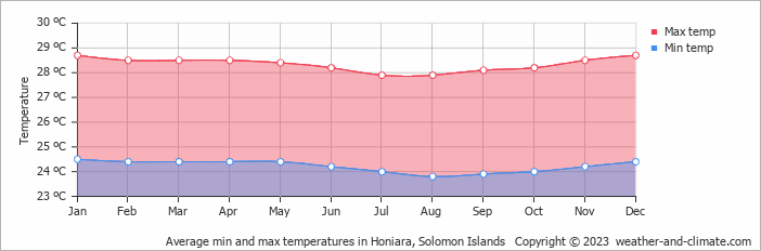
This monthly temperature plot for Honiara gives a clue about the power of cloud feedback over tropical oceans:
Andy,
I agree. Another reason clouds are probably a negative feedback is that the SW sunlight they reflect (cooling), is far more energetic than the LW they reflect (warming). So, unless CO2 can magically cause cloudier nights and less cloudy days, clouds are negative.
Also, we know from the ground temp record that there was natural warming before human CO2 could have been a cause. So it’s possible, maybe even likely, that some portion of the recent warming is also natural.
I have been saying for several years now that the experiment is over. We don’t need models because we have added sufficient CO2 to the real-world to be able to see what affect it actually has. The result is that there is no credible evidence that human CO2 has caused or will cause anything more than mild warming, and plant fertilization, both of which are beneficial to the biosphere to which we are (so far) inextricably linked.
To put the warming in perspective: I’m 63 years old. If all the warming of my lifetime occurred in the time it took me to write this paragraph, I probably would not have been able to detect it.
Andy, I researched clouds for essay ‘Cloudy Clouds’ in ebook Blowing Smoke. Cannot say your negative cloud feedback hypothesis is wrong, but can say there isn’t a lot of observational support for it in the two climate relevant cloud databases: ICOADS and ISCCP.
IF clouds have a significant negative feedback, thus lowering TCR beyond EBM estimates, it would have to be in at least one of three basic possible ways:
And we still have the fact that satellite clear sky/all sky says that for over a decade, clouds had a zero statistical feedback trend.
Rud, and yet, changes below the accuracy of our measurements could make enough difference to completely negate all calculated (from models) human impacts, with abundant room to spare. How little we know…
‘I do not believe we can say cloud feedback is zero, I don’t think anyone knows what it is. But the net cloud impact is negative, so it is more logical, at least to me, that the cloud feedback is net negative as well.’
Absolutely right, Andy. If it was just Tyndall and Clausius-Clapeyron, we would have locked into Snowball or Venus Earth a long, long time ago.
Almost correct but not quite there – change the word “some” to “powerful”.
In fact the feedback is so powerful that it actually sets a hard limit on the SST of 30C over an annual average in open water.
It would take an enormous addition of any atmospheric gas to increase this temperature because it is a weak function of surface pressure; requiring a 10% increase in atmospheric mass to increase the regulating temperature to 33C.
And clouds are only unknown to those who do not want to know. Cloud persistency over tropical oceans is related directly to surface temperature. The sky would go dark for 24 hours per day if the oceans were heated by some source other than sunlight to reach SST of 32C.
I don’t want to blow anyone’s mind….but if there were no clouds, the Albedo of the planet would be about half of it’s current .3. So it would be about a dozen degrees warmer assuming present lapse rate (not really a good assumption if it’s dry enough to not have clouds). So in general, clouds have to be a negative feedback.
Willis’ chart following in these comments shows the stats.
I have no independent opinion about what value of no-feedback response to doubled CO2 is right, so I’m agnostic about the particular number you got from Christopher Monckton. But I know for sure that Equation 1 of his “Irreducibly Simple” paper is a fundamental differential-equations error, so you’d be better off not giving his equation (rather than, say, his parameter values) as the basis for your estimate.
I critisied it at the time over at Judith’s, since is further reducible using conventional definitions. Did not find your claimed error. Could you please explain it, as opposed to just asserting it. I found his math rather impeccable, albeit too convoluted.
Please show where I math goofed, per your clear assertion.
Lord Monckton treats a time-independent system that has state as though it were a stateless time-dependent system.
In his Equation 1, namely, , the expression
  is his notation for the stimulus
  ,
,  is his notation for the response
  , and
, and  is his notation for the (linear) system’s step response
  . So what he’s saying is that if a system’s step response is
  then its response to a stimulus
  is simply the product
  of the stimulus
  and step response
  .
.
That’s incorrect. Elementary differential equations tells us that instead of those functions’ product a linear system’s response equals the convolution
of the stimulus’s derivative and the system’s step response
  .
.
Or, equivalently, it’s the convolution
of the stimulus and the system’s impulse response
  .
.
My understanding is that most engineering students have learned this by the end of their second year.
To people who understand differential equations, Lord Monckton’s Equation 1 is like saying that two operands’ product can be approximated by simply taking their sum. Occasionally that works (2 + 2 = 2 x 2). Usually it doesn’t.
So his math falls far short of “impeccable.”
As I’ve pointed out elsewhere, many have been duped by Lord Monckton’s obscure language.
I protest….thats like saying “there is no temperature feedback because the average global temperature is 288 C” And we know the real numbers, not just it’s average….
Let me rephrase…..saying “cloud feedback is zero” is like saying Planck feedback (temperature) is zero because the average global temperature is a constant 288 K. We have Willis Eschenbach,’s rather brilliant recent CERES analysis to show us what the situation really is.
No, it is most certainly not correct.
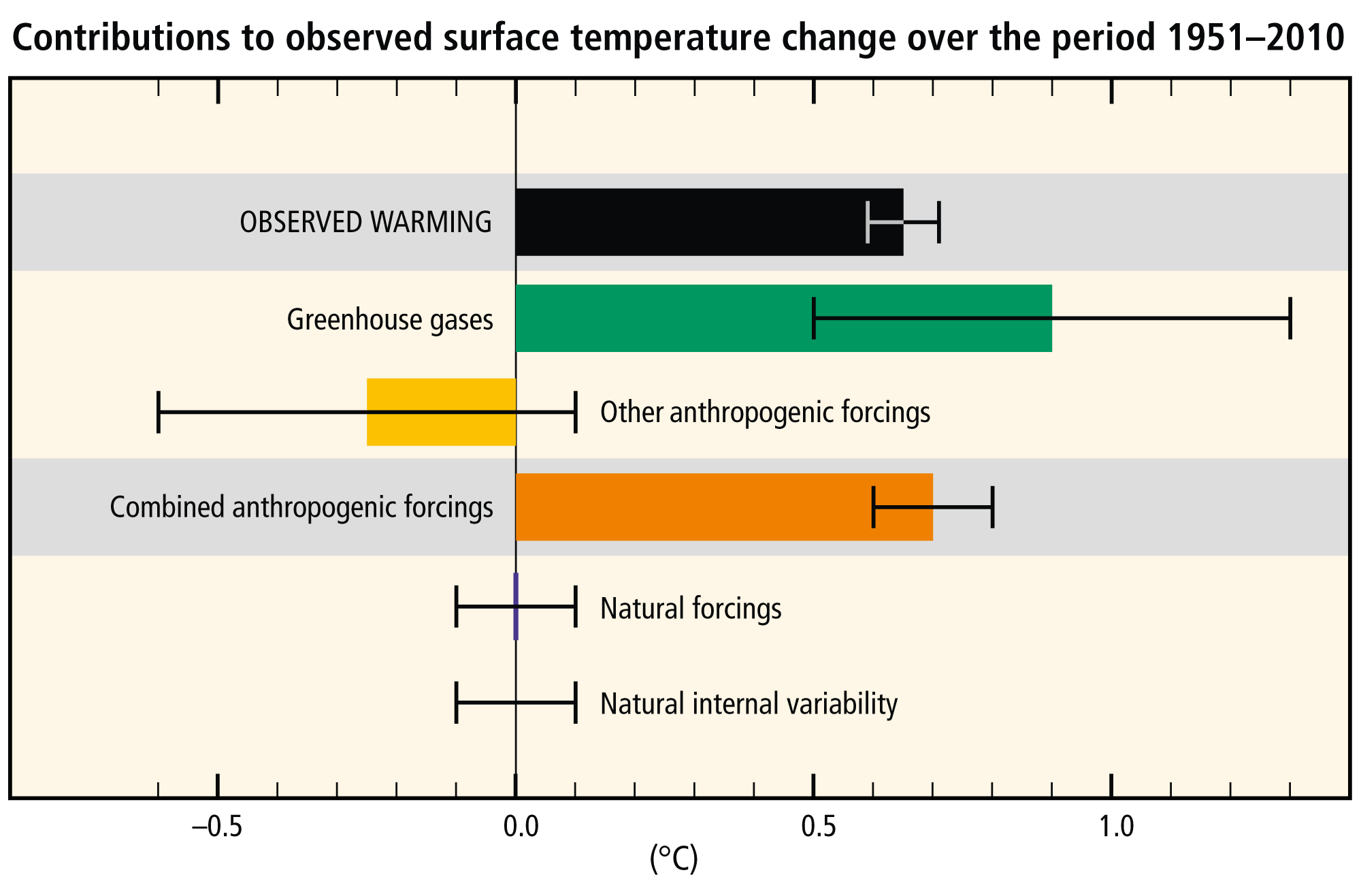
When calculating ECS or TCR you are all making the same mistake. In the calculation goes the implicit assumption that only anthropogenic forcing is responsible for the warming. Remember figure AR5 SYR SPM.3:
You are all repeating the calculations assuming there is no natural warming (solar, volcanic, multidecadal variability).
Solar variability indirect effects are not considered. The contribution of the AMO is not considered. Petr Chylek et al. 2014 estimates the AMO contributed about 33% to recent warming. The contribution of the PDO is not considered.
Now, what effect has natural warming on ECS or TCR? Very easy. As Roy Spencer tells us in this post, if we assume 30% of the warming is natural, you have to multiply ECS by 0.7. If we assume 50% natural, then ECS is half. If most warming is natural, ECS is very small.
Trying to calculate ECS or TCR without proper knowledge of natural climate change is silly and useless. Whoever claims to be able to quantify natural climate change contribution to recent warming is a liar.
As usual, Javier shows us what we should have already known.
Don’t forget the most important direct observations that play a huge role, although these are deliberately ignored.
How can changing global cloud levels and increased sunshine hours be at zero natural forcings?
Agreed, they are ignoring any natural forcings deliberately.
It is important to note that UAH often often use IGRA.
Notice what IGRA says about using their dataset [1].
Furthermore, Christy et al. 2020 shows the following breakdown with global lower troposphere trends using 3 different radiosonde datasets designed for climatic analysis.
satellite-RSS = +0.21 C/decade
satellite-UAH = +0.13 C/decade
raob-RATPAC = +0.21 C/decade
raob-RAOBCORE = +0.19 C/decade
raob-RICH = +0.21 C/decade
BadWaxJob,
You’re listing the ADJUSTED radiosonde data. That is the singular reason that the RSS trend APPEARS to come close to the radiosonde data. Their adjustments significantly raise the temperature trend of the radiosonde data.
Stop pretending that you’re a scientist when you’re obviously not.
First, It’s not my table. It comes from Christy, Mears, Po-Chedley, and Haimberger. Second, it better be adjusted data because I’m going to be critical of a comparison that is contaminated by “jumps and other discontinuities caused by changes in instrumentation, observing practice, or station location.”
Badwaxjob, “Adjusted” has a different connotation than calibrated. Properly calibrated data sets have no need for further adjustments. “Adjustments” includes thing like infilling which cannot improve statistical accuracy – it can only degrade it. Sometimes inferior data is incorporated improperly further degrading accuracy – that also constitutes an “adjustment”.
For example, if a station is moved, that introduces a systematic error – say the new station is at a lower elevation at a different location where temperatures are generally higher. Generally, but not always. So you need to correct for the bias.
How do you do that? If you run both stations for many years and look at the difference between them, that’s a start, but just a start. How do you know that the difference is statistically always the same? It might be different during a different phase of the PDO, for example. Maybe the prevailing wind direction changes. Maybe increasing UHI affected the new station more than the old. If you didn’t have data spanning all the conditions of interest and you use a model to correct for the bias, why then you’ve just introduced your model bias.
Adjustments are ok if the adjustments are very small and don’t significantly change the trend, but that’s typically NOT what has been happening. Trends are often heavily influenced by the adjustments. A claim that the trend has a high impact and thus must be dealt with requires exceptional proof. The proof is sorely lacking as evidenced by the fact that there are still large differences between the various data sets. It’s made worse by the unwillingness of some alarmists to be transparent and participate in an open process to resolve the causes of the differences.
If you were an actual scientist you would have known.
I think you may be conflating infilling and adjusting. Those are two different things. A dataset can choose to infill without adjusting or adjust without infilling. And the UAH adjustments are anything but small. We know the adjustments are large because of the changes in the trend between different revisions and adjustment methodologies. So if you’re going to base the decision on the validity of an adjustment on the magnitude of its effect as opposed to the reason behind it then you’re probably going to have to omit the UAH dataset as part of any analysis you are doing.
Wrong again, BadWaxJob.
Infilling isn’t a simple process of interpolation based on location. Interpolation must consider all the factors that cause differences between stations (elevation, proximity to the ocean, humidity, prevailing winds, UHI, etc.). Then, some combination of the adjacent stations’ adjusted data is formed to represent an area without data..
I have the perfect example. The station in my town was shut down a decade ago. Its data was replaced by a station about 15 miles inland. But I live on the coast where it’s routinely warmer in the winter and colder in the summer. The infilling doesn’t replace the station’s data with anything that comes close to approaching the accuracy of having the data from the (now closed) station. The net result is worse statistical error.
So, if you want to determine the actual trend, you always do better just using just the stations that weren’t moved or modified and have a long, continuous record. Forget about the (adjusted) infilled data, it has no valid use.
First… that’s not what infilling means. Second…since UAH applies adjustments are you saying Andy’s post is not valid?
UAH doesn’t apply adjustments without information justifying the changes. Meab is telling you that land temp changes to an old record in order to just maintain a long record is not justified. A new record should have been started when the move was made and the old record should have been stopped. It’s as simple as that.
I don’t get why each satellite data set has its own unique adjusted radiosonde data to compare against. So we take two datasets and adjust each somehow to bring them into correlation with the other. And for UAH and RSS these adjustments are radically different. How is this science, exactly? The UAH appears the most mildly adjusted radiosonde (versus the raw) while the RSS is the most extremely adjusted. I would trust RSS the least, based on that alone. (At least the NOAA dataset is honest, their radiosonde adjustments are small and they show divergence from the satellite results.)
Neither UAH nor RSS are radiosonde datasets. UAH is heavily adjusted. The orbital decay adjustment alone adds an astonishing 0.10 C/decade to the trend [1]. And that’s just one of the many adjustments applied.
Now you’re just lying. Go away.
It’s an honest question. You said “Adjustments are ok if the adjustments are very small and don’t significantly change the trend”. The orbital decay adjustment alone adds 0.10 C/decade to the trend [1]. Am I to conclude that UAH is not okay and that Andy’s assessment that UAH is better than RSS is invalid?
Thanks for the table. The only important columns are global LTT (1979) and tropical TTT (1979). The three sets of observations for the LTT are 0.21, 0.19, and 0.21. These values cannot be directly compared to the satellite records. Christy, et al., 2018 goes to great pains to make sure that the observations, which are sparse, are compared accurately to the satellite data which covers much of the world. Your article states:
Your article also states:
Comparisons of the weather reanalysis warming trends can be made directly to the satellite datasets, since they are nearly global. It is interesting that the reanalysis trends lie in between RSS and UAH and near the median value.
However, even 1979 to 2020 is a short interval from a climate perspective and as the Christy paper you site says clearly, the effect of the early volcanic eruptions and the ENSO events must be taken out to extract the climatic trend and when that is done the trend is 0.12 deg/decade +-0.04. This is not far off the UAH trend.
If the argument is that radiosonde datasets are not fit for the purposes of computing a global average temperature then they aren’t fit for the purpose of validating the global average temperature products provided by the satellite datasets.
Now that is totally irrational bdgwx. All observations are important, they just need to be used properly according to the way they were collected, and especially where they were collected.
My point is that if we are going to dismiss the global average temperature trends of radiosonde datasets because they aren’t fit for the purpose of measuring the global average temperature then we cannot make any statements about how closely the global average temperature trend from satellite datasets is to radiosonde datasets.
I’m not saying that this precludes from making more narrowly focused comparisons. I have no problem with that either. That’s why I’ll accept Christy’s uncertainty analysis saying monthly UAH TLT anomalies are ±0.20 C while the long term trend is ±0.05 C/decade based primarily on radiosonde comparisons. I also have no problem accepting the Christy 2018 result saying UAH is better or the Mears 2012 result saying RSS is better. They are probably both correct in their own way.
I totally echo your sentiment that it is interesting that reanalysis (and I’ll add the traditional surface datasets to that) lie somewhere in the middle of the warming trends from both. It is a testament to the fact that the mean of an ensemble is more likely to be closer to the truth than any one member alone.
This makes no sense, what uncertainties are you referring to? The long-term cited in your article (Christy, Mears, et al. (2020, BAMS) is 0.12 deg/decade +-0.04, after correcting for ENSO events and volcanic eruptions. That is the takeaway. There are no UAH specific uncertainties mentioned in that article or in Christy, et al. 2018 that I saw.
Zou cites +-0.128, all in and +- 0.04 under perfect conditions. I’ve not seen +-0.2 before under any conditions.
AM said: “This makes no sense, what uncertainties are you referring to?”
Christy et al. 2003.
AM said: “The long-term cited in your article (Christy, Mears, et al. (2020, BAMS) is 0.12 deg/decade +-0.04, after correcting for ENSO events and volcanic eruptions.”
That’s not an uncertainty analysis. The 0.12 C/decade figure is the amount of the trend after the ENSO and volcanic analysis was subtracted off. The +0.04 C/decade figure is the uncertainty on that portion.
AM said: “There are no UAH specific uncertainties mentioned in that article or in Christy, et al. 2018 that I saw.”
Right. The figures I cited come from Christy et al. 2003.
bdgwx,
Aha! You finally come clean.
From the paper you cleverly didn’t cite in your comment. We’re on to you now.
I’ve cited that paper many times. Here is sample of the times I’ve cited that paper on the WUWT blog. [1] [2] [3] [4] [5] [6] [7] [8] [9] [10] [11] [12] [13] [14] [15] [16] [17] [18] [19] [20] [21] [22] [23]
‘It is a testament to the fact that the mean of an ensemble is more likely to be closer to the truth than any one member alone.’
Well yeah, if the vast majority of the models run hot, then by definition, their mean will be somewhat closer to the ‘truth’ – but that mean will still be completely useless for any purpose. You’re not sampling ball bearings at the end of an assembly line, so the Central Limit Theorem doesn’t apply here. Stop it.
I’m not talking about predictions here. I’m talking about the observed trend.
bdgwx,
What is the Truth?
What is its numerical value here?
(“You can’t handle the truth”).
Geoff S
Badwaxjob, you said “The mean of an ensemble is more likely to be closer to the truth than any one member alone”.
Not true when you’re trying to find a trend with the singular exception of all data having the same error. All data almost never has the same error. You had better review Deming regression.
You’re such a phony.
I’m not sure what a Deming regression buys you here.
You’re not sure about much of anything, badwaxjob. Come back when you have a degree in Mathematics with an emphasis on Statistics, like I do.
I’m not questioning your credentials. I’m questioning what a Deming regression buys us in this case.
BTW…that’s great that you have a degree in mathematics with an emphasis in statistics. Those are super important tools in scientific work. Hey, would you mind explaining to the contrarians how uncertainty propagates through the function f(x_1, …, x_N) = Σ[x_i, 1, N] / N when u(x_i) is known?
Uncertainty propagation is fundamental to statistics. Too bad all the alarmists are clueless. Like you.
I don’t know if I’d call it fundamental to statistics. It is kind of a niche thing. Either way I fully accept the established statistical techniques for propagating uncertainty including those documented by NIST, the GUM, Taylor, Bevington, etc. I just wish we could get contrarians who post here to accept them as well.
Anyway, back to the topic. What is a Deming regression going to do for us in the analysis of satellite vs radiosonde warming trends?
You are confusing sampling protocol with calibration procedures.
Maybe that’s it. I don’t understand what bdgwx is saying. None of it makes any sense.
I’ve not mentioned either sampling protocol nor calibration procedures.
Exactly, and that is the problem. You would never make it in an occupation that lives and dies with making real, verifiable, accurate, and guaranteed reliable measurements. Do you think the folks that made the Webb telescope used Standard Error of the Mean from numerous measures across the mirror to document how accurate their mirror was or did they guarantee each measurement exceeded requirements?
Andy May,
Thanks for your timely work to communicate this explanation.
I have recently read your book concerning politics and climate change. It is an exceptionally well-documented and comprehensive skillful historical account of the subject by a competent, rational scientist and expert data analyst – a major contribution, IMHO, despite a few typos none of which are material.
Thanks Bill. I hired a copyeditor for my latest book, just to catch the typos. Hopefully it doesn’t have any.
Still , not able to provide the real curves of all measures over the time …
Most of them showing the same évolution and waiting for a decline after 2020 …
RSS with a higher rate, but quite similar to others … with same variations …
Hubert, Interesting, thanks.
Andy,
I can recall when the RSS data dramatically changed.
I used to analyze the RSS data instead of the UAH data. On 6/3/2017, I downloaded the latest RSS data. Then on 6/30/2017, I downloaded a newer version.
It was quite a change shown in the figure below:
https://1drv.ms/u/s!AkPliAI0REKhhMY7qu81-BIHRjm_oQ?e=PMv2jx
I compared this with smoothed data so the differences could be more easily seen.
Some of us can remember Monckton would analyze the RSS data before the 2016 El Nino and show there was no global warming. I think that went up to 18 years at one point. The starting point for the pause was 1997.
I put the UAH, RSS (06/03/2017), RSS (06/30/2017), and H4 data on the chart.
If you compare the UAH and the early RSS data, you can see a delta, but if you look at the data beyond 1997, you can see they are parallel. That all changed with the late June data. That data now parallels the H4 data.
I stopped using the RSS data thereafter. I don’t like cheating.
Here is Charles May’s plot.
Charles, this is a similar plot from my latest book. The red line is before the change and blue is after the change. As I explain in the post, the changes included keeping more of the bad NOAA-14 data.
It is worse than you think. Notice that the late June data only affects the pause line. There is hardly anything noticeable before 1997. I think this makes this an intentional false edit of the data.
Ouch! That has to hurt RSS’s Mears. The old saying comes to mind: “Figures don’t lie but liars can figure.”
Then there is NOAA’s cute trick of changing the starting point. Your government inaction.
‘Your government inaction.’
We should be so lucky.
“I put the UAH, RSS (06/03/2017), RSS (06/30/2017), and H4 data on the chart.”
Yes. But what you should put on also is the UAH V5.6 data. At about the same time, RSS versions showed a large trend increase, and UAH showed a large trend decrease. About the same. Here is a difference plots, with the small changes to GISS for comparison.
Blue is the version change to UAH, orange to RSS. Here is Roy Spencer’s own version of the UAH difference. It looks less but check the scale.
http://www.drroyspencer.com/wp-content/uploads/V6-vs-v5.6-LT-1979-Mar2015.gif
“I stopped using the RSS data thereafter. I don’t like cheating.”
Of course. So did Lord Monckton. But why is the RSS change cheating, and the UAH not? What is really happening is that those so inclined use whatever gives the result that suits them.
My suspicions are aroused when only the pause line was eliminated by the changes. How come the data before 97 remained unchanged? If they wanted to hide their intent the data would have changed over the full range. In that case, I would have missed the link.
For both UAH and RSS, the change came mostly post-97. It is pretty symmetrical.
Nick, that trend decrease is called “The Pause”, or hiatus in global warming. It actually took place as hundreds of scientific articles attest. RSS modifications went in the same direction as Karl et al. 2015: erase the pause.
The decrease plotted is the change from UAH V5.6 to V6. Why is it that V6 sees so much more Pause than V5.6? Is V6 creating the Pause?
The change is far more than anything Karl ever did.
You need to provide justification for questioning changes. Can you identify something wrong with the development of a “correction curve” used to make adjustments?
Nick, I think you already know the answer to that. Anyway, here it is:
Among the changes in UAH v6.0 versus v5.6 the one that had the biggest impact, as explained by Roy Spencer here, was the diurnal drift correction. This became neccesary as satellites started to last longer (decrease in solar activity, and draft) showing a bigger diurnal drift, and some satellites failed (NOAA-17, Metop). v5.6 did not have diurnal drift correction. Christy and Spencer used an empirical correction that was uncontroversial because it produced the same result than Mear’s RSS climate model diurnal drift correction.
The need for the correction is obvious by looking at figure 1 in Roy’s post. The correction had the same effect that the correction applied by RSS to the same issue. The effect on the temperature dataset is larger at the times when satellite coverage and drift become an issue, before 1984 and after 2004.
http://www.drroyspencer.com/wp-content/uploads/V6-vs-v5.6-LT-1979-Mar2015.gif
So in 2015 UAH was correcting drifts, and in 2017 RSS was introducing a bias by using NOAA-14 data 2001-2005 when it was showing excessive drift, instead that the more realiable available data from NOAA-15. This is the jump Charles May plot above shows.
There is a lot of tribal special pleading here. We are using good satellites, they are using bad satellites. We are making good corrections, they are making bad corrections. I think the only conclusion is that satellite global temperatures are so rubbery that you can make choices to get whatever result you want. Whatever it is, John Christy will tell you that UAH (before and after) is verified by radiosondes (which are at least as rubbery).
And below is a “direct anomalies, shifted to improve visibility” plot.
NB : The last version of the UAH V5.6 dataset I downloaded ends in July 2017.
The last version of RSS V3.3 goes up to October 2018.
The changes, in the 2010s at least, look to be around the same order of magnitude to me.
The fact that the UAH and RSS teams decided to make changes in opposite directions during that time period does seem … “odd” (?), though.
It’s almost like they both decided, simultaneously, “Hey ! You’re right ! We really ought to change …”.
PS : The effects of the larger “UAH (6.0 – 5.6)” deltas in the 1980s, e.g. on the overall trends, are unclear (to me) at the time of posting.
Try the following on for size …
Up to 2015 UAH was showing more warming because it did not have a diurnal drift correction, which became an issue after NOAA-14 started to drift a lot in 2001.
The correction introduced by UAH v6 made it very similar to RSS. Between 2015-2016 both showed the same warming.
Then in 2016 RSS introduced changes because Mears did not want satellite temperatures to be used as a denier argument. Chosing to use NOAA-14 data between 2001-2005 is the same Karl et al. 2015 decission to “correct” 2003-2016 sea surface temperature data to erase the Pause.
One deception after another. That’s alarmist climate science.
Andy- Very good analysis and easily understood.
The question is this: if the tropopause is strongly depressed in winter, does the satellite data for the tropopause not include the lower stratosphere? If there is an SSW during the winter season, doesn’t too strong a temperature spike appear in the satellite data?
Ireneusz you are correct, as usual. Satellite data samples a very large portion of the atmosphere and seasonal changes in the tropopause height do affect the temperature estimates. Another problem, RSS and UAH sample slightly different parts of the atmosphere in their respective lower troposphere and troposphere records.
Anomalies hide the true picture. Good practice would be to show the basis of determining the temperature and the actual estimated temperature in any store comparing satellite records.
I wonder how many people reading the above article know that UAH is at freezing level.
Exceptional article, Andy.
I’m bookmarking this one.
UAH is the most accurate. Gotta love it! 🙂
Very informative.
I’m interested in why this new UW series covers -30 through +30 latitudes.
If the poles are where we are meant to be seeing most of the warming, wouldn’t they be the best places to monitor, to try and get the best measurement of the warming ‘signal’?
Do they monitor around the equator because that’s the ‘easiest’?
I’m genuinely interested in the reason, not questioning motives in any way.
Good question and I do not know the answer. But, if I’m allowed to speculate, I would say it is because the tropics are the most important part of the atmosphere to understand from a climate change perspective. This is where the most solar radiation is collected. This is where the most extreme GHG effect should be, this region has the highest absolute humidity and the highest tropopause. But, surprise, surprise! The tropics are warming slower than the rest of the Earth!
[beginning of rant] The tropics sends huge amounts of thermal energy to the polar regions to be radiated away to space. The equator-to-pole gradient controls climate change, this is not an exaggeration.
There was a huge change in climate when Panama formed and cut off the tropical Atlantic from the tropical Pacific. There was another when the Straits of Magellan opened, and Antarctica became surrounded by the Southern Ocean and developed a very strong polar vortex. The North Pole has a weak polar vortex and receives much more energy from tropics as a result and radiates more energy to space than Antarctica. The fact that Antarctica is colder helps.
This weird idea that that CO2 and other GHGs controls the climate is completely off-base. [end of rant]
That deserves a +1.
I would go a little further – To come up with some notion or belief that any trace gas such as CO2 can directly alter the energy balance in any way is absurd.
If I were a cynic (heaven forbid) I would suspect that the UW data is an attempt to recreate the tropical hotspot using satellite data by applying “appropriate” adjustments.
No, not possible, I mean what kind of scientists would stoop to massaging data to give the answers they want?
That’s a rhetorical question.
The kind whose job depended on it.
Andy, a great job with this. Your references are immpecable and your conclusions are conservative, both are admirable.
Trust me, the warmists would be singing the praises of the totally objective, unbiased, highly accurate and scientific UAH data… if it delivered the results to match their narrative.
If the UAH dataset is unbiased then why do the trends change significantly between revisions? Remember the revision in 1998 increased the trend by an astonishing 0.10 C/decade which is 2x as much their claimed uncertainty of ±0.05 C/decade.
Why are we in a pause when CO2 climbs higher?
CO2 as a control knob is silly.
It’s the same as the last time I told you. The UAH TLT temperature does not monotonically increase because there are lot of factors in play that modulate energy fluxes into and out of the layer. CO2 is but one among many of those factors. The pauses are expected. Using the Monckton method CMIP5 says that between 1979/01 and 2022/02 we should expect about 20% of the months to be included in a trend < 0 C/decade lasting 7 years and 5 months. UAH shows about 25%. That’s pretty good agreement between the prediction and the observation.
Lol….the cold of the 70s
Good report and interesting conclusions, especially about UAH being best. What? “…AR6 is deliberately ignoring valid analysis and data to sell their political agenda.”. The United Nations has an agenda, other than promoting human welfare and Peace? My tax money goes to further an agenda, in this case, CAGW – we’re all going to burn in hell on earth if you don’t walk to work and burn buffalo chips to cook with?
On a related note (I think). Someone want to post a new thread about this?
https://m.youtube.com/watch?v=CZy8mgD05QA
“… A similar, but stronger case can be made using surface temperature datasets, which I consider to be more reliable than satellite datasets (they certainly agree with each other better than the various satellite datasets do!). So I don’t think the problem can be explained fully by measurement errors” (Carl Mears 2014).
Dr Mears’ reasoning seems to be that since he cannot see any flaws in the physics of the models that any model-data discrepancies are likely due to data errors.
If the compiler of the RSS data has no faith in the product why should anyone else?
This is dead wrong for two reasons:
1. Humans live on the land surface. The weather on land is important for human habitation. The land surface temperature trend is important to humans and a key factor in climate trends.
2. The ocean heat uptake and relative temperature difference between ocean surface and land surface determine the level of net precipitation and this is a fundamental in supporting human life without resorting to energy intensive process of de-salinating sea water for human needs.
Measuring and trending temperature at freezing level in the atmosphere is only pertinent to human existence when the ground is freezing.
This is flawed as nobody lives at the global surface temperature mean. The best measurements are the ones with most coverage and are most accurate.
1) Satellites do measure from the surface upwards.
2) Surface data has huge regions with no data especially around Africa, some parts of Asia and the poles.
3) Huge areas of the ocean surface are still under observed even with the latest projects.
4) Measuring fractions of the surface doesn’t help know what the true global trends are. (a lot of station cherry picking has occurred with the surface sets and a huge reduction in samples)
5) There is no better accurate data observations and better coverage than between satellite, land and ocean. Whether that is humidity, temperature, clouds or sea ice.
While this is not on the same topic, current temperature measurements, I wonder if temperatures measured 200 years ago and meticulouly recorded by a gardener and mentioned in his journals are not suprisingly accurate despite more primitive thermometers? The same applies to various temperature comments in journals – they were very popular in previous centuries – being a valuable historical record.
A scientific voyage up and back down the east coast of Australia provides a very good record of sea surface temperature up the east coast of Australia in first and third weeks of December 1871.
I have attached a chart comparing the records of those voyages with 2019 satellite data at the same latitude and similar longitude for the same weeks of the year.
The waters of the coral sea were warmer in 1871.
The temperature spike to 32C is in the Brisbane River and is a clue to why Brisbane is noted for its cricket ball size hail stones.
Rick
Thanks for this additional historical record. While piecing together data from older records and journals is time consuming I am convinced that they support the variability that runs counter to the current alarmist narrative. Models can say anything they like but actual measurements from the past usually do not seem to fit these models. Nothing can beat empirical observations which is one of the foundation stones of science.
That is why “climate science” is a belief system rather than science. It is based on a pretend world.
Ask a climate modeller to explain why the model disagrees with measured data, their stock reply is that our model agrees with other models and is, in fact, middle of the road. So the test is how close they are to other models, not reality.
“One of the reasons that UAH has a lower warming trend than the other datasets is UAH has corrected clearly spurious data in the older NOAA-11 to NOAA-14 satellite instruments and the other datasets have not. “
“The full story of all the required corrections and adjustments to produce a satellite tropospheric temperature record is too involved to be explained here but is well documented in the references cited.”
So there we go – satellite measures are full of adjustments, but we like UAH because it did more correction (and got a lower trend).
Between the years 1998 and 2016, NASA and NOAA proclaimed about ten of those years as being “the hottest year evah!”, as part of their efforts to scare people and demonize CO2.
The UAH satellite chart puts the lie to these NASA and NOAA claims.
The UAH satellite chart is below. See if you can find ten years between 1998 and 2016 that could be claimed to be the hottest year ever going by this chart.
The fact is none of the years between 1998 and 2016 are warmer than 1998, so none of them can be proclaimed to be the “Hottest year evah!”, and that includes 2016, which is statistically tied with 1998 for the warmest year in the satellite era.
NASA Climate and NOAA are such liars!
Many times you have criticized NASA for applying adjustments and now you argue that they are lying by showing a graph from a dataset that makes adjustments and whose maintainers have qualms in adjusting the radiosonde observations as well. Do you not see the irony here?
You are making an accusation that data has been changed based upon no scientific evidence. That requires some proof from you. Please show that the basis for the adjustments are not scientific?
I made no such accusation. I don’t think the basis for adjustments are unscientific.
Then exactly what are you criticizing? The fact that someone criticized something?
It is the criticism of adjustments using a dataset that is known to be liberal with their adjustments that I find ironic. BTW…the accusations aren’t coming from me. The indictment of lying came from Tom Abbott.
“It is the criticism of adjustments using a dataset that is known to be liberal with their adjustments that I find ironic.”
I think all the adjustments have been adequately explained in this article, and UAH comes out on top of RSS and the surface temperature distortions, since UAH correlates with the Weather Balloon data and the other data sets do not.
The other data sets correlate with each other because they all use the same basic data, so why wouldn’t they look the same.
UAH is the best measure of the Earth’s temperatures and using the best measure shows NASA Climate and NOAA are lying about their “hottest year evah!” claims, since they know all this themselves and know they should be using UAH if they want accuracy. Obviously, they don’t want accuracy, they want to propagandize the temperature record.
TA said: “since UAH correlates with the Weather Balloon data”
satellite-RSS = +0.21 C/decade
satellite-UAH = +0.13 C/decade
raob-RATPAC = +0.21 C/decade
raob-RAOBCORE = +0.19 C/decade
raob-RICH = +0.21 C/decade
You tell me. Does RSS or UAH better match the warming trend of RATPAT, RAOBCORE, and RICH?
TA said: “The other data sets correlate with each other because they all use the same basic data, so why wouldn’t they look the same.”
RSS and UAH use the same basic and they differ by quite a bit.
Why are you trying to criticize UAH for having a different interpretation than others? You seem to be promoting psuedoscience instead of encouraging unique and varied ways of investigating. Are you so invested in “settled science” that you can’t allow various views to exist?
“See if you can find ten years between 1998 and 2016 that could be claimed to be the hottest year ever going by this chart.”
No, I can’t. The reason is that you have posted a monthly chart. It doesn’t show years.
But if you do show years, there is something interesting. Yes, UAH V6 has 2016 and 1998 in a statistical tie. But UAH V5.6 told a very different story. 2016 was 0.17°C warmer than 1998. No tie there. V6 warmed 1998 and cooled 2016 to achieve that tie.
Now where have I heard endless complaints about a far smaller change to GISS US data? Even talk of “liars”?
Here is the plot of annuals:
You fail to explain why “annual” temperatures should be more important than monthly temperatures. What is the old saying about figures and liars? Figures Don’t Lie, But Liars Do Figure – Quote Investigator
It was Tom Abbott who invoked annual temperatures and their records, not I. As usual, it was just my task to get it right.
You didn’t get anything right, you just try to confuse things. My invocation stands regardless of the version of UAH you use. Regardless of whether you use an annual chart or a monthly chart. Those 10 “hottest year evah!” claims are bogus.
“Yes, UAH V6 has 2016 and 1998 in a statistical tie. But UAH V5.6 told a very different story.”
And we know why there was a difference: V5.6 was using bogus data, which when corrected in V6 do show that 1998 and 2016 are statistically tied for the warmest years in the satellite era.
You seem to be promoting bogus data in V5.6 as being real.
“You seem to be promoting bogus data in V5.6 as being real.”
Well, UAH promoted it as real. WUWT had a post every month promoting it as real.
It is just as real as the data in V6. V6 has just been adjusted.
“No, I can’t. The reason is that you have posted a monthly chart. It doesn’t show years.”
I don’t see any years on either of those versions, V5.6, or V6 that show any years between 1998 and 2016 as being hotter that those years. So the version doesn’t matter in this case. I could still say that there are no years between 1998 and 2016 that could be claimed to be the “hottest year evah!” going by either one of those charts. So what’s your point?
Nick,
Time will tell who is right. The following are interesting points:
None of the three points are definitive, but clearly the observations support UAH. Are there any observations that support RSS?
I didn’t think so.
I don’t think that is as clear as you think it is. Mears et al. 2012 show that RSS is a better match than UAH. And from publication I posted above RSS provides a better match than UAH in regards to the global average temperature warming trend from 1979. And remember, that +0.12 C/decade figure with ENSO and volcanic components subtracted came from datasets that show +0.18 C/decade of warming overall. +0.21 C/decade (RSS) is closer to +0.18 C/decade (other datasets) than +0.13 C/decade (UAH). So the fact that UAH is closer to that +0.12 C/decade should be throwing up an immediate red flag to you.
bdgwx,
The fact that the very heavily Northern Hemisphere (NH) weighted weather balloon dataset matches RSS better should be a “red flag” to you since the NH is warming faster than the SH.
It is. I no more trust RSS than I do UAH. This is why when I discuss the warming trend from satellites I always equally weight them estimate +0.17 C/decade of warming.
Andy,
“Are there any observations that support RSS?”
Yes. The published RatPac radiosonde cited in Christy’s BAM article 2018, cited by bdgwx above, clearly agrees with RSS and has UAH as an outlier. A commenter claimed, offering no support, that these were adjusted values, but they are the ones originally published.
On ENSO/volcanic correction, you only give data for IGRA and UAH. So there is no basis for saying that UAH is better than others.
Of course, the other TLT indices (NOAA, UW) also agree with RSS, not UAH.
“Ratpac radiosonde data shows spurious warming when compared to the average of 7 other radiosonde and reanalysis datasets for TLT”.
“But you might ask, why do those 3 satellite datasets agree so well with each other? Mainly because UW and NOAA have largely followed the RSS lead… using NOAA-14 data even when its calibration was drifting, and using similar strategies for diurnal drift adjustments. Thus, NOAA and UW are, to a first approximation, slightly altered versions of the RSS dataset”.
https://www.drroyspencer.com/2019/04/uah-rss-noaa-uw-which-satellite-dataset-should-we-believe/
“But you might ask, why do those 3 satellite datasets agree so well with each other? Mainly because UW and NOAA have largely followed the RSS lead… using NOAA-14 data even when its calibration was drifting, and using similar strategies for diurnal drift adjustments. Thus, NOAA and UW are, to a first approximation, slightly altered versions of the RSS dataset”
And in my opinion, this use was deliberate as an effort by the data manipulators to make things look as hot as they could so they continued using satellites that were reading too warm. That suited their purposes perfectly. That way they can make “hottest year evah! claims to scare everybody and that is their aim.
Minor detour, but while investigating another issue I downloaded the latest RATPAC-A and -B datasets (including “adjustments” …) and compared them to UAH (V6) and RSS (V4).
The NOAA (STAR) dataset is only available in a “TMT” version (and I’m still looking for an up-to-date version of the “UW / University of Washington” dataset).
The Christy et al paper addresses TMT, not TLT.
Looking at “1979 to current endpoint” trends that may well be true.
With my “cherry-picked” Reference Period it looks more like the “agreement” alternates between the two.
In the 1980s (both of) the RATPAC curves are closer to UAH.
In the 2010s they are (both) closer to RSS.
There is even a brief period (~2008 to 2012) where RATPAC-A (only available with 3-month / quarterly time resolution) is closer to RSS while RATPAC-B (monthly resolution) is closer to UAH …
“Computers are useless. They can only give you answers.” — Pablo Picasso
bdgwx and Nick,
The Ratpac radiosonde trend you cite is not collocated with the satellite data, the comparison is invalid.
Look at the table above. RATPAC, RAOBCORE, and RICH have the same spatial (globe) and temporal (1979-2019) domains as UAH and RSS. If the comparison is invalid it does not appear to be because they are not collocated.
Clearly that is not true. The satellite data uniformly cover the globe, over both the oceans and the land. There are only a few hundred to perhaps 600 weather balloon records that cover 1979-2019, and nearly all of them are over land in the Northern Hemisphere.
The only decent recent study that compares weather balloons to the satellite datasets is Christy, et al. 2018 and it is significant that the study has never been challenged. Christy used collocated data for his comparisons. He also published a similar study in 2000.
That is a spatial sampling problem. All datasets except reanalysis have spatial sampling sparseness to varying degrees. It is well known that satellites have more complete spatial sampling than do radiosonde datasets. But satellites are not complete like what is available for reanalysis. Either way this is a problem with spatial sampling and not collocation. BTW…notice that reanalysis is about +0.17 C/decade where as UAH is +0.13 C/decade and RSS is +0.21 C/decade. Both UAH and RSS diverge from reanalysis by about 0.04 C/decade. Yet another line of evidence that suggests the truth is more likely to lie between what UAH and what RSS say.
Tu Quoque (logical fallacy).
This is no more than using a “calibration curve” that is generally provided with sophisticated and quality measuring devices. When a systematic error is identified, THE REASON FOR IT, and the effect on the magnitude of the measurement, corrections are not out of line.
Attempting to “identify” possible “breaks” in a land surface measuring device, then failing to identify a reason for the change or the actual magnitude is not scientific. All you can possibly say is that something MAY have changed so we are going to take the opportunity to modify the entire record. Nobody knows if the microclimate of the thermometer has changed due to land use changes or if the thermometer itself failed. What you end up with is what the programmer thinks the temperatures may have been yet having no evidence whatsoever. If a temperature reading has changed because of a growing windbreak 100’s of yards away or a new building far away changes wind patterns, the microclimate has changed permanently and warrants no such change to past data.
If you consider the .05 deg C much more warming as shown on the graph, then that’s true.
But keep this in mind. When I worked in the measurement industry not that long ago, anyone who said they could resolve .05 Deg C on their instruments were roundly laughed at. We compared thermistor temperature sensor sets with Laboratory PRT standards and we derated all of them to +/- .15 deg C of reading at best, which was the accuracy of the standard.
+100
The Standard Error of the sample Mean distribution IS NOT the uncertainty of the measurement readings! Significant Digits should rule, but don’t in Climate Science!
+1
This is only the uncertainty of the sensor itself. When considering the entire measurement device (e.g. an Argo float) the total uncertainty will be even higher, especially after it has been in the field for a period of time. That’s why the Federal Meteorological Handbook No. 1 shows +/- 0.6C as an acceptable uncertainty for government measurement devices.
Nice to hear from someone who has lab based experience.
(from the radiosonde link)
Just curious – how does the new version have more data than the previous version “before the 70’s”?
Or is this just badly worded and they are trying to say the new version has more data than they had before the 70’s?
I mean it’s not that I don’t trust them… really… no, really it isn’t!
But look how UAH temps jumped when v6 was implemented in 2015. I know the church of AGW tried to make it look like 2015/2016 were hottest EVAH! but I don’t recall a suddenly warmer world when v6 came in and yet it is clearly there.
I’d like to see the raw data put through version 5 and see them side by side.
I believe they are saying that for dates prior to 1970 there is more data in v2 than in v1.
That’s what I thought as well. If so, they are making stuff up. How can there be more data? Did they just leave some on the shelf and dusted it off for v2? Are they now ‘modelling’ data so it looks more complete or something?
There is more data included in the dataset because more of the data got digitized. Digitization projects are ongoing. They are still digitizing and uploading observations from decades ago. It’s a lot of work analyzing hand written records. This is true for all weather observation repositories. For example, the GHCN repository received a huge upload of observations from v3 to v4 that increased the station count from 8000 to 27000.
Ahh… thanks for the info. I was concerned the gold standard of observations might have been tampered with…
A renewed strong increase in galactic radiation is observed. What does this indicate about solar activity?
Usually indicates the Sun is going quiet and the heliosphere is shrinking and/or letting more GCR’s through.
A better Q is what happened on the 14th? Was there CME or flare activity that altered the incoming GCR’s?
Yes, a single solar plasma ejection has arrived.