By Christopher Monckton of Brenchley
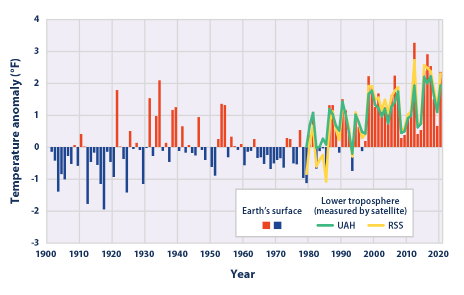
The New Pause lengthens and lengthens. On the UAH dataset, the most reliable of them all, there has been no global warming at all for fully seven years:

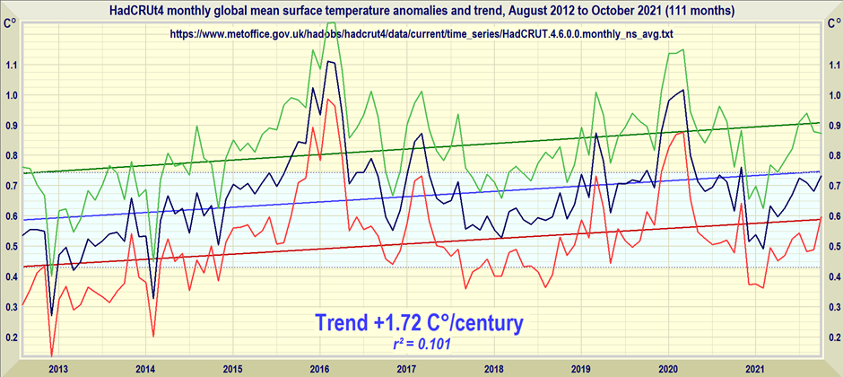
On the HadCRUT4 dataset, using the published monthly uncertainty interval, it is possible to go back 9 years 3 months – from August 2012 to October 2021 – before finding any statistically-significant global warming. The region of statistical insignificance is shown in pale blue below. Since well before the last-but-one IPCC report, there has been no statistically-significant global warming:

For 7 years 8 months – one month longer than last month’s data showed – there has been no global warming at all on the HadCRUT4 dataset. The least-squares linear-regression trend is a tad below zero:

As always, the trend shown on the Pause graphs is taken over the longest period, compared with the most recent month for which data are available, during which the least-squares linear-regression trend is not positive.
Given the succession of long periods without global warming, each of which begins with a strong el Niño, it is no surprise that the rate of global warming is proving to be a great deal less than the one-third of a degree per decade medium-term warming confidently predicted by IPCC in its 1990 First Assessment Report:
The significance of the succession of long periods without any global warming, of which the current Pause is the most recent, should not be underestimated. It is legitimate to draw from the length of such Pauses the conclusion that, since the climate system is in essence thermostatic, the radiative imbalance inferred from satellite data is either exaggerated or may be exerting a smaller effect on climate sensitivity than is currently imagined.
No small part of the reason why some object so strongly to the fact that there has been no statistically-significant global warming for almost a decade is that it can no longer be credibly maintained that “it’s worser’n we ever done thunk, Bubba”.
In truth, it’s no worser’n it was at the time of the previous IPeCaC assessment report back in 2013. But the flatulent rhetoric must be – and has been – dialed up and up, with totalitarian administrations such as that of the UK whiffling and waffling about an imagined “climate emergency”.
Even in rural Cornwall a local administration has pompously declared a “climate emergency”. Yet there is no more of a “climate emergency” today than there was in 2012, so the only reason for declaring one now is not that it is true (for it is not) but that it is politically expedient.
Whole industries have already been or are soon to be laid waste – coal extraction, distribution and generation (and, therefore, steel and aluminum); oil and gas exploration and combustion; internal-combustion vehicles; a host of downstream industries, and more and more of the high-energy-intensity industries. But it is only in the West that the classe politique is silly enough or craven enough to commit this economic hara-kiri.
The chief beneficiaries of the West’s self-destruction are Russia and China. Russia, which substantially influences the cabal of unelected Kommissars who hold all real power in the collapsing European tyranny-by-clerk, has for decades been rendering Europe more and more dependent upon Siberian methane, whose price rose a few weeks back to 30 times the world price when the wind dropped. As it is, the routine price of methane gas in Europe is six times what it is in the United States.
China has taken over most of the industries the West has been closing down, and emits far more CO2 per unit of production than the businesses the West has forcibly and needlessly shuttered. The net effect of net-zero policies, then, is to increase global CO2 output, at a prodigious cost both in Western working-class jobs pointlessly destroyed and in rapidly-rising fuel and power prices. What is more, now that a Communist has become president of Chile, the last substantial lithium fields not under Chinese control are likely to fall into Peking’s grasping hands, as the lithium fields in Africa, occupied Tibet, Afghanistan, Greenland, Cornwall and just about everywhere else have already done, so that everyone daft enough to buy an electric buggy will be soon paying far more than at present for the privilege.
All of this economic wreckage arises from an elementary error of physics first perpetrated in 1984 by a many-times-arrested far-left agitator at NASA, and thereupon perpetuated with alacrity throughout climatology in the Communist-dominated universities of the West. I gave an outline of the error last month, but there was a careless miscalculation in one of the tables, which I am correcting here.
A simple summary of the error, together with a note of its economic effect, is to be found in the excellent American Thinker blog for December 31, 2021.
Thanks to the error, climatologists falsely assume that every 1 K of direct warming by greenhouse-gas enrichment of the atmosphere will necessarily become about 4 K final or equilibrium warming after accounting for feedback response. In truth, however, that is only one – and not a particularly likely one – of a spectrum of possible outcomes.
For 1850, climatologists (e.g. Lacis et al. 2010, an influential paper explicitly embodying the error) neglect the emission temperature in deriving the system-gain factor, which they take as the ratio of the 32.5 K natural greenhouse effect to the 7.6 K direct warming by all naturally-occurring greenhouse gases up to 1850. Thus, 32.5 K / 7.6 K gives the implicit system-gain factor 4.3 (given in Lacis as ~4). Multiplying the 1.05 K direct doubled-CO2 warming by 4.3, one would obtain 4.5 K final doubled-CO2 warming, also known as equilibrium doubled-CO2 sensitivity (ECS).

The corrected system-gain factor for 1850 is obtained by adding the 255.2 K emission temperature to both the numerator and the denominator: thus, the system-gain factor is in reality (255.2 + 32.5) / (255.2 + 7.6), or 1.095. That simple correction implies that ECS on the basis of the feedback regime that obtained in 1850 would be only 1.095 x 1.06 K, or about 1.2 K. The ECS in Lacis et al. is thus getting on for four times too large.
But what if the feedback regime today were not the same as in 1850? Suppose that the system-gain factor today were just 1% greater than in 1850. In that event, using climatology’s erroneous method ECS would still be 4.5 K, as it was in 1850. But using the corrected method would lead us to expect ECS of 4 K, some 250% greater than the 1.2 K obtained on the basis of the feedback regime in 1850.
Precisely because a mere 1% increase in the system-gain factor would drive a 250% increase in ECS, it is impossible to make accurate global-warming predictions. Climatologists simply don’t know the values of the relevant feedback strengths to within anything close to 1%. Hansen et al. (1984), the first perpetrators of climatology’s error, admitted that they did not know the feedback strength to within 100%, let alone 1%. IPCC (2013), in its table of the principal temperature feedbacks, implies a system-gain factor from unity to infinity – one of the least well-constrained quantities in the whole of physics.
For this reason, all predictions of doom, based on what climatologists’ elementary control-theoretic error has led them to regard as the near-certainty that ECS is large, are entirely meaningless. They are mere guesswork derived from that elementary but grave error of physics.
It matters not that the giant models on which the climate panic is founded do not implement feedback formulism directly. Once it is clearly understood that not a single feedback response can be quantified by direct measurement, so that the uncertainty in feedback strength is very large, it follows that no prediction of global warming based on the current assumption that the system-gain factor is of order 4 can be relied upon at all. For there is no good climatological reason to assume that the feedback regime today is in any degree different from what it was in 1850, not least because the climate system is essentially thermostatic.
Once one understands climatology’s error, one can better appreciate the significance of the pattern of long Pauses in global temperature followed by sharp upticks driven by the naturally-occurring el Niño Southern Oscillation. And one can better understand why it is not worth spending a single red cent on trying to abate global warming. For correction of the error removes the near-certainty of large warming.
Even before correcting climatology’s error, global warming abated by Western net-zero (even if we were to attain it, which we shall not) would be only 1/13 K. Therefore, spending quadrillions to abate what, after correction, would be just 1/40 K of global warming by 2050 is simply not worthwhile. That is far too small a temperature reduction to be measurable by today’s temperature datasets. The calculation, using mainstream data step by inexorable step, is below:

In Britain, ordinary folk are becoming ever more disenchanted with all their politicians, of whatever party, for their poltroonish fear of the reputational damage that the climate Communists have inflicted on all of us who – for sound scientific and economic reasons – have rejected the Party Line on global warming. The first political party to find the cojones to oppose the global-warming nonsense root and branch will sweep the board at the next elections.
Realizing the IPCC has not narrowed the range of credible effects of doubling CO2 over the life of the organization says quite a lot about the level of the “science”.
You are correct, it’s mostly crap.
Pro-warming schemers disguised as scientists, must be the purchasers of the high sleeping pill demand
Realizing that the IPCC has never used narrow-band infra-red detection equipment to measure the temperature of the air column and constantly ignores evaporation tanks and bases their math on static air density when changes in temperature cause expansion of air reducing mass and density and the amount of energy per fixed volume at ground/sea level is violently regulated by gravity will lead you to the understanding that the IPCC does indeed exist only to produce fantasy global apocalypse scenarios and can be ignored completely.
The ipcc doesn’t do any measurement. They select science that suits the UN’s agenda of global governance, usually from pet scientists.
IN that regard, the behavior of the IPCC appears to reflect the quality of the UN’s “peacekeeping.”
Pr,
‘ignored completely’ which they are by any human capable of doing joined up thinking, unfortunately that skill has not been acquired by our lords and masters.
The range has stayed the same since before the IPCC. Charney had it 1.5 to 4.5 degrees C per doubling in 1979, based upon two models, Manabe’s yielding 2.0 and Hansen’s 4.0 degrees, plus a 0.5 degree MoE.
IPCC has dragged the low end higher, without any scientific basis.
Earth has been cooling since February 2016. So six years next month.
How long must a temperature trend last to become statistically significant?
According to Ben “I’ll beat you to a pulp” Santer, it’s 17 years IIRC.
That was for a Pause, not cooling, which, according to Warmunists is impossible.
If you are going to redefine your pause to include statistical significance you should correct for autocorrelation, then you could make it quite a bit longer.
For example using the good old Skeptical Science Trend Calculator, there is a “pause” starting in March 2011. The trend is a mere 0.255 ± 0.263°C / decade.
The trend follows expansion of urban environments very closely. Wonder what that causes??
“Skeptical Science”
LOL. The cartoon site.
Run by Nazi cosplayers
the extremely dogmatic site daring to call itself the skeptical science site
Feel free to do your own calculations.
There is nothing good, or accurate at Skeptical Science.
Or Skeptical…
Or Science…
But there is a pause 🙂
Prove it.
I mean, now we are finally talking about the need for significance testing, you could surely define what a testable pause will look like, what the null hypothesis is, and provide some evidence to reject the null hypothesis.
It was warmer in the 30s.
How can you possibly know the UAH TLT temperature from the 1930’s considering UAH TLT only goes back to 1978/12 nevermind that it was warmer? And what does this have to do with Monckton’s pause from 2015/01 to 2021/12?
Clearly there is a pause
As for the 30s , there was much less CO2 and it was just as warm. Settled science indeed.
Actually there was just as much CO2, you need to go look at the German records like the one that gave us 554ppm on August 4th 1944 in the middle of the Black Forest when the reading should have been something more like 180ppm.
1944 the Germans were still at war. I think a 554 ppm CO2 report of theirs during August probably involved some error.
Could have been measuring close to an Allied bomb blast….that would have provided some CO2
Machines of War pumping burned petrol.
It should have been over 300 ppm in 1944.
Forests produce a lot of CO2.
Especially forests with broadleaf trees. OCO-2 data mapping strongly indicates the elevated CO2 levels associated with dense broadleaf vegetation. Is this the source for 95% of the CO2 presence in the atmosphere?
It’s could be the source of 95% (or some significant percentage) of the seasonal variation. But we know it cannot be 95% of the source of the additional mass since we know the biosphere mass is increasing. In other words it is taking mass (in net terms) from other reservoirs; not giving it away.
Is atmospheric CO2 considered part of the biomass?
No. The carbon mass in the atmosphere is different from the carbon mass in the biosphere. There is a large carbon mass exchange between the two however.
Not as much as the thermometer ON Heathrow Airport in London which the biasedbeebeecee uses.
Yes. There is a pause in both UAH and HadCRUT. The fact that there is a pause in no way invalidates the fact that UAH does not have data prior to 1978/12 so you can’t make any statements about the TLT temperature prior this to point. You can, however, make statements using CMoB’s other dataset…HadCRUT. And when we look at that dataset we can see that the 1930’s were cooler.
How can you possibly know it wasn’t warmer in the 30’s?
James Hansen said that 1934 was 0.5C warmer than 1998. That would make 1934 warmer than 2016, too, since 1998 and 2016 are statistically tied for the warmest temperaure in the satellite era (1979 to present).
Hansen also said the 1930’s was the hottest decade.
Other, unmodified, regional charts from around the world also show the Early Twentieth Century was just as warm as current temperatures.
There is no unprecedented warming today and this means CO2 is a minor player in the Earth’s atmosphere. It’s nothing to worry about.
Here’s Hansens U.S. chart (Hansen 1999):
The chart on the left of the webpage.
https://www.giss.nasa.gov/research//briefs/1999_hansen_07/
“James Hansen said that 1934 was 0.5C warmer than 1998. ”
That was true (in the US 48 – back in ’98)
But not now:
“Other, unmodified, regional charts from around the world also show the Early Twentieth Century was just as warm as current temperatures.”
The myth that never dies …..

And – Yes the entirety of the World’s weather/climate organisations are producing fraudulent data (even UAH).
The rabbit-hole is infinitely deep with some denizens.
I looked at one of the datasets CMoB used as part of his post here plus several others.
https://www.metoffice.gov.uk/hadobs/hadcrut5/
All they have are Hockey Stick charts. If they didn’t have Hockey Stick charts, they wouldn’t have anything at all.
Computer-generated Hockey Stick Charts. The only thing that shows unprecedented warming.
Withou the Hockey Stick Charts, the Alarmists are out of ammunition.
If we can’t know what the temperatures were in 1930, how the heck can we know what they were in 1850?
I didn’t say we can’t know what the temperatures were in the 1930’s. I said you can’t know what the UAH TLT temperatures were in the 1930’s because they don’t exist.
“It was warmer in the 30s.”
1) Prove it.
2) What relevance would it be to my comment.
“The trend is a mere 0.255 ± 0.263°C / decade.”
When the uncertainty is greater than the stated value then the trend can be anything you want to say it is.
Maybe you can prove that the trend is *not* zero?
That sound you might have heard was the point flying over your head.
Yes, that was my entire point. This is an example of a trend that is not statistically significant.
Whether there is a pause or not is inconsequential. It’s the effect on the planet as a whole that’s important.
The planet is greening thanks to elevated atmo CO2. That’s very good news.
There is no meaningful effect on ‘extreme weather’. That’s also very good news.
Extreme poverty has dropped like a stone over the last few generations. That’s also very good news.
50 years of catastrophic climate predictions have not materialised. That’s also very good news.
Clearly there is no direct relationship between rising atmospheric CO2 and temperatures. That’s also very good news.
Judging by past known atmospheric CO2/temperature trends going back to 1850 mankind’s emissions would take around 25,000 years to raise global temperatures by the 2ºC the ipcc are/were hysterically knee jerking about. The bulk of atmospheric CO2 rise is entirely natural and beyond mankind’s ability to do anything about. That’s also very good news.
Were sea levels to rise any more than the 1mm – 3mm they have been doing (depending on where one measures) for a thousand years or so, Barry Obama’s country estate on Martha’s Vineyard would quickly be engulfed. That’s also very, very good news.
“Whether there is a pause or not is inconsequential.”
That’s my point. But it doesn’t stop Lord Monckton banging on about it every month.
Lord Moncton’s point, Bellend, is that the warming recently is so small it’s statistically insignificant. That means that the Alarmists, like you, have insignificant credibility. This point goes so far over your head it could be a UAH satellite.
That’s not the point of his pause. Up until now he’s barely mentioned significance. His pause is simply an arbitrary flat trend, starting at a carefully selected end point. It tells you nothing about how much warming there’s actually been – so far each pause has actually caused an increase in warming.
bellcurveman still can’t read.
The point is that a cyclical phenomena can result in what appears to be a pause. One must be careful when dealing with cyclical phenomena to insure you are not purely looking at only piece of the waveform.
“The point is that a cyclical phenomena can result in what appears to be a pause.”
True. Another thing that can give the appearance of a “pause” is random noise about a linear trend.
It’s best not not to get too exited about any minor apparent change. Look at the bigger picture.
Bellman talks of looking at the bigger picture but routinely fails to do so. The bigger picture is that the medium-term rate of global warming is considerably below what IPCC “confidently” predicted in 1990 – so much so that, on the international data, fewer people died of extreme weather in 2020 than in any year for well over a century. The fact that there are so many long Pauses in the data is a readily-comprehensible illustration of the fact that the original official medium-term global warming predictions have been proven wildly exaggerated. Since events have proven the original medium-term predictions to be nonsense, it is more than likely that the original, as well as current, long-term predictions are nonsense too.
We actually agree.
Yes indeed, but it’s also true if the data isn’t a cyclical, but stocastic.
adjectiveOf, relating to, or characterized by conjecture; conjectural.Involving or containing a random variable or process.
Conjectural; able to conjecture.
So you think temperature is a random variable? Or do you think it is based on conjecture? Or are ocean cycles random instead of cyclical?
If none of these then why bring it up?
It was Monckton who described the temperature series as stochastic. See my comment here.
And yes, when comparing data against the linear trend, the residuals can be described as stochastic.
M did *not* say temp time series are stochastic. Read for meaning next time.
So what did he mean by “On any curve of a time-series representing stochastic data”?
I don;t really care what you call it. The point is it goes up and down and choosing the right start point can give you a spurious change in trend.
He meant exactly what he said, which is *not* the same thing as what you are apparently seeing. He did *NOT* say that the time series of temperature consists of stochastic data. Read it again.
Then you are going to have to explain to me what he actually meant. Then explain why the so called endpoint fallacy applies to surface data but not UAH.
You dumb ass. The end point isn’t carefully selected, it’s NOW. Pauses don’t cause warming, they’re a PAUSE in warming.
Your inane attempts to contradict everything that goes against your phony Alarmist narrative is what makes you a Bellend.
Thanks for your considerate correction. The problem is whenever I say he carefully chooses his start point, I’m greeted by an angry mob insisting that he doesn’t choose the start point. The start point is NOW, and he travels back in time to find the end point.
But it really makes no difference whether you call the starting point the end point or start point, what matters is it’s chosen to give the longest possible zero trend.
Monckton himself called this the endpoint fallacy, and doesn’t care if you point you choose is the end or the start. Here for example
Bellman continues to make an idiot of himself by saying that a least-squares linear regression trend starts with its endpoint. Likewise, the endpoint of these Pause graphs is not “carefully selected” – it is simply the most recent month for which global mean lower-troposphere or surface data are available. And the startpoint is not “carefully selected” either: it is simply calculated as the earliest month from which the data to the most recent month show no positive trend.
Bellman is lost. He doesn’t know if he’s coming or going and therefore can’t tell start from end.
Thanks for confirming that the earliest date of the trend is the start point. I’ll bookmark this comment for the next time someone calls me an idiot for not understanding that your start point and you then work backwards in time to the end point.
I’m still not sure how you can claim that finding the earliest month which gives you a non-positive trend, is not “carefully selecting” the start point. It’s not like you are selecting it at random, or making a rough guess. You can only find the earliest date by looking at every month, working out the trend, and rejecting it if it is positive.
The context of this is you claiming the IPCC were carefully selecting a 25 year period in order to show accelerated warming. Would they have not been carefully selecting that date if they calculated the month that gave them the greatest or longest period of acceleration?
The start point is the endpoint of the temperature data record. It’s not like you can select where the data set ends. There is no “random” to the end of the data record. There is no “picking” of the end of the data record.
The IPCC *does* pick the starting point and works forward along the data record. Monckton does *not* pick the end point of the data record. The data record does that all on its own! Monckton just works backward from the endpoint the data record gives him!
How many times has this been explained to him, yet he persists in the fallacy.
“The data record does that all on its own! Monckton just works backward from the endpoint the data record gives him!”
Why do you think he does this? Are you saying he looks at each potential starting month from the most recent, until he finds his pause? As I’ve said before, you can do that, but it’s not efficient as you cannot know you’ve found the correct starting point until you reach the very beginning of the data. By contrast if you start your search at the beginning of the data and work forwards you can stop as soon as you find the first zero trend.
I’m not sure why anyone thinks the direction of the search matters, or why it means you are not carefully selecting the earliest month.
“The IPCC *does* pick the starting point and works forward along the data record.”
Again, what does this actually mean? Please describe the algorithm you think the IPCC are employing to artfully select the endpoints.
Go read his articles, he explains it over and over.
A quote would help. All I ever see is words to the effect that the pause is the earliest start date that will give a non positive trend – nothing about how he searches backwards, or why that would make a difference.
Can *YOU* search forward from today? Where do you get your time machine?
No, but you can search forward from the earliest date.
But the temps are supposed to keep going up and up and up with all the CO2.
The point is take your clown show elsewhere
“But the temps are supposed to keep going up and up and up with all the CO2.”
Hypocritical nonsense.
Why else why do Denizens fervently pray for La Ninas?
To remind you (just so you can deny it again of course – as it is needed to keep the cognitive in dissonance to reality) ….
Because there is NV in the climate on top of the general anthro GHG warming trend.
FI:
Would you like to correlate the following UAH (Monckton’s) graph against the ENSO regime?
Here I’ve provided the data ….
In order that you are at least away of your badge wearing ignorance ….
See the El Nino in 2016?
What does the UAH anomaly do?
See the lesser one in 2020?
What does the UAH anomaly do?
AND what happened between them?
Predominantly La Ninas (with a big one in 2010).
That is the reason for Monckton’s latest snake-oil recipe that he peddles here for the gullible to fawn over.
No spaghetti today, Baton?
The sneering Mr Banton, as always, generates more heat than light. His posting would have been a little less unimpressive if he had displayed the UAH graph he had said he was displaying, rather than the HadCRUT4 graph. For all the dodging and ducking and diving of the trolls, the truth remains: the rate of medium-term global warming is proving to be a great deal less than IPCC had “confidently” predicted in 1990, and the existence of long Pauses is a readily-comprehensible illustration of that fact.
If the fact of a Pause is so obviously “inconsequential”, one wonders why the likes of Bellman waste so much time and effort trying to deny that it is consequential. They know full well, but carefully skate around, the fact that long Pauses indicate – in a form readily understandable even to politicians – that the long-run rate of global warming is a great deal less than was or is predicted. They also know that, since there was no “climate emergency” seven years ago, with zero warming since then there is no “climate emergency” now.
It certainly shows that CO2 is not directly coupled to the “GAT”,at least in any significant manner. The coupling is either minor, non-existent, or significantly time-lagged. Any of these really calls the current climate models into question.
So, barring impulse events that set records, minor noisy temperature anomalies, whether greening happens from natural or human sources is also inconsequential and has a positive effect. Neither temperature nor climate has changed with substantial effects, other than environmental disruptions forced by spreading Green tech.
Bellman, you are obviously persona non grata here as you have been attacked by a cadre of clapping minus monkeys.
No one is persona non grata here: our genial host allows everyone to express a point of view, however silly or however well-paid the contributor is to disrupt these threads.
In response to Bellman, who continues to be worried by the ever-lengthening Pause in global warming, the head posting makes it quite plain that the Pause is calculated as the longest period, ending in the most recent month for which data are available, over which the least-squares linear-regression trend in global warming is not positive.
Since there was some debate last month about whether one should take statistical significance into account, this month I have provided additional information showing that, as one would expect, taking statistical significance into account lengthens the Pause.
The debate last month was not about whether you should take statistical significance into account. It was about the claim from Richard Courtney that that was how you always calculated the pause. He also insisted the start date was now. I’m happy that you are now confirming that he was wrong on both counts.
I’ve argued since the beginning that you needed to take into account statistical significance, but this is not what you are doing. My point is that if you are going to claim that a pause exists in a short period of fluctuating data, you have to provide a null-hypothesis and show that the observed data is significantly different to that.
What you are now doing is redefining the pause as the length of time with no significant warming, but that does not mean you are proving there is no warming over that period. Absence of evidence is not evidence of absence. And as you are still cherry picking the start date, all you are saying is that whilst the warming at your start month was not statistically significant, you only have to go back one month to see a warming trend that is statistically significant.
Bellman,
As usual, you are completely wrong. You say,
I was right on both counts.
And your words I have here quoted confirm that you cannot read.
On the first point, Viscount Monckton says,
That supports my statement that the calculation is from now (i.e. the most recent month from which data are available).
It is calculated back from now to determine “the longest period” from now which does not exhibit a positive trend. There is no other start point for calculating the period in the data series. The end point determined by the calculation is the earliest point in the time series which provides the period from now without a positive trend.
On the second point, Viscount Monckton makes a clarification that emphasises he calculates the minimum length of the recent pause.
He says,
To which you have replied
That reply is an admission by you that the Viscount is considering statistical significance. Your error derives from your inability to read plain English: this causes you to wrongly claim the end point obtained from the calculation is the start point chosen (i.e. cherry picked) for the calculation.
In summation, your attempt at nit-picking is nonsensical distraction.
Richard
RSC: “The end point determined by the calculation is the earliest point in the time series which provides the period from now without a positive trend.”
MOB: “Bellman continues to make an idiot of himself by saying that a least-squares linear regression trend starts with its endpoint. Likewise, the endpoint of these Pause graphs is not “carefully selected” – it is simply the most recent month for which global mean lower-troposphere or surface data are available.”
RSC: “(b) the length of the pause is the time back from now until a trend is observed to exist at 90% confidence within the assesedd time series of global average temperature (GAT).”
MOB: “…the head posting makes it quite plain that the Pause is calculated as the longest period, ending in the most recent month for which data are available, over which the least-squares linear-regression trend in global warming is not positive.
…this month I have provided additional information showing that, as one would expect, taking statistical significance into account lengthens the Pause.“
Bellman,
I said you could not read. There was no need for you to reply by providing a further demonstration that you cannot read. However, since you chose to provide it, I thank you for it.
Richard
If you are going to keep insulting people by claiming they can’t read you should be extra careful to demonstrate that you have read and understood the point they are making.
Read the highlighted words and try to figure out how they contradict each other.
Is “the end point is the earliest point in the time series” compatible with “the end point is the most recent month”?
Is “the pause is calculated at 90% confidence” compatible with “the pause calculated as the longest period for which the trend is not positive”?
It seems to me, nobody special, that any timeline one considers will have two endpoints. I hope this helps.
That could be the source of the confusion, but it doesn’t explain Monckton’s comment to me:
“Bellman continues to make an idiot of himself by saying that a least-squares linear regression trend starts with its endpoint.”
Yes, I think the confusion arises in part because of the underlying longer term warming trend, which is effectively granted here, with the recent “pause” under discussion being essentially contrasted with the rather shrill warnings of a presumed inevitable “climate catastrophe”, based on the longer-term warming trend period selected by the IPCC folks.
In a nutshell, the “regression” has a backward time orientation, with the beginning in the ongoing present. While the time period so described, begins in the past and goes on as long as the recent overall “flat” period described, continues. These two kinds of “beginning and ending” being discussed can become confusing at times, no doubt.
In the instance you just mentioned, the inclusion of the term “regression” fixes the direction of the time-span calculation process, but not the trend within that timeframe, which of course moves forward in time . . though, flat is flat, either way you look at it …
Yes on all points!
Statistical significance is usually calculated to determine how closely experimentally obtained data matches the null hypothesis. E.g. you collect data from an experimental group and compare it to results from a control group.
Exactly what null hypothesis are you assuming here? What is your control group and what is the experimental data?
As usual you are asking for something that is irrelevant in the case of what Monckton is doing. If this was a case of comparing climate model data to actual observations (i.e. the control group) then you might be able to calculate statistical significance – which would actually fail for climate models since their outputs typically don’t match the data in the control group.
What Monckton is doing is analyzing the control group for statistical characteristics. Continuing to beat the “statistical significance” horse is a non sequitur.
“Exactly what null hypothesis are you assuming here? What is your control group and what is the experimental data?”
It’s not for me to specify the null hypothesis. The pause is Monckton’s claim and he needs to specify what a pause isn’t. There is no need for a control group.
If, instead of pause you were trying to test if there had been a slow down, you could say the null hypothesis was no change in trend. Then you would just have to show the trend over the last 7 years was significantly different from the trend that preceded it. You could do the same if you wanted to test for an acceleration in warming.
You keep saying one is needed. If it isn’t up to you to specify what it is then how will you know whether one is specified or not?
A null hypothesis is used when comparing data, experimental results vs control results. If there is no control group then there is no need for experimental results either – i.e. no null hypothesis is needed.
Where is your control group in this situation? What is your experimental data? Again, if you aren’t comparing results then you don’t have or need a null hypothesis. Calculating a trend and recalculating a trend on a data set is *NOT* comparing experimental data with control data. So there is no null hypothesis.
You aren’t doing anything here but trying to create a red herring argument. It’s actually nothing more than a non sequitur. Monckton isn’t comparing experimental data with control data.
The existence of a pause is Monckton’s claim. It’s his responsibility to show the evidence, and that includes explaining what the null hypothesis is.
I have however suggested a possible significance test. If you are claiming that the pause means a change in the rate of warming, you can take the rate up to that point as the null hypothesis. If the pause is significantly different from that rate, you have evidence for a change. That would seem to me to be the minimum argument you could make for a pause in warming, that it’s warming at a demonstrably slower rate.
As is customary most of your comments show you don;t really understand what you are talking about. You do not need a control group to conduct a significance test.
The null hypothesis defines what you are testing against. It could be that an experimental group is the same as a control group, but it could also be a comparison with an expected result. For example, if you want to test that a die is unfair, the null hypothesis is that it is fair. If you want to test if temperatures are warming, the null hypothesis is that there is no warming.
I fail to find the “American Thinker blog for December 31, 2021.”
Can you give an explicit link?
(I searched their archive here: https://www.americanthinker.com/blog/2021/12/).
Direct link: https://www.americanthinker.com/articles/2021/12/the_new_climate_of_panic_among_the_panicmongers.html
(Skipped it myself, as I knew everything had already shown up here.)
Sorry, but no matter how fancy the graphics are presented, I still reckon that tootling around with numerical constructs purported to a measure of a “global average temperature” is utter nonsense.
Such conjecture has absolutely no connection to anything that exists in reality.
No kidding. I have never understood a global average temperature in a chaotic system.
It doesn’t really exist
It exists by definition. The question is, of what practical importance is it? If alarmists have to resort to differences of 0.01 deg C to try to make a case that there is a trend, and that it is an existential threat, then I think they have a very weak case. That is, the evidence is not compelling.
It exists in the same way as 0/0 or √-1 exist. If you imagine that it exists, sure, it exists. For you.
It’s still not real, however.
This is dumb to say a conceptual average planetary atmosphere temp does not exist.
It is the overall temp of the atmosphere.
We have the weather we have partly due to the general overall temp of our atmosphere.
In general, if you measure an adult male in the United States, what will his average height be? It will be about 5 foot 9. If you and I were to bet on whether some random guy’s height was 5foot 9, or 6 foot nine, we would not have 50-50 odds. No one would take that bet.
If you visited a random household in the U.S., what might their average income be? It would be around $65K/year.
If you and I bet on this, whether it might be $65k or $265K, neither one of us would take the $265K at 50-50 odds.
When I run a bath, the tub may be much hotter by the faucet then at the far end. But there is a difference between a lukewarm tub of water and a hot tub of water.
If you show up on planet earth, on land or at sea, what would be the best guess as to what the ambient atmosphere temp would be? [Ground level.]
It depends where you land, but we can develop a best guess. We all know it would not be negative 5 degrees C.
Thus to say there is not a concept of average planetary temp is just a distraction.
Furthermore, we know that the temp represents energy.Any of us can conceptually see that the atmosphere holds a certain level of energy. We also know energy comes in, and goes out.
Conceptually, something could warm the atmosphere, on average. Across earth’s history, it almost certainly has. Cloud cover, oxygen content, and other changes, have occurred to influence this.
As we discuss these obvious changes across epochs, we can speak of the average temp for the planet.
Venus has quite a different atmosphere, partly because of the average temp. Which is driven by its own set of condiutions – cloud cover, atmospheric gasses, incoming radiation, etc.
Let’s give up on this goofy argument line of trying to debunk man-made global warming by saying “there is no such thing as average planet temp.”
We sound stupid when we do.
And man-made global warming is easy enough to debunk without resorting to dumb throw-away nit-picking-detail quips.
What if you measure an adult male in Chile? Be careful of your populations. “Global” average temp purports to be representative of *ALL* populations. Yet the heights of adult males in the US and the heights of adult males in Chile represent two different populations giving you a bi-modal distribution. The average of a bi-modal distribution tells you what exactly?
What would the average income be for a random household in Burma? It’s the same problem. You wind up with a bi-modal distribution. Exactly what does the average tell you about either population?
Combining the temperatures in the US, Chile, and Burma all gives you a multi-modal distribution. What does the average of these populations actually tell you about the “average” temperature of the populations?
Of course it does. And that is the problem with a “global average temperature”. It tells you nothing about what to expect anywhere on the earth.
Nope. If the average planetary temp is useless for determining the conditions associated with where you are then it is worthless.
Actually it doesn’t. Energy in the atmosphere is represented by enthalpy, not temperature.
h = h_a + Hh_g
h = enthalpy
h_a = enthalpy of dry air
H = mass of water vapor/ mass of air (absolute humidity)
h_g is the specific enthalpy of water vapor (see steam tables)
If you will, h_a is the sensible heat in the atmosphere and H*h_g is the latent heat in the atmosphere. As you go up in elevation absolute humidity goes down, i.e. water vapor gets removed from the atmosphere.
h_a = cpw * T where cpw is the specific heat of air.
It’s only when H*hg goes to zero that enthalpy (i.e. energy) is directly related to temperature. At any other point T is not a good proxy for energy in the atmosphere because it leaves out the latent heat factor.
This is just one more problem with the global average temperature. It makes no allowance for the elevation at which the temperature is read let alone the humidity associated with the atmosphere at that point.
What’s the saying about Phoenix? Something about dry heat?
Actually the Global Average Temperature is a joining of two sets of data that have different measurements. One is Sea Surface Temperature (SST) and the other is the atmospheric temperature at 2 meters above land. They are two different things entirely and the average has no real meaning. An example would be joining the sets of head measurements of Clydesdale and Miniature Shetlands, finding an average and then making halters for that average. The halters would fit neither. A simple look at the distributions and the standard deviation of the combined sets of data would tell you right away that the mean is meaningless!
Since SST has little increase from CO2 radiation, the only reason to include SST’s with land temperatures is to have two sets of data with warming.
Yet if we ditch ocean temperature and only use the surface I expect there would be more complaints.
You obviously have no experience with continuous functions such as temperature. You cannot treat temperatures as probabilities. They are a small sample of a continuous waveform that has varying periods, day/night, spring/fall, summer/winter. On an annual basis, the distribution of the these various periods will provide a mean that again, is meaningless. Think of a distribution that has multiple humps. The mean is likely to be in the middle and will not provide a meaningful description of the distribution.
I suspect your statistical training is lacking in how to deal with continuous time series functions. Temperatures are not just numbers in a data base, they are MEASUREMENTS of continuous functions in time.
Let’s just say that global warming is going to dangerously warm the planet. Do you really think that everywhere on the planet is going to warm at the same anomaly, i.e., the Global Average Temperature?
If so, then the same mitigation strategies for coping with the effects should be similar, correct? In other words, the Antarctic should have the same mitigation strategies as the Shahara Desert or as Northern Europe or as a tropic island. This makes no sense.
Regional temperature changes are what is important for mitigation strategies. That is what is needed, not some made up metric that describes no where specific on earth.
Sometimes the alarmists include ocean temperatures, just to see if we are paying attention.
The first example is ‘undefined,’ and the second is ‘imaginary.’ However, imaginary numbers can be very useful. An average global temperature is questionable.
I’m still working on finding the definitive global average telephone number.
Somewhere in China I would guess.
It would be a Wong number, no doubt…
🤣
And you might wing the wong number
You are abacusly right!
I believe it’s 867-5309 and belongs to someone named Jenny.
Good song.
Jenny Goodtime?
Telephone numbers aren’t measurements. They are regional clusters of numbers assigned approximately sequentially as the population of phones increases. I think about the only information that might be extracted would be the ranking of the number of phones in different prefixes by ignoring the prefix and finding the maximum. Even in this case, the average isn’t particularly useful.
No kidding, imagine that … nearly 80 and I wasn’t aware of that undeniably important explication. In your rush to maximum pedantry you seem to have mislaid the most important quality, identity.
Do you regularly take facetious remarks literally? I guess I could have used street address … but others appear to have caught the tongue in cheek.
… nor is averaging global temperature or the term climate change.
“It exists by definition. The question is, of what practical importance is it? If alarmists have to resort to differences of 0.01 deg C to try to make a case that there is a trend …”
Weren’t you claiming earlier that the 30% increase in CO2 was caused by global warming?
I have asserted that natural CO2 emissions are influenced by warming. However, the correlation is not high enough to warrant trying to tease out 2 or 3 significant figures to the right of the decimal point to try to ‘prove’ that one month or year is warmer than some reference year.
When you use statistics to try and increase the resolution of actual measurements you have leaped thru the looking glass and taken on the role of Humpty Dumpty —
“When I use a word,” Humpty Dumpty said, in rather a scornful tone, “it means just what I choose it to mean—neither more nor less.”
In other words “I can increase the resolution of measurements by using averaging and calculating the Standard Error of the sample Means (SEM)!
Clyde Spencer,
Sadly, global average temperature (GAT) does NOT have an agreed definition, and if there were an agreed definition of GAT then there would be no possibility of a calibration standard for it.
This enables each team that determines time series of GAT
(a) to use its own unique definition of GAT
and
(b) to alter its definition of GAT most months
This link shows an effect of the alterations at a glance.
http://jonova.s3.amazonaws.com/graphs/giss/hansen-giss-1940-1980.gif
These matters were discussed in my submission to the UK Commons Parliamentary Inquiry into ‘climategate’ especially in its Appendix B.
The submission is recorded in Hansard at
https://publications.parliament.uk/pa/cm200910/cmselect/cmsctech/387b/387we02.htm
I hope this is helpful and/or interesting.
Richard
Like a snake with its head chopped off, it continues to squirm! I can accept that reanalysis might result in random adjustments. However, your graphs show a pattern. One that probably doesn’t exist in Nature.
when they install a proper thermometer on every acre on the globe- I’ll think maybe they can come up with a global average temperature- the suggestion that they can say what the GAT was centuries ago is absurd- well, of course, there are ways to estimate it- but what are the error bars?
It’s much more than just error bars. The temperatures taken at any point in time form a multi-modal distribution. When it is summer in the NH it is winter in the SH. Temperature spreads in summer and winter are different so even monthly anomalies calculated using different monthly averages give different anomalies depending on season. None of this seems to be adjusted for. In addition, guessing infill values for an area from stations more than 50 miles apart have a correlation factor of less than .8, i.e. the correlation is not significant. And if you want a snapshot of the globe then *all* measurements should be taken at the same time, e.g. 0000 UTC. Otherwise you run into problems with the non-stationary temperature curve. These are just *some* of the problems with the gat. There are more.
Clyde questions the usefulness of the metric known as the global average temperature. To me, it is useless. If you want a useful metric for global temperature you need to look elsewhere.
well, at the ripe old age of 72, all I wanna know is the temperature just outside my house- screw the rest
Yes, sometimes knowing whether a coat will be needed, or if delicate plants need covering, is all that is important. Usually, 1 to 10 degrees is adequate for such life choices. Which explains why for so many years thermometers were only read to the nearest degree.
Sometimes, knowing the magnitude of some property is useful. However, trying to measure it more precisely may just result in adding noise to the estimate. I think it would be more accurate to say that I feel that a GAT tells us a little about something of importance. However, it is commonly used inappropriately and assigned more importance than it warrants, particularly with respect to the precision that is claimed.
The problem is that the GAT is not a property. it is a calculated metric that is poorly done. Even its magnitude tells you nothing you can use let alone measure.
The average height of men and women can be used to create a metric as well. At least that is measuring a property. Is the average useful? If it is then what is it useful for? It’s the average of a bi-modal distribution and tells you almost nothing about each of the modes. That metric can go up because women are getting taller, because men are getting taller, or a combination. How do you judge which it is? And what do you use that increasing average for? If you don’t know what is causing it then do you just buy bigger t-shirts for everyone based on the greater average?
I simply do not agree that the GAT tells you anything about anything. It’s a useful propaganda tool and that is about it.
It amuses Brench on those cold winter nights when the global average tv programme is not worth watching.
In response to “Mr.”, the global mean lower-troposphere or surface temperatures are derived from real-world measurements by methods that are published. To attempt to suggest that they are “conjecture” that “has absolutely no connection to anything that exists in reality” is silly.
A slight caution: just because the methods are published that doesn’t mean they are correct. The only real test is if they give results that matches reality.
Here’s the full UAH graph showing the pause in blue. The red line is the trend up to the start of the pause, extended to the present. That is it shows where temperatures might have been if we hadn’t had this pause.
Where is the warming of the 30s?
Didn’t happen 😉
Not in the satellite data, it didn’t.
They didn’t have satellites in the 30s. Nor did we have blacktop, Walmart’s, Targets…you know progress.
But you want us to live in the 1800s. You are sick indeed.
Like a bad penny, bellcurveman always returns to whine about pauses.
Menopause???
I think that it is spelled “Mannopause.”
The CAGW Doomsday Death Cult want more people to die from cold. Increased electricity costs to pay for unreliables so more cannot afford heating is just icing on the cake for them.
The Left have already culled a disproportionate number of the old and vulneable with covid. Now they want to increase the annual kill rate of my democratic through cooling and starvation.
we had lots of blacktop in the 1930s
Who is “we”?
The 1930s? No. Those were yellow brick roads, Prjindigo. Just ask Dorothy.
“Nor did we have blacktop, Walmart’s, Targets…you know progress.”
Amusing to see what an American first thinks of as progress. We don’t have any of those shops in the UK, yet I don’t consider myself to be deprived because of it.
As to tarmac, I’m pretty sure we had that in the 30s.
“But you want us to live in the 1800s.”
No I don’t.
There was blacktop in the 30s. A very small amount compared with today. You know that yet you still (fecklessly) try to challenge everything, even solid arguments, that climate realists forward to counter your (dishonest) climate alarmism. That’s what makes you a Bellend.
Oh dear, you don’t appear to be able to compare Walmart and Target to shops in the UK. Let me help you with just a couple: Primark and Tesco.
And no, there wasn’t as much blacktop in the 30s. Lete help you: Google “year M1 was built”.
You’re welcome
It wasn’t the comparison I was interested in, though I think ASDA might be a closer fit, given that Walmart owns them. I just found it interesting that they were the first thing that was thought of in terms of progress since the 1930s.
If I was thinking about progress, Primark and Tesco’s wouldn’t be the first thing that came to mind.
Just ‘cos Walmart owns Asda doesn’t make it as big as Sainsburys. But then again, you’ve never been good with measurement of scale.
As for the concept of progress,, you go back to any UK supermarket in the 1970s and try and find some mozzarella or fresh coriander. Today you can find these and a whole host of different products you wouldn’t find decades ago – just because you only shop in Woke Waitrose doesn’t mean the other supermarkets the proles shop in haven’t progressed.
You seem to be quite angry with me for things I haven’t said. I made no mention of which supermarket was bigger, or said where I shopped.
Just for the record I haven’t shopped at Waitrose since my local one closed, and before then only occasionally and mainly for the free woke coffee.
I sometimes visit Asda but it’s a bit out of the way – I mainly alternate between Sainsbury’s and Tesco’s. I hope you don;t find any of this to offensive to your politics.
Angry? Not at all.
Laughing at you? Yes.
You missed the sarcasm. He was actually referring to change.
Missing sarcasm often goes both ways.
But are you sure he was being sarcastic when he called it progress? If so I still don’t get the claims that I want to live in the 19th century.
Just for the record, in case I wasn’t being clear, I don;t disagree that supermarkets and parking lots are some sort of progress, there just not the things that immediately spring to mind if you ask me for definitive examples of progress since the 1930s. I might list things like mass communication, computers, the internet, eradication of smallpox, polio, etc. Lots of other things which I’ll avoid mentioning to avoid further arguments come to mind, all before chain stores.
None of which have any relation to climate change, unlike paved roads and parking lots.
It’s difficult to follow an argument here when you are talking with multiple people, each with their own opinion, and all talking in riddles.
I assumed that Derg’s original point was that all progress, for example Walmars, was the result of of burning fossil fuels, and that therefore reducing fossil fuel usage would instantly destroy all progress and return the planet back to the 19th century, and that I wanted that to happen.
Yes you do Jack wagon
Oh no I don’t!
I thought Panto season was over.
But not as much. In the ’30s, cars were not nearly as common as now, and the US population has more than doubled.
The point about the stores is that the megastores all have large paved parking lots, which was virtually unknown in the ’30s. People with cars parked on the street by the small stores they frequented.
Black top (asphalt) and Tarmac (tar Macadam) are to entirely different things.
Sorry for my ignorance. Before the comment I’d never heard the name, and first assumed it was another American chain store. And I’m not much of a road nerd to care about the distinction.
Wikipedia says
Disappeared. A bit like the MWP.
The MWP was global and still visible
https://www.google.com/maps/d/u/0/viewer?mid=1akI_yGSUlO_qEvrmrIYv9kHknq4&ll=2.5444437451708134e-14%2C118.89756200000005&z=1
Now combine all of those studies and produce a global mean temperature and see what happens.
The UAH record seems to be a series of pauses between super-El Niños, not the outcome one would expect from overwhelmingly dominant monotonic CO2 forcing.
The UAH record is consistent with current CO2 forcing. It’s also consistent with current solar forcing, aerosol forcing, and the various hydrosphere/atmosphere heat transfer processes and cycles like ENSO. If you were expecting a different result from CO2 forcing then you are working with a theory that is not the same as that advocated by climate scientists.
The theory that is “advocated by climate scientists” is that, as IPCC 1990 “confidently” predicted, there would be one-third of a degree per decade medium-term warming because of our sins of emission. However, in the real world the rate of observed warming has been about half that. Therefore, for the reasons explained in the head posting, the theory that is “advocated by climate scientists” is incorrect.
IPPC FAR A.11 for a scenario with a 2% increase in emissions I see about 0.7 C of warming from 1990 to 2020. That is 0.7 / 3 = +0.23 C/decade. The observed rate via HadCRUT, BEST, GISS, and ERA is +0.21 C/decade, +0.21 C/decade, +0.22 C/decade, and +0.23 C/decade respectively.
Yes, yes, yes! Breaking out the 32K of warming from the total 287K of total solar produced avg. temp. doesn’t provide license to use the 8K CO2 portion as the divisor of 24K water vapor portion of GHG’s to be multiplied by the non-feedback temperature produced by a doubling of CO2.
In plain language; you cannot arrive at an accurate estimate by breaking a portion of the total avg solar induced warming without plugging the breakout portion, (CO2 and water vapor back into the total avg. temperature. Look at it this way…how much feedback would a doubling of CO2 produce if the Sun didn’t exist and temperature was close to absolute zero?
Mr. Monckton is absolutely correct. I’m certainly no genius, but it took me far too long to see the light. As a Technical Communicator I will break this serious error down for easy mass consumption This is crucial, as the Alarnists will not fold until public sentiment compels them to do so.
We must start with graphic depictions that reduce cognitive loading induced through the necessary introduction of several complex variables.
Three cheers for the Argonauts!
I don’t see atmospheric CO2 plotted against that.
Try it. Then we can understand the relationship between rising atmo. CO2 and temperatures.
Here’s one I made earlier.
Completely dependent on your y-axes scalings, meaningless.
And so it goes. Someone complains I didn’t plot CO2 on my temperature graph. So I do, choosing the best linear fit, and then someone else says I’m using the wrong scale. So, what scale do you want me to use?
<T> = T_sum / N
u^2(<T>) =
(∂<T> / ∂T_sum)^2 × u^2(T_sum) +
(∂<T> / ∂N)^2 × u^2(N)
u^2(<T>) = u^2(T_sum)
u^2(T_sum) =
(∂<T_sum> / ∂T_1)^2 × u^2(T_1) +
(∂<T_sum> / ∂T_2)^2 × u^2(T_2) + … +
(∂<T_sum> / ∂T_2)^2 × u^2(T_N)
u(<T>) = sqrt(N) × u(T)
Are you feeling OK?
You know exactly what this is, don’t be coy—I’ve just demonstrated how the uncertainty of an average of N measurements increases by the square root of N, using the partial differentiation method.
This…
u^2(<T>) = u^2(T_sum)
Does not follow from this…
u^2(<T>) =
(∂<T> / ∂T_sum)^2 × u^2(T_sum) +
(∂<T> / ∂N)^2 × u^2(N)
Fix the arithmetic mistake and resubmit for review.
Hey Mr. Herr Doktor Genius—two toughie Qs:
• What is the variance of the number of data points?
• What is the partial derivative of the mean WRT to the sum?
CM said: “What is the variance of the number of data points?”
u^2(N) = 0
CM said: “What is the partial derivative of the mean WRT to the sum?”
∂<T> / ∂T_sum = 1/N
Not that it matters, but here is a bonus question. This one will make you think. What is ∂<T>/∂N?
Anyway, if you would oblige us; fix the arithmetic mistake and resubmit for review. I want you to see for yourself what happens when you do the arithmetic correctly.
Wrong. If as you assert (without proof) that ∂<T> / ∂T_sum = 1/N, then u(<T>) = u(T) instead of u(<T>) = sqrt(N) × u(T) because N drops out.
You’ve defined T as the function T_sum / N.
∂ / ∂T_sum (T_sum / N) =
(1 / N) x ∂ / ∂T_sum (T_sum) =
(1 / N) x 1 = 1/N
Proof cribbed from here
u^2(<T>) =
(1 / N) ^2 x u^2(T_sum) =
(1 / N) ^2 x sqrt(N) × u^2(T) =
(1 / N) x u^2(T)
Hence,
u(<T>) =
sqrt((1 / N) x u^2(T)) =
u(T) / sqrt(N)
Sorry for formatting and any errors. Too tired to try to write it in LaTeX.
Why are you so obsessed with trying to come up with a form of equations which will contradict the standard equations for propagation of uncertainties?
More of your noise, why do you have an innate need for these temperature uncertainties to be as small as possible? [see below]
Anything you specifically disagreed with, or are you just going to keep up these content free jibes?
You have a precast agenda, anything I might write is completely futile.
I’ll take that as a “no”. You don;t have any specific objection, you just don’t want to accept it.
As a confirmed warmunist, you make unwarranted assumptions as standard operating procedure, so jumping to another unwarranted conclusion here is no surprise.
CM, when you change T_sum by 1 units then the effect upon <T> = T_sum/N is 1/N. You don’t even need a calculator to figure that out. You can literally do the math in your head on this one. And if you follow it through the rest of the method (thanks Bellman) you are left with u(<T>) = u(T) / sqrt(N). Do you still disagree?
CM, if you don’t disagree then would you mind explaining the math to the Gormans? That way we can settle this once and for all.
As I’ve tried to tell you lot multiple times, UA is not a cut-and-dried adventure, the GUM is not the end-all-be-all for the subject and many times there are multiple ways a way to the end. My objection is to the claims that temperature uncertainty values can be less that 0.1K outside of a carefully controlled laboratory environment, which is absurd to anyone who has real experience with real instrumentation and measurement.
In this case, that the GUM eq. 10 can be applied in two different ways and result in different answers should be a huge clue for you.
CM said: “In this case, that the GUM eq. 10 can be applied in two different ways and result in different answers should be a huge clue for you.”
It doesn’t give two different answers. Your approach (with correct arithmetic) yields u(<T>) = u(T) / sqrt(N) just like it does with Bellman, I, and everyone else’s approach.
And in the case of the UAH, the variance of the monthly averages is about 13K—the square root of which is 3.6K**; you can’t legitimately ignore this just because its an average, it has to be propagated into the final answer.
**With two of these averages in the UAH numbers (the monthly result and the baseline), this ends up as the RSS of both, which is 5K!
My envelope guess of 3.5K for the UAH uncertainty was generous.
No, the variance is 169 K. I just downloaded the data and checked myself. The standard deviation is 13 K. The sample size is 9504. Applying GUM equation (5) gives…
s^2(q_bar) = s^2(q_k) / n
s^2(q_bar) = 169 K / n
s^2(q_bar) = 0.0177[8]
s(q_bar) = 0.133 K
And per the note in 4.2.3 s(q_bar) can be used as the uncertainty of q_bar therefore…
u(q_bar) = 0.133 K
Interestingly, this is consistent with Christy et al. 2003 which report ±0.1 K (1σ) using a completely different methodology.
And yet you still ignore the basic fact that these tiny values are absurd.
That the histograms are not Gaussian should be another huge clue for you.
You *STILL* don’t understand the difference between the terms precise and accurate.
If you do *not* propagate the uncertainty of the base data into the sample mean and from the sample mean into the mean of the sample means then all you have done is assume the sample means are 100% accurate. That allows you to calculate a very precise mean of the sample means by arbitrarily decreasing the standard deviation of the sample means.
But it leaves you totally in the dark concerning the accuracy of that mean calculated from the stated value of the sample means while ignoring the uncertainty of the sample mean in each sample.
Take the example of five values, 10 +/- 1, 20 +/- 1, 30 +/- 1, 40 +/- 1, and 50 +/- 1. The mean of that sample is *NOT* 30, which is what you and your compatriots want to use in calculating the mean of the sample means, it is actually 30 +/- 2 at best and 30 +/- 5 at worst. When you leave off the +/- 1 uncertainty in calculating the mean of the sample means you are only kidding yourself that the standard deviation of the sample means are giving you some kind of uncertainty measurement. All it is giving you is a metric on how precisely you have calculated the mean based on assuming the sample means are all 100% accurate.
Say you have three sample means, 29 +/- 1, 30 +/- 1, and 31 +/- 1. The mean of the stated values is 30. So |x – u| is 1, 0, and 1. The sum is 2. Divide by n = 3 and you get a standard deviation of .7. *YOU* and the climate scientists claim that is the uncertainty of the mean. But the actual uncertainty lies between 3 (direct addition) and 2 (quadrature addition).
All the .7 metric tells you is how precisely you have calculated the mean of the sample means based solely on the stated values. It tells you nothing about the accuracy of the mean you calculated. Including the uncertainties *does* tell you about the accuracy of what you have calculated. The value that should be stated is 30 +/- 2 at best and 30 +/- 3 at worst. That’s somewhere between a 7% and 10% accuracy. Not very good! The actual uncertainty is somewhere between 3 and 4 times the value of the standard deviation of the sample means.
Unfreakingbelievable that you keep on claiming that the standard deviation of the assumed 100% accurate sample means is the uncertainty of the mean of the population.
Which was the argument we were having last month, but has nothing to do with the correlation between CO2 and temperature.
Bellman,
The coherence between atmospheric CO2 and temperature is much more informative than their correlation.
At all time scales changes to atmospheric CO2 concentration follow changes to temperature.
I add that a cause cannot follow its effect.
Richard
On the contrary, it has everything to do with this assumed correlation because you continue to push the narrative that these tiny changes in the artificial GAT are caused by increasing CO2, and thus you have a need for the uncertainty of these numbers to be as small as possible in order to justify your preordained conclusion.
Here’s UAH (V6, lower-troposphere) versus CO2 and an ENSO/SOI proxy (ONI in this case).
Clearly CO2 is the dominant influence on atmospheric (and hence surface) temperatures … [ looks in vain for the “add sarcasm HTML tags” button … ]
Demonstrative plot. I merely used the temps, but if you evaluated over your (valid) time period, and found 7 year periods just as flat, they are actually regularly spaced. Here is where they begin.
1980.75 1988.5 1998.33 2004.67 2014.92
If you were to add them to your plot, guess which Skeptical Science plot they would mimic?
Your patience with this silliness is an example to us all.
blob to the rescue!
Good demo. And the 4 similarly flat 7 year periods are quite regularly spaced, starting at:
1980.75 1988.5 1998.33 2004.67
If you included them, guess which Skeptical Science plot yours would mimic…
I’m obviously biased, but I prefer my version showing the (overlapping) “longest pauses” I could come up with.
For reference :
“Pause 0” = 11/1985 to 11/1997 (133 months)
“Pause 1” = 5/1997 to 12/2015 (224 months)
“Pause 2” = 1/2015 to 12/2021 (84 months … so far …)
Thanks for illustrating how meaningless these statistical tricks are. Not only do you get overlapping periods, where half a year can simultaneously exist in two states. But also despite every month being in at least one pause since 1979, temperatures have still warmed by over half a degree.
Temperatures of what have risen?
The UAH global anomaly estimate. I’d have thought that was clear from the context.
And what does this mean?
It means the same thing as it means when finding all these pauses.
Oh, more deception.
Nonsense. GASTA is a statistical construct, not actual temperatures as you try to imply. As such, a priori deductions must stay within that domain and not be freely interchanged with a posteriori measurements, as you attempt to do.
But IPCC (1990) predicted that in the medium term temperatures would rise by one-third of a degree per decade. Two decades later IPCC has been proven wrong. Its prediction has turned out to be an absurd exaggeration. Yet it has not reduced its long-term prediction, as it ought to have done. The fact of these long Pauses provides a readily comprehensible illustration of the fact that the original predictions on which the global-warming scam was predicated were vastly overblown.
Here is the same data plotted with generous uncertainty limits and without the exaggerated y-axis scaling:
Are you ever going to explain to Dr Roy Spencer why his life’s work has a monthly uncertainty of over 3°C, and are you going to suggest Monckton stops using it for his pause “analysis”?
Are you ever going to stop whining?
Are you ever going to stop answering every question with a school yard insult?
No, he never is. It’s all he knows how to do.
Indeed. Without fail, whenever CMoB threatens the steadily rising GAT theme, he and his pals from Spencer’s blog hop in to set everyone straight.
The explanation is that he has listened to too many statisticians who conflate standard deviation of sample means with uncertainty of the mean as propagated from the data elements themselves.
[(10 +/- 1) + (20 +/- 1) + (30 +/- 1) + (40 +/- 1) + (50 +/- 1)] /5 gives an exact average of 30 if you only look at the stated values, assuming these five values are the entire population. But that ignores the uncertainty of the data elements. The actual mean would be 30 +/- 2.
It’s the same if you take multiple samples of a population. Each sample will have multiple elements with uncertainty. Each sample will probably have a slightly different mean with an associated uncertainty. The spread of those means makes up the standard deviation of the sample means. Far too many statisticians take that value as the uncertainty of the mean. It isn’t. Doing so requires ignoring the uncertainty of each individual element and the propagation of that uncertainty into the calculation of the mean.
Statisticians and mathematicians are simply not physical scientists. They are prone to assume the stated value of a measurement is 100% accurate and just ignore the uncertainty associated with the measurement. And they have convinced far too many so-called “climate scientists* that doing so is perfectly fine. The problem is that the example above, if assumed to be a sample, gives a mean of 30 +/- 2. Where is that uncertainty of “2” included in the standard deviation of the sample means when all you look at is the spread of the stated mean values?
If uncertainty were properly propagated using appropriate significant digit rules, none of the supposed signal from CO2 could be identified at all!
TG said: “[(10 +/- 1) + (20 +/- 1) + (30 +/- 1) + (40 +/- 1) + (50 +/- 1)] /5 gives an exact average of 30 if you only look at the stated values, assuming these five values are the entire population. But that ignores the uncertainty of the data elements. The actual mean would be 30 +/- 2.”
Taylor, the GUM, and the NIST uncertainty machine all say it is 30 ± 0.4.
Nope. As I have shown you multiple times, according to Taylor propagated uncertainty is NOT an average. The denominator of an average is a CONSTANT. Constants have no uncertainty and do not contribute to propagated uncertainty.
Here are the calculations using 4 different methods including the methods from Taylor that you wanted me to use. All 4 methods give the uncertainty as 0.4 using significant digit rules.
Method 1 Taylor (3.9) and (3.16)
a = 10, δa = 1
b = 20, δb = 1
c = 30, δc = 1
d = 40, δd = 1
e = 50, δe = 1
q_a = 1/N * a = 1/5 * 10 = 2, δq_a = 1/5 * 1 = 0.2
q_b = 1/N * b = 1/5 * 20 = 4, δq_b = 1/5 * 1 = 0.2
q_c = 1/N * c = 1/5 * 30 = 6, δq_c= 1/5 * 1 = 0.2
q_d = 1/N * d = 1/5 * 40 = 8, δq_d = 1/5 * 1 = 0.2
q_e = 1/N * e = 1/5 * 50 = 10, δq_e = 1/5 * 1 = 0.2
q_avg = q_a + q_b + q_c + q_d + q_e
q_avg = 2+4+6+8+10
q_avg = 30
δq_avg = sqrt[δq_a^2 + δq_b^2 + δq_c^2 + δq_d^2 + δq_e^2]
δq_avg = sqrt[0.2^2 + 0.2^2 + 0.2^2 + 0.2^2 + 0.2^2]
δq_avg = sqrt[0.2]
δq_avg = 0.447
Method 2 Taylor (3.47)
a = 10, δa = 1
b = 20, δb = 1
c = 30, δc = 1
d = 40, δd = 1
e = 50, δe = 1
q_avg = (a+b+c+d+e)/5
∂q_avg/∂a = 0.2
∂q_avg/∂b = 0.2
∂q_avg/∂c = 0.2
∂q_avg/∂d = 0.2
∂q_avg/∂e = 0.2
δq_avg = sqrt[∂avg/∂a^2 * δa + … + ∂avg/∂e^2 * δe]
δq_avg = sqrt[0.2^2 * 1 + … + 0.2^2 * 1]
δq_avg = sqrt[0.2]
δq_avg = 0.447
Method 3 GUM (10)
x_1 = 10, u(x_1) = 1
x_2 = 20, u(x_2) = 1
x_3 = 30, u(x_3) = 1
x_4 = 40, u(x_4) = 1
x_5 = 50, u(x_5) = 1
y = f = (x_1+x_2+x_3+x_4+x_5)/5
∂f/∂x_1 = 0.2
∂f/∂x_2 = 0.2
∂f/∂x_3 = 0.2
∂f/∂x_4 = 0.2
∂f/∂x_5 = 0.2
u(y)^2 = Σ[∂f/∂x_i * u(x_i)^2, 1, 5]
u(y)^2 = 0.2^2*1^2 + 0.2^2*1^2 + 0.2^2*1^2 + 0.2^2*1^2 + 0.2^2*1^2
u(y)^2 = 0.2
u(y) = sqrt(0.2)
u(y) = 0.447
Method 4 NIST monte carlo
x0 = 10 σ = 1
x1 = 20 σ = 1
x2 = 30 σ = 1
x3 = 40 σ = 1
x4 = 50 σ = 1
y = (x0+x1+x2+x3+x4)/5
u(y) = 0.447
“q_a = 1/N * a = 1/5 * 10 = 2, δq_a = 1/5 * 1 = 0.2
q_b = 1/N * b = 1/5 * 20 = 4, δq_b = 1/5 * 1 = 0.2
q_c = 1/N * c = 1/5 * 30 = 6, δq_c= 1/5 * 1 = 0.2
q_d = 1/N * d = 1/5 * 40 = 8, δq_d = 1/5 * 1 = 0.2
q_e = 1/N * e = 1/5 * 50 = 10, δq_e = 1/5 * 1 = 0.2″
q = [Σ(a to e)]/5 = 150/5 = 30
At worst δq = δa + … + δe + δ5.
δ5 = 0 so δq = δa … δe = 5
So at worst you get q +/- δq = 30 +/- 5
at best you get δq = sqrt(5) = 2
So at best you get 30 +/- 2
It truly *is* that simple. You don’t divide the total uncertainty of a through e by 5. q is the sum of a through e divided by 5, that does *not* imply you divide the uncertainty of a thru e by 5 as well.
Which Taylor equation are you using there Tim?
Let’s use Eq 3.18.
if q = x * y * … * z/ u * v * … * w then
δq/q = sqrt[ (δx/x)^2 + (δy/y)^2 + … + (δz/z)^2 + (δu/y)^2 + … + (δw/w)^2 ]
Since we have only x and u as elements this becomes
(δq/q) = sqrt[ (δx/x)^2 + (δu/u)^2 ]
So we define x = ΣTn from 1 to n and u = n
thus Tavg = x/n
and (δTavg/Tavg) = sqrt[ (δx/x)^2 + (δn/n)^2]
Since n is a constant then δn = 0 and our equation becomes
(δTavg/Tavg) = sqrt[ (δx/x)^2 ] = δx/x
δTavg = (Tavg)(δx/x) = (x/n)(δx/x) = δx/n
Let’s assume the uncertainty of all T is the same.
So the total δx = ΣδTn from 1 to n = nδT
therefore δTavg = (1/n)(nδT) = δT
It doesn’t matter if you add the uncertainties in quadrature, you just get (δx) = sqrt [ (nδT)^2 ] or δx = nδT
Even if the uncertainties of Tn are not equal you can still factor out “n” and then add the uncertainties (ΣδTn from 1 to n)
This isn’t hard. I don’t understand why climate scientists, statisticians, and mathematicians don’t understand how to do this.
I know you won’t give up your delusion that the mean of a sample is 100% accurate and there is no reason to propagate uncertainties of the base data elements into the sample mean and from there into the data set representing the sample means. Neither do most climate scientists. To you the sample mean is 30 +/- 0 for the sample above. For the next sample it might be 29 +/- 0. And you just figure the standard deviation of the sample means is the uncertainty of the population. All the standard deviation of the sample means tells you is how precisely you have calculated the mean of the sample means. It tells you absolutely nothing about the actual accuracy of the mean you have so precisely calculated.
Spencer has certainly not given much thought to the distributions of his monthly averages.
I like Taylor (3.18) too. However, you made an arithmetic mistake.
This…
(δx) = sqrt [ (nδT)^2 ] or δx = nδT
Does not follow from this…
δx = δΣ[Tn, 1, N] = sqrt[δT_1^2 + δT_2^2 + … + δT_n^2]
Fix the mistake and resubmit for review. Watch your order of operations! Use symbolab.com to perform the steps if needed. I want you to see for yourself what happens when you do the arithmetic correctly.
AYE AYE, Admiral!
You are more than welcome to give it a shot as well. Solve for δx and then proceed through the rest of the Taylor (3.18) method and let’s see if we can all agree on the right answer.
Let’s [tinu] recap:
You divide individual uncertainties by root-N.
You divide standard deviation of the mean by root-N.
Is there anything you DON’T divide by root-N?
CM said: “Is there anything you DON’T divide by root-N?”
Absolutely. For example, you don’t divide by root-N when propagating uncertainty through sums. You actually multiply by root-N in that case.
No, it can’t be! How then do you get to tiny unrealistic uncertainty values?!??
Of course it follows! I explained this. 1. Assume all δTn are equal so ΣδTn = nδT.
I then went on to explain that even if the δTn values are not the same you can still factor out “n” and get the same conclusion.
Fix *YOUR* reading ability before challenging my math!
TG said: “Assume all δTn are equal so ΣδTn = nδT.”
That’s wrong.
You defined x = ΣTn.
That’s a sum. The formula for combined uncertainty of addition is Taylor (3.16) as follows.
δx = sqrt(δT1^2 + δT2^2 + … + δTn^2)
or
δx = sqrt(ΣδTn^2, 1, n)
And when all δTn are equal…
δx = sqrt(ΣδTn^2, 1, n)
δx = sqrt(δT^2 * n)
δx = δT^2 * sqrt(n)
This is nothing more than the normal root sum square application.
Therefore the statement “So the total δx = ΣδTn from 1 to n = nδT” is wrong. Your math is wrong.
I’ve no intention at the moment of going through all your errors again, as you are clearly have some sort of mental block against anything that contradicts your world view, even when they come from your own sources.
But to be clear, are you saying here Dr Roy Spencer is wrong and doesn’t understand the statistics?
In other words you simply cannot refute my assertion so you use, as usual, the argumentative fallacy of Argument by Dismissal. Pathetic.
Deflecting from my question I see. Are you saying that Dr Roy Spencer doesn’t understand the statistics? It isn’t a trick question, I’ve questioned a number of his arguments before.
Spencer doesn’t apparently understand physical science and neither do you. Neither of you apparently understand that the standard deviation of the sample means only tells you how precisely you have calculated the mean of the sample means. It tells you absolutely nothing about the accuracy of the mean you have calculated. That requires you to propagate the uncertainties of the base data into the sample man and from there into calculating the accuracy of the mean calculated from the sample means. The standard deviation of the sample means, calculated by assuming all sample means are 100% accurate, tells you absolutely nothing concerning the actual accuracy of the mean you have so precisely calculated.
If I have five values in my sample, 10 +/- 1, 20 +/- 1, 30 +/- 1 , 40 +/- 1, and 50 +/- 1, the mean of that sample is *NOT* 30. It is, at best, 30 +/- 2 and at worst 30+/- 5. If you don’t account for the +/- 2 uncertainty then you are only kidding yourself about the accuracy of the mean calculated from the sample means and the usefulness of the standard deviation of the sample means. As has been pointed out to you and your compatriots time and time again, “precise” and “accurate” are *not* the same thing.
They refuse to consider reality.
TG said: “If I have five values in my sample, 10 +/- 1, 20 +/- 1, 30 +/- 1 , 40 +/- 1, and 50 +/- 1, the mean of that sample is *NOT* 30. It is, at best, 30 +/- 2 and at worst 30+/- 5.”
GUM section 5.1 says at best it is 30 ± 0.4
GUM section 5.2 says at worst it is 30 ± 1.0.
Section 5.2 Only if the uncertainties are TOTALLY RANDOM and cancel out. Back to the multiple measurements of the same thing vs multiple measurements of different things. Look at the title of the Section: “5.2 Correlated input quantities”
Correlated quantities mean you are measuring the same thing. Measurements of different things are *not* correlated. The measurement of one unit gives no clue to the expected value of the next thing – NOT CORRELATED.
In such a case the standard deviation of the sample means *is* the uncertainty of the mean. But you can *ONLY* assume that if you *know* that all uncertainty is random only, e.g. multiple measurements of the same thing.
The values I gave you do not specify totally random uncertainty therefore you cannot assume that!
Section 5.1 is *exactly* the formula I used.
Equation 10: u_c(y) = δy.
Σu^2^(x_i) from i = 1 to n is the same as = (ΣδTn)^2 from n = 1 to n.
So you get (δy)^2 = (ΣδTn)^2 from 1 to n
which gives you δy = ΣδTn from 1 to n.
Give it up! You continue to do nothing but cherry pick things you think you can buffalo people with – while demonstrating no actual knowledge of the theory of metrology and physical science at all!
TG said: “Correlated quantities mean you are measuring the same thing.”
That’s not what correlated means. Relevant points are C.2.8, C.3.6, C.3.7, and F.1.2. There are many examples given of correlated quantities. I could not find even a single example where the quantities were of the same thing.
TG said: “Section 5.1 is *exactly* the formula I used.”
Sure. We can use section 5.1 as an alternative to Taylor (3.16). Let’s do that now.
u^2(y) = Σ[∂f/∂T_i^2 * u^2(T_i), 1, N]
y = f = Σ[T_i, 1, N]
∂f/∂T_i = 1 for all T_i
Therefore…
u^2(y) = Σ[1^2 * u^2(T_i), 1, N]
u^2(y) = Σ[u^2(T_i), 1, N]
And when u^2(T_i) is the same for all T_i then…
u^2(y) = u^2(T) * N
u(y) = sqrt(u^2(T) * N)
u(y) = u(T) * sqrt(N)
Or using your notation…
δx = δT * sqrt(n)
TG said: “Σu^2^(x_i) from i = 1 to n is the same as = (ΣδTn)^2 from n = 1 to n.”
Mistake: Σa^2 does not equally (Σa)^2
Let’s review where we are with the problem of the average of 10±1, 20±1, 30±, 40±1, 50±1. When you do the arithmetic correctly you get the same answer regardless of method.
Taylor 3.9 and 3.16: 30±0.4
Taylor 3.16 and 3.18: 30±0.4
Taylor 3.47: 30±0.4
GUM 10: 30±0.4
GUM 15 with r(x_i, x_j) = 0: 30±0.4
NIST monte carlo: 30±0.4
NIST monte carlo??????
HAHAHAHAHAHAHAHAHAHAHAHAHA
More unskilled and unaware…
That is correct. You can find their uncertainty calculator here. It also does the GUM partial derivative method for you as well.
So can we finally put this to bed? For the average of 10±1, 20±1, 30±, 40±1, 50±1 we have.
The method Carlo Monte chose yields 30±0.4 when the arithmetic is done correctly.
The method Tim Gorman chose yields 30±0.4 when the arithmetic is done correctly.
The multiple methods bdgwx chose yields 30±0.4 as well.
Everyone’s choice of method says u(y_avg) = u(x) / √N.
“DON’T confuse me with facts, my mind is closed!” — bwx
CM, would you mind providing the link to the comment where you extracted the quote that you attribute to me?
You’re less genuine than a three-dollar bill.
All your climastrology pals must be high-fiving you for all your vaunted efforts at keeping the jive alive on WUWT.
Mr Monte:
As one of the Chief and chronic adherents here – you take yourself/ves too seriously.
No one in “Climastrology” gives two figs about this place.
Even if they know it exists.
Just because it’s the Internet and a few stalwarts turn up here regularly to talk ideologically motivated, cognitive dissonance group hugs – does not make this place of the slightest importance to science.
It’s a Blog … just one of many thousands available on the Interweb -for peeps to pic’n’choose what they want to believe that particular day.
Yet here you are, Baton.
“Spencer doesn’t apparently understand physical science and neither do you.”
I might agree with you there, but that doesn’t mean I’d reject UAH out of hand.
“Neither of you apparently understand that the standard deviation of the sample means only tells you how precisely you have calculated the mean of the sample means.”
I’m not going through all this again. You just don’t understand that the standard error of the mean or whatever you call it, is not about calculating the mean of multiple means, it’s about tacking a single sample mean and estimate how precisely that single sample mean describes the population mean.
“It tells you absolutely nothing about the accuracy of the mean you have calculated.”
Agreed, it tells you about its precision. It won’t tell you about its trueness.
“That requires you to propagate the uncertainties of the base data into the sample man and from there into calculating the accuracy of the mean calculated from the sample means.”
The measurement uncertainties are generally going to be much smaller than the sampling uncertainties involved in the standard error of the mean. Assuming they are random they will tend to cancel, and at worst cannot, as you claim, increase as sample size increases.
“If I have five values in my sample, 10 +/- 1, 20 +/- 1, 30 +/- 1 , 40 +/- 1, and 50 +/- 1, the mean of that sample is *NOT* 30. It is, at best, 30 +/- 2 and at worst 30+/- 5.”
Not going through all this again. You are just wrong about how the uncertainties propagate. The actual average measurement uncertainty cannot be larger than the individual uncertainty. It’;s just not mathematically possible, just as the average of different values cannot be bigger than the biggest value.
But in your example and most real world examples the measurement uncertainty will be small compared with the sampling uncertainties, as well as systematic sampling biases, that any measurement errors are going to be trivial in comparison.
<snort>
Pure fantasy.
OK, you’ve convinced me with that argument.
So yes, I now understand that you can take 5 measurements, each with an uncertainty of ±1, and the average of their uncertainties will be ±5, and this will be much more important than the fact we only have a sample size of 5 with an SD of 15. And of course, if the sample size was 1000 with an average of 30 the actual uncertainty would be 30±1000. Obviously it would be far more accurate to just take a sample of 1. Then we would know the average with an uncertainty of ±1.
This is the problem with UAH. It uses two satellites when it would be more accurate if it just used 1. And takes multiple readings across the globe, when it could just take one reading a day, or better still one reading a year, that’s the way to reduce the uncertainty.
What argument?
Why are you averaging uncertainties? Did you get this from the NIST machine?
This has to be the most bizarre statement in this thread to date.
I think your argument was <snort>.
I’m not sure why you think the argument is bizarre. If we are now all agree with Tim that uncertainty increases with sample size, it must follow that the smaller the sample size the more certainty.
No! This is not a reduction, every measurement has its own uncertainty that you cannot sweep away and ignore.
Yeah…as we collect more measurements of the electron mass the uncertainty continues to grow. Scientist should have just accepted Arthur Schuster’s first measurement in 1890 and moved on. The same can be said of any physical quantity really so science in general will only continue to get worse as the uncertainty on all of its measurements will tend toward infinity as time goes on. It’s a miracle we’re all still able to get on the internet and lament about this inevitably on a forum at all.
The real problem is trying to use linear regression on a time varying continuous function for which you do not have sufficient data to adequately address the function.
Even from the mid 1800’s to now is only a moment in geologic time. That doesn’t include many other cold and warm periods that have occurred nor the reasons for the changes. Making predictions based on such a short period is fraught with uncertainty.
Here’s a similar view of the satellite data.
https://woodfortrees.org/graph/uah6/from:1980/to/plot/uah6/from:2014.75/to/trend/plot/uah6/from:1997/to:2006/trend/plot/uah6/from:1980/to:1994/trend/plot/uah6/from:2006/to:2014/trend
The difference is I separated the various trend lines at points of ocean cycle (PDO and AMO) phase changes. Note there are two big jumps upward and one small one downward. There’s also and underlying trend of about .2 C /century.
I expect the two big jumps to be countered by big drops when the ocean cycles change phase back into their cool modes. That will leave us with the small trend which has brought us out of the Little Ice Age over the past 400 years. It too will reverse one of these days. That’s what happens with natural cycles.
Christopher Monckton of Brenchley you say correctly:
> “there has been no global warming at all for fully seven years”
I was wondering if with a few tweaks whether we could establish any period(s) of statistically significant cooling?
The best ‘tweak’ to demonstrate cooling is the raw, unadjusted, unhomgenised, rural data.
In response to Rob_Dawg, there have indeed been periods of statistically-significant cooling. I once showed the House of Representatives one such period of cooling, leading to astonishment on all sides, for the propaganda had talked of nothing but global warming.
From: http://climatesense-norpag.blogspot.com/2021/08/c02-solar-activity-and-temperature.html
“Most importantly the models make the fundamental error of ignoring the very probable long- term decline in solar activity and temperature following the Millennial Solar Activity Turning Point and activity peak which was reached in 1990/91 as shown in Figure 5. The correlative UAH 6.0 satellite TLT anomaly at the MTTP at 2003/12 was + 0.26C. The temperature anomaly at 2021/12 was + 0.21 C. (34) .These RSS/MSU global satellite temperature at 2004/3 was +0.5684 and at 2021/11 +0.5405. These satellite data set shows that there has been no net global warming for the last 18 years. As shown above, the Renewable Energy Targets in turn are based on model forecast outcomes which now appear highly improbable. Science, Vol 373,issue 6554 July2021 in”Climate panel confronts implausibly hot models” (35) says “Many of the world’s leading models are now projecting warming rates that most scientists, including the modelmakers themselves, believe are implausibly fast. In advance of the U.N. report, scientists have scrambled to understand what went wrong and how to turn the models…… into useful guidance for policymakers. “It’s become clear over the last year or so that we can’t avoid this,” says Gavin Schmidt, director of NASA’s Goddard Institute for Space Studies.”
The global temperature cooling trends from 2003/4 – 2704 are likely to be broadly similar to those seen from 996 – 1700+/- in Figure 2. From time to time the jet stream will swing more sharply North – South. Local weather in the Northern Hemisphere in particular will be generally more variable with, in summers occasional more northerly extreme heat waves droughts and floods and in winter more southerly unusually cold snaps and late spring frosts.”
Is “No Statistically-Significant Global Warming” a goal-post shift?
In response to Mr Taylor, I have provided – just as usual – the straightforward linear-regression trend for the longest period up to the present for which that trend is not positive. I have additionally satisfied several questioners by providing the HadCRUT4 statistically-significant Pause, which is of course somewhat longer than the actual Pause.
Here in NZ though, we’re subjected to this sort of thing …
https://www.newshub.co.nz/home/new-zealand/2022/01/niwa-climate-summary-weather-extremes-happening-five-times-more-frequently-in-past-10-years.html
I think the national news station has decided to give us a daily ‘climate crisis’ segment – there’s always a flood or fire somewhere in the world they can show us.
Every dry spell, flood, or run of warm weather is just more evidence as far as they’re concerned. When the onslaught is so relentless I’m not surprised that some people think the climate has gone mad.
I’d love for a political party in NZ to call BS on the climate crisis, but even the best we’ve got has indicated we have to go along with the idiocy because other countries expect us to. Big sigh.
Mr Monckton,
Thank you for putting up the current UAH pause.
–
The reason pauses occur is that with a variable product you have to start from the end date and work backwards and you will find time intervals where no increase or decrease seems to occur.
This result, a pause in the Warmist’s expected warming, causes pangs of disbelief.
A need to argue endless that it is not occurring.
Now there is an increase in CO2 and CO2 is one of the GHG and as such an increase in level can be expected, pari passu, to be associated with some upwards temperature movement.
The chaotic nature of the many other events affecting temperature rise, not least of all clouds means that a small or even moderate increase is totally obscured by the noise.
On the other hand it means that your assertions as well are equally difficult to prove.
The truth, as always , will lie somewhere in the ball park of both views.
–
We desperately need another La Nina or 2 in a row to loosen solid viewpoints.
The current outlook is not great.
I would love to see you put up a 10 year pause shortly, but a bit pessimistic.
Angech, as a regular contributor here, ought to know that there are many technical specialists who read this blog. For them, some additional scientific detail is welcome.
It is of course important to demonstrate that the error of feedback analysis that arose in Hansen (1984) and was perpetuated e.g. in Lacis et al. (2010) caused GISS – copied by climate scientists on all sides of the debate – to overstate the system-gain factor for 1850 fourfold.
However, it is also important to demonstrate that, even if the feedback regime today is not quite as it was in 1850, a mere increase of 1% in the system-gain factor compared with 1850 would lead to a 250% increase in global warming compared with 1850. That fact demonstrates not only that all the values for feedback strengths throughout official climatology are nonsense but also that all predictions of global warming are nonsense, because we do not know feedback strengths to within 100%, let alone 1%.
Once it is realized that the accurate prediction of global warming is entirely impossible, it becomes possible to appreciate that spending quadrillions fatally to damage the economies of the West is not justifiable, particularly since the warming abated even if the whole of the West went to net-zero emissions over the next 30 years would be infinitesimal.
Bravo! The uncertainties in the entire climate base are so large that accurate prediction of the future state of the climate is impossible.
From comments here(h/t Mr.) the problem is with the global average surface temperature.
“ Beware of averages. The average human being has one breast and one testicle.” (Dixie Lee Ray).
The real issue with global warming is that it is not global. Some warming and some cooling.
More significantly, Willis Eschenbach has shown here that there has been no warming in the continental USA this Century.
Further a Nature paper also mentioned here records no warming at Antarctica for seven decades.
On the UAH figures Monckton of Benchley is clearly correct.
I think you’ll find that the average human has less than one breast and less than one testicle. In fact, depending on the average you use, they might have no breasts and no testicles.
When I say average, I mean mode, in the median.
No different beasts
Pretty men have breasts, too. How else do they get breast cancer?
CMoB said: “On the UAH dataset, the most reliable of them all“
What metric, algorithm, procedure, etc. are you using to justify this statement. I’d like to apply it and see if I can replicate the ranking with UAH in the pole position myself.
It’s climate science data and has so much noise just do a Nick Stokes and define something that suits your needs and use that criteria. You can make the data first or last depending on your needs.
the likelyhood of being fired for calling it out as incompetent claptrap anecdotal incompetence…
I don’t think that criteria was used. Dr. Spencer and Dr. Christy have not been threatened with firing even after adjusting the UAH TLT trend up by 0.1 C/decade in 1998. Hansen, on the other hand, had been threatened with firing even though the adjustments incorporated into GISTEMP actually reduce the overall warming trend. So if this is the criteria CMoB used then I think GISTEMP would be ranked at the top and UAH would be ranked at the bottom.
Climategate emails showed The Team™ was willing to
adjust all of the other datasets which they control &
have adjusted without any explanation. The first “Pause”
ran ~18 yrs & embarrassed the heck out of them, with
The Team™ scrambling to come up with reasons- actually
~75 lame excuses- for where the missing heat was.
Trenberth took 1st prize for his dog-ate-my-homework
excuse of it being in the deep ocean! ROTFLMAO!!!!!
(Search WUWT for “Trenberth’s missing heat”.)
Climategate emails can also be found here:
http://tomnelson.blogspot.com/p/climategate_05.html
Enjoy!
If the alarmists didn’t have bastardized temperature records, they wouldn’t have anything. They would be out of talking points.
Old Man Winter said: “he Team™ was willing to adjust all of the other datasets which they control & have adjusted without any explanation.”
Here is the source code that will apply the adjustments. Here and here is the explanation for why and how the adjustments are made. Here is the source code that will compute the global mean temperature. You are free to download it and run it on your own machine as I and many others have done. UAH on the other hand does not make their materials public. So if this is the criteria CMoB used then UAH would not be ranked number 1. Note I’m ignoring your statement about Trenberth because no relevance to the topic whatsoever.
The algorithm means nothing by itself. If there is no evidence that the data being changed was read and recorded incorrectly or that the measuring device was defective, then there is no scientific reason to change the data.
An algorithm cannot determine these things so it can only make decisions based upon the coding being made. It cannot judge by itself if there are fact based reasons for making or not making the change. The person writing the algorithm simply has to assume that each “discovery” is wrong and/or mistaken whether that is the case or not.
Neither you or anyone else has provided any reason why it is necessary to create new information to replace recorded data other than to “make a long record possible”. This is not a scientific reason for doing so.
UAH is not a direct temp measurement. It is a calculated result derived from other data. UAH changes are a result of different calculation methods. The underlying data is not changed. That is not the case for land/sea direct temp measurement data.
If you’re going to claim that UAH adjustments aren’t really adjustments because they are calculated from the raw data as the underlying source then you’re going to have to accept that the adjustments from surface station datasets like GISTEMP aren’t really adjustments either because they too are calculated using the raw data as the underlying source. At least with GISTEMP their calculations are open source. UAH…not so much.
Totally different things. UAH measures luminosity and converts that to a temperature. That is a totally different process than guessing at an adjustment to actual measured temperatures. It’s why studies of land based temperature stations recommend that adjustments be made on a station basis using comparison to a calibrated reference located at the same location.
Think about it. The make up of the ground below each station has an impact on that station. Green grass, brown grass, gravel, sand, etc all result in different impacts. There is simply no way to do a generalized adjustment to a data set. And this is just ONE of the factors to be considered.
If you don’t like the luminosity to temperature algorithm, you can change it. That doesn’t impact the raw data in any way. And there is no guessing – the result can always be compared to reality. And the entire data set is used, not just some guessed-at adjustments to part of the data set.
First…do you really think UAH “measures” luminosity?
Second…no, I can’t change the way UAH does any of their processing including the luminosity to temperature algorithm, satellite drift adjustment, and the other adjustments because they don’t provide their source code.
Third…surface station dataset adjustments don’t impact the raw data in any way either. And their adjustments are based on methodological choices that have pros and cons just like the choices that UAH had to make.
Synonyms for luminosity
(bolding mine, tpg)
You got a problem with this then take it up with Merriam Webster.
I didn’t say *you* could change the algorithm. I said changing the algorithm would affect all the results, it wouldn’t be some subjective guesswork used to change some of the data.
It certainly impacts the relationship of the adjusted data to other “unadjusted” data. So you can make things look however you want them to look.
“And their adjustments are based on methodological choices that have pros and cons just like the choices that UAH had to make.”
Marlarky! Homognizing a stations temperature data with surrounding stations in order to effect an adjustment assumes the surrounding stations are correct. How is that assumption reached? You simply don’t know if some or all of the other stations are wrong and the adjusted one was actually correct!
UAH doesn’t homogenize data in order to make adjustments to some data and not to others. When you change the algorithm it affects *all* data. It doesn’t propagate errrors from one station to another.
Those “methodological choices” are subjective at best, based on incomplete knowledge and usually tempered with ideology.
I would also add from Hubbard and Lin, 2002: “It is clear that future attempts to remove bias should tackle this adjustment station by station. ” “We suggest that the transition from CRS to MMTS was often accompanied by geographically small but micrometeorologically significant changes in the location which in some cases enhanced the bias and sometime cancelled the bias depending on the specific microclimate variations in the vicinity of the station.
These microclimate variations could be anything such as ground cover, shading from sun and/or wind, etc. Using other stations to correct bias at a specific site is simply not very accurate although widely used. UAH does not suffer from this.
I wasn’t questioning the meaning of “luminosity”. I am questioning whether you really believed it could be “measured”.
UAH does homogenize data. They homogenize the data from 15 different satellites because of differences in calibration, channel frequency, and local observation time.
If this is true, then why are continuing multiple changes made? Raw data doesn’t change. There should only be one and only one change required after running the algorithm through one time. No further changes should be needed.
Are the algorithms changed quite often in order to meet a predetermined goal perhaps?
The surface station repositories are continuously receiving uploads of past observations. Most observations are delivered within 3 months, but there are still significant record digitization efforts underway. For example, just last year they announced they would start digitizing US Navy observations from WWII. So if the analysis is ran later in time it will have a bigger sample of observations to work on. The raw data itself isn’t changing. Scientists are just getting access to more and more of it all the time.
If you track the UAH updates and compare the monthly values with each successive update you’ll see that a lot of the past month values changed. Usually the changes are minor amounting to only a slight bump up/down in the 3rd decimal place. I don’t know exactly why this happens, but I speculate it may have something to do with UAH’s quality control routine toggling a quality flag on raw data points that are toeing the line between acceptable and unacceptable based z-scores built from the entire dataset or someone similar technique. I just don’t know because I can’t see the source code. We’d have to get Spencer or Christy to explain this to us.
“CMoB said: “On the UAH dataset, the most reliable of them all“
What metric, algorithm, procedure, etc. are you using to justify this statement.”
He must be referring to the fact that UAH didn’t bastardize (cool) 1998, like the other data sets did.
That can’t possibly be the criteria since we know that in that same year it was discovered that UAH had shown 1998 being about 0.2 C cooler than it actually was. Update D applied a bias correction that increased the trend by a whopping 0.1 C/decade relative to the unadjusted data. Compare that to the bias corrections applied today by the various other datasets including the one that CMoB uses in this blog post in which the unadjusted data for 1998 is shown to be only about 0.04 C cooler than it actually was. So if this is the criteria CMoB used then UAH would rank dead last in terms “reliability”.
And right on cue, bozo-x whines in.
Not even statistically plausible or statistically relevant or even … statistically valid.
The problem with errors is they make errors bigger errors and lies become bigger lies. Statistics has always been for making smaller easier to read lies of the larger data set. The moment you apply statistics the data becomes anecdotal.
The moment you apply statistics the data becomes qualified.
But the data is already qualified by conditions. There is the sampling and the choice of what to measure in the first place, for example.
There is nothing wrong with applying statistical methods to understand the meaning of your data. The problem comes if you don’t discuss what you are doing and why.
Here we go again. A pause lasting seven years, or 84 consecutive months, is a regular occurrance in the UAH data set which, despite this, continues to show a statistically significant long-term warming trend.
In fact, this latest temperature anomaly update for Dec 2021, the 6th warmest December in the UAH record by the way, despite continuing La Nina conditions, fractionally increases the rate of the long term warming trend.
To put numbers on it, there are 434 consecutive overlapping 84-month periods in the latest UAH_TLT data set. Of these, fully 116 either show zero warming or else a cooling trend. The warming trend in UAH up to the start of this latest 84-month pause, Dec 1978-Dec 2014, was +0.11C per decade. Including this latest 84-month pause (Dec 1978 – Dec 2021) increases the this warming rate to +0.14C per decade.
That’s right: the latest 7-year pause in warming has increased the rate of the overall warming trend in UAH. How come? Because, despite no warming over the past 7-years (in UAH), temperatures have generally remained at historically high levels. It is this fact that influences the long term warming trend; not commonplace ‘pauses’ in warming such as theat seen over the past 7 years.
As for HadCRUT4, that’s not even the latest HadCRUT data set!
High in the UAH record but I’m not sure what your point is, if any.
The influence of the strong 2015-16 El Niño and following warmer central Pacific has had a ~3 month delayed influence on the GAT as usual.
It remains to be seen how the GAT responds to any predicted continued cooling in the tropical Pacific.
My point is that the recent high temperatures, even though they don’t show a warming trend in themselves, reinforce the long term warming in the UAH data set. Therefore they in no way indicate that long term warming has stopped. If anything, they suggest the opposite.
TheFinalNail continues to miss the main point, which is that long Pauses are what one would expect in a world that is not warming anything like as fast as IPCC (1990) had originally predicted, and they are not what one would expect in a world that was warming as rapidly as IPCC (1990) had predicted. Why do trolls such as TheFinalNail continue to disrupt these threads? The reason, of course, is that they know how very easy it is for the general public to understand that there has been no global warming for seven years and that, therefore, there is no more reason to declare “climate emergencies” today than there was seven years ago.
It also calls into question the direct coupling of CO2 with the “GAT”. A pause of any length in the face of continuously rising CO2 shows much more work on the physics of the Earth is needed. Calling CO2 the thermostat is obviously problematic.
A pause lasting seven years, or 84 consecutive months, is a regular occurrance in the UAH data set which… demonstrates that adaptation is virtually free and mitigation is the wrong strategy.
How many product cycles are greater than 7 years? Even cars are replaced over that period. Housing is renovated in 2 x that period. Production techniques in bulk facilities are updated over 3 x the no warming period.
It’s important to note that conceding the Pause is real also concedes that any climate emergency is unreal. This is why those of the False Faith cannot concede the facts that they do know are true.
The 7-year period isn’t of my choosing, M. It just happens to be the maximum period of ‘pause’ that Lord M can squeeze out of the current UAH data, starting from the latest month and counting backwards.
I wouldn’t use the term ‘conceding’ for aknowledging that, counting back from the latest month, there is currently a 7-year period of no warming in the UAH data set. As I’ve pointed out, it’s a commonplace enough event. Trivial, even.
The ball to keep an eye on here is the long term trend; and as we can see, this latest 7-year period in UAH has contributted to a substantial increase in the long-term warming trend, despite not containing a warming trend in and of itself.
TheFinalNail is wrong, as usual. The fact that there are so many periods of 7 years without any warming in the UAH data is a further illustration of the fact – well illustrated in the fact of the current Pause – that the original prediction of medium-term warming in IPCC (1990) has proven to be an enormous exaggeration.
This is nonsensical. The fact that there are so many 7-year periods of no-warming or cooling in UAH, despite its overall statistically significant warming trend, is evidence of the fact that attaching importance to trends over such short periods is apt to mislead.
Nope. It makes perfect sense. The climate studies all assume a direct relationship between CO2 and temperature. That’s why all of the models become linear equations, y = mx + b, after just a few years. The fact that pauses exist in reality means those models are *not* handling the physics correctly. Either there isn’t a direct relationship, there is a lagging relationship, or there isn’t any relationship at all. Take your pick.
You can go to the KNMI Climate Explorer and download the model and see for yourself that models show lots of pauses; some long and extended like what is occurring now.
Maybe the “ucar” site doesn’t use the models either! Don’t see many “pauses”. Of course that would ruin the CO2 being a temperature control knob.
https://scied.ucar.edu/learning-zone/climate-change-impacts/predictions-future-global-climate
That graph is of the ensemble mean. You don’t see the pauses because the variation is averaged out. To see the pauses you need to analyze the ensemble members individually. For example, here is the GDFL-ESM4 ssp370 run.
Random number generator.
I’ll take “a” and “b.”
Dear Mr. Monckton,
You write: “All of this economic wreckage arises from an elementary error of physics first perpetrated in 1984 by a many-times-arrested far-left agitator at NASA”.
This would be a very interesting and important information for me. Please, could you help me with some details, links, etc.
Thank you for your support and I look forward to hearing from you soon.
Curious myself, couldn’t find anything except recent (+/- 5 years):
https://tinyurl.com/msj72ktr
Hint: He actually thought that trains which transported coal were “trains of death”.
Wasn’t that just hyperbole in support of some protestors who had tried to stop trains taking coal to Drax here in the UK, said in evidence in their court case?
I think you are thinking of the protestors who had scaled a 200-metre chimney at Kingsnorth power station, Hoo, Kent. Though that’s not the only time he’s used the analogy, he also referred to them as death trains when addressing the Iowa Utilities board
You are right it was Kingsnorth not Drax. Faulty memory!
Google James Hansen. The world is at your fingertips.
In response to “Hari Seldon”, Google “James Hansen arrested” and you will find all the evidence you need that James Hansen has been arrested many times for his far-Left global-warming agitation.
The error of physics perpetrated by Hansen and perpetuated by climatologists on both sides of the debate ever since is briefly outlined in the head posting, with a good, simple treatment in the December 31 edition of American Thinker.
The error of physics is indeed elementary. It arose when Hansen borrowed feedback formulism from control theory, a branch of engineering physics with which he was not familiar. In essence, he forgot the Sun was shining and consequently imagined that the system-gain factor – the ratio of final warming after feedback response to direct warming before it – was about four times what it is in the real world. Consequently, all predictions of global warming are likely to be substantial exaggerations. Correct the error and the climate “emergency” vanishes.
Many THX for the information.
Winds will weaken again in the UK, while temperatures will drop below zero C and snow will fall.

The polar vortex is blocking strongly in the North Pacific, so waves of the jet stream are falling southward.

Comparison of UV solar activity in the three most recent solar cycles (SC) 22-24. The thick curves show the Mg II index timeseries twice smoothed with a 55-day boxcar. Dates of minima of solar cycles (YYYYMMDD) were determined from the smoothed Mg II index.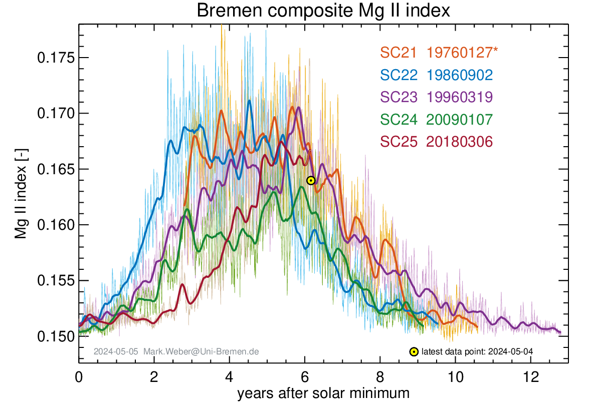
Still low UV levels compared to previous solar cycles.
La Niña is not weakening, far from changing the temperature of the Peruvian Current.
http://www.bom.gov.au/archive/oceanography/ocean_anals/IDYOC007/IDYOC007.202201.gif
Since November, a drop in tropopause temperatures below the -60th parallel was evident.
On the UAH dataset, the most reliable of them all
How is a multiply adjusted proxy measurement of the Troposphere ‘reliable’ as regards the global temperature?
Especially as the similar RSS has a different take?
The troposphere is uncontaminated with stuff like UHI’s and awkward things like Oceans and Ice at the poles, which are still there BTW, despite hysterical predictions they would all be gone by now…….
“On the UAH dataset, the most reliable of them allHow is a multiply adjusted proxy measurement of the Troposphere ‘reliable’ as regards the global temperature?
Especially as the similar RSS has a different take?”
The UAH data is compared with the weather balloon data and they correlate at about 97 percent.
The RSS data is not that different from the UAH data, but the RSS data does not correlate as well with the weather balloon data. And the other data sets do not correlate with the weather balloon data, so that makes the UAH data the more reliable.
It also hasn’t been subjected to the whims of The Adjustors.
This is version 6 of the UAH, every new version has been an “adjustment”. There would be no point in trying to improve your data set if you don’t expect it to cause an adjustment
In 1998 UAH made an adjustment so large it caused a change in the trend of +0.10 C/decade.
WOW! This is a YUGE number! — not
It is 2x the Christy et al. 2003 uncertainty of ±0.05 C/decade. That is a 4σ adjustment.
I would like to stir the pot and opine that both the IPCC and Chris Monckton must be wrong about feedback. The IPCC is wrong for the reasons given, but Monckton’s own derivation must be wrong because it is based on a linear assumption. Unless I am mistaken he is assuming that the feedback ratio is constant at all temperatures.
Common sense suggests this can’t be so. If we are to say that feedback is the result of more water vapour in the air caused by warming, then how can that happen below temperatures that freeze water vapour? 255K seems pretty cold to me. I imagine that below 255K there wouldn’t be much water vapour in the air – maybe none. So temperature changes below 255K, whether caused by changing CO2 levels or not, wouldn’t change water vapour and therefore wouldn’t have any feedback. If true, then the formulae (255 + 32)/(255 + 8) doesn’t make any sense.
Maybe an atmospheric physicist could throw some light on this conundrum – how does water vapour change with temperature? What do other people think?
I think it’s all hot air.
Mr Causey makes the elementary mistake of assuming that my team has assumed linearity in feedback response when the contrary is stated and demonstrated in the head posting.
The reference temperature in 1850 was not 255 but 263 K: therefore, the corrected system-gain factor is indeed not 32 / 8 but (255+32) / (255+8).
At any given moment such feedback processes as subsist at that moment must perforce respond equally to each Kelvin of reference temperature then obtaining.
A mean emission temperature of 255 K means that throughout the tropics the ocean would be ice-free, and a fortiori at a reference temperature of 263 K.
Climatology (e.g. Lacis et al. 2010) has assumed that the system-gain factor in 1850 was about 4 when it is little more than 1. That is a fourfold exaggeration.
Climatology has assumed that today’s system-gain factor is about 4, implying linearity in feedback response.
We make no such assumption of linearity. Instead, we point out that an increase of little more than 1% in the system-gain factor today compared with 1850 would increase the equilibrium climate sensitivity from 1.1 K to 4 K.
It follows from that fact that it is entirely impossible to calculate equilibrium climate sensitivity to any useful degree of accuracy.
Ironically, retro-fitting least-squares linear-regression trends in data-sets containing obscene outliers like ENSO becomes self-congratulating and rather meaningless. It doesn’t need much imagination that after compensating for this factor (de-trending), some overall long-term trend remains. On any short term however one can always find a “pause” because of the distortion provided by any large ENSO component in the last one or two decades. It’s like magic! That said, I do not believe any natural and artificial changes in “world temperature” are as problematic like so often depicted. They happen slower and have way a more complex balance of damages and beneficial factors compared to what many activists are suggesting.
In response to “John Dowser”, all least-squares linear-regression trends are by definition “retro”, for they are based on previously-established data. Furthermore, as has been discussed in detail in earlier columns on the monthly Pause data, the only global warming evident in the record arises because there have been several large el Nino Southern Oscillations, which are of natural origin.
North America without Florida will be frozen in two days.
Now the temperature is down to -7 C in New York and -9 C in Washington.
It looks real cold up in Alaska. I guess that’s heading towards the Lower 48.
https://earth.nullschool.net/#current/wind/isobaric/500hPa/overlay=temp/orthographic=-116.62,41.41,264
Griff is on the cold side of the jet stream now:
https://earth.nullschool.net/#current/wind/isobaric/500hPa/orthographic=-21.29,24.80,264/loc=-0.985,53.826
Another trend arising from actual measurements globally is found here:
http://temperature.global/?fbclid=IwAR1mhZfsFG7WnZYOjTznx_Yvy-_MguXETmvV-cioDlJGGsEqNoWppwAMrUo
This uses actual METAR data, which must remain accurate as it is critical to aviation safety, so cannot be “adjusted” by the hooligans perpetrating the climate change cult narrative!
From the above site:
“The recorded global temperature for previous years:
2015 average: 0.98 °F (0.54 °C) below normal
2016 average: 0.48 °F (0.27 °C) below normal
2017 average: 0.47 °F (0.26 °C) below normal
2018 average: 1.33 °F (0.74 °C) below normal
2019 average: 0.65 °F (0.36 °C) below normal
2020 average: 0.00 °F (0.00 °C) below normal
2021 average: 0.20 °F (0.11 °C) below normal”
How does anyone take that site serious?
No explanation of how the averages are calculated. No definition of the base period.Results that bare no relationship to any other data set.
According to that list 2020 was 0.27°C warmer than 2016, 2021 was 0.63°C warmer than 2018. Compare this with UAH, according to Lord Monckton, the most reliable of all data sets, where 2020 was 0.03°C cooler than 2016, and 2021 only 0.05°C warmer than 2018.
The good folks over at the Daily Sceptic has an article describing the same trend in the UK:
U.K. Temperatures Defy the Doomsday Climate Models and Fail to Rise for 10 Years, Met Office Data Shows
What does the USCRN show for the US? (It seems difficult to find.)
Is something like this what you’re looking for ???
https://www.ncdc.noaa.gov/temp-and-precip/national-temperature-index/time-series/anom-tavg/1/0