By Christopher Monckton of Brenchley
The drop from 0.03 K to 0.00 K from January to February 2022 in the UAH satellite monthly global mean lower-troposphere dataset has proven enough to lengthen the New Pause to 7 years 5 months, not that you will see this interesting fact anywhere in the Marxstream media:

IPeCaC, in its 1990 First Assessment Report, had predicted medium-term global warming at a rate equivalent to 0.34 K decade–1 up to 2030. The actual rate of warming from January 1990 to February 2022 was a mere two-fifths of what had been “confidently” predicted, at 0.14 K decade–1:

The entire UAH record since December 1978 shows warming at 0.134 K decade–1, near-identical to the 0.138 K decade–1 since 1990, indicating very little of the acceleration that would occur if the ever-increasing global CO2 concentration and consequent anthropogenic forcing were exercising more than a small, harmless and net-beneficial effect:

Note that all these charts are anomaly charts. They make the warming look much greater and more drastic than it is in reality. The 0.58 K warming trend since late 1978 represents an increase of just 0.2% in absolute global mean surface temperature – hardly a crisis, still less an emergency.
Meanwhile, the brutal invasion of Ukraine by Mr Putin and his cronies is bringing about a growing realization, among those who have eyes to see and ears to hear, that the global-warming narrative so sedulously peddled by the climate-change industrial complex originated in the Desinformatsiya directorate of the KGB. For a detailed background to this story, visit americanthinker.com and click on the archive for March 2022. There, the kind editors have published a 5000-word piece by me giving some history that readers of WUWT will find fascinating. It is a tale much of which, for security reasons, has not been told until now.

It is worth adding a little more about the economic aspect of this sorry tale of Western feeblemindedness and craven silence in the face of the unpersoning – the relentless campaign of vicious reputational assault – to which all of us who have dared to question the Party Line have been subjected.
Do not believe a word of what either the Russian media or the Western media are saying about Mr Putin. He is not a geriatric who has lost his touch. The events now unfolding in Ukraine have been planned since long before Putin’s silent coup against Boris Yeltsin in 2000, after which, over the following five years, Putin put 6000 of his former KGB colleagues into positions of power throughout the central and regional governments of Russia. Some of those who were in post in 2004 are listed above. Many are still there.
The televised meeting of senior advisers at which Putin shouted at those of them who dithered when recommending that Ukraine should be invaded was a classic maskirovka, designed to convey to the West the impression of an unhinged and mercurial dictator who might reach for the nuclear button at any moment.
The chief purpose of the Ukraine invasion was to hike the price of oil and gas, and particularly of the Siberian gas delivered to Europe via many pipelines, some of which date back to the Soviet era.
It was Putin’s Kremlin, later joined by Xi Jinping in Peking, that founded or took over the various “environmental” lobby groups that have so successfully campaigned to shut down the coal-fired power stations, particularly in Europe, which is now abjectly dependent upon Russian gas to keep the lights on when the unreliables are unreliable.
That is why one should also disbelieve the stories to the effect that the sanctions inflicted on Russia by the West are having a significant impact. The truth is that they were fully foreseen, prepared for and costed. The thinking in the Kremlin is that in due course the increased revenue from Russian oil and gas will more than compensate for any temporary dislocations caused by Western attempts at sanctions, which look impressive but count for remarkably little.
But surely sending close to a quarter of a million troops to Ukraine is expensive? Not really. Putin keeps 1.4 million under arms anyway – about five times as many per head as the UK, which has 200 tanks to Putin’s 15,000. The marginal logistical cost of the invasion is surprisingly small: and Putin will gain Ukraine as his compensation. It is the world’s most fertile agricultural area, and it is big. Russia is already a substantial exporter of grain: once it controls Ukraine it will have as much of a stranglehold on world food prices as it now has on world oil and gas prices, and it will profit mightly by both.
Putin’s first decisive act of policy when he became Tsar of Some of the Russias was to slash the Russian national debt, which currently stands at less than a fifth of the nation’s annual GDP. That is the ninth-lowest debt-to-GDP ratio in the world. Once he has gained control of Ukraine and its formidable grain plain, he can add the profits from worldwide sales to his immense profits from the elevated oil and gas price. His plan is to pay off Russia’s national debt altogether by 2030.
In this respect, Putin’s Russia compares very favourably with Xi’s China, whose national, regional and sectoral debts are colossal. For instance, the entire revenue from ticket sales for the much-vaunted high-speed rail network is insufficient even to meet the interest payments on the debt with which it was built, let alone to meet the operating costs.
Once Putin has restored Kievan Rus and Byelorus to the Sovietosphere, he is planning to expand his nation’s currently smallish economy no less rapidly than did the oil-rich nations of the Middle East. Do not bet that he will fail.

It is galling that those of us who have been sounding warnings about the Communist origin of the global-warming narrative for decades have gone unheeded. The late Christopher Booker, who came to the subject after reading a piece by me in Britain’s Sunday Telegraph and devoted most of his weekly columns to the subject thereafter until his untimely death, wrote week after week saying that by doing away with coal we should put ourselves at the mercy of Russia and its Siberian gas.
However, our politicians, nearly all of whom lack any strategic sense or knowledge of foreign affairs, and who are less scientifically literate than at any time since the Dark Ages, paid no heed. Now some of them are waking up, but far too late.
On the far side of the world, in Australia, the land of droughts and flooding rains, the south-east has been getting some flooding rains. The ridiculous Tim Flannery had been saying to any climate-Communist journalist who would listen a decade ago that global warming would cause all the rivers in south-eastern Australia to run dry. Now, of course, the climate-Communist news media are saying that the floods are because global warming. Bah! Pshaw!
“one should also disbelieve the stories to the effect that the sanctions inflicted on Russia by the West are having a significant impact.”
The ban from the Swift (text messaging – that’s what it is) system is Pythonesque, it merely means Russia will have to pick up the phone more.
As John Lennon once said, gimme some truth.
I have reservations concerning the seizure of properties and bank accounts of Russian oligarchs and forced closure of independent Russian businesses here. I wonder whether we are observing a normalization of such theft of property and rights by governments, even though I don’t have a yacht, etc.
First they came for the Russian yachts…
This is not a new thing.
It is a rather blunt instrument and as you are arguing, there is no due process where both sides can present arguments before the assets are frozen.
Yes, I’m also concerned about sanctions and seizures of assets without legal process. If you were intending to ferment revolt and begin a process of regime change through funding a disaffected internal or excile minority, that is exactly what you’d do. This is thus fueling a legitimate fear for Putin and his cronies. If you wanted peace you’d respect property.
Take your disinformation somewhere else you Slavophile troll. What kind of craziness are you spouting? Putin and his oligarchs are the ones with no respect for property and in the act of “regime change” in Ukraine, in case you’ve been living in a cave for the last decade. He has invaded and attacked a peaceful, democratic, sovereign nation with no provocation. He is destroying billions of dollars of private property, has killed thousands already, and has displaced millions of people. Putin is a violent, remorseless, petty little tyrant with Napoleonic ambitions. Now he is a war criminal. He has joined the ranks of Stalin, Mao, and Hitler in the history books. The oligarchs and military leaders who support him are just as culpable. Just to be clear.
Should not be a surprise considering the gulag that Nasty Pelosi runs in Wash DC.
The RAF sank my yacht by mistake, but did not pay compensation
Dear Lord M.,
I always enjoy your essays, but this one and the Am Thinker piece are beyond excellent.
The warmunistas have finally achieved their world war. The bombs are falling. Mothers clutch their children in dank cellars listening to the rolling thunder above. The streets run red with blood. All this wished for, planned for, by design of monsters.
Putin is to blame, and his minions. Caesar never stands alone. But the seeds of destruction were laid by the lefty liberal hippie milli sheeple herders, the barkers of hate, the panic porners, the commissars of death and slavery, in their gilded mansions, mad with greed and lacking any semblance of conscience.
It is a tragic day for humanity. You and a few others saw all this coming years ago and tried to warn us. It is not your fault. Your efforts have been stellar. You could not have done any more. I know that is little consolation. I have no tonic for grief.
Our man in Canada is looking into freezing and seizing accounts of truckers who had a massive protest in front of Parliament Hill for about 5 weeks of the coldest winter in a long time. In this huge long protest, not one person was physically hurt, probably a world record for a protest of this size and duration, a poster of a peaceful protest. This, despite the usual paid small group with swastika placards to taint the truckers with white supremacist BS and give the corrupted MSM a focus for fake news articles.
So much for freedom of speech and the right to protest peacefully in Canada.
It has been inching up for decades. Recall the wide spread ‘taking’ of property in the US some while back from people accused of various crimes, no proceedings, certainly no convictions, necessary. More of less every state was getting on that gravy train. I think the courts eventually put some limitations on the practice, either that or the msm stopped reporting on it.
They came 4 me well be4 the yachts…kaint have any freeman loose
You have reservations about governments around the world making life uncomfortable for Russian oligarchs in bed with the war criminal Putin??!! Your utter disconnection from the reality of an unprovoked war on a peaceful, democratic country by a murderous dictator and his evil cronies and the devastating impact it is having on millions of innocent people is…there are no words. Wow. Just wow. Like the global warming nutjobs, you’re bleeting about an imaginary problem while a monumental and real crisis happens before your eyes.
At least you didn’t call me a racist, stink.
Da, da, da) Well,
The Ukraine girls really knock me out (… Wooh, ooh, ooh)
They leave the West behind (Da, da, da)
And Moscow girls make me sing and shout (… Wooh, ooh, ooh)
That Georgia’s always on
My, my, my, my, my, my, my, my, my mind
Oh, come on
Woo (Hey)
(Hoo) Hey
Woo hoo (Yeah)
Yeah, yeah
Hey, I’m back In the U.S.S.R.
You don’t know how lucky you are, boys
Back In the U.S.S.R.
I think this should be 5 years and 7 months, not 7 years and 5 months?
Thanks as ever. Russia, however has 12400 tanks, but many are obsolete, compared to western armour.
Even obsolete tanks are quite effective against women and children.
Even obsolete tanks will withstand untrained men with machine guns.
And be in no doubt that the vast majority of the non-obsolete tanks will be a match for almost anything, especially tanks operated by the “snowflakes” that our army have gone out of their way to recruit.
Not that our army is likely to see much action, at least until Putin is enforcing his “corridor” through Lithuania to Kaliningrad. Adolf would have been proud of him.
“Adolf would have been proud of him.”
I don’t know, Adolf’s Wehrmacht defeated the French and British armies and then overran Northern France in two weeks.
Absolutely.
But the “Danzig Corridor” was a very successful pretext for invasion.
You think Vlad isn’t aware of that?
And, on the other hand, Zhukov did a great job against the Japanese tanks at Khalkin Gol in 1939 and went on to win against much more sophisticated German tanks using fairly basic but effective T-34s from Stalingrad to Berlin.
Meanwhile the tanks the British were provided with in early part of the war up to Dunkirk were, ahem, a bit embarrassing.
Zhukov – like most US military tacticians – relied on overwhelming numbers.
Nothing more.
You won’t find many British tanks at the bottom of the English channel, and there are a lot of tanks down there.
Zhukov succeeded where other Soviet Generals foundered.
There’s a US Sherman tank near us recovered from the botton of Start Bay, South Devon, when a training exercise for D day went tragically wrong when the troops and landing craft were ambushed by German Uboats.
Operation Tiger – an Amphibious D Day Rehearsal Disaster (combinedops.com)
E-boats not U-boats. E-boats were kinda like MTBs (Motor Torpedo Boats which many in the US would recognize as PT Boats) but larger with torpedo tubes that fired from the bow of the hull. They were sturdier built craft than PT boats. Top speeds of MTBs and E-boats were comparable.
The American tanks that sunk were using a British flotation device.
That is true but not fair. It was stupid to launch those DD Tanks off Omaha in the existing sea conditions. And had the officer in charge on the spot had been able to communicate with the half of his command that did launch, it would not have happened.
The British lost a few too but their beaches were much more protected and the waters not so rough and so a lot more of their made it.
The DD tanks were the only one of Hobarts “follies” that the US decided to use. The other several specialized tank configurations that British Officer came up with did great service with the British.
Ike was offered a limited number of LTVs (Alligators) as the Marines were using in the Pacific, but refused them. That was a mistake.
American Sherman tanks known as Tommy Cookers to the Wehrmacht.
Only when fitted out as a Sherman Firefly with a British 17lb anti tank gun did it stand any kind of chance against German armour
Anyone that thinks that the invading Allies would have done better with the equivalent of a Tiger or Panther during the invasion and pursuit phases in Europe, is mistaken. Does not understand the logistical realities of the time. And does not understand how unreliable the Tiger was nor how the Panther was limited in range by fuel and the very limited service life of it’s all metal tracks on hard surface roads.
Admittedly the US should probably have started to introduce the M 26 Pershing earlier and in greater numbers than it did but this failure is understandable considering the fact that even at the time of the Battle in the Ardennes most US front line troops lacked proper winter clothing for most of that battle.
There is a reason why the Russians decided to use lend lease M-4 Shermans and not the T-34s to make the long track over the mountains to reach Austria.
I get tired of the one sided way this argument is presented.
There is a story about some German officer who noticed cans of Spam after they overran the Ardennes line and said something to the effect that Germany was finished if the US was able supply the Army from across the Atlantic.
In 1942, maybe August….the German who was in charge of War Production flew to Hitler’s Wolf’s Lair or whatever in Ukraine and informed him that Germany could not out produce the Allies…too few people and resources – advised him to make peace.
In the movie, Battle of the Bulge, there is a scene where a German general looks at captured packages from families to US soldiers. The general says much the same thing.
It is a movie, but based on a true story!!
They were known as Tommy-Cookers because the tanks tended to burn rather well when hit close to fuel tanks, which I believe were un-armoured so vulnerable to shell hits! The Sherman Firefly was indeed a good upgrade with it’s 76.2mm 17lb shells. However, as in so many cases, the British Army was slow to learn, until the Comet tank was developed with a well powered engine, good well sloped armour, & a 76.2 barrelled gun!!! The final success story, the Centurion tank never got to see tank on tank action merely mopping up works towards the end. However, in the early years, British tanks had better armour than the German tanks, but poor firepower, with mere 3lb & 5lb guns, mere popguns compared to 75mm & 88mm guns on the other side!!! However the Sherman tank must always be viewed as a workhorse throughout!!!
The problem with the early British tanks of WW II was not only being under gunned but also poor mechanical reliability.
A British enlisted tank driver gave one of the first M-3 Stewarts delivered to N. Africa a test drive. He did his best to get it to throw a track. When asked by his officer how he liked it, he responded “It’s a Honey”.
And that right there in a nutshell expresses the primary reason the US tanks were favored. No tanks produced by any nation during the war came close to having the mechanical reliability of those that came off the production lines of the US.
Above I noted the “Tommy Cookers” phrase. And it was true until later versions of the M-4 came out with wet storage for the ammunition for their primary gun. Those later versions would still brew up due to the gasoline used for their fuel but they gave the crew time to bail out before their internally stored ammo started blowing up and thus improved survivability.
I think that the Israeli army used nearly 1000 Centurions in the 6 day war, mostly regunned
And Sherman’s upgrade with a 105.
Well sloped armour on the Comet???
A 90 degree upper glacis isn’t well sloped. Ok the turret was reasonable, but the hull was almost a box.
Sherman Tanks were designed to be mass produced in HUGH numbers. They were under armed but, non the less, their NUMBERS overran the Wehrmacht.
Tanks were important but:
I suspect many have heard that in the US Army the infantry is known as “the Queen of Battles”. How many have wondered what “the King of Battles” is? Well the answer is the Artillery. King Louis XIV had “Ultima Ratio Regum” (The Ultimate Argument of Kings) cast into all of his artillery pieces and he was correct.
It was the development of artillery that eventually ended the usefulness of castles as fortified redoubts and caused the evolution of siege warfare. It was artillery that turned the infantryman into a gopher where by a good trench or hole is an essential for survival in static warfare.
But despite the trenches and holes about 75% all KIA during WW I were from Artillery. During WW II Artillery accounted for about 64% of the total casualties in the war against Germany and Italy. In the war against Japan it was about 46%.
BS, the Sherman was dominate in North Africa and quite possible the E8 version was the best tank of the war.
Although it was before the war, I think Zhukov’s victory at Khalkin Gol was the decisive battle of WW2. Japan was soundly defeated and decided to not join the Axis war on the Soviet Union. Had Japan gone into Siberia rather than the Pacific (and not brought America into the war with the Peal Harbor sneak attack) an Axis victory would have been certain.
When “Blitzkreig” failed at the outskirts of Moscow…it was “ovah”. It became a war of attrition…Hitler was not too good at arithmetic…believed in “will” over numbers…he was wrong.
True this, the air force was completely designed around lightning war, with no strategic and heavy lift capabilities at all.
I saw a special a few months back that claimed that during the battle for Russia, over half of German supplies were still being delivered in horse drawn carts.
Meanwhile the Russians used US produced trucks and after the supply chain through Iran had opened the supply of trucks was so prolific that when the sparkplugs became fouled parked it and grabbed another.
And that is another aspect of logistics that the amateurs ignore or are ignorant of. No combatant in WW II even came close to achieving the efficiency or scope of the US vehicle and recovery, repair, and maintenance efforts.
It came not only from a concerted effort of the Army to make it that way but from the fact that during the prewar years the US had a far larger population of men familiar with mechanics than any of the other combatants.
It seems to be a talent that has been forgotten. My father related how during WWII, along with food rationing, one could not get repair parts for cars. When his low-compression 30s-vintage Ford started blowing oil, he shimmed the cylinder with a tin-can, and got many more miles out of it.
Unfortunately, a talent that is pretty much useless these days (unless you have a very old car).
Even with that talent, a modern battle tank doesn’t work that way. Coaxial laser on the main gun, coupled with a targeting computer that calculates range, windage, tube wear, temperature, humidity. Frequency hopping encrypted communications. IVIS for battlefield awareness of every other tank and attached vehicles. Armor that is definitely not “patch and go.”
That said, tankers ARE trained to do everything that they CAN still do, like breaking track (a very physical job that, sorry, females just cannot do). There is less and less of that as technology advances.
The story is probably apocryphal, but I remember reading about the world’s only DC-2 1/2. The story is that during the early days of WW2, and the Americans were evacuating ahead of the advancing Japanese. In a Japanese attack on an American airfield a DC-3 had one of it’s wings destroyed. The mechanics weren’t able to find any undamaged DC-3 wings, but they did find a DC-2 wing. So they jury rigged a way to connect the DC-2 wing onto the DC-3 body and used it to help evacuate the field.
I got it first hand. To be fair, my father was a machinist, amateur gunsmith, and knife maker in his younger days. He worked his way up to be a tool and die maker and jig and fixture builder at the end of his career.
As a teenager, I stripped first-gear in my ’49 Ford V8, drag racing with a friend. I know he had never repaired a transmission of that vintage. Yet, he unhesitatingly pulled the transmission, and repaired it, with the admonition, “Next time, you do it by yourself.” He was prescient!
And, I have heard that in the early years of cars, many a farmer made money pulling tourists out of the mud holes in what passed for roads, using their plow team.
I certainly believe this—they had to regauge thousands of kms of Russian broad gauge railroads before being able to get rail supply east. Trucks ate fuel, plus they were needed for the motorized infantry.
New interesting perspective for me, I haven’t studied the Japan/Russian war, which apparently was never settled after WWII due to mutual claims of 5 islands north of Japan. That Japan needed oil, and COULD have had it with much shorter supply lines from Russia, is something to think about. And without bringing the US into the war, there would have been nothing to obstruct the shipments to Japan.
Russia attacked on 2 fronts. That could have engendered a completely different ending to WWII. Without US steel and trucks and jeeps, etc. the Russian war machine would have probably collapsed.
All of Europe, possibly less the UK, would be speaking German and most of Asia north of the Himalayas would be Speaking Japanese.
Something for me to study in my retirement, thanks Jeffery P.
Even more simple, Hitler doesn’t attack Russia. Builds the bomb and puts it on V2 rockets. War over.
Yes, jeffery,
And interesting that Stalin waited until the peace for the Khalkin Gol campaign was signed before following the Nazis into Poland, then swallowing the Baltic states.
And we all (hopefully) are aware how those occupations worked out.
And some of Putin’s latter day admirers today are shocked, shocked I say, that the children of the poor sods who suffered then and continually until 1991 are lacking in enthusiasm for Putin and his chums, being back in charge of their lives.
And training professional snowflakes:
https://townhall.com/tipsheet/mattvespa/2022/03/04/as-russia-invades-ukraine-our-military-is-ensuring-we-pronouns-and-gender-identity-right-n2604118
The question isn’t Russian tanks against western tanks, because nobody in the west has the courage to stand up to Putin. Not the Stasi informant in Russia and certainly not the president suffering from dementia.
No, Ukraine will have to stand alone, and they don’t have enough tanks to do the job.
The US should stay out.
It’s too late to share responsibility. From 2014, this is the Slavic Spring in the Obama, Biden, Clinton, McCain, Biden Spring series.
This former SF soldier targeted for Europe during the cold war agrees. Weapons and advisors and that is it. No conventional forces deployed in Ukraine. I would bet though that guys from my former unit, the 10th SFG(A), are on the ground in country and advising and providing intel. That is exactly what they are trained to do and exactly the theater, including language, they have been trained to do it in.
I hear stories about the effectiveness of Javelins and our donation of hundreds of these to Ukraine. Perhaps these level the playing field to some extent or least place some concerns in the minds of Russian tank operators.
Also NLAW’s. (Fire n Forget guided missiles) Apparently they’re better for close combat which will be needed in urban fighting, and also a lot cheaper. Ukraine needs thousands of those rockets.
What a mess it all is.
My understanding of NLAWs is that they are great for lightly armored vehicles, which MOST of any convoy is. Javelins for tanks, NLAWS for the rest, Stingers for air cover, good mix.
Its hard to subjugate an armed populace when the majority of your troops are trying to protect that expensive armor. As I said on a previous Thread, small hunter/killer teams supported by a local populace will devastate armored maneuver. Send in the Javelins! The Ukraine is and will become more of a bloody mess.
Tanks are meaningless, if The Ukrainians can keep the Russian from total control of the Air they can win as long as the west keeps sending supplies.
They are NOT obsolete to Ukraine’s few tanks while the newest T-14 Tank is very powerful but only 20 of them built.
They cannot take Russia on head to head in armored warfare. What they can do is extract a very heavy price in urban combat. You gain nothing knocking down buildings because the rubble serves equally well for cover and concealment for the defenders and obstructs the passage of vehicles, including armor. The only reason to knock down the high buildings is to deny them as observation points. Other than that, it is self defeating in an urban area that one wishes to take control of with troops on the ground.
I’d be very surprised if there are any large scale tank on tank operations. The Ukrainians know they don’t have the equipment for such operations. They seem to be gearing up for hit and run and urban operations.
This is NOT a tank battle, if it were, Russian tanks would be spread out passing through the fields, not sitting in convoys.
I have posted this before, the Flying Tigers is the model. Get US pilot volunteers, place them on furlough, get them Ukrainian citizenship, repaint A 10s, F 15s, and old F117As in Ukrainian colors, give them to Ukraine, and this war would be over in 2 weeks tops. Imagine what US stand off weapons, F117A targeting of Russian AA missile batteries and A 10s attacking he 40 mile long convoy. Total game changer.
Either the Russians will withdraw, or they will use nuclear weapons, but either way, it would be over.
It is not a tank battle obviously and it isn’t simply because it can’t be. Your ploy will not work though. You simply will not get the numbers of qualified volunteers even if this government would support such an effort, Which it won’t.
The country simply is not big enough either.
And long-range sniper nests.
For sure Putin has his strategy, but I cannot help but think he has underestimated the unified response of the West, especially where there are a few leaders that would see this distraction as a blessing in disguise, affording them the opportunity to hide their abysmal polling figures and low voter confidence by taking “decisive action” against an old foe now universally maligned. Time will tell
“he has underestimated the unified response of the West”
The West’s response at the moment is unified hysteria #putinbad.
Most people giving their “expert” views on the situation would have been unable to point out Ukraine on a map two weeks ago. It was the same with covid, everybody became overnight virologists.
Ukraine has been hung out to dry by the West and NATO.
If you want to stop a bully you have to punch him not tickle his roubles.
“If you want to stop a bully you have to punch him”
That’s right. A bully understands a punch in the nose.
Mike Tyson: Everybody has a plan until he is punched in the face.
I do think Putin underestimated the Ukrainian forces and overestimated the capabilities of the Russian army. I also agree underestimated the Western response but I believe without an outright ban on Russian oil and gas, the sanctions won’t have the desired efffect.
There seems to be an unofficial ban on Russian oil. Private companies are taking it upon themselves and are refusing to handle Russian oil.
I imagine Chicom brokers will be more than happy to fill in the gap and the Chicoms will be happy to buy Russian oil.
Putin can do a lot of damage before all the money runs out.
Lots of Ukrainian citizens have Russian families.
Putin could have levelled the place, but hasn’t.
As pointed out in the article, this is about resource gathering.
Russians pride themselves on 50yr plans, we can’t make plans for 5 minutes in the West.
It’s sad but true…
Galactic radiation levels are still at solar minima levels to the 23rd solar cycle.
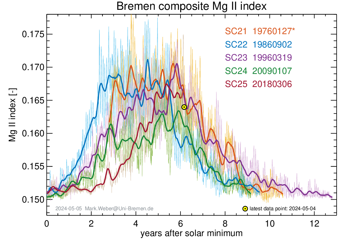
UV radiation levels are still low.
This indicates a weakening of the Sun’s magnetic activity. Therefore, I predict another La Niña in November 2022.
Very little chance of El Niño.

Most grateful to Ireneusz Palmowski for his interesting material predicting that the current weak la Nina may occur again this coming winter.
Well that’s just great. If that comes to pass I don’t think I will able to stand the ”it’s climate change” squawking when we have floods again next summer.
I had hoped for an El Nino as selfishly, I’m building a house and need the hot dry days…
I still think China has played a very large role … primarily in raising the price of energy in the west as part of its long term plan to take our manufacturing.
We are now in a position, where if we want to go to war with China … we have to ask them to supply all the basic spare parts.
And, if you look at the way China has put money into Universities that then went woke and started hating Britain … you can see it wasn’t just an attack on British industry, but also an attack on the cohesiveness of British society.
If Christopher, as you suggest, the Russians have been pouring money into the Green groups, whilst China pours money into academia turning them into Western hating wokes, then it more or less explain how we got to this appalling situation.
There’s a good chance there is more to the China-Russia story, Mike (aka SS). China could roll through Russian anytime they want, and once Russia has been weakened militarily and economically they might go for it. Taiwan can wait. Remember the Tom Clancy book “The Bear and the Dragon”? The USA won’t be coming to the Russian Rescue in reality, partly because China has more on the Brandon Crime Family than does Russia. What a mess.
China is facing several self inflicted wounds. CMB mentioned the high speed rail debacle that wastes millions per day. There are many others to be sure:
1. Population demographic shift to more retirees than workers, thanks to the one-child policy.
2. Massive imbalance in the ratio of males to females. Millions of female babies were aborted or killed at birth.
3. Belts and Roads initiative debt bomb.
4. A Massive GOAT f**k of a housing bubble crisis. Billions wasted by the likes of Evergrande et al. on failed non real estate ventures.
5. Billions wasted on creating ghost cities nobody will ever live in due to the declining population.
6. The loss of upwards of 80% of the populations personal wealth due to the housing market crash.
7. Drastic lockdown measures have largely failed, and only served to anger the population.
8. If the Chinese people discover the Wuhan Virus was created in a lab the will go ape s**t and there will be blood.
9. Massive debt incurred in road building projects to nowhere to stimulate the economy.
China is in much worse shape than most people realize. It remains to be seen if they will do something stupid like make a grab for Tiawan.
Can someone tell me why this guy is saying this on twitter please?
Dr Simon Lee
@SimonLeeWx
· 2 Mar 2020
Even the UAH satellite-based estimate of global lower-tropospheric temperatures (which has the slowest warming trend of all major datasets) showed Earth had an exceptionally warm February – the 2nd warmest on record, behind only 2016, which was fuelled by a Super El Niño.
I really wish it would warm up. More snow on the way 😡
Two years ago?
Because that’s about February 2020. 2022 was only 16th warmest.
Here’s the current February graph.
And yet CO2 rises 😉
Why don’t you ask him why he’s saying that?
Sorry guys, my mistake. I could have sworn that when I first looked at that tweet it read March 2 2022.
I guess I’ll have to blame old eyes and a small screen.
Don’t sweat it. I make a ton mistakes myself. I’m a little embarrassed to admit this but in one post I said carbon had 12 protons multiple times. Carbon has 12 protons and neutrons only 6 of which are protons. Now that is embarrassing.
The full monthly lower-troposphere anomaly dataset is reproduced in the head posting. The temperature has fallen quite a bit since February 2020.
And one should be careful not to deploy the device used by the climate Communists, of picking out a single anomalous value that suits the Party Line and then considering it in isolation.
As the head posting shows, the underlying rate of global warming is small, slow, harmless and net-beneficial.
2020 is tied for first place with 2016, despite the largest downturn in anthropogenic CO2 in history.
And everyone knows the climate responds instantly to even the slightest change in CO2. Or something.
It does so, without fail, within about a couple weeks of the leaves coming out, every Spring. The northern hemisphere MLO CO2 peak is in May every year.
I think you’re getting your causation backwards there. CO2 goes down because the leaves come out.
One of us is missing something. When anything reaches a peak, it has nowhere to go but down. And, I did mention the leaves coming out.
I do expect better from you.
I’m sorry if I misunderstood your argument.
You were replying to Matthew Schilling suggesting that the climate does not respond instantaneously to changes in CO2, and so I assumed when you said “It does so, without fail, within about a couple weeks of the leaves coming out, every Spring.” you meant that the climate was reacting immediately to a change in CO2. If that’s not what you meant I apologize, but in that case I’m not sure how it’s relevant to Matthew’s comment.
And we have another new start date for ‘the pause’! Oct 2014 replaces Aug 2015, or whatever other start date provides the longest non-positive duration that can be wrangled from the UAH data.
Notwithstanding the constant changes to whenever this latest ‘pause’ was supposed to have started, we should ask ourselves the usual question:
‘Is a period of 7 years and 5 months (AKA 89 months) without a best estimate warming trend unusual in a data set spanning several decades that, overall, shows statistically significant warming?’
The answer, as usual, is ‘no’.
Rounding up to a neat 90 months, there are 321 such overlapping periods in the full UAH data set. Of these, 111 are periods of no warming or else cooling. More than one third of all consecutive 90-month periods in the UAH data set do not show a warming trend. Despite this, the data set shows an overall statistically significant warming trend.
Given that Lord M starts counting (from his various start points) at the peak of a big El Nino, and finishes counting at the trough of the recent double-dip La Nina, it is hardly surprising to find yet another ~90 month period of no warming. Suggesting that the underlying long term warming trend has stopped or reversed is a wish.
There is no global warming and as long as La Niña lasts there will not be. Many regions will be cooler.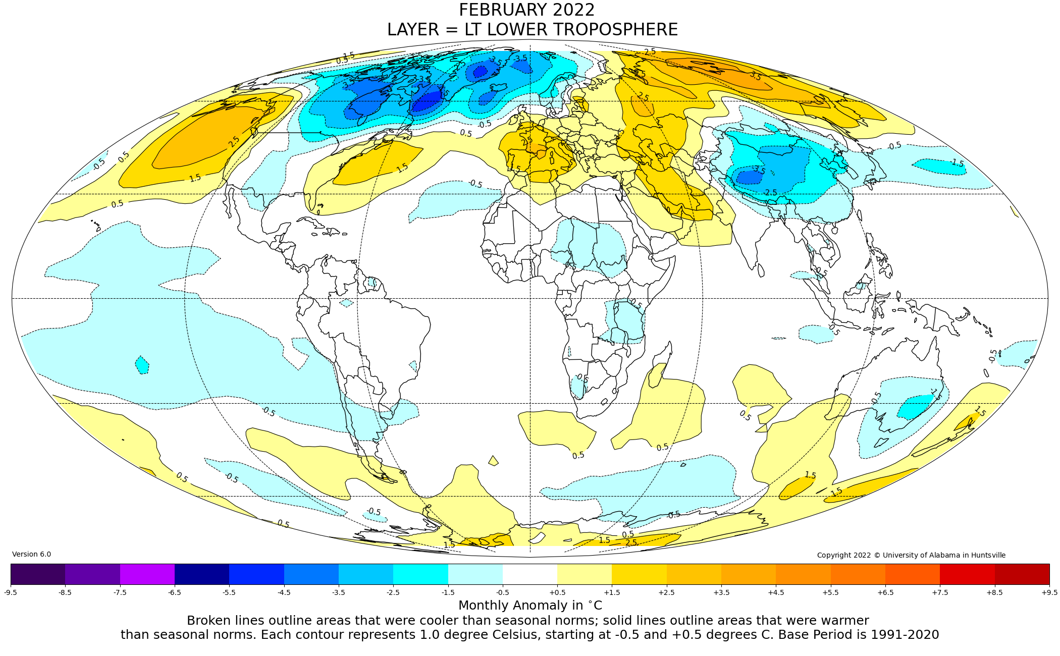
For example, Australia will have below average temperatures due to cloud cover.
http://tropic.ssec.wisc.edu/real-time/mtpw2/product.php?color_type=tpw_nrl_colors&prod=global2×pan=24hrs&anim=html5
And soon after the next round of El Nino conditions recommence, that map will look decidely red. Doesn’t matter what a single month looks like; it’s just a snap shot. What matters is the underlying long term trend; and that remains statistically significant warming.
“What matters is the underlying long term trend; and that remains statistically significant warming.” – said all the climate experts in 1940.
Don’t confuse ToeFungalNail with a climate expert. He’s just a run-of-the-mill climate alarmist who makes “predikshuns” based on his belief that CO2 dominates all other factors that influence the climate.
ToeFungalNail doesn’t understand that CO2 is just one factor out of many. He doesn’t understand that, since climate models are unable to hindcast major changes in the climate when CO2 was stable, the models are essentially useless.
Meab said: “since climate models are unable to hindcast major changes in the climate when CO2 was stable, the models are essentially useless.”
Willeit et al. 2019 was able to hindcast major changes in the climate over the last 3 million years both with stable and unstable CO2 trends. Their model even explains the transition from 40k to 100k year glacial cycles around 800,000 YBP. It hindcasts both the CO2 and T profiles with pretty reasonable skill. As always, if you know of a model that has better skill in replicating both CO2 and T simultaneously I’d love to review it.
Yet another worthless bit of computer modelling, completely devoid of any physical basis.
Would you mind posting a link to the model you had in mind that exhibits better skill and also explains the mid Pleistocene transition and which has a firm physical basis?
I have no idea, but I do know that a model with as many adjustable knobs and dials as climate models can be “adjusted” to fit any desired scenario.
The Standard Model of particle physics has a lot of knobs and dials that can be adjusted. Do you hold the same prejudice against it as you for the climate models?
This is nonsense.
Wrong. The Standard Model is based on the fundamental constants, has only four forces, six leptons and three quarks, and makes physically-verifiable predictions.
”Willeit et al. 2019 was able to hindcast major changes in the climate over the last 3 million years”
God spare me. You actually believe we have the slightest clue about the details of the climate 3 million years ago?
You need help. And I don’t mean regular help but a team of specialists working round the clock. 🙂
Mike said: “You actually believe we have the slightest clue about the details of the climate 3 million years ago?”
Yes. I’ve not seen a convincing reason to doubt the abundance of evidence which says that glacial cycles were common.
When do you expect the next El Nino to happen and how big will it be?
And that warming is the result of what, TFN? What is the significance of that minor warming?
The AMO (down) cycle will prove you wrong Nail.
ResourceGuy said: “The AMO (down) cycle will prove you wrong Nail.“
The AMO was negative from 1965 to 1998 and positive through at least 2019. Based on Berkeley Earth’s data the temperature increased about 0.50 C during the cool phase (34 years) and 0.45 C during the warm phase (21 years). Those are warming rates of +0.15 C/decade and +0.21 C/decade. Based on that alone you could reasonably hypothesize that the future trend would be lower, but since it was still significantly positive even during the cool phase I don’t think it is reasonably to hypothesize that it would be negative.
I’m not suggesting a univariate model but I guess you took it that way.
Except for the last 7 years and 5 months. That is about 1/4 of the 30-year baseline. Not quite a “snap shot.”
As every good climate scientist knows, once a trend starts, it never, ever, ends.
I don’t know if you are this math deficient, or just being your usual duplicitous self.
The calculation of the pause starts at the present and works backwards in time.
According to the leading lights of the AGW panic, such long pauses aren’t possible.
For once I’d like someone who insists Monckton is working backwards, to explain exactly what they think he does, and why it make a difference.
This is about how you determine which month will be the start of the pause. You look at one month after another until you have found the correct start month, i.e. the earliest month that gives you a non-positive trend from that month to the most recent month. It makes no sense to perform your search backwards as you won’t know you have found the earliest such month until you have gone back to the start of the data set. It’s easier to start at the beginning look at each potential start month and stop as soon as you find the first one that gives you a non-positive trend. But it makes no difference which direction you look in, you will get the same result.
NEE!
It.
“The cure for boredom is curiosity. There is no cure for curiiosity.” — Dorothy Parker
1) For a given dataset, fix the end-point as “the last available monthly anomaly value”.
2) Working backwards, find the earliest month that results in a (just) negative trend.
3) One month later, when a new “last available monthly anomaly value” becomes available, go to step 1.
The latest results, for the main surface (GMST) and satellite (lower troposphere) datasets, are shown below.
It doesn’t, it’s merely an “interesting” phenomenon.
To classically trained detractors it can (legitimately …) be called “intellectual onanism”.
For ignorant peasants (such as myself, who need to look up what the term “sermo vulgaris” means instead of simply recalling it from memory) the term usually employed is “math-turbation”.
NB : The results still count as “interesting” though …
Thanks. Yes that is how the start date can be determined. The question still remains, why work backwards in step 2? The only way to be sure a given month is the earliest month is to go all the way to the earliest date e.g. December 1978. You could just as easily start at the earliest date and work forwards until you found the first negative trend.
You have been VERY badly misinformed …
That’s not what I’m describing. What I’m saying is you have to look at every start date (or end date if you prefer) calculate the trend from that date to the present, and choose from all possible dates the one that gives you the longest pause.
The forwards method
What’s the trend from December 1978 to February 2022. It’s positive so reject that as a start date.
What’s the trend from January 1979 to February 2022. That’s positive so reject that.
Repeat for each month until you get to
What’s the trend from October 2014 to February 2022. It’s negative. Hooray! We have the start date for the longest possible pause. We can stop now.
The backwards method
Whats the trend from January 2022 to February 2022. It’s negative, it’s the best candidate for a pause, but we have to keep going on.
Whats the trend from December 2021 to February 2022. It’s negative, it’s the best candidate for a pause, but we have to keep going on.
And so on till
Whats the trend from March 2018 to February 2022. It’s positive so not a candidate for a pause – April 2018 remains our best candidate, but it could easily turn negative again, so we keep going.
Until
Whats the trend from October 2017 to February 2022. It’s negative. Hooray, we can use that as a start date for the pause, but we have to keep going.
So on through more negative months until
Whats the trend from September 2014 to February 2022. It’s positive so not a candidate for a pause. October 2014 is now our best start date. But we can’t know if it won;t turn negative again. So keep going.
Finally
Whats the trend from December 1978 to February 2022. It’s still positive. We’ve come to the end of our data, so go back to the earliest pause date we found October 2014 – and that’s the start of the pause.
NB : I don’t “have to” do that, it’s one option amongst many.
On the other hand, “been there, done that, got the T-shirt” …
Start 8000 years ago
Actually, you can save yourself some time by looking at a graph and seeing what historical dates can be eliminated as being impossible. Not that you will probably notice the difference unless you are still using an old 8-bit computer with a 1MHz clock speed.
True, and I thought about mentioning something to that effect, but it’s getting complicated enough. You can generally tell when the trend isn’t going to go negative, and either stop there if going backwards or start there if going forwards.
In all fairness, I don’t use an algorithm to determine the start of the pause, I just generate a time series of every month and eyeball it to see the earliest start date, and this also allows me to see where to cherry pick periods with fast warming rates.
The issue still is why people think using any process to find the exact start month to give you the longest pause is not cherry-picking as long as it’s calculated and done backwards. To me, the very fact you are doing the calculation for every month is what makes it a cherry-pick.
CMoB is doing the equivalent of your “Trends to last data point” line. And Bellman is right. You can start in either direction, but computationally starting at the beginning requires less calculations since you get to stop the moment a non-positive trend is observed. Starting at the end forces you to walk all the way to the beginning.
And yet CO2 keeps rising 🙂
Derg said: “And yet CO2 keeps rising “
ENSO keeps happening too.
A sphincter says what?
ENSO is the El Nino Southern Oscillation. It has been shown to drive the UAH TLT temperature up during the warm phase (El Nino) and drive it down during the cool phase (La Nina).
You hit the nail right on the head!
The fact that CO2 keeps rising *should* mean there will be no pause. That’s what the climate models all show – NO PAUSE.
The longer the pause the more questionable the tie-in between CO2 and temperature becomes.
When the climate models get good enough to predict the pauses then they might become useful for predicting the future. Don’t hold your breath.
I have submitted two articles supporting your position, but Charles has not been willing to publish them. Would you be interested in seeing them?
Yep. Send’em along! Do you still have my email!
TG said: “The fact that CO2 keeps rising *should* mean there will be no pause.”
That would only true if CO2 were the only thing modulating the atmosphere temperatures.
TG said: “That’s what the climate models all show – NO PAUSE.”
If all climate models show NO PAUSE then why is it that I see a lot of pauses in the CMIP5 members available on the KNMI Explorer?
Again, here is the graph of the models.
Where are the pauses?
TG said: “Where are the pauses?”
Download the tabular data for each member from the KNMI Explorer. Load the data into Excel. Do a =@LINEST(X1:X89) on each monthly value. Look for occurrences where LINEST is less or equal to zero. If Excel is not your thing you can use R or your favorite programming language.
“Download the tabular data for each member from the KNMI Explorer. Load the data into Excel. Do a =@LINEST(X1:X89) on each monthly value. Look for occurrences where LINEST is less or equal to zero. If Excel is not your thing you can use R or your favorite programming language.”
I don’t need to do so. I’ve already posted the data in the form of a graph of the model outputs included in CMIP5.
TG said: “I don’t need to do so. I’ve already posted the data in the form of a graph of the model outputs included in CMIP5.”
How did you apply the Monckton method to the graph? With so many lines on that graph how did you make sure you weren’t confusing members especially when the lines crossed?
I can only assume you are color blind. You can separate out the model runs via their color.
TG said: “I can only assume you are color blind. You can separate out the model runs via their color.”
I zoomed in on the graph you posted and put the pixel grid on it. It looks to me that a lot of them have the same color. I also noticed that when multiple members land on the same pixel the color seems to be a blend of all of them. And the mass in the center looks to be blended together so thoroughly that I can’t tell where an individual member even starts. Maybe my eyes are failing me. Maybe you can help out. Would you mind separating out just a single member here so that I can see how you are doing it?
What’s the big deal? With computer, going back to 1978 and doing all the calculations won’t even give you enough time to go get a cup of coffee.
It’s not a deal at all, big or small. I just don’t understand why people say it must be done in the slightly more complicated way, and more importantly why they think doing it this way means you are being more honest than if you did it the other way.
If you work forward, you have to take each month in turn and then run the calculations from that month to the current month. Sure you get the same results in the end, but it takes a lot more time to find the last month.
If you start from the current month, you find the answer in one pass.
The claim has been that he cherry picks the start month, which he has never done.
It doesn’t take more time that’s my point. Start in December 1978 and work forward. You stop when you reach October 2014 as that’s the first negative trend. Start in January 2021 and you have to go all the way back to December 1978 before you can be certain you’ve found the earliest start date.
“The claim has been that he cherry picks the start month, which he has never done.”
My claim is that looking at every possible start date in order to find the result you want is cherry-picking. Again I’ll ask, if I check every possible start date to find the earliest date where the trend is greater than 0.34°C / decade (The rate Monckton claims the 1990 IPCC predicted), would you consider that to be a cherry-pick or just a carefully calculated period?
The start date for that one is October 2010. Would you object if I right an article claiming that for the last 11 years and 5 months the earth has been warming faster than the IPCC predicted, or would you ask why I chose that particular start date?
Poor, hapless, mathematically-challenged Bellman! I do not cherry-pick. I simply calculate. There has been no global warming for 7 years 5 months. One realizes that an inconvenient truth such as this is inconsistent with the Party Line to which Bellman so profitably subscribes, but there it is. The data are the data. And, thanks to the hilarious attempts by Bellman and other climate Communists frenetically to explain it away, people are beginning to notice, just as they did with the previous Pause.
There has been warming at over 0.34°C / decade for the past 11 years and 5 months. I did not cherry pick this date, I calculated it[*]. This is obviously inconvenient to anyone claiming warming is not as fast as the imagined prediction of from the 1990 IPCC report, so I can understand why that genius mathematician Lord Monckton chooses to ignore this carefully calculated trend. It doesn’t fit with his “the IPCC are a bunch of communists who make stuff up” party spiel. But the data are the data. And no amount of his usual libelous ad hominems, will distract from his inability to explain why this accelerated warming is happening despite the pause.
[*] Of course it is a cherry pick.
Pick a start date if 8000 ago
Tricky using satellite data.
Then start in 1958. We have good balloon data which agrees with the satellite from 1979. There has been no global warming for 64 years…..At least!
What’s the point? We know how this will go, I’ll point to all the data showing a significant warming trend since 1958 and you’ll say that doesn’t count because you don;t like the data. But for the record, trends since 1958
GISTEMP: +0.165 ± 0.021 °C / decade
NOAA: +0.150 ± 0.021 °C / decade
HadCRUT: +0.139 ± 0.020 °C / decade
BEST: +0.175 ± 0.018 °C / decade
Above uncertainties taken from Skeptical Science Trend Calculator.
RATPAC-A
Surface: 0.166 ± 0.024 °C / decade
850: 0.184 ± 0.022 °C / decade
700: 0.165 ± 0.022 °C / decade
500: 0.197 ± 0.027 °C / decade
My own calculations from annual global data. Uncertainties are not corrected for auto-correlation.
All uncertainties are 2-sigma.
As usual, you can’t explain the difference between precision and accuracy. How do you get a total uncertainty of 0.02C from measurement equipment with a 0.5C uncertainty?
That’s no different than saying if you make enough measurements of the speed of light with a stop watch having an uncertainty of 1 second you can get your uncertainty for the speed of light down to the microsecond!
The fact is that your “trend” gets subsumed into the uncertainty intervals. You can’t tell if the trend is up or down!
He makes the same blunders, over and over and over, and he still doesn’t understand the word.
It’s the uncertainty in the trend. I.e. the confidence interval. You know the thing Monckton never mentions in any of his pauses, and you Lords of.Uncertainty never call him out on.
“The fact is that your “trend” gets subsumed into the uncertainty intervals. You can’t tell if the trend is up or down!”
Which would mean the pause is meaningless, and calculating an exact start month doubly so.
The same old propaganda, repeated endlessly
The uncertainty of the trend depends on the uncertainty of the underlying data. The uncertainty of the trend simply cannot be less then the uncertainty of the data itself.
Uncertainty and confidence interval are basically the same thing. The uncertainty interval of a single physical measurement is typically the 95% confidence interval. That means when you plot the first data point the true value will lie somewhere in the uncertainty interval. When you plot the next point on a graph it also can be anywhere in the confidence interval. Therefore the slope of the connecting line can be from the bottom of the uncertainty interval of the first point to the top of the uncertainty interval for the next point, or vice versa – from the top to the bottom. That means the actual trend line most of the time can be positive or negative, you simply can’t tell. Only if the bottom/top of the uncertainty interval for the second point is above/below the uncertainty interval of the first point can you be assured the trend line is up/down.
Again, the trend line has no uncertainty interval of its own. The uncertainty of a trend line is based on the uncertainty of the data being used to try and establish a trend line.
Can you whine a little louder, I can’t hear you.
I have never said anything else. UAH is a metric, not a measurement. It is similar to the GAT in that the total uncertainty of the mean is greater then the differences trying to be measured. You can try and calculate the means of the two data sets as precisely as you want, i.e. the standard deviation of the sample means, but that doesn’t lessen the total uncertainty (ii.e. how accurate the mean is) of the each mean.
Are you finally starting to get the whole picture? So much of what passes for climate science today just totally ignores the uncertainty of the measurements they use. The stated measurement value is assumed to be 100% accurate and the uncertainty interval is just thrown in the trash bin.
Agricultural scientists studying the effect of changing LSF/FFF dates, changing GDD, and changing growing season length have recognized that climate needs to be studied on a county by county basis. National averages are not truly indicative of climate change. And if national averages are not a good metric then how can global averages be any better?
If the climate models were produced on a regional or local basis I would put more faith in them. They could be more easily verified by observational data. Since the weather models have a hard time with accuracy, I can’t imagine that the climate scientists could do any better!
“The uncertainty of the trend depends on the uncertainty of the underlying data.”
No it doesn’t, at least not usually. The data could be perfect and you will still have uncertainty in the trend. But there’s little point going through all this again, given your inability to accept even the simplest statistical argument.
“Therefore the slope of the connecting line can be from the bottom of the uncertainty interval of the first point to the top of the uncertainty interval for the next point, or vice versa – from the top to the bottom.”
Which is why you want to have more than two data points.
“Only if the bottom/top of the uncertainty interval for the second point is above/below the uncertainty interval of the first point can you be assured the trend line is up/down.”
Again, not true, but also again, I see no attempt to extend this logic to anything Monckton says. If, say there’s’ a ±0.2°C in the monthly UAH data, then by this logic the pause period could have warmed or cooled by 0.4°C, a rate of over 0.5°C / decade.And if you take the Carlo, Monte analysis the change over the pause could have been over 7°C, or ±9°C / decade.
As it happens the uncertainty over that short period is closer to the first figure, around ±0.6°C / decade, using the Skeptical Science Trend Calculator which applies a strong correction for auto correlation. But that uncertainty is not based on any measurement uncertainty, it’s based on the variability of the data combined with the short time scale.
“I have never said anything else”
Fair enough if you think the pause is meaningless, but I see many here who claim it proves there is no correlation between CO2 levels. It’s difficult to see how it can do that if you accept the large uncertainties.
Projection time.
Do you want me to enumerate all the times he’s ignored all explanations for why he’s wrong? Insisting that uncertainty in an average increases with sample size, refusing to accept that scaling down a measurement will also scale down the uncertainty, insisting that you can accurately calculate growing degree days knowing only the maximum temperature for the day. To name but three of the top of my head.
You are wrong on each of these. The standard deviation of the sample means is *NOT* the uncertainty of the average value. You can’t even state this properly. The standard deviation of the sample means only tells you how precisely you have calculated the mean of the sample means. It does *NOT* tell you anything about the uncertainty of that average. Precision is *NOT* accuracy. For some reason you just can’t seem to get that right!
There is no scaling down of uncertainty. You refuse to accept that the uncertainty in a stack of pieces of paper is the sum of the uncertainty associated with each piece of paper. If the uncertainty of 200 pages is x then the uncertainty of each piece of paper is x/200. u1 + u2. + … + u200 = x. This is true even if the pages do *not* have the same uncertainty. If the stack of paper consists of a mixture of 20lb paper and 30lb paper then the uncertainty associated with each piece of paper is *NOT* x/200. x/200 is just an average uncertainty. You can’t just arbitrarily spread that average value across all data elements.
Growing degree-days calculated using modern methods *IS* done by integrating the temperature profile above a set point and below a set point. If the temperature profile is a sinusoid then knowing the maximum temperature defines the entire profile and can be used to integrate. If it is not a sinusoid then you can still numerically integrate the curve. For some reason you insist on using outdated methods based on mid-range temperatures – just like the climate scientists do. If the climate scientists would get into the 21st century they would also move to the modern method of integrating the temperature curve to get degree-days instead of staying with the old method of using mid-range temperatures. HVAC engineers abandoned the old method almost at least 30 years ago!
Thanks for illustrating my point.
Nothing in your points about the distinction between precision and accuracy do you explain how increasing sample size can make the average less certain. Your original example was having 100 thermometers each with an uncertainty of ±0.5 °C, making, you claimed, the uncertainty of the average ±5 °C. If your argument is that this uncertainty was about accuracy not precision, i.e. caused by systematic rather than random error, it still would not mean the uncertainty of the average culd possibly be ±5 °C. At worst it would be ±5 °C.
What do you think x/200 means if not scaling down. You know the size of a stack of paper, you know the uncertainty of that measurement, you divide the measurement by 200 to get the thickness of a single sheet, and you divide the uncertainty by 200 to get the uncertainty of that thickness.
The outdated methods requiring average temperatures in GDD was exactly the one you insisted was the correct formula here. It shows the need to have both the maximum and minimum temperatures and to get the mean temperature form them along with the range. I suggested you try it out by keeping the maximum temperature fixed and seeing what happened with different minimum temperatures. I take it you haven;t done that. Here’s the formula you wrote down, with some emphasis added by me.
(New Total GDD) = (Yesterday’s Total GDD) + (1/π) * ( (DayAvg – κ) * ( ( π/2 ) – arcsine( θ ) ) + ( α * Cos( arcsine( θ ) ) ) )
DayAvg = (DayHigh + DayLow)/2
κ = 50 (the base temp.)
α = (DayHigh – DayLow)/2
θ = ((κ – DayAvg)/α)
Who let prof bellcurveman have a dry marker again?
“Nothing in your points about the distinction between precision and accuracy do you explain how increasing sample size can make the average less certain.”
Increasing the sample size only increases the PRECISION of the mean. As the standard deviation of the sample means gets smaller, you are getting more and more precise with the value calculated – THAT IS *NOT* THE UNCERTAINTY OF THE MEAN which is how accurate it is.
If you only use the stated value of the mean for each sample and ignore the uncertainty propagated into that mean from the individual members of the sample and then you use that mean of the stated values to determine the mean of the population you have determined NOTHING about how accurate that mean is.
Take 10 measurements with stated values of x_1, x_2, …, x_10 each with an uncertainty of +/- 0.1. Then let q = Σ (x_1, …, x_10). The uncertainty of q, ẟq, is somewhere between ẟx_1 + ẟx_2 + … + ẟx_10 and sqrt(ẟx_1^2 + ẟx_2^2 + … + ẟx_10^2)
Now, let’s say you want to calculate the uncertainty of the average. q_avg = Σ (x_1, …, x_10) / 10.
The uncertainty of q_avg is somewhere between ẟx_1 + ẟx_2 + … + ẟx_10 + ẟ10 (where ẟ10 = 0) and sqrt(ẟx_1^2 + ẟx_2^2 + … + ẟx_10^2 + ẟ10^2) (where ẟ10 = 0)
Taylor’s Rule 3.18 doesn’t apply here because n = 10 is not a measurement.
from Taylor: “If several quantities x, …, w are measured with small uncertainties ẟx, …, ẟw, and the measured values are used to compute (bolding mine, tg)
q = (x X … X z) / (u X …. X w)
If the uncertainties in x, …, w are independent and random, then the fractional uncertainty in q is the sum in quadrature of the original fractional uncertainties.
ẟq/q = sqrt[ ẟx/x)^2 + … (ẟz/z)^2 + (ẟu/u)^2 + …. + (ẟw/w)^2 ]
In any case, it is never larger than their ordinary sum
ẟq/q = ẟx/x + … + ẟz/z + ẟu/u + … + ẟw/w
Even if you assume that u, for instance is 10, the ẟ10 just gets added in.
Thus the uncertainty of the mean of each sample is somewhere between the direct addition of the uncertainties in each element and the quadrature addition of the uncertainties in each element. Since the number of elements is a constant (with no uncertainty) the uncertainty of the constant neither adds to, subtracts from, or divides the uncertainty of the sum of the uncertainties from each element.
When you use the means of several samples to calculate the mean of the population by finding the average of the means, the uncertainty associated with each mean must be propagated into the average.
Average-of-the-sample-means = (m_1 + m_2 + … + m_n) / n,
where m_1, …, m_n each have an uncertainty of ẟm_1, ẟm_2, …, ẟm_n
The uncertainty ẟAverage_of_the_sample_means is between
ẟAverage_of_the_sample_means/ sum_of_the_sample means =
ẟm_1/m_1 + ẟm_2/m_2 + …. + ẟm_n/m_n
and
sqrt[ (ẟm_1/m_1)^2 + ( ẟm_2/m_2)^2 + … + (ẟm_n/m_n)^2 ]
The standard deviation of m_1, …, m_n is
[Σ(m_i – m_avg)^2 / n where i is from 1-n ]
This is *NOT* the uncertainty of the mean. Totally different equation.
I simply do not expect you to even follow this let alone understand it. My only purpose is to point out to those who *can* follow it and understand it that the standard deviation of the sample means is *NOT* the same thing as the uncertainty of the mean of the sample means.
Only a mathematician that thinks all stated values are 100% accurate would ignore the uncertainties associated with measurements and depend only on the stated values of the measurements.
Thanks for reminding me and any lurkers here of the futility of arguing these points with you. You’ve been asserting the same claims for what seems like years, provided no evidence but the strength of your convictions, and simply refuse to accept the possibility that you might have misunderstood something.
Aside fro the failure to provide any justification, this claim is self-evidently false. You are saying that if you have a 100 temperature readings made with 100 different thermometers, each with an uncertainty of ±0.5 °C, then if this uncertainty is caused by systematic error – e.g. every thermometer might be reading 0.5 °C to cold, then the uncertainty in the average of those 100 thermometers will be ±50 °C. And that’s just the uncertainty caused by the measurements, nothing to do with the sampling.
In other words, say all the readings are between 10 and 20 °C, and the average is 15 °C. Somehow the fact that the actual temperature around any thermometer might have been as much as 20.5 °C, means that the actual average temperature might be 65 °C. How is that possible?
“Taylor’s Rule 3.18 doesn’t apply here because n = 10 is not a measurement.”
Of course 10 is a measurement. It’s a measure of the size of n, and it has no uncertainty.
Uncertainty is not error.
And the relevance of this mantra is?
The problem is same regardless of how you define uncertainty. How can 100 thermometers each with an uncertainty of ±0.5 °C result in an average with a measurement uncertainty between ±5 and ±50 °C?
tg: “How is it possible for the uncertainty to be 65C? What that indicates is that your average is so uncertain that it is useless. Once the uncertainty exceeds the range of possible values you can stop adding to your data set. At that point you have no idea of where the true value might lie.”
I’m not surprised you can’t figure this one out!
Oh I figured it out a long time ago. I’m just seeing how far you can continue with this idiocy.
Could you point to a single text book that explains that adding additional samples to a data set will make the average worse?
Taylor and Bevington’s tome. I already gave you the excerpts from their text books that state that statistical analysis of experimental data (i.e. temperatures) with systematic errors is not possible.
“adding additional samples to a data set will make the average worse?”
Very imprecise. It makes the UNCERTAINTY of the average greater. You are still confusing preciseness and accuracy. You can add uncertain data and still calculate the mean very precisely. What you *can’t* do is ignore the uncertainty and state that the preciseness of your calculation of the mean is also how uncertain that mean is.
And all you do is keep claiming Taylor and Bevington are idiots and their books are wrong.ROFL!!
I’m sorry that’s an inconvenient truth for you but it *IS* the truth! The climate scientists combine multiple measurements of different things using different measurement devices all together to get a global average temperature. What do you expect that process to give you? In order to get things to come out the way they want they have to ignore the uncertainties of all those measurement devices and of those measurements and assume the stated values are 100% accurate. They ignore the fact that in forming the anomalies that the uncertainty in the baseline (i.e. an average of a large number of temperature measurements, each contributing to uncertainty) and the uncertainty in the current measurement ADD even if they are doing a subtraction! They just assume that if all the stated values are 100% accurate then the anomaly must be 100% accurate!
They just ignore the fact that they are creating a data set with a HUGE variance – cold temps in the NH with hot temps in the SH in part of the year and then vice versa in another part of the year. Wide variances mean high uncertainty. But then they try to hide the variance inside the data set by using anomalies – while ignoring the uncertainty propagated into the anomalies.
At least with UAH you are taking all measurements with the same measuring device. It would be like taking one single thermometer to 1000 or more surface locations to do the surface measurements. At least that would allow you to get at least an estimate of the systematic error in that one device in order to provide some kind of corrective factor. It might not totally eliminate all systematic error but it would at least help. That’s what you get with UAH.
BTW, 100 different measurement devices and measurements would give you at least some random cancellation of errors. Thus you should add the uncertainties using root-sum-square -> sqrt( 100 * 0.5^2) = 10 * 0.5 = 5C. Your uncertainty would be +/- 5C. That would *still* be far larger than the hundredths of a degree the climate scientists are trying to identify. If you took 10 samples of size 10 then the mean of each sample would have an uncertainty of about 1.5C = sqrt( 10 * .5^2) = 3 * .5. Find the uncertainty of the average of those means and the uncertainty of that average of the sample means would be sqrt( 10 * 1.5^2) = 4.5C. (the population uncertainty and the uncertainty of the sample means would probably be equal except for my rounding). That’s probably going to be *far* higher than the standard deviation of the sample means! That’s what happens when you assume all the stated values in the data set are 100% accurate. You then equate the uncertainty in the mean with the standard deviation of the sample means. It’s like Berkeley Earth assuming the uncertainty in a measuring device is equal to its precision instead of its uncertainty.
No, the uncertainty of the mean would be +/- 5C. Thus the true value of the mean would be from 10C to 20C. Why would that be a surprise?
Remember with global temperatures, however, you have a range of something like -20C to +40C. Huge variance. So a huge standard deviation. And anomalies, even monthly anomalies, will have a corresponding uncertainty.
How is it possible for the uncertainty to be 65C? What that indicates is that your average is so uncertain that it is useless. Once the uncertainty exceeds the range of possible values you can stop adding to your data set. At that point you have no idea of where the true value might lie. In fact, with different measurements of different things using different devces there is *NO* true value anyway. The average gives you absolutely no expectation of what the next measurement will be. It’s like collecting boards at random out of the ditch or trash piles, etc. You can measure all those boards and get an average. But that average will give you no hint as to what the length of the next board collected will be. It might be shorter than all your other boards, it might be longer than all the other boards, or it may be anywhere in the range of the already collected boards – YOU SIMPLY WILL HAVE NO HINT AS TO WHAT IT WILL BE. The average will simply not provide you any clue!
With multiple measurements of the same thing using the same device the average *will* give you an expectation of what the next measurement will be. If all the other measurements range from 1.1 to 0.9 with an uncertainty of 0.01 then your expectation for the next measurement is that it would be around 1.0 +/- .01. That’s because with a gaussian distribution the average will be the most common value – thus giving you an expectation for the next measurement.
“And all you do is keep claiming Taylor and Bevington are idiots and their books are wrong.ROFL!!”
I claim nothing of the sort. I keep explaining to you that they disagree with everything you say, which makes them the opposite of idiots.
“I keep explaining to you that they disagree with everything you say, which makes them the opposite of idiots.”
They don’t disagree with everything I say. The problem is that you simply don’t understand what they are saying and you refuse to learn.
These are two entirely different things. Different methods apply to uncertainty in each case.
In scenario 1 you do not get a gaussian distribution of random error, even if there is no systematic error. In this case there is *NO* true value for the distribution. You can calculate an average but that average is not a true value. As you add values to the data set the variance of the data set grows with each addition as does the total uncertainty.
In scenario 2 you do get a gaussian distribution of random error which tend to cancel but any systematic error still remains. You can *assume* there is no systematic error but you need to be able to justify that assumption – which you, as a mathematician and not a physical scientist or engineer, never do. You just assume the real world is like your math books where all stated values are 100% accurate.
As Taylor says in his introduction to Chapter 4:
“As noted before, not all types of experimental uncertainty can be assessed by statistical analysis based on repeated measurements. For this reason, uncertainties are classified into two groups: the random uncertainties, which can be treated statistically, and the systematic uncertainties, which cannot. This distinction is described in Section 4.1. Most of the remainder of this chapter is devoted to random uncertainties.” (italics are in original text, tg)
You either refuse to understand this or are unable to understand this. You want to apply statistical analysis to all situations whether it is warranted or not. Same with bdgwx.
Bevington says the very same thing: “The accuracy of an experiment, as we have defined it, is generally dependent on how well we can control or compensate for systematic errors, errors that will make our results different from the “true” values with reproducible discrepancies. Errors of this type are not easy to detect and not easily studied by statistical analysis.”
Temperature measurements are, by definition, multiple measurements of different things using different measurement devices. Thus they are riddled with systematic error which do not lend themselves to statistical analysis. There is simply no way to separate out random error and systematic error. A data set containing this information can be anything from multi-modal to highly skewed to having an absolutely huge variance. Your typical statistical parameters such as mean and standard deviation simply do not describe such a data set well at all.
It’s even worse when you want to ignore the uncertainties associated with each data point in order to make statistical analysis results “look” better. And this is what you, bdgwx, and most climate scientists do. “Make it look like the data sets in the math book” – no uncertainty in the stated values.
“You want to apply statistical analysis to all situations whether it is warranted or not.”
You mean situations like taking the average of a sample or calculating a linear regression?
“You mean situations like taking the average of a sample or calculating a linear regression?”
Taking the average of a sample while ignoring the uncertainties of the components of the sample is *NOT* statistically correct. It requires an unjustified assumption.
A linear regression of uncertain data without considering the uncertainty interval of the data leads to an unreliable trend line. You’ve been given the proof of this via two different pictures showing why that is true. The fact that you refuse to even accept what those pictures prove only shows that you are continuing to try and defend your religious beliefs.
I’ll repeat what Taylor and Bevington said:
============================
As Taylor says in his introduction to Chapter 4:
“As noted before, not all types of experimental uncertainty can be assessed by statistical analysis based on repeated measurements. For this reason, uncertainties are classified into two groups: the random uncertainties, which can be treated statistically, and the systematic uncertainties, which cannot. This distinction is described in Section 4.1. Most of the remainder of this chapter is devoted to random uncertainties.” (italics are in original text, tg)
=======================================
=================================
Bevington says the very same thing: “The accuracy of an experiment, as we have defined it, is generally dependent on how well we can control or compensate for systematic errors, errors that will make our results different from the “true” values with reproducible discrepancies. Errors of this type are not easy to detect and not easily studied by statistical analysis.”
=========================================
You want to ignore these experts and believe that statistical analysis of data with systematic error *CAN* be treated statistically.
No problem with either of your quotes, they are just saying there are random and systematic errors, both of which lead to uncertainty but in different ways. You keep jumping back and forth as to whether you are talking about random or systematic errors, and then start shouting “ERROR IS NOT UNCERTAINTY” whenever I mention it.
“Temperature measurements are, by definition, multiple measurements of different things using different measurement devices. Thus they are riddled with systematic error which do not lend themselves to statistical analysis.”
Wut? Why would multiple measurements using different devices have more systematic error than taking measurements with a single device?
“A data set containing this information can be anything from multi-modal to highly skewed to having an absolutely huge variance.”
What has that got to do with systematic error?
“It’s even worse when you want to ignore the uncertainties associated with each data point in order to make statistical analysis results “look” better. And this is what you, bdgwx, and most climate scientists do.”
We’ve been arguing about measurement uncertainties for months or years, why do you think we are ignoring them. Uncertainty estimates include the uncertainty in measurements.
There is no “jumping around”. All real world measurements have some of each, some random error and some systematic error.
Error itself is *NOT* uncertainty. The fact that you don’t *KNOW* how much of each exists in the measurement is what defines the uncertainty. If you *know* what the sign and magnitude of each type of error is in a measurement then you could reach 100% accuracy for the measurement. The fact that you do *NOT* know the sign or magnitude of either means that you also don’t know the true value of the measurement.
Why is this so hard to understand after having it explained time after time after time after time?
OMG! Did you *actually* read this before you posted it? Do you think all thermometers have the same systematic error?
Again, did you actually read this before you posted it? If you are using different measurement devices you can easily find that you get all kinds of different distributions. You really have *no* experience in the real world doing actual measurements, do you? Suppose you and your buddy are measuring the bores in a V8 engine. You are doing one side using one device and he is doing the other side. If the systematic error for each device is not the same you will likely get a bi-modal distribution for the measurements. And that isn’t even considering the fact that you can find that the bores haven’t worn the same giving you a very skewed distribution!
Really? Then why does Berkeley Earth use the precision of the measuring device as their uncertainty estimate? Do you think the Berkeley Earth data is truly representing the uncertainty of the temperature data? When you use the standard deviation of the sample means as the uncertainty of the mean instead of just being the precision of the mean you are ignoring the uncertainty of the actual data. You just assume the stated values are 100% accurate!
“I’m sorry that’s an inconvenient truth for you but it *IS* the truth!”
Continually asserting that something is the truth doesn’t make it so. (Whatever the Bellman says.)
I just gave you two excerpts from Taylor and Bevington that show why you are wrong. My guess is that you will ignore both of them.
As I said, I agree with both of them.
“As I said, I agree with both of them.”
No, you don’t. If you agreed with them you would calculate the uncertainty of the mean the way you do for data from measuring different things using different devices. You wouldn’t be amazed that uncertainty can grow past the range of the stated values when you have a data set from measuring different things using different devices. You wouldn’t ignore the existence of systematic uncertainty!
Just point to me the places where either say that measurement uncertainties of an average can be bigger than any individual measurement uncertainty.
And stop claiming I’m ignoring things I keep mentioning.
You’ve never had a job where you carry a measuring device have you? Why do you think a staircase going up 10 ft with 6″ risers might come up 3/4″ short? I’ve renewed a lot of engines. Should I order main bearings based on the “average” wear on the journals? Which main bearings have the most wear? Do you have any experience with certified labs?
“You’ve never had a job where you carry a measuring device have you?”
I have but it’s not relevant to the point.
“Why do you think a staircase going up 10 ft with 6″ risers might come up 3/4″ short?”
I’d need more context to know, but I’d guess it’s becasue you’re summing measurements. If you have 20 risers and a small small measurement error in the measurement of each riser, then the uncertainty in the height of the staircase will involve the propagation of errors in the sum. That tells you nothing about the uncertainty in the average riser.
If the total uncertainty of the staircase was 20mm, it’s difficult to see how the uncertainty in the average riser was also 20mm.
Taylor and Bevington.
Especially Taylor in chapter 3 which is about total uncertainty, where you have both systematic and random error.
If y = (x1 +/- u1) + (x2 +/- u2) + … + (xn +/- un)
then the average is [ (x1 +/- u1) + (x2 +/- u2) + … + (xn +/- un) ] / n
the uncertainty of the average is u1 + u2 + …. + un + δn as a upper bound or
sqrt[ u1^2 + u2^2 + … + un^2 + δn^2 ] as a lower bound.
since n is a constant, δn = 0
So the uncertainty of the average is greater than any individual uncertainty.
I’m not at my library or I would provide you a quote (for the umpeenth time) from Taylor.
it’s the entirety of what Taylor’s chapter 3 is about!
“then the average is [ (x1 +/- u1) + (x2 +/- u2) + … + (xn +/- un) ] / n
the uncertainty of the average is u1 + u2 + …. + un + δn as a upper bound or
sqrt[ u1^2 + u2^2 + … + un^2 + δn^2 ] as a lower bound.
since n is a constant, δn = 0”
You are just making this up. Taylor does not say anything of the sort in Chapter 3 or anywhere else.
As always you are trying to extrapolate the result you want whilst ignoring the central problem – when you divide by a constant n, you can divide the uncertainty by n.
E.g,
“the uncertainty of the average is u1 + u2 + …. + un + δn as a upper bound …”
You are mixing up the rules for propagating uncertainties for adding and subtracting with the rules for propagating uncertainties for multiplying and dividing. Your sum of the uncertainties for the sum is correct, but you cannot just add the uncertainty of the divisor n. When you divide you have to add the fractional uncertainties, and it’s a mystery why you cannot see the parts in Taylor Chapter 3 where he explains that. (It’s not really a mystery, it’s just a case of seeing what you want to see).
Call your some S, with uncertainty uS. And call the mean M with uncertainty uM. Then the uncertainty of S has as you say an upper bound of u1 + u2 + …. + un. But then when you divide by n you have
uM / M = uS / S + δn / n = uS / s + 0
and as M = S / n
uM / (S / n) = uS / S
which means
uM = (uS / S)(S / n) = uS / n
U —> zero as N —> infinity?
Again?
Nope. Read what I say, read what I’m replying to, before getting triggered.
The uncertainty of the sum in that extract is being propagated as the sum of the uncertainties. That is assuming all errors are the same as the uncertainty interval and in the same direction. It’s an upper bound if you cannot assume the errors are random and independent. So
U —> U as N —> infinity?
How does uS / n not go to zero as n –> infinity?
I’m using this formula from Tim, “the uncertainty of the average is u1 + u2 + …. + un + δn as a upper bound …”
The uncertainty of the sum is u1 + u2 + …. + un, which if all the uncertainties are equal is N * u, and the correct uncertainty of the mean is equal to N * u / N = u.
This is the uncertainty if all error s are systematic, or as Tim puts it the upper bound of the uncertainty of the mean. If all errors are completely random and independent etc, then just as the GUM says the uncertainty will tend to zero as N tends to infinity. But that obviously isn’t going to happen in the real world.
Yep, again! I really tire of trying to explain how this all works. I do it over and over and over and he keeps coming back to
U –> zero as N –> infinity.
I explained why that isn’t the case here, becasue we were talking about systematic errors, the formula where you were just adding the uncertainties. The uncertainty of the sum is therefore N * U, so the uncertainty of the mean is U regardless of the sample size.
What a farce! Uncertainty covers both random and bias!
Do you still not understand this??!?
Your the one who keeps insisting that I’m saying uncertainty would go to zero with infinite sampling. I’m saying that would only happen if there was no bias, and would never happen in reality.
You and Tim meanwhile insist that
U -> infinity as N -> infinity
“You are just making this up. Taylor does not say anything of the sort in Chapter 3 or anywhere else.”
The only one making stuff up is you! Just look up Taylor’s Rule 3.16 and 3.17!
===========================================
“Suppose that x, …., w are measured with uncertainties ẟx, …, ẟw and the measured values are used to compute
q = x + … + z – (u + … + w).
If the uncertainties in x, …, w are known to be independent and random, then the uncertainty in q is the quadratic sum
ẟq = sqrt[ ẟx^2 + … + ẟz^2 + ẟu^2 + … + ẟw^2 ]
of the original uncertainties. In any case, ẟq is never larger than their ordinary sum
ẟq ≤ ẟx + … + ẟz + ẟu + … + ẟw.
===========================================
You *really* should take the time some day to actually read through Taylor’s Chapter 3 and actually work out all of the examples and chapter problems. Stop just making unfounded assertions that you base on a cursory reading.
q is not an AVERAGE. It is a sum. The uncertainty of a constant is 0.
Read the start of Section 3.4 twenty times till you get it:
====================================
Suppose we measure a quantity x and then use the measured value to calculate the product q = Bx, where the number B has no uncertainty.
……….
According to Rule 3.8, he fractional uncertainty in q = Bx is the sum of the fractional uncertainties in in B and x. Because ẟB = 0 this implies that
ẟq/q = ẟx/x.
==========================================
You always want to ignore this. I don’t know why.
You always jump to the conclusion that if q equals multiple x’s then you can divide the uncertainty in x by B. If q is the sum of the x’x then you can’t do that. x = q/B, not the other way around. Somehow you miss that! The uncertainty of a sum, and Bx *is* a sum, simply can’t be less than the uncertainty of an individual component.
If q is associated with a stack of B sheets of paper then the uncertainty in q simply can’t be less than the uncertainty in each individual sheet of paper – which is what you keep trying to assert!
The relationship is ẟq/B = ẟx, not the other way around!
The same applies for fractional uncertainties. The fractional uncertainty in q simply cannot be smaller than the fractional uncertainty in x. That’s why ẟq/q = ẟx/x!
As I keep saying, you have *not* studied Taylor and worked out any of his examples, quick checks, or worked out *any* of his chapter questions.
Quick Check 3.3: The diameter of a circle (d) is
d = 5.0 +/- 0.1 cm
what is the circumference and uncertainty?
c = πd = 3.14 * 5.0 = 15.7
ẟc/c = ẟd/d
ẟc = (ẟd/d) * c = (0.1/5) * 15.7 = 0.3
If you will check Taylor’s answer to QC 3.3.you will find that it is 15.7 +/- 0.3 cm.
This means that we have π is equivalent to B in Example 3.9. π does not show up in the calculation for the uncertainty of πc.
If you knew the uncertainty in c before hand then you could find the uncertainty in d by dividing ẟc by π.
Just like if you know the uncertainty in q, the whole stack of sheets, you can find the uncertainty in each sheet by dividing ẟq by B.
As for your calculations you have set the problem up wrong to begin with. Go to Equation 3.18 in Taylor!
if q = x/w then ẟq/q = sqrt[ (ẟx/x)^2 + (ẟw/w)^2 ]
If w is a constant then ẟw = 0 and the uncertainty equation becomes
ẟq/q = ẟx/x
It is absolutely disgusting to me that you can’t work out any of the problems in Taylor and then try to find out where you keep going wrong!
Go work out Question 3.25. If you don’t have a full copy of his book let me know and I’ll provide it here. My guess is that you won’t bother.
“The uncertainty of a sum, and Bx *is* a sum, simply can’t be less than the uncertainty of an individual component.”
And right there is your problem. B is not a sum it’s a product. Maybe you dropped out of school after they taught how to treat multiplication as repeated adding, and missed out on fractions. But Taylor, who you never seem to read for meaning, only says that B is an exact quantity. No requirement for it to be an integer, no requirement for it to be greater than 1, no requirement for it to be positive. And if you ever looked at how the equation is derived that would be obvious. And if you do want to accept that you only have to look at the examples Taylor uses where B is equal to pi, or to 1/200.
“If q is associated with a stack of B sheets of paper then the uncertainty in q simply can’t be less than the uncertainty in each individual sheet of paper”
I begin to feel quite sorry for you sometimes. You are so convinced that uncertainties cannot be reduced that this simple example has to be continually rewritten in your mind so it doesn’t upset your believes. I’m sure you’ve got an aphorism to describe this.
The example of the stack of paper is that you can derive the width of a single sheet of paper by dividing the height of the stack by 200, and that this means the uncertainty in the width of a single sheet of paper is 1/200th of the uncertainty of the measured height of the stack. Nobody is saying the uncertainty of the stack is less than the uncertainty of an individual sheet of paper, it’s the other way round.
Exercise 3.25: The argument is fallacious because 3.18 requires the uncertainties to be independent, which they won’t be if multiplying x by itself.
Now you are reduced to just a clown show, one that no one buys tickets to get in.
“BTW, 100 different measurement devices and measurements would give you at least some random cancellation of errors. Thus you should add the uncertainties using root-sum-square -> sqrt( 100 * 0.5^2) = 10 * 0.5 = 5C. Your uncertainty would be +/- 5C.”
Careful, you’ll invoke the “UNCERTAINTY IS NOT ERROR” inquisition.
You are the one, just now who was insisting that you were not talking about precision but accuracy. You were implying and I was going along with the idea that these were systematic errors. You said that the uncertainty of the sum could be at most equal to the sample size times the uncertainty.
“Your uncertainty would be +/- 5C. That would *still* be far larger than the hundredths of a degree the climate scientists are trying to identify.”
Of course it is, because it’s nonsense.
“That’s probably going to be *far* higher than the standard deviation of the sample means! That’s what happens when you assume all the stated values in the data set are 100% accurate.”
Yes, because your calculations are gibberish.
“No, the uncertainty of the mean would be +/- 5C. Thus the true value of the mean would be from 10C to 20C. Why would that be a surprise?”
Again, make your mind up. 2 comments ago you were saying “Thus the uncertainty of the mean of each sample is somewhere between the direct addition of the uncertainties in each element and the quadrature addition of the uncertainties in each element.” You were assuming the uncertainties might be due to systematic error and the upper bound of the uncertainty is a direct sum – i.e. ±50 °C.
“How is it possible for the uncertainty to be 65C? What that indicates is that your average is so uncertain that it is useless.”
Or that you are wrong – why would anyone think it’s more likely that it’s impossible to do what every text book and statistician has done for over 100 years and take an average, or that you don’t know who to calculate the uncertainty of an average.
YOU *STILL* DON’T UNDERSTAND THE DIFFERENCE!
Precision is not accuracy and accuracy is not precision. Every measurement you take in the real world has both random error and systematic error. Those together determine the uncertainty in your stated value. Nor did *I* ever say anything about the uncertainty of the sum being equal to the sample size times the uncertainty. I have always said, in a scenario where you have multiple measurements of different things using different measuring devices the upper bound of uncertainty for the sum of the stated values is a direct addition of the component uncertainties and the lower bound is the root-sum-square addition of the component uncertainties.
You need to get it through your head that even in the case of repeated measurements of the same thing using the same device the average of your readings may not give you the “true” value if systematic error exists. Averaging the measurements can only determine the “true” value if the errors are all random and not systematic. If you use a yardstick that is too short by an inch to measure the same 2″xr” board multiple times the average of your measurements will *not* give you the “true” value for the length of the board, the average of your measurements will cluster around a value that is off by an inch! All the statistical parameters you calculate from your measurements won’t help you identify that.
They are only gibberish to someone that has no idea of how metrology in the real world actually works.
As usual you don’t read anything for meaning, do you?
I said: “BTW, 100 different measurement devices and measurements would give you at least some random cancellation of errors. Thus you should add the uncertainties using root-sum-square -> sqrt( 100 * 0.5^2) = 10 * 0.5 = 5C.”
You apparently are wanting to consider all of the uncertainty to be due to systematic error. Do you have a justification for that assumption?
Sorry, I’m not wrong. Again, you didn’t even bother to think about what I posted. That’s usually the response of someone who knows they are wrong and are trying to defend an indefensible position – just quote articles of faith!
As I keep telling you, most statisticians and statistics textbooks just ignore uncertainty. I gave you a whole slew of examples from my textbooks. Not one single example of data sets where the individual components had uncertainty. All of the data was assumed to be 100% accurate. And that appears to be where you are coming from – stated values are all 100% accurate and all real world measurements can be assumed to be totally random with no systematic uncertainty meaning the results can always be analyzed using statistical parameters.
Open your mind to the real world, eh?
“The average gives you absolutely no expectation of what the next measurement will be.”
That isn’t the main purpose of the average here, I’m interested in how the global temperature is changing, not trying to predict what a random measurement will be. But you are still wrong. You can use an average to give you an expectation of the net measurement. The very fact that you know the average gives you some (i.e. not absolutely no) expectation. If you know the average you can make a better prediction than if you have no information. If you also know the standard deviation you can have a reasonable expectation of the likely range as well.
“It might be shorter than all your other boards, it might be longer than all the other boards, or it may be anywhere in the range of the already collected boards – YOU SIMPLY WILL HAVE NO HINT AS TO WHAT IT WILL BE. The average will simply not provide you any clue!”
Your obsession with picking boards out of the ditch is getting a little disturbing. But again, you are wrong for all the reasons you are wrong about temperature. Of course knowing the average length of the boards I’ve found in the ditch is going to give me a clue about what other boards might be like. It might not always be correct, but it is a clue.
How do you tell how its changing if your uncertainty allows the trend line to have a negative, positive, or no slope depending on where you pick to go through the uncertainty intervals? I gave you examples of this just a day or so ago!
And now you are back to assuming that all measurements have totally random error. You didn’t even bother to read my example of picking up boards out of ditches and trash piles. You can calculate the average of your boards but it won’t give you any kind of hint as to how long the next board you spy in the ditch will be!
No, you can’t. The average gives you no data about the variance of the data in your data set. If its a bi-modal distribution the average will not tell you which of the modes the next board is likely to be from. At best you just flip a coin! And it gets worse if its a multi-modal distribution! The standard deviation won’t help you at all!
I suspect that is so because they are so accurate at pointing out the problems with your assumptions of metrology in the real world.
Wow! Good thing you aren’t an engineer designing a bridge the public will use!
“How do you tell how its changing if your uncertainty allows the trend line to have a negative, positive, or no slope depending on where you pick to go through the uncertainty intervals?”
Read Taylor again. He explanes how to calculate an OLS linear regression, and how to calculate it’s uncertainty. You do not do it by picking a line through he uncertainty intervals. And, I’ll ask again. If you want to do it that way, why are you so certain there’s been no warming over the last 7 and a half years? If you cannot be sure there’s no warming how can you claim there’s zero correlation with CO2 over that period?
“Read Taylor again. He explanes how to calculate an OLS linear regression, and how to calculate it’s uncertainty. You do not do it by picking a line through he uncertainty intervals. And, I’ll ask again. If you want to do it that way, why are you so certain there’s been no warming over the last 7 and a half years? If you cannot be sure there’s no warming how can you claim there’s zero correlation with CO2 over that period?”
As usual you are skimming Taylor hoping to find something you can throw at the wall in the faint hope it will stick to the wall.
Go look at figure 8.1(b). It shows *exactly* what you’ve already been shown. Taylor defines the trend line as y = A + Bx. He then goes on to calculate the “uncertainty” of A and B and uses that to determine a σy which is used to determine the best fit of the line to the stated values of the data.
From Taylor: “The results (8.10) and (8.11) give the best estimates for the constants A and B of the straight line y = A + Bx, based on N number of measured points (x_1,y_1, …., (x_N,y_N). The resulting line is called the least-squares fit to the data, or the line of regression of y on x”
“And, I’ll ask again. If you want to do it that way, why are you so certain there’s been no warming over the last 7 and a half years? If you cannot be sure there’s no warming how can you claim there’s zero correlation with CO2 over that period?”
You can’t tell *ANYTHING* from global temperatures. I keep telling you that. The global average is trash statistics, the baselines calculated from the annual global average is trash, and the anomalies calculated from the two are trash. The uncertainties associated with the values of each of this is wider (far wider) than the differences climate science is trying to determine!
“As usual you are skimming Taylor hoping to find something you can throw at the wall in the faint hope it will stick to the wall.”
No. I’m throwing Taylor at you, because he’s the one author who I think you might listen to. His equations for calculating the trend and confidence interval for the trend are exactly the same as every other text on the subject – and they are not at all what you describe. You think that the uncertainty of a trend comes from trying to draw a line through all the uncertainty intervals in individual measurements, and that’s just not correct.
Of course they are! I gave you the quote from Taylor on the subject!
In other words you just want to ignore Taylor’s Figure 8.1. Typical.
The residuals are *NOT* a measure of uncertainty. They are a measure of the “best-fit”.
A trend line is not a measurement!
The best-fit trend line is based solely off of the stated values and ignore the uncertainty intervals of each individual data point. Just like you *always* do. The “true” value of each data point can be anywhere in the uncertainty interval, not just at the stated value. Trend lines based off the stated values are just one guess at the trend line. Picking other values in the uncertainty interval to form the trend line is perfectly correct.
From Taylor:
===================================
Nevertheless, we can easily estimate the uncertainty σy in the numbers y_1, …, y_N. the measurement of each y_i is (we are assuming) normally distributed about its true value A + Bx, with width width parameter σy. Thus the deviations y_i – A – Bx_i are normally distributed, all with the same central value zero and the same width σy.
=======================================
y_i -A – Bx_i is the residual between the data point and the trend line. In other words you are calculating the best fit, not an uncertainty, even if Taylor calls it such. The assumption that the residuals are normally distributed is a *very* restrictive assumption. For many data sets you will *not* find a normal distribution of the residuals.
Which is why looking at the residuals histogram is so useful.
“And now you are back to assuming that all measurements have totally random error. You didn’t even bother to read my example of picking up boards out of ditches and trash piles.”
Sure I did. This is your spiel:
“It’s like collecting boards at random out of the ditch or trash piles, etc. You can measure all those boards and get an average. But that average will give you no hint as to what the length of the next board collected will be. It might be shorter than all your other boards, it might be longer than all the other boards, or it may be anywhere in the range of the already collected boards – YOU SIMPLY WILL HAVE NO HINT AS TO WHAT IT WILL BE. The average will simply not provide you any clue!”
Nothing there about measurement uncertainty of any sort, just about averaging.
Of course if there’s a systematic error in all your measurements, that error will also be in the estimate of what the net board will be. But that error will also be in all the single measurements you’ve made of all your boards. By this logic you shouldn’t ever bother measuring anything because it might have a systematic error.
“No, you can’t. The average gives you no data about the variance of the data in your data set.”
As an engineer I’m in the habit of plucking out random boards from the trash. Say there’s a big pile of trash with thousands of boards all wanting to be measured. I pull 20 out at random and measure them and find the average length was 1.5m. For some reason I forgot to write down the individual measurements do I’ve no idea what the standard deviation was. But I can still make an estimate that the net board I pull out will be 1.5m. It probably won;t be that, but 1.5m is the value that minimizes error. And I say it is better to base my estimate on the average lengths of the 20 boards I’ve already seen, then on nothing. If you come along and we have a bet as to who can guess the closest to the net board pulled out, and I guess 1.5m and you guess 10m, who’s most likely to be correct?
“Sure I did. This is your spiel:”
Obviously you didn’t!
“Nothing there about measurement uncertainty of any sort, just about averaging.”
The issue was no uncertainty, it was if the average could provide you an expectation about the next measurement. Nice try at changing issue – but its nothing more than a red herring.
“Of course if there’s a systematic error in all your measurements, that error will also be in the estimate of what the net board will be. But that error will also be in all the single measurements you’ve made of all your boards. By this logic you shouldn’t ever bother measuring anything because it might have a systematic error”
More red herring. Here is what I said: “YOU SIMPLY WILL HAVE NO HINT AS TO WHAT IT WILL BE. The average will simply not provide you any clue!”
Of course you couldn’t address *that*, could you?
“As an engineer I’m in the habit of plucking out random boards from the trash. Say there’s a big pile of trash with thousands of boards all wanting to be measured. I pull 20 out at random and measure them and find the average length was 1.5m. For some reason I forgot to write down the individual measurements do I’ve no idea what the standard deviation was. But I can still make an estimate that the net board I pull out will be 1.5m.”
No, you can’t assume that. What makes you think you can? You are still assuming that the average is the most common value (i.e. a gaussian distribution) but you have no way of knowing that from just an average value. Again, if you have a multi-modal distribution with an equal number of components you have *NO* chance of getting a board anywhere near the average. There won’t be any boards that are of the length of the average.
“The issue was no[t] uncertainty, it was if the average could provide you an expectation about the next measurement.”
That was my point. I don;t know if you realize you keep doing this, shifting the argument from one thing to another and then accusing me of doing the same. Lets go other this again. You asked a question about what an average of a random sample could tell you about the next value. When I replied:
“That isn’t the main purpose of the average here, I’m interested in how the global temperature is changing, not trying to predict what a random measurement will be. But you are still wrong. You can use an average to give you an expectation of the ne[x]t measurement.”
You hit back with:
“And now you are back to assuming that all measurements have totally random error. You didn’t even bother to read my example of picking up boards out of ditches and trash piles.”
And when I explain I wasn’t and was responding to your comment about averaging boards, you respond by completely agreeing with me and saying your example was not about measurement but about averaging, and then say I obviously hadn’t read your original questions, and accuse me of trying to change the subject.
“That was my point. I don;t know if you realize you keep doing this, shifting the argument from one thing to another and then accusing me of doing the same. Lets go other this again. You asked a question about what an average of a random sample could tell you about the next value. When I replied:”
The only one changing the subject here is *YOU*!
You are the one that said: “For some reason I forgot to write down the individual measurements do I’ve no idea what the standard deviation was. But I can still make an estimate that the net board I pull out will be 1.5m”
“And when I explain I wasn’t and was responding to your comment about averaging boards, you respond by completely agreeing with me and saying your example was not about measurement but about averaging, and then say I obviously hadn’t read your original questions, and accuse me of trying to change the subject.”
Do you have dyslexia? I didn’t agree with on anything except that you can calculate an average, and then I tell you that the average is meaningless if you don’t know the distribution.
I’m not even sure you understand that using a trend line is a *very bad* way to predict the future. A linear regression trend line will have residuals between the actual data and the trend line. When you project past the last data point you ASSUME FUTURE RESIDUALS WILL BE ZERO! That all future data will lie on the trend line. In other words you are right back to the same old thing – assuming all data is 100% accurate.
Will you never stop that using that idiotic assumption?
And again:
“More red herring. Here is what I said: “YOU SIMPLY WILL HAVE NO HINT AS TO WHAT IT WILL BE. The average will simply not provide you any clue!”
Of course you couldn’t address *that*, could you?”
You were the one who bought up the idea that there were non random errors in the measurement.
And I did address the question. I said you were wrong. Your argument is nonsense becasue you always talk in absolutes, not probabilities.
You insist that if it’s not possible to predict exactly what the the next board will be, then that means you have no clue what it will be. I maintain that past experience can be a clue to the future, that it is possible to learn from the evidence, that if you know what something is on average you have more of an idea what it is than if you know nothing. Taking a random sample of things from a bag is the essence of statistical analysis and if you think it tells you nothing about the rest of the objects in the bag, then you don’t understand probability.
I maintain that if someone has thrown a load of boards in a trash bin, that if I take a random sample from that bin, the average is going to tell me more than nothing about the rest of the boards. Just as I know that on the basis that most of your arguments are nonsense, the next thing you say is more likely than not to be nonsense.
Your mind is closed, don’t confuse you with any facts.
“…don’t confuse you with any facts.”
You certainly don’t.
Yep. He simply believes that Taylor and Bevington are wrong and assuming gaussian distributions for everything plus assuming all stated values are 100% accurate is perfectly legitimate when it comes to real world measurements.
Carl Monte has said both books were wrong because they use Error rather than the new definition of uncertainty. I’ve never said that either were wrong.
Wrong—the GUM standardized the EXPRESSION of uncertainty, read the title (AGAIN).
I explained this to you at least twice in this thread and you just refuse to learn the lesson.
Uncertainty is made up of random error and systematic error. The issue is that you do not know either the sign or the magnitude of either error. The way this is handled is to define an uncertainty interval which defines where the true value might lie.
You have repeatedly said both books were wrong. You believe that you can do statistical analysis of measurements of that have systematic error as part of its uncertainty. Even when you have been shown that both Taylor and Bevington state that you cannot!
“You have repeatedly said both books were wrong.”
Citation required.
Pointing out that you don’t understand the books is not the same as saying they are wrong.
Of course I brought that up! All measurements have both random error and systematic error. You do your best to eliminate systematic error but usually the best you can do is reduce it to a level where it is far less than the tolerance required for what you are doing. That does *NOT* mean that you can just ignore it.
Neither can you just assume that all non-systematic error is gaussian – which is a necessary assumption to assume total cancellation.
You keep wanting to fall back on the assumption that all error is gaussian and systematic error can be ignored. Stated values are 100% accurate and statistical analysis is a perfect tool to use in all situation – even though both Taylor and Bevington specifically state that isn’t true.
Uncertainty does not have a probability distribution, not even uniform. The true value has a 100% probability and all other values in the uncertainty interval have a 0% probability. The problem is that you don’t know the true value! It could be anywhere in the uncertainty interval.
The only one talking in absolutes here is you. Absolute 1 – all uncertainty cancels. Absolute 2 – uncertainty that doesn’t cancel can be ignored. Absolute 3 – stated values are always 100% accurate.
Then you depend on these Absolutes to justify using statistical analysis on *everything* – totally ignoring what Taylor and Bevington say.
And you are wrong. You HAVE to know the distribution in order to calculate the standard deviation at a minimum. Even the standard deviation won’t tell you much if you don’t know the distribution. All the average by itself can tell you is what the average is. Nothing else.
====================================
From the textbook “The Active Practice of Statistics”:
“Mean, median, and midrange provide different measures of the center of a distribution. A measure of center alone can be misleading. Two nations with the same median family income are very different if one has extremes of wealth and poverty and the other has little variation among families” (bolding mine, tg)
“The five-number summary of a data set consists of the smallest observation, the lower quartile, the median, the upper quartile, and the largest observation, written in order from smallest to largest.”
“The five-number summary is not the most common numerical description of a distribution. That distinction belongs to the combination of the mean to measure center with the standard deviation as a measure of spread.
“The five-number summary is usually better than the mean and standard deviation for describing a skewed distribution or a distribution with strong outliers. Use y-bar and s only for reasonably symmetric distributions that are free of outliers.”
=====================================
In other words you *have* to know the distribution. The average alone tells you nothing. All you ever do is assume that all distributions are gaussian and all stated values are 100% accurate.
This is absolutely correct—ISO 17025 requires a UA according to the GUM as part a laboratory’s accreditation, and that expanded uncertainties be reported as the combined uncertainty times a coverage factor of k=2; this originated from student’s t for 95%, and many times U=k*u is referred to as “U-95”. But because the actual distribution for a given measurement is rarely known, calling it U-95 is misleading. k=2 is just a standard coverage factor and shouldn’t be used to imply that 95% of measurement values will be within an interval of the true value.
“No, you can’t assume that. What makes you think you can? You are still assuming that the average is the most common value (i.e. a gaussian distribution) but you have no way of knowing that from just an average value.”
I’m not saying the next board is most likely to be 1.5m, I’m saying it’s the best estimate of what the next board will be. This does depend on how you are scoring “best”.
Say the trash is filled equally with boards that are either 1m long or 9m long. Average is 5m. If the objective is to have the best probability of getting the correct size, the best strategy is to randomly guess 1 or 9 and have a 50% chance of being right, and in that case guessing 5m gives you a 100% chance of being wrong.
But if the objective is to minimize the error, 5 is as good a guess as 1 or 9, and either is a better guess than 10 or more.
If you are trying to avoid large error, e.g. scoring it by the square of the error, then 5 is the best guess. It’s a guaranteed score of 16, verses a 50/50 chance between 0 and 64, or 32 on average.
However, my point was that however you score it, knowing the average of a random sample of the boards tells more than knowing nothing. The question you are posing is not, what is the best guess knowing the distribution. It’s is it better to make an educated guess than guessing blind. If you haven’t looked at a single board then worrying about how normal the distribution is, is irrelevant. Your guess could be anything, 1cm 100m, you don’t know because you have no idea what any of the boards are like.
Extrapolating from regression results is asking for disaster.
Good luck, you’ll need it.
Try to keep up. We aren’t talking about regression, gust the average.
Evidently you don’t know what the word means.
What word? “regression”? As I say I’m not an expert on any of this, so maybe regression can mean take an average, but I can’t find any reference to that. Regression is always defined in terms of relating a dependent variable to one or more independent variables.
Duh, regression is a form of averaging, and assuming a unit will be near an average of a group of other units is extrapolation.
What do you think standard deviations are for? The mean is not the best estimate. It may not even be one of the measured values.
Tim ruled out the idea of using the standard deviation. The only thing you know is the average:
“No, you can’t. The average gives you no data about the variance of the data in your data set.”
No, you said the only thing you knew was the average! If that’s all you know then you don’t have the standard deviation!
If you didn’t get so hysterical you could remember what you are asking, or at least make the parameters of your thought experiments clearer.
You said:
“The average gives you absolutely no expectation of what the next measurement will be. It’s like collecting boards at random out of the ditch or trash piles, etc. You can measure all those boards and get an average. But that average will give you no hint as to what the length of the next board collected will be. It might be shorter than all your other boards, it might be longer than all the other boards, or it may be anywhere in the range of the already collected boards – YOU SIMPLY WILL HAVE NO HINT AS TO WHAT IT WILL BE. The average will simply not provide you any clue!”
I replied:
“If you know the average you can make a better prediction than if you have no information. If you also know the standard deviation you can have a reasonable expectation of the likely range as well.”
Then you said:
“No, you can’t. The average gives you no data about the variance of the data in your data set. If its a bi-modal distribution the average will not tell you which of the modes the next board is likely to be from. At best you just flip a coin! And it gets worse if its a multi-modal distribution! The standard deviation won’t help you at all!“
Hysterical? ROFL!!! I write long, detailed answers trying to explain the basics to you and you just ignore them and stick with your religious dogma!
I give you the same example *YOU* provided. You have a group of boards of 1 length and 9 length. The average is 5.
You obviously have a bi-modal distribution, i.e. a skewed distribution. The average tells you nothing about the modes. Neither does the standard deviation. You have an average that can’t give you an expectation for the next board. And the standard deviation tells you that you have a large spread of values but not what the modal distributions are like.
You even admitted that picking 5 for the next board would be wrong 100% of the time. Proof that the average gives you no expectation for the next board. If you can calculate the standard deviation then you already know what the range of values for the distribution is. But that doesn’t give you any expectation of what the next board will be. Just like a coin flip. Pick one side as a winner and see what happens. That isn’t an *expectation*, it’s gambling, and you have no leverage to control the outcome.
I’m not exactly sure what you are getting at with this post. But you sure haven’t shown that you have learned anything!
“Hysterical? ROFL!!!”
Hysterical asks someone rolling about on the floor laughing.
“You obviously have a bi-modal distribution, i.e. a skewed distribution.”
It’s bi-modal, that was the point, it’s not skewed though, the assumption is there’s an even distribution between the two sizes of board.
“The average tells you nothing about the modes.”
It’s the mid point between the two modes.
“Neither does the standard deviation.”
The standard deviation tells you the distance between the mid point and each node. If you know this is a perfect bi-modal distribution you’ve got all the information you need with those two values.
“You even admitted that picking 5 for the next board would be wrong 100% of the time.”
The point is you have to define “wrong”. If you want to predict the size of the next board, then 5 won;t be it. If you are trying to minimize the square of the error than 5 is the best option.
“That isn’t an *expectation*”
That is how expectation is defined in statistics and probability theory. The expected roll of a six sided die is 3.5. It doesn’t mean you will ever roll a 3.5, but it is the expected value.
I’ll bet the casino’s go crazy when they see you coming! If the next board is not most likely to be 1.5m then why are you picking that value? That’s like playing blackjack and keep drawing cards till the dealer breaks, hoping he breaks first no matter what cards you get.
But 5m is the EXACT value you said above is the best estimate of what the next board would be!
Minimize what error? If you are 100% wrong each time you guess the length of the next board what error have you minimized?
Or are you now saying the average is *NOT* the best estimate of the length of the next board?
Once again you aren’t living in the real world. Guessing the average every time is *NOT* the best. 5 has a zero chance of being correct. 1 and 9 have at least a 50% of being correct.
If you pick two boards and nail them end to end their length can be 2, 10, or 18. Since you will never find a 5 board their combined length will always be zero!
“Wow! Good thing you aren’t an engineer designing a bridge the public will use!”
If i was building a bridge I wouldn’t do it by picking random boards out of ditches.
but you might get loads of I-beams from different suppliers, each with a different distribution of lengths and uncertainties.
“x/200 means if not scaling down”
If you can’t answer these simple questions then you will are just being willfully ignorant.
” It shows the need to have both the maximum and minimum temperatures and to get the mean temperature form them along with the range.”
from degreedays.net
—————————————————–
There are three main types of degree days: heating degree days (HDD), cooling degree days (CDD), and growing degree days (GDD). I’ve focused most of this article on explaining heating degree days. Once you understand how heating degree days work, it will be very easy for you to understand the others. ………
Simple example: calculating Celsius-based heating degree days from hourly data
First, we’ll give a simple example of calculating Celsius-based heating degree days for a spring day (2019-03-29) at station CXTO in Toronto, Canada. We’re using a base temperature of 14°C but you should choose the heating base temperature that makes most sense for your building.
This example is simple because:
To get the data and chart above, we:
Then, for each consecutive pair of temperature readings, we:
1/24days).Finally we sum all the figures (3) above to get the total heating degree days for the day.
———————————————–
This is called the INTEGRATION METHOD. It is the most modern method of calculating all of the aforementioned degree-day types, heating, cooling, and growing.
This may be a confusing thing for you to understand and an inconvenient truth for you to acknowledge but it is the truth nonetheless. You do *NOT* need to know the mid-range value in any way, shape, or form. It is based solely on the area between the temperature profile and the set point. It doesn’t really matter where on the x-y axis you put the temp profile and the set point as long as the area between the two curves remains the same you’ll get the same value for the degree-day.
Here we go again. I keep pointing out the various ways to calculate degree days are calculated, and you just keep insisting I don;t understand what they are.
We were talking about approximating GDD with a sine wave. You spent a long time in previous threads insisting that that was the best way to do it, pointing out to me how good an approximation a sine wave was to a daily temperature cycle, and crucially insisting that you only needed the maximum temperature. I’ve posted earlier in this thread your final comment where you insisted that the Ohio University had the correct formula using a sine wave.
Now, when it’s obvious that answer doesn’t work, you’ve finally gone back to what we can all agree is the most accurate was of calculating it, using multiple measurements taken throughout the day. (But of course, this is no use if you want to do what your “real agricultural scientists” when they only have max and min values).
But guess what. Taking readings throughout the day still means you are not basing it on just the maximum value. If all of the day is above the base line the GDD will be the mean temperature (if you are using multiple readings it will be a more accurate mean, but a mean nonetheless).
“This may be a confusing thing for you to understand and an inconvenient truth for you to acknowledge but it is the truth nonetheless.”
These discussions would be much more pleasant if instead of finding more ways to patronize me, you actually tried to listen to what I’m saying.
“You do *NOT* need to know the mid-range value in any way, shape, or form.”
You don’t need to know it because the mean temperature is implicit in the multiple readings. What you do need is more than the single maximum value.
“It doesn’t really matter where on the x-y axis you put the temp profile and the set point as long as the area between the two curves remains the same you’ll get the same value for the degree-day.”
This obviously still confuses you, but the problem is not where you put the base and temperatures on the y axis. It’s the fact that if the minimum temperature is close to or above the base line the area under the curve will be greater than if the minimum is well below the base line – even when the maximum temperature is the same.
Hourly measurements have been available for almost all measuring stations for at least 20 years. Longer for some. There is *NO* reason not to use the most accurate method. A twenty year record is plenty long to track what is happening to the climate in order to size HVAC systems or to adjust planting and harvesting techniques.
I simply do not understand why you are so adamant that 20 year old methods are somehow inadequate and we should keep on using the old methods!
Using Tmax and assuming a sine wave is a simplified way to get a first estimate. I’ve been recording my 5 minute temperature profile since 2002. The resemblance of the temperature profile during the day to a sine wave is uncanny. I’ve attached a copy of my temperature profile for the past week. You can easily see that the daytime profile for most days is *very* close to a sine wave.
Days 1, 2, and 3 are pretty close. Days 4 and 5 are not but 6, 7, and 8 are. Of course Days 3, 6, 7, and 8 don’t even reach the typical set point of 65F!
Once again, the mid-point of a sine wave is *NOT* the average temp. It is the *average* value that impacts HVAC and plant growth. Your way of thinking is just based on the old way of doing degree-days. Join the 21st century!
“It’s the fact that if the minimum temperature is close to or above the base line the area under the curve will be greater than if the minimum is well below the base line – even when the maximum temperature is the same.”
ROFL!! If he minimum temp is below the base line then that part of the curve doesn’t add to the integration! You have violated the restriction I gave that the area between Tmax and the set line HAS TO BE THE SAME! When you change the position of the set point then you change the area under the curve!
“I simply do not understand why you are so adamant that 20 year old methods are somehow inadequate and we should keep on using the old methods!”
I’m not. The integration method is fine and obviously more exact than using max and min temperatures. I’ve always said this. But you can’t usually do that if you want an estimate of changing GDD over the century, and an approximation is better than nothing. In any event, I doubt it matters much. These degree day calculations are only ever a rough estimate of what they used for.
Go back a few months, when we were arguing about this before. I was trying to explain to you that the integral method wasn’t integrating under a sine wave, and you were insisting on using a sine wave and only using maximum temperature. For example you said: “Geometric integration is just one method. If the temp curve is a sine wave then you can just use the max value in the integral. And, as you admit, this gives you *less* uncertainty!”
Then just a few days ago you were quoting a paper you insisted was accurate because it was calculating GDD and you insisted that meant maximum temperature. I pointed out they used the mean temperature minus baseline to estimate GDD, and you insisted the correct way was to use a formula from Ohio University, which again used a sine wave and max and min temperatures. You continued to insist this meant you only needed maximum temperatures.
Now you insist that the most accurate method is the one I was talking about of using hourly or shorter measurements. Fine, but of course the problem now is to reconcile this with your claim that when you average multiple measurements the uncertainty increases – and yes I know you’ll insist that you aren’t actually averaging the values, but “integrating” them, without explain why that makes a difference.
“A twenty year record is plenty long to track what is happening to the climate…”
But this all started because you were insisting it was hotter in the 1930s.
“But you can’t usually do that if you want an estimate of changing GDD over the century,”
The HVAC industry started doing this more than 40 years ago. 20 years worth of temperature profile records are available from *lots* of recording stations. Are you saying that a 20 year record is not enough to use HDD, CDD, or GDD to track climate?
“These degree day calculations are only ever a rough estimate of what they used for.”
And, once again, we see your lack of knowledge of the real world. Have you lived in your basement your whole life? Professional engineers use this data to design and size heating and air conditioning systems. Their professional career and livelihood depend on how accurately they can design these systems from a cost, efficiency, and capability perspective. Farmers use these figures to determine what seed to pick when planting, 100day seed, 150 day seed, one crop over another, etc. Again, their livelihood *depends* on accurate dependable HDD and GDD values.
“Go back a few months, when we were arguing about this before. I was trying to explain to you that the integral method wasn’t integrating under a sine wave, and you were insisting on using a sine wave and only using maximum temperature. For example you said: “Geometric integration is just one method. If the temp curve is a sine wave then you can just use the max value in the integral. And, as you admit, this gives you *less* uncertainty!“”
A day or so ago I posted my weekly temperature profile and asked you if the daytime temps looked like sine waves. You never answered. I’m sure we can guess why.
You CAN integrate under a sine wave against a set point using the max value of the sine wave.
go here: https://awc.ksu.edu.sa/sites/awc.ksu.edu.sa/files/imce_images/01-an_integral_model_to_calculate_the_growing_degree-days_and_heat_units_a_spreadsheet_application.pdf”
====================================
2.2. The non-iterative sinusoidal fitting model The simple form of the sinusoidal equation representing relationship between the temperature (T) and the Julian day number (j) is as follows: TðjÞ ¼ a þ q sinðxj þ uÞ ð4Þ where a: the mean temperature on the curve, C; q: the amplitude of the sine wave (half the peak-to-peak distance of the curve), C; x is the frequency (number of occurrences of the curve per year, usually p/180), radians; and u: the phase (the fraction of the wave cycle that has elapsed relative to the origin), radians (Ballou, 2005).
=====================================
There is no difference in how to calculate HDD, CDD, or GDD. I’ve already provided excerpts from degreedays.net on how to integrate between the sine wave and the set point. The above does the same thing.
You are arguing about something you don’t understand, just like you do with uncertainty. You would argue black is white even if you wee blind!
“Are you saying that a 20 year record is not enough to use HDD, CDD, or GDD to track climate?”
You were the one who was insisting that you had to look at climate change since the 1930s.
“And, once again, we see your lack of knowledge of the real world.”
Strange. First I’m told I don;t live in the real world because I don’t understand about all about uncertainties, now I don;t live in the real world because I suggest the various degree days are only an approximation.
“Professional engineers use this data to design and size heating and air conditioning systems.”
I’m sure they do. It doesn’t mean that any DD is more than an estimate of heating / cooling needs.
Do building perfectly reflect the temperature gradient of the outside temperature? Is the thermostat set to the same temperature all day? Does it cost the same to heat a building to a given temperature as it does to maintain it at that temperature? Does it use the same energy to warm a building by 1 degree over 10 days as it does to warm it by 10 degrees over 1 day? Are you sure your baseline reflects the actual time heating / cooling starts?
You have me confused with someone else. All I have *ever* said is that it was hotter in the first part of the 20th century than it is today. It was hotter with far less anthropogenic CO2 in the first part of the 20th! So tell me again how CO2 is the control knob for temperature. Or, better yet, tell Greta and Lurch how CO2 is *not* the control knob. It’s not even obvious which you believe based on the evidence.
Not just because you don’t understand uncertainty. It’s because you don’t seem to understand *anything* about the real world! You have no real world experience at all, at lest when it comes to metrology. Apparently you’ve never rebuilt an gasoline engine, never built a stud wall, never had to specify a build sheet for a project, etc. Give me a little time to look and I’ll find some more!
Another plank showing you have no real world experience. How long would *your* HVAC business last if you use “estimates” that aren’t pretty damn accurate? About the second time you have to replace a HVAC unit in a school building your reputation will be shot as well as your cash flow! If you continually overbuild to avoid not having enough capacity then your competitors will undercut your bids and if you do get your bid accepted then you’ll be called back to find out why the humidity in the building is so screwed up!
They damn well better! Have you ever sweated day after day in an office building whose air conditioning isn’t sized to keep up with the outside temperature? Or frozen your fingers day after day because the furnace system is undersized?
I have! It ain’t any fun! The CEO got complaint after complaint – even threatened with OSHA safety violations.
Does your business run 24/7?
Depends. Do *YOU* know what it depends on?
How many residences do you know of that are unoccupied for ten days in a row?
The cooling and heating are driven by the outside temperature, by the the heat generated internally (i.e. people, equipment, etc), and the environment (a warehouse has different requirements than an office building or an auto repair building. There are all kinds of other requirements that have to be considered. The heating/cooling starts are driven by the environment that is needed on the INSIDE. You might start out with heating in the morning and move to cooling in the afternoon. Your system needs to be capable of handling both!
Add this to the evidence that your real world experience is sadly lacking.
“A day or so ago I posted my weekly temperature profile and asked you if the daytime temps looked like sine waves.”
You didn’t. You said you were going to but the pictures never arrived. I’m still not sure what point you are trying to make. Either you are claiming a sine wave is a good way of estimating degree days or it isn’t. You don;t seem to know which side you are arguing for.
“You CAN integrate under a sine wave against a set point using the max value of the sine wave.”
And once again you provide a link that shows you are wrong. Let me clean up the bits your cut and paste messed up, and highlight a couple of the key points.
========================================
2.2. The non-iterative sinusoidal fitting model
The simple form of the sinusoidal equation representing relationship between the temperature (T) and the Julian day number (j) is as follows:
where α: the mean temperature on the curve, °C; ρ: the amplitude of the sine wave (half the peak-to-peak distance of the curve), °C; ω is the frequency (number of occurrences of the curve per year, usually p/180), radians; and φ: the phase (the fraction of the wave cycle that has elapsed relative to the origin), radians (Ballou, 2005).
==========================================
Well then here it is!
Several of these days have a temperature profile that is a pretty good sine wave. Of course only two of them go above the 65F set point and there CDD values would be pretty low. But the other days are all below 65F so would require calculating the HDD value. To calculate the HDD you have to find the area between the temp profile and the set point. It requires a flip of perspective to understand how to do that. Are you capable of that?
What do you think “half the peak-to-peak distance of the curve)” actually means? Once again your knowledge of basic trigonometry is showing. 50sin(t) -> 50 is HALF THE PEAK-TO-PEAK distance of the curve! it is Tmax.
Do you have even a clue as to why α is added?
“What do you think “half the peak-to-peak distance of the curve)” actually means?”
It’s the amplitude of the sine wave, corresponding to the difference between the maximum and mean temperature.
“Once again your knowledge of basic trigonometry is showing. 50sin(t) -> 50 is HALF THE PEAK-TO-PEAK distance of the curve! it is Tmax.”
Only if the mean is zero.
“Do you have even a clue as to why α is added?”
Because it’s the mean temperature. The sine wave is oscillating about the mean temperature. ρsin(t) gives you the correct range of temperatures, but centered on 0 (0°C, 0°F, 0K or whatever). To get the correct temperature profile you have to add the mean temperature to sine function.
“ROFL!! If he minimum temp is below the base line then that part of the curve doesn’t add to the integration! You have violated the restriction I gave that the area between Tmax and the set line HAS TO BE THE SAME!”
Sorry but you don;t get to impose restrictions on basic geometry. I don’t care how many times you write it capitals, it’s simply not true. The are under the curve is not just defined by the maximum height of the curve. It also depends on how much of the day it stays above the base line, and that depends on the mean or minimum temperature. The bigger the difference between the max and minimum temperature the quicker the temperature will rise and fall, and hence the shorter the period above the line.
You are apparently the one that doesn’t understand geometry. As I showed you before – if you take two circles, one inside the other and calculate the area between them then you can move them anywhere on the x,y axis and the area between the circles will remain the same. You can take a sine wave and a set point and move them anywhere on the x,y axis and the area between the sine wave and the set point won’t change.
You keep wanting to change the area between the curve and set point by changing the relationship between them.
OMG!
sine wave = 50sin(t)
∫ 50sin(t) dt from 0 to π/2 = -50cos(π/2) – (-50cos(0) ) = 50
That integral, i.e. the area under the curve, *IS* determined by the max value of the sine wave. You do the same thing for π/2 to π to get the second half of the positive part of the curve.
All the set point does is to determine what part of the sine wave gets integrated. (hint: it won’t be from 0 to π/2)
We went through this once before. The area between the sine wave and the set point is the area under the sine wave minus the area under the set point. That area won’t change whether the base line is absolute zero, 2000F, or 0F. It’s no different than the area between two circles, one inside the other. Put the circles anywhere you want on the x,y axis. Put the center of the circles at (f000,1000), (0,0), or (-1000,-1000) == the area between the circles won’t change.
You, however, always insist on not just moving the sine wave and set point but also change their relationship, ala changing the size of the circles.
This has reached is usual level of futility. Here’s a graph showing what I’m talking about. Three sine waves all with the same maximum but different minimums, and a thick black line representing the base line. Do you see why the three sine waves do not have the same area above the base line?
If you are declaring the black line as the “baseline” then you are not showing SINE waves. A sine wave starts at “0”, crosses “0” again at π, and again crosses “0” at 2π. The wave itself is symmetrical. Your baseline is not even a DC offset. You should learn what a unit circle in teig is and how it is used.
What you are showing are one sine wave (red) and two complex waveforms (green/red) around YOUR baseline that would need to to be resolved into the component parts by doing Fourier or wavelet analysis.
What you have really done is create a sine wave (red) with a baseline offset of 5 and an amplitude of 5. The second one (green) has a baseline offset of 0 and an amplitude of 10. The last one (blue) has a baseline offset of -5 and an amplitude of 15.
Your question is facetious from the outset. Of course they will have different areas, they have different amplitudes with the same period.
You need to talk to Tim about this rather than trying to make sense of it at this point. The idea is that the sine wave is an approximation for the daily temperature profile. This is not a pure sine wave centered on zero. It’s function of the form a * sin(t) + m. The base line is the point where you start counting degree days, e.g. if this is cooling degree days, it’s the hypothetical point where you would turn on the air con, if you had it.
The only issue throughout this is Tim’s insistence that CDDs (the area under the curve) can be determined knowing just the maximum temperature.
Wrong. The black line is *NOT* the base line, it is the SET LINE.
I’ve attached an annotated graph showing how this needs to be interpreted.
The peak values of each curve is *NOT defined by the set line. It is defined by the 0deg to 180deg line for each sine wave and the value from that line to the peak of the curve. Those lines are at about -5 for the blue curve, 0 for the green curve, and +5 for the red curve.
The blue curve has a greater diurnal variation than the green curve and the green curve has a greater diurnal variation than the red curve. This is why the area under the red curve is largest. While Vp_r is smaller, the curve spends more time above the set line.
I didn’t go ahead and actually calculate the integrals because I’m doing this by eye and just guessing at the integral limits. Perhaps I’ll get a ruler and try to get them more accurately tomorrow. But it’s really a waste of time. The differences in the areas is easily seen by eye.
Bottom line? it is the area above the set line that determines the degree-day. Just like this picture:
“Wrong. The black line is *NOT* the base line, it is the SET LINE.”
It’s the line showing where you count temperatures from. This is called the base temperature in your linked Degree Day site. The set point is the temperature the thermostat is set to come on, which is not the same.
“I’ve attached an annotated graph showing how this needs to be interpreted”
You come to a lot of effort to accept the point I’ve been trying to explain to you. Namely
“The total area under the red curve is A1 + A2 + A3. The total area under the green curve is A1 + A2. The area under the blue curve is, of course, A1”
Good, so three temperature profiles with the same maximums can have different areas under the curve, and hence different GDDs.
This is because
“The blue curve has a greater diurnal variation than the green curve and the green curve has a greater diurnal variation than the red curve. This is why the area under the red curve is largest. While Vp_r is smaller, the curve spends more time above the set line.”
Exactly. Different minimum temperatures with the same maximum mean different diurnal ranges, mean different degree days.
“Good, so three temperature profiles with the same maximums can have different areas under the curve, and hence different GDDs.”
Unfreakingbelievable.
You got caught and now you are trying to claim it was your understanding to begin with!
The time spent above the set line is based on the integral limits. The red curve has wider integral limits. Vp is not the same as for the other two sine waves! Tmax is still Tmax.
Look closely at the picture. I told you what the integral limits are (estimated).
I don’t think you actually understand this at all!
“Exactly. Different minimum temperatures with the same maximum mean different diurnal ranges, mean different degree days.”
With smaller diurnal ranges, the amount of time spent gets higher because the integration limits get larger.
The minimum temperature has nothing to do with it. What if the temperature profile for the location with the smaller diurnal range NEVER REACHES THE SET POINT? What if the temperature profile for another location has twice the diurnal range of the blue curve but the profile never reaches the set point?
The minimum value doesn’t control this. Tmax and the time spent above the set line is the determining factor!
Again, you don’t understand integrals at all. I don’t know why I am spending so much time trying to educate you, I have lots of other projects that need attention, especially with spring coming.
You are on the verge of being ignored. You refuse to learn anything. You are a waste of valuable time.
“With smaller diurnal ranges, the amount of time spent gets higher because the integration limits get larger.
The minimum temperature has nothing to do with it”
Are you saying minimum temperature has nothing to do with diurnal range?
“What if the temperature profile for the location with the smaller diurnal range NEVER REACHES THE SET POINT? What if the temperature profile for another location has twice the diurnal range of the blue curve but the profile never reaches the set point?”
I’ve been asking you that for ages to try to get you to understand that you cannot ignore the minimum temperature. If the maximum temperature is below the base value the CDD or GDD will be zero. If the minimum temperature is above the base value, then the entire day is counted and the CDD / GDD will be equal to the mean temperature minus the base value.
Oh yeah.
The black line is the set line. It is defines the integral limits. It is *NOT* the baseline, not if the temperature profile is sinusoidal!
The set line *should* be the nominal temperature you want the building HVAC to be engineered to. That *is* where the thermostat should be SET!
Look at the graph I linked to ONE MORE TIME!
Are you *really* trying to say that 70deg is *NOT* where the thermostat should be set to?
You are, as usual, trying to argue that black is white. I really tire of such trolling!
“The black line is the set line. It is defines the integral limits. It is *NOT* the baseline, not if the temperature profile is sinusoidal!”
Now you are confusing me. CDDs are calculated by looking at temperature above a predefined value. This is called the base point. As far as I can tell set point refers to the thermostat setting, it is not the same as the base point. So why would you want to know it for calculating CDDs?
“Are you *really* trying to say that 70deg is *NOT* where the thermostat should be set to?”
Yes that seems obvious. The base point is what the outside temperature you are using to calculate degree days. This will be different to the set point of the thermometer which is responding to indoor temperature.
https://www.degreedays.net/base-temperature
tg: “The uncertainty of the trend depends on the uncertainty of the underlying data.”
Malarky! The trend line is created from data points that have an uncertainty associated with them. When you try to connect the dots to form a trend using only he stated values of the data and don’t include the uncertainty then you are assuming the stated values are 100% accurate. They aren’t!
Again, MALARKY! If I am connecting two data points that are 100% accurate then how does the line connecting the dots have any uncertainty! Where does the uncertainty in the trend line come from?
A linear regression is just a way to “smooth” a jagged line connecting the uncertain data points. If that linear regression only includes the stated values and not their uncertainty THEN the trend line becomes even *more* uncertain because you have totally ignored part of the physical data associated with the data points!
It doesn’t matter how many data points you have. If you ignore their uncertainty then your trend line becomes meaningless unless the change between the data points is more than the uncertainty associated with them. That applies whether you two data points or a thousand!
tg:”“Only if the bottom/top of the uncertainty interval for the second point is above/below the uncertainty interval of the first point can you be assured the trend line is up/down.”
OMG! Here we go again. Are you unable to draw even the simplest of graphs?
Attached are two simple graphs showing the stated value of three data points in dark spots. The uncertainty bars are shown with each data point, I have assumed the uncertainty intervals are equal.
For the first graph Line 1 is the line through the stated values of the data points. Line 2 is a line through possible true values within the uncertainty intervals where the possible true values are denoted by circles. It even has a negative slope where the line through the stated values has a positive slope. Line 3 has possible true values denoted by triangles that are within the uncertainty intervals of each stated value. Line 3 has a much steeper slope than Line 1.
For the second graph I’ve offset the data points so the uncertainty bars of each data point do not overlap. If you do the complete exercise I did with the first graph you will find that the possible lines through the data points plus the uncertainty intervals can have vastly different slopes – meaning the uncertainty of the trend line still exists – but they will all be negative. Meaning you can be assured that you at least have an identified slope direction even if you can’t be certain of what the slope actually is.
Try the same exercise with three staggered data points when you use linear regression to come up with a composite slope. If you don’t do the regression with permutations of possible true values then you *must* be assuming that the stated values of the data points are 100% accurate. If you *do* pick possible true values within the uncertainty intervals, say at the bottom and top of each uncertainty interval, then you will find that your linear regression line can vary widely as far as slope is concerned, just like in the first graph.
Once again you are showing your mathematician bias when it comes to physical science and engineering. You can’t help but assume that the stated values of the data are 100% accurate, just like in most math textbooks. That may work for a mathematician but it doesn’t work in the physical world.
I forgot the graph. I’ll put it in a reply.
“If I am connecting two data points that are 100% accurate then how does the line connecting the dots have any uncertainty! Where does the uncertainty in the trend line come from?”
Firstly, you don’t usually get a trend line by connecting two dots.
Secondly, the uncertainty comes form the fact that the samples do not fall on perfectly on the line. You have a set of things, each with two or more values, and you want to see if one of those values is correlated with the others. If there was a perfect correlation there would be no uncertainty, but that’s not usually the case. Each thing will have an imperfect correlation.
Say you want to see if there is a relationship between the circumference of a tree and it’s height. You take a random sample of trees, measure the circumference and height, and plot the points, height along the x-axis, circumference along the y. You see that there seems to be a relationship. taller trees tend to have larger circumferences. You calculate an OLS or whatever trend. It gives you a formula for predicting the average circumference given the height. But none of the points are exactly on the line,
And it’s this that causes the uncertainty. The line is the best fit for that particular sample, but a different sample might have given you a different equation. Maybe in your sample there happened to be a couple of short trees that had unusually wide trunks, The uncertainty calculated for the trend is the error of the trend. As with the the error of the mean, you can look on it as what would happen if you took an infinite number of samples, each of the same size, and calculated all the trends. The error of the trend is standard deviation of all possible trends.
With the temperature series, the x-axis is time, and the y-axis is temperature, and the uncertainty can be calculated in the same way. The uncertainty here is caused by the variation about the trend, e.g. from things like El Niños, and is illustrating how the trend might be if this variation had happened in a different order.
“Secondly, the uncertainty comes form the fact that the samples do not fall on perfectly on the line.”
That’s not uncertainty. That’s a result of the linear regression trying to find a best fit line. Its the residual or the *error* of the trend line compared to the actual data points. Once again, ERROR IS NOT UNCERTAINTY. You’ve been told that multiple times over at least a two year span. Print in out using a 20pt font, frame it, and hang it over your computer station.
“And it’s this that causes the uncertainty.”
Again, this isn’t uncertainty. It is the error of the trend line from a poor fit to the actual data. The uncertainty lies in the actual measurements which should be shown as error bars at each data point!
“With the temperature series, the x-axis is time, and the y-axis is temperature, and the uncertainty can be calculated in the same way.”
What you are calculating is the ERROR associated with the trend line and the stated value of the data point. There is no uncertainty interval associated with the trend line, just a measure of how well it fits the stated value of the data point. It’s typically called the standard error of the residuals or residual standard error and not the uncertainty of the trend line. Each of the data points have possible values given by the uncertainty interval. The difference between each point in the uncertainty interval and the trend line will give you a different residual value. As usual you want to ignore uncertainty in the measurement value and just assume the stated value is 100% accurate.
If you want the true uncertainty in the trend line then plot the residuals calculated from the max value of the data point uncertainty interval and the minimum value of the data point uncertainty interval. You will find that a plot of these residuals can easily be non-symmetrical around the trend line. An example would be something like +2,-1.
I keep hoping that someday you will begin to learn something about the real world physical science and engineering instead of believing solely in math text books that never take actual uncertainty into consideration. Far too much math literature assumes stated values are 100% accurate. That’s why they consider the standard deviation of sample means to be uncertainty instead a measure of precision.
“Once again, ERROR IS NOT UNCERTAINTY.”
You don;t know what the error is, therefore your trend line is uncertain.
“You’ve been told that multiple times over at least a two year span. Print in out using a 20pt font, frame it, and hang it over your computer station.”
While I’m doing that should I burn all the heathen books, such as Taylor’s Introduction to Error Analysis and Bevington’s Data Reduction and Error Analysis?
“Again, this isn’t uncertainty. It is the error of the trend line from a poor fit to the actual data”
Again, the confidence interval is not the error, it’s the range of plausible errors – i.e. uncertainty. Define uncertainty by the range of error, define it as the characterization of the dispersion of the range of values that could reasonably be attributed to the measurand. I don’t care as they both end up the same.
“There is no uncertainty interval associated with the trend line, just a measure of how well it fits the stated value of the data point.”
It’s usually called the confidence interval, but it describes the uncertainty in the trend.
“It’s typically called the standard error of the residuals or residual standard error and not the uncertainty of the trend line.”
I think what you’re describing is typically called the prediction interval. It’s describes an uncertainty, but not he one I’m talking about. The CI describes the uncertainty of the trend, i.e. how much confidence we have that the calculated trend reflects the true trend. The PI describes how much confidence we have that an individual measure will be close to the predicted value.
The *error* is the residual. The *error* defines how well the trend line fits the data.That is *NOT* the same thing as uncertainty about the trend line. The uncertainty of the trend line is determined by the uncertainty of the data.
“While I’m doing that should I burn all the heathen books, such as Taylor’s Introduction to Error Analysis and Bevington’s Data Reduction and Error Analysis?”
If you aren’t going to read them, do the examples, and understand what they are teaching then you may as well burn them.
Each residual is a single value. There is no range associated with it that is not determined by the uncertainty of the data point itself.
What you are calculating is the AVERAGE ERROR, not the uncertainty. The average error might tell you something about how well your trend line fits the data but that is still not uncertainty.
ERROR IS NOT UNCERTAINTY!
It is the ERROR. It only describes how well the trend line fits the data. There is no uncertainty associated with that other than the uncertainty in the data value itself. The trend line is a linear equation, y = mx + b. There is no uncertainty in what value that equation calculates.
“how much confidence we have that the calculated trend reflects the true trend.”
Again, that is ERROR, not uncertainty.
“OMG! Here we go again.”
Sorry. On that point I might have misspoken. You were still talking about constructing a trend from two data points. In that case, yes you would need the trend to be greater than the uncertainty, whether from measurement or natural variation to be confident that the trend was positive.
It’s not just two points. It’s the same with *any* number of points greater than one! Attached is a graph I found on the internet attempting to show the same thing.
…………………………
If you do a traditional least squares fit, which assumes a Gaussian error model, you get the green line. But if the error model is uniform inside the error bars, the red and teal lines are just as good as the green line. Under the uniform error model, there are an infinite number of solutions that are all equally good.
………………………………
Notice carefully that the slope of the lines *do* indeed include one that has a negative slope along with one that has a zero slope in addition to the line with a positive slope. There are a multiplicity of possible lines with +, -, and 0 slopes.
here it is
Down below you used HadAT2 as your balloon dataset. From 1979 to 2012 the HadAT2 warming rate was +0.16 C/decade. UAH TLT is +0.11 C/decade and RSS was +0.19 C/decade. Your preferred dataset suggests RSS is the better match to balloons.
Any buffoon can look at the anomaly graph and see that arbitrarily chosen segments have different trends. Not only is it a ‘no-brainer,’ it is a non sequitur. What Monckton is demonstrating is that the most recent temperatures constitute a run that has a zero trend for at least 7 years and 5 months.
CS said: “What Monckton is demonstrating is that the most recent temperatures constitute a run that has a zero trend for at least 7 years and 5 months.”
The Monckton method also demonstrates that the highest warming trend for a period starting prior to the beginning of the recent pause is +0.35 C/decade starting in Jan. 2011. Which is more significant? The 0 C/decade from 2014/09, the +0.35 C/decade from 2011/01, or the +0.13 C/decade from 1979/01?
Always the same old tune, don’t you ever tire of this garbage?
Which is more significant? The one that shows the climate modes are either wrong or the physics are incomplete. Including the current pause. Why don’t the climate models predict the current 7 year pause? That’s long enough to eliminate it as just noise!
If CO2 goes up but the temp doesn’t and the climate models all show the temperature as a linear rise with no pause then why should we believe the models?
TG said: “Why don’t the climate models predict the current 7 year pause?”
They do predict the existence of 7 year pauses.
When? As with Hansen’s hypothetical volcanoes that didn’t happen?
I downloaded the CMIP5 data from the KNMI Explorer. I selected one member per model for RCP45. There are 42 members. I then applied the Monckton method to each member between 1979/01 and 2022/02. For a pause of length 7 years and 5 months 22% of the months were included the pause. The number of months include in such a pause in the UAH TLT timeseries is 25%.
I already had this data downloaded and processed so it only took a few minutes to apply the Monckton method. One thing I want to do when I get time is download all members from all members. There are 108 of them and apply the Monkton method to that set. I have a hypothesis that the percentage of months included in a 7 year 5 month pause will be higher than 22%. If that is true than the 22% expectation would be more of a lower bound.
Again, you are *STILL* missing the point of what Monckton is doing.
I don’t see one in the ensembles I posted. And don’t think everyone didn’t see what you did here. Predicting the current pause is *NOT* the same thing as predicting 7 year pauses exist, especially when the model outputs don’t show any such thing.
The 0°C/decade from 2014/09.
From a random “Statistical Significance” webpage :”Statistical significance is used to provide evidence concerning the plausibility of the null hypothesis, which hypothesizes that there is nothing more than random chance at work in the data.”
From another “random” document :
“The null hypothesis H0 that there is no trend, is to be tested against the alternative hypothesis H1, that there is a trend.
…
All statistical tests involve two kinds of errors. These are the so-called type I error (rejecting the null hypothesis when it is true), and the type II error (not rejecting the null hypothesis when it is false).”
Precisely zero tests for “statistical significance” include the phrase “the longest trend greater than 0.34°C / decade”.
Many of them, however, do include phrases like “no trend” or “zero trend”.
That is why the “The 0 C/decade from 2014/09” option is your original question is “more significant” (or “less insignificant”, if you prefer) than the others you proposed.
It is also why looking for “the longest period with zero trend” in general is relevant when talking about “significance”.
– – – – –
NB : For the specific case of detecting “global‐scale changes in satellite estimates of the temperature of the lower troposphere” see Santer et al (2011, “Separating signal and noise in atmospheric temperature changes: The importance of timescale”).
That paper introduced a specific number in the phrase “temperature records of at least 17 years in length are required for identifying human effects on global‐mean tropospheric temperature”.
That is why an 18+ year period with zero trend in the UAH dataset is so problematic for the “pro-consensus” crowd, and also why “cherry-picking” the longest period with a zero trend up to the most recent value counts as an “interesting” exercise to perform.
I get what you are saying. I didn’t really mean to invoke statistical significance when I used the word “significant’. A better choice probably would have been “meaningful” or the like.
But while we’re on the topic…Christy et al. 2003 say the uncertainty on their trends is ±0.05 C/decade (2σ). So if Monckton is wanting a statistically significant period of non-positive trend then he probably needs to find the earliest occurrence of a -0.05 C/decade value which would shorten the pause period by a few months.
That was for research done 19 or 20 years ago.
What have scientists said more recently ?
1) I have no idea what CMoB “wants”.
2) The whole point of a zero trend is that it is by definition “NOT statistically significant”, whatever length it is.
3) Santer et al (2011) implies that for satellite (tropospheric) “temperature” (MSU) measurements, 17 years should be long enough for any anthropogenic (= resulting from “human effects” …) “signal” to rise up above the “noise”.
4) UAH includes a “zero trend” period that is more than 18 years long …
All other things being equal, probably the most recent temperatures. If you are in a dogfight, you don’t aim your guns at where your opponent had been, but you lead the position he is in currently.
And I’m saying the most recent 11 years and 5 months temperatures have warmed at the rate 0.34°C / decade. The fact that both of these statements are correct is also why they are both not a useful way of seeing what’s happening to the climate.
But for 7 years NOTHING. Now why?
CO2 has certainly gone up.
Derg said: “But for 7 years NOTHING. Now why?
CO2 has certainly gone up.”
Because CO2 is only one among many factors that modulate the UAH TLT temperature. We know that ENSO modulates it as well as does dozens of other factors. The linear regression trend of ONI over the same period is -2.4 C/decade. That is a very significant modulating effect.
Why then do the climate models never show any pauses? Do they ignore all the factors you speak of? If so, then why should we believe them?
Climate models do show pauses.
For the most part they don’t. They show some noise, i.e. higher and lower annual anomalies but no decadal pauses. Some of the RCP 2.6 models show long pauses in out years but those are not the ones being pushed by the CAGW advocates.
Look at the ensembles on the attached graph. Pink is 8.5, orange is 6, green is 4.5, and blue is 2.6. Ensemble 8.5, the one being pushed by CAGW advocates shows some one or two year decreases but no decadal pauses, let alone 2 decades of pause.
Gee, no pauses in the spaghetti, what a surprise.
According to the CMIP5 data from the KNMI Explorer we should expect that about 22% of the months between 1979/01 and 2022/02 to be included in a pause (as Monckton defines it) with an 89 month length. UAH TLT has 110 months out of a possible 435 that are included in an 89 month trend of zero or less. That is about 25%. I realize a lot of people think that if a model does not predict something with 100% skill then the skill must actually be 0%. But I think most pragmatic people would conclude that a prediction of 22% is pretty close. Do you know of a model that makes a better prediction in this regard?
Being pragmatic, being right 22% of the time is of less utility than flipping a coin. 22% of the correct answer is similarly such a poor prediction that is is useless. Imagine a situation where someone had to predict the force necessary to lift an object, and the calculated value was 22% of the correct number. The task would fail.
I think there is a misunderstanding here. The prediction is that 22% of the months will be included in a pause lasting at least 7 months and 5 years. This is not a statement that the prediction is only right 22% of the time.
The best analogy is that of the 5730 year half life of 14C. The prediction is that 50% of the 14C atom will survive 5730 years. This is not a statement that the prediction is only right 50% of the time since nearly 100% of the time the test is performed the result is consistent with a half life of 5730 years.
BTW…do you know of an alternative model that makes a better prediction of the recurrence rate of pauses? Do you know of an alternative model that makes any prediction at all of the recurrence rate of pauses?
Again, you totally misunderstand what Monckton is doing. You are attributing *your* mindset to him – a total fail.
In order to avoid charges of cherry picking he starts in the present. The present is the present and can’t be cherry picked. He the works backwards to find the start of the current pause. Again, no cherry picking.
The current pause is sufficient to show that CO2 is *not* the thermostat the climate models try to depict.
If the models were correct more than 50% of the time you might be able to justify their use. But they aren’t. The current pause is totally missing in their projections. In fact they have missed *every* single pause that I am aware of over the past 50 years or more. There is something wrong with the models. That may be an inconvenient truth for you to accept but it is the truth nonetheless. Polar bears aren’t extinct, the Arctic is not ice free, the earth is not turning brown, and food harvests are not going down every year leading to world-wide starvation. These predictions are all results of the climate models showing ever increasing temperatures each year eventually turning the earth into a cinder.
The predictions of the climatologists have a remarkable record of being 100% wrong. This should give clues about the veracity of the GCMs, but no it doesn’t.
It doesn’t to the faithful!
CM said: “The predictions of the climatologists have a remarkable record of being 100% wrong.”
You can falsify that hypothesis by finding just one prediction that was right. Climatologists predicted that the planet would warm. The planet warmed. Therefore this hypothesis is false.
More nonsense, its all you watermelons have in the tank
Oh no…your side says it is CO2 don’t weasel out you 💩
My side is the abundance of evidence. It says that there are many factors that modulate the atmospheric temperature. CO2 is but one among many.
Why don’t the models then show the cyclical impacts of these factors? Factors like the AMO and ENSO.
Models do show a cyclical behavior with temperature.
About as evident as the ‘Tropical Hot Spot.’
Wow! How long did it take for you to come up with this imprecise statement?
The models do *NOT* show a cyclical behavior for temperature. If they did they could predict the next ice age. And the one after that. But they can’t. Instead they use anomalies based on local annual averages which tell you NOTHING about the temperature. If the anomalies were based on a common, global baseline temperature they might show you something since someplace like Alaska would have a higher negative anomaly than most and Dubai would have a higher positive anomaly than most, and on and on and on ….
But then the global mean of all the anomalies should work out to be zero, right? So what good would that do?
TG said: “Wow! How long did it take for you to come up with this imprecise statement?”
I already had the data downloaded so not very long.
TG said: “The models do *NOT* show a cyclical behavior for temperature.”
The CMIP5 models do. There is an almost perfect 50/50 balance between negative and positive month over month changes between 1979/01 to 2022/02.
Um, noise is NOT “cyclical behavior”.
Then how can the slope of the CMIP5 ensembles all have a positive trend?
We aren’t talking about monthly averages but annual averages over decades!
Oh for Pete sake…moving the goal post indeed. I suppose you think Benghazi was started by an internet video. You and Simon are human 💩.
Those goal posts haven’t moved an inch. My position has been and will continue be that CO2 is one among many factors that modulates the atmospheric temperature. If there is a side who thinks otherwise we can try to convince them together that their position is inconsistent with the abundance of data if you want. I have no idea what Benghazi has to do with any of this and I have no idea who Simon is.
The critical question is whether it is necessary to eliminate fossil fuels to ‘save’ the Earth. Where do you stand on that?
That might be critical question for some, but for those of us who are only interested in the science the policy banter is distracting. I take no stand on the matter.
This is either cowardice or subterfuge—the “remedies” are dire and direct threats to civilization, that allows you to type on the keyboard.
Call it what you want. I’m not going to be dragged into political or policy banter because I find it distracting, unsatisfying, and a general waste of my time.
Quadrupled energy prices don’t matter to you? Are just a political waste of your time?
But it isn’t political or policy banter. It is many people reacting to your advocating that the models are correct and guess what? The models are driven by CO2.
They were built to show CO2 is the only cause for the temperature increase and they have succeeded to the ultimate. For you to say you won’t be dragged into the debate isn’t wishy washy it is refusing to say you and the science is correct.
You can’t advocate for the accuracy of the model and then turn around and say the politicians are the ones making the decision. That is farcical.
“Abundance of evidence” only counts in a court of law. One fact alone can invalidate a scientific hypothesis. Why are alarmists hung up on consensus?
There are few people knowledgeable on the debate that deny that CO2 has an effect. The problem is that you and those like you claim it is the most important factor and justifies destroying our economy and infrastructure, for what is probably a minor influence.
Looks like CMoB has put the butthurt hard on bellcurveman in the past and it still smarts.
Says the person who feels the need to respond to my every comment with a whinging taunt.
So I’ve got a butthurt? Is this what you are trying to imply?
Or maybe you’re just desperate for attention.
Says the warmunist who posts the same same same stuff over and over.
The climate models do not predict *any* pauses. When one is found, such as the current one, that falsifies the results of the models.
What you are really trying to say is that the linear equation the models put out are really correct and that any pauses are just noise that can be ignored.
When CO2 goes up but the temperatures don’t that is an indication that the physics of the climate models are either wrong or incomplete.
Which is it?
TG said: “The climate models do not predict *any* pauses.”
Yes, they do. CMIP5 predicts that we should see 96 months included in a pause lasting 7 years and 5 months. UAH TLT shows 110 such months. That’s not a bad prediction.
TG said: “When one is found, such as the current one, that falsifies the results of the models.”
When a model says pauses are common I would think that observing pauses when would provide support for it; not falsify it.
TG said: “When CO2 goes up but the temperatures don’t that is an indication that the physics of the climate models are either wrong or incomplete.”
It is an indication that CO2 is not the only thing that modulates atmospheric temperatures. Since models simulate multiple heat flux processes to and from the atmosphere I would think that observing that CO2 is not the only factor modulating the temperature would provide support for the models; not indicate that they are wrong. I do agree that models are incomplete. They always will be.
Really? I already posted the model outputs plus the ensembles for each scenario. Only a few of the 2.5 models show any kind of a pause.
Attached is another graphic of the CMIP5 projections. It doesn’t show any either! Don’t know what you are looking at!
Then why is everyone so adamant about it being the only thing that modulates temperature and therefore we need to impoverish ourselves and lower our quality of life in order to reduce it in the atmosphere?
And they all consider CO2 to be the control over those multiple heat fluxes. Back radiation, intercepting IR headed for space, all that kind of stuff.
TG said: “Really?”
Yes. Really.
TG said: “I already posted the model outputs plus the ensembles for each scenario.”
And when you applied the Monckton method to the data what did you find?
TG said: “Attached is another graphic of the CMIP5 projections. It doesn’t show any either! Don’t know what you are looking at!”
The black line is only the ensemble average. If you are wanting to see what kind of variation is expected you need to either look at the members individually or look at the confidence interval. Notice that there is a 5% chance that the pause could last until 2035 and still be consistent with expectations at least based only on the graph you posted which I don’t necessarily think is the best way to assess that kind of thing.
TG said: “Then why is everyone so adamant about it being the only thing that modulates temperature”
If you think everyone is adamant about it being the only thing that modulates the temperature then you haven’t based your worldview on the abundance of evidence. My advice is to study the evidence provided by scientists. A good starting point is the IPCC physical science basis for a brief overall of the available literature.
TG said: “CMIP5 is not a model.”
It is an ensemble not unlike GEFS or EPS used for operational weather forecasting.
TG said: “CMIP5 does *not* show pauses as being common.”
You can “nuh-uh” this all you want and it still won’t be true. Don’t take my word for it. I invite you to download the data and do the analysis yourself.
TG said: “And they all consider CO2 to be the control over those multiple heat fluxes.”
That’s an extraordinary claim. Do you have extraordinary evidence to support it?
I posted the CMIP5 graph. I don’t see where it predicts anything like 8 years of a pause. Guess you are going to have to photoshop the graph, abel the pause that it shows, and paste it on here.
The gray lines are CMIP5’s minimum and maximum. They don’t show any eight year pause either.
Not according to the min/max gray lines. The slope of the minimum is positive until at least 2035. And 5-95% confidence interval shows no evidence of a pause at all!
Two argumentative fallicies together! Poisoning the Well, False Appeal to Authority,
That’s why CMIP5 is not “A” model. It is a group of models. showing their outputs.
I posted the data in graphical form. It’s not my problem if you can’t read the graphs, especially the line on the graph showing the minimum projected temperature.
go here: https://www.nasa.gov/topics/earth/features/co2-temperature.html
Title: “Carbon Dioxide Controls Earth’s Temperature”
test excerpt: “Water vapor and clouds are the major contributors to Earth’s greenhouse effect, but a new atmosphere-ocean climate modeling study shows that the planet’s temperature ultimately depends on the atmospheric level of carbon dioxide.” (bolding mine, tg)
go here:https://tntcat.iiasa.ac.at/RcpDb/dsd?Action=htmlpage&page=welcome
“This comprises emissions pathways starting from identical base year (2000) for BC, OC, CH4, Sulfur, NOx, VOC, CO and NH3″
“The RCPs are not new, fully integrated scenarios (i.e., they are not a complete package of socioeconomic, emissions, and climate projections). They are consistent sets of projections of only the components of radiative forcing that are meant to serve as input for climate modeling, pattern scaling, and atmospheric chemistry modeling.”
And yet there is not a push from anyone concerning controlling any of the emissions except CO2.
From Joe Biden’s plan for a clean energy revolution:
“ Excessive CO2 emissions caused by human activities, such as the burning of fossil fuels, have contributed to a severe exacerbation of a natural phenomenon known as the greenhouse effect.”
You’ve been reduced to throwing crap at a wall hoping something will stick. Stop it. You are stinking up the place.
Yes TG is exaggerating slightly when using “only” as a qualifier, but still …
AR6, WG1, SPM, paragraph D.1.1, page SPM-36 :
“This Report reaffirms with high confidence the AR5 finding that there is a near-linear relationship between cumulative anthropogenic CO2 emissions and the global warming they cause. Each 1000 GtCO2 of cumulative CO2 emissions is assessed to likely cause a 0.27°C to 0.63°C increase in global surface temperature with a best estimate of 0.45°C.”
Section 5.5.1.2.1, “Sensitivity to amount of cumulative CO2 emissions”, on page 5-88 :
“Overall, there is high agreement between multiple lines of evidence (robust evidence) resulting in high confidence that TCRE remains constant for the domain of increasing cumulative CO2 emissions until at least 1500 PgC, with medium confidence of it remaining constant up to 3000 PgC because of less agreement across available lines of evidence.”
Section 5.5.2.3, “Remaining Carbon Budget”, pages 5-95 and 5-96 :
“There is robust evidence supporting the concept of TCRE as well as high confidence in the range of historical human-induced warming. Combined with the assessed uncertainties in the Earth system’s response to non-CO2 emissions and less well-established quantification of some of the effect of non-linear Earth system feedbacks, this leads to medium confidence being assigned to the assessed remaining carbon budget estimates while noting the identified and assessed uncertainties and potential variations. The reported values are applicable to warming and cumulative emissions over the 21st century. For climate stabilisation beyond the 21st century this confidence would decline to very low confidence due to uncertainties in Earth system feedbacks and the ZEC.”
– – – – –
The entire concept of “a carbon budget” is based on the oft-repeated mantra that “Reducing [ anthropogenic ] CO2 [ + CH4 ] emissions will SAVE THE PLANET ! ! ! ” …
TG said:
This is not a very good graph to be posting if the intent is to demonstrate that climate models are useless. It is especially bad for Monckton who insists that predictions are overestimated by as much as 3x.
I’m curious…can you post a link to the model you prefer? It would be interesting to see if it is more skillful than the CMIP ensemble.
“This is not a very good graph to be posting if the intent is to demonstrate that climate models are useless. It is especially bad for Monckton who insists that predictions are overestimated by as much as 3x.”
I don’t know how you are reading the graph. The minimum gray line is the only one to show any kind of pause and it doesn’t happen until after 2035. And those values are from the RCP 2.5 scenario which is based on a drastic reduction in CO2 emissions.
“I’m curious…can you post a link to the model you prefer? It would be interesting to see if it is more skillful than the CMIP ensemble.”
I don’t prefer any of them. They are all wrong. The graph is made up of 297 different models running all of the various RCP scenarios. The minimum values are based on a scenario which will never happen.
As bdgwx says, they do. Monckton keeps quoting an old NOAA document which said they see pauses of 10 or so years in the models.
But even if they didn’t that wouldn’t mean they were falsified or useless. All models are simplifications of reality. A simple model might just show a smooth rising trend. It doesn’t mean it’s predicting the rise will be smooth, it’s just not modelling that amount of detail.
But, yes this pause so far doesn’t look like anything but an artifact of noise to me so far.
“When CO2 goes up but the temperatures don’t that is an indication that the physics of the climate models are either wrong or incomplete.
Which is it?”
If that happened it could be either. But at present I’d say it’s more likely they would be incomplete. All models are incomplete, it’s just not possible to model every aspect of the real world.
Your displayed ignorance of the GCMs is astounding.
I freely admit I have little knowledge of the GCMs.
CMoB said: “I do not cherry-pick. I simply calculate. There has been no global warming for 7 years 5 months.”
How much warming has there been over the most recent 11 years and 2 months?
“How much warming has there been over the most recent 11 years and 2 months?”
Who cares? The current pause plus all the others are enough to invalidate the climate models.
So, you are saying that it is faster to compute the trend for 36 years than for 7 years?
Have you invented your own mathematics?
I thought I explained this. The problem is you don;t know when to stop when going backwards. You’ve found a 7 year pause, but who’s to say there might not be a longer pause waiting to be discovered. With the current pause, you can take an educated guess that you are not going to see a pause start date before say 2013, just because temperatures were so much cooler back then, but by the same token you could start your forward search in 2013.
Your CO2 control knob is broken.
/snort/
You are missing the entire point! The issue is not to find the LONGEST pause but the length of the current one! That is all that is needed in order to invalidate the climate models.
The Viscount defines his pause as longest period with no trend.
Saying he’s trying to find the length of the current pause is a circular argument as by definition it will be the longest possible.
“The Viscount defines his pause as longest period with no trend.”
JEESHHh! Learn to read!
“As always, the Pause is calculated as the longest period ending in the present” (bolding mine, tpg). All it takes to end this period is a point where the temp avg is higher than the end of the period (i.e. today)!
“Saying he’s trying to find the length of the current pause is a circular argument as by definition it will be the longest possible.”
Where in what statement does he say he is trying to find the LONGEST PERIOD POSSIBLE?
He only says he is finding the longest period ending in the present, not the longest period possible.
Where have I suggested he’s not ending in the present. (Quite a few people here think he starts in the present for some reason.)
The pause is the longest period he can find that does not have a positive trend ending in the present.
Please see the graph attached to my “got the T-shirt” post above.
In other words you STILL don’t get it. Since most Tmax records were set in the 20’s, 30’s, and 40’s a trend from that period would show a negative trend for Tmax when compared to the present.
That’s not what he is interested in. It’s what *YOU* are interested in. And for some reason you can’t help yourself from applying *YOUR* mindset to Monckton. That’s *YOUR* problem, not his.
You can’t cherry pick the present. The present is the present. Working back from the present is meant to undercut those whose only purpose is to confuse the issue (like you) by accusing him of cherry picking. Monckton is neither cherry picking the present or the start of the pause. Get used to it.
“All it takes to end this period is a point where the temp avg is higher than the end of the period (i.e. today)!”
I’m not sure what you mean by that. What it would take for the pause to not be current is for there to be no start month which would give a non-positive trend. That will take a lot more than a single month which is warmer than today.
One can say that it is a matter of semantics. That is, what Monckton has demonstrated is that there is a recent pause that is at least 7 years and 5 months.
You yourself have acknowledged that simply examining the temperature anomaly graph can establish that the hiatus is not significantly longer.
CS said: “So, you are saying that it is faster to compute the trend for 36 years than for 7 years?”
No, he’s saying it is faster to compute the trend for each month over a 36 year period than it is for a 43 year period. Remember, if you walk backwards you are forced to analyze all 43 years of data otherwise you won’t know if that starting point in 2014/09 was truly the longest pause period or not.
WTF cares outside of your little watermelon clan?
You are totally missing the entire point! Just like Bellman!
The point of the analysis is not to find the longest pause. It is to find the length of the current pause!
The longer the length of the current pause the more it shows the climate models have a major problem. It shows that CO2 is *not* the thermostat knob for the temp of the earth. There are lots of other factors that the models don’t consider – thus making them wrong and not useful for predicting the future. If they can’t predict a decade long current pause then how do the modelers know what the future holds?
Yes, there has already been a longer hiatus, that was supposedly ended by a questionable approach to splicing data.
Bellman
I’ll say it, you are a dope
Thanks for the heads up, but do you have any answer to the question?
Once again, and for the zillionth time, the start date of the Pause is always now, working back. But your “misunderstanding” is deliberate, and all part of your Pause Denial, so never mind. Continue on with your cluelessness.
That isn’t what is being “suggested”. That “wish” you are obsessing about is just an inference on your part.
For me an “interesting” question is : “How long would the recent ‘pause’ in UAH need to be extended for it to merge with the original ‘Pause’ (1997 to 2015) ?”
Looking at the options shows that for a given “target date”, e.g. December 2030, the various straight lines cross around 5/9ths of the way there (see graph below).
Extrapolating from the largest possible (most negative) trend from recent data crosses that threshold around the middle of 2030.
The answer to my question is therefore “roughly until 2037”.
It is an “interesting” intellectual exercise. It is not (yet) “significant”.
Given the fact that the globe experienced a recent 19-year pause, what is fanciful about imagining another 15-year pause?
Who described it as “fanciful” ???
I “projected” the steepest possible trend into the future, which is definitely “unlikely”, but only the future will tell us by how much.
I repeat, it is “not (yet) significant”, and we will have to wait until 2037 (!) before the question is answered with actual empirical measurements.
Sorry for any confusion, Mark. I was in no way criticizing your work. My comment was directed, in general, to those who dismiss the possibility of a continued new pause.
TFN, how does your UAH6 “statistically significant warming trend” from 1979 (43 years) compare to the various CMIP efforts by the UN IPCC CliSciFi modelers? Despite the finest sophistry government money can buy, CliSciFi still can’t explain the lack of predicted warming.
It is astonishing how self-deluding your typical climate Communist is. The very fact that there are frequent long periods without any warming, of which the current ever-lengthening Pause is merely the latest, is striking evidence that the supposedly “catastrophic” warming rate that had originally been predicted is simply not occurring.
Bingo. CO2 keeps rising and why is it so damn cold?
CMoB said: “is striking evidence that the supposedly “catastrophic” warming rate that had originally been predicted is simply not occurring.”
As I show down below of the scenarios that the IPCC evaluated (A, B, C, and D) it is scenario C that appears to be the most representative of the course humans selected. I think you can make an argument for scenario B as well. The IPCC said B is 0.2 C/decade and C is 0.1 C/decade through 2100 [IPCC FAR SPM pg. xxii]. B shows about 0.65 C of warming from 1990 to 2020 while C is about 0.55 C of warming. A blend of HadCRUT, BEST, GISTEMP, ERA, NOAA, RATPAC, UAH, and RSS show about 0.55 C of warming. The IPCC did not describe the warming through 2020 in any of the scenarios as catastrophic.
You clowns have a bad case of trends on the brain.
Can you supply a means of falsifying your hypothesis (that temperatures are controlled by CO2)? As it stands, your hypothesis explains absolutely everything, pauses included, but cannot be falsified, nor does it provide any testable observations or predictions.
1) Show that polyatomic gas species do not impede the transmission of IR radiation.
2) Show that when controlling for all other factors the climate system does not gain/lose heat when polyatomic gas species concentration changes.
3) Show that when controlling for all other factors the troposphere minus stratosphere temperature (TLT – TLS) does not change when polyatomic gas species concentration changes.
There are many tests that could falsify the greenhouse gas hypothesis but I think these 3 are among the most relevant.
#1 Huh? What wavelength constitutes “IR radiation”?
#2 Impossible test
#3 As there is no single lower troposphere temperature, there is no way to perform this calculation
1) Different gas species have different vibrational modes and thus different activation frequencies. It depends on the specific gas species.
2) Impossible, no. Difficult, yes.
3) UAH is testing the hypothesis. The TLT – TLS trend is +0.40 C/decade.
What color is the sky in your world?
Pink?
Dream on. Except for intervals of El Nino, global warming equals Nada.
https://rclutz.com/2022/02/08/no-global-warming-chilly-january-land-and-sea/
And, to state the obvious, CO2 doesn’t cause El Nino, which has existed for eons.
The ONI averaged +0.02 from 1979 to present.
Where is Bellend (sorry, Bellman)? Surely he will pop up any moment to tell us to trust the models predicting Global Warming and not our senses or this graph.
TheFinalNail has returned from hiatus to take Bellman’s place.
Well, since you asked so politely…
When have I ever said to trust the models? I’m more interested in trying to tell you not to trust the cherry-picked trends being used to convince you that global warming has stopped.
The Agenda Cannot Be Allowed To Be Questioned
Your assertion that GW has not ceased is entirely based on models.
Why are we even trying to impose a straight line on what is almost certainly a random, stochastic walk with no overall trend whatever?
“Your assertion that GW has not ceased is entirely based on models.”
As is the assertion that it has ceased. All statistics is based on models, the question is which is more likely to be correct.
My initial model is a straight line, change is happening in a linear fashion. It’s the simplest model, makes the fewest assumptions. Like any model it will probably be wrong, but it is still the best assumption until the data shows it to be wrong.
Monckton’s model on the other hand requires choosing arbitrary change points, instantaneous jumps in temperature, ever changing start points, and the best part of a year being at two different temperatures.
GW has not ceased. [1] There is a lot of variation in the UAH TLT due to the lower heat capacity and many heat transfer processes modulating it. As long as the Earth Energy Imbalance stays positive (it is currently around +0.87 ± 0.12 W/m2 [2]) the UAH TLT temperature will continue its upward march over the long run. It is very likely that the 2020’s will be warmer than the 2010’s. Anyway, notice how oceanic heat content logged its highest point since at least 1958.
A hockey stick!
Run for your lives!
Hockey stick indeed.
He’s really fond of his ZETAJoules axis, it sounds all massive and stuffs.
Well, I guess that convinces me that “the science is settled”.
You applied that most precise scientific term –
“highly likely”.
I actually said “very likely” which is common vernacular for a 90% chance of occurrence [1].
Oh, my clanger.
So what’s the science rationale for “very likely” vs “highly likely”?
(and please don’t say “it’s a 90% chance”, because that will prompt me to ask – “why 90%? Why not 88.3% or 91.0725%”)
Mr said: “So what’s the science rationale for “very likely” vs “highly likely”?”
I have no idea. You’re the one who used that phrase. Can you tell us what you meant by it?
But for 7+ years it hasn’t warmed…CO2 control knob indeed.
Scary red zeta joules again!
It doesn’t look scary to me. Why are you scared?
Why do you keep spamming this graph at least twice a month, clown?
Your fatuous ocean heat content graph again! You really believe anyone knows the temperature of every cubic meter of ocean, everywhere, at all depths? Have you any idea what the error bars should be on that graph? They would dwarf any trend.
Graemethecat said: “You really believe anyone knows the temperature of every cubic meter of ocean, everywhere, at all depths?”
No. But neither do I believe there is any reason not to doubt that we can know the global average temperature to depth of 2000m to within at least 0.01 C. Even the oft misrepresented Hatfield et al. 2007 publication says that this is possible. Note that the 3-month average uncertainty of 10 W/m2 on a 10×10 degree grid mesh means the global average uncertainty would be 10 / sqrt(180 / 10 * 360 / 10 * 0.71) = 0.5 W/m2. And 0.5 W/m2 * 510e12 m2 * 0.71 * 365.25 * 24 * 3600 = ±5.7e21 joules. That is less than the ±11 ZJ that Cheng et al. 2022 claim and that is from the Hadfield et al. 2007 source the contrarians seem to prefer. Note that the 0.6 C figure in Hadfield et al. 2007 is the uncertainty on spot measurements along a single cross section in the North Atlantic. It is not the uncertainty on the global average profile as many here incorrectly claim.
Someone has mastered the techno-word salad. Must have taken years and years of work.
Wishful thinking, chum. You clearly don’t understand the distinction between accuracy and precision. Pat Frank will set you straight on this.
Bdgwx won’t listen. Even the ARGO floats have a +/- 0.5C uncertainty. Yet bdgwx thinks you can reduce this uncertainty to +/- 0.01C if you just take enough measurements.
Using his logic you could take 1000 measurements of a crankshaft journal using a 12″ ruler marked in 1/16th’s and get its diameter within .001″. No need for a micrometer!
Maybe. But to do so he’ll need to explain 1) why he treats the Folland station uncertainty of 0.2 differently than the Hubbard station uncertainty of 0.25 2) why he used the formula sqrt(N*u^2/(N-1)) to propagate uncertainty contrary to all statistics text including the one he cited and 3) why he made no attempt to propagate his combined station uncertainty of 0.46 through the gridding, infilling, and averaging steps. BTW…in attempt to answer #1 he pointed me to Brohan et al. 2006 which said the Folland 0.2 station uncertainty is for a single observation and the monthly average uncertainty is 0.03 which is inconsistent with Dr. Frank’s assessment.
He explained each of these stoopid points, and made you look foolish in the process. Yet here you are repeating the same stoopid propaganda.
He explained #1 by citing Brohan et al. 2006 which contradicts his equation for the propagation of certainty. He explained #2 by citing Bevington which contradicts his equation for the propagation of uncertainty. He never addressed #3 that I saw.
Pat has tried. He and bellcurveman are 100% clue-resistant.
He doesn’t do error bars, they make his Holy Trend plots look stoopid.
Ocean heat content as measured in joules can only increase linearly if there is more shortwave sunlight available to do the work of warming the ocean.
The energy to do this work has to come from somewhere. It is certainly not from any miniscule increase of longwave IR backradiation at -80 deg C, which is a logrhythmic function and cannot penetrate sea water anyway.
Doonman said: “Ocean heat content as measured in joules can only increase linearly if there is more shortwave sunlight available to do the work of warming the ocean.”
I can think of a few ways the ocean could warm. Increased shortwave radiation would be one mechanism. Others would include increased downwelling longwave radiation, a decrease in the sensible flux away, and/or a decrease in the latent flux away.
Doonman said: “The energy to do this work has to come from somewhere. It is certainly not from any miniscule increase of longwave IR backradiation at -80 deg C, which is a logrhythmic function and cannot penetrate sea water anyway.”
According to UAH the mid troposphere from 1991-2020 is 250.55 K or -22.6 C. That means the back radiation from the troposphere is being emitted molecules that are closer to -20 C than they are to -80 C.
IR does not penetrate water deeply because it absorbs so greedily that it is taken up in the first few millimeters. This definitely warms the oceans. See Wong & Minnett 2018 for details on how the warming occurs at the microscale level.
To be honest though, the fact that IR can warm water is rather intuitive. The effect is exploited by countless cafes around the world to keep food at a warmer temperature than it would be otherwise with IR lamps.
b, the missus and I have taken to watching a Sovereign Citizen Owned youtube before bed. There are hundreds, and are a Trumpian YUGE source of amusement. Take it as a compliment that when I watch a cop patiently, for a half hour, try and explain to some some woebegone (and his family) that just because you are “traveling” you still need a license and registration (and buckle up that baby), I think of you.
Lol. That visual is actually pretty funny. I’ll definitely take that as a complement.
And word salad Bob arrives with his windmills.
Same old same old, every month, without fail…
“IR does not penetrate water deeply because it absorbs so greedily that it is taken up in the first few millimeters. This definitely warms the oceans. See Wong & Minnett 2018 for details on how the warming occurs at the microscale level.”
Give it up. You simply don’t know squat about science. Any increase in temp that the IR might cause on the surface only increases evaporation – which cools the water!
The effect is exploited by countless cafes around the world to keep food at a warmer temperature than it would be otherwise with IR lamps.
That’s strange. I looked at the lamps in my local carvery and they were all emitting lots of extremely bright visible light, not just IR.
It’s a hell of a long pause, cherry picked or not, and alarmist activists have no explanation for it via their CO2 corellation
The period back to April 2007 is twice as long. The trend since that date is 0.29°C / decade, more than twice the overall rate. That’s a hell of a long doubling of the warming rate, cherry picked or not.
Back to 1997, the trend is 0.13 C/decade. That rate was established during a warming period of an approximate 70-year cycle of ups and downs. What’s the problem, Bellman?
Back to 6000 BCE and the cooling trend is what?
Waiting for correlation
Correlation to what? I’ve demonstrated the correlation to CO2 several times, but as I keep saying correlation does not imply causation.
Then why bother posting it over and over and over?
Because Lrp asked me to.
Asked you to post it over and over and over?
I didn’t ask you to post garbage!
You said “Waiting for correlation“. Don’t complain that I showed you the correlation. If you disagree with my graph, feel free to work it out for yourself.
If there is no causation or no causal link to a common factor then the correlation is spurious and is of no consequence.
It has no more meaning than the correlation between annual US spending on science and technology and the annual number of suicides.
If you can’t say whether there is a causal link then why do you post it? To try and fool someone?
No. “Correlation does not imply causation” does not mean that “Causation does not imply correlation.” I correlation may indicate a cause, but it may not.
The main use of correlation is to not rule out a causation. In this example we have a hypothesis that increasing CO2 will rise global temperature. We test this against the null-hypothesis that there is no correlation between CO2 and temperature. If CO2 increased over a reasonable period, and there was no corresponding change in temperature than that could indicate we’ve falsified the original hypothesis. But if temperature goes up with CO2 we’ve failed to falsify the hypothesis, not proven it.
“No. “Correlation does not imply causation” does not mean that “Causation does not imply correlation.” I correlation may indicate a cause, but it may not.”
The pause indicates NO CORRELATION between CO2 and temperature. I’m sorry that is heresy to your CAGW religion but the truth is the truth.
“In this example we have a hypothesis that increasing CO2 will rise global temperature. We test this against the null-hypothesis that there is no correlation between CO2 and temperature. If CO2 increased over a reasonable period, and there was no corresponding change in temperature than that could indicate we’ve falsified the original hypothesis.” (bolding mine, tg)
See the bolded text. The pause indicates we’ve falsified the hypothesis that CO2 is the cause of increased temperature increase.
Here’s the graph showing the correlation between CO2 and UAH temperature I keep having to produce over and over and over again. (Sorry Carlo). Please show me where you think the pause indicates NO CORRELATION.
Sorry, graph to follow.
Here it is.
Probably the most interesting effect of the pause is how many of it’s years are warmer than expected.
Expected? So you do think CO2 is the sole cause of LT temperature changes.
Plot that with prediction intervals and see what you get.
No, stop being silly. The expected value is that trend line, showing what the temperature would be if CO2 was the only predictor of temperature.
And yes, I’m sure the prediction interval would encompass most of the warmer years (not got time to try this out tonight), but the point, is that despite the claim that the pause refutes the correlation between CO2 and temperature, the pause has been mostly warmer than the average temperature the correlation would predict.
“not got time to try this out tonight”
I changed my mind. Here’s my attempt at a prediction interval.
And again my inability to use the UI lets me down – graph to follow.
Here:
THIS is the uncertainty of this “correlation”.
Now plot the residuals histogram.
Now what are you whinning about? You asked for the prediction interval, I gave you it. As I suggested all the recent pause years are within the 95 percent prediction interval based on the log of CO2. If you don’t like it do your own homework.
Here’s hint mr expert at everything: what does a residuals histogram tell?
Obviously you have nary a clue despite all your pompous posturing.
Rather than hinting, maybe you could tell me what you want to see and produce the graph yourself.
I’m more interested in the prediction interval you asked for. What conclusions do you draw from that? For me, the obvious point is that all of the annual totals of the “pause” are within the predicted 95% range, hence there is no indication that anything unusual is happening that would prove a lack of correlation between CO2 and temperature.
I did wonder what it would look like if we only used data up to 2014 and extrapolate it up to the present, to see how good a predictor the pre-pause correlation was.
The trend is slightly less, but all the pause years are still within the prediction range, but now the coldest years are only slightly below the mid range prediction. As expected the main issue withe the pause is it’s too warm, or the pre pause period was too cold.
And where is the correlation coefficient of your fit? I don’t see it.
The Pearson correlation coefficient is +0.77. p-value is 1.348e-09.
Output from R cor.test:
This doesn’t show a 7 year pause in temperature rise. What you have done is show the foible of using a linear regression to form a trend line for a cyclical process. The trend line doesn’t show a pause but that is incorrect. There *has* been a pause and that pause puts into question the correlation between CO2 and temperature.
The histogram you posted looks Gaussian at first glance but if you look closely it is at least slighty skewed. The zero value is not the most common value which it would be for a gaussian.
“This doesn’t show a 7 year pause in temperature rise. What you have done is show the foible of using a linear regression to form a trend line for a cyclical process.”
Then it’s up to you to show me the full data, with a cyclical model, and justify why it’s a better fit than the linear correlation.
“There *has* been a pause…”
Spoken like a True Believer. For us pause skeptics you have to show that there has been a significant change.
“The histogram you posted looks Gaussian at first glance but if you look closely it is at least slighty skewed.”
That’s what I said.
But if you insist, here’s a histogram of residuals. Any particular conclusion you want me to reach?
This is stats 101 stuff—look at the shape, it’s a Gaussian!
I thought you were an expert on statistics, you present yourself as such.
I have never presented myself as an expert on statistics or anything else. I’ve constantly pointed out It’s just a hobby for me. I can see why you might see me as an expert, but that’s just relative to you.
I wasn’t asking you what the distribution was, I asked you what conclusion you wanted to draw from it. The distribution looks approximately normal, but a bit skewed to the high end. Do you want me to test the fit for you?
Yet you condescendingly lecture people on subjects about which you are ignorant.
A Gaussian residuals histogram indicates random noise, which there is a lot of in the UAH numbers.
The high point is the 1998 El Nino year, which this plot suggests has nothing to do with CO2.
An r^2 = 0.77 is a poor correlation (I’m a bit surprised it is even this high).
But if you need CO2 to be THE control knob, go right ahead, have fun.
CM said: “An r^2 = 0.77 is a poor correlation (I’m a bit surprised it is even this high).”
The R^2 for sunspots is 0.09. If 0.77 is poor then 0.09 would have to be poor as well. Do you suppose the Sun cannot be a control knob based on this?
0.09 is horrible, this is no correlation at all.
Do you believe that it is?
What was the x-axis for this calculation? (I can only assume that by “sunspots” you mean sunspot number.)
I used RSQ in Excel. The first input was column A. The second input was column B. Column A contains the UAH TLT anomalies from here. Column B contains the sunspot number from here. The result is 0.09.
I’ll ask again…do you suppose the Sun cannot be a control knob based on this?
Of course you’ll get an r^2 of zero, this is silly—sunspot numbers versus time are sinusoidal while CO2 is monotonic.
I’ll say again, you people have trends on the brain; might be terminal, clues still aren’t penetrating.
It’s not sunspot number vs. time. It is sunspot number vs UAH TLT.
I’ll ask the question again…do you suppose the Sun cannot be a control knob based on this?
I’ll also add that sunspot numbers being sinusoidal would only correlate with temperature if temperature was changing sinusoidally also.
Your idiocy apparently boundless, here’s another free clue:
sunspot numbers =/= The Sun
Unbelievable.
The issue is the time delay between sunspots and the change in the temp. It’s same for CO2. You are doing a direct comparison with no consideration of the time involved for physical processes.
Yep. Absolutely. It’s the same with ENSO as well. With no lag the R^2 is 0.01. With a 5 month lag the R^2 jumps up to 0.12. 0.12 is a lot lower than 0.77 and yet no one disputes that ENSO modulates the UAH TLT temperature.
What it means is that the system is multivariate and CO2 is not the control knob. Net Zero is doomed from the start. It can’t be used to make a change.
If CO2 can’t explain the fall into the Little Ice Age AND the rise out of it, then CO2 is not the answer. Not then, not now.
JG said: “What it means is that the system is multivariate and CO2 is not the control knob.”
Everybody already agrees the system is multivariate. We’re not discussing whether CO2 is the control. We are discussing whether CO2 is a control knob.
You can’t eliminate the possibility of ENSO modulating UAH TLT temperatures because its R^2 is around 0.12 at a 5-month lag. Similarly, you can’t eliminate the possibility of CO2 modulating UAH TLT temperatures especially since R^2 is significantly higher at 0.77.
You beat me to it!
Why do you think sunspot numbers should have correlation with temperature?
Even then, sunspot numbers have been going down over the last few cycles. How about that correlating with fewer clouds and more insolation reaching the surface? That is, not CO2 being the driver!
JG said: “Why do you think sunspot numbers should have correlation with temperature?”
I never said either way. I’ll ask you the same question. Do you think an R^2 = 0.09 for sunspot number and UAH TLT means that the Sun cannot be a control knob?
No more than this. You need a connecting hypothesis.
JG said: “No more than this. You need a connecting hypothesis.”
Let me make sure I have this straight so that I’m not putting words into your mouth. It is your position that solar activity has no more influence over the climate than the US Postal Service. Is that correct?
I never said that. I wanted to point out that correlations without a hypothesis are nothing more than playing games.
Are “solar activity” and “sunspots” connected? You need to define what you are talking about and connect them with a hypothesis.
That’s the question I’m asking you and CM. The R^2 of sunspots and UAH TLT is 0.09. What do you conclude from that? Do you think sunspots is connected with solar activity? Do you think solar activity is connected with the amount of energy Earth receives from the Sun? Do you think the amount of energy Earth receives modulates the UAH TLT temperature?
Instead of blinding dumping stuff into columns, first think about the data.
Assuming this isn’t a series of loaded questions:
A correlation coeff this small means there is no correlation. Do you expect there should be?
“Sunspots” are solar activity, so yeah, they are by definition.
Active periods are manifest by variable amounts of very short wavelengths, i.e. ultraviolet below 350 nm. The actual increase compared to the overall solar spectral irradiance is tiny.
How could a small amount of UV irradiance “modulate” the temperature of O2 molecules in the lower atmosphere?
CM: “Assuming this isn’t a series of loaded questions:”
They are not loaded or trick questions. I’m asking as a means to get you to think about what can be concluded from R^2 especially on monthly timescales and for a part of the climate system that has a relatively low heat capacity. I thought the sunspot would be a good grounding point since the abundance of evidence is consistent with the hypothesis that solar activity and planetary temperature are connected and that few seriously challenge the link. In fact, it seems like most of the WUWT bloggers and audience believe that solar activity is the primary mechanism by which the planetary temperature changes.
CM: “A correlation coeff this small means there is no correlation. Do you expect there should be?”
First…0.09 is not the same thing as 0.00. Yes, in that I expect there to be a correlation between solar activity and planetary temperature. No, in that it does not surprise me that the correlation is so low on a monthly time scale and from 1979 to 2022. And that is an important element of my point. You may get a relatively low R^2 on small timescales and relatively high R^2 on large timescales and vice-versa. Similarly, during periods in which the dependent variable is being driven more strongly by unknown variables then the R^2 will be lower while during periods in which the dependent variable is driven strongly by the independent variables of the model the R^2 will be higher.
If the r^2 varies based on time span then it is highly likely that there is no direct correlation. You are talking about trends that needs to be treated as a time series that are not stationary. It says that variances and means are changing over time and linear regression will give unreliable trends.
You aren’t giving enough info to make a decision. Is there supposed to be a connection between the two? The r^2 would say no, there is no direct connection. That doesn’t mean there is no connection.
I’ll post the UAH graph again. Does it appear that sunspots directly correlate to the changes shown. I see no variation that corresponds directly to the sunspot cycle. That doesn’t mean there isn’t an intermediate process involved. That is why you need a hypothesis to make a decision.
You need to get away from math defining everything. Math is to be used to confirm observations that result in a hypothesis. It is obvious that sunspots don’t DIRECTLY affect lower troposphere temperatures. That doesn’t mean that there isn’t a connection. You just need to find it.
What is the r^2 of USPS rates versus CO2? It has to be more than 0.5.
CO2 does not cause sunspots!
Get the article in Nature ready!
“An r^2 = 0.77 is a poor correlation (I’m a bit surprised it is even this high).”
You asked for the correlation coefficient, not the coefficient of determination. The adjusted r^2 is 0.59. Whether this is poor or not depends on what you are asking. All it’s saying is that there’s a lot of variation in the temperatures, and CO2 can explain more than half of it.
If you want a better score you need to look at a longer period where the effects of the random variance smaller compared to the overall rise. For example the r^2 for HadCRUT v CO2 since 1850 is 0.85.
What’s important, and the point I keep trying to make is that it is wrong to assert there is no correlation between CO2 and temperature.
“The high point is the 1998 El Nino year, which this plot suggests has nothing to do with CO2.”
Of course it’s nothing to do with CO2. That’s the point. Some years are warmer than predicted by CO2 some colder. 2016 was warmer than predicted by CO2 because there was a big El Niño, 2021 cooler becasue there’s been a La Niña. Saying this proves CO2 is not effecting temperature is to ignore the nature of random variance.
Hmmmm, random variance. Do you natural variation? You do realize that there are all kinds of cycles affecting climate and although their result looks random at this point, that may or may not be case. Noone knows at this point for sure. At this point, we do not have the data to adequately assess the various cycles of the ocean, the atmosphere, the sun, and orbital changes.
Trying to make CO2 be the controlling factor just isn’t going to work. If humans went net-zero tomorrow, neither you nor any scientist can GUARANTEE what the result will be. The climate has warmed in the past and it has cooled in the past without any CO2 being added by humans. All you are doing is trying to convince folks that your “correlation” proves causation.
Which is even worse!
Putting words into other peoples’ mouths again.
The usual climastrology circular reasoning — CO2 causes catastrophic warming by definition.
“despite the claim that the pause refutes the correlation between CO2 and temperature, the pause has been mostly warmer than the average temperature the correlation would predict.”
So what? That still doesn’t mean there is a correlation between CO2 and temp. Or are you now flipping again and saying CO2 is the only factor?
“That still doesn’t mean there is a correlation between CO2 and temp.”
I’ve demonstrated there is a correlation. I’ve given the p-value for it. The fact that you still refuse to believe it exists suggests you are incapable of accepting anything that contradicts your beliefs.
Projection time again.
Once again, you fail to show the current pause. If there is a pause in the midst of rising CO2 then CO2 is *not* the thermostat. The correlation between CO2 and the temp is 0.
You need to find the cause that is correlated with rising temps that never has a zero correlation.
TG said: “The correlation between CO2 and the temp is 0.”
I’d like to see if I can replicate that claim. What formula are you using to determine correlation?
I show the pause. If you can’t see it without Monckton taking it out of context and drawing a linear trend over it, might suggest it isn’t that important.
“The correlation between CO2 and the temp is 0.”
Then show it. You can, but only if you ignore the majority of the data and only look at a carefully selected few years. That’s not a good way of showing the correlation doesn’t exist.
I’m pretty sure that most people reading this believe climate (temperatures) changes on all timescales. The general bitch is with CliSciFi using the short end-of-20th Century warming period to correlate with rising atmospheric CO2 concentrations in building unrealistic climate models to scare the world into accepting Leftist dogma.
Mr. Bellman: Don’t worry, we don’t trust cherry picked anything- we’re skeptics! This pause thing always starts today, never cherry picked. It does move backwards, maybe that makes you dizzy.
Can you provide a citation by Monckton, or anyone, that the hiatus is being used to claim warming has stopped?
It seems to me that it is being used to demonstrate the poor correlation between CO2 growth and temperature, particularly anthropogenic CO2.
Yep!
I think calling it a pause implies it’s stopped.
The whole idea that the pause demonstrates a poor correlation is based on the assumption that there has been a deviation in the rate of warming, which so far I see no evidence of. See the graph of temperature verses CO2 that so annoys Carlo, Monte. The problem, is that the zero trend line does not indicate that warming stopped, but that there were a few years when temperatures were above the trend, followed by a few years when they are below it. The pause is only a pause if you accept it’s been a lot warmer than before the pause.
You mistake amusement. But keep trying some day you might get something right!
A new hurdle that must be passed?
”I think calling it a pause implies it’s stopped.”
Yep, and black is white. Do you pause before blowing out the candles, or just stop breathing altogether.
A pause to me, means a temporary stop. If I press pause on my TV I expect it to stop playing and not start until I unpause it. How temporary the supposed global warming pause is something we shall see, but if it’s just a matter of the climate taking a brief intake of breath before blowing hard, I’m not sure if that’s good news.
You *still* don’t get it! It isn’t an issue of whether the warming has stopped! It’s an issue of whether the CO2 is a significant driver of any warming. If the two aren’t even correlated then CO2 can’t be a significant driver. A lengthy pause in warming while CO2 is rising at almost the same rate as it has for the recent past, puts the correlation between warming and CO2 in question.
If the rate of CO2 accumulation in the atmosphere has not slowed but the rate of atmospheric temperature increase has slowed then how can there be a correlation between the two? The physics doesn’t work.
The excuse that there are other factors at play is just an excuse. What are those factors and why have they changed to cause a pause in temperature rise? If the temperature rise starts up anew then why is it assumed that CO2 is the cause when its rate of rise has not changed? Why is it not the other factors that caused the temperature rise to pause?
He will never get it.
“If the two aren’t even correlated then CO2 can’t be a significant driver.”
But as I keep having to say over and over and over again, CO2 is correlated with temperature. What you want to do is pick out a short period where you can find a lack of correlation, but when you look at the bigger picture, the correlation is clear. In other words, you are cherry-picking.
“If the rate of CO2 accumulation in the atmosphere has not slowed but the rate of atmospheric temperature increase has slowed then how can there be a correlation between the two?”
And you have not established temperature has slowed down. The pause period has no significance, the longer term shows no sign of slowing down. As usual, taking the pause out of context ignores the fact that it requires a big jump in temperature, that adds to the longer term warming.
“The excuse that there are other factors at play is just an excuse.”
It’s an explanation. It’s not at all a surprise, you only have to look at the history of UAH data to see other factors at work.
“What are those factors and why have they changed to cause a pause in temperature rise?”
Predominately ENSO. Why would you not know this, it’s been mentioned so many times? Do you accept that 2016 was warm, the warmest year in the UAH at that point was warm becasue of the El Niño? Do you accept that the last couple of years have been colder because of the La Niñas? The “pause” is simply the consequence of having a couple of warmer years near the start and cooler years towards the end.
“If the temperature rise starts up anew then why is it assumed that CO2 is the cause when its rate of rise has not changed?”
Past your mind back to the end of the last pause. It happened because there was a big El Niño. Everyone here insisted this meant it was not being caused by CO2, and it would make no sense to look at the increase in a short trend ending on the El Niño as being caused by CO2. Correct. You don’t figure out the rate of arming by cherry-picking short trends because the variation in temperature causes short term fluctuations in the trend.
Apparently it is not correlated. Otherwise there would be no pause.
Nope. What it tells me is that CO2 is not the thermostat, Something else is. If the temp starts back up it is those *other* factors that are the cause, not CO2!
You don’t know enough science to even make an educated judgement. The issue is *NOT* the temperature rise, the issue is the correlation between the temp rise and CO2. The pause shows that there is *NO* correlation. The temp rise and fall is due to other factors that actually control the temperature. The green agenda is reducing CO2. If CO2 is not correlated to temperature rise then reducing it is useless. The other factors will just cause the temp to continue to rise.
It’s handwaving magical thinking being used as an excuse. If those “other factors” can’t be identified and used in the models to show temperature rise then referencing them is just an excuse. It’s nothing more than an item of religious dogma.
Does atmospheric CO2 drive ENSO? If ENSO goes down while CO2 is rising then it’s a negative correlation. We should be putting more CO2 into the atmosphere in order to drive ENSO down further if we want to drive down temperature rise.
Does CO2 level in the atmosphere drive La Nina and El Nino? If not, then what does? If it doesn’t then why all the worry about about CO2?
If you want to claim other factors are driving the temperature rise and pauses then you have to be able to show the relationship between those other factors and atmospheric CO2. Can you? Since ENSO the Nina/Nino are cyclic and CO2 rise is not you might have a hard time with your correlation!
“Apparently it is not correlated.”
“Apparently” butters no parsnips. Show your working.
“Nope. What it tells me is that CO2 is not the thermostat, Something else is. If the temp starts back up it is those *other* factors that are the cause, not CO2!”
Then say what that other thing is, show how it’s correlated with temperature, and preferably demonstrate how it controls temperature. Remember though, this other thing has to have stopped in 2014 or else it won;t be correlated with temperature.
“It’s handwaving magical thinking being used as an excuse.”
You’re arguing that ENSO conditions cannot affect temperature and any suggestion that they do is “handwaving magical thinking” and “religious dogma”.
“Does atmospheric CO2 drive ENSO?”
That’s the point. ENSO is assumed to be independent to CO2, that’s why it’s “random” variation, not predicted by CO2.
go here: https://www.climate.gov/news-features/understanding-climate/climate-change-atmospheric-carbon-dioxide
This shows a rise in CO2 with a slope of somewhere between 30deg and 60deg, call it 45deg.
go here:
This trend line has a slope of zero.
No correlation. You may not like that but it is what it is over the past seven years. How long of a pause interval would it take for you to believe CO2 rise is not correlated temperature rise?
I don’t have to be able to say exactly what it is or its correlation in order to know it exists. I can’t tell you exactly what it is or its correlation to anything but I still know it exists because of observational results.
It’s apparent that *something* besides CO2 is controlling the temperature because CO2 is rising and the temperature is not.
Call it clouds if you must. The CGM’s don’t handle clouds correctly. Or call it phlogiston. It doesn’t matter.
I never said that. I asked you to show how CO2 causes ENSO! And you failed to answer. You just put words in my mouth.
The magical thinking is that CO2 is what has caused the temperature profile when there is no correlation between the two.
ENSO is *not* a random variation. It is a cyclical oscillation. If it causes what causes the global average temp to go up and down then why are we worrying about CO2?
As I said before, if you look at just the last seven years you won’t see a correlation. But why would you do that unless you were deliberately trying to avoid seeing a correlation. As I keep saying, if you look at the whole data series the correlation becomes obvious and the last 7 years have not altered that, in fact they make the correlation stronger.
Basing a correlation on just seven years is pointless, choosing those 7 years because you know the short term trend is zero is just cherry-picking.
Here’s what your cherry-picked no-correlation period looks like compared with all the data.
Remember what you are trying to trend and call a correlation. Variance values from a constant baseline versus a rising concentration. These aren’t absolute temps, they are variances.
The very fact that you have both positive and negative values from your trend line means CO2 doesn’t control the variance let alone the sign of the variance.
“These aren’t absolute temps, they are variances.”
They are anomalies from the 1991-2020 base period. I’m not sure what you mean by variances. The fact that they are anomalies makes no difference to the variance. It makes no difference to the trend. Any more than it would make a difference if absolute temperatures were measured in Celsius or Kelvin.
“The very fact that you have both positive and negative values from your trend line means CO2 doesn’t control the variance let alone the sign of the variance.”
Once again, why do you think CO2 should control the variance? (I’m assuming you mean the residuals and not the variance as that doesn’t have a sign.) The trend line is the estimate of what CO2 controls (assuming causation) the variation around the trend line is the part not controlled by CO2.
It isn’t me that thinks CO2 controls the variance, it is every CAGW warmist that thinks so. Anyone, including you that posts a graph showing that CO2 and temperature are both rising together obviously thinks that.
The fact that anomalies return to the baseline shows that there is no correlation between CO2 and temperature. If you think differently, show your work.
You were talking about the variance about the trend line. The trend line is what I think is likely to be controlled by CO2, the variance about the trend line is not controlled by CO2.
“The fact that anomalies return to the baseline shows that there is no correlation between CO2 and temperature.”
Which baseline do you think the anomalies want to return to? The 1981-2010 one, or the 1991-2020 one? What do you think makes any particular arbitrary 30 year average the ones temperatures will naturally return to? And if CO2 isn’t responsible for the changes in baseline, what is?
“If you think differently, show your work.”
Yes, and I’ve shown my work ad nauseam.
Once again, a graph showing correlation between CO2 and UAH data:
This is some fine vintage handwaving.
Says someone making a typically vague point, without actually saying what you disagree with.
I guess you didn’t see what I quoted, where you hand-waved a conclusion out of thin air, that you think might support your gallant efforts to keep the CO2 fiction alive.
More hand waving. I asked what specifically you disagreed with.
I say the trend line shows the correlation with CO2, and if CO2 is causing the warming that is the part it causing. I say the variation about the trend line shows changes that are not being caused by CO2, but other things such as ENSO. If you don’t agree, say what you disagree with and why you disagree.
“I say the trend line shows the correlation with CO2,”
Only if you depend only on a long term linear regression. The problem with this is that short term trends many times become long term trends. The dependence on ONLY using long term trends is a crutch useful only in denying that the trend has changed.
Long term trends are assumed to be more reliable than short term trends. It’s like saying the coin was coming up heads 50% of the time in the last 100 tosses, but the last seven have all been tails, so obviously it’s not a fair coin.
By whom?
Anyone other than climastrologers?
“Long term trends are assumed to be more reliable than short term trends.”
By who? When I was in long range planning for the phone company here you could *never* depend on long range demographic trends to decide where to put a central office. You *had* to depend on short term trends – usually based on developers building permits, real estate estimates of prime residential and business growth, and polls of residents. Just because the long term trend was growth on the east side that wasn’t a reliable indicator of where future growth was going to go.
Stocks are the same way. Dependence on long term linear trends is not a good indicator of current trends. Haven’t you ever heard something like that on advertisements?
Data load on a server is very similar. The long term activity growth can change rapidly, both up and down, depending on users requirements. You had *better* be watching current trends or the users might come for you with pitchforks!
Linear trend lines are many times terrible predictors because typically the future residuals are assumed to be zero.
As MC already told you, it is important to graph the residuals to see if they are staying constant, growing, or decreasing. Just calculating best-fit isn’t sufficient.
This is just one more indication of how out of touch with the real world you are.
It is not like a coin toss. Coin tosses are independent, meaning the previous throw(s) have no affect on the probability of whether the current throw is a heads or tails.
What do you think a trend line would look like for coin tosses? How about a die throw?
You are trying to compare probability with functional relationships of physical phenomena. Look up SI units at Wikipedia. Measurements require functional relationships of SI units. That is why SI has a large number of DERIVED values. It why a theory requires a mathematical treatment to be accepted. It is why there is no relationship like “K/ ppm of CO2”
Correlations, especially cause and effect correlations, don’t just come and go. When you see that happen, such as the loss of correlation between CO2 rise and temperature rise, it is a pointer to the correlation being spurious.
Lot’s of things go up. Population growth is correlated to temperature rise. Does that tell you anything about there being a relationship between them? If population growth stopped for a decade while temperature rise stopped, would still say population growth and temperature rise are correlated?
You are *trying* to imply that CO2 rise is CAUSING temperature rise and using correlation to prove it. But first you have to show why there hasn’t been any correlation for 7 years – and you have failed to that except through magical thinking.
That interval is based on the PRESENT and working backwards. There is no cherry picking. That’s why Monckton does it this way – to undercut assertions that he is cherry-picking dates. You don’t cherry pick the present!
“Correlations, especially cause and effect correlations, don’t just come and go.”
This one certainly hasn’t – it just keeps going.
“When you see that happen, such as the loss of correlation between CO2 rise and temperature rise, it is a pointer to the correlation being spurious.”
Your argument, for want of a better word, is that your 7 year lack of correlation disproves the correlation over the last 43 years. This is nuts. As I keep trying to tell you, when you look at the correlation going up to your pause, and then use it to predict the range of temperatures over the next 7 year using just CO2, all these years have been within the predicted range, most have been warmer than the prediction, and their overall effect has been to strengthen the correlation. What you are looking at is a statistical mirage.
“Lot’s of things go up. Population growth is correlated to temperature rise.”
Except by your logic it isn’t as population has risen over the last 7 years and temperature hasn’t.
But so what. I keep saying you cannot prove CO2 is the cause of the warming, it’s just wrong to say there is no correlation. However, there are reasons to suppose that rising CO2 would cause warming, it’s been predicted for a long time, whereas there’s no reason to see why any other correlation could be a cause.
Of course in the case of population, there’s likely to be some correlation between it and CO2.
“You are *trying* to imply that CO2 rise is CAUSING temperature rise and using correlation to prove it.”
I keep saying you cannot prove causation like this, all you can say is there’s nothing in the data to falsify the hypothesis.
“But first you have to show why there hasn’t been any correlation for 7 years – and you have failed to that except through magical thinking.”
I’ve said the most obvious reason is the big old El Niño in 2016, and the current La Niña. If you think that’s magical thinking, then I don;t know what to say.
If I run the same model on the last 7 years as I did below, log2 of CO2 and ENSO data with a lag of 1 year I get a just a bout statistically significant correlation, with an r^2 of 0.70. In this model the influence of CO2 is increased over the pause period, 2.8 °C per doubling of CO2. (It should go without saying there is no significance to this increase over such a short period).
If I do the same with just the ENSO data the r^2 is only 0.55.
Here’s the graph. The blue line is the model using just ENSO, the red is ENSO and CO2.
“This one certainly hasn’t – it just keeps going.”
It hasn’t for the past seven years. it didn’t for the last long pause, what was it? 15 years?
“Your argument, for want of a better word, is that your 7 year lack of correlation disproves the correlation over the last 43 years.”
Like I said before, short term trends many times become long term trends. If you ignore the short term trends then sooner or later you slapped in the face and you are far behind the eight ball!
“Except by your logic it isn’t as population has risen over the last 7 years and temperature hasn’t.”
My point EXACTLY! Substitute CO2 for the word “population”.
“ I keep saying you cannot prove CO2 is the cause of the warming, it’s just wrong to say there is no correlation. “
If it isn’t the cause then it is a spurious correlation! The correlation is meaningless!
“I keep saying you cannot prove causation like this, all you can say is there’s nothing in the data to falsify the hypothesis.”
Except there has been no correlation for the past seven years. So the hypothesis that CO2 is causing the warming *has* been proven false.
“I’ve said the most obvious reason is the big old El Niño in 2016, and the current La Niña. If you think that’s magical thinking, then I don;t know what to say.”
So now you are claiming that ENSO is the cause for the long term temperature rise? That would at least explain why there are increases and pauses! I could buy that!
“Here’s the graph. The blue line is the model using just ENSO, the red is ENSO and CO2.”
So ENSO is pushing CO2 up? Yeah, I could see that. Higher temps causing more natural CO2 emission.
“It hasn’t for the past seven years.”
And I say it has. The problem with you and Monckton is you only ever look at the trend in isolation. (Holly Trenders as Carlo might say.)
The only reason you can see a flat trend over the last 7 years is because the first few years were well above the trend line. The overall temperature in your pause was warmer than where you’d expect if the overall trend is just continuing. It’s warming.
“If you ignore the short term trends then sooner or later you slapped in the face and you are far behind the eight ball!”
Then that’s the point you can claim there’s been a change in the rate of warming. But so far all you are doing is extrapolating the pause well into the future and hoping it marks the end of warming.
So far all these pauses have done little to reduce the overall rate of warming, and if anything have increased it. Trend up to the start of this pause was 0.11 °C / decade. Now it’s 0.13 °C / decade.
HAH! More handwaving.
Rates of warming in UAH data to starts of pauses.
to December 1996: 0.09 °C / decade
to September 2014: 0.11 °C / decade
to February 2022: 0.13 °C / decade
So what? Once again you refuse to accept that linear regression trend lines are only as good as “what have you done for me lately?”.
Do you *really* believe that long term demographic linear regressions of population growth can be used by city planners to establish where to put in new sewer systems? Water lines? I don’t know where you live but can *YOU* predict where the next residential development will go five years from now based on trends going back 30 years? 40 years? 20 years?
Try reading the comment I’m replying to. The so what is that I said “So far all these pauses have done little to reduce the overall rate of warming, and if anything have increased it.”
Carlo, Monte accused me of handwaving, so I had to back up the claim with some figures.
I’m not trying to predict the future with these trends, but it until I see some sign that the warming trend is reducing, expecting it to continue to warm might be a reasonable bet. You on the other hand insist that whenever you can find a short term trend that you like, that should be expected to continue into the future. Reminder this started with you saying
“Like I said before, short term trends many times become long term trends. If you ignore the short term trends then sooner or later you slapped in the face and you are far behind the eight ball!”
So why do you think it unreasonable to expect a 40 year trend to continue, but insist we must assume that a short term 7 year trend is likely to become a long trend? Did you apply this logic in 2017, when the short term trend was warming at the rate of 0.7 °C / decade?
Your trends mean nothing. Look at the last two “triangles” on this graph. They both depict return to zero temperatures.
Can you tell from this where temps are going next? Your trends says there will be an inexorable rise. How sure are you of this?
“Look at the last two “triangles” on this graph. They both depict return to zero temperatures.”
What do you mean by “zero temperature”? The cast couple of months have been close to a zero anomaly, but that just means close to the average of the last 30 years. Since the start of this pause there have only been a hand full of months below this average, and the coldest only about 0.05 °C below. Suggesting temperatures have returned to the 1991 – 2020 average yet is just wishful thinking. You expect cold years to be below average.
“Can you tell from this where temps are going next?”
I wouldn’t like to predict just using my graphs. In the short term it will depend very much on ENSO conditions and other random factors. I expect temperatures to rise in the longer term, but again that’s not based on my analysis.
That’s the only way you can look at it. If you don’t watch what is going on *TODAY* then it will come up and bite you on the butt.
ROFL!!! That’s exactly the tactic the CATW alarmists always use! Start in a cool decade and go to a hot decade so as to exacerbate the appearance of warming!
Apparently it is *NOT* warmer than where you would expect or there would be no pause! You are losing it and becoming irrational!
What do you think the word “pause” means?
“So far all these pauses have done little to reduce the overall rate of warming,”
Once again, that’s not the purpose of identifying the pause. It’s to show the correlation between CO2 and temperature rise is not what the CAGW advocates say it is. If it is a control knob then it is not effective at all!
“So ENSO is pushing CO2 up? Yeah, I could see that. Higher temps causing more natural CO2 emission.”
That’s true to an extent, warm El Niño years cause a slightly larger rise in CO2 in that year, and cold La Niña years result in a slightly smaller rise.
But that is not something you could see in my graph. It’s showing the difference between the correlation with just ENSO and ENSO + CO2.
If you are relying only on the last 7 years you would conclude there is a negative correlation between ENSO and CO2 as ENSO has declined sharply over that period but CO2 continues to rise. But only an idiot would try to draw a conclusion over that period.
“That interval is based on the PRESENT and working backwards. There is no cherry picking. That’s why Monckton does it this way – to undercut assertions that he is cherry-picking dates. You don’t cherry pick the present!”
You really are quite gullible.
In other words you can’t deny that Monckton is not cherry picking.
Not only can I deny that Monckton is cherry picking, I can say he is cherry picking. And moreover I do say he’s cherry picking.
You can say anything based on your religious dogma. That doesn’t make it true.
How do you cherry-pick the present? I’m guessing you live in the past, right?
By cherry picking the start date, obviously. Why do you think hew calculates October 2014 as the current start date if not because, a) it gives him a zero trend, and b) it gives him the longest possible zero trend up to the present.
How is starting in the PRESENT cherry-picking? Are you claiming the present doesn’t exist? That we don’t live in the present?
The past date you find is not cherry-picked. It is calculated by going backwards from the start point – the PRESENT.
It’s like trying to figure out how fast a car in an accident was going! You follow the skid marks *back* to where they started!
Do the police cherry-pick the beginning and end point?
“It’s like trying to figure out how fast a car in an accident was going! You follow the skid marks *back* to where they started!”
Which has no relation to what Monckton is doing. There isn’t a fixed point where the climate crashed, as you keep saying the pause always starts in the present, hence keeps changing, and the so does the start point. Every month the start point goes back a month or two.
There *IS* a point on the timeline called “THE PRESENT”.
And the start point never changes – it is the PRESENT.
The PRESENT changes every month, the month where the pause starts, according to Monckton changes every month. It makes no difference if you call the final month of the pause the start point or the end point.
Let me test this a bit further.
You say it is not cherry picking because the particular picked period is only picked for the start date and has a fixed end date. It that your logic?
Assuming it is, then what happens to the pause say in a few years time if there’s a big El Νιño and there are no negative trends up to the current date, just as happened with the old pause in 2016? Do you say there is no longer a pause and there is a correlation with CO2, or do you now fix the end date as well as the start date, and claim there was a pause that proved no correlation?
The problem with that is it breaks your “but it’s based on the PRESENT so there is no cherry-picking” argument.
There is no “end” date! There is the PRESENT! Only someone living on a different time line would see using the Present as a starting point as “cherry picking” a date.
What do you think will happen?
The pause doesn’t assume there is a negative trend. It only means there is no positive trend.
You start over at the PRESENT date and look back. If there is no pause then you wait for the next PRESENT date and do it again!
How does that “break” anything?
“Only someone living on a different time line would see using the Present as a starting point as “cherry picking” a date.”
I don;t care if you think the end is the start or start is the end – call it what you will. The point is you have one fixed point, the most recent month and then search for the other end of the desired trend.
Monckton calls this the endpoint fallacy, and got very hot under the cover when he accused the IPCC of doing this. He illustrated the problem by taking the data starting in the present and advanced the end point, or start point as he calls it forward in time to get very different results.
http://scienceandpublicpolicy.org/images/stories/papers/originals/feb_co2_report.pdf
Here’s another example of Monckton’s views of this.
and
http://scienceandpublicpolicy.org/wp-content/uploads/2009/06/climate_conspiracy.pdf
or here
https://wattsupwiththat.com/2013/05/04/monckton-asks-ipcc-for-correction-to-ar4/
“an artful choice of endpoints”
Do you not understand the difference? Picking a date in the past and moving forward IS NOT THE SAME THING as starting in the present and moving backwards!
WoW. You have really lost it.
Ypou keep getting hung up on the word “endpoints” A trend has two endpoints. It doesn’t matter if you fix a point in the past and search forward until you find a good point to end on, or if you start at a fixed final point (say the present) and work backwards until you find a good point to begin your trend. They both involve the same fallacy. But in both Monckton’s pause, and in his attacks on the IPCC he’s doing the same thing. Starting at the present and looking back to choose the start point.
It *does* matter if you pick a start point in the past and go forward or whether you start in the present and work backward!
“or if you start at a fixed final point (say the present) and work backwards until you find a good point to begin your trend. “
He looks for the point where the trend is becomes stagnant or down. He does not cherry pick a point in the past to make the present look warmer.
As usual, you don’t seem to even understand what “cherry-picking” is.
Monckton is finding the length of the current pause. That is *NOT* a fallacy.
Again, his start point is the present.
There’s none so blind as those who only see what they want to see.
“He looks for the point where the trend is becomes stagnant or down.”
How does he do this looking backwards? Does he stop at the first month he sees where the trend is down, or does he continue until he finds the earliest possible month? I just find it odd to insist that there’s some sort of objectivity in looking backwards, yet accepts that he finds the first such month as if he was going forwards in time.
“He does not cherry pick a point in the past to make the present look warmer.”
Of course he doesn’t. That wouldn’t work for his agenda.
“Again, his start point is the present.”
I keep asking this. If I start at the present and work back to find a date where the warming rate is much faster, e.g. ending on a date in the past where the trend from that date to the present is say twice as fast as the overall rate, would you find that a useful statistical technique or would you accuse me of cherry-picking?
“I don;t care if you think the end is the start or start is the end – call it what you will. The point is you have one fixed point, the most recent month and then search for the other end of the desired trend.”
How is that cherry-picking? The “fixed point” is TODAY, the PRESENT!
“Monckton calls this the endpoint fallacy, and got very hot under the cover when he accused the IPCC of doing this”
The IPCC didn’t start in the present. They *picked* a date in the past. “By starting in 1993″, not by starting in the present!
“How is that cherry-picking? The “fixed point” is TODAY, the PRESENT!”
Once again, the cherry-picking is not in the choice of one end of trend, it’s in the choice of the other end. By all means insist that all trends have to go up to the present day, but you still have to pick where the trend starts (or if you want to look at time backwards, where it ends.) You could just as easily pick a date that shows a longer positive trend, or even a shorter positive trend.
Idiot.
“The IPCC didn’t start in the present. They *picked* a date in the past. “By starting in 1993″, not by starting in the present!”
The IPCC didn’t start a trend in 1993, that’s the date Monckton chose to illustrate the endpoint fallacy. All the trends he chooses are going up to what was then the present. He just chooses different start dates to show that over short time scales you can get misleading trends – e.g. trends that appear to show rapid cooling over the last 8 years.
The only difference between the trends Monckton uses to illustrate what he calls a fallacy are that he’s not carefully selecting the start point, just jumping forwards 4 years at a time.Whereas now he looks at every possible trend up to the present and chooses the one that best makes his claim of a pause.
1993 was the present for the IPCC?
Monckton STARTS with the present and goes backwards! The present time *does* change as time moves forward. But it is *sillt* the PRESENT.
Are you a tachyon in real life?
“1993 was the present for the IPCC?”
What on earth are you on about now? Read the links I posted. The 1993 date has nothing to do with the IPCC. The graph Monckton objected to goes up to 2005.
It started with the present and showed the trend over the most recent 25, 50 etc years.
Here’s the offending graph.
In order to make this a correlation that confirms a relationship between the two variables you need to define the relationship. Otherwise your x-axix can be postal rates or population growth, or how many guns are sold.
No one would accept these correlations without a defining functional relationship. You have not shown this.
In fact I am positive that there are multiple anomaly values for a given concentration of CO2. That is a logical refutation of a functional relationship.
That is why all graphs of temperature growth vs the log CO2 ultimately fail. You can have multiple temperatures or anomalies for one value of CO2 concentration. Therefore there is no function. Basic math.
I tried to tell them that any random pair of monotonic time series data will show a “correlation”, and they called me crazy or something.
Stop lying. I agreed with you that any linearly rising time series would likely show a correlation. They don’t even have to be monotonic, after all temperature isn’t. That’s why I keep emphasizing that this correlation isn’t proof that CO2 caused the warming.
I may well have called you cray for other reasons, but not that.
Then why do you keep throwing it up as if it means something?
If you ever read what I wrote, you’d know. It’s because some here keep insisting there is no correlation between CO2 and temperature.
And you keep insisting that there is, despite and ignoring evidence to the contrary.
I insist there is and show the evidence. The only evidence offered to the contrary is to only look at a specific short period and to ignore all other possible sources of short term temperature change, such as ENSO.
https://wattsupwiththat.com/2022/03/09/co2-emissions-hit-record-high-in-2021/#comment-3473835
US only and stopping in 2000.
So zero CO2 effect in the USA?
How does this affect your alleged “correlation”?
All the CAGW alarmists say CO2 is well-mixed globally!
You show a long term trend while ignoring the fact that short term trends many times become long term trends. Would you even believe that an ice age is starting or would you just fanatically hang onto the religious dogma that CO2 is going to turn the Earth into a cinder?
If it is ENSO that is causing the pause then how is CO2 correlated to the pause?
I’d apply the same level of skepticism to a claim that a new ice-age was starting as I do to the claim of global warming. Namely, show me the evidence.
If you want to establish a pause is happening, by which I assume is meant something has happened to the warming rate, then show me some statistically significant evidence. Either show that the warming rate during the last 7 or so years is significantly different to the previous rate of warming, or show me the underlying rate of warming has significantly changed, or best of all produce some proper point-change analysis.
Not only do I see no significant evidence for the pause, I don’t see any evidence at all. If anything the pause suggests a slight acceleration.
If you continue looking at the long term trend the new ice age will all of a sudden slap you in the face because you never noticed the short term trend and the beginning of the ice age.
it’s like saying the long term trend is dry so I’m not going to worry when it starts to rain. I’ll just keep driving the same speed because of the long term trend.
A seven year pause *is* significant. It ruins the claim that the temperature is correlated to CO2 growth in the atmosphere. Apparently it isn’t!
“Not only do I see no significant evidence for the pause, I don’t see any evidence at all. If anything the pause suggests a slight acceleration.”
There are none so blind as those who refuse to see.
“If you continue looking at the long term trend the new ice age will all of a sudden slap you in the face because you never noticed the short term trend and the beginning of the ice age.”
I love the consistency in the arguments against me. I’ve only got to show a graph of the long term current change in temperature for someone to attack me for claiming I’m extrapolating that rise into the far future. But now I’m being told that I cannot ignore a short term fall in temperature because if it continues it will lead to an ice age.
There *hasn’t* been any correlation for seven years. There are none so blind as those who will not see.
There’s none so blind as those who don’t understand hypothesis testing. You cannot say on the basis of the past seven years that there has been no correlation. That’s not how statistics works. You cannot prove no correlation because you cannot prove the null-hypothesis. All you can say is that you don’t have enough evidence to reject the null-hypothesis.
There really isn’t enough evidence in the last seven years to confirm or deny a correlation, becasuse the time period is too short and there’s too much natural variation. Fortunately we are not restricted to looking at just the last seven years, we can look at the last 40+ years (including the last 7), and then we do find sufficient evidence to reject the null-hypothesis.
The hypothesis is that human effects cause CO2 to control the global average temperature. It only takes one experiment to disprove the hypothesis.
The main null hypothesis is that CO2 doesn’t control the GAT with a sub-hypothesis that human impact does not cause CO2 to increase the GAT.
For seven consecutive years the first null hypothesis has been proven since CO2 is rising but not causing a temperature rise.
The sub-hypothesis is thus also proven since if CO2 is rising but not the temperature then human contribution to CO2 is not causing a temperature rise either.
If CO2 is rising but the temperature isn’t then there isn’t any correlation between the two. That may be an inconvenient truth for you to accept but it is the truth nonetheless.
“Fortunately we are not restricted to looking at just the last seven years, we can look at the last 40+ years (including the last 7), and then we do find sufficient evidence to reject the null-hypothesis.”
Nope. Because you have *not* proven that CO2 controls the temperature.
The hypothesis is that CO2 is correlated with temperature. It doesn’t matter what causes changes in CO2.
The null-hypothesis is that there is no correlation. Not that CO2 does not control the temperature.
You can’t disprove this with statistics, that’s not how hypothesis testing works. All you can say is that you haven’t rejected the null-hypothesis. You might be able to conclude that if there is insufficient evidence to reject the null-hypothesis that’s evidence that the hypothesis, but only if there’s a reasonable expectation that you would be able to reject it – your seven year period is not that. There is simply no way you could reject anything. The uncertainty’s are too big.
“For seven consecutive years the first null hypothesis has been proven since CO2 is rising but not causing a temperature rise.”
As I’ve said before, that’s badly stated. You cannot prove the null-hypothesis. At best, all you’ve done is show there is insufficient evidence to reject the hypothesis, but that just means there might be a strong positive or negative correlation and you still wouldn’t be able to see it.
And this ignores the fact that the last 40+ years, including the last 7, collectively do show strong evidence to reject the null-hypothesis.
“If CO2 is rising but the temperature isn’t then there isn’t any correlation between the two.”
How would you know? There’s been a small rise in CO” over that period, which might be expected to cause a small rise in temperature, everything else being equal. But you know everything else isn’t equal, there’s much bigger variation in temperatures over that period than the expected change from CO2. How do you know there was not simply one or two unusually hot years near the start and one or two cold years towards the end, that are causing a negative trend despite the rise caused by the CO2?
“No one would accept these correlations without a defining functional relationship. You have not shown this.”
I’m not sure why you think this has to be a functional relationship. The trend line shows the relationship. If you want the actual formula it’s 1.89 * log2(CO2) – 16.23 + ε.
.
But I’m certainly not trying to suggest that’s an actual formula to predict temperature per rising CO2. For a start it’s only based on a short period of suspect data. For another it’s taking into account any physical modelling of temperature, in particular any lag between CO2 rise and temperature, or any longer term feed backs. As I keep saying, the point is simply to illustrate that anyone who insists there is no correlation between temperature and CO2 hasn’t actually looked at the data.
“In fact I am positive that there are multiple anomaly values for a given concentration of CO2. That is a logical refutation of a functional relationship.”
Again, that is why it does not have to be a functional relationship.
“does not have to be a functional relationship.”
By definition it CAN’T be a function. A function requires one output for each input.
Your linear regression doesn’t even allow for a return to zero as the UAH graph shows. The only way to get back to zero is for CO2 to decrease. That is unphysical.
I’m trying to establish why you think the model has to be a functional relationship for it to be correct. The linear trend is a functional relationship, but the model isn’t becasue it assumes random error – the + ε in the equation. This is the way all statistical models work, and I don’t see why you think this excludes all of them from being correct.
What is the functional model for the correlation between CO2 and USPS postal rates?
I’m not the one insisting there has to be a functional relationship. The model can not be functional as it has a random element.
“The model”?? You’re just making stuff up as you go along.
So correlation is random? How then can it be considered correlation?
Just because you can calculate a trend from a bunch of numbers doesn’t mean the x and y values are connected in any way. That connection requires a functional relationship between x and y in order for the trend to mean ANYTHING.
That’s why postal rates/CO2 growth looks to be correlated, but I know they are not because there is no functional relationship between them.
Wow, it’s almost as if I was right to say correlation doesn’t imply causation.
Ahem— V = I*R is a physical functional relationship. By measuring pairs of voltage and current, it is possible to calculate resistance using regression.
What is the physical function that relates Mauna Loa CO2 data to O2 temperature in the lower tropopause?
BTW, the linear trend is not a functional relationship between the independent and dependent values unless the residuals are ALL zero. Basically, it is a best fit BETWEEN the data points you have plotted.
The problem is that the data points are two independent values in time with nothing tying them together.
That’s why I keep asking you why you think it has to be a functional relationship. No statistical regression model is functional because there is always a random error element.
What is the “random error element” in V=I*R?
But there is a functional relationship between the independent and dependent variables. Of course the trend has no functional relationship to either variable. The trend equation can not give you the data points unless all the residuals are zero and then why do you need a linear regression?
I’m pretty sure the GUM requires there to be a functional relationship. y = f(x,y,z,….)
“I asked you to show how CO2 causes ENSO!”
Why would anyone need to show that? The whole point is that ENSO is assumed to be independent of CO2, hence random variation, not something that can be predicted by CO2.
Anything that isn’t CO2 is random? How convenient.
If you are looking at just the correlation CO2 as the independent variable – yes. That’s how it works. Now, there’s nothing stopping you looking at the correlation with ENSO, or anything else.
If I look at a linear correlation using both log2 of CO2 and the annual ENSO value with a lag of 1, I get a stronger correlation. r^2 = 0.66.
In fact, if I look at just the last seven years and include CO2 and ENSO, there’s a statistically significant correlation with r^2 = 0.70, mostly from ENSO. With the CO2 component being 3°C per doubling of CO2. But you wouldn’t want to take that seriously with just 7 data points.
How do you get a correlation between a cyclical process, i.e one that is sinusoidal and one that is not?
ENSO is *not* a constant, it follows a curve, one that may not be defined by “annual”. You are trying to remove the time series dependence by picking a fixed value on the curve. Doesn’t work that way!
I know ENSO is not a constant, that’s why it causes variation in the temperature. The whole point is that the variations are similar to the curve of ENSO, warmer than predicted just by CO2 during El Niño years, cooler in La Niña years. I’m really not sure why even you have a problem understanding this. Every time we have a big El Niño everyone says, Oh look it’s hot because there was an El Niño.
For what it’s worth, here’s a quick graph of UAH annual means with the fitted CO2 in blue, and combined CO2 and ENSO in red. Not a perfect fit, ENSO isn’t the only cause of variation but it does improve the r^2 value to 0.72.
Here’s the same using GISTEMP since 1959. R^2 with just CO2 is 0.92, with CO2 and ENSO it’s slightly better at 0.94. A longer time frame makes ENSO less important, and surface data doesn’t show as much influence from ENSO.
“I know ENSO is not a constant, that’s why it causes variation in the temperature. “
Then why do you insist on trying to correlate a cyclic function with a linear function?
“Why would anyone need to show that?”
You are the one that said: “Predominately ENSO.”
If CO2 is the cause of temperature rise then why would it not also affect ENSO which is a cyclical process associated with a change in temperature?
It basically boils down to this.
What natural cause made temperatures drop and result in the Little Ice Age?
What natural cause made temperatures begin to rise at the end of the Little Ice Age?
What caused the natural warming to continue for 80 – 100 years prior to mankind’s tiny amount of CO2 being added to the atmosphere?
Is the cause of the natural warming from the Little Ice Age still occurring?
Did the natural warming from the Little Ice Age cease when CO2 reached a certain level?
A lot more information is needed prior to believing mankind’s CO2 emissions are the entire cause.
The CAGW narrative is a memeplex, and serves many masters. It relies on vast numbers of brainwashed Useful Idiots in the western world, who have no idea what science is really about, and have no clue about how our energy systems work, or that without fossil fuels, we wouldn’t even have a western civilization.
The CAGW memeplex has invaded science, truth, and reason. Despite being criminally wrong, it overwhelms by surrounding, then smashing any resistance with brutal force. Its primary goal is expansion of its own power, at whatever human cost, and its currency is a network of lies, all based on the Big Lie, that CO2 is our enemy.
No. It is the enemy.
“sounding warnings about the Communist origin of the global-warming narrative for decades have gone unheeded”. I have been reading WUWT for several years and I don’t recall any previous articles on the “Communist Origin”
Funny old thing weather innit..
My little flock of Wunderground stations tell me it was The Warmest February across most of England for the last 20 years with an average of 7.2° Celsius compared the 20 yr ave of 5.2°C
Apart from the Northwest corner (Lancs and Cumbria) that came in at their 4th warmest Feb – down from their 20 yr best in 2019
Which is especially odd because of al the cows that live there- shouldn’t all the methane they emit have roasted the place?
(Oh dear: “self roasting cows” WTF next!!??!!)
Absolutely amazing stuff that carbon oxide….
Right on cue, the Pause Deniers are at it, vigorously “misunderstanding” what the Pause is, and throwing straw men right and left.
Amusing.
Oh dear. Now you’ve used that word expect everyone to tell you it’s the most offensive thing you could ever call anyone, and it means you’ve already lost the argument.
Seriously though, how skeptical I am of the pause depends on how you define it. If you just define it as an arbitrary period where the trend line is less than zero with no cares about the significance of the trend, and no mention of the it’s confidence interval – then no, I don’t deny the Pause. There are loads of them in any noisily increasing data set. Just as there are loads of periods where the trend is much faster than the average. I just don;t think it has anything to tell us about what temperatures are doing over the longer term.
The trend since October 2010 is currently 0.35°C / decade, more than twice the 0.13°C /decade overall trend. Do you deny that there is an 11 year 5 month Acceleration?
Oh dear indeed, Bellend. Thank you for proving my point.
Bellman never explains how hippopotamus bones were deposited in the Thames river during the Eemian or how the heat necessary for tropical animals to survive was in England during that time. It must have been the CO2 that did it since the physics did not change. But it certainly wasn’t from humans driving SUVs. So since the Eemian ended the cooling and any other pause trend has continued forward for over 150,000 years.
Those are the facts about the climate of the Earth that he ignores, because he cherrypicks his start dates.
Nobody has asked me. At a rough guess was it because it was warmer in England during that period?
Indeed, out of the woodwork they crawl, whenever something about The Holy Trends is posted.
Here’s another point worth considering about this ‘pause’ in warming since October 2014. From the start of the UAH data (Dec 1978) up to September 2014, before the onset of this latest pause, the warming rate in UAH was +0.11 C per decade; a total warming, up to that point, of +0.39C.
Since the onset of the latest pause, the warming rate in UAH from Dec 1978 has now risen to +0.13 C per decade and the total warming is now +0.58C. We might ask ourselves how it is that this latest so-called pause in warming has actually increased the overall warming rate and increased the total warming measured in UAH by a third of what it was before the pause began?
The answer is simple enough: temperatures throughout the ‘pause’ period have generally remained at exceptionally high levels. Only a handfull of months since October 2014 have been outside the top 10 warmest for each respective month, and seven warmest monthly records (and a warmest year) have been set since then. Linear regression clocks this. The fact that there is no warming trend over this latest short period in no way suggests that long term warming has stopped. The simple facts stated above suggest, if anything, the opposite.
Lots of words, nearly content-free.
“Past performance is no guarantee of future results.”
You misunderstand what “anomalies” are supposed to be. They are simply the amount above or below a baseline. When you say that total warming is +0.58C, just exactly what does that mean? Can you add annual anomalies together over a period of time and get a total. No, you can’t do that!
The best you can do with anomalies, assuming they mean something, is to trend the over/unders compared to the baseline upon which the anomaly was calculated. See the attached from the UAH website. Look closely at the last 6 years. I would estimate no more 0.2C – 0.3C average with no acceleration in growth at all. But, if you go all the way back to 1978 you will be hard pressed to say there has been any permanent warming at all.
44 years is simply to short a time to make any grandiose claims of unending growth in temperatures. Remember this graph doesn’t have the cool 70’s and the warm 30’s and 40’s on it. Those might give a better view of the cyclical behavior the earth has.
Beware all the hype and alarmism going on right now. I assure you that any number of people are shaking in their boots about cooling coming again. The cry to do stuff in the next 8 – 15 years is from folks who are worried the government dole may run out on solar/windmills and they’ll be left holding the empty bag. Scientists are part of this since 8 years may end up tarnishing reputation beyond repair from all of the existencial forecasts that we are going to burn up. Politicians are worried about their reelections so they are in a hurry to get money in the pipeline now to help shore up chances of being elected again.
The watermelons didn’t like this splash of cold water on their little parade, not even one little bit.
That’s just the warming normally described as the trend stated in full. Lord M himself calculates the same value in the above article:
If you have Excel on your computer, download the UAH data. Use the LINEST function to get the linear trend and multiply it by the number of monthly data points. You will get +0.58C as your answer, as I (And Lord M) did.
There’s no mystery to it.
But you can not really do a trend of anomalies in that fashion. Anomalies are the variation around a baseline. They are not absolute values that can be trended. They are more like variances. In fact, the variances look like a system that returns to common mean. In this case, the baseline used. Look at the attached graph. I have added in green lines that indicate no growth because of a return to zero.
Of course you can. And, Monckton does it all the time, he even print’s it on his graphs. You can take the trend of an anomaly as easily as for an absolute value. The only difference is with seasonal values which are avoided using anomalies. An anomaly is just an absolute value with a constant value removed. The rise in the trend is identical for either.
You can’t take a trend that easily.
Understanding Heteroscedasticity in Regression Analysis – Statology
Remember, you are dealing with variances around a “constant baseline mean”. The variances are obviously not constant. And worse, anomalies, i.e. variances with different means are then averaged. And then, averaged again.
Heteroscedasticity has nothing to do with whether you are using anomalies or not, and as far as I’m aware it doesn’t affect the trend, rather it’s an issue for the significance tests.
Did you not read what this said?
Then you go on and say:
You made no attempt to show that anomalies have constant variance between them. Does someone need to show you that anomaly variance from coastal stations are different from ocean anomaly variance or from desert anomaly variance?
Why don’t you show that the trends you are making result from data that all have the same variance.
The variance of anomalies is the same as for absolute temperatures, apart from seasonality and that’s constant, so I don;t see how using anomalies could change homoscedasticity.
You haven’t explained why you think think the data is not homoscedastic. I’m learning on the job here, but I’ve run a couple of tests and neither suggest there is any heteroscedasticity in the UAH monthly values.
Here for example is the Breusch-Pagan test on a linear model.
No evidence at all that UAH is not heteroscedastic.
See my reply to bigoil. That us because UAH uses a common baseline for all measurements. As I told him, I suspect that is why UAH agrees so well with balloon data.
All the others try to smear anomalies based on monthly varying baselines for each station. None of the data is based on a static baseline. Anomalies look like variances but are calculated differently. They are not based on one common mean throughout. It is like trying to find out if sprinters are going slower or faster by looking at anomalies from each distance all over the world in all classes. Look at how much runners are strung out in longer distances. They will have much heavier weight than 50 m distances.
I’m really not sure what point you are making here. A reminder that this started of with TheFinalNail talking about total warming based on the trend, and you couldn’t do that using anomalies.
This was in relation to UAH data. Then you introduced heteroscedasticity as a problem, and now you seem to be saying UAH data doesn’t have this problem.
I didn’t say that. I used this graph because it is not a linear regression trend. It is a graph using a common baseline throughout and showing the variances in references to that baseline. It is not a plot of absolute anomalies showing continuing, never ending growth.
“That us because UAH uses a common baseline for all measurements.”
Are you sure about that? The documentation seems to suggest they calculate an anomaly for each grid point.
I may have missed that, I will reread it.
And the last we’ll hear from him on this….
From: GTR_202111Nov_1.docx (live.com)
The point is that they use a common baseline or the graph would not show just one. They may calculate an anomaly for each region but it is still based on a common baseline.
In fact, again from the document:
Maybe you could find some monthly anomalies from the other databases that are this large. This was from the Nov. 2021 document from UAH.
The dead giveaway here, is that only one baseline is shown. Nick Stokes has admitted in another thread that other databases use monthly baselines per station to find the monthly anomaly for each station. Do you think you could show this kind of graph when all the baselines are different? No wonder they can not go back and define an absolute temperature for each region or station. They are subsumed into an average that can’t go backward.
I’m still not sure what you mean by a common baseline. It only makes sense to calculate an anomaly relative to the the thing you are measuring, so if you show an anomaly for a particular area for a particular month it has to be against the baseline of the average for that area and month.
Here’s the document I was referring to
https://www.drroyspencer.com/wp-content/uploads/APJAS-2016-UAH-Version
6 Product Anomaly Calculation
First your link doesn’t work.
Second, your quote discusses anomalies but not how they are calculated. The document I posted earlier indicates a common baseline is used to calculate the anomalies.
I’ll post it again here.
“New Reference Base Jan 2021. As noted in the Jan 2021 GTR, the situation comes around every 10 years when the reference period or “30-year normal” that we use to calculate the departures is redefined. With that, we have averaged the absolute temperatures over the period 1991-2020, in accordance with the World Meteorological Organization’s guidelines, and use this as the new base period. This allows the anomalies to relate more closely to the experience of the average person, i.e. the climate of the last 30 years.”
Sorry it looks like I didn’t copy the full url. Try this
https://www.drroyspencer.com/wp-content/uploads/APJAS-2016-UAH-Version-6-Global-Satellite-Temperature-Products-for-blog-post.pdf
“The document I posted earlier indicates a common baseline is used to calculate the anomalies.”
Maybe I’m just misunderstanding what you mean by a common baseline. Your quote only talks about changing the base period, from 1981-2010 to 1991-2020.
You do realize that “Tb” is an absolute brightness temperature, right.
I have attached a screenshot from the referenced paper showing how Tb is calculated in Kelvins.
Although the paper doesn’t elucidate how the anomalies are calculated the reference I gave and the quote, and the graph itself indicates one single baseline is used to calculate all anomalies.
As I tried to tell you even Nick Stokes said in most databases, anomalies are calculated using individual station monthly averages to calculate that single months anomaly for that station. That means a unique, separate baseline for each and every month and for each and every station.
You couldn’t possibly do a graph like I showed over the years because the baselines vary all over the place and there isn’t a common baseline.
I keep asking you to explain what you mean by “one single baseline”. UAH uses a single base period, as does every data set. But they use different base vales for each grid point, month and satellite, just as surface data uses a different base value for each month and station.
Note that there is an uncertainty associated with the polynomial fit to theta versus Tb, as well as the uncertainty in the theta measurement/assessment. The UAH people never tried to quantify this, as far as I could tell.
There are several places where. Corrections are applied using various methods. It appears that uncertainty should increase as this is done. I’m just not sure what the values should be.
I think that is correct. I say that because they provide 12 baseline grids (one for each month) that is the absolute average from 1991 to 2020 and an anomaly grid for every month from 1978/01 to 2022/02.
So now you are an expert in statistics again?
In the space of just a few hours?
Amazing.
No. Just capable of looking things up.
“rather it’s an issue for the significance tests”
True. Jim Gorman’s link only says that data sets with error bands that include some larger than expected will result in a standard error for the resulting trend larger than expected. And that those larger standard errors might not have sufficient statistical durability. No argument there. But it does not include the fact that those anomalies and trends and their standard errors can be correctly, easily, found, both analytically and by simple bootstrapping, for either homo or hetero data sets.
And of course you’re also right about the anomalies and trends themselves. Their expected value is always correctly calculated from the expected values of the data.
blob shows up just in time with a blob-rant.
You are not getting the problem. The anomalies do not have a common baseline throughout. Basically each month for each station has its own baseline. You end up with a bias toward months with higher variances, probably summers, which destroys the whole process. It is no better than using absolute temperatures and probably worse. I also expect that there are few months with negative anomalies which also biases them warmer.
UAH uses a common baseline for all measurements and doesn’t suffer from these problems. I suspect that is why it matches balloons so well.
Sorry, on land at least, temperature variance is larger in winter than in summer. Therefore subtracting a constant value from both to get anomalies is creating data points with different variance, higher in the winter and lower in the summer.
Well yes, that’s one of the advantages of anomalies, it’s seasonally adjusted.
The baselines may be seasonally adjusted but the variance of the temperatures and therefore the variance the anomalies remain. The anomalies in winter will have a larger variance than the the temperatures in summer.
But the chart does not measure anomaly, it measures temperature change (acceleration).
Anomaly is the difference between a datum point and the observation.
Change is the difference between observation(n) and observation(n-1).
You can certainly add up the changes to get the new temperature.
But you can not take year1 at 0.2 and year2 at 0.2, add them together and say the warming growth is 0.4. Anomalies don’t work that way.
That is also one of my pet peeves of using anomaly growth as a replacement for temperature growth. A growth from 0.2 to 0.4 looks like a (0.4 – 0.2)/0.2 = 100%. Yet with temps it would be (15.4 – 15.2)/15.2 = 1%.
And in absolute temperature, (288.4 – 288.2)/288.2 = 0.07%!
To be pedantic that should probably be (288.55 K – 288.35 K) / 288.35 K = 0.07%.
/blink/
To be pedantic, you are assuming that the absolute temperature for a single reading can be read to the nearest hundredth.
It doesn’t matter. (288.6 – 288.4) / 288.4 = 0.7 %.
So what, BFD.
(288.600008 – 288.400005) / 288.400005 = 0.7 %.
Got any more decimals in your back pocket ready to tack on?
Temperature change is velocity, Δtemp/Δtime. The change in the velocity is acceleration.
You really can’t add them to get a trend regardless of what most scientists do. A trend predicts that the next point is predictable. The UAH graph indicates that is not true. Just in the last several years the anomalies have increased and then fallen twice.
A linear regression gives a constant slope. There is no way it can predict properly what occurs in the future with this kind of variation.
Your mistake is that the changes do not add. They are independent measures. If (Data1 = +4) and (Data2 = +2) when added you get a change of +6 when in actuality you have a drop of +2. Mathematically, the derivative changes independently between each pair of points. If you can find a derivative function that properly follows the peaks and valleys plus positive and negative anomalies you will have solved a major climate problem. It certainly won’t be a linear function of two variables.
“The entire UAH record since December 1978 shows warming at 0.134 K decade–1, near-identical to the 0.138 K decade–1 since 1990, indicating very little of the acceleration that would occur if the ever-increasing global CO2 concentration and consequent anthropogenic forcing were exercising more than a small, harmless and net-beneficial effect:”
Firstly, expect to get a strong lecture from Jim Gorman about how only someone who doesn’t understand the rules of measurements would ever use 3 decimal places for you trend, as that implies you know the trend to 0.0005°C / decade.
Secondly, Do you think it interesting that despite most of the period since 1990 being in one of two “pauses”, and some of the time in two pauses simultaneously, you still get a trend since 1990 that is statistically indistinguishable from the overall trend?
Thirdly, why would you assume there should be much of an acceleration since 1990? The increase in atmospheric CO2 is close to linear over the satellite era. The rate of increase since 1979 is 1.86 ppm / year, compared with the rate since 1990 of 2.03 ppm / year.
Yet more whining
I guess if you’re in a cult, anyone asking questions of the Great Leader must sound like whining.
Are you for real?
No. I’m just a figment of your mind. That little, long suppressed part, that asks questions of itself. Please just ignore me, you’ll be much happier.
Last Word bellcurveman never fails to deliver
Thank you.
Dude, you’re not asking questions! You’re whinging
It is total atmospheric concentrations of CO2 that are supposed to doom us. No matter the rate of increase over any past period, the effects are supposed to be multiplying. I know its tough to keep up with dogma shifts, Bellman, but do try.
He lives for this stuff, it must be his entire existence.
Bellman, I never say much about UAH or for that matter RSS because I am not familiar with the measurements they do take and from which they make their calculations. I am also not familiar with the algorithms they use to calculate their results.
I can only hope they are following accepted scientific practice of propagating uncertainty, using Significant Digits properly, and refrain from modifying recorded data in order to achieve a desired output.
I do know that satellite drift and atmospheric conditions like clouds and aerosols can have an affect on measurements and I hope the UAH folks take this into account in their uncertainty estimates. It is good to know that UAH and weather balloons agree somewhat closely.
As to terrestrial measurements, my criticisms remain the same. The results being touted are from a hodgepodge of statistical treatments with no regard for the underlying assumptions and requirements that are needed to use them. In one moment the data are treated like an entire population and in the next like a group of samples. New information is fabricated to replace existing recorded data with no evidence of problems just in order to maintain “long records” so extra “accuracy” can be claimed in calculations. I could go on but this is enough.
He doesn’t want to deal with any reality.
OT but interesting – new research suggests that solar surface magnetic loops might be optical illusions. The surface may not have loops, only a complex convoluted “wrinkled” surface presenting the appearance of loops in 2D projection view.
https://www.sciencedaily.com/releases/2022/03/220302092742.htm
Actual paper:
https://iopscience.iop.org/article/10.3847/1538-4357/ac3df9
realistic model :
Interesting. Which formula are you using for the y-values? Also, did you consider incorporating the aerosol forcing into the model?
AMO index from https://psl.noaa.gov/data/timeseries/AMO/, also AGGI (Greenhouse Gas index) which include CO2, CH4. N2O, CFC , HFC, 1 watt/m2 per 30 years …
Right, I get that. Is it just a simple y = AMO + AGGI?
CMoB said: “The effect of such long Pauses is to reduce the overall rate of warming to little more than a third of the midrange rate originally predicted by IPCC in 1990.” [1]
Last month you made this comment. You never answered my question of where in the IPCC FAR from 1990 you are basing this statement.
I double-checked the claim. Here are the scenarios put forth by the IPCC in 1990. As of 2020 there was 413 ppm of CO2 which puts us a hair above scenario B. There was 1900 ppb of CH4 which puts us right on scenario C. And there was 225 ppt of CFC11 which puts us well below scenario C/D.
I then compared the scenarios with the actual RF of all GHGs up to 2020. At 3.2 W/m2 we are still under scenario D.
I think based on these graphics we can reasonably say the actual course humans selected was close to scenario C. The warming the IPCC predicted for scenario C is 0.55 C. HadCRUT shows that it actually warmed 0.65 C from 1990 to 2020. Based on this it looks like the IPCC did not overestimate the warming by a factor of 3x, but actually underestimated it by about 15%. Even if you think humans went down a course closer to B that would be about 0.65 C of warming as to the observed warming of about 0.65 C or nearly spot on.
BTW…the 1990 to 2020 warming as shown by UAH is 0.45 C. Note that the IPCC is predicting the surface temperature here; not the TLT temperature so it’s not a like-for-like comparison. That nuance aside the UAH warming is only 0.1 C less than the IPPC prediction from 1990. That is no where close to the difference of 0.45 / 0.33 = 0.9 C implied by CMoB’s statement that UAH shows a warming little more than 1/3 of the IPCC prediction.
bdgwx said: “ That is no where close to the difference of 0.45 / 0.33 = 0.9 C”
Typo…that should be (0.45 / 0.33) – 0.45 = 0.9.
As usual, these projections are based entirely on computer models, not real, observable data.
It’s a testament to the skill of these computer models that they could predict the temperature trajectory from 1990 to 2020 to within 0.1 C without any knowledge of the real observed data from 1990 to 2020. Do you know of a better prediction made around 1990 using any kind of model computer or otherwise?
HAHAHAHAHAHAHAHA
You really are a dyed-the-wool IPCC shill.
Why did even Gavin Schmidt admit that the models were running too hot?
The ‘fly in this ointment’ of course, is that the IPCC summary for policymakers doesn’t predict Scenario C or D as ‘likely’. It touts alarmism based on Scenario A (also known as RCP8.5.) Even assuming the models run hot, if we continue at Scenario C, Catastrophic Warning won’t happen. So what’s all the fuss about?
If the world thinks China and India will tip us into Scenario A, then why not focus climate action on them, vs. the innocent West, who apparently is trying to unilaterally disarm?
I read through the IPCC FAR SPM from 1990. I don’t see any prediction either way of which scenario is most or least likely. I will say that the Montreal Protocol was signed in 1987 or 3 years prior to the release of the FAR which made scenario A unlikely. I think scenario D could have reasonably been classified as unlikely in 1990 as well. That leaves scenarios B and C as being the most likely scenarios from the point of view of an assessor in 1990. This is consistent with Hansen’s belief that scenario B in his work from 1988 would be the most likely course.
The HADCRUT4 linear trend 1850 – 2020 is less than 1C.
It would be tragic indeed if someone were to slip some polonium-210 into Putin’s drink. Because that would be wrong. No one should be doing that.
Oops.
Send your weapons purchase credits to Ukraine now for mortars, armed drones, RPGs, Stingers, and other innovative weapons built in Europe, Turkey, and other places. A large indigenous response by a large volunteer army needs good weapons.
That’s one of the reasons the U.S. Founders’ adopted the Second Amendment.
“The 0.58 K warming trend since late 1978 represents an increase of just 0.2% in absolute global mean surface temperature – hardly a crisis, still less an emergency.”
Would this percentage argument apply if temperatures had dropped 0.2% since 1978?
Of course. See the little ice age.
Temperature dropping “‘substantially”, which it will towards the end of this interglacial, is a cause for alarm: When the ice sheets start to form, Canadian wheat fields stop producing, etc. THEN we will have something to worry about.
But Monckton is saying as long as the change is only a small percentage of the temperature from absolute zero, there’s no need to worry.. What percentage do you think temperatures will have to drop before we return to a little ice age?
You have a special talent for putting words into other peoples’ mouths.
So what do you think Monckton means when he says “…represents an increase of just 0.2% in absolute global mean surface temperature – hardly a crisis, still less an emergency.“?
You obviously think this IS some kind of dire crisis.
But I do think he is right to point out that sort of argument.
A miniscule percentage of one temperature measurement can be critical, when 99% of the value of the temperature number represents a totally catastrophic temperature.
Using Kelvin is pretty much the same kind of trick warmistas use all the time. Carefully chosen to make the number look large/small as required.
yes it would not be a serious problem either way
It’s not that the global warming narrative has Communist origins, it’s that the global warming narrative and Communism share the same (((origins))).
Because I now understand how CMoB is determining the pause length (thank you Bellman) I thought I’d post a graph of the method to see how it behaves at different months within the UAH TLT timeseries.
I figured since it was acceptable to walk backwards looking for the earliest occurrence when the linear regression was non-positive I had the liberty to start at that point and continue walking backwards looking for the maximum value. I circled both.
The point is this. If you accept that the pause is 7 years and 5 months that you no choice but to accept that the warming rate since Jan 2011 (11 years and 2 months) is +0.354 C/decade. Note that I’m only following CMoB’s lead in reporting the trend to 3 decimal places.
Wow, you Pause Deniers sure are thick. The current Pause is in early days yet, and already it is getting CAGWers hot under the collar. The point is that the whole anti-carbon narrative relies on an “unprecedented” warming supposedly being caused by man’s CO2. But the problem is that reality has a nasty habit of stepping in and showing otherwise. The longer the Pause grows, the more of a monkey wrench it throws into the Warmunist narrative, such that, at some point the “dog-ate-my-global warming” excuses will begin. Which will be hilarious.
BC said: “Wow, you Pause Deniers sure are thick.”
I think you are confusing me with someone else. I’m not denying that the earliest point at which the linear regression trend is non-positive is 7 years and 5 months. The chart I posted says exactly that. And if this fits the definition of “pause” then there has most certainly been a pause over that period.
BC said: “The current Pause is in early days yet, and already it is getting CAGWers hot under the collar.”
I don’t think I’m a CAGWer. A week or two ago I asked the WUWT audience to define “CAGW” for me. I got 3 different definitions. 1) The theory that predicts that all humans will die by March 2022. 2) The theory that predicts that all humans will die by 2070. 3) The theory that predicts the planet will warm by 3 C. So we know the term CAGW is used ambiguously to describe at least 3 different hypothesis. I reject 1 and 2 outright. And I’m pretty skeptical regarding 3. Therefore I think it is safe to say that I’m not a CAGWer. If you want to add another definition to the mix let me know.
BC said: “The longer the Pause grows, the more of a monkey wrench it throws into the Warmunist narrative, such that, at some point the “dog-ate-my-global warming” excuses will begin.”
It is likely that the current pause will lengthen. However, pauses and even transient declines in the surface or UAH TLT temperature are expected to be common due to the low heat capacity of the atmosphere and the many heat transfer processes that modulate its temperature. If you go the KNMI Explorer you will find the individual CMIP model runs. Notice that most show long pauses embedded in the upward trend some lasting well over 10 years. We could be in a 10 year long pause today.
So you “accept” the fact that the Pause exists. Wonders will never cease. But you deny what it means, which still makes you a Pause denier.
Since you pretend not to know, a CAGWer is someone who Believes in the CAGW narrative which, in a nutshell is that 1) The warmup since the LIA is both alarming, and caused in large part by man. False, and false again, 2) That if we continue our use of fossil fuels at the current rate, it will cause a “climate catastrophe” (or some such nonsense), (false again), and 3) That we are already in a “climate crisis” now because of (get this) weather. Yes indeed, all you have to do now, according to them, to “see” the “climate crisis” is “look out the window”. It would be laughable if it weren’t so sad.
Part of the Pause Denial gestalt (when they aren’t denying it exists altogether) is to try to claim “it doesn’t mean anything” because they have happened before. Thud. That is the sound of my jaw dropping at that idiocy.
I don’t have a choice but to accept that the pause as defined by the earliest point in which the linear regression trend is non-positive exists. That’s what the data says.
I don’t think 1 C of warming is alarming or can be described as a crisis nor do I think the mid range estimate of the 2xCO2 sensitivity of 3 C would be catastrophic. So if those are requirements to be a CAGWer then I’m probably not eligible.
The thing about the data is that if you believe there has been a pause since 2014 then you have no choice but to believe that the warming trend from 1979 is +0.13 C/decade and from 2011 it is +0.35 C/decade. Therefore even with the pause the warming has accelerated since 2011. If anyone wants to deny that then they also have to deny the pause. I am more than willing to accept both as true per the data provided by UAH.
Miss the point much?
Maybe. If you could clarify the salient point I’d be happy to respond it to it as well if I haven’t already.
Oh yeah, he’s quite good at this.
The Feb UAH data show that there has been no net warming for 18 years. See this quote from https://climatesense-norpag.blogspot.com/
The Solar Activity – Global Cooling Trackers – March 1. 2022
1. Global Temperature.
https://blogger.googleusercontent.com/img/a/AVvXsEjbSnv27PK5uV7c0Ma7QRapv7GTZzY9Vj-edBzo4-PGCqMgI436-pZKAJyNWKAArON6oLdvaOa6-XZI7JWxkNUFXA9TLmu09PGbHcanacgzHZPDhmPT51T1alwqM8mTTdnFpygOMjn3TnfMNORzad001xsTOwbtHMtDXinlXYjVTxI-rJXnWXv6iAz8tw=w655-h519
Fig.1.Correlation of the last 5 Oulu neutron count Schwab cycles and trends with the Hadsst3 temperature trends and the 300 mb Specific Humidity. (28,29) see References in parentheses ( ) at http://climatesense-norpag.blogspot.com/2021/08/c02-solar- activity-and-temperature.html Net Zero Threatens Sustainable development Goals.
The Millennial Solar Activity Turning Point and Activity Peak was reached in 1991. Earth passed the peak of a natural Millennial temperature cycle in the first decade of the 21st century and will generally cool until 2680 – 2700.
Because of the thermal inertia of the oceans the correlative UAH 6.0 satellite Temperature Lower Troposphere anomaly was seen at 2003/12 (one Schwab cycle delay) and was + 0.26C.(34) The temperature anomaly at 2022/02 was +0.00 C (34).There has now been no net global warming for the last 18 years.
So you take a single monthly anomaly, December 2003, and compare it to another single monthly anomaly, February 2022 (not even the same month!) and conclude that because the earlier one is higher than the later one there has been no net warming in 18 years?
Even on this site, is there anybody still falling for this nonsense? Anybody?
All you have to do is chart the linear trend. If you can’t be bothered to make a chart up yourself, there are many sites that will do it for you.
Since Dec 2003, the warming trend in UAH is +0.20C per decade; or a total warming of +0.36C. That’s much faster even than the full UAH trend from Dec 1978.
Ftnal Nail The important part of my comment says:
see References in parentheses ( ) at http://climatesense-norpag.blogspot.com/2021/08/c02-solar- activity-and-temperature.html Net Zero Threatens Sustainable development Goals.
The Millennial Solar Activity Turning Point and Activity Peak was reached in 1991. Earth passed the peak of a natural Millennial temperature cycle in the first decade of the 21st century and will generally cool until 2680 – 2700.
From the Net Zero link:
Net Zero threatens Sustainable Development Goals
Abstract
This paper begins by reviewing the relationship between CO2 and Millennial temperature cycles. CO2 levels follow temperature changes. CO2 is the dependent variable and there is no calculable consistent relationship between the two. The uncertainties and wide range of out-comes of model calculations of climate radiative forcing arise from the improbable basic assumption that anthropogenic CO2 is the major controller of global temperatures. Earth’s climate is the result of resonances and beats between the phases of cyclic processes of varying wavelengths and amplitudes. At all scales, including the scale of the solar planetary system, sub-sets of oscillating systems develop synchronous behaviors which then produce changing patterns of periodicities in time and space in the emergent data. Solar activity as represented by the Oulu cosmic ray count is here correlated with the Hadsst3 temperatures and is the main driver of global temperatures at Millennial scales. The Millennial pattern is projected forwards to 2037. Earth has just passed the peak of a Millennial cycle and will generally cool until 2680 – 2700. At the same time, and not merely coincidentally, the earth has now reached a new population peak which brought with it an associated covid pandemic, and global poverty and income disparity increases which threaten the UN’s Sustainable Development Goals. During the last major influenza epidemic world population was 1.9 billion. It is now 7.8 billion+/. The establishment science “consensus” that a modelled future increase in CO2 levels and not this actual fourfold population increase is the main threat to human civilization is clearly untenable. The cost of the proposed rapid transition to non- fossil fuels would create an unnecessary, enormously expensive. obstacle in the way of the effort to attain a modern ecologically viable sustainable global economy. We must adapt to the most likely future changes and build back smarter when losses occur.
Net Zero threatens Sustainable Development Goals
CO2 and Temperature
The mass of the atmosphere is 5.15 x 10¹⁸ tonnes. (1) The mass of atmospheric CO2 in 2018 was approximately 3 x 10¹² tonnes. (2). Jelbring 2003 (3) in The “Greenhouse Effect as a Function of Atmospheric Mass “ says
“…the bulk part of a planetary GE depends on its atmospheric surface mass density..”
Stallinga 2020 (4) concludes: ” The atmosphere is close to thermodynamic equilibrium and based on that we……… find that the alleged greenhouse effect cannot explain the empirical data—orders of magnitude are missing. ……Henry’s Law—outgassing of oceans—easily can explain all observed phenomena.” CO2 levels follow temperature changes. CO2 is the dependent variable and there is no calculable consistent relationship between the two. The uncertainties and wide range of out-comes of model calculations of climate radiative forcing (RF) arise from the improbable basic assumption that anthropogenic CO2 is the major controller of global temperatures.
Miskolczi 2014 (5) in “The greenhouse effect and the Infrared Radiative Structure of the Earth’s Atmosphere “says “The stability and natural fluctuations of the global average surface temperature of the heterogeneous system are ultimately determined by the phase changes of water.” Seidel and Da Yang 2020 (6) in “The lightness of water vapor helps to stabilize tropical climate” say ” These higher temperatures increase tropical OLR. This radiative effect increases with warming, leading to a negative climate feedback” The Seidel paper is based on model simulations.
Dinh et al 2004 (7) in “Rayleigh-Benard Natural Convection Heat Transfer: Pattern Formation, Complexity and Predictability” made large scale experiments and numerical simulations based on the Navier- Stokes and energy equations to capture and predict the onset of, and pattern formation in Rayleigh-Benard thermal convection systems heated from below.
Eschenbach 2010 (8) introduced “The Thunderstorm Thermostat Hypothesis – how Clouds and Thunderstorms Control the Earth’s Temperature”. Eschenbach 2020 (9) in https://whatsupwiththat.com/2020/01/07/drying-the-sky uses empirical data from the inter- tropical buoy system to provide a description of this system of self-organized criticality in which the energy flow from the sun into and then out of the ocean- water interface in the Intertropical Convergence Zone results in a convective water vapor buoyancy effect and a large increase in OLR This begins when ocean temperatures surpass the locally critical sea surface temperature to produce Rayleigh – Bernard convective heat transfer.
Final Nail open the figure above which really sums everything up.
https://blogger.googleusercontent.com/img/a/AVvXsEjbSnv27PK5uV7c0Ma7QRapv7GTZzY9Vj-edBzo4-PGCqMgI436-pZKAJyNWKAArON6oLdvaOa6-XZI7JWxkNUFXA9TLmu09PGbHcanacgzHZPDhmPT51T1alwqM8mTTdnFpygOMjn3TnfMNORzad001xsTOwbtHMtDXinlXYjVTxI-rJXnWXv6iAz8tw=w655-h519
Have you ever heard of heteroscedasticity? Read this and see why linear regression on data with differing variances. Remember, you are anomalies are a variance of data around around a mean. They are not data themselves. If the data was heteroscedastic the variances would all be similar.
Understanding Heteroscedasticity in Regression Analysis – Statology
The polar vortex continues to work. A blockage over the Bering Sea causes air to flow from the north to the southwest US.
March will be a cold month in the northern hemisphere as there will be a weakening of the polar vortex and temperatures in the tropopause in the north are at record lows.